1. Picture Ledge Lean
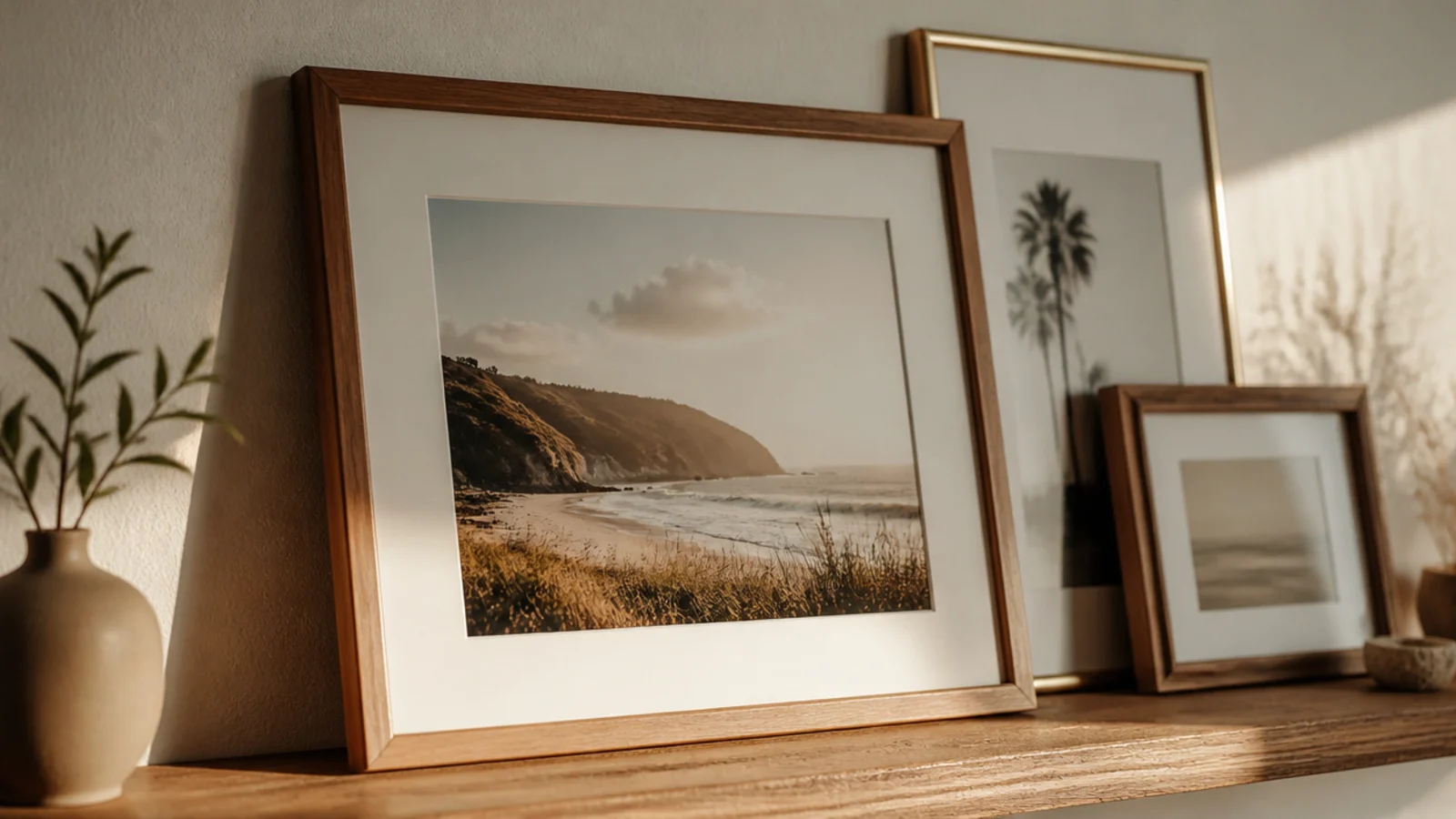
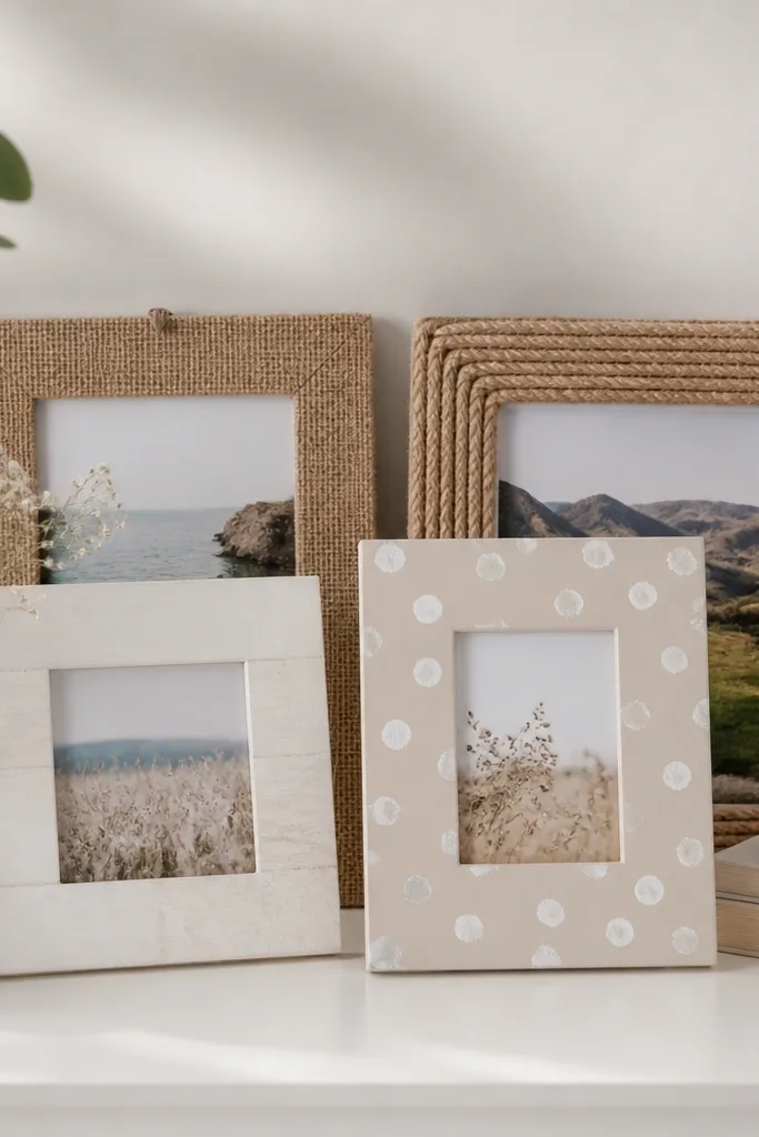
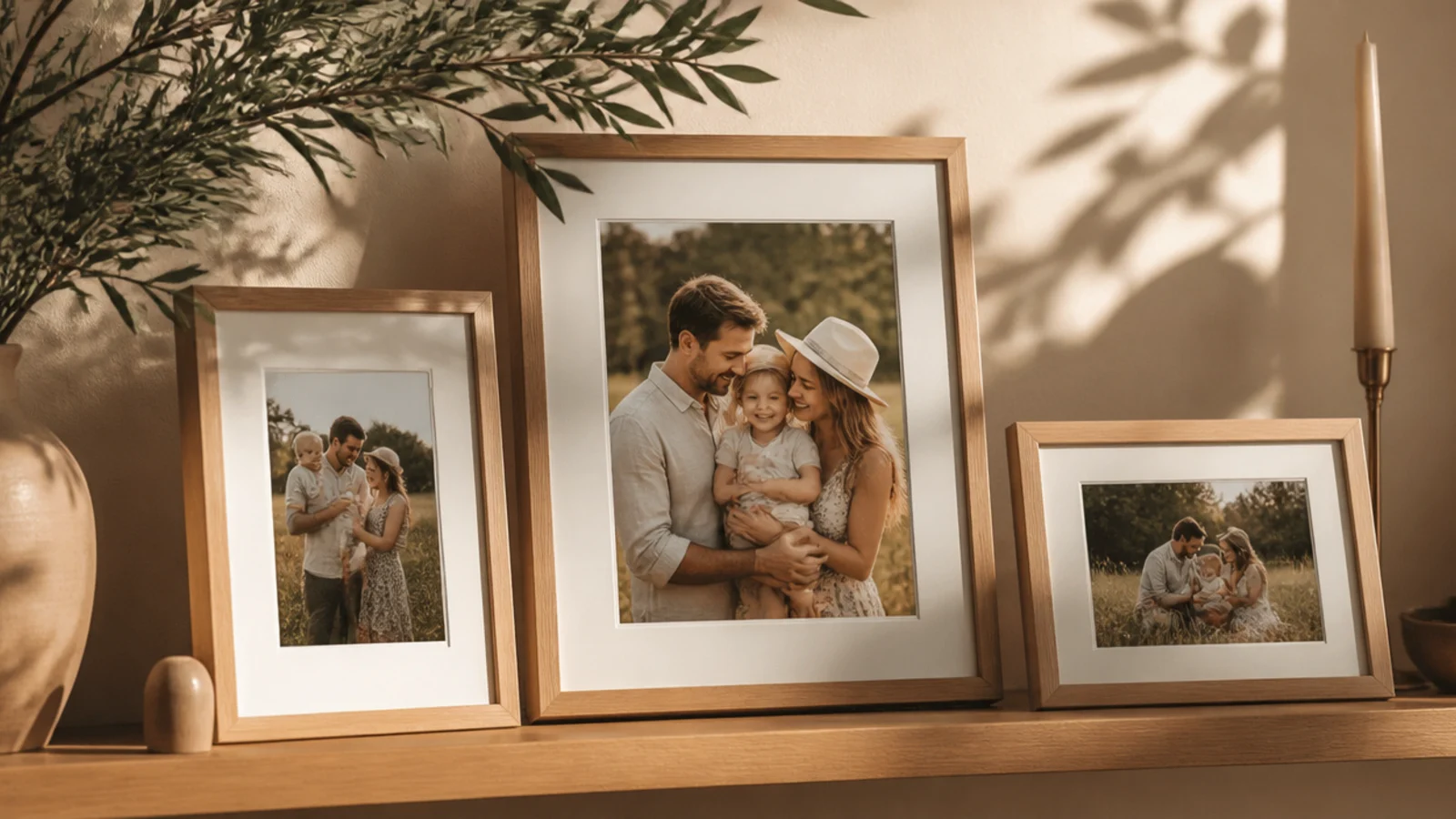
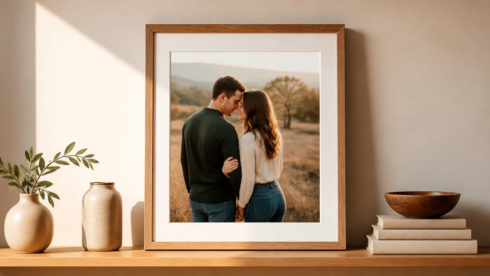
A slim ledge lets you lean and layer frames with no per-frame nail holes, so you can restyle anytime. It’s the easiest wall idea and perfect for renters. A natural or matte-black ledge with mixed frames leaning and overlapping looks relaxed and gallery-fresh.
Mount a picture ledge to the wall, anchoring into studs or with rated drywall anchors, and check it level. Lean your largest frame at the back, then overlap smaller ones in front, staggering heights. Add a small ball of removable putty behind each frame’s top so it can’t slide. Restyle whenever you like without touching the wall again.
Layer frames front to back in odd numbers and let them overlap slightly — a little overlap looks intentional, a rigid row looks stiff.
Don’t overload a ledge past its rated weight; a sagging or pulled-out ledge takes the whole arrangement down.
2. Salon-Style Cluster
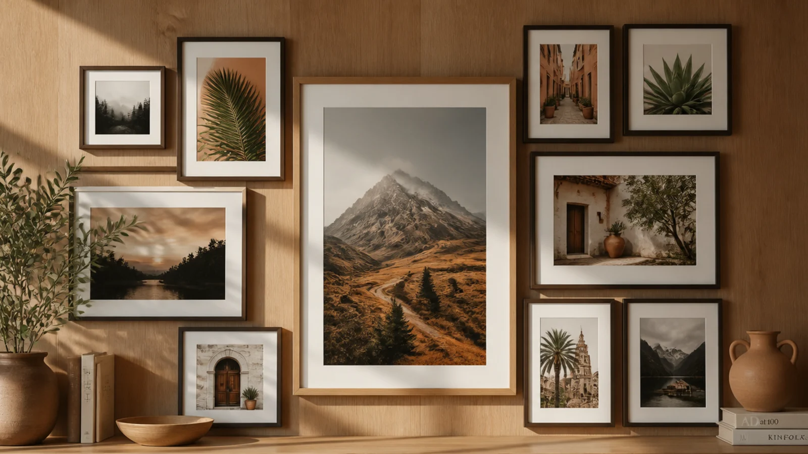
A dense, floor-to-ceiling cluster of mixed frames looks collected and rich, like an art salon. It suits a big blank wall that needs impact. Mixing sizes but keeping gaps even and finishes related is what turns a jumble into a designed salon wall.
Template every frame in kraft paper and tape them to the wall, starting with the largest anchor frame slightly off-center. Fill outward, keeping a consistent 2 to 3 inch gap. Mark hooks through each template, then hang from the center out. Level as you go and use two points per frame so none tilt.
Start hanging from the central anchor frame and work outward — it keeps the whole cluster balanced instead of drifting to one side.
Don’t let the gaps vary; uneven spacing is the single thing that makes a salon cluster look accidental.
3. Symmetrical Grid
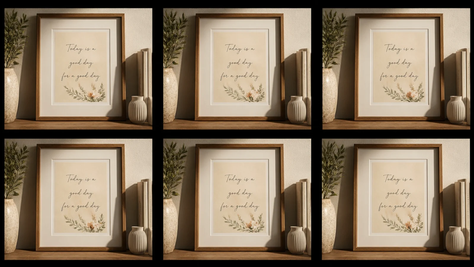
A tidy grid of identical frames looks calm, modern, and architectural. It suits a hallway or a wall above a sofa where you want order. Matching frames and mats with equal gaps give that crisp, deliberate gallery-shop look.
Choose identical frames and decide your grid — say three across and two down. Calculate spacing so gaps are equal, and template the whole grid in paper first. Measure carefully; a grid punishes any misalignment. Mark all hooks, then hang row by row, leveling each frame and checking columns line up with a straight edge.
Snap a light pencil line or use a laser level for the top row — if the first row is dead level, the rest of the grid follows easily.
Don’t eyeball a grid; even a slight drift between columns is glaringly obvious in a repeating pattern.
4. Vertical Column Stack
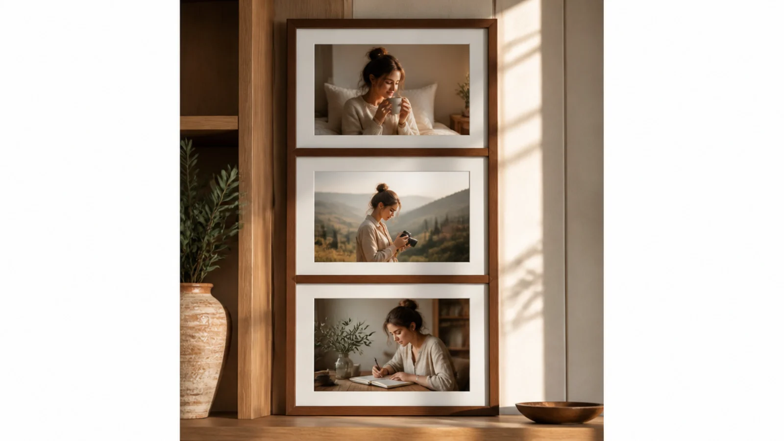
A single vertical stack of frames fills a tall narrow gap — beside a door, between windows — that a horizontal layout can’t. It suits awkward slivers of wall. Three evenly stacked frames draw the eye up and make a low ceiling feel taller.
Center the column on the narrow wall. Template three frames stacked with equal gaps, keeping them all aligned on a central vertical line. Mark the center point of each frame and drop a plumb line or use a level to keep the column dead straight. Hang from the top down, checking each frame is centered and level.
Editor's noteAlign all three frames on their centers, not their edges, if the frames are different widths — centered stacking looks balanced even with size variety.
Skip thisDon’t let the column lean off-vertical; a stack that drifts sideways is far more noticeable than a crooked single frame.
5. Staircase Ascending Line
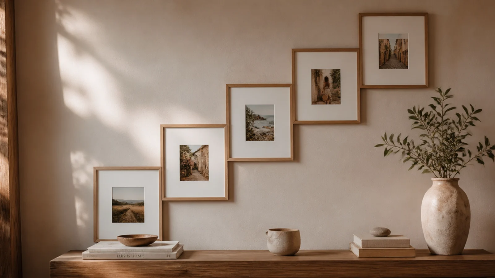
Frames that climb the stair wall in a stepped line turn dead stairwell space into a gallery. It suits any staircase. Following the stair angle with evenly stepped frames looks intentional and guides the eye up the stairs.
Measure the stair rise and run to find the diagonal angle. Cut a cardboard template of one tread step to keep frame heights consistent above each stair. Template the frames on the wall along that diagonal, keeping the gap between frames even. Mark hooks and hang, measuring each frame’s height from the stair nosing below it for a consistent climb.
Editor's noteMeasure each frame’s height from the step directly below it, not from the floor, so the line climbs evenly with the stairs.
Skip thisDon’t hang stair frames all at the same wall height; ignoring the stair angle makes the line fight the staircase.
6. Matching-Mat Mixed Frames
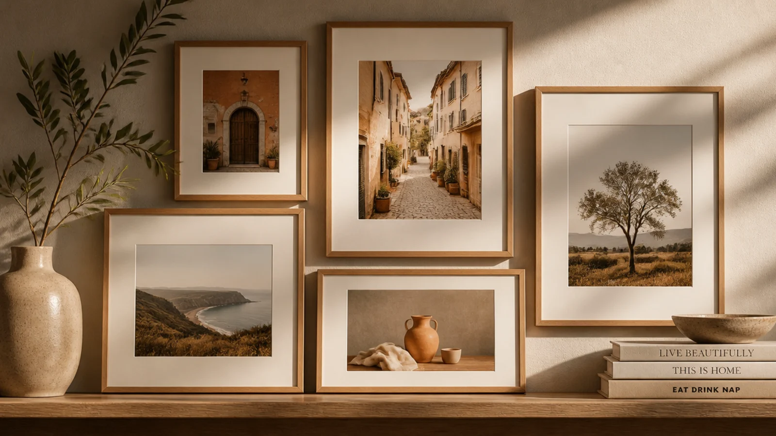
Using the same wide mat inside every frame unifies a mismatched collection instantly. It suits people who’ve inherited or thrifted assorted frames. The consistent cream mat becomes the visual thread that makes clashing frames read as a set.
Gather your mixed frames and cut or buy matching mats in one color — cream or white — sized so each photo sits centered with a wide even border. Insert the same mat style in every frame regardless of the frame itself. Arrange with consistent gaps and hang. The repeated mat does the unifying work for you.
Keep the mat border generous and identical in all frames; a wide, matching mat reads as gallery-grade and hides size differences.
Don’t mix mat colors trying to coordinate with each frame; one mat color throughout is what makes the mix look deliberate.
7. Black-and-White Photo Wall
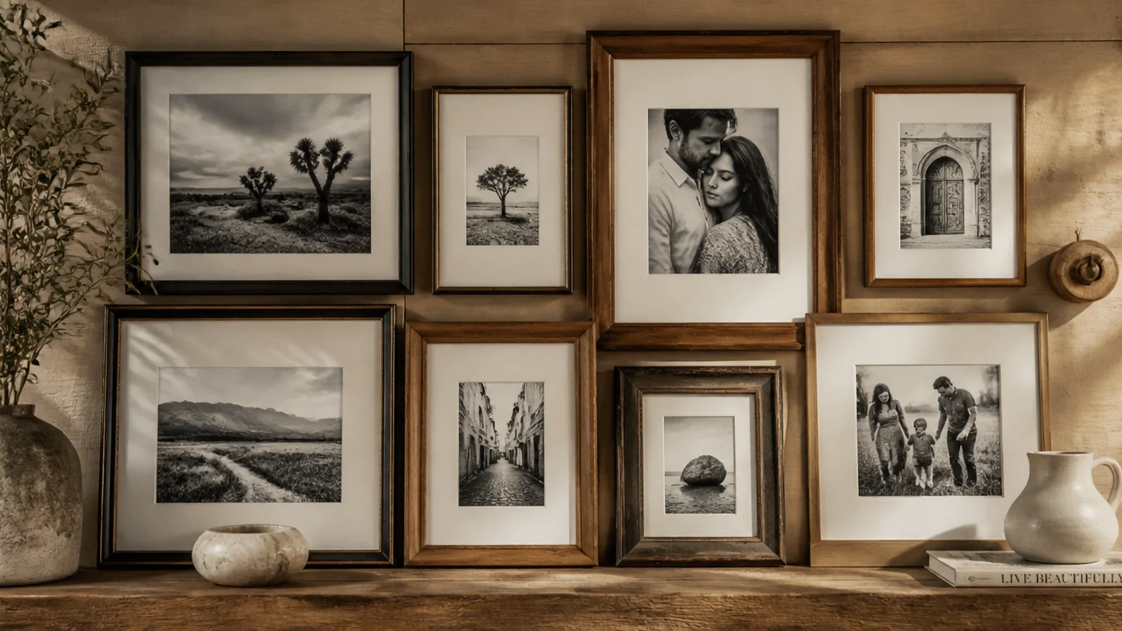
Filling every frame with black-and-white photos unifies any mix of frames through the images themselves. It suits family photo walls with decades of mismatched pictures. Converting all photos to monochrome erases era and color clashes and looks timeless.
Convert your chosen photos to black-and-white and print them at consistent sizes. Insert them into your frames, mixed styles and all. Arrange with even gaps and a shared anchor line, then hang, leveling each. The unified tone of the images ties the whole wall together no matter how varied the frames are.
Print all photos on the same matte paper stock so reflections and tones match across the wall for a true gallery feel.
Don’t leave one color photo in the mix; a single color image breaks the monochrome spell and draws all the attention.
8. Asymmetrical Anchor Layout
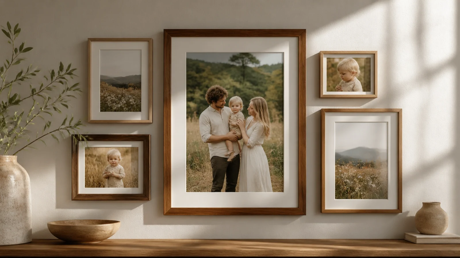
An asymmetrical layout anchored by one large frame feels more relaxed and modern than a rigid grid. It suits a living room where you want interest, not symmetry. One big anchor with smaller frames balanced around it reads collected and designed.
Pick your largest frame as the anchor and place it off-center. Template smaller frames around it, balancing visual weight — a couple of small frames on one side can offset one medium on the other. Keep gaps consistent even as sizes vary. Adjust the paper templates until it feels balanced, then mark hooks and hang from the anchor out.
Editor's noteSquint at your paper templates on the wall — blurring the details makes it easy to see if the visual weight is balanced.
Skip thisDon’t cluster all the large frames on one side; a lopsided arrangement looks like you ran out of wall, not like a plan.
9. Corner-Wrap Gallery
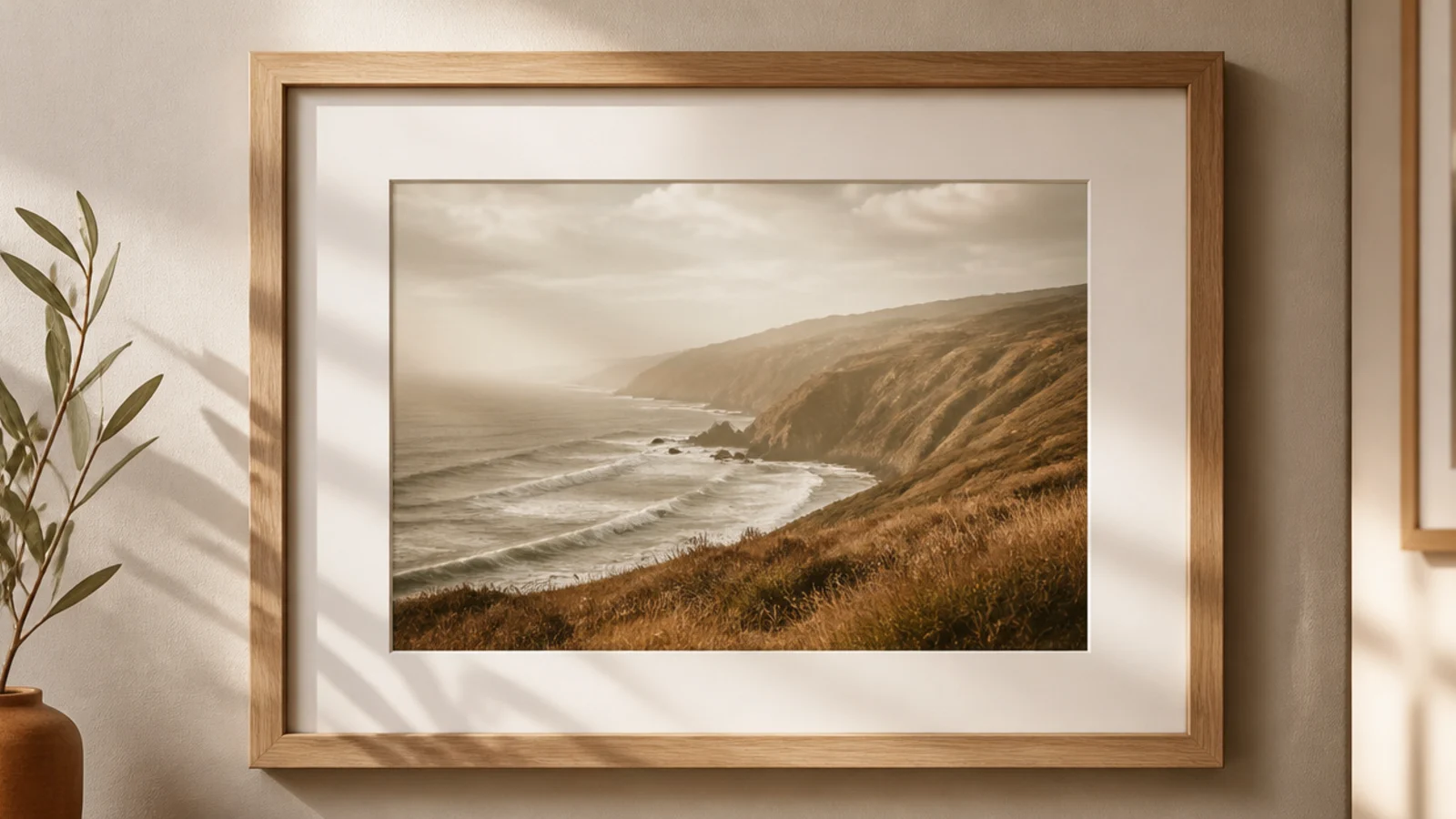
Wrapping frames around a corner onto the next wall makes a small room feel intentional and expansive. It suits tight spaces and reading nooks. Continuing the gap and line around the corner treats two walls as one gallery.
Plan both walls together, keeping the gap between frames identical as the arrangement turns the corner. Template both walls in paper at once so the transition flows. Keep the frames on both walls sharing an anchor height. Hang the corner-adjacent frames first to nail the transition, then fill outward on each wall.
Keep the two frames nearest the corner at the same height and the same gap from the edge so the wrap looks seamless.
Don’t crowd frames right into the corner; leave a little breathing room from the edge so neither wall looks cramped.
10. Shelf-and-Frame Mix
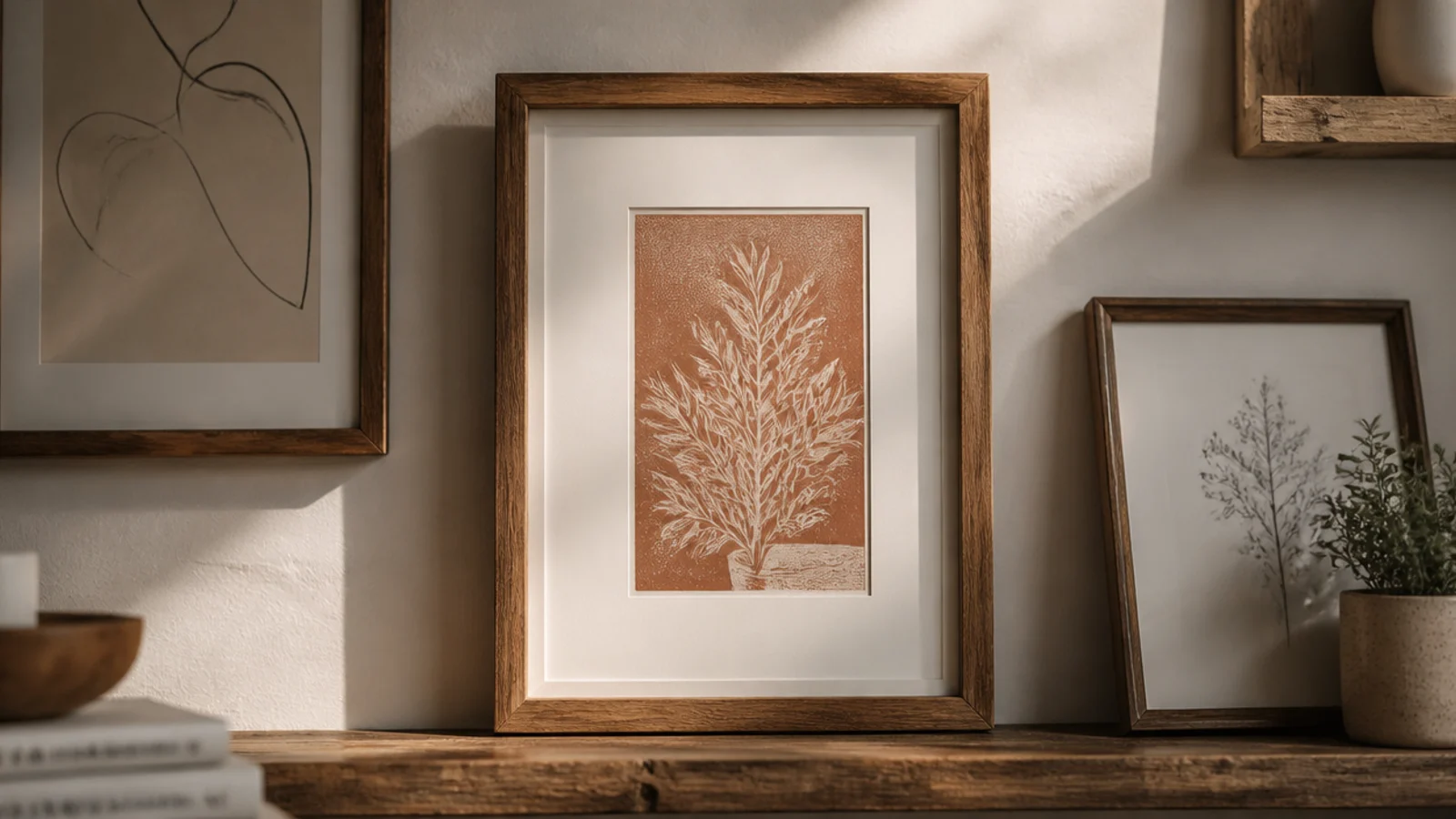
Mixing hung frames with a small shelf of leaning frames and a plant adds depth a flat wall lacks. It suits a living room or office. The combination of hung and leaning frames plus a bit of greenery feels layered and lived-in.
Hang a floating shelf as one element of the arrangement, anchored into studs. Template the hung frames around and above it, keeping gaps consistent with the shelf as part of the composition. On the shelf, lean frames and add one small plant or object. Balance the leaning frames against the hung ones so the whole wall feels even.
Editor's noteTreat the shelf as one 'frame' in your layout math so the gaps around it match the gaps between the hung frames.
Skip thisDon’t clutter the shelf with objects; a couple of leaning frames and one plant keep it from competing with the wall.
11. DIY Matching Wood Frame Set
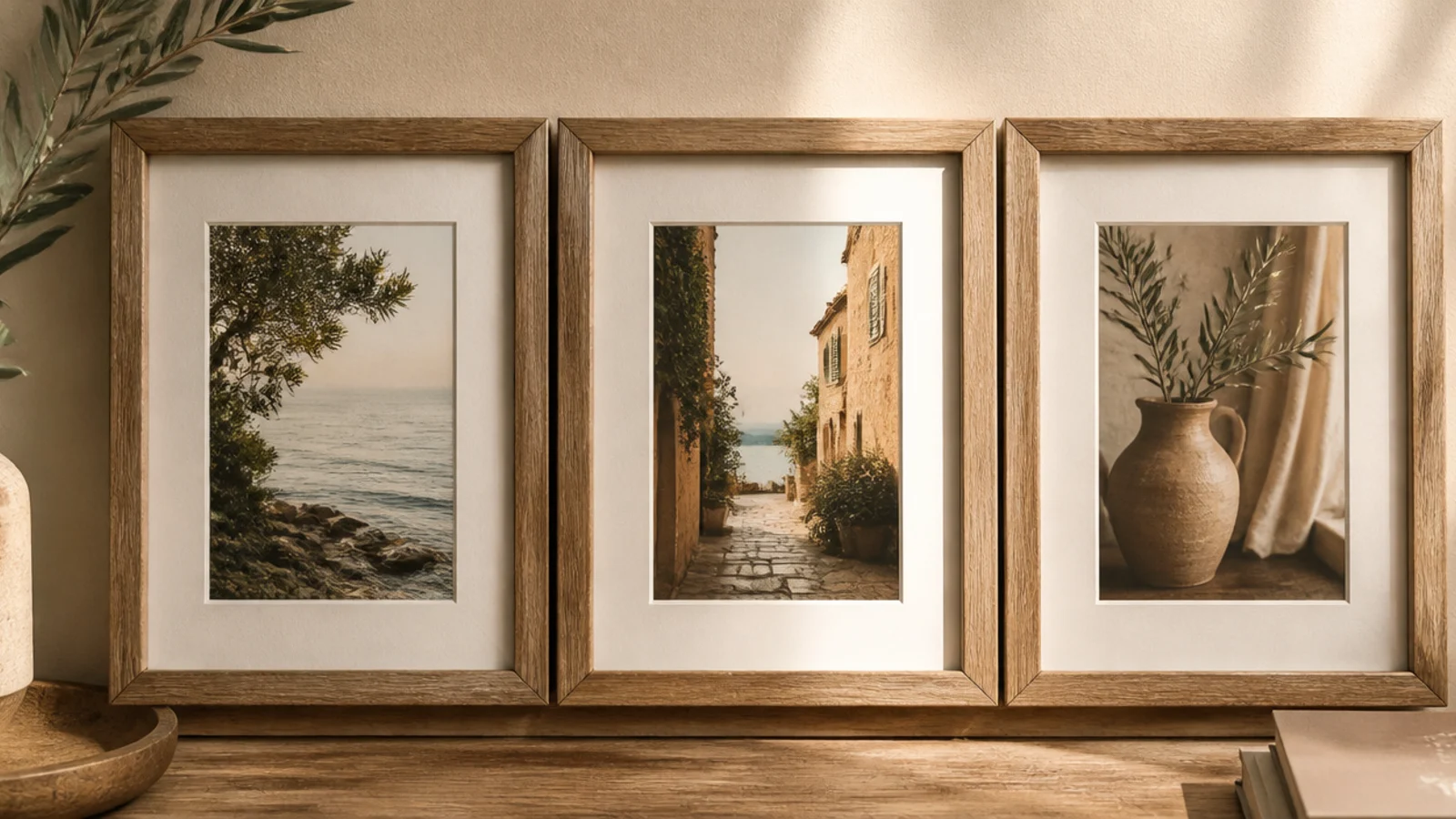
Building a set of identical simple wood frames gives you a matching gallery for the cost of lumber. It suits anyone who wants a coordinated look on a budget. Same-size scrap-wood frames in one finish read as a designed collection.
Cut matching strips of wood for several identical frames, joining corners with glue and a chipboard backing each. Sand and finish all of them the same — clear-sealed natural or one paint color. Print photos to fit. Template the set in a row or grid with equal gaps, mark hooks, and hang, leveling each frame.
Editor's noteBatch-build the frames assembly-line style — cut all pieces, then glue all, then finish all — so they come out truly identical.
Skip thisDon’t finish them one at a time with different techniques; slight finish differences show badly in a matched row.
12. Washi-Tape Frames
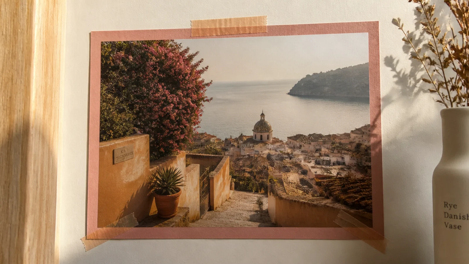
Framing photos with washi-tape borders straight on the wall is the no-hole, no-cost idea for renters and dorms. It suits temporary or playful spaces. The tape border gives a flat, graphic frame you can rearrange endlessly.
Arrange your prints on the wall with painter’s tape to plan spacing. Once happy, tape each photo’s corners down, then run washi tape along all four edges to create a border frame, mitering or overlapping the corners neatly. Keep gaps between photos consistent. Peel and reposition anytime without marks.
Editor's noteUse a low-tack washi and press only the corners of the photo so prints don’t tear when you rearrange them.
Skip thisDon’t stick photos flat with strong tape; it can lift paint or tear the print — low-tack washi comes off cleanly.
13. Oversized Single Statement Frame

One oversized framed photo can fill a wall better than a dozen small ones, with zero layout math. It suits minimalists and above-furniture spots. A single large frame reads confident and modern and takes minutes to hang.
Choose or print one photo large — engineer prints and poster printers make big prints cheap. Frame it in a simple wide frame with a clean mat. Center it over the furniture, hanging the visual middle at eye level, 6 to 10 inches above the piece below. Use two hooks into studs for the weight and level carefully.
Editor's noteSize a single statement frame to roughly two-thirds the width of the furniture below it so it feels anchored, not stranded.
Skip thisDon’t hang one large frame too high; floating it above eye level disconnects it from the room and looks stranded.
14. Multi-Opening Collage Frame
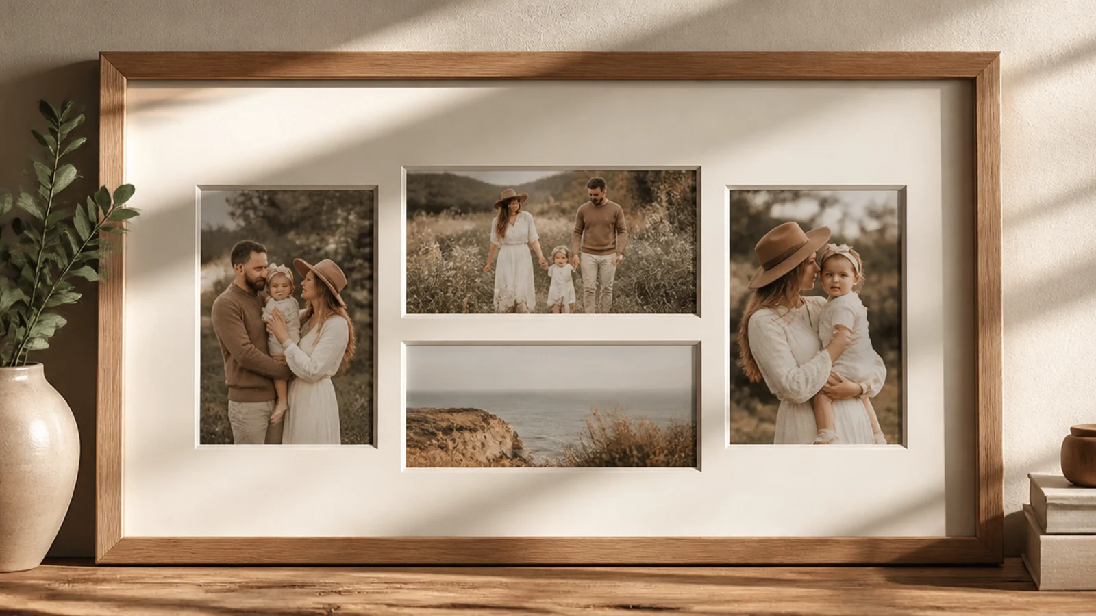
A single frame with multiple mat openings gives you a collage that hangs as one piece — no layout, no gaps to measure. It suits people who want many photos with one nail line. The pre-cut mat does all the alignment for you.
Buy or cut a multi-opening mat sized to your frame. Print photos to fit each opening exactly. Mount each behind its window with acid-free tape, keeping them straight. Assemble into the frame with a rigid backing. Hang as a single frame with two points so it stays level — all the internal alignment is already handled by the mat.
Editor's noteChoose a mat with openings sized to standard prints so you don’t have to trim photos to odd dimensions.
Skip thisDon’t mount photos crookedly behind the openings; since the mat is perfectly even, any tilted photo stands out sharply.
15. Hanging Clip-Frame Grid
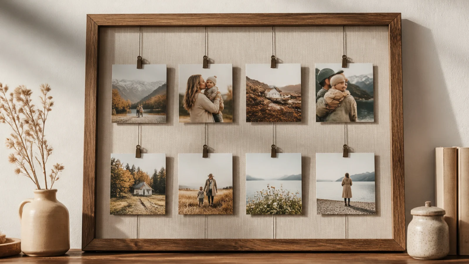
Photos clipped to vertical wires or strings make a light, swappable grid with an airy, modern feel. It suits offices and creative spaces. The clips let you change photos in seconds without reframing anything.
Mount small hooks in a row along the top of the wall, spaced evenly. Hang taut vertical wires or strings from each, weighting or anchoring the bottoms. Clip photos across the wires with small metal clips, aligning them into a rough grid. Keep horizontal rows level by clipping at consistent heights. Swap photos freely.
Editor's noteAdd a small weight or a bottom anchor to each wire so the strings stay vertical and the grid doesn’t drift.
Skip thisDon’t let the wires sag or lean; loose, uneven strings turn a crisp grid into a tangle instantly.
16. Themed Travel Wall
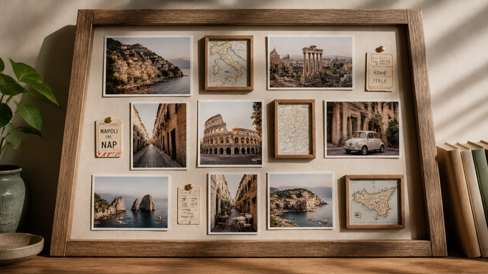
A wall themed around travel — photos mixed with small framed maps and mementos — tells a story beyond the pictures. It suits well-traveled homes. The mix of photos and travel objects gives the wall a clear, personal narrative.
Gather travel photos plus flat mementos — maps, tickets, postcards — and frame the mementos in small matching frames. Template the whole arrangement with the photos and memento frames mixed evenly. Keep gaps consistent and unify with one frame finish. Hang from a central anchor out, leveling as you go.
Editor's noteFrame a few flat mementos alongside the photos to add texture and story, but keep them the minority so photos still lead.
Skip thisDon’t let mementos outnumber the photos; too many tickets and maps and it looks like a scrapbook, not a gallery.
17. Monochrome Frame-Finish Wall
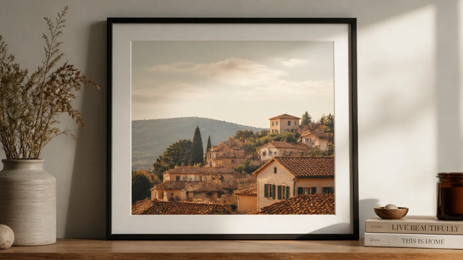
Painting every frame the same color unifies a wildly mixed collection through the frames themselves. It suits thrifted, mismatched frames. One coat of matte black or cream on all of them makes even clashing shapes read as a coordinated set.
Gather mixed frames and remove glass and photos. Scuff-sand each and spray or brush them all the same matte color — black, cream, or charcoal. Let cure and seal. Reinsert photos, then arrange with consistent gaps. The single shared finish turns the mismatch into a deliberate monochrome gallery.
Spray-paint all the frames in one session on a drop cloth so the finish and sheen match exactly across the set.
Don’t leave the frames their original mixed finishes hoping the layout unifies them; the shared color is what does it.
18. Above-Bed Symmetrical Pair
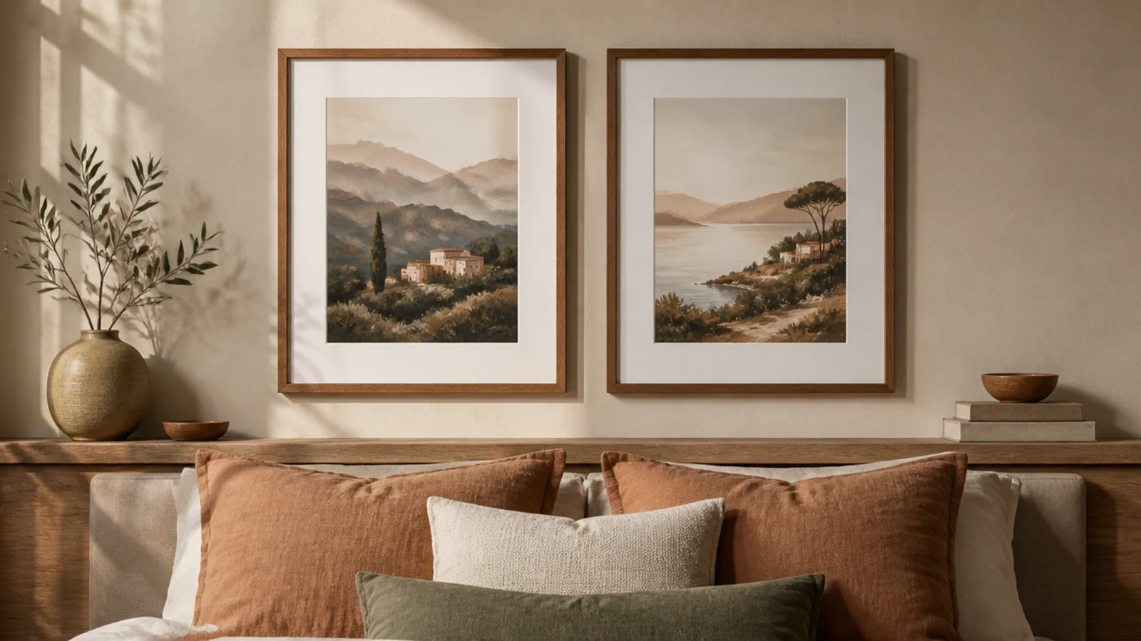
Two matching frames centered above a headboard give a calm, balanced bedroom focal point. It suits bedrooms that need restful symmetry. A simple mirrored pair feels serene and is quick to hang right.
Measure the bed width and center the pair over it. Template two matching frames with an even gap between them, both at the same height. Position the visual center of the pair at a comfortable height above the headboard — about 6 to 10 inches. Mark hooks, hang, and level both, checking the gap and heights match exactly.
Center the pair on the bed, not the wall, so the arrangement relates to the headboard below it.
Don’t hang the pair too high above the headboard; a big gap disconnects them from the bed and looks unbalanced.
19. Full-Wall Photo Mosaic
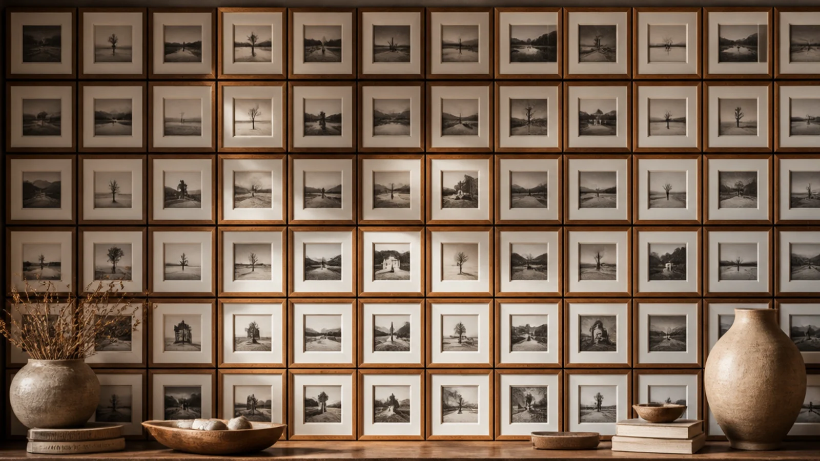
Packing a whole wall with small same-size frames in a tight mosaic makes a bold, immersive statement. It suits a feature wall you want to fill completely. The dense, even grid of small frames reads as one big textured artwork.
Use many identical small frames. Calculate a grid that fills the wall with a consistent small gap — an inch or less. Template the full grid in paper, which is essential at this scale. Mark every hook, then hang methodically row by row with a laser level or pencil guideline. Fill each frame with photos in a shared tone for cohesion.
Keep photos in one tone — all warm or all monochrome — so the packed mosaic reads as unified texture, not visual noise.
Don’t attempt this without templating; at this density any misaligned frame throws off the entire mosaic.
20. Oversized Leaning Floor Frame
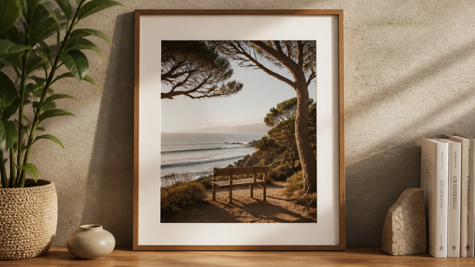
A large frame leaned on the floor against the wall skips hanging entirely and looks effortlessly modern. It suits renters and anyone avoiding big holes. A big leaning frame beside a plant fills a corner with zero hardware.
Choose or print one large photo and frame it in a substantial frame. Lean it against the wall on the floor or on a low console, angled slightly back so it’s stable. Secure it to the wall with a small anti-tip strap or a dab of putty so it can’t slide out, especially near kids or pets. Style a plant or basket beside it.
Anchor a leaning floor frame to the wall with an anti-tip strap — a big frame that slides is a genuine hazard.
Don’t leave a tall leaning frame unsecured near foot traffic; angle and anchor it so it can’t be knocked over.