1. The Picture Ledge That Got Me Started
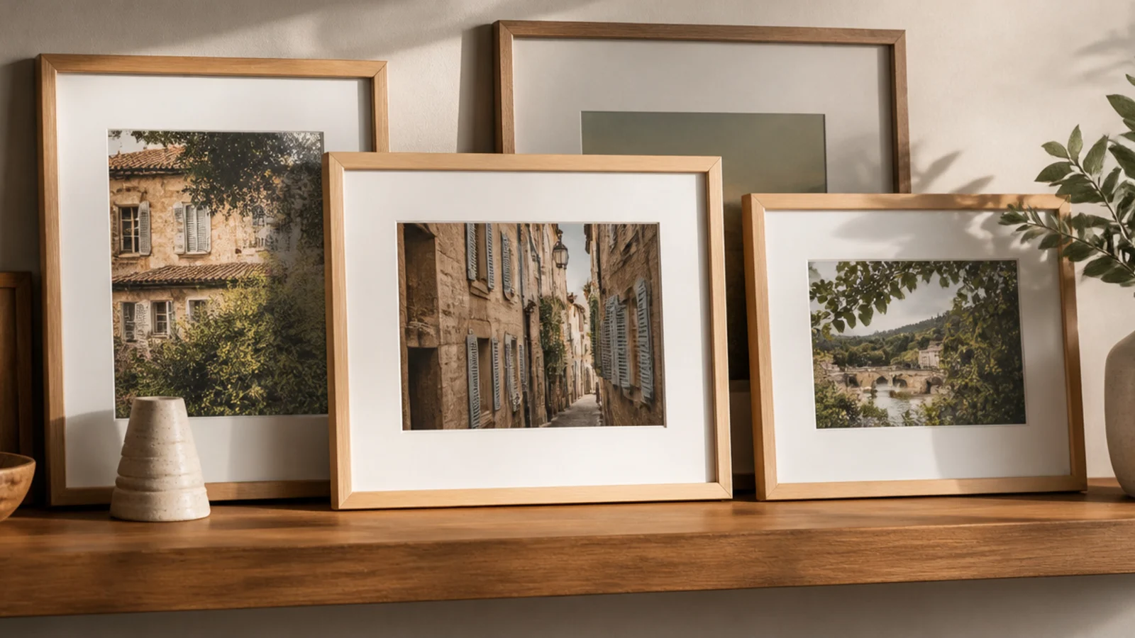
This is the one that finally broke my two-year standoff with the wall, because it needed only two anchors and zero commitment. It suits anyone frozen by the fear of getting the layout wrong. I could restyle it endlessly without touching the wall again, which took all the pressure off.
I mounted a slim ledge into two studs and checked it level with my phone app. I leaned my largest framed photo at the back, then overlapped smaller ones in front, staggering the heights. A little ball of removable putty behind each frame’s top stopped them sliding. Whenever I got a new photo, I just swapped one in — no new holes ever.
Editor's noteLayer the frames front to back and let them overlap a little; the overlap is what makes a ledge look styled instead of like a row of books.
Skip thisDon’t pile more on the ledge than it’s rated for — I overloaded mine once and the whole row leaned forward alarmingly.
2. The No-Holes Adhesive Cluster
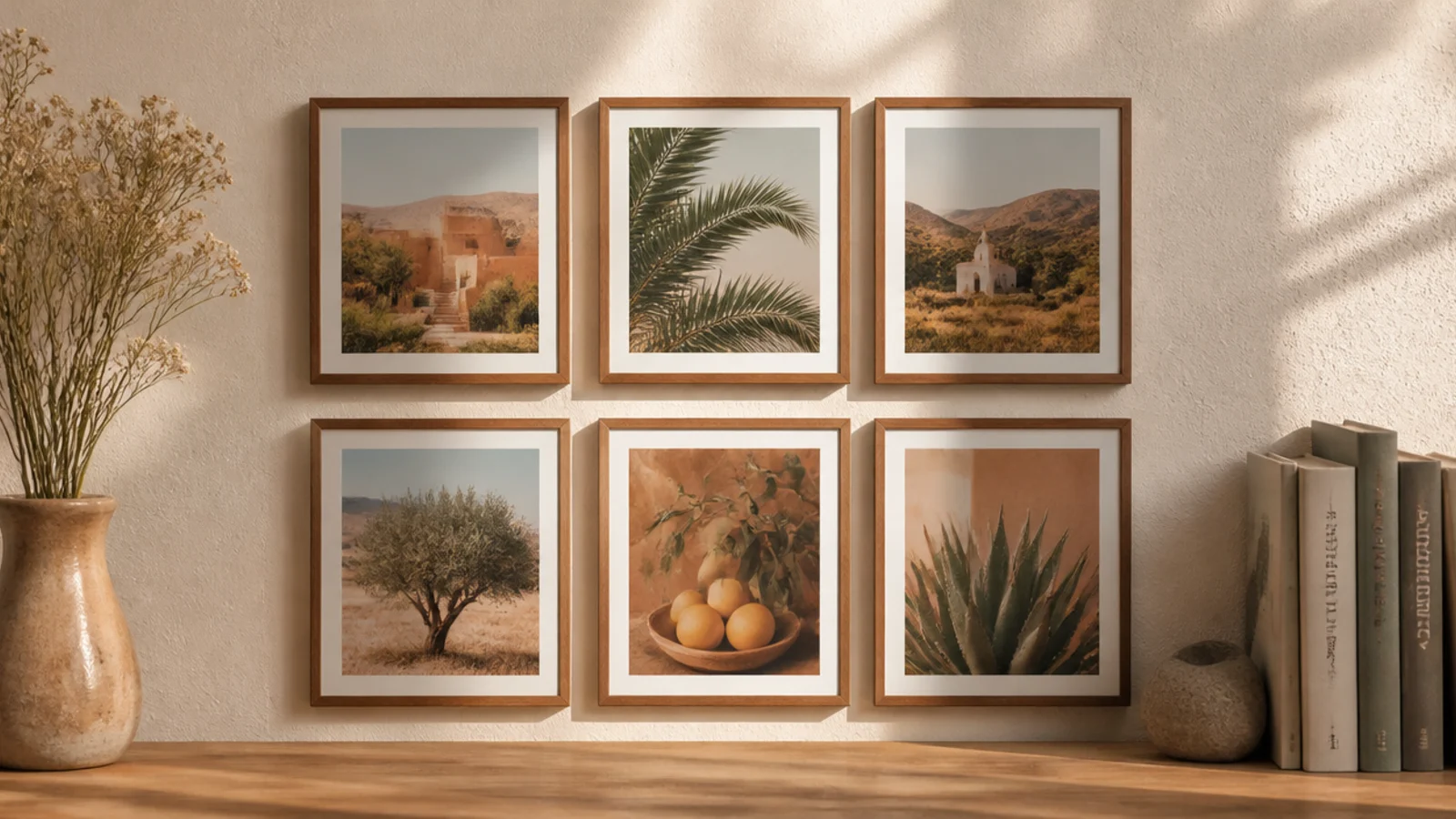
When I wanted more frames actually on the wall but still no holes, adhesive strips did it. It suits renters and the commitment-shy. I filled a whole section in an evening and it’s still holding a year later, which genuinely surprised me.
I templated the cluster in paper first, then stuck each lightweight frame up with adhesive wall strips, pressing hard and holding for the full time the pack said. I kept a consistent gap of about two and a half inches and leveled each frame by eye against the paper marks. When one photo bored me, the strips let me reposition without a mark.
Editor's notePress each strip firmly for the full time on the packet — the one frame I rushed slid down the wall overnight and taught me to wait.
Skip thisDon’t use adhesive strips on heavy or glass-heavy frames; they’re for lightweight frames only, or you’ll find them on the floor.
3. The Single Big Print That Did the Heavy Lifting
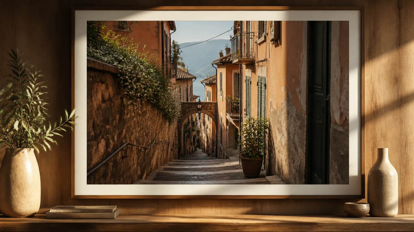
One oversized print filled more wall than a dozen small frames and took ten minutes to hang. It suits anyone who wants maximum impact for minimum fuss. This was the piece that made the wall feel intentional overnight, and it’s my favorite of the lot.
I ordered one photo printed large online, matted it in a simple wide frame, and centered it over the console. I hung it with two hooks into studs so it couldn’t tilt, with the visual middle at eye level and the bottom about a hand’s width above the console. Two hooks instead of one is what keeps a big frame dead level.
Editor's noteSize a single statement frame to roughly two-thirds the width of the furniture below it — mine looked stranded until I went bigger.
Skip thisDon’t hang the big print too high; my first attempt floated above eye level and looked disconnected until I dropped it down.
4. The Grid I Had to Measure Twice
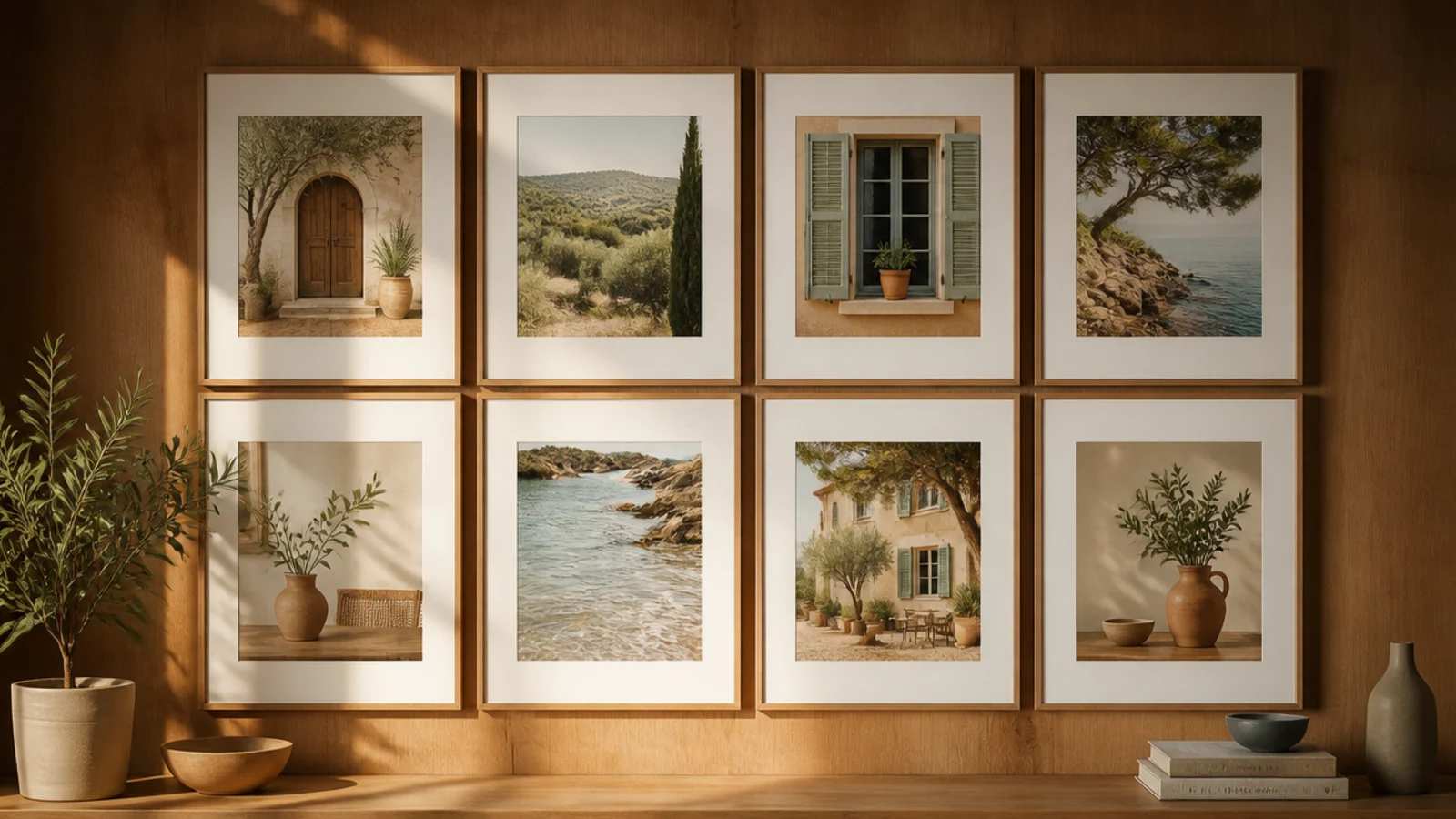
A grid of matching frames gave one section of my wall a calm, ordered feel. It suits people who like things neat and symmetrical. It took the most measuring of anything I did, but the crisp result was worth the extra half hour with the tape measure.
I bought a set of identical frames and planned a three-by-two grid with equal gaps. I templated the whole grid in paper — essential, because a grid shows every error. I snapped a light pencil line for the top row, marked all the hooks, and hung row by row, checking each frame against the level and the columns against a straight edge.
Get the top row perfectly level first; once that row was dead straight, the rest of the grid fell into place under it easily.
Don’t eyeball a grid like I tried to at first — even a slight drift between columns jumped out and I had to redo two frames.
5. The Thrift Frames I Repainted to Match
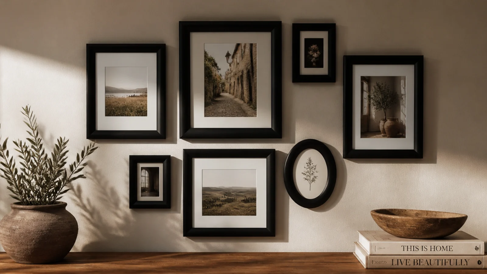
My mismatched thrift and hand-me-down frames looked like clutter until I painted them all one color. It suits anyone with a drawer of random frames. This cheap fix is what pulled my whole wall together, and I’d do it first next time.
I gathered every stray frame, removed the glass, scuffed each with 220-grit, and sprayed them all matte black in one session on a drop cloth. Once cured, I sealed them and put the photos back. Painting them all at once meant the finish matched exactly. Suddenly the clashing shapes read as one deliberate set instead of a jumble.
Spray all the frames in one go so the sheen matches perfectly — the two I did on a separate day looked subtly different up close.
Don’t skip scuff-sanding glossy old frames; the paint peeled off the one I rushed within a week and I had to redo it.
6. The Black-and-White Photo Swap
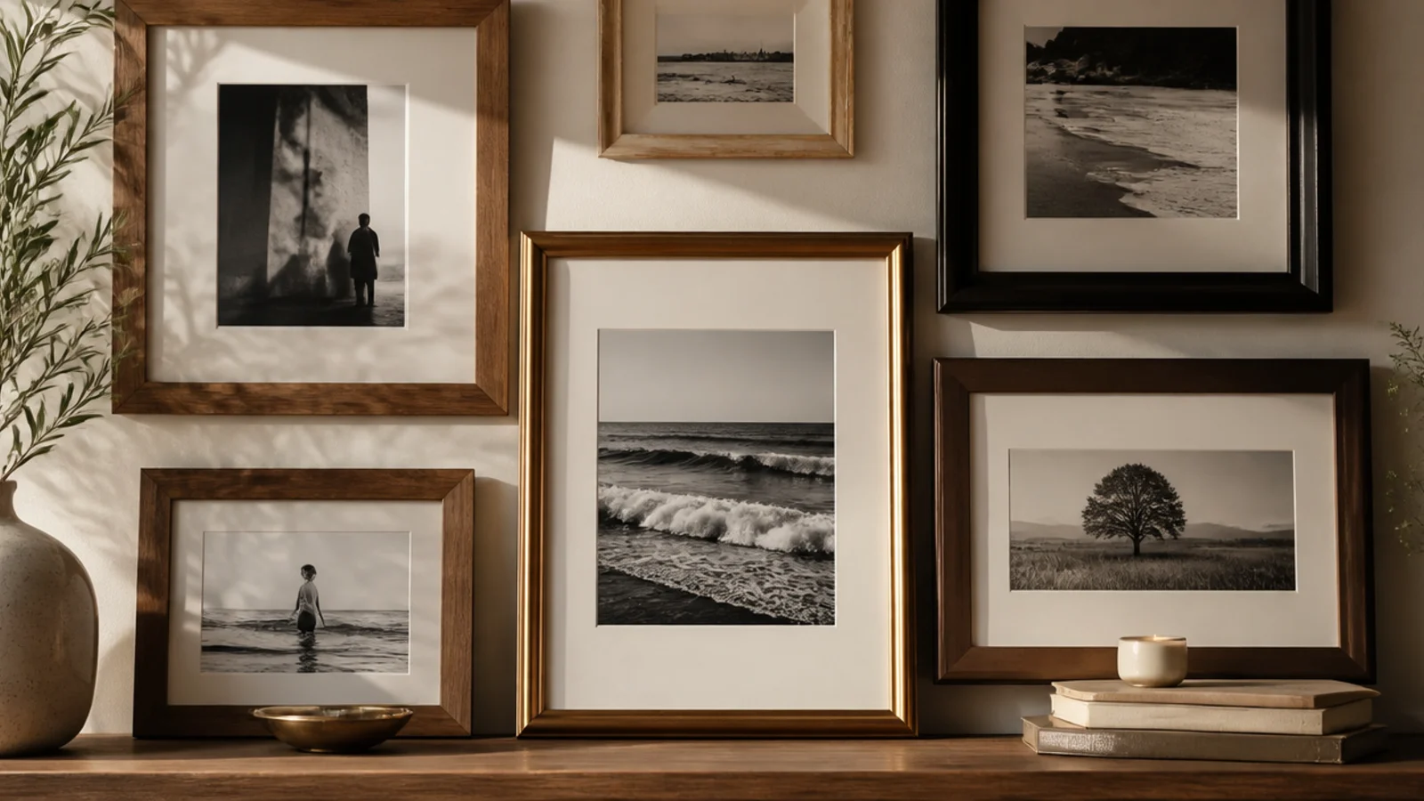
Reprinting my photos in black-and-white unified frames I couldn’t repaint. It suits family photos from clashing eras and cameras. This was the trick that made decades of mismatched color snapshots finally look like they belonged together.
I converted my chosen photos to black-and-white and reprinted them at the drugstore on matte paper. I swapped them into the frames I already had, mixed styles and all. The single tone tied that whole section together instantly. Matte prints meant no mismatched glare across the frames, which glossy prints had been causing.
Print them all on the same matte stock so the tones and finish match across the wall — it reads far more like a gallery.
Don’t leave one color photo in the group; the single color print I left in kept stealing the eye until I converted it too.
7. The Shelf-and-Plant Corner
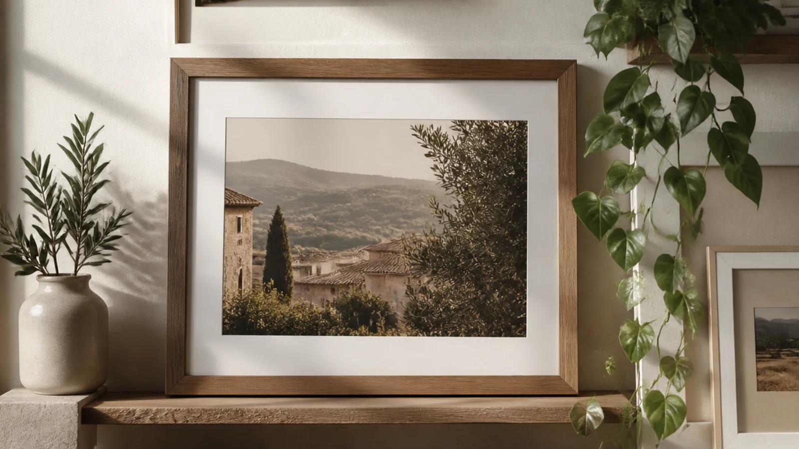
Adding a small shelf with a leaning frame and a trailing plant gave the flat wall some depth. It suits a corner that feels one-dimensional. This was the finishing touch that made the wall feel lived-in rather than just decorated.
I hung a small floating shelf into a stud as part of the arrangement, treating it as one element in my spacing. On it I leaned a framed photo and set one trailing plant. I kept the gaps around the shelf the same as between the frames. The mix of hung frames, a leaning one, and a bit of green added the layer the flat wall was missing.
Editor's noteCount the shelf as one 'frame' in your spacing so the gaps around it match the rest — that kept it from looking bolted on.
Skip thisDon’t crowd the shelf with knick-knacks; one frame and one plant looked intentional, and my first over-styled version looked busy.
8. How It All Came Together on One Wall
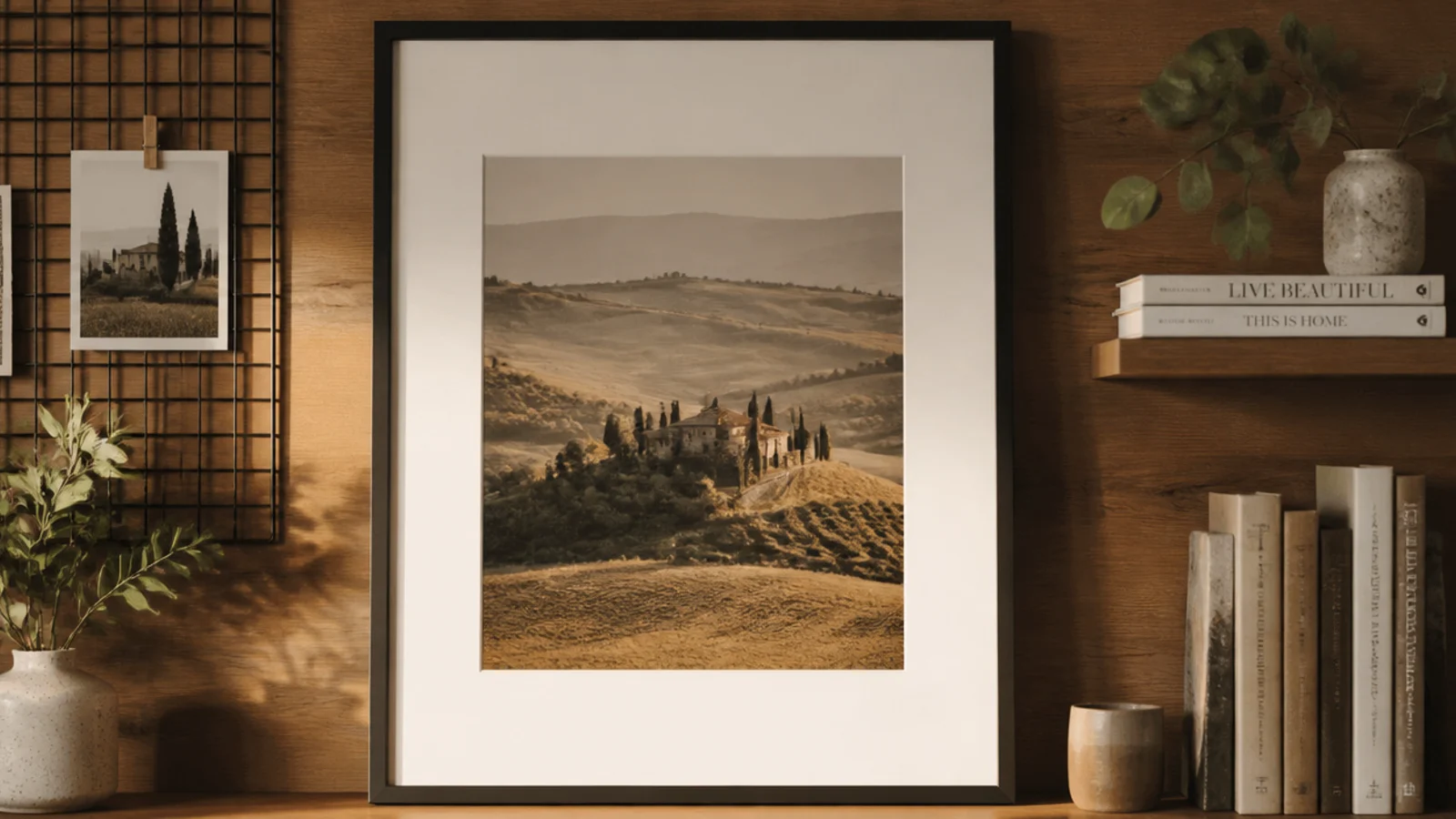
In the end I combined several of these on the same wall, and the mix looked intentional because of two rules. It suits anyone who can’t pick just one idea. Consistent gaps and one shared finish let me blend a ledge, a big print, and clusters without it reading as chaos.
I laid the whole wall out in paper first, deciding where the big print, the grid, the ledge, and the clusters would sit. I kept every gap around two and a half inches and made sure every frame was either warm wood or matte black. I hung the big print and shelf into studs first as anchors, then filled in the lighter frames around them, leveling as I went.
Pick your shared finish before you buy or build anything; deciding warm-wood-or-black up front saved me repainting frames later.
Don’t combine ideas without a consistent gap and finish; the unity is the only thing keeping a mixed wall from looking random.