
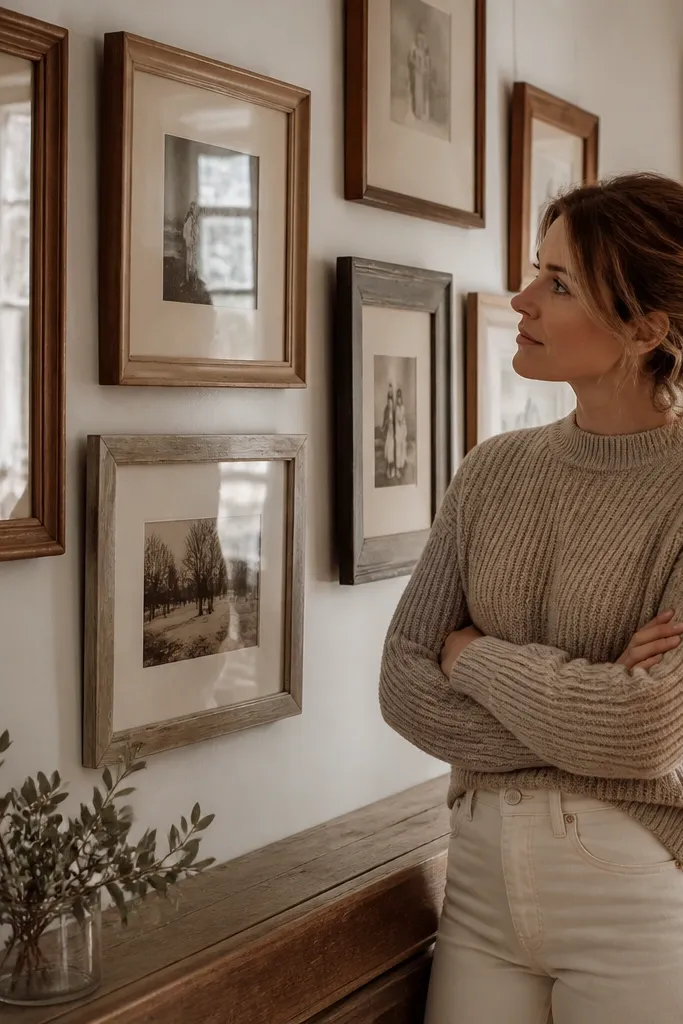
1. French Market Frame Wall With Teal Mat Borders
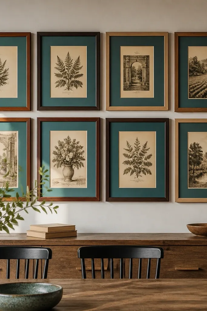
This is a clean way to get Vintage Gallery Wall Ideas that still feel old-world. The frames can vary in wood tone, but the teal mats make every piece visually belong together. You get a calm structure, then the vintage prints add the lived-in texture. Use smaller prints so the teal border becomes a consistent “breathing line” across the whole wall. It looks great in a hallway or dining area where you want order without looking sterile.
Editor's noteSpray the back of each mat with a light coat of clear matte fixative to reduce scuffing during handling.
Start by sorting thrift frames into three wood tones: light oak, medium walnut, and dark brown. Buy or cut mat boards in a single teal shade (the kind used for mounting photos), and cut mats so the window is 1/2 inch smaller than each print. Lay everything flat and arrange a loose grid on the floor, keeping 2 inches between frames. Tape the final layout to the wall, then hang with picture wire or D-rings so all frames sit level.
Skip thisAvoid using mixed mat colors; the wall loses the vintage coherence fast.
2. Monochrome Sepia Frames With One Burgundy Accent
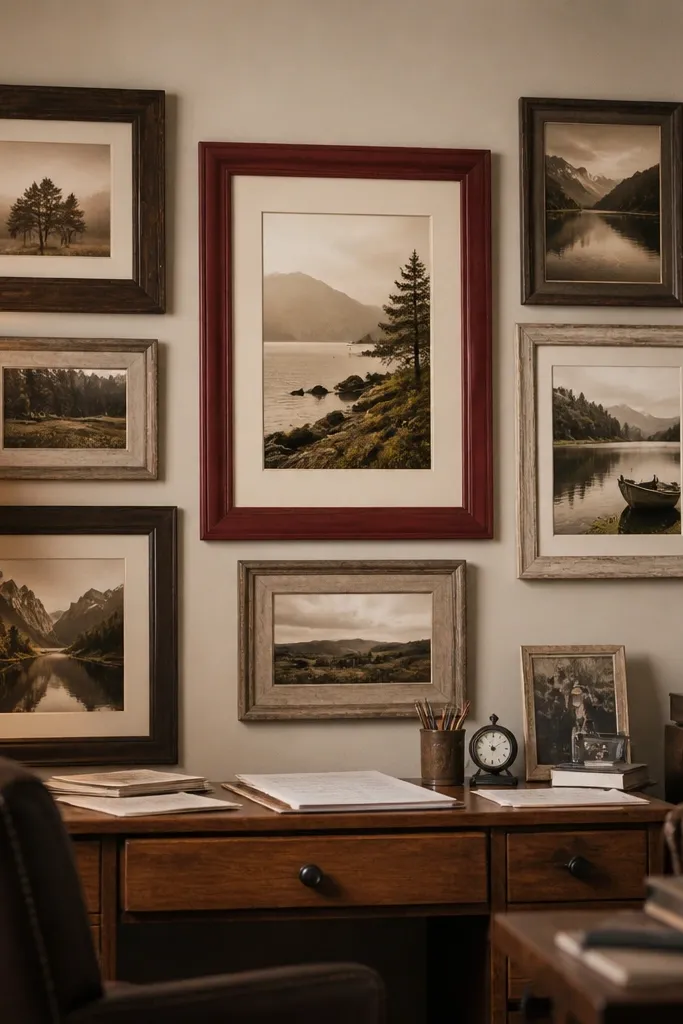
If your room already has a lot going on, this setup keeps the gallery from fighting your furniture. Most frames are neutral — espresso, cream, and weathered wood — and the content is sepia so everything looks like it came from the same decade. One burgundy accent frame gives you a focal point and keeps the wall from reading flat. It’s a smart choice for Vintage Gallery Wall Ideas when you want character but don’t want bright colors. Expect it to look best in warm lighting because the sepia and burgundy deepen the shadows.
Editor's noteUse matte photo paper for any reprints; gloss makes sepia look cheap and modern.
Choose 18-24 prints in sepia tones and consistent aspect ratios (mix 4x6 and 5x7, but don’t throw in random tiny scraps). Spray-paint or stain frames to keep them in brown/cream families, then leave one frame burgundy (matte paint, not gloss). Arrange the burgundy piece as the center anchor, then build outward in descending size. Hang using a level and measure spacing so the distance between frame edges stays within 2-3 inches.
Skip thisSkip bright black frames in this scheme; they break the vintage temperature.
3. Linen-Textured Print Gallery in Rattan Frames
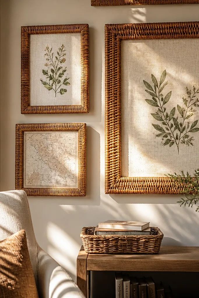
This one leans into texture, which is what makes Vintage Gallery Wall Ideas feel expensive even when they’re thrift-built. Rattan frames add warmth and a soft, woven edge that reads “old home” from a distance. Pair them with prints that look like linen — think muted botanical illustrations, neutral maps, or abstract shapes with grain. The result is cohesive because the texture repeats, even when the images change. It’s ideal for living rooms, bedrooms, and any space with natural wood, rattan, or woven baskets.
Editor's noteIf the frames don’t have hanging hardware, add a small D-ring on the back so you can level them without bending the frame.
Pick 10-14 rattan frames in the same size family, then mix two sizes for rhythm. If prints are glossy, swap them for matte or print on textured paper so the surface matches the rattan. Use adhesive photo corners or a light spray mount so the print doesn’t buckle behind the glass. Arrange in a staggered grid, leaving consistent gaps, then hang the center row first and build out to the sides.
Skip thisAvoid glass reflections; position the gallery away from direct overhead glare or use anti-glare film behind the glass.
4. Vintage Blueprint Strips With Oversized Clips
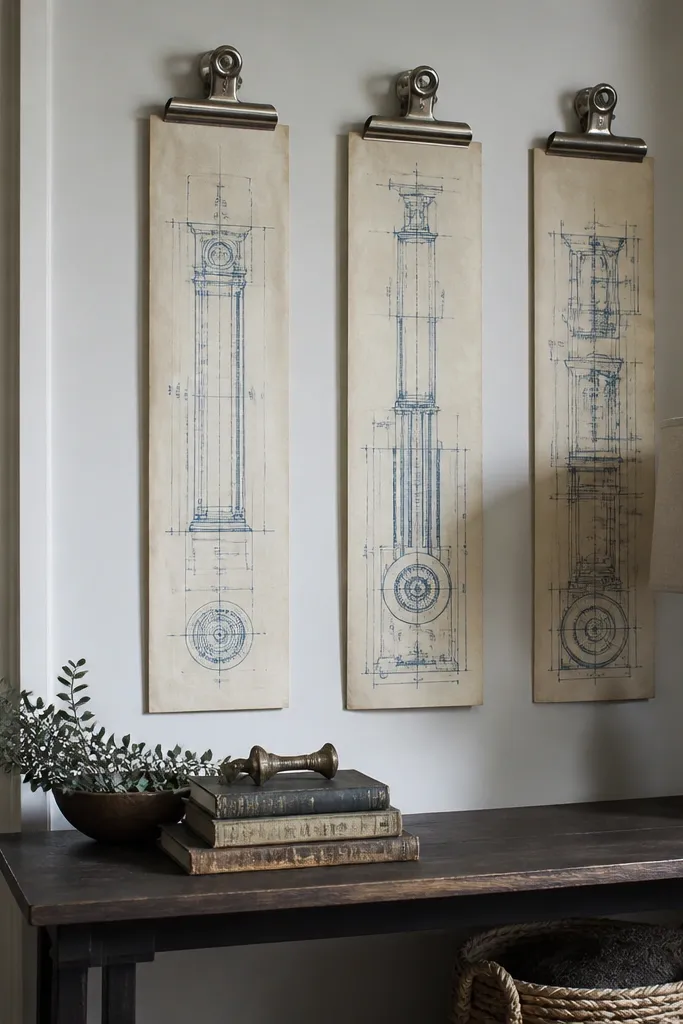
Blueprints look instantly vintage, and using oversized clips turns them into a wall object instead of flat wall decor. This is a great option when you want a more industrial-meets-vintage look without painting anything. The vertical strips create height, which makes your wall feel taller and your room more open. Keep the prints in one color family (sepia or faded blue) so it doesn’t look like random documents. This style is especially good in home offices, stair landings, and kitchens with open shelving.
Editor's noteUse two clips per strip at the top and bottom; one clip makes the paper bow over time.
Print or source blueprint-style pages and trim them into vertical strips, aiming for consistent heights like 18 inches. Mount each strip to a thin backing board (foam board works) so it holds flat under clips. Use a strip of clear acrylic or lightweight backing as the “mounting spine” behind each clip. Space the pieces 2-3 inches apart and hang using a rail or a series of hooks so the row reads straight.
Skip thisDon’t use clip colors that clash with your room hardware; keep them brushed metal or black.
5. Antique Map Corner Gallery With Compass Rose Anchor
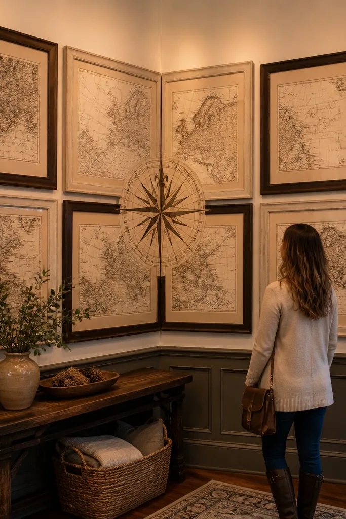
Corner walls are tricky because they’re off-axis. A map gallery fixes that by giving you directional content — coastlines and compass roses visually guide the eye. Put the compass rose (or a map with a clear focal point) near the corner so it “reads” even when you’re standing to the side. Mix frame finishes, but keep mat tones warm and off-white so the paper ages look consistent. This is a solid pick for Vintage Gallery Wall Ideas in entryways where you want personality but still want the room to feel organized.
Editor's noteIf the wall has a strong shadow line, turn the corner anchor 1-2 degrees so it catches light instead of disappearing.
Choose 8-12 map prints and trim them so the main text blocks are visible (avoid cutting off the legend). Use off-white mats, then cut a few frames without mats to vary the thickness. Arrange so the compass piece sits closest to the corner, and the rest extend outward in a gentle arc. Mark the tape layout, then hang the center first and hang the outer frames last to adjust for corner distortion.
Skip thisAvoid high-contrast black mats; they make printed maps look like modern posters.
6. Vintage Postcard Wall With Threaded Monogram Cards
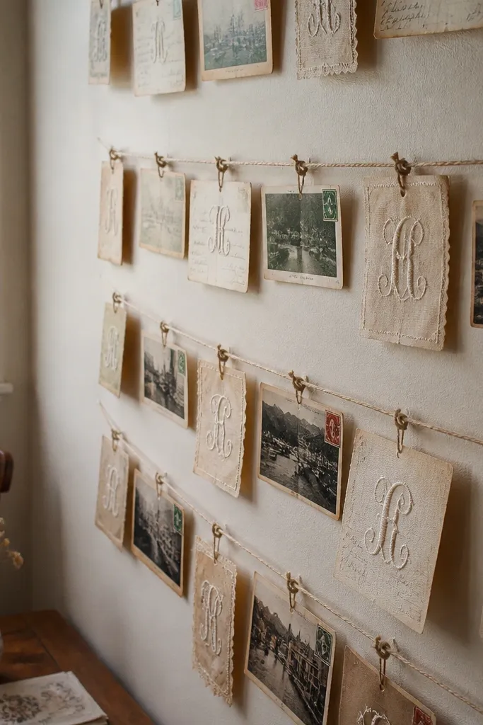
Postcards are the fastest route to Vintage Gallery Wall Ideas that look collected. They already have borders, stamps, and the right kind of randomness. Add a few monogram cards threaded with twine to bring a DIY touch without turning it into a craft project. The twine creates a little depth and shadow, which reads beautifully in photos. This works best in kitchens, breakfast nooks, and craft rooms where you want a personal, travel-ish mood.
Editor's noteUse cotton twine in a natural color, not dyed; dyed twine looks too modern next to postcards.
Use frames with glass and removable backs. Print or source postcards, then mount them with photo corners so they don’t shift. For the monogram pieces, cut cards from heavier cardstock and punch two holes on opposite sides. Thread cotton twine through the holes, tie a small knot on the back, and place the card under the glass so the twine sits taut.
Skip thisSkip stretchy elastic behind the glass; it warps the cards and ruins the clean look.
7. Oversized Oval Frames for a Soft Vintage Layout
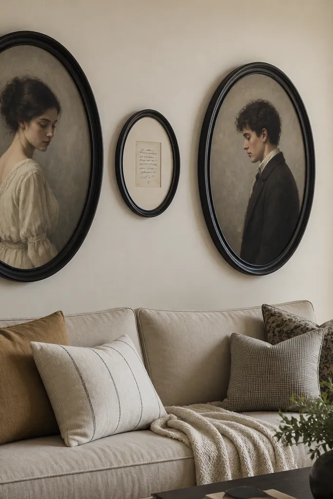
Most gallery walls are rectangles. Swapping in oval frames instantly makes Vintage Gallery Wall Ideas feel different and softer. The oval shapes also create a natural flow, which helps when you’re mixing portraits, prints, and a quote card. Keep the palette muted so the oval frames don’t look like party decor. This style is especially flattering in bedrooms and living rooms with rounded furniture or curved mirrors.
Pick 3 oval frames as the top row anchor and 6-8 smaller rectangular frames around them. Keep mat colors consistent and choose a single print type for the center pieces, like faded portraits or old botanical illustrations. Arrange on the floor first, then tape the outline to the wall. Hang the ovals first, then fill in the rectangles, keeping gaps between frames around 2 inches.
Use picture wire and adjust lengths so each oval sits perfectly level; oval frames show tilt faster than rectangles.
Avoid mixing too many oval sizes; it looks accidental instead of intentional.
8. Shadowbox Frame Mix With Fabric Swatches
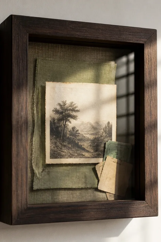
This idea adds depth, which is where vintage character lives. Shadowbox frames let you combine prints with fabric swatches, ticket stubs, or tiny labels, so your wall reads like a collection. The texture from fabric makes the whole gallery look warmer and less flat than standard prints. Keep swatch colors in a tight range: cream, warm gray, and one muted accent like dusty blue. It’s perfect for Vintage Gallery Wall Ideas in entryways and offices where you want something that looks better from up close.
Buy 4-6 shadowbox frames with glass and removable backing. Cut fabric swatches into 2x3 inch pieces and pin them to a thin backing board using small craft pins. Add one or two paper items per box, like a small label card, and secure with acid-free glue dots. Arrange the shadowboxes as the centerpiece, then surround them with flat frames that match the same mat color so the wall still feels unified.
Use acid-free materials for paper so the pieces don’t yellow and curl behind the glass.
Don’t overfill shadowboxes; empty space inside the frame makes the vintage look intentional.
9. Vintage Window Panes With Mini Frames Inside
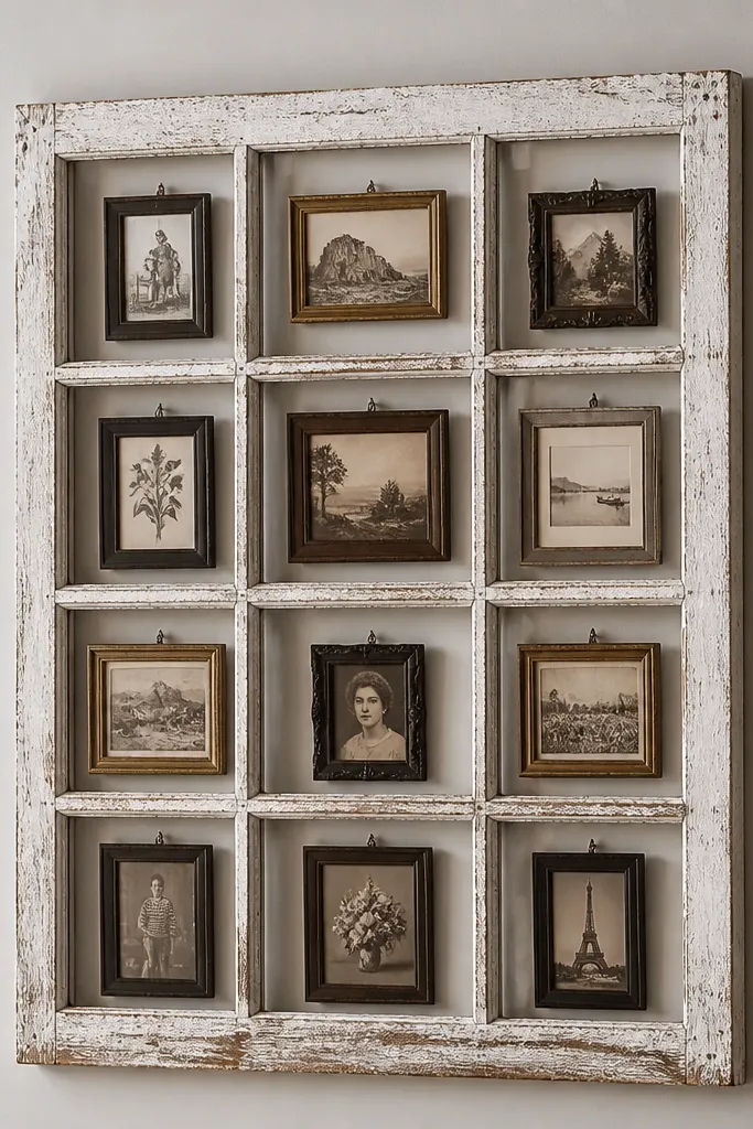
A window-pane style display turns Vintage Gallery Wall Ideas into a statement piece. Instead of hanging many separate frames, you anchor everything to one structure, which makes spacing and alignment easy. The mini frames inside give you variety without chaos. Whitewashed wood also makes thrift mismatches look like a design choice. This works in hallways, dining rooms, and laundry rooms where you want personality but don’t want to measure 14 separate hang points.
Editor's noteDrill pilot holes for the mini frame screws; old wood splits if you skip it.
Source a vintage window frame or build a simple grid from wood strips. Sand and whitewash the frame so it looks weathered but still sturdy. Inside, mount mini frames using screws through the back so each sits square. Add a backing board or fabric panel behind the mini frames to hide gaps, then hang the window structure using two heavy-duty wall anchors.
Skip thisAvoid using lightweight craft wood — it warps and makes the mini frames misalign.
10. Thrift Frame Stack With Two-Story Depth Layering
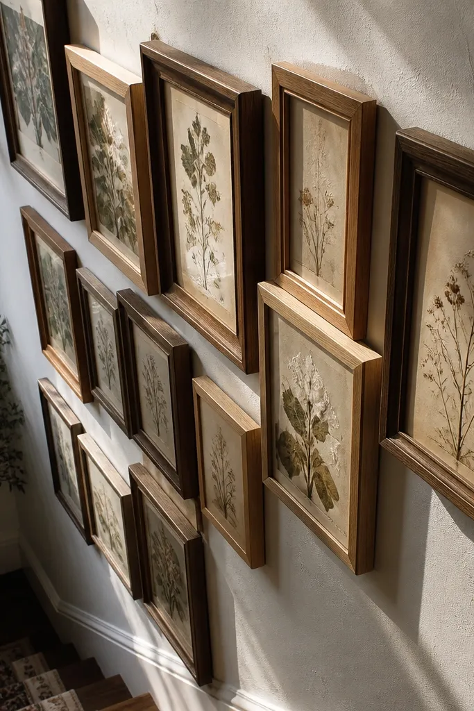
This is a vintage look that’s all about depth, and it photographs like crazy. By staggering frames at slightly different distances from the wall, you create shadow lines that feel collected over time. You can mix frame sizes and finishes, but you keep the content cohesive through a shared paper style like aged botanical prints. This is a great pick when your wall is plain and you want it to feel dimensional without adding bulky decor. It suits living rooms and stairways where you see the wall from multiple angles.
Editor's noteUse the same spacer thickness for all deep frames so the shadow pattern looks intentional.
Choose 10-14 frames and decide which two sizes will sit deepest. Use foam mounting tape or 1/2 inch picture frame spacers behind the back of the frames to create depth differences. Start with a flat template on the floor, then place spacers under the “deep” frames only. Tape and level the outer edges, then attach using secure hanging hardware so the staggered frames don’t pull forward over time.
Skip thisAvoid stacking more than two depth levels; too many distances turns the wall into clutter.
11. Vintage Botanical Prints With Matching Green Frame Edges
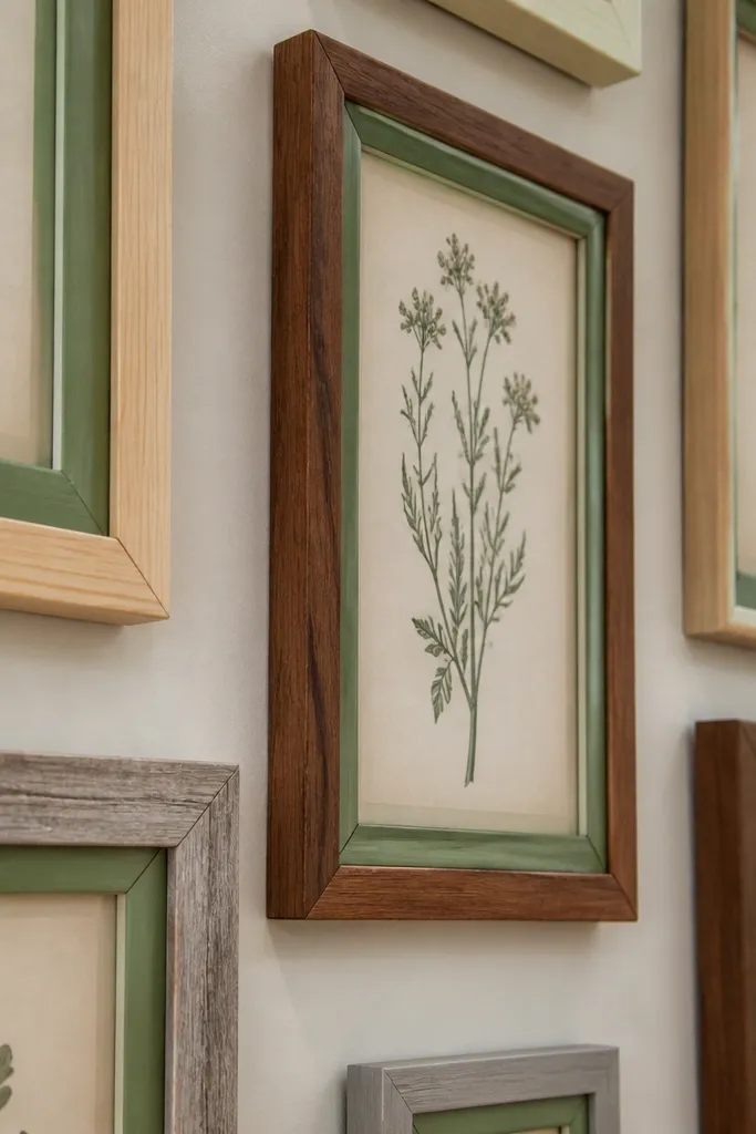
If you want Vintage Gallery Wall Ideas that look curated but still thrift-friendly, this is the trick. Paint only the inner edge or trim of mismatched frames in one muted green, then leave the rest of the frame wood alone. That creates a unifier without destroying the vintage character of each frame. The botanical prints bring the old-world mood, and the green edge makes everything read as one family. This works especially well in kitchens, bathrooms with natural light, and rooms with houseplants.
Editor's noteUse painters tape to mask the inner lip and remove it while the paint is still slightly tacky for sharp lines.
Pick 8-12 frames with similar inner openings but different outer finishes. Mask the outer wood and spray-paint only the inner lip with matte sage green. Insert botanical prints under glass or acrylic, keeping the mat color off-white. Arrange in a loose grid, then hang with a level and consistent spacing so the green edges line up visually across the wall.
Skip thisSkip glossy paint on the inner edge; it reflects and makes the wall look modern.
12. Cream and Gold Frame Wall With Antique-Look Quotes
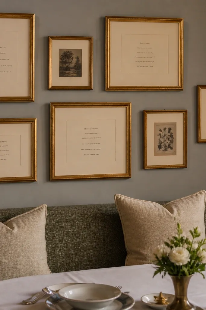
Quotes can look cheesy fast, but Vintage Gallery Wall Ideas fix that when you keep the typography muted and the framing consistent. Use cream mats and gold frames that are either real gilded-looking paint or aged metallic. Pair quote cards with a few small ornamental prints so the wall doesn’t feel like a single-message sign. Keep the quotes short and old-style in tone, like “Home is where the heart is” or “Gather.” This looks best in living rooms and dining rooms where you can read it without squinting.
Choose 10-12 frames and standardize mat sizes so the quote typography sits at a consistent height. Print quote cards on warm cream paper and slightly blur the ink if you’re reprinting digitally, or use pre-aged sources. Insert 2-3 ornamental prints between quotes to break up the text blocks. Hang starting with the center frame, then build outward while keeping 2-3 inches between frame edges.
Use a font style with varying stroke width (old-style serif) so it reads like letterpress, not a modern greeting card.
Avoid bright white mats; they make gold frames look like cheap picture frames.
13. Book Page Collage Frames With Black-White Mat Grid
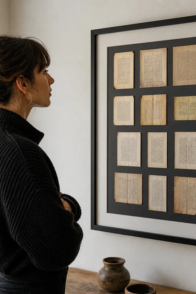
Book pages give you instant vintage paper texture, but you need a framing system or it becomes random. The black-white mat grid keeps the collage controlled while the book text adds character. This is one of the best Vintage Gallery Wall Ideas for people who don’t want to hunt for matching prints. You can clip different pages, cut them into matching rectangles, and still make it look intentional. It’s great in offices and libraries where paper textures feel right.
Editor's noteSand the edges of the cut paper lightly so they look worn instead of sharply new.
Collect book pages and cut them into rectangles sized to the mat window, usually 4x6 or 5x7. Use black mats with a white paper window backing so the text pops. Place the cut page inside and secure with a thin strip of archival tape or photo corners. Arrange 12-16 frames in a grid with consistent spacing, then hang with the center aligned to eye level.
Skip thisDon’t glue pages directly to the glass side; you’ll trap wrinkles and it looks messy fast.
14. Odd-Number Mix: 7 Large Frames, No Center Symmetry
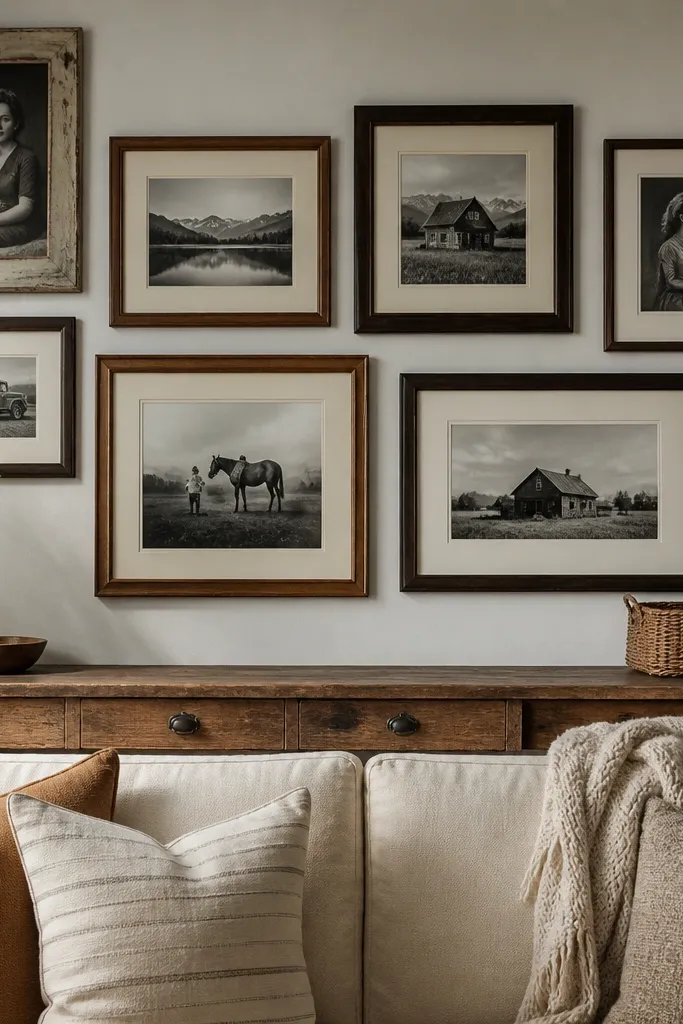
Symmetry feels modern. Vintage Gallery Wall Ideas often look better when they break center symmetry slightly, especially when you use an odd number of large pieces. This layout uses 7 large frames so it still looks intentional, but it avoids the “wedding photo wall” vibe. Keep everything in one paper family — antique prints, sepia photos, or botanical cards — and don’t mix too many frame colors. The asymmetry makes it look collected over time. It’s a strong choice for living rooms and hallways where you want the wall to feel designed, not templated.
Editor's noteUse a single measuring stick — like a yardstick — to keep frame gaps consistent even when your layout is asymmetrical.
Pick 7 large frames and 2-4 smaller frames to fill gaps. Standardize mat color and aim for frame widths within a 1-inch range so the wall feels cohesive. Lay it out on the floor and place the largest frame slightly above eye level, then place the second largest to the side. Tape the outer bounds to the wall and hang by starting with the largest frame first, then work outward with 2-3 inches between edges.
Skip thisAvoid centering every frame vertically; one axis alignment is enough for a vintage look.
15. Distressed Black Frames With White Mat and One Copper Print
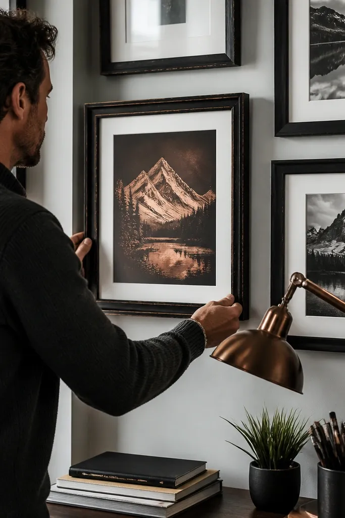
This is a moody Vintage Gallery Wall Ideas option that still reads warm. Distressed black frames create contrast, but the white mats keep the wall bright and readable. Add one copper-toned print to catch light and pull the palette together. The contrast makes the vintage paper look crisp, and the copper adds a metallic antique vibe. This works in entryways, offices, and bedrooms where you have black hardware or dark wood furniture.
Paint thrift frames matte black, then lightly sand edges to expose wood for distressing. Cut white mats with a consistent window size and mount prints using photo corners. Pick one copper print (an antique map section or metallic-toned artwork) and place it as the focal piece. Arrange in a staggered grid, keeping 2 inches between frames, then hang with a level and ensure the copper piece sits slightly higher than the center of the layout.
Spray a light matte clear coat on the distressed frames to protect the sanded areas from scuffs.
Don’t use glossy black paint; it looks like modern decor instead of aged hardware.
16. Vintage Photo Strips With Clothespin Display Under Film
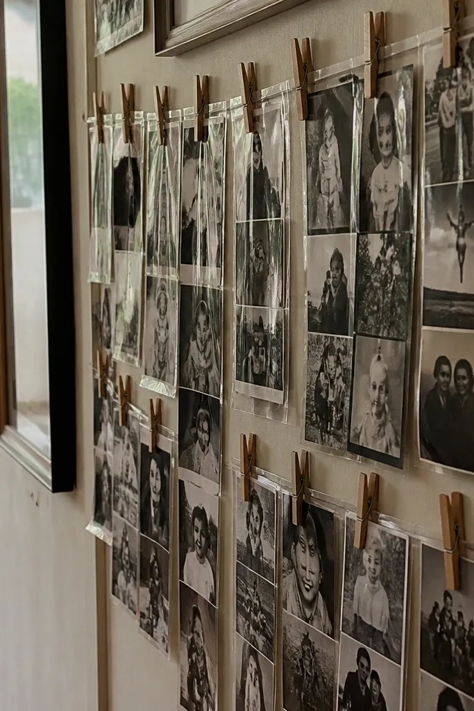
If you like the idea of a gallery wall that changes seasonally, this is the most photogenic way to do it with vintage content. Clothespins create that “found at home” look, and photo strips let you show lots of small memories without tiny separate frames. Using a clear film or protective backing keeps the vintage prints from getting smudged. It’s visually interesting from across the room because the clothespins and layers cast little shadows. This suits laundry rooms, hallways, and kids' play-adjacent spaces where you want something lively but still cohesive.
Editor's noteUse weathered clothespins or spray them matte to match your frame palette.
Mount a simple wooden rail horizontally on the wall at the center height you want. Print photo strips in consistent widths (like 3x8 or 4x10) and trim them so the edges align. Attach small clothespins to each strip and clip them to the rail, then add a clear protective film over the back side so the clips aren’t dusty. Hang the rail securely with anchors and keep the strip spacing consistent at 1-2 inches between clips.
Skip thisAvoid mixing strip widths; it makes the wall feel like a craft supply display.
17. Antique Print Grid With 1-Inch Matte Spacers
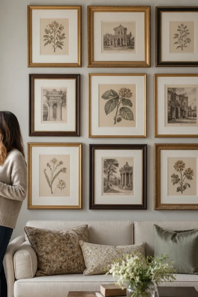
This is the cleanest way to make Vintage Gallery Wall Ideas look high-end: keep spacing measurable. When frames are evenly spaced with a consistent air gap, the wall reads intentional even if the frames themselves are mismatched. The 1-inch matte spacer look also gives the prints room to breathe, which helps vintage paper textures show up. Use this when you’re working with a lot of frames and you want control. It’s perfect for a dining room wall or any long blank wall where you want an orderly vintage collection.
Editor's noteIf your frames vary in thickness, compensate by adding extra spacers behind thinner frames so the visible gaps stay uniform.
Cut spacer strips from foam board or thin cardboard to 1 inch wide. Mount each print into its frame as usual, then place foam spacers between frames when you tape the layout on the wall. Arrange in a grid so each frame edge aligns horizontally and vertically. Hang using a consistent hanging method (wire or D-rings) so the frames sit at the same height and the spacing stays even.
Skip thisAvoid eyeballing gaps; uneven spacing is the fastest way to make a gallery wall look messy.
18. Vintage License Plate and Map Hybrid Gallery
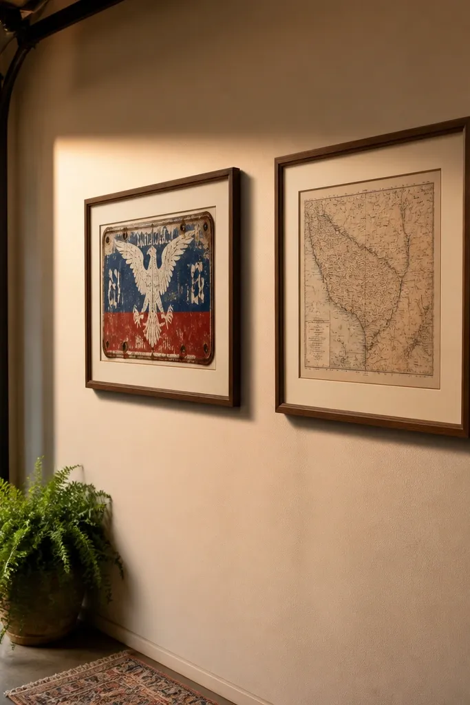
This is a quirky Vintage Gallery Wall Ideas combo that still looks designed when you keep it in one theme. License plate textures bring enamel shine, while map fragments bring paper age. Put them together in frames with the same mat color and you get a cohesive travel-and-road vibe. The key is to treat the plates like prints, not like random trinkets. This looks best in a home office, garage-adjacent room, or entryway where you can lean into Americana.
Source small license plate fragments or use vintage-style decals printed on sticker paper and mount them on cardstock. Cut map fragments into rectangles that match your mat windows. Use frames with glass and mount everything to a backing board so the plate texture sits flat. Arrange 9-12 pieces with consistent mat color and spacing, and place one larger map frame as the anchor.
Seal sticker-mounted elements with a matte clear spray so fingerprints and dust don’t catch the surface.
Skip glossy clear tape on the front; it shows up under light and ruins the vintage feel.
19. Gold Foil Botanical Labels in Dark Wood Frames
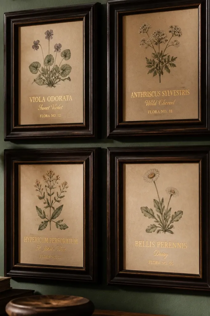
Gold foil labels are the fastest route to “antique shop” energy. Pair that metallic accent with dark wood frames and matte botanical prints, and the wall looks like it belongs in a study. Keep the foil usage small — labels, not full backgrounds — so it stays classy instead of flashy. This is one of those Vintage Gallery Wall Ideas that looks better as you get closer because you can see the gold tone reacting to light. It’s a great pick for libraries, home offices, and any room with dark furniture.
Buy or print botanical label cards and choose gold foil-look text on cream paper. Mount the labels into dark wood frames with a mat that matches the cream paper tone. Add 4-6 plain botanical prints without foil to balance the metallic pieces. Arrange in a staggered grid and hang with consistent spacing so the gold accents land in a predictable rhythm.
Use anti-glare film behind glass if you see hotspots from overhead lights; foil looks messy when it glares.
Don’t mix silver foil accents; stick to gold to keep the vintage look coherent.
20. Vintage Frame Wall With Built-In Leveling Jigs
This is the practical idea behind a lot of gorgeous Vintage Gallery Wall Ideas: the spacing and alignment tool. When you build a simple leveling jig from scrap wood, your frames line up even when you’re working with different frame sizes and thicknesses. The end result looks intentional, which is what makes vintage collections feel curated. It also saves time because you’re not constantly re-measuring and re-hanging. This suits anyone doing a large wall with 12-20 frames where accuracy matters.
Editor's noteMark hanger points on the back of frames with painter’s tape before you take anything off the jig.
Cut two scrap boards to the same length as your gallery’s width and attach a spacer strip between them to create a consistent gap marker. Tape the jig to the wall at the center height and use it to place the first row of frames. For each subsequent row, measure spacing with the spacer strip rather than eyeballing. Once the layout is locked with painter’s tape, hang frames using the jig reference so all edges align.
Skip thisAvoid hanging frames one at a time without a reference; small shifts compound fast.



