
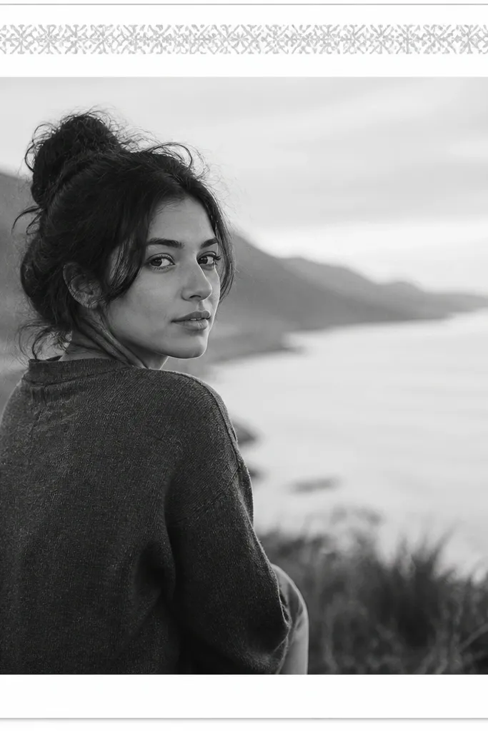
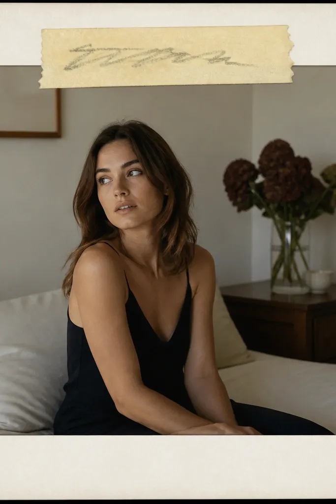
1. Cream Paper Mat with Thin Black Line
This looks like a mini gallery print. The cream paper texture hides minor photo edge noise, and the thin black line keeps the whole thing sharp on mobile. I like a darker cream mat band because it creates depth without adding extra colors.
Use a 1080x1080 canvas. Set the outer border at 40 px, then add an inner mat band of about 18 px with a cream texture. Place the photo with a 7 px gap from the inner mat so the photo edge stays clean.
Pro tipTry a paper texture with visible fiber - it makes the frame look "real" instead of flat.
AvoidAvoid thick black borders; they turn into a sticker outline on small screens.
2. White Mat with Soft Gray Shadow
This template is the one I use when the photo has good lighting but needs structure. White matting gives you a clean, airy look, and a soft gray shadow adds depth without turning into a dramatic effect. The shadow makes the photo feel placed, not pasted.
Set outer border to 45 px white. Add a shadow under the photo layer: opacity around 25-35% and blur around 18-22 px. Keep the photo gap to 6 px from the mat so the shadow doesn't bleed into the border.
Pro tipUse a shadow color that matches the photo's dominant gray tone, not pure black.
AvoidSkip hard-edged shadows; they look like a default app effect.
3. Two-Tone Band Frame in Sage and Off-White
Two-tone bands make the frame feel designed while staying minimal. Sage reads calm against most skin tones and natural textures, and off-white keeps the overall post bright. The trick is keeping the band narrow so it feels like a design accent, not a poster headline.
Create an off-white background. Add a 14 px sage band along the top edge and a 14 px vertical band on the left. Put the photo centered with a 40 px outer border and a 8 px inner gap.
Pro tipIf your photo is warm (golden light), choose sage with a slightly yellow undertone.
AvoidDon't add bands on all sides; it starts to look like a UI layout.
4. Dried Flower Press Frame (Neutral Florals)
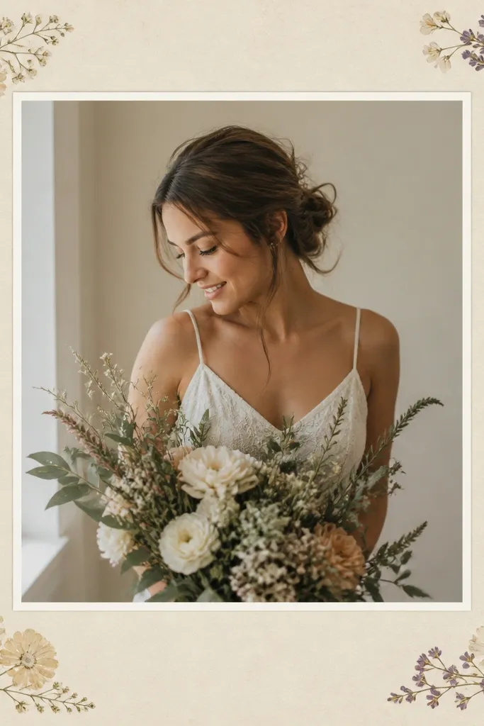
This is for soft, romantic photos. The pressed-flower corners add story without covering the subject, and the off-white mat keeps it cohesive. Pale beige plus muted florals works because it doesn't compete with skin or fabric colors.
Use a beige textured background. Add corner elements sized about 90 px wide each, placed 10 px inside the outer border. Keep the photo gap at 7 px and use a 38 px mat border.
Pro tipUse one floral color family only: neutral browns + dusty pink, or neutral browns + sage.
AvoidAvoid full-bleed flower overlays; they make the frame look busy.
5. Ripped Notebook Paper Edge Frame
Ripped edges make your photo feel like it's been saved in a scrapbook. The notebook texture adds grain, and the torn edge gives movement. Keep the center clean so the torn sides read as an accent, not a distraction.
Use a paper texture background. Add torn edges on left and right as separate overlays (about 110 px tall overlap into the center). Put the photo centered with a 45 px outer border and a 7 px inner gap.
Pro tipMatch the paper color to your photo whites - if your photo is creamy, don't use bright printer white.
AvoidDon't stretch torn edges; keep the rip shape proportional.
6. Polaroid-Style Frame with Slight Off-Center Placement
Polaroid frames feel personal fast. A thick white border imitates instant film, and the subtle shadow makes it sit on the page. Off-center placement is what keeps it from looking like a template.
Set outer border to 52 px. Add a shadow with blur 16-20 px and opacity around 30%. Shift the photo up-left by about 12 px inside the frame so there's more white at bottom-right.
Pro tipAdd a tiny 6 px highlight line at the top-left of the border if your app supports it.
AvoidSkip perfectly centered photos; instant-style looks better when it's slightly imperfect.
7. Black Tape Corner Frame
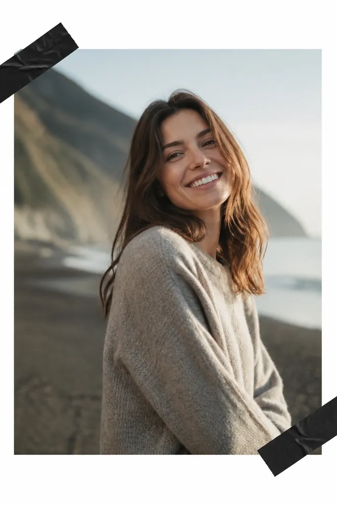
Tape corners add attitude without taking over the composition. Black tape contrasts with light photos and makes darker photos feel styled. The key is using tape only on two corners so the photo remains the focus.
Set a white background. Outer border 40 px white. Place two tape overlays: each about 70 px by 20 px, rotated 8-12 degrees, positioned 8 px inside the outer border. Keep a 7 px photo gap so the tape looks like it's holding it.
Pro tipUse tape with a matte finish, not glossy black - matte reads more realistic.
AvoidAvoid tape on every corner; it turns into clutter.
8. Gold Foil Line Frame on Light Gray
Gold foil lines make basic photos look like they belong in a brand grid. Light gray keeps the gold from screaming, and the thin line stays classy. I like adding a faint second gold line inside the mat for a premium feel.
Use a light gray background (#E9E9EA style). Outer border 40 px in gold line (1-2 px thick). Add a second gold line 10 px inside the border at 1 px thickness. Photo gap stays 7 px.
Pro tipIf the gold looks flat, add a subtle grain overlay at 10-15% opacity.
AvoidDon't use thick gold borders; they look like clip-art.
9. Pastel Gradient Wash Background Frame
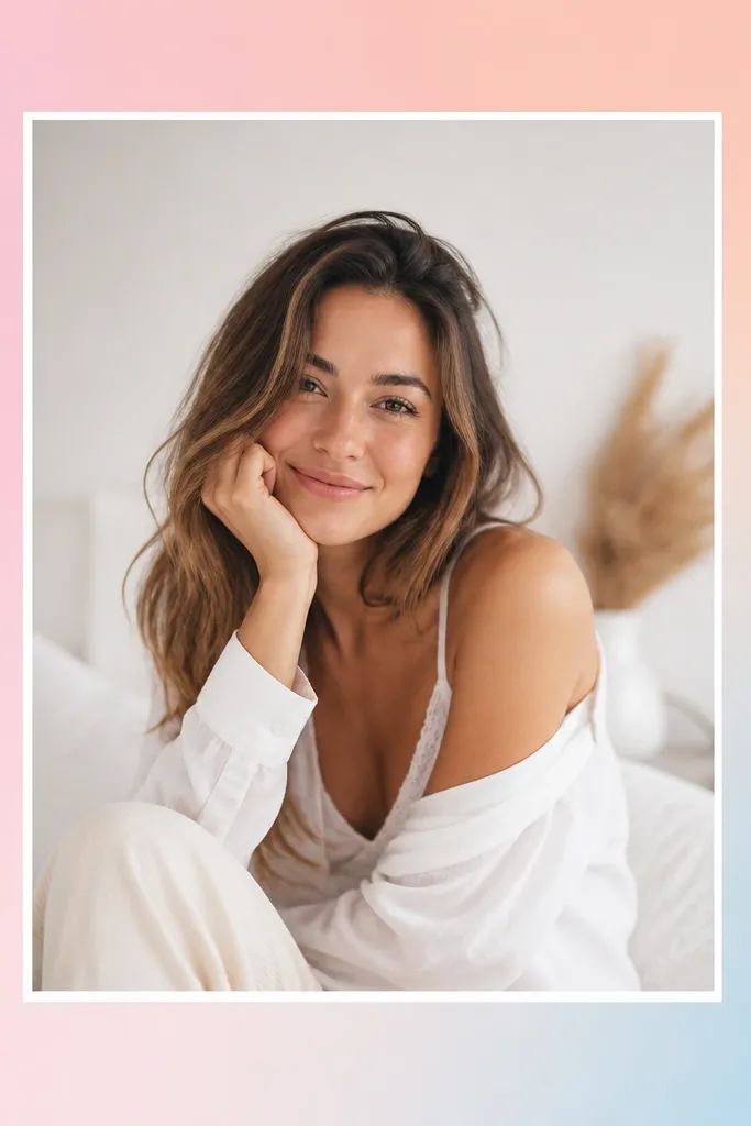
A gradient wash is the easiest way to make a frame feel modern. Pastels calm down the image and add depth behind the photo edges. Keep the gradient subtle - if it's too strong, it competes with your subject.
Make the background a gradient: top-left pink, bottom-right light blue, with peach in the middle. Outer border 42 px white or very pale cream. Add a 7 px photo gap and a faint gray shadow under the photo only (blur 14-18 px).
Pro tipUse gradients that are close in brightness to the photo so edges blend naturally.
AvoidAvoid neon gradients; they dominate the feed.
10. Terracotta Border with Linen Texture
Terracotta + linen reads earthy and cozy. The texture makes everything feel tactile, and the terracotta border gives a clear frame without needing extra decorations. This one looks great with ceramics, skin close-ups, and warm indoor light.
Use a linen texture background (off-white). Outer border 40 px terracotta (#C56A4A style). Add an inner mat band of 16-18 px in a slightly darker linen tone. Keep photo gap 8 px and add no extra shadow.
Pro tipPick terracotta that matches the photo's warmest orange/brown tones.
AvoidDon't use terracotta that's too red; it clashes with beige photos.
11. Monochrome Frame with Patterned Border Strip
Monochrome photos look extra polished when the frame adds one pattern element. The repeating strip gives motion while the rest stays clean. This works best when your photo has one strong focal subject and you want the frame to stay quiet.
Use a grayscale photo. Background white. Outer border 40 px, but make the top strip 16 px tall with a subtle pattern (dots or tiny waves) in light gray. Keep the rest of the border solid gray or white and keep photo gap 7 px.
Pro tipChoose a pattern with low contrast so it doesn't steal attention from faces.
AvoidAvoid high-contrast patterns; they turn the frame into the main event.
12. Corner Cut-Out Frame (Clean Modern)
Cut-out corners make your post feel graphic and modern. It's minimal, but it still defines the photo area. The trick is keeping line thickness consistent and leaving the background visible only at corners.
Background can be any solid color (I like pale mint or warm gray). Outer border is a 2-3 px line. Add 4 corner cut-outs by leaving a 22 px gap at each corner (top-left, top-right, bottom-left, bottom-right). Photo gap 8 px so it doesn't touch the line.
Pro tipUse a background color that appears in the photo - even a small undertone helps.
AvoidDon't make the cut-outs too big; it starts looking like a broken frame.
13. Checkered Border Frame in Soft Black and Cream
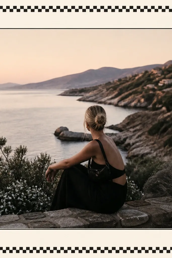
A checkered border adds instant personality without clutter. Soft black and cream keeps it classic, and the inner mat line stops the pattern from touching the photo. This is great for outfits, coffee, and anything that already has casual energy.
Use a cream background. Outer border 40 px with a checkered pattern where each square is about 6-8 px. Add an inner mat line 2 px in off-white between photo and pattern. Keep photo gap 7 px.
Pro tipIf your photo has busy patterns, shrink the checker size so it stays subtle.
AvoidAvoid large check squares; they look costume-y.
14. Vintage Film Strip Edge Frame
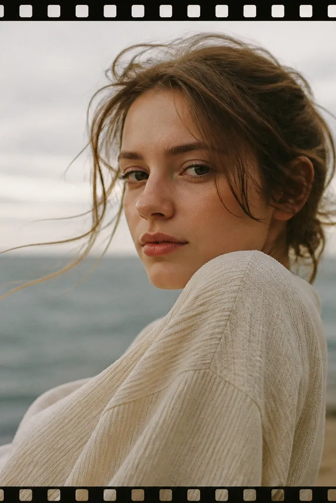
Film strip edges make a frame feel nostalgic but still clean. You get a theme without covering the subject. Keep the strip thin and let the photo breathe so it doesn't turn into a collage border.
Background white or warm gray. Outer border 40 px. Add a top film strip overlay height 16 px and bottom strip the same height. Include perforation marks every 10-12 px. Keep photo gap 7 px and use a subtle gray shadow under the photo only if the background is busy.
Pro tipMatch the film strip color to the photo's darkest gray so it looks printed.
AvoidSkip full film strips on all sides; it gets heavy fast.
15. Color Block Frame with One Bold Side

One bold side color is the cleanest way to add contrast. It makes the photo feel like it has a designed layout, not just a border. Teal works with skin, denim, and greenery; swap it based on your photo's dominant cool tone.
Background off-white. Outer border 40 px, but make the left side border 70 px wide in teal. Add a small top accent block 18 px tall in the same teal. Keep photo gap 8 px and keep the right border at 40 px for balance.
Pro tipUse a flat solid teal, not a gradient, so your post stays sharp.
AvoidAvoid uneven border widths on both sides; it looks accidental.
16. Hand-Lettered Label Frame (No Words Needed)
You get the "styled shelf" look without needing actual text. The label shape adds a human touch, and the rest stays minimal so the photo remains the point. I've used this on food and product shots where I don't want captions covering the image.
Background white or light beige. Outer border 42 px. Add a label strip overlay height 22 px centered at the top inside the border, with a slightly off-white fill and a hand-drawn scribble effect. Keep photo gap 10 px so the label doesn't crowd the subject.
Pro tipMake the label slightly crooked (rotate 1-2 degrees) for realism.
AvoidDon't add real words unless you can match your font to the photo mood.
17. Soft Fabric Border (Denim Blue Edge)
A fabric edge makes the frame feel tactile, especially for casual photos. Denim blue reads cozy with warm interiors and skin tones. The inner cream mat line keeps the denim from overwhelming the image.
Use a muted denim texture for the outer border at 40 px. Add a 2-3 px cream inner mat line. Place the photo with a 7-8 px gap and add a gentle shadow blur 12-16 px, opacity about 25%.
Pro tipIf your photo is already blue-heavy, choose a lighter denim texture so it doesn't blend.
AvoidAvoid glossy fabric textures; they look like plastic.
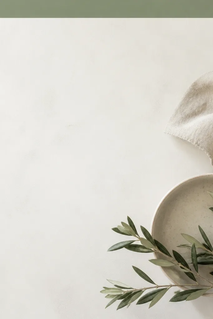
18. Botanical Corner Vines Frame on Sage
Corner vines add movement while keeping the center clear. Sage background ties it together and makes the vines look like printed stationery. This one works well for plants, skincare, and calm lifestyle shots.
Background sage (muted, not neon). Outer border 40 px white. Add vine overlays in corners sized about 120 px wide each, placed 10 px inside the border. Keep photo gap 7 px and skip extra shadows.
Pro tipChoose vines in dark olive or muted brown so they match the photo's greens.
AvoidAvoid full botanical frames; they turn the post into wallpaper.
19. Matte Black Border with Tiny White Gutter
Matte black borders make photos look editorial. The tiny white gutter gives a crisp separation that feels intentional. If your photo has contrast (dark hair, bold clothing, night scenes), this frame makes it pop without extra decoration.
Outer border 45 px matte black. Add a white gutter line 3 px between the photo and the border area. Keep photo gap at 6-7 px and use a minimal shadow at 10-15% opacity if the photo edges are light.
Pro tipUse matte black, not charcoal gradient - matte reads clean on Instagram compression.
AvoidAvoid thick black borders combined with busy photos; it looks heavy.
20. Half-Photo Frame with Diagonal Border
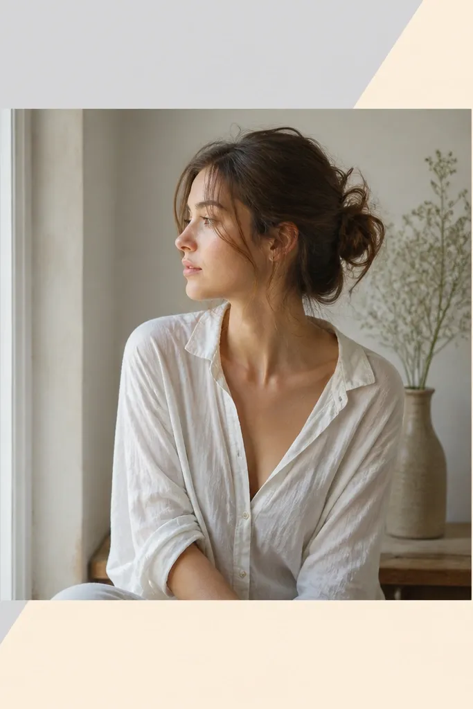
Diagonal borders make the layout feel dynamic while staying simple. The split background gives you structure even when your photo is plain. This works great for portraits where you want a stronger design element without adding icons.
Background split diagonally: top-right pale cream, bottom-left light gray. Outer border can be 38 px solid white or transparent line. Add a 2-3 px diagonal line that follows the split to sharpen the edge. Keep photo gap at 8 px and center the photo slightly toward the brighter half.
Pro tipMatch the diagonal colors to two tones already in the photo so it feels built-in.
AvoidAvoid using three background colors; it looks like a template grid.