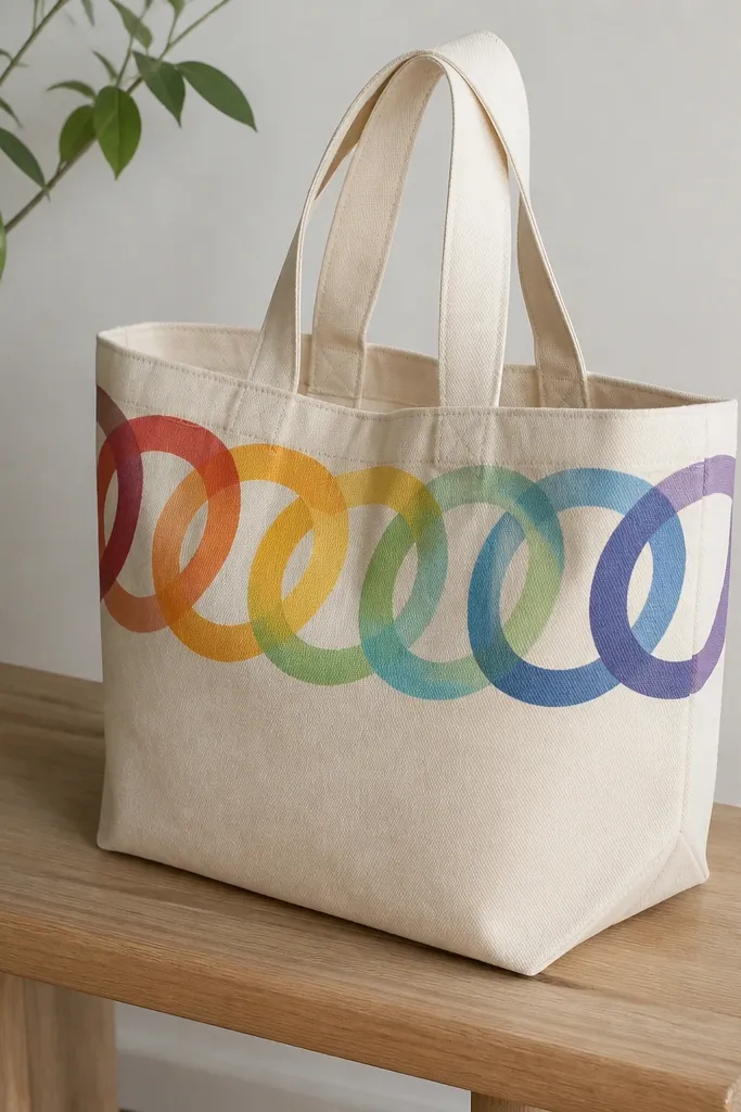
1. Two-Color Sunburst with Tape Rays
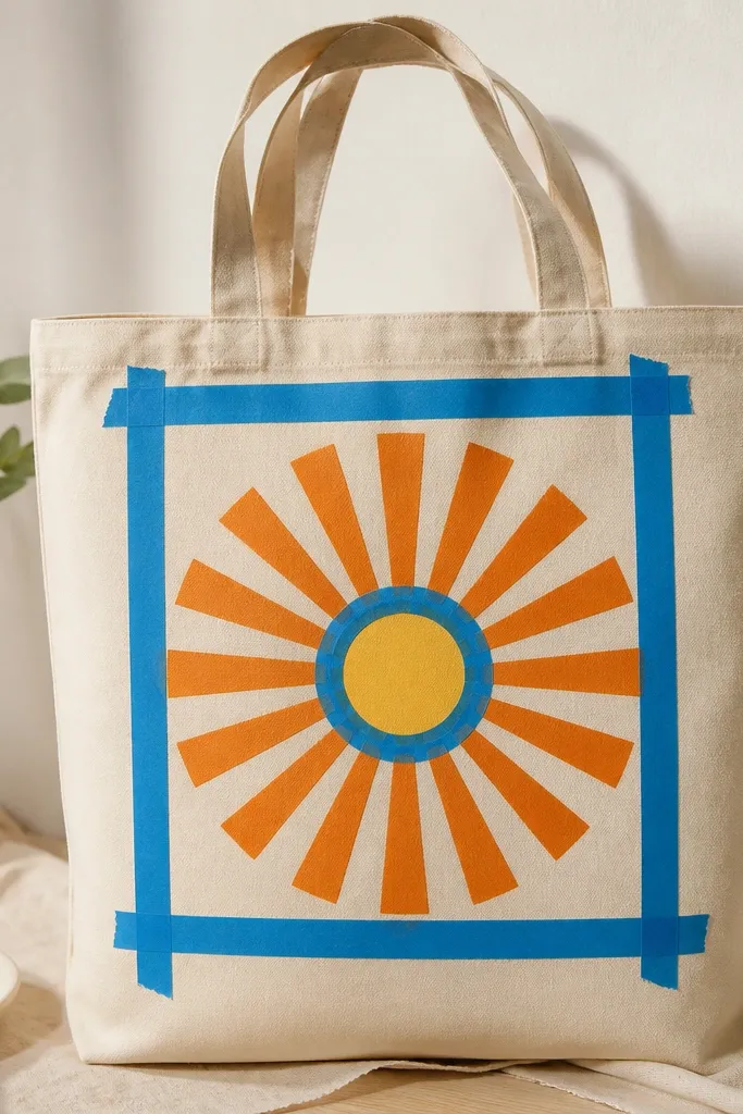
You paint the background once, then build rays using tape so the lines stay sharp. The orange rays give warmth, and the yellow center circle pulls the eye to the middle of the tote. This works because the design is geometric, so beginners don't need perfect freehand control.
Use painter's tape to mark 12-16 rays radiating from a center point about 5 inches above the bottom seam. Paint the rays with a flat brush, 2 light coats, let dry between coats. Keep the center circle about 3 inches wide so it looks intentional with the tote size.
Pro tipPress tape down with a fingernail so paint doesn't creep under the edge.
AvoidAvoid thick paint on tape edges - it bleeds and looks fuzzy.
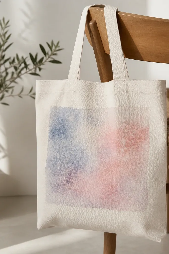
2. One-Brush Ombre from Bottom Hem
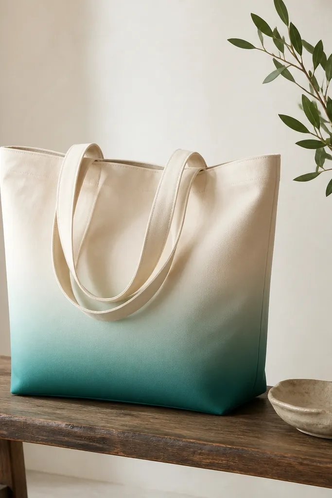
Ombre is forgiving because the edges blend naturally. You get a professional look by building the gradient with small overlaps instead of trying to paint the whole fade in one pass. Teal-to-mint looks fresh on neutral totes and photographs well.
Mix teal paint with water or fabric medium to create 3-4 dilution steps. Start at the bottom with the darkest mix, then paint a band upward using progressively lighter mixes. Blend where colors meet with a damp sponge using light taps.
Pro tipUse a flat brush for the main strokes, then switch to a sponge for the blend.
AvoidDon't overwork the blend - repeated strokes make it streaky.
3. Botanical Dots and Stems in Sage
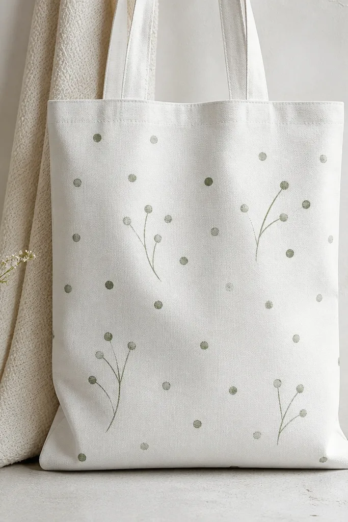
This design uses simple shapes that look intentional even if your hand isn't steady. Dots feel playful, and the thin stems give movement. Sage-green on white looks calm and clean, and it hides minor brush imperfections.
Use a small round brush or paint pen for stems, aiming for lines about 1/8 inch thick. Add dots with the back end of a paintbrush or a cotton swab dipped lightly in paint. Keep the layout in a loose cluster on one side panel so it doesn't fight the tote seams.
Pro tipLet dots dry for 10 minutes before adding stems so they don't smear.
AvoidAvoid filling the whole tote - emptiness makes the botanical shapes read.
4. Geometric Blocks with Color-Blocked Corners
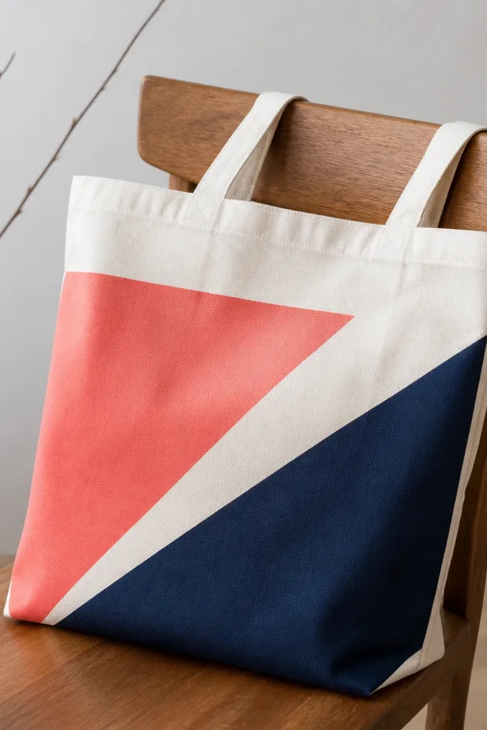
Color-blocking looks modern and doesn't require shading. The trick is to plan blocks so they land near seams and corners for a stable look. Coral and navy pop hard on kraft or natural canvas.
Sketch a diagonal grid lightly in pencil: 3-4 rectangles per side panel. Apply tape along the pencil lines, paint coral first, then remove tape after it sets for 5-7 minutes. Finish with navy blocks and small corner accents to balance the diagonal.
Pro tipPaint in the order you want tape edges to stay crisp - light colors first, dark last.
AvoidSkip "freehand rectangles" - crooked blocks look like mistakes, not design.
5. Masking Fluid Galaxy with Star Speckle
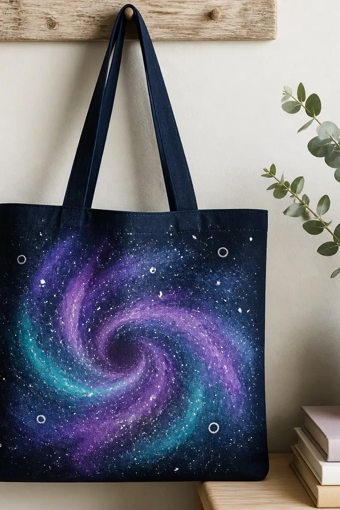
Masking fluid lets you keep star highlights sharp instead of smudgy. A galaxy looks impressive because the motion comes from swirling colors, not perfect drawing. Teal and purple on navy feels deep without needing glitter.
Paint the tote base navy, let dry. Apply masking fluid with an old brush in tiny dots for stars, then swirl diluted purple and teal with a sponge in circular motions. Once dry, add star speckles with a toothbrush dipped in white paint, then remove masking fluid when fully cured.
Pro tipSponge swirl from the center outward so the movement reads like a spiral.
AvoidDon't remove masking fluid too early - you'll tear the paint edges.
6. French Stripe Side Panel with Thin Lines
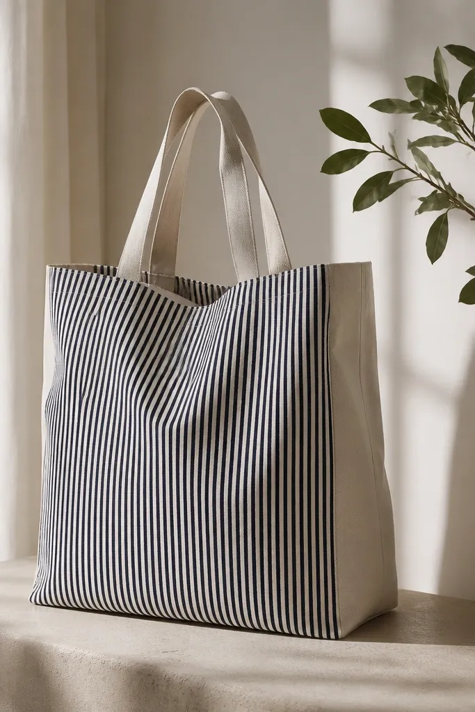
Stripes look clean and graphic, which is why they're a beginner win. By limiting stripes to one panel, you keep the design from overwhelming the bag. Navy and off-white feels classic and hides small brush variations.
Mark stripe spacing with a ruler: for example, 1/4 inch per stripe. Use tape or a fabric ruler guide to keep lines straight. Paint each stripe with a small flat brush, 2 thin coats, then remove tape after the paint is tacky, not wet.
Pro tipUse the same brush angle every time so the stripe edges stay consistent.
AvoidAvoid thick paint on stripes - it makes lines look wobbly.
7. Watercolor Wash Window with Salt Texture
Salt creates natural texture, so you don't have to paint every detail. The translucent look comes from watered-down fabric paint, layered gently. A centered "window" makes the tote feel designed, not random.
Lightly sketch a rectangle about 6x8 inches on the front panel. Wet the area with clean water, then paint wet-on-wet layers of blue and pink. Sprinkle coarse salt while it's still damp, let dry fully, then brush off salt grains carefully.
Pro tipUse coarse salt (like kosher) for stronger speckles than table salt.
AvoidDon't move the salt around - it smears the wash.
8. Hand-Stamped Leaves with a Sponge Stamp
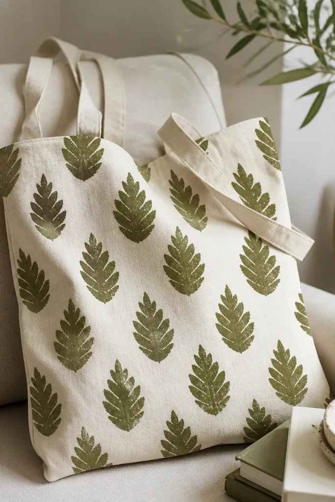
Stamping is fast and forgiving because slight variation looks natural. Leaves create an organic rhythm and hide uneven coverage. Olive over cream looks earthy without getting messy.
Cut a leaf shape from craft foam or use a store-bought foam stamp. Dip into fabric paint lightly so it doesn't flood. Stamp in a diagonal line starting near the bottom corner, leaving 1-2 inches between stamps.
Pro tipTest the stamp on paper first so you learn how much paint it grabs.
AvoidAvoid heavy paint - it fills the leaf edges and turns the stamp into a blob.
9. Marbled Paint Ribbon Across the Tote
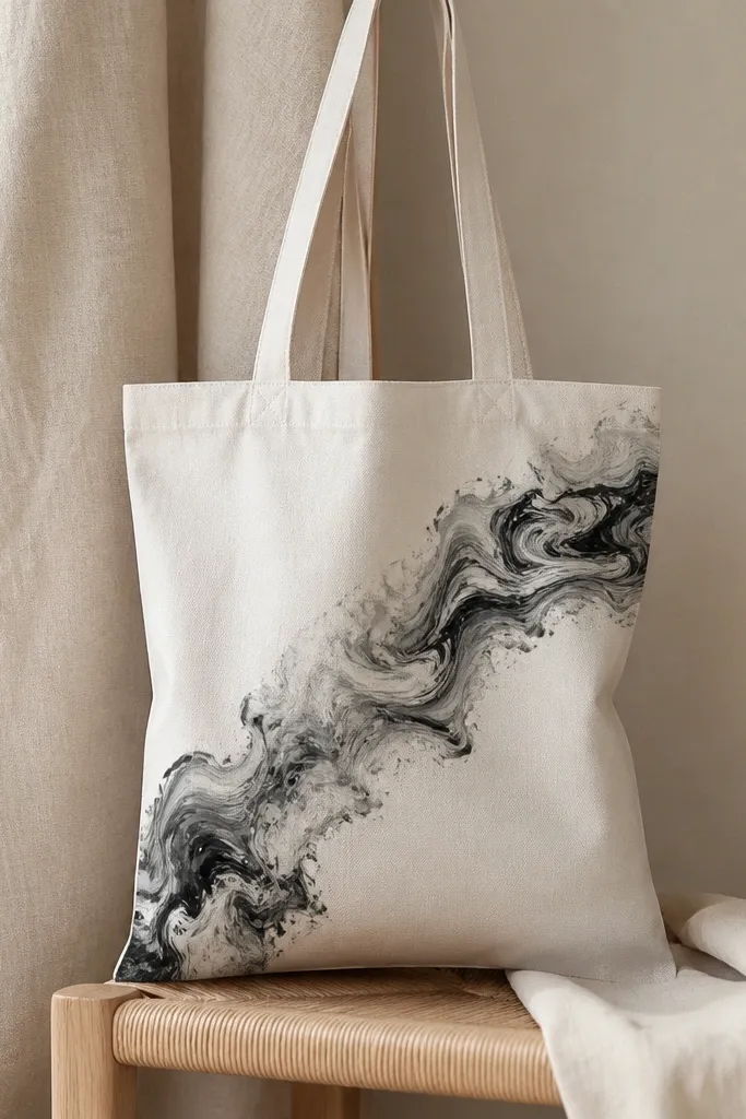
Marbling looks complex but the steps are straightforward. The ribbon effect makes it feel intentional because you're painting one band, not the whole bag. Black-gray-white marbling looks classy and matches everything.
Use a disposable tray with a thin layer of water mixed with a drop of fabric paint and a marbling medium if your paint brand recommends it. Drag a toothpick through to create swirl lines, then lay a strip of plastic or paper onto the pattern, lift, and press onto the tote band. Let it dry before adding any outline.
Pro tipKeep the ribbon width around 5-6 inches so it reads as a design element, not a stain.
AvoidDon't make the marbling too watery - it turns into muddy streaks.
10. Outline Animals with Paint Pen French-Curve Style
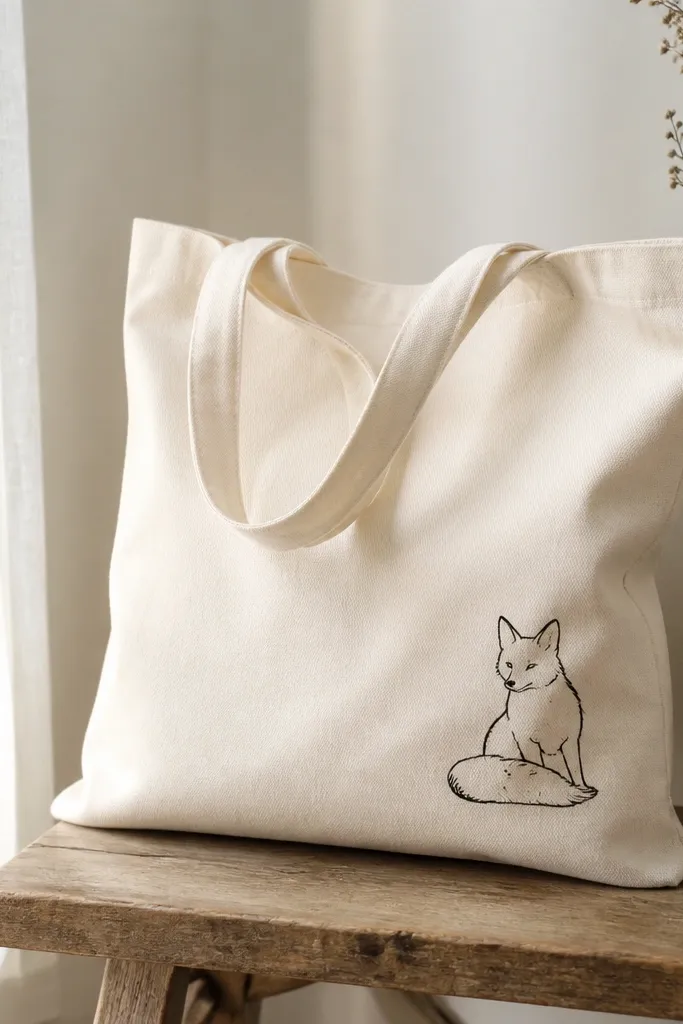
Outline animals look good even with minimal color. A paint pen gives consistent linework, and small size keeps it beginner-friendly. Black outlines on natural canvas look like a sketchbook page.
Pick one animal and keep it small: about 4-5 inches tall. Use a paint pen for the outer line, then add one or two filled shapes (like the ear inner area) with a tiny brush. Place it where the tote panel is flat, not across a seam.
Pro tipPractice the curve of the tail on scrap fabric before you commit.
AvoidAvoid over-coloring - big filled areas show every brush wobble.
11. Rainbow Loop Border on One Handle Side
Borders look polished because they frame the bag. Loop patterns hide tiny mistakes because the eye tracks the repeating shapes. A rainbow palette gives instant color without complex shading.
Start about 2 inches below the handle seam and draw loop outlines with a pencil guide. Paint each loop color one at a time, letting each color dry for 10-15 minutes before the next so you don't smear. Keep loops about 3/4 inch tall for a neat scale on tote fabric.
Pro tipUse a thin liner brush for the first coat, then fill carefully with a smaller brush.
AvoidDon't paint rainbow loops too close together - gaps look intentional, but touching loops look messy.
12. Polka Dot Gradient from Dark to Light
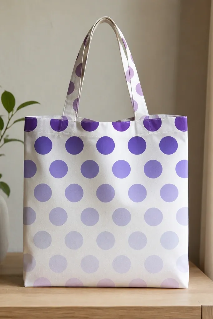
This is one of the easiest tote bag painting ideas because you're repeating one shape. The gradient makes it look planned, not random. Purple-to-lavender reads soft and stylish.
Pick 4 purple mixes: dark, medium, light, and pale. Use a dotting tool or the eraser end of a pencil for consistent circles. Arrange dots in rows, changing the paint mix every 1-2 rows to create the vertical fade.
Pro tipPress the dot tool straight down - angled presses make ovals.
AvoidSkip uneven spacing - random dot gaps make the tote look unfinished.
13. Stenciled Mandala Corner with Gold Outline
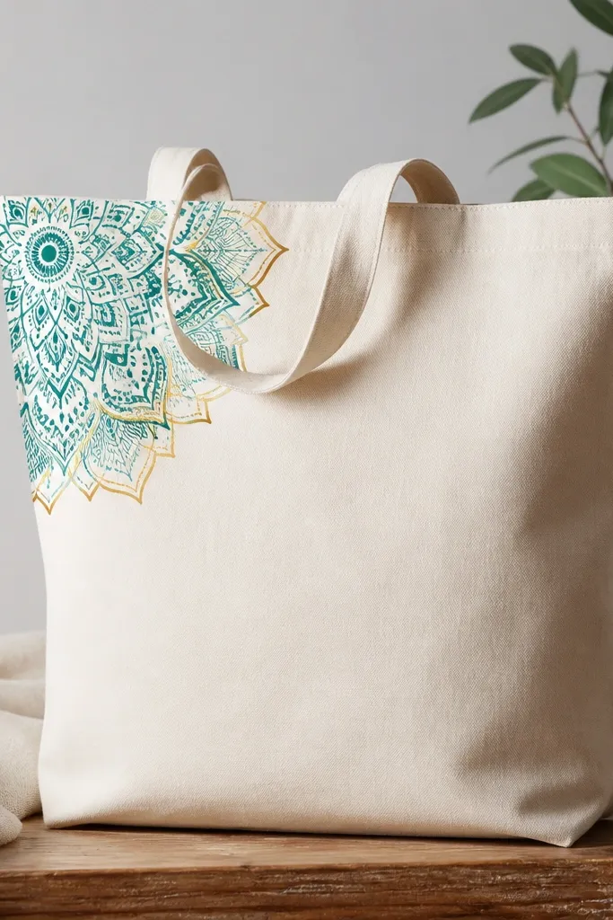
Mandala corners look high-effort even when you use a stencil. Teal fills make the pattern readable, and a gold outline adds contrast without needing shading. This design works great on bags with a single front panel.
Tape a mandala stencil in the corner about 3 inches from the top seam and 3 inches from the side seam. Dab teal fabric paint with a sponge brush in light layers. Once dry, use a gold paint pen to trace only the outer petal edges for a clean finish.
Pro tipRemove stencil while paint is still tacky so edges don't tear.
AvoidAvoid flooding the stencil - it bleeds under and ruins the pattern edges.
14. Tie-Dye Look with Thick Fabric Paint Lines
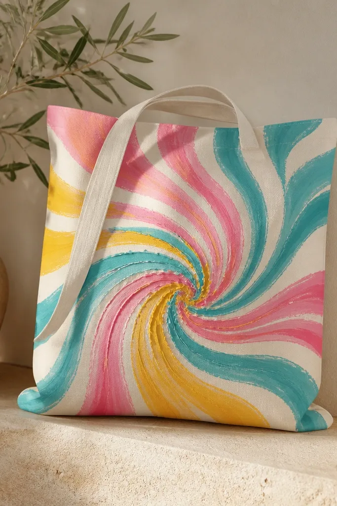
You can fake a tie-dye look without any fabric dye. Thick paint lines create the "swirl" effect, and layering colors makes it feel deep. It's playful and still controlled for beginners.
Use a squeeze bottle or fabric paint with a fine nozzle. Draw a big swirl center about 4 inches wide, then trace around it with turquoise, pink, and yellow lines. Leave tiny gaps between lines so the colors stay crisp. Let it dry longer than you think - thick paint needs extra time to cure.
Pro tipAdd one thin white highlight line on the swirl edge for extra pop.
AvoidDon't rush the cure time - thick lines can smear during drying.
15. Cat Face Sticker Style with Flat Fill
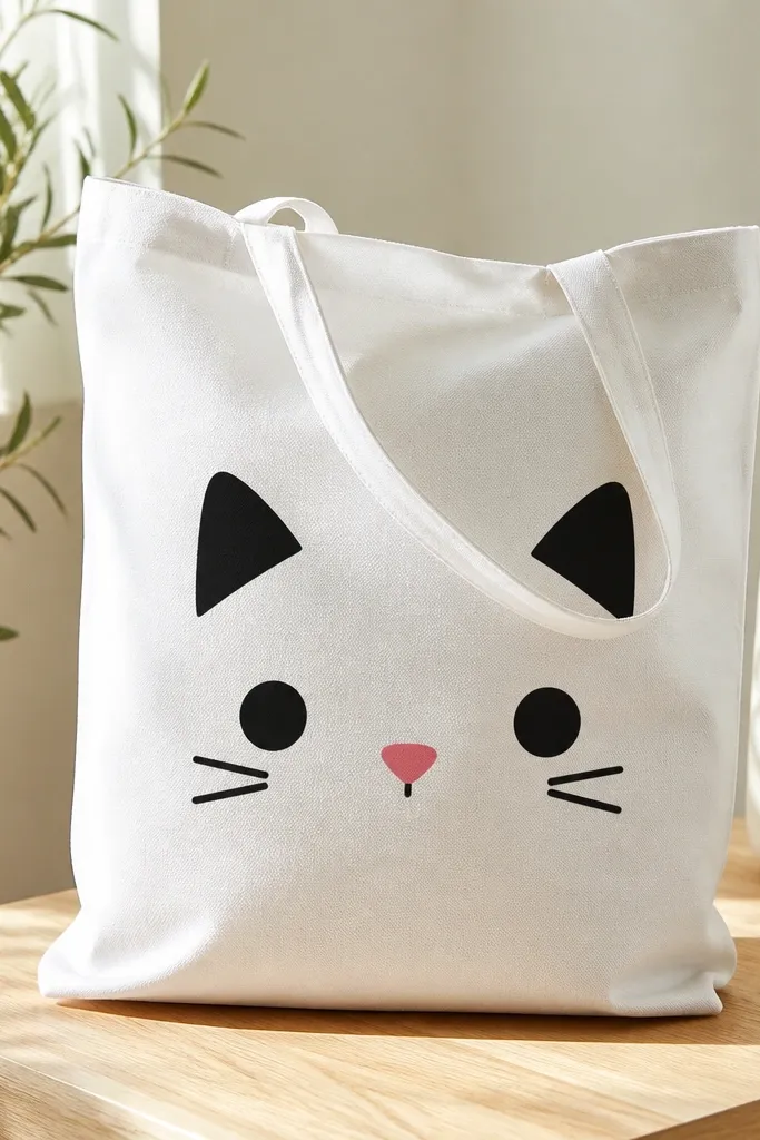
Sticker-style faces are basically shape painting. Flat fills look bold and hide minor brush texture. Black plus pink accents give you an instantly cute result.
Sketch a cat face about 5 inches wide. Fill ears and head with black fabric paint using a small flat brush. Add cheeks as two smaller rounded shapes, then paint a tiny pink triangle nose and two dot eyes.
Pro tipUse a toothpick to place the nose and eye dots so they stay centered.
AvoidAvoid gray instead of black - gray looks dull on canvas.
16. City Skyline at Dusk with a Single Horizon Line
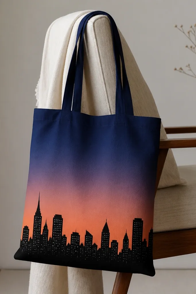
A skyline is a great first "scene" because the horizon line anchors everything. The gradient sky gives depth, and the silhouette keeps the buildings simple. Dusk colors look good on neutral totes and don't require realistic detail.
Paint a horizontal gradient band: navy on top, peach near the bottom, blending with a sponge. Let dry, then draw a skyline silhouette in black along the lower third. Add tiny window dots with a white paint pen for a subtle detail layer.
Pro tipKeep building heights random but avoid tiny buildings under 1 inch wide.
AvoidDon't add lots of window shapes - a few dots look cleaner than a full pattern.
17. Monogram in Bubble Letters with Shadow Offset
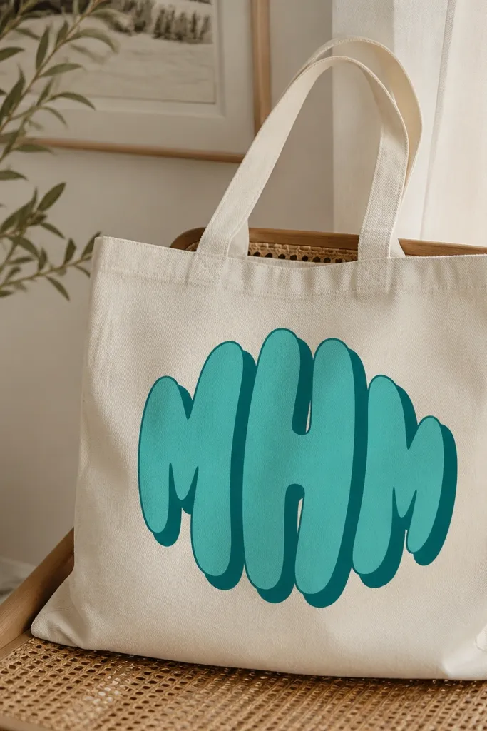
Bubble letters are forgiving because curves hide shaky lines. The shadow offset gives the monogram dimension without complicated shading. Teal bubble letters on cream looks bright without being loud.
Pick one letter and draw it about 6 inches tall. Paint the main bubble in teal, then make a shadow behind it by tracing the same outline offset 1/4 inch down and left. Fill shadow with a darker teal so it reads even after washing.
Pro tipLet the main letter dry fully before painting the shadow so the colors don't mix.
AvoidAvoid thin outlines with bubble letters - they look like stickers that peeled.
18. Stenciled Hearts in a Tight Row
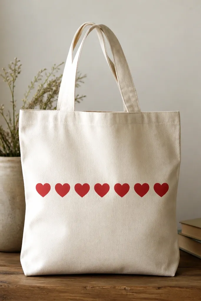
Hearts are simple geometry, and a stencil makes them look crisp. A tight row creates a clean graphic band that still feels cute. Red on natural canvas looks like classic Valentine merch.
Choose a heart stencil about 1.25-1.5 inches wide. Center a row across the middle panel, leaving 1 inch margin on both sides. Dab with red fabric paint, remove stencil carefully, and let dry before touching up edges with a tiny brush.
Pro tipUse a scrap piece under the bag so you don't get paint on your table when stencil dabs leak.
AvoidAvoid using too much paint in the stencil - it creeps and fattens heart edges.
19. Marquee Sign with Filled Letters and Outline
Marquee letters look like signage, so you get instant personality. Filling the letters first keeps them bold, and outlining in black makes the shapes readable from a distance. This is a fun way to paint words without fine-detail work.
Draw large letters about 5-6 inches wide across the center. Paint the fill in yellow fabric paint, then trace the letter edges with a black paint pen or liner brush. Add a border of tiny dots with white paint to mimic marquee lights.
Pro tipUse painter's tape to mask the letter edges if you struggle with straight lines.
AvoidDon't pick a yellow that's too pale - pale yellow disappears on canvas.
20. Wave Pattern with a Ruler Guide
Waves look hard, but a ruler guide makes them repeatable. Navy on light fabric keeps it crisp and calm. This pattern looks good on the front or as a band near the bottom seam.
Mark a baseline across the front panel. Use a ruler and draw gentle arcs in pencil with consistent amplitude, about 1 inch between peaks and troughs. Paint over pencil with navy fabric paint using a small round brush, 2 thin coats.
Pro tipErase pencil only after paint is fully dry so you don't smear graphite.
AvoidAvoid jagged wave peaks - smooth arcs are what make it look intentional.
21. Butterfly Silhouette with One Accent Color
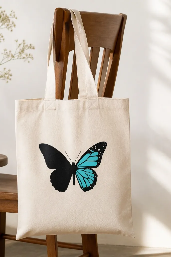
Silhouettes look sharp and stylish, and you only need one accent color to make it interesting. The black gives contrast, and the turquoise wing detail adds a focal point. This is beginner-friendly because you're not painting lots of tiny textures.
Use a printable butterfly shape as a stencil or trace a simple template. Paint the silhouette in black fabric paint, then fill one wing section with turquoise. Keep the butterfly size around 6 inches wide so it doesn't get swallowed by the tote.
Pro tipAdd a thin white dot trail along the body to mimic wings highlights.
AvoidAvoid tiny butterflies - small detail makes beginners' lines look shaky.
22. Coffee Stain Look with Stippling and Brown Wash
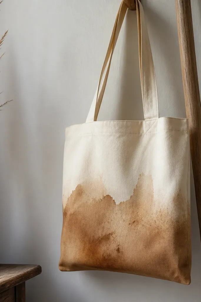
This is the "I meant to do that" style. The brown wash looks like a vintage mark, and stippling adds realism. It works because the pattern is imperfect on purpose, which hides beginner brush control issues.
Dilute brown fabric paint with water to make a thin wash. Lay it where you want the stain, then add darker spots with a stippling brush or sponge. For a more natural edge, dab the boundary with a damp cloth so it fades.
Pro tipLet the wash dry, then add one extra darker ring to make the stain look layered.
AvoidAvoid painting a perfect oval - real stains look uneven.
23. Retro Check Pattern with Two Brush Sizes
Checks look great when the grid is consistent. Using two brush sizes helps you paint borders cleanly without flooding the squares. Coral and cream gives a vintage diner vibe on simple totes.
Mark a grid of squares about 1.25 inches each. Paint all the coral squares first with a small flat brush, then fill the cream spaces with off-white. Clean up borders with a slightly damp brush after the paint sets for a few minutes.
Pro tipTape the grid lines lightly if you're nervous about straight spacing.
AvoidSkip freehand grid drawing - uneven squares make the whole pattern look sloppy.
24. Raised Texture Dots Border Using Fabric Gel
Raised dots look fancy because the texture shows under light. Fabric gel makes the dots stay dimensional after drying. Off-white dots on a colored tote look like trim without needing actual trim.
Use fabric gel or puff paint in a squeeze bottle. Draw a straight border line lightly in pencil, then squeeze dots about 1/2 inch apart. Let it cure fully - puff textures need more dry time than flat paint.
Pro tipPractice dot spacing on paper first so the border doesn't wander.
AvoidDon't touch or smear the gel - it stays tacky longer than paint.
25. Lettering in One-Line Script with Underline Block
One-line script looks modern and stays beginner-friendly because it's just one stroke style. The underline block adds shape and contrast so the design doesn't look too delicate. Thin black script on teal underline reads clean and intentional.
Write your word in pencil first, then use a fine liner brush for black paint. Let it dry, then paint a solid teal rectangle underline about 1.5 inches tall and slightly wider than the word. Keep the rectangle corners sharp for a graphic feel.
Pro tipUse a scrap of wax paper under the brush hand to avoid smudging wet paint.
AvoidAvoid painting script over wet pencil marks - graphite can drag into paint.


