
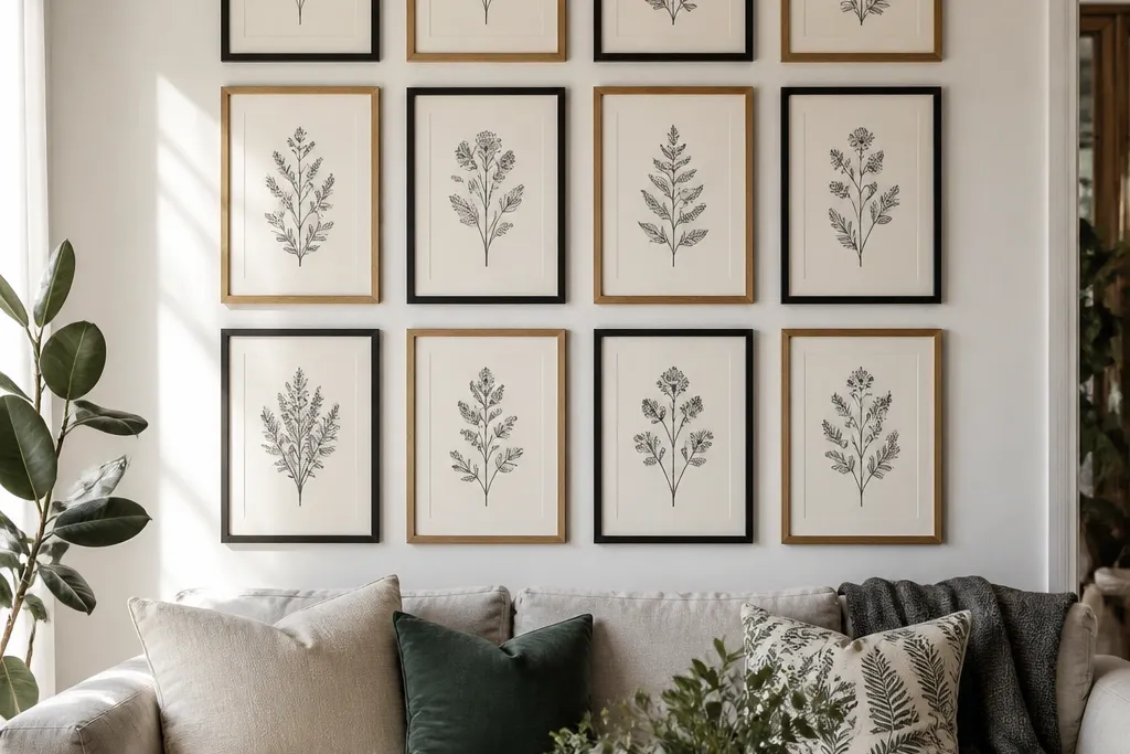
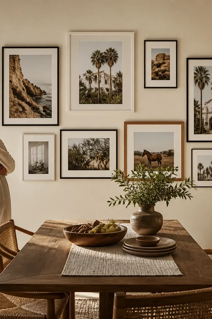
1. 3x3 Grid With One Oversized Anchor
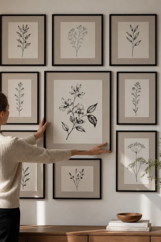
This is the quickest way to make mixed frames look curated. You keep eight frames on a tight grid rhythm, then break the pattern with one oversized center piece so the wall has a clear focal point. Choose prints that share a theme — all botanical line art, all family photos in the same border tone, or all travel maps in one color palette. The result reads structured from across the room, even when the frames are different widths.
Start by measuring the wall space and deciding your overall grid size. Lay out 3 columns and 3 rows with equal spacing — aim for 2.5 inches between frame outer edges. Pick one center frame to be about 1.5x the width and height of the eight smaller frames, then hang the center first at eye level (about 57-60 inches to the center of the anchor). Finish by leveling the four corner frames, then place the remaining four using the same tape-measured spacing.
Editor's noteUse a cardboard spacer cut to your exact 2.5-inch gap so every frame lands the same distance apart.
Skip thisDon’t mix frame sizes without a fixed grid — it turns into a collage.
2. Vertical Ladder Gallery (4 Frames Down the Wall)
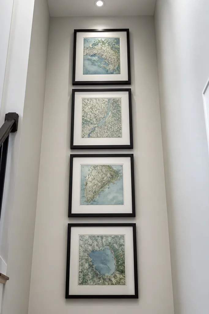
A vertical ladder makes a wall feel taller and gives you a clean, intentional flow. It’s perfect when your room has a narrow wall or when you want the gallery to pull the eye upward. Use portrait-oriented prints so the shapes stack naturally; horizontal frames fight the structure. Keep the frames similar in finish (all walnut, all black, or all off-white) so the ladder looks like one design, not four separate purchases.
Pick four portrait frames with the same width, then decide the gap between them — 2 inches is a good starting point. Mark a centerline on the wall so all frames align vertically. Hang the top frame first with its center around 65 inches, then measure down for the next three frames using the same gap and the frame height. Level each frame to the centerline before drilling and repeat the spacing carefully from tape marks.
Editor's noteIf your prints vary in height, trim the mat openings so the visible image area stays consistent.
Skip thisDon’t let the frames drift sideways — a ladder only looks good when it’s straight.
3. Salon Arc Using 7 Frames (Big-to-Small Curve)
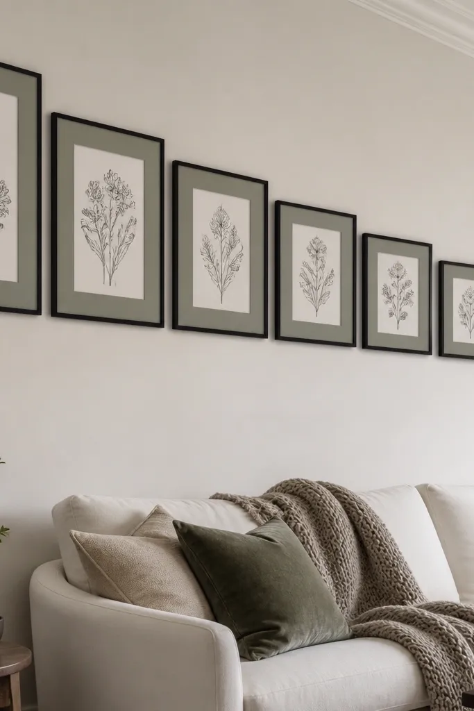
A salon arc gives you that magazine look where everything feels styled, but the layout still breathes. The curve works because the frames step down in size and sit along an implied arc, so your eye reads a smooth sweep instead of scattered rectangles. Use one consistent mat color across all frames to unify the look — cream mats make it feel warm and cohesive. This is the best choice for living rooms and hallways where you want something eye-catching without building a full grid.
Choose seven frames and sort them by size, with the widest pieces for the top and the smallest for the bottom. Find the arc height by dry-laying the frames on the floor and aiming for a gentle curve, not a steep dome. On the wall, tape the centerline, then tape the top center frame and work outward and downward, keeping the top edges slightly staggered along the arc. Maintain a consistent gap of about 2 inches between frame edges, then hang from the center out so the curve stays smooth.
Editor's noteMark the arc with a long strip of painter’s tape before you hang anything — it saves you from redoing the layout.
Skip thisDon’t use glossy frames with high-contrast art — the glare fights the arc.
4. Staggered Two-Row Gallery With Mixed Widths
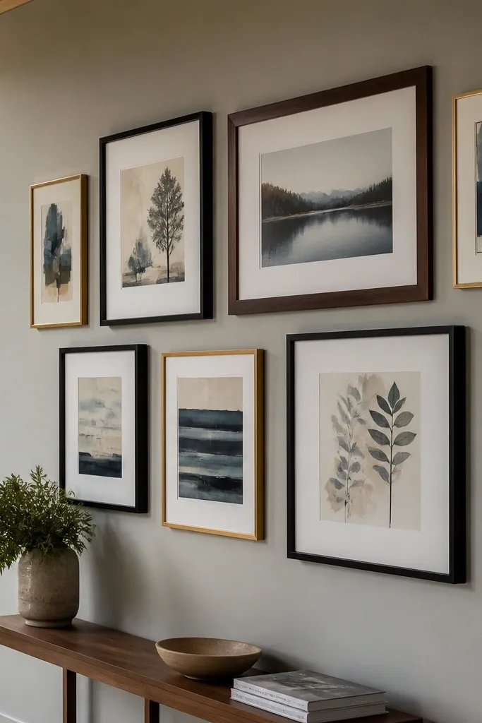
This layout looks modern and intentional because it uses offset rhythm. One row sits slightly higher and shifts sideways, creating movement without chaos. It’s especially good if you have a mix of frame widths from different purchases. Use art that shares a color temperature — warm neutrals, cool blues, or monochrome — so the stagger feels like one set.
Pick six to eight frames and separate them into two rows of equal count. Choose a consistent vertical gap between rows, then offset the second row by about half a frame width. Keep the space between frames within a row at 2 to 2.5 inches. Tape the entire layout first, then hang the bottom row and use it as your reference line for the offset top row.
If you’re mixing frame finishes, keep the inside mat color the same to tie the stagger together.
Don’t offset randomly — the offset amount should be consistent across the whole row.
5. Frame-Within-Frame Collage (One Big Mat, Several Small Prints)
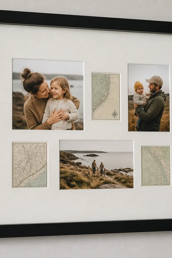
Instead of scattering frames across the wall, you create one tidy “window” that holds many images. This is a great fix for walls that feel too busy: you get variety inside a single boundary. Use a large mat board inside the outer frame and arrange smaller prints like a mini gallery. It photographs cleanly because everything shares the same border thickness and alignment.
Buy a single large frame with a deep enough backing to hold multiple mats or prints. Choose one mat thickness (like 1/4 inch) and cut openings for your smaller prints, or mount them directly in a layered arrangement on the backing board. Keep a consistent 1/4 to 1/2 inch gap between the small prints. Hang the completed framed collage at eye level and adjust the final position so the outer frame center lands at about 57-60 inches.
Editor's noteUse archival photo corners or small strips of acid-free tape for mounting so paper doesn’t buckle.
Skip thisDon’t cram prints edge-to-edge — leave small consistent gaps for the collage to read.
6. Floating Shelf Picture Rail (3-5 Frames Mounted Over a Shelf)
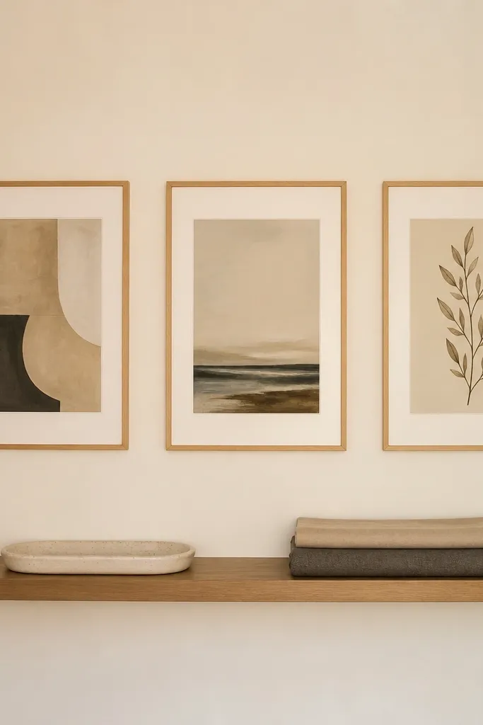
A picture rail vibe looks styled without needing a full gallery wall. The shelf gives you a horizontal anchor, and frames mounted above it create a clean line that feels intentional. This works in entryways and dining rooms where you want art but also need storage or a place for small decor. Keep the frames slim and use consistent spacing so the shelf line stays crisp in photos.
Install a floating shelf at your chosen height and mark a level line where the frame bottoms will sit. Choose 3 to 5 frames with the same width and hang them so the top edges line up. Maintain 2 inches between frames and keep the shelf centered under the group. Use a level and a stud finder for the rail supports, then hang frames using wall anchors where needed.
Editor's notePaint the shelf and the frame backs the same color to reduce distracting shadows behind the art.
Skip thisDon’t pick random frame heights — align the top edges to make the shelf look deliberate.
7. Wallpaper-Behind-the-Gallery (One Bold Patch, Then Frames)
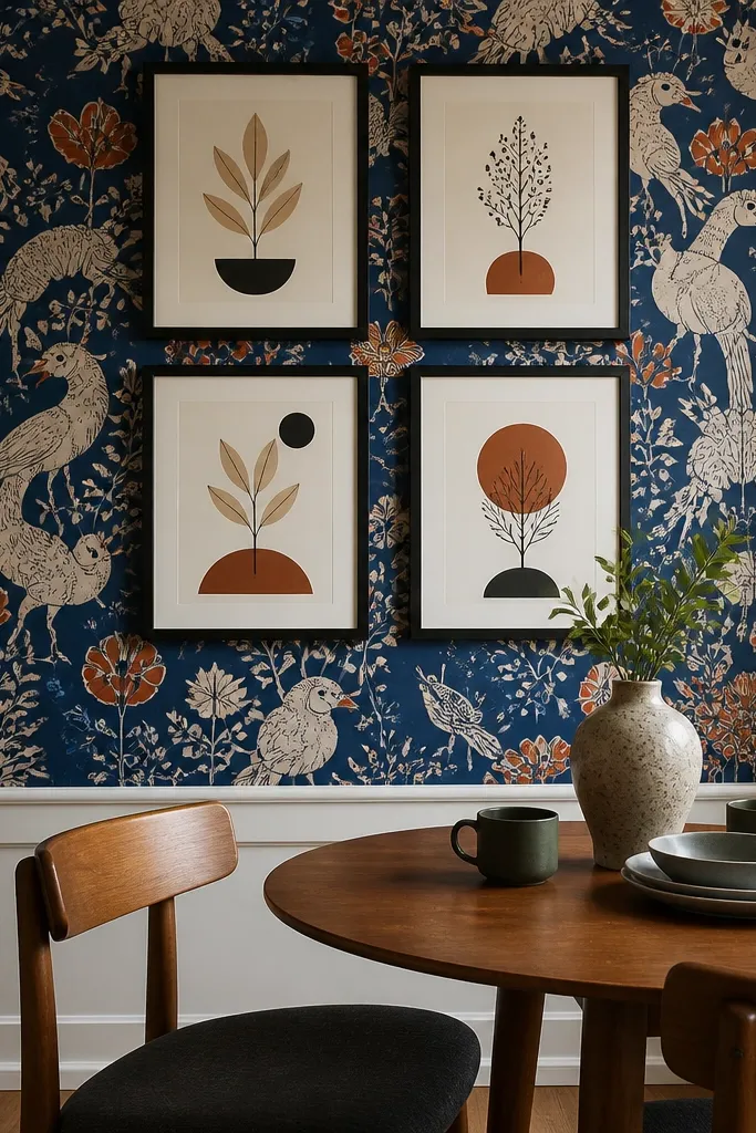
If your wall is plain, you can make a gallery look high-end by adding one patterned backdrop area. The wallpaper patch acts like a stage, so the frames pop without you buying a dozen new pieces. Choose one bold print with a limited color palette so the art inside the frames doesn’t fight it. This looks amazing in small spaces like a powder room or a reading nook.
Pick a wallpaper pattern and cut a rectangle big enough to contain the frames with at least 4 inches of border around the outside edges. Apply the wallpaper patch to the wall first, smoothing carefully so there are no bubbles. Then lay out your frames over the wallpaper area using tape and keep consistent spacing. Hang the frames through the wallpaper carefully, using anchors only where the wall requires it and avoiding wallpaper tears by drilling slowly.
Editor's noteChoose a wallpaper with a matte finish so the pattern doesn’t glare under overhead lights.
Skip thisDon’t use a wallpaper that has tiny high-contrast details if your framed art is also busy.
8. Mat-Only Gallery (No Prints, Just Textures)
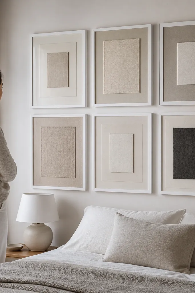
This one is for when you want a gallery wall that looks good even when you change your mind about images. Instead of prints, use textured paper, fabric swatches, or solid-color mat boards with different thicknesses. It looks intentional because the variation is in material and tone, not in random subject matter. Keep the palette tight — think sand, oat, charcoal, and soft white — and the whole wall reads like design, not clutter.
Choose frames with wide mats so you have room for layered textures. Cut mat boards in 3-4 tones and insert textured papers behind the mat opening, keeping each opening the same size for consistency. Arrange 6 to 9 frames in a grid or stagger, and keep the mat color inside each frame aligned across the wall. Hang like a normal gallery using 2 to 3 inches between frames and align top edges for a clean look.
Editor's noteUse felt-backed paper or cotton fabric behind the mat opening so the texture looks soft, not shiny.
Skip thisDon’t use glossy scrapbook paper — it catches light and makes the wall look messy.
9. Monochrome Photo Strip Gallery (All Same Width Frames)
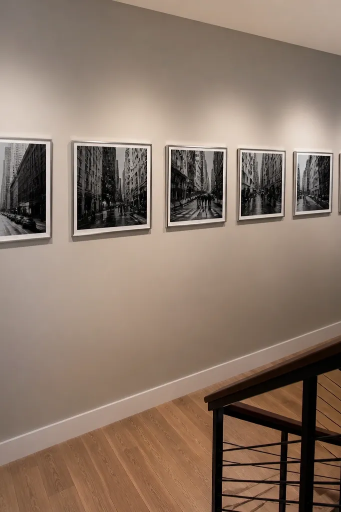
A photo strip keeps things graphic and easy to read. The secret is uniform frame width and consistent spacing, so the wall becomes a visual band. Use monochrome photos or prints with a similar contrast level so the strip looks cohesive. This is a strong option for stair landings and hallways where you want the art to guide the eye along the path.
Pick 5 to 9 frames all the same width, and keep the image size inside each consistent. Decide your strip orientation — horizontal works best when the wall has enough length. Tape frames in a straight line with 2 inches between them, then hang so the strip center aligns with your usual eye-level line. Level each frame to the same baseline and use a pencil mark for the top screw point so the spacing stays even.
Use matte black and off-white prints together — the contrast reads clean and modern in photos.
Don’t vary frame widths — the strip loses its band effect.
10. Corner Gallery Wrap (Frames Continue Around the Corner)
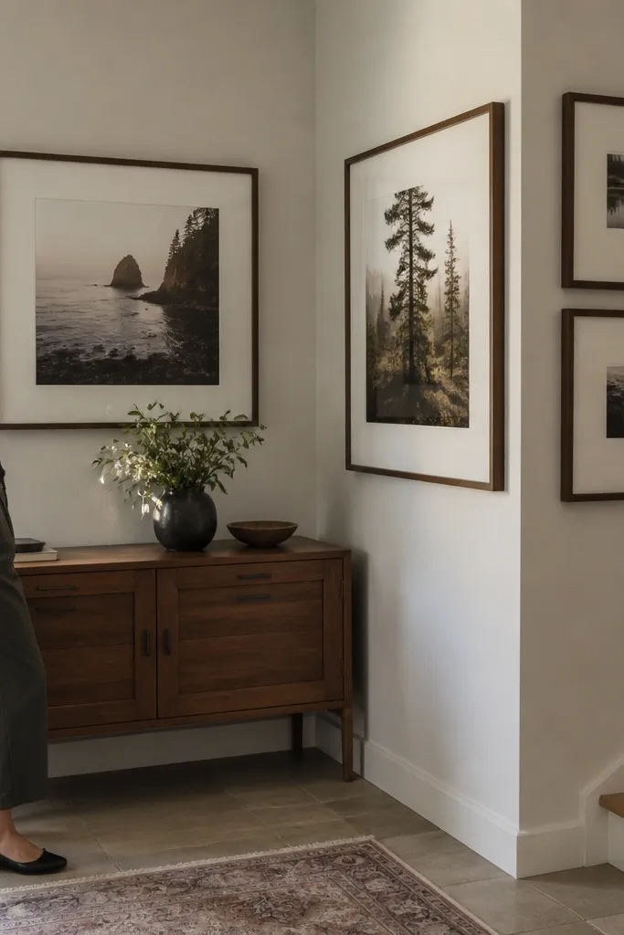
Corners are where boring walls go to hide. A corner wrap gallery makes the corner feel designed because the frames continue around it, turning the awkward angle into a feature. Use fewer, larger frames so the wrap doesn’t look cramped. This is great for entry corners, kitchen nooks, and small dining spaces where one corner gets a lot of sightlines.
Choose 4 to 6 frames, with 2 to 3 on each wall side of the corner. Pick one dominant frame size and repeat it, so the wrap looks intentional. Tape the frames on both walls first and keep the gaps consistent where they meet the corner. Hang the larger frames at eye level on the main viewing side, then align the smaller frames so their outer edges form a smooth curve around the corner.
Editor's noteUse the corner as your alignment reference: keep the frame inner edges the same distance from the corner so it wraps cleanly.
Skip thisDon’t crowd the corner with tiny frames — it makes the angle feel messy.
11. Grid of Shadow Boxes (3D Items in One System)
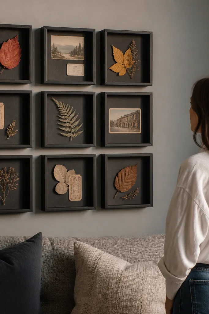
Shadow boxes add depth, and depth reads beautifully in photos because it catches light. A grid of shadow boxes feels cohesive because every box shares the same depth and mounting style. Put in meaningful-but-not-too-busy items: pressed leaves, a few fabric scraps, small postcards, or ticket stubs mounted flat. Keep the items low-profile so the glass doesn’t reflect too much.
Choose 6 to 9 shadow boxes with the same outer dimensions. Plan what goes inside each box so the arrangement has breathing room — leave at least 1 inch of empty space around the main item. Mount items to the backing using hot glue on the back of the paper or archival adhesive dots, then close the box and check for glare by holding it near a light source. Hang the grid with 2.5 inches between boxes and align top edges for a crisp look.
Editor's noteWipe the glass with microfiber and a little distilled water so fingerprints don’t ruin the photo look.
Skip thisDon’t pack items thickly — the box becomes reflective and visually heavy.
12. Color-Block Gallery (Frames in One Theme Color, Background Neutral)
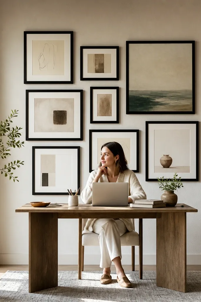
A color-block gallery looks designed because the frames themselves create the pattern. Pick one bold frame color — terracotta, deep teal, or matte black — and keep mat colors neutral. Then use art that’s mostly off-white, cream, or muted tones so the frames do the heavy lifting. This works in rooms with lots of neutral furniture because the wall becomes the color anchor.
Paint or buy frames in one color and keep the frame finish the same (matte looks best). Choose 6 to 8 frames and arrange them in a grid or staggered row with consistent spacing. Use neutral prints or plain textured paper inside each frame so the wall reads as a block of the frame color. Hang using painter’s tape grid lines first, then drill only after you confirm the balance from standing back.
Editor's noteUse a satin paint for frame exteriors so the color looks smooth without looking glossy.
Skip thisDon’t mix multiple bold frame colors — you lose the block effect.
13. Woven Rattan + Frames Combo (Texture Wall Over a Grid)
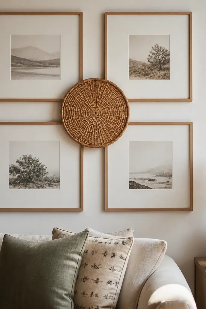
This is for when you want warmth without clutter. Add one woven piece — a small rattan round, basket, or macrame-style wall panel — and anchor it with a simple frame grid. The texture gives the wall a handcrafted feel, while the frames keep it orderly. Choose frames with light wood or off-white mats so the woven piece doesn’t look like it belongs to a different design world.
Pick one woven centerpiece roughly the size of your largest frame footprint. Arrange 4 to 6 frames in a grid around it, leaving extra spacing near the woven piece so the texture stays the focal point. Tape everything first and adjust until the woven piece sits centered in the overall composition. Hang the woven piece first, then hang the frames using the same 2 to 2.5 inch gap between frame edges.
Use picture-hanging hooks for woven pieces to avoid drilling through delicate materials.
Don’t put a rattan piece next to heavy glossy art — reflections make the texture look uneven.
14. Comic-Panel Layout (6 Frames Like a Story Strip)
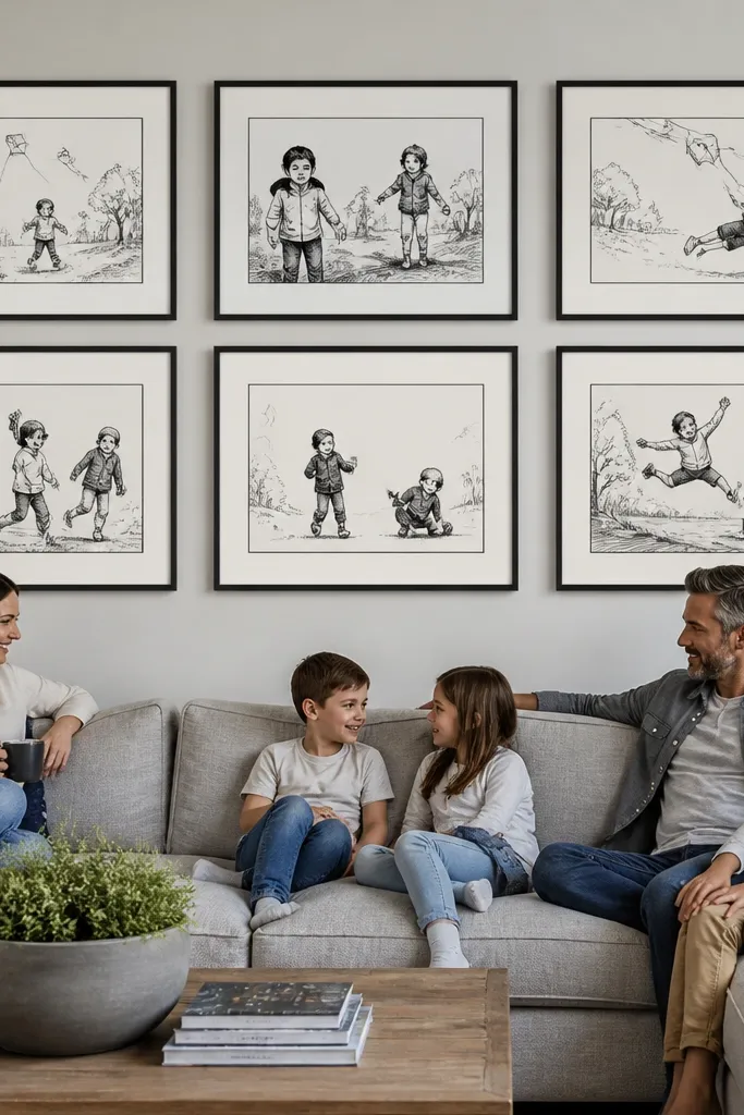
Comic-panel layouts look fun and clean because they use a story-like rhythm. You get a mix of sizes, but the spacing and consistent “panel” style keeps it organized. Use simple art — line drawings, bold typography prints, or monochrome sketches — so the panels feel like one theme. This works great for kids' rooms, creative studios, and hallways that need energy.
Choose 6 frames and plan a layout that alternates large and small panels. Keep all gaps consistent at 1.75 to 2 inches and align the panel edges so it reads like a grid with intentional breaks. Tape the layout on the wall and step back to check the rhythm from 6 to 8 feet away. Hang the largest panel first at eye level, then install the smaller ones around it using the tape spacing as your guide.
Editor's noteUse the same mat color in every frame so the panel borders look like one graphic system.
Skip thisDon’t use wildly different mat colors — the comic effect collapses into random frames.
15. Gallery Wall With a Single Metal Frame Border (One-Line Look)
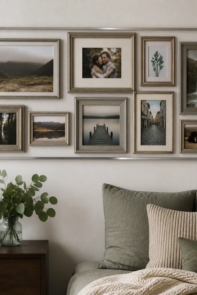
A single border line makes the whole gallery feel like a designed layout instead of separate pieces. It’s a smart way to unify mixed frames, especially when you have thrifted or hand-me-down frames. The border also hides small alignment errors because everything visually sits inside the same boundary. This looks sharp in modern homes with clean lines and works well in offices and hallways.
Measure your intended gallery rectangle and decide the border width — a thin metal strip or picture rail style border looks best around 1/2 to 3/4 inch wide. Install the border first using level marks and proper anchors. Then hang frames inside the border at consistent 2 inches spacing, using the border edges as your alignment reference. Finish by centering each frame visually within the border so the gallery reads like one unit.
Editor's noteIf you can’t install a full border, use masking tape to outline it and hang the frames within that taped boundary first.
Skip thisDon’t make the border thick and shiny — it draws attention away from the art.
16. Art + Mirror Combo (Two Anchors, One Clean Layout)
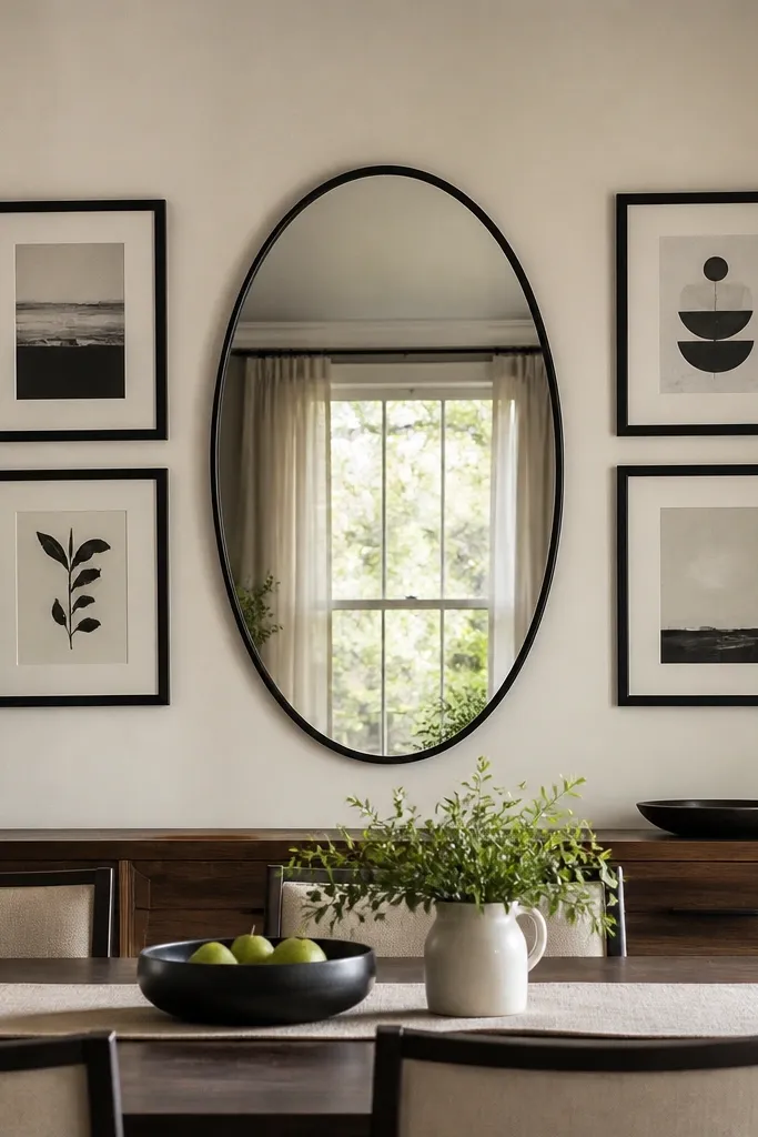
Pairing a mirror with framed art gives you light and style at the same time. The mirror acts like a bright anchor, so the gallery looks intentional even if the art pieces vary. Use one big mirror and two to four frames around it in a balanced arrangement. Keep the mirror frame finish consistent with the frames so the whole wall looks like one set.
Choose a mirror size that covers about 60 to 70 percent of the total gallery width. Arrange 2 to 4 frames around the mirror with a consistent gap of 2.25 inches from the mirror edge to the nearest frame edge. Tape the layout first to check reflections — you want the mirror to bounce light from a window or lamp, not reflect a TV screen. Hang the mirror first, then hang frames using the mirror edges as your reference for spacing.
Editor's notePick a mirror with a matte frame finish to avoid harsh glare in photos.
Skip thisDon’t place the mirror so it reflects clutter — the gallery will look messy in real life.
17. Oversized Single Frame With a Micro-Frame Cluster
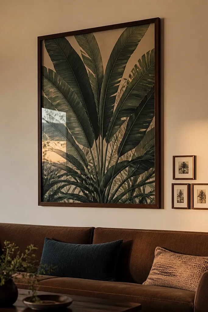
This layout is a cheat code when you want impact but don’t want a full gallery wall. One oversized frame sets the tone, and a tight cluster of three micro frames adds detail without overwhelming the space. It’s great for living rooms above a sofa, bedrooms, and reading nooks. Use a bold print in the big frame and keep the micro frames either monochrome or matching in mat color for cohesion.
Pick one oversized frame and place it at eye level, centered on the wall. Choose three small frames and arrange them as a compact triangle or vertical stack next to the big frame, keeping the cluster within 1/2 the width of the big frame. Maintain 2 to 3 inches between the big frame and the cluster so the pieces separate cleanly. Tape everything, confirm balance from standing distance, then hang the big frame first so the smaller cluster can be aligned precisely.
Editor's noteUse the same mat color on all three micro frames so the cluster reads as one unit.
Skip thisDon’t let the micro frames spread out — the cluster must feel tight.
18. Gallery Wall Using Only Typography and Numbers
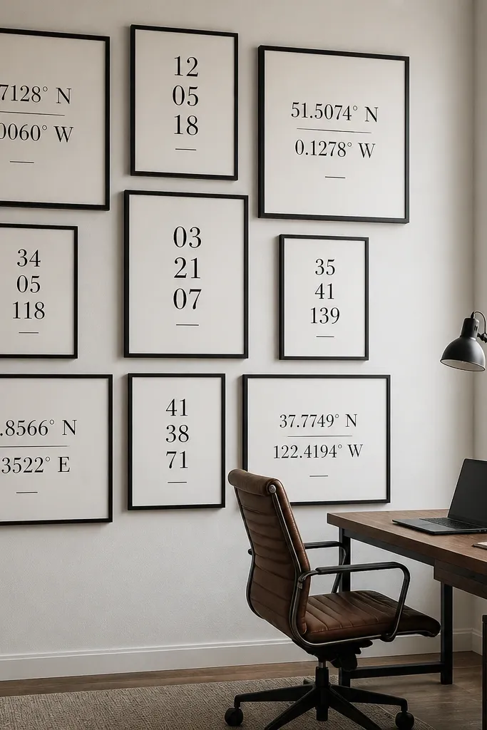
Typography-only walls look modern and intentional because the content is consistent in style. You can use dates, coordinates, favorite quotes, or simple word art, but keep fonts and sizes controlled. This is ideal for people who don’t want to manage dozens of photos or who want a gallery that still looks good even if you change decor seasonally. Keep the palette to one or two ink colors like black and warm gray.
Choose 6 to 9 typography prints and standardize the font style across them, even if the words change. Use frames with the same mat size so the text sits in consistent borders. Arrange in a grid or staggered row with 2 inches gaps, then hang after you tape-test the spacing. Print at high resolution, and keep the text centered with a ruler so the alignment feels graphic.
Editor's noteUse a matte art paper for prints so the ink doesn’t glare under overhead lights.
Skip thisDon’t mix too many font families — keep it to one or two styles.
19. Gallery Wall With Fabric Banners (Instead of Paper Prints)
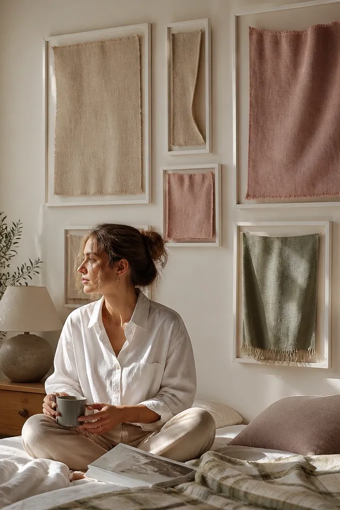
Fabric swatches in frames look warmer than paper prints and hide small wall imperfections because the texture softens edges. You get a gallery that feels cozy and design-forward, especially in bedrooms and living rooms. Choose fabrics with visible weave — linen, cotton canvas, or heavy knit — and keep them in a tight color story. This idea also works when you don’t have prints yet because fabric swatches are easy to collect and swap.
Select 5 to 7 fabrics and cut swatches slightly larger than the mat opening. Mount fabric behind glass using a backing board so the weave lies flat, and trim edges cleanly. Use frames with wide mats so fabric shows without looking cramped. Arrange in a staggered vertical or 2-row layout, keeping gaps at 2 to 2.5 inches, then hang using tape marks for alignment.
Editor's notePress fabric flat first and let it cool before mounting so it doesn’t wrinkle under glass.
Skip thisDon’t use thin slippery fabric — it bunches and looks uneven once framed.
20. Mirror-Backed Frame Wall (One Reflective Element, Rest Matte)
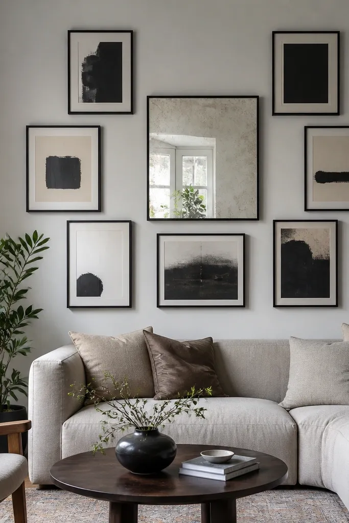
One reflective element can make an entire gallery wall look brighter and more intentional. Put a mirror-backed frame in the center or top to catch light, then keep the rest matte with paper art and matte frames. The contrast between reflective and matte gives the wall depth without turning it into a disco ball. This works well in entryways and rooms with limited natural light.
Choose a single frame to use mirror-backed backing or a reflective insert, and keep its size similar to your anchor piece. Select 4 to 7 matte frames with consistent mat colors. Arrange using a grid or salon arc, but keep the reflective frame as the anchor point. Hang the reflective frame first, then build outward with tape spacing and level alignment so the reflective element sits exactly where you want it.
Position the reflective frame so it catches a lamp or window, not a ceiling light straight on.
Don’t add more than one reflective element — it quickly turns chaotic.
21. Oversized Frame + Gallery Rail Hooks for Rotating Art
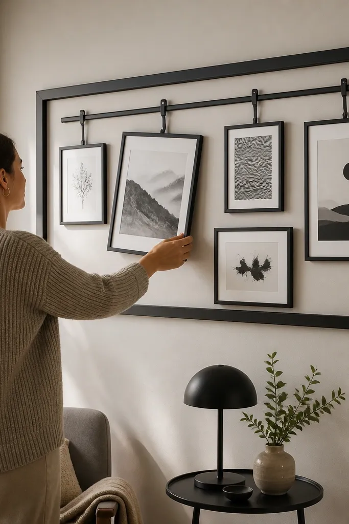
This is for people who want the look of a gallery wall but hate committing to one set of prints. Use an oversized base frame or rail system, then hang smaller pieces on hooks so you can swap art without taking down everything. The wall stays photogenic because the structure is fixed while the content changes. It’s also practical if you’re collecting prints over time.
Install a rail or a set of picture hooks where the small frames will hang, keeping them level across. Choose an oversized anchor frame and place it centered at eye level, then hang 3 to 5 smaller frames around it using the rail spacing. Keep the gap between small frames consistent at about 2 inches. Use picture wire or framed hangers that lock in place so swapped pieces don’t drift.
Editor's noteUse identical hanging hardware on every swap-in frame so the change looks seamless.
Skip thisDon’t mix hook types — different hang angles make the wall look uneven.
22. Two-Tone Frame Family With a Single Layout Template
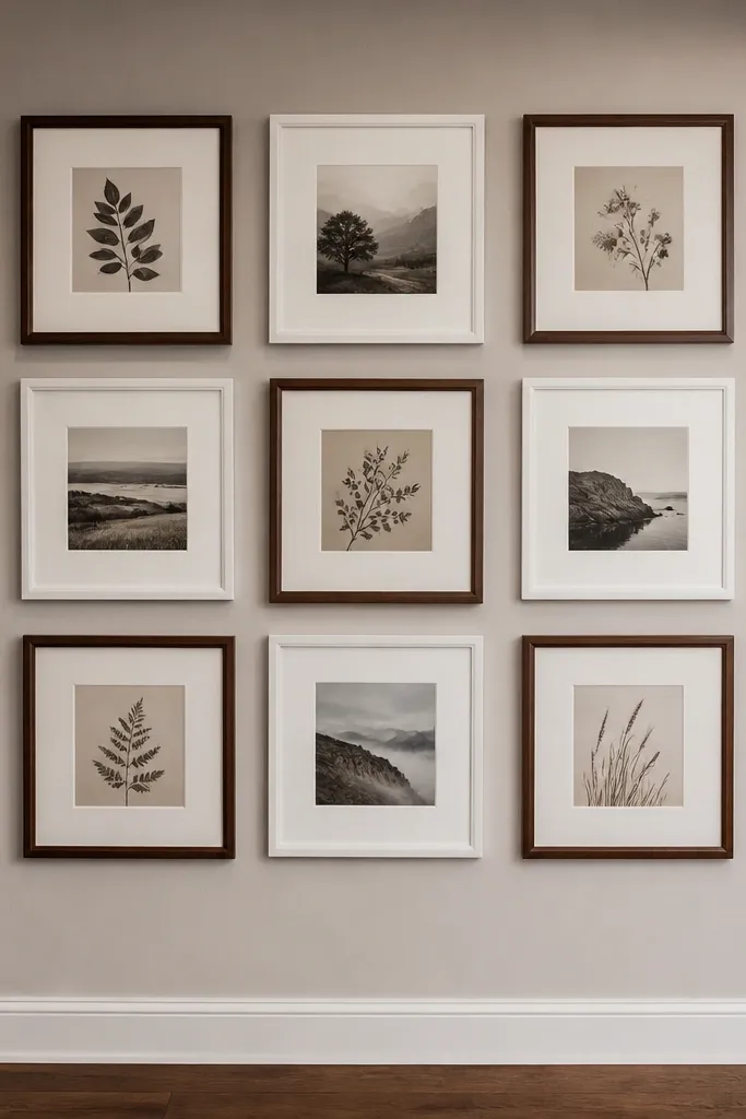
This makes mixed frames look intentional because you limit the visual variables. Pick two frame colors only — for example, walnut and off-white — and alternate them in a predictable pattern. Then build the gallery using a strict template like a 3x3 grid or a staggered row. The wall looks styled because the pattern is repeatable, not because the art is identical.
Choose 8 to 9 frames total and sort them into two finish groups. Build a layout template on the floor first and decide exactly where each finish goes, like walnut on the top row and off-white on the bottom row. Transfer the template to the wall with painter’s tape and mark screw points. Hang the frames one at a time, using the same 2 to 2.5 inch spacing and checking alignment after every two frames.
Editor's noteKeep mat thickness identical across both finish groups so the border lines match.
Skip thisDon’t add a third frame finish — the pattern stops reading as design.
23. Gallery Wall With a Fabric-Covered Backer Board (Like a Mood Board)
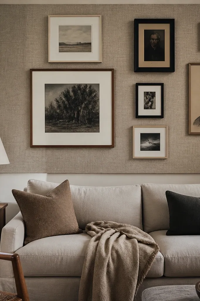
A fabric backer board makes your gallery feel like one cohesive mood board. It hides wall imperfections and gives the art a soft background so it looks more intentional in photos. You can use this with any layout rule — grid, stagger, or arc — but the fabric background is what makes it look styled. Pick a fabric with a tight weave, like cotton canvas or linen, and keep the color neutral so the frames still pop.
Cut a backer board to the size of your intended gallery area, leaving about 3 inches of border around your frame layout. Stretch fabric over the board and staple the back tightly, smoothing wrinkles before trimming edges. Mount the covered board to the wall level, then hang frames on top of the board using pre-marked tape spacing. Use picture hangers that grip the board securely so frames don’t shift over time.
Editor's noteUse a fabric in the same temperature as your art (warm prints with warm fabric) so the wall looks calm.
Skip thisDon’t use stretchy fabric — it wrinkles in waves and reads messy.
24. Minimalist Frame Line With One 3D Piece (The 'Rule Breaker')
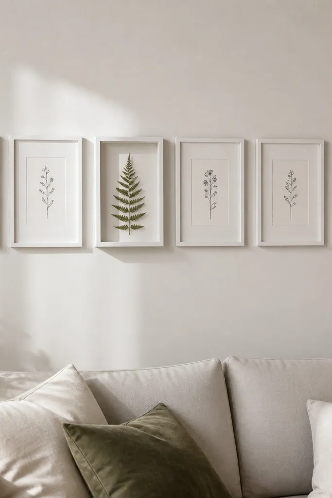
This layout uses restraint, then breaks it once for impact. The straight line of matching frames creates order, and the single 3D shadow box adds depth and a reason to look closer. It’s a great option for people who want a clean wall that still feels interesting. Keep the shadow box content simple — a pressed leaf, a small object mounted flat, or a tiny fabric swatch with space around it.
Choose 4 to 7 frames of the same size for the line and decide where the rule breaker will sit — usually centered or slightly above center. Hang the matching frames first in a straight line with 2 inches spacing and align tops. Then hang one shadow box slightly offset from the line by 1 to 2 inches, keeping the gap between it and the nearest frame consistent. Level everything and check the composition from across the room before drilling final holes.
Editor's noteUse matte frames for the line and keep the glass on the shadow box spotless to reduce glare.
Skip thisDon’t offset more than one 3D piece — multiple breaks make the wall feel unplanned.
25. Patterned Mat Gradient (From Light to Dark Across the Wall)
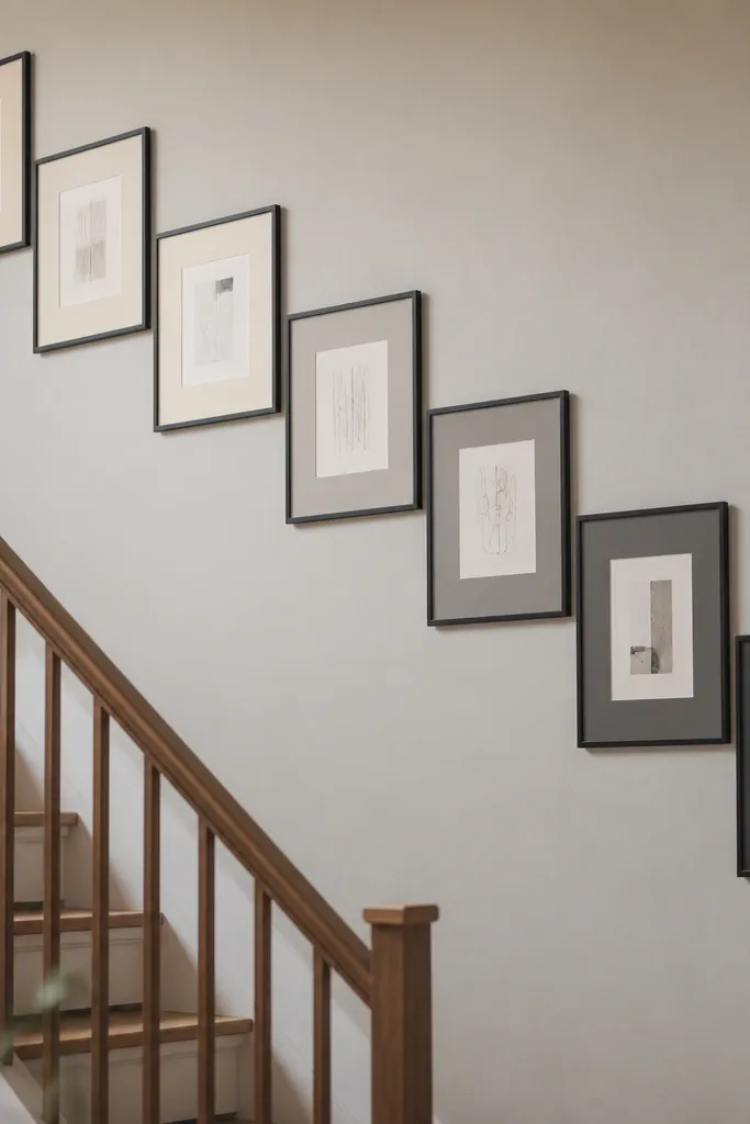
A mat gradient looks expensive because the wall has a built-in progression. Instead of changing images, you change mat tone from light to dark across the arrangement. Pair this with simple art — black line drawings, soft color blocks, or monochrome photos — so the gradient does the work. This idea is great for people who want a gallery wall that looks good even if the subject matter varies.
Pick 6 to 9 frames and decide on a mat tone sequence, like cream, oat, sand, taupe, charcoal. Use the same frame size and keep the inner image size consistent. Arrange frames in a left-to-right or top-to-bottom order, then tape the layout on the wall so you can confirm the gradient direction. Hang using consistent spacing and align the outer edges so the gradient reads straight and clean.
Editor's notePrint or choose art that stays neutral so the mat gradient doesn’t clash with bold colors.
Skip thisDon’t use mat tones that are too similar — the gradient needs noticeable steps.



