1. Matcha Green Color Block
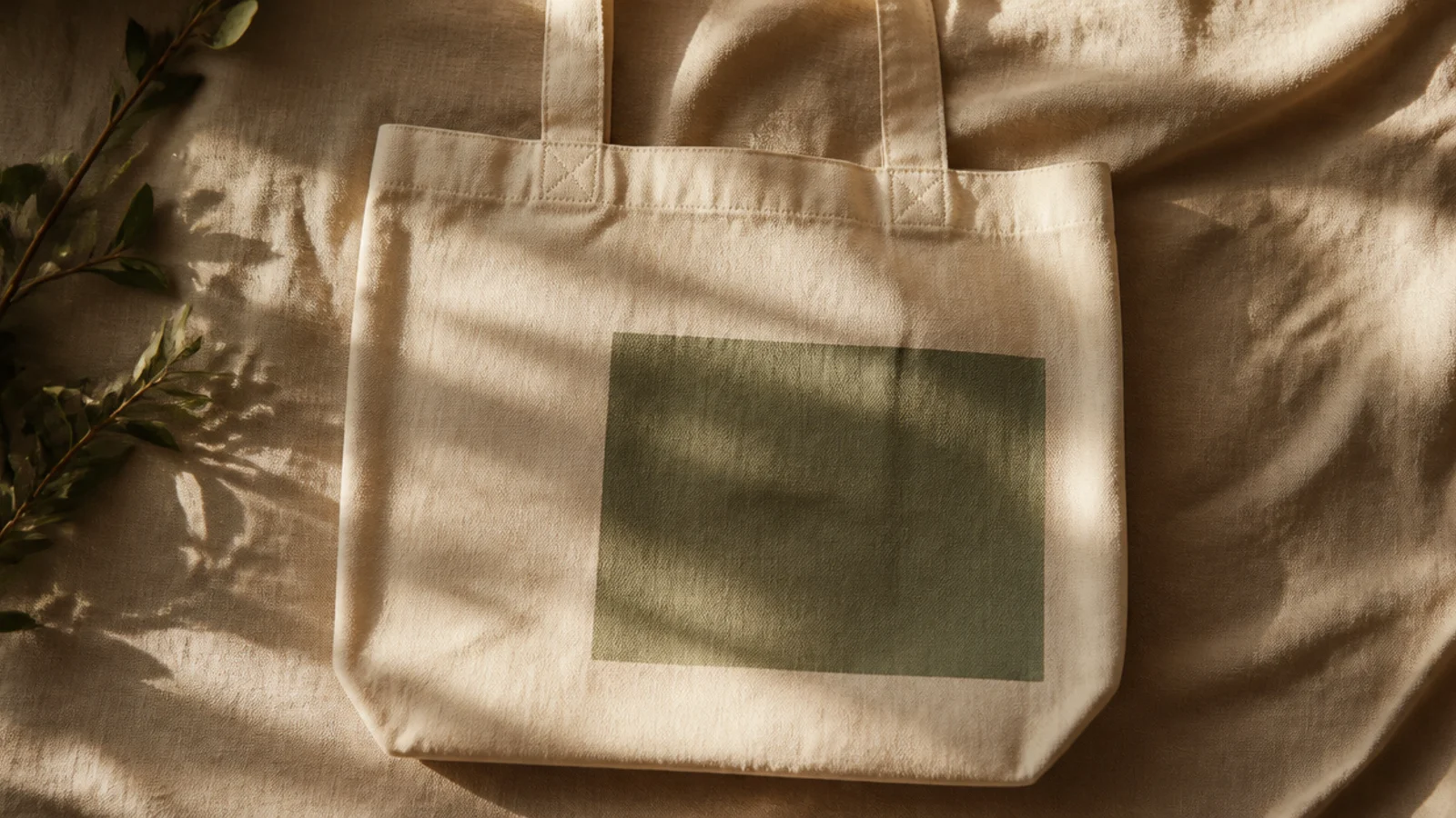
One soft green rectangle placed off-center is the most beginner-friendly aesthetic look and reads instantly boutique. The muted matcha shade plus lots of bare canvas is the whole trick. It works because the color is calm and the negative space does the styling.
Prep and iron the tote, then slide cardboard inside. Tape off a clean rectangle placed low and slightly left of center, burnishing every edge. Fill it with two thin coats of muted green fabric paint, letting the first dry before the second. Peel the tape while slightly wet, cure 24 hours, and heat-set under a cloth.
Place the rectangle in the lower-left third rather than dead center; off-center placement is what makes a plain block look designed.
Do not use a bright kelly green; a grayed matcha or sage is what gives it the calm, expensive look.
2. Cottagecore Wildflower Spray
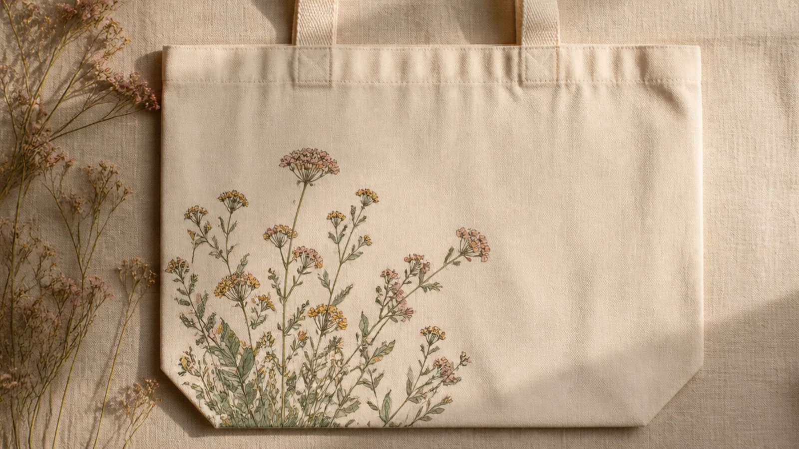
Prep the bag and insert cardboard. Paint a few thin green stems rising from the lower-left corner with a size 2 round brush. Add small flower heads as clusters of dots and short petal strokes in dusty pink, ochre, and cream. Tuck tiny leaf dashes along the stems, let dry, cure, and heat-set.
A loose, airy spray of tiny wildflowers reads soft and cottagecore without needing botanical accuracy. Keeping it to one corner and letting the stems trail up leaves the rest of the bag calm. Muted flower colors are what keep it from looking like a kids' craft.
Skip thisDo not use saturated flower colors; grayed, dusty tones are what give wildflowers that soft, pressed-flower look.
Editor's noteVary the stem heights so some flowers sit taller than others — uneven heights look natural, a level row looks stiff.
3. Tonal Cream Checkerboard
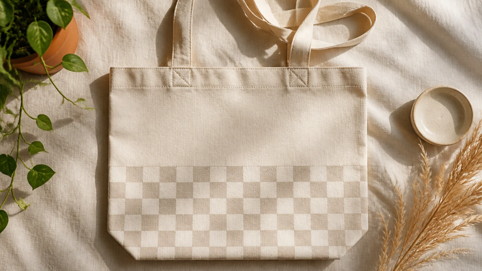
Prep and iron the tote, insert cardboard, and pencil an even grid across the lower half. Paint alternating squares with a small flat brush in a soft oat tone, just a shade deeper than the canvas, using two thin coats. Erase visible pencil, cure, and heat-set.
A checkerboard in two close tones — cream and oat, or oat and taupe — is quietly aesthetic where a high-contrast one is loud. The low contrast keeps it subtle and grown-up. It fills space without shouting.
Skip thisDo not go black-and-white here; high contrast reads retro and loud instead of soft and curated.
Editor's noteChoose your square color only one or two shades off the canvas; the whole point is a soft, tonal grid, not a bold contrast.
4. Single-Line Abstract Face
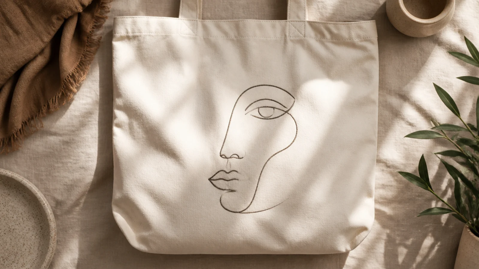
A continuous single-line face is a gallery-shop staple and looks far harder than it is. One unbroken charcoal line suggests a profile, and the simplicity is the aesthetic. It suits anyone who likes modern, minimal art.
Prep the bag and insert cardboard. Practice the continuous line on paper until your hand knows the path. Pencil it lightly on the canvas, then trace over it in one smooth pass with a fine-tip fabric marker or a thin round brush, keeping the line an even weight. Erase stray pencil, cure, and heat-set.
Draw the whole face without lifting your pen — a single unbroken line is what gives it that effortless artist look.
Do not vary the line thickness or go over lines twice; a shaky, doubled line breaks the clean minimal effect.
5. Terracotta Arch Repeat
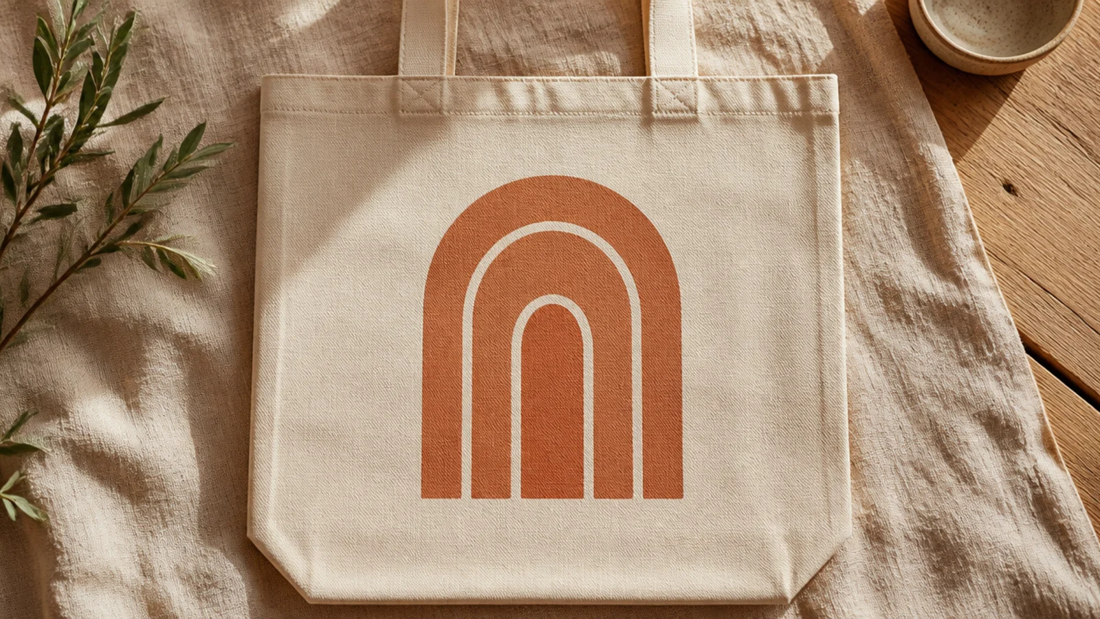
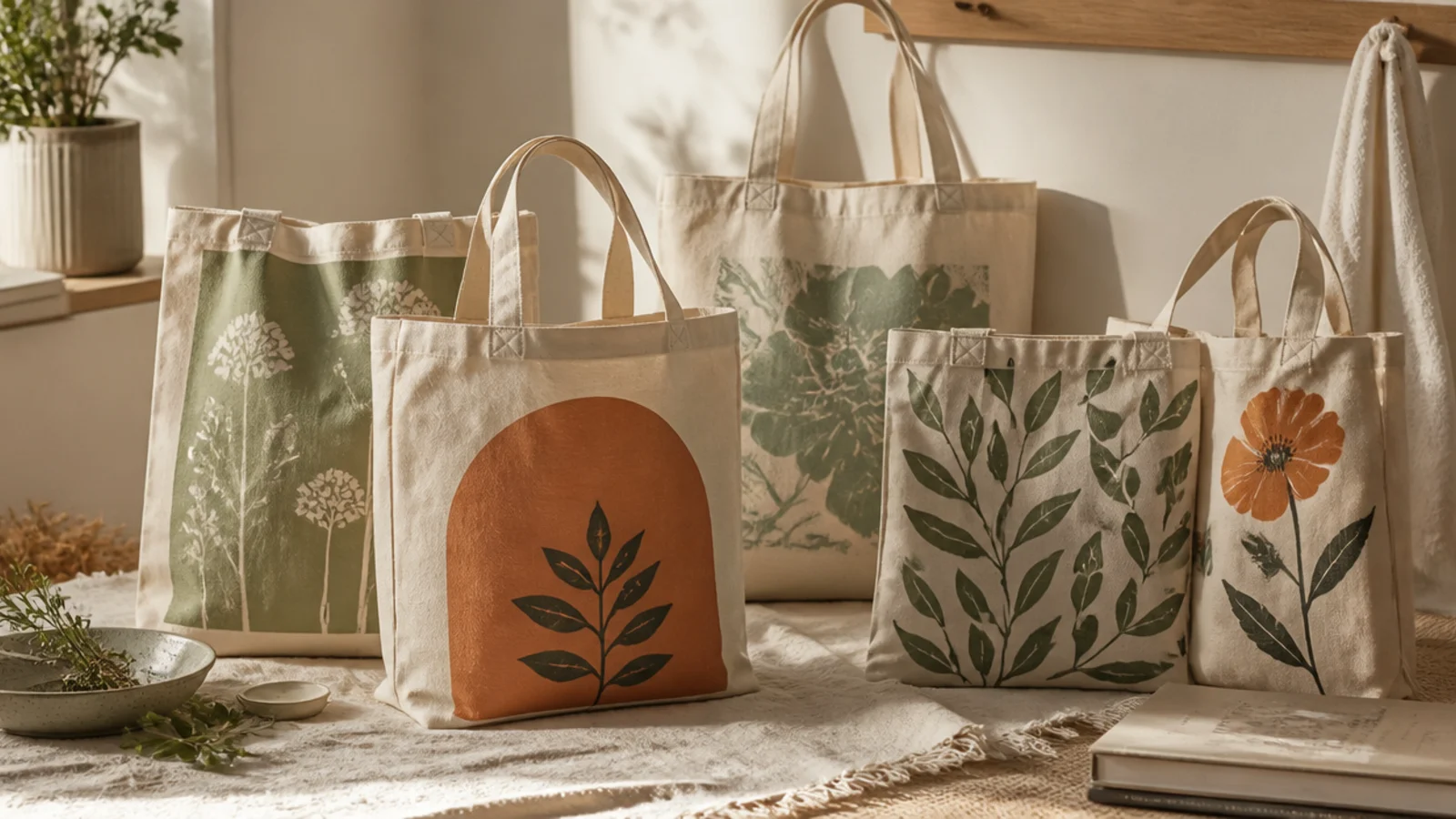
Nested arches in warm terracotta are a modern, architectural motif that feels straight off a design shop shelf. The repeated curves are calming and easy to trace. One earthy color keeps it refined.
Prep and iron the tote, insert cardboard. Trace around graduated round objects — a bowl, a plate, a lid — to pencil three nested arches. Fill each band with terracotta fabric paint using a flat brush, leaving thin bare gaps between them. Two thin coats, then erase pencil, cure, and heat-set.
Leave an even sliver of bare canvas between each arch band; the negative gaps are what make the arches read crisp.
Do not fill the arches solid with no gaps; without the bare stripes between them they blur into one shapeless blob.
6. Pressed Fern Outline
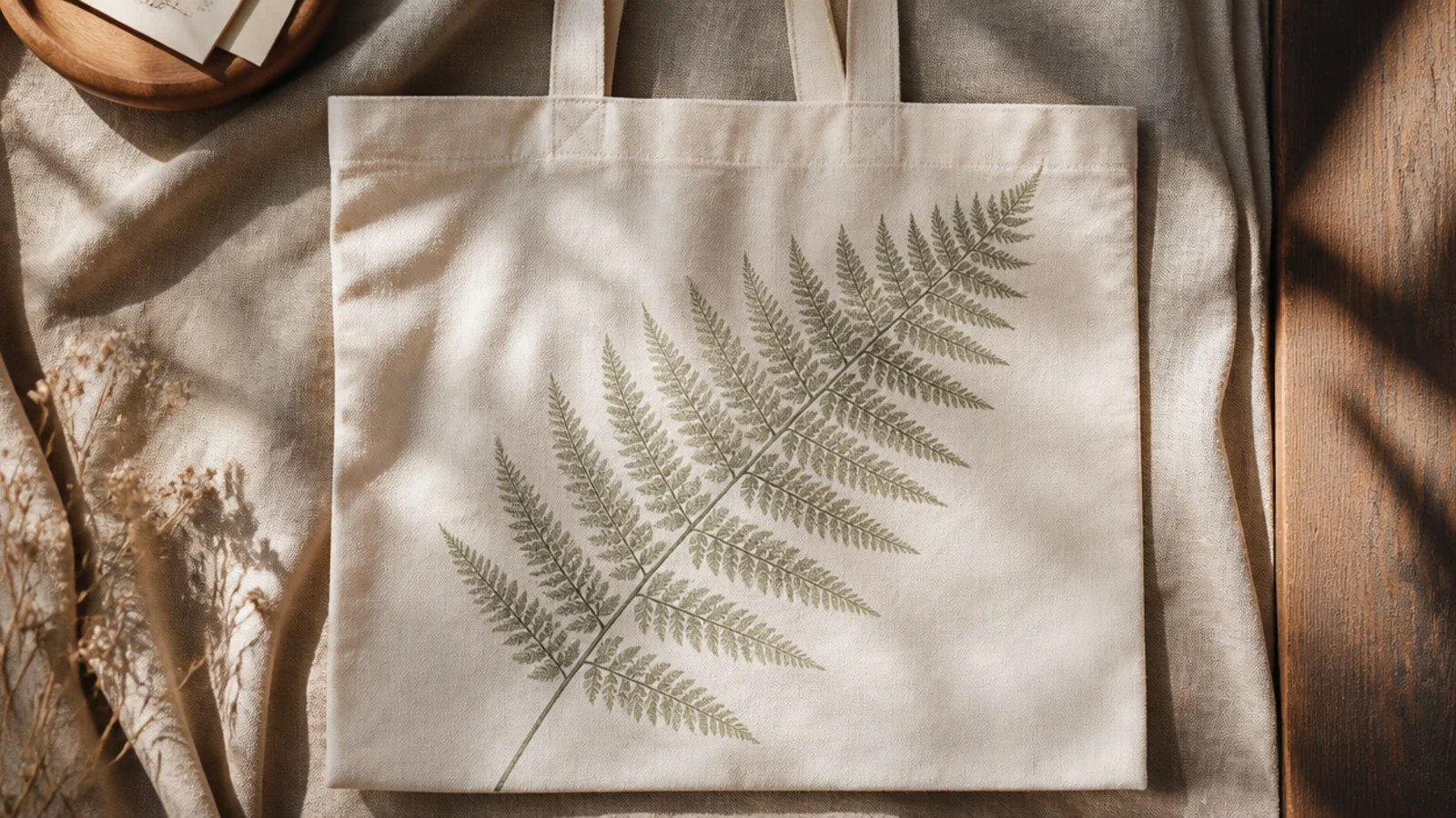
Prep the bag and insert cardboard. Brush a thin, even coat of sage fabric paint onto the vein side of a fresh fern frond with a sponge. Lay it paint-side down diagonally across the front, cover with a paper towel, and press evenly. Peel straight up to reveal the print, let dry, cure, and heat-set.
One fern frond printed diagonally is elegant, botanical, and calm — the essence of the aesthetic. Using a real leaf as a stamp gives crisp veins with no drawing. The single stem across bare canvas is quietly striking.
Skip thisDo not overload the frond with paint; a thin coat prints fine veins, while a heavy coat smears into a green blob.
Editor's noteChoose a flat, freshly picked fern so it lies fully against the canvas; a curled leaf only prints in patches.
7. Coquette Ribbon Bow
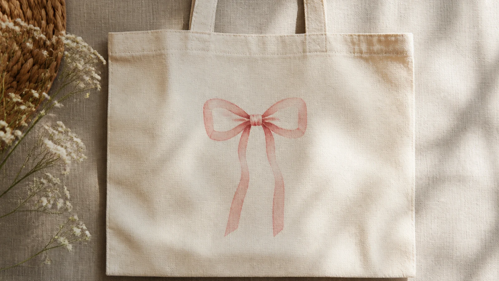
A single painted bow is the coquette look in one motif — soft, feminine, and trend-forward. Placed high on the front with the tails trailing down, it draws the eye up. A muted blush keeps it tasteful rather than cutesy.
Prep and iron the tote, insert cardboard. Pencil a simple bow — two loops, a knot, and two trailing tails — near the top center. Fill it with dusty-pink fabric paint using a size 2 round brush in two thin coats, keeping the loops smooth. Add a slightly deeper shade in the knot for depth, erase pencil, cure, and heat-set.
Let the ribbon tails trail down long and wavy; the movement in the tails is what makes a flat bow look like fabric.
Do not paint the bow in a hard bright pink; a soft, grayed blush is what gives it the coquette softness.
8. Danish Pastel Color Trio
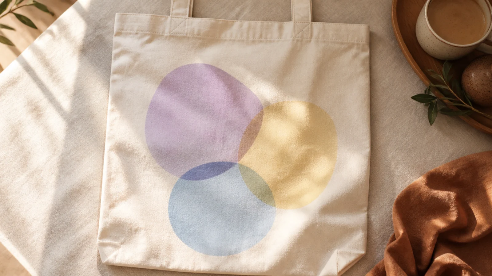
Prep the bag and insert cardboard. Pencil three loose blob or oval shapes that overlap slightly. Paint each in a soft pastel — lilac, butter yellow, sky blue — with a flat brush. Where two shapes overlap, mix a touch of both colors for a translucent third tone, cure, and heat-set.
Three soft pastel shapes overlapping loosely is the Danish-pastel aesthetic in a nutshell. The gentle colors and organic shapes feel playful but grown-up. Overlapping them where they meet adds a translucent, layered look.
Skip thisDo not use hard-edged geometric shapes; soft, rounded blobs are what give the Danish-pastel look its softness.
Editor's noteBlend a little of both colors in the overlap zones; the translucent overlaps are what make the shapes look layered.
9. Cottage Mushroom Illustration
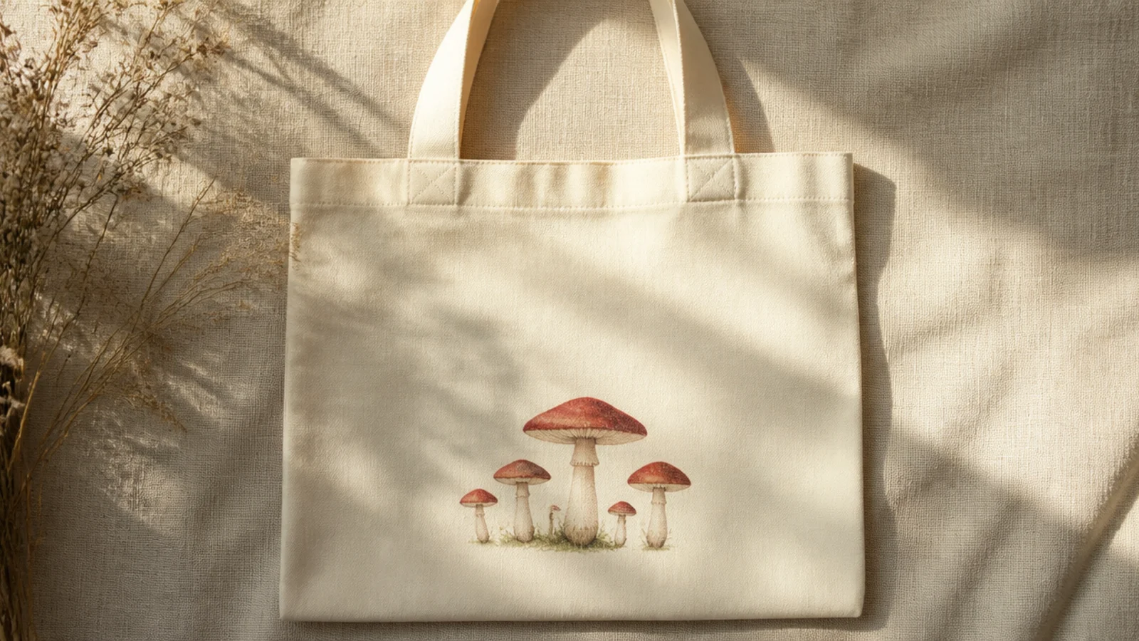
A little cluster of mushrooms is a cottagecore favorite and reads whimsical without being childish in muted tones. Grouping two or three of different heights makes it feel like a natural find. Dusty red caps over cream stems keep it soft.
Prep and iron the tote, insert cardboard. Pencil two or three mushrooms of varying heights. Paint the caps in a muted brick red with a small round brush, add cream stems, and dot a few pale spots on the caps once the red is dry. Add tiny grass dashes at the base, cure, and heat-set.
Paint the pale cap spots only after the red has fully dried; wet-on-wet makes them bleed into pink smears.
Do not use a fire-engine red; a dusty brick tone is what keeps the mushrooms looking storybook rather than cartoonish.
10. Golden Hour Sky Wash
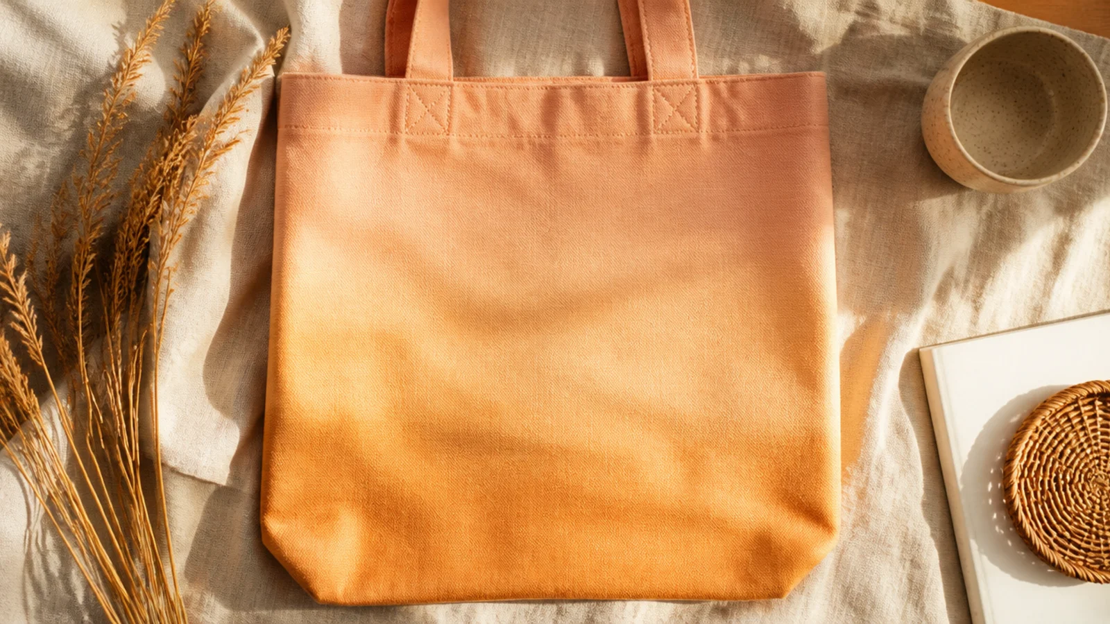
Prep the bag and insert cardboard. Thin your fabric paints with a little water. Brush pale peach across the top, then blend into warm ochre toward the bottom with long horizontal strokes, wetting the seam with a clean brush so the colors melt. Work quickly while wet, let dry fully, cure, and heat-set.
A soft gradient wash in golden-hour tones covers the whole front in a warm glow with no drawing at all. The peach-to-ochre fade feels dreamy and expensive. It is the easiest way to get an all-over aesthetic effect.
Skip thisDo not use too much water; a soaking wash leaves tide lines as it dries, which ruins the soft gradient.
Editor's noteBlend the color seam while both bands are still wet, dragging a damp clean brush along it, so the fade stays smooth.
11. Continuous-Line Figure
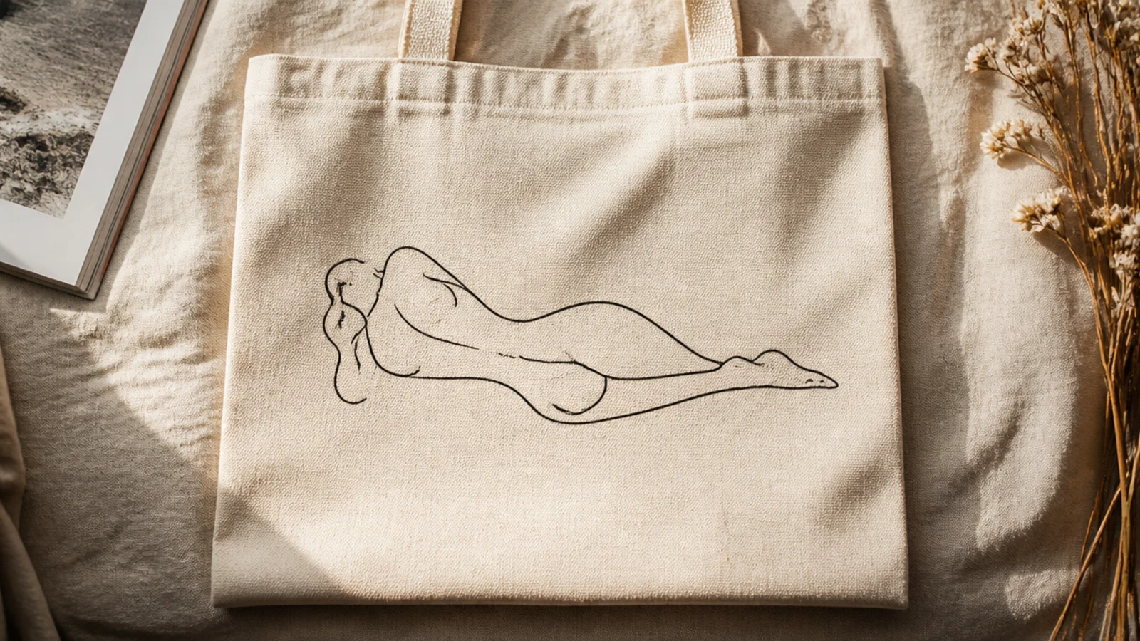
Prep and iron the tote, insert cardboard. Practice the figure on paper first. Pencil it lightly, then trace in one continuous pass with a fine-tip fabric marker, keeping the line even and unbroken. Erase stray pencil, cure, and heat-set under a cloth.
A single-line figure drawing is a Matisse-inspired staple that looks like fine art on a bag. One unbroken line suggesting a reclining body is elegant and modern. The empty canvas around it is essential to the effect.
Skip thisDo not fill the figure in with color; a line drawing loses its elegance the moment it becomes a solid shape.
Editor's noteKeep the figure small and low on the bag with lots of space around it; the emptiness is what makes it look like gallery art.
12. Muted Strawberry Scatter
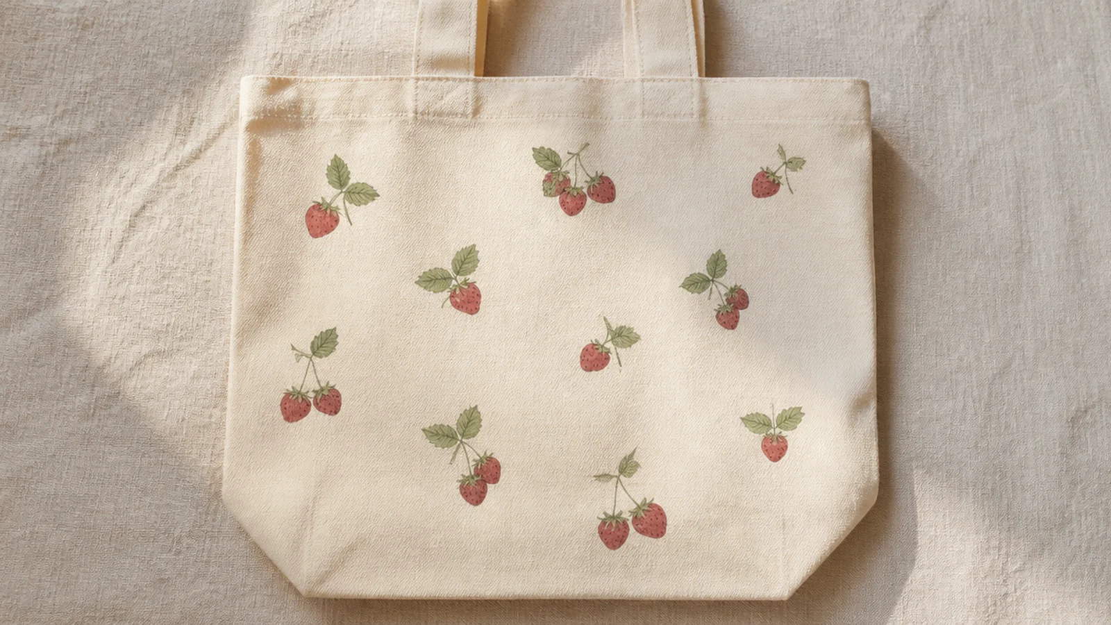
A light scatter of small strawberries is sweet and current, and muted colors keep it from looking juvenile. A few berries spaced across the front, not a dense print, is the aesthetic move. Dusty red and sage read soft and vintage.
Prep the bag and insert cardboard. Paint a few small strawberry shapes in dusty red with a size 2 round brush, spacing them unevenly. Add tiny sage leaf caps and a scatter of little seed dots in cream on each berry once the red is dry. Cure and heat-set.
Space the berries loosely and at slightly different angles; an even, dense grid of berries looks like cheap printed fabric.
Do not add the cream seeds while the red is wet; let it dry first or the seeds smear into pink dashes.
13. Eucalyptus Sprig
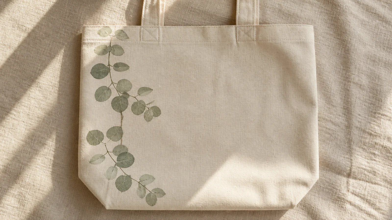
Prep and iron the tote, insert cardboard. Paint a thin curving stem down the left side with a size 2 round brush. Add small rounded leaves alternating along the stem, each a single soft brush press in sage, letting some overlap. Vary the leaf sizes toward the tip, cure, and heat-set.
One trailing eucalyptus sprig curving down the side is minimal, botanical, and endlessly aesthetic. The soft round leaves and muted sage feel calm and modern. It frames the bag without covering it.
Skip thisDo not space the leaves evenly like a ladder; natural alternating placement is what makes the sprig look real.
Editor's notePress each leaf as a single confident dab rather than outlining and filling; one press per leaf keeps them soft and quick.
14. Retro 70s Rainbow Cloud
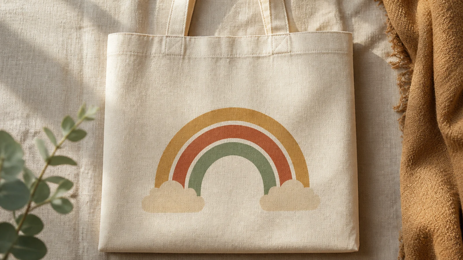
A retro rainbow with little clouds at each end is a warm, nostalgic motif when done in 70s earth tones. Mustard, rust, and sage bands feel vintage rather than childish. The small clouds give it a finished, illustrated look.
Prep the bag and insert cardboard. Pencil three or four nested arches ending in small cloud bumps at each end. Fill each band with a muted 70s tone using a small flat brush, then paint the clouds cream with a soft outline. Two thin coats, erase pencil, cure, and heat-set.
Stick to a rust-mustard-sage palette; the earthy colors are what make it read 70s retro instead of primary-color kids' art.
Do not use rainbow primary colors; bright red-orange-yellow-green-blue instantly looks like a children’s design.
15. Minimal Mountain Range
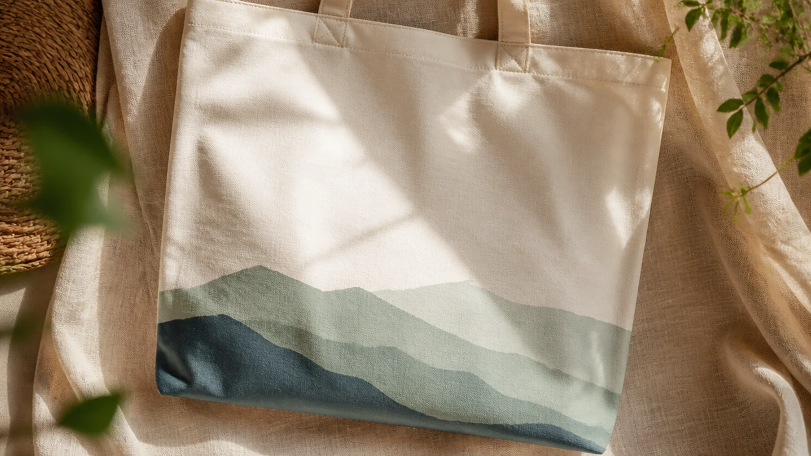
Prep and iron the tote, insert cardboard. Pencil two or three overlapping mountain outlines across the lower front, the back range taller. Paint the back range in the palest color first, then the closer ranges in slightly deeper tones, letting each dry before overlapping. Cure and heat-set.
A layered mountain range in flat silhouettes is calm, modern, and outdoorsy. Overlapping two or three colored ranges gives depth with no shading. Muted blue and sage keep it soft and aesthetic.
Skip thisDo not add tiny details like trees or snow; the charm is in the clean flat silhouettes, and details muddy them.
Editor's noteMake the farthest range the palest and each nearer one a shade deeper; the tonal shift is what creates depth without shading.
16. Aesthetic Script Word
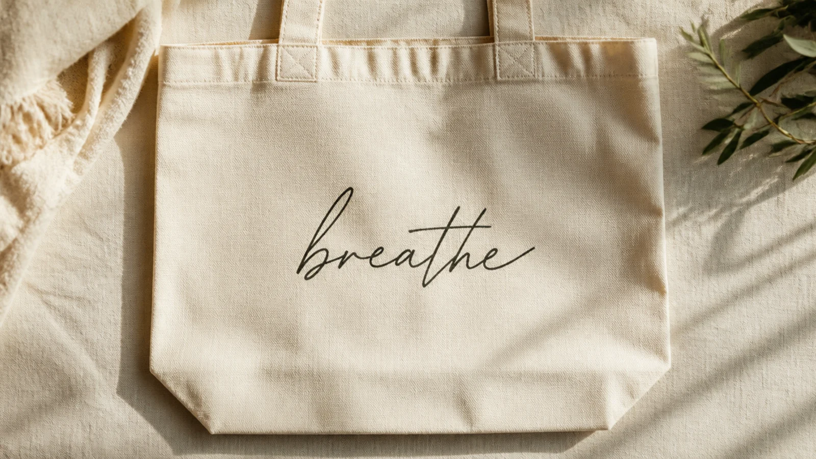
One short word in soft script — a place, a feeling, a name — is a classic aesthetic tote. Handwritten-style lettering feels personal and modern. Keeping it to a single word in a muted color keeps it elegant.
Prep the bag and insert cardboard. Print your word in a script font at the size you want and trace it lightly onto the canvas, or pencil it freehand. Trace the letters with a fine-tip fabric marker, keeping the downstrokes slightly thicker for a calligraphy feel. Erase pencil, cure, and heat-set.
Thicken only the downstrokes of each letter for a faux-calligraphy effect that looks far more polished than even lines.
Do not write a long phrase in script; more than one word gets hard to read and loses the clean aesthetic.
17. Citrus Slice Motif
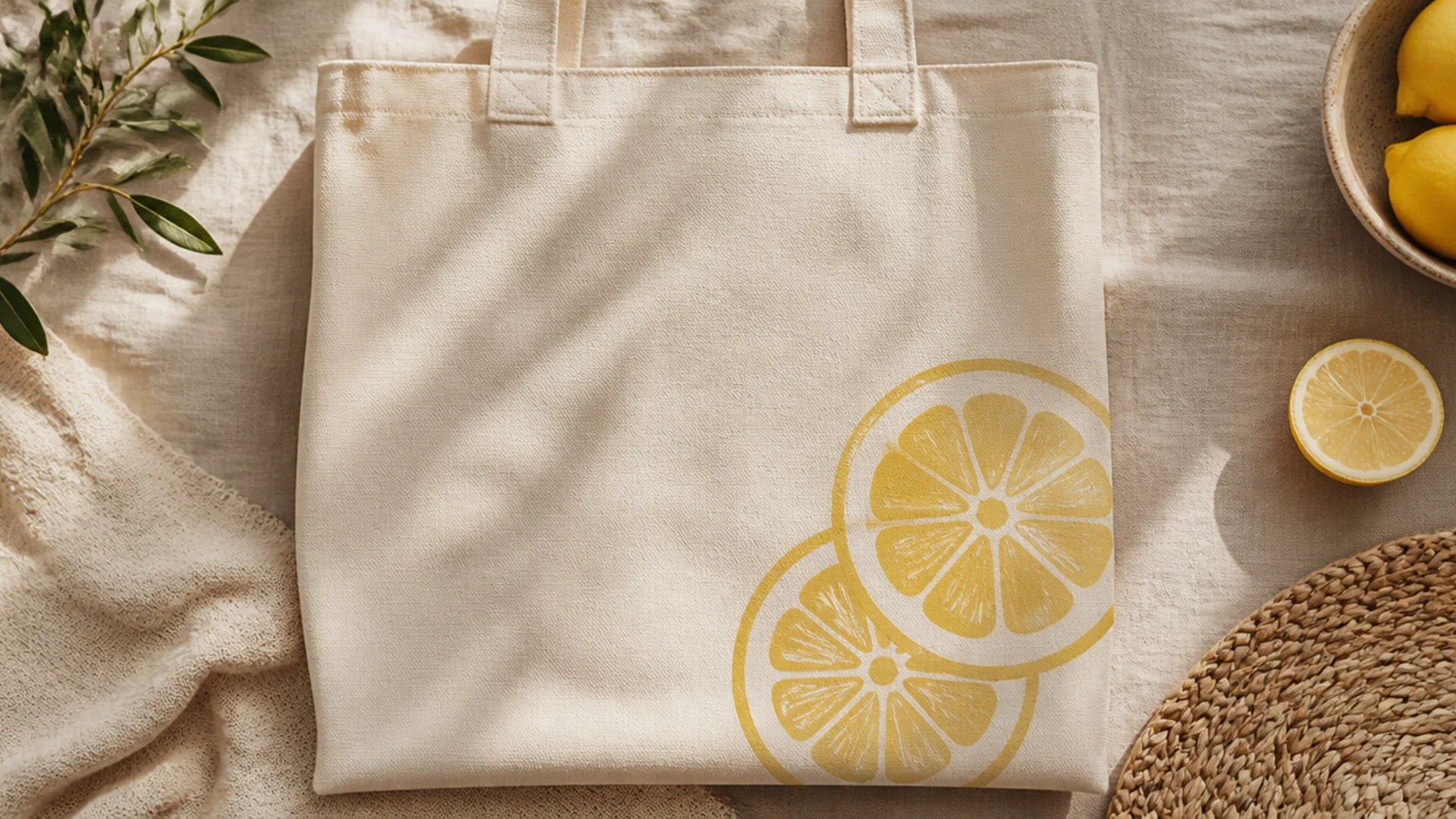
Prep and iron the tote, insert cardboard. Paint two soft-yellow circles in the lower right with a flat brush. Once dry, add a thin cream rind ring and a few segment lines radiating from the center with a fine brush. Add a couple of tiny seed shapes, cure, and heat-set.
A couple of stylized citrus slices are fresh and summery without being loud in muted tones. Lemon or orange slices are simple circles with a few segment lines. Placed in one corner, they keep the rest of the bag airy.
Skip thisDo not use a neon lemon yellow; a soft, buttery yellow keeps the citrus looking vintage rather than cartoonish.
Editor's noteAdd the rind ring and segment lines only after the yellow base is dry so the lines stay crisp instead of bleeding.
18. Color-Pop Checker Square
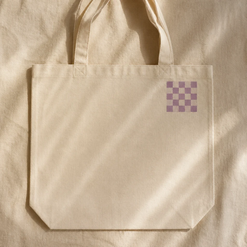
One small checkerboard patch in a soft pop color is a modern, minimal take on the checker trend. Keeping it to a single small square in the corner is the aesthetic restraint that makes it work. Muted lilac or sage keeps the pop gentle.
Prep the bag and insert cardboard. Pencil a small even grid, four by four squares, in the upper-right corner. Paint alternating squares in a soft pop color with a small flat brush, two thin coats. Keep the square small and tidy, erase pencil, cure, and heat-set.
Keep the whole checker patch smaller than your palm; the restraint of one small square is what makes it look intentional.
Do not make the checker patch huge or use it all over; a big high-contrast grid tips from aesthetic into loud.
19. Matisse Cut-Out Shapes
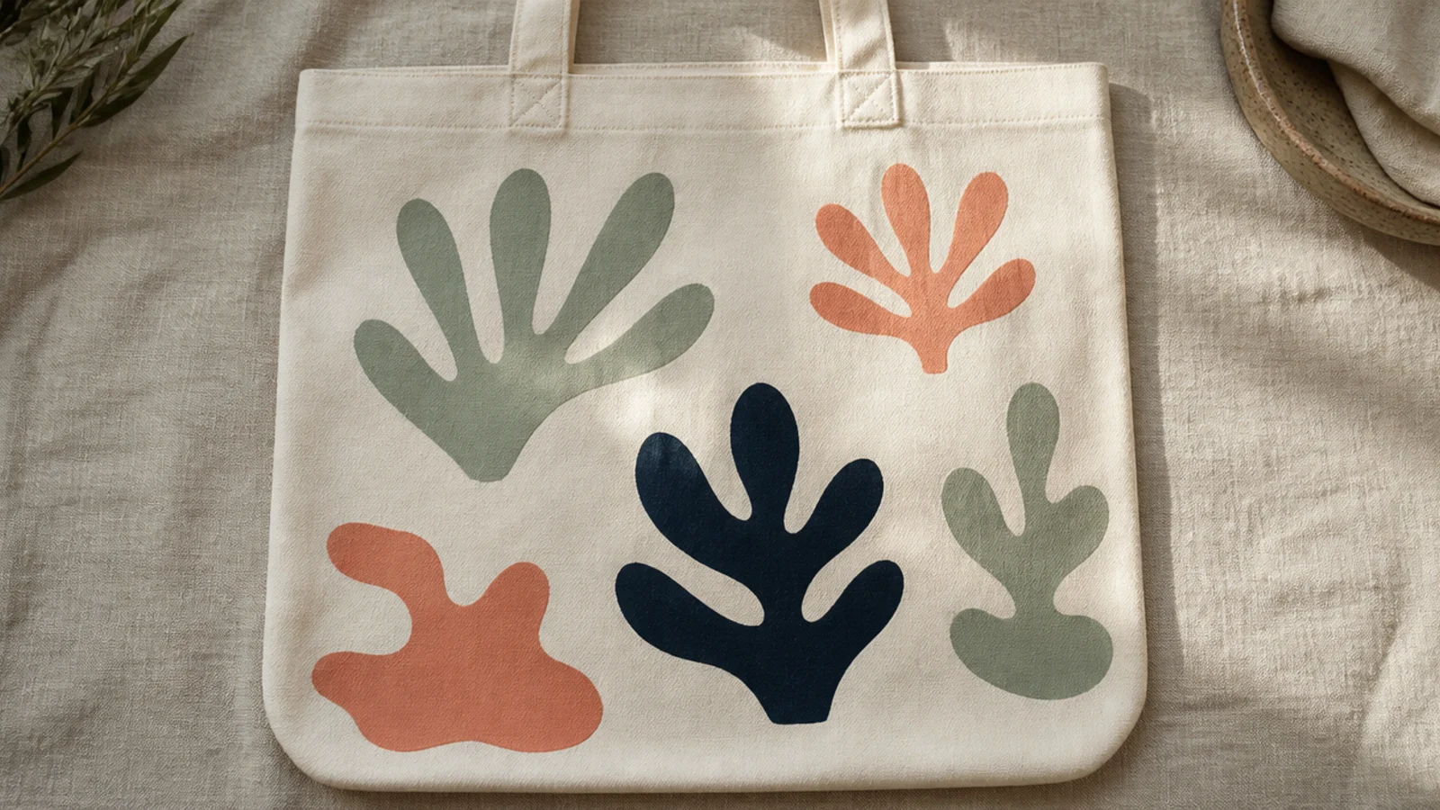
Loose organic shapes inspired by Matisse cut-outs are effortlessly artistic and need no drawing skill. A few flowing blob and leaf shapes in a muted palette read as modern art. The uneven placement is the whole charm.
Prep and iron the tote, insert cardboard. Cut a few organic shapes from freezer paper — a leaf, a blob, a wavy strip — and iron them shiny-side down as stencils, or just pencil loose shapes freehand. Dab fabric paint inside each in a different muted color, peel, cure, and heat-set.
Cut the shapes freehand with scissors rather than drawing them; hand-cut curves have that loose organic Matisse quality.
Do not make the shapes symmetrical or geometric; the appeal is in imperfect, organic, hand-cut curves.
20. Watercolor Blush Gradient
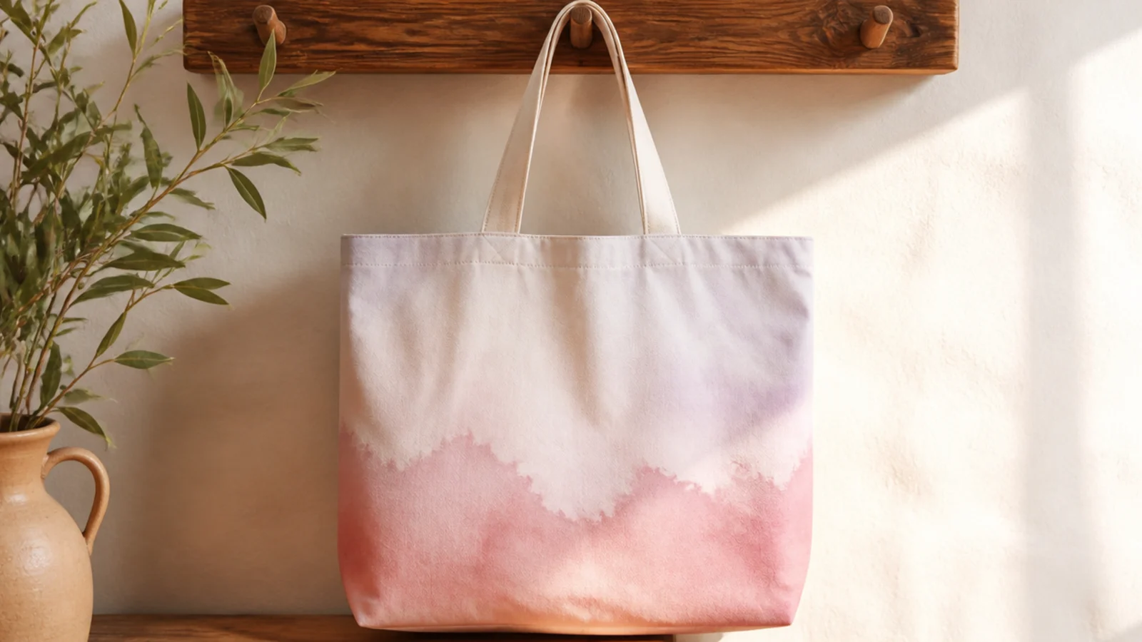
A feathery watercolor-style wash looks delicate and expensive, and thinned fabric paint fakes the effect beautifully. The soft bloom of one color into another feels like real watercolor. Blush into lilac is a gentle, aesthetic pairing.
Prep the bag and insert cardboard. Lightly dampen the canvas front with a clean wet sponge. Load thinned blush fabric paint on a soft brush and let it bloom into the damp fabric at the bottom, then feather pale lilac in at the top so they meet softly. Let it dry slowly, cure, and heat-set.
Dampen the canvas before you add color so the paint blooms and feathers like true watercolor instead of sitting flat.
Do not use thick paint here; watercolor effects need heavily thinned paint or you lose the soft, feathered edges.
21. Celestial Star Scatter
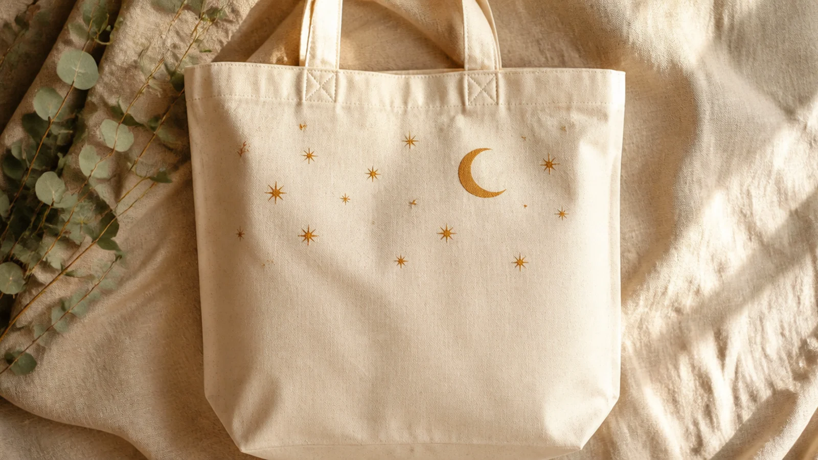
A soft scatter of little stars with one crescent moon is a dreamy celestial motif. In muted ochre or gold rather than bright yellow, it reads calm and grown-up. The uneven scatter keeps it natural.
Prep and iron the tote, insert cardboard. Paint a thin crescent moon in the upper area by overlapping two traced circles and filling the sliver. Scatter small four- and five-point stars around it in ochre with a fine brush, varying their sizes. Add a few tiny dots between them, cure, and heat-set.
Vary the star sizes and spacing; a random scatter of different-sized stars looks like a real night sky, an even grid does not.
Do not use a bright yellow; a muted ochre or antique gold is what keeps the celestial look soft and refined.
22. Wavy Squiggle Grid
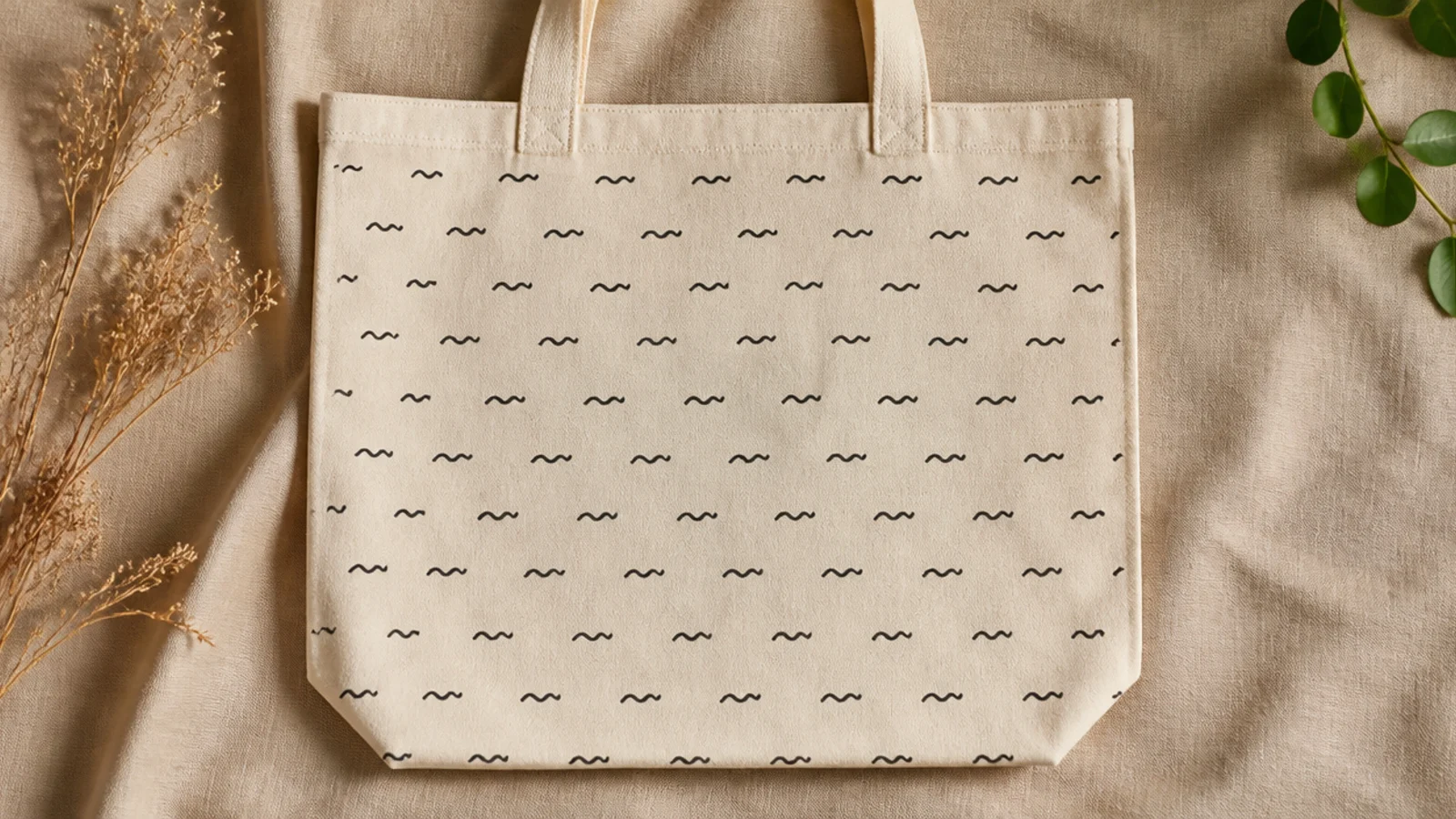
An all-over field of little squiggles is a playful, modern pattern that still reads calm in one muted color. The repeated wavy marks feel hand-drawn and current. It fills the front softly without a heavy block of color.
Prep the bag and insert cardboard. Make faint pencil dots in a loose grid to space the squiggles. At each dot, draw a small wavy squiggle with a fine-tip fabric marker, keeping them roughly the same size. Work row by row, erase stray pencil, cure, and heat-set.
Space the squiggles on a light pencil grid so they stay evenly distributed; random spacing quickly looks messy up close.
Do not vary the squiggle size wildly; a consistent mark size is what makes an all-over pattern look designed.
23. Trailing Vine Border
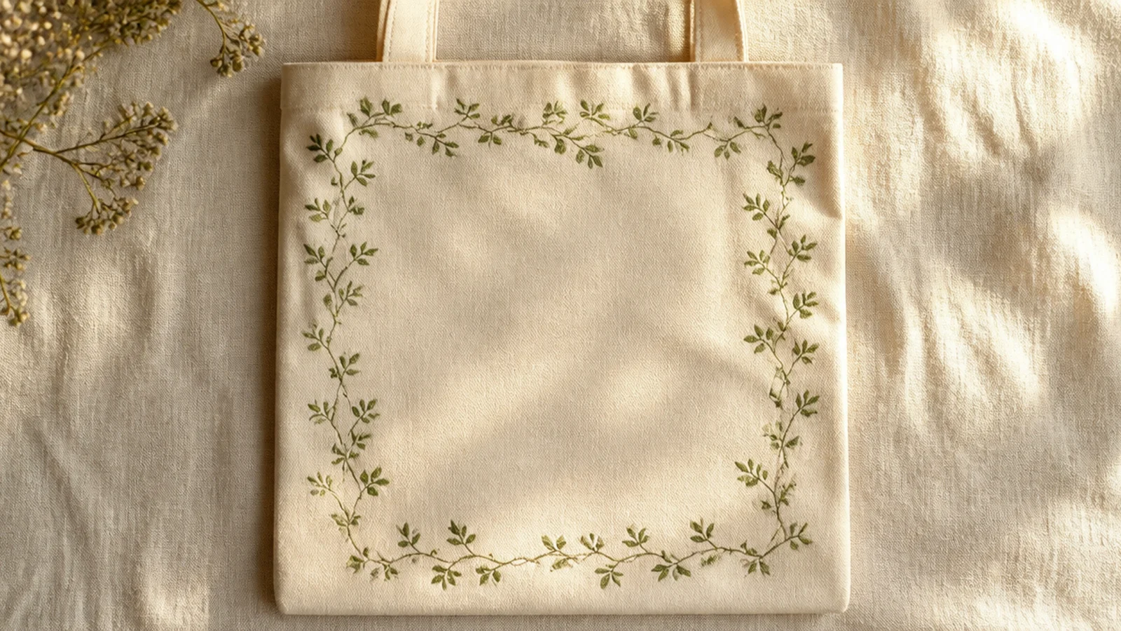
Prep and iron the tote, insert cardboard. Pencil a light rectangle just inside the front edges as a guide. Paint a thin vine along it with a size 2 round brush, adding small alternating leaves as single brush presses in sage. Keep the line loose and continuous, cure, and heat-set.
A delicate vine tracing the outer edge of the front frames the bag and leaves the center open. The thin trailing stem with small leaves is soft and botanical. It is an elegant way to add detail without a central motif.
Skip thisDo not make the vine thick or crowded; a fine, airy line is what keeps the border delicate instead of heavy.
Editor's noteLet the vine wander slightly off the guideline in places; a perfectly straight border looks stiff, a loose one looks hand-drawn.
24. Twin Heart Outlines
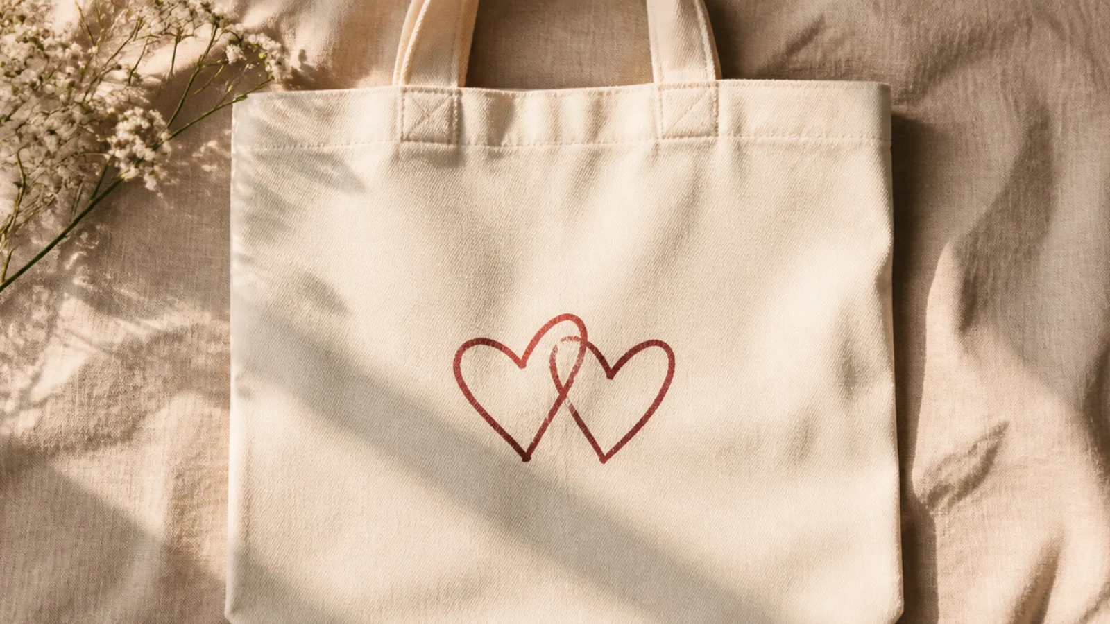
Two simple heart outlines overlapping is minimal, sweet, and modern — the outline keeps it from being cutesy. Just the linework, no fill, reads clean and aesthetic. A dusty red or terracotta keeps it soft.
Prep the bag and insert cardboard. Pencil two small hearts that overlap slightly at the center. Trace only the outlines with a fine-tip fabric marker or thin round brush, keeping the line even and leaving the insides bare. Erase pencil, cure, and heat-set.
Leave the hearts as outlines only; the empty interiors are what make them look modern instead of like a valentine sticker.
Do not fill the hearts solid or use bright red; solid bright hearts lose the clean, minimal aesthetic instantly.
25. Half-Dip Ombré Base
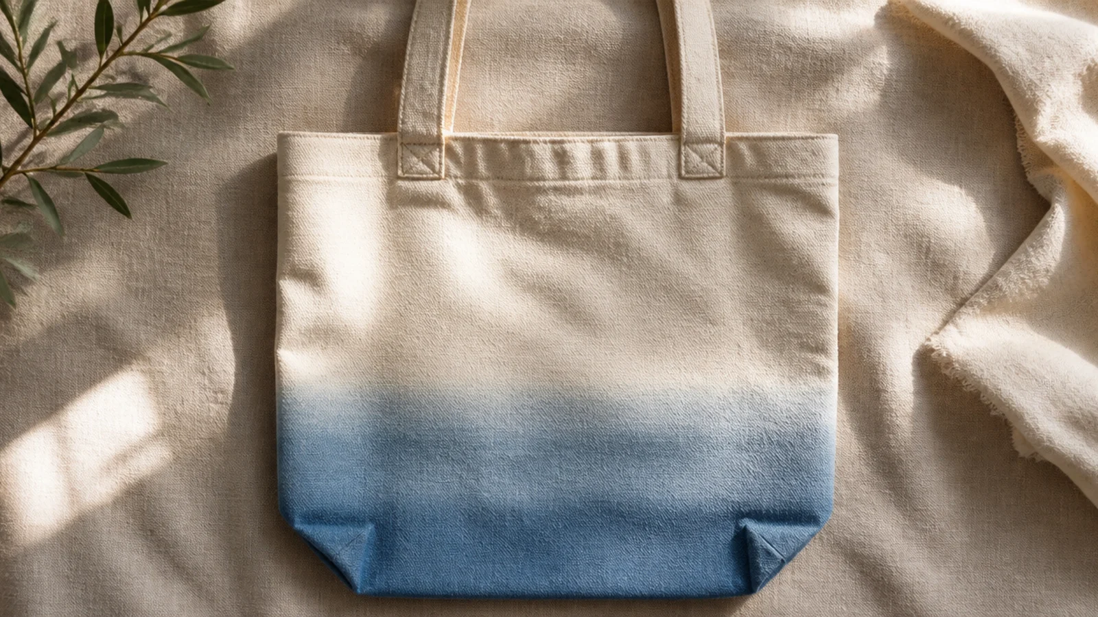
A soft ombré rising from the bottom edge, like the bag was dipped in dye, is a calm, all-over aesthetic with no motif at all. The color fading into bare canvas at the midpoint feels intentional and modern. Dusty blue or blush both read soft.
Prep and iron the tote, insert cardboard. Thin your fabric paint slightly. Paint the bottom edge solid, then work upward with a damp sponge and lighter pressure so the color thins and fades to nothing near the middle. Pounce the top edge to soften it, let dry, cure, and heat-set.
Fade the color all the way to bare canvas rather than stopping at a hard line; the gradual dissolve is what looks dip-dyed.
Do not end the ombré with a visible hard edge; an abrupt stop looks like a color block, not a soft dip-dye.