
1. Walnut + Cream Mat Salon Grid
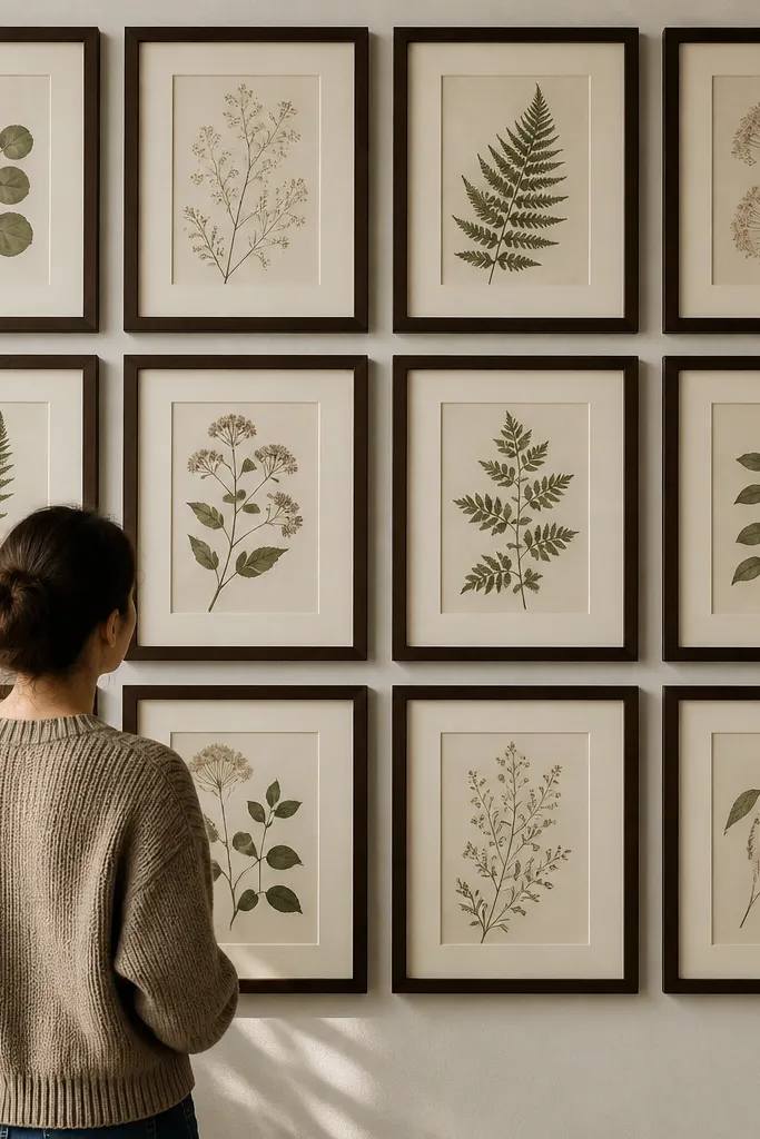
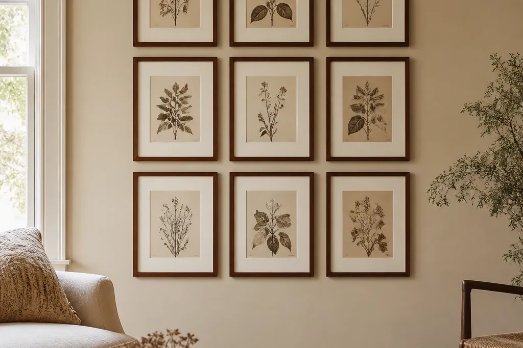
This layout looks timeless because it uses a strict grid but keeps the vintage feel through mat color and frame finish. Walnut frames bring that warm, slightly aged tone, and cream mats create a soft border that makes prints look older without actually distressing them. The grid also makes the wall easy to maintain — you can swap one print later and the structure still holds. For the best look, use prints with similar contrast levels so the wall reads cohesive instead of patchy. This works great in hallways and dining areas where you want calm order.
Editor's noteCut your templates from brown craft paper so you can tape them up, step back, and adjust without drilling.
Start by choosing one frame size for the repeating pieces, like 11x14 inches with 1.5 to 2 inch cream mats. Lay out a 2x2 or 3x2 grid on craft paper on the floor first, then transfer to the wall with painter’s tape. Measure eye level using the midpoint of the largest frame, and keep the spacing between frame edges at 2.5 to 3 inches. Hang the center row first, then align the outer frames to the tape lines. Finish by pressing the art and mats flat before inserting to avoid waves.
Skip thisDon’t mix glossy mats with matte prints — the glare makes the whole wall look newer than it is.
2. Brass-Tone Oval Frames with Botanical Prints
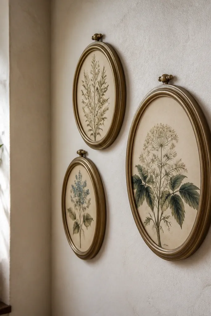
Oval frames feel vintage instantly because they break the strict rectangle grid while staying refined. The brass tone adds a warm, antique highlight, and botanical prints give you that old-world garden vibe without needing distressed paint. Keep the prints consistent in palette — muted greens, sepia stems, and faded florals — so the wall reads like one collection. This style is photogenic because ovals create gentle curves that catch light differently than straight frames. It’s a strong choice for entryways, kitchens, and reading corners.
Choose three or five oval frames in the same brass finish, around 9x12 or 10x14 inches. Use botanical prints sized to fit each frame’s opening, and keep margins consistent by using the same print type across all frames. Place the largest oval at eye level, then stagger the smaller ones above and to the sides with 2 to 2.5 inches between frame edges. Mark screw points through the frame hardware onto the wall using a pencil and level. Hang starting from the center so the curves look intentional, not random.
Wipe brass-tone frames with a dry microfiber cloth before hanging — fingerprints dull the warm highlights.
Avoid mixing modern botanical prints with bright neon greens; vintage requires muted color.
3. French Country Trio with Wide Off-White Mats
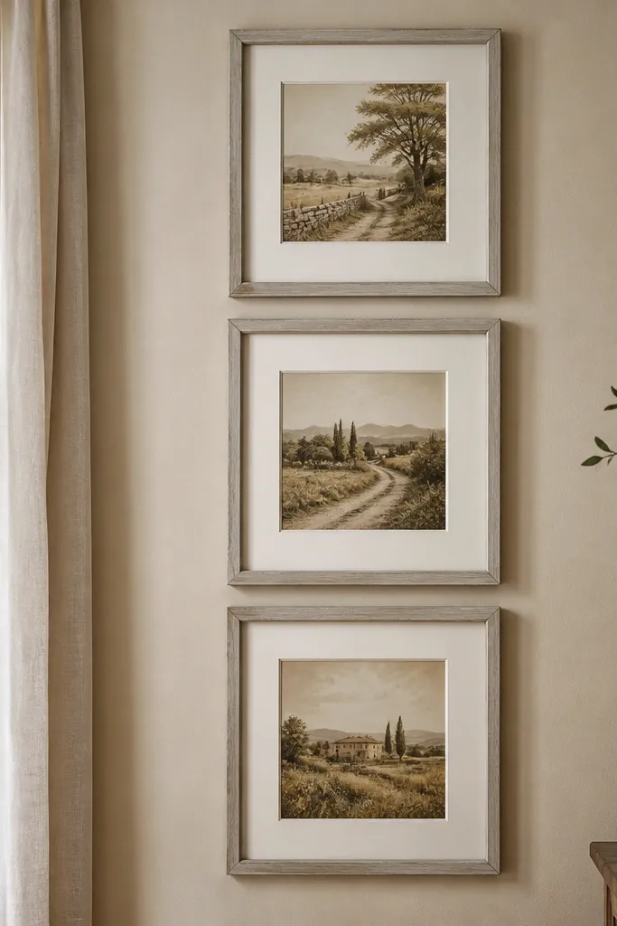
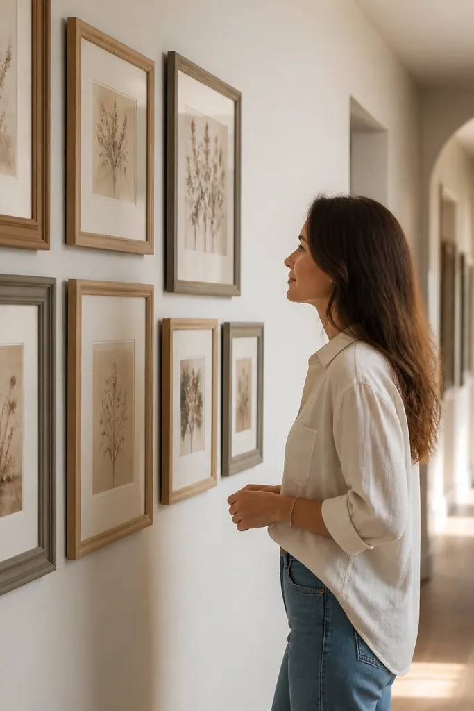
A three-frame vertical trio looks timeless because it’s structured and simple, but the wide mats add that “old print in a grand house” feeling. Off-white mats soften the art and help it blend with walls that have warm undertones. Use frames in light wood or light gray with a slightly distressed finish for an authentic antique look. This is one of the easiest ways to get a vintage gallery effect without filling the entire wall. It’s best on narrow walls, stair landings, and above a console table where you want height.
Editor's noteIf your frames don’t include anti-glare glass, use matte acrylic or remove glossy reflections with a soft cloth before final placement.
Pick three frames with matching mat dimensions, like 8x10 inches with 2 to 3 inch off-white mats. Center the trio so the middle frame’s midpoint lands around 57-60 inches from the floor. Set spacing between frame edges at 3 inches for a clean separation. Use a level to hang the top and bottom first if your wall has a slight slope, then fill in the middle. Insert prints and mats, then tighten the frame backs evenly so the mats don’t skew.
Skip thisDon’t use thin mats under wide art — it shrinks the vintage look and makes the frames feel cheap.
4. Black Frame Mix with Sepia Photo Strips
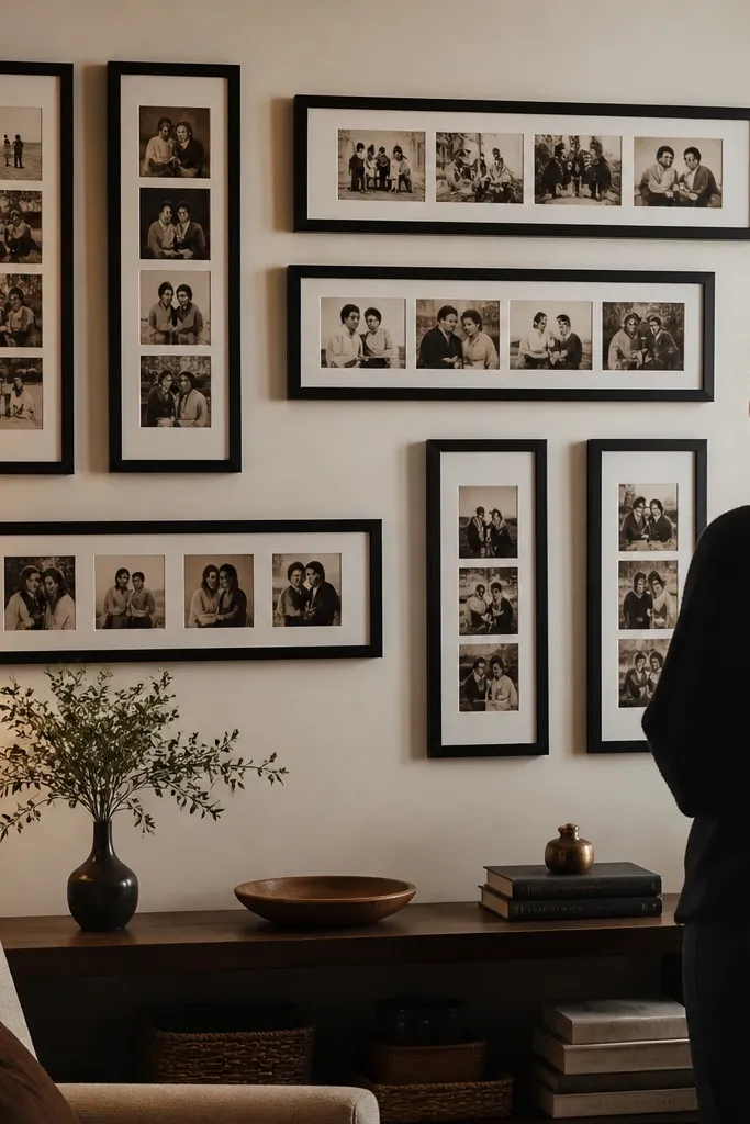
Black frames paired with sepia photos create a sharp vintage contrast that still looks modern enough to feel timeless. The key is consistency in photo tone: keep everything in sepia or muted monochrome, not a mix of color and black-and-white. Add variety in orientation — some vertical, some horizontal — but keep the mat color the same so the wall reads as one story. This layout is great if you want your gallery wall to feel personal without looking messy. It also photographs well because the black frames anchor the eye.
Editor's notePrint your photos on matte paper — it gives the sepia tone a softer, older look than glossy stock.
Select five frames in matte black with the same width, for example 1 inch frame width, but vary sizes like 8x10, 11x14, and 5x7. Use matching light gray or off-white mats inside each frame so the photo edges align visually. Arrange them in a strip that runs horizontally, then stagger heights by 1-2 inches while keeping the center photo at eye level. Use painter’s tape to map the strip, then hang from the center outward. Tighten frame backs and check that the photos sit flat to avoid curling edges.
Skip thisSkip mixed frame finishes like shiny black next to satin — the mismatch looks like a mistake.
5. Oil Painting Look with Textured Reproduction Prints
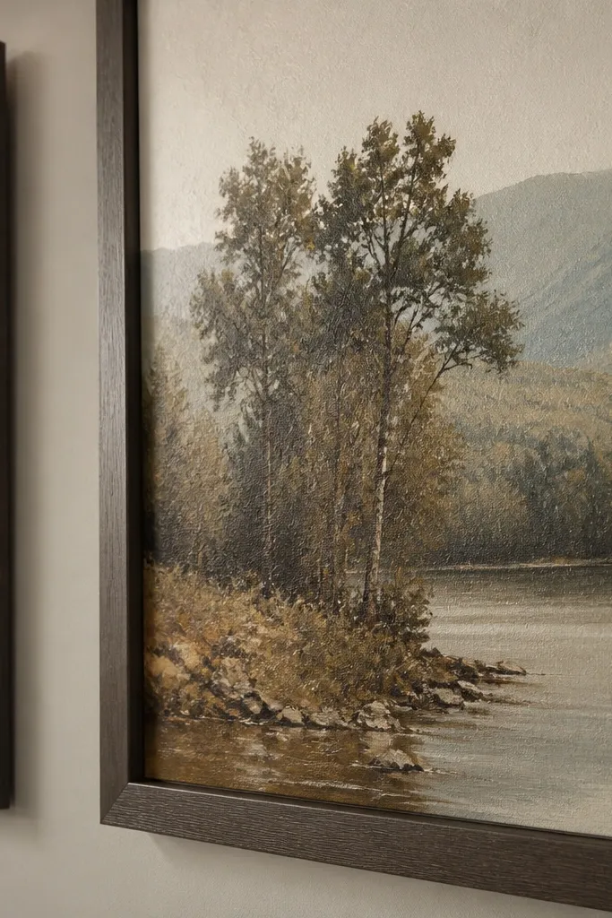
Textured reproduction prints can mimic the depth of old paintings without the mess of restoring anything. The vintage look comes from the surface — you get subtle shadows in the print texture that read like brushwork. Pair these prints with simple frames in dark walnut or warm gray so the texture does the talking. Keep the palette tight: browns, creams, and muted blues. This setup works especially well in living rooms where you want a gallery wall that looks substantial from across the room. It’s also forgiving if your prints aren’t identical sizes because the texture unifies them.
Editor's noteUse museum-style matting (same mat color, same thickness) because it makes textured prints feel like they belong together.
Choose 4 to 6 framed pieces, using textured print sizes that fit standard frames like 11x14 and 8x10. Use frames with a simple profile and consistent color finish, and keep mat widths the same across all frames. Arrange as a loose rectangle cluster with 2.5 inches between frame edges. Make paper templates for each frame and tape them on the wall so you can adjust spacing without removing hardware. Hang the largest frame first, then align the rest to the template lines and level.
Skip thisDon’t mix shiny varnished-looking prints with matte textured ones; the shine breaks the vintage mood.
6. Mismatched Frames, Matched Mat Width
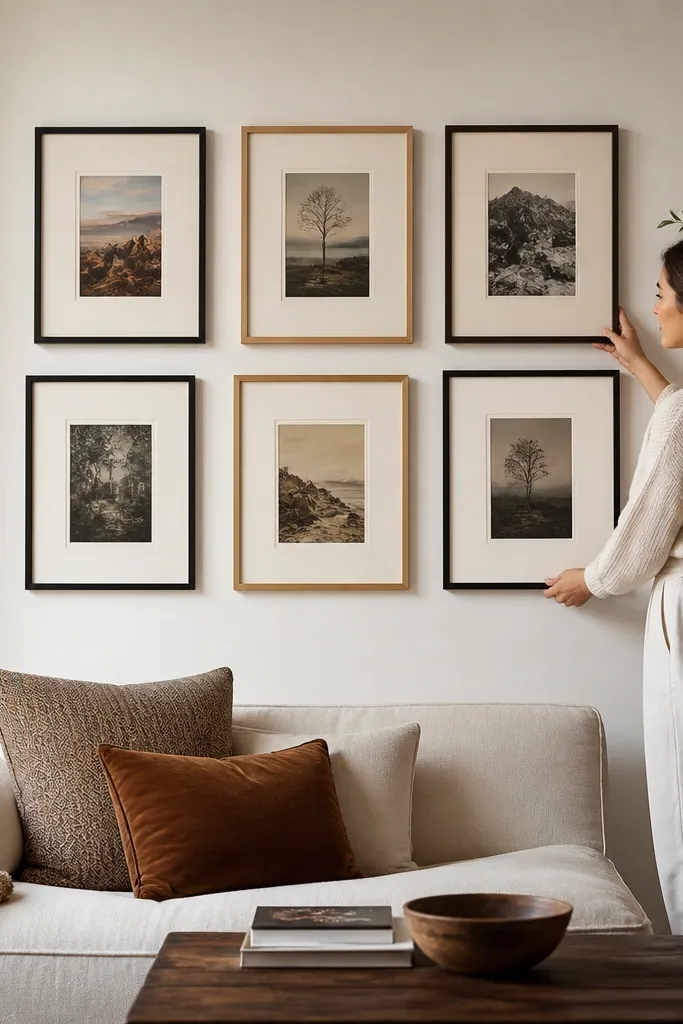
This is the vintage cheat code: let the frames vary, but keep the mats identical. When mat width stays consistent, the wall looks intentionally collected instead of thrown together. Choose one mat color like cream or warm white, and keep the same opening size logic across frames so the artwork sits at the same visual depth. This approach gives you the charm of thrifted frames without the common problem of uneven artwork placement. It’s ideal for people who already own frames and want a plan that makes them look coordinated.
Editor's noteIf you’re cutting mats yourself, use a sharp mat cutter and measure twice — tiny mat differences show immediately in a vintage wall.
Start by measuring your frame openings and selecting a mat kit style that matches the largest opening. Buy or cut mats so every frame has the same mat width, like 2 inches. Arrange 6 to 8 frames into a rectangle cluster, keeping 2.5 to 3 inches between frame edges. Tape templates on the wall, then mark each frame’s mounting points through the hardware. Hang from the top-left corner downward to keep spacing consistent and prevent drift.
Skip thisDon’t vary mat width — that’s what turns “collected” into “inconsistent.”
7. Sculptural Shadowbox Letters
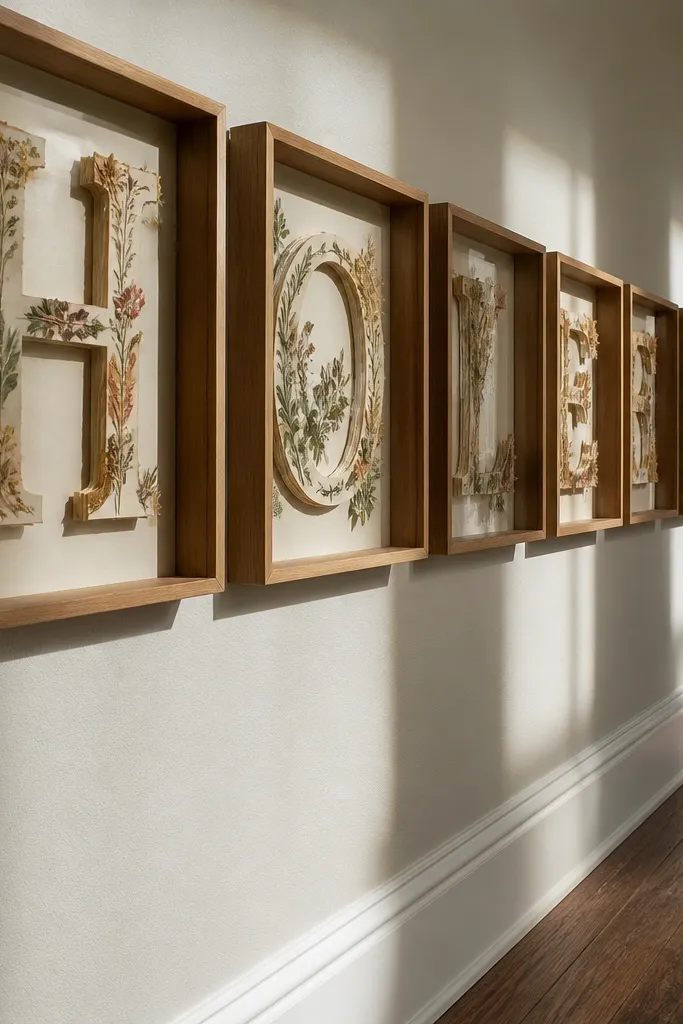
Shadowbox letters add depth, which is what makes vintage gallery walls feel more curated than flat prints. Use letterforms, botanical fragments, or small paper ephemera inside each shadowbox so the wall has texture you can actually see from different angles. Keep the shadowbox frames in one finish, like natural wood or black, and use consistent backing paper color. This style is excellent for offices, bedrooms, and entryways because it feels like decor, not just wall art. Photographically, shadowboxes catch side light and create that “antique cabinet” look.
Editor's noteUse acid-free mounting putty or archival tape so paper pieces stay flat and don’t warp over time.
Choose 2 to 3 shadowbox frames with similar depth, around 1.5 to 2 inches. Cut backing paper in a warm tone like parchment and mount letterforms with acid-free adhesive so they don’t discolor. Add small items like dried seed pods or vintage-style labels, but keep them centered so the boxes don’t look cluttered. Arrange the boxes in a vertical line or a shallow triangle with 3 inches between frame edges. Hang using the built-in hanging hardware and confirm the boxes are level before loading contents permanently.
Skip thisSkip random-sized objects floating everywhere; shadowboxes need a clear focal arrangement.
8. Classic Black-and-White Map Stack
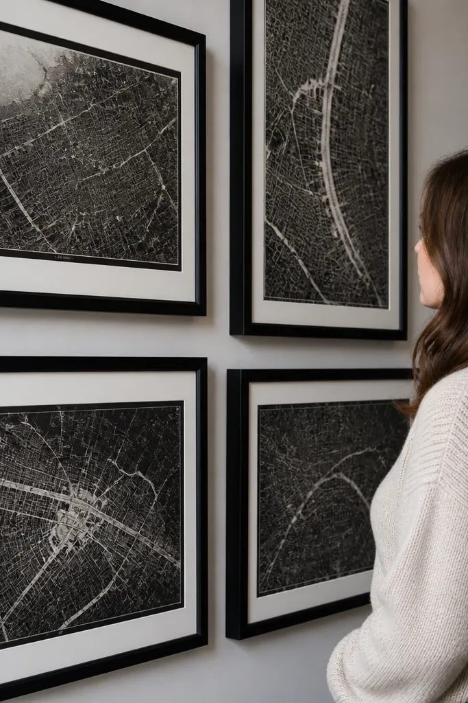
Maps look vintage because they’re graphic, detailed, and naturally monochrome when you pick the right prints. Keep everything black-and-white or near-black and avoid colored maps; color pushes it toward “travel poster” instead of vintage. Use frames that are narrow and consistent, with a simple profile, and set the maps at slightly different heights to create motion. This layout reads clean from a distance, which is what you want in a timeless gallery wall. It’s perfect for home offices, hallways, and behind a desk where you want visual interest without chaos.
Pick 5 frames with consistent frame width, like 1 inch black frames, and choose map prints that fit standard sizes like 8x10 and 11x14. Use no mats or a thin mat, around 0.5 to 1 inch, so the map lines stay bold. Arrange them in a stacked cluster with 2.5 inches between frame edges, keeping the middle map at eye level. Trace each frame to create templates and hang using a level so the stagger still looks deliberate. Insert prints and check for glare if you use glass — matte acrylic prevents reflections.
If the map print curls, mist the back lightly and press it under a book overnight before framing.
Don’t mix map scales with huge typography blocks unless you keep the spacing larger to separate the visual weight.
9. Cream Frames with Linen-Look Paperbacks
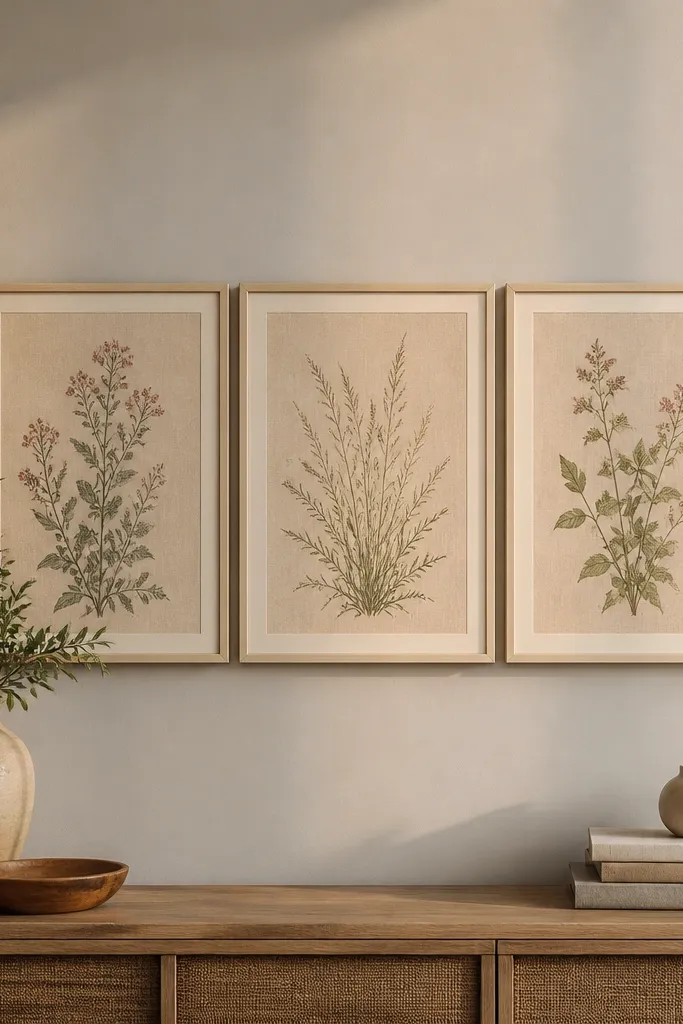
Linen-look paper inside frames makes the wall feel older because the surface texture mimics old stationery and book pages. Pair it with cream frames or off-white frames to keep the look airy but vintage. The trick is choosing linen-textured paper in warm beige, not gray — gray reads modern and cold. Arrange 3 to 5 pieces in a gentle cluster so the textures show as you move. This style is great for bedrooms and living rooms because it feels calm and tactile without needing heavy ornament.
Buy or cut linen-look paper to fit standard mat openings, then mount it in frames with a backing board. Use consistent mat colors and keep the paper centered with a 1/4 inch border around the opening. Arrange frames in a cluster with 2.5 to 3 inches between frame edges, anchored by a larger center piece. Make paper templates and tape them on the wall to confirm the cluster shape before drilling. Hang with picture hooks rated for your frame weight and verify each frame is level.
Choose frames with a matte finish, not glossy — linen texture looks better with reduced reflections.
Avoid mixing linen textures with glossy photos; the contrast makes the gallery feel mismatched.
10. Gallery Wall Over Wallpaper Pattern Break
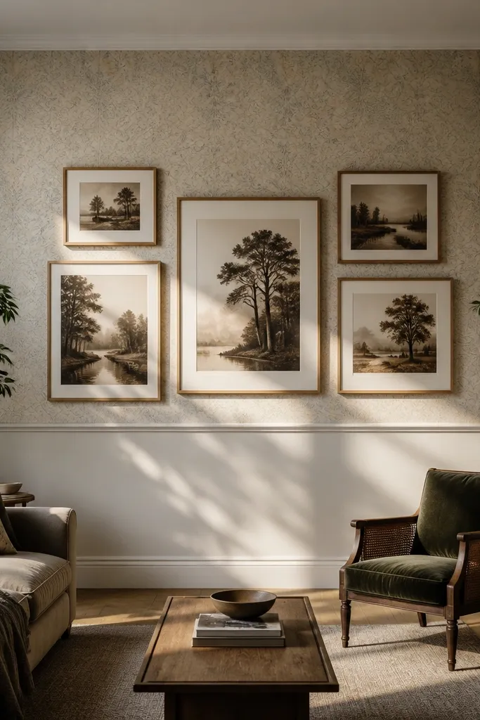
This idea uses the wall itself to make the vintage gallery feel intentional. If you have wallpaper with a pattern, place the gallery over a lighter, less busy section or a pattern break, then keep frames simple. The vintage look comes from the art and frames, while the wallpaper adds a subtle backdrop that makes the frames pop. Choose a limited palette: warm wood frames, cream mats, and muted prints. This is a strong choice for feature walls where you want the gallery to look like it belongs, not pasted on top. It also photographs beautifully because the wall texture adds depth behind the frames.
Find a wallpaper section with lower contrast and mark the rectangle area where your gallery will go. Use 6 to 8 frames with consistent mat widths and spacing of 2.5 inches between frame edges. Arrange in a rectangle cluster so the gallery’s edges align to the wallpaper’s lighter area. Tape templates first, then hang starting with the center frame at eye level. Choose picture hooks or anchors based on wall type, and press frames flush so they sit evenly against the patterned surface.
Keep mat color creamy and avoid bright white — it looks more aged against wallpaper.
Don’t place a busy gallery on a busy pattern; you’ll lose the vintage focus.
11. Corner Staircase Curve Cluster
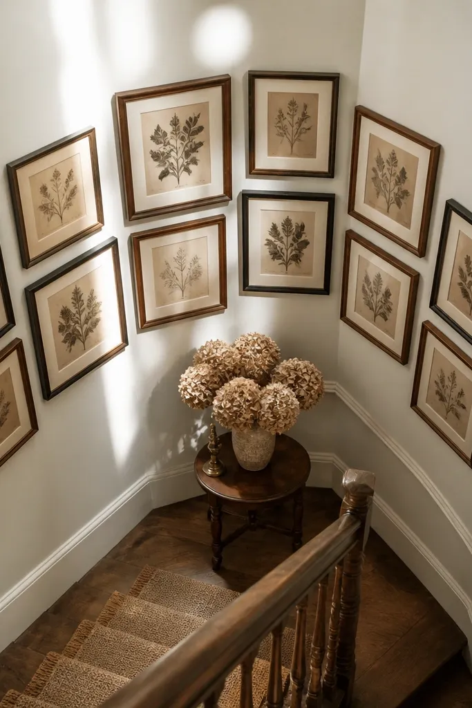
Corners can look awkward, but a curved cluster fixes that by guiding the eye around the corner. A vintage gallery wall looks best when it follows a shape, not a straight line that fights the geometry. Use frames in one finish direction — warm wood or black — and vary sizes slightly to create a gentle arc. The vintage feel comes from the art choices too: sepia photos, botanical prints, or old book pages. This is perfect for stair landings and hall corners where you want interest without blocking doors. It’s also great for photos because the frames catch light from two angles.
Plan your cluster across two walls with 5 to 7 frames total, staying about 1.5 to 2 inches off the corner so they don’t look squished. Choose one frame finish and keep mats consistent, like warm white 2-inch mats. Arrange on the floor as a curve, then transfer using craft paper templates so you can align the arc across both walls. Hang the largest frame first, then place the rest so the spacing between frame edges stays 2.5 to 3 inches. Use a level on each wall separately because corners often aren’t perfectly plumb.
Use painter’s tape to mark a “no-drill zone” near the corner trim so you don’t hit molding screws.
Skip tight spacing in corners; frames look cramped and the vintage effect disappears.
12. Oval Mirror + Photo Frames Trio
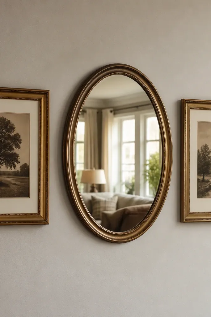
Pairing an oval mirror with photo frames makes the gallery feel more like lived-in vintage decor. The mirror brings depth and reflects light, so your vintage art looks warmer and more dimensional. Choose a mirror frame finish that matches your photo frames so the wall reads like one set. This layout is photogenic because you get reflection and framing lines that lead the eye. It’s ideal for entryways and bedrooms where you want a functional piece plus sentimental art. Keep the photo prints in sepia or muted monochrome for a consistent vintage tone.
Choose an oval mirror around 20-24 inches tall and two matching frames of similar finish. Use photo frames with consistent mat color and keep the distance between the mirror and frames about 3 inches between frame edges. Place the mirror at eye level, then position the two frames symmetrically or slightly staggered for an editorial look. Use templates to mark mounting points, then drill and anchor as needed for your wall type. Hang the mirror first so you can align the photo frames to its center line.
If your mirror reflects glare, switch to warm bulbs around 2700K so the vintage prints look softer.
Don’t mix mirror finishes with frames that are too different; the mismatch makes the set feel accidental.
13. Desk-to-Wall Timeline Frames
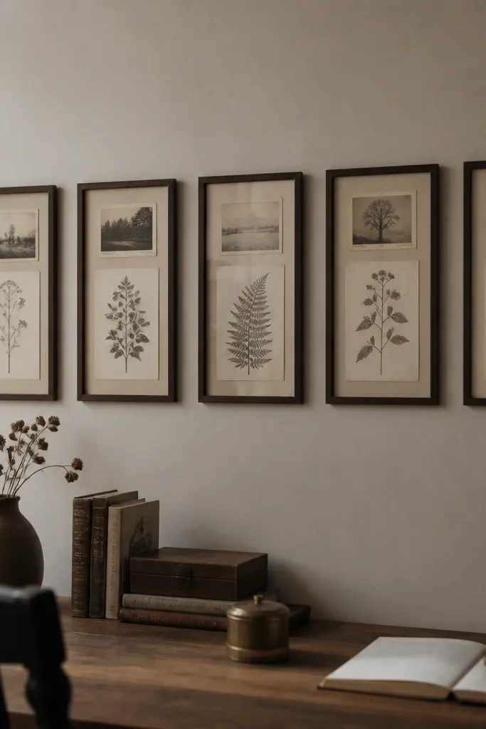
A timeline arrangement looks vintage because it mimics how old family records or letters get displayed in order. Instead of a random grid, the frames create a clear path: left to right or top to bottom. Use consistent frame finishes and keep the prints from the same theme, like old postcards, botanical pages, or monochrome sketches. This is a practical gallery wall idea because it’s easy to update as you add new “chapters.” It’s great above a desk, console, or dresser where you want the art to feel like it belongs to daily life. It also reads clean in photos because the sequence guides the eye.
Pick 3 to 4 frames with the same finish and similar mat widths, like 2 inches. Use prints that have a similar visual density so the timeline looks balanced, not heavy on one side. Arrange the frames in a line, with the center frame at eye level, then move the others up or down by 1-2 inches to create a gentle step. Keep 2.5 inches between frame edges and use templates to mark spacing before drilling. Hang the center first, then align the rest to the same baseline line.
Use the same font family across your prints when possible — even vintage-style fonts match the timeline vibe.
Avoid mixing wildly different print styles in a timeline; the sequence will feel messy instead of curated.
14. Thick Mat Frames with Antique-Map Corners
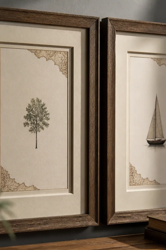
Thick mats make your gallery wall look like it’s been collected for years. The extra mat depth creates a shadow line, which reads as vintage craftsmanship rather than flat print framing. Antique-map corner designs add the “old paper” feel even if the rest of the print is simple. Keep your frames in warm wood or matte black and avoid modern thin profiles. This style looks best when you use fewer frames — 4 to 6 — because the mats are doing the heavy lifting visually. It suits living rooms and dining rooms where you want a classic, composed look.
Choose 4 to 6 frames with thick profiles and consistent mat sizes, like 2.5 to 3.5 inches wide mats. Use prints that include antique-style map details in the corners or borders so the mat shadow looks intentional. Arrange as a rectangle cluster with 2.5 to 3 inches between frame edges. Make templates from craft paper, then tape and measure the cluster height so the center sits at 57-60 inches. Hang from the center outward and tighten each frame evenly to keep mat alignment straight.
Use anti-glare glass or matte acrylic to keep thick mats from catching reflections.
Don’t use thick mats with cheap, wobbly frames; the whole look turns flimsy.
15. Red Brick Warmth with Terracotta Frame Pops
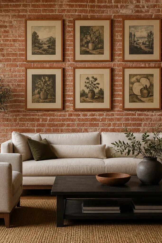
Terracotta frame accents make a vintage gallery wall feel grounded. If your space has warm tones like brick, terracotta, or rust-colored textiles, this is the easiest way to match the room without painting anything. Choose vintage prints with muted earth tones so they don’t fight the frames. The look is timeless because the palette is warm and consistent, and the frames still feel “period” rather than trendy. This works in kitchens, dining rooms, and rooms with exposed brick or warm paint colors. It’s also a great option if you want color but still want the wall to look aged on purpose.
Pick 4 to 6 frames and keep the finish consistent except for the terracotta accents, like terracotta-painted inner edge or mat board. Use prints with sepia, clay, and faded olive colors. Keep mat color warm cream and set spacing at 2.5 inches between frame edges. Arrange as a rectangle cluster, anchor the largest frame at eye level, then build outward. Hang using level and anchors, and make sure all frames sit at the same depth from the wall so terracotta edges line up visually.
Match your terracotta shade to a nearby fabric or tile by sampling it — the wrong orange looks modern fast.
Avoid bright cherry red frames; that reads contemporary and breaks the vintage effect.
16. Antique Gold Frames with Monochrome Figures
Antique gold frames add instant vintage polish, but the wall stays timeless when the art stays monochrome. Choose prints that are black, charcoal, or off-white with simple line work or silhouettes. Arrange 3 frames in a triangle: one central, one above-left, one below-right, with equal visual weight. The gold catches light and makes the monochrome prints feel richer without adding clutter. This style is great for living rooms and bedrooms where you want a little drama but still want the wall to feel classic. It also photographs well because gold frames create a strong outline against neutral walls.
Editor's noteIf your gold looks too shiny, lightly sand the frame edges with fine grit to soften the highlights before hanging.
Choose 3 frames with the same antique gold finish and similar widths, around 1 to 1.5 inches. Use monochrome prints sized to fit, like 8x10 and 11x14, and keep mat color off-white with a 1.5 to 2 inch width. Place the center piece at eye level and angle the other two positions so the triangle’s edges are balanced with 3 inches between frame edges. Tape templates, then hang center first using a level. Install the other two frames aligning to the center’s baseline line for consistent height.
Skip thisDon’t add colorful art to gold frames — it shifts the whole wall into “holiday decor” territory.
17. Vintage Book Page Frames with Clear Glass Texture
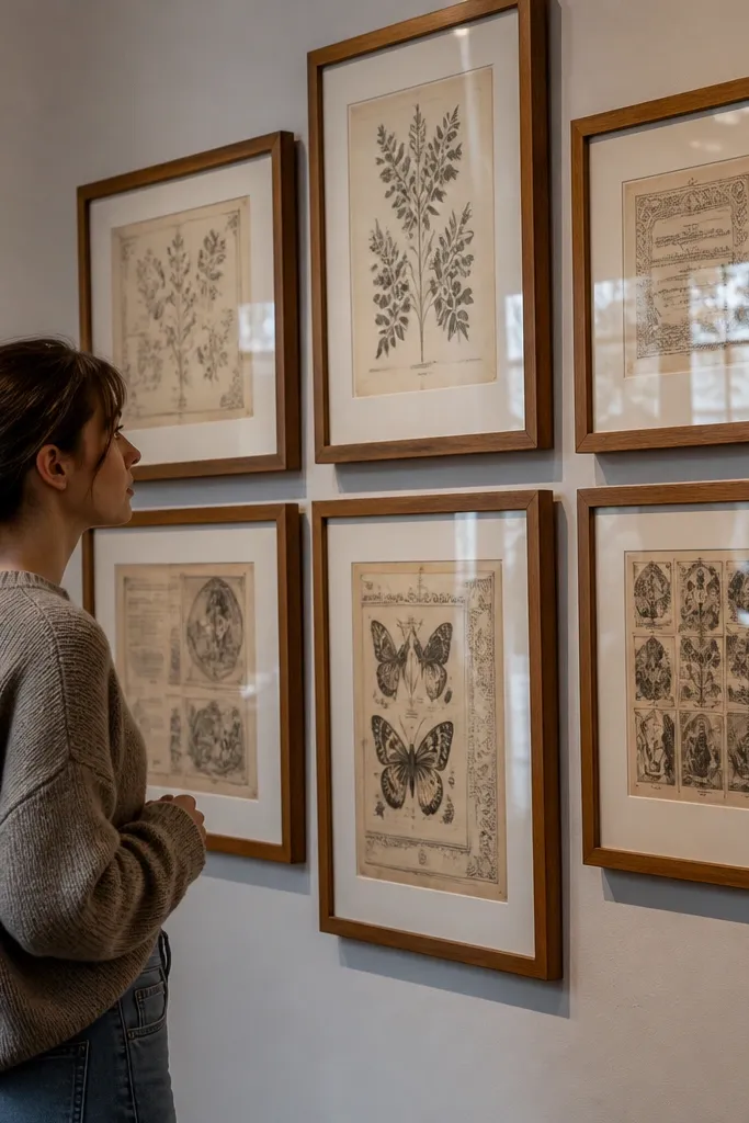
Using actual book page designs inside frames creates a vintage gallery wall that feels like paper ephemera, not prints. The look is timeless because text blocks and aged paper tones naturally feel old. Keep the pages in a consistent size and choose frames with off-white mats so the page edges look clean and intentional. This layout works best when you use 4 frames, spaced evenly, so it reads as a set. It’s especially good for reading rooms and bedrooms where you want a warm, literary vibe. Photographically, the text detail gives the wall depth.
Choose 4 frames in the same finish, like light wood, and keep mat sizes consistent with a 2-inch off-white mat. Cut book page reproductions to fit the opening, leaving a small border so the page edge doesn’t get trimmed unevenly. Arrange in a 2x2 rectangle with 2.5 to 3 inches between frame edges. Tape templates and mark mounting points, then hang the top row first. Insert pages and secure backing so the paper stays flat behind glass.
Use archival tape on the back corners so the page doesn’t shift when you insert it.
Avoid using glossy glass with dense text — reflections can wash out the vintage lettering.
18. Mixed Sizes, One Consistent Background Color
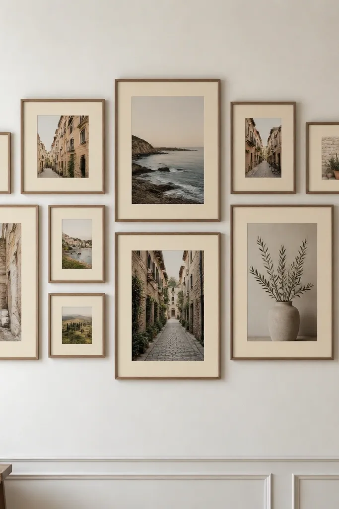
This is how you get a vintage look even when your frames are all different. The secret is one consistent background color across every mat and print backing — warm cream or soft gray. When the background stays the same, your eye reads the wall as one collection, not a pile of frames. Mix sizes for visual rhythm, but keep the “visual field” consistent so it still feels timeless. This layout is great for living rooms because it can scale from small to large without losing cohesion. It’s also forgiving if you’re mixing prints you already own.
Pick a mat color first, like warm cream, and choose 6 to 9 frames with varied sizes that can all share the same mat width, around 2 inches. Use prints that have similar contrast and warm undertones, even if the subject changes. Arrange as a rectangle cluster with a clear center frame at eye level. Keep 2.5 inches between frame edges and use templates to map the exact spacing. Hang the center and corners first, then fill in the middle frames to lock the shape.
If you’re using different print sizes, trim or center them so the main subject sits at the same height in each frame.
Don’t let one frame have a much darker mat — it becomes the focal point and wrecks the vintage balance.
19. Tonal Blue Frames with Faded Prints
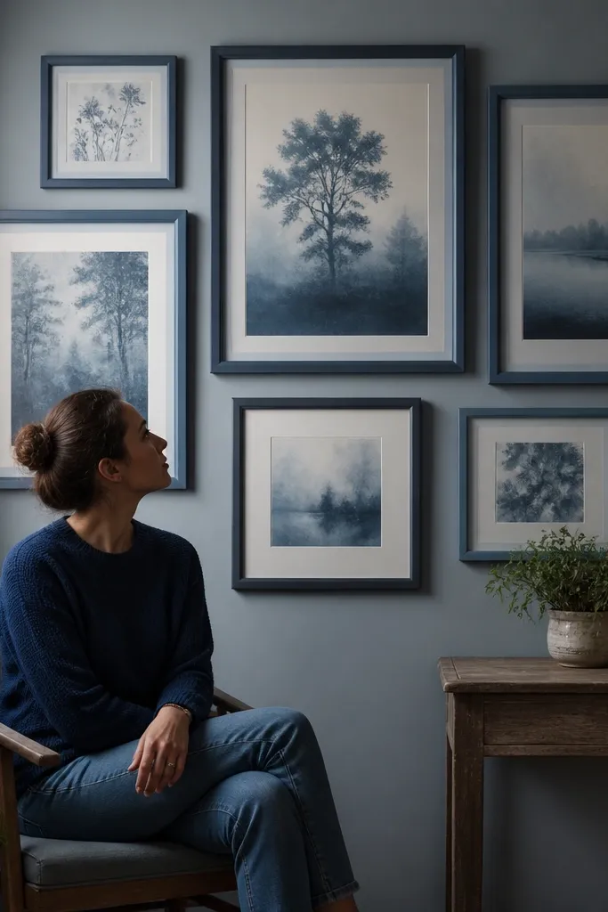
Tonal blue frames give you a vintage feel without leaning on gold or heavy wood. The look comes from fading: choose prints that are washed, muted, and slightly desaturated, with blues that echo the frame tones. Keep the blue family limited — think dusty navy, faded indigo, and powder blue — so it stays cohesive. This wall is visually striking because the cool palette looks intentional next to warm lighting. It’s a great choice for bedrooms, bathrooms, and any room with blue accents. The vintage vibe comes from the faded print effect, not from random decor.
Choose 5 frames in tonal blue finishes and keep mat color white or warm cream with consistent width, like 2 inches. Select prints with faded blue elements and similar contrast so the wall doesn’t look uneven. Arrange in a loose grid that keeps 2.5 to 3 inches between frame edges. Place the largest frame at eye level and align the top edges to create a clean upper line. Tape templates first, then hang center, then build outward while checking spacing with a ruler.
Use warm 2700K bulbs if the wall looks gray — tonal blues turn more vintage under warmer light.
Avoid bright saturated blues; they look like modern prints even in vintage frames.
20. Centerpiece Portrait with Symmetrical Side Frames
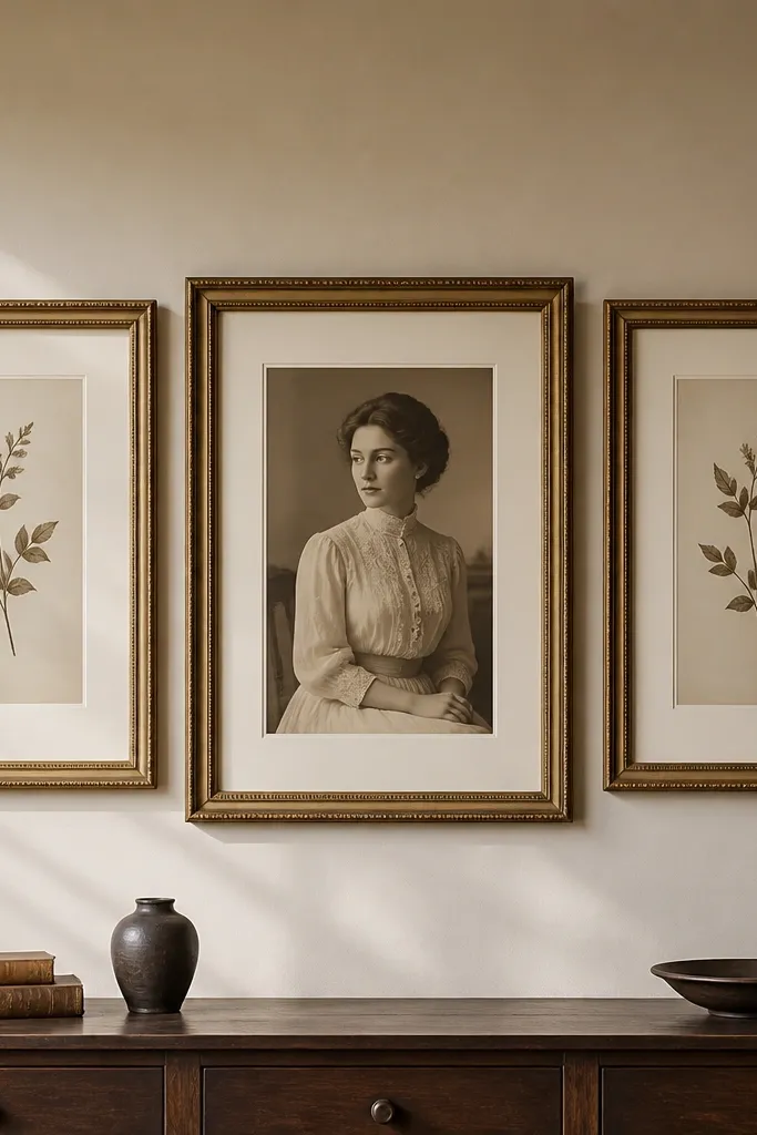
A centerpiece portrait with symmetrical side frames is timeless because it’s balanced and easy to read. The vintage feel comes from the portrait style: sepia or monochrome portraits, old studio-style photos, or vintage illustration prints. Symmetry prevents the wall from looking chaotic, which is the most common problem with gallery walls in real homes. This layout works especially well if you want the gallery to feel like a “moment” rather than a scatter of art. It’s ideal for above a sofa, a console table, or a fireplace mantle where you want a clear focal point.
Pick one large centerpiece frame, like 16x20 inches, and two smaller matching frames on the left and right, like 11x14. Use consistent mat color and mat width, around 2 inches, so everything looks collected. Center the large frame at eye level midpoint, then place the side frames with 3 inches between frame edges. Use tape templates to mark the exact positions and keep symmetry — measure distance from the centerline to each side frame edge. Hang the center first, then align the two sides to the same height and spacing.
If the wall is wide, increase spacing to 3.5 inches between frames so the centerpiece doesn’t feel crowded.
Don’t use asymmetric side frame sizes with symmetry — it breaks the balanced vintage look.



