
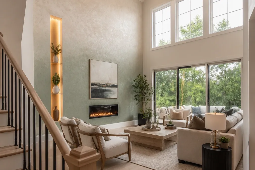
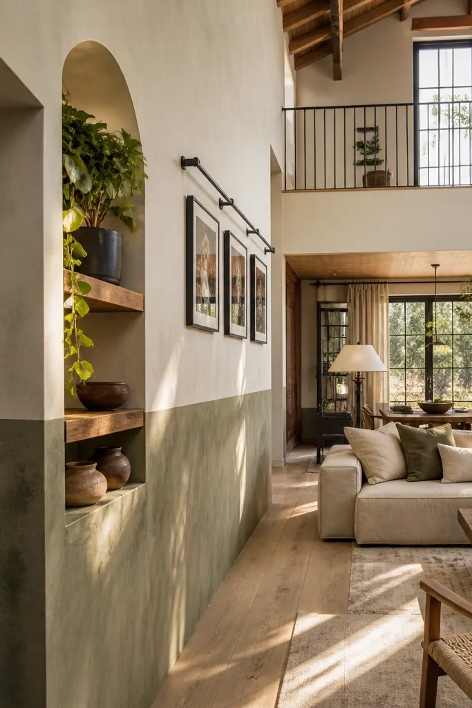
1. Oversized framed paint gradient (top-to-bottom mood wall)
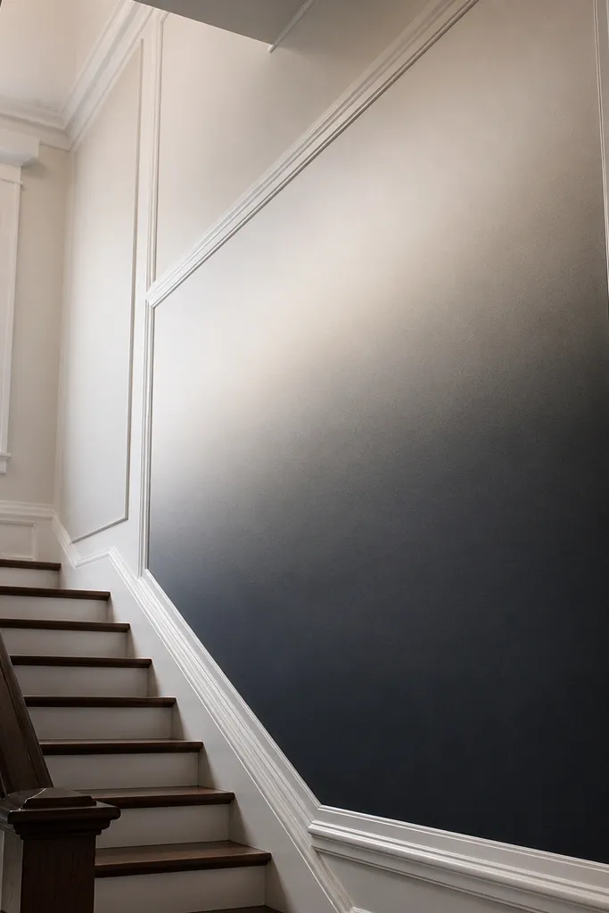
This is the fastest way to make a double-height wall feel designed without wallpaper seams or heavy build-out. The gradient does the work of depth: darker at the bottom grounds the room, and lighter higher up keeps the space from feeling heavy. The “expensive” part is the frame — crisp trim lines make the gradient look like a custom mural panel instead of a DIY experiment. Use it when you want a themed accent wall that coordinates with almost any furniture color because you’re controlling value (light vs dark) more than guessing at a specific pattern.
Start by marking a rectangle on the wall with painter’s tape using a tape measure and a level. Build a frame with 1x2 MDF or PVC trim strips (about 3/4 in to 1 in wide), miter or butt them cleanly, and caulk the edges so you don’t see gaps when you paint. Prime the whole wall and trim, then paint the base color and mix a lighter version for the top third. Apply the gradient with a roller for broad strokes, then blend the transition with a dry brush or foam roller in light passes. Let it cure, then paint the trim separately for a sharp border.
Use a satin finish on the gradient and a semi-gloss on the trim so the border reads in daylight.
Don’t freehand the fade — mark the transition zones with tape so the blend stays smooth.
2. Vertical wood fluting with a shadow-gap border
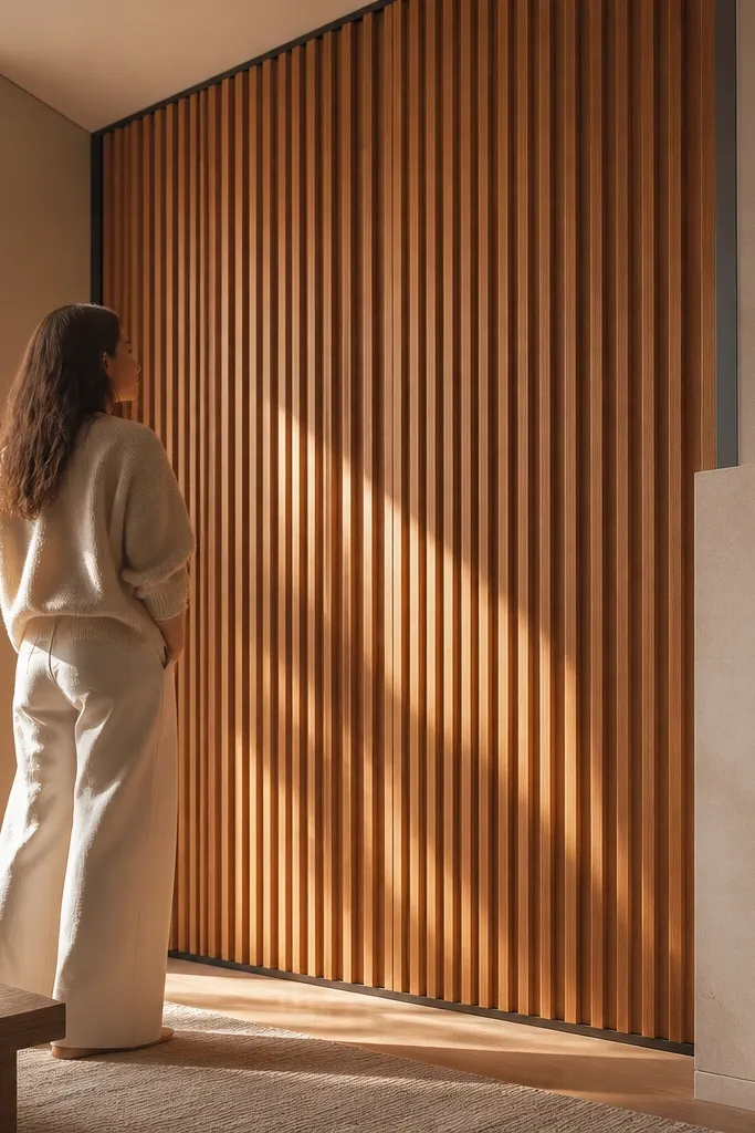
Vertical fluting gives your double-height wall instant height and rhythm. The shadow gap — that thin dark line between fluting and its border — makes the whole thing look sharper than flat battens, especially from the bottom of the room where perspective exaggerates depth. This works best for modern, Scandinavian, and “quiet luxury” styles because it’s pattern without loud color. It also hides small wall imperfections better than perfectly smooth paint because the slat lines break up visual noise.
Find straight studs or install a horizontal ledger first so your fluting doesn’t drift. Mark your fluting width and spacing on paper before you cut — a clean starting point is 1.25 in slats with 0.5 in gaps for a bold look. Install a perimeter border from 1x3 or 1x2 trim, then add a thin spacer strip (like 1/4 in) so you create a consistent shadow gap between the fluting and the border. Cut and install the fluting boards with glue plus finish nails, keeping spacing identical across the wall. Sand edges lightly, then prime and paint the slats and border in two colors — white for slats and a slightly darker off-white for the border reads extra crisp.
Pre-paint the slats before installation if you want fewer brush marks and faster drying time.
Don’t rely on the wall being straight — if you start crooked, every slat will look wrong.
3. Limewash look with a two-tone "themed" band
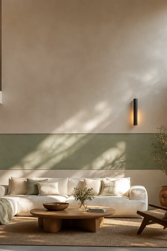
Patch and sand the wall, then apply a tinted base coat so the final texture doesn’t look blotchy. Mix or buy a limewash-like paint product and apply it with a wide brush and a stippling motion, working in small sections so the texture stays consistent. Once the base texture cures, tape a horizontal band across the wall at a height that visually balances the room — a good starting target is around the eye line of the main seating, then adjust after you stand back. Paint the band a second shade (usually one step lighter or darker) with the same matte sheen, and remove tape carefully to keep edges clean. Seal lightly if your product calls for it, since some limewash looks can scuff without a topcoat.
Limewash-style texture is the cheat code for a photogenic accent wall because it catches light in tiny variations. Pair that with a single two-tone band — like a lighter “horizon” strip across the middle — and you get an obvious theme without repeating patterns up the entire height. This fits rooms that already have natural textures: linen curtains, oak furniture, travertine, or soft matte finishes. It also forgives small bumps better than smooth paint, so your wall looks better even when your sanding isn’t perfect.
Skip thisDon’t use high-gloss over texture — it will look patchy and cheap in photos.
Editor's noteTest both shades on a 2 ft section and photograph it in daylight — limewash reads differently than flat paint.
4. 3D panel grid using MDF squares and shadow lines
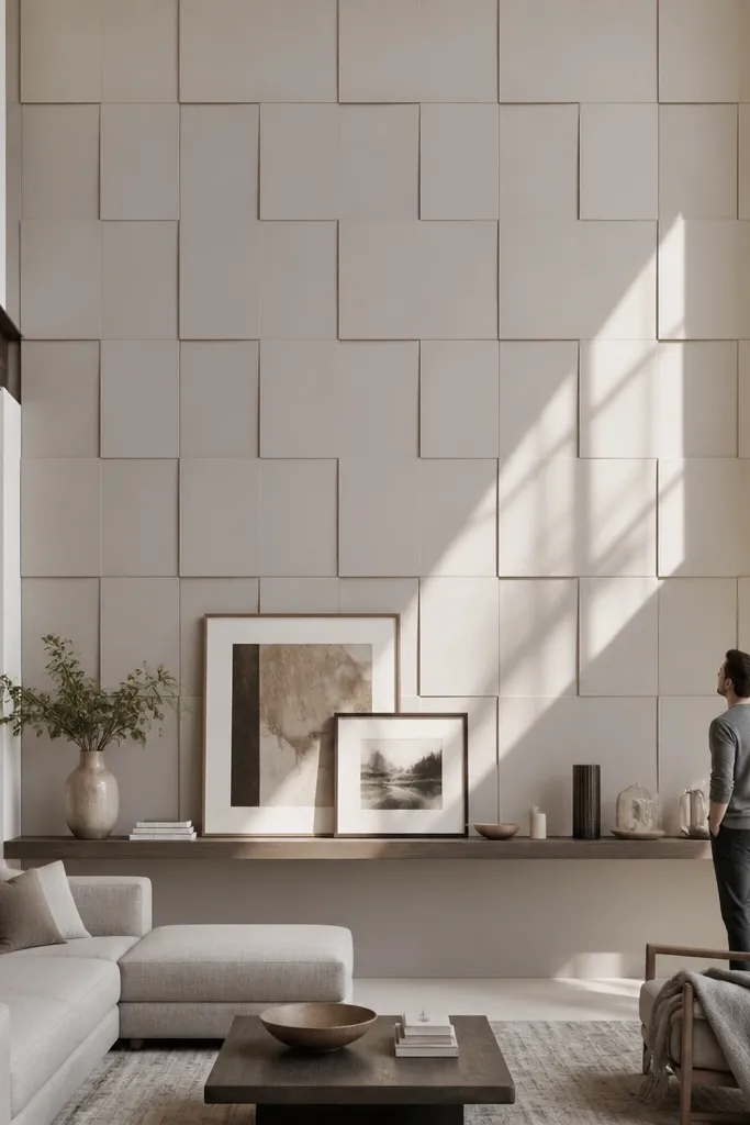
Start with a layout grid on the wall using painter’s tape and a level. Choose panel sizes that match the wall height — for double-height rooms, 12 in to 18 in squares look right; tiny squares look fussy. Install a perimeter frame first, then attach a backing rail so every panel edge lands on solid support. Cut MDF squares, prime them, then glue and nail them onto the wall with spacers (like 1/8 in to 1/4 in) to create consistent shadow gaps. Fill nail holes, sand edges, then paint the panels and walls in two shades for contrast — for example, warm white panels and soft greige wall.
A 3D panel grid turns a plain wall into a themed “architecture” feature. Squares give you a clean, modern rhythm that looks intentional in both wide shots and close-ups. The shadow lines between panels are what sell it — they create depth even when you use neutral colors. This is a great option if you want a theme that works with furniture patterns because the wall has structure, not imagery. Build it when you want a durable wall that can be repainted without losing the 3D effect.
Skip thisDon’t skip the layout — without a grid plan, the pattern will drift and look off immediately.
Editor's noteUse pre-primed MDF and sand the edges lightly before paint so the finish looks smooth at a distance.
5. Textured wallpaper with a vertical "spine" and framed top/bottom
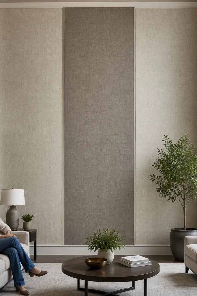
Wallpaper in a double-height room can look incredible, but only if you control where the seams land and how the eye travels. The clean approach is a vertical “spine” panel in the center — a strip of bolder pattern or texture — with simpler filler areas around it. Add framed top and bottom borders so the wallpaper looks like a composed panel, not a roll that ran out. This works for themed styles like botanical, art deco, or modern geometric because you’re using the theme as a vertical focal track.
Measure the wall and pick wallpaper that has clear repeat markings so you can align the pattern at the center. Plan your centerline first: snap a vertical line, then hang the first strip so the spine lands exactly there. Use a paste or prep method matched to the wallpaper type, and smooth with a plastic smoothing tool to avoid bubbles in tall panels. Install top and bottom trim borders after the wallpaper is dry — 1x3 trim is a good scale — and caulk the edges so the pattern reads flat and finished. Paint the trim to match your room palette, keeping the wallpaper the star.
If you’re nervous about seams, choose a wallpaper with vinyl backing and a straight-line pattern so alignment is forgiving.
Don’t place the seam in the center of the spine — it will look like a mistake in every photo.
6. Stone-look microcement strip wall with a "gallery" border
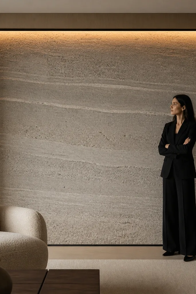
Protect the room with painter’s plastic and remove outlet covers if you’re working near them. Apply a bonding primer made for cementitious coatings, then roll or trowel the first coat of stone-look microcement in thin passes. Work in sections that fit your framed zone, because thick builds can dry unevenly. Tape your border lines and install a trim frame before finishing top coats, then apply the final thin layer and smooth with a steel trowel for a consistent sheen. After curing, seal with the product’s recommended topcoat so the finish wipes clean and doesn’t stain.
Microcement-style texture gives you the stone look without the weight and cost of real tile, and it photographs like a luxury finish. The trick for double-height rooms is to limit the texture area to a framed zone, then keep the rest of the wall calmer so the theme feels intentional. A “gallery” border — think narrow trim and a slightly darker outline — makes the textured section read like an artwork panel. This is ideal if your room has hard surfaces like concrete floors, black metal, or sleek cabinetry and you want one wall to feel tactile and grounded.
Skip thisDon’t skip primer — poor adhesion is the main reason cement-style finishes fail on painted drywall.
Editor's noteUse a bright, directional light when you’re smoothing — it reveals trowel lines so you can fix them before the material sets.



