
1. Coastal Linen Blue Zone Closet
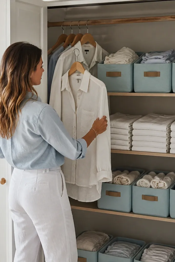
This theme works because coastal style is about lightness and repetition. Use white and sea-glass blue storage so every folded item looks like it belongs, even when the closet is only half full. You’ll build a “blue zone” for daily tops and a “white zone” for bottoms, then keep both zones at matching shelf heights so the visual rhythm stays clean. The look is airy, but it’s also practical: bins hide clutter while still keeping colors readable. This project is best for bedrooms that already lean bright, with white walls or light wood furniture.
Start by measuring your closet shelves and choosing bins that match the shelf depth. Then label two bin colors only: sea-glass blue for daily tops and white for bottoms, using simple black vinyl labels. Finally, fold using a consistent method like the rectangle fold and stack by zone so each stack is the same height from front to back. Add white fabric shelf liners or contact paper to make the bottom of the closet look intentional, not stained or dusty.
Buy bins with flat fronts, not mesh — they photograph cleaner and keep dust off folded stacks.
Don’t add a third “random” color bin. Two colors keeps the theme readable.
2. Black-and-Cream Capsule Closet Grid
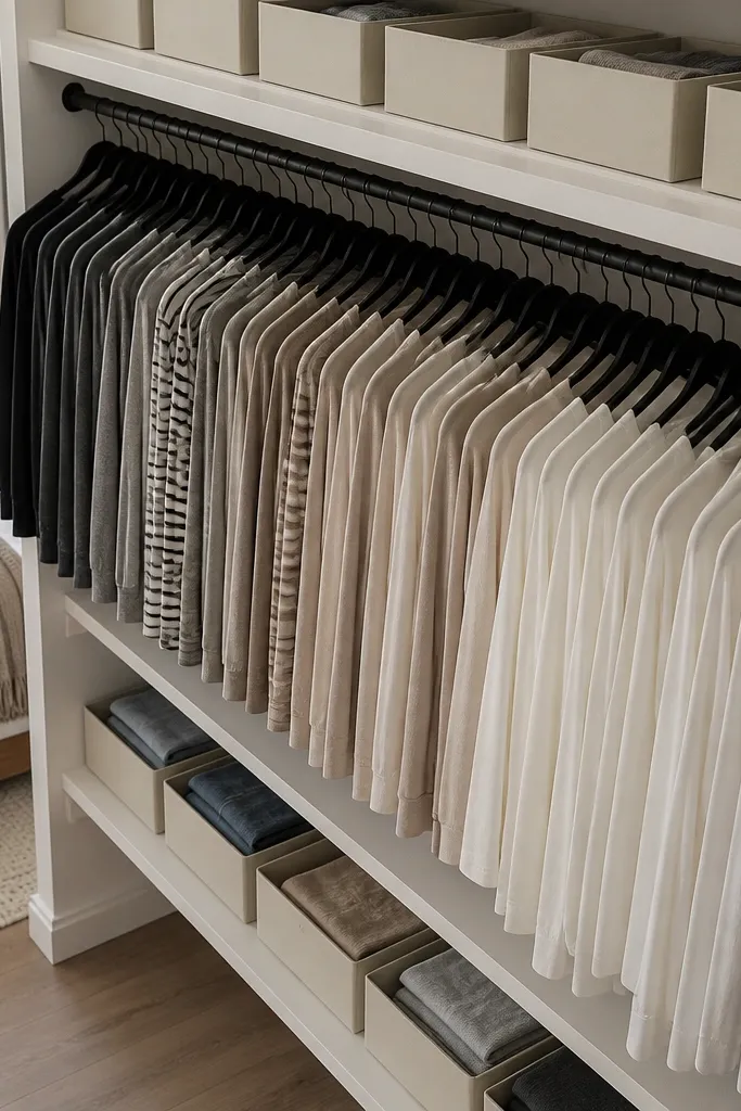
If your closet feels visually loud, this theme calms it down fast. Black-and-cream works because it limits contrast and forces everything into a tight grid. Hang all tops on black hangers, then use cream bins for categories like tees, sweaters, and activewear. The grid look is what makes it photogenic: items sit at the same spacing and the closet reads orderly even when you open it quickly. This is the best theme for people who love dark clothes but hate how clutter looks next to bright laundry piles.
Swap to matching black hangers across the entire closet so your first visual impression is uniform. Install a shelf divider or use shelf bins to create a grid layout that keeps stacks separated by category. Choose cream bins in two sizes only, then label them with a single font style and keep label placement consistent on every bin. Fold items into rectangles and stack to the same height, using a small spacer book or folded cardboard as a height guide while you build the stacks.
Editor's noteUse a label template with the same character count style so short labels don’t look “off” next to long ones.
Skip thisSkip clear plastic bins if you hate seeing lint and label glare — they look messy in photos.
3. Vintage Rose Boutique Closet
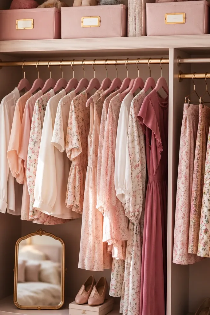
This theme is for closets that include dresses, blouses, and “going-out” pieces you want to see. Dusty rose + warm metallic labels makes the closet feel like a mini boutique, not a storage room. Keep your hanging section styled like a storefront: dresses and blouses together, then a separate section for skirts and trousers. The key is the finish — matte bins and warm labels look softer than glossy plastic. It’s also forgiving: if a piece is slightly wrinkled, the warm palette still looks intentional.
Pick one rose tone and one metallic accent, then buy matching storage bins in that rose. Add warm-toned labels using gold vinyl or gold foil label stickers on white backing so text stays readable. Arrange hanging items by length: shorter tops on the front rail, longer dresses toward the back so the closet doesn’t look tangled. For folded items, use rose bins with a fabric shelf liner to hide the “closet floor” look and keep the theme cohesive.
Editor's noteUse matching velvet or felt hangers for blouses and dresses — they keep fabric from slipping and make the closet look luxe.
Skip thisDon’t mix cool gray labels with warm rose bins. The palette clash kills the boutique vibe.
4. Monochrome Sage and Wood Shelves
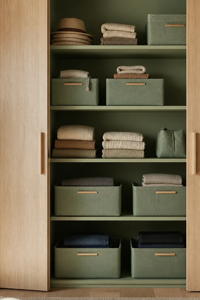
Sage and wood is one of the easiest “designed” looks because it blends storage with the room’s materials. The closet door looks calm, and the theme stays attractive even if you swap in different outfits. Use sage bins for folded categories and keep hanging hardware minimal and consistent. The wood tone is important: if your closet has dark shelves, use peel-and-stick wood-look contact paper so the whole space reads warm. This is a great theme for bedrooms that already have plants, rattan accents, or light oak furniture.
Start by covering shelf panels with wood-look contact paper, cutting edges cleanly with a craft knife. Choose sage bins sized to fit your shelves without leaving big gaps. Label only the bins you can see from the closet opening, and keep the label placement at the top-right corner of every bin. Fold into even rectangles, then stack so the front edge lines up across all bins.
If the closet has a wire shelf, add a thin foam board under bins so the look stays solid and doesn’t show wire lines.
Don’t use bright neon green. Sage needs muted tones to look calm, not loud.
5. Rainbow by Category, Not by Chaos
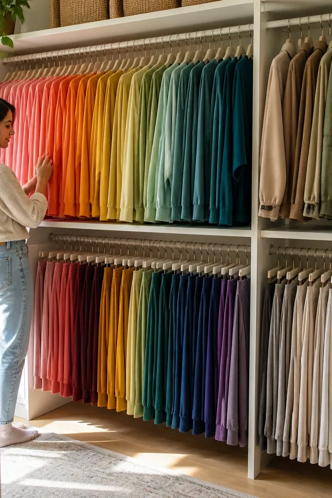
This theme is photogenic because color is the design. But doing it “by chaos” turns into a messy rainbow. The smart version is rainbow by category: tops go in one color order, bottoms in another, and jackets in a separate rail. You get the satisfaction of color grading without losing your ability to find things fast. Use bins with the same shape and size so the rainbow reads like a planned display, not mismatched storage. This works best if you own enough pieces across colors to fill each bin.
Choose bins in the same size and shape, then order colors by ROYGBIV (skipping what you don’t have). Create three zones: tops (folded), bottoms (folded), and jackets (hung). Label each bin with both color and category, like “Blue Tops” so the system stays practical. Fold tops into rectangles and keep stacks shallow enough that the color edge stays visible.
Use a small color swatch card taped inside the bin lid so you can re-sort fast after laundry.
Don’t mix rainbow bins with random sizes. Different bin heights break the graded look.
6. Hotel Minimal Closet with White Fabric Dividers
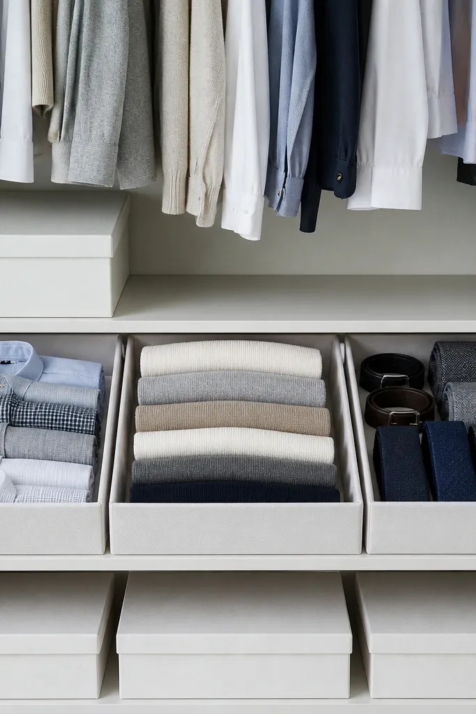
Hotel minimal is about clean lines and hidden clutter. White fabric drawers and dividers create a “fresh room” feeling, and they photograph better than open stacks because they remove visual noise. The theme works when you limit the closet to a few categories and keep everything aligned to the same rule set. If your closet is constantly messy because small items spill, this theme fixes that with fabric storage you can pull out and reset. It’s also great for shared closets where you want a uniform look across different people’s clothes.
Install fabric drawer organizers sized to your closet depth so they slide smoothly into the shelf space. Add vertical dividers so each drawer has two compartments at most. Hang clothes with the same hanger style and keep the rail spacing consistent by setting a hanger “stop” with a small hook or tape marker. Fold items into consistent rectangles and place them into drawers by category, not by color.
Use a fabric marker to label drawer fronts lightly in pencil-style ink so labels don’t look harsh in photos.
Skip open baskets. They look fine in real life but read messy on camera.
7. French Pantry Closet for Shoes and Accessories
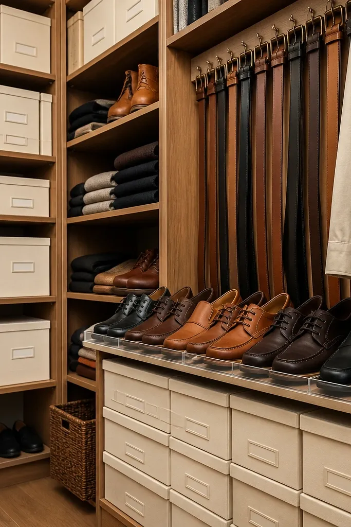
This theme turns the closet into a “back-of-house” pantry look, but for shoes and accessories. It’s especially good if your closet floor is cluttered with bags, belts, and random shoe pairs. The photogenic part is the labeling and uniform container sizes. Cream labels on matching boxes make the closet feel intentional, and the organization makes it easier to rotate seasonally. This theme doesn’t require fancy carpentry, just clean container choices and disciplined placement.
Measure your closet floor and pick one shoe storage format: stackable boxes or a low drawer system that fits your width. Choose matching boxes in a single color (cream or black) and label each with shoe type and color. For belts and scarves, add a hanging organizer with clear pockets for visibility or a small drawer with dividers for a cleaner look. Keep bags upright in one dedicated area using a bag tree or a shelf insert so they don’t collapse.
Editor's noteLabel the boxes on the side facing the closet opening so you don’t need to pull everything out to find a pair.
Skip thisDon’t store shoes in random paper bags. The texture mismatch looks chaotic next to labeled boxes.
8. Athleisure Studio Theme with Color-Coded Rails
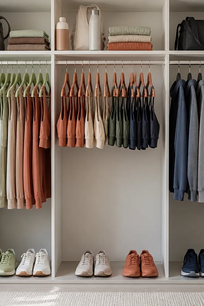
If your closet is full of workout sets, the best theme is the one that mirrors workout routines. This studio look uses muted color blocks and a strict category order: sets together, sports bras grouped, then outer layers. It’s photogenic because the closet opens like a lineup, not a pile. Use matching hangers for bras and leggings so fabric doesn’t twist visually. This theme also keeps you from re-wearing the same pieces because you can see what’s where at a glance.
Split the closet into three zones: hanging for bras and outer layers, shelves for folded sets, and a low bin area for socks and small accessories. Use bins with fabric fronts in one neutral palette, then label with category names and a color dot sticker for quick sorting. Fold sets into one rectangle stack per color family so the closet reads as coordinated blocks. Add a “rotation bin” for one-week laundry so clean items don’t mingle with the dirty pile.
Use a fabric lint roller right before styling. Athleisure shows lint and fuzz fast under closet lighting.
Skip mixing gym and everyday items in the same shelf. The theme breaks immediately.
9. Neutral Workwear Closet with Drawer-First Layout
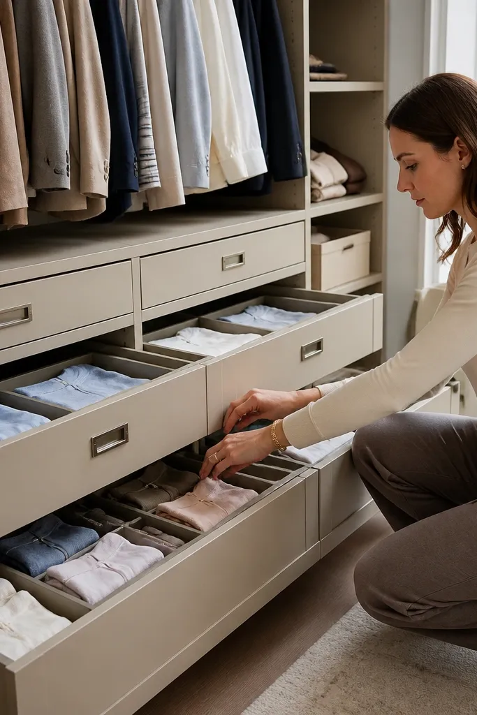
Workwear closets look best when you can grab a whole outfit in seconds. A drawer-first layout makes the theme feel organized, not just stored. Use neutral bins and drawers in beige or taupe, then label by outfit type like “Mon-Thu Shirts,” “Blouses,” “Trousers,” and “Layers.” The visual beauty comes from consistent fold sizes and drawer fronts that stay smooth. This works for people who wear office clothes most days and want the closet to look tidy even when you’re rushing.
Install shallow drawers or drawer organizers in the closet so folded items are contained. Choose two fold sizes and stick to them: one for shirts and one for trousers, so drawer contents don’t bulge. Label each drawer on the front center and keep the same label height across all drawers. Hang jackets and coats above, but keep the majority of daily items in drawers for a cleaner door view.
Use a ruler or a folding guide card to keep fold widths identical. Small differences create a messy drawer look in photos.
Don’t rely on “just stacking.” Stacks collapse and the drawer theme turns into a bulge.
10. Spice Rack Closet for Scarves and Small Layers
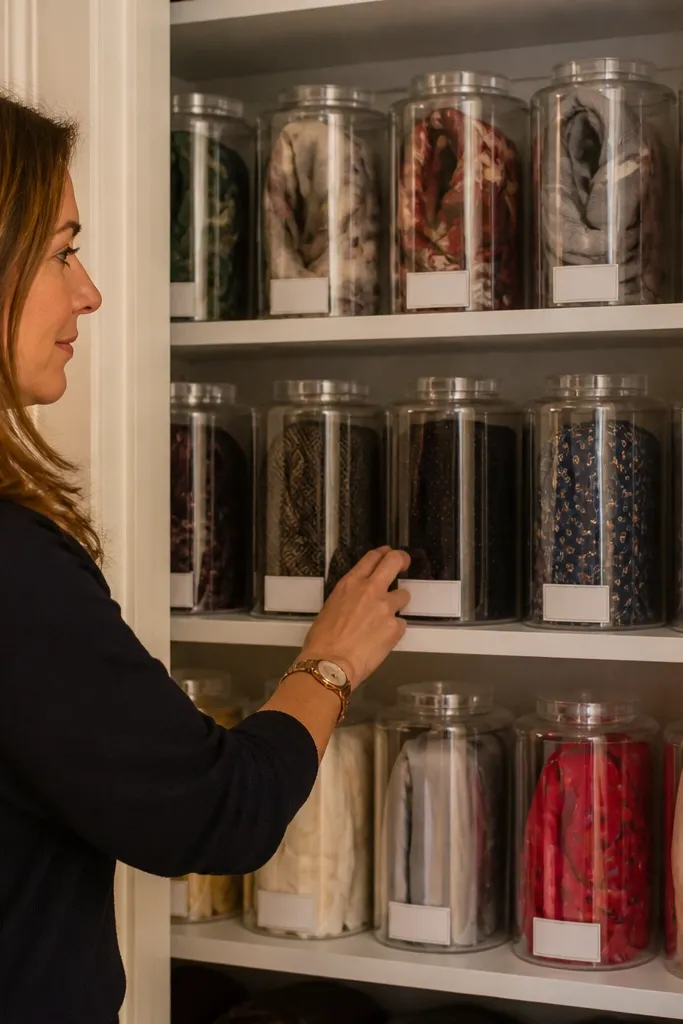
This theme is all about making small items look intentional. Scarves, ties, and lightweight wraps are perfect for a spice rack style because they’re easy to roll and they look great in rows. When you treat each roll as a “jar,” the closet door becomes a visual display. The labeling is part of the beauty: you’ll use matching label bands so the closet looks designed, not patched together. This is ideal if your scarves always end up in a tangled pile and you hate digging.
Roll scarves tightly using a consistent method: fold into a strip, roll from one end, then secure with a small paper band. Use a narrow shelf or a spice-rack insert with vertical dividers so rolls stand upright. Add label bands to each roll with a simple category name and color, like “Cream Wraps” or “Black Ties.” Keep the shelf lighting bright so the labels and colors read clearly when the closet opens.
Editor's noteUse identical paper bands (same width) so the shelf looks uniform even when scarf sizes vary.
Skip thisSkip loose rolling. Loose rolls look messy and collapse into a tangle.
11. Art Gallery Closet with a Display Shelf for Hero Pieces
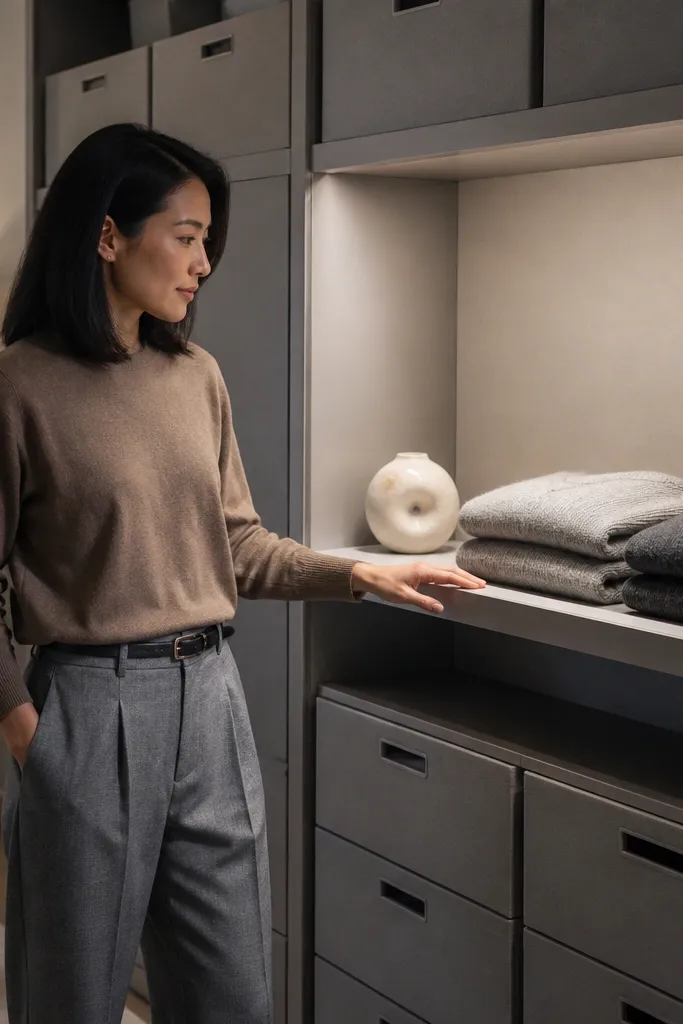
A display shelf is the fastest way to make a closet look like a room, not a storage unit. This art gallery theme uses one shelf as a “curated wall” for your best-looking folded pieces and a couple of small decor anchors. The beauty comes from negative space — you leave gaps on purpose so the items look like they’re displayed, not shoved. Keep the hero items folded the same way and placed in the same orientation. This theme works when you want the closet to look good even when you open the door for a quick outfit grab.
Choose one shelf height near eye level or slightly above and clear it completely. Cover the shelf with a solid-toned runner or contact paper in a single color, then add 3-5 hero stacks only. Fold hero pieces into identical rectangles and stack them so the front edges line up. Add two small decor anchors like a slim tray for jewelry and one small framed print or a clean ceramic object, then remove anything that doesn’t match the palette.
Editor's noteUse a level and tape marks to align the hero stacks. Straight lines make closets look expensive.
Skip thisDon’t turn the display shelf into a junk shelf. Curate small, leave space.
12. Cottage Garden Closet with Woven Baskets and Label Cards
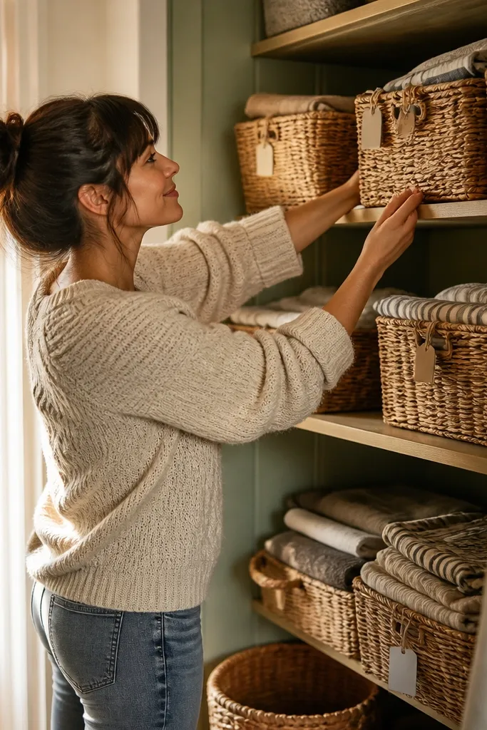
Woven baskets create texture, and cottage themes look best when texture is consistent. This closet theme uses woven baskets in one size range, plus label cards that look like little library tags. It’s visually warm and forgiving for everyday mess because baskets hide wrinkles and keep small items contained. The label cards keep it organized, so you can still find things without dumping baskets out. This works in bedrooms with warm lighting, floral bedding, or wood furniture.
Pick baskets that match in color and weave tightness, then measure shelf openings so they don’t wobble. Add label cards on the basket front using a small clip or a pocket label holder so labels don’t peel. Use hangers in a matching neutral tone for tops and dresses. Fold items into rectangles and place them into baskets by category, then keep basket contents shallow so the top edge stays neat.
Editor's noteChoose baskets with flat fronts. They make labels sit straight and look clean in photos.
Skip thisAvoid mixing basket sizes within the same shelf row. One size rule keeps the cottage look coherent.
13. Black Cherry and Brass Closet for Evening Wear
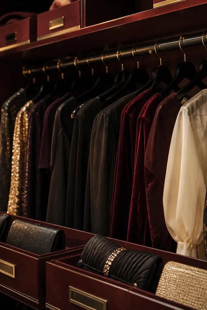
This theme is dramatic in a good way. Black cherry (deep red) storage looks luxe next to dark hangers, and brass label accents add the “evening” feel. It’s best for closets with dresses, blouses, and special-occasion pieces that you want to see without rummaging. Keep the closet door looking clean by using bins for folded items and separating hanging items by length. The color depth hides small stains and dust better than light bins, which helps the closet stay photogenic.
Use deep red bins or fabric drawers and pair them with black hangers. Add brass-look label stickers on white label cards so text stays readable. Create a hanging layout with three groups: short tops, mid-length dresses, and long items at the back rail. Fold and store only your evening-leaning knits and accessories in the themed bins so the palette doesn’t get diluted.
Editor's noteUse satin or velvet hangers for dress shirts and blouses. They catch light softly and keep fabric from sliding.
Skip thisDon’t add bright neon labels. Brass and deep red need muted, warm tones.
14. Monochrome Denim Closet with Overdyed Storage
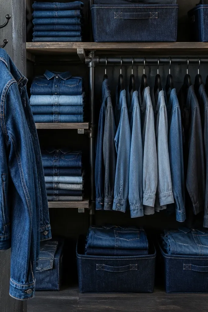
Denim looks best when the closet palette is denim-adjacent. Overdyed blues and indigo tones create a cohesive look, and the fabric texture makes everything feel styled. This theme is great for people who live in jeans, denim jackets, and chambray shirts. The closet stays photogenic because denim pieces share similar thickness and fold shape, so stacks look orderly. It also helps you separate everyday denim from dressier tops so you don’t accidentally grab the wrong outfit.
Choose indigo or dark-blue bins and keep hanger color consistent, like black or dark brown. Fold denim tops and bottoms into the same rectangle width so stacks align across shelves. Use one shelf for “daily denim” and another for “dress denim layers,” then label each shelf front. For jackets, use a dedicated hanging section and keep jacket sleeves facing the same direction for a clean door view.
If your closet has wire shelves, line them with heavy felt or thick shelf liner so denim doesn’t catch on metal and pull threads.
Skip mixed fabric bins like glossy plastic. Denim texture needs matte surfaces to look right.
15. Kids' Theme Closet with Colorful Drawer Fronts and Picture Labels
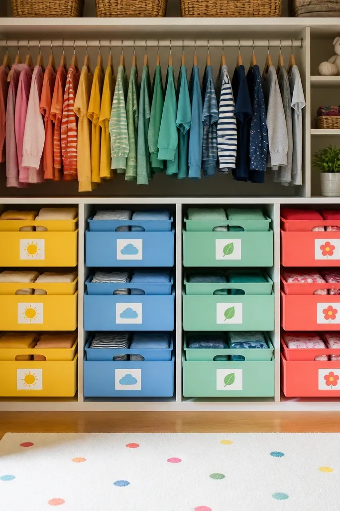
A themed closet for kids should be visual enough that they can put things away without asking. Use matching drawer fronts in 3-4 bright colors and picture labels instead of tiny text. The aesthetic part comes from uniform drawer sizes and consistent fold shapes, so the closet looks tidy even with busy little hands. Keep daily items in the lower drawers and reserve the top shelf for seasonal storage. This theme is perfect for bedrooms where mornings are chaotic and you need the closet to look organized fast.
Buy drawer organizers with the same size drawers, then assign one color per category like “Tops,” “Bottoms,” “PJs,” and “Underwear.” Add picture labels using printable label stickers or laminated icons so they survive spills. Fold clothes into rectangles that fit the drawer width, and keep drawer stacks shallow so kids can see the top item. Place the most-used categories at kid eye level and store seasonal items above with plain bins.
Use a label template with thick icons and big text. Small labels look cute but fail in real use.
Don’t overload one drawer. If it’s too full, the drawer front looks messy and the theme disappears.
16. Monochrome Blush Closet with Clear-Front Shoe Inserts
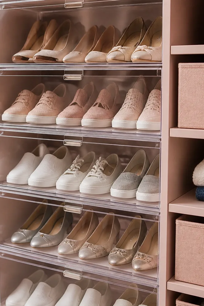
Blush is photogenic because it softens the closet palette and makes light fabrics look better. This theme pairs blush storage with clear-front shoe inserts so the shoe section looks like a curated display. The beauty is the contrast between soft blush bins and the crisp visibility of shoes, which keeps the closet looking styled even when you’re switching pairs. Use consistent label placement so the shoe area reads clean. This theme works best in closets where shoes take up floor space and you want them visible without messy clutter.
Choose blush bins or fabric drawers for clothing and add clear-front shoe organizers that fit your closet width. Label each shoe section with a simple category and pair type, like “Flats” or “Heels.” Keep the shoe inserts in one row so the closet door view stays aligned. Fold clothing using consistent rectangle folds and place the folded items into blush bins by category so the color story stays uniform.
Editor's noteWipe clear inserts with a microfiber cloth before styling. Fingerprints and dust show instantly under closet light.
Skip thisSkip mixed metallic labels. Keep everything the same color so the blush palette stays calm.
17. Rust and Oat Closet with Hanging Bag Organization
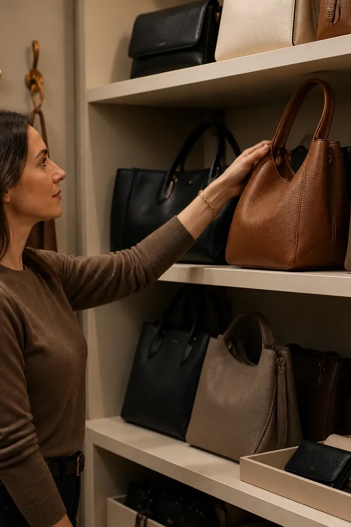
This theme is for people who carry bags daily and hate the “bag pile” look. Rust and oat tones feel warm and grounded, and they make your closet look like it belongs in a styled room. Organize handbags upright on hooks or a dedicated shelf so they don’t slouch and look messy. Then match the closet storage colors with the bag vibe — oat bins for general items and rust accents on hangers or labels. It’s practical too: you can grab the right bag fast because they’re visible and spaced.
Pick oat bins for folded categories and a rust accent color for either label stickers or hanger color. Install a row of hooks or a hanging organizer designed for bags at a consistent height. Label the bins by function, like “Everyday Tops,” “Accessories,” and “Layers,” and keep labels aligned on the front. Store only small items in the bin tops; keep the bag area clear so the door view reads clean.
Editor's noteUse one bag hook height across the row. Mixed heights create a lopsided look in photos.
Skip thisDon’t stack handbags on top of bins. The stack makes the closet look crowded immediately.
18. Totally White Closet with Wicker Pull-Out Baskets
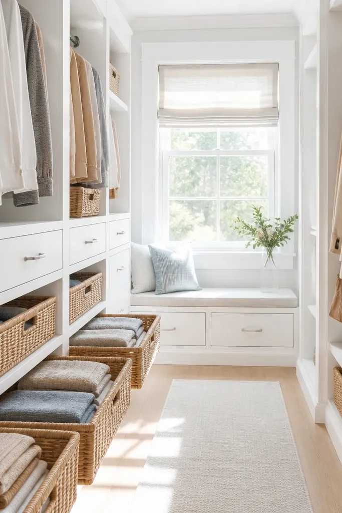
All-white closets look crisp, but they only work if you control clutter. This theme uses white surfaces and wicker pull-out baskets to hide mess while keeping a clean, bright overall look. Wicker adds texture so the closet doesn’t feel sterile. It also makes the closet more usable: you pull out one basket to grab items, then slide it back without disturbing the whole system. This theme is best for small closets where you need every inch to look tidy.
Cover shelf surfaces with white contact paper or paint-safe liner and let it dry fully before loading. Add wicker pull-out baskets sized to your shelf compartments so they slide smoothly. Fold clothes into rectangles and keep each basket filled to the same “line” level so the top stays neat. Label baskets with simple tags attached with twine or clips, and place the labels at the same corner on every basket.
Editor's noteChoose baskets with tight weave. Loose weave looks messy and catches lint in a bright white closet.
Skip thisAvoid using too many types of baskets. Two styles max looks intentional.
19. Earth Tone Capsule Closet with Shelf Labels Only
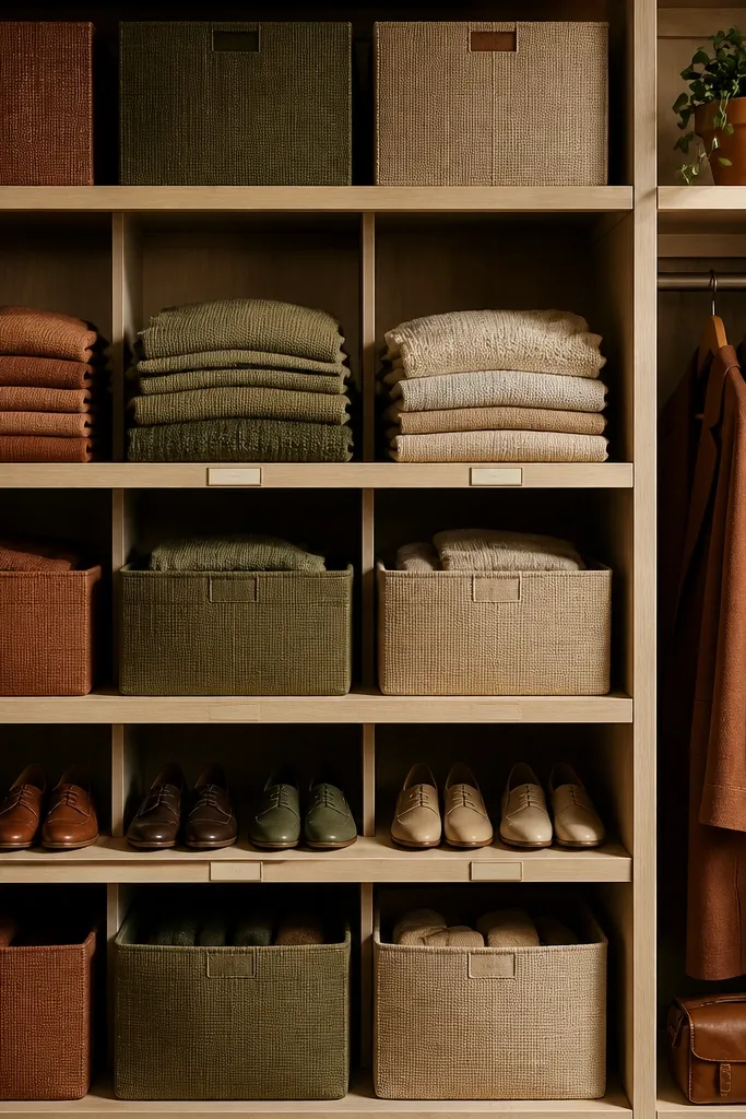
If you hate label clutter, this theme uses earth tones and relies on shelf labels. It keeps the closet looking calm by reducing text and keeping colors cohesive. Use a warm palette like terracotta, olive, and sand in bin colors, then store items by capsule group. The closet looks styled because the bins match the room’s natural textures and the stacks are consistent. This theme is for people who want a “soft” aesthetic without turning the closet into a craft project.
Pick 3 earth tones for bins and keep everything else neutral. Label only the shelf fronts with small cards, like “Tops,” “Bottoms,” “Layers,” and “Athleisure.” Fold items into identical rectangle shapes and stack them so each stack reaches the same height. Hang coats and jackets on a separate rail with uniform hangers to keep the visual line straight.
Editor's noteUse the same label background color for every shelf front so the closet looks designed, not improvised.
Skip thisSkip tiny label stickers on every bin if you want the calm look. Too many labels read busy.
20. Olive-Ombre Closet with Fabric Drawer Liners and Hidden Jewelry Trays
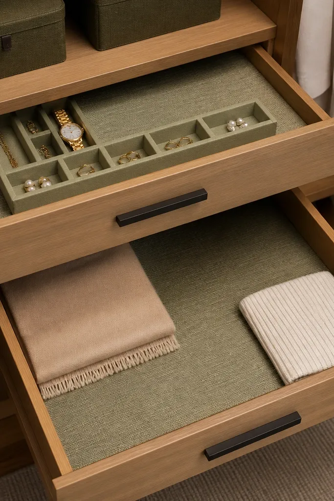
This is a themed closet organization idea for people who hate clutter showing through and still want everything easy to grab. The olive-ombre fabric liners make your drawers look intentional from across the room, while the hidden jewelry trays keep small stuff from turning into a weekly mess. You get a clean visual theme and better day-to-day function because rings, earrings, and tiny hair clips live in labeled spots you can reach without dumping a drawer. It suits bedrooms where you have a lot of hanging clothes and you need a “small items” system that stays out of sight. Skill level is beginner-friendly if you can use a staple gun and measure straight — expect about a weekend for one closet section. The finished look is photogenic because the drawer front rhythm stays calm, and the liner color gradient adds depth without becoming busy.
Measure the inside width, depth, and height of each drawer you want to line. Buy cotton canvas or medium-weight linen in three olive tones (for example: sage-leaning olive, moss, and deep olive) and cut liners with a 1/2 inch overlap on the long edges so they wrap cleanly. Staple the liner to the drawer base first, then wrap the sides and pull tight so the fabric sits flat with no ripples; finish by trimming the edges with a sharp utility knife. For the hidden jewelry trays, use shallow plastic drawer bins or wooden craft boxes sized to sit under a shelf lip (about 10 to 12 inches wide, 3 inches tall). Screw two small cleats or drawer slides to the underside of a shelf so the tray slides out 3 to 4 inches — enough to grab without exposing the whole thing.
Iron the fabric before cutting and do a quick dry-fit before stapling so your ombre seams land where you want them.
Avoid lining only the drawer bottom — the sides need to be wrapped or your fabric will shift and bunch after a few weeks of use.



