
1. Oak shelves with black ceramic anchors

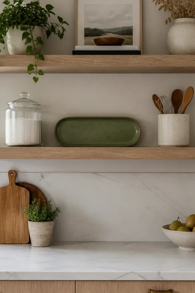
This setup looks styled because the warm wood gives you a friendly base, and the black ceramics give you structure. Use it when your kitchen has white cabinets or light countertops and you want contrast without going harsh. The key is keeping the black pieces consistent — same finish or same general shape — so the shelf reads like a set. Add one soft textile element like a linen runner or folded cloth to break up the hard edges of jars. It works in kitchens with busier backsplashes because the wood and matte ceramics don’t compete with tile patterns.
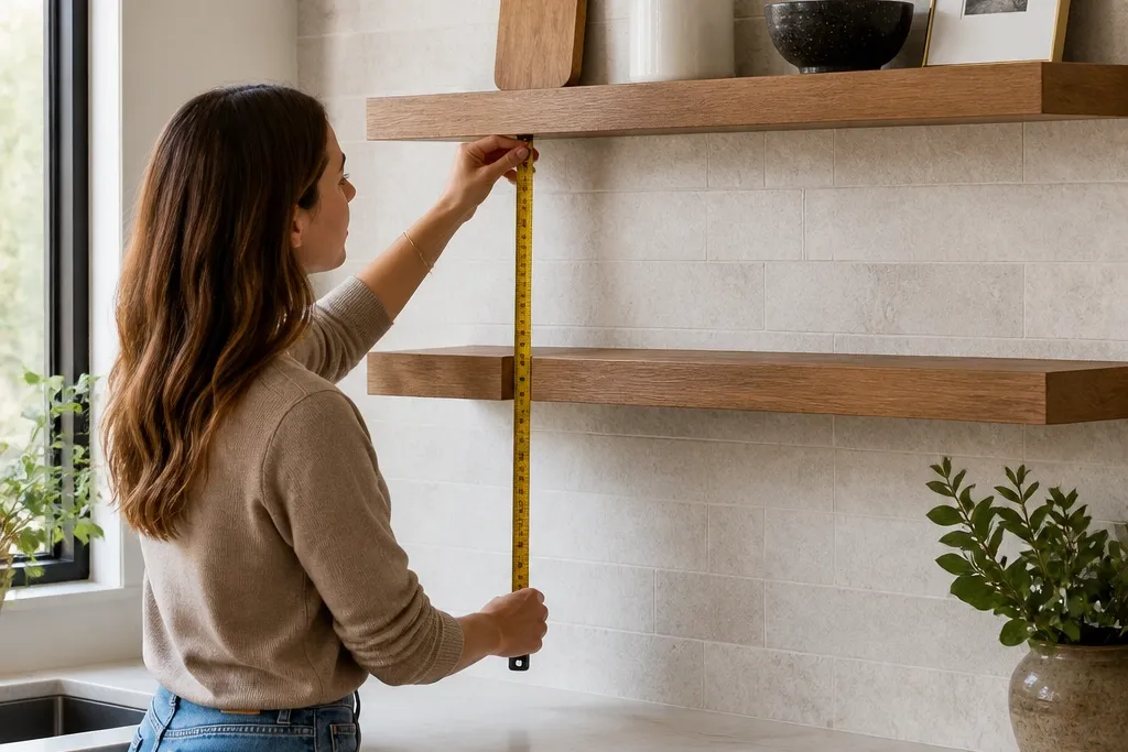
Start by choosing shelves with a 3/4 inch thickness and a matte oak finish so they don’t glare under overhead lights. Mount them so the bottom edge sits about 18-20 inches above the counter line, then use a level and mark stud locations clearly. Style each shelf with one tall item (a black ceramic canister), two medium pieces (stacked jars or one jar plus a small tray), and one small detail (a folded linen corner or a short utensil crock). Finish by placing items so their front edges line up in a gentle arc, not a straight row.
Editor's noteWipe jars with a microfiber cloth before styling; matte ceramics show fingerprints less, but dust still catches.
Skip thisDon’t mix three different black finishes like matte, glossy, and speckled unless you repeat each one across both shelves.
2. White shelves with a brass-and-glass clean line
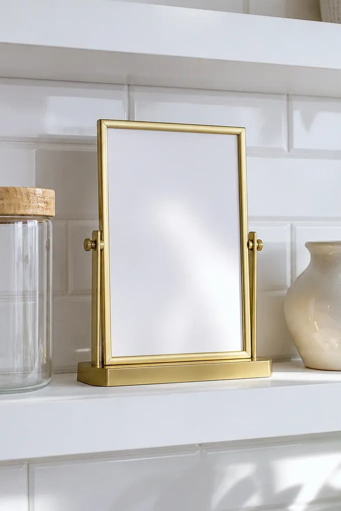
White floating shelves look crisp, but they can also look empty or harsh if you don’t add shape and shine. This version stays photogenic by using glass and brass in small doses — think one brass-framed photo or menu card holder, one clear jar, and one glazed ceramic. The glass keeps the wall airy, while brass gives you a warm highlight that stands out against white or neutral kitchens. Use this when your kitchen is mostly white, cream, or light greige and you want the shelves to feel brighter rather than heavier.
Pick white shelves with a satin or low-sheen finish, not high-gloss, then mount them with consistent spacing using a measuring tape from the countertop to the shelf bottom. Arrange your decor on a table first, then transfer it to the wall so you don’t shuffle glass items while mounted. Place the anchor on the centerline of each shelf, then add one glass jar to one side and a flat brass piece to the other side. Finally, keep the tallest item within about 2-3 inches of the shelf’s overall vertical space so it doesn’t look crowded.
Editor's noteUse museum putty or clear adhesive pads under small brass pieces so they don’t slide when you bump the shelf.
Skip thisAvoid stacking two tall glass items; they create a “tower” that looks messy fast.
3. Dark walnut shelves with a spice-caddy vibe
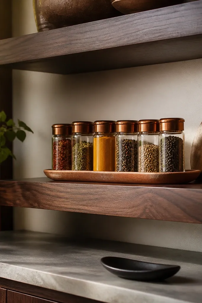
If you want your kitchen shelves to look beautiful and actually useful, go for a spice-caddy arrangement. Dark walnut shelves add depth and make warm colors like amber lids and terracotta ceramics look intentional. This look is great for kitchens that feel cold or empty because the wood tones add warmth without needing lots of decor. The shelf stays photogenic because the jars create repeat patterns, and the tray gives you a clean boundary. It’s best in kitchens where you can keep the jars matched or at least color-coordinated.
Choose walnut shelves with a slightly oiled look or satin finish so they don’t look plastic under light. Mount the shelves so you have enough clearance for lids to open comfortably if you store frequently used spices on the shelf. Style by placing a small wooden tray on one end, then line up 3-5 spice jars across the tray or in a tight cluster. Add one taller element like a slim utensil crock or a single ceramic vase to create height variation, then set a small label card or chalk tag at the front edge.
Editor's noteKeep jar heights within 1.5 inches of each other for a calmer look; label uniformity matters more than matching brands.
Skip thisDon’t use random jar sizes without a tray; without a boundary, the shelf looks like a storage dump.
4. Black shelves with white stoneware and a single plant
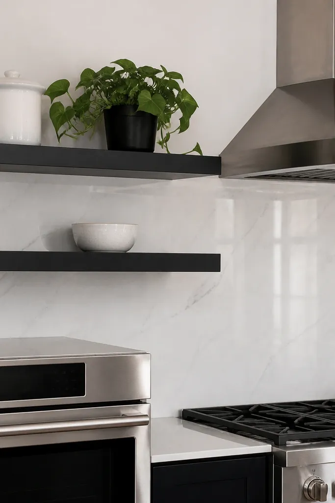
Black floating shelves give you that modern, high-contrast look, but they work best when you keep the decor light in color. White stoneware plus one small plant is the cleanest pairing because the contrast makes the shelf read sharply while the plant softens it. This is a great choice for kitchens with stainless appliances or black hardware. The plant also adds a living texture that looks good even when you don’t change anything else. Keep it simple: one plant, not three — multiple plants can turn the shelf into a jungle wall.
Pick black shelves with a powder-coated matte finish and mount them level using a stud finder so the brackets don’t wobble. Place the shelf bottom about 17-19 inches above the counter line for a balanced sight height. On the shelf, set one white stoneware canister or bowl as the anchor, then add a smaller white piece next to it like a creamer or dipping bowl. Put the plant in a small ceramic pot or a simple tin and keep the pot height consistent across shelves.
Choose a faux plant only if it’s low-shedding and matte; shiny leaves look fake under kitchen lighting.
Avoid placing the plant directly against the backsplash if you have steam or backsplash splatter; put it slightly forward.
5. Natural rattan baskets with linen and a canister trio
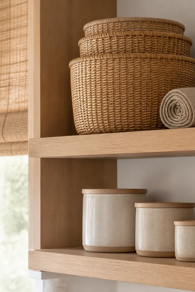
This look is about texture. Rattan baskets bring softness and a handmade feel, while linen adds a calm, cozy layer that still looks tidy. Use it when your kitchen has light oak, woven shades, or natural fibers elsewhere and you want the shelves to match that vibe without turning into boho chaos. The basket gives you instant “organization” because it hides small clutter — extra napkins, tea packets, or cleaning tabs. Pair it with three matching canisters so the shelf doesn’t look too random.
Use shelves with a light natural finish so the rattan color doesn’t fight a dark wood tone. Mount at a height where basket handles don’t brush cabinet doors, then leave enough room for the baskets to sit flat without tilting. Add your three canisters in a row or a staggered line inside the basket area, keeping the tallest canister in the center. Fold linen into a rectangle and place it under or beside the canisters so it looks intentional, not draped randomly.
Editor's noteLine the basket with a thin tray or a folded piece of cardboard covered by linen so the bottom stays flat and clean.
Skip thisDon’t mix rattan with glossy decor; it looks mismatched and cheap fast.
6. Two-tier look using different heights for jars and trays
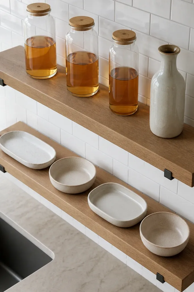
This is the most reliable way to make floating shelves look “designed” instead of decorated. You create a two-tier rhythm by staggering heights across the shelves: one shelf holds flatter trays and bowls, the other holds taller jars or vases. When the heights alternate, the wall has movement and your eye knows where to land. It’s a smart option for kitchens with long walls where you want the shelves to look like a single composition, not two separate shelves. Keep colors controlled so the height variation does the work.
Mount both shelves parallel, then measure the vertical gap between them and keep it consistent with your wall space. On the top shelf, place a wide tray or shallow bowl as the anchor, then add one small jar and one flat piece like a cutting board. On the bottom shelf, place the taller anchor — a jar, vase, or utensil crock — and balance it with a shorter tray or bowl. Step back and check the silhouette; if the tallest item lines up directly above another tall item, shift one piece 2-4 inches.
Editor's noteUse painter’s tape to mark item positions on the wall before you place anything — it saves your shelf from being rearranged 10 times.
Skip thisAvoid placing identical-height items on both shelves; it makes the whole setup look like a shelf of identical props.
7. Metal shelves with a monochrome utensil display
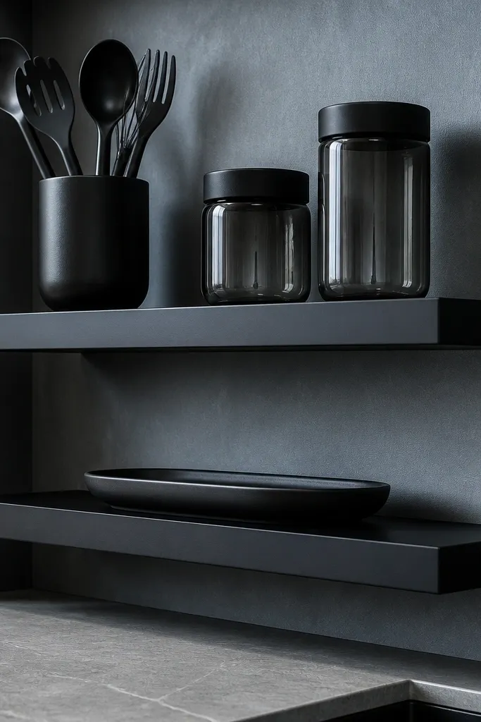
Matte metal floating shelves can look sleek, but they need a monochrome system to avoid looking industrial. This approach uses one utensil holder in a matching finish, a couple of monochrome jars, and one flat ceramic tray. The result is clean and graphic, which photographs well because the shapes are consistent. It’s a strong pick for kitchens with black, gray, or stainless appliances where you want the shelves to look like part of the design, not an afterthought. Keep the color palette to two tones so the metal doesn’t feel overpowering.
Choose metal shelves with a matte finish and mount them with the same spacing across the wall so the lines stay straight. Start styling with the utensil holder as the anchor because it defines the silhouette. Add two jars on the sides, then place a flat tray or board in front so the shelf has a grounded base. Finish by setting one small object — like a folded cloth or a small ceramic salt dish — at the front corner to add depth without clutter.
Use felt pads under tray corners so the metal doesn’t scrape and leave marks when you adjust pieces.
Don’t add three different textures of metal hardware; it turns the shelf into mixed hardware.
8. Light oak shelves with a seasonal color pop
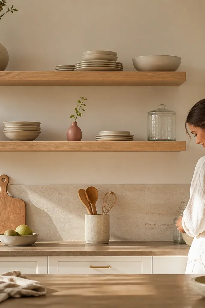
Neutral shelves look good year-round, and the easiest way to keep them interesting is one controlled color pop. Light oak plus neutral ceramics gives you a calm base, then you swap one small item seasonally like a terracotta bud vase, a green bottle, or a muted pink ceramic. This keeps the wall from feeling dated because the shelf structure stays the same. It also helps if you want your kitchen to look photo-ready without constantly rearranging everything. The shelf stays beautiful because the change is small and intentional.
Mount light oak shelves at a height that keeps the top shelf decor visible but not tall enough to block sightlines to windows. Style with neutral jars or canisters in a matched set, then add one ceramic vase or bottle in your seasonal color. Place the color pop slightly off-center by 2-3 inches so it looks natural, not perfectly symmetrical. Keep the rest of the shelf to one texture type like matte ceramics, then add a linen napkin or folded cloth in the same neutral tone.
Editor's notePick a seasonal color that matches one existing element in your kitchen — cabinet hardware, dish towels, or countertop veining.
Skip thisAvoid swapping multiple items at once; changing one anchor piece keeps the look cohesive.



