
1. Focal-point sofa wall with a rug that actually anchors
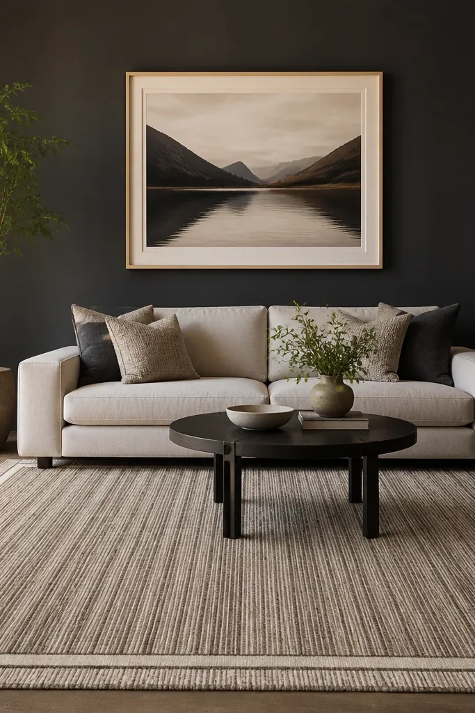
Measure the seating zone first. Put the sofa in its final spot, then place the rug so at least the front legs of the sofa (and any accent chair) sit on it; for most rooms, that means the rug should extend 15-25 cm beyond each side of the sofa. Next, center the coffee table so it lines up with the sofa seat — not the wall — then aim for 30-45 cm between the coffee table and the sofa front. Finally, add a single medium-size framed art piece above the sofa or a simple horizontal grouping that matches the sofa width so the wall doesn’t look empty.
This look fixes the most common drawing room problem: the sofa wall feels like a setup, not a room. Center the sofa on your chosen focal point wall and anchor the seating zone with a rug big enough that the front legs land on it. Go for a rug with a clear border or a pattern that has directional lines; those visual cues help the room feel structured in photos. Use a low-pile or medium-pile rug so the coffee table area looks crisp and doesn’t sink into a messy pile. Style with two throw cushions in the same family of colors and one contrasting cushion in a different texture — think smooth linen plus a knit or a subtle velvet for depth.
Skip thisDon’t center the sofa on the wall if your window or fireplace is the real focal point — let the focal point win.
Editor's noteIf you’re between two rug sizes, buy the larger one. A too-small rug makes even great furniture look temporary.
2. Layered lighting corner with a floor lamp + two table lamps
Lighting is where drawing room interiors go from flat to flattering. This look uses three layers so you don’t get harsh shadows behind the sofa or a dim corner that ruins the photo. Start with one ambient source like a ceiling fixture or track light set to warm tones, then add task lighting near seating with table lamps. Finish with an accent light — a floor lamp aimed slightly upward or a small lamp with a directional shade — so the wall has glow and texture. Use warm bulbs around 2700K to 3000K; cooler light makes wood look gray and fabric colors look washed out. The result is a room that looks styled even when curtains are closed and the TV wall is dark.
Choose bulbs first: get 2700K-3000K for every lamp so the color temperature stays consistent. Place one table lamp on the left and one on the right side of the sofa or armchairs, keeping the lamp shades roughly at eye level when seated (usually 110-130 cm from floor to shade top). Add a floor lamp in the corner or behind the seating line, aiming the light toward the wall or a tall plant so you get soft vertical glow. If you have a dimmer, set it so the brightest setting still feels warm and not glaring.
Pick shades in off-white or warm beige. They reflect light softly and make the whole room look calmer.
Avoid placing lamps too low or too high — the shadows behind cushions will look messy in photos.
3. Color palette that reads "designed" with one grounding material
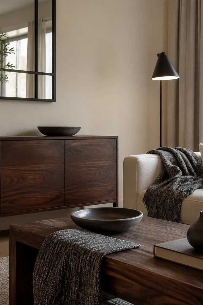
Start by listing your “big three” items: sofa color, curtain color, and rug color. Pick a dominant neutral for walls or curtains, then choose one supporting color for cushions and one grounding material for the coffee table and frames. Next, match metals: if you use black frames, keep lamp bases black too; don’t mix chrome and matte black in the same room. Finally, lay out cushions before you commit — two in the dominant neutral, one in the supporting color, and one textured accent (knit or woven) so the sofa looks layered without looking cluttered.
A good drawing room interior looks put together because materials repeat. This look builds a palette using one grounding material, like dark walnut wood, black metal, or charcoal fabric, so the room has a visual spine. Keep walls and large upholstery in a light neutral — warm white or greige — then add one supporting color via cushions and art. Choose one accent color that shows up in at least two places: for example, terracotta in a throw plus terracotta in the artwork. Texture does the heavy lifting: add a woven throw, a matte finish lamp base, and a rug with a pattern that doesn’t fight your cushions.
Skip thisDon’t add more than two accent colors. More colors make the room feel busy even with neutral walls.
Editor's noteIf your rug pattern has multiple colors, limit your cushions to only two of those colors. That keeps the palette tight.
4. Gallery wall that fits the wall width - not random spacing
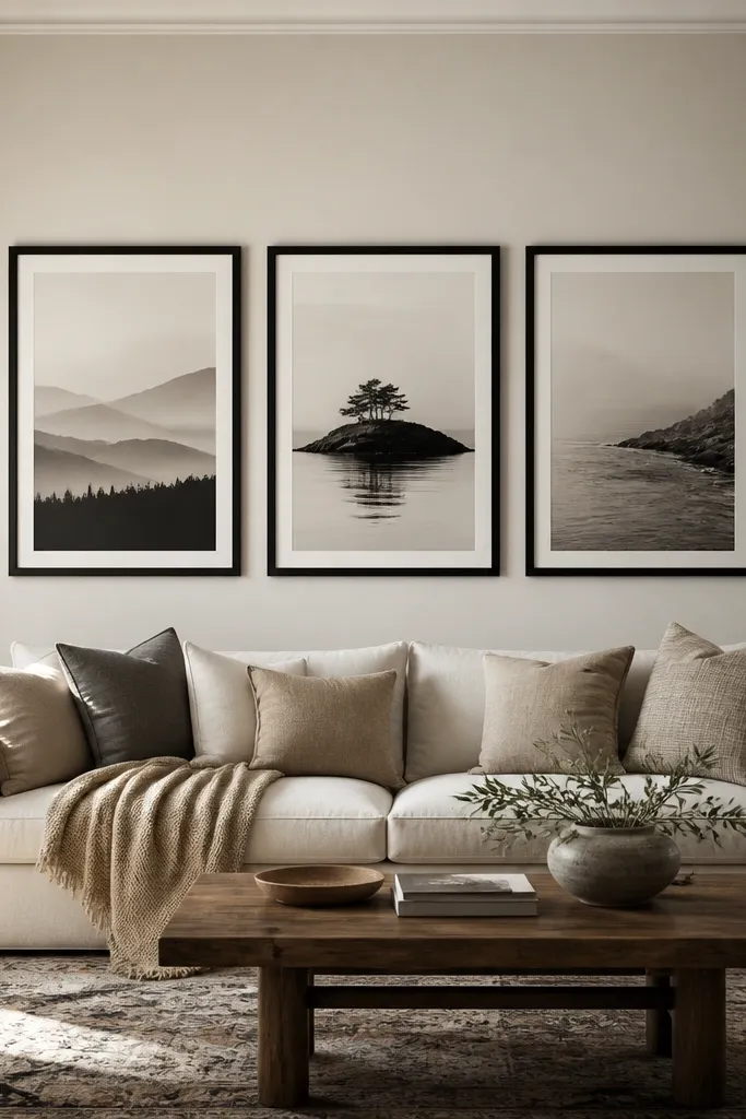
Measure your wall from left to right and decide if you want a horizontal or vertical arrangement. For a typical sofa wall, a horizontal trio often works best: place three frames so the combined width is about 60-75% of the sofa width. Mark the center line of the sofa, then tape the frames on the wall at the correct height; the bottom of the lowest frame should land around 145-160 cm from the floor for most rooms. Finally, keep spacing consistent: 4-7 cm between frames looks crisp without looking tight, and it holds up in photos.
A gallery wall can look designer or chaotic depending on spacing and size. This look is built around the wall width and the sofa proportions, so it feels intentional in every photo angle. Choose frames with the same finish and use either a horizontal trio for a long sofa wall or a 3x1 vertical stack for tall walls. Keep the art roughly centered to the sofa seat, not the wall itself, so the composition feels anchored to the seating. Use matte prints or textured paper — glossy art throws glare from lamps and windows. The frames should be slim enough that the wall still feels clean, but substantial enough to read as “finished.”
Skip thisDon’t mix frame sizes randomly. If the frames differ, keep the same interior mat size so the wall looks coordinated.
Editor's noteUse painter’s tape to build the layout before you drill. You’ll spot alignment errors immediately.
5. Coffee table styling with a readable height stack
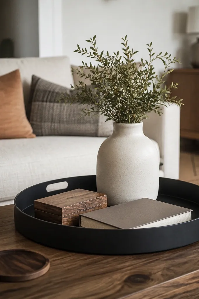
Clear the coffee table completely first. Place a tray centered on the table, then build a book stack on one side of the tray and a vase or bowl on the other side so the arrangement balances. Aim for a top height of about 15-25 cm above the tray for most living rooms — that keeps it visible but not towering. Finally, add one small accent item (a candle or a second small object) only if it fits within the tray boundary; keep the rest off the surface.
Most drawing room interiors look messy because the coffee table has no structure. This look solves that by building a height stack that reads clearly from the sofa and by using one tray to keep small items grouped. Start with a tray in wood, black metal, or ceramic — it creates a boundary that keeps clutter from spreading. Add a book stack (2-3 books) and a single object on top like a small vase or sculptural bowl. The height matters: if the tallest item is too high, it blocks sightlines; if it’s too low, it looks like a random pile. Leave open space around the stack so the table still feels breathable.
Skip thisAvoid using too many tiny decor pieces. One medium object beats five small ones for a styled look.
Editor's noteUse a tray with slightly raised edges. It stops small items from sliding and keeps photos cleaner.
6. Curtain plan for taller windows and better drape
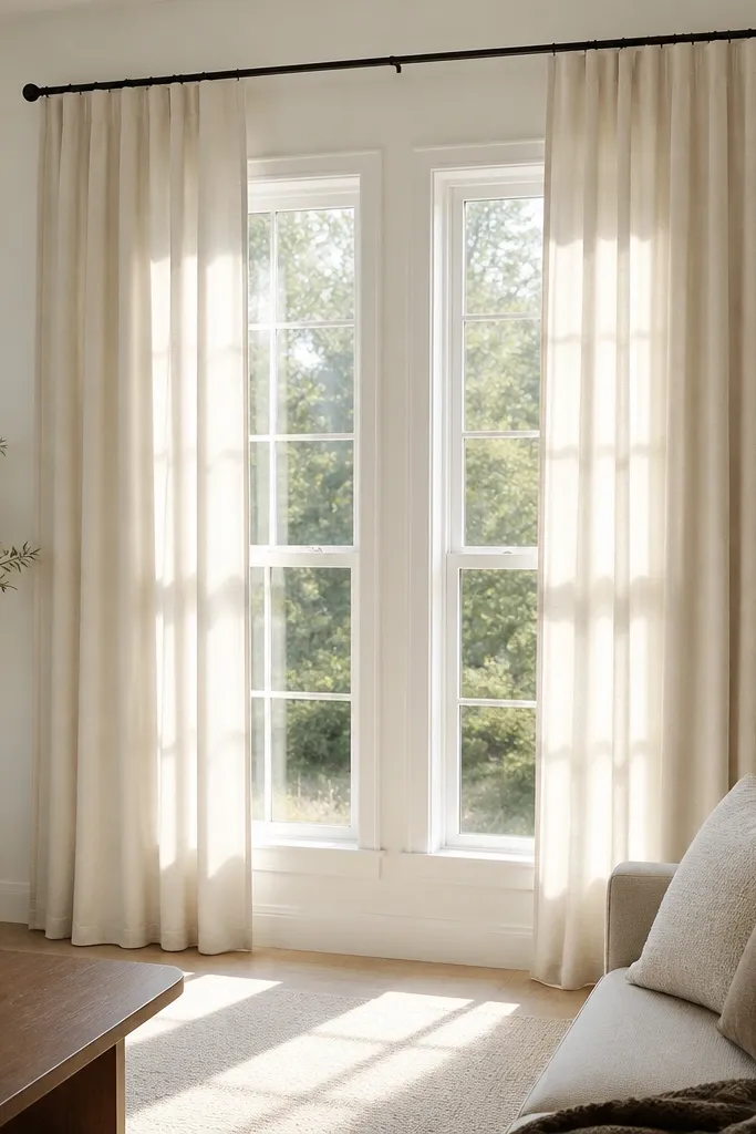
Curtains change how “finished” a drawing room looks faster than any other DIY. The reason is simple: height and drape. This look places the curtain rod higher and wider than the window so the room feels taller and the window looks larger in photos. Choose a fabric with good weight for smooth movement — medium to heavy cotton, linen blends, or a soft blackout lining if your room needs privacy. Aim for curtains that reach the floor with a slight break or puddle at the bottom; too-short curtains scream unfinished. Keep the color neutral or slightly warm to match the palette you picked for the sofa and rug.
Measure the window width and decide how wide you want the curtains to span; add 15-25 cm on each side of the window for fullness. Install the rod 10-20 cm above the window frame and keep it centered. For length, measure from rod to the floor and add 1-3 cm for the hem break; if you want a softer look, add 5-8 cm for a light puddle. Hang panels so the folds start when closed; use curtain hooks or rings and spread the panels evenly before you tighten the tiebacks.
If you’re using tiebacks, keep them high enough that the curtain still looks full when tied.
Don’t hang curtains from the window frame. It makes the ceiling look lower and the whole room feels smaller.



