
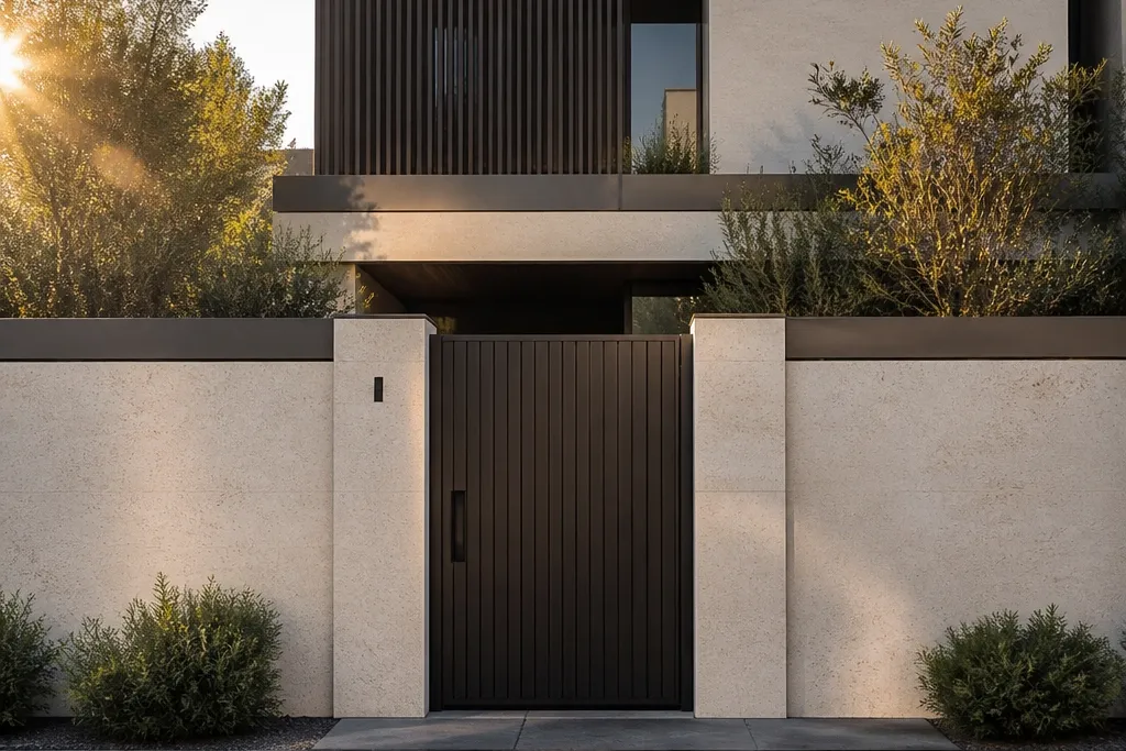
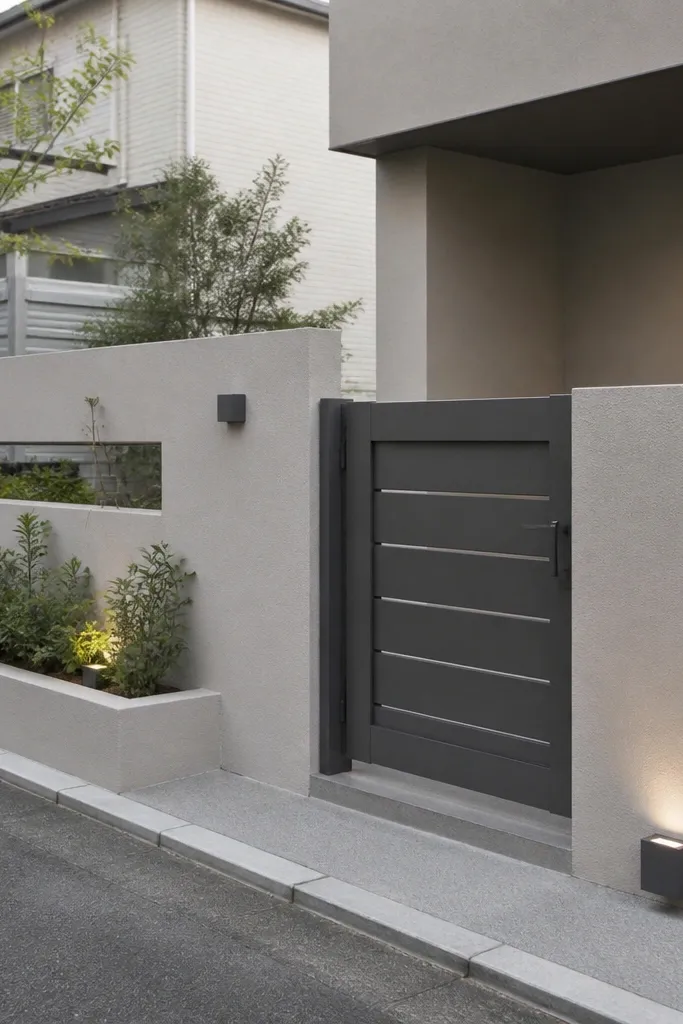
1. Half-Solid Block with Vertical Slat Top
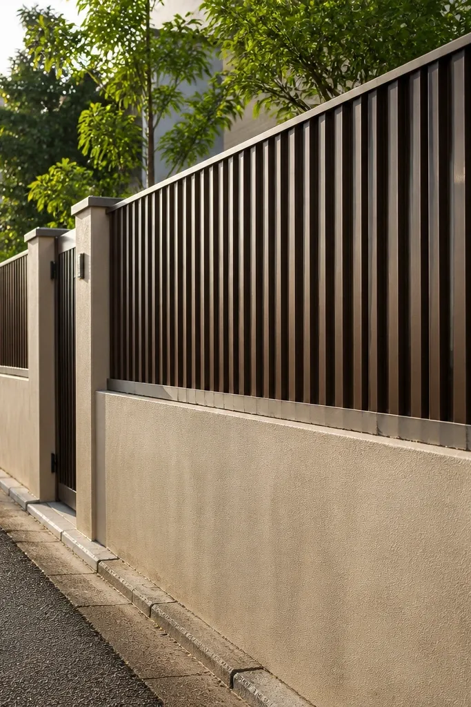
This design gives you privacy where you need it and air where you don’t. The lower solid portion stops direct views at sitting height, while the vertical slats break the outline so the wall doesn’t look like a big flat slab. Use a light base color to keep the street-facing side brighter, then go darker on the slats for a crisp modern contrast. It looks clean even on narrow frontage because the eye reads straight lines, not random ornament. Build it with masonry for the base and powder-coated metal or UPVC slats for the upper section; that mix holds up and photographs well.
Start by laying out a base height of about 1.3 m, then mark your slat centers across the remaining height (aim for 70-90 mm spacing). Build the masonry base with a straight top line and embed U-channel anchors at regular intervals. Fix vertical slats to the anchors using weatherproof screws and leave a small gap at the bottom of the slat panel so moisture doesn’t get trapped. Finish the base with exterior texture plaster or tile cladding, then add a simple wall cap with drip edges to stop staining.
Paint anchors and exposed metal edges with primer before coating so the slats don’t rust at screw points.
Don’t use wide random gaps in the slat section; it kills the clean, modern look and reduces privacy.
2. Stacked Concrete Panel Rhythm with Dark Cap
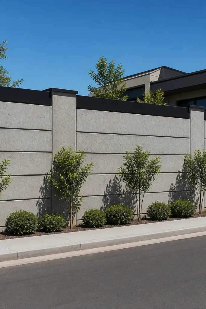
If your current wall looks plain, this one adds structure without complicated shapes. The trick is stacked rectangular panels that repeat at consistent widths, creating a strong grid from the street. A dark cap line makes the top feel finished and gives the wall a sharper silhouette. This design is great when you want a modern, minimal look and don’t want metal slats or lots of tile patterns. It’s also friendly for small-space compound wall design because the vertical panel edges visually narrow the wall and make it look more refined, even at modest lengths.
Editor's noteUse the same module width for both wall sections and the gate pillar faces so the grid looks continuous.
Divide your frontage into equal-width modules, then build panel frames using formwork strip sizes like 300-450 mm wide for each module. Cast shallow concrete panels (about 40-60 mm depth) so you get shadow lines without adding too much weight. Keep the panel edges crisp by using good form alignment and vibrating the mix lightly to remove air pockets. After curing, apply an exterior finish — matte paint or texture plaster — then install a dark cement or stone cap with a drip edge.
Skip thisDon’t vary panel widths mid-wall; it reads sloppy from a distance.
3. Terracotta Tile Cladding with White Grout Lines
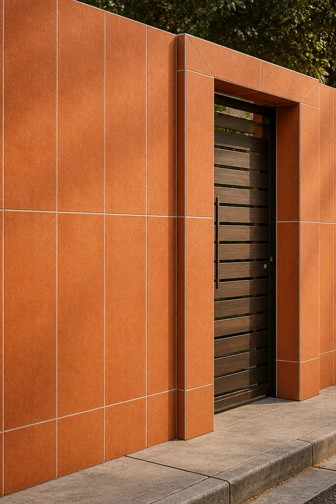
This is one of the most photogenic options because tile creates instant texture and color depth. A terracotta body gives warmth, while thin white grout lines make the design look modern and intentional instead of rustic. Keep the layout simple: large-format tiles in a straight pattern or a mild vertical alignment, and let the grout do the visual work. It works well for small-space compound wall design because the wall looks “designed” even if your plot is narrow and you don’t have room for big decorative elements. Use it when you want a warm, modern look that still feels durable.
Editor's notePick tiles with a matte or satin finish; glossy tiles show dust and water spots fast.
Start by preparing the masonry surface — scrape loose plaster, apply a bonding primer, and fix tile spacers for consistent grout lines. Use exterior-grade tile adhesive and grout meant for outdoor exposure. Lay tiles in vertical strips so the grout lines run straight up and down; keep a 2-3 mm expansion gap at edges and around gate openings. After the grout sets, seal if your climate gets heavy rain, then add a flat top coping with an angle so water sheds.
Skip thisDon’t use interior grout or thin cement slurry; outdoor grout needs proper polymer additives to resist cracking.
4. Cement Plaster Grooves with Lime-Wash Finish
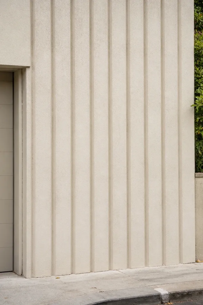
Grooves are the fastest way to make a small wall look modern without adding heavy cladding. Vertical grooves create a slimmer, taller appearance, which helps on narrow frontage. A light lime-wash style finish (or a lime-effect exterior coating) softens the look and keeps the wall from feeling harsh. This design is best when you want a clean, architectural look and you’re okay with a bit of surface finishing work. It’s also good for maintenance because grooves hide minor imperfections better than flat plaster.
Editor's noteDo a small test panel first; groove depth changes how shadows look in sunlight.
Apply a base layer of exterior plaster and let it firm up, then mark groove lines with chalk or a laser guide at 80-120 mm intervals. Use a grooving tool to cut consistent channels about 10-15 mm wide and 8-12 mm deep. Clean dust from grooves, then apply a lime-wash effect exterior coating in two thin coats. Finish the top with a coping stone or cement cap that has a slight slope and drip edge to stop water streaks.
Skip thisDon’t make grooves too deep on a thin plaster layer; they can crack at the edges.
5. Perforated Masonry Block Upper with Solid Base
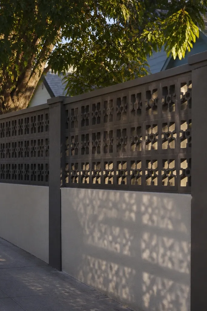
Perforated blocks give you privacy with a soft, patterned shadow effect. From the street, it reads modern because the top section has a built-in pattern rather than random holes. The base stays solid for privacy at eye level, while the block section lets light through and prevents the wall from looking heavy. This is a strong choice for small-space compound wall design because it adds visual interest without requiring extra width. Choose a block size that repeats cleanly so your wall doesn’t look like it was patched from leftover material.
Build the solid base to about 1.2-1.4 m, then set perforated blocks for the upper section in a consistent running bond. Use exterior mortar and keep block alignment tight; use a level guide strip to avoid a wavy pattern. Fill only the necessary vertical joints to keep the perforations clean, then cap the top with a coping that covers the mortar line. Finish with exterior paint or render on the solid base only, so the perforation pattern stays crisp.
Choose blocks with consistent hole size and spacing; mixing brands usually ruins the pattern.
Don’t leave the top edge unprotected; exposed mortar around perforations stains quickly.
6. Stone Look Porcelain Panels with Shadow Joints
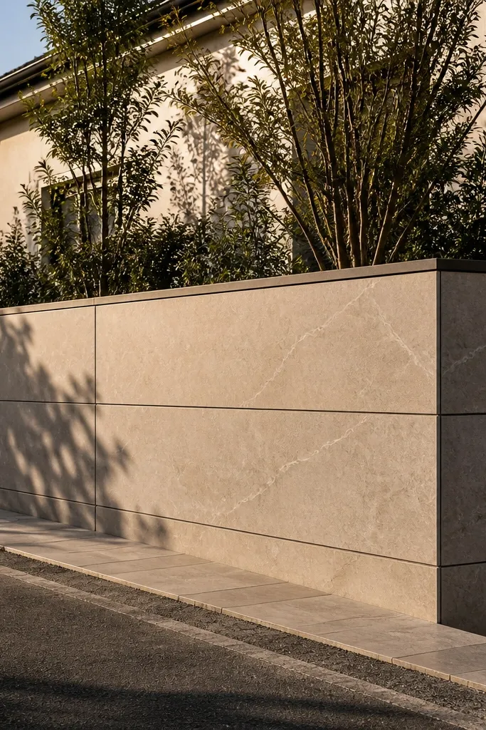
Stone-look porcelain panels make a compound wall look high-end without real stone weight. The key is the shadow joint: a thin dark gap between panel sheets that creates depth and a modern, gallery-like feel. This design works great for tight plots because it gives a composed, premium look even when the wall length is short. Keep the palette restrained — warm gray or light beige panels with a dark joint line — so it looks intentional. It’s also good for durability since porcelain takes weather better than many cement-only finishes.
Editor's noteDry-lay panels on the ground first and adjust widths so the cut tiles at ends are small and neat.
Start by planning panel widths based on your wall length so you end up with neat edges at the corners and gate. Use an exterior tile adhesive rated for outdoor use and apply a skim coat to level the surface. Install panels with spacers that create a shadow joint effect (often 6-10 mm), then fill with an outdoor grout matched to the joint color. Finally, add a coping stone or aluminum flashing under the top line so water doesn’t sit on the panel edges.
Skip thisDon’t skip surface leveling; porcelain panels show waves because they’re flat and reflective in sunlight.
7. Black Mesh Frame with Clear Glass Band
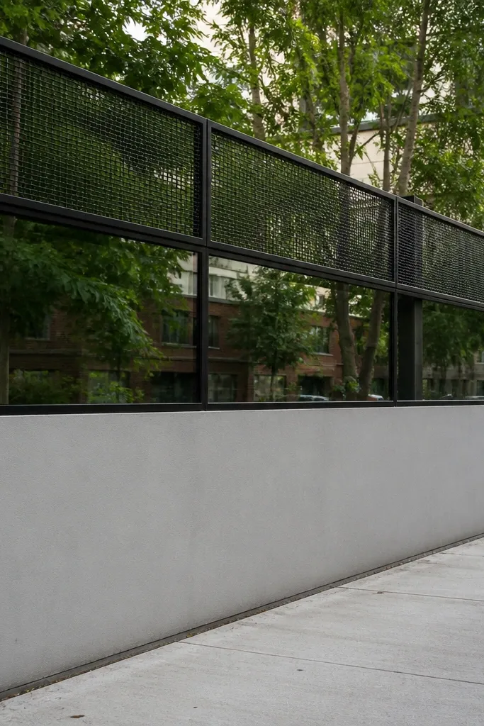
This is the modern look that makes a small compound feel more open without losing control. A black metal frame reads sharp, and a clear glass band lets light pass while keeping the upper zone tidy. The solid base handles privacy at eye level; the glass band keeps the street view from feeling blocked. If you want an urban, clean aesthetic, this is your pick. Use it for narrow frontages where you want height and crisp lines, not thick cladding.
Editor's noteUse toughened glass with proper gasket thickness; thin gaskets lead to rattling and uneven gaps.
Build a masonry base around 1.2-1.5 m, then install a black powder-coated steel frame on top with anchored bolts. Add a clear toughened glass strip in the middle band, with rubber gaskets between metal and glass. Use mesh or polycarbonate panels in the remaining upper area to control visibility while keeping the frame looking uniform. Finish with a top cap that covers the frame ends and includes a drip line so water doesn’t collect inside.
Skip thisDon’t use regular glass; outdoor temperature swings can crack it.
8. Horizontal Lamella Bands in Two Tones
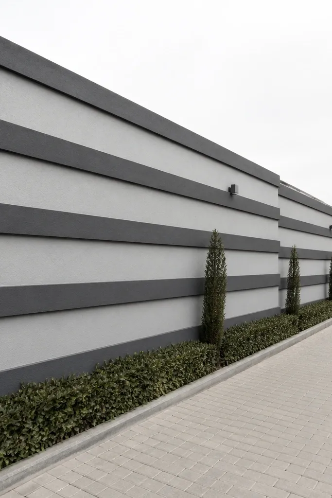
Horizontal lamella lines make a wall look designed and modern, especially on flat streets where vertical designs can feel too rigid. Two-tone bands — like light gray with charcoal — add depth without clutter. This works well when your frontage is longer; it visually stretches the wall and keeps it from looking like a single block. For small-space compound wall design, the trick is to keep the bands consistent height, not random stripes. The wall looks clean in photos because the lines run across the entire face.
Start by sketching your band heights — for example, 180-220 mm per band with 20-30 mm spacing between them. Build a base to 1.2-1.4 m, then attach lamella panels on the upper section using a frame system that keeps spacing equal. Use two materials or two finishes: one set of lamellas in a light tone and another in dark charcoal. Add a coping cap that covers the frame tops and seal joints with exterior sealant.
Use a laser level to mark lamella lines; horizontal alignment is what makes this look premium.
Don’t mix lamella spacing after every few feet; uneven bands look like a repair job.
9. Brick-on-Edge Vertical Accent with Smooth Plaster
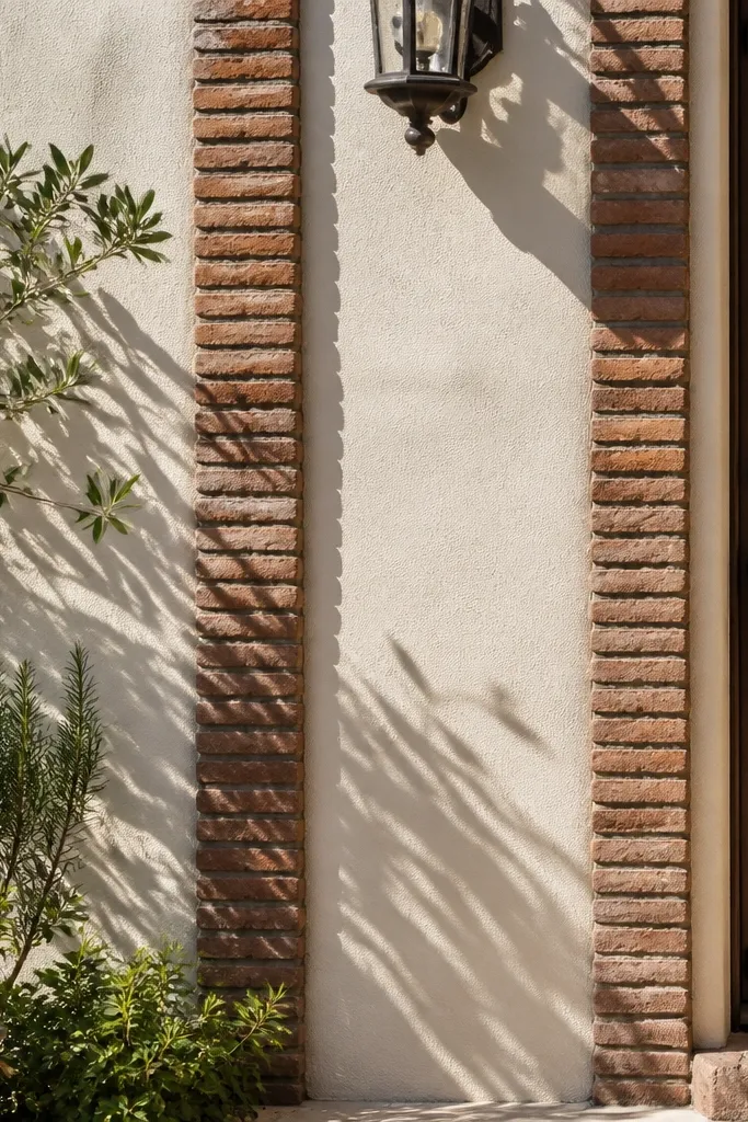
This design gives you texture without making the whole wall loud. Smooth plaster keeps the main surface modern and clean, while brick-on-edge vertical accents add a sharp, handmade texture. It’s great for small-space compound wall design because the wall stays visually light, but the accents create a focal rhythm. Use the accents as columns aligned with your gate pillars, so the eye reads a deliberate pattern. It also hides minor plaster imperfections since the brick texture draws attention.
Editor's noteUse the same brick thickness across all columns; mixed thickness causes visible steps after mortar sets.
Render the main wall face with a smooth exterior finish and let it cure. Mark vertical accent columns at fixed widths, such as 200-300 mm, with consistent spacing. Fix brick-on-edge units over the cured render using exterior mortar and keep the brick faces aligned with a straight guide strip. Finish with an exterior sealant on brick surfaces if your area gets heavy rain, then install a coping cap with a drip edge.
Skip thisDon’t paint the brick with a thick coat; it makes the texture look flat and cheap.
10. Matte Microcement Panels with Embedded LED Spots
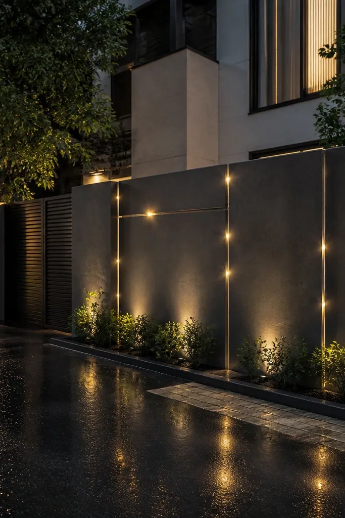
Lighting is what makes this one look modern at night, and microcement keeps the day look smooth and architectural. Panel sections are clean and minimal, then tiny recessed LED spots create a dotted glow that makes the wall look intentional rather than plain. For small-space compound wall design, this is a sneaky win: you can keep the wall material simple and let lighting do the drama. Use warm white LEDs (2700-3000K) so the wall doesn’t look harsh. It’s a good option when you want a high-end look without heavy cladding.
Editor's noteTurn down brightness so the LEDs highlight texture; too-bright spots look like construction work.
Apply microcement or microcement-style exterior coating in panel areas, using masking tape to keep edges straight. Plan LED points in a grid — for example, every 40-60 cm — and leave shallow recess channels during coating. Install low-voltage LED spot modules in weatherproof housings and route cable in conduit behind the panel backing. Seal all edges with exterior-grade waterproof sealant, then add a coping cap to keep water off the top layer.
Skip thisDon’t skip waterproof conduit and gaskets; outdoor LED failures usually come from moisture at cable entries.
11. Geometric Cutout Panels in Fiber Cement
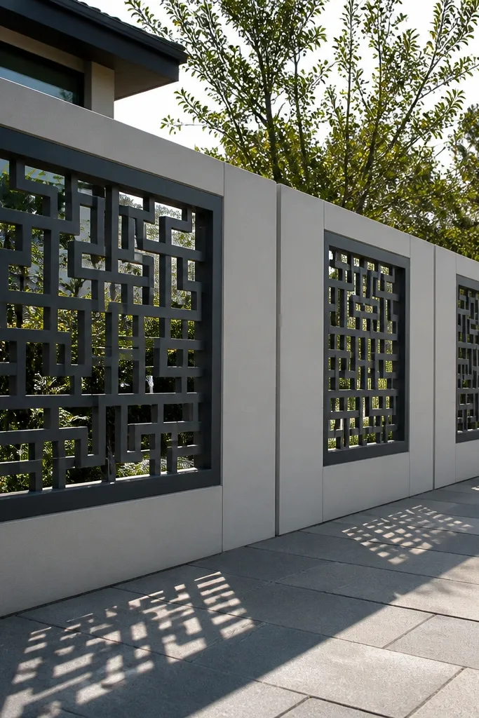
Geometric cutouts look designer because the wall has negative space. Fiber cement panels hold shape and stay flat, and the cutout pattern casts shadows that look great in photos. Keep the main wall light and use a darker frame or border so the shapes pop. This design is perfect when you want a modern look but don’t want heavy stone or tile. It also works on small plots because the pattern adds interest without increasing width.
Editor's noteUse a template for cutouts so every panel matches; mismatched geometry screams DIY in close photos.
Build a solid base and a simple backing frame with treated timber or steel rails at fixed intervals. Mount fiber cement panels onto the rails using exterior screws and leave consistent gaps for expansion. Choose a geometric pattern that repeats — like 200-250 mm squares or triangles — and keep cutouts aligned across sections. Finish the base with exterior plaster, then paint panels with a weatherproof exterior paint, and cap the top with a coping stone.
Skip thisDon’t use thin panels without proper backing; cutouts can crack if the frame spacing is too wide.
12. Vertical Wood-Effect Slats with Metal Supports
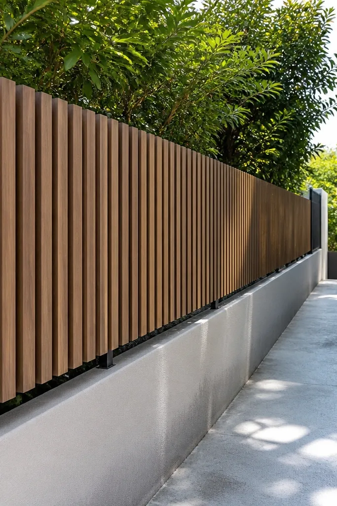
Wood-effect slats give warmth but keep the wall looking modern when you use clean metal supports. The secret is choosing slats that are made for outdoor exposure (wood-look composite or treated slats) and installing them with a consistent gap. The wall reads warm and contemporary instead of rustic, especially with a light neutral base. This option suits small-space compound wall design because the vertical lines add height while keeping the wall visually narrow. If you like a calm, hotel-style look, this is it.
Build a masonry base around 1.2-1.4 m, then install a metal support frame on top using powder-coated rails. Fix vertical slats to the rails with spacing of 60-90 mm so light passes but faces aren’t fully visible. Use stainless or coated screws and keep the bottom edge of slats slightly off the base line to prevent moisture trapping. Paint or coat the base with exterior textured finish, then install a coping cap with side drip edges.
Set slat spacing with plastic spacers; eyeballing gaps makes the wall look uneven from the road.
Don’t leave slat ends raw; seal or cap them so rain doesn’t wick into the material.
13. White Panel Wall with Black Stud Grid
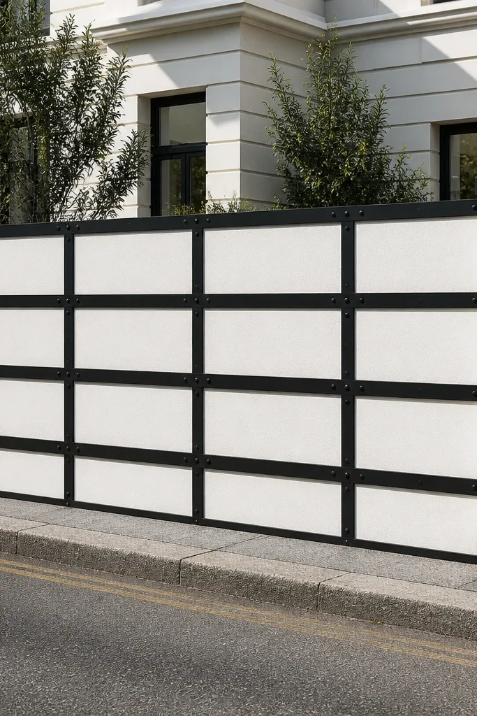
A white panel wall with a black grid looks sharp, modern, and very photogenic because it turns the wall into a graphic. The black grid lines create structure, while the white panels keep it bright for narrow frontages. This is a great choice when you want a minimal design that still looks designed up close. Keep the grid spacing consistent and align it with your gate — the wall will look like a single system, not separate parts. It’s also practical because you can swap panel materials later without changing the grid.
Editor's noteUse a matte finish on the white paint; gloss creates glare and makes grout lines look messy.
Render and paint the base wall in exterior white or a warm off-white. Install a black metal stud grid on top using anchors at regular spacing, like every 300-450 mm vertically and horizontally. Fill the grid bays with exterior panel material — fiber cement sheet, thin tile panels, or perforated sheet — cut to the grid size. Seal all perimeter edges, then add a flat coping cap with a drip lip so the top line stays clean.
Skip thisDon’t use thick decorative bars; thin grid lines look modern, thick ones look heavy.
14. Terrace-Style Baluster Top with Solid Base

Baluster-style tops give a classic structure, but you can make it modern by using clean metal bars and a simple base. The advantage is that you get privacy at the bottom and a refined look at the top without carving complex shapes. On small-space compound wall design, this works because it adds vertical detail that doesn’t eat width. Choose a consistent bar spacing and a straight top rail so the wall reads orderly from the street. Pair it with a solid, smooth finish on the base for a clean contrast.
Editor's noteMeasure bar spacing from the same reference point on every bay; tiny drift adds up across a long wall.
Build the solid base to 1.3-1.5 m with smooth exterior plaster or tile cladding. Install vertical metal bars on top using embedded sleeves or anchor plates, keeping consistent spacing around 70-100 mm. Add a top rail and a simple end cap so the bars look finished, not stuck-on. Paint the metal with powder coating or exterior enamel, then install a coping stone that sits with a slight slope for water runoff.
Skip thisDon’t mix bar thicknesses; it makes the top look patchy instead of intentional.
15. Two-Level Color Blocking with Vertical Edges
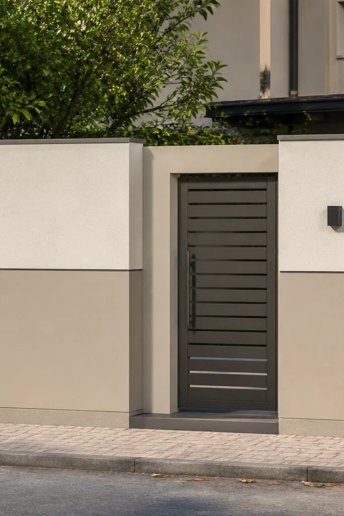
Color blocking is the easiest way to make a plain wall look designed, and it works especially well for small-space compound wall design because it adds “structure” without adding height. Split the wall into two horizontal zones, then sharpen the edges with vertical border lines or recessed trims. Use one light tone and one charcoal or deep gray so it reads modern, not playful. The look stays photogenic because the color boundary creates a crisp line that the eye tracks. Keep the gate pillars aligned to the same split height for a clean, architectural face.
Mark a split line around 1.2-1.4 m from the ground for the two zones. Render and paint the entire wall first in the lighter base tone, then mask the upper section and paint it in the darker tone. Add vertical edge trims by installing thin cement or metal strips at corners and at module intervals (like every 1.2-1.5 m). Seal the top coping and joints with exterior sealant to prevent color staining from water.
Use painter’s tape plus a thin caulk bead along the mask line for ultra-straight edges.
Don’t choose two colors with similar undertones; the boundary will look muddy instead of crisp.



