
1. Tall vertical slat wall with a low horizontal picture rail
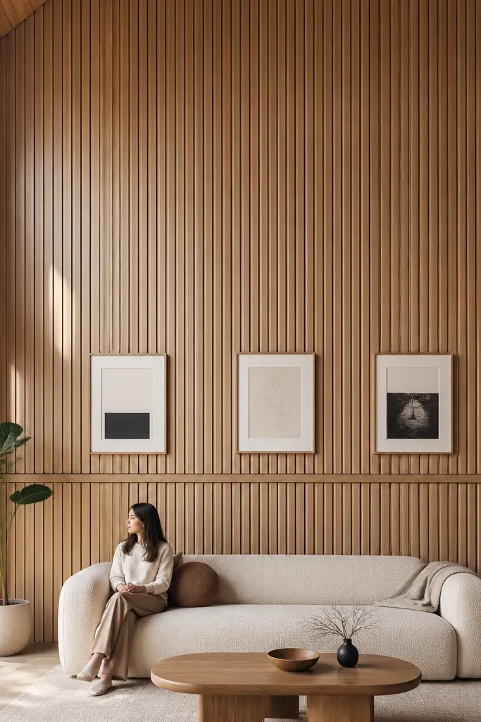
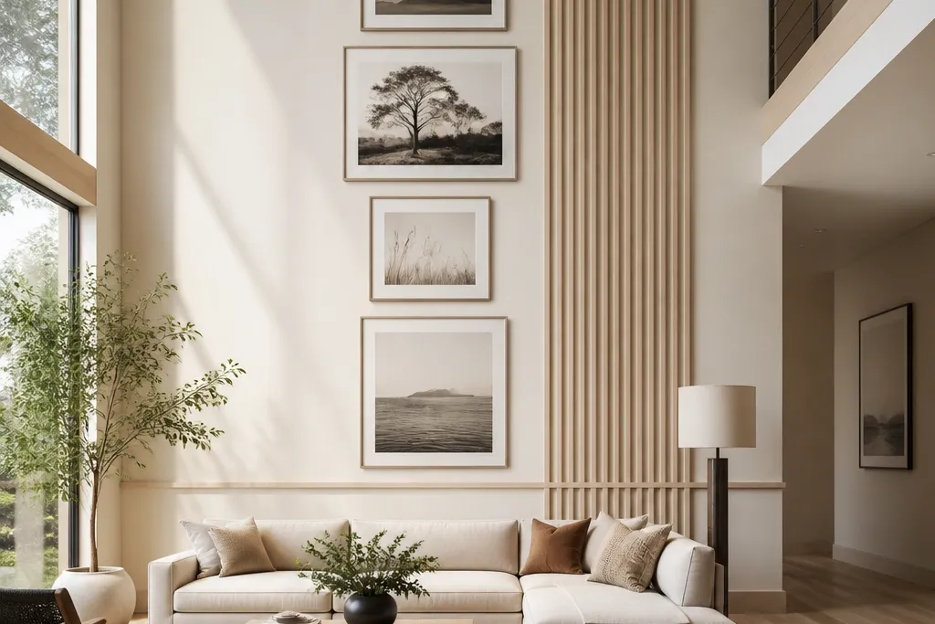
This is the cleanest way to give a double-height wall structure without making it look busy. Vertical slats pull the eye up, but the low horizontal picture rail keeps everything grounded at sofa height. Use a pale, warm wood tone so the wall brightens the room instead of looking heavy. Add two or three framed pieces aligned to the rail and you get a gallery that still feels designed from far away. The look works best in small spaces because it reduces visual noise while still filling the tall wall.
Editor's notePre-finish the slats before installation so you don’t rush the edges and end up with darker lines.
Start by marking a level line for the picture rail at 50-56 inches from the floor, then map the rail length so it lands centered on the wall. Install a simple backing frame using 1x3 furring strips, then attach vertical slats spaced 3/4 inch apart; keep the first and last slat perfectly plumb. Prime and paint the rail to match your trim, and stain or finish the slats in a matte clear or light stain so they don’t glare. Finally, mount frames so their top edges line up with the rail, and add a wall-wash light or two slim picture lights aimed upward along the slat direction.
Skip thisDon’t start with random slat spacing — uneven gaps show instantly on a tall wall.
2. Oversized framed grid with museum-mat spacing
A framed grid turns the double-height wall into a layout you can read at a glance. Wide museum-mat spacing is the trick: it makes everything look intentional and gives the wall breathing room so it doesn’t feel like a cluttered photo wall. Choose frame colors that match your room trim — white or warm oak works best for small spaces. This idea also plays nicely with renters because you can do it with existing frames and picture hanging hardware. The result is photogenic and structured, with enough scale to match the height.
Pick a grid size that spans about 1/3 to 1/2 of the wall width; measure the usable wall area and sketch a simple 3x2 or 3x3 layout. Use off-white 8-ply mat boards or mat kits so the inner opening stays consistent across frames. Mount a level ledger line, then hang the top row first so the whole grid stays straight. Use spacers behind frames or mat thickness to create a consistent gap between frames and the wall. Finish by adding one plug-in picture light or a small track light above the grid aimed to wash the frames, not the ceiling.
Use the same mat color across every frame — it makes the whole wall look like one installation.
Avoid mixing frame widths unless you’re repeating them in a strict pattern.
3. Limewash color-block paneling with a single bold column

Color-blocking works because it adds a strong shape to a tall wall without needing a lot of objects. The single bold column gives you vertical focus, while the limewash keeps it soft and dimensional rather than flat paint. Choose one darker shade that pulls from your furniture — think warm greige, clay taupe, or muted olive. Limewash-like finishes are great for small spaces because they reduce harsh reflections compared to glossy paint. This design looks expensive in photos because the texture catches light at different angles.
Tape off a central vertical column that’s about 18-24 inches wide, then add a second set of tapes for a thin trim border around the column. Prime the wall if it’s patchy, then apply a limewash paint or limewash-effect product in the background color first, letting it dry fully. Mix and apply the darker column color with a roller and brush for that mottled look, keeping the edges crisp where tape meets wall. Remove tape while the paint is still slightly tacky to avoid tearing. Finish by adding a warm wall-washer or sconces so the lime texture shows, not just the color.
Test your limewash effect on a small taped square 2 feet up and 2 feet over before you commit to the whole column.
Don’t paint the entire wall two-tone with no trim lines — the column loses its purpose.
4. Built-in low credenza wall with tall display niches
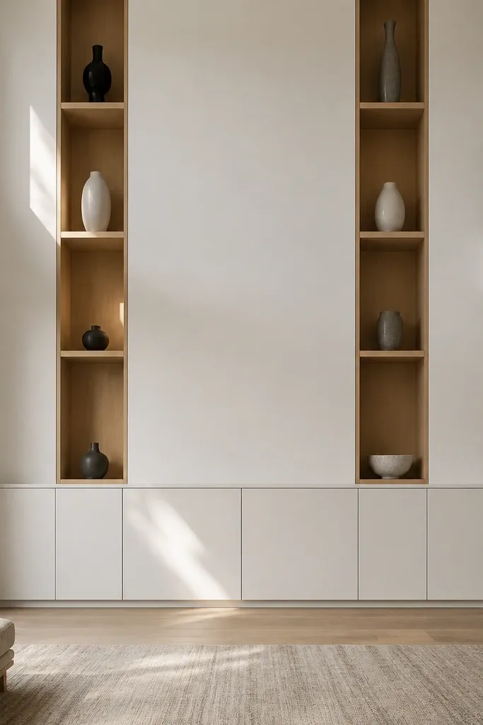
This is the most “designed” answer when your double-height wall is also the main wall people see from the entry. A low credenza gives you a horizontal anchor for the room, and tall niches fill the vertical space without clutter. Use closed cabinets at the bottom for visual calm, then open niches for a few sculptural objects. In small spaces, this helps because it replaces loose decor with storage and keeps the wall from feeling empty. The look is photogenic because the niches create a rhythm of light and shadow.
Measure your wall width and plan a credenza that spans roughly 60-70 inches, with a top line aligned to around 30-34 inches from the floor. Build a simple carcass using plywood or pre-made cabinet boxes, then add two or three tall vertical niches above. Keep niche openings consistent — about 12-16 inches wide each — so it looks intentional. Paint the entire built-in in a satin finish and install LED strip lighting inside niches with a diffuser lens. Finally, add a solid shelf or ledge where the credenza meets the niches, and style with 1-2 objects per niche.
Use warm LED strips at 2700K and add a frosted diffuser so the light looks like a glow, not a bright line.
Don’t make niches different widths — the wall starts looking like accidental shelves.
5. Wallpaper mural strip running the full height
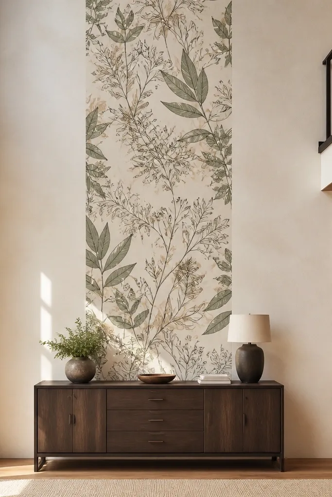
A tall mural strip is a smart small-space trick: it adds personality while keeping other areas simple. It works especially well if you have a window or stair cutting through the wall — the mural gives you a continuous vertical story. Choose a pattern that isn’t too busy; think botanical line drawings, subtle geometric, or faux plaster texture. The strip format also prevents the “wallpaper overload” look in rooms where you already have a lot going on. Photos look great because the mural creates a strong focal line from bottom to top.
Measure the wall height and choose wallpaper with enough width for one clean vertical strip; add 2-3 inches of extra length for trimming at the top and bottom. Prep the wall by smoothing bumps and priming if needed. Mark a vertical plumb line and apply paste or activate adhesive depending on the wallpaper type, then align the strip to the plumb line. Smooth with a plastic tool to avoid bubbles, then trim edges with a sharp utility knife. After install, hang simple art on either side or keep the rest minimal so the mural stays the hero.
Match your pattern alignment carefully at the top. A small mismatch becomes obvious on a tall strip.
Don’t cover the whole wall — in small spaces it turns into visual noise.
6. Oversized arched panel wall with fluted trim edges
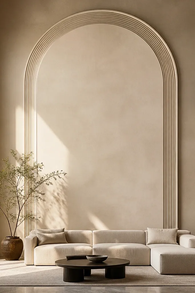
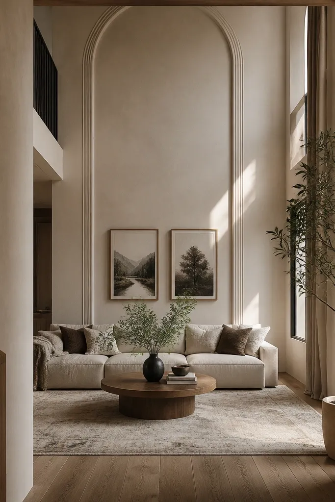
Arches read instantly as intentional architecture. In a double-height living room, a single large centered arch gives you a strong silhouette that photographs well and feels grounded. Fluted trim edges add depth without needing a full remodel. Keep the main wall neutral and let the arch be slightly raised or a different paint tone so it catches shadow. This is a great option when you want drama but you don’t want clutter. The arch also frames your sofa art area, so the wall doesn’t feel like dead space.
Create the arch shape by tracing a template or using a flexible strip to mark a smooth curve centered on the wall. Use 1/2 inch MDF or plywood for the main arch panel, then add 1x2 trim strips around it for the fluted effect using pre-grooved molding or spacing marks for slim strips. Prime everything, then paint the wall and panel in a satin finish contrast — for example, eggshell wall with semi-gloss arch edges. Mount the arch to studs with construction screws, then fill and sand seams. Finish by adding two warm sconces or a single wall-wash light aimed to graze the fluted edges.
Use joint compound and sand in thin passes — raised trim shows every ridge under grazing light.
Don’t center the arch too high. Keep the arch base around 48-60 inches from the floor.
7. 3D acoustic wall panels in a vertical wave pattern
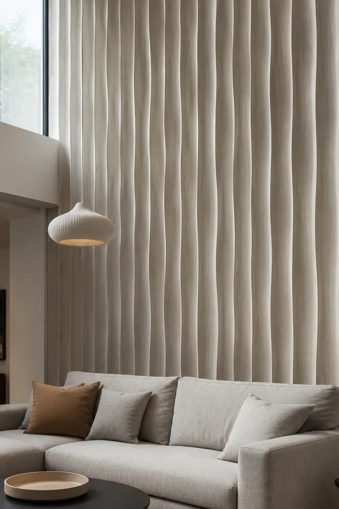
If your double-height living room feels echoey, 3D acoustic panels solve the sound problem and the look at the same time. A vertical wave pattern adds movement up the wall, which helps it feel less flat and less empty. Choose a warm gray or sand tone so it doesn’t look like office decor. The panels also create soft shadow lines — perfect for photos with side lighting. This idea is a strong choice for small spaces because it reduces visual clutter while improving the room’s feel.
Editor's noteTest one panel under your planned lighting angle before you commit; texture reads differently under direct light.
Measure your wall area and buy panels that install with adhesive plus mechanical anchors or a rail system, depending on the panel type. Start by finding studs and marking a vertical reference line. Install a top and bottom guide strip so the pattern stays aligned, then attach panels row by row, keeping seams tight. If you’re using fabric-wrapped or painted panels, do any final touch-ups before the last row. Add a warm LED wall washer at one side to emphasize the wave texture instead of flattening it.
Skip thisDon’t choose a glossy finish. It kills the shadow effect that makes these panels look premium.
8. Floating shelves as a staggered vertical story
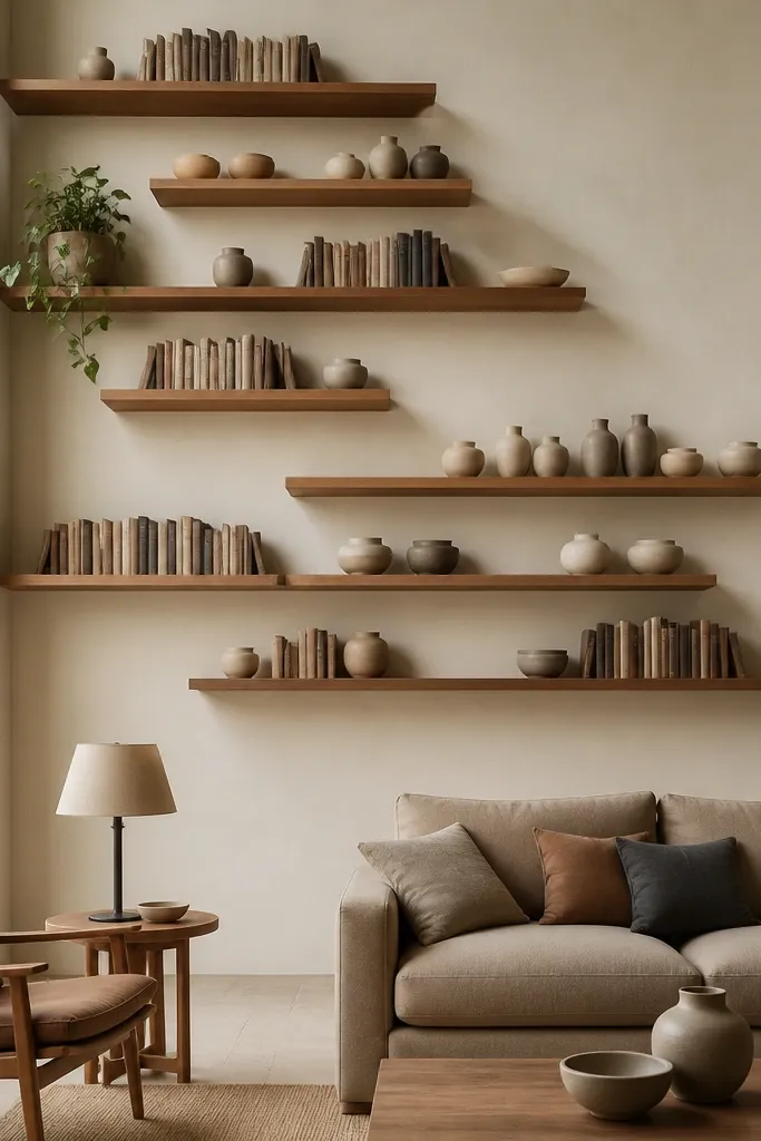
Floating shelves can look messy fast, but a staggered vertical story makes them look like a designed installation. The key is spacing and repeat materials: books in one direction, ceramics grouped by color family, and a mix of heights that forms a gentle diagonal up the wall. This is good for small spaces because it replaces a tall empty wall with controlled display areas. It also gives you a place to rotate decor without changing the whole wall. Photos look good because the shelves create a clear rhythm from the bottom of the wall to the top.
Editor's noteUse matte ceramics and matte book covers. Glossy items reflect the room lights and can look harsh in photos.
Plan 5-7 shelf lines that climb up the wall, with the lowest shelf placed around 16-22 inches from the floor. Use a laser level to mark mounting points and anchor into studs with shelf brackets rated for the weight you’ll place on top. Choose shelves 8-10 inches deep for a tight look; wider shelves start grabbing attention in small rooms. Arrange objects before mounting — keep books facing the same direction and leave at least 1-2 inches of empty space between groups. Finish by painting the wall behind shelves the same color as trim so the objects pop, and add a single strip light under the top shelf aimed downward.
Skip thisDon’t mix too many object types at once. Limit to books, one ceramic, and one natural element per shelf.
9. Vertical gallery of large-format prints with equal margins
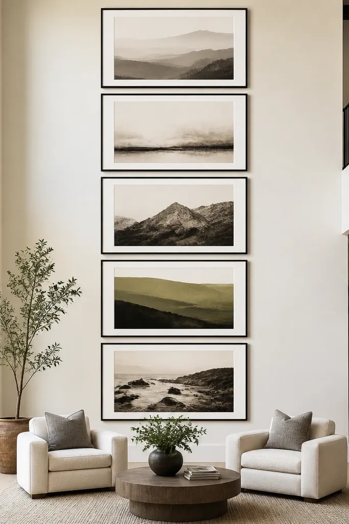
Large-format prints are the cleanest way to fill double height without making the wall feel busy. A vertical gallery of 3-5 pieces creates a tall rhythm that matches the ceiling height, while equal margins keep it calm. Choose frames in one finish — black matte or warm oak — and keep the print palette tight to your room colors. This idea looks good even with minimal styling because the prints do the work. It’s a practical pick for small spaces because you’re placing fewer items, bigger than decor, and the wall reads as intentional.
Editor's noteUse non-glare glass or acrylic if you get direct light. Double height often throws glare from high windows.
Pick 3 or 4 prints that have the same aspect ratio and frame width, ideally 24x36, 18x36, or 16x20 formats depending on wall size. Lay them out on the floor and measure the total height, then decide where the center of the stack lands around 60-66 inches from the floor. Mount two or three hanging wires or French cleat points per frame based on frame weight. Keep spacing between frames consistent — around 2-3 inches between frame edges. Add a picture rail or two slim wall lights above the stack so the prints are evenly lit, not shadowy.
Skip thisDon’t use mixed aspect ratios. The stack loses its vertical line.
10. Dark wood panel wall with a single brass line
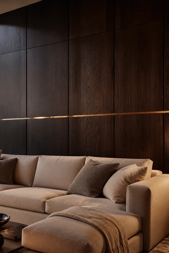
If you want that high-end look without a full renovation, dark wood paneling plus one brass line is a strong combo. The wood gives depth and warmth, and the brass line adds a clean horizontal break so the wall doesn’t feel too tall. This works best in small spaces when your furniture is light or neutral, because the wood anchors the room and adds contrast. It also photographs well because the brass catches light and the wood slats create subtle texture. Keep the rest of the room simple so the wall stays the hero.
Editor's noteUse satin or matte dark stain, not high gloss. Gloss makes wood look dated under warm LEDs.
Install a backing grid of 1x3 furring strips into studs, then attach dark-stained wood slats or panel boards with consistent spacing. Keep slat spacing at about 1/2 inch for a tight, modern look. Paint or finish the backing edges so you don’t see gaps. Mark a horizontal line for the brass trim at 48-52 inches from the floor, then apply brass picture rail trim or a thin metal strip along that line with adhesive plus small nails. Finish with a warm wall-washer directed across the slats to show texture.
Skip thisDon’t add multiple metal accents. One brass line is what keeps it clean.
11. Stone-look tile stripe with a soft plaster surround
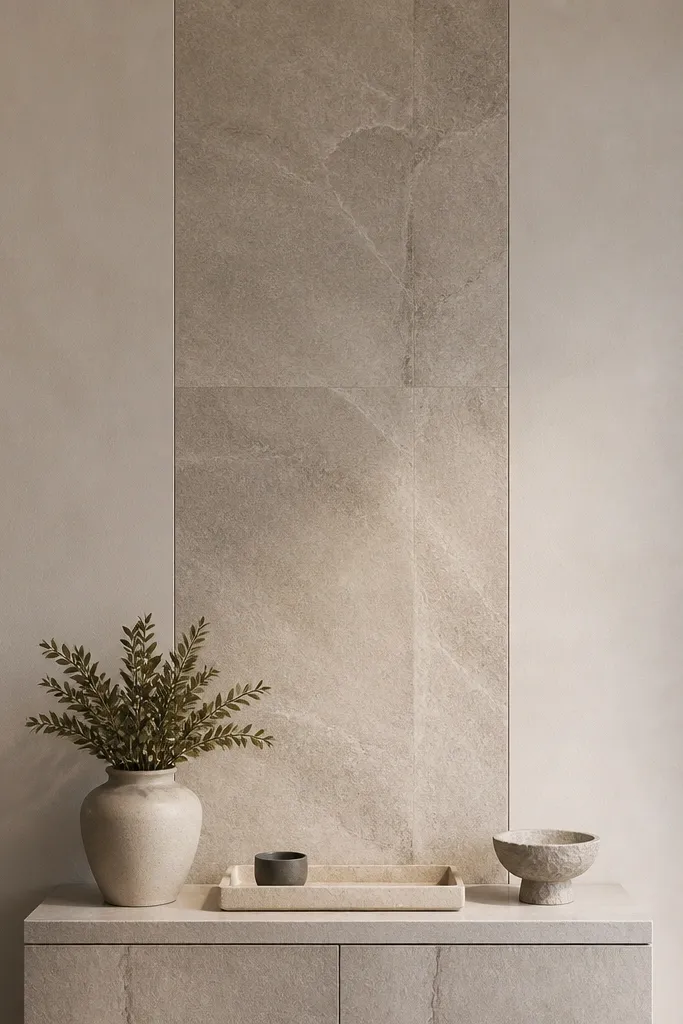
A stone-look stripe brings a heavier material feel to a double-height wall, but in a controlled way. Tile can be intense, so the trick is to keep it as a single vertical stripe or two slim stripes, surrounded by a soft plaster finish. This makes the wall look like it has real architectural moments without covering the whole surface. The stone texture reads well under side lighting and looks great in photos. It’s also a practical choice if you want something durable and easy to clean.
Editor's noteKeep your stripe centered relative to the main seating, not centered to the wall if the window/stair shifts the view.
Choose peel-and-stick stone-look tile for small-space projects, or install real tile if you’re already doing a renovation. Mark a centered stripe width of about 12-18 inches, then prep the wall by cleaning and priming so adhesive holds. Apply tile from the bottom up, using a level line so grout lines stay straight. If using real tile, use 1/4 inch notch trowel and back-butter the tiles for full coverage. Finish the edges with trim pieces or a slim bullnose strip, then add warm wall lighting to graze the stone texture.
Skip thisDon’t pick a stripe that’s too wide. If it covers half the wall, it starts feeling heavy.
12. Ceiling-to-floor fabric paneling with tension rods and tracks
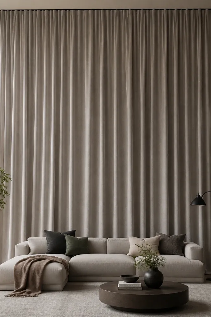
Fabric panels are the quickest way to make a tall wall look softer and more expensive. They also help acoustics, which matters in double-height spaces where sound can ring. The look is photogenic because fabric creates gentle folds and shadow — a texture paint can’t match. Choose a heavy linen or performance fabric in warm white, oat, or light greige. This idea is best when you want a calm, hotel-like feel and you don’t want shelves or frames to dominate.
Measure wall height and decide on panel width so you get 2-4 panels across the wall. Install a ceiling track or tension rod system anchored into studs, then hang fabric panels with grommets or sewn pockets for a clean top edge. Leave a small gap between panels so the folds don’t overlap awkwardly. If you want a more tailored look, add a slim trim border around the panel area using 1/2 inch MDF strips painted to match. Use a warm wall washer or a small uplight aimed at the folds to create shape.
Use fabric weights or tension clips near the bottom so the panels don’t billow in drafts.
Avoid sheer fabric. In a double-height wall, sheer reads as unfinished.
13. Floating ledge + mirror combo scaled for double height
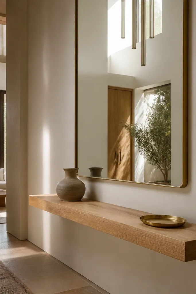
A long floating ledge paired with a large mirror turns the wall into a functional focal point. The mirror adds depth and bounces light upward, which helps small spaces feel taller without repainting everything. The ledge gives you a place for a single row of objects, but with enough negative space to avoid visual clutter. Scale matters here: the mirror has to be large enough to read from the sofa, not small enough to feel like a bathroom accessory. This design is great when you want the wall to feel brighter and more open.
Choose a mirror size that spans about 40-60 inches wide for small-space double height, then center it over the floating ledge. Install the ledge first at 28-32 inches from the floor, anchored into studs with proper brackets. Hang the mirror using mirror clips or a French cleat system so it sits perfectly level. Style the ledge with one tall element (like a ceramic vase) plus two small items, keeping the total height under the mirror’s bottom edge. Add warm lighting — either a wall mirror light bar or two sconces — to prevent dark reflections.
Pick a mirror frame finish that matches your hardware — brass with brass, black with black.
Don’t crowd the ledge. Three items max reads clean at double height.
14. Arch-and-sconce composition with warm uplight grazing
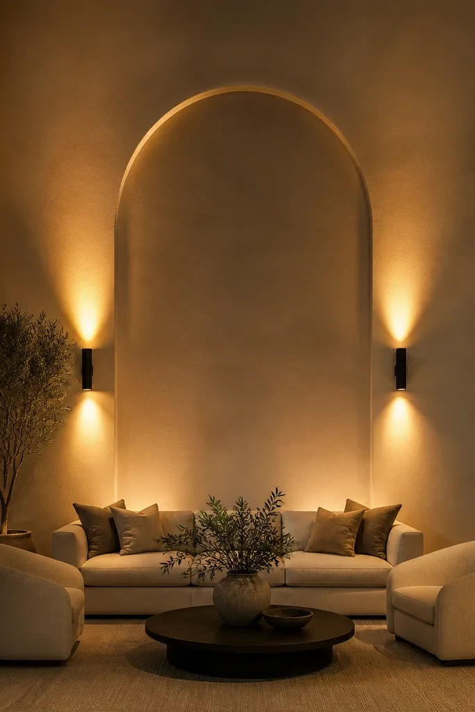
This is the “instant designer” wall plan: build a simple arched feature and wrap it with wall sconces for grazing light. The arch gives shape, and the sconces create controlled illumination so the wall looks good even at night. In a small-space double-height room, the lighting trick is what makes everything feel intentional rather than decorative. Choose sconces with baffle shades so the light doesn’t blast your eyes. The result is photogenic because you get shadow lines on the arch and a warm glow around the focal point.
Editor's noteIf the sconces have adjustable heads, angle them 10-15 degrees toward the arch for better shadow definition.
Mark a centered arch area and install a flat MDF or drywall-backed arch feature with a depth of about 1-2 inches. Prime and paint it in a slightly different tone than the wall — like off-white arch on white wall. Install two sconces flanking the arch, keeping the light source around 60-66 inches from the floor so it grazes the arch surface. Run wiring to a junction box behind each sconce or use a licensed electrician if you’re not comfortable. Finish with a warm bulb at 2700K and adjust the angle so the light hits the arch edges, not the ceiling.
Skip thisDon’t place sconces too high. Grazing light turns into ceiling light and the arch looks flat.
15. Monochrome mural in a framed column with hidden LED edge glow
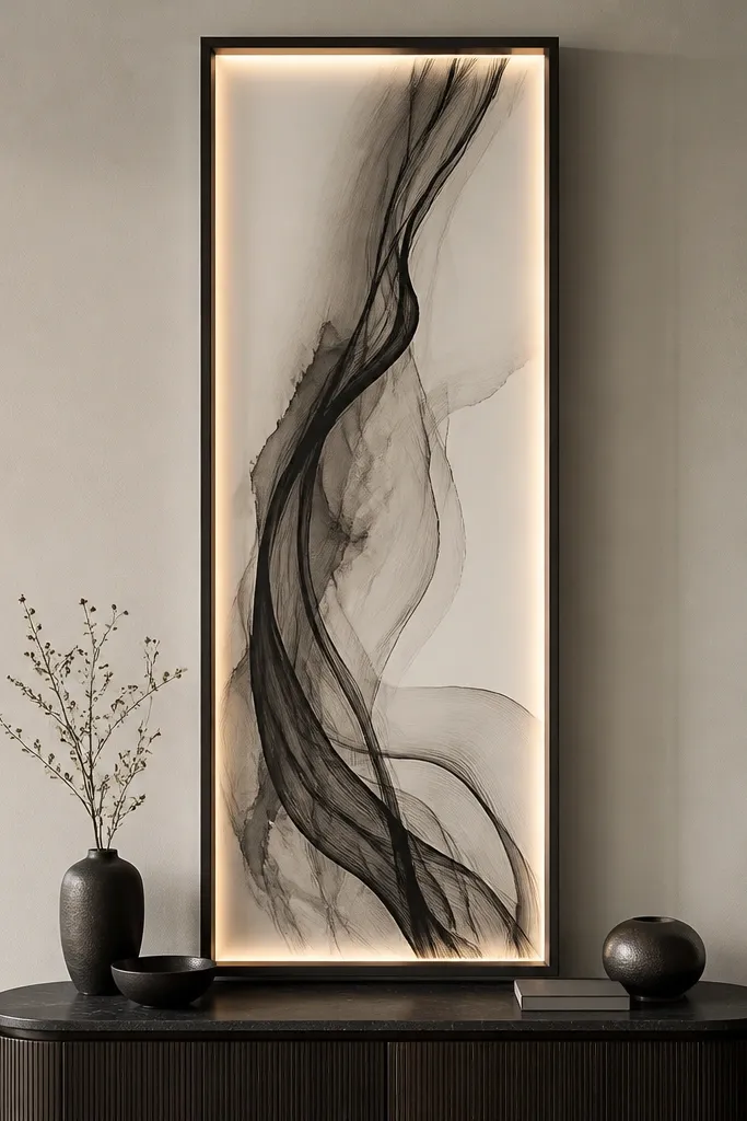
This is for when you want a bold, modern look but still keep it clean. A framed mural column creates a single strong vertical focus, and the hidden LED edge glow makes it look like a built-in lightbox without the harshness of a backlit poster. Monochrome art keeps the palette calm, which matters in small spaces where too many colors feel cramped. The LED edge glow also makes the piece look crisp in photos because it separates the frame from the wall. This one works especially well on walls that already have windows or stairs cutting up the view.
Editor's noteUse a frosted diffuser lens. Clear LEDs show individual diodes and cheapen the look instantly.
Build a rectangular frame around a mural area that’s about 24-30 inches wide and runs from 12 inches above your sofa sightline to near the ceiling. Use 1x2 or 1x3 MDF for the frame, then paint it satin in a matte black or off-white to match your room. Apply the mural using removable mural wallpaper or a printed canvas panel mounted to foam board, then secure it inside the frame. Install an LED strip along the inside edge of the frame using an aluminum channel with a frosted diffuser so the glow is soft. Mount the finished framed column with a French cleat and test the lighting angle before final placement.
Skip thisDon’t put the LED strip too close to the mural surface. You want even glow, not hotspots.



