
1. 3-inch spacer gallery grid with mixed frame sizes
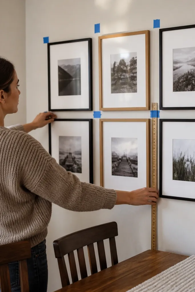
This layout fixes the most common gallery wall problem: uneven gaps that make the whole wall look “almost right.” A 3-inch gap between frame edges gives enough breathing room for mixed sizes, and it still feels connected rather than scattered. I like using a consistent gap because your eye reads it as a grid even if the arrangement is asymmetrical. It’s renter-friendly because you can plan everything precisely before you hang anything, which reduces re-sticking and re-leveling.
Start by laying your frames on the floor and measure frame edge-to-edge spacing. Place a 3-inch strip or spacer between frames (or use playing cards as a stand-in) so every gap matches. Transfer the layout to the wall with painter’s tape outlines, keeping the same reference edge for every measurement. Mark the hanging points for each frame through the tape, then remove the frames and hang from the largest piece outward.
Use the same spacer for every gap in that zone. If you switch gap sizes halfway through, your brain spots it instantly.
Don’t eyeball spacing on the wall — your first “close enough” placement becomes the last.
2. Removable hanger placement using tape-only leveling
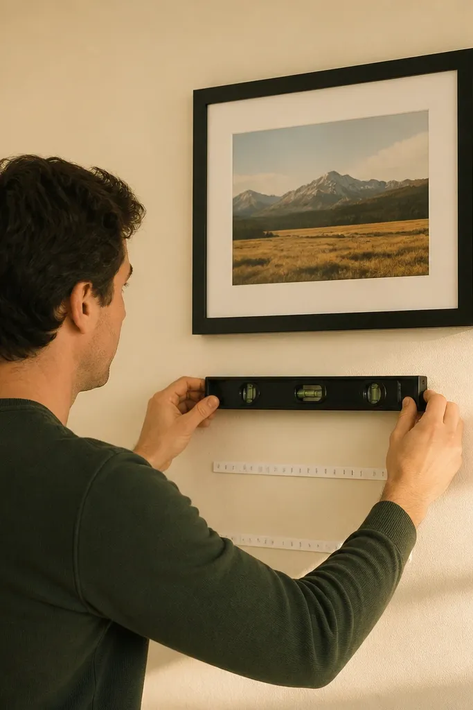
Most crooked gallery walls come from one thing: leveling after the hardware is already stuck. The tape-only method lets you lock the alignment before adhesive ever touches the wall. You can adjust by a few millimeters without committing, and that’s exactly what you need for a multi-frame setup where one misaligned piece throws off the whole line. This approach is ideal for renters because it reduces how many times you remove and reapply hardware.
Tape a level horizontal line on the wall using a small level or a smartphone level app. Then tape your frame outlines over that line and mark each frame’s top hanger point. Remove the frames, apply your removable hardware aligned to the tape marks, and press firmly for the time your strip or hook instructions specify. Hang the largest frame first, then use the same tape line to check every next frame before you step back.
Press hardware with a flat palm for 30 seconds, then wait the recommended cure time before hanging weight.
Don’t level by “looking at it from across the room.” Level while you’re close enough to see the tape edges.
3. Gallery wall with a single height anchor at 57 inches
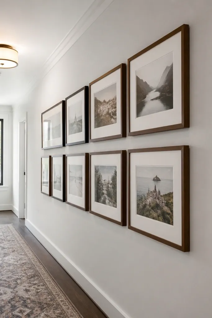
If you want a gallery wall that looks intentional in a hallway or living room, set one height anchor and build from it. A common mistake is placing frames by ceiling height or by the top edge of furniture, which makes the arrangement feel too high or too low once you live with it. I recommend using a 57-inch center anchor measured from the floor to the center of your largest frame. That gives most rooms a natural viewing height without turning the gallery into a “wall decoration that fights your eye.”
Measure from the floor up to 57 inches and mark that point lightly with a pencil. Tape a short vertical guide line at that mark, then position your largest frame so its center aligns with the guide. Use painter’s tape to outline every frame, then mark the hanger points based on the tape outlines. Hang the largest frame first, then align the rest relative to the same guide line so you don’t drift upward or downward across the wall.
If your largest frame is not the visual center of the arrangement, still use it as the height anchor. It keeps the whole wall from creeping.
Don’t anchor to the top of a sofa or console. Your spacing will look wrong once you sit down.
4. Lightweight print gallery on removable hooks with staggered rows
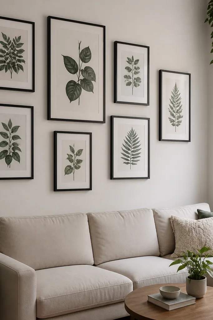
This is the renter-friendly option when most of your frames are lightweight prints. Staggered rows create motion without breaking the grid rules, and you still get a clean look because the gaps are consistent. Use this when your gallery is mostly paper prints, thin frames, or canvases under about 2 pounds each. The benefit is speed: you can hang quickly, adjust spacing easily, and avoid drilling.
Lay the prints on the floor and decide your stagger pattern, like two rows offset by half a frame width. Keep the horizontal gap between frames at 2 inches and the vertical gap at 2.5 inches so it reads as designed. Transfer outlines to the wall with painter’s tape and mark hook locations based on each frame’s hanging point. Install removable hooks at the marks, then hang starting with the row that contains the largest frame so your eye has a reference.
Use a single hook type for the whole wall. Mixing hook styles can shift how frames sit and you’ll chase that difference.
Don’t use removable hooks for heavy frames. If the hook compresses or flexes, the whole gallery looks slanted.
5. Medium-frame gallery using picture-hanging strips in a 2-point layout
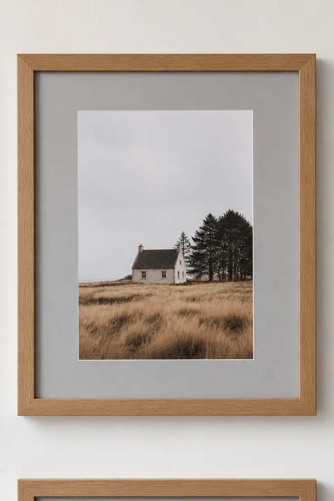
When your frames are more than lightweight but still renter-friendly, picture-hanging strips work better than single-point hooks. A 2-point layout spreads the load so the frame sits flat and doesn’t tilt under its own weight. This matters in gallery walls because you’ll notice even slight sag between neighboring frames. It also keeps removal cleaner than nails, since you can take the hardware off without patching holes.
Check the back of each frame for the hanging hardware position and use two strips per frame side or two strips across the top, depending on the frame’s mounting design. Clean the wall area with rubbing alcohol and let it dry fully before applying strips. Apply strips to the frame or wall per the strip system instructions, then align the frame to your tape outline and press firmly. Hang the largest frame first, then use the tape layout to position each remaining frame so the gaps match your planned spacing.
Apply strips in a cool, dry room. Heat and humidity weaken adhesive hold and make removal messy.
Don’t stack strips too close to the frame edge. You need enough contact area to keep the frame from pulling away.
6. Template-first gallery wall with a removable paper template sheet
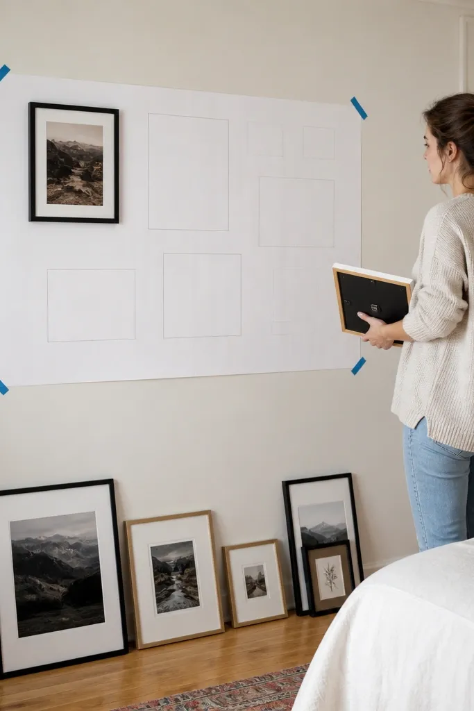
This is the method for people who keep remeasuring and still end up with one frame drifting. A paper template gives you one accurate map of the arrangement, so you don’t keep transferring measurements from frame to wall. It’s especially helpful when you have uneven frame sizes and want a tight, consistent look. For renters, it also reduces wall time because you stick the template once, mark everything, then remove it before placing hardware.
Lay your frames out on the floor and trace each frame outline onto craft paper or poster board, then add small dots for the top hanger points. Tape the paper template to the wall at your chosen anchor height and align the template edges with your reference marks. Mark the wall with a pencil through the hanger dots, then remove the template. Install your removable hangers or strips at the marked points and hang frames starting with the largest one to lock the visual center.
Editor's noteUse a bright pencil or painter’s tape dots so your hanger marks don’t fade after you remove the template.
Skip thisDon’t reuse a template that got stretched or wrinkled. A warped template transfers wrong spacing.
7. Mat-and-frame matching system for a calmer renter gallery
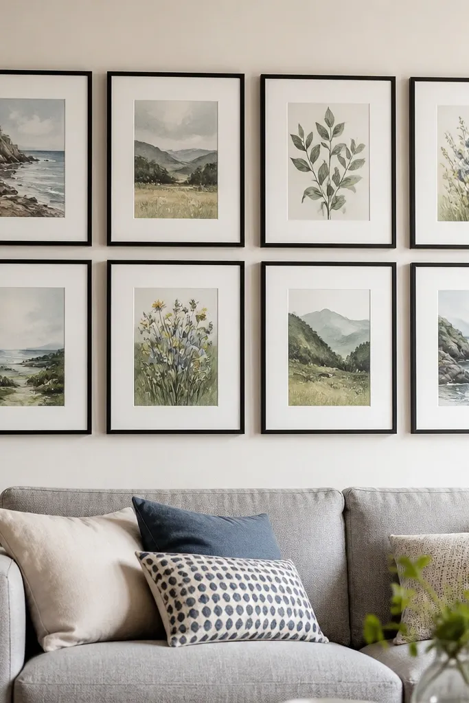
A gallery wall looks cleaner when the frames share a mat and border system, even if the art changes. This reduces the visual chaos that makes spacing errors look worse. The key is to choose a consistent mat width, like 2 inches, across different frame sizes, so every print has the same “breathing frame.” It’s a renter-friendly approach because you can change art later without redesigning the whole wall, and the wall stays cohesive even when you swap one piece at a time.
Pick one mat width you like, then choose frames that can fit that mat measurement without custom alterations. Order prints to match the mat opening sizes so you don’t end up with uneven artwork cropping. Layout the frames on the floor using your fixed gap rule, then tape outlines to the wall. Hang using your planned hardware per frame weight, and keep the mat edge aligned so the borders look level as a group.
If you’re mixing sizes, choose frames that have the same outer depth and finish. Depth mismatch makes gaps look uneven.
Don’t mix random mat colors with different border widths. That turns a spacing issue into a color issue.
8. Corner-to-wall gallery using vertical alignment from one edge
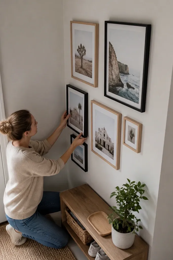
Corners expose every measurement mistake because the wall lines aren’t visually straight. If you’re building a gallery near a doorway, hall corner, or the end of a long wall, you need a strict alignment method. Align everything to one wall edge and one vertical reference line, not to the room’s geometry. This keeps the gallery from looking like it’s “tilting” when you view it from the side. It’s also renter-friendly because you’ll spend less time redoing hardware placements.
Choose the wall edge you’ll align to and measure from it to where your outermost frame edge should land. Draw a vertical reference line from that edge using a level (or a plumb line if you have one). Tape your frame outlines so every frame’s left or right edge matches the measured distances from that reference line. Mark hanger points through the tape, install hardware, then hang from the outermost frame inward so the corner doesn’t steal your alignment.
Editor's noteStand where you’ll actually see the wall most (like from the hallway doorway) and do one last alignment check before hanging the last frame.
Skip thisDon’t align frames to the ceiling. Ceilings look level but walls rarely are.



