
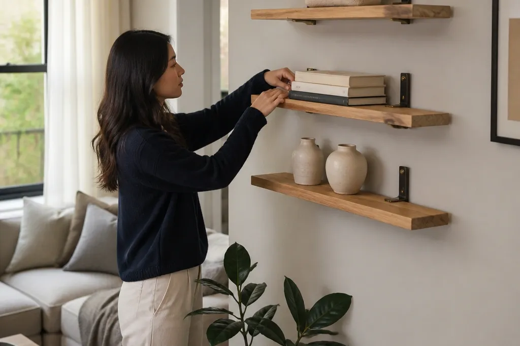
1. Linen Tray + Stacked Books on a White Oak Floating Shelf
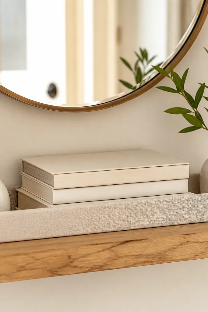
This setup makes a shelf look styled without looking busy. The linen tray gives you a soft, textured base, while stacked books add height and a clean horizontal line. Two small ceramics on the tray corners frame the books so the shelf reads balanced from across the room. White oak keeps the palette warm even if your walls are cool gray or bright white.
Editor's noteUse book stacks with one dominant spine color so the tray doesn’t look like it’s holding random paper.
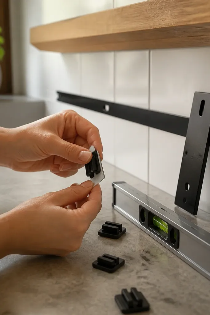
Start by installing a white oak floating shelf with hidden brackets and level it carefully using a small spirit level. Place your linen tray first, then build a book stack behind it so the spines form a single color band. Add two small ceramics or bud vases at the tray’s left and right corners, keeping the tallest item within the same height window. Finish by adding one thin accent like a bookmark ribbon or a small brass object on the tray for a crisp highlight.
Skip thisDon’t center the tray and then crowd everything around it — the edges should still breathe.
2. Black Frame Gallery Shelf with One Tall Plant
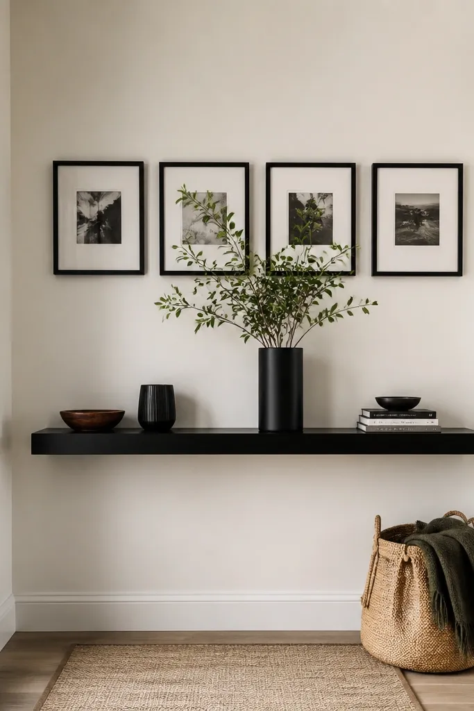
If you want the “gallery wall” look but your landlord says no, this is the move. Framed prints give you instant polish, and a single tall plant adds life without turning the shelf into a plant shelf. Keep the frames the same finish so the shelf looks designed, not collected. The black hardware echoes the frames and makes the shelf feel intentional.
Editor's notePick frames with matte interiors, not glossy, so sunlight doesn’t create glare streaks across the room.
Mount a black floating shelf and choose three frames with matching dimensions, like 8x10 or 5x7, all in the same black finish. Place the tall plant in the center back of the shelf, then arrange the frames in a slight arc around it so one edge doesn’t look cramped. Secure each frame with small shelf-safe adhesive pads or stand them using frame feet so they don’t slide. Leave a narrow gap between frames for clean separation.
Skip thisAvoid mixing frame sizes wildly — it makes the shelf look like a storage dump.
3. Rattan Basket + Ceramic Bud Vases in a Color Block
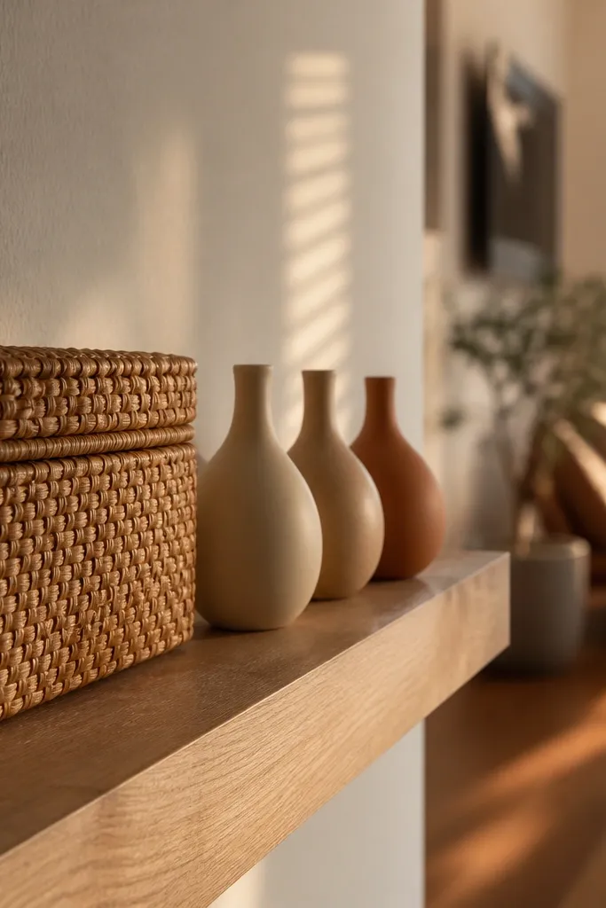
This is the easiest way to make floating shelves look curated in a rental because it hides clutter. A rattan basket gives you a built-in container, while bud vases create a tidy rhythm on top. Choose one color family for the ceramics — like cream, sand, and warm terracotta — so the shelf reads like a planned palette. The texture from rattan makes the shelf feel warm even with minimal decor.
Install your floating shelf and place the rattan basket first, centered with the handle facing slightly toward the room. Add three bud vases in a row across the front edge, spacing them evenly so each vase has breathing room. If you’re using faux stems, trim them so the tallest vase is only about 1.5 times the height of the shortest. Finish by tucking one folded linen cloth behind the vases so the background stays clean.
Choose vases with similar openings so they visually line up even if their heights differ.
Don’t use a basket that’s too tall — it should stay below the shelf’s front lip visually.
4. Monochrome Ceramic Set with a Thin Brass Tray
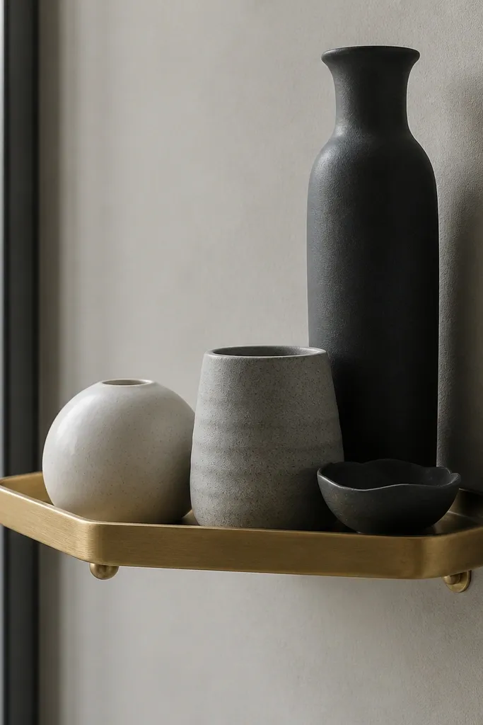
Monochrome shelves look expensive because they reduce visual noise. A thin brass tray adds just enough shine to catch light without looking like a “decor haul.” Use ceramics in one palette — white, charcoal, and smoke gray — and keep shapes related so the set feels curated. This is great for small spaces because the shelf stays visually calm.
Mount the shelf and place a thin brass tray centered, with the tray’s long edge parallel to the wall. Arrange three ceramics on top: one larger piece in back, two smaller pieces in front corners. Keep the ceramic heights within a 6-8 inch range so the shelf reads tidy. Add one small brass detail like a match holder or a mini candle holder at the tray’s edge.
Wipe brass with a microfiber cloth right before styling so it looks clean in daylight.
Don’t stack ceramics too high — height spikes make monochrome look like it’s falling apart.
5. Floating Shelf Spice-Label Look for a Kitchen Nook
This makes kitchen shelves look curated without turning them into clutter. Small jars with labels create a repeating pattern, and the shelf becomes functional even when you’re not displaying decor for guests. Use a consistent jar shape and label style so the shelf looks like part of the kitchen design. It’s renter-friendly because you can swap labels later without changing hardware.
Install a floating shelf in a kitchen nook where you can reach it easily. Use identical jars with matching lids, then label them with the same font style and size. Arrange jars in a left-to-right order with one taller jar at one end for visual anchor. Finish by adding a small wooden scoop or a folded dish towel behind the front row so the back doesn’t look empty.
Use waterproof label paper or laminate so steam doesn’t ruin the look.
Avoid mixing jar heights randomly — keep one height leader and everything else even.
6. Dark Walnut Shelf with a White Sculptural Vase
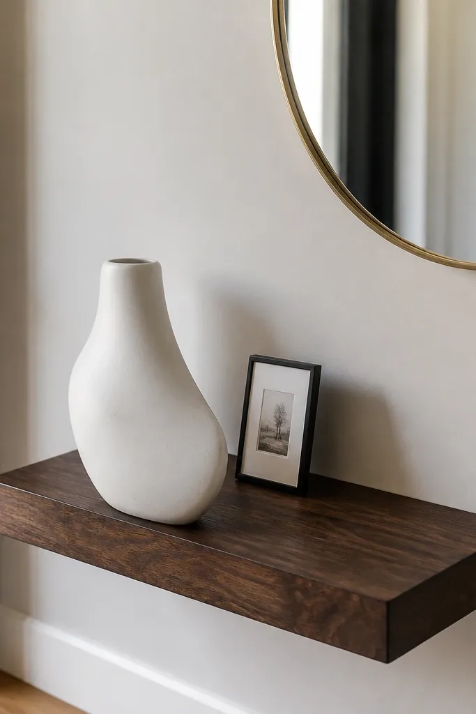
High-contrast styling looks intentional fast. Dark walnut makes the shelf feel weighty, and a single white sculptural vase creates a clean focal point. Add one small framed card or mini art print to keep the shelf from looking like a single-item display. This setup works especially well in hallways and entryways where you want a quick “finished” look.
Editor's noteChoose a vase with an interesting silhouette so you don’t need multiple items to create depth.
Mount a dark walnut floating shelf at about eye level, roughly 60-66 inches from the floor to the shelf surface if it’s near a doorway. Place the sculptural vase centered, then add one small framed piece on the opposite side so the composition isn’t symmetrical in a boring way. Use a thin black or brass picture ledge if your frames slide easily. Step back and check that the vase and frame sit on the same horizontal line visually.
Skip thisDon’t add three more small objects — the contrast is doing the heavy lifting.
7. Two-Tone Shelf Styling with a Vertical Book Spine Accent
This is how you make a shelf look designed when your decor collection doesn’t match. Pick two tones and repeat each twice: for example, cream + black, or terracotta + natural wood. Use one vertical book spine as a “signpost” in the center so the shelf gets a clear focal point. The rest stays simple so the repeated tones read as intentional.
Editor's noteChoose one book with a spine color you already have elsewhere, like a black bookmark holder or black frame.
Install the shelf and place a small tray on one side to lock in your first tone. Put a vertical book spine in the middle back so it stands taller than everything else by about 2-4 inches. Add one small object in that same tone on the opposite side, then fill the remaining space with a second-tone candle or ceramic. Keep the front edge clear so the shelf line looks sharp.
Skip thisAvoid more than two tones — the shelf starts looking like a thrift haul.
8. Sunburst Mirror Backdrop with Minimal Shelf Objects
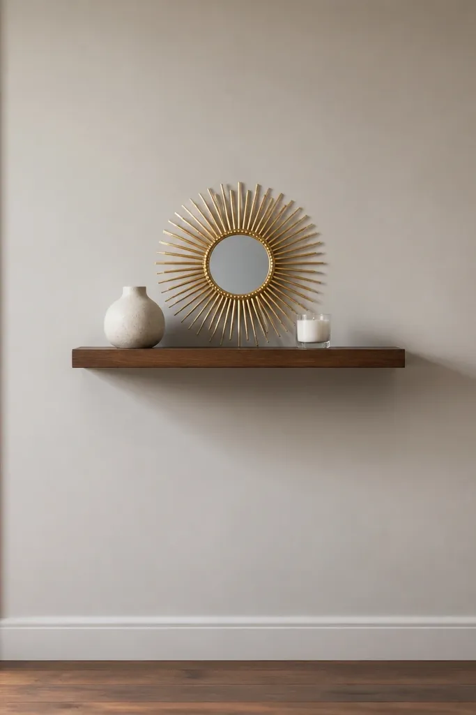
A small sunburst mirror behind the shelf makes everything look styled because it adds depth without adding clutter. The mirror catches light and makes the shelf feel layered, even with just two objects. Keep the objects minimal: one ceramic and one candle or small plant. This works well on blank walls where your shelf needs visual support behind it.
Mount the floating shelf and place a small sunburst mirror against the wall directly behind the shelf center. Add a single ceramic vessel on the left and a candle holder on the right, keeping both objects at similar height. If your mirror is too tall, lean it slightly back so it doesn’t block the shelf line. Use removable museum putty for the mirror so you can remove it cleanly later.
Use warm-white bulbs if you have a nearby lamp — they make sunburst reflections look softer.
Don’t pick a mirror with a busy pattern — the sunburst should be the only “graphic” element.
9. Stacked Picture Ledge with a Fabric Runner
A fabric runner is the cheat code for renters. It hides tiny gaps and makes the shelf look like it has a planned base layer. Stack picture frames in a small cluster so the runner shows like a soft background. This setup looks curated in daylight because the fabric texture adds warmth and makes the shelf feel styled, not random.
Editor's noteUse a runner that’s 2-3 inches shorter than the shelf so it doesn’t bunch at the ends.
Install the floating shelf with a level line, then fold a fabric runner so it sits under the frame cluster. Place two frames stacked slightly offset, with their top edges aligned to keep the look clean. Add one small object like a tiny vase or a candle at the front corner. Keep the runner centered so the background stays symmetrical even if the frames aren’t.
Skip thisAvoid glossy fabric — it shows wrinkles and glare.
10. Asymmetrical Plant Shelf with a Hanging Rattan Chair-Back Look
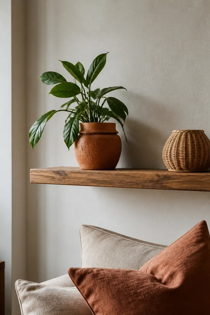
Asymmetry looks curated when it’s controlled. One plant in a textured pot adds organic shape, and a second smaller texture item on the opposite side balances the composition. Rattan or woven accents bring a natural rhythm that looks good in photos. This is a strong choice for living rooms where you want the shelf to feel like part of the room, not like separate decor.
Mount the shelf and place a larger plant pot on the back left, centered on the shelf. Add one smaller woven item on the front right, like a mini basket or a rattan coaster set. Keep the plant leaves trimmed so they don’t spill over the shelf edge in a messy arc. Finish by adding one small framed photo standing behind the smaller woven item, secured with frame feet.
Trim faux plants so their widest point sits below the shelf’s midpoint for a cleaner silhouette.
Don’t mirror items perfectly left and right — controlled asymmetry looks more intentional.
11. Travel Poster Shelf with a Brass Paperweight
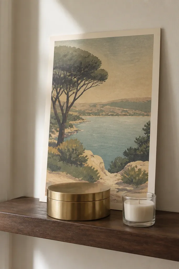
This one is for renters who want personality without chaos. A single poster-style print adds a strong visual theme, and a brass paperweight makes it feel grounded. Add one small supporting item — a candle, a small tray, or a tiny ceramic — and stop there. The result looks curated because you’ve got one clear graphic element and one physical anchor.
Editor's noteChoose prints with thick borders so the shelf doesn’t look like it’s holding loose paper.
Install a shelf and place a poster-style print in a frame or stand so it sits upright behind the main objects. Set a brass paperweight or small brass tray in front to anchor the composition. Add a single supporting object on the opposite side, keeping it lower than the paperweight by about 1-2 inches. Keep the shelf edges clear and check the spacing from a standing height, not while kneeling.
Skip thisAvoid multiple prints at once — the shelf turns into a collage.
12. Monogram Letter + Candle Trio on a Floating Shelf
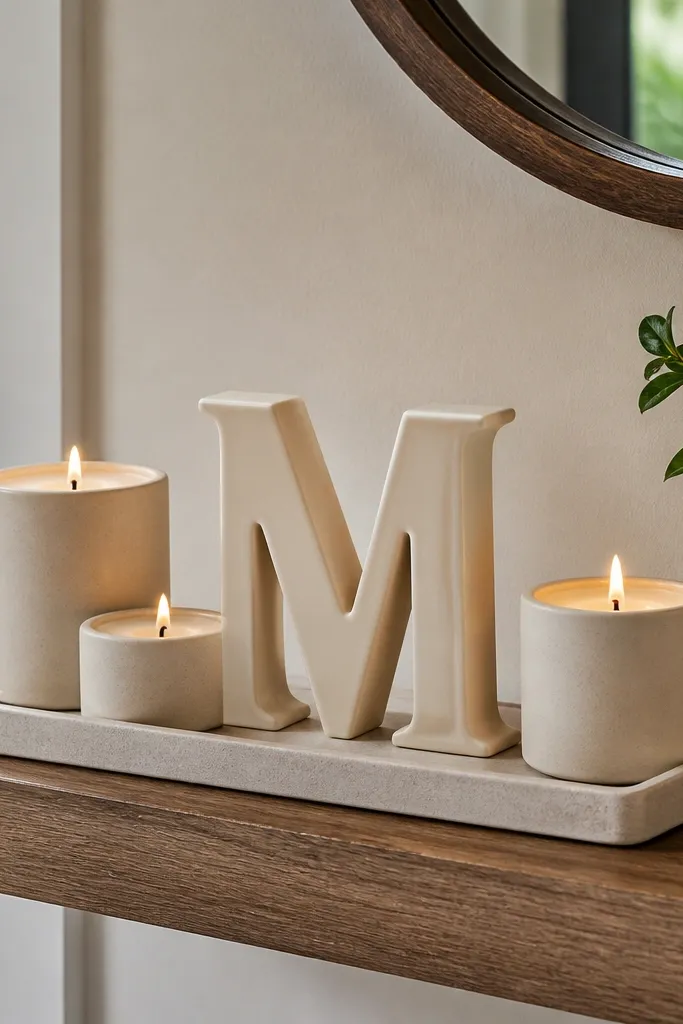
A monogram letter gives you a clean, graphic element that still feels personal. Three candles create an easy repeating pattern, and a small tray keeps everything pulled together. This setup looks great on entryway shelves because it’s readable from a distance and doesn’t require a lot of items. Keep the letter and candles in related finishes so it looks designed.
Editor's noteUse unscented candles if you’re styling for photos — heavy scents can overwhelm the room smell.
Mount the shelf and center a monogram letter in the back, either freestanding or secured with museum putty. Place a small tray in front, then set three candles on the tray with consistent spacing. Add one small match holder or mini candle accessory at one corner of the tray so it looks finished. Use a level to keep the candle line straight across the shelf.
Skip thisDon’t use candles that vary wildly in height — the rhythm gets messy fast.
13. White Marble Look Tray with Black Candlesticks
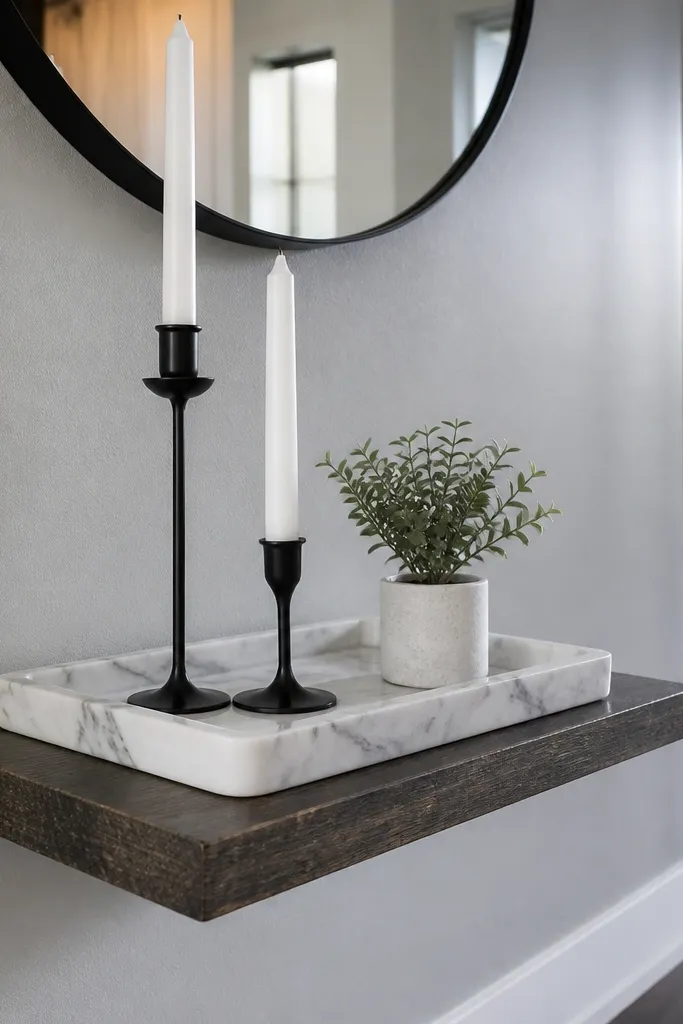
This is a classic contrast formula that reads polished in almost any interior. A white marble-look tray gives you a crisp base, and black candlesticks add sharp vertical lines. Add one small plant or sprig in a tiny pot to soften the hard surfaces. It looks curated because the tray organizes the shelf and the candlesticks create structure.
Mount the shelf and place the white marble-look tray centered. Arrange two black candlesticks at the tray’s left and right positions, then put a small plant or sprig in the middle back. Keep the candlesticks upright and aligned so the shelf looks symmetrical without being boring. Finish by adding a single thin item like a matchbook or a small incense holder on the tray edge.
Wipe dust off tray edges — marble-look surfaces show smudges immediately.
Avoid adding more than one plant — too many greens turns it into a jungle shelf.
14. Floating Shelf with a Chalkboard Label Strip for a Farmhouse Kitchen
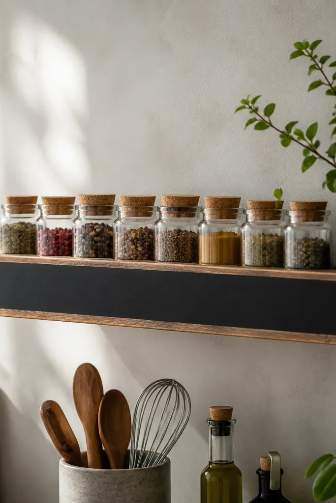
Farmhouse style looks curated when it has clear labeling. A chalkboard label strip makes the shelf feel organized and intentional, and small jars keep the palette consistent. You get a functional display that doesn’t rely on expensive decor. This works especially well in kitchens and laundry rooms where you want storage that still looks good.
Install the shelf and set up identical jars or canisters with matching lids. Add a chalkboard label strip across the back wall area or lean it against the wall behind the jars using removable adhesive pads. Arrange jars in a neat row, then place one small utensil or wooden scoop on one end for a natural accent. Keep jar labels aligned so the strip looks like it belongs to the same set.
Write labels with white chalk or chalk markers and wipe clean before you style for photos.
Don’t mix jar sizes constantly — pick one jar footprint and repeat it.
15. Color-Coordinated Book Spines with a Single Oversized Ornament
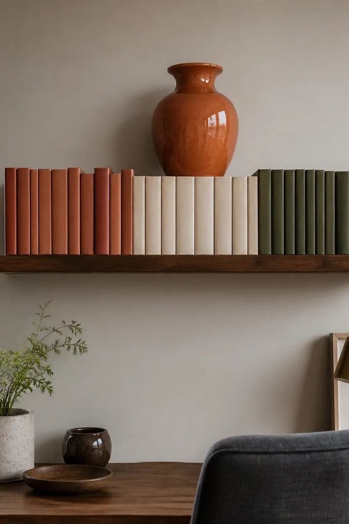
When you don’t have a lot of decor, book spines do the heavy lifting. Color-coordinated spines create a band of color that looks designed, and one oversized ornament adds a focal point. Keep the ornament’s color in the same palette as the books so it doesn’t feel like an extra. This is great for bedrooms and home offices because it looks neat and calm.
Editor's noteUse book stacks with one dominant height so the spine band stays level.
Mount the shelf and line up books horizontally in a row, pushing spines together so there are no big gaps. Choose books with a tight palette — for example, sand, cream, and muted olive — then add one oversized ornament in the center back. Place the ornament slightly behind the book row so it creates depth. Add one small accent at the front edge only if it matches the palette.
Skip thisAvoid adding multiple ornaments — one oversized piece is the whole point.
16. Floating Shelf Mug Display with a Hanging-Style Ring
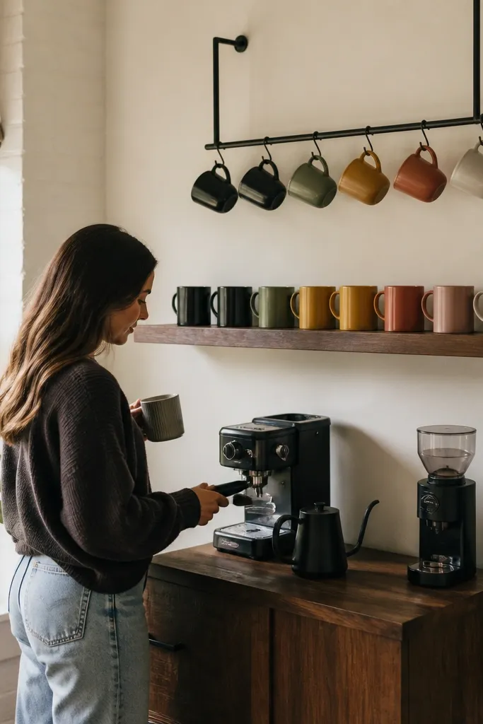
Mug displays look curated when the mugs are visually aligned and supported. A hanging-style ring or simple bar above the shelf gives you the “collected” look without needing a full pot rack. Use matching hooks or a single color of hardware so it doesn’t look improvised. This setup is ideal for coffee corners because it’s decorative and practical.
Install the floating shelf and attach a small ring or bar above the shelf line using shelf-safe brackets. Hang mugs with similar handle orientation so the silhouettes look consistent. Place a small tray on the shelf surface for sugar or stir sticks, centered under the ring. Keep mug colors to two tones so the display reads intentional, not random.
Use mug hooks that grip the handle firmly so mugs don’t swing and clack against the shelf edge.
Don’t overload with too many mugs — five to seven looks styled; more starts looking like a storage wall.
17. Textured Ceramic Row with a Single Neutral Photo Frame
Texture beats clutter. A row of small textured ceramics gives you visual interest without requiring multiple colors, and one neutral photo frame keeps the shelf personal. This works in rentals because textured items hide minor imperfections in your wall color or lighting. It’s also easy to swap photos later without changing the whole shelf setup.
Editor's noteChoose ceramics with matte glazes so they don’t glare under overhead lighting.
Mount the shelf and place one neutral photo frame on the back left, standing upright. Arrange three to five small textured ceramics in a straight row on the front half, keeping their heights within a 3-4 inch range. Add one small element like a folded linen napkin or a tiny candle on the opposite side so the shelf feels balanced. Step back and ensure the ceramics don’t touch the frame visually.
Skip thisAvoid glossy ceramics in a row — they reflect light and look chaotic.
18. Woven Wall-Shelf Basket with Dried Florals and a Wood Paddle

This looks curated because it mixes three things that photograph well: woven texture, soft dried stems, and a flat wood shape. The basket hides small clutter, the dried florals add height and movement, and the wood paddle adds a practical prop that breaks up round shapes. It’s a strong choice for living rooms and bedrooms where you want warmth and softness without heavy furniture.
Editor's noteTrim dried stems so the top lands 1-2 inches below the shelf’s top line visually from standing height.
Mount the shelf and place a woven basket centered, leaving a little space at the front edge. Insert dried florals in a small vase or directly in a slim jar tucked inside the basket. Add a wood paddle or slim board leaning against the back wall behind the basket so it creates a clean diagonal. Keep the tallest dried stem inside the shelf footprint so it doesn’t look messy.
Skip thisSkip the “full bouquet” look — a few stems look intentional; too many looks like a craft project.
19. Oversized Knotted Rope Shelf with Driftwood-Look Planks
This is the renter-friendly floating-shelf look when you want something that feels built-in but doesn’t require a heavy wall change. The rope suspension gives you that curated, design-studio vibe because the shelf reads like one intentional piece, not “a shelf you added.” Use driftwood-look planks and keep the styling tight — two small frames and one ceramic object — and the shelf looks finished even with minimal decor. It works great in entryways, reading nooks, and small living rooms where you want vertical interest without clutter. Skill level is beginner, and the build takes about 2 to 3 hours including finishing and dry time. The result looks deliberate in photos because the rope lines pull the eye upward and the weathered wood texture adds depth.
Editor's notePre-drill the shelf holes with a bit that’s 1/64 in smaller than your rope thickness so the wood doesn’t split when you tighten the knots.
Cut two shelf boards to 30 in long x 6 in wide x 3/4 in thick (use pine or poplar for easy drilling). Sand to 120 grit, then apply a driftwood-look stain (gray-brown) followed by a light dry-brush of white acrylic craft paint; seal with matte water-based polyurethane. Mount two rope anchors on the wall using a stud finder: place them 24 in apart horizontally, and keep the top of the shelf about 68 in from the floor if you want a comfortable viewing height. Drill matching holes in the shelf ends at 1-1/2 in from the outside edge, 3/4 in down from the top, then thread 1/2 in thick cotton rope through and tie a tight fixed knot under each side with a drop of wood glue on the knot base. Hang the shelf, then style with one small framed print (black frame, white mat) and one ceramic object so the shelf stays airy.
Skip thisDon’t use glossy sealer — it flashes in daylight and makes the shelf look temporary instead of finished.
20. Two-Level Floating Shelf with Hidden Peg System
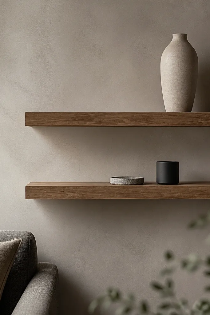
This gives you the curated “layered shelving” look without the messy visual clutter of stacked brackets. The trick is a hidden peg system so the shelves align perfectly and the wall stays visually clean. Keep styling minimal: one vertical element on the top shelf and two small objects on the bottom shelf — it looks designed, not crowded. This is ideal for renters who want a statement in a narrow wall space like a hallway, above a console, or next to a reading chair. It’s also a great option if you’ve ever tried to level shelves by eye and ended up with one slightly crooked. Skill level is intermediate because you’re measuring and drilling accurately, but the total time is still reasonable at about 3 to 4 hours. The result photographs well because the two levels create a rhythm and the pegs disappear behind the shelf lip.
Editor's noteDry-fit one shelf on the pegs before finishing so you can confirm spacing and level, then remove, finish, and rehang once the stain is fully cured.
Use two shelf boards 36 in long x 7-1/2 in deep x 3/4 in thick, and plan a 10 in gap between the underside of the top shelf and the top of the bottom shelf. Build a concealed rail on the wall: install a 1x2 ledger board level at the height you want, then attach a second matching rail 10 in below it using 2-1/2 in screws into studs. For the peg system, drill 1/4 in holes into the underside of each shelf at 2 in from each end and then every 12 in along the length; keep the holes 1/2 in deep so the pegs seat firmly. Use 1/4 in steel shelf pegs or dowel pegs that match your holes, and set them into the wall rails so the shelves drop on and lock. Finish the shelves with a warm stain (walnut or medium oak) and matte topcoat, then add felt pads where the shelf meets the pegs to prevent squeaks.
Skip thisDon’t rely on wall anchors only — a two-shelf setup needs stud fastening so it stays straight over time.



