
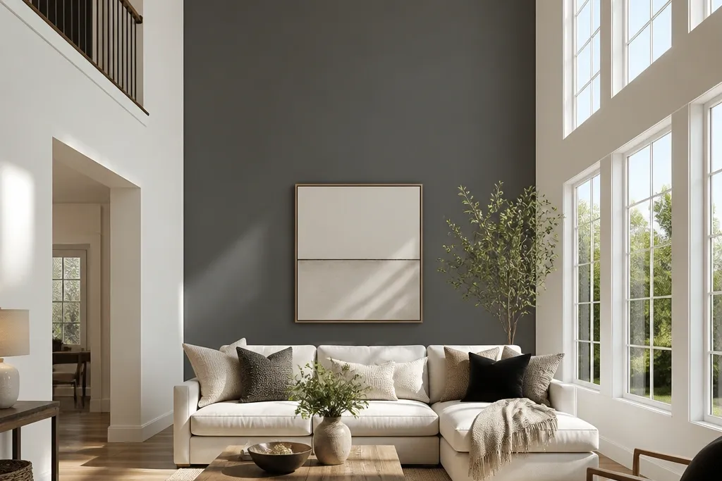
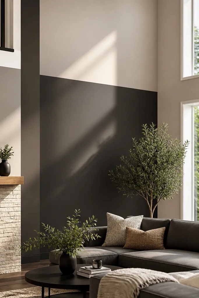
1. Two-Color Color Block with a Crisp Tape Edge
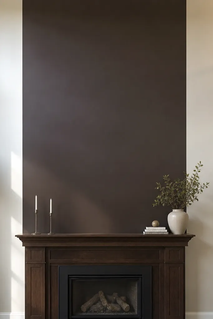
This is the fastest way to make a double-height living room look designed. A single large rectangle in a darker shade pulls attention to the middle of the wall, so the height feels intentional instead of empty. Keep the boundary straight and clean — that’s what reads as “custom” in photos. Use matte or eggshell paint so the wall texture doesn’t glare under light. This works best when you want a bold look without buying lots of materials or doing any demolition.
First, tape a rectangle that’s about 6-9 ft tall and centered on the wall, using a level to keep the top and sides straight. Paint the lighter base color, let it cure overnight, then apply painter’s tape to the rectangle edges and press it firmly. Roll the darker color in two thin coats, keeping a wet edge as you go. Remove tape while the paint is still slightly tacky so the line stays crisp, then touch up with a small angled brush if needed.
Use a foam roller for the main field and an angled sash brush for the tape line — it keeps edges sharp.
Don’t paint the darker block first; the tape line needs a fully dry base to prevent bleed.
2. Vertical Wood Slat Panel Accent in a Narrow Frame
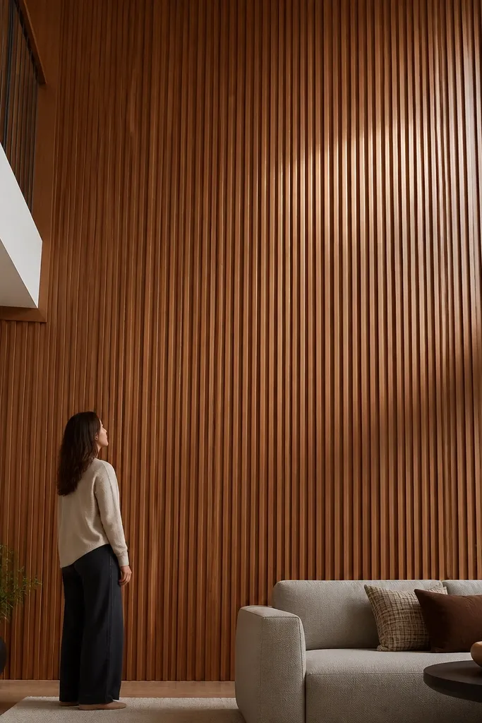
Vertical slats are one of the cleanest ways to make tall walls look higher-end. When you install slats inside a simple perimeter frame, the wall reads like built-in architecture, not a random feature. The vertical rhythm also guides the eye upward, which helps in double-height rooms. Choose pre-finished or paintable slats to control color and keep the install straightforward. This works well if your room has simple furnishings and you want the wall to do the styling.
Start by deciding the framed area size — a common sweet spot is 8 ft wide by 7 ft tall, centered. Mark stud locations, then install a level ledger board for the slat bottoms. Mount slats vertically with consistent spacing (often 1/4 in) using finishing nails or a brad nailer, checking level as you go. Finally, add trim around the frame edges, caulk the seams, and paint or stain to match your room’s wood tones.
Editor's notePre-paint trim and slat edges before assembly; it reduces visible misses along corners.
Skip thisDon’t skip checking the wall for flatness — slats will telegraph every wobble.
3. Peel-and-Stick Geometric Panels in a Centered Column
Geometric peel-and-stick panels look custom without the time cost of building a frame. A centered column design works especially well in double-height rooms because it gives you a strong focal point that still respects the height. Choose matte finishes to avoid glare from overhead lights. This is ideal when your wall has minor texture and you want minimal mess. The look is photogenic because the pattern creates shadow lines that hold up in photos.
First, clean the wall with a degreaser wipe and let it dry fully. Use a laser level or long level to mark the centerline and the outer edges of your panel column. Dry-fit one row to confirm the spacing you like, then peel backing a few inches at a time and press firmly with a roller. Work from the center outward so the pattern stays aligned, and trim edges with a sharp utility knife.
Plan your pattern so the vertical seam lands near the centerline, not near a door or window edge.
Don’t install from the top down if your panel set has alignment marks — small drift shows fast.
4. Large-Scale Wallpaper with a Single Repeat Focus
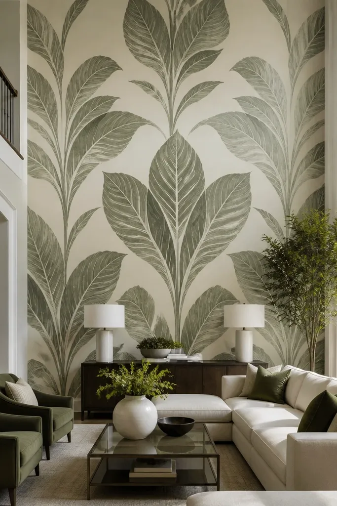
Wallpaper is the quickest way to add texture and personality to a blank double-height wall. For a clean, “intentional” look, pick a pattern with a strong single motif and place it centered so it reads as one artwork. Large-scale designs look great because the shapes scale up with the height of the room. Choose a washable, vinyl-backed paper if you can — it’s easier to keep looking good. This is best when you want a statement without building anything.
Start by measuring wall width and height, then check the wallpaper’s repeat so you can plan where the motif lands. Dry-hang the first strip lightly to find your centered alignment, then trim carefully. Apply paste or use peel-and-stick wallpaper as directed, smoothing from the center out to avoid bubbles. Match the seam pattern for the next strip, then trim the top and bottom edges with a sharp blade and a straightedge.
Editor's noteUse a seam roller on each join — it keeps the seam tight and makes the wall photograph cleaner.
Skip thisDon’t rush the first strip; every mistake multiplies across the wall.
5. Half-Wall Limewash Look with a Ragged Soft Boundary
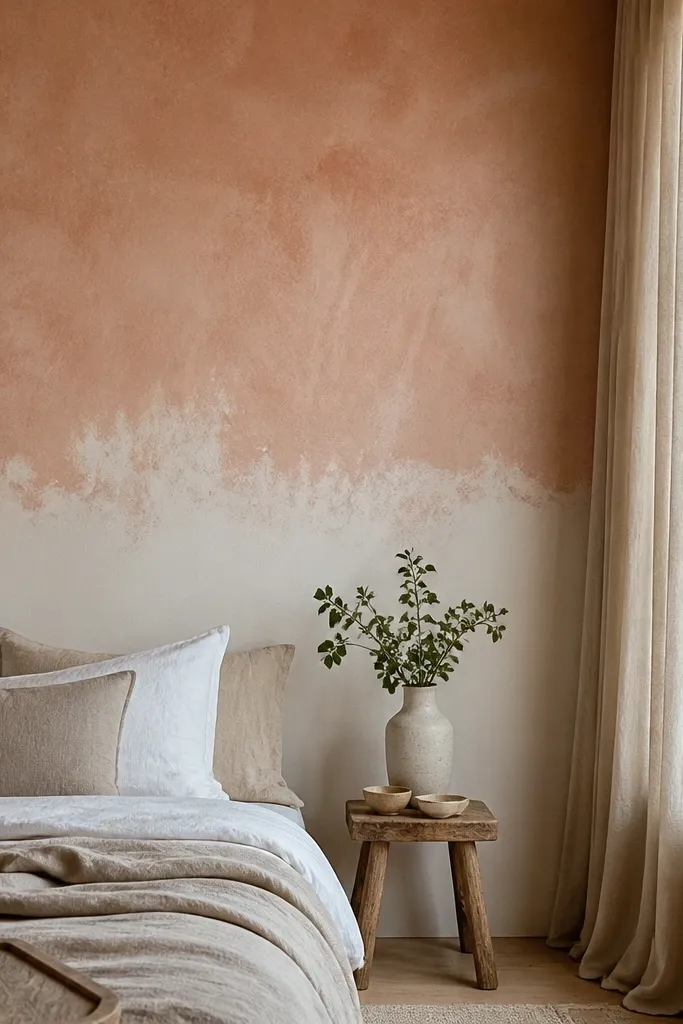
A limewash-style finish gives you that airy, textured look that flat paint can’t match. The trick is the boundary: put the color shift at the eye-level zone and blend the edge so it feels natural. This looks expensive because the mottling reads like depth, not just color. It works well in rooms with natural materials like linen, rattan, or light oak. If you want a calm, artistic accent without sharp lines, this is the move.
First, paint a base coat in the lighter color and let it dry fully. Apply the second color using a rag or sea sponge, then blend the transition area while both layers are still workable. Work in small sections to keep the mottling consistent, using a lighter touch as you near the boundary. Seal with a clear, limewash-compatible topcoat if the product requires it, then check coverage under the room’s lighting.
Editor's noteTest the rag technique on a scrap piece of drywall or cardboard first so you know how much contrast you’ll get.
Skip thisDon’t brush over a limewash-style layer once it starts setting — it kills the softness.
6. Plaster-Style Venetian Float in a Warm Greige Block
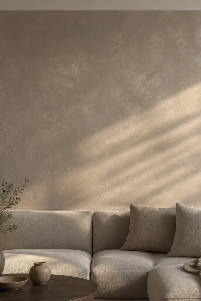
Venetian-plaster style gives you depth and movement with a controlled, modern palette. A single block shape works best: it frames the height without requiring full-wall coverage. The sheen is the key — you want a gentle glow that catches light when you move. This option looks great with modern furniture and works as a backdrop for art. It’s not the fastest if your wall is rough, but it’s quick if you use a pre-mixed plaster system and keep the design simple.
Prep the wall with a skim coat if needed, then sand until smooth. Tape the boundary for your block and prime with a plaster-compatible primer. Apply plaster with a stainless steel trowel, then build the finish in thin layers, using a light swirling motion. After it dries, burnish lightly for sheen and remove tape carefully so edges stay clean.
Editor's noteUse a plastic mixing bucket and a drill with a paddle — plaster needs consistent texture to float evenly.
Skip thisDon’t skip primer; plaster won’t bond well to glossy or dusty surfaces.
7. Oversized Framed Canvas Look with DIY Molding Grid
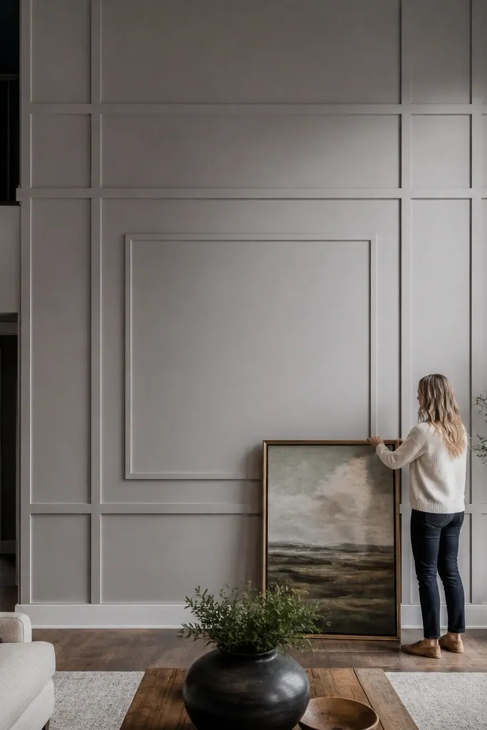
This makes the wall look like custom paneling without buying real built-ins. The framed grid creates structure at eye level and gives you a place to hang art or a large statement piece. Keep it monochrome — trim color close to the wall — for a subtle luxe vibe. It’s also forgiving if your wall isn’t perfectly flat because you can caulk small gaps. This is a great option when you want something architectural but still quick.
Measure and mark your outer frame rectangle, then use a level to draw guides. Install backing strips or thin cleats along stud lines so the molding has something solid to nail into. Cut molding pieces with 45-degree corners for a clean frame, then nail and glue where needed. Fill nail holes, caulk seams, sand lightly, and paint to match the wall or go one shade darker.
Editor's notePre-paint the molding before installation to reduce visible raw wood at miters.
Skip thisDon’t rely on drywall anchors for corners — the frame needs solid mounting points.
8. Matte Black Accent with a Whiteboard-Friendly Strip
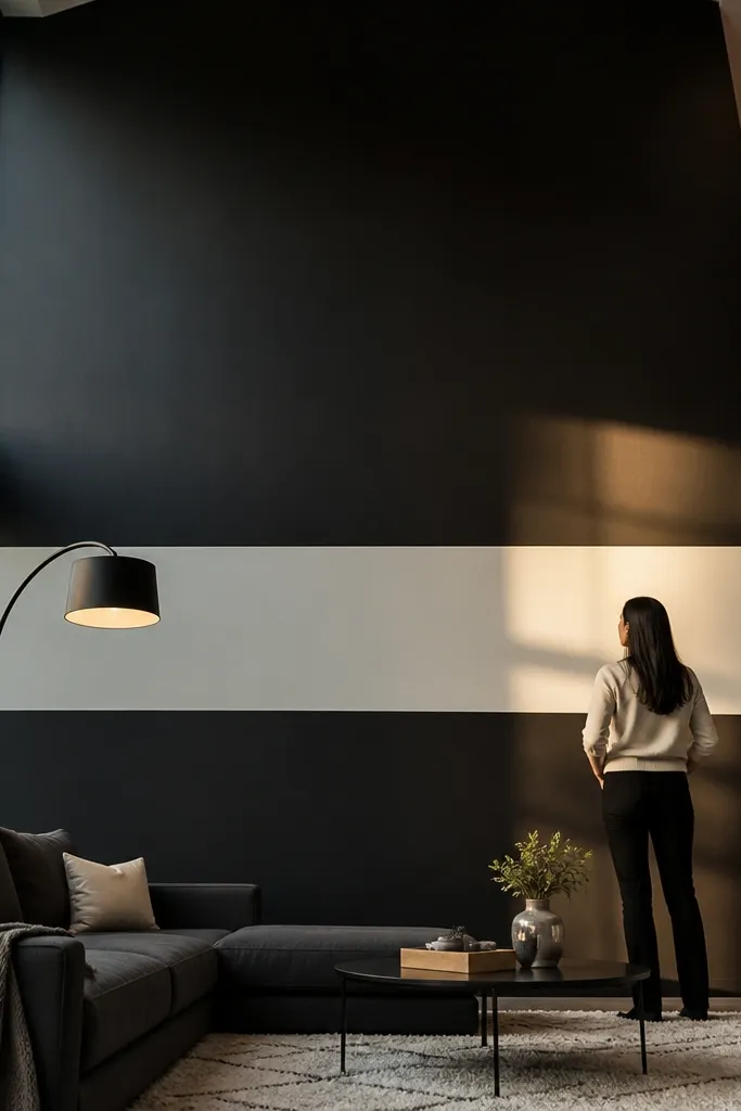
This is an accent wall that looks cool and also gives you function. The matte black field makes the room feel grounded, while a narrow light strip adds contrast and catches light without making the wall busy. Put the strip at eye level so it’s usable and visually balanced. This works especially well in living rooms where you want a place for notes, reminders, or art swaps. The look is modern and photo-friendly because black matte absorbs glare.
First, protect floors and mask the boundary using painter’s tape and plastic sheeting. Prime the wall with a bonding primer if you’re painting over a darker or textured surface. Paint the matte black in two coats with a roller and a small brush for edges, letting it dry between coats. For the writing strip, tape a thin line and apply a chalkboard/whiteboard primer and topcoat, then cure fully before using.
Editor's noteUse a satin or eggshell adjacent color for trim so the matte black stays the star.
Skip thisDon’t use glossy black; it reflects overhead lights and ruins the clean look.
9. Oversized Ribbed Accent with Foam Board Panels
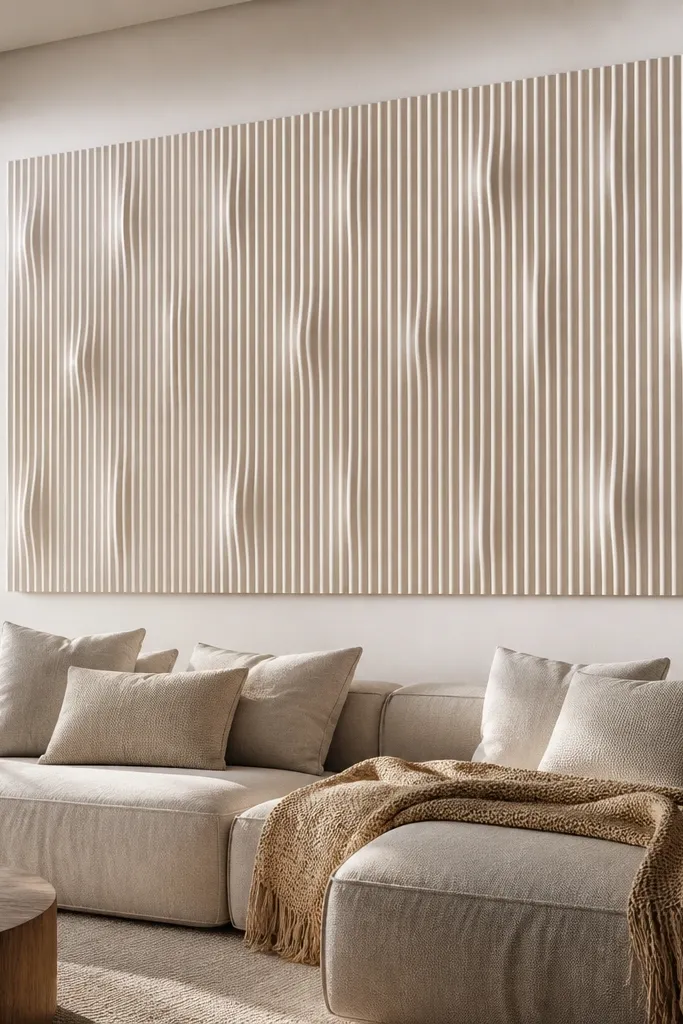
Ribbed 3D panels create shadow depth that looks great in photos, even when you keep colors neutral. A tall rectangle keeps it modern and stops the texture from overwhelming the room. Foam board panels are lightweight, fast to cut, and easy to install compared to real wood. If you want a quick makeover with a “designed” feel, this is a smart route. It suits living rooms with lots of light and simple decor because the texture adds interest.
Start by cleaning the wall and checking for flatness. Tape your rectangle area, then dry-fit a panel test to confirm how the ribs align. Glue panels with a construction adhesive rated for foam, apply adhesive in a consistent pattern, and press with firm pressure for the hold time listed on the product. Fill seams with foam-safe filler, sand smooth where needed, then prime and paint the whole accent area.
Editor's notePaint the panels before installation if your product allows it — it reduces seam show-through.
Skip thisDon’t use solvent-based adhesives — they can melt foam and warp edges.
10. Herringbone Accent in Peel-and-Stick Wood Look
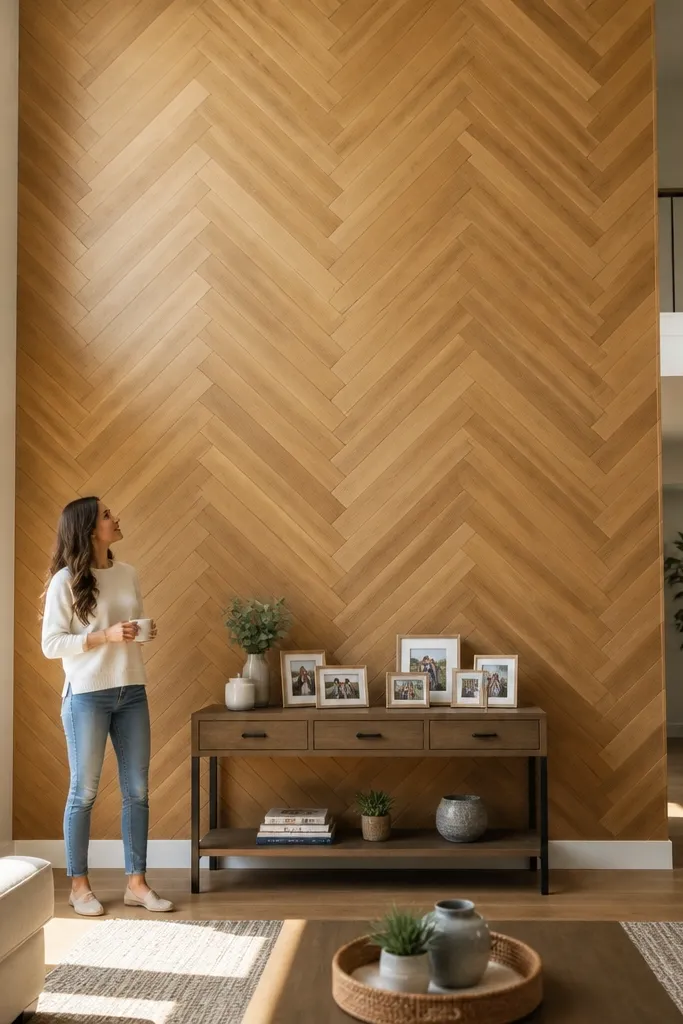
Herringbone reads upscale because the pattern creates movement without needing lots of colors. A centered herringbone block makes the double-height wall feel like a feature panel, not a blank background. Choose a wood-look finish in a warm tone or a cool gray — both photograph well. Peel-and-stick keeps this quick and avoids staining issues. This works best if your room’s palette is simple, since the pattern will be the visual star.
First, plan your layout by drawing a centerline and marking where the first tile will land. Start with a full row centered, then build outward, keeping the angle consistent using spacers or guides. Press each piece firmly and check alignment every few pieces so the line doesn’t drift. When you reach edges, cut tiles with a sharp blade and a straightedge, then seal the perimeter if the product calls for it.
Use a long metal ruler as a cutting guide — it keeps the cuts straight at the edges.
Don’t place pieces randomly; herringbone only looks clean when the angle stays identical across the block.
11. Stair-Step Ombre from Floor Up with Matte Paint
Ombre is one of the only accent styles that uses the height of a double-height wall in a flattering way. Instead of a smooth gradient that can be hard to pull off, use stair-step bands that look intentional and easier to repaint if you miss. Matte paint keeps the transition soft and reduces glare. This works beautifully when your room has a neutral base and you want something artsy but still calm. It’s also surprisingly quick because you’re painting bands, not carving complex shapes.
Choose a base color family with three to four paint shades, from light to dark. Tape horizontal bands across the wall, starting with the darkest band near the eye-level zone and working upward in lighter steps. Roll each band in two coats, then remove tape while slightly tacky. Use a lightly damp brush or small roller to soften the edges between bands only if you want a blended look.
Editor's noteKeep band heights consistent, like 14-18 inches each, so the pattern looks designed.
Skip thisDon’t use too many shades — more than four bands starts to look muddy.
12. Ceiling-to-Anchor Fabric Panel Accent with Batten Edges
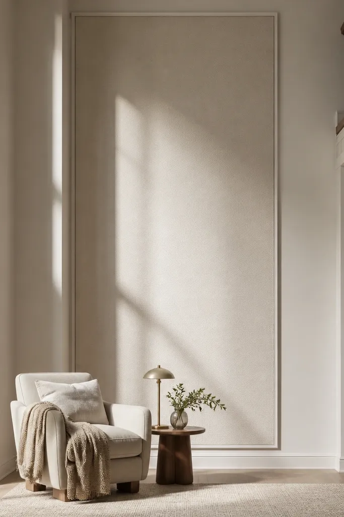
Fabric on a double-height wall looks soft and architectural when you frame it cleanly. The goal is to create a smooth panel that breaks up the emptiness without the heaviness of paint. Use a tightly tensioned fabric so it doesn’t sag, and keep the frame simple with slim battens. This is great for rooms that already feel warm and textured, like with rugs, curtains, or upholstered furniture. It’s also a good move if you don’t want to commit to permanent paint.
First, install a level mounting rail or two battens where the fabric edges will sit, using wall anchors into studs if possible. Cut fabric to size with extra for folding or stapling, then wrap and secure the edges to the battens. Pull fabric taut as you fasten so you avoid wrinkles, then add thin trim boards to hide fasteners. Finish by trimming the top edge and checking tension from the seating area.
Choose medium-weight curtain fabric with a tight weave; it holds shape better than thin sheers.
Don’t pick a fabric that frays easily unless you’re okay with sealed edges.
13. Two-Stage Tile Look Accent with a Subway Band
If you want a crisp, clean accent that photographs like a real renovation, a subway-tile band hits the mark. Keep the tile area to a band around 24-36 inches tall so it feels intentional and not like a small bathroom. Use a tile-look peel-and-stick sheet or modular panels for speed and easier install. The grout lines create dimension and make the wall look finished even from far away. This works best when your wall is otherwise neutral and you want one strong horizontal statement.
Start by marking the band’s top and bottom lines with a level. Clean the wall and apply a primer if the system requires it for adhesion. Install peel-and-stick tile panels from the center outward, aligning grout lines and pressing firmly. Trim edges with a utility knife and use caulk or edge trim at the perimeter for a clean stop.
Editor's noteUse a grout-line guide card or printed alignment sheet so the pattern stays straight across the wall.
Skip thisDon’t install over peeling paint or dusty drywall; tile-look panels fail fast on loose surfaces.
14. Oversized Macrame-Style Wall Panels with a Tight Color Palette
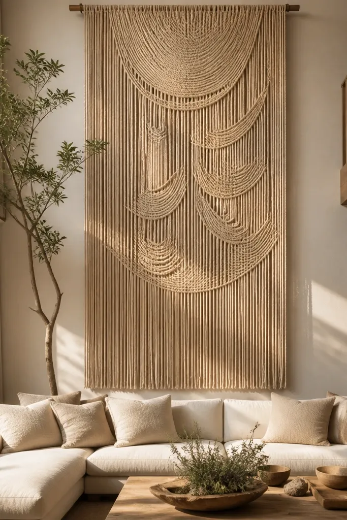
Woven wall panels add warmth and movement without paint. A tall rectangle hanging panel works because it fills the vertical space and softens the room’s edges. Keep the color palette tight — natural beige, oat, or warm white — so it looks cohesive with your furniture instead of like a craft project. This is quick because you’re mounting a pre-made panel, not building a frame from scratch. It’s especially good for living rooms with wood, rattan, or neutral textiles.
First, find wall studs or install a strong mounting rail where the top of the panel will rest. Mark the centerline and mount two hooks or a batten at the correct height so the panel hangs straight. Attach the panel using the built-in hanging tabs or sew-in loops, then check for level from the seating area. Add small corner hooks if needed to prevent twisting, then style with one or two minimal wall objects nearby.
Editor's noteSteam the panel lightly before hanging to remove shipping wrinkles and keep the weave flat.
Skip thisDon’t hang on drywall alone if the panel is heavy; use studs or a properly anchored rail.
15. Matte Paint + Floating Ledge Shelf as the Accent Anchor
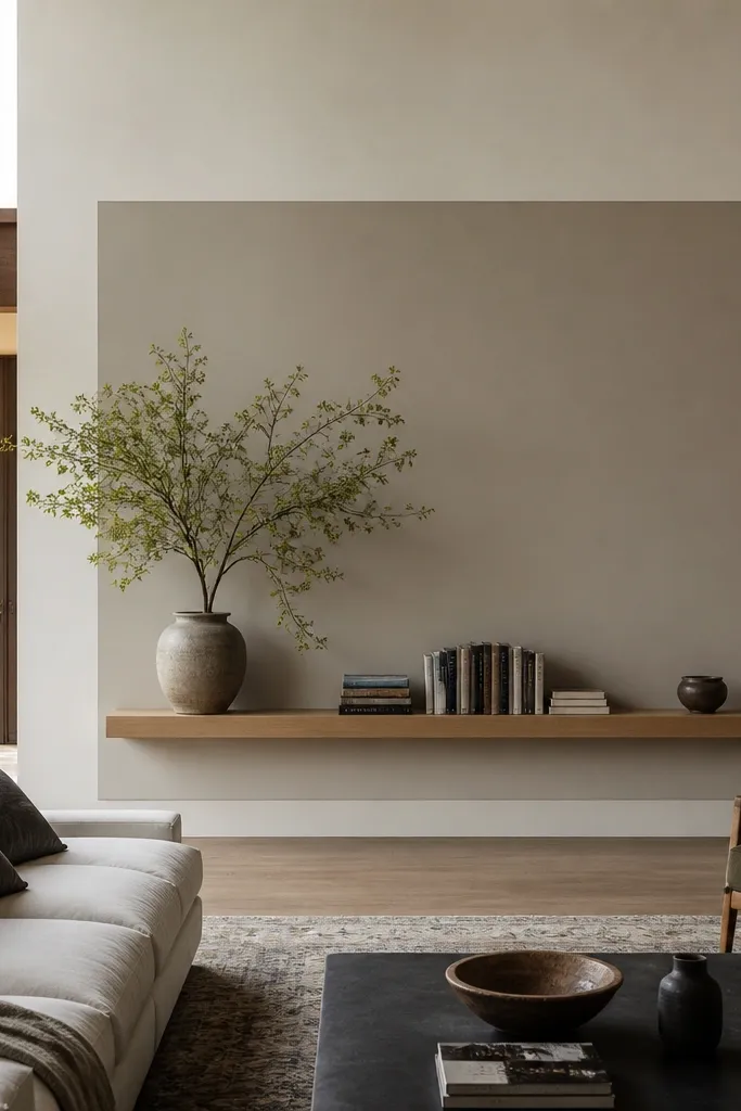
This is a good-looking shortcut: you paint a clean rectangle, then add a floating shelf as the visual anchor. In a double-height room, a shelf at eye level makes the wall feel designed even before you style anything on it. The paint field gives you the contrast, and the shelf adds a practical landing place for books, candles, or small plants. It’s also safer than a full-wall install because you only need to paint one section. This works best when you want a modern look with functional styling space.
First, tape a centered rectangle about 7-9 ft tall, and paint it in your accent color with matte or eggshell finish. Let it cure overnight. Install a floating shelf using a stud finder and proper shelf brackets, keeping the top of the shelf around 56-60 inches from the floor. Style the shelf with items that share a color family, then step back to confirm the rectangle frames the shelf in photos.
Editor's noteUse a shelf bracket template or measure twice — shelf alignment is what makes the whole wall look straight.
Skip thisDon’t mount the shelf too high; if it sits above the eye zone, the wall looks unfinished.
16. Micro-Panel Wallpaper with Vertical Stripes for Height Control
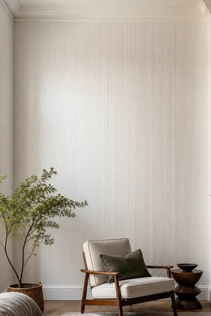
Thin vertical stripes are a smart way to control how tall the space feels. They make the wall look taller and cleaner, and they also help hide minor unevenness because the pattern is forgiving. Use a wallpaper that has a subtle texture or micro-panel look so the stripes aren’t flat. Keep the color close to your trim and ceiling for a refined, modern effect. This is a good choice when you want the height to feel intentional but not dramatic.
Measure wall width and plan your first strip so the pattern aligns at the centerline. Prime the wall if the wallpaper calls for it, then apply paste or activate peel-and-stick backing as instructed. Hang strips with a level line for the first one, then match the stripe alignment as you go. Trim edges neatly, press seams, and use seam roller if the paper has vinyl coating.
Editor's notePlan your pattern so the first stripe starts slightly off-center if your wall has a window — it visually balances the room.
Skip thisDon’t skip centering; a stripe offset looks obvious in double-height photos.
17. Oversized Canvas-Style Paint Texture with a Roller Pattern
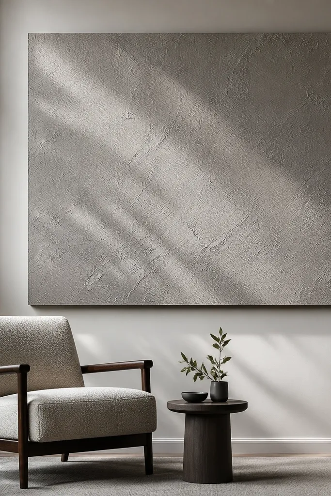
If your wall looks too flat after you paint, a roller texture gives you that “designed” depth without buying panels. Canvas-style roller patterns create soft shadows that read great under directional lighting. Keep the accent as one big rectangle so the texture stays intentional and doesn’t turn into a busy wall. This works well when your room has neutral furniture and you want a warm, tactile background for art. It’s also quick because you’re doing one paint technique, not multiple finishes.
Tape a centered rectangle in the eye-level zone and paint the base color first. Once dry, apply a second coat of the accent color and immediately roll with a canvas-texture roller, working in small sections. Keep pressure consistent so the pattern density stays even. Let it dry, then remove tape while slightly tacky to avoid tearing the edge.
Use the same roller direction for every section so the texture catches light the same way.
Don’t overwork the wet texture; repeated passes muddy the pattern.
18. Concrete-Look Surface Panel in a Centered Rectangle
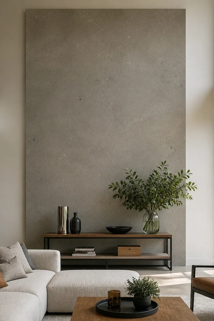
A concrete-look panel finish makes a double-height living room feel modern and grounded. The texture hides small wall imperfections and gives you a strong backdrop for wood, metal, and glass decor. Use a centered rectangle so the wall doesn’t feel like a basement. This is photogenic because the speckling creates depth without needing complicated design. It’s a good fit for industrial-leaning spaces or minimalist rooms that need contrast.
Prep the wall by filling dents and sanding smooth. Prime with a bonding primer, then tape a centered rectangle. Apply a concrete-look coating system in thin layers, following the product’s timing so it sets in the right texture window. After it dries, remove tape, then seal with the recommended topcoat to control sheen and wipe-clean performance.
Editor's noteUse a wide plastic trowel for the base coat so the texture stays consistent across the rectangle.
Skip thisDon’t seal too early; it traps moisture and can cause uneven curing.
19. Mirror Frame Accent with a Thin Border
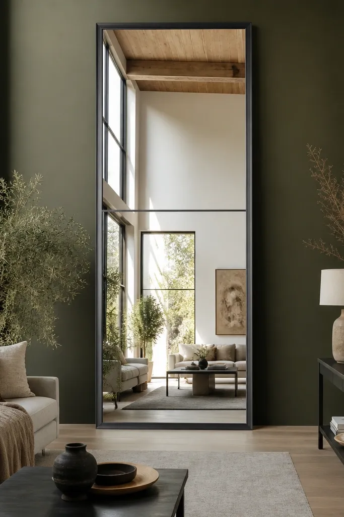
A mirror accent is the easiest way to make a double-height wall feel finished and brighten the room. If you frame the mirror with a thin border, it looks intentional instead of like a random decorative mirror. The reflection also helps your accent color show up more clearly because it bounces light around. This works especially well if your living room has limited natural light. Keep the mirror size large enough to read as one panel, not a small accessory.
Choose a mirror that matches the wall’s eye-level anchor, like 30-36 inches wide and 60-72 inches tall. Mark stud locations and mount securely using mirror-rated hardware. If you want a border, build a simple frame from thin MDF trim and paint it before attaching. Seal edges, then hang and level from the seating viewpoint so the reflection sits straight.
Editor's noteUse a mirror spacer or shims behind the frame to keep the gap even and prevent wobble.
Skip thisDon’t mount without checking wall studs; mirror weight can crack anchors.
20. Bold Large-Format Canvas Art Wall with Paint Mat Border
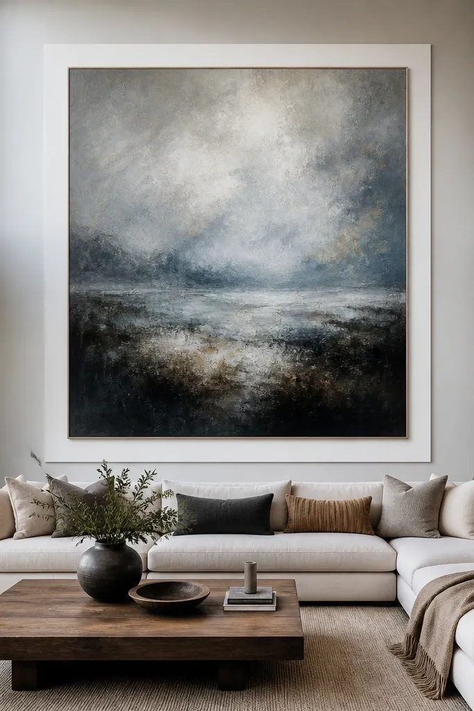
This is the “accent wall” approach where the wall becomes a gallery. Paint a clean mat border around a large canvas or framed print so the piece looks custom and centered in the double-height space. The border gives you a strong reference point at eye level, and it photographs cleanly because it creates a clear edge. Choose one bold artwork with simple colors so the wall doesn’t compete with it. This works when you want personality but still want control over the look.
Pick the canvas size first, then measure the wall and center it. Tape a mat rectangle around the art opening, leaving a border width of about 4-8 inches. Paint the mat border in an accent color and let it dry fully. Mount the artwork using proper hanging hardware and level it last, then touch up any edge paint with a small brush.
Use painter’s tape with a sharp edge and remove it at a slight tack to keep the mat line crisp.
Don’t choose a mat border color that blends into the wall; you need contrast to read in photos.
21. Layered Faux Brick Panels in a Short Vertical Band
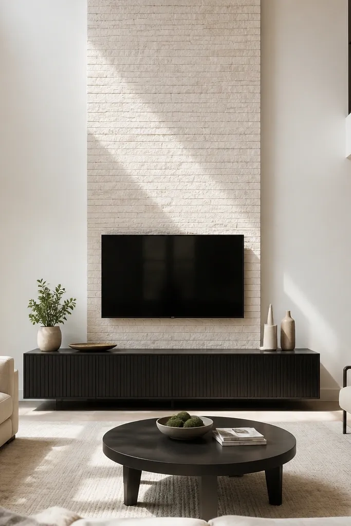
Brick look panels can be too heavy if you cover the whole wall, so keep it as a short vertical band. A narrow brick column creates texture and warmth while still feeling modern because the design is controlled. Use light brick tones like cream, limestone, or light gray so it doesn’t darken the room. This is quick because panels install like large tiles. It’s perfect for living rooms that need warmth but already have a lot of visual elements.
Clean and prime the wall if the panels require it. Tape a centered vertical band width based on panel dimensions, then dry-fit one panel to confirm the pattern direction. Glue or press the faux brick panels according to the product, starting at the center and working outward. Cut at edges with a utility knife or panel saw if needed, then fill gaps and seal the perimeter for a finished look.
Editor's noteIf your panels have staggered seams, start with a “center” brick so the pattern symmetry looks deliberate.
Skip thisDon’t pick a too-dark brick tone; it makes double-height rooms feel smaller.
22. Rope-Mounted Woven Panels as a Vertical Accent Strip
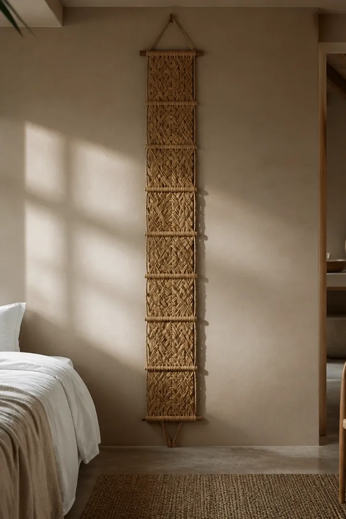
This is an easy way to add texture with a lighter visual footprint than wood or plaster. Use woven panels arranged as a vertical strip so the wall has movement without covering the entire height. The rope mounting looks intentional and graphic, especially when you keep the strip centered. This works best in rooms with neutral textiles and warm lighting. It’s also a flexible option because you can swap panels later without repainting.
Measure the strip height you want, then mark two vertical anchor points where the rope or cable will run. Install wall anchors into studs or use heavy-duty toggle bolts rated for the load. Mount rope/cable taut with turnbuckles if you want perfect straightness. Hang woven panels with clips or rings so they stay aligned, then trim any uneven bottoms with fabric scissors.
Editor's noteKeep the panel widths consistent so the strip reads as one design element in photos.
Skip thisDon’t mount the rope with slack; bowed lines look messy at double-height scale.
23. Matte Color Field with a Single Oversized Wall Sconce Pair
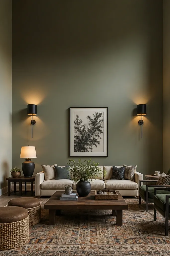
This is an accent wall that uses lighting as the design. Paint a matte color field in a calm tone, then install two oversized sconces spaced to frame the center. In double-height rooms, sconces help the wall feel “held” because they create two bright focal points at eye level. Choose matte black or aged brass depending on your hardware finishes. This is quick if you’re comfortable with basic electrical work or hiring an electrician for the wiring.
Pick an accent paint color and tape a centered rectangle around 7-9 ft tall. Paint two coats and let it cure. Install sconces at the correct height (often around 60-66 inches to the centerline, depending on fixture size) and space them evenly from the centerline. If wiring is needed, have an electrician handle it, then mount fixtures, install bulbs, and check lighting angle against the wall.
Use warm bulbs around 2700K so the matte wall doesn’t look flat or gray.
Don’t mount sconces too high; the light should hit the eye-level anchor zone.
24. DIY Limewash Over Concrete Wallpaper Panels with a Faux Joint Grid
This one gives you that double-height “architectural” wall feel without the weight or mess of real plaster. The trick is using concrete-look wallpaper for the texture, then you add a painted faux joint grid so the wall reads like large poured panels. Limewash paint over the paper makes it look soft and mottled instead of flat, which matters a lot on tall walls where harsh shine shows up fast. It’s a quick and easy Double Height Living Room Accent Walls option because the wallpaper does the heavy texture work and you’re only painting lines. It suits modern, industrial, and farmhouse-leaning rooms, especially if your ceiling is tall and you want the accent to look substantial from the floor all the way up. Skill level is beginner-friendly — the only “hard” part is measuring straight grid lines and keeping them consistent.
Step 1 — Measure your wall width and choose your panel rhythm. Mark a grid on the wall with a pencil and level: for a double-height wall, start with 24-inch wide “panels” and 18-inch tall segments so the grid doesn’t feel too tiny up top. Use a laser level if you have one; otherwise, snap chalk lines. Step 2 — Apply concrete-look wallpaper panels cut to your marked panel blocks, matching seams as you go. Roll it out carefully and trim edges with a sharp utility knife so the joints look crisp. Step 3 — After the wallpaper is fully dry, tape along the grid lines and paint faux grout lines with a flat off-white or warm gray (latex, not glossy). Then apply limewash over the whole surface using a wide brush and a damp sponge to break up streaks; let it dry and remove tape while the paint is still slightly tacky for clean edges.
Editor's noteUse 1/16-inch foam board as a straightedge guide for the faux grout lines — it keeps your brush from wandering and makes the lines look intentionally “designed.”
Skip thisDon’t limewash over wet wallpaper seams — the paper will bubble and the “joint” lines will look wavy.
25. Ceiling-to-Floor Fabric Strips in a Tension-Fit Frame with Hidden Velcro
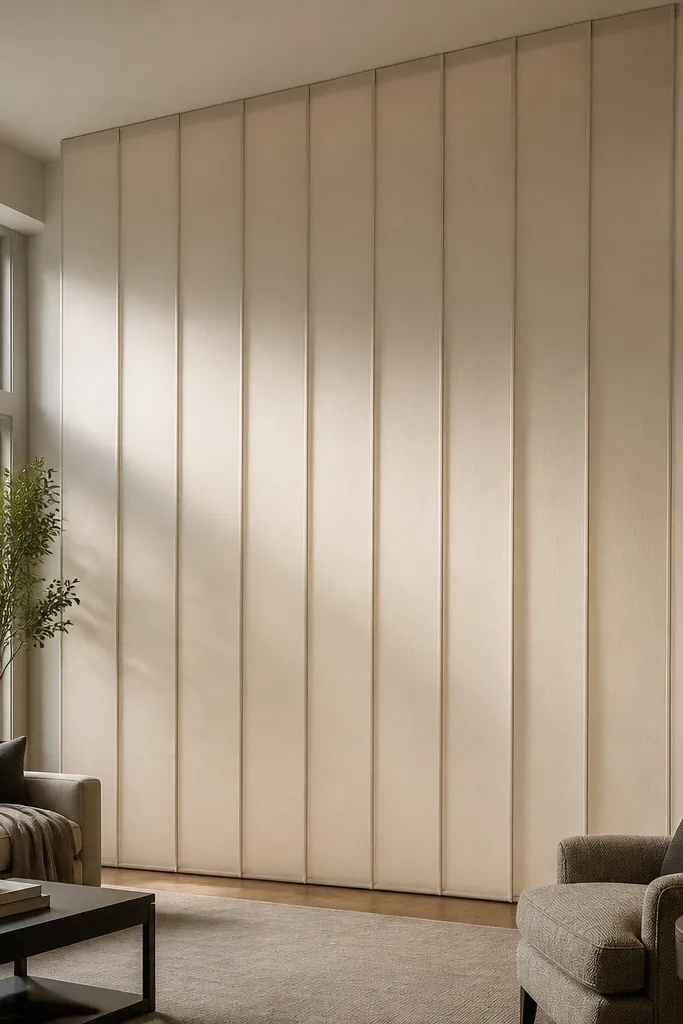
If you want a double-height accent that looks custom and soft, fabric strips beat paint because they kill glare and add depth. This method makes vertical panels that visually “pull” the wall upward, but you get a clean, tailored edge because the fabric is mounted inside a simple frame. The look works in living rooms that already have neutral furniture, light wood, or warm metals since the fabric texture reads cozy even when the wall is tall. It’s quick and easy Double Height Living Room Accent Walls because you’re cutting repeat widths and mounting them to a frame instead of painting large surfaces. It also fixes a common problem: bare double-height walls often look echo-y and flat; fabric adds a bit of acoustic softness without turning the room into a theater. Skill level is easy to moderate — you need straight cuts and careful stretching so the strips sit smooth.
Step 1 — Build a shallow frame grid that runs ceiling to floor. Use 1x2 pine or MDF strips, cut to wall height minus 1/2 inch for clearance, and install perimeter rails with screws into studs or strong anchors; add vertical rails every 20-24 inches so each fabric panel has enough tension. Step 2 — Attach adhesive-backed loop Velcro to the frame edges where the fabric will sit, and sew matching hook strips to the top and side margins of each fabric strip. Cut fabric strips 1-2 inches wider than the finished panel width so you can fold edges under and keep the fabric from fraying. Step 3 — Hang the fabric by pressing it onto the Velcro, then pull each strip taut before fastening the bottom edge to a second Velcro strip or a hidden staple line behind a trim cap. Finish with a thin flat trim board along the front edges to hide the Velcro and make the whole thing look intentional.
Editor's noteChoose medium-weight upholstery fabric (not thin drapery) so it holds tension without fluttering when the HVAC kicks on.
Skip thisDon’t use slippery satin or polyester-blend fabric — it shows wrinkling and won’t stay crisp on a tall, tension-mounted wall.



