
1. Cream + Black Photo Stack with One Tall Glass
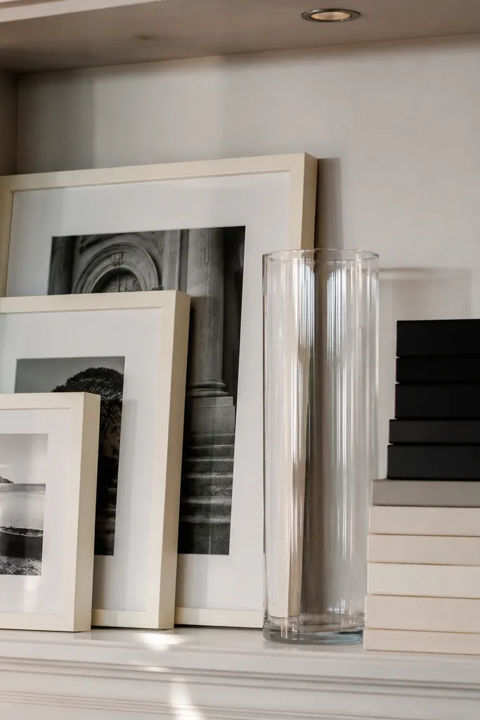
This setup makes built-ins look curated without feeling overly styled. The cream frames and black accents read clean against most wall colors, and the tall clear glass adds height without blocking the view. Use a mix of framed photos and book stacks so your shelves don’t become a single texture. The look photographs well because the contrast is strong and the spacing stays consistent across bays. It’s also quick: you’re mostly arranging what you already have, then swapping only the frames and one vase to lock the palette.
Start by choosing 3 frames that match in finish (black or dark walnut) and set them as a vertical group with 1-2 inches between frames. Next, stack 6-10 books by spine color, then stand 1-2 books upright as thin dividers on either side of the stack. Finish by placing one tall clear glass vase or bud vase at the highest point on the bay, then add a short filler like 3-5 stems or a single branch so it doesn’t look empty.
Editor's noteCut stems to the exact shelf height you want, then dry them flat on a paper towel so they don’t droop.
Skip thisDon’t use frames with different depths; they create shadows that make the whole bay look messy.
2. Monochrome Ceramic Set with Stacked Books as the Base
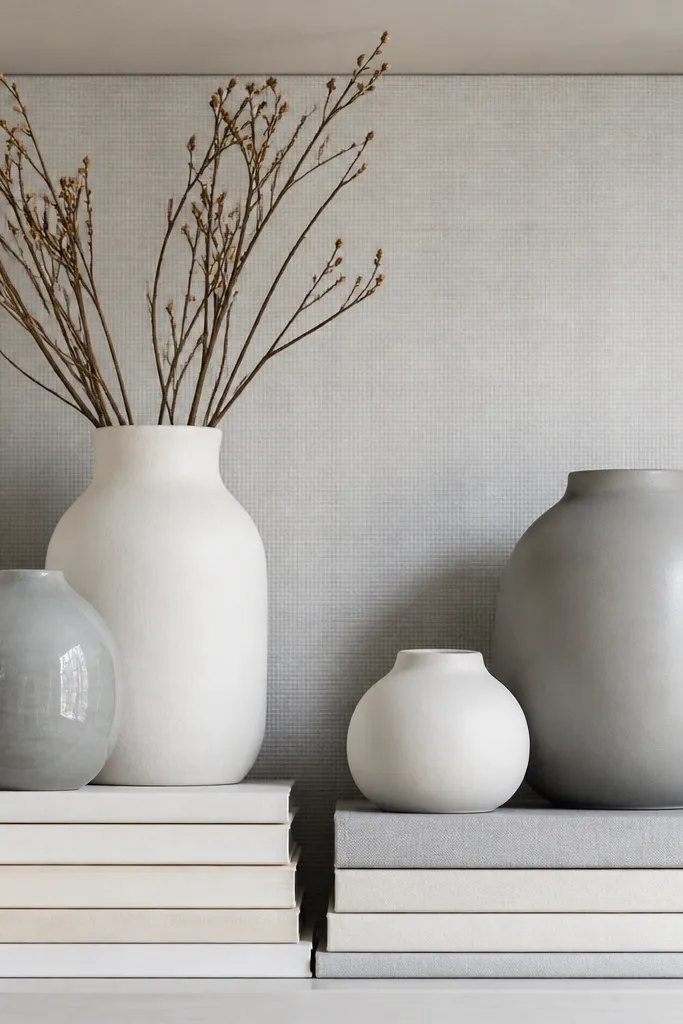
If your built-ins feel busy, monochrome ceramics calm everything down. Keep the ceramics in one family — think matte white, soft gray, and a single glazed accent — then let the book spines add the only pattern. Stacked books create a stable “platform” so the vases don’t float midair. This style looks intentional because the eye reads a clear sequence: books at the bottom, ceramics in the middle, and a clean negative space around them. It also works in living rooms that get lots of natural light, since matte finishes don’t glare.
Begin by stacking books so the top of the stack lands at about the same height as the tallest ceramic you plan to use. Place two ceramics side-by-side on the book stack, then add a third ceramic slightly behind them for depth. Keep one bay more open than the next by using empty space as part of the design — leave 3 inches of clearance around the ceramics so they stay crisp.
Use book stacks with similar thickness; uneven stacks make the ceramics look like they’re tipping.
Don’t mix glossy and matte ceramics in the same bay; the glare difference reads as clutter.
3. Woven Basket + Linen Tray "Storage Looks Like Decor"
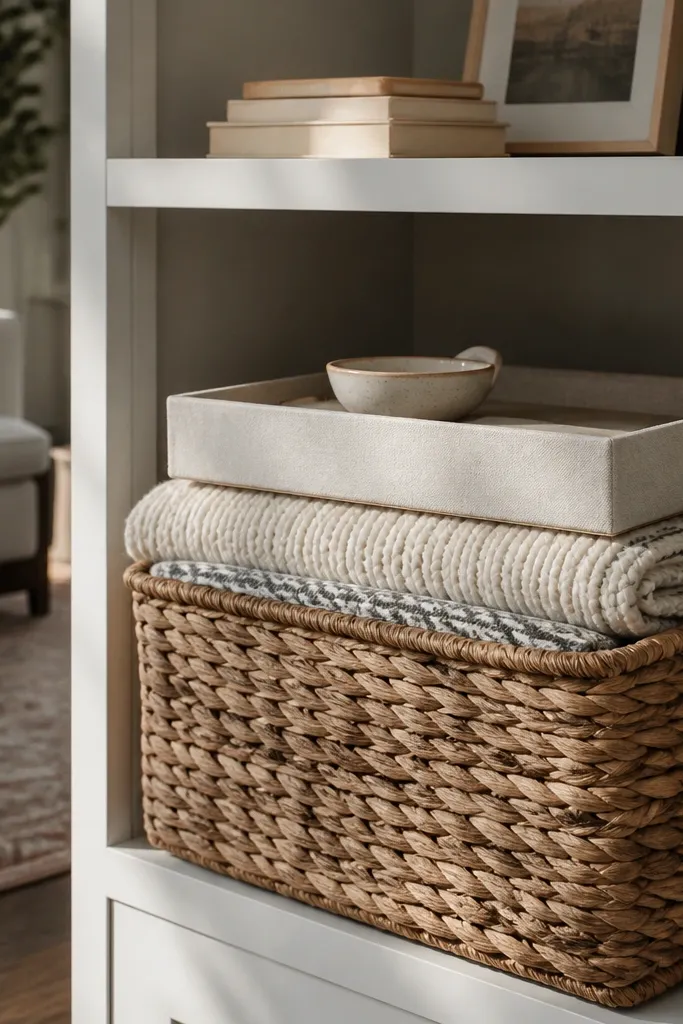
This is the styling move I recommend when you have real stuff you need to hide. A woven basket gives you texture and hides remotes, coasters, or blankets, while a linen tray makes the top layer look styled instead of dumped. The result is calm and photo-ready because you control what shows. It’s perfect for living rooms that get used daily and still need to look good when guests walk in. You get a tidy look without making your shelves feel like a museum display.
Start by lining one shelf bay with a flat woven basket sized to fit the width without touching the edges. Put a linen tray inside or on top of the basket with 1-2 small objects like a candle jar and a match holder. Then add one book stack next to the basket and finish with a small plant or dried stems in a simple pot so the arrangement has a height change.
Editor's noteChoose baskets that are the same tone across all bays; mixed basket colors make the whole run look accidental.
Skip thisDon’t overfill baskets; leave 1 inch of empty space so the tray and objects look deliberate.
4. Tall Plant Silhouette with Minimal Frames
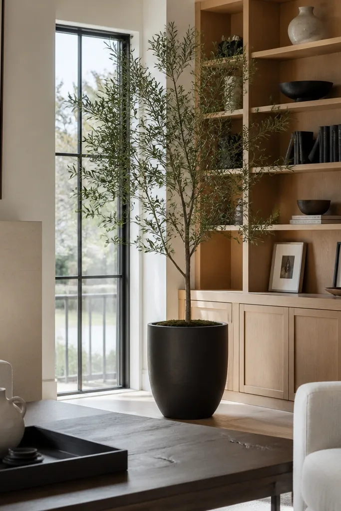
Built-ins look instantly taller when you use a plant silhouette that reaches the top third of the bay. Pair it with minimal frames so the shelf stays airy and doesn’t compete with the plant. This style is great if your living room already has bold art on the wall or a large sofa with strong pattern. The shelf becomes the calm vertical organizer, and the plant gives movement. It also works when you want a low-maintenance look because fewer objects means less dusting.
Place the plant in the center of the bay or slightly off-center, aiming for the tallest leaf line to hit the upper third of the shelf height. Add one or two minimal frames on the side, then keep the bottom shelf simple with a single book stack and a small ceramic pot. Keep all frame finishes consistent and use a neutral mat color so they don’t fight the plant.
Rotate the plant every 2 weeks so the leaf mass stays facing forward for photos.
Don’t use a tiny plant in a tall bay; it looks lost and makes the shelf look unfinished.
5. Book Spine Gradient with Two Sculptural Objects
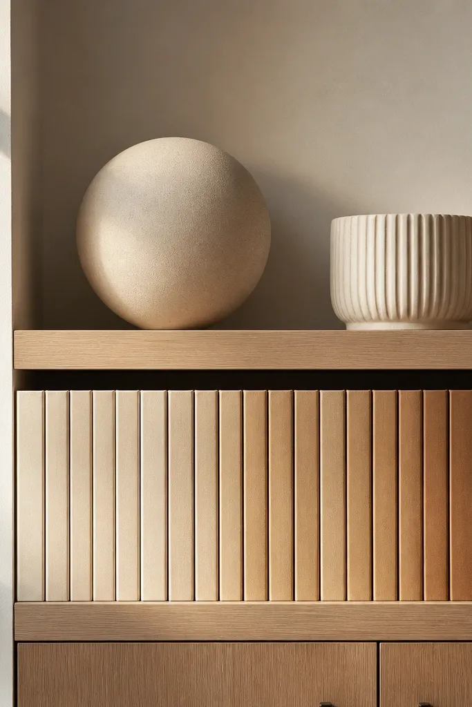
A book spine gradient makes shelves look designed even when you use plain objects. Choose books with spines in one range — for example cream to tan to camel — then arrange them like a color bar. Put two sculptural pieces on top or beside the gradient so the shelf has focal points. This is a strong choice for quick and easy built in shelves living room styling because you can swap only books and keep everything else stable. The gradient also reads as a single visual block, which helps built-ins feel cohesive.
Start by selecting 12-18 books with spines that sit in one color family. Lay them down or stack them so the spines create a left-to-right gradient across the bay width. Then place one sculptural object on the highest point of the gradient and a second object slightly lower, leaving 2-3 inches of empty space around both.
Editor's noteUse at least two different book heights in the gradient so it doesn’t look like a flat line.
Skip thisDon’t mix random spine colors; the gradient disappears and the bay looks chaotic.
6. Navy + Brass Contrast with One Oversized Frame
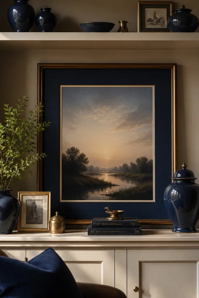
This look adds punch and still stays clean because it has one dominant color and one metal tone. Navy ceramics or books anchor the shelf, while brass picture frames or small objects add warmth and shine. The oversized frame is the trick — it sets the visual center and makes the bay feel intentional. If your shelves are in a neutral living room, this contrast reads rich without clutter. It’s also easy to maintain because you’re not rotating lots of items, just keeping the palette consistent.
Begin by choosing one oversized frame and placing it upright in the center of a bay. Add a stack of navy books on the lower shelf and lean a brass-toned object beside the stack like a small tray or candle holder. Finish with two small brass-and-navy accents on either side of the frame, then keep the rest of the shelf mostly empty so the frame stays the hero.
Wipe brass with a dry microfiber cloth before styling; dust makes it look dull in daylight.
Don’t use more than two navy tones; too many shades of blue blur into clutter.
7. Black-and-White Graphic Books with a Ceramic Clock
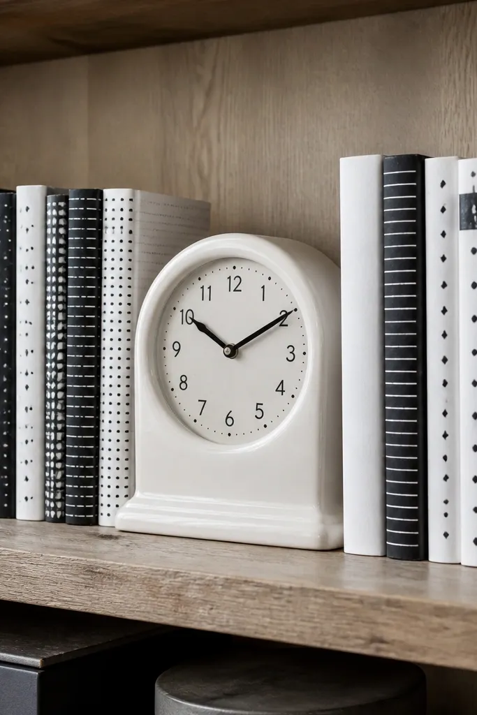
Graphic black-and-white book spines bring instant rhythm to built-ins. Add one ceramic clock to create a functional object that still looks decorative. The monochrome books make the shelf look styled even if other decor is simple. This setup works in modern living rooms and also in older homes where the built-ins have character — the clean lines balance the woodwork. It’s photogenic because the contrast is crisp and the clock face gives a clear focal point.
Stack 8-12 black-and-white graphic books so the spines face outward or sit at a slight angle. Place a ceramic clock on the top of the stack or on the adjacent shelf, then add one small item like a monochrome vase or a short candle on the other side. Keep the remaining space empty and avoid more than two small objects per shelf level.
Editor's noteAngle the clock 5-10 degrees so it catches light without looking crooked.
Skip thisDon’t add colorful accent pieces; the black-and-white system breaks.
8. Travel Map Book Stack with Framed Print Set
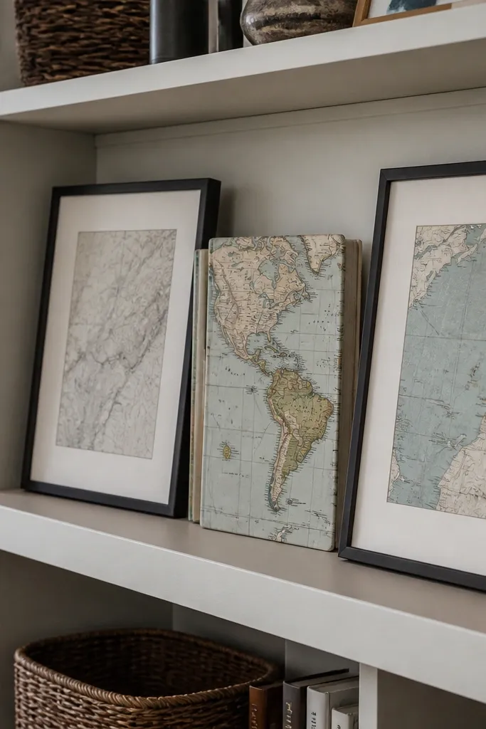
This is a smart choice when you want personality but don’t want clutter. A map-themed book stack gives texture and story, and framed prints keep it from looking random. Choose prints that match your frame finish and keep the mat color consistent. The look works especially well if your living room has global textiles or a neutral couch with warm undertones. Built-ins help this style because the frames line up with the architecture and the book stack anchors the theme.
Start with a stack of 6-10 travel or map books; keep the stack centered in a bay. Add two to three frames above or beside it, keeping their heights within 2 inches of each other. Place one small object like a brass compass or small ceramic globe on the top shelf, then keep the rest of the bay empty so the map theme reads clean.
Editor's noteUse a single frame size for the set; mixed sizes make the bay look like a collection rather than a design.
Skip thisDon’t add loose postcards or loose paper items; they look messy on shelves.
9. Ribbed Vase Trio with a Low Book Ledge
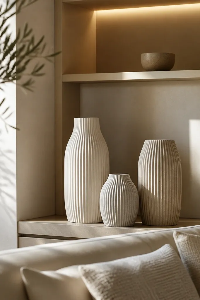
Ribbed vases bring texture that reads from across the room, so your shelves look interesting even from a distance. Use three vases in one neutral family (sand, oat, stone) so the texture is the star, not the color chaos. A low book ledge keeps the vases from sitting too high and looking top-heavy. This style is great for living rooms with smooth surfaces like glass tables or painted walls. It also keeps things tidy because the objects are clean and simple.
Select three ribbed vases with different heights, but keep their openings similar in size. Build a low book ledge by stacking 4-6 books so the top aligns with the tallest vase’s mid-body. Place the tallest vase in the center, then flank it with the two shorter vases. Finish by adding one small tray or a single candle on the shelf below to balance the vertical weight.
Wipe vase ridges with a slightly damp microfiber, then dry — dust sits in the grooves.
Don’t mix ribbed and smooth vases in the same bay; the textures compete.
10. Floating Tray + Candle Set with Slim Stems
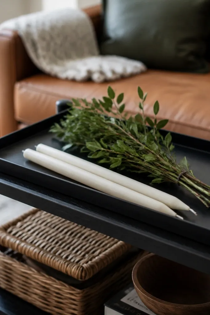
A tray-based arrangement looks styled because it creates a boundary. Put candles and slim stems on top so you get height without big bulky shapes. This is the easiest way to make built-ins look “done” because you’re controlling where everything sits. It’s perfect for shelves that are hard to fill because of awkward spacing or a shallow depth. The tray also keeps the look consistent across seasons: swap stems, keep the candles.
Start by placing a wood or rattan tray centered on the shelf, leaving equal gaps left and right. Put two candles on one side of the tray and a slim bud vase or bottle on the other side. Add 3-5 stems inside the vase, then place a small book stack behind or beside the tray for height contrast.
Choose candle holders with the same metal tone so the tray reads cohesive.
Don’t place candles too close together; you want 1-2 inches between them.
11. Color-Blocked Book Shelf with Matching Frame Pair
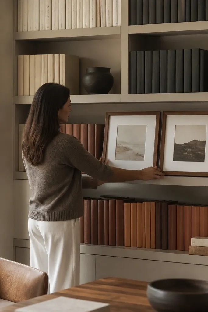
Color-blocked books make shelves look crisp because each section is intentional. Pair it with a matching frame pair (same size, same finish) to give the eye a clear landing spot. This style is ideal if you like modern, graphic looks and want quick and easy built in shelves living room styling that doesn’t require lots of small decor. The blocks also make it easier to maintain because you can swap books within the same color category without rethinking the whole shelf.
Pick 3 color categories for your books, like cream, tan, and black. Arrange them in blocks across the shelf width — each block should be thick enough to read from across the room. Add two matching frames on one shelf level, then place a small sculpture or plant pot between them if there’s space. Keep one side of the bay slightly emptier so the frames don’t feel crowded.
Editor's noteUse book stacks that are the same height per block; it keeps the blocks looking like design, not a pile.
Skip thisDon’t mix in random thin paperbacks; they scramble the block pattern.
12. Oversized Round Mirror + Leaning Books
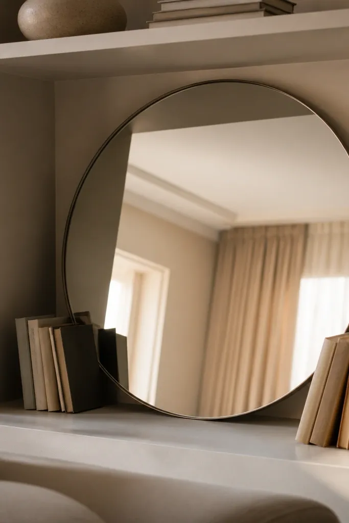
An oversized round mirror on a built-in shelf is a lighting trick and a style trick at the same time. It bounces light, and the circular shape softens the geometry of rectangular bays. Leaning books against the mirror adds structure and keeps the mirror from looking like a random wall item. This setup is photogenic because reflections pull in the room’s colors and make the shelves feel connected to the space. It also works even when your living room has limited decor because the mirror does the heavy lifting visually.
Place a round mirror leaning against the back of a bay, centered and angled slightly so it catches light. Build a leaning book stack next to it with spines facing out, then add one small object on the opposite side like a ceramic bowl or a small plant pot. Keep the remaining shelf level empty or filled with just one frame to avoid competing focal points.
Editor's noteUse mirror stoppers or a folded felt strip so it doesn’t slide forward when you bump the shelf.
Skip thisDon’t choose a mirror with a busy frame finish; it distracts from the built-ins.
13. Stacked Wood Boxes + One Ceramic Catchall
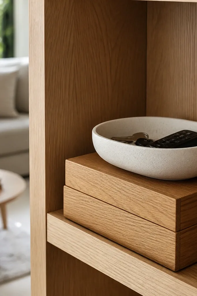
Wood boxes make built-ins look intentional because they add structure and hide small clutter. Stack two or three boxes of the same finish, then top them with one ceramic catchall that holds small items like keys, coasters, or remote controllers. This is a clean look that still feels lived-in. It’s great for families because you can style once and keep using the shelves without breaking the aesthetic. The texture contrast between smooth ceramic and wood boxes reads warm in photos.
Start by stacking wood boxes so the highest box sits at the same height as your medium decor piece. Place one ceramic catchall on top and add one small accent like a match striker or a tiny bottle. Add a book stack on the lower shelf level and keep the rest of the bay mostly open so the boxes don’t crowd the front edge.
Editor's noteChoose boxes with lids or removable trays so you can quickly clear the top surface when guests come.
Skip thisDon’t stack boxes of three different wood tones; it looks like storage, not styling.
14. Vintage Books with a Brass Picture Ledge
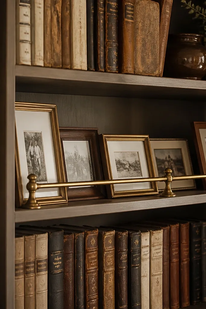
This look makes built-ins feel collected without looking messy. Vintage-style books add character, but you control the mess by using one brass picture ledge or small frame stand to hold photos in place. Brass ties in with lamps, hardware, and picture frames, so the shelf looks cohesive with the rest of the room. It’s also photogenic because the brass creates a bright line that catches light. If you want aesthetic shelves that don’t require fragile objects, this is a strong option.
Stack 8-14 vintage-style books and align their spines toward the front. Place a brass picture ledge above or beside the stack and set a single small photo or print on it. Add one small vase or candle on the opposite side to balance the visual weight, then keep the shelf level below simple with just one neutral frame.
Editor's noteUse book covers that have a similar spine color range; vintage look works best when it’s controlled.
Skip thisDon’t add more than one small photo per bay; too many prints makes it look busy.
15. Monochrome Lantern + Dried Pampas Bundle
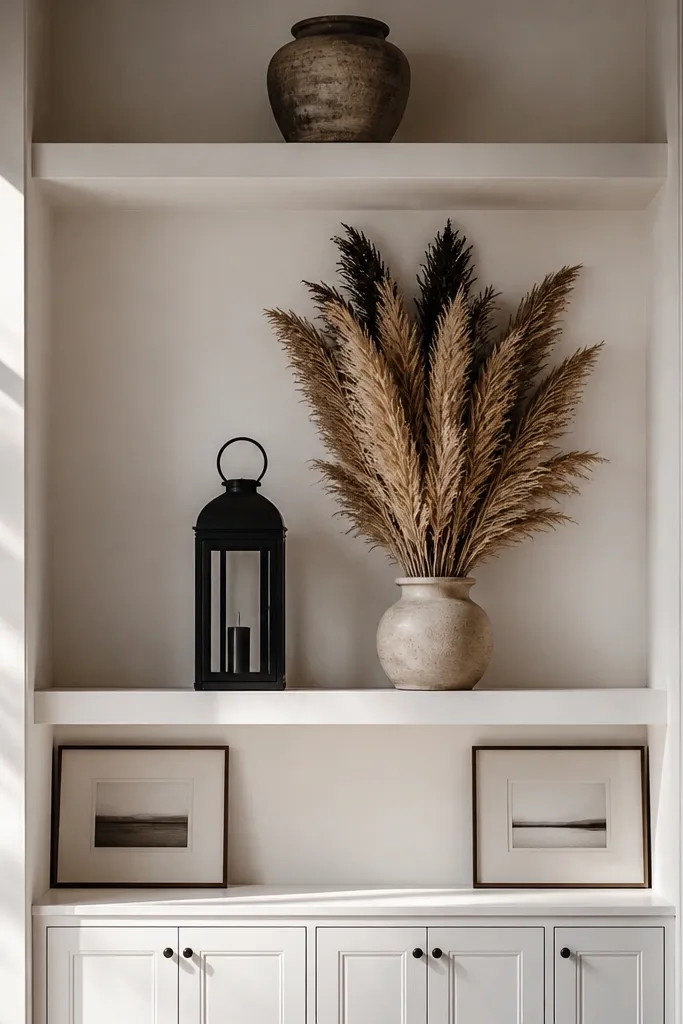
A lantern silhouette gives you instant height and shape, and dried pampas adds soft movement. Keep both in monochrome — black, charcoal, or natural tan — so it reads styled instead of themed. This setup is great if your shelves are tall and you need something that fills vertical space without taking over the whole room. In photos, the pampas texture shows clearly, even when the background is busy. You also get a “season-agnostic” look that stays pretty through winter and summer.
Place the lantern on the lower shelf or the center of the bay, then insert dried pampas so the tips reach the upper third of the shelf. Use a small bowl or vase insert inside the lantern base if the lantern top is decorative. Add one book stack beneath the pampas for a stable base and one small ceramic piece on the side for balance.
Spray dried stems lightly with hair spray from a distance to reduce shedding on shelves.
Don’t use overly white pampas against super cool gray shelves; it clashes and looks chalky.
16. Black Tray + Cream Candle + Greenery Cuttings
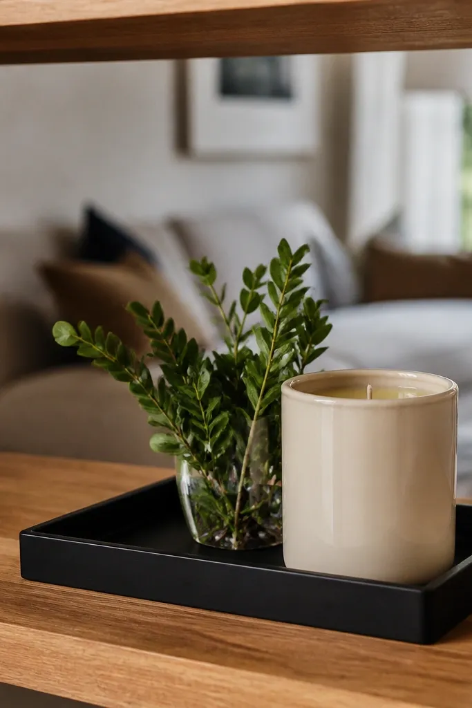
This is a high-contrast, low-effort shelf formula. A black tray creates a clean boundary, the cream candle adds warmth, and small greenery cuttings bring life without making the shelf look chaotic. It works especially well for quick and easy built in shelves living room styling when you want a consistent look across multiple bays. Greenery also softens straight lines and makes the shelf feel less architectural and more lived-in. Keep everything compact so the tray becomes your focal point.
Start by centering a matte black tray on one shelf level. Place a cream candle in the center, then add greenery cuttings in a small ceramic container at one side of the tray. Add a slim book stack behind the tray so it reads layered, then place one small decorative object on the opposite side to keep the composition balanced.
Trim greenery so it stays under the tray rim by about 1 inch; tall greenery spills into the shelf above.
Don’t use scented candles with thick labels; the text competes with the shelf design.
17. Clear Glass Vessels with a Single Color Filler
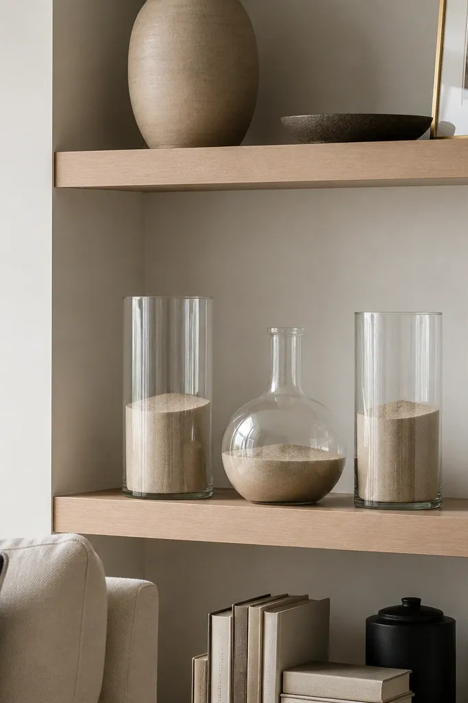
Clear glass makes built-ins feel lighter because it doesn’t visually block the background. The trick is adding a single color filler — think sand, dried leaves, or colored stones — so the vessels don’t look empty. This style is great for modern living rooms and for shelves where you want a clean look without heavy ceramics. It also photographs beautifully because light passes through the glass and creates subtle highlights. It’s quick because you’re repeating the same vessel shape multiple times.
Find 3 matching clear glass vessels in different heights. Fill them with one consistent filler color so the bottom mass looks uniform. Place the tallest vessel in the center, then set the two shorter ones at the sides with 2-3 inches of spacing. Add a thin book stack or a single frame behind them to give the glass something to contrast against.
Editor's noteUse a small funnel when filling so the glass stays clean and doesn’t smear on the outside.
Skip thisDon’t mix multiple filler colors; the glass turns into visual noise.
18. Color-Matched Pottery Parade on Lower Shelf
If your built-ins have open lower shelves, small pottery and plants create a tidy parade. The key is matching pottery tones so the plants look intentional instead of random. This style works because lower shelves are where clutter usually happens, and plants add a reason to keep the area clean. In photos, the repeated pot shapes give a pattern that reads designed. It’s also easy to maintain since you can swap one plant for another without changing the whole shelf layout.
Start by selecting 3-5 small pots in the same color family and the same rim finish, like matte cream or deep green. Arrange them along the lower shelf so the pot tops align in a gentle arc — highest in the center, slightly lower on the sides. Place 1-2 book stacks or a single tray on the shelf above for height layering, then keep the upper shelf simple so the plants get the focus.
Use saucers under pots so water rings don’t stain shelf surfaces.
Don’t crowd the pots edge-to-edge; leave 1-2 inches so each pot reads as its own object.
19. Shelf Styling with One Oversized Bowl + Two Book Stacks
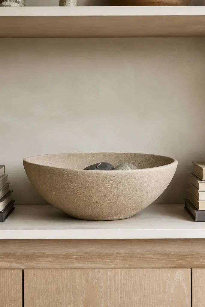
An oversized bowl is a cheat code for built-ins because it gives you a strong shape and a clear center. Pair it with two book stacks on either side so the bowl doesn’t look lonely. Choose a bowl in the same tone family as your frames or rug — warm stone, matte black, or cream — then keep the rest minimal. This is one of the cleanest looks for quick and easy built in shelves living room styling because it’s symmetrical and hard to mess up. It’s also practical since bowls can hold small items and keep them out of sight.
Place the oversized bowl centered on a shelf level, then build two book stacks on the left and right so the top of each stack sits slightly below the bowl’s rim. Add one small object on the bowl like a single stem or a decorative sphere. Keep everything aligned to the shelf front edge, then use the shelf above for a single frame or one tall vase to complete the vertical layering.
Editor's noteIf your bowl is very glossy, wipe it with glass cleaner and dry with microfiber so it doesn’t show fingerprints.
Skip thisDon’t add more than one small decorative item on the bowl; extra pieces look cluttered quickly.
20. Warm Wood + White Linen Texture Layering
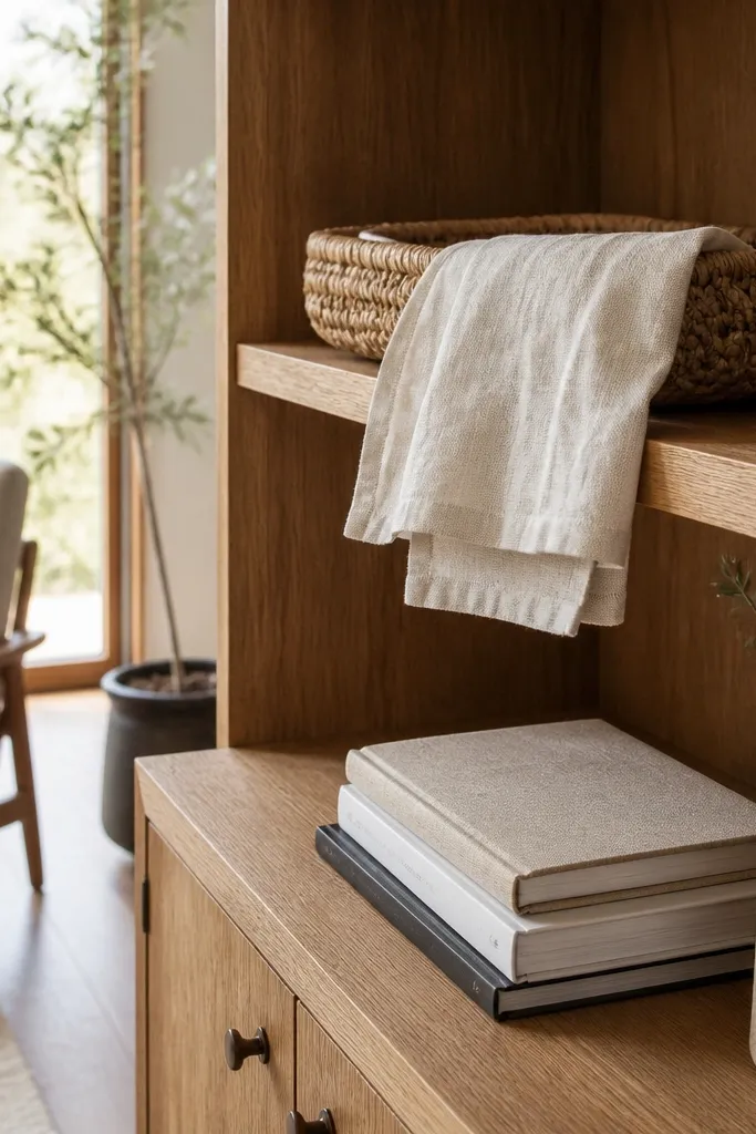
Texture layering makes built-ins look cozy and “right” even when you keep shapes simple. This look pairs warm wood tones with white linen-like textures such as a linen book cover, a folded cloth in a basket, or a woven tray. The contrast between smooth wood and soft textile reads warm in daylight and looks layered in photos. Use it when your living room feels too flat or too modern for your taste. It’s also easy to keep consistent: you’re repeating the same material textures across bays.
Start by building a base layer with a warm wood tray or wooden box on one shelf level. Place a linen-textured item on top like a small folded cloth in a basket or a linen-covered book, then add 1-2 books to create height. On the adjacent bay, repeat the warm wood tone and use a matching basket so the texture family stays consistent. Finish with one neutral ceramic piece to keep it from turning too soft.
Editor's noteKeep textiles slightly under the shelf edge so they don’t look like they’re spilling.
Skip thisDon’t mix too many textures at once; pick linen + wood and let everything else be simple.



