
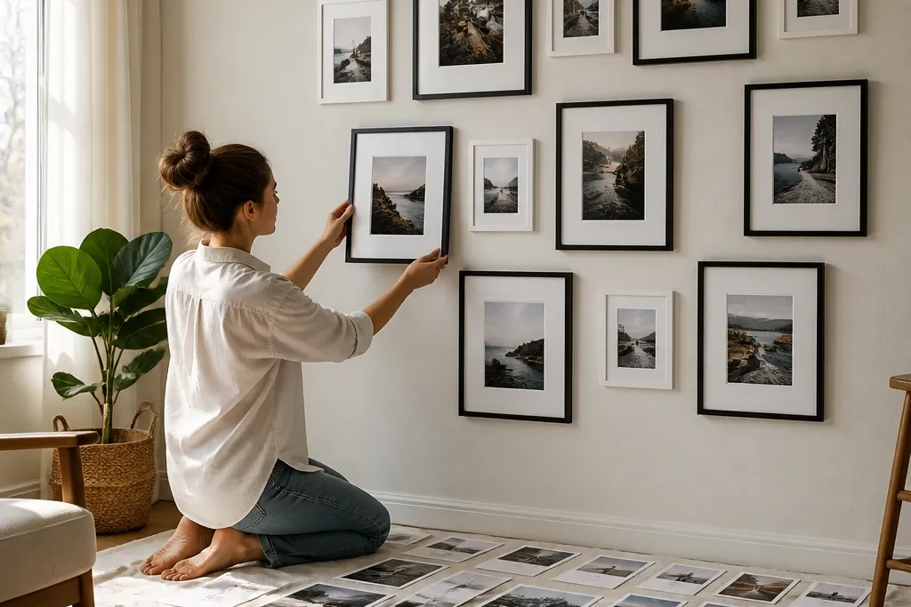

1. The 3-Row Timeline Grid
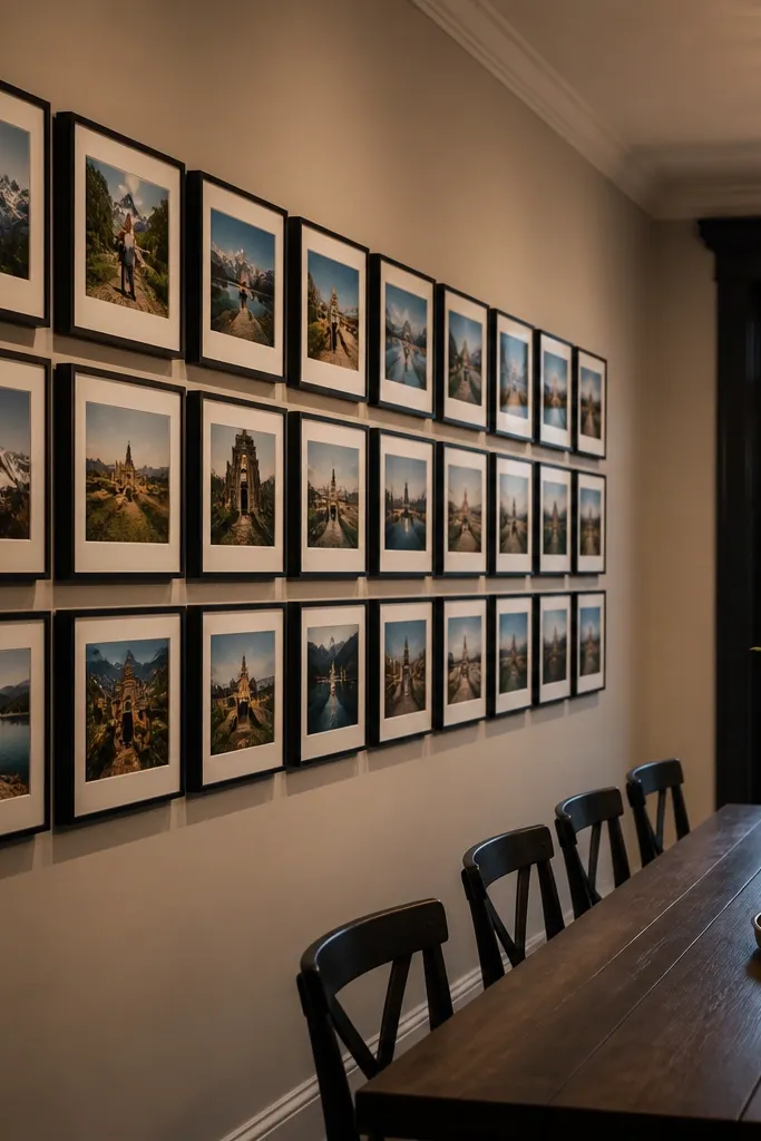
This layout makes your memories read in order without you writing captions. Use three horizontal rows so your eye tracks smoothly, and keep the frames identical to avoid visual noise. It looks best when your photos have a consistent vibe — think family milestones, travel seasons, or yearly holiday photos. The wall feels finished because the grid repeats shapes and spacing, so even when the photos vary, the structure stays calm. Plan for a wide wall section where you can keep the row lengths even.
Start by choosing identical frames and deciding on one gap size — 2.5 inches between frame edges is a good baseline. Pick an anchor photo for the middle row center, then place the remaining frames so the grid is symmetrical left and right. Measure the total taped rectangle width and height, then mark the center point at about 58 inches from the floor. Finally, hang using a level and a laser or straightedge, starting with the center frame then working outward row by row.
Editor's notePrint a paper template of the frame outer sizes and tape it on the wall first — it saves you from measuring mistakes.
Skip thisDon’t mix frame widths in this layout unless every frame has the same outer dimensions.
2. Center Anchor + Floating Side Steps
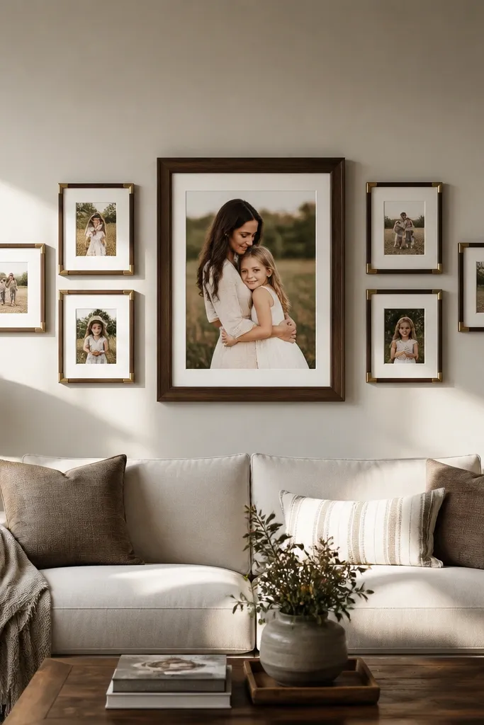
If you want a story wall that feels curated, this one does it with minimal effort. The large center anchor holds attention, and the smaller side frames create a gentle “step” pattern that looks dynamic but still controlled. This works great for a hero photo like a graduation, wedding portrait, or a big family moment. The staggered heights give depth, so the wall doesn’t look flat. It also hides uneven wall space because the eye stays locked on the center.
Choose one oversized frame for the center (for example, 20x30 or 24x36) and four smaller frames (like 11x14 or 12x16). Tape the center frame rectangle first and mark its center at 58 inches from the floor. Then place two frames on the left and two on the right, stepping each one up or down by about 1.5 to 2 inches from the one closest to the center. Keep consistent horizontal gaps from the center frame, then hang the center frame last if you’re aligning with studs.
Editor's noteUse the same mat color for all frames; it visually ties the stagger together even when photo sizes differ.
Skip thisDon’t make the side frames too close to the center — gaps under 1.5 inches make it look crowded.
3. Loose Symmetry Cluster with One Big Photo
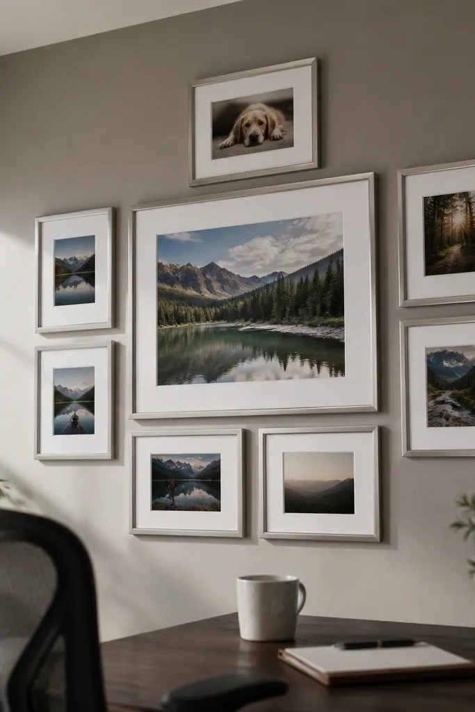
This is the “gallery wall” look without the messy feel. You get the warmth of a cluster, but symmetry keeps it polished. Pick one large photo to anchor the cluster, then surround it with 6-8 smaller frames arranged in a balanced semicircle on each side. The trick is to keep the overall cluster edges roughly aligned so the wall doesn’t sprawl. This layout is perfect for mixed photo sets — childhood, friends, and everyday moments — because the variety stays contained.
Select one large frame and 6-8 smaller frames that share the same frame color and mat thickness. Tape a large rectangle that represents the outer boundary of the cluster, then mark the center point at 58 inches. Place the largest frame in the middle, then build left and right mirror positions using the same vertical rhythm. Keep gaps between frames consistent at about 2 inches, and use the same spacing rule across the whole cluster. Hang center first, then test the symmetry by stepping back and checking the balance from the room’s main seating spot.
If your frames are slightly different sizes, hide the mismatch with consistent mat widths — aim for 1.5 to 2 inches of mat on everything.
Don’t overlap frames with stickers or tape — overlapping usually reads messy once real hardware goes up.
4. Vertical Column Story (4 Frames Tall)
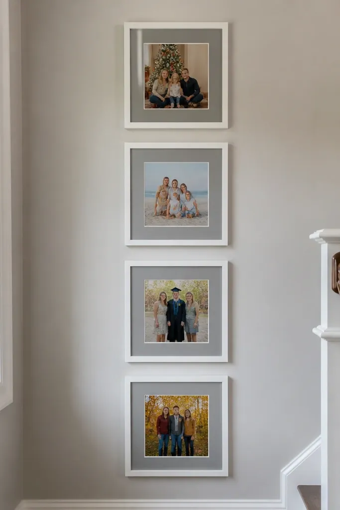
A vertical story column is the cleanest way to tell a timeline when your wall is narrow. It also makes rooms feel taller, which is why it works in hallways and stair landings. Use four frames stacked with equal spacing so the wall looks like an intentional photo feature, not a set of decorations. This layout suits single-subject stories like “our home before and after,” “kid growth,” or “new city seasons.” It’s also the easiest to hang straight because you can align everything to one center line.
Pick matching frames and decide on a consistent gap — 2 inches between frame edges looks sharp. Mark the center of the top frame location so the overall column sits around eye level; usually the center of the second frame from the bottom lands at about 58 inches. Tape the top frame box, then work downward using your measured frame height plus the 2-inch gap. Use a level to mark each frame’s mounting line, and install hardware on the same vertical center line. Hang from top to bottom so you can adjust each next frame without losing alignment.
Editor's noteChoose matte prints for this layout to reduce glare from overhead lights.
Skip thisDon’t use mixed frame depths — deeper frames catch shadows and make spacing look uneven.
5. Checkerboard Mix with 2 Sizes
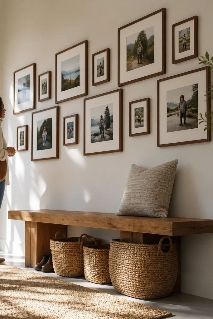
This layout is photogenic because it creates visual rhythm. You use two frame sizes and alternate them like a checkerboard, which gives structure while still letting you highlight certain photos. Big frames pull the eye, small frames fill the rhythm, and the pattern makes the wall look designed even with varied photos. It works best with square or nearly square frames and a tight color palette for frames. If your photos vary in orientation (some landscape, some portrait), this layout still reads clean because the pattern carries the structure.
Pick two frame sizes that share the same outer frame color and mat style, such as 12x12 and 8x10 (or any two sizes that create a repeating footprint). Create a grid on the floor first by laying frames in alternating positions, then measure the total width and height. Tape your outer boundary to the wall, mark the center point at 58 inches, and place one large frame on the center. Continue alternating outward, keeping the gaps between all frames consistent at 2 to 2.5 inches. Hang the center frame, then the four nearest frames, then fill the rest.
Editor's noteUse the same mat thickness on both sizes; it keeps the checkerboard lines crisp.
Skip thisDon’t rotate frames randomly — rotation breaks the checker rhythm.
6. Salon-Style Overlap Without Chaos
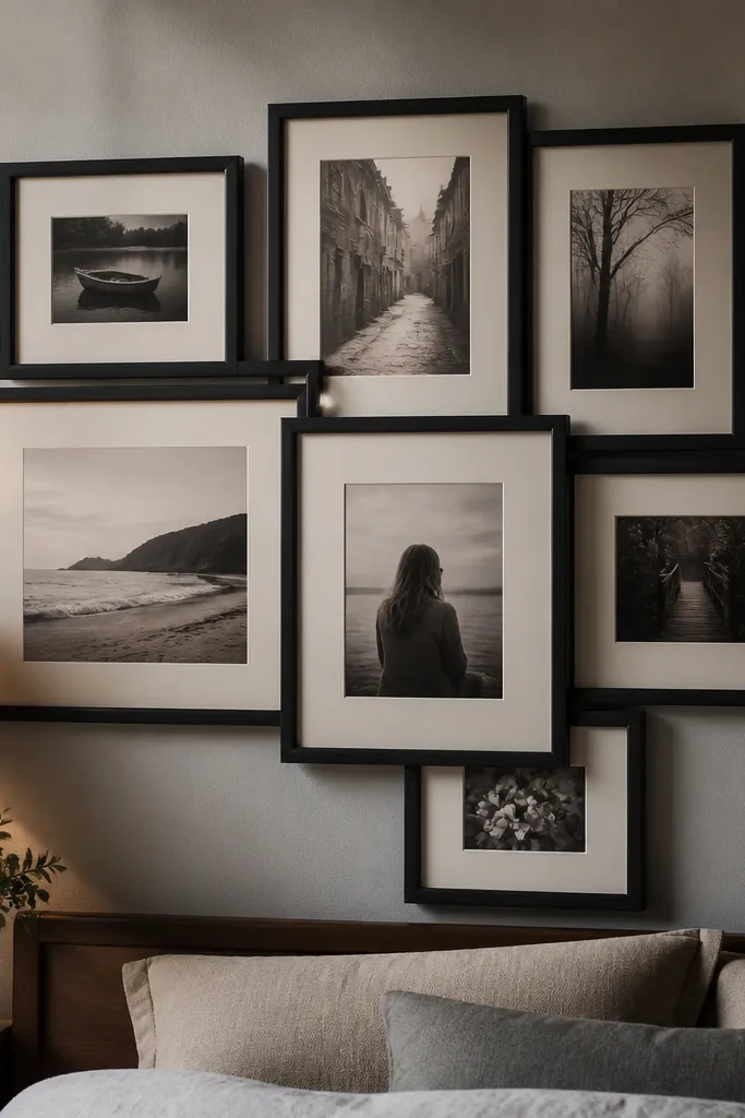
Salon-style is supposed to feel collected, but most people overdo it and it turns into clutter. This version keeps the overlap subtle and uses consistent frame color and mat color so it still looks like a plan. The photos look layered, which adds depth and makes the wall feel warmer. It’s great for sentimental sets where you want the wall to feel lived-in — family groupings, friend photos, and holiday shots. If you want a gallery vibe without the “why are these crooked?” feeling, this is the safer approach.
Choose frames in the same finish (black, walnut, or brushed brass) and use mats so the overlap looks intentional rather than random. Decide on a “no more than 1 inch overlap” rule between frames, then map the layout on paper first. Tape a center line on the wall at 58 inches and place your anchor frame slightly higher on that line. Build outward with a consistent overlap amount, then mark mounting points for each frame while holding a level. Hang starting with the bottom-most frame so you can layer upward without blocking your view of alignment.
Editor's noteUse picture wire or hooks rated for the frame weight so each frame sits flat and doesn’t tilt as you hang it.
Skip thisDon’t skip spacers or mats — overlap without mats looks messy and uneven.
7. All-Matte Photo Wall with White Borders
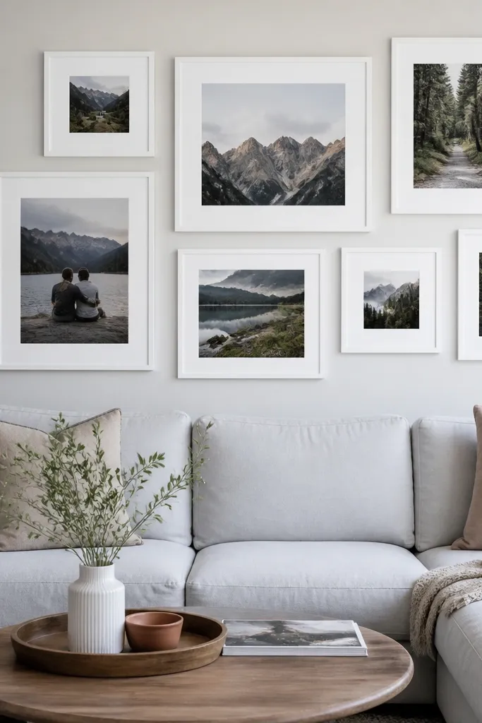
This is the clean, modern look that makes photos read clearly even if your wall lighting is harsh. The matte prints reduce glare, and the white borders create a visual buffer so the images don’t bleed into each other. You can use a mix of frame sizes, but the consistent mat makes everything feel cohesive. This works well for travel photos, black-and-white portraits, and any set where you want calm contrast. It’s also forgiving if you’re using prints of different paper tones.
Pick frames with white mats that have the same mat width — 1.75 to 2 inches is a good range. Choose a simple layout like a grid or a cluster, but keep the mat color and width identical across every frame. Measure and tape your outer boundary, then mark the center line at 58 inches. Hang by starting with the center frame, then placing the others so the distance from frame edge to frame edge stays at about 2 inches. Use a level on each frame, not just the overall line, because studs and wall surfaces vary.
Editor's noteIf your photos have different brightness levels, boost the darker ones with a small brightness adjustment before printing so the wall looks even.
Skip thisDon’t use glossy prints with strong overhead lighting — glare will ruin the clean look.
8. Black Frames, Color Pop Photos
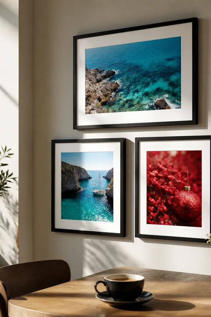
This layout makes your photos look like they belong in a shop window. Black frames add contrast, and color-pop images jump forward instead of blending into the wall. The key is choosing photos with bold subjects — bright skies, colorful outfits, or seasonal decor shots. Keep the frame finish consistent and use a neutral mat (off-white) so the color stays the star. This is a strong option for living rooms and entryways where you want the wall to pull attention.
Choose all black frames in the same width so the border thickness stays consistent. Use off-white mats around every photo to keep skin tones from looking too cool. Pick a layout with either 2 rows of 4 or a single cluster of 7-9 frames, but keep spacing at 2 to 2.5 inches. Mark the center point at 58 inches, tape the layout boundary, then hang the center frame first. Work outward, checking the wall from a few steps back after every 2 frames so you don’t drift.
Editor's noteIf your photos include lots of dark tones, add a few lighter photos so the overall wall doesn’t become a dark block.
Skip thisDon’t mix matte and glossy photos — the sheen differences show through black frames.
9. Monochrome Theme Wall (Grays + Whites)
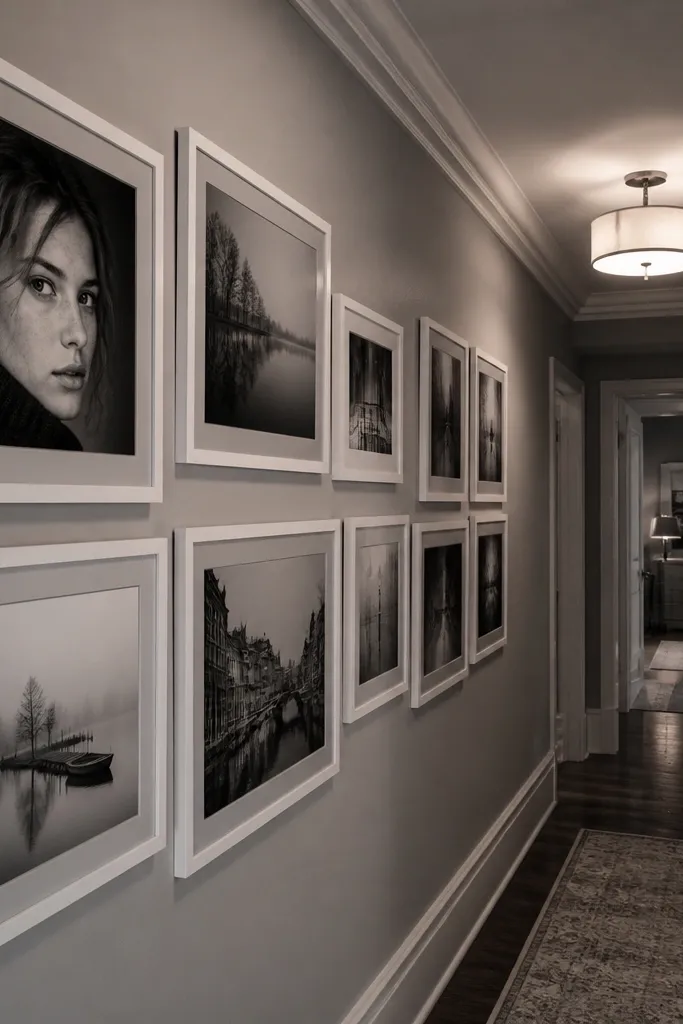
A monochrome gallery wall makes the story feel cohesive, even when the subjects vary. By keeping photos in the gray/white range and using a light frame or white mat, the wall reads as one visual piece. This layout is perfect for black-and-white portraits, foggy travel shots, or any set you want to feel calm. It also hides small print inconsistencies because the tones are uniform. The look is clean from across the room, not just up close.
Pick frames in white, light oak, or light gray, and use white or very light warm mats. Convert your photos to a consistent black-and-white treatment before printing so contrast levels match across the wall. Choose a grid layout like 3x3 minus one frame, so you get symmetry without making it too rigid. Tape the outer boundary, mark the center at 58 inches, then hang frames maintaining 2-inch gaps. Finally, step back and check that the brightest photo isn’t always in the same corner — spread visual weight.
Keep one photo slightly larger (about 20% bigger than the rest) to prevent the wall from looking flat.
Don’t use pure white mats with very bright wall paint — it can look washed out.
10. Framed Polaroid-Style with Oversized Mats
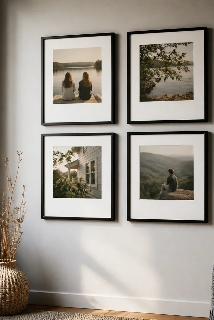
Polaroid-style mats give your wall that nostalgic pop without needing actual instant film. The oversized mat creates a visual “breathing space” around each photo, so the wall looks airy and intentional. It’s great for casual candid memories, birthday moments, and friend group shots. This layout is also forgiving if you’re using different photo sizes, because the mat standardizes the overall look. Keep frames simple — a thin wood or black frame keeps it modern instead of costume-like.
Choose frames that can hold a standard mat size, then print your photos with consistent aspect ratios. Aim for mat widths of 3 to 4 inches around the image, which gives that polaroid feel. Tape a grid-like arrangement on the wall, keeping 2 inches between outer frame edges. Mark the center point at 58 inches, then place the largest mat photo in the center. Hang center first, then fill outward, using a level and measuring from the center line to each frame edge.
Use a slightly warm off-white mat so skin tones look friendly instead of gray.
Don’t go too big with mats if your wall is narrow — it makes everything feel cramped.
11. Floating Frame Shelf Look (No-Mess Alignment)
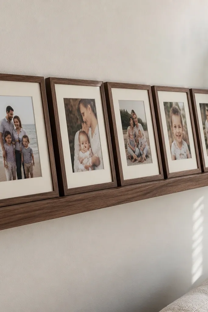
This look gives you a gallery wall vibe without the constant measuring for each frame. You mount a narrow picture ledge or a floating rail, then set frames evenly so the story stays aligned. It’s perfect for renters, seasonal photo swaps, and families who add new photos over time. The spacing looks crisp because the rail sets the baseline. It also reduces the risk of crooked frames because you’re not relying on multiple individual hanging points.
Pick a sturdy picture ledge sized to your wall section and install it level using wall anchors or studs. Decide your frame sizes and choose frames with flat backs that sit flush. Place frames on the ledge with consistent gaps, then measure the outer footprint to confirm the total width. Mark where each frame sits on the ledge so you can pull them off later without losing spacing. Secure each frame with small stoppers or clear bumpers so they don’t slide.
Use a ledger depth that leaves at least 1/4 inch clearance behind the frame so nothing rubs the wall.
Don’t use lightweight ledges for heavier frames — the sag shows up as uneven lines.
12. Heart-Shaped Layout with a Center Story Photo
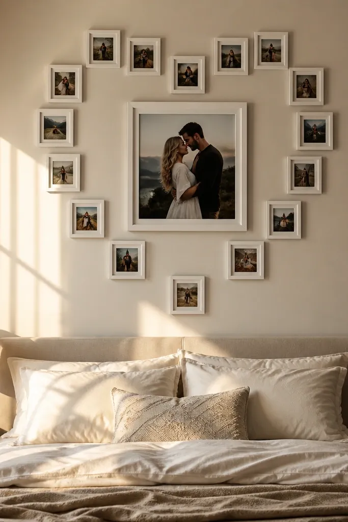
A heart-shaped gallery wall is sweet without being childish if you keep the frames consistent and the spacing clean. The center photo becomes the “message,” and the surrounding frames create the curve that makes it instantly recognizable. This works for anniversary photos, wedding memories, or family photos for a bedroom or hallway. Use matching frames and a calm mat color so the heart shape reads from across the room. Keep it monochrome or color-cohesive so the heart doesn’t look busy.
Choose one large center frame and then 6-10 matching frames for the heart outline. Tape a heart-shaped guide on the wall using painter’s tape — start with the center point at 58 inches, then map the top curves and bottom point. Keep the outer gaps consistent at about 2 inches between frames. Use the same mat width for all frames so the heart outline is crisp. Hang the center frame first, then hang the top curve frames, then the sides, and finish with the bottom tip frame.
Print your center photo with slightly higher contrast so it stays readable when the eye follows the heart shape.
Don’t use wildly different frame widths — the heart outline breaks.
13. Staircase Steps Layout for Narrow Walls
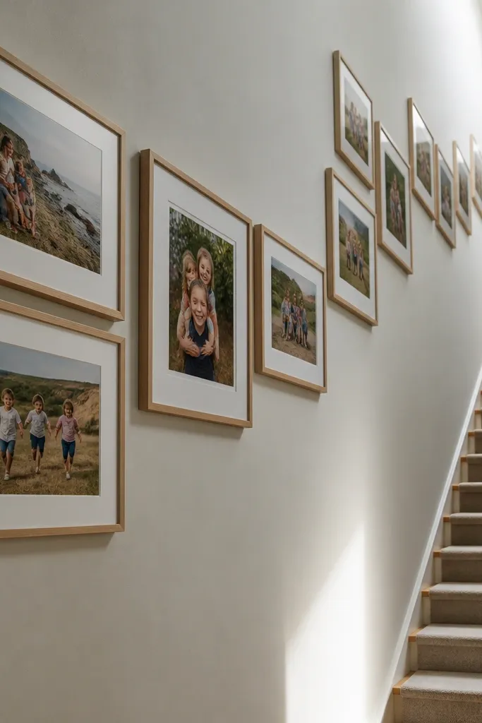
Staircase steps make narrow walls feel intentional instead of empty. The diagonal rise adds energy, and it’s easier to pull off than a full gallery cluster when space is limited. This is a great option for hallways where you can’t fit a wide grid. Choose photos that look good in pairs or groups, like “family events” or “travel days,” because the steps naturally create mini chapters. When frames are aligned on one diagonal axis, the wall looks designed even if you mix photo sizes.
Pick 7-9 frames in one consistent finish and mat color. Mark a diagonal center line on the wall and decide the height of the top anchor so the whole arrangement sits around eye level. Tape the frames along the diagonal using 2-inch gaps between frame edges. Start with the largest frame at the lower center, then place the next frames slightly higher to create even step increments of about 2 inches. Hang by installing the bottom anchor first, then the next frame on the diagonal, checking the line with a level each time.
Editor's noteUse portrait-oriented photos for the steps so the diagonal rhythm looks balanced.
Skip thisDon’t let the gaps vary wildly between steps — keep one spacing rule for the whole run.
14. Triptych with Two Supporting Frames
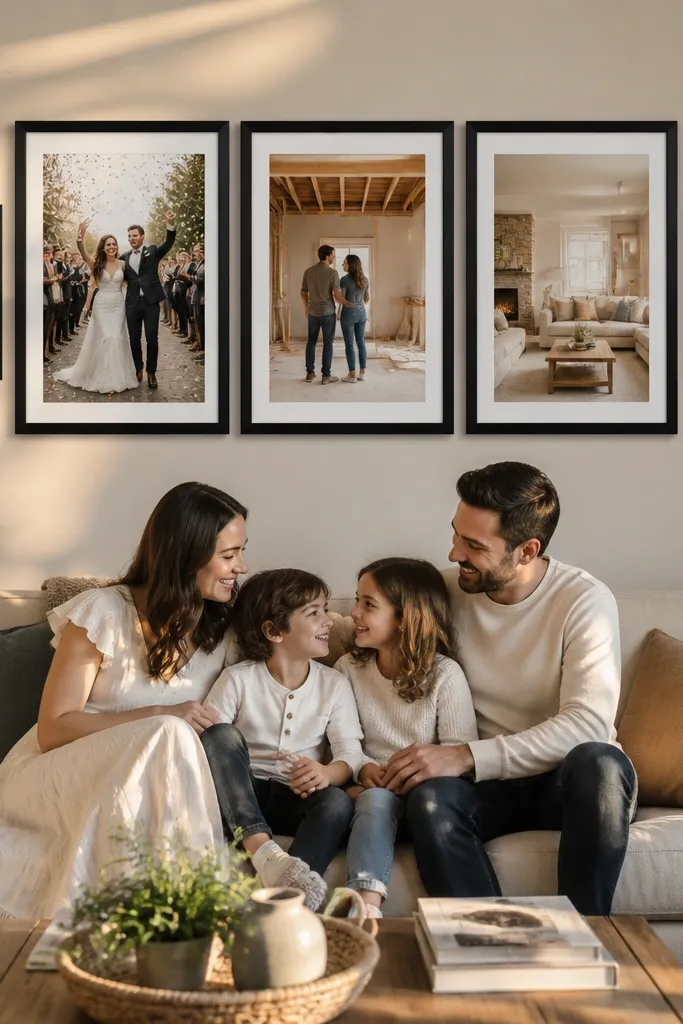
Triptych layouts look strong because they read like one statement piece. You get a clear story direction with three main panels, then you can add two supporting frames to hold important moments that don’t fit the sequence. This works well for wedding, pregnancy, or renovation photos where you want a beginning, middle, and end. The supporting frames add depth without breaking the structure. It’s also a good choice when you want your wall to look stylish with fewer frames.
Choose three matching frames for the triptych and keep the outer dimensions consistent. Place the triptych in a straight row with 2.5-inch gaps between the frames. Add two smaller frames above the left and right panels or below them, keeping the vertical distance consistent at about 6 inches from the triptych frames. Mark the center of the middle triptych frame at 58 inches from the floor. Hang the triptych first, then align the supporting frames using the same center line so the whole piece looks balanced.
Editor's notePrint the middle photo slightly sharper or higher contrast so it becomes the visual center of attention.
Skip thisDon’t choose two random supporting photos — they should relate to the triptych theme.
15. Grid of 9 with One Surprise Cropped Photo
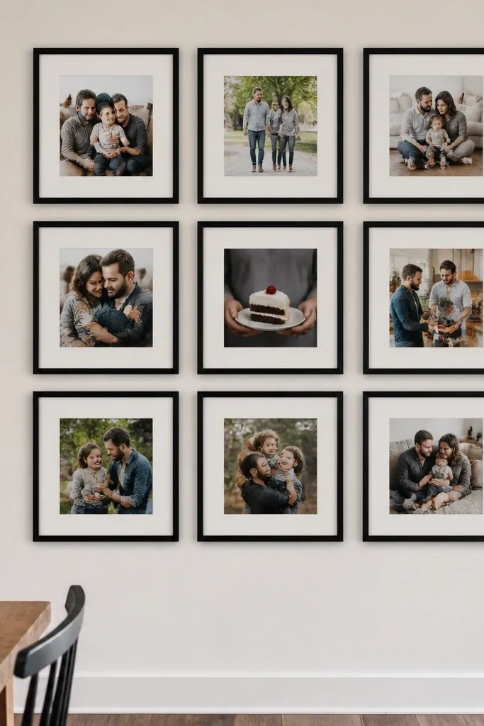
A 9-photo grid looks clean and modern, but it can feel flat if all photos are the same size and framing. This version keeps the grid structure and adds one surprise cropped image to keep it interesting. The cropped photo creates motion and immediacy, like a close moment that makes you feel present. Use it for details — hands, a cake slice, a skyline corner — while the other photos show wider context. The wall still reads as a grid, but it has a story twist.
Pick matching frames and mat widths so the grid looks uniform. Create a 3x3 arrangement with 8 standard frames and one larger “surprise” frame that overlaps the grid footprint visually by about 20% (for example, one frame that is 2 inches wider or taller than the rest). Tape the outer boundary and mark the center at 58 inches. Hang the eight standard frames first to establish spacing, then place the larger cropped frame in the center or upper-middle so it feels intentional. Confirm the gaps between every neighboring frame edge remain consistent at 2 inches.
Editor's noteWhen cropping the surprise photo, keep the subject centered or rule-of-thirds aligned so it doesn’t look accidental.
Skip thisDon’t crop the surprise photo too tight — you still want it readable from across the room.
16. Landscape Sweep Across the Wall
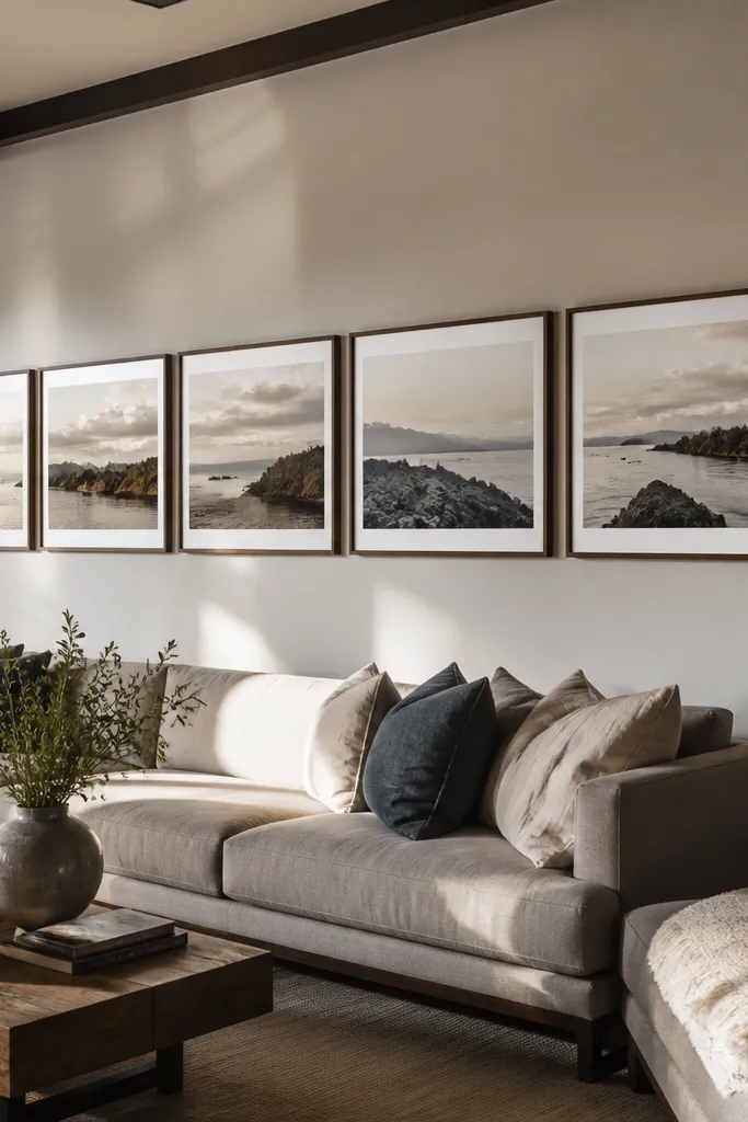
This layout is made for landscape photos and long walls. You arrange frames in a single horizontal sweep so each image feels like a panel in a panorama. It’s especially good for vacation sequences, family walks, or any set where the background matters. The look is cinematic, and it’s easy to keep consistent because you’re working in one row. Use similar mat colors and keep frames aligned so the sweep stays straight.
Choose 6-10 frames in the same size, ideally landscape orientation like 8x10 or 11x14 landscape. Tape a long rectangle on the wall and mark the center point at 58 inches. Place the frames in a straight line with 2.5-inch gaps between frame edges. Use a level to keep the row perfectly horizontal, then mark mounting points using a ruler against the taped layout. Hang from the center outward so you don’t drift to one side.
Editor's noteUse a consistent white or warm off-white mat across every frame so the sweep looks like one continuous strip.
Skip thisDon’t put this layout in a space with frequent glare from windows — it turns your photos into reflections.
17. Vertical Frames with a Thin Line Divider
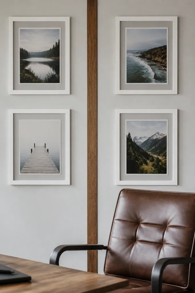
This is a surprisingly stylish way to organize photos without making a full grid. You create a thin divider line (a simple strip of wood, a narrow picture rail, or a framed shadow box) and align vertical frames above and below it. The divider gives the wall a graphic look, like a design element, and it makes the photos feel curated. It works great for sets where you want two themes — for example, “family” above and “friends” below. The wall looks crisp from a distance because the divider controls the composition.
Pick a divider method: a narrow ledge, a thin wood strip, or a picture rail, then keep it level. Decide how many vertical frames you want above and below — 3 and 3 is a clean starting point. Mark the divider height so the overall piece centers around 58 inches; usually the divider lands around 56-60 inches depending on frame height. Hang vertical frames in matching spacing of about 2 inches, aligning their inner edges to a center line. Finally, add the frames above first, then below, checking spacing against the divider while you go.
Editor's noteUse the same frame color for everything and keep mat widths identical so the divider doesn’t look like it belongs to a different project.
Skip thisDon’t choose frames with thick, uneven mat colors — the divider effect gets lost.
18. Mixed Frames with a Single Mat Color Rule
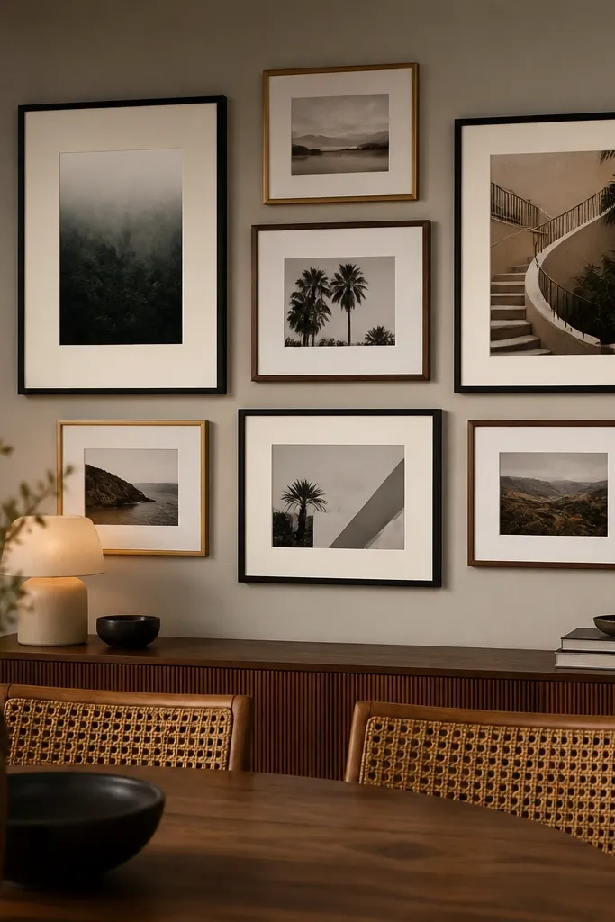
Mixing frame styles sounds risky, but it works when you control one thing — the mat color. This layout lets you use different finishes like black, walnut, and brushed metal while keeping the photos cohesive. The shared mat color creates a visual border around each image, so the wall feels unified instead of random. It’s ideal for families who inherited frames or thrifted a few and want to use them without it looking like a garage sale. Choose a mat color that flatters your photos — warm off-white is the safest.
Sort your frames by finish, then measure the usable mat opening so you can standardize mat size. Pick one mat color and one mat width across every frame, even if the frame sizes differ. Tape your layout boundary and decide whether you want a 7-9 frame cluster or a loose grid. Keep frame-to-frame gaps consistent at 2 inches, then mark the center at 58 inches. Hang the largest frame first, then fill in smaller frames around it, checking cohesion after every 2 frames.
Editor's noteIf some frames don’t accept the same mat size, swap the mats instead of forcing the photo to fit.
Skip thisDon’t mix mat colors — even two shades of white make the cluster look messy.
19. Gallery Wall with a Linen Backer Color Block
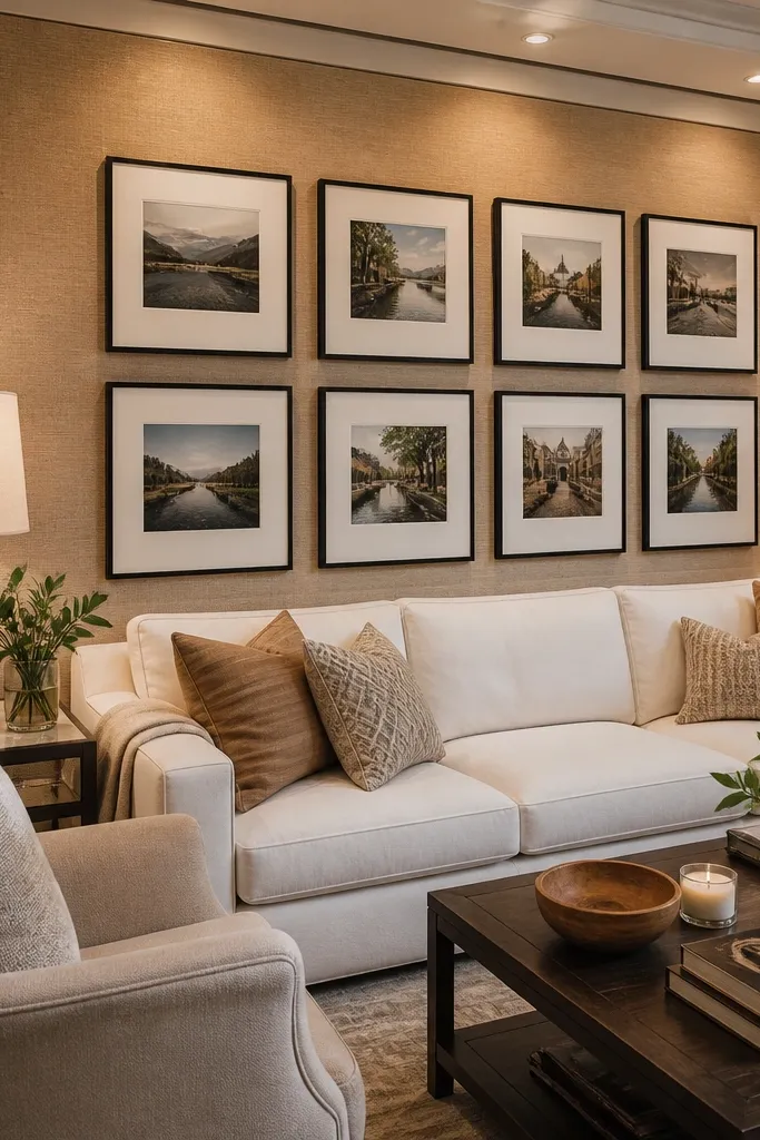
This one looks expensive because it changes the wall background behind the photos. Instead of hanging frames directly on paint, you mount them on a fabric backer — like linen, burlap, or a textured neutral — so the whole gallery feels like one styled piece. The texture reduces glare and makes photos look softer and warmer. It also works when you want a story wall in a room with busy wall paint or patterns. Keep the frame color simple and let the backer tone support your photos.
Choose a fabric backer panel sized to your gallery area, then stretch it tight over a board or use a tension frame so it doesn’t ripple. Mount the backer to the wall first at the center point around 58 inches. Then hang frames on top using spacers so there’s a small air gap and the fabric doesn’t get crushed. Keep gaps between frames consistent at 2 inches and use matching mat widths so the fabric texture doesn’t compete. Finish by trimming edges neatly and checking for wrinkles with side lighting.
Use light, breathable fabric like cotton-linen blends — heavy burlap can create shadowy texture that fights the photos.
Don’t use a backer color that matches your photo backgrounds — the frames lose separation.
20. Monogram Frame + Photo Surround
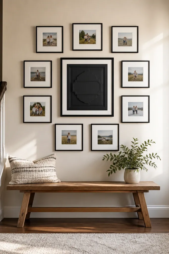
This layout turns your photo wall into a readable story point with a clear title. The center monogram or initial acts like a chapter label, then the surrounding photos show the memories tied to that theme. It’s great for a bedroom, entryway, or a hallway where you want the wall to feel personal and intentional. Choose a monogram in a frame with a matte finish and keep the photos cohesive in tone. The result looks like design, not decoration.
Pick one monogram frame as the center anchor and choose 6-8 smaller photo frames around it. Use consistent frame finish and mat width so the monogram and photos belong together. Tape the layout boundary and mark the center of the monogram frame at 58 inches. Arrange photos in a balanced ring or a two-row cluster around the monogram, keeping 2-inch gaps. Hang the monogram first, then place each photo frame and mark mounting points carefully so the ring stays even.
Editor's noteUse a monogram print with plenty of negative space so it doesn’t look crowded next to photos.
Skip thisDon’t choose a monogram font that’s too thin — it disappears once printed and framed.



