
1. Light render with a dark shadow-gap window band
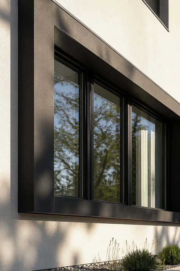
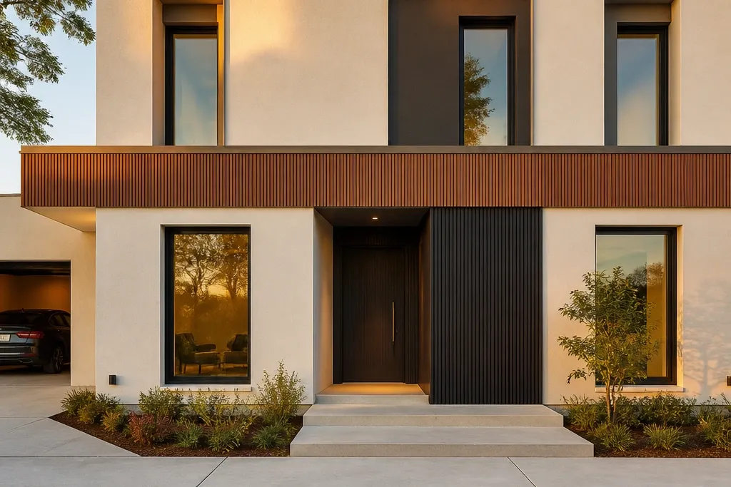
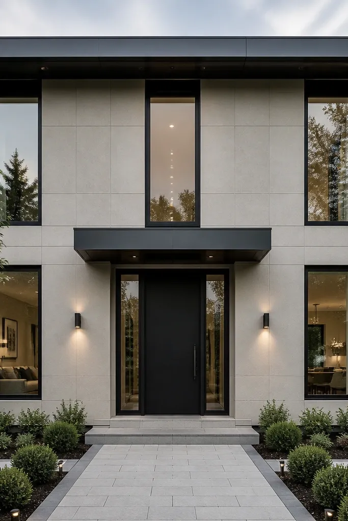
This is the cleanest route to modern minimalist modern house facades because it creates a visible grid without extra ornament. The light render keeps the surface calm, while a dark band around the main window line gives you that designer contrast. The thin shadow gap matters: it creates a crisp edge where light hits the reveal, and the facade looks sharper even from the street. Use this when you want a timeless front that won’t fight your landscaping. It’s also budget-friendly because you’re mostly working with finishes and trim rather than rebuilding formwork.
Start by marking a single horizontal reference line at the height you want for your window band, then check it with a long spirit level across both storeys. Install rainscreen battens or a flat backing layer so you can create a consistent 15-20 mm shadow gap behind trim. Apply a skim coat or render system to the main wall, then paint in a flat or low-sheen finish. Finally, fit dark uPVC or aluminum trims around the window band so the reveal width stays consistent; keep the frame-to-trim alignment exact on both floors.
Use a 20 mm spacer strip when installing trims so your shadow gap stays uniform across corners.
Don’t use glossy paint on the render — the glare kills the crisp shadow line.
2. Porcelain panel facade with vertical seam alignment
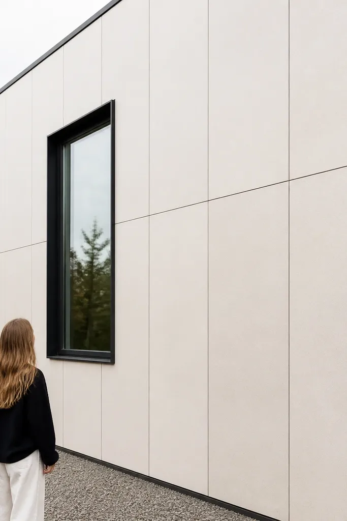
Plan your panel layout first: dry-lay a few rows from a corner and decide where a cut will land so it doesn’t end up at eye level. Mount a ventilated rainscreen system with battens spaced to match your panel fixing points, then snap chalk lines for seam positions. Install panels starting from the most visible corner, using spacers to keep the joint width consistent (commonly 3-5 mm). Cut panels with a wet saw if needed, then grout or seal joints per the manufacturer’s system and finish with a compatible exterior sealant at transitions.
Large-format porcelain panels look modern because the surface reads flat and continuous, and the seams become part of the design. With modern minimalist modern house facades, the trick is seam discipline: align vertical joints and keep them straight from ground to roofline. Choose a light neutral (cream, bone, or warm grey) and use dark frames so the panel grid pops in daylight. This idea works well for two-storey homes because the panels visually “stack” without making the facade heavy. Skill level is mid: you’re not doing complicated carving, but you do need careful measuring and cutting.
Skip thisDon’t stagger seams randomly — it makes the facade look DIY even if the panels are perfect.
Editor's noteMark panel orientation before you start; many porcelain finishes have subtle directionality.
3. Matte charcoal cladding with a pale entry wall
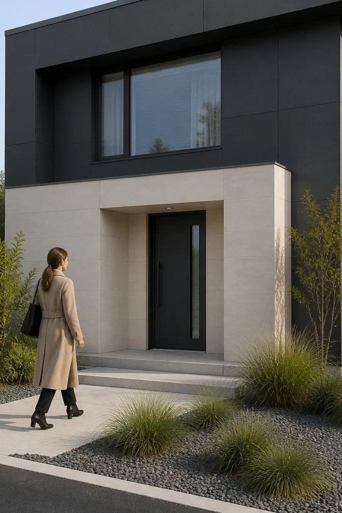
This facade uses contrast the right way: one big dark field plus one lighter “anchor” around the entry. The matte charcoal cladding keeps the exterior grounded, and the pale entry wall frames the door so it reads as the focal point. For modern minimalist modern house facades, focal contrast is cleaner than adding multiple small details. The entry wall also gives you a place to add a flush door and a simple canopy without clutter. It suits homes with a strong central front door position.
Square off your entry feature first: define a vertical zone around the door with a planned width that matches your window grid. Install a rainscreen on the entire facade and clad in charcoal fiber-cement or timber-look composite boards with a consistent overlap. Apply the pale entry wall using either smooth render on backing panels or a light cladding system, keeping it matte. Finish by installing a flush door, simple house numbers on the entry wall, and a slim canopy that aligns with the door’s vertical edges.
Keep board direction consistent on the dark field; change direction only on the entry wall for a clean visual break.
Don’t mix two different dark materials with different sheen; it makes the facade feel patchy.
4. Timber slat screen over the upper windows
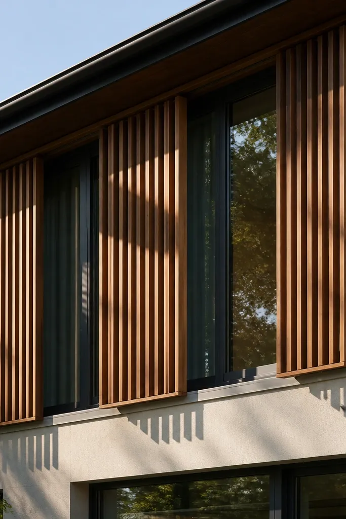
A timber slat screen is one of the most photogenic modern minimalist modern house facades moves because it adds depth without looking busy. Shade screens create a layered effect: the slats cast lines of shadow that change through the day. Place the screen over upper windows if you want privacy without blocking the ground-floor light. Use straight, evenly spaced slats so the rhythm stays calm. This looks especially sharp when your main facade is smooth render or large panels.
Decide the screen coverage: measure the window width and add a 150-300 mm overhang beyond the frames for a clean edge. Build a simple subframe with aluminum or treated timber rails fixed to the wall studs through the rainscreen backing. Install slats with a consistent pitch — for a minimalist look, aim for 50-70 mm spacing and 20-30 mm slat width. Seal timber with a matte exterior oil or use pre-finished cladding for even color, then fit drip edges at the bottom so water doesn’t stain the wall.
Use a spacer jig for slat spacing; it keeps the shadow pattern even across the whole front.
Don’t install slats directly into exterior render without backing — you’ll get cracking and water ingress.
5. Split-face stone veneer at the corners only
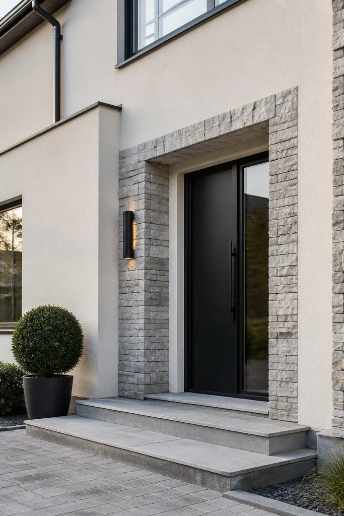
Start by selecting your veneer thickness and confirming the wall substrate can take it (cement board on a rainscreen is a common setup). Install corner waterproofing and backer boards first, then dry-fit the stone to plan your cut lines around windows. Apply thin-set adhesive in the manufacturer-recommended thickness and press stones in small sections, keeping vertical edges tight. Finish by grouting with a color that matches the mortar depth (aim for a subtle joint, not thick contrast), then seal the stone if the product recommends it for exterior exposure.
Corner stone is a clever way to add texture while keeping the facade minimal. Modern minimalist modern house facades often fail when people cover the whole wall with texture, making it look heavy. Instead, run split-face stone veneer just on the front corners and maybe the entry surround. The result is a framed, architectural look that photographs well because the shadows land on the stone edges. Choose a stone in warm grey or light limestone tones to avoid turning the facade into a dark cave.
Skip thisDon’t run stone through window reveals without a transition detail; it makes the lines look accidental.
Editor's notePlan your first and last stone rows carefully; corner veneer looks wrong when the top course ends too short.
6. Two-tone cladding with a horizontal midline
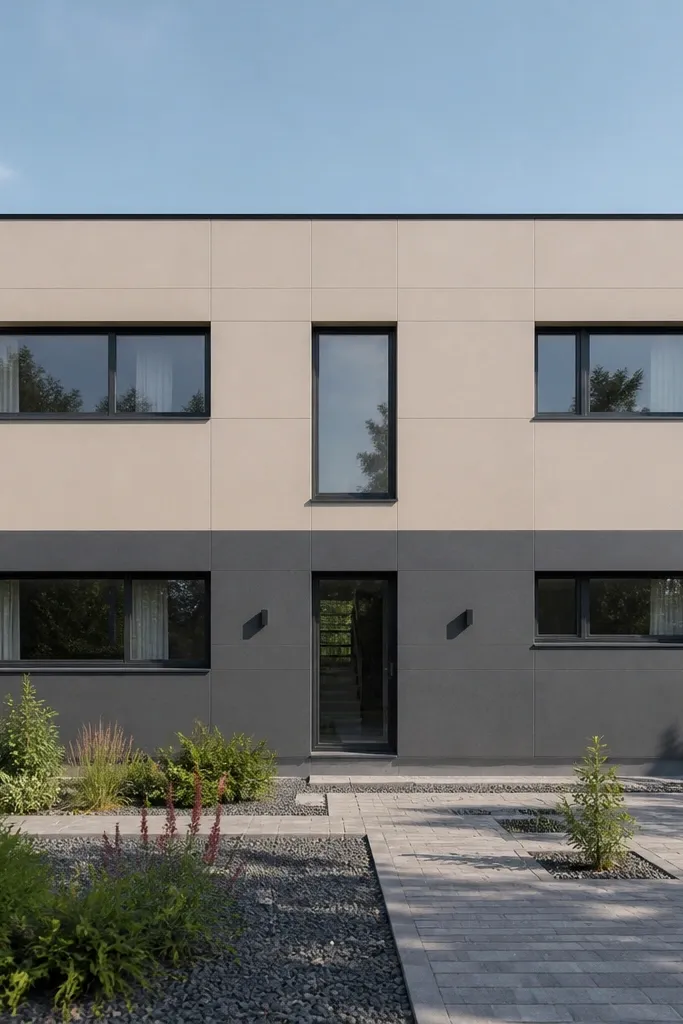
Two-tone cladding works because it gives you a clear visual division, and the midline becomes your design anchor. For modern minimalist modern house facades, keep the colors to one light and one dark or muted neutral — and keep the separation line straight across both storeys. This makes the house look proportioned even when the floor plan is simple. It’s also a practical renovation idea because you can replace only part of the cladding system if the lower section is worn. Pick matte finishes so the boundary line looks crisp.
Measure the exact height of your midline from finished ground level, then snap a laser line all the way around the facade. Install rainscreen battens for the whole wall, and use a continuous backer board at the boundary so you don’t get a wavy seam. Fix the upper cladding with your chosen fasteners and spacings, then switch to the second color for the lower zone. Add a slim aluminum trim flashing at the midline so water sheds cleanly and the join stays straight.
Use the same cladding profile for both colors; switching profiles creates shadow differences that look messy in photos.
Don’t pick two colors with similar undertones; the line will blur instead of reading as a deliberate split.
7. Monolithic flat render with recessed window reveals
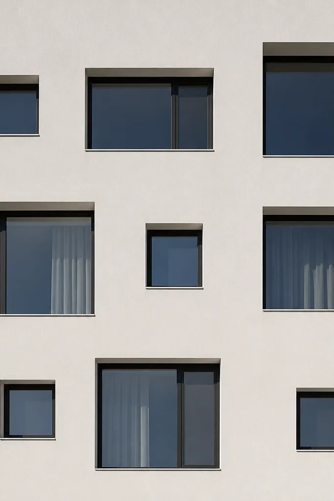
Prepare the wall with a flat substrate and correct any waviness; render shows every bump. Install edge strips or reveal formers to lock in the window setback depth, commonly around 30-50 mm for a visible shadow effect. Apply your render in layers per the system, using a straightedge and finishing trowel to keep the surface flat. Prime and paint with a breathable exterior coating in a flat finish, then check the reveal shadows from the street after the final coat dries.
A monolithic render face looks modern because it removes visual noise. The key is recessed window reveals — you’re not adding trim for decoration, you’re creating depth with a consistent setback. Recessed reveals make the facade look expensive in daylight because shadows outline every opening. This suits homeowners who want a quiet facade and plan to keep landscaping simple. It takes more prep than panel systems because render quality depends on substrate and finishing.
Skip thisDon’t rush the surface drying time; premature finishing causes hairline cracking that ruins the monolithic look.
Editor's noteCheck reveal depth with a tape at corners and midpoints; tiny differences show instantly in photos.
8. Full-height vertical fins framing the facade
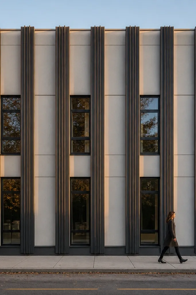
Decide fin spacing based on your window widths so the pattern looks intentional, then mark the fin lines with chalk at both sides of the facade. Build a backing rail system that fixes into studs or into the rainscreen structure, and keep fin alignment plumb. Install fins from the bottom using concealed brackets and allow expansion gaps if using metal or composite. Finish by sealing edges and painting fins in a matte charcoal or off-black for strong shadow definition.
Vertical fins make a facade feel architectural without adding clutter. When they run full height across both storeys, they create a strong vertical rhythm — perfect for modern minimalist modern house facades that need structure. Use fins in aluminum, fiber-cement, or timber-look composite, and keep spacing consistent. This is a great option if your house has large window areas and you want a pattern that reads even when the curtains are closed. It photographs well because the fins cast long shadows.
Skip thisDon’t vary fin spacing to “use leftover boards” — the rhythm is the whole point.
Editor's noteIf you’re using timber-look fins, keep the color matte and consistent; satin finishes look cheap fast.
9. Flush entry with a slatted privacy wall
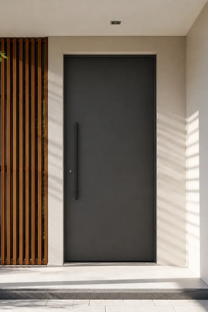
Start by framing the entry zone on the wall — define the slatted wall width and height so it aligns with your window grid. Install a rainscreen backing and then mount vertical slat rails, leaving a small gap at the bottom for airflow. Use vertical slats with consistent spacing (around 40-60 mm for a tight minimalist look) and finish with a matte exterior oil or pre-finished coating. Finally, install a flush door system and add a slim overhead canopy that matches the slat color.
This idea makes the entry look crisp by combining a flush door with a simple slatted side wall. Modern minimalist modern house facades often feel incomplete when the door area is too plain, so the slatted wall adds pattern and privacy without turning into a fence. Keep the surrounding facade smooth and light, so the slats become the only texture. It works especially well on two-storey homes where the entry sits slightly off-center and you want to “pull” attention toward it.
Skip thisDon’t add extra wall art in the entry zone; let the slats do the talking.
Editor's noteUse the same slat width and spacing on both sides of the entry if you have room; symmetry reads high-end.
10. Dark frame grid with light cladding panels
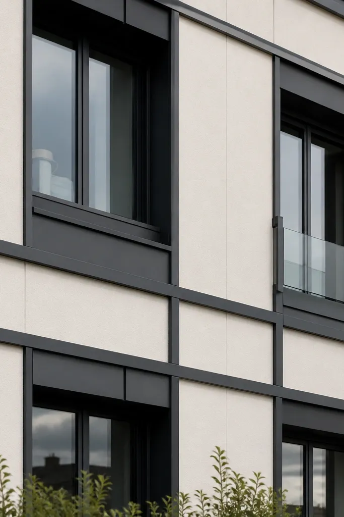
A dark frame grid makes the facade look designed even when the wall is simple. Modern minimalist modern house facades depend on repeatable linework, and dark frames give you that instantly. Keep the wall surface light (render or panels), then use dark window frames plus thin, matte dark trim strips to align reveals. This makes the house feel taller and more structured. It’s also a smart renovation route because you can update only frames and trim without rebuilding the entire wall.
Choose a light wall finish first and lock in its color — off-white or warm grey works best. Then select window frames in a matte dark finish (charcoal or black) and match your trim color exactly. Install slim aluminum or uPVC trim strips with a consistent reveal width around openings, keeping all horizontals aligned across floors. Seal all joints with exterior-grade sealant and paint the trim if needed so the facade has one continuous line language.
Take a photo from the street before buying trim lengths; alignment issues show up immediately in perspective.
Don’t use multiple dark shades; charcoal and black together look like mismatched parts.
11. Matte white render with warm timber accents
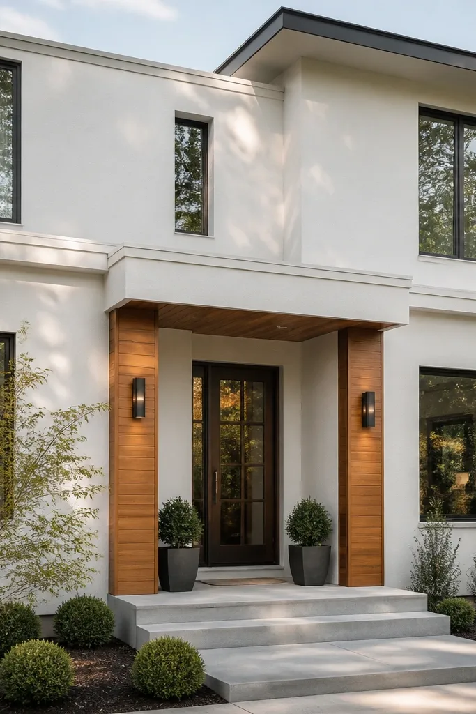
Apply a matte exterior render or paint system in a true off-white, then let it cure fully before you start trim work. Install timber battens for your accent zones and ventilate the assembly with a rainscreen approach. Fix timber cladding vertically for a crisp look, using concealed fasteners if you want the cleanest lines. Seal timber with a matte exterior finish and keep the canopy soffit simple — flat boards or a smooth panel, not decorative fascia.
Matte white plus warm timber reads modern and friendly, not sterile. The facade stays clean because the base is flat and low-sheen, while timber accents add warmth and texture in controlled areas. Use timber as vertical feature panels or a small soffit under the entry canopy, not everywhere. Modern minimalist modern house facades benefit from this because the texture is concentrated, so the overall look remains calm. It suits homes with clean landscaping and simple rooflines.
Skip thisDon’t pair matte white with glossy timber varnish; the sheen mismatch makes photos look off.
Editor's noteUse the same timber tone for every accent piece so the facade looks intentional, not mixed.
12. Porch-like entry canopy with recessed lighting line
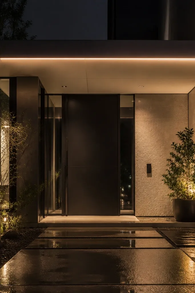
A modern entry canopy with a thin recessed lighting line adds a strong “wow” without heavy styling. For modern minimalist modern house facades, the lighting line creates a clean horizon that frames the door area at night. Keep the canopy minimal: flat soffit, slim edge, no decorative brackets. Use warm white LEDs and hide the channel inside the soffit so you don’t see the light source. This makes the facade look designed after dark and gives photographers a sharp vertical focal point.
Plan the canopy footprint so it extends 300-500 mm beyond the door on each side, then build a simple frame anchored to the wall structure. Install a soffit panel (fiber-cement or metal) and leave a channel cavity for an LED strip with a diffuser. Wire the lighting to an exterior-rated driver and use a switch or sensor you can access for maintenance. Finish by painting the canopy soffit matte and sealing all penetrations to keep water out of the LED channel.
Use a diffuser with a narrow beam so the light line stays even and doesn’t flicker at edges.
Don’t mount LEDs too close to the diffuser; heat can warp cheap channels and ruin the line.
13. Recessed vertical garage wall panel with a centered door
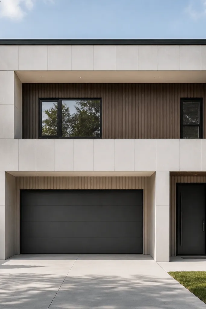
Mark a centered vertical line from the front door to the garage opening and design a recessed plane width that matches your door and window grid. Install a backing board or rainscreen subframe for the recessed panel, then keep the reveal depth consistent (around 30-60 mm). Apply your chosen finish to the recessed plane and a contrasting finish to the outer wall field. Seal the edges with flashing trim so water doesn’t sit in the recess, then paint all planes in matching sheen levels.
If your garage dominates the front, this is how you keep modern minimalist modern house facades from looking like a parking lot. Create a recessed vertical panel zone that frames the garage door and aligns with the front door on the same vertical axis. The recessed plane gives depth and makes the facade look composed. Use smooth render or flat panels in the recessed area, and keep the surrounding wall lighter or textured. This works for two-storey homes where the garage is on the ground floor and you need a strong visual anchor.
Skip thisDon’t add extra trim lines around the garage — keep it quiet so the recess does the work.
Editor's noteUse one reveal depth for the entire recessed zone; mixed depths read like construction errors.
14. Stacked horizontal timber boards across both floors
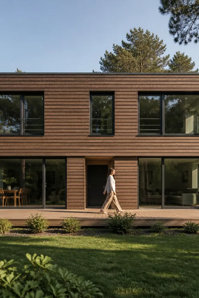
Install a rainscreen with battens that run vertically so the horizontal boards have a solid fixing base. Plan your board widths and gaps, then calculate enough material to avoid running out mid-facade. Fix boards with concealed fasteners and keep a consistent expansion gap at edges and around windows. Sand any rough cut edges, then apply a matte exterior oil or composite finish; finish with drip edges at the bottom course and around the canopy.
Horizontal timber boards can look strikingly modern when the layout is disciplined. The boards create long lines that visually widen the house, which is ideal for two-storey fronts that feel narrow. For modern minimalist modern house facades, the aesthetic comes from consistent board width, even gaps, and matte finish. Choose a warm grey-brown timber tone or pre-aged composite so the color stays subtle. This is a good choice when you want texture but still want a clean, modern grid.
Skip thisDon’t use thick, glossy timber stains; the surface glare makes the facade look industrial.
Editor's noteStart your first board row from a level reference point and check every few rows; timber lines show misalignment fast.
15. Microcement wall with one clean sculpted panel

Microcement gives you that smooth, modern “skin” look, and pairing it with one sculpted panel makes the facade feel designed without adding lots of parts. Use microcement as the main field for a quiet texture that catches light softly. Then pick one feature area — like a darker panel plane around a window cluster or a central vertical strip — to create depth. Modern minimalist modern house facades look best when the texture is subtle and the geometry is the star. This suits modern homes with clean rooflines and simple landscaping.
Make sure the substrate is stable and flat; microcement shows every wave. Apply a primer and base coat system designed for exteriors, then build up microcement in thin layers and trowel to a smooth finish. Mask off your feature panel shape and keep edges straight with flexible masking tape and a straightedge. Seal with an exterior-rated topcoat in the same sheen level across the whole facade, then paint or seal trims separately so you don’t get color bleeding at edges.
Use a straightedge and check reflections under oblique light; microcement defects show in sunlight.
Don’t try to hide unevenness with heavy texture — microcement should look intentional, not rough.
16. Brick veneer with oversized, minimal window proportions

Brick can work for modern minimalist modern house facades when you treat it like a background, not the star. The modern look comes from oversized, minimal window proportions and clean dark frames that cut through the brick grid. Keep mortar lines subtle and choose a brick color that doesn’t scream orange — think soft red-brown, warm grey brick, or light brick. This facade is great if you want durability and a classic material but still want a modern front. It also hides small wall imperfections better than perfectly flat render.
Choose a brick veneer thickness and pattern that aligns with your planned window layout; don’t retrofit window sizes after you commit to brick coursing. Install brick veneer over proper backing and waterproofing, then keep the reveals around windows consistent. Use dark aluminum or uPVC frames with flat profiles and flush alignment to the brick edge. Add a slim lintel or head flashing detail above windows so the top line stays straight and water sheds cleanly.
Keep window frames flush to the brick face; recessed frames add complexity you don’t need for minimalist lines.
Don’t mix bright white mortar with modern dark frames; the contrast reads traditional instead of modern.
17. Vertical board-and-batten feature wall beside the entry
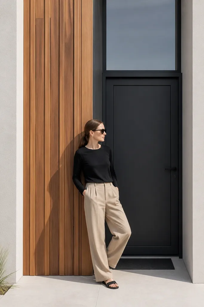
A board-and-batten feature wall is a minimalist look when you keep it narrow and disciplined. Place it beside the entry or around a window stack, not across the entire facade. The vertical rhythm adds height and frames the door area, giving modern minimalist modern house facades more personality without heavy detailing. Use a matte finish and consistent board widths so the lines read crisp. This is ideal for two-storey homes where the entry needs a visual “frame” but you don’t want to change every surface.
Define the feature wall width — a common choice is about 1/3 of the facade width, centered on the entry zone. Install vertical battens or a subframe on a rainscreen backing so you can fix boards securely. Lay boards vertically with consistent spacing and add battens to cover joints, then sand edges for a clean finish. Seal and paint in a matte color, and keep the surrounding facade smooth render or panels in a light neutral for contrast.
Use identical board widths and battens thickness across the whole feature; mismatched thicknesses show instantly.
Don’t extend the feature wall past the door line; it starts to look like a random patch.
18. Monochrome frame + horizontal cladding soffit under roofline
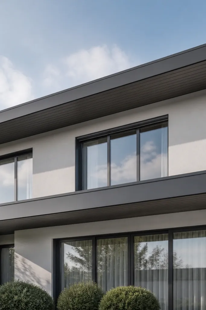
Inspect your current fascia and soffit for any rot or gaps, then replace anything damaged before you install new cladding. Install a continuous subframe to support soffit panels or fiber-cement sheets, and keep the outer edge aligned with window reveals. Fit the wall cladding or render so it visually meets the soffit edge with a clean trim line. Paint everything in matte matching tones and seal all joints with exterior sealant to prevent water ingress.
This idea is about finishing lines — the roofline is where a facade either looks designed or looks unfinished. Modern minimalist modern house facades look sharp when the soffit and fascia create one clean horizontal plane that ties both storeys together. Use a monochrome palette (charcoal frames with matching matte cladding soffit) and keep the wall field light. The soffit line also helps visually separate the upper windows from the roof, which is great for two-storey fronts with busy openings. It’s a renovation-friendly upgrade if you can access the soffit and fascia area.
Skip thisDon’t leave exposed fasteners on the soffit; even small visible screws break the minimalist look.
Editor's noteUse a single trim thickness at roofline and around windows; consistent trim makes the whole facade read intentional.
19. Corner window tower effect with stacked vertical glazing
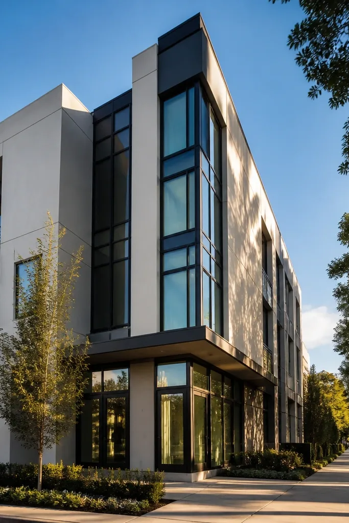
Plan the window layout first with the rough opening sizes — stacked vertical glazing needs accurate measurements and proper structural support. Choose slim, dark frames with flat profiles and consistent mullion widths. Install the windows with correct flashing and air/water sealing, then build the surrounding cladding or render so reveals are uniform. Finish by adding minimal vertical trim lines only where they align with the glazing edges, and keep the wall field smooth and matte.
A corner window tower effect makes the facade look taller and more modern, especially for two-storey homes. Stack tall, narrow glazing on the corner so the vertical line becomes the facade’s spine. Keep the rest of the wall minimal with smooth render or light panels and dark window frames. Modern minimalist modern house facades look best when one element does the heavy lifting — here, it’s the glazing composition. This is a strong option if your floor plan allows a corner opening and you want a dramatic street presence without extra cladding complexity.
Skip thisDon’t add extra decorative panels around the windows; the glazing stack should be the feature.
Editor's noteUse the same mullion width across both storeys; it keeps the tower line clean in photos.
20. Light cladding field with a recessed dark vertical spine
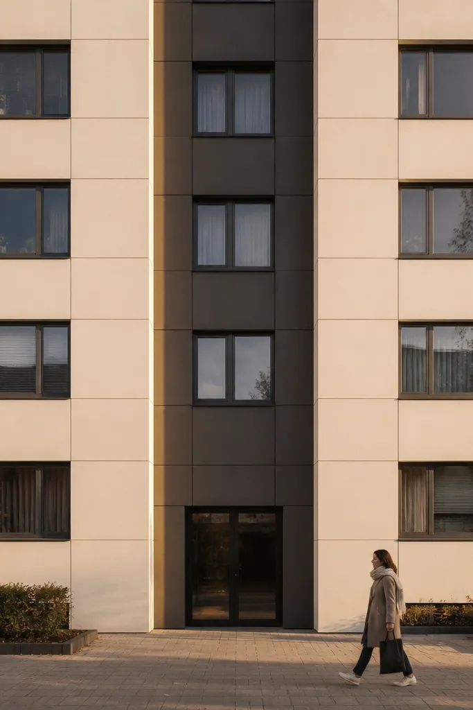
A recessed dark vertical spine is a simple way to make modern minimalist modern house facades feel structured. The light cladding field keeps things calm, and the recessed spine adds depth without clutter. This is a smart choice when your windows are already well-proportioned but the facade feels flat. The recessed plane also creates shadow that makes the entry feel more important. Keep the spine matte and narrow enough that it reads like architecture, not like a feature wall that dominates the entire front.
Pick a vertical spine width that matches your entry width — a common starting point is about 600-900 mm wide depending on facade scale. Install a rainscreen backing and create a recessed plane by building the subframe so the spine sits 30-50 mm in from the wall field. Clad the recessed spine in dark fiber-cement boards or dark panels with a matte finish. Finish the edges with slim aluminum trim to hide the join and seal the recess against water.
Laser-mark the spine centerline from the front door and keep it aligned with your main entry axis.
Don’t make the spine too wide; it turns a clean minimalist facade into a heavy block.



