
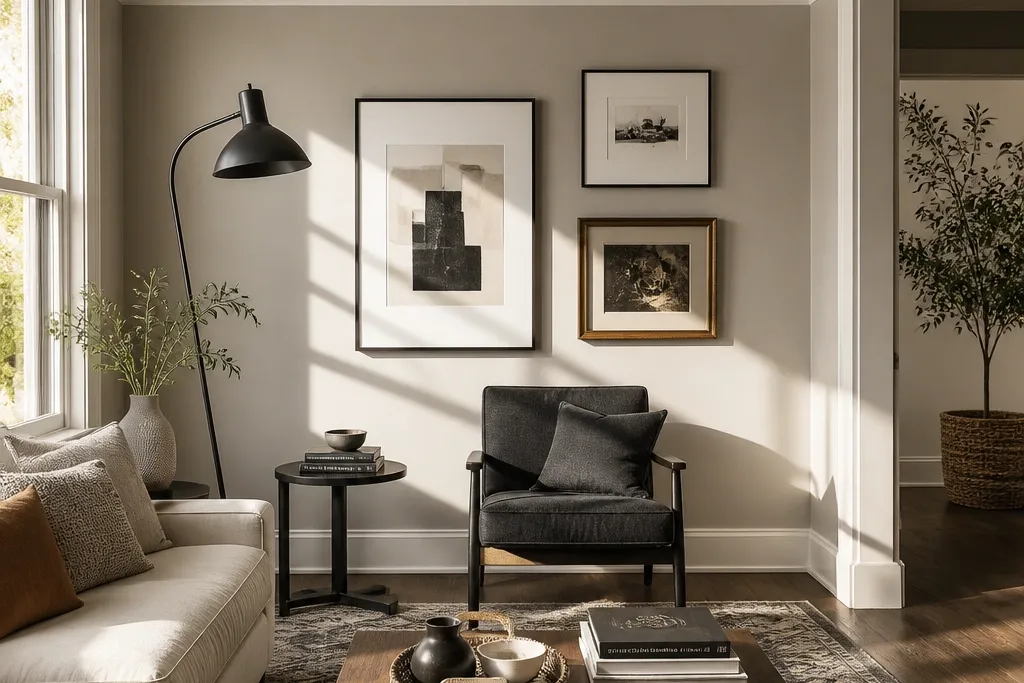
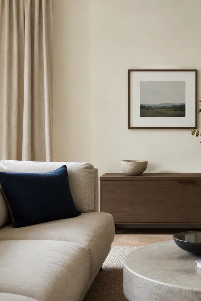
1. Charcoal wall + warm white trim + tan leather accents
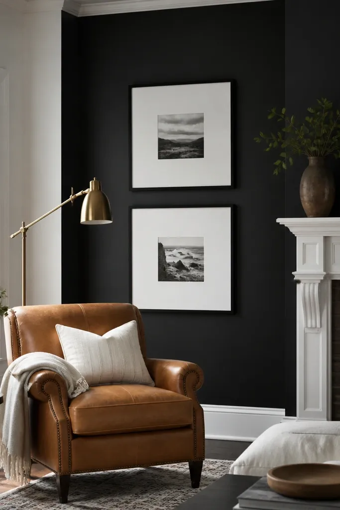
Go dark without making the room feel smaller. Charcoal on the walls creates a modern frame for art and makes metal finishes pop, and warm white trim keeps it from looking like a basement. This combo is photogenic because it gives you deep contrast — bright pillows, art mats, and lamps read cleanly. Add tan leather or caramel suede in the seating area to soften the edges and stop the charcoal from feeling cold. This is best for living rooms with decent daylight or good lamps, because the contrast needs light to stay friendly.
Start by painting the walls in a charcoal with a neutral undertone (not blue-black). Then paint trim, doors, and built-in edges in warm white at satin finish so it reflects without glare. Finally, add one tan leather piece or textile and keep other accents limited to brass, off-white, and a muted brown so the palette stays modern. Use painter’s tape to create a crisp line at the baseboard and window casing before you brush or roll trim.
Editor's noteChoose a charcoal with a light reflectance that reads “soft charcoal,” not “inky,” for better daylight behavior.
Skip thisSkip glossy paint on walls — it turns charcoal patchy and highlights roller marks.
2. Greige walls + creamy ceiling + black picture rails
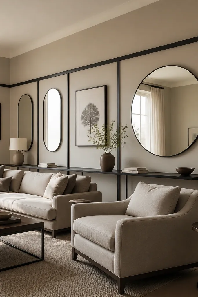
This look makes a drawing room feel designed, not decorated. Greige is the anchor that works across flooring types, and a creamy ceiling lifts the space so it doesn’t feel heavy. Black picture rails give you a modern “grid” effect that helps shelves, art, and mirrors look intentional. Keep fabrics in oatmeal, stone, and light camel so the greige doesn’t get overwhelmed. This is a strong option for rooms with paneling, built-in shelves, or any wall where you want art to feel organized.
Paint walls in greige at matte or eggshell, then do the ceiling in a creamy off-white with the same undertone family. Install or paint picture rail trim in black, and keep it consistent across the room. After paint cures, mount art so the bottom edge aligns with the rail height you picked, usually around 60-66 inches from the floor. Use a level and mark studs so the rail and frames sit straight.
Editor's notePick your black last — test a black sample on the rail spot because some blacks look brown under warm bulbs.
Skip thisDon’t use bright white trim with creamy ceiling — it fractures the color story.
3. Sage green walls + natural oak + oatmeal textiles
Sage green gives modern calm without drifting into “country.” The trick is choosing a sage with a gray base so it stays refined, not minty. Natural oak adds warmth, and oatmeal textiles keep the look grounded. This palette photographs well because the green reads soft and the oak grain adds texture instead of visual noise. It also pairs cleanly with white art frames and brushed nickel lighting.
Prime any stained patches, then roll sage green on walls in matte for a smooth, modern finish. Keep trim and baseboards in a warm white or soft cream so the green stays balanced. Choose oak-toned furniture or add it via a coffee table and blinds in oak or oak-look wood. Finish by layering oatmeal curtains and a couple of pillows in off-white and warm gray.
Use a satin finish on trim so the sage doesn’t look flat beside it.
Avoid pairing sage with cool gray upholstery — it makes the green feel sickly.
4. Muted blue-gray walls + light walnut + off-white linen

This is modern and clean, but it stays cozy because the undertone is muted. Blue-gray walls make white trim look crisp and make warm wood feel richer. Light walnut adds a gentle contrast — not as heavy as dark brown, but still clearly warm. Off-white linen keeps the room airy, so the blue-gray never feels like a storm cloud. Choose this palette when you want a calm backdrop for art and when your room gets mixed daylight.
Paint walls in a muted blue-gray at eggshell if you need durability, matte if you have low traffic. Select trim in off-white with a touch of warmth, then keep ceiling the same off-white. Add light walnut through a cabinet, sideboard, or coffee table, and finish with linen slipcovers or textured throws. Keep metal accents in brushed brass or warm nickel so the blue-gray doesn’t go icy.
Editor's noteTest the blue-gray next to your floor sample — the undertone match is what keeps it from turning muddy.
Skip thisDon’t choose a bright, icy blue-gray — it exaggerates wall unevenness and looks harsh.
5. Warm mushroom beige + black accents + woven textures
Mushroom beige is the modern alternative to plain beige. It has enough depth to look expensive, but it still reads neutral in daylight. Black accents — think frames, lamp bases, and thin shelves — add structure and keep the room from looking blurry. Woven textures like rattan or jute bring warmth without adding color chaos. This works especially well in drawing rooms with natural light and wood floors where you want a layered, lived-in look.
Roll mushroom beige on walls in matte for softness, then paint trim in true white or a very light warm white. Add black through picture frames, a slim media console, and a lamp base. Bring in woven texture with a chair, basket, or shade, and keep textiles in cream, oat, and light tan. Finish by placing art with white mats so the beige doesn’t swallow the edges.
Editor's noteIf your beige looks too pink, switch to one with a more gray-brown undertone rather than adding more dark colors.
Skip thisSkip all-black large surfaces — it can make beige look dingy instead of luxe.
6. Terracotta clay walls + cream trim + olive accents
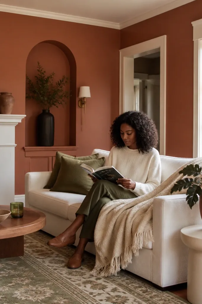
Terracotta in a drawing room feels modern when it’s clay, not orange. The warmth makes the room inviting, and cream trim keeps it crisp instead of rustic. Olive accents — pillows, a rug border, or plant pots — create a grown-up palette that doesn’t turn into “festival colors.” This look is excellent for rooms that face north or get cooler daylight, because terracotta warms the color temperature. It also looks great with matte black or aged bronze hardware.
Pick a terracotta that reads more brown than red, then paint feature walls first if you’re nervous. Use cream trim in satin, and keep the ceiling a soft cream so the wall color feels grounded. Add olive accents in small areas like cushions, a throw, or a patterned rug with green undertones. Keep metals aged bronze or matte black so the warm wall color stays balanced.
Editor's noteDo a two-coat test on your wall sample — terracotta often deepens after the second coat.
Skip thisDon’t pair terracotta with pure cool grays — the clash makes the orange edge show up.
7. Deep forest green + white ceiling + brass details

Deep forest green is dramatic, and it looks best when you add a bright ceiling to lift the room. White ceiling keeps the upper space from feeling boxed in, while brass details add a warm shine that flatters green. This is a strong choice for formal drawing rooms with statement lighting and for people who like bold color but still want it to feel tailored. Use crisp whites in textiles to keep the palette sharp and modern. The result reads intentional in photos because the green has a rich, even depth.
Paint walls in deep forest green at matte or eggshell, and use primer if your wall has stains. Keep the ceiling bright white at flat finish and do trim in satin white for clean edges. Add brass sconces, a brass mirror frame, or brass lamp bases, then choose textiles in white, cream, and dark green. Finish with a rug that has a subtle pattern so the green doesn’t look flat across a large area.
Use a foam roller for the final coat on green — it reduces lap marks in darker colors.
Avoid eggshell on ceilings — it catches light and shows roller texture.
8. Soft white walls + charcoal gallery wall + steel gray furniture
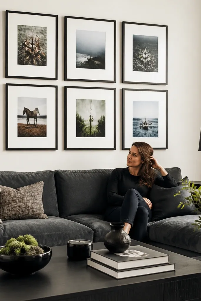
This palette is modern minimal without being sterile. Soft white walls give you a clean canvas, and a charcoal gallery wall creates the focal point. Steel gray furniture adds contemporary contrast without going too dark everywhere. The look is photogenic because the frames and art create a strong grid, and the furniture color reads crisp against the white. It’s a good choice if you change art often or want your drawing room to feel gallery-like.
Paint walls in a soft white with a slight warmth, then keep ceiling white at flat finish. Choose one wall for a charcoal gallery — paint it directly or use charcoal backing behind frames. Use steel gray on the sofa or chairs, and keep throw colors limited to white, black, and one muted accent like slate. Hang frames with consistent spacing using a template and measure the center line for each piece.
Editor's noteUse museum-style matte art paper or matte frames so reflections don’t glare in photos.
Skip thisDon’t scatter charcoal accents across multiple walls — it breaks the focal point.
9. Warm white walls + blush pink accent wall + brass mirrors
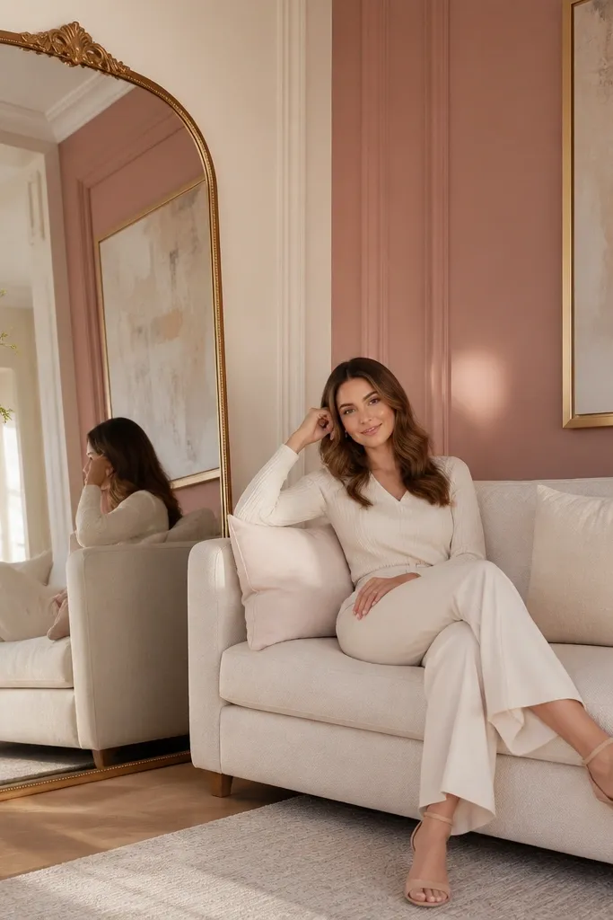
Blush pink works when it’s dusty and used as an accent, not a full-room paint job. Warm white walls keep the room bright and modern, while blush creates a gentle focal point that flatters skin tones and light. A brass mirror makes the accent wall feel doubled, because it reflects the blush hue back into the room. This is a great option for drawing rooms that need a personality upgrade but still want a light, airy vibe. Keep the rest of the palette in cream and soft gray so it stays sophisticated.
Paint all main walls in a warm white at eggshell, then pick one accent wall and paint it in dusty blush. Use satin finish on trim and keep the ceiling warm white as well so the blush doesn’t feel too contrasty. Add a brass mirror above a console and choose curtains in cream linen. Finish with a rug in off-white that has a subtle texture, not a busy pattern.
Test blush in two coats — some blushes look pink in one coat and peach in two.
Skip bright fuchsia or neon pink — it turns modern softness into loud chaos.
10. Oyster gray walls + black door frames + patterned rug anchor
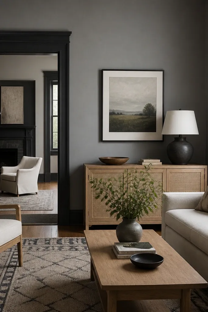
Oyster gray is a workhorse color that reads modern when you add sharp black lines. The walls stay calm, while black door frames and trim create definition and architecture. A patterned rug becomes the visual anchor because the gray background doesn’t compete. This palette is ideal for drawing rooms with multiple openings — doorways, pass-throughs, big windows — where you want the space to look structured. It also hides minor wall flaws better than crisp white.
Roll oyster gray on walls in matte or eggshell for durability. Paint door frames, window casings, and any trim in black satin, and keep the ceiling a light gray-white so it doesn’t look yellow. Choose a rug with a clear pattern and a mix of black and warm off-white so it connects to the door frames. Add one or two black metal pieces like side tables to keep the look cohesive.
Use painter’s tape burnishing along trim edges — black paint shows bleed more than light colors.
Don’t pick a gray with strong green undertones — it clashes with many warm rugs.
11. Charcoal pinstripe wallpaper + matte black accents
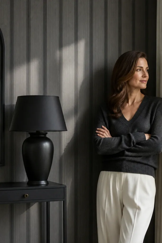
Pinstripe wallpaper instantly upgrades a drawing room because it adds vertical rhythm without needing furniture changes. Choose a charcoal stripe on a soft gray base so it stays modern, not old-fashioned. Matte black accents — lamp bases, frames, and a narrow console — keep the look sharp and consistent. This is photogenic because stripes catch light differently at different angles, making the wall look styled even when everything else is minimal. It suits spaces with plain furniture lines and people who want texture without loud color.
Measure wall heights and buy wallpaper with enough extra for matching — pinstripes need careful alignment. Prep the wall smooth: skim coat dents and sand so the pattern doesn’t telegraph. Install with a plumb line and use a seam roller for tight joins. After it dries, paint or touch up trim and add matte black décor with simple shapes to avoid visual clutter.
Editor's noteHang samples first and check the stripe alignment at eye level; adjust before committing to the whole wall.
Skip thisDon’t use high-gloss paint near wallpaper edges — it creates shiny ridges at seams.
12. Light sand beige + white oak + navy textile accents
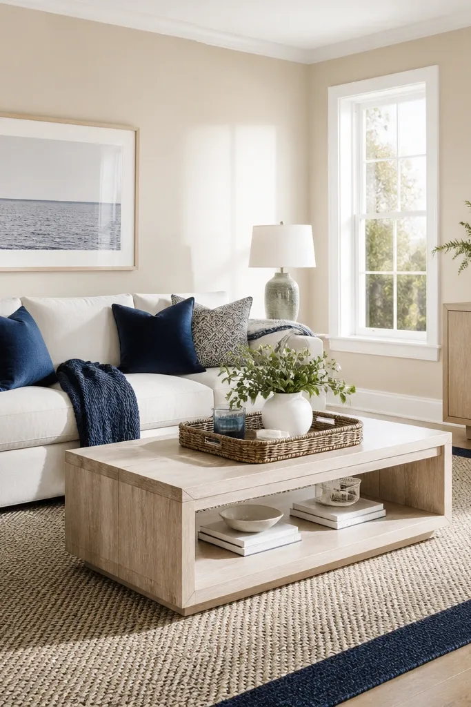
Light sand beige keeps a modern room bright, and navy adds a crisp contrast that looks intentional. White oak furniture makes the palette feel clean and airy, especially if your floors are similar. The navy shows up in pillows, a throw, or a rug border, so you get color without overwhelming the room. This is a smart choice for drawing rooms that face north or have large windows — it stays warm but not orange. It also works well with brushed nickel and white ceramic lamps.
Paint walls in a light sand beige at eggshell so it wipes clean. Keep trim and ceiling in true white, then choose white oak or oak-look furniture with a pale finish. Add navy in textiles and artwork with a simple pattern so it reads modern. Finish with a rug in cream with navy accents and keep metal hardware in brushed nickel or chrome.
Editor's notePick navy that leans slightly gray, not bright royal, for a more modern feel.
Skip thisAvoid mixing warm gold décor with orange-leaning beige — it can turn the room too yellow.
13. Warm taupe walls + black-and-white framed art + creamy upholstery
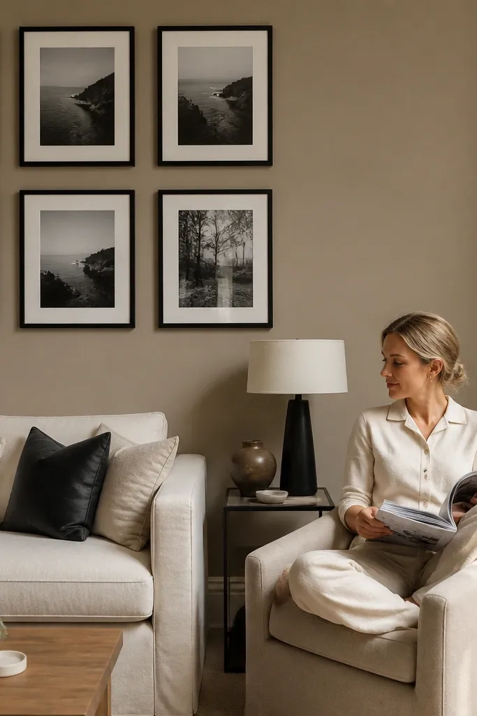
Warm taupe is the background that makes contrast look expensive. Pair it with black-and-white framed art and creamy upholstery, and the room feels designed even when the furniture is simple. Taupe hides small imperfections and keeps the room from looking sterile like gray can. The black-and-white art grid gives you structure, and creamy textiles keep it soft. This works well in modern drawing rooms where you want a curated art wall and minimal color clutter.
Paint walls in warm taupe at matte or eggshell, then keep trim in creamy off-white. Choose a consistent frame finish — matte black or dark walnut — and use white mats for most pieces. Upholstery should be creamy or oatmeal, and avoid patterned fabrics that fight the art. Hang frames with a tape layout first and keep the gap between frames consistent for a clean gallery look.
If taupe looks too brown, switch to a taupe with a gray undertone rather than darkening it.
Skip glossy paint on the wall — it makes taupe look patchy.
14. Olive-gray walls + off-white trim + terracotta pottery
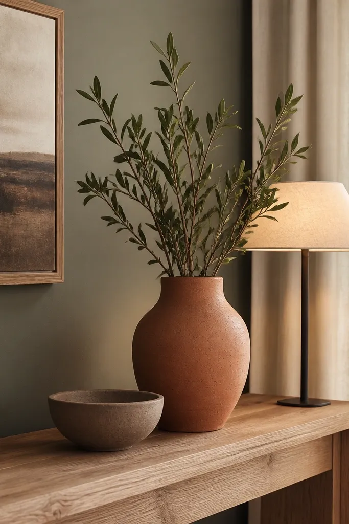
Olive-gray is modern and earthy without going full rustic. It reads like a muted fashion color, especially under warm lamps, and it pairs beautifully with off-white trim. Terracotta pottery adds a small hit of warm color that looks handmade but still fits the palette. This is a good choice for people who want a calm, layered room that doesn’t feel beige. Add a couple of textured fabrics like bouclé or linen and you’ll get a drawing room that looks styled even without heavy décor.
Roll olive-gray onto walls in matte, then do trim in off-white satin so it stays crisp. Keep ceiling in off-white with the same undertone family. Add terracotta through a console vase, a couple of planters, and a small accent rug with warm tones. Choose metal items in aged brass or antique bronze so the olive doesn’t clash.
Editor's noteUse a tinted primer on patchy walls — olive-gray shows uneven coverage faster than lighter colors.
Skip thisDon’t add bright orange accents — it makes the olive look dull.
15. Pale mint-gray walls + white ceiling + chrome highlights
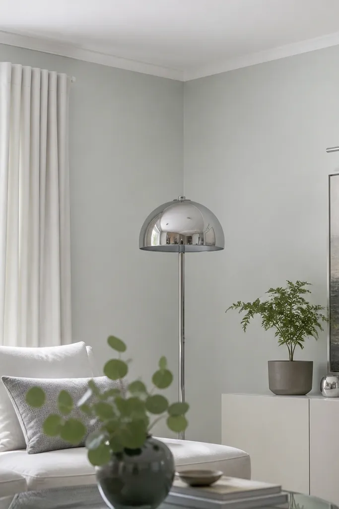
This palette gives you a modern, airy look with a hint of color. Pale mint-gray has enough green to feel fresh, but the gray base keeps it sophisticated. A true white ceiling prevents the room from looking dingy, and chrome or polished steel adds crisp highlights. It’s photogenic because the walls reflect light in a soft way, and the chrome gives you clean points of shine. Use this in drawing rooms that already feel a bit too warm or yellow.
Paint walls in pale mint-gray at eggshell for cleanability, and keep ceiling true white at flat. Trim should be bright white satin, not off-white, so the mint reads clean. Add chrome lamp bases, a mirror frame, or a slim side table. Keep textiles white, pale gray, and light green in small accents so the wall color stays the star.
Editor's noteIf your room has warm bulbs, test mint-gray under that light — some greens go yellow fast.
Skip thisAvoid dark charcoal furniture with mint-gray — the contrast can look harsh.
16. Soft black walls on a single feature panel + light fabrics
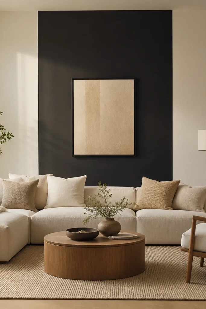
Full black walls can feel intense, so I prefer a single feature panel in soft black. This keeps the room modern and dramatic, while the rest stays bright and comfortable. Choose a soft black with a brown-neutral undertone so it doesn’t look like a hole. Pair it with light fabrics — cream, oatmeal, and linen — so you get contrast without heaviness. It’s ideal for drawing rooms with a fireplace, a built-in niche, or one main wall where you want focus for art.
Pick the feature wall and tape a clean rectangle if you want panel-like impact, usually 2-3 feet taller than your largest art. Paint the panel in soft black satin or matte depending on your wall texture. Keep the surrounding walls in warm off-white and do the ceiling in bright white. Add light curtains and upholstery so the black reads intentional, then place a large mirror or art with a light mat to reflect and balance.
Editor's noteUse a leveling primer on the feature wall — black shows every ridge and patch.
Skip thisDon’t place black next to yellow-beige trim — it makes both look dirty.
17. Pale gray-lavender walls + warm white trim + oatmeal rugs
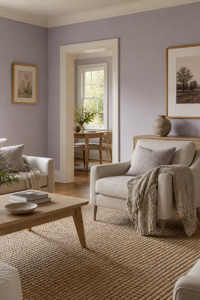
Gray-lavender is the calm cousin of purple. It adds a subtle color shift that looks modern under daylight and still feels soft at night. Warm white trim keeps it from reading cold, and oatmeal rugs or throws ground the palette. This works well when you want something more interesting than gray, but you don’t want a bold accent wall. Pair it with brushed brass, off-white ceramics, and simple geometric art for a clean look.
Paint walls in pale gray-lavender at eggshell for durability. Keep trim in warm white satin and ceiling in warm off-white so the undertone stays consistent. Choose an oatmeal or cream rug with a low-contrast texture, not a busy pattern. Add brass and ceramics in off-white, then pick artwork frames in dark walnut or matte black for structure.
Use a sample card and compare it to your living room lighting — lavender undertones can shift fast with warm bulbs.
Avoid pairing lavender walls with bright cool blues — it makes the room look mismatched.
18. Warm white walls + biscuit baseboards + caramel leather

This is a modern way to do contrast without dark paint. Warm white walls stay bright, then biscuit baseboards and trim create a gentle frame that looks intentional in close-up. Caramel leather or tan upholstery ties the room together and makes the palette feel warm, not clinical. It’s great for drawing rooms with lots of natural light and light wood floors where you want depth without using dark walls. The look is understated but polished, and it photographs cleanly because the color separation is subtle.
Paint walls warm white at eggshell, then paint baseboards and lower trim in biscuit at satin for a smooth, wipeable finish. Keep ceiling in warm white or a slightly brighter off-white so the room feels lifted. Add caramel leather through seating or a statement chair and keep other accents in cream, tan, and light brown. Finish with a rug that has warm neutrals and a little contrast so the floors don’t blend into the walls.
Bring a real baseboard sample to the paint store if you can — matching undertones beats chasing names.
Don’t pick a biscuit that’s too yellow — it will fight warm whites and look dated.
19. Sky-blue ceiling with neutral walls and white trim
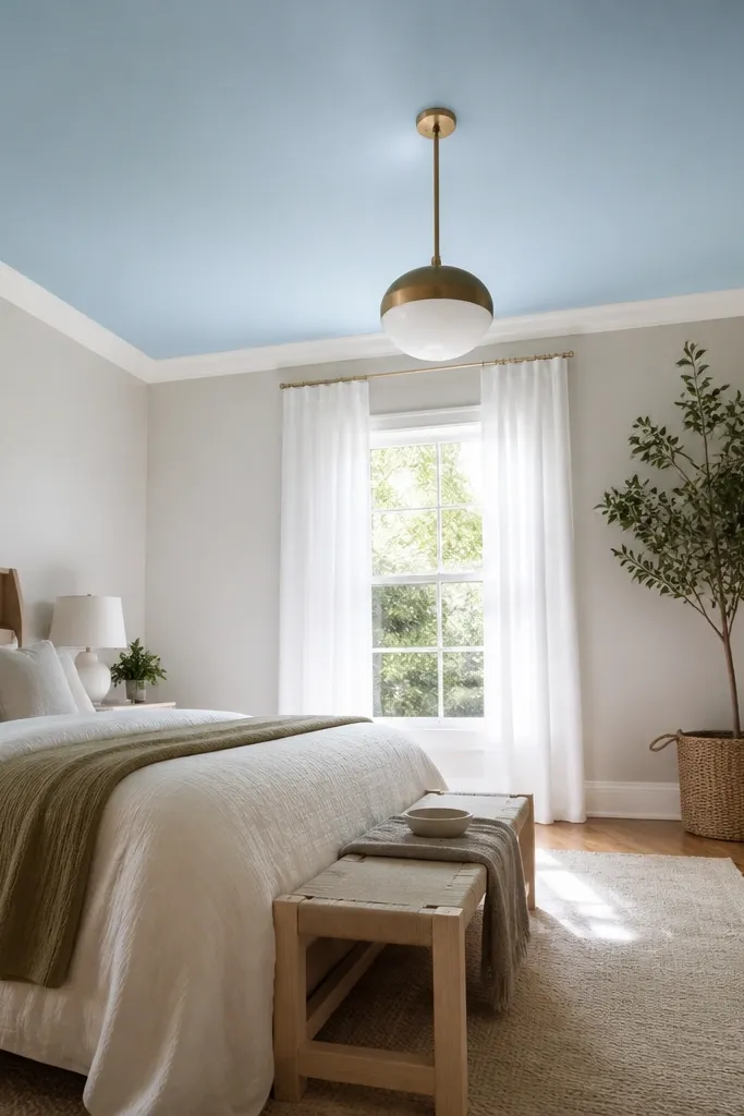
Color on the ceiling is the fastest way to make a drawing room feel special without changing everything else. A sky-blue ceiling adds depth and makes the room feel taller, especially when the walls are neutral. Keep walls in a soft greige or warm off-white, and keep trim bright white so the blue stays crisp. This look is photogenic because cameras catch the ceiling color during wide shots, and it makes pendant lighting feel more dramatic. Use it in rooms where ceiling height is average and you want visual lift.
Protect floors and tape edges carefully along trim lines. Paint the ceiling in a sky-blue at flat finish, and let it cure fully before removing tape. Paint walls in a neutral greige or warm off-white at eggshell, and keep trim in bright white satin. Add simple lighting — a white shade or warm bulb — so the blue reads clean rather than green.
Editor's noteUse a roller with extension pole and a cut-in brush around edges to avoid lap lines on the ceiling.
Skip thisSkip flat ceiling paint if you have texture — it will show every roller mark.
20. Warm gray walls + white molding + walnut built-ins
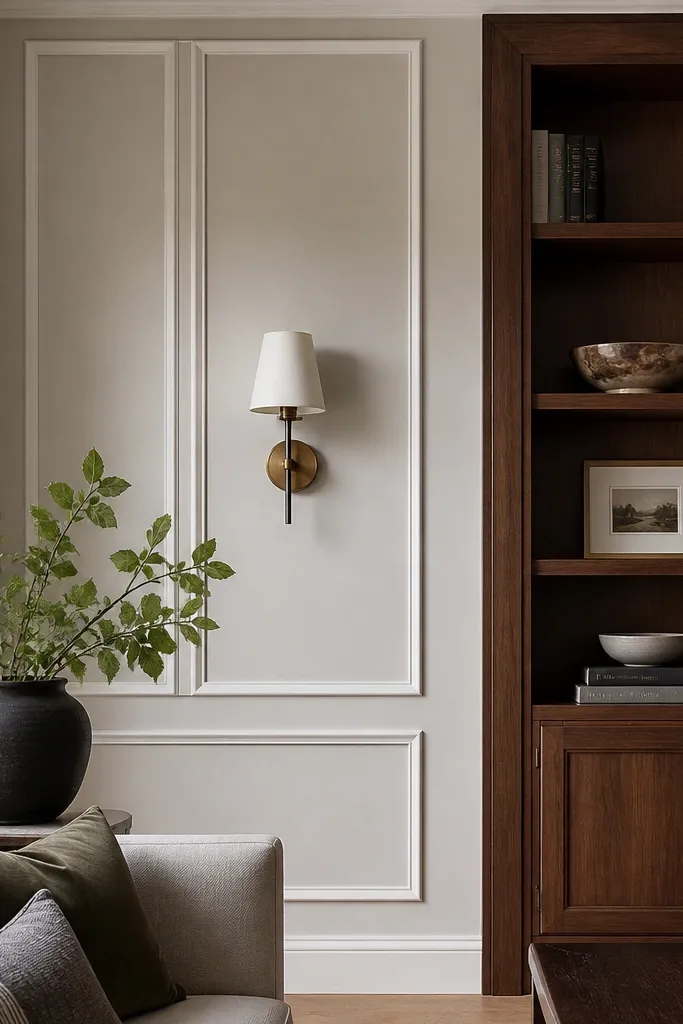
Warm gray with white molding is classic modern, but it stays current when you add walnut built-ins. The gray gives you a calm backdrop, and white molding creates crisp architecture that makes the room look tailored. Walnut adds warmth and visual grain, so the palette doesn’t feel flat. This works best in drawing rooms with built-ins, bookcases, or a media wall where color can highlight structure. It also photographs well because you get strong lines and warm wood texture in the same frame.
Paint walls in a warm gray at matte or eggshell depending on wall traffic. Keep molding, paneling edges, and chair rails in bright white satin, and paint the ceiling in the same bright white family. Finish built-ins in walnut veneer or stain, then add hardware in brushed brass or dark bronze. Style shelves with books in neutral covers and a few ceramic pieces to keep the walnut from looking cluttered.
If your walnut is new, let it acclimate before final staining so the sheen looks even.
Avoid cool blue-gray walls — they fight walnut and make molding look yellow.
21. Monochrome oatmeal + soft white + textured boucle

Monochrome rooms look modern when you rely on texture, not more color. Oatmeal walls and soft white trim create a calm base, and boucle or chunky knit textiles add the visual “spark” that color usually provides. Keep black accents minimal and use them only in small frames or lamp bases for definition. This palette is ideal for drawing rooms that feel busy with too many patterns; it simplifies the look while still feeling soft and stylish. It also works in spaces with lots of daylight because the neutrals don’t turn harsh.
Paint walls in oatmeal at matte so the color looks velvety, then do trim in soft white satin. Choose upholstery in cream or oatmeal with visible texture, like boucle or textured linen. Add a rug with woven texture and a low-contrast pattern, plus art in black frames with off-white mats. Keep décor pieces in ceramic, wood, or linen so the room stays within the same color family.
Editor's noteUse two different textures at least — smooth ceramic plus boucle — otherwise monochrome can look flat.
Skip thisDon’t add glossy accents everywhere — they make oatmeal look greasy and uneven.
22. Warm beige + deep navy sofa + white curtains

This is a high-contrast modern palette that still feels cozy. Warm beige walls keep the space inviting, while a deep navy sofa creates a strong focal point without requiring a dark wall. White curtains brighten the sightline and help the navy look intentional rather than heavy. This combination is especially good for drawing rooms where you want your seating to be the star. It also photographs well because the navy reads crisp and the white curtains add a clean vertical line.
Paint walls in warm beige at eggshell for wipeable durability. Choose a deep navy sofa or slipcover and keep upholstery fabric matte to avoid shine. Hang white floor-length curtains with a simple rod so the fabric falls straight, then add a rug that includes both beige and navy. Finish with brass or warm nickel lighting so the navy doesn’t look cold.
If your navy looks too black, choose one with a slight blue undertone — it will keep the palette softer.
Skip patterned navy pillows that match the rug — it turns the room into one visual blur.
23. Monochrome charcoal + white art mats + chrome lamp bases
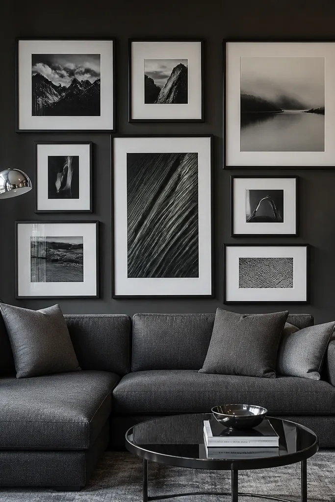
If you want a modern drawing room that looks like a magazine spread, this is the clean formula. Charcoal walls create the mood, white art mats keep pieces readable, and chrome lamp bases add sharp modern shine. The reason it works is contrast discipline: white only shows up where it needs to, like art and cushions, so the room stays sleek. This palette is best for people who like minimal décor and strong composition. It also handles bold art well because the wall color doesn’t compete.
Paint walls charcoal at matte or eggshell, then keep trim and ceiling in bright white. Use white mats behind most art and keep frame widths consistent so the gallery reads organized. Choose chrome lamp bases or hardware for a clean metallic accent, and keep upholstery in off-white or pale gray. Add one or two throw pillows in solid white to connect with the art mats.
Use a matte charcoal on the wall and satin on trim — mixing sheen wrong makes the room look DIY.
Don’t use gray art mats — they blend into charcoal and kill the contrast.
24. Soft sage + warm blush textiles + light oak floor
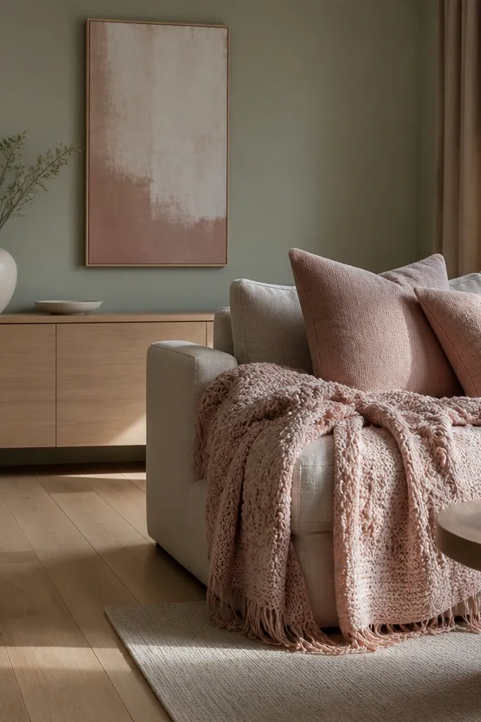
This palette is modern and gentle, with color coming from textiles instead of heavy paint. The sage wall is the calm anchor, and warm blush textiles add a flattering pop without turning the room into a “theme.” Light oak floors keep it bright and natural. This works well for drawing rooms that get morning light and want a warm, lived-in feel in the evening. It’s also a good option if you rent or don’t want to commit to multiple paint colors — the wall does the heavy lifting, and the textiles bring change.
Paint walls in a soft sage at eggshell so it’s easy to clean. Keep trim and ceiling in warm white, then choose textiles in blush — one throw and two pillow sizes is enough. Add a light oak coffee table or sideboard if you don’t already have it, and choose a rug in oatmeal or cream. Finish with brass or warm nickel lighting so the blush reads warm instead of pink-purple.
Editor's noteWhen choosing blush, pick one that looks peachy in daylight — it stays flattering against sage.
Skip thisDon’t add cool lavender textiles — it clashes with sage’s gray base.
25. Light stone gray + black steel accents + geometric rug
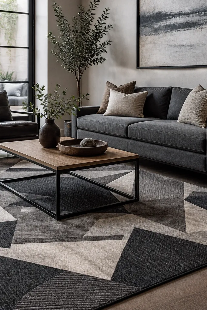
Light stone gray makes the room feel modern and spacious, and black steel accents add a sharp industrial edge. A geometric rug brings energy without using loud colors, because the gray wall keeps the pattern crisp. This looks great in drawing rooms with modern furniture lines and metal legs. It’s also a practical palette — gray hides minor scuffs, and black metal frames stay graphic. If your room has a lot of straight lines, this color setup makes them look intentional.
Paint walls in light stone gray at eggshell for durability. Choose black steel or matte black metal accents for your furniture legs, frames, and a side table. Pick a geometric rug with black lines and light gray or off-white fields so it connects to both wall and metal. Add simple curtains in off-white and keep any additional colors to one small accent like muted green.
Editor's noteUse a rug with high-contrast line weight — thin lines disappear against light gray walls.
Skip thisAvoid mixing multiple black finishes — black matte plus glossy black looks messy.



