
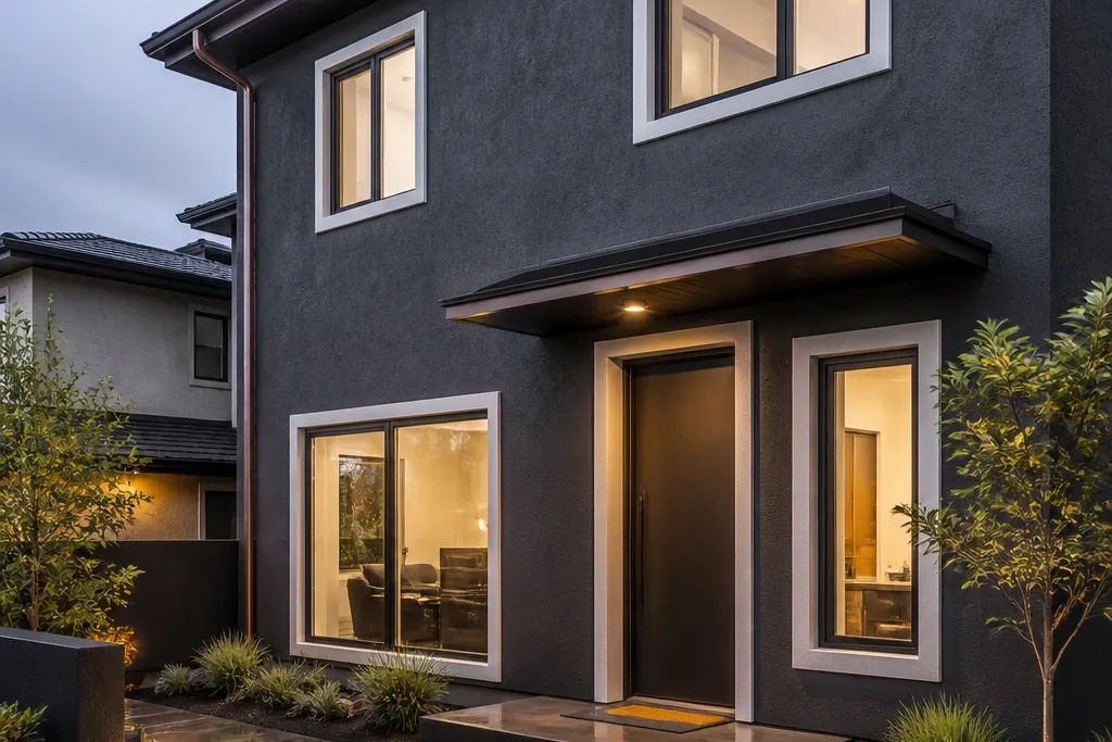
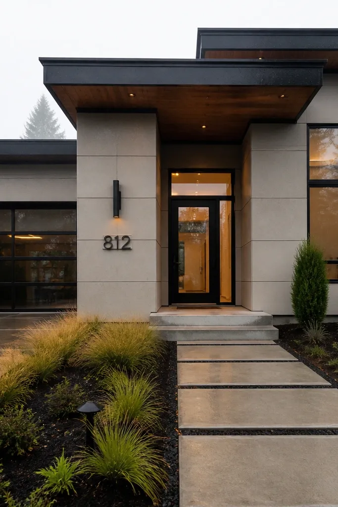
1. Charcoal stucco with warm white trim
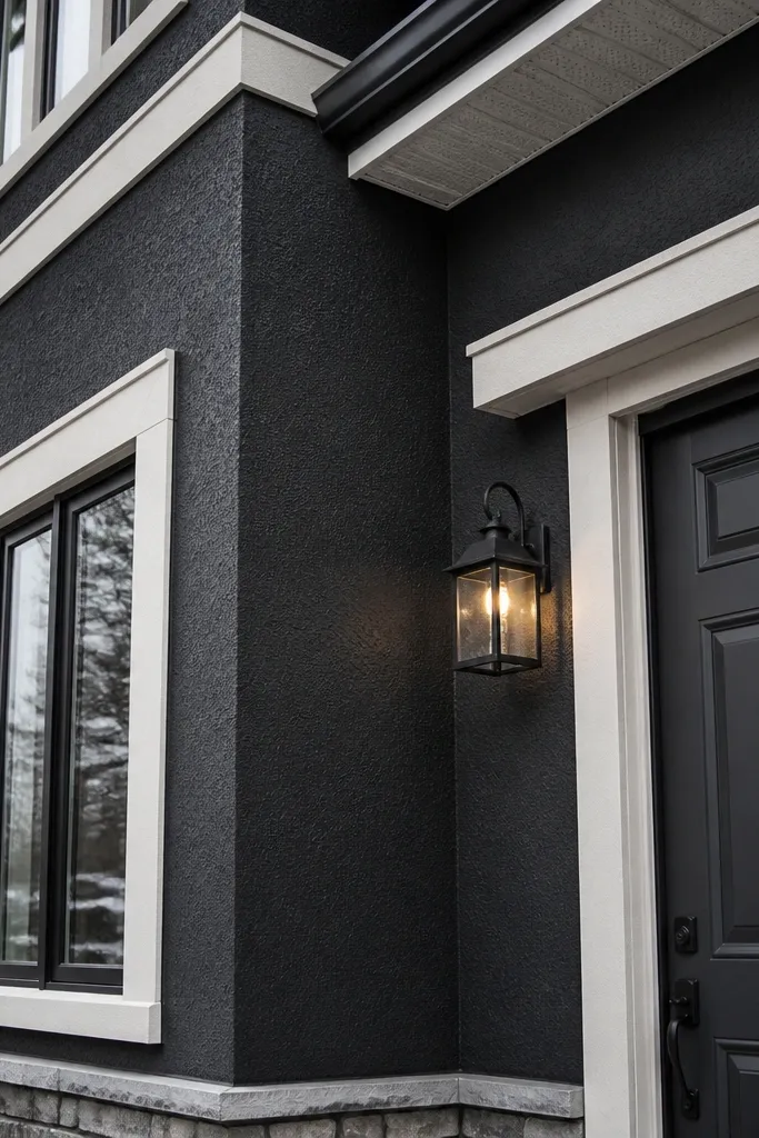
Go with a deep charcoal body because it hides dust and road grime better than medium grays. Pair it with warm white trim so your facade doesn’t turn cold and washed out in winter light. This combo looks sharp on stucco because the texture adds depth, and the warm trim keeps it from looking like a dark cave. If your front faces harsh sun, charcoal also keeps the facade from looking sun-faded as fast as lighter tones.
Start by priming bare or stained areas with an exterior bonding primer made for stucco or masonry. Paint the main body in an exterior acrylic-latex color-matched to a charcoal range, then add trim in a warm white with the same sheen across the whole project. Work from top down, keep a consistent wet edge, and cut in around windows with angled trim brushes. Finish with a second coat on the body and one full coat on trim for even tone.
Editor's noteUse painter’s tape with a firm burnish and remove it while paint is still slightly tacky to avoid a hard ridge.
Skip thisAvoid matte on the main facade; it scuffs and shows streaks sooner than satin/low-sheen exterior finishes.
2. Greige fiber cement with dark bronze accents
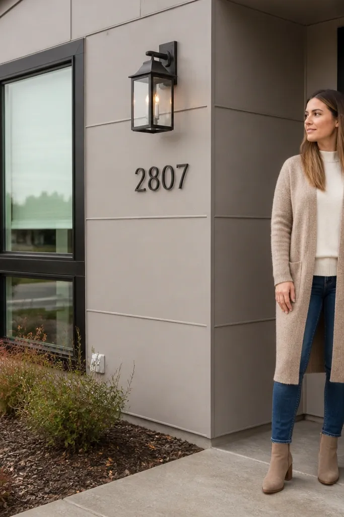
Greige is the modern neutral that stays flattering across seasons because it mixes warm and cool tones. It’s visually clean on fiber cement panels, especially when joints are caulked smooth and painted to match. Add dark bronze accents on window frames, house numbers, and lighting to create that “intentional” look without bright colors. Bronze also hides minor oxidation better than bright gold tones.
Choose a greige siding paint color in the 20-30% gray range (not beige-heavy) and confirm it reads greige under your actual north or south light. Prime panel edges and any cut ends, then roll or brush the panels with a consistent direction to reduce flashing. Paint trim and accents in a dark bronze color using a smaller brush for clean lines. Seal any joints with paintable exterior caulk before the final coat so the facade stays uniform.
Editor's noteIf your siding has a lot of panel edges, use an angled sash brush for the first cut-in pass, then roll the field for speed.
Skip thisDon’t pick greige that looks too yellow; it turns dingy fast next to dark hardware.
3. Cool light gray with black window frames
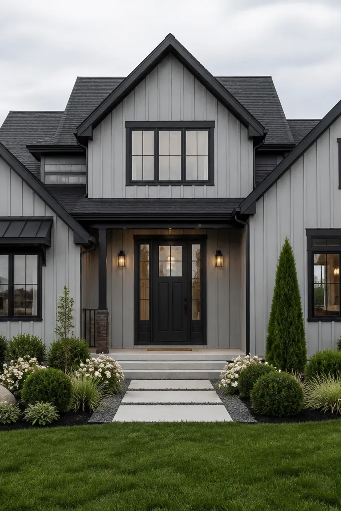
A cool light gray body makes the facade feel modern and keeps it bright without becoming trendy. The secret is the black frames: they create crisp geometry around windows and doors, so the whole front reads designed even if the house is simple. This look photographs clean because the contrast is strong but not harsh like pure white plus black. It also hides small scuffs better than very pale colors.
Select a light gray with a blue or green undertone, then test a sample board directly on the wall at both morning and afternoon light. Prime any repaired areas, then apply an exterior coating with a satin or low-sheen finish to the entire body. Spray or brush window frames in a true black exterior enamel, keeping coverage even on corners. Add a second coat to frames if you see any gray bleed-through.
Editor's noteMask glass tightly and keep paint off weatherstripping; dried paint there looks obvious in photos.
Skip thisAvoid using off-black interior paint on exterior frames; it chalks and looks gray after rain.
4. Soft white stucco with charcoal door and house numbers
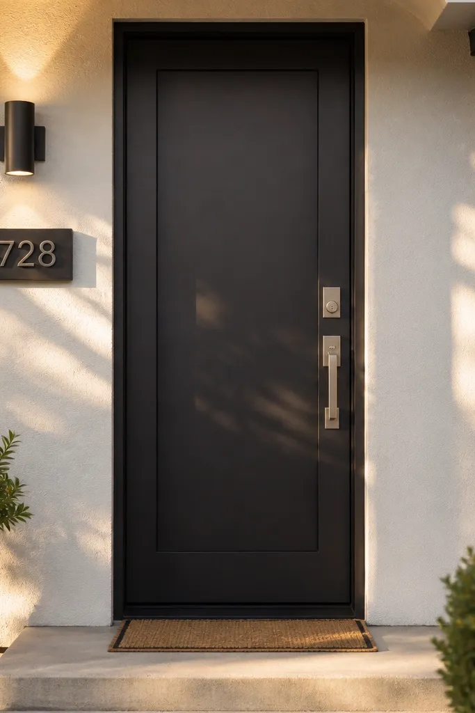
If you want modern but don’t want a dark whole facade, use a soft white base that’s slightly warm or slightly gray. Then concentrate the drama on the door and small details: charcoal door slab, dark numbers, and matching hardware. This makes the facade look polished without painting everything deep. It also helps with low-maintenance because the base is light enough to stay crisp, while the darker focal points hide dirt around high-touch areas.
Pick a soft white that isn’t stark; look for a creamy-white or warm-gray-white so it doesn’t look yellow. Apply an exterior primer to any patchwork, then coat the stucco in two full passes with a roller and back-brush for even coverage. Paint the door in charcoal exterior enamel and match the same tone on house numbers and light fixtures. Touch up caulk lines around the door opening so they don’t flash under sunlight.
Use a door-specific exterior enamel for the slab and a separate trim brush for the edges so you don’t get fuzzy lines.
Don’t choose bright white; it shows dirt and splash marks quickly on real streets.
5. Deep navy siding with matte black hardware
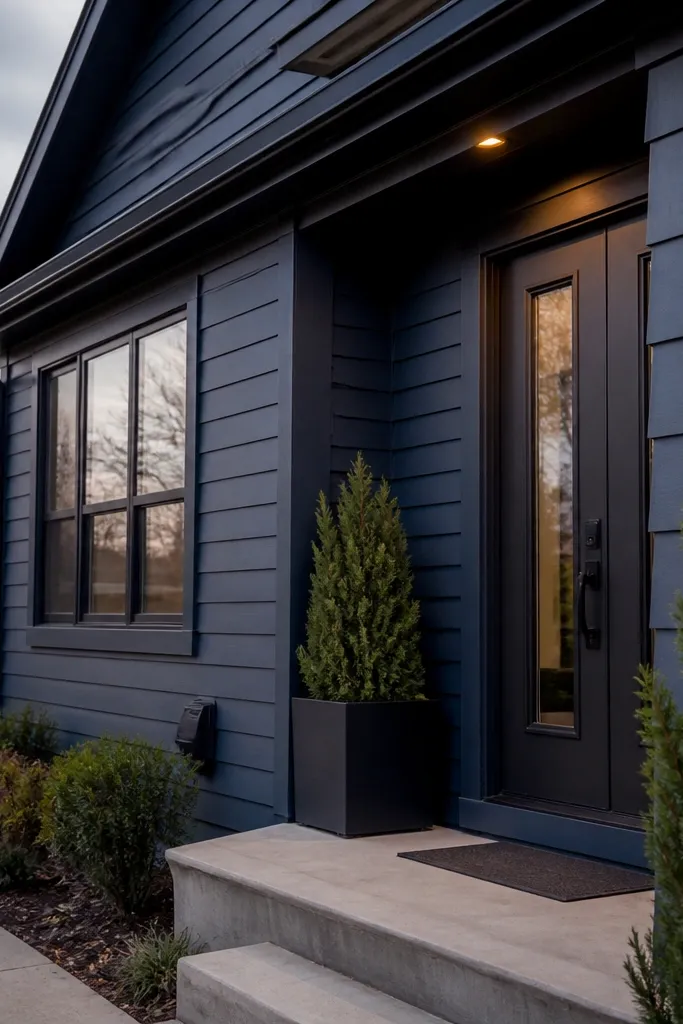
Deep navy reads modern when it’s not saturated royal blue. It looks rich in photos, but the trick is choosing a navy that still has enough gray in it to hide grime. Matte black hardware keeps the geometry consistent and prevents the facade from looking too colorful. Navy also hides minor scuffs on siding better than bright whites and many medium grays.
Choose an exterior navy in the dark range and confirm it doesn’t turn purple under your lighting. Prime cut edges and any bare spots, then coat the siding with an exterior acrylic-latex in a low-sheen finish for easier washing. Paint railings, mailbox, and door hardware in matte black or satin black enamel and keep it consistent. After curing, inspect corners and under eaves for thin spots — those are where dirt starts to streak.
Editor's noteIf you have a lot of horizontal trim, use a brush for the top edges first, then roll the faces to avoid missed bands.
Skip thisAvoid high-gloss coatings; they show uneven roller marks and streaks after rain.
6. Basalt gray with charcoal vertical slats
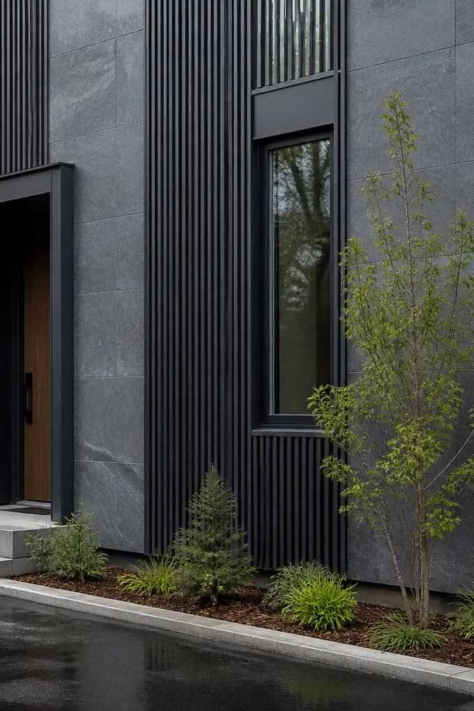
Basalt gray is a modern middle ground — darker than light gray, lighter than charcoal — and it hides dirt well. Add charcoal vertical slats for a façade rhythm that looks expensive in photos. The slats also break up large flat wall areas, so minor texture differences don’t stand out as much. This is a strong option if your home has a big blank wall section or long stretches of siding.
Paint the main wall basalt gray and let it cure fully before installing or painting slats so you don’t scratch the base. Use pre-primed slat material (wood composite or metal) and prime any raw edges. Paint the slats charcoal and then install with corrosion-resistant screws, keeping spacing even by using a simple spacer strip. Seal joints and touch up screw heads, then do a final spot coat on any scuffed edges.
Make a quick spacer jig from scrap wood so every slat gap stays identical across the front.
Don’t leave raw edges on slats; unsealed cuts wick moisture and discolor faster than the field.
7. Warm sandstone stucco with dark bronze gutters
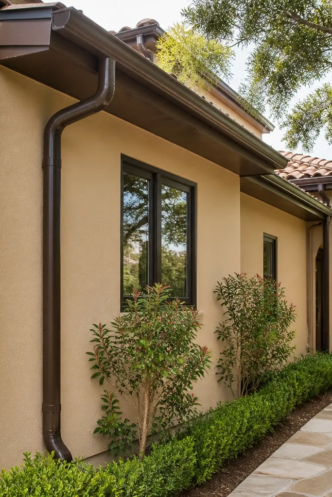
Sandstone tones look modern when they’re muted, not orange. Warm stucco plus dark bronze trim reads upscale without demanding bright accents. This combo is forgiving because warm neutrals hide minor water spotting better than cool whites. Bronze gutters and downspouts also reduce the “hardware mismatch” problem that makes facades look unfinished.
Select a muted sandstone color and test it in shade and full sun; orange-heavy tones can look dated. Prime stucco patches and apply two exterior coats with a low-sheen finish. Paint gutters, downspouts, and trim in a matching dark bronze — consistency matters here. Re-caulk around roofline penetrations before painting so you don’t get a line of fresh caulk showing through later.
Editor's noteIf you can, paint gutters separately on sawhorses for smoother coverage and fewer missed spots.
Skip thisAvoid pairing sandstone with pure white trim; it creates harsh temperature contrast that shows every dirt line.
8. Olive gray siding with black-framed windows
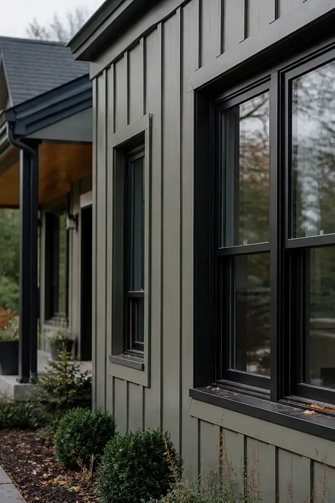
Olive gray sounds like a design risk, but it reads modern when it’s controlled and slightly muted. It hides dust and leaf residue better than lighter grays and adds a natural feel that still looks architectural. Pair it with black window frames so the geometry stays crisp. This is a great choice if your landscaping has greenery and you want the house to blend without turning bland.
Pick an olive-gray exterior paint that leans more gray than green; you’re aiming for a subdued tone. Prime repaired areas and coat the siding in two passes, keeping roller direction consistent to reduce flashing. Paint window frames and the door in black enamel and match sheen across all dark elements. Add a matte black house number plate so the facade has a strong focal point.
Editor's noteDo a wet-weather test on your sample: spray a little water on the sample area and check for streaking in 10 minutes.
Skip thisDon’t go too green; olive that reads green will show algae-like staining over time.
9. Teal-gray accent panels on a light base
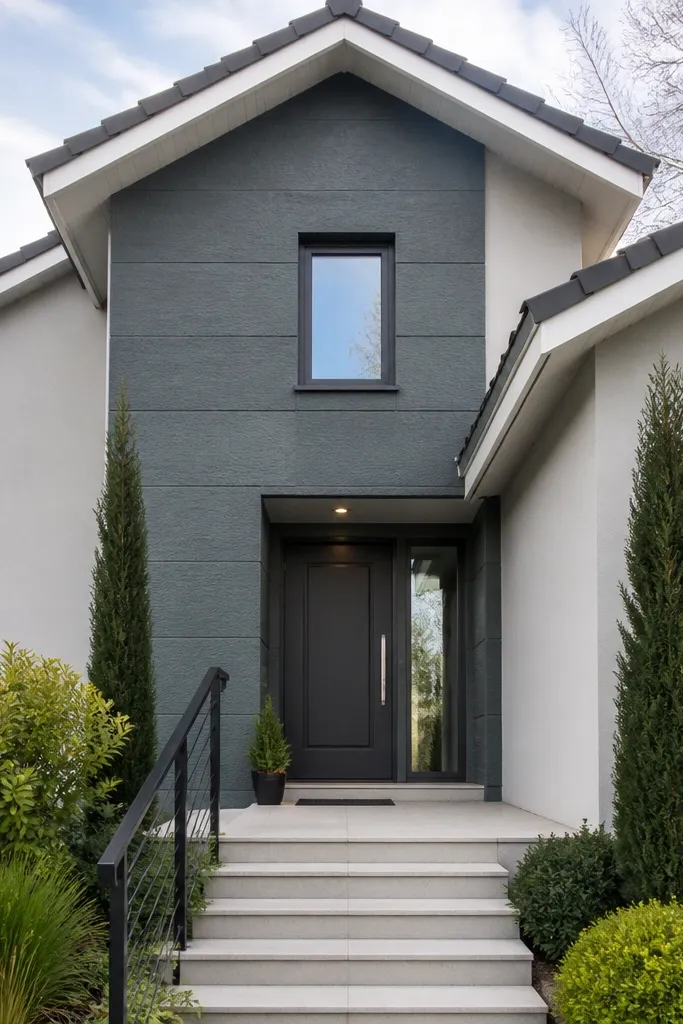
Teal-gray accents make a modern facade look designed without painting the whole front a bold color. Keep the base light gray or soft white, then use teal-gray on a single feature zone: entry wall, a stair-facing gable, or a vertical panel strip. This approach photographs well because the accent creates a focal plane, and it’s low-maintenance because the rest of the facade stays in dirt-hiding neutrals. It also makes touch-ups easier since you’re only maintaining one color for the feature area.
Choose one accent location and measure it so you can buy enough paneling or siding to avoid shade mismatch between batches. Paint the base first and let it cure; then install or paint the accent panels in teal-gray. Use pre-primed panels if you’re doing DIY install, and seal cut edges with exterior primer before final color. Caulk the perimeter neatly and match caulk color to the base or accent depending on which line you want to disappear.
Editor's noteKeep accent color away from too many trim lines; two clean edges look better than five thin ones.
Skip thisAvoid multiple teal tones; one accent color makes the facade look intentional.
10. Black-brown wood tone with light stone texture
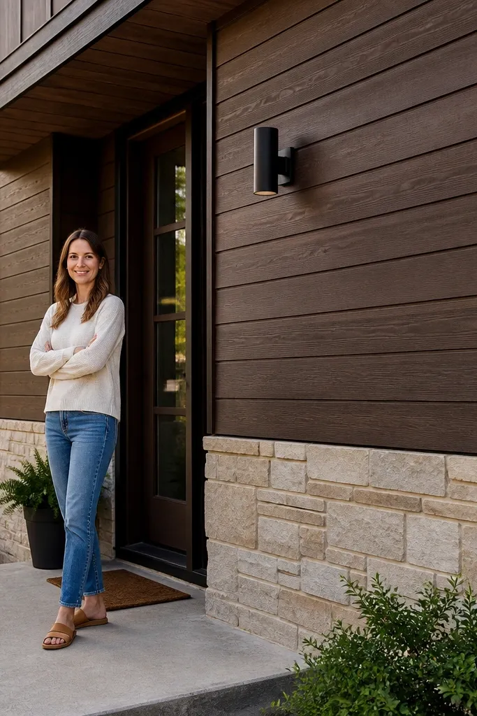
Dark wood tone is modern when the undertone is brown, not blue-black. Combine it with light stone or a light cladding band at the base so the facade doesn’t disappear into shadow. The stone band hides splashback and dirt because it’s textured, and it gives you a clear horizontal anchor. This is one of the better options if your house has a covered porch or deep shadows where light paint would look grim.
Sand and clean wood or composite cladding, then apply an exterior primer rated for the specific substrate. Stain or paint the wood tone in a dark brown-black and build coverage evenly on boards and edges. Install or paint the stone cladding band, then grout or caulk to match. Seal the final system with an exterior topcoat appropriate for your product so the color doesn’t dull from moisture.
Use a stain-and-seal system that matches your substrate; mixing products across the same surface can lead to uneven sheen.
Don’t skip sealing at board ends; those spots take water and discolor first.
11. Cement gray with bright white geometric trim
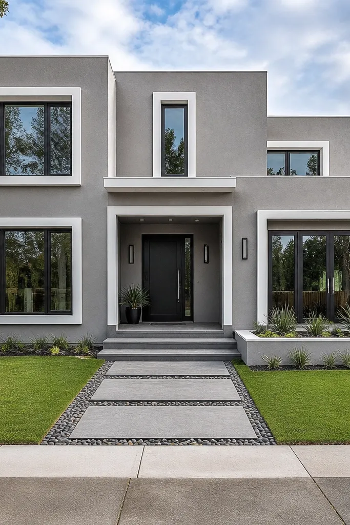
This look is modern because the trim forms geometry. Cement gray is neutral and dirt-friendly, while bright white trim makes lines pop and reads clean in photos. The key is keeping the bright white limited to trim, not the whole body, so you don’t get constant cleaning. If you have flat surfaces and crisp edges, this combo makes the architecture do the work.
Choose a cement gray that’s closer to gray than beige, then apply two coats to the body with a low-sheen exterior finish. Paint trim in bright white exterior enamel and use a fine brush or sprayer for sharp lines. Mark guidelines with a level and painter’s tape so the geometry stays straight across corners. Seal gaps with paintable exterior caulk and touch up any tape edges immediately after removal.
Editor's noteUse a small foam roller for large trim surfaces so you don’t get brush streaks that show under sun.
Skip thisAvoid painting trim over unprimed repairs; the patch will flash as a lighter or darker rectangle.
12. Charcoal base with light upper siding
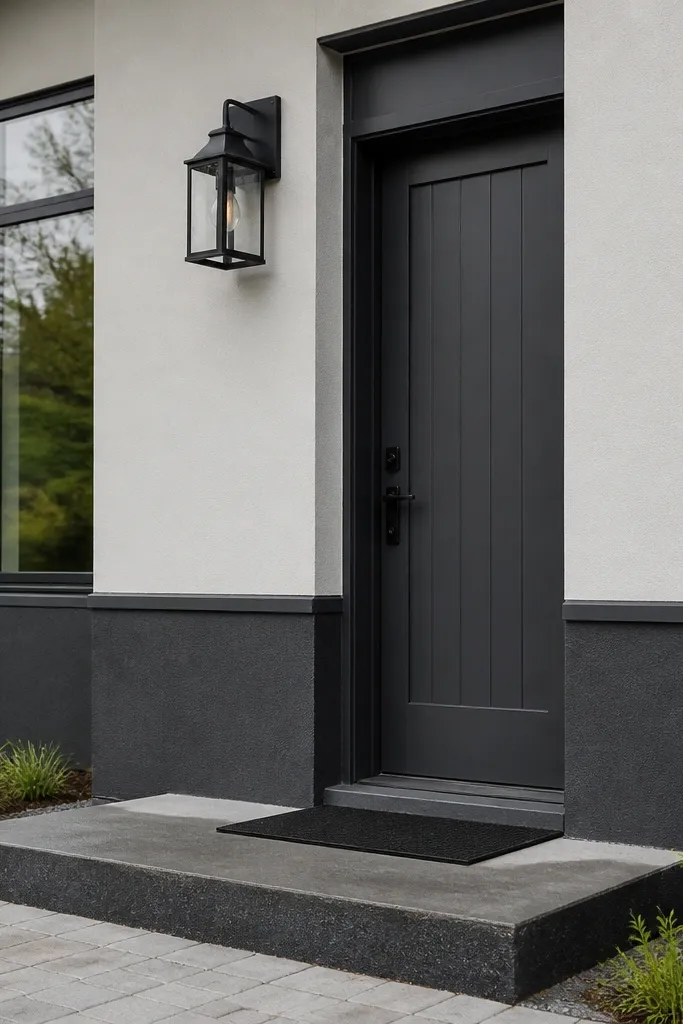
Two-tone facades look modern when they follow a real architectural break — like a base band and upper wall. Dark charcoal at the base hides splashback and grime that collects near the ground, while a light upper color keeps the overall front from looking heavy. This is one of the easiest ways to get low-maintenance results because you’re placing the dirt-hiding color exactly where dirt shows most. It also makes the house feel taller in photos.
Pick a light upper color and a charcoal base that are both compatible with the same exterior finish system. Mask a straight line at the desired height using a laser level, then paint the base first, let it cure, and tape again for the upper coat. Caulk the transition line cleanly so it doesn’t look like a sticker band. Paint the door and window frames a consistent dark tone to tie both colors together.
Editor's noteUse a thicker caulk bead at the color break — a messy line reads worse than a slight shade difference.
Skip thisDon’t choose a charcoal that’s too blue; it can look oily against warm stone or brick.
13. Stone gray stucco with black gutters and downspouts
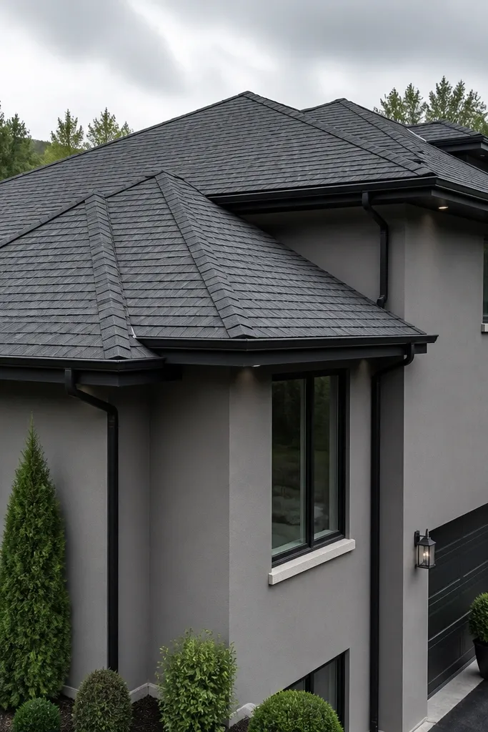
Stone gray is a smooth, modern neutral that doesn’t swing warm or cold too hard. Add black gutters and downspouts so the roofline reads crisp and intentional. This combo is practical because it hides water streaks better than light gutters, and it keeps the top of the facade from looking messy. If you’ve got a lot of rain exposure, this is one of the most forgiving color stacks.
Choose stone gray with a slightly warm or neutral undertone so it stays consistent across seasons. Prime stucco repairs and apply two exterior coats, focusing on even coverage around corners and window reveals. Paint gutters and downspouts with an exterior metal coating designed for weather exposure. After everything cures, inspect the gutter line for thin spots and do a small touch-up pass with a brush.
Clean gutters before painting — dust and chalky residue cause paint to fail even if the surface looks okay.
Avoid painting over peeling coating; strip to sound material for clean adhesion.
14. Light sand with charcoal window mullions
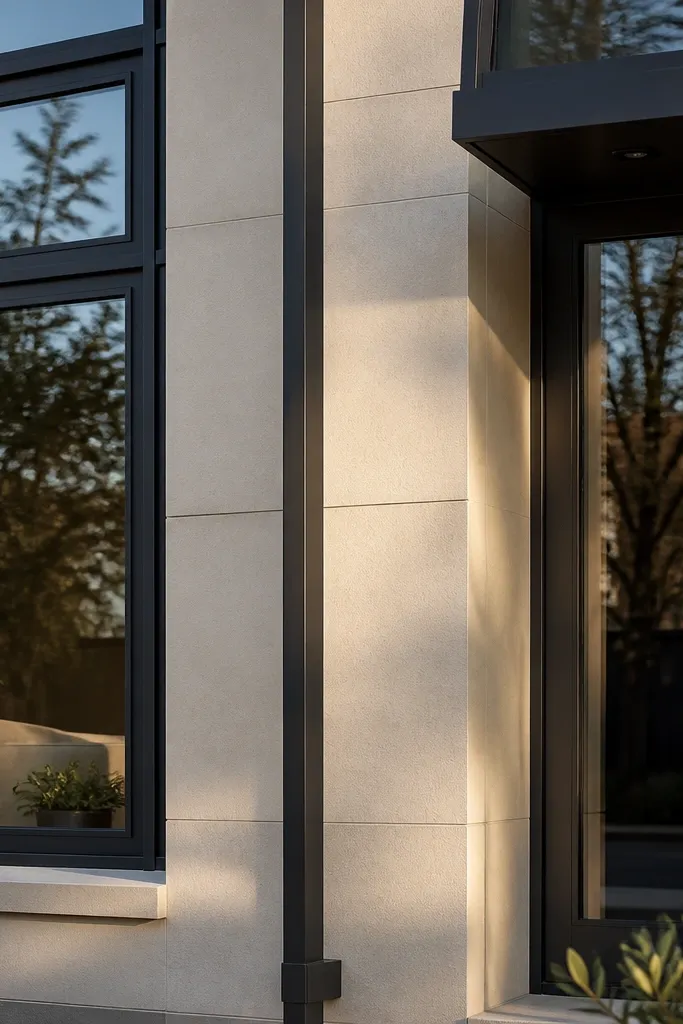
Light sand keeps the facade bright but still warm, and it works beautifully with modern mullions. Charcoal mullions create a grid that makes windows look intentional even when the house plan is simple. This is a low-maintenance approach because the base hides some dirt and the mullions hide small window frame scuffs. It also looks great with black exterior lights and a charcoal door.
Paint the main facade in a muted light sand tone with a low-sheen exterior finish. If your mullions are metal or composite, scuff-sand lightly and prime before color to prevent peeling. Paint mullions charcoal and keep the lines clean around glass edges. Finish with a second coat on mullions only if coverage is uneven, then seal any caulk seams around window trim.
Use a small angled trim brush and steady your wrist on the sash frame for sharper edges.
Don’t paint over dirty window tracks; you’ll trap grit and it will smear as paint dries.
15. Slate green with white trim and a black door
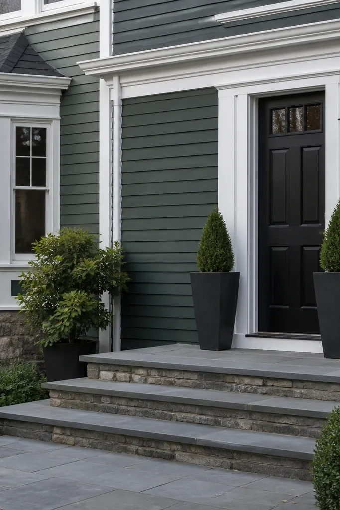
Slate green is modern when it’s deep and gray-leaning, not bright. It gives color interest without the “paint looks dated fast” problem that comes with saturated greens. White trim brightens the face, and a black door ties the whole front together. This combo also hides algae better than lighter greens because the tone reads darker and less reflective.
Choose a slate green exterior paint and test it on the largest wall section you plan to paint. Prime repairs and apply two coats at a consistent thickness; thin coats look patchy in side light. Paint trim in a clean white exterior enamel and keep the same sheen across all trim. Finish with a black door paint system and touch up around the door casing where dirt collects.
Plan your paint schedule around dry weather so rain doesn’t hit fresh coats — streaking happens when paint cures unevenly.
Avoid lime-green shades; they show mildew and fade in a way that looks uneven.
16. Warm white with charcoal shadow lines
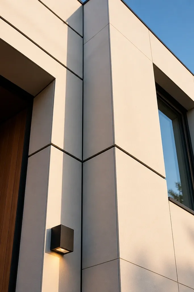
This is a modern look that’s all about “shadow lines.” Keep the main facade warm white, then use charcoal lines around panel seams, window reveals, and a few architectural breaks. The result is crisp and graphic in photos, even if the house has minimal ornament. It also stays low-maintenance because the main surface is clean-looking, while the darker lines hide minor unevenness around joints.
Start with a warm white exterior paint and apply two coats to the main surfaces. Tape and measure a consistent line width for shadow lines — 1/4 to 1/2 inch is enough to read modern without looking cartoonish. Paint the lines in charcoal using a brush or small roller, then remove tape carefully while paint is slightly tacky. Caulk panel seams first, then paint over the caulk so the lines look continuous.
Use a laser or long level to keep the shadow lines straight across the entire facade.
Don’t paint shadow lines freehand; wobbly lines make the facade look DIY in the worst way.
17. Gray-black with smoked glass accents
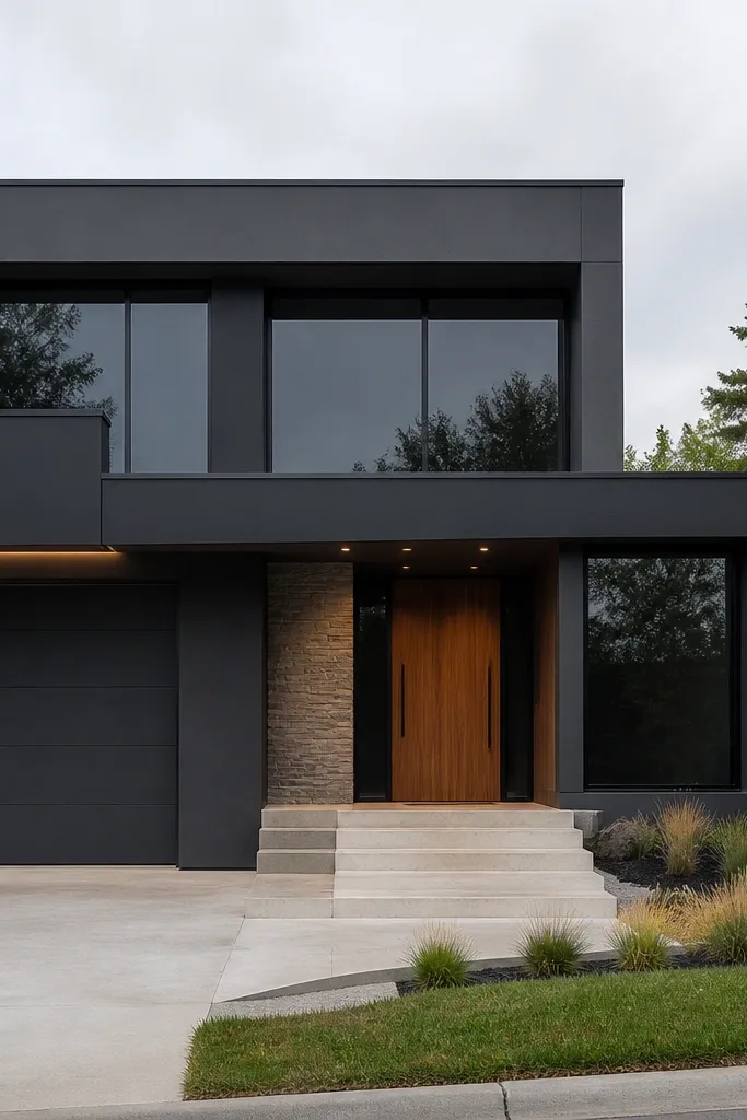
A gray-black facade looks sleek and modern, especially when paired with darker window glass or smoked panels. The color hides dust better than lighter shades and makes the architecture feel grounded. Keep accents minimal: one or two lighter surfaces like a pale stone step or a warm wood entry can stop it from feeling too heavy. This is a strong option if you want maximum curb impact without bright colors.
Choose a gray-black exterior paint and confirm it doesn’t read pure black in sunlight. Prime repaired areas, then coat the body with two full passes in a low-sheen finish. Paint door and frames the same tone or a slightly different dark for depth. If you’re adding or updating glass accents, ensure the surrounding trim is primed and sealed so water doesn’t get behind the frame.
If your facade is mostly dark, use brighter exterior lighting near the entry so the door area stays readable in evening photos.
Avoid dark paint over chalky old coatings; adhesion failure shows up as peeling patches.
18. Terracotta-brown with cream trim
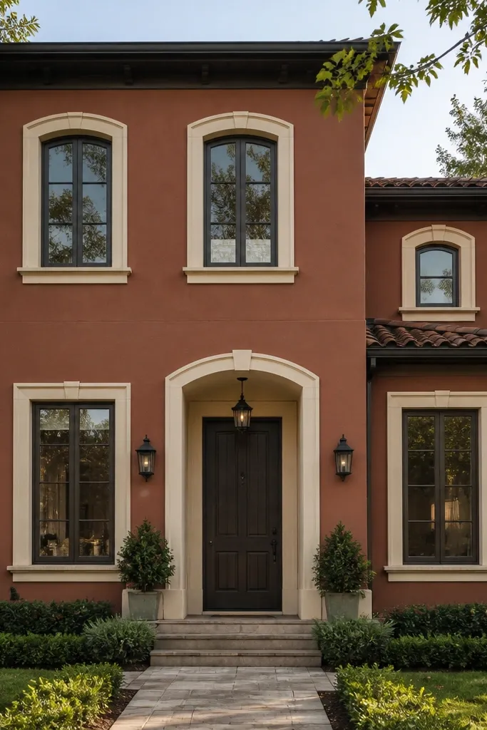
Terracotta-brown gives modern warmth without drifting into orange brick territory. Pair it with cream trim so it looks intentional rather than mismatched. This combo photographs well because the warm body has depth and the light trim sharpens edges. It’s also relatively low-maintenance because medium-dark warm tones hide small stains better than very light beige.
Select a terracotta-brown exterior paint that leans toward brown and muted red, not bright terracotta. Prime any repairs and apply two coats to the main facade with a low-sheen exterior finish. Paint trim in cream exterior enamel and keep it smooth — trim texture shows if the sheen is too glossy. Seal all window and door trim edges with paintable caulk and spot-check for gaps where dirt can collect.
Use a slightly warmer cream than you think; cool whites make terracotta look muddy.
Don’t use bright white trim; it can make warm brown look harsh and dirty in photos.
19. Sandstone with charcoal bands at the corners
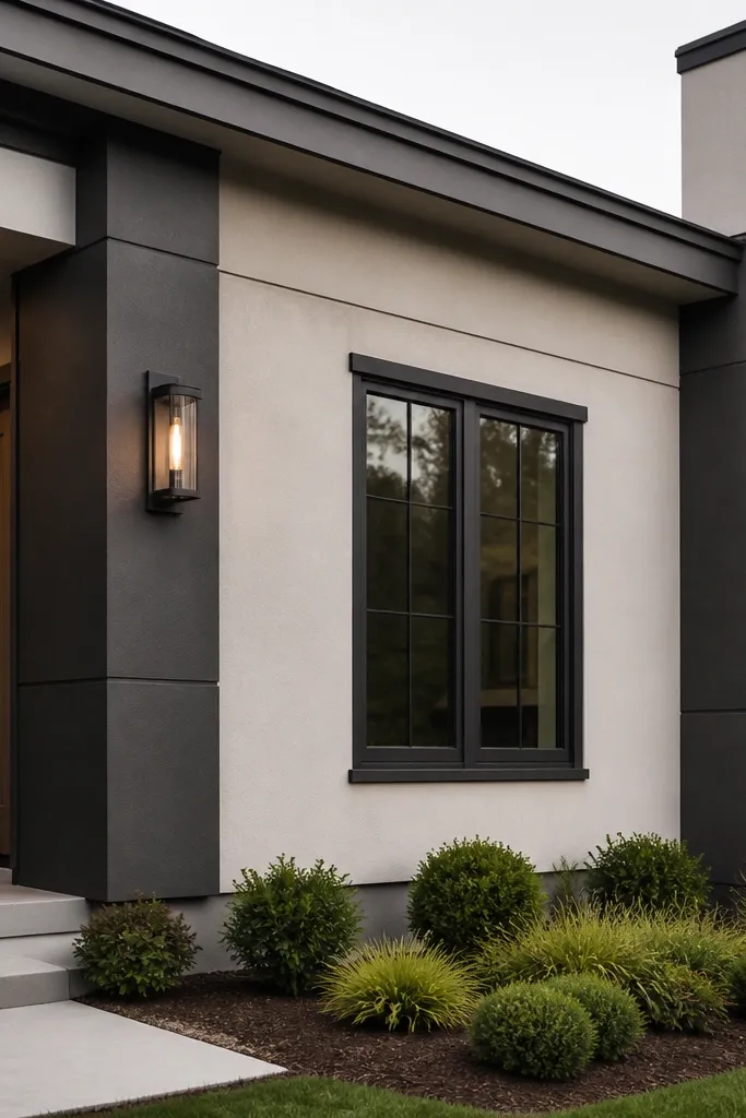
Corner bands are a clean modern trick: they frame the house and make it look taller and more structured. Use a muted sandstone body, then run charcoal bands along the corners and around a few vertical features. This gives you contrast without needing a full two-tone facade. Since the charcoal is concentrated, touch-ups are easier and the main surface stays a dirt-hiding neutral.
Paint the entire facade sandstone first, then let it cure enough for clean tape removal. Tape charcoal bands by measuring corner widths and using a level line across every edge. Paint the bands in charcoal exterior paint with a brush for crisp edges. Finish by matching the door and light fixtures to the charcoal so the corners feel like part of one design system.
Editor's noteKeep band width consistent from corner to corner; even a 1/4 inch difference shows up fast.
Skip thisAvoid uneven tape pressure; it can cause wavy paint edges along the band.
20. Pale gray with dark limestone-look base cladding
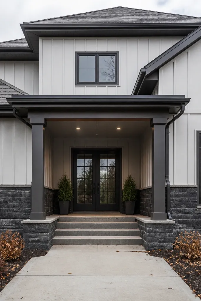
This is a low-maintenance facade formula: light upper for brightness, dark base for splash and scuff hiding. Dark limestone-look cladding reads modern when it has clean lines and a realistic stone pattern that isn’t too busy. The contrast makes the entry zone feel grounded and helps your front walk and porch look intentional in photos. It also reduces how often you’ll notice grime because the base is doing the heavy lifting.
Pick a pale gray exterior paint for the upper facade in a low-sheen finish. Prime and paint the base transition area carefully, then install stone-look cladding panels or cultured stone banding. Use corrosion-resistant fasteners or adhesive rated for exterior cladding, and keep panel alignment tight with a level. Caulk seams with a color-matched exterior sealant so water can’t work into joints.
Editor's noteDry-fit a row first and adjust the layout so seams land where you have architectural lines, not random spots.
Skip thisDon’t rely on paint alone at the base; splash zones need cladding or a tougher coating system.
21. Midnight bronze-brown with black trim
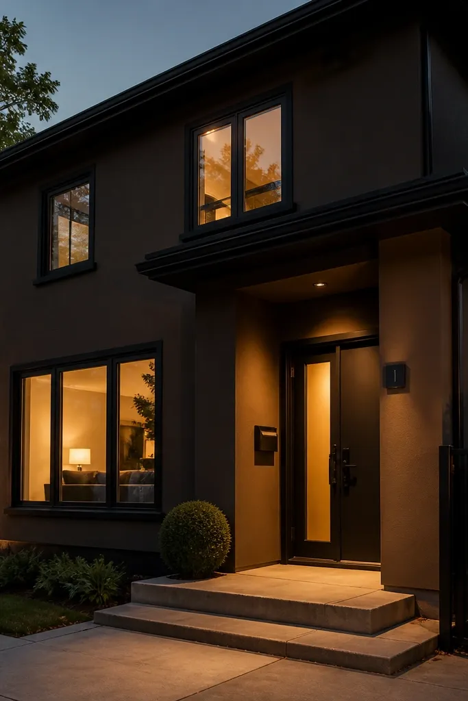
Bronze-brown reads modern when it’s dark enough to hide dust and when the undertone stays brown, not orange. Pair it with black trim for a sleek, high-contrast front that still feels warm. This color direction looks great on homes with metal accents, and it hides minor streaking better than lighter browns. It’s also one of the better picks for low-maintenance because the tone is deep enough to mask everyday grime.
Choose a midnight bronze-brown exterior paint and verify it doesn’t read red. Prime repairs and apply two coats on the body with a low-sheen exterior finish. Paint trim in black exterior enamel and keep the sheen consistent so it doesn’t look patchy. Touch up around vents and downspouts — those are the spots where grime builds and the color mismatch becomes obvious.
Editor's noteUse a brush around vents and corners so you don’t get roller texture ridges that catch dirt.
Skip thisAvoid mixing sheen levels between body and trim; it makes the facade look uneven after a few rainstorms.
22. Whitewashed gray siding with dark gray rails
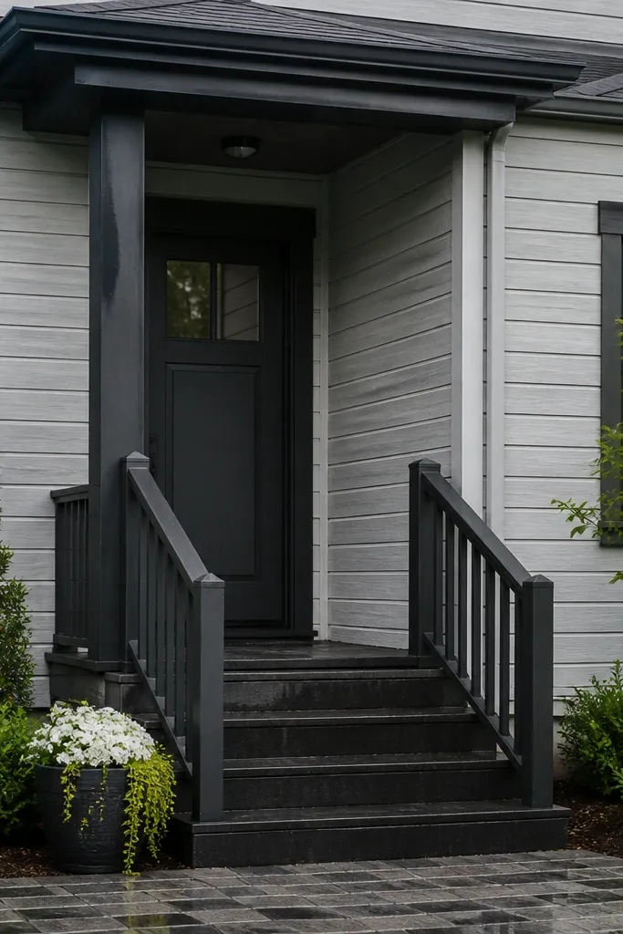
Whitewashed gray is modern when it stays subtle — it should look like a softened gray, not a faded white. Pair it with dark gray rails and a dark door so the facade doesn’t look washed out. The rail color matters because it frames the entry and makes the whole front look cohesive. This is a good option if you want a light facade but still need dirt-hiding that plain white can’t deliver.
Pick a whitewashed gray paint that still has pigment density; thin tinted coatings look uneven and chalky. Prime any bare wood or repaired areas, then coat the siding with two even passes. Paint rails in a darker gray exterior enamel and match the door tone to the rails. Check the final look from the street at two angles; whitewashed tones can drift when the house is viewed from the side.
Do a second pass only where the siding grain or texture shows through; patchy coverage looks like streaking later.
Don’t skip primer on exposed wood — the first coat soaks in and creates blotchy gray patches.
23. Charcoal board-and-batten with warm oak door
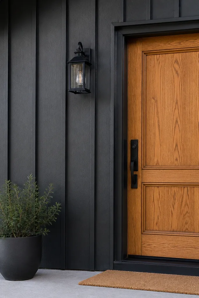
Board-and-batten looks modern when the color is dark and the door adds warmth. Charcoal hides dirt and makes the vertical rhythm feel intentional, not rustic. A warm oak-toned door keeps the facade from feeling too heavy and makes the entry feel welcoming. This combo is especially photogenic because the batten lines cast crisp shadows across the front.
Prime the battens and any cut ends, then paint the board-and-batten charcoal with a low-sheen exterior finish. Use a brush for the grooves and battens edges, then roll the flat faces to keep texture consistent. Stain or paint the door in a warm oak look using an exterior-rated stain or paint system with UV protection. After installation, seal around the door frame and touch up screw heads so the lines stay clean.
Editor's noteAfter the first coat, lightly sand raised fibers on wood battens and dust off before the second coat.
Skip thisAvoid skipping UV protection on dark stains; without it, the door dulls and looks patchy.
24. Slate gray with muted terracotta entry wall
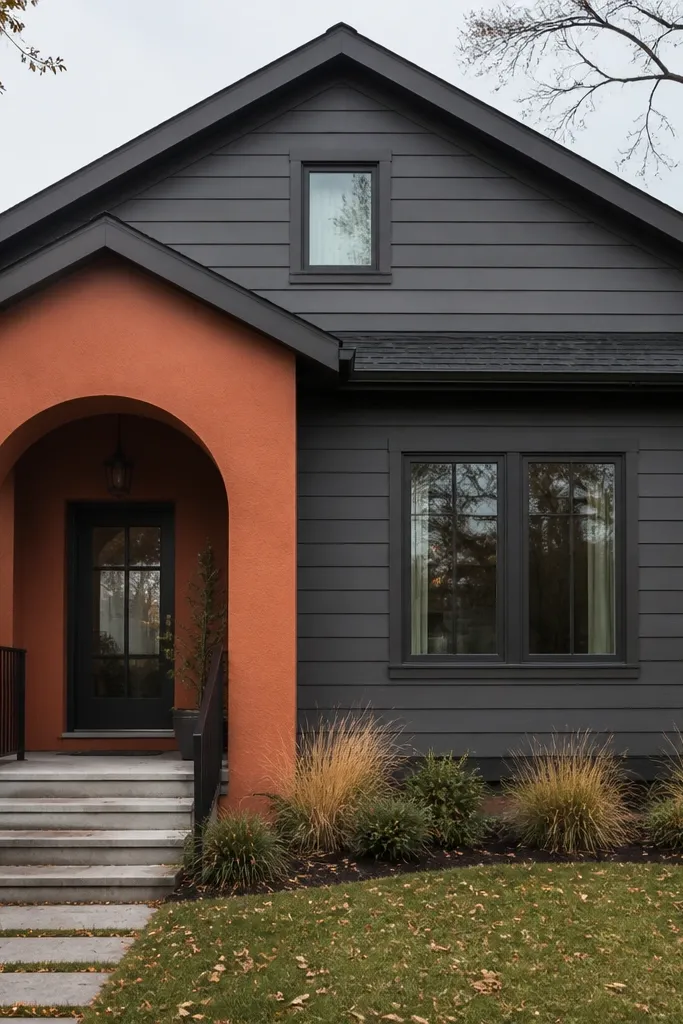
Keep the house body slate gray for a clean, modern neutral, then use muted terracotta only at the entry wall or porch feature. That small warm hit makes the front feel styled without turning the entire facade into a color project. Slate gray hides grime better than light neutrals, and terracotta hides small scuffs because it’s not too pale. This is a strong choice if you want curb appeal that reads “designer” in one focal area.
Paint the main facade slate gray in two coats with a low-sheen exterior finish. Choose the terracotta feature area and either install paneling/cladding there or paint a dedicated smooth wall section. Prime the feature surface, then paint terracotta with a durable exterior coating and two coats. Finish by matching the door hardware to either slate gray or terracotta depending on what you want to dominate — I’d keep hardware dark so it looks modern.
Editor's noteUse painter’s tape to create a single clean boundary line around the entry feature, not a jagged edge.
Skip thisAvoid terracotta that’s too bright; it creates a cheap contrast against slate in daylight.
25. Mushroom stucco with cocoa-brown trim and brass house numbers
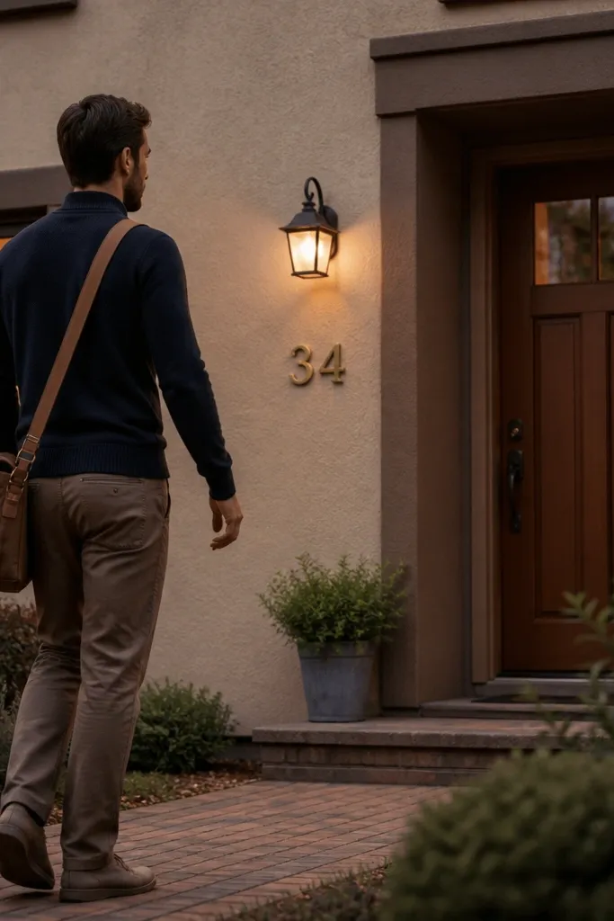
This color combo reads modern because it keeps the base warm and matte, then adds contrast only where it counts — trim, frames, and a clean number plate. Mushroom stucco hides scuffs and hairline marks better than bright whites, so it holds up with less repainting. Cocoa-brown trim makes the windows look crisp without going full black, and the small brass touch adds just enough shine to look expensive in daylight photos. This is a low-maintenance modern house facade idea for anyone who wants a neutral that still pops, especially on homes with simple lines and large window openings. Plan on a one-week refresh if you’re painting trim and doing minor prep, or longer if you’re repairing stucco first.
Start with a mineral-matte stucco paint in a mushroom tone (look for a silica or elastomeric exterior stucco coating) and roll it on with a 3/4-inch nap roller. Mask edges with 1-inch painter’s tape and use a brush for the first pass at reveal lines so the trim stays sharp. For cocoa trim, use a high-quality exterior trim paint in a satin or eggshell finish and spray or brush it on in two thin coats after priming any bare spots with a stain-blocking exterior primer. Install brass house numbers on a small matching trim plate or directly to the siding with corrosion-resistant screws; keep the numbers centered in line with the door handle height. Let everything cure fully before washing or touching up — give the stucco paint at least 48 hours in dry weather before you remove tape. If you have stucco cracks, fill with acrylic exterior patch and feather 2-3 inches around each crack before painting.
Editor's noteUse a foam brush for trim edges — it lays down paint without streaks and makes masking look cleaner when tape pulls away.
Skip thisDon’t paint over chalky stucco or unprimed repairs; it shows as dull patches and dark halos within a season.



