
1. Oak-and-Linen Triptych Over the Coffee Nook
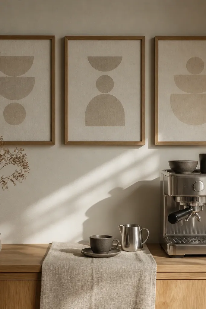
This is the warmest-looking setup for kitchens because it uses repetition and texture. Go with three frames in the same light oak finish, each holding a linen-textured print or a photo with a soft, creamy matte. Keep them in a straight horizontal row, so your eye reads it as calm and intentional. The result is a kitchen gallery wall that feels like a styled shelf, not a wall of paperwork. It’s also easy to live with — you can swap the prints seasonally without changing the structure.
Start by measuring the space above your coffee station and dry-lay the frames on the floor. Choose 11x14 or 12x16 frames so the middle one is the largest and the side frames match it. Mark the wall with painter’s tape for the center frame first, then place the side frames using 2 inches of gap between frame edges. Level the center frame, then use a stud finder or wall anchors rated for the frame weight. Finish by swapping in matte prints and sealing the print edges with a thin layer of mod podge on the back side only if your print is unmounted.
Editor's noteUse museum glass if your kitchen has bright overhead lights — it keeps the linen texture from looking flat.
Skip thisDon’t hang glossy prints; kitchen glare makes the wall look colder.
2. Butcher-Print Grid With Black Thin Frames
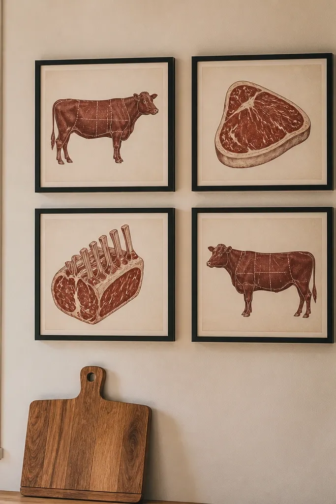
A grid looks clean, but it still feels warm when the art has brown, cream, and faded red tones. Use thin black frames for contrast against warm cabinetry or beige walls. Put four prints in a 2x2 layout so the wall reads structured, not scattered. The warmth comes from the print palette and the matte finish — you get that vintage kitchen vibe without clutter. This arrangement works especially well between open shelving and a doorway because it doesn’t fight the architecture.
Pick four prints with the same color temperature and similar margins (even if the images differ). Use 8x10 or 9x12 frames so the overall block is compact. Tape a rectangle on the wall, then divide it into two rows and two columns, leaving 2 to 2.5 inches between frame edges. Mount the top row first using a level guide, then mount the bottom row to keep the gaps even. Tighten frame hardware after mounting so the spacing doesn’t shift.
Print on matte paper and keep the frame glass matte or museum glass to prevent glare from turning the black frames gray.
Avoid mixing frame sizes in a grid unless the inside print sizes match.
3. Tall-Then-Wide Pathway for Narrow Hall Kitchens
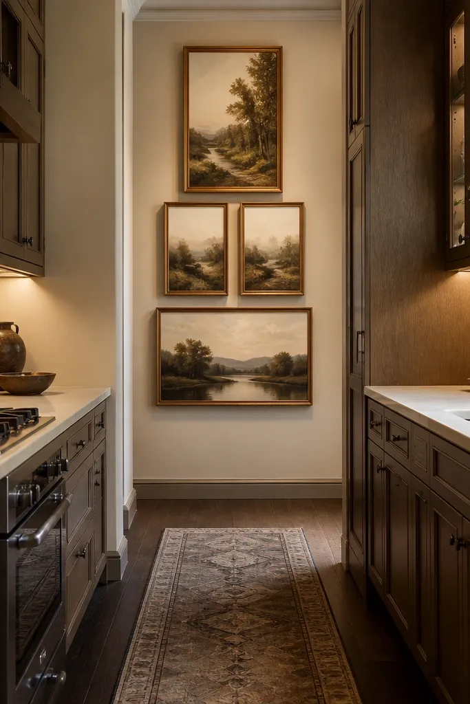
If your kitchen wall is narrow, a straight row can look squeezed. This layout starts tall at eye level and gradually steps wider as you move down or across, creating a gentle visual “path.” Choose one tall frame, then two medium, then one wider — all with the same wood tone or same metal finish. That progression makes the wall feel warm and deliberate, not like you ran out of room. It’s especially good for kitchens that connect to a hallway or stair landing where you want flow.
Choose frames in three widths: one tall (like 8x20), two medium (11x14), and one wider (16x20). Align the center of the tall frame to your eye-level target, then measure down to position the medium frames with 2 inches of gap. Place the widest frame last so it balances the visual weight at the bottom. Mark and mount one frame at a time using a level — adjust the lower frames last since they’re more likely to drift. Use picture wire or a hanging system that keeps frames flat and stable.
Use the same print type in all frames (all photos or all art prints) to keep the pathway from feeling random.
Don’t use different frame colors; the progression only looks intentional with one finish.
4. Floating Shelf + Frame Combo Above Open Shelving
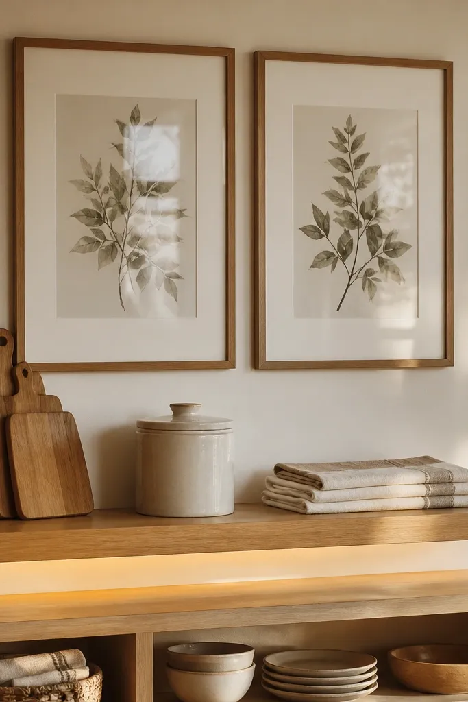
This is a warmth trick: the art wall doesn’t have to be only frames. Pair one horizontal floating shelf with two framed prints on the wall directly above open shelving. The shelf adds texture and real objects that read cozy in a kitchen — wood cutting boards, ceramic canisters, or folded linen. Keep the frames identical in finish and size so the shelf doesn’t turn the wall into a clutter pile. The warmth lands because the wall mixes flat art with tactile kitchen items.
Mount the shelf first, centered above your open shelving. Use a shelf depth around 6 inches so decor doesn’t jut into your walkway. Then position two frames side by side above the shelf with a 2 to 2.5 inch gap between frame edges. Use a template made from cardboard to mark screw holes for the frames so spacing stays even. Finish by adding decor with warm materials — light wood, cream ceramics, and one small brass element.
Editor's noteKeep the frame glass matte and your shelf decor in a height range within 2 to 3 inches so the whole area looks tidy.
Skip thisSkip tiny decor in lots of colors; the shelf already adds visual noise.
5. Cream Mat Photos in a Soft L-Shape Layout
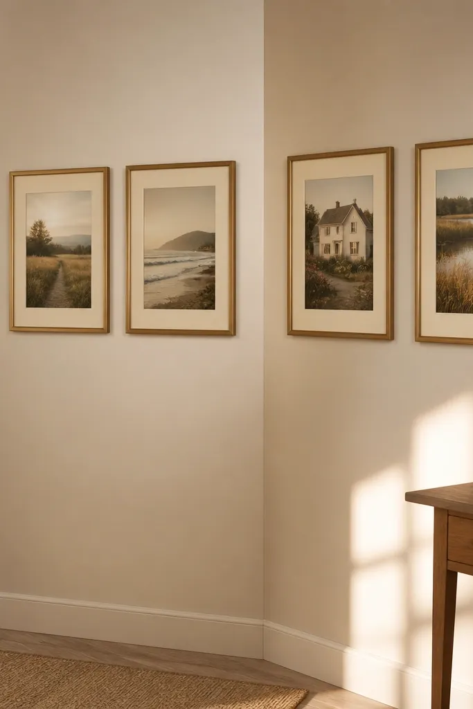
An L-shape gallery adds warmth because it wraps around a corner or architectural bump without feeling like a “wall of frames.” Use cream mats (not white) to soften the look and make the photos feel like they belong in the room. Choose four photos with similar tones — think golden-hour kitchens, family cooking moments, or still-life food photos. Keep all frames the same width so the mats do the work of creating softness. This layout also makes small kitchens feel more designed because it uses negative space well.
Pick two frames for the top row and two for the side row, creating an L that stops before the corner curve. Use painter’s tape to draw the L outline on the wall, then lay the frames on the floor to confirm the mat margins look consistent. Aim for 2 inches between neighboring frame edges and keep the outer edges aligned. Mount the vertical side frame first, then work across to the top frames using the tape lines as a guide. Hang with anchors rated for your drywall thickness if you can’t hit studs.
Editor's noteUse 8x10 frames with 5x7 photos and consistent mat thickness (around 2 inches) for a cohesive, warm look.
Skip thisDon’t mix mat colors; cream mats are what makes this feel cozy.
6. Terracotta and Sage Print Row With One Brass Frame
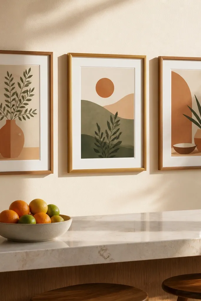
Warmth comes from color temperature here. Choose three prints with terracotta and sage tones and place them in a straight row above a small appliance zone or breakfast bar. Use the same frame color for all three, then add one brass-toned frame for the center piece. The brass catches light and makes the whole wall feel warmer without turning it into a shiny mess. Keep the prints matte so the colors look soft rather than neon.
Select three frames in one finish (matte black, dark walnut, or warm oak) and one center frame in brass. Use equal outer frame sizes so the brass piece doesn’t look like an afterthought. Mark a center line on the wall, then place the center frame first at eye level. Measure outward and place the side frames with 2 to 2.5 inches between frame edges. Use a level and spacers made from cardboard strips to keep gaps even.
If your brass frame looks too yellow against warm walls, choose aged brass or brushed brass instead of bright gold.
Don’t use glossy prints; color will look harsh next to brass.
7. Sunburst Frame Collage With Four Sun-Kissed Prints
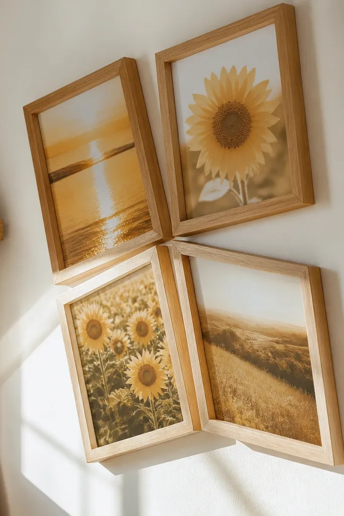
This one adds warmth by creating a focal point. Use four frames arranged in a loose sunburst around a center point, with the prints all featuring warm yellows, creams, or honey tones. The slight angle differences keep it from looking like a rigid grid. Choose frames in one finish — light oak or warm white — so the angled arrangement still feels cohesive. It’s a great move for kitchens where the wall needs a “moment” above a dining nook.
Buy four identical frames, then choose one center point on the wall. Mark where each frame’s center will land, spacing them so the frame edges stay 1.5 to 2 inches apart. Tilt the outer frames by a few degrees by adjusting the hanging hardware so they fan out toward the center. Start by mounting the center-most frame point (even if it’s empty) using a small pencil mark, then hang the frames one at a time. Confirm spacing with a ruler before tightening the hooks.
Editor's noteUse picture wire (not rigid hooks) so small angle adjustments stay easy after mounting.
Skip thisDon’t go too wide with the fan; if the gaps exceed 3 inches, it stops reading as one collage.
8. Whitewashed Wood Frames With Black-and-White Kitchen Photos
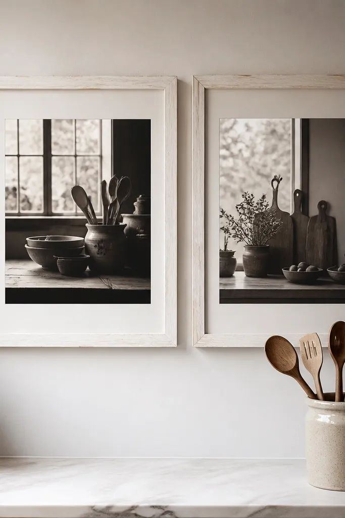
Black-and-white can feel cold, but whitewashed frames fix that. Choose whitewashed wood frames with visible grain and hang black-and-white kitchen photos that have warm undertones (cream highlights, soft grays). The warmth comes from the frame texture and the mat color — use off-white mats. This arrangement is clean and calm, and it makes a kitchen feel airy instead of heavy. It also works when your kitchen has colorful cabinets and you want the wall to stay neutral.
Pick three to five identical frames in whitewashed wood. Choose photos that have consistent contrast and similar cropping so the wall looks like one set. Lay out on the floor and keep 2 inches between frame edges, then tape the final footprint to the wall. Mount from the center outward: hang the middle frame first, then add the left and right frames, then fill in any extra frames. Use spacers cut from cardboard so the gaps don’t drift.
Editor's noteMat thickness around 1.5 to 2 inches makes black-and-white look softer against whitewashed wood.
Skip thisDon’t use pure white mats; it can make the wall feel sterile.
9. Recipe Card Shadowbox Wall With Two Framed Prints
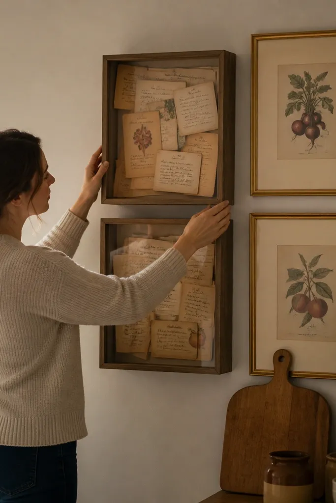
If you want warmth that feels personal, a shadowbox does it better than another photo frame. Pair one or two shadowboxes filled with vintage recipe cards with two framed prints that match the color palette. The shadowbox adds depth — paper texture, handwriting, and layered cards look cozy in kitchen light. Use sealed frames with backing so the paper doesn’t warp. This setup also works well on walls near the dining area because it reads like decor, not a gallery.
Choose a shadowbox size like 12x16 with glass and a sealed backing. Insert recipe cards on acid-free paper or backing so they look crisp and don’t smear. Mount the shadowbox at eye level, then place two matching framed prints to the left and right with 2 to 2.5 inches between edges. Keep all frames in the same finish so the wall feels like a set. Use anchors for the shadowbox weight since it’s heavier than a standard frame.
Editor's noteTrim the recipe card backing edges so you don’t see uneven white paper around the glass.
Skip thisAvoid cheap open back shadowboxes; they collect dust and show warping paper.
10. Small Hexagon Frame Cluster With Warm Wood Edges
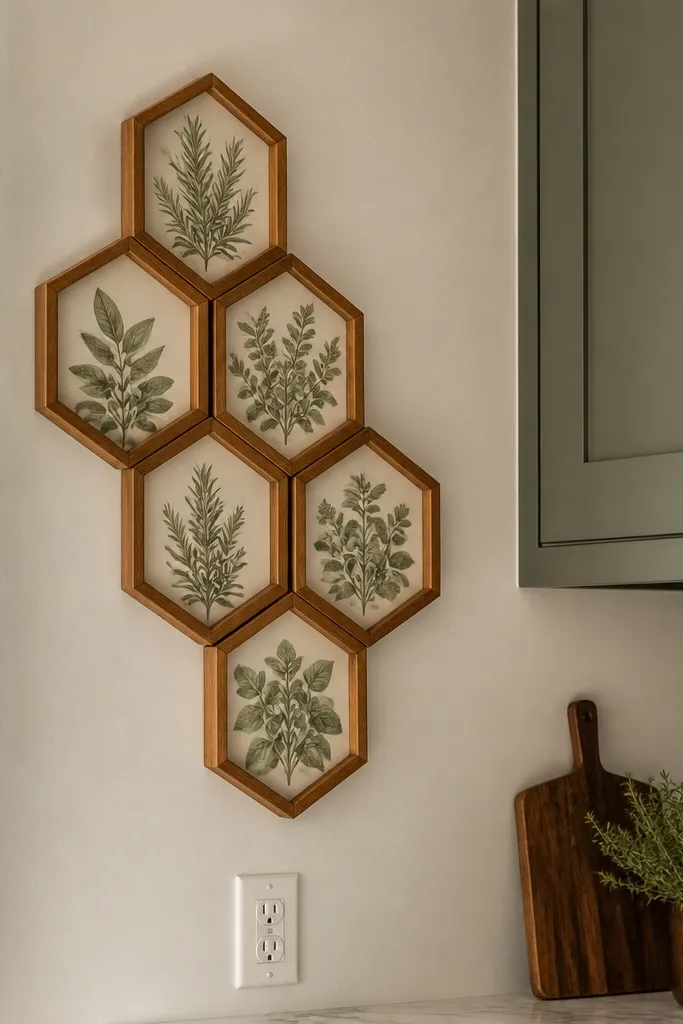
Hexagons add warmth because they break the rectangle monotony without looking chaotic. Use small hexagon frames with warm wood edges and place botanical or herb-themed prints inside. Keep the cluster tight so the shapes read as one unit. This is a good option for kitchens with narrow walls, above outlets, or beside a fridge where a big rectangular gallery would crowd the space. The warmth comes from the natural theme and the wood finish.
Pick six hexagon frames that all match in finish and size (for example, 6x6 or 7x7 equivalents). Arrange them on the wall in a tight cluster, leaving 1 to 1.5 inches between frames. Create a paper template of the hexagon footprint, tape it to the wall, then mark mounting points. Hang the center hexagon first, then place the surrounding frames using the template edges as spacing guides. Use picture hooks that can handle the frame weight and keep frames flat.
Editor's noteUse matte prints with herb greens and warm browns so the cluster reads cozy under kitchen light.
Skip thisDon’t space hexagons too far apart; then it stops looking like a single cluster.
11. Woven Basket Behind Frames for Texture Glow
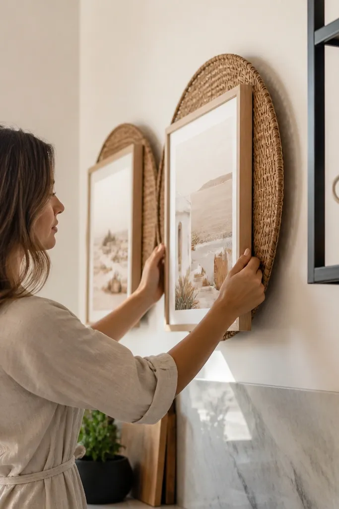
Texture is warmth you can see. Put a woven basket or rattan panel behind two frames so the wall has depth behind the art. Choose two matching frames with warm neutral prints, then mount them in front of the woven texture. The basket catches light and makes the whole gallery look softer, even if your kitchen is modern. It’s also a clever move when your wall color is cool and you want to warm it without painting.
Mount the woven basket panel first so it sits flat and secure on the wall. Choose frames that are narrow enough to sit side by side with 2 inches between them, and keep their outer edges aligned. Position the frames so the basket pattern shows evenly around each frame, then mark screw points. Mount frames with anchors, since the basket panel may not be strong enough to hold frame weight alone. Finish by using matte prints so the woven texture doesn’t get lost in glare.
Editor's noteUse a slightly lighter woven tone (natural rattan) so it reads warm but doesn’t overwhelm dark cabinets.
Skip thisDon’t use glossy glass; it competes with the woven texture.
12. Corner Gallery With Two Levels of Hanging
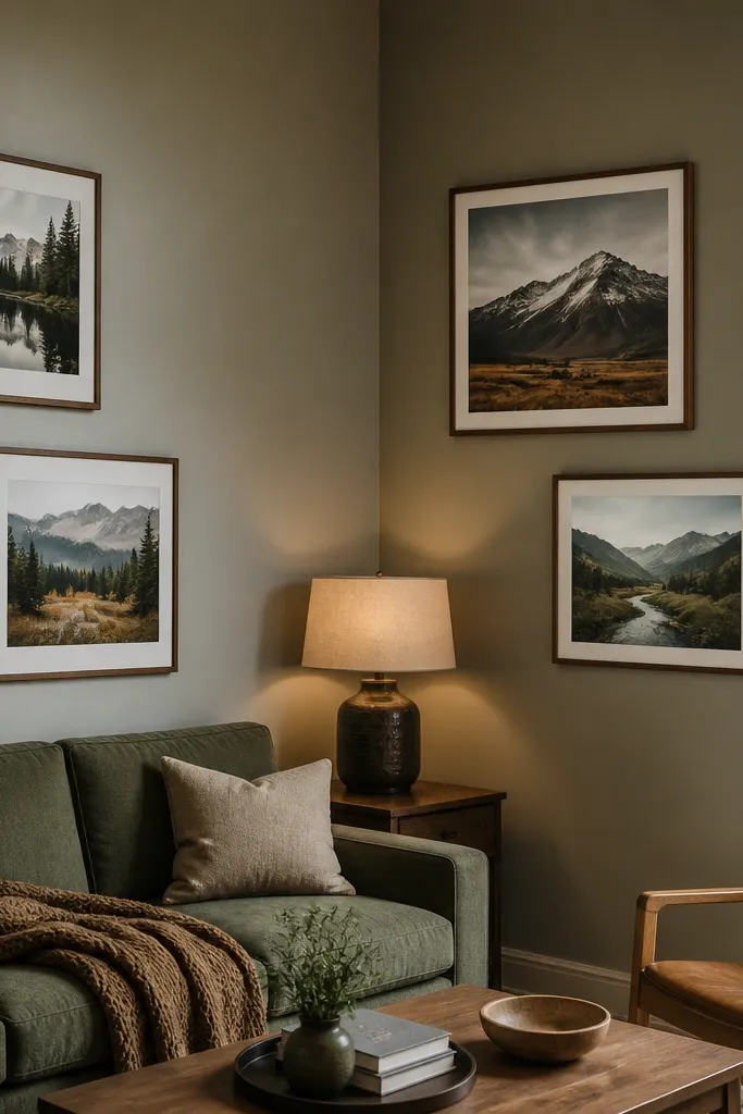
Corners are tricky, and this layout solves it with staggered heights. Hang two frames on one wall and two on the adjacent wall, but offset them so the top edges don’t line up perfectly. That creates a warm, dynamic look that feels intentional. Use identical frame finishes and keep the prints consistent in style so the corner doesn’t feel like an accident. This works great for kitchens with a corner dining set or a breakfast nook where the corner is the visual anchor.
Pick four identical frames, then decide your staggering: for example, set the frames on the left wall so their centers are at 60 inches and 46 inches from the floor. Match the right wall frames but offset them by about 3 to 4 inches so the top edges don’t create a harsh line. Tape the final placement and use a level to mount each frame one at a time. Use anchors or studs based on your wall type and frame weight. Step back and check from the main kitchen viewpoint before committing.
Editor's noteUse the same print size on all four frames; the corner will look cleaner.
Skip thisDon’t hang all four at perfect alignment; corners need a little stagger to feel warm.
13. Floating Frame Strip With One Oversized Center Piece
A floating frame strip gives you warmth without making the wall feel heavy. Use a row of three medium frames and one oversized center frame, all in the same warm wood or matte black. The oversized piece becomes the focus, while the smaller frames fill the space around it. This layout is great above a counter or near a window where you want the wall to look styled but not busy. The warmth is in the scale and the consistent finish — it feels curated without being overly complicated.
Choose three medium frames (like 11x14) and one oversized center frame (like 16x20). Mark the wall center line, then position the oversized frame first at eye level. Place the medium frames to the left and right with 2 to 2.5 inches between frame edges. Use a straightedge to keep the top edges aligned, or align by centers — pick one and stick to it. Mount the bottom corners last and check the spacing with a ruler before tightening.
Editor's noteIf you’re unsure about spacing, start with 2 inches between frames and adjust only after you hang the center piece.
Skip thisDon’t choose random sizes for the side frames; the strip needs a scale plan.
14. Matte Black Frames With Cream Ceramic Wall Art Pair
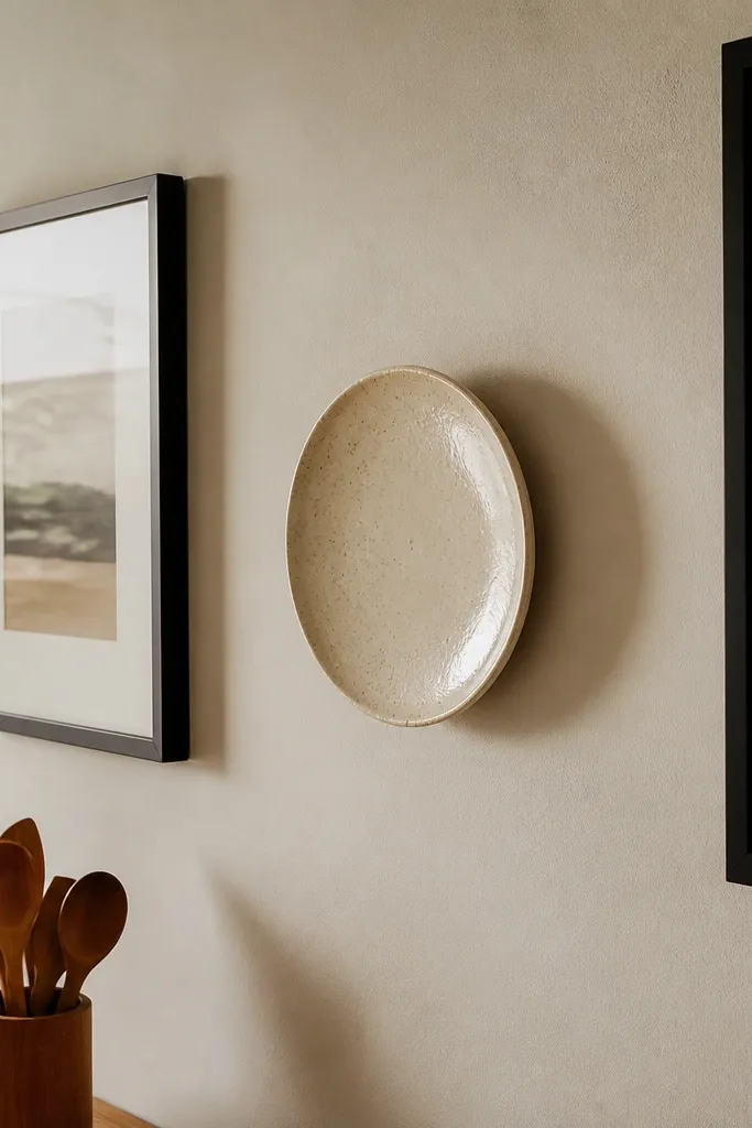
This idea adds warmth by mixing flat and three-dimensional decor. Use two matte black frames with cream matting on either side of a small ceramic wall piece like a shallow plate or sculptural tile. The ceramic brings texture and a soft highlight that feels kitchen-friendly. Keep the ceramic tone in cream or warm off-white and match it to the mat color. The frames give structure so the wall doesn’t look like random decor.
Pick two identical frames in matte black and one ceramic wall piece small enough to sit between them. Mount the ceramic piece first at the height you want, then position the frames so their inner edges are about 4 to 6 inches away from the ceramic. Mark all mounting points with tape and use anchors rated for ceramic weight plus frame weight. Hang frames using the same wire height so they line up visually. Insert prints with warm creams and muted colors, then check for glare from overhead lighting.
Editor's noteUse a ceramic piece with a matte glaze so it doesn’t reflect light like a mirror.
Skip thisSkip shiny ceramics; they add glare and make the wall feel colder.
15. Warm Oak Frame Stack With Three Different Print Crops
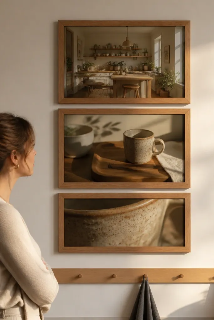
This stack looks warm because it repeats the same design language while changing the crop. Use three warm oak frames, all the same outer size, but put three prints that are variations of the same theme: a wide kitchen scene, a medium detail (like a mug or cutting board), and a close-up. The consistent frame finish makes the wall feel cohesive, while the cropping adds interest without adding chaos. This is great for small walls where you want impact but don’t have room for many frames.
Buy three identical frames in warm oak and remove the existing inserts if needed. Print or choose three images in the same color temperature and similar contrast. Lay the frames out on the floor and keep 2 inches between frame edges. Transfer the layout to the wall using tape, then mount the bottom frame first so you can set the vertical spacing accurately. Mount the middle and top frames using a level and confirm the outer edges line up.
Editor's noteChoose images with similar background tones so the stack looks warm even from across the room.
Skip thisDon’t mix unrelated styles; the stack depends on a single visual theme.
16. Gallery Wall Above the Sink With Water-Resistant Backing
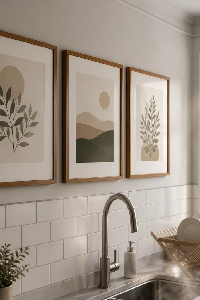
Putting art above a sink can look amazing, but only if you plan for splashes and steam. This layout uses fewer frames — typically three — and keeps them at eye level so they read clearly even in busy kitchen lighting. The warmth comes from soft neutrals and matte prints, plus sealed frame backs that handle humidity. If your kitchen gets steamy, this is the gallery style that survives real life. It also makes the sink area feel styled instead of purely functional.
Select three frames that have sealed backs and either glass or acrylic fronts. Use matte prints with cream mats and keep the frames in one finish so the wall doesn’t fight moisture. Measure the sink width, then keep the gallery width around 70% of that area. Tape the layout and mount the center frame first, then add the left and right frames with 2 to 2.5 inches between edges. Seal the print paper by mounting it under glass and avoid any unprotected edges.
Editor's noteUse picture-hanging hardware that grips well in studs so you don’t loosen mounts over time from humidity.
Skip thisDon’t hang paper-only art directly behind glass; steam can still warp it.
17. Vintage Map Meets Herb Prints With Warm Walnut Frames
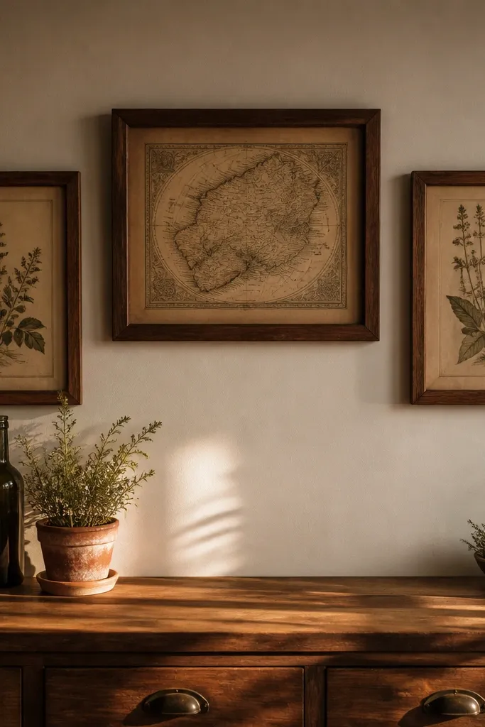
A map print adds warmth because it brings patina and age, especially when paired with herb or kitchen illustrations. Use warm walnut frames to make the wall feel grounded instead of flat. Mix one vintage map print with two herb-themed prints, then space them so the map sits slightly higher than the others. This layout looks great in kitchens with dark counters or wood cabinets because the walnut repeats the room’s tone. It’s also a strong choice if you want warmth that feels grown-up, not cutesy.
Pick three frames in warm walnut and keep their outer sizes consistent. Choose one map print and two herb prints with matching cream and green tones. Lay them out so the map frame is centered and placed about 3 inches higher than the herb frames. Mark the wall with tape and mount the map first at eye level, then mount the herb frames to match the spacing. Use a level and measure the gaps so the wall doesn’t drift.
Editor's noteStick to matte paper for the map; glossy map prints reflect overhead lights and kill the vintage warmth.
Skip thisDon’t add more than three print types; the warmth comes from the pairing.
18. Warm White Frame Cluster With Minimalist Line Art
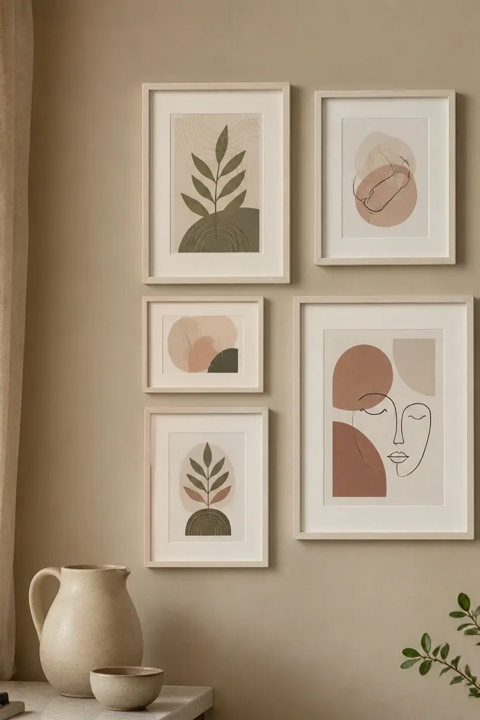
Minimalist line art can still feel warm when the frames and mats are warm-toned. Use warm white frames (not bright white) and cream mats, then choose minimalist prints in muted clay, sage, and cocoa. Build a cluster of five frames in a compact arrangement with equal gaps so the wall stays airy. This looks especially good in modern kitchens that feel too clean or too gray. The warmth comes from the frame tone and the softness of the print colors.
Choose five warm white frames in the same size, like 10x12 or 11x14. Pick line art prints that share line weight and color palette so they look like one set. Lay the frames out on the floor and keep 2 inches between frame edges. Tape the footprint on the wall and mount the center frame first, then place the surrounding frames by following the tape marks. Use anchors if needed and press frame backs flat so they don’t tilt and break the warm, even look.
Editor's noteMat color is the secret — use cream mats to keep minimalist art from feeling stark.
Skip thisDon’t use bright white frames; they read cooler next to warm wood.
19. Oversized Single Frame With Two Small Side Frames
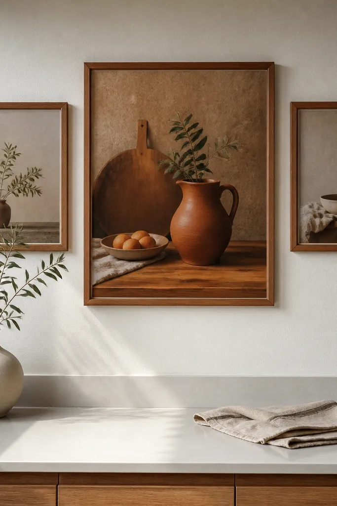
If you want warmth but hate over-hanging a wall, do this. One oversized frame anchors the look, and two small frames balance it. Choose the oversized frame for the most colorful or warmest piece — like a terracotta still-life or a warm-toned kitchen photo — then use the smaller frames for supporting neutrals. This arrangement is forgiving when your wall has outlets, switches, or awkward angles. It makes the kitchen feel styled without turning it into a jigsaw puzzle.
Select one large frame (like 20x30) and two small frames (like 8x10). Use the same finish for all three frames so they feel like a set. Mark the wall center line and hang the large frame first at eye level. Then place the two smaller frames to the left and right, keeping 3 to 4 inches between the inner edges of the small frames and the large frame. Level everything and mount with anchors or studs based on weight.
Editor's noteUse one strong piece in the large frame and keep the side prints muted; it keeps the wall warm, not loud.
Skip thisAvoid three equally bold prints; the oversized anchor needs quieter support.
20. Wood Slice Coasters in a Frame-Like Layout
This is warmth you can almost smell. Instead of traditional prints, use wood slice coasters or wood slice art pieces mounted in a regular arrangement so the wall reads like a gallery. Choose slices with consistent thickness and similar stain tones, then mount them on a backing board or in shallow shadowbox frames. The result looks cozy and tactile, especially against white or cream walls. It also works when you want kitchen decor that doesn’t feel like “more paper.”
Buy or make wood slices with consistent thickness (around 1/4 to 1/2 inch) and seal them with a clear matte topcoat. Arrange 6 to 9 slices in a tight grid on a thin backing board, leaving 1/2 to 1 inch between pieces. Mount the backing board to the wall using screws into studs or proper anchors. If you’re mounting individual slices directly, use small D-rings and ensure weight distribution is even. Finish by wiping slices clean and checking the overall grid alignment with a straightedge.
Use a matte clear coat so the slices look warm, not glossy under kitchen lights.
Don’t use random wood tones; the warmth comes from matching stain family.



