
1. Terracotta Panel Wall with Dark Coping
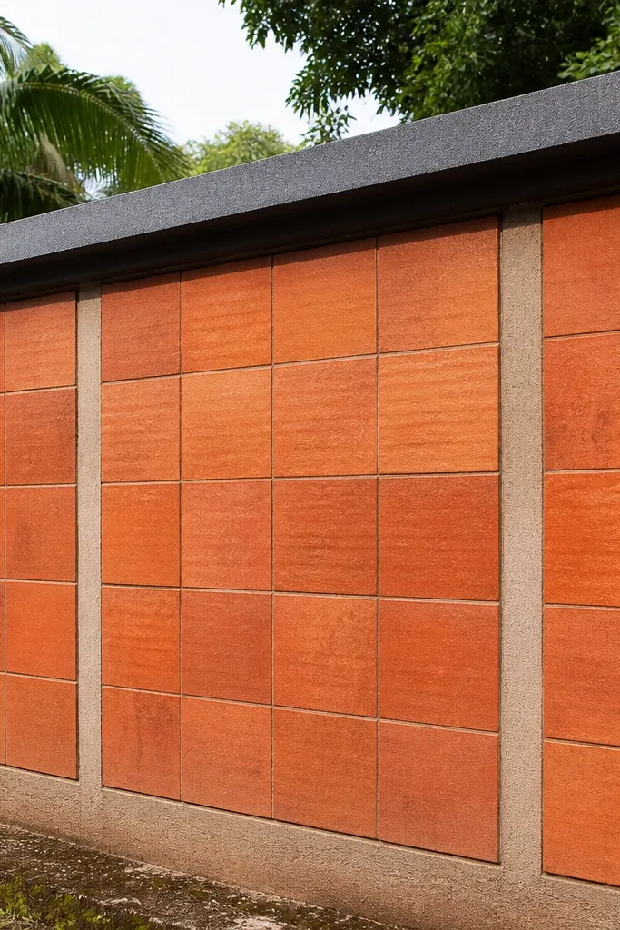
This design makes your compound wall look warm and intentional, not like a plain boundary. The trick is the panel rhythm: you create rectangular sections using thin cement strips or tile borders, then fill each section with terracotta-colored tiles or terracotta-look cladding. Dark grey coping makes the top line look sharp and helps hide minor surface variations. It suits homes with warm exteriors, wood doors, and earthy landscaping because the tones blend naturally in Kerala light. Skill level is moderate because the face needs straight lines and consistent grout gaps, but the build time is still manageable for a DIY weekend schedule.
Start by plastering the wall face flat and marking panel grids with chalk lines every 1.2 m horizontally and about 0.6 m vertically. Apply exterior cement primer, then fix terracotta-look tiles using polymer-modified adhesive, keeping a 3 mm grout line for consistency. After curing, grout with exterior grout and finish with a sealant on top edges. Finally, install dark grey coping slabs with a slight slope away from the wall so rain doesn’t sit on the top.
Editor's noteDry-fit two tiles plus spacer before you commit; it keeps your panel grid from creeping over long stretches.
Skip thisDon’t tile over rough plaster — unevenness shows as wavy grout lines.
2. Kerala Stone Cladding Strips with White Render Base
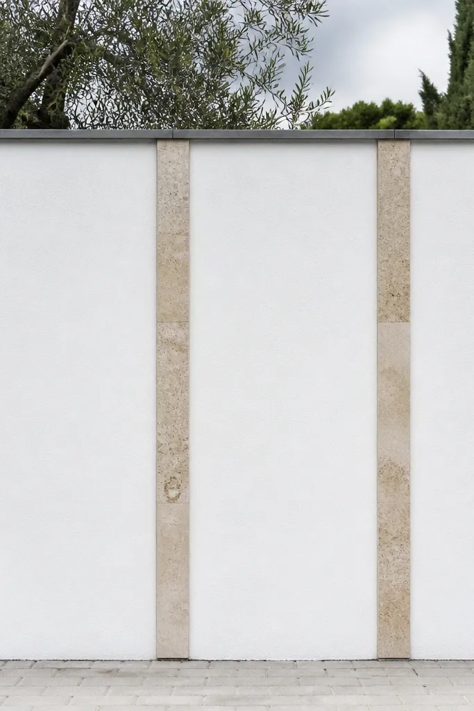
If you want that “resort gate” vibe without covering the entire wall in heavy stone, this is the cleanest approach. You keep the main area bright with white render, then add narrow vertical or horizontal stone cladding strips for texture. The contrast makes the wall look taller and more structured from the street. It also hides minor patch repairs because the stone strips break up the surface. This works well for modern Kerala homes with white or cream facades and dark metal gates.
First, render the wall face smooth and straight with cement-sand plaster, then apply an exterior primer. Mark strip positions — for a good look, use 100-150 mm wide strips spaced evenly, like every 600-800 mm. Fix thin stone cladding panels with exterior adhesive, starting from the bottom corner and using spacers for uniform gaps. After the adhesive cures, grout lightly and add a top waterproof sealant; finish with black coping slabs.
Use a level laser or long spirit level for strip alignment; small errors become obvious once the white base is done.
Don’t skip primer; stone adhesive fails to bond properly on chalky render.
3. Alternating Breeze Block Pattern with Limewash Finish
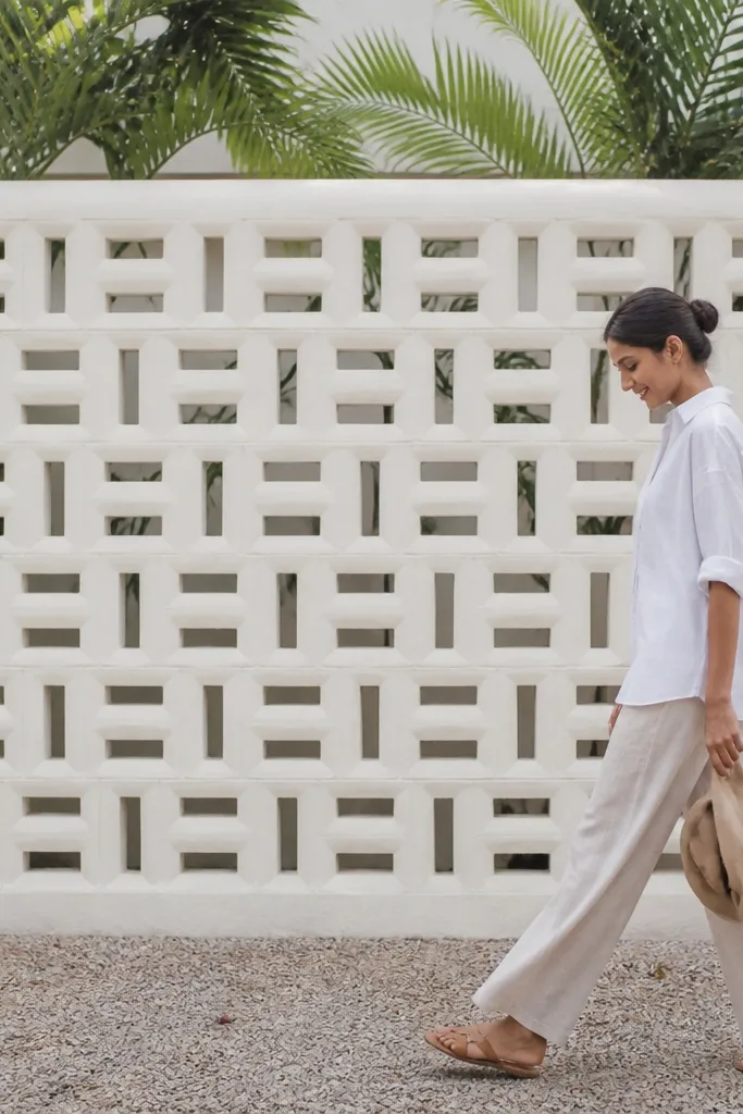
This one leans into Kerala’s love for breezy, airy texture. Instead of a flat face, you create an alternating block pattern using breeze blocks laid with consistent mortar joints. The limewash-style finish softens the look and gives a gentle, matte texture that photographs well under overcast light. The wall stays breathable, and the openings create a subtle rhythm without needing heavy cladding. It’s a great pick for front boundaries where you want privacy but still want visual lightness.
Plan your module before you build: alternate solid and hollow blocks in a repeating grid, keeping hollow blocks aligned vertically. Use cement-sand mortar with a consistent thickness (about 10-12 mm joints) so the pattern looks crisp. After curing, apply exterior limewash or limewash-look paint over a cement primer base. Install a simple coping strip and keep the top edges sealed with waterproofing so rain doesn’t soak into mortar.
Editor's noteMark vertical lines with string and keep the same block orientation every row — the pattern depends on alignment.
Skip thisDon’t use thick, messy mortar joints; it ruins the clean geometric look.
4. Vertical Pilaster Wall with Tile Belt Course
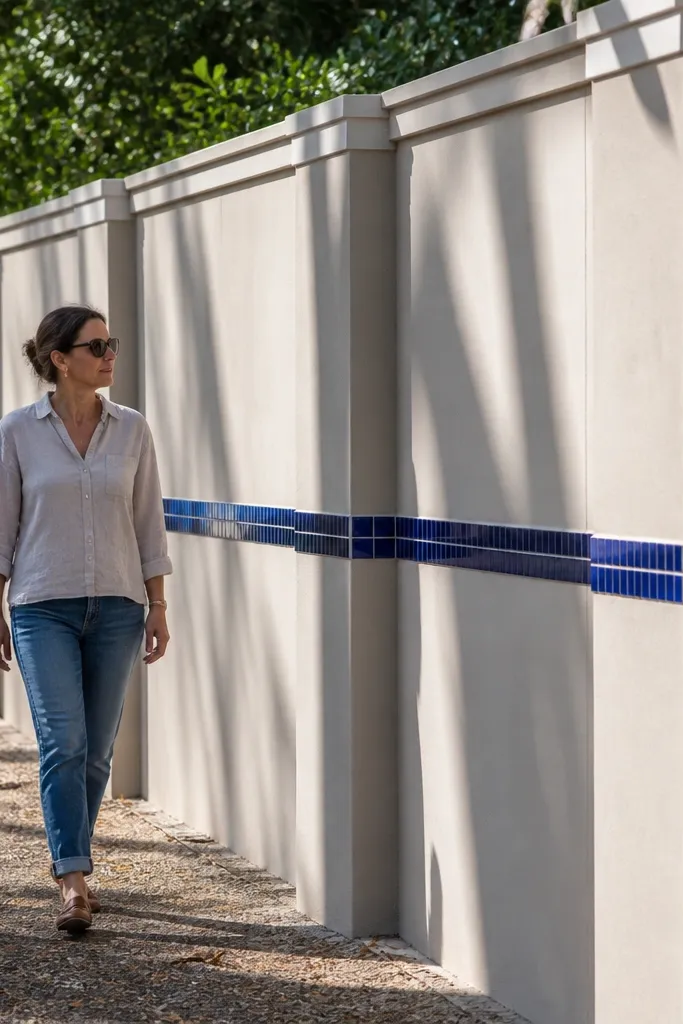
This is one of the best “looks expensive, still DIY” designs because it uses a simple structure: vertical pilasters plus a belt course. The pilasters create depth, while the tile belt adds color and a visual break. Choose a belt height around 1.0-1.2 m from the ground so it lines up with common gate sightlines. The rest of the wall can stay neutral, which makes maintenance easier and keeps the design from feeling busy. It suits both traditional and modern houses.
Start by drawing pilaster widths — a clean ratio is 150-200 mm pilasters with 600-800 mm spacing between them. Render the wall and then apply cement strips or fix tile-on-cement board borders to define pilasters. For the belt course, lay a 200-300 mm tall tile band at your chosen height, using a level line and spacers. Finish with exterior grout and a waterproof seal, then cap the top with concrete or stone coping.
Editor's noteUse the same tile for the belt and small corner accents; it makes the wall look designed, not patched.
Skip thisDon’t place the belt too high — if it sits above eye level, the wall looks awkward in photos.
5. Mosaic Corner Frames with Plain Middle
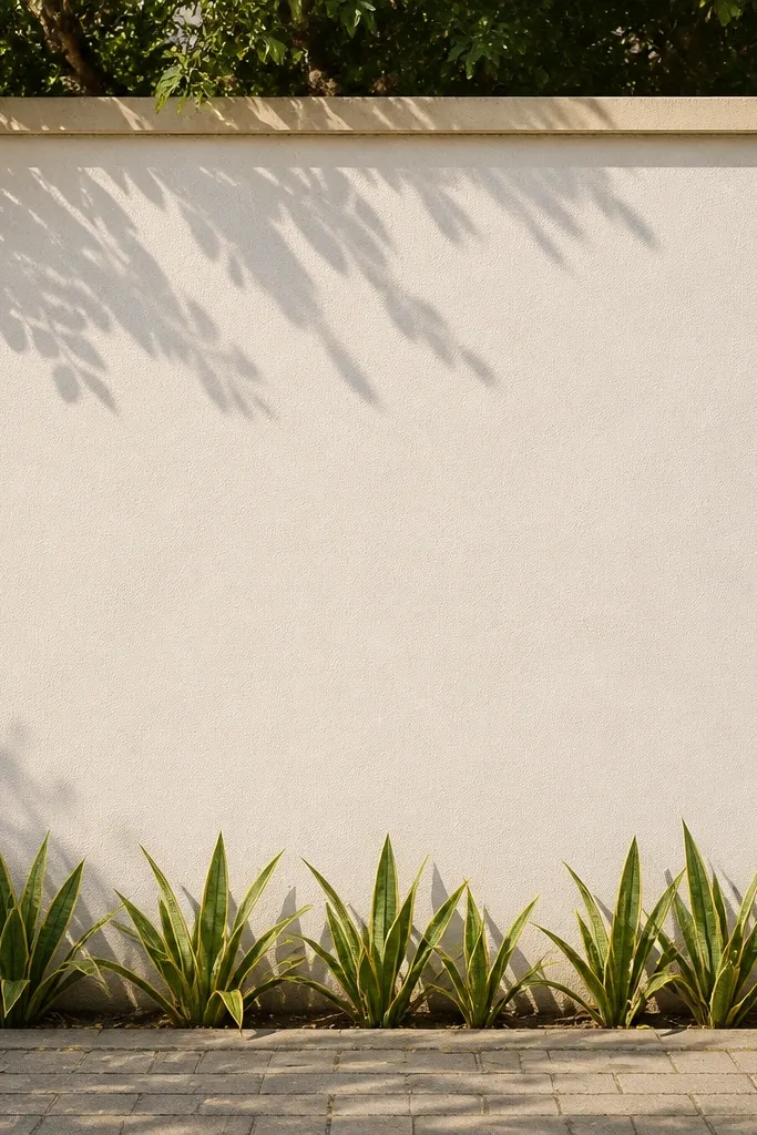
This design uses a small amount of mosaic to create a big visual hit. You keep the middle section plain for a clean, calm look, then add mosaic corner frames that act like decorative borders. It’s ideal if you want a photogenic wall but don’t want to mosaic the entire length. The corner frames catch light differently as you walk past, which is exactly what makes it look “styled.” It suits houses with minimal exterior decoration and a focus on clean lines.
Prime and paint or render the wall first, then mark two vertical mosaic frames near each corner with 300-400 mm width. Use small ceramic mosaic tiles for the frames and fix them with adhesive, starting from the bottom and working upward. Keep grout lines consistent at 2-3 mm so the frame looks sharp. After grout cures, seal the mosaic and install coping slabs with a drip slope.
Choose one mosaic color family and stick to it; corner frames look best when they don’t compete with the gate.
Don’t mix too many mosaic colors; it turns the frame into noise.
6. White Cement Render with Black Vertical Slats
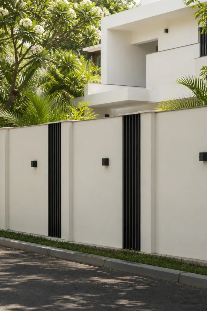
This one is clean, modern, and very camera-friendly. You render the wall white or off-white, then add thin vertical slats in black (either UPVC slats, metal strips with powder coat, or cement-based faux slats). The slats create shadows that make the wall look layered even when the rest is plain. It’s a strong match for contemporary gates and dark door hardware. The build is straightforward as long as your spacing is consistent.
Render the wall smooth and prime it, then snap chalk lines for slat positions. Install slats using exterior anchors at regular intervals, keeping a 30-50 mm gap between slats for shadow depth. If you use UPVC, cut ends clean and seal joints with exterior silicone. Finish by painting around slats edges neatly and fixing coping slabs to lock in the top line.
Editor's noteDry-measure slat-to-slat spacing over the full wall length; adjust at the ends so the grid stays perfect.
Skip thisDon’t skip sealing around slat anchors; water gets behind and leaves streaks.
7. Half-Tile Face with Textured Plaster Top
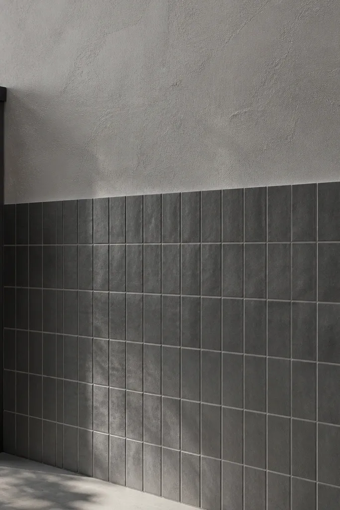
This design balances durability and looks. Tiles handle splash zones and easy cleaning, while textured plaster on top adds character without heavy materials. The split also makes the wall look intentional and proportioned. Choose a tile color that matches your gate metal — grey and charcoal are safe bets. It’s a good plan if you’re worried about the wall getting stained near the ground from rain splash and foot traffic.
First, mark a horizontal split line around 1.0 m from the ground. Prime the whole wall, then apply tile adhesive only up to the split line and fix tiles in a staggered or straight pattern, keeping 3 mm grout gaps. Above the split, apply textured exterior plaster using a trowel finish or sponge texture, then let it cure. Seal the plaster lightly and install coping with a slope away from the wall.
Use a straight edge board as your bottom tile guide so the first row stays level.
Don’t paint textured plaster before it fully cures; it traps moisture and dulls the finish.
8. Red Oxide Bands with White Tile Infill

This gives you a punchy Kerala color story without clutter. The method is simple: white tile infill keeps it bright, while red oxide bands add warmth and a strong horizontal rhythm. Horizontal bands also visually widen the wall and make gates look more balanced. It’s a great option if you want something traditional-leaning but still clean and modern. The look stays consistent even if you have small wall imperfections because the bands structure the face.
Render and prime the wall, then plan two or three band heights, each about 120-180 mm tall. Fix white tiles as the base layer and keep grout lines even. For bands, either use red oxide colored tiles or paint-cement bands sealed with exterior waterproofing; align them perfectly with a chalk level line. Finish with exterior grout sealant and install black coping slabs.
Editor's noteUse painter’s tape along band edges during paint/cement band work for crisp lines.
Skip thisDon’t eyeball band heights; slight unevenness shows immediately on a white background.
9. Terracotta + Sea-Blue Vertical Panel Mix
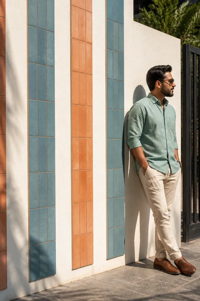
If you want the wall to look playful but still premium, alternate terracotta and sea-blue vertical panels. The colors work well together because terracotta is warm and sea-blue is cool — they make the wall look lively under Kerala sun. Keep the panels narrow (around 200-250 mm) so the rhythm feels refined, not chunky. This design is excellent for homes that already use blue accents in windows or planters. It’s also very photogenic from the side because the panel edges catch light.
Prime the wall, then create vertical panel boundaries with thin cement strips or border tiles, each 200-250 mm wide. Fix terracotta-look tiles for one set of panels and sea-blue tiles for the alternating set, using spacers and consistent adhesive thickness. After curing, grout with a light grey grout so colors stay clean. Seal the tile surface and install coping slabs to finish the top line.
Editor's noteChoose tiles with similar sheen; matte terracotta + matte sea-blue looks better than mixing glossy and matte.
Skip thisDon’t use thick adhesive ridges; they create uneven panel depth and visible waves.
10. Brick-Style Tiles with Limewash Walls

Brick-style tiles are a cheat code for the “old Kerala warehouse” look without the cost of real bricks. You limewash the main wall in a soft off-white, then apply brick-pattern tiles in a focused band or full face if you want a stronger effect. The mortar-look grout lines create the texture that makes photos pop. This is a smart choice if you want character but don’t want the maintenance of real exposed brick. It fits both modern minimal homes and heritage-style facades.
Render and prime the wall, then plan the brick area width (either full face or a 1.2-1.8 m height band). Fix brick-pattern tiles with a polymer-modified adhesive, keeping grout lines consistent at 3 mm. Use light grey grout for a limewash-friendly palette. Seal the finished surface and add a coping slab that prevents water from sitting on top.
Editor's noteStart tiling from the center line so the brick pattern stays balanced on long walls.
Skip thisDon’t choose a grout color that’s too dark; it can make the wall look dirty in Kerala humidity.
11. Geometric Cement Panel Wall with 3D Borders

This design looks modern and architectural because it creates true dimensional shadows. You build geometric panels using cement strips or ready-made cement border tiles, then fill the panels with smooth cement render or light-colored plaster. The raised borders create a layered look even from far away. It’s a great option for people who want a clean, contemporary boundary wall without heavy stone. The skill level is higher than simple tiling because the border lines must be straight and level.
Mark a grid on the wall — for a clean look, use repeated rectangles about 600x600 mm or 600x450 mm. Fix or build raised borders using cement-based strips or ready-made border tiles, anchored with exterior adhesive. Fill inside the panels with smooth cement render and strike it flat. After curing and sanding, paint the recessed areas and leave borders in a slightly darker shade, then seal and install coping.
Editor's noteUse a straight 2 m aluminum level often; small border slips ruin the geometry.
Skip thisDon’t paint before full curing; fresh cement pulls water and causes patchy discoloration.
12. Wave Relief Tiles with Neutral Paint
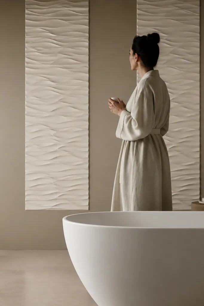
Wave relief tiles add movement without needing bright colors. You paint the background neutral and install wave-texture tiles only on certain sections, like every third bay or as a continuous band. The relief catches light and makes the wall look “designed” even in dull weather. It’s a good pick for coastal-style themes and for homes that already have clean, neutral exteriors. This design also hides small surface imperfections because the wave relief draws attention away from minor flatness issues.
Prime and paint the wall first, then mark where wave tiles will go. Fix wave relief tiles with the right adhesive — use a notched trowel and press tiles firmly to avoid hollow spots. Keep grout lines consistent, and choose a grout color close to the tile base so the relief stays the star. Seal after grout cures and add coping slabs with a drip edge.
Editor's noteChoose relief tiles with matching thickness; mixed thickness makes the wave pattern look uneven.
Skip thisDon’t install relief tiles over powdery paint; scrape back to primer if needed.
13. Mangalore Tile Fan Pattern
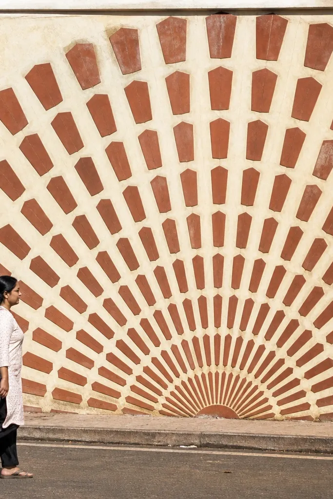
This is a traditional look that reads instantly from the road. The fan pattern breaks the wall into decorative sections while keeping the overall design warm and grounded. Use Mangalore-style terracotta tiles or terracotta look tiles cut into consistent shapes for the fan rays. The cream background makes the pattern stand out and prevents the wall from looking heavy. This one suits homes with warm roof tiles, wooden shades, and plants that spill over the boundary.
Render and prime the wall, then mark fan centers at regular intervals, like every 1.2 m. Fix a small base tile shape in the center, then lay rays outward with careful spacing — keep the fan diameter consistent. Use exterior tile adhesive and a 3 mm grout line so the rays look clean. Seal and finish with coping slabs in dark grey to frame the top.
Editor's notePre-cut a template for the ray tiles so every fan uses the same angle and spacing.
Skip thisDon’t make random fan sizes; inconsistent fans make the wall look handmade in a bad way.
14. Seafoam Green Accent with White Tile Grid

This design is crisp and modern, and it works because the grid is predictable. You cover the wall with a white tile grid and insert seafoam green square accents at regular intervals. The accents give color without turning into clutter, and the uniform grout lines make it look neat in every photo. It suits contemporary homes, especially if you have seafoam or mint-green planters. The build is time-intensive only because you’re tiling a full face, but the pattern is straightforward.
Prime the wall and plan your tile size — a common clean ratio is 300x300 mm tiles with 100x100 mm accent squares. Fix the white tiles first in straight rows with spacers, then place seafoam accents where the grid lines intersect. Use a polymer-modified adhesive and keep grout joints uniform at 3 mm. After curing and grouting, seal the grout and install grey coping slabs.
Use a chalk grid on the wall before tiling; it prevents crooked rows later.
Don’t skip back-buttering tiles on corners; it prevents lippage where light hits.
15. Black-and-White Checker Panels with Warm Coping

Checker panels look bold, but only if you control the scale. Use checker tiles in a defined panel area, like a center band, and keep the rest of the wall neutral. The black-and-white contrast makes the wall pop in photos, while warm brown coping softens the harshness. This design suits modern homes where the gate has dark metal elements. It’s also a good choice if you want a statement wall without painting the entire compound boundary bright.
Prime and paint the background in a warm neutral tone. Mark a central panel area and fix black and white tiles in alternating squares, keeping each square the same size (for example 100x100 mm) and using spacers. Grout with a light grey grout so lines stay crisp. Seal the panel and add warm brown coping with proper waterproofing along the top edge.
Editor's noteStart your checker pattern from a single reference line so you don’t end up with half squares at the edges.
Skip thisDon’t use glossy black tiles; they show dust and water spots more clearly.
16. Coconut-Leaf Carved Plaster Panels (Stencil Look)
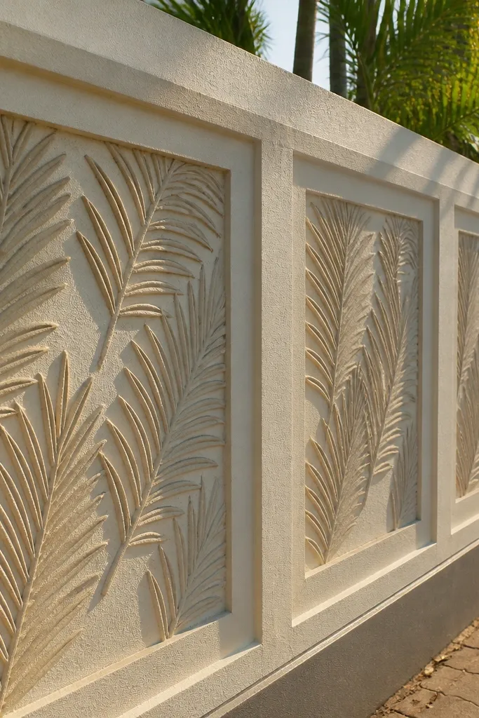
This is how you add a Kerala theme without printing big murals. Use a stencil to create raised coconut-leaf patterns in plaster on small panels, then keep the rest plain. The raised texture reads well in sunlight and looks hand-crafted even when it’s repeatable. It works beautifully for front boundaries where you want a subtle local identity rather than generic decoration. The look is best when you use off-white base and dark grey coping so the relief stays visible.
Prime the wall and paint a base coat in off-white. Create a stencil panel size — about 400x600 mm each — and tape it down firmly. Apply exterior texture plaster through the stencil to build a shallow relief, then smooth the edges around the pattern. After curing, paint over the plaster relief in a slightly different shade (one tone darker) and seal the surface, then install coping.
Work in small sections so plaster doesn’t dry in the stencil openings and leave rough edges.
Don’t make the relief too deep; deep carvings trap water and grime.
17. Travertine-Look Cladding with Vertical Groove Lines
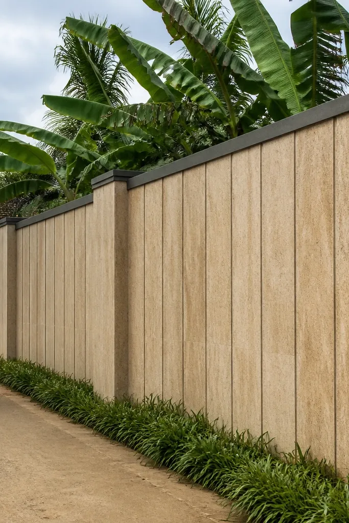
Travertine-look cladding makes a wall feel upscale without the cost of natural stone. The vertical grooves add direction and make the wall look taller. This is a strong choice when your gate is minimal and you want the wall to carry the style. The look works in Kerala because the finish is neutral and doesn’t show water stains as harshly as high-contrast colors. You’ll still need good waterproofing behind the cladding so it stays clean over monsoon seasons.
Prime the wall and apply a waterproofing layer where moisture can reach. Mark vertical groove lines on the face at 100-150 mm intervals. Fix travertine-look cladding panels with exterior adhesive, aligning edges to create groove shadows. Grout lightly or use a thin filler for a travertine-like finish, then seal and install light grey coping.
Match panel veining direction across adjacent sections for a more “designed” look.
Don’t grout too thick; heavy grout makes travertine looks flat.
18. Raked Concrete Bands with Smooth White Center
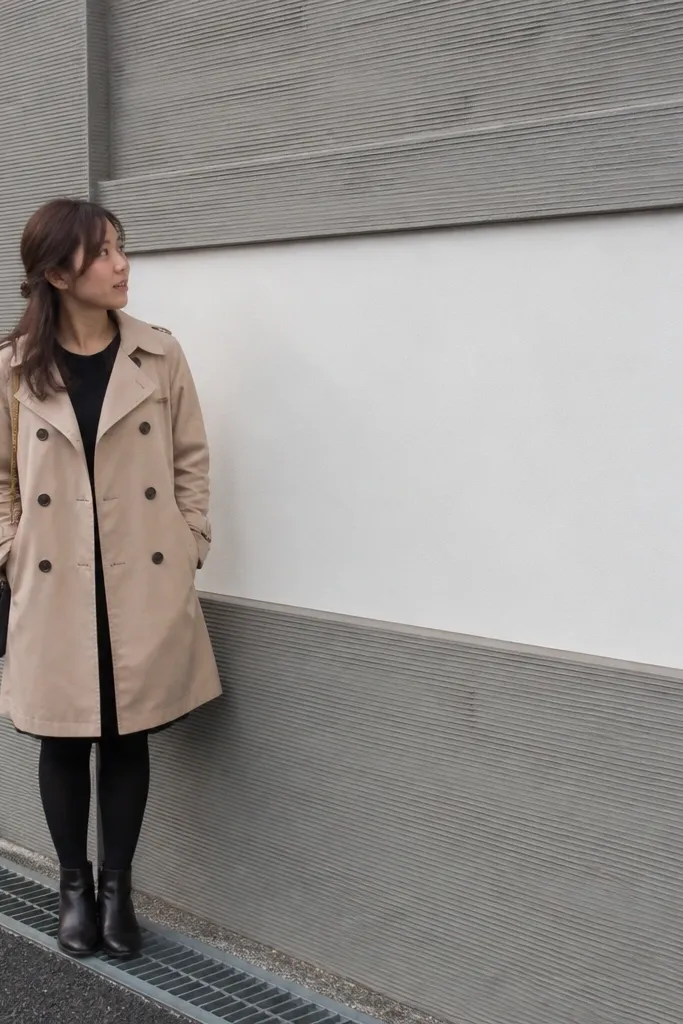
This is a texture-first design that looks modern and strong in harsh weather. You keep the center area smooth and bright, then add raked concrete bands that create a natural shadow texture. The contrast between smooth and rough makes the wall look layered without needing tiles. It’s a great option if you’re comfortable with cement work and want a DIY project that doesn’t depend on tile availability. It suits minimalist houses and works especially well when the gate is sleek.
Render the wall smooth for the center area, then mask off bands with tape and guide boards. Mix cement-sand for the bands, apply it thicker than the base, and rake the surface with a comb tool to create grooves. Let it cure, then remove guides and sand edges for clean lines. Paint the center white, leave bands in a grey cement tone or paint them lightly, seal everything, and top with coping slabs.
Editor's noteUse wide guide boards for band edges; narrow guides shift and ruin the straight lines.
Skip thisDon’t over-water the cement mix; it weakens the raked surface.
19. Vertical Lattice Screen with Tile Base
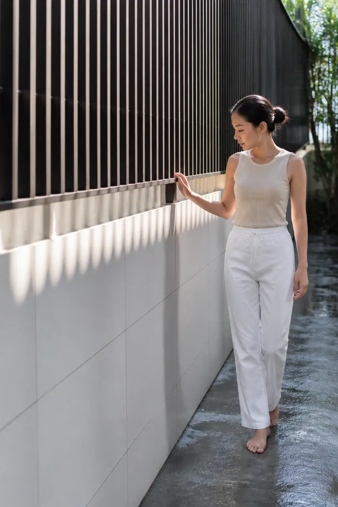
This design gives you privacy with style because the lattice breaks sightlines while keeping the wall airy. Use a tile base for the bottom portion so it stays clean from rain splash, then add a lattice screen panel above. The lattice creates repeating shadows that look great in photos. It’s also functional: it reduces the harshness of a tall solid wall and makes the entrance feel more inviting. It suits homes with modern gates and plants that you want to frame.
First, tile the lower wall up to about 1.0-1.2 m using exterior adhesive and 300x300 mm tiles or smaller for a tighter look. Then install a lattice — either metal powder-coated strips or treated wood slats — anchored to the wall with brackets. Keep spacing consistent (for example 40-60 mm gaps) and ensure the top frame supports the screen so it doesn’t sag. Seal the tile and paint the lattice supports, then finish with coping slabs.
Editor's notePaint lattice frames before installation so you don’t get streaks around anchors.
Skip thisDon’t anchor into weak plaster; chip back to solid masonry for bracket mounting.
20. Round Medallion Panels with Border Tiles

Round medallions break the strict rectangle look and make the wall feel decorative without becoming busy. You place medallion tiles at regular intervals, framed by thin border tiles that keep the design neat. The shape helps the wall read softer, which works well if your gate has curved elements or if you have round planters near the entrance. It’s a good compromise between simple paint walls and full mosaic walls. The look is photogenic because circles catch light and create a focal point.
Prime and paint or render the wall in an off-white tone. Mark medallion centers at consistent spacing, like every 1.2 m along the length. Fix border tiles first to form a clean ring, then set the round medallion tile in the center using adhesive. Grout carefully, then seal and install coping slabs to finish.
Use a medallion tile with a matching border tile set; alignment looks much better than mixing random sizes.
Don’t place medallions too close to corners; cropping makes circles look unfinished.
21. Half-Height Tile + Vertical Stone Pillars

This design keeps the wall clean where it gets dirty and makes the upper part look structured. The lower half is tiled for easy cleaning, while vertical stone pillars create height and rhythm. Use pillars at regular intervals — the spacing matters more than the exact stone color. It suits homes with columns on the porch or pillars near the entry because it repeats the same architectural language. The overall project is DIY-friendly because you’re mixing two materials instead of tiling every square inch.
Prime the wall and tile the lower half up to about 1.0-1.2 m using an exterior tile adhesive. Mark pillar positions and fix stone pillar cladding panels vertically, starting from the bottom. Use spacers and a level to keep pillar faces straight. After grouting and sealing, paint the upper smooth area in a neutral tone and cap the wall with coping that slopes outward.
Editor's noteChoose stone pillar cladding with uniform thickness so you don’t get steps at grout lines.
Skip thisDon’t use glossy stone; it shows water streaks more clearly.
22. Matte Grey Paint with Raised Cement Dot Pattern

Raised dot patterns turn a plain wall into something you notice from the road. You paint the wall matte grey or taupe, then add a repeating grid of raised cement dots or small circular patches. The dots create shadow texture without color clutter. This is a smart choice if you want a modern look but don’t want tile work. It also hides minor plaster imperfections because the texture becomes the focal point.
Prime and paint the wall matte grey as your base. Mark a dot grid with chalk, like 150 mm spacing both directions. Mix a small batch of cement putty or exterior texture mix and apply each dot using a small spoon or template, about 10-15 mm diameter and shallow relief. Let it cure, then seal the surface lightly and install coping.
Editor's noteMake a quick cardboard template with dot positions; it keeps the pattern even across long lengths.
Skip thisDon’t make dots too tall; tall texture cracks and traps grime.
23. Diagonal Chevron Tiles in a Single Accent Zone
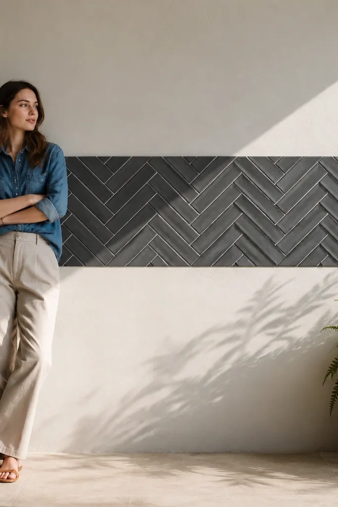
Chevron is dramatic, but you don’t need to tile the whole wall to get the effect. Put a chevron tile strip in one accent zone, like centered at 1.2 m height and about 300-500 mm tall, while keeping the rest neutral. The diagonal lines add energy and make the wall look more expensive in photos. Choose a tile color that matches your house — greys, off-whites, and black accents look best. This design is also good for DIY because the chevron area is small, even if you’re not confident tiling full faces.
Prime and paint or render the wall first. Mark an accent rectangle and fix a chevron pattern inside it using small tiles, keeping a consistent 45-degree angle. Use spacers and check alignment from both sides so the chevron looks symmetrical. After grouting, seal and top with coping slabs that protect the tile edges from rain.
Editor's noteUse a tile-cutting jig or template for repeated diagonal cuts; it keeps your chevron clean.
Skip thisDon’t attempt a full-wall chevron pattern; it turns into a cut-and-realign nightmare.
24. Stone Base + Smooth Upper with Black Corner Caps
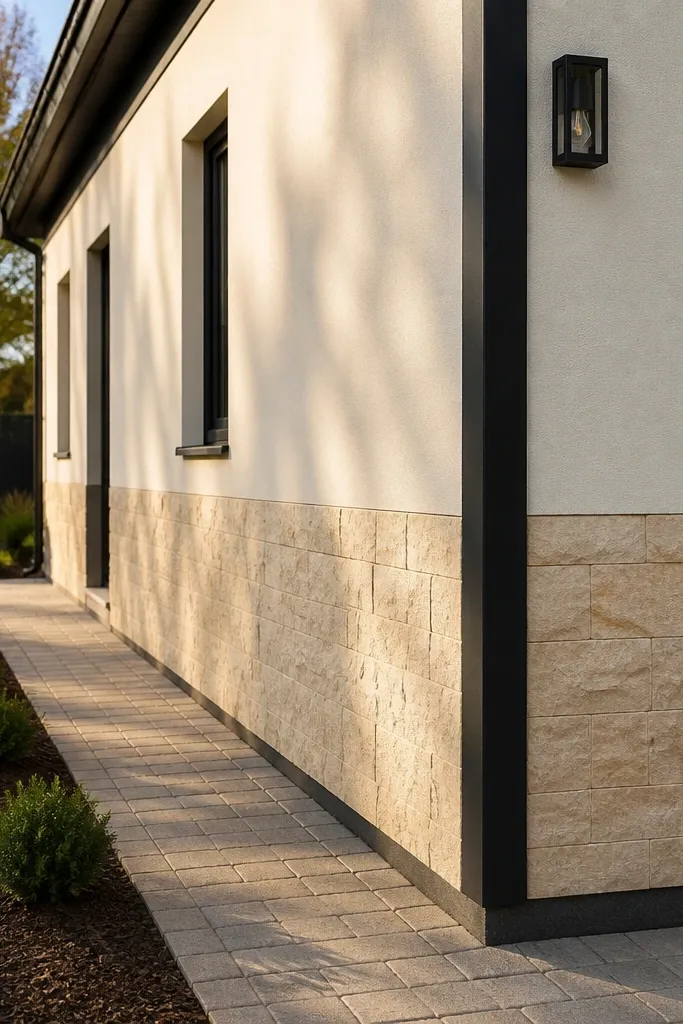
This is a strong, low-clutter design that makes your wall look taller and more orderly. You tile or clad only the bottom portion with stone-look material, then keep the upper wall smooth and painted. Add black corner caps or corner trims to frame the wall edges — it’s a small detail that changes how “finished” the whole property looks. This is a good choice if your gate is already decorative and you don’t want to compete with it. It also reduces maintenance because only the lower area is textured and stain-prone.
Prime the wall and fix stone-look tiles or thin stone cladding up to 1.0 m height. Apply smooth exterior paint above the stone area after primer and patching. Install black corner trim pieces at both ends and along any extended corner sections, using exterior anchors or adhesive. Seal grout lines and install coping slabs with waterproofing along the top edge.
Choose corner trim that matches your gate metal color; it ties the property together without extra decoration.
Don’t leave the stone base edges raw; finish with a proper trim strip so water can’t wick in.
25. Golden Sand Texture Panels with Grey Borders
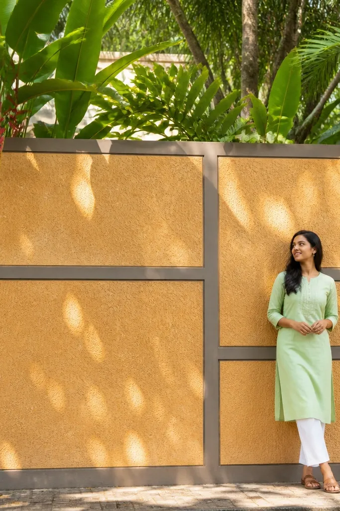
Texture panels in a golden sand tone look warm and upscale, and they hide wall imperfections better than glossy finishes. You create panel boundaries with grey borders so the texture stays organized. The warm tone works especially well with Kerala greenery because the wall doesn’t fight the plants. This design is photogenic because the texture creates tiny highlights and shadows across the surface. It’s also practical since textured finishes don’t show small scuffs as clearly.
Render and prime the wall, then mark panel rectangles about 600x800 mm. Apply grey border strips first using cement strips or border tile trims, anchored firmly. For the panel centers, apply exterior sand-texture plaster or microcement-like texture mix and comb it lightly for uniform grain. After curing, seal with a matte exterior sealer and install coping slabs.
Keep border thickness consistent; uneven borders make the panels look DIY in a bad way.
Don’t seal too early; texture plaster needs full cure to avoid peeling.



