
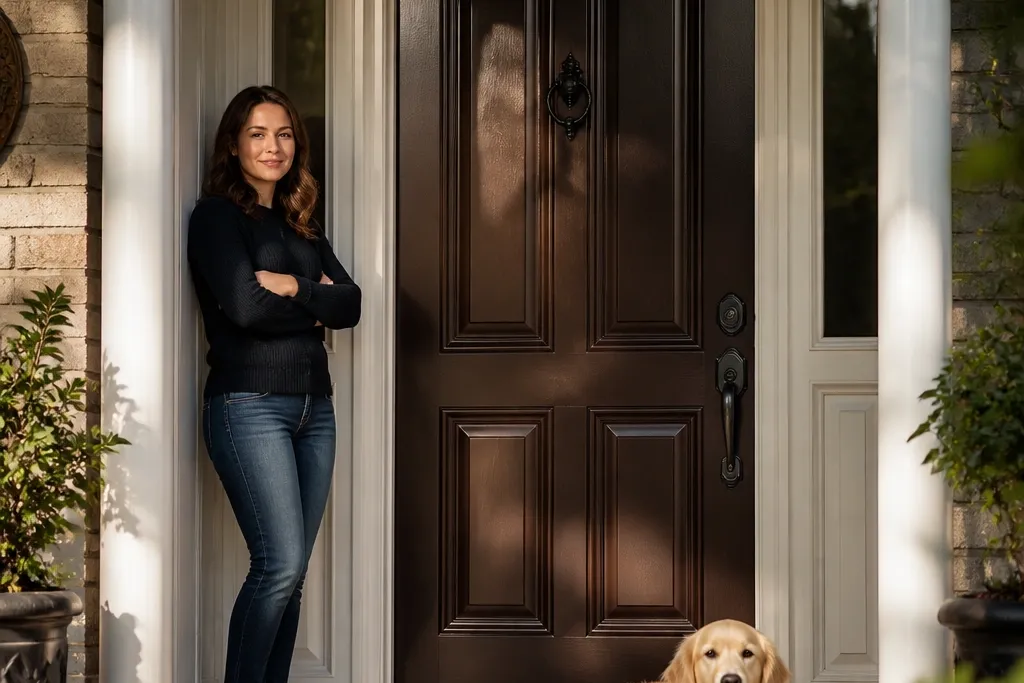

1. Deep Espresso Brown with Satin Enamel
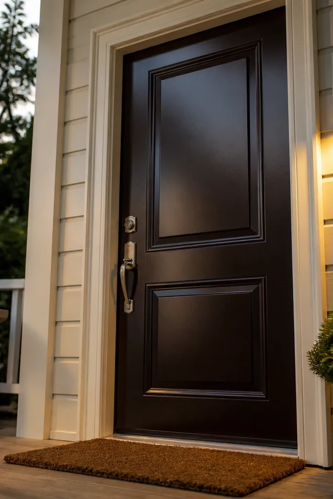
Start by cleaning the door thoroughly with a degreaser, then sand with 180-grit to knock down shine. Apply an exterior bonding primer (especially if you’re going from a light color), then let it cure per the can. Paint two thin coats of exterior satin enamel, using a foam roller for the field and a brush for edges and panels. Finish by lightly sanding any rough spots with 220-grit between coats for a smooth look.
A deep espresso brown reads high-end because it’s dark enough to feel grounded, but it still has warmth so it doesn’t turn flat black in shade. This color is especially flattering with white, cream, or warm off-white trim because the door becomes the focal point without looking harsh. Go satin enamel so the surface catches light smoothly instead of reflecting like a mirror. This is a great fit for brick exteriors, cedar siding, and houses with warm-toned stone. DIY-wise, it’s forgiving: the brown hides minor surface imperfections better than very light colors.
Skip thisAvoid flat paint; it grabs dirt and makes the door look older than it is.
Editor's noteUse a light-gray primer under brown — it keeps the final color from turning muddy.
2. Charcoal Gray with Matte Hardware Contrast
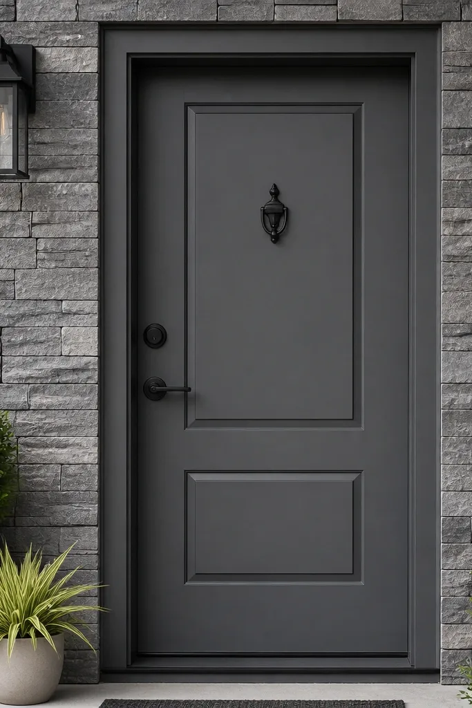
Degrease and sand the door, then remove old peeling paint completely. Prime with an exterior primer that matches your substrate (wood, metal, or previously painted surfaces). Roll on two coats of exterior charcoal paint in satin or low-eggshell, keeping a consistent direction on each panel. After the final coat cures, install hardware and add a clear weather seal around any exposed edges if your door has gaps.
Charcoal gray is one of the fastest ways to make a main door look designer without going trendy. It works because it sits in the “neutral luxury” zone — darker than most grays, but not as severe as black. Pair it with matte black hardware for a crisp, modern entry that still feels warm. This door color looks best when your trim is bright (white or crisp cream) and your exterior has wood or stone textures that need contrast. It also photographs well because the color doesn’t blow out under porch lights.
Skip thisDon’t skip primer — charcoal shows adhesion problems and flashing through faster than lighter colors.
Editor's noteIf your trim is glossy, consider a low-sheen door finish so the door doesn’t glare more than the trim.
3. Ink Navy with Brass Knob Glow
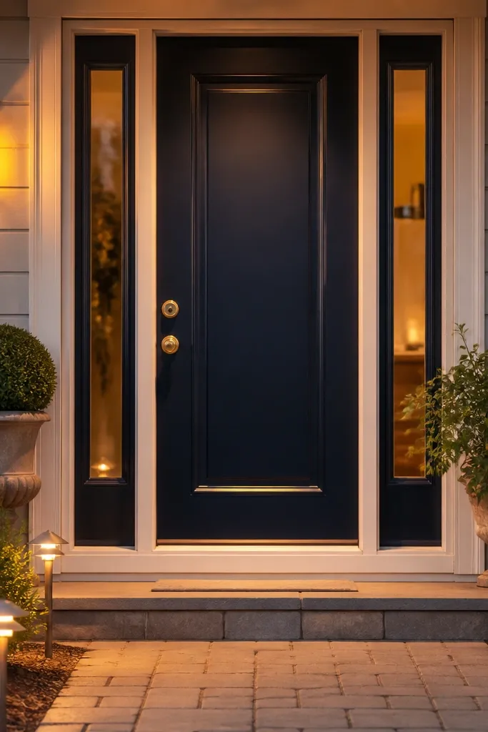
Clean, sand 180-grit, and patch any dents with exterior wood filler (if needed), then sand smooth again. Prime with a stain-blocking exterior primer if you have knots or old tannin bleed. Apply two coats of exterior ink navy enamel in satin, using a foam roller for even coverage and a brush for grooves. Let the final coat cure before you hang the hardware so you don’t leave fingerprints or tiny chips.
Ink navy creates a luxury look because it’s saturated and deep, so it reads expensive even in shadow. It also plays nicely with brass hardware, which adds warmth and a little “glow” near the handle. If you have gray siding or light stone, navy adds color depth without going loud. This is a great choice for modern farmhouse, craftsman, and traditional homes that want a richer front door color than standard black. Expect a clean, high-contrast look at dusk when porch lights turn on.
Skip thisAvoid painting over chalky paint; you’ll get peeling around the handle and edges.
Editor's noteChoose navy that leans slightly purple rather than pure blue — it reads richer in photos.
4. Forest Green with Oil-Rubbed Bronze Accents
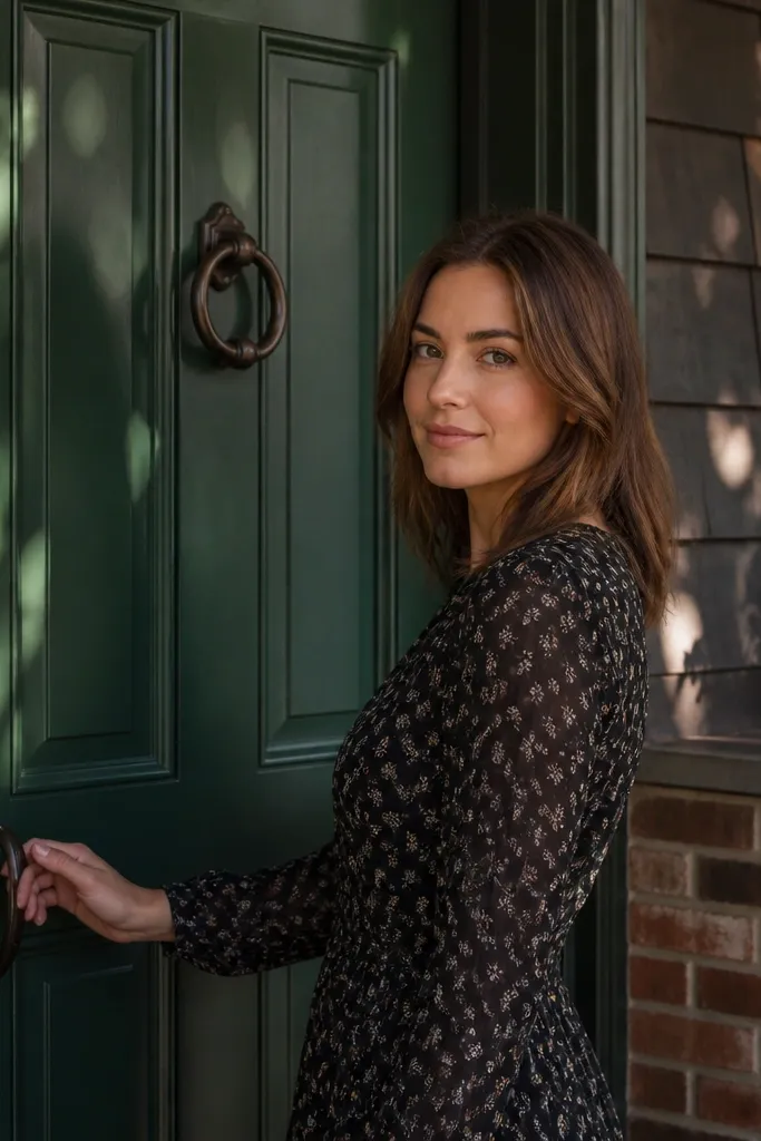
Start with a degrease and a thorough sand (180-grit), then wipe dust with a tack cloth. Prime with exterior primer and let it fully dry — green colors can show unevenness if the base varies. Roll on two coats of exterior forest green paint in satin, paying extra attention to edges around raised panels. Seal any exposed wood end grain or worn spots with a compatible sealer before painting.
Forest green feels high-end because it’s bold but grounded, and it looks especially sharp with bronze accents. If your exterior has brick, slate, or dark shingles, green makes the entry look intentional instead of random. The trick is choosing a green with enough depth that it doesn’t turn bright or minty in sun. Oil-rubbed bronze hardware and a matching door knocker push it into the luxury zone. It’s also a great choice for homes with warm wood trim, because the green balances warmth.
Skip thisDon’t pick a green labeled “bright” or “leafy” — those read casual on a main entry.
Editor's noteUse a small angled sash brush for panel edges so the paint line stays crisp.
5. Smoky Slate Gray with Subtle Texture
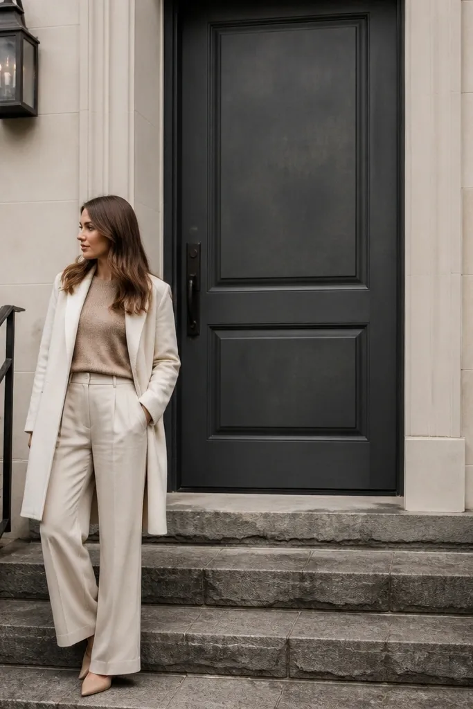
Sand to 180-grit, then apply primer that blocks stains and evens out the base. For a smoother luxury look, apply paint with a foam roller and then lightly tip off with a high-quality brush. Use two coats and keep the coat thickness consistent so you don’t get patchiness. If your door has small surface texture, don’t overwork it; extra passes create sheen variation.
Smoky slate gray looks expensive because it’s closer to rock than to steel. It softens the whole entry, especially if your house has hard materials like stone steps or metal railings. This color is excellent when you want a modern look without going cold; slate gray holds warmth from masonry undertones. Keep the hardware simple in either brushed nickel or matte black. The finish should be satin or low-eggshell so it doesn’t glare, but it should still show a smooth surface.
Skip thisAvoid heavy brushing back and forth — it creates visible streaks on slate tones.
Editor's noteStick to one brand line for primer and topcoat so sheen and adhesion behave the same.
6. Warm Taupe Brown with Cream Trim
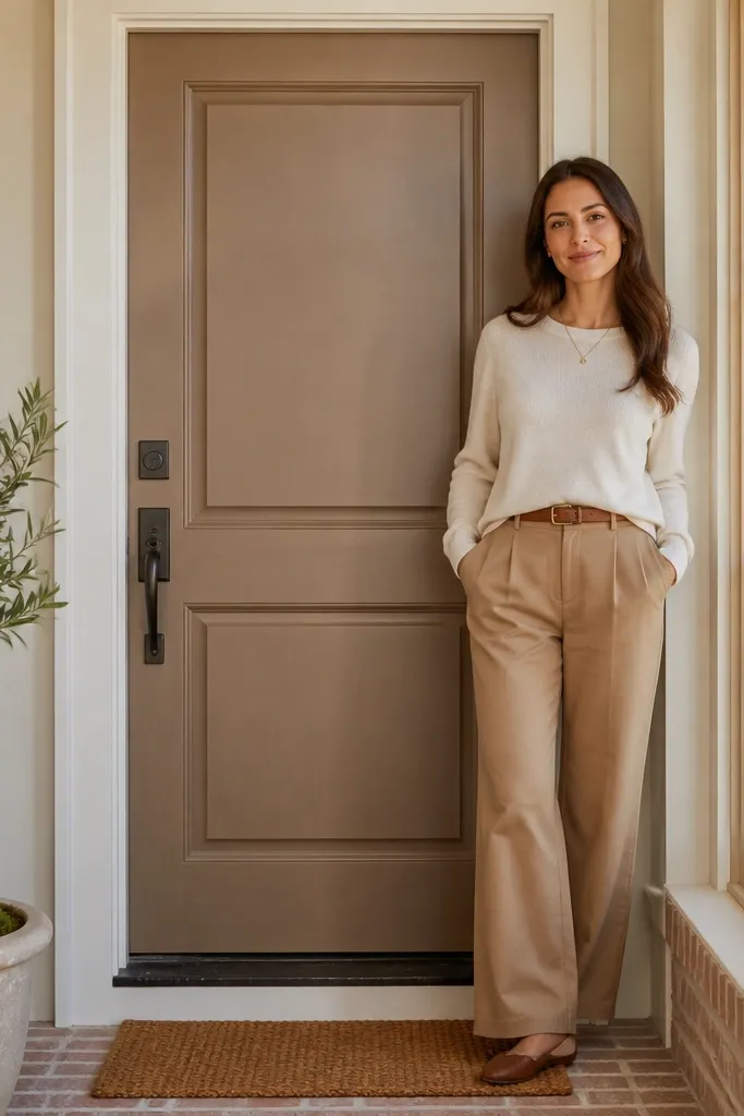
Clean and sand the door, then prime with a bonding primer if you’re changing from a lighter color. Apply two coats of exterior taupe-brown in satin, using a foam roller for even coverage. Paint in vertical strokes on the door face, then lightly smooth without pressing hard. Finish with a final check for thin spots around panel edges and the strike plate area.
Warm taupe-brown gives that high-end “custom builder” feel because it looks like a stain color, even when it’s paint. It’s also forgiving if your exterior has mixed materials like brick plus siding, since taupe bridges warm and neutral tones. Pair it with cream trim and darker hardware for a layered, expensive look. This works well on entry doors with glass sidelights because it won’t fight the brightness of the windows. If you want luxury without going dark-dark, taupe is the sweet spot.
Skip thisDon’t pair warm taupe with stark white trim if your siding is creamy; it can look mismatched.
Editor's noteTest the taupe in shade and sun on a scrap panel — taupe can swing warmer or cooler fast.
7. Brushed Gold Yellow with Black Door Hardware
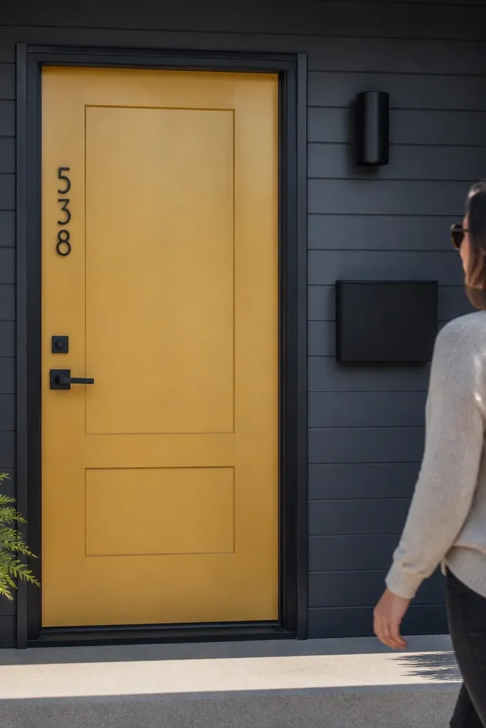
Degrease, sand, and prime with a tinted primer closer to the yellow so coverage is even. Apply two coats of exterior brushed gold yellow in satin, keeping edges crisp around the panel lines. For the cleanest look, use painter’s tape on the trim edges after the first coat has flashed off and is tack-free. Remove tape carefully while paint is still slightly soft to avoid chipped edges.
A brushed gold yellow door is bold, but it can look high-end when the yellow is muted and deep, not sunshine-bright. This color reads like painted metal or lacquer when finished in satin, and it makes black hardware look intentional. It’s a strong option for homes with dark shutters, gray siding, or stone entrances. The luxury effect comes from contrast: dark trim and hardware make the yellow feel designed, not chaotic. It also photographs well because the color stays readable under porch lighting.
Skip thisAvoid bright primrose yellows — they look playful, not luxury.
Editor's noteIf your door has raised panels, use a small foam brush to get into corners without leaving bubbles.
8. Classic Black-Brown with a Low-Sheen Finish
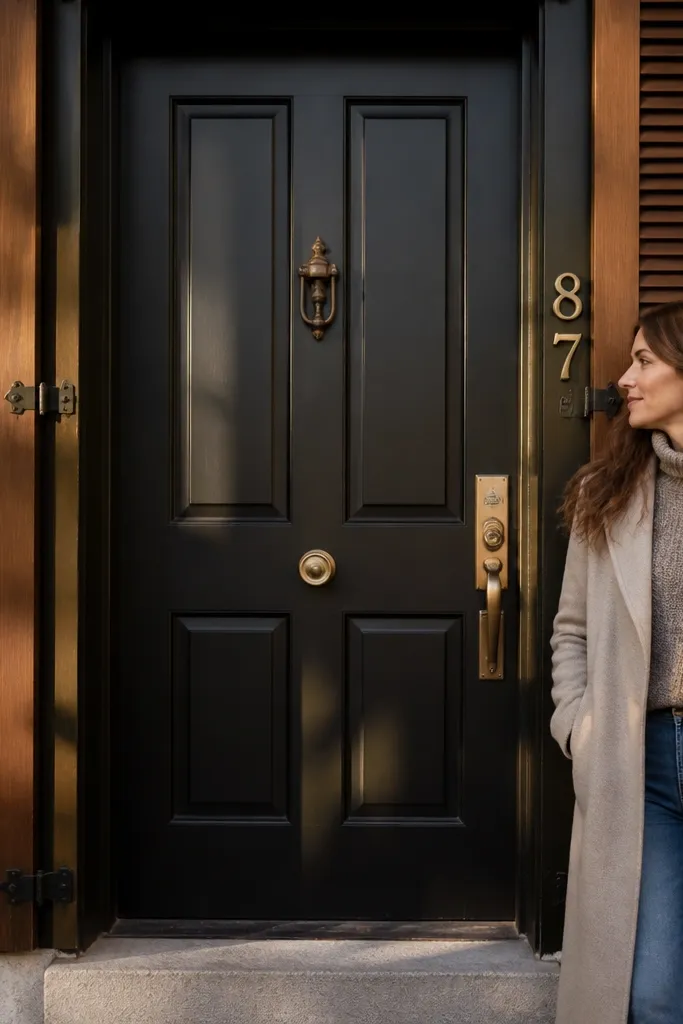
Black-brown gives you the power of black with the warmth of chocolate. It looks expensive because it doesn’t read as harsh in daylight, and it hides scuffs better than true black. This is a smart choice if your exterior has warm brick, walnut-toned shutters, or brass fixtures. Use a low-sheen or satin finish so it looks smooth, not glossy. It also looks great with natural stone and traditional trim profiles.
Sand and clean, then spot-prime any bare or repaired areas. Use an exterior primer to lock down old paint and improve adhesion. Paint two coats of black-brown exterior enamel in low-sheen, rolling the main face and brushing panel edges. After the second coat, check under angled light for thin spots and touch up small areas with a mini foam roller.
Choose black-brown with a brown undertone — test by viewing it next to your trim in shade.
Don’t use high-gloss black-brown; it shows every roller line and patch.
9. Deep Burgundy with Brass and Warm Wood Trim
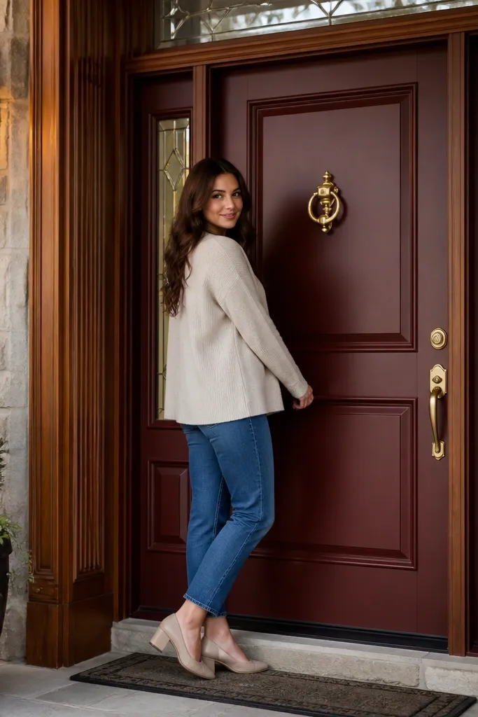
Deep burgundy feels luxurious because it’s complex — it reads red in sun and wine in shade. It turns a plain entry into a statement without needing bright accents everywhere else. Pair it with brass hardware and warm wood trim for a rich, layered look. This color is gorgeous on doors with glass inserts because it adds warmth behind the panes. If your exterior is gray or neutral, burgundy adds depth without clashing.
Clean, sand 180-grit, and prime with an exterior primer that blocks stains if the base is uneven. Apply two coats of exterior burgundy paint in satin, using a foam roller and brush for edges. Keep your coats thin so the red doesn’t look streaky; let proper dry time pass between coats. Seal around the perimeter if your door has exposed joints or weather stripping gaps.
Burgundy benefits from a tinted primer in the same family; it cuts down on patchy coverage.
Avoid painting burgundy over glossy paint without sanding — adhesion problems show quickly.
10. Aged Teal with Nickel Hardware
Degrease and sand, then prime with an exterior bonding primer. Apply two coats of aged teal exterior paint in satin, rolling the door face evenly. For a clean panel definition, use painter’s tape on trim edges and remove it while paint is still lightly soft. Finish with a careful touch-up around the lockset area where paint tends to wear.
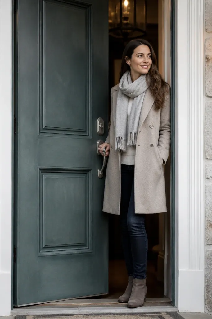
Aged teal looks high-end because it’s muted and slightly gray-green, like weathered copper or deep coastal stone. It’s more sophisticated than bright teal and it plays well with brushed nickel hardware. This door color works when your exterior has light stone, white trim, or gray siding. Under porch lights, it looks moody and expensive instead of neon. It also makes front entries feel calmer, even when the color is bold.
Skip thisDon’t choose teal that’s too blue — it can look cold against warm exterior materials.
Editor's noteIf the door gets lots of sun, pick a finish rated for UV exposure so the teal doesn’t fade unevenly.
11. Moody Charcoal with White Limewash Look
Paint the door charcoal in satin after proper prep and priming. Tape off around the door frame if you’re also working on the surrounding wall finish, and protect the trim with plastic sheeting. Apply two coats, then add a thin clear exterior topcoat if the paint brand recommends it for durability. Clean up edges with a damp cloth before paint fully cures.
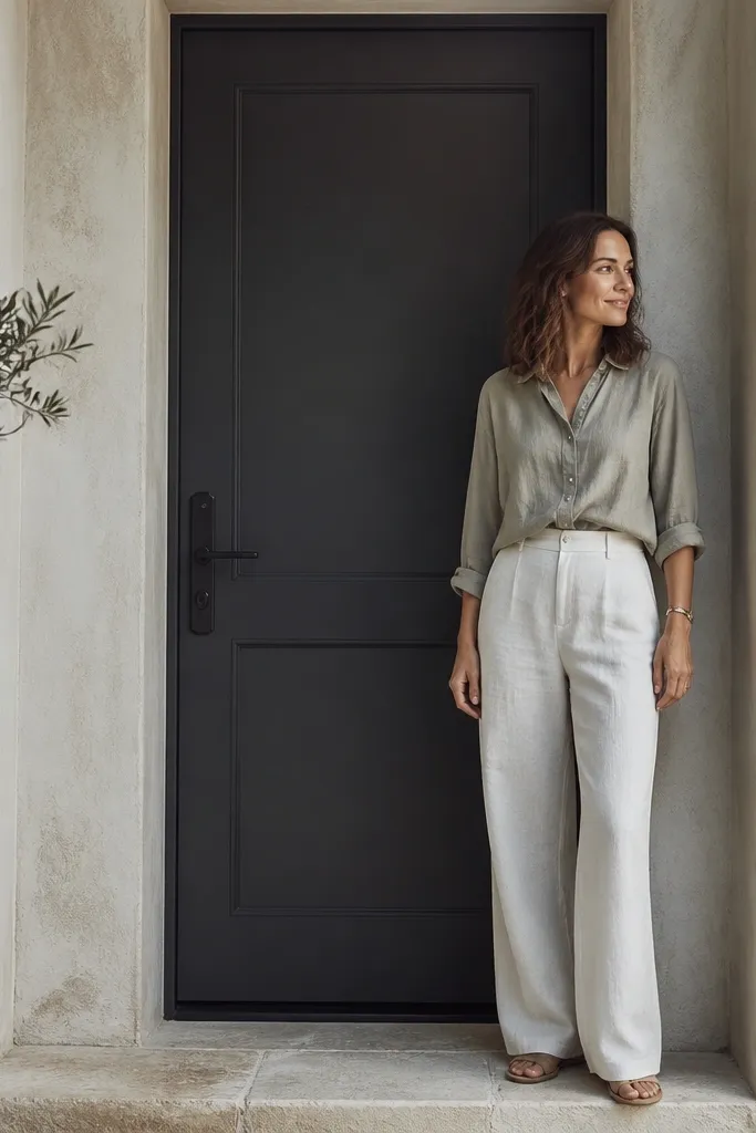
This combo works because charcoal anchors the entry while a limewash-style surrounding wall gives that textured, old-world contrast. The door itself should stay smooth and satin; the texture should be around it, not on the door surface. If your porch area has plaster-like finishes, this pairing looks curated and expensive. Use matte black hardware to tie everything together. This is a great option for people who want luxury through contrast and texture, not through metallic paint.
Skip thisAvoid adding texture to the door — it makes it harder to keep crisp and clean.
Editor's noteKeep the door color one shade darker than the shadow tone of your porch wall for a cleaner separation.
12. Pale Stone Gray with Oil-Rubbed Bronze Details
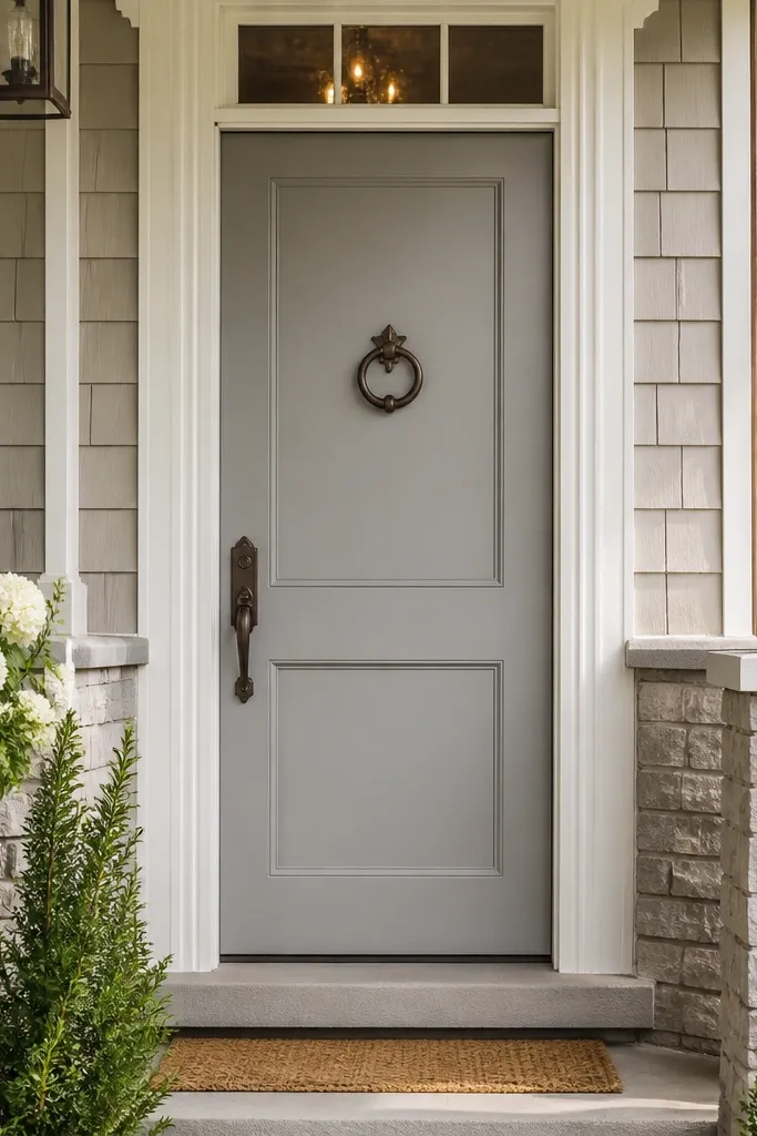
Clean and sand, then prime with a quality exterior primer that blocks tannins and evens out the base. Apply two coats of exterior pale stone gray in low-eggshell or satin, rolling smoothly to avoid lap marks. Let it dry fully, then add a third spot coat only where the panel edges show thin coverage. Use a brush to paint around glass frames and weather seals carefully so you don’t gum up moving parts.
Pale stone gray feels high-end because it’s soft and architectural, like limestone. It’s a smart choice when you have busy siding or lots of window glazing and you don’t want a dark door to swallow the entry. Bronze details add warmth so the door doesn’t look sterile. This color looks best with warm white trim and natural stone steps. It also photographs clean because the gray stays light without turning chalky when you use the right primer and finish.
Skip thisDon’t use flat paint; pale colors look dirty fast.
Editor's noteIf the door is going from dark to pale, do three coats — two can leave faint unevenness on stone grays.
13. Terracotta Clay with Antique Brass Knocker
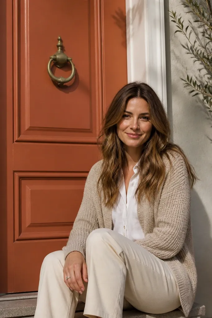
Sand and degrease, then prime with an exterior primer to prevent uneven absorption. Apply two coats of exterior terracotta clay in satin, keeping strokes consistent so the finish looks even. Tape off glass and trim edges if needed, and remove tape while paint is still soft to avoid tearing. After the final coat, inspect the corners and strike plate area for thin coverage and touch up.
Terracotta clay gives a warm, high-end look because it reads like natural fired clay, not a generic orange-brown. It’s stunning with white trim, light stucco, and Mediterranean or Spanish-influenced exteriors. Antique brass hardware makes the color feel curated and old-world. Choose a terracotta that leans slightly redder rather than pumpkin — it looks deeper and more luxurious. This is also a great option if you’re tired of gray and want something that still looks “architectural.”
Skip thisAvoid highly saturated neon terracotta; it looks trendy in the wrong way.
Editor's noteUse a primer tinted close to terracotta to reduce the number of coats and prevent patchiness.
14. Soft Sage Gray-Green with Black Hardware
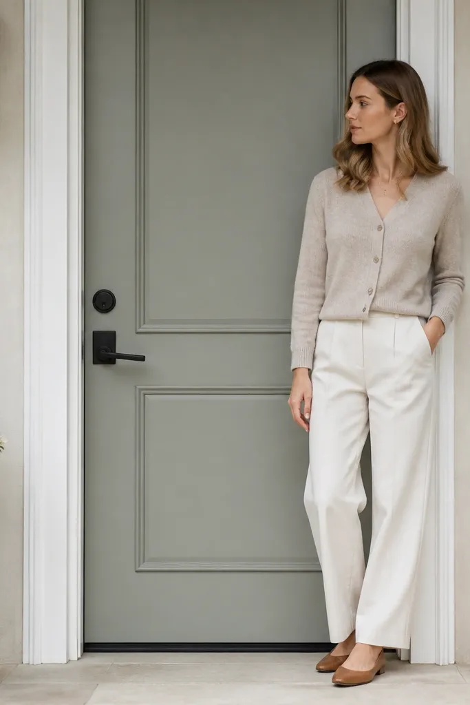
Soft sage gray-green is a luxury color because it’s calm, muted, and pairs well with both warm and cool exterior palettes. It looks especially good on doors with simple panel designs; the color does the work. Black hardware adds definition and keeps it from reading too pastel. This works well with white trim, light stone, and siding that has gray or beige tones. Under evening light, the door looks smooth and high-end instead of washed out.
Prep by sanding 180-grit and cleaning thoroughly, then prime with exterior bonding primer. Apply two coats of exterior sage gray-green in satin, rolling evenly and brushing edges. Use a foam roller to avoid bubbles and stop overworking the paint once it starts to tack up. After cure, reinstall hardware and check weather seal contact points.
Choose sage with gray undertones, not yellow-green — the yellow-green swing reads casual.
15. Metallic Bronze Paint with Clear Exterior Topcoat
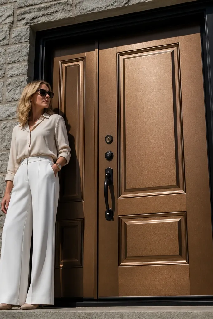
Sand and degloss, then prime with an exterior metal-ready primer if the surface is bare or previously coated unevenly. Apply metallic bronze in thin coats, keeping your spray or rolling direction consistent so the metallic doesn’t stripe. Let each coat flash as directed, then add a clear exterior topcoat over the final color coat. Keep the clear coat even; heavy clear can mute the metallic and create shine patches.
Metallic bronze can look seriously high-end when you treat it like a finish, not like glitter. The trick is using a metallic paint designed for exterior doors and then sealing it with a compatible clear exterior topcoat so it stays even and cleans up easily. This color looks amazing with black trim, dark shutters, and modern lines. It also makes glass inserts look more luxurious because the metallic tone bounces light through the panes. If your door gets harsh sun, choose a UV-rated system.
Skip thisDon’t skip clear topcoat; metallics can chalk and look uneven in a year.
Editor's noteTest a small area on the door bottom corner first — metallics show undertone fast.
16. Brilliant White with Satin Finish and Hidden Trim Lines
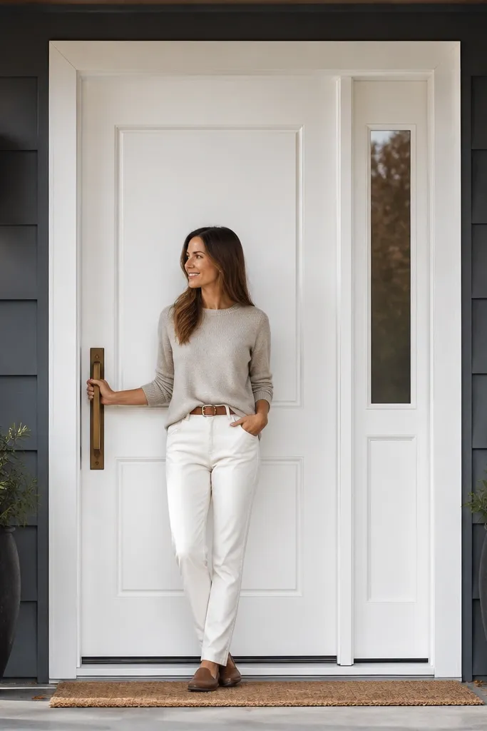
Clean, sand 180-grit, and prime with a high-coverage exterior primer so old stains don’t ghost through. Use exterior satin enamel in a true white, applying two coats with a foam roller for an even surface. Brush panel edges carefully and keep a wet edge to avoid lap marks. After full cure, touch up any tiny chips and seal around the lockset area if water gets in there.
A true brilliant white door can look high-end because it’s crisp, photo-friendly, and makes the entry feel freshly designed. The luxury comes from the finish: satin keeps it smooth and wipeable, while careful panel edges make it look custom. This color is ideal when your exterior has darker siding, stone, or black accents. Pair with dark bronze, matte black, or brushed nickel hardware for a clean focal point. If you want a luxury look without heavy color drama, this is the cleanest choice.
Skip thisAvoid off-white if your trim is already off-white — it can look mismatched instead of intentional.
Editor's noteUse a white paint labeled for trim/doors; wall whites often look too soft and dingy on entries.
17. Blush Pink-Gray with Black Knockers
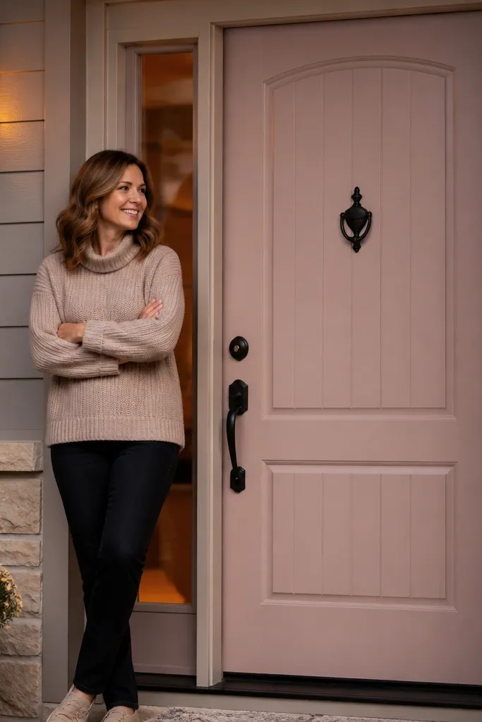
Sand and degrease, then prime with exterior primer so the pink-gray doesn’t turn patchy. Paint two coats of blush pink-gray exterior satin, using a foam roller for the door face and a brush for grooves. Tape off trim lines if you’re painting near molding, and remove tape carefully before the paint fully dries. Let the door cure before closing it against weather stripping to prevent sticking.
Blush pink-gray reads luxury because it’s sophisticated and muted, not bubblegum. It works when your exterior is mostly neutral — think white trim, light gray siding, or stone with beige tones. Black hardware adds the structure that makes the color feel designed. This is a great choice for modern entries with clean lines because the color softens the architecture without overpowering it. It also looks beautiful in photos because it keeps skin-tone warmth near the front door when you catch people coming and going.
Skip thisDon’t choose a dusty rose that’s too gray — it can read lifeless in daylight.
Editor's noteIf your exterior has lots of cool gray, test the blush in shade — some pink-grays can swing purple.
18. Deep Teal-Blue with Clear Glass Sidelights
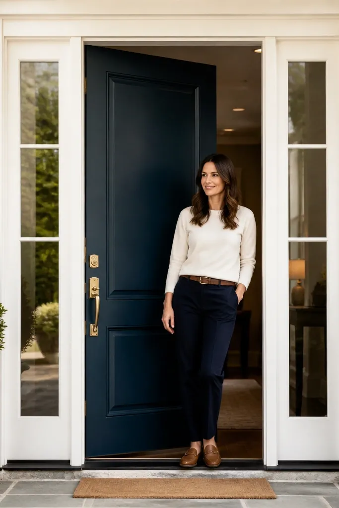
Deep teal-blue looks high-end because it’s saturated like navy, but it has green depth that makes the entry feel richer. It’s stunning with clear glass sidelights because the color adds color depth without making the glass look tinted. Use brass hardware to warm the overall look, especially if your porch lighting is warm yellow. This door color also pairs well with both stone and wood because teal has enough complexity to sit between brown and gray. It reads expensive without needing metallic paint.
Prep by sanding 180-grit and cleaning thoroughly, then prime with an exterior primer that seals the old surface. Apply two coats of deep teal-blue exterior satin, keeping coats thin for smooth coverage. Use a high-quality brush for panel edges and a roller for the field to keep a consistent finish. After cure, check around the sidelights frame for any paint buildup that could interfere with seals or operation.
Choose teal that leans more blue than green — it stays elegant instead of earthy.
Avoid teal that’s too bright; it looks decorative rather than luxury.
19. Slate Blue with White Trim and Matte Nickel
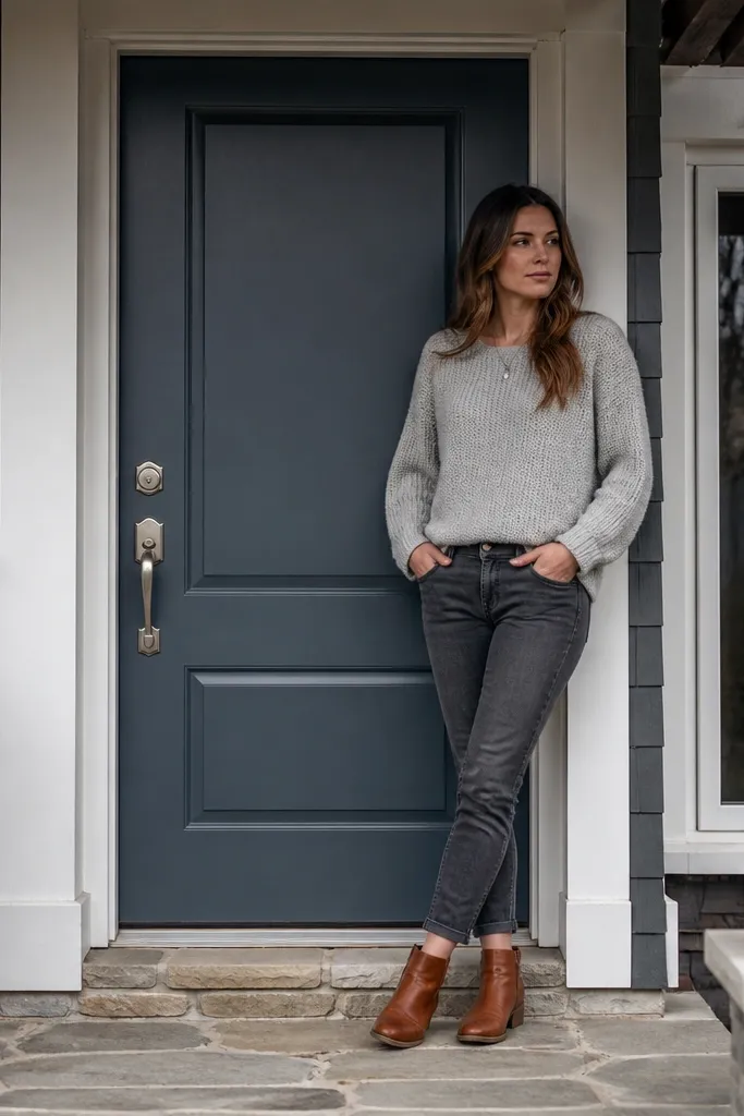
Slate blue is a quiet luxury color. It gives you color interest while staying neutral enough to work with most siding shades and roof colors. With white trim and matte nickel hardware, it looks clean, modern, and expensive without feeling loud. This is a strong option for coastal, craftsman, and contemporary homes that want a softer alternative to navy. The finish should be satin so the door looks smooth and doesn’t glare in photos.
Sand the door, then degrease and prime with exterior bonding primer. Apply two coats of exterior slate blue in satin, rolling evenly and brushing panel edges. Keep your brush strokes light — slate blues show texture more than grays. If you have glass panels, mask them with painter’s tape and plastic so you get crisp lines and don’t smear paint onto the glass edges.
For crisp results, use painter’s tape on the trim line and remove it within 10-20 minutes of finishing each coat.
Avoid thick coats; slate blue can look uneven and patchy when it dries.
20. Warm Walnut Stain Look with Exterior Clear Coat
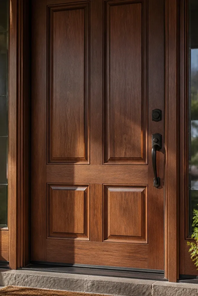
If you want high-end luxury but your door style is already detailed, a warm walnut stain look nails it. The luxury comes from depth and grain-like tone, especially on doors with raised panels. You get a richer look than solid brown paint because the tone feels dimensional. This works best on wood doors or doors that are prepped for a stain system. Pair it with dark bronze or oil-rubbed hardware so the warmth matches the hardware finish.
Sand to a finer grit (220-grit) than paint prep so the stain sits evenly, then wipe dust completely. Apply an exterior wood stain in walnut tones following the grain direction, letting it penetrate per the label. Once dry, apply a compatible exterior clear coat in gloss or satin depending on how reflective you want it, usually satin looks most premium. Lightly scuff between clear coats with 320-grit for a smooth finish.
Do a test board first; walnut stain can swing warm or cool depending on the wood species and prior coatings.
Don’t apply stain over paint — strip it first or you’ll get blotchy panel edges.



