
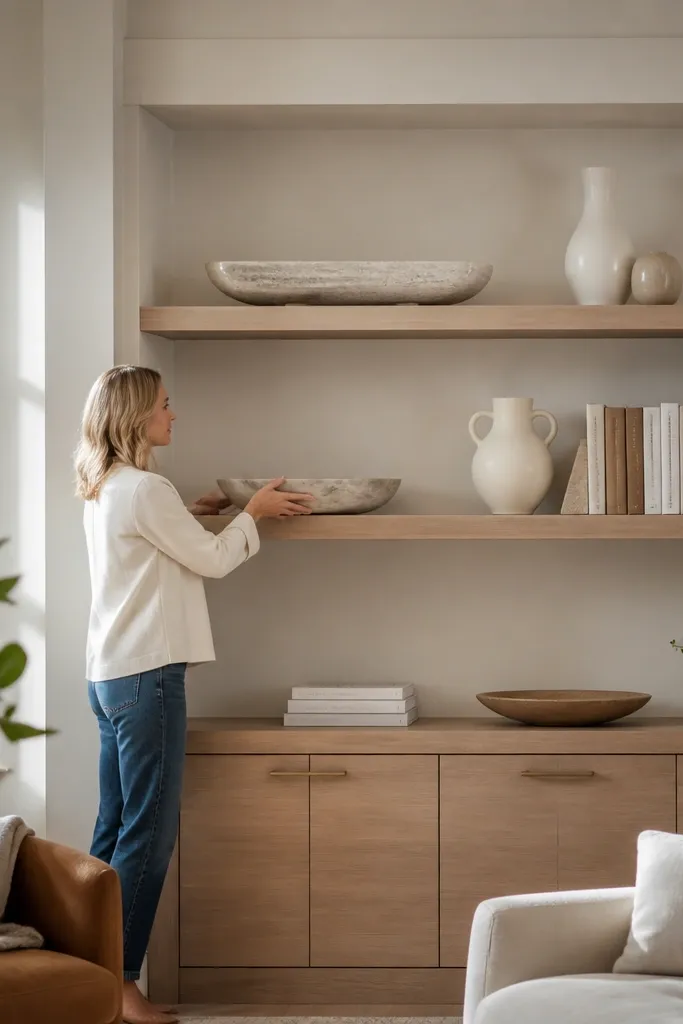
1. Charcoal stoneware + linen runner shelf gallery
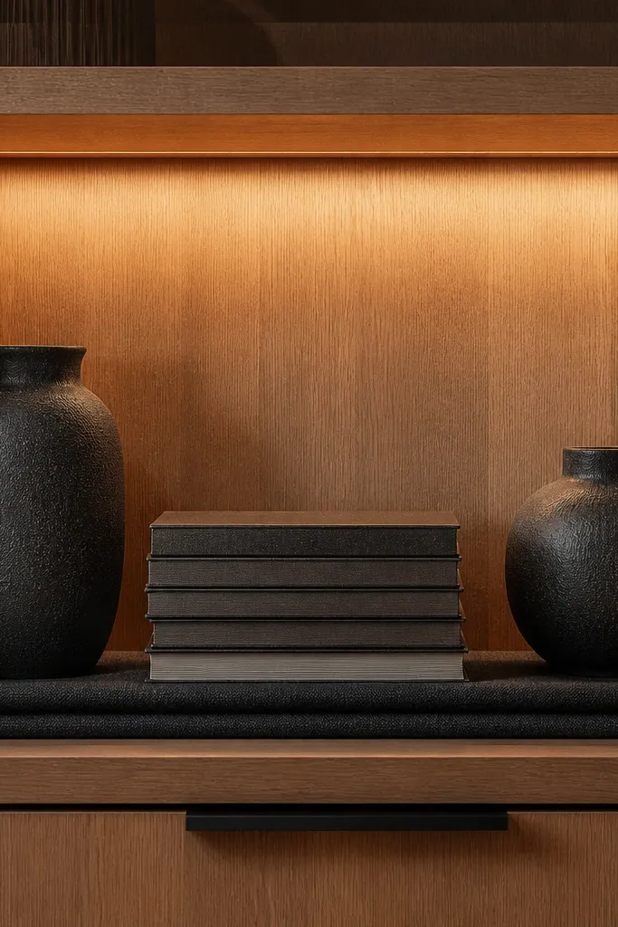
This look works because it creates a consistent “stage” instead of scattered objects. A linen runner anchors the shelf visually and softens the hard lines of built-ins, while charcoal stoneware keeps everything grounded and upscale. Use two vases or sculptural pieces, then add one stack of art books with uniform spines for order. The runner also hides minor scuffs and dust trails, so the shelf stays photo-ready longer.
Start by cutting a linen runner to the shelf depth minus 1/2 inch on each side so it looks tailored. Place it centered, then set your largest piece first and build around it with one medium vessel and one small sculptural object. Finish with a stack of 3 to 5 books, all leaning the same direction, and top with a small tray for keys or small decor.
Editor's noteUse a removable runner with a non-slip backing so it doesn’t creep when you move items.
Skip thisDon’t mix glossy ceramics with matte ceramics on the same shelf without a unifying tray or runner.
2. Aged brass picture ledge with framed shelf moments
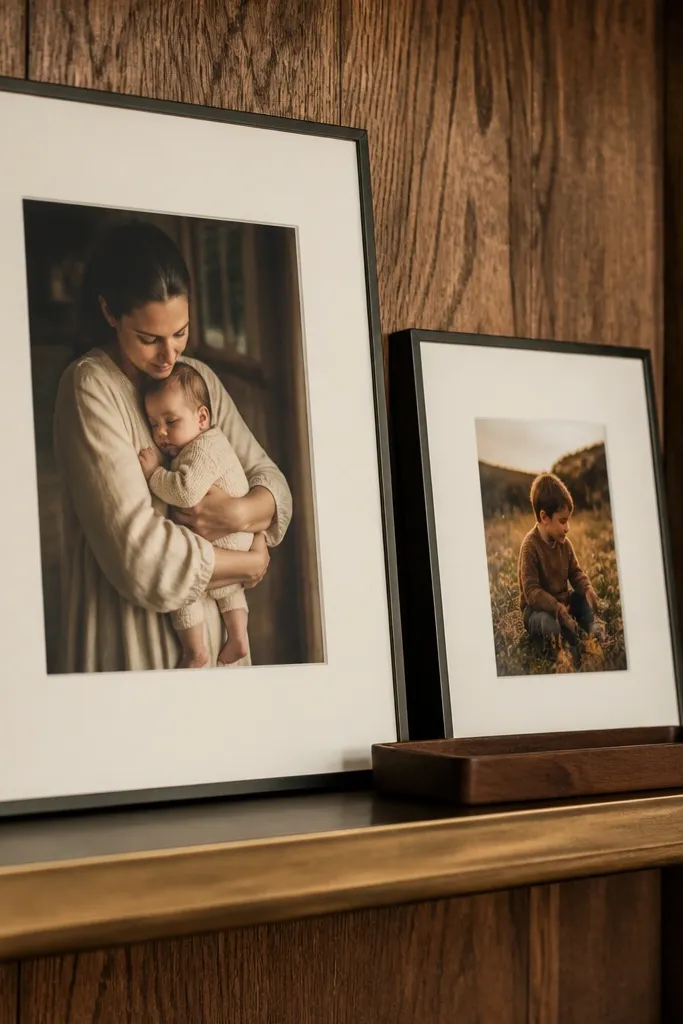
A picture ledge makes built-ins look architectural, not like open storage. The aged brass tone pairs with warm wood and most paint colors, and it adds a thin highlight line that reads luxury in photos. Keep the shelf styling minimal: a small grouping of frames and one tray, then stop. This is one of the best long-term looks because frames and trays don’t go out of style and are easy to swap.
Install a thin picture ledge across the shelf using a level and pre-drilled pilot holes so it sits straight. Choose a ledge depth around 1 to 1.25 inches so frames look supported, not floating. Arrange 2 to 4 frames in a tight cluster, then add one slim tray centered at the front edge for balance.
Editor's noteUse museum glass or glare-reducing acrylic in your frames if the shelves sit under bright lighting.
Skip thisAvoid mixing frame finishes (black, silver, gold) on the same ledge.
3. Warm wood book backs with matching spines
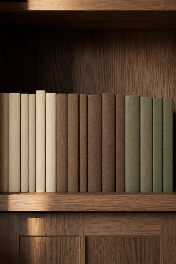
Luxury shelving often looks “designed” because the books form a pattern. If your built-ins have a wood back panel or removable backing, use it to make a color rhythm. Match spines in 2 to 3 tones so the shelf reads intentional from across the room. This approach also makes future styling easy: you can add or swap a book without ruining the whole look.
Start by selecting 12 to 18 books in 2 to 3 spine colors, then remove dust jackets if they fight your palette. Stack books so the shelf has a clean top line and no leaning that breaks the silhouette. Add one object every 2 stacks — like a small ceramic bowl or a compact sculpture — so books aren’t the only visual mass.
Editor's noteLabel the back of one book stack with a pencil mark so you keep the same arrangement when you restyle quickly.
Skip thisDon’t mix random paperback sizes that create uneven shelf edges.
4. Sculptural bud vases in a repeating 3-height grid
This is the cleanest “high-end” repeat pattern because it controls height without looking stiff. A repeating 3-height grid makes the shelf look curated even when the individual pieces are simple. Use bud vases or small sculptural vessels in a single material family like matte ceramic or clear glass with tint. The grid also hides the fact that you’re not using huge decor — it reads expensive through spacing and repetition.
Mark the shelf with painter’s tape to map 3 columns and 2 rows, then place your tallest vase in the center. Fill the remaining spots with medium and small pieces so each column steps down in height. Keep the opening of vases aligned toward the room, then add a thin tray beneath the grid if the shelf is textured.
Editor's noteChoose vases with similar rim thickness so light reflects consistently across the shelf.
Skip thisDon’t let one vase jump way taller than the grid — it breaks the luxury rhythm.
5. Black and white ceramic busts with a stone tray
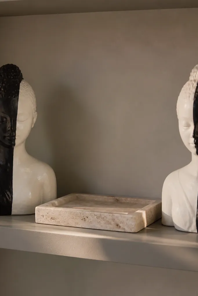
Figurative decor gets expensive-looking fast when you anchor it on a real material base. A stone or faux-stone tray gives weight and makes the busts look intentional instead of “random shelf sculptures.” Keep the color range tight: black/white/one neutral. This setup works great on wider shelves because it creates a strong center point and leaves controlled negative space around it.
Place a stone tray centered on the shelf, leaving 1 inch of space to the back. Set two busts: one slightly forward and one slightly back, both facing the room. Add one thin element like a small book or a slim candle holder to connect the busts to the shelf line, then stop — no extra clutter on this shelf.
Editor's noteUse felt pads under the busts so they don’t slide and scratch the tray.
Skip thisAvoid mixing glossy bust finishes with matte tray surfaces without a unifying dark accent.
6. Backlit shelf niche with frosted glass jars
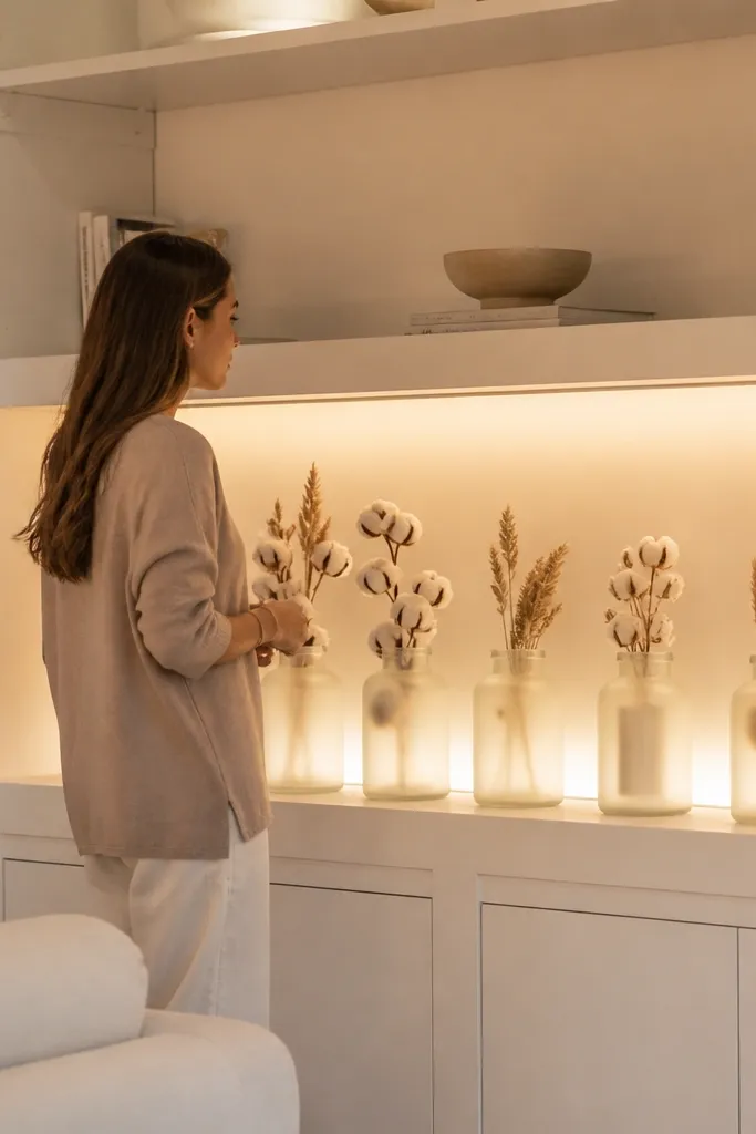
Lighting is what makes built-ins feel like cabinetry from a designer shop. A backlit niche turns ordinary jars into a display, and frosted glass hides dust and small inconsistencies. Choose neutral jar contents like cotton stems, dried wheat, or simple stones. The look lasts because the lighting stays the same even when you swap the jar contents seasonally.
Install LED strip lights behind the shelf with a diffuser cover so you don’t see hot spots. Use a warm white LED around 2700K for an expensive glow. Place 3 to 5 frosted jars on a tray or directly on the shelf, then keep the jar heights within about 3 inches of each other for a smooth visual line.
Editor's noteRun the LED control on a dimmer so the shelf doesn’t look harsh during daytime.
Skip thisDon’t place clear glass jars directly under LEDs — reflections make everything look messy.
7. Oversized framed art leaning on shelf rails
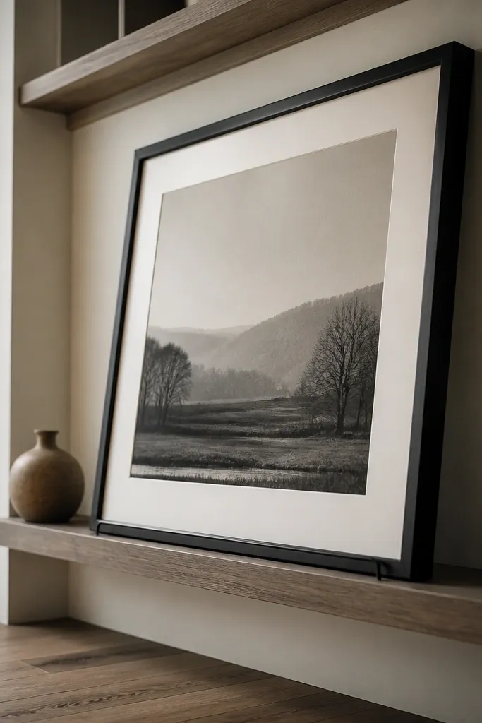
Leaning frames create a gallery vibe without needing gallery-level artwork. It’s also one of the best ways to fill a shelf end-to-end because it uses the shelf’s width as a design element. Pick one large frame for the center and keep everything else small. This is durable decor because you can swap the leaning frame art while keeping the same shelf structure.
Add two shelf rails or small ledges so the frame can rest securely at a slight angle. Choose a frame width that spans about 60 to 70 percent of the shelf width. Place a 2-book stack on each side of the frame, then add one small object at the front edge like a ceramic dish.
Editor's noteUse picture hanging wire or a small anti-slip pad under the frame feet to stop sliding.
Skip thisDon’t lean a frame without rails or pads — it looks unsafe and can chip paint.
8. Ribbed glass apothecary bottles with uniform labels
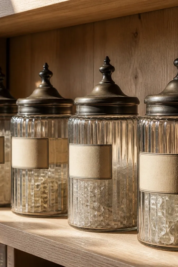
Apothecary bottles look high-end when the set is consistent. Ribbed glass catches light and adds texture without adding visual chaos. Uniform labels make the shelf read like a curated collection, not like you grabbed whatever was left. This idea lasts because you can replace labels easily and the glass set remains the anchor.
Choose 3 to 6 ribbed bottles in the same height family, then clean and dry them thoroughly. Create labels in one font style and one cream paper tone, applying them straight so they align. Arrange bottles in a gentle arc and place a small tray at the base to catch any drips or dust.
Use a matte clear seal on labels so they don’t curl from humidity.
Avoid mixing bottle heights with random label sizes; it looks like clutter.
9. Two-tone vases with painted ceramic stems
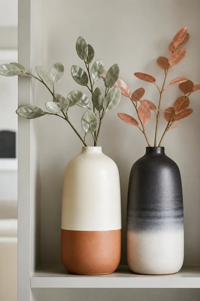
Two-tone ceramics look upscale because they create a color gradient that flatters most living rooms. Pair warm and neutral tones like cream with clay, or charcoal with off-white. Add painted ceramic stems or branches so the silhouette stays crisp even when you remove flowers. It’s a good long-term choice because stems look good dry and don’t require frequent water changes.
Pick two vases that share one color and differ in the other, keeping shapes similar. Place the taller vase in the back center, then the shorter vase slightly forward at one side. Add 1 stem bundle per vase, trimming stems so the top reaches about 2 to 3 inches below the shelf’s top edge.
Editor's noteTrim stems gradually and test the height by placing a piece of paper at the shelf top as a visual ruler.
Skip thisDon’t use overly feathery real plants that spill past the shelf line.
10. Linen-wrapped candle stacks on a brass riser
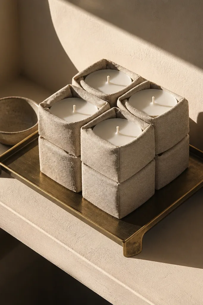
Candle styling reads luxury when it looks intentional, not like a random candle pile. A brass riser lifts the candles and creates a clean shadow line, which makes the shelf look designed. Linen wraps add soft texture, and the low height keeps the shelf from feeling cluttered. This style lasts because you can replace candles without changing the structure.
Place a brass riser centered, then stack 3 candles with linen wraps in a tight column. Add a small tray at the base to catch wax and keep the shelf surface clean. Balance the stack with a single book pile to one side so the shelf doesn’t look bottom-heavy.
Editor's noteChoose unscented candles for shelf decor — strong scents pull attention away from the look.
Skip thisAvoid mixing different candle heights taller than the riser by more than 2 inches.
11. Hidden storage doors with glass fronts and styled interiors
Open shelves are gorgeous until everyday items pile up. Glass-front sections keep the luxury look while hiding the stuff you don’t want on display. Style the inside like a vignette: matching baskets, uniform jars, and a single “hero” object. This idea lasts because the door prevents visual clutter from creeping in when life gets busy.
Add slim glass doors or retrofit sections so you can close off the lower shelves. Inside, use 2 or 3 matching containers like woven baskets in one color and clear jars with matching lids. Place one larger object in the back center and keep side containers within equal spacing from the edges.
Editor's noteUse magnetic catches and soft-close hinges so doors close quietly and stay aligned.
Skip thisDon’t mix container materials inside the glass — it reads like storage, not decor.
12. Oversized woven baskets in the bottom shelf bay
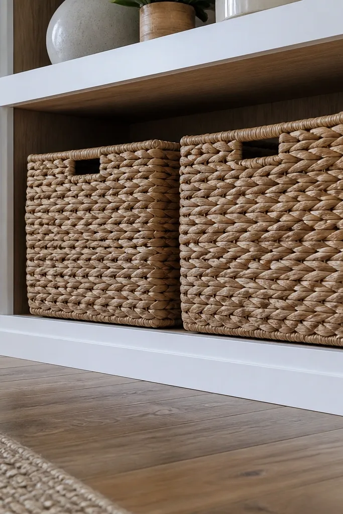
The bottom shelf is where luxury breaks first. If it’s just extra decor, it looks messy; if it’s blank, it looks unfinished. Oversized woven baskets solve both. They hide remotes, blankets, and charging clutter while adding texture that looks warm and intentional. Pick one weave color and keep it consistent across the room.
Measure the bottom bay opening and choose baskets that leave about 1 inch of clearance on each side. Line the basket bottoms with a flat fabric sheet so small items don’t fall through. Add a folded linen throw on the top of one basket and keep the rest of the shelf surface clear.
Editor's noteUse baskets with flat bottoms so they sit square and don’t sag in the corners.
Skip thisAvoid baskets that are too small — they create gaps that scream “temporary storage.”
13. Mirror-backed shelves with black frames and white ceramics
Mirror backing makes shelves look deeper and brighter, which is exactly what high-end built-ins do. The trick is to keep it crisp: black frames or trim and white ceramics so the reflection doesn’t turn into visual noise. Add a few sculptural ceramic pieces and one tray so the mirror has something clean to bounce. This lasts because mirror and ceramics stay in style and the shelf always looks “full” even with fewer items.
Use mirror panels cut to fit the shelf bays with a thin black frame or trim border. Wipe the mirror with streak-free glass cleaner before styling. Place 2 to 4 white ceramic pieces in a loose cluster and add a black tray at the front to anchor the reflection.
Editor's noteKeep the mirror panels slightly offset from the back edge so you get a subtle shadow line.
Skip thisDon’t fill the shelf with too many small objects — mirrors amplify clutter.
14. Matte black metal bookends with tall bud vase
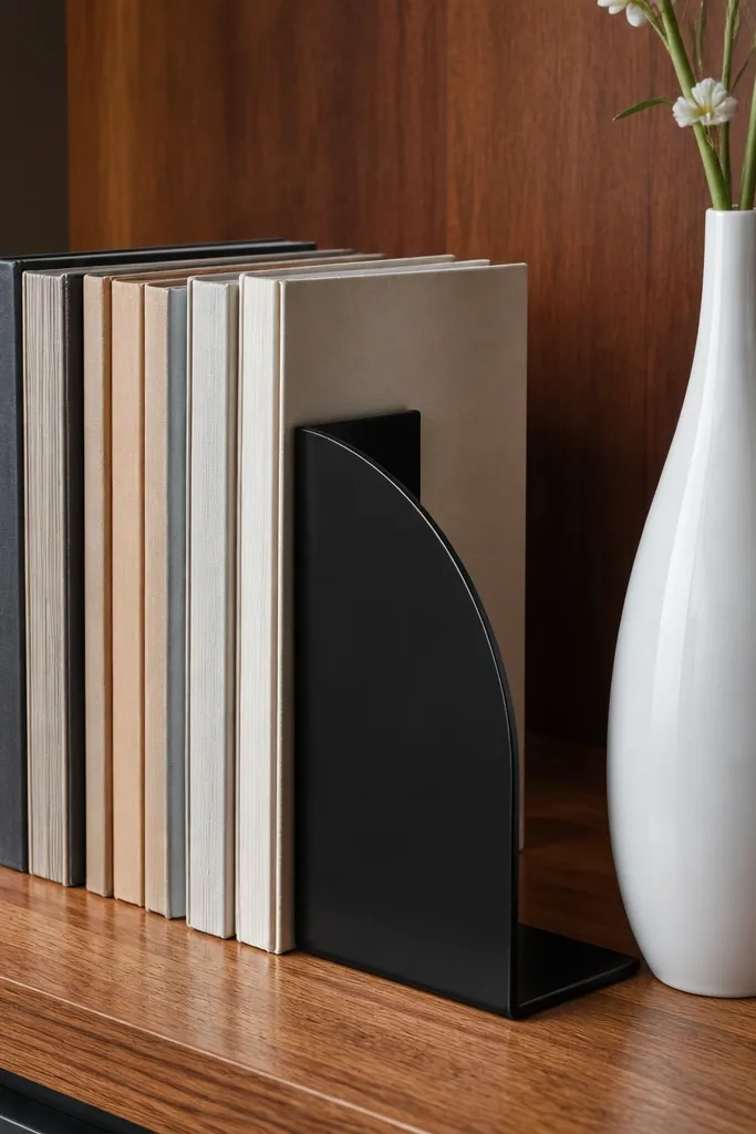
Bookends are the easiest way to make books look architectural. Matte black metal looks sharp against wood and painted shelves, and it gives your shelf a defined “spine.” Pair one tall bud vase with a controlled book block. This combo lasts because it’s stable: books don’t shift like loose decor, and a single vase is easy to swap.
Choose bookends with a flat base and a slim footprint so they don’t crowd the shelf. Stack books so the top stays level, then place the vase at center back with its height reaching about 70 percent of the shelf bay. Add one small object at the front edge, like a ceramic dish, to complete the triangle of visual weight.
Editor's noteUse a straightedge to align the book spines — crooked stacks ruin the luxury look fast.
Skip thisDon’t use bulky bookends that cover too much of the shelf surface.
15. Stacked wood boxes + ceramic bowl on the lower shelf
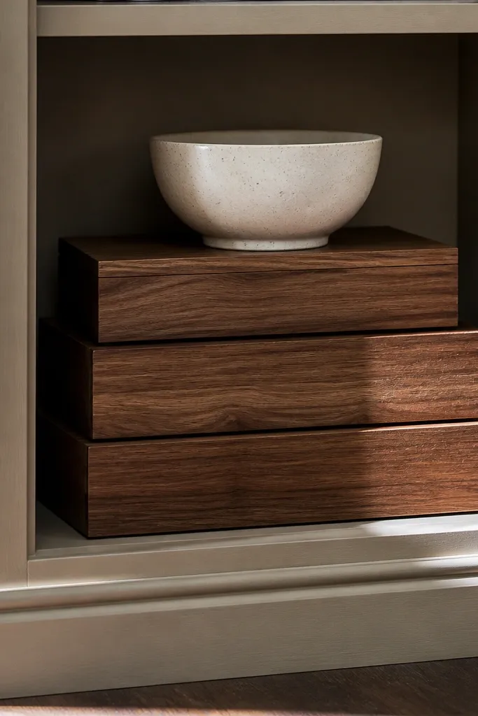
If you want the “expensive cabinet” look, treat storage like decor. Stacked wood boxes in one finish create rhythm and hide small items without hiding everything. A single ceramic bowl on top adds softness and a focal point. This idea lasts because boxes age well and you can change the bowl or contents without redoing the entire shelf.
Pick two or three wood boxes with the same color family and matching lid styles. Stack them so the tallest box sits at the back and the stack stays within the shelf width. Place a ceramic bowl centered on top, then add one slim book or magazine at the side only if the shelf needs a visual counterweight.
Editor's noteSeal the boxes with a matte clear coat so they wipe clean and don’t look dry after a year.
Skip thisAvoid random box sizes that create an uneven silhouette.
16. Gallery row: three framed photos with matching brass hooks
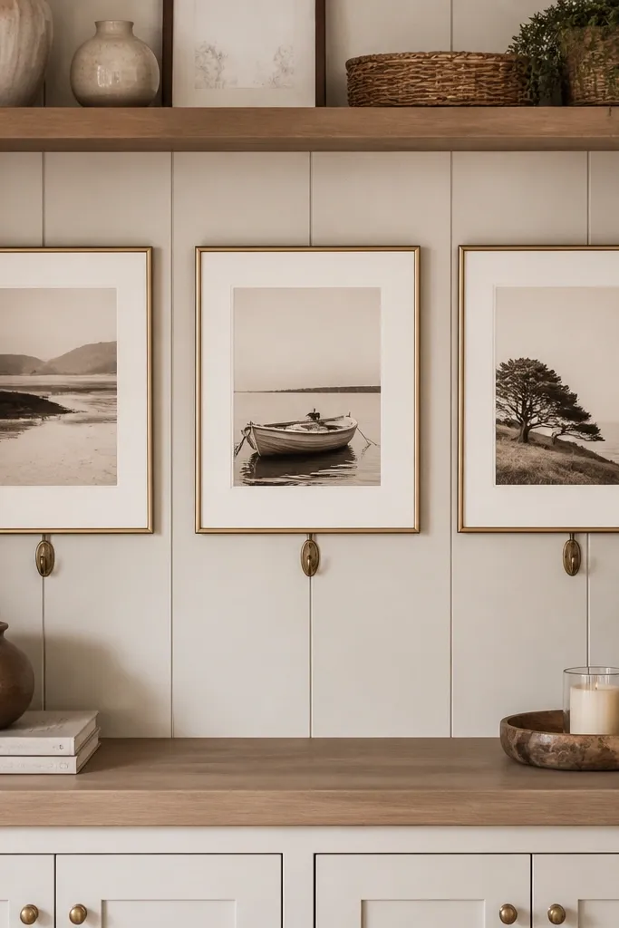
A row of frames looks high-end when it’s measured, not “eyeballed.” Matching brass hooks or small hardware pieces add a subtle metal repetition that ties the whole built-in together. Keep the frames the same size and align their bottoms to one line. This is a shelf decor idea that lasts because photos and prints are easy to rotate while keeping the hardware and spacing rules unchanged.
Choose three frames in the same dimensions and finish, ideally with thin mats. Align the frames so the bottom edge forms a straight line across the shelf, using painter’s tape as a guide. Add matching brass hooks or small hanging clips under one side of the row, then place one small object like a tray or candle between the hooks and the frames.
Editor's noteTape a paper grid to the shelf before placing anything so your spacing stays even.
Skip thisDon’t mix frame sizes — staggered sizes can look casual unless you have a full gallery wall plan.
17. Tall standing art object paired with low books
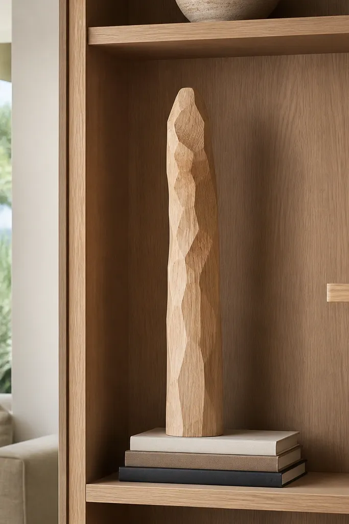
A tall standing object gives your shelf a vertical anchor, which is what most people miss. Pair it with low books so the shelf doesn’t become top-heavy or cluttered. The visual contrast reads expensive: upright silhouette against clean book blocks. Choose one hero object only — a ceramic column, a sculptural wood piece, or a tall glass vessel — so it doesn’t look like a junk collection.
Place the tall object in the back corner, not the exact center, so the shelf feels dynamic. Build a low book stack directly opposite it to balance the weight visually. Add one small tray or dish at the front edge near the books, then keep the rest of the shelf empty to preserve negative space.
Editor's noteUse a level to ensure the hero object is perfectly vertical; leaning objects look messy fast.
Skip thisAvoid adding a second tall item — it kills the hero effect.
18. Ceramic plate wall display on shelf backs
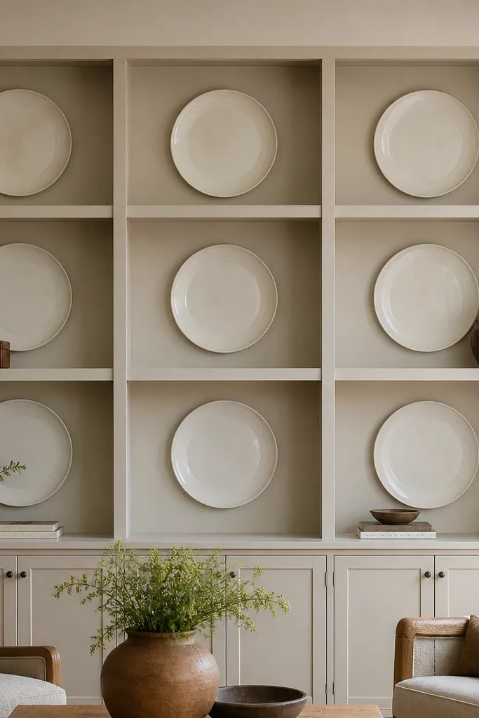
Plates on shelf backs look like a custom showroom without needing wallpaper or a full gallery wall. When the plates are mounted flat and spaced evenly, they create a decorative surface that hides the fact you’re styling shelves without constant rearranging. This works especially well in living rooms with neutral walls because the plates add pattern where your eyes already travel. Choose one glaze family for consistency: matte white with black speckle, or warm cream with subtle gold lines.
Mount plates to the shelf backing using plate hangers or small picture hooks rated for ceramic weight. Space them so the gaps between plates are consistent, then step back and adjust until the pattern reads balanced. Add one small bowl or candle at the bottom front of the bay and keep any books minimal so the plates stay the main event.
Editor's noteUse plate hangers with soft grips to prevent hairline cracks from pressure points.
Skip thisDon’t hang plates unevenly across multiple shelves — it reads accidental.
19. Matte white vases with a single black accent line
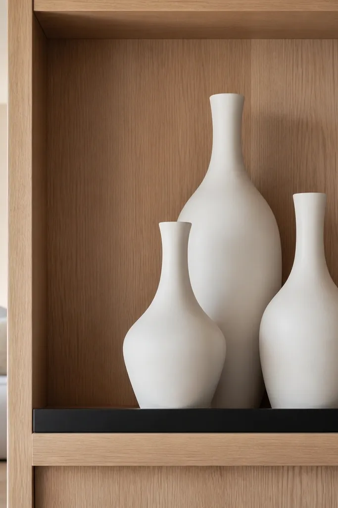
This is the tightest, most reliable way to get that high-end look: keep everything matte, keep everything light, then add one black accent line to frame the shelf. Matte white ceramics reflect less light than glossy pieces, so the shelf stays calm and doesn’t glare in photos. The black accent line — a thin tray, a black book spine, or a slim candle holder — gives you contrast that reads intentional. It’s a styling rule you can repeat on every shelf bay.
Set one black tray centered at the front edge, then place 2 matte white vases behind it in a staggered height arrangement. Add one book stack with black spines or a single black-lined book at the side. Leave at least 2 inches of clear space between the vases so they don’t merge into one blob.
Editor's noteWipe matte ceramics with a microfiber cloth — fingerprints show more than you think on matte glaze.
Skip thisAvoid adding multiple black accents; one line reads designed, three reads busy.
20. Weathered terracotta planters with a glazed shelf rail
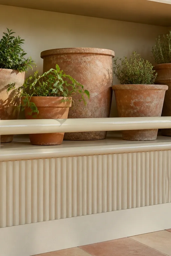
This is the built-in shelf look that survives real life. Terracotta planters handle dry air and occasional watering mistakes better than most ceramic, and the warm clay color hides scuffs that happen over time. A glossy glazed rail across the shelf face pulls everything together and makes the styling look intentional instead of random. Use this in living rooms that get sun — the terracotta warms the room and the glaze reflects light without looking shiny-cheap. Skill level is medium because you are matching rail trim to the shelf opening and sealing the planter area, but the build time is still a weekend project if your carpentry is solid.
Cut a 3/4 in thick shelf rail to run the full inside width of the built-in with 1/2 in returns at each end. Use 1x3 or 1x4 hardwood for the rail, then sand to 180 grit and stain to a warm walnut tone before glazing. Seal the top surface of the rail with a clear water-based polyurethane, then apply a thin coat of ceramic-style glaze paint made for trim, and let it cure fully before placing anything on it. Set terracotta planters that match in diameter — aim for 6 in, 8 in, and 10 in — and space them so the smallest sits centered over the rail seam and the larger ones align with shelf supports. Line the shelf bay under the planters with a thin plastic drip tray or a sealed wood panel so water never soaks into the built-in.
Editor's noteDry-fit every planter with the shelf rail in place and mark the exact footprint before you seal anything. If you seal the wood first, you can wipe spills up fast without staining the finish.
Skip thisDon’t place terracotta directly on bare wood — water marks show up fast and you can’t sand them out without redoing the finish.



