
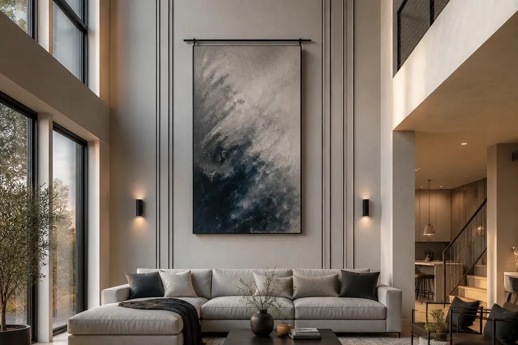
1. Oversized vertical slat wall with a centered art rail
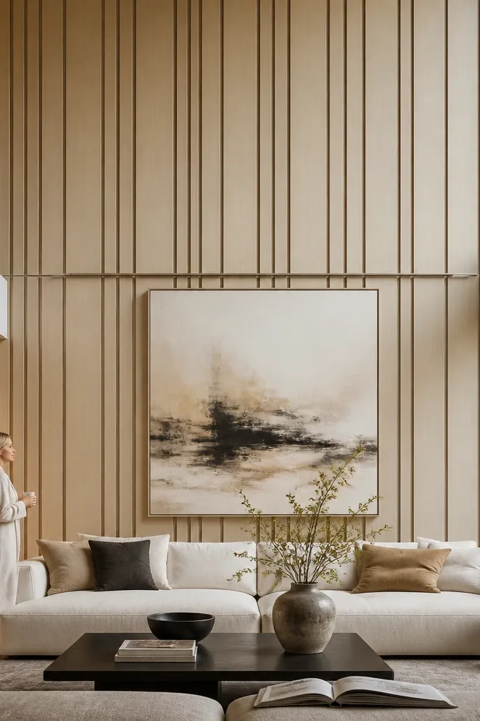
This is one of the cleanest ways to make a double-height wall feel modern without clutter. Vertical slats pull the eye up, and the centered art rail gives you a flexible way to hang one big piece or a tight pair. Use a light wood tone like ash or pale oak so the slats reflect some light and keep the wall airy. The shadows between slats create depth, which is exactly what flat paint can’t do on a tall surface. It suits living rooms with contemporary furniture — think clean lines, neutral upholstery, and minimal patterns.
Editor's notePre-sand slats to 180 grit and wipe with tack cloth before sealing so the finish looks even up the wall.
Start by marking a level centerline on the wall and deciding your slat width and gap (a strong modern combo is 2.5-inch slats with 0.75-inch gaps). Install a horizontal ledger at your anchor height (around 60 inches) so your first slat row stays straight. Then mount vertical backer battens spaced to match your slat mounting points, and screw the slats onto the battens. Finish by adding the art rail centered on the wall, and seal the wood with a matte clear coat to reduce glare.
Skip thisDon’t vary slat gaps — even a 1/8 inch inconsistency reads obvious on tall walls.
2. Herringbone wood paneling above the sofa
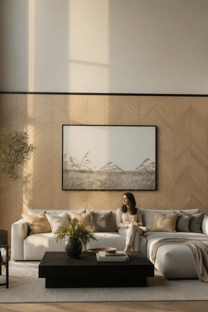
Herringbone adds movement without looking busy, and it’s perfect for a double-height wall because the pattern naturally guides the eye upward. Keep the panel height to a defined band so it feels like a tailored design, not wallpaper. The look feels modern when the wood is light and the spacing is crisp. Add a thin painted border around the band to frame it and make the pattern pop. This works well in rooms with a neutral palette — it brings warmth while staying structured.
Editor's noteUse a track saw or miter saw with a stop block so every strip length stays identical for a sharp, photogenic pattern.
Measure a band starting around 55-65 inches from the floor and stopping at a height that leaves 2-3 feet above for negative space. Build a simple rectangle frame from 1x3 lumber and mount it level to the wall. Install plywood backing inside the frame, then cut individual lath strips for the herringbone at a 45-degree angle. Nail or screw the strips to the backing, keep the joints tight, and finish with a matte stain or natural oil finish.
Skip thisDon’t go too dark — dark herringbone on a tall wall can swallow light and make the room feel heavy.
3. 3D plaster wave panels with a single matte highlight line
Raised wave panels look modern because they catch light differently as you walk past the wall. The trick is subtlety: the wave depth should be shallow enough that the wall still reads calm, not sculptural chaos. A thin satin accent line (like a 1-inch reveal) gives you a controlled highlight without turning the whole wall glossy. This is a great choice when you want texture but your furniture already has patterns. It also photographs well because the shadow edges stay legible even in daylight.
Skim-coat the wall flat first, then mark a centered layout for your wave panels (keep them in a vertical band). Use pre-made flexible plaster sheets or a molded foam template system, then adhere it to the wall with a thinset or specialty adhesive rated for wall texture. Trowel skim coat over seams, then texture with a smoothing trowel for consistent wave edges. Finish with a matte white or warm greige paint, and add a thin satin stripe using painter’s tape for crisp lines.
Let texture cure fully before painting so the surface doesn’t absorb paint unevenly and create blotchy shadows.
Don’t paint over humps before they cure — soft texture can smear and lose the wave definition.
4. Backlit vertical channel wall in matte white
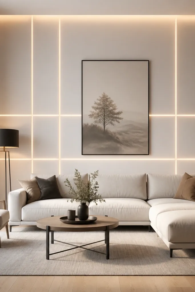
Backlit channels make a double-height wall look architectural even when the room is simple. The vertical channels create a clean, modern grid in light form, and the glow adds depth without needing heavy materials. Choose matte white around the channels so the light looks soft, not harsh. This design is ideal when you want a “designed” look at night and day. It also helps if your room lighting is flat — the wall becomes a secondary light source.
Plan your channels first: a common layout is 8-10 channels about 1 inch wide with 6-8 inch spacing, centered on the wall. Build a shallow MDF or PVC channel frame with a 1/2-inch reveal and install it with construction adhesive plus screws into studs or blocking. Add LED strip channels rated for recessed use, with a diffuser cover so the glow looks even. Run wiring to a transformer and controls, then paint the wall and channel faces matte white.
Use a diffuser cover and aim for even brightness across channels — hotspots look cheap fast in tall spaces.
Don’t skip diffuser — bare LED strips create visible points that ruin the clean glow.
5. Gallery wall grid with floating shelves and picture ledges
A grid-based gallery wall keeps the wall from feeling chaotic while still letting you personalize the space. Floating shelves break up the height in a controlled way, and picture ledges let you swap art without rebuilding. Modern versions use consistent frame sizes or consistent spacing, so the wall looks designed instead of “random frames.” This works especially well if you already own artwork you want to display. The grid also gives you a clear plan for where to place each piece.
Choose a grid spacing that matches your frames, like 16 inches between horizontal lines. Mark the grid on the wall using a laser level, then install a hidden rail system or French cleat backing behind the shelves. Mount floating shelves only where you can hit studs or use proper anchors rated for the shelf load. Add picture ledges below the highest shelf so artwork sits at a consistent eye-line, then finish with frame hardware that matches the shelf color.
Keep frames in one finish family (black, brushed brass, or oak) so the wall reads modern even with mixed art.
Don’t mix frame sizes wildly — tall walls amplify visual noise.
6. Full-height framed paneling with a central vertical column
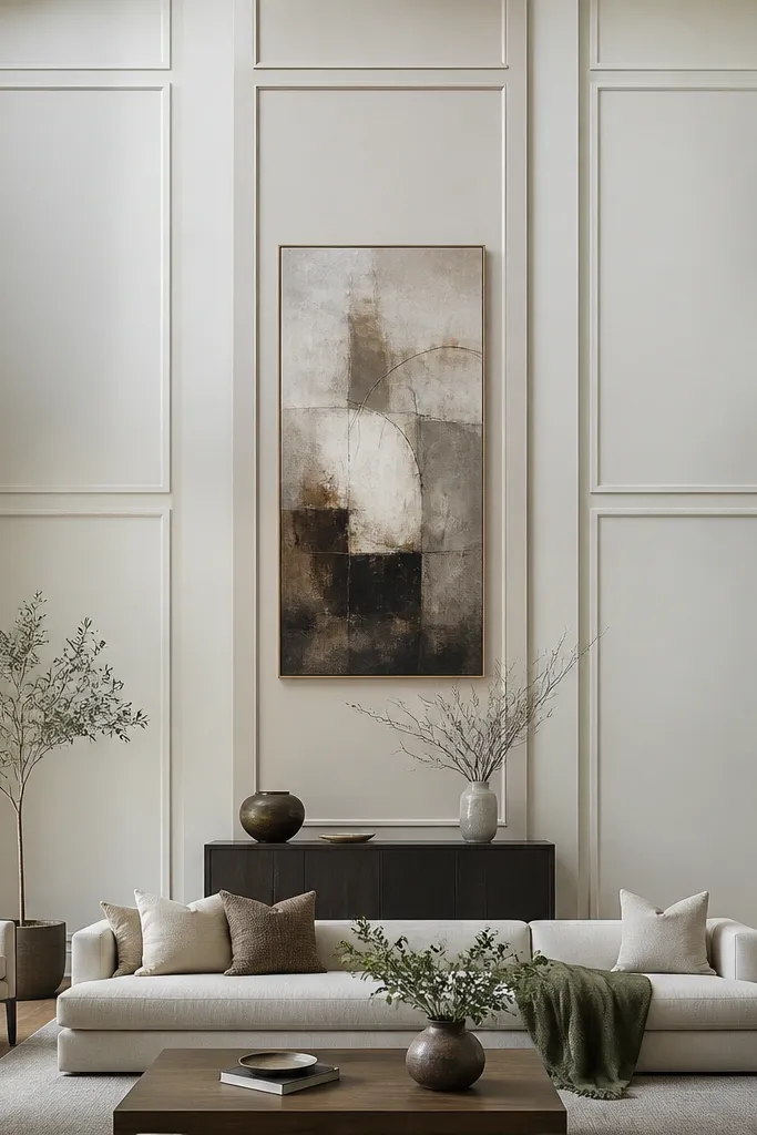
This is the modern take on classic wall molding: a clean frame pattern that looks intentional across the whole double-height height. The central vertical column gives the eye a path upward, so the wall never feels split into two separate zones. Use simple flat trim profiles and keep the paint finish matte or eggshell. It’s a strong option for rooms with large sofas and minimal decor because the wall does the heavy lifting. When done with crisp caulk lines, it looks custom without needing stone or tile.
Editor's noteUse a 1/8-inch caulk bead tool for uniform lines — it keeps the panel look sharp.
Start by deciding your panel grid: a safe modern layout is rectangles that are about 12x24 inches, repeated in a balanced way. Install a base perimeter trim first, then add vertical and horizontal battens using a stud finder for secure fastening. Cut trim pieces to match, glue and nail them, and fill gaps with paintable caulk. Finish by priming and painting in a single color, then add the central vertical column trim last so it looks perfectly aligned.
Skip thisDon’t paint trim without caulking — hairline gaps show up instantly on tall walls.
7. Oversized fabric wall panels with vertical seams
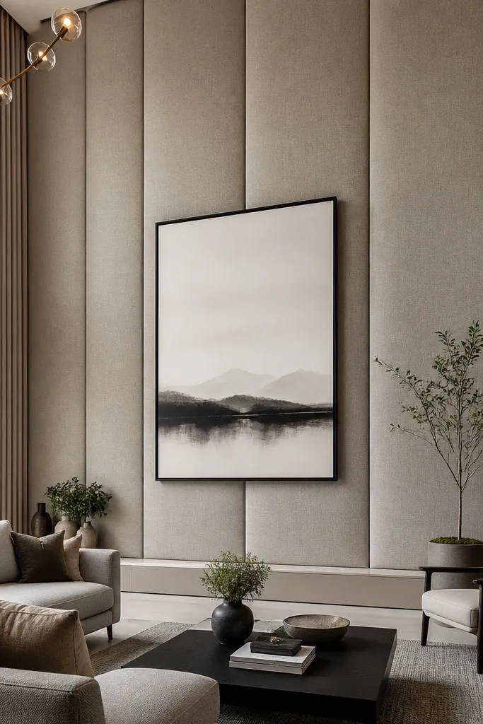
Fabric panels are a cheat code for a double-height living room because they soften acoustics and look luxurious without heavy construction. Vertical seams keep the layout modern, and the large scale makes the wall feel designed. Choose performance fabric in a neutral like oatmeal, dove grey, or warm greige so it stays clean visually. This works best when your room has hard surfaces like stone floors or glass — the fabric adds warmth and reduces echo. It also photographs well because the texture stays consistent and matte.
Build or buy panel boxes with a consistent thickness, like 1.25-inch, and cut foam backing to fit. Stretch fabric tightly over each panel and staple to the back, then attach panels to a wall backing grid (hit studs or use rated anchors). Keep seam spacing consistent, like 2 inches between panels, and align them from a centerline. Finish by trimming edges cleanly and adding a simple top rail or trim cap for a polished look.
Use a tensioning method (pull fabric in opposite directions) so the fabric doesn’t bag over time.
Don’t choose shiny fabric — it creates glare that makes the wall look uneven in photos.
8. Limewash plaster wall with a geometric shadow reveal
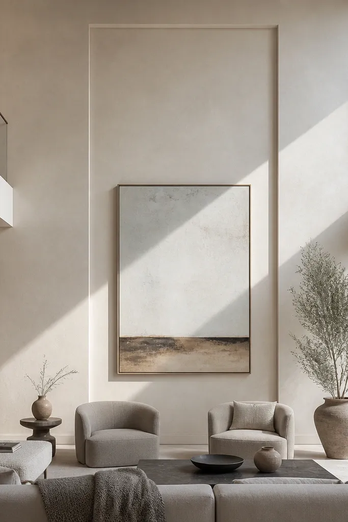
Limewash-style texture gives you depth without looking like wallpaper, and a geometric recessed outline makes it modern. The reveal creates a shadow line that looks high-end because it’s all about lighting, not extra decoration. Choose a neutral limewash tone like warm white or pale clay to keep it airy. This design suits rooms that already have strong furniture shapes and need a textured backdrop. It also works well if you want something that hides minor wall imperfections.
Editor's noteUse thin coats of limewash and build slowly — thick coats look muddy on tall walls.
Skim and smooth the wall lightly, then apply a limewash plaster system in thin coats so you get even variation. Before it cures, tape and mark a geometric outline where your shadow reveal will be — a simple rectangle frame is best. Install a thin MDF or plasterboard reveal strip (about 3/4-inch deep) along the outline, then finish the reveal with the same limewash or a slightly lighter tone. After cure, paint the surrounding area matte and remove tape cleanly for sharp edges.
Skip thisDon’t make the reveal too deep — deeper cavities cast heavy shadows that can look dramatic in a bad way.
9. Wood slat wall with a built-in bench-height credenza niche
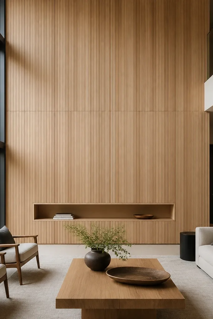
This combines vertical slats with one functional architectural element, so the wall has a job. The niche gives you a place for books, trays, or a small display, and it breaks up the tall surface into readable sections. A bench-height opening also connects visually to seating, which makes the room feel grounded. Choose a warm wood finish and matte paint around the niche for contrast. It’s a great choice if you want a modern wall that still feels practical.
Editor's noteUse a laser level to keep niche edges perfectly square — slight skew reads instantly on tall walls.
Start by laying out your slat grid and niche rectangle on a centerline, with the niche top around 46-50 inches depending on your sofa height. Install the slat backer battens first, then frame the niche with 2x2 or 1x3 lumber anchored to studs. Cut a backing panel for the niche and finish the inside with a matching wood or paint. Finally, attach the slats over the surrounding area so the niche edges look crisp and intentional.
Skip thisDon’t place the niche too high — if it rises above eye-line, it stops feeling connected to the seating area.
10. Stone-look porcelain tile mosaic panel in a tall frame
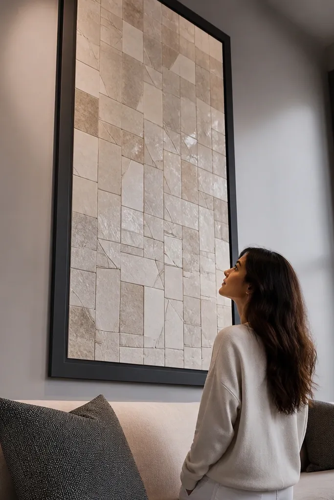
A tile mosaic band inside a tall frame is one of the most photogenic double-height wall designs because it creates sparkle and depth. Use stone-look porcelain for consistency — it reads upscale without the unpredictability of natural stone. The frame keeps it modern, and the mosaic scale should be medium, not tiny, so it doesn’t look like bathroom tile. This is a strong pick if your living room has sleek flooring and you want one statement wall that feels architectural.
Editor's noteDry-fit the mosaic sheets on the floor first so you can adjust the pattern direction before it’s on the wall.
Mark a centered rectangle band on the wall with a clear top stop and bottom stop, leaving negative space above and below. Build a flat frame using cement board or a wood frame sealed for tile, then attach cement board to the wall where the mosaic will sit. Plan your tile layout with spacers and dry-fit to confirm the look. Set tiles with thinset rated for porcelain, grout after cure, then seal the grout lightly if the manufacturer recommends it, and finish the frame with paint or tile trim.
Skip thisDon’t use glossy stone-look — it reflects room lights and can make the mosaic look messy.
11. Microcement wall with a thin vertical stainless reveal
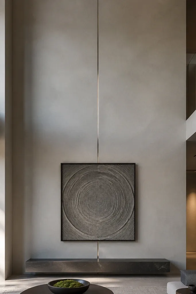
Microcement looks modern because it’s smooth, continuous, and slightly textured without big patterns. Add a thin vertical stainless reveal and you get a clean line that feels architectural. This design works when you want a calm wall but still want something that catches attention. It’s also good for open-plan living rooms because the wall doesn’t fight your furniture. The reveal gives the eye a path upward, which matters on double-height walls.
Editor's noteUse a level guide strip for the stainless reveal so it stays straight from floor to ceiling.
Prep the wall with proper smoothing and prime for microcement compatibility. Apply microcement in thin layers following the product system, usually with a base coat, then a finishing coat. While finishing, install a stainless reveal strip by anchoring it to the wall at the centerline using the manufacturer’s recommended fasteners. After cure, seal the surface with the microcement top coat so it stays uniform and easy to clean.
Skip thisDon’t skip the system primer — microcement adhesion problems show up as peeling on large walls.
12. Concrete-look lime plaster with a floating picture box
A concrete-look wall is modern and dramatic, but it can feel flat unless you add a crisp element. A floating picture box does that job: it creates a layered depth effect and frames your artwork like architecture. Keep the picture box edges sharp with painted trim so it contrasts with the texture. This design suits rooms with dark frames, black metal accents, or industrial lighting. It’s also great if you want one statement moment without covering the whole wall in texture.
Editor's noteUse a consistent artwork size so the box looks intentional; stretching art to fit looks off on tall walls.
Apply a concrete-look lime plaster product or cement-based texture system and let it dry fully. Mark the picture box center and size, then build a shallow box from 1x material or MDF, typically 2-3 inches deep. Attach the box to the wall using screws into studs, then fill seams and caulk edges for a clean shadow gap. Paint the box in a contrasting matte color and mount artwork using picture hardware that keeps it centered.
Skip thisDon’t make the box too thick — chunky boxes look heavy on double-height walls.
13. Matte paint ombre wall with a stepped trim border
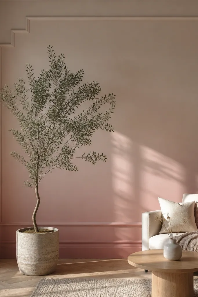
Ombre paint can look expensive on a double-height wall because the gradient uses the height you already have. Add a stepped trim border and it turns a paint trick into a structured design. Keep the gradient subtle — think warm white to pale greige, not loud color blocks. The stepped border gives a modern rhythm and keeps the wall from looking like a DIY experiment. This works well when your furniture is modern and you want color without patterns.
Editor's noteUse a 2-inch angled brush for blending so you don’t get harsh bands.
Pick two paint shades close in value, like warm white and pale greige, and test on a large poster board first. Tape a stepped border shape on the wall using a level and measure the step heights, like 10-inch steps. Apply the base coat, then sponge or roll the second shade gradually upward and blend edges with a dry brush technique. Remove tape while paint is slightly tacky for clean lines, then install optional thin trim pieces if you want a raised effect.
Skip thisDon’t choose a high-contrast gradient — it reads chaotic in tall spaces.
14. Two-tone panel wall with a lower band in warm wood

Two-tone walls look modern because they separate the wall into zones without needing a ton of decor. The lower warm wood band ties into furniture and flooring, while the upper painted panels keep the space bright and airy. This is one of the easiest ways to make a double-height wall look designed even if you’re not adding art. Choose a wood veneer or slatted finish for the lower band and keep the upper section in matte paint. The contrast creates depth and makes the wall feel intentional from every angle.
Decide your split line, usually around 72-84 inches from the floor depending on sofa height and art placement. Install a simple panel frame system for the upper section using battens and flat trim profiles. For the lower band, attach a wood veneer panel or install vertical slats on a backer grid up to your split line. Caulk all trim seams, prime bare wood edges, then paint the upper panels and seal the wood band with a matte clear coat.
Stain or seal wood before attaching it if possible — it’s cleaner than trying to seal after installation.
Don’t skip priming the trim edges — unprimed wood can flash through paint.
15. Oversized framed mirror with a thin black border
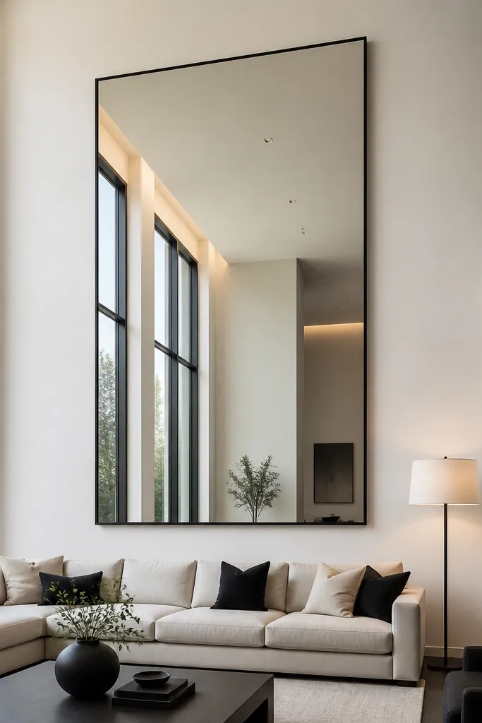
An oversized mirror is a modern wall design that solves two problems at once: it fills a double-height wall and it reflects light to make the room feel larger. The thin black border keeps it contemporary and prevents the mirror from looking heavy. Position it so it sits above the sofa line, with the bottom edge roughly 6-12 inches above the sofa back. This design is especially good in rooms with limited natural light. It’s also photogenic because reflections add depth and movement.
Editor's noteUse shims during mounting so the mirror is perfectly level — tiny tilt shows up hard in tall reflections.
Pick a mirror size that is about 50-70% of the wall width and tall enough to hit the double-height scale. Use a wall-mount mirror bracket system rated for the mirror weight, and locate studs or install blocking. Install the mirror frame or backing first, then mount the glass securely. Finish by aligning the mirror centerline with your room’s focal point and use a thin black trim molding to frame it cleanly.
Skip thisDon’t pick a thick ornate frame — it fights the clean modern scale.
16. Floating media alcove with stacked acoustic panels
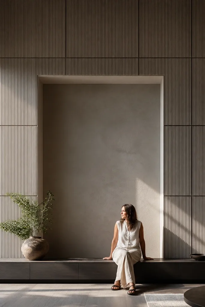
If your double-height wall is already carrying a TV or media area, make it look intentional with a recessed alcove and acoustic-style panels around it. Stacked panels create texture and absorb some sound, which helps living rooms with echo. Keep the alcove opening crisp and centered so the wall feels architectural. This design works when you want modern function without turning the wall into a cluttered TV zone. Use neutral colors and consistent panel thickness for a clean look.
Editor's notePlan cable routing before closing the alcove — once panels are on, access is a pain.
Frame a recessed alcove using 2x material and mount it to studs, keeping the opening centered. Install backer board or plywood and leave wiring paths for power and cable management. Around the alcove, install stacked acoustic panels or slatted sound panels with a consistent gap (like 3/4-inch). Finish by painting everything in a matte neutral and install a floating media shelf or trim cap over the alcove opening.
Skip thisDon’t cover vents or block airflow — recessed alcoves need ventilation for electronics.
17. Cane webbing wall panels with a centered art block
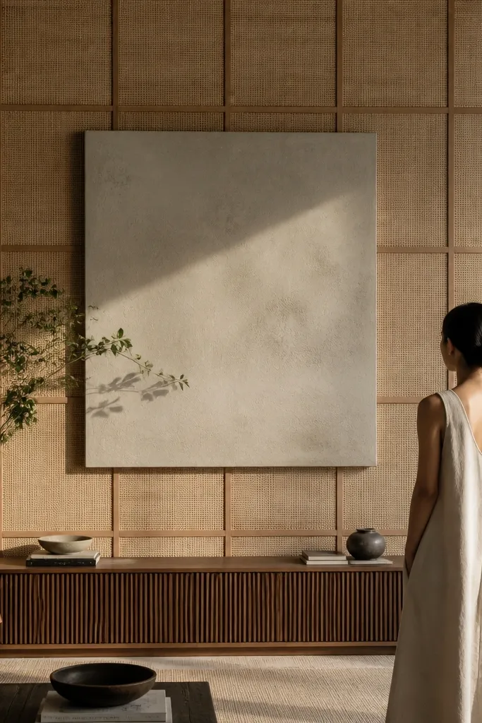
Cane webbing is modern and warm, and it adds a woven texture that looks good even from across the room. Put it in a large framed area so it reads like a deliberate panel, then add a centered art block (one large piece or a matte panel) to balance the texture. This design works in double-height rooms where you want softness without going fully fabric. Keep the art block matte and simple so the cane remains the star. It’s also great if your room has natural wood and rattan accents.
Editor's noteStretch cane firmly and let it settle before trimming so it doesn’t loosen later.
Build a rectangular frame on the wall using 1x3 lumber, then attach a backing panel like plywood inside the frame. Install cane webbing by stretching it tightly and tacking or stapling to the backing, then trim edges cleanly. Mount the framed cane panel to studs or add blocking for support. Finish by painting or staining the frame and adding a centered art block with simple mounting hardware.
Skip thisDon’t use cheap cane sheets with uneven tension — the webbing pattern will look warped on tall walls.
18. Metal grid wall with thin shelves and cable-free lighting
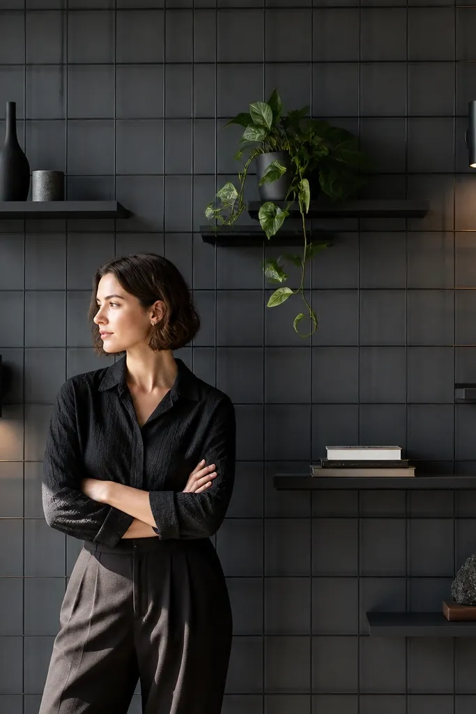
A metal grid wall looks modern because it’s structured, airy, and easy to style. The grid gives you a built-in placement system for shelves and decor, which matters on tall walls where random placement looks messy. Add small wall lights or plug-in picture lights aimed upward to create depth. Use thin black metal or brushed steel so it doesn’t overpower the room. This design is best when you want a functional display wall for books, ceramics, or framed photos.
Editor's noteKeep shelf items in two heights max — tall clutter makes double-height walls feel chaotic.
Choose a metal grid system with mounting points that match stud spacing, or plan blocking behind it. Install the grid on studs using the manufacturer’s hardware. Add slim shelves to selected grid points, keeping shelf depth around 4-6 inches for a clean modern look. Install small wall lights or picture lights with concealed wiring routes, then style with a strict color palette to avoid visual clutter.
Skip thisDon’t overload the grid — leave empty squares so the wall breathes.
19. Vertical fluted panel wall with a central spotlight niche
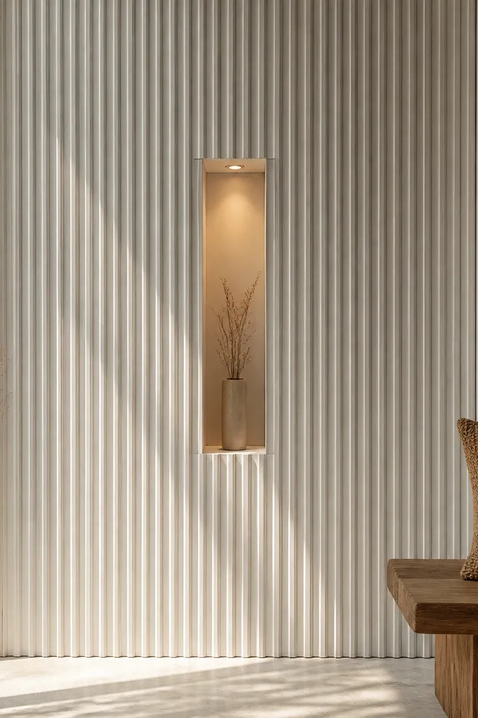
Fluted panels look crisp and high-end because the grooves cast consistent shadows. Pair them with a small central recessed niche and you get a focal “spotlight” effect without needing a gallery wall full of frames. This is a strong choice if you want modern texture that still feels calm. Keep the flutes in white or pale greige and use a warm light inside the niche for depth. It’s great for rooms with modern lighting fixtures and simple decor.
Mark the centerline and decide flute spacing, like 2.5-3 inches between grooves. Install a backer grid and attach fluted panel boards to it, starting from the center and working outward. Cut and fit the niche box in the center area, leaving enough clearance for a small LED puck or strip with a diffuser. Finish by caulking panel edges and painting in a matte or eggshell finish so the grooves stay readable.
Use a low-voltage LED puck with a diffuser so the niche glows evenly.
Don’t paint flutes too glossy — sheen makes grooves look muddy.
20. Oversized framed textile art diptych in matching colors
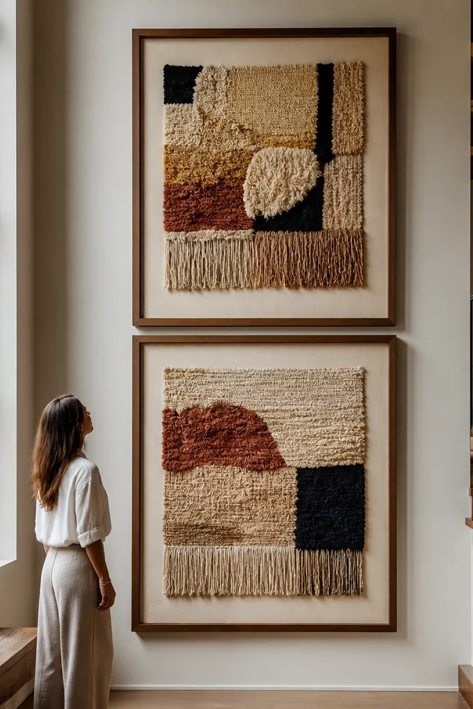
A double-height wall can handle bold art better than you think, as long as the frames and colors are disciplined. A diptych textile approach looks modern because fabric texture adds softness while the frames keep it structured. Choose two large pieces instead of many small ones — it avoids the “floating collage” look that happens on tall walls. Match frame finish and keep the textile palette within one color family. This works when you want a clean focal point and minimal DIY construction.
Measure the wall width and pick two panels that together cover about 60-75% of the wall width. Use matching frames with a consistent inner mat thickness, like 1.5-2 inches. Mount the frames on a secure rail system anchored to studs so they don’t sag over time. Space the diptych with a deliberate gap, like 2-4 inches between frames, then add a centered placement so the artwork sits above the sofa line.
Use a matte non-glare glazing option if you’re using printed fabric or art — glare kills the look in daylight.
Don’t mix frame colors — two-tone frames look messy at double-height scale.
21. Modern wood slat ladder wall with open shelves
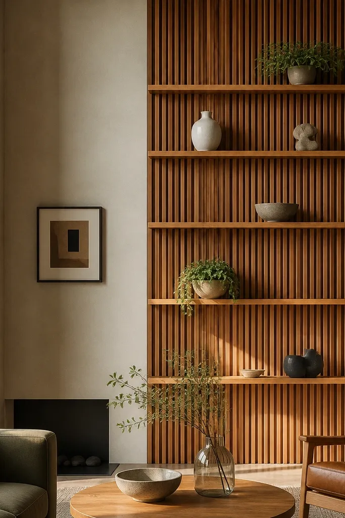
A ladder-like slat wall brings vertical organization and creates a strong silhouette. It looks modern because the slats are straight, evenly spaced, and the shelves are open instead of boxed. This design gives you a place for books or decor without a full gallery wall. Keep the shelves minimal and let the slat pattern do the work. It’s a good match for contemporary rooms with clean furniture and a mix of neutral textures.
Mark a centerline and decide shelf positions, keeping the highest shelf below the top third of the wall. Build two vertical side rails from 1x3 or 2x2 lumber and mount them level into studs. Install horizontal slats between the rails at consistent spacing, like 10-12 inches apart. Add open shelves using wood boards screwed to hidden brackets, then sand and finish the entire wall system with a matte clear coat.
Pre-stain slats and rails before assembly for a more even finish on tall surfaces.
Don’t use too many shelves — the ladder wall already has strong structure.
22. Curved plaster ribbon wall with a single centered frame
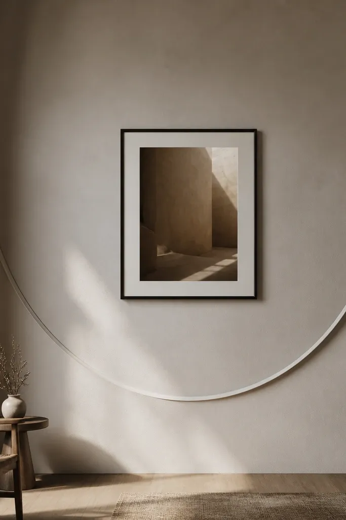
Curved plaster ribbons add motion to a tall wall without turning it into a mural. The raised ribbon casts a sweeping shadow line, which reads modern and intentional when it’s one continuous shape. Pair it with one centered framed artwork so you don’t compete for attention. Keep the wall base matte and the ribbon finish a shade darker or lighter so the curve stays visible. This works best in rooms with smooth, minimal furniture and a single color palette.
Choose ribbon width and position by marking a centerline and drawing a curve with a flexible strip. Apply a base coat of wall paint or plaster, then create the ribbon using foam strip or flexible plaster forms adhered along your curve. Skim coat the ribbon to smooth edges, then texture lightly for consistent shadow. Seal and paint the base and ribbon in two close values, then install one centered frame above sofa height.
Use a flexible strip to trace the curve on the wall first; it prevents lopsided ribbon shapes.
Don’t add multiple ribbon curves — two lines start looking decorative instead of architectural.
23. Matte black vertical picture rails with removable frames
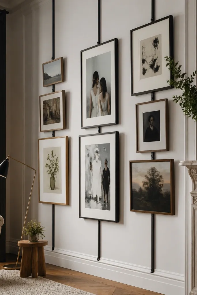
Picture rails are practical and modern because they keep your wall flexible and aligned. Two vertical rails with removable frames look intentional on double-height walls, and you can change the art seasonally without patching holes. Matte black rails add contrast, especially against white walls. This design is great when you want the wall to evolve and you don’t want a permanent build for each artwork change. It also photographs well because the rails create straight lines.
Editor's noteUse the same mat width on every frame so the wall grid looks clean even with different art.
Find your centerline and decide how many frames you want, then measure exact frame heights and spacing. Install two vertical picture rails on studs using the rail brackets and level it carefully from top to bottom. Hang frames using wire or hooks designed for picture rails so the frames sit flush. Finish by adding a consistent frame style and keeping mat colors neutral, like warm white, to avoid color noise.
Skip thisDon’t mix frame depths — shadow gaps between frames make the rail look messy.
24. Wood veneer checkerboard band with painted outer panels
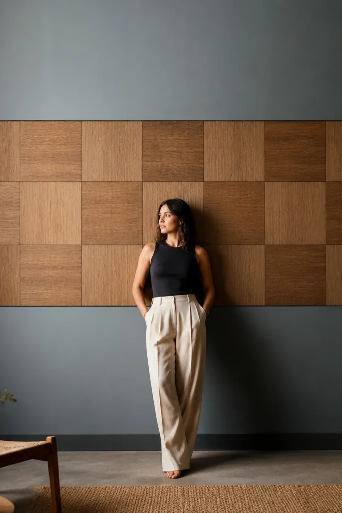
Checkerboard bands look modern when they’re scaled large and kept inside a framed rectangle. The wood veneer adds warmth, and the painted outer panels keep the design crisp. This works well when you want a statement that’s graphic without being loud. Choose one veneer tone and one paint color so the band looks intentional. It’s also a good way to make a tall wall feel designed even if you don’t want art clutter.
Mark a centered rectangle band and build a simple frame around it using trim. Cut veneer squares in two sizes that repeat cleanly, like 6x6 and 6x6 with alternating orientation, or 8x8 for a bigger scale. Apply veneer to a stable backing panel like MDF using contact adhesive and press with a roller. Install the finished band into the frame, then caulk edges and paint the outer panels matte.
Use a sharp veneer knife and a metal straightedge so edges stay crisp — checkerboards show every mistake.
Don’t use tiny squares — small checkerboards on tall walls look like random wood scraps.
25. Floating stacked stone-look panels with a thin grout line
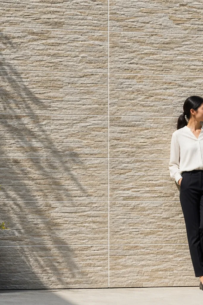
Stacked stone-look panels create instant texture and a high-end feel when the layout is tight and the grout line is thin. Keep the color consistent and modern, like light greige with warm undertones, so it doesn’t look dated. The “floating” effect comes from clean panel edges and consistent spacing. This is a strong choice if your room has modern black hardware or rustic wood and you want a bridge between them. It also gives you a focal wall that doesn’t rely on art.
Editor's noteDry-lay one section on the floor and number panels so you don’t mix up orientation mid-install.
Pick a panel system sized for wall installation so you don’t have to cut tiny stones. Prep and prime the wall, then mark a grid line for the first panel row. Apply thinset or panel adhesive, set the panels with a consistent spacer to create the thin grout line look, and tap level. Finish by grouting lightly if the system uses grout, then seal if required by the panel manufacturer.
Skip thisDon’t let the grout lines vary — inconsistent spacing makes the whole wall look homemade.
26. Twin-tone vertical wallpaper look with matte paint over texture
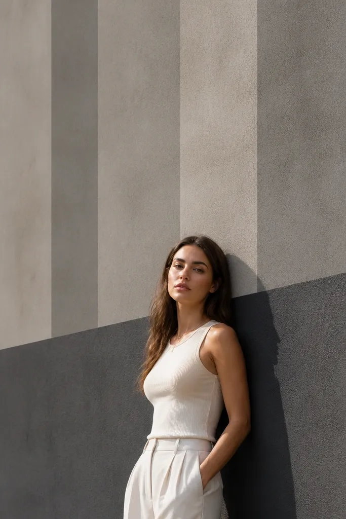
You get the look of wallpaper without the risk when you build it as texture plus paint. A subtle vertical pattern, kept in matte and limited to two close tones, reads modern and calm at double-height scale. This is a good option when you want visual interest but you hate loud prints. The vertical direction makes the wall feel taller and more structured. It also lets you control glare by keeping everything matte.
Editor's noteUse a foam roller for the texture so the vertical pattern stays consistent and doesn’t get blotchy.
Start by applying a textured roller system or thin wall texture compound in vertical passes across the wall. After it dries, tape off a central vertical band and paint it a slightly deeper tone than the surrounding areas. Remove tape carefully after the paint is tacky for crisp edges. Finish with a matte topcoat to unify sheen across textured and flat areas.
Skip thisDon’t use glossy paint over texture — it highlights every surface wave.
27. Monolithic panel wall with one centered shadow-gap frame

This design is pure modern restraint: a big monolithic surface with one recessed frame that gives it depth. The shadow gap makes it look architectural, and it works beautifully when you have a single hero artwork or sculpture you want to spotlight. Choose a matte paint color for the monolith and a slightly different matte for the frame so the frame edge stays visible. This is ideal if your room is already busy and you want the wall to calm everything down.
Editor's noteUse painter’s tape as a straightedge guide for the frame edges — it’s faster than measuring symmetry after the fact.
Apply a smooth finish coat to the wall and paint it matte. Mark and install a centered recessed frame using 3/4-inch MDF strips, leaving a consistent gap between the frame and the artwork area. Create the shadow gap by setting the frame back from the wall surface, typically 3/8 to 1/2 inch. Caulk and paint the frame to match the monolith, then mount artwork inside using standoffs or a simple backer panel.
Skip thisDon’t make the frame too wide — a wide recess looks like a niche, not a modern picture moment.
28. Reeded glass block columns with a back-painted glow panel
Glass block columns add a modern, light-catching effect that looks incredible in double-height spaces. The reeded texture breaks up light so it feels glowing, not flat. Add a back-painted panel behind the glass blocks for controlled color — keep it subtle like warm amber or pale grey-blue. This design is best when your room lighting is already decent, because the wall becomes a light feature. It also adds privacy while still letting light travel.
Editor's noteUse a level guide and check plumb every few blocks — glass block layout errors are hard to correct later.
Mark the column positions and build a frame or mounting support using backer board rated for glass block. Install the glass blocks with proper spacers and mortar or a glass block system, keeping columns perfectly plumb. Behind the blocks, add a back-painted panel fixed to the wall framing so you get an even glow. Finish the surrounding wall with matte paint so the glass blocks stand out.
Skip thisDon’t choose a saturated back color — it can look harsh in daylight.
29. Modern slatted panel with horizontal ledges for decor
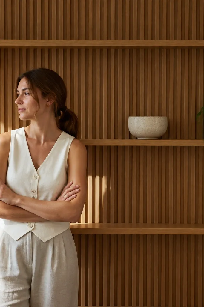
Horizontal ledges on a slatted wall create a modern rhythm and give you places to style without a full shelf wall. Vertical slats provide structure, while the ledges add function and help break up the double-height scale. Keep ledges spaced so the top ledge sits below the upper third of the wall. This is a good design for living rooms where you want a clean backdrop but still need storage for small decor. The shadows between slats also help the wall look dimensional in photos.
Editor's noteUse the same wood finish for slats and ledges so the wall reads as one system.
Mark your centerline and choose ledge heights, like 30, 48, and 66 inches from the floor. Install vertical slat backer battens into studs, then mount slats leaving consistent gaps. Add ledge supports using hidden brackets or cleats mounted to studs, then screw ledges in place. Finish by sanding and sealing the wood, and paint the wall behind slats in a color that matches your room palette.
Skip thisDon’t mix ledge depths — a shallow-deep-shallow pattern looks random at tall scale.
30. Large-scale geometric wallpaper panels with matte varnish
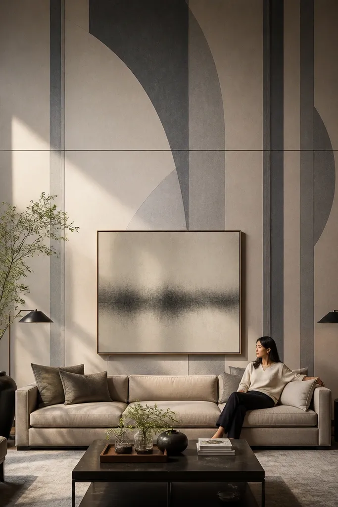
Large-scale geometric wallpaper panels look modern when you treat them like architecture — one or two big panels, not a full wall print. Choose a pattern with vertical elements so it fits the double-height proportions. Apply a matte varnish over it if the brand recommends it, so the surface doesn’t glare under spotlights. This design is ideal when your furniture is simple and you want the wall to bring pattern and color. Keep the palette muted so it feels contemporary, not decorative.
Editor's noteUse a wallpaper smoothing tool and work from the center outward to prevent bubbles that show at tall distances.
Prep and prime the wall for smooth adhesion, then measure a single centered panel width that fits your wall proportion. Apply wallpaper in vertical strips, matching the pattern alignment carefully. Trim edges with a sharp blade for clean seams, then seal with a matte protective topcoat if the paper system allows it. Finish by adding simple trim around the panel to make it look like a framed section.
Skip thisDon’t pick a busy multi-color pattern — double-height walls amplify visual noise.



