
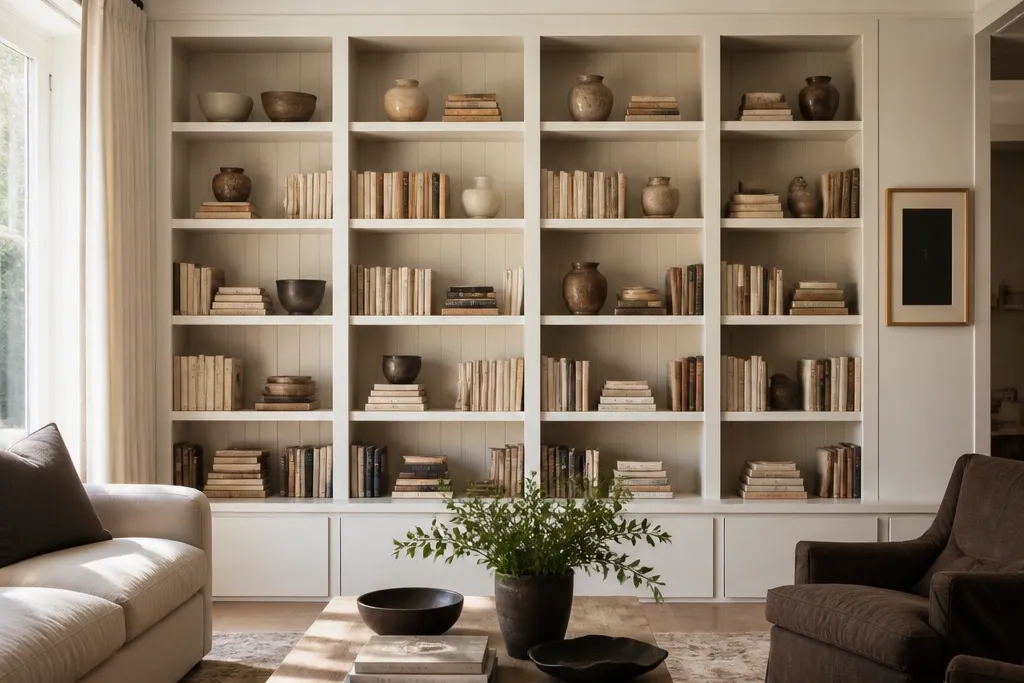
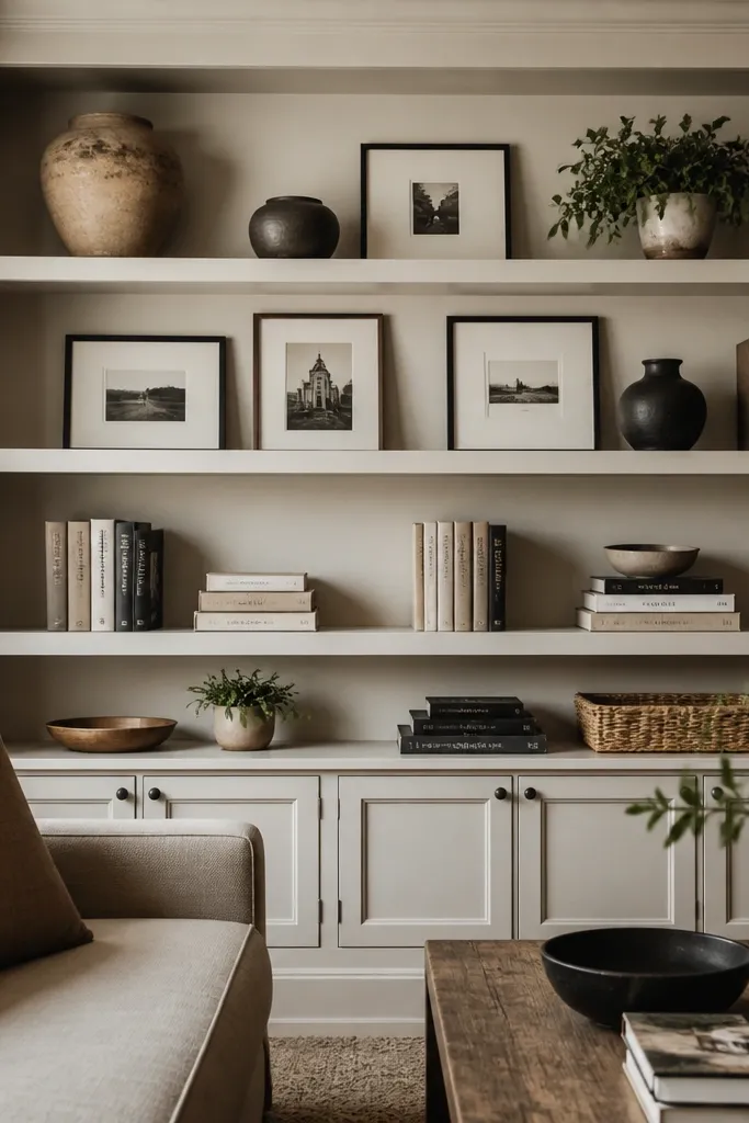
1. Shadow-gap white built-ins with charcoal book spines
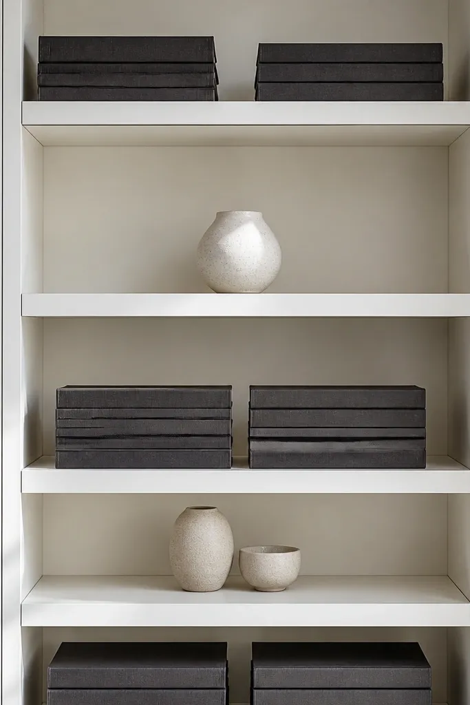
This look is for people whose built-ins feel too bright or too “builder basic.” A shadow-gap trim line makes the shelves look custom, and charcoal book spines add contrast without adding visual clutter. Keep the book stacks tight — no loose singles — and use a small number of ceramic objects in the same neutral family. The result is crisp and photogenic because the eye catches the edges first, then the content. It works best in living rooms with white walls, pale floors, or modern black accents like picture frames.
Step one: add or fake a shadow gap by installing thin MDF trim strips along the shelf edges, then caulk and paint everything the same white as the built-in carcass. Step two: paint or cover a set of book spines in charcoal (book tape and matte spray paint works), then stack books in groups of 5-7 by height. Finally: place one low ceramic tray at the center of each shelf and keep objects within a 10-inch band so the cluster stays readable in photos.
Editor's noteUse matte paint on the trim and keep the gap consistent across all shelves — uneven gaps show up immediately in daylight.
Skip thisDon’t mix glossy ceramics with matte books; the shine makes the shelf look messy instead of styled.
2. Warm oak shelves with linen baskets and black accents
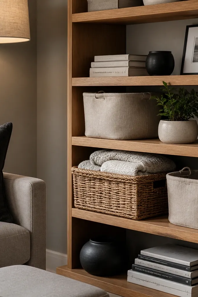
If your room feels cold or “gray-on-gray,” warm oak plus linen fixes it fast. Linen baskets hide remotes, chargers, and extra blankets, so the shelves stay clean even when life happens. Add black accents in small doses — a frame, a candlestick, or a small metal box — to keep the look grounded. This style reads intentional because you have texture on purpose: wood grain, woven fabric, and matte black. It fits living rooms with beige walls, natural wood floors, or any space where you want cozy without clutter.
Step one: choose a warm oak stain or finish for the shelves and keep the built-in frame a matching warm white or off-white. Step two: measure each shelf opening and buy linen baskets that fit within 1-2 inches of the shelf width so they don’t look oversized. Finally: install a simple picture rail or use matching frames, then place one black object per shelf cluster to repeat the accent across the built-ins.
Editor's notePick baskets with flat fronts, not round ones, so they sit flush and look neat in tight shelf spaces.
Skip thisDon’t use different basket colors across shelves; keep all baskets the same linen tone for a calm look.
3. Book-only symmetry with a single brass object per shelf

This is the cleanest solution for people who hate clutter but still want a styled look. Symmetry makes the built-ins feel designed, and a single brass object adds warmth and a small “wow” moment. Use book stacks as the main visual — spines aligned, heights controlled, and no random loose books. Keep the brass items consistent in shape family, like one tapered vase or one small sculpture repeated across shelves. This works in modern living rooms with black-and-white decor or minimal furniture lines.
Step one: select 3-4 book colors and keep them consistent across the built-ins — for example, black, cream, and deep green. Step two: build stacks in mirrored pairs on each shelf, then set a brass object in the center. Finally: add one thin photo frame leaning behind the center stack if you want a hint of human detail without breaking symmetry.
Editor's noteTrim book spines with book covers so colors look uniform; the shelf looks more expensive when the spines match.
Skip thisAvoid mixing too many book heights; if every stack is a different height, symmetry collapses.
4. Gallery frames on the middle shelves with plants on top
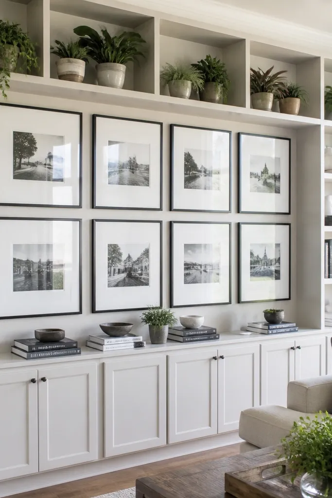
This look turns built-ins into a living-room gallery without making it feel like a wall of pictures. Middle shelves hold frames in a tight grid so the eye reads structure. Top shelves get plants because greenery adds softness and movement, but you keep plant pots consistent for a tidy look. Choose frames with the same finish — black, brushed brass, or warm wood — so the shelf doesn’t look like a random collection. It works especially well in living rooms where the main wall already has art and you want built-ins to echo that style.
Step one: pick 6-10 frames with matching finish and matte backing, then lay them out on the floor to match spacing before you mount anything. Step two: anchor the middle-shelf frames using standoff brackets or shelf risers so each frame sits at the same height. Finally: place one plant on each top shelf and use simple planters in one material, like matte ceramic or woven baskets, to keep the look cohesive.
Use picture frame glass or acrylic that reduces glare; your built-ins will photograph better at night.
Don’t mix frame sizes randomly; vary within one size range so the grid still reads as intentional.
5. Matte black risers for layered decor and books
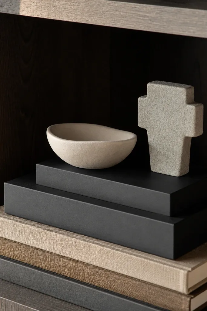
Risers are the secret to making a shelf look styled without buying more stuff. Matte black risers create a stage for books and decor, so everything sits at different heights instead of stacking flat. Layer books at the base, then add decor on top of risers — it creates depth that reads in photos. Keep the decor palette tight: one neutral ceramic, one woven or natural texture, and one small metal detail. This style looks sharp in modern spaces and works with both light and dark built-in finishes.
Step one: buy risers in two heights, like 2-inch and 4-inch, and test them on your shelves for spacing. Step two: stack books in groups of 3-6, then place risers behind or around the book stacks so the decor doesn’t float. Finally: place one sculpture or vase on each riser, keeping objects centered and leaving a 2-3 inch breathing gap between clusters.
Dust risers and shelf surfaces before arranging; matte black shows smudges more than you think.
Don’t put risers on every inch of shelf space; use them at key points so the shelf still feels calm.
6. Rattan and ceramic stacks for a coastal-modern vibe
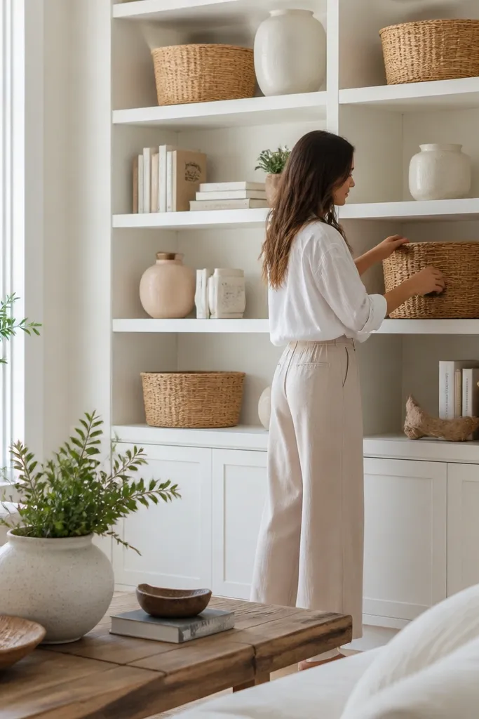
This is a coastal-modern look that avoids the “beach gift shop” feeling. Rattan baskets and woven textures add warmth, while white or cream ceramics keep it clean and modern. Stack books horizontally and vertically to break up the basket shapes, then add one tall ceramic piece at the corner of each shelf. Keep your palette to three tones: cream, warm wood, and black or charcoal. It works well in bright living rooms with light sofas and natural light.
Step one: choose rattan baskets with a similar weave pattern and size so the texture repeats across shelves. Step two: add books as separators — two horizontal stacks at the edges and one vertical stack in the center. Finally: place white ceramics on top of small risers or directly on shelf corners, then tuck small items inside the baskets.
Editor's noteUse a lint roller on rattan before placing it; it makes the texture look crisp.
Skip thisSkip seashell decor unless it matches a specific piece; lots of small shells read messy fast.
7. Clear acrylic organizers for hidden clutter
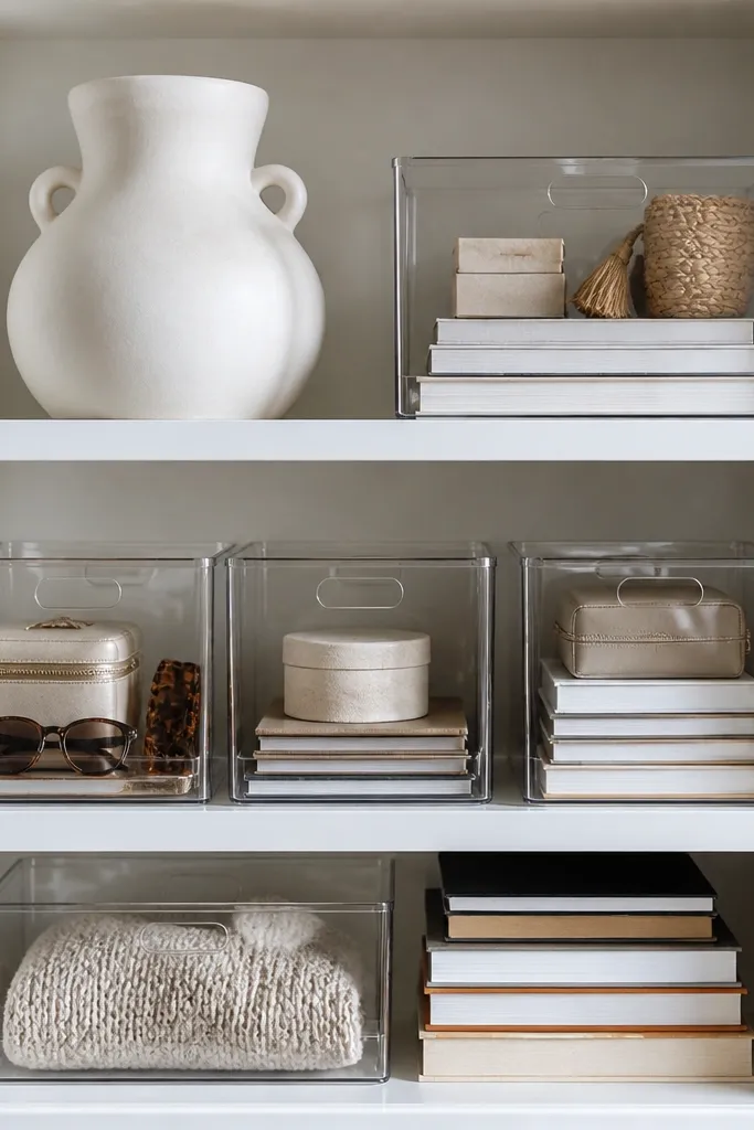
If your built-ins keep turning into a junk zone, transparent organizers give you control without hiding everything. Clear acrylic bins let you see what’s inside, so you can keep the shelf looking curated. Pair them with consistent book stacks and one or two large objects like a vase or lamp base. This approach looks modern because it has clean lines, and it’s practical because you can retrieve items without dumping the shelf. It’s perfect for living rooms where you need storage but still want a designed look.
Step one: measure shelf depth and buy organizers that leave at least 1 inch of clearance from the back so dust doesn’t collect. Step two: use bins for small items like remotes, coasters, or craft tools, then stack books in front of or beside bins. Finally: add one large object per shelf to anchor the composition and keep the rest minimal.
Editor's noteLabel the inside with small black labels on white tape; it stays subtle but keeps you from rummaging.
Skip thisDon’t mix random bin sizes; use one or two sizes across all shelves so the visual rhythm stays clean.
8. Built-in bar shelf with glassware and a back-painted panel

A bar-style built-in turns everyday glassware into decor. The key is the back panel color — it makes glass reflect light and makes the shelf look like a feature, not storage. Use a matte paint behind the shelf section, then hang or rest glasses in a controlled pattern. Add a small tray at the bottom shelf for coasters and a bottle-shaped decor piece to keep the look consistent even when you’re not hosting. This works great if your living room has a dining area or if you want a focal point near the seating.
Step one: paint the back panel behind your glass shelves in a matte color that matches your room accents, like deep green or charcoal. Step two: arrange glassware by type — wine glasses in one section, tumblers in another — and keep the stems aligned. Finally: add a bottom shelf tray and one decorative bottle or ceramic decanter for height variation.
Use felt pads under glass racks or cup holders to prevent tiny scratches on your shelves.
Don’t overload with every glass you own; keep it to a curated set that repeats.
9. Floating shelves look using thin trim and matching book widths
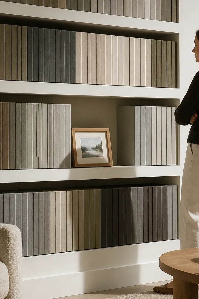
This look makes built-ins feel lighter by emphasizing clean lines. Thin trim around shelf openings creates a “floating shelf” vibe even though it’s built-in. The styling trick is aligning book widths so the spines form a smooth block, then adding one framed photo or small art object to break the pattern. It’s a good move if your living room has modern furniture and you want the built-ins to match that crisp feel. It also hides imperfections because the visual block is consistent.
Step one: install thin casing or trim around shelf openings, keeping the same thickness across the entire built-in. Step two: select books with similar spine widths and arrange them into a tight block, leaving a small 1-2 inch margin at the edges. Finally: add one photo frame or small art object centered between book blocks for contrast.
Use book spine labels or covers to keep widths consistent; the effort pays off in how neat it looks from across the room.
Skip random decorative objects on every shelf; this look relies on spacing and pattern.
10. Two-tone shelves with dark interior and light exterior
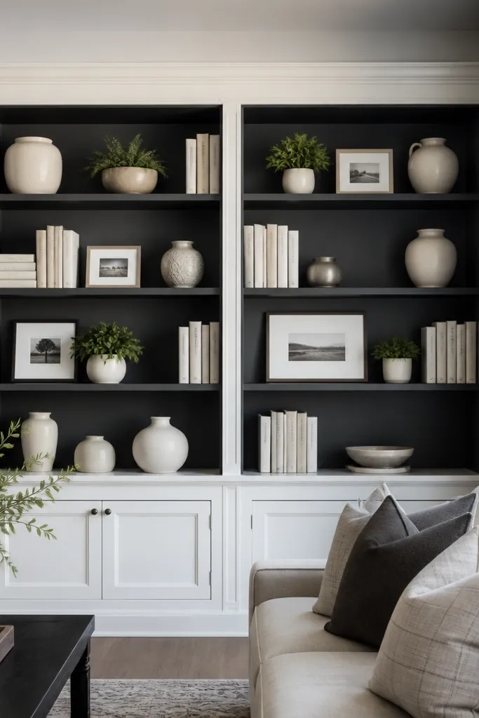
Two-tone built-ins add depth instantly. Painting the interior of the shelves a dark color makes light ceramics and books pop, and it hides small messes better than white interiors. Keep the exterior lighter so the room doesn’t feel heavy. Style with light-colored decor like cream vases, white frames, and pale book covers, then repeat one accent color like brass or black across the shelves. This is a strong option for living rooms with dark floors or a fireplace feature.
Step one: mask carefully and paint the exterior first in your main trim white, then paint the shelf interior in a dark matte like charcoal. Step two: use light decor and book covers so the contrast reads clearly — build clusters in 3s across each shelf. Finally: finish with a couple of brass or black objects placed at consistent heights so the dark interior looks intentional, not empty.
Use matte paint on the interior; it reduces glare from daylight and makes shelves look smoother in photos.
Don’t pick a dark color that’s too blue; it can clash with warm wood furniture.
11. Monochrome green plants with ceramic pots
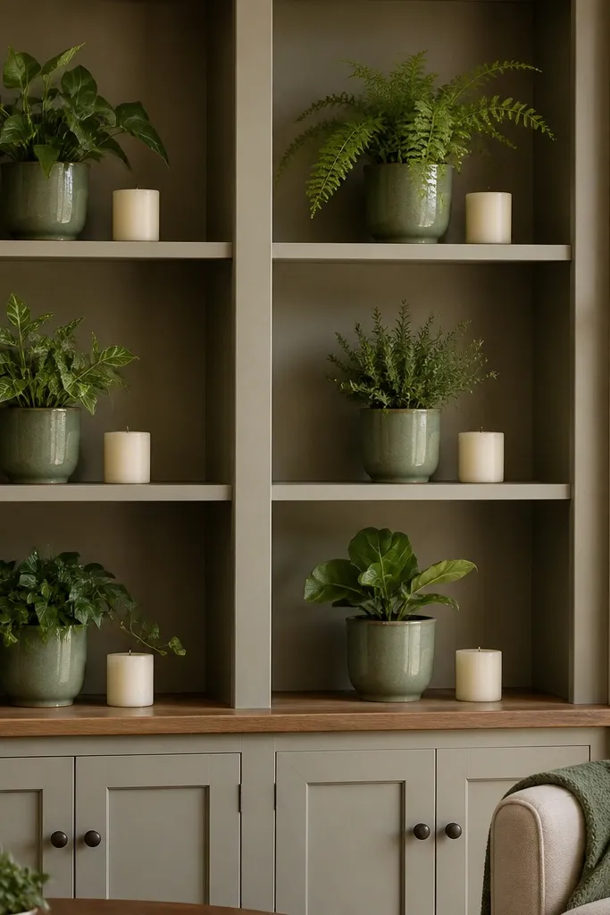
Green plants make built-ins feel alive, but only if you control the pot look. Go monochrome: same ceramic pot color and similar plant shapes, then spread them across top shelves and corners. Keep books and decor minimal — a single tray or candle per shelf — so the plants stay the hero. This look is clean, calming, and photogenic because the repeating greens create a visual rhythm. It fits living rooms with neutral walls and simple sofas where you want one strong texture.
Step one: choose 4-6 plants with similar leaf size and shape, like snake plant, pothos, and a trailing vine style, and match the pot color. Step two: place plants on top shelves and corners, then fill the remaining shelf space with books stacked horizontally. Finally: add one small ceramic tray or candle per shelf and keep the decor palette to cream and black so the plants don’t compete.
Rotate plants every two weeks so leaf angles stay even; uneven growth makes the shelf look random.
Don’t mix glossy and matte planters; the shine difference reads as clutter.
12. Vintage wood frames and stacked art books
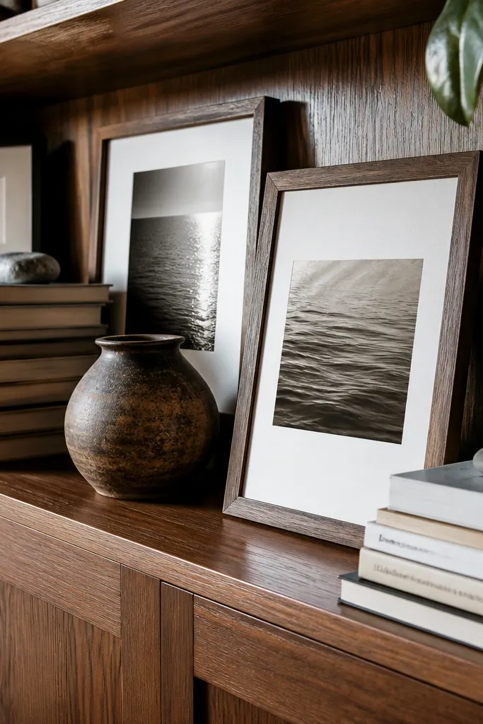
If your built-ins feel too new, vintage-style frames and art books warm them up. Wood frames in a similar tone to your floors make the shelf look like it belongs in the room. Stack art books in a consistent height range, then lean one frame at a slight angle next to the stacks for a lived-in look that still photographs neatly. Keep the decor minimal — one small sculpture or candle — because the frames and book spines already do the work. This works in traditional, farmhouse, and transitional living rooms.
Step one: pick frames with a similar wood finish and size so they look like a set, then clean them and remove any glass glare if needed. Step two: stack art books in pairs or groups of 4-6, keeping spine colors consistent across shelves. Finally: place one small sculpture or ceramic object on a tray to anchor the cluster and repeat a tray color across shelves.
Editor's noteUse museum-style matte photos or prints; glossy prints reflect windows and look messy in daylight.
Skip thisDon’t add too many small knickknacks; this shelf style relies on frames and book stacks.
13. Monogram tray system for small decor control
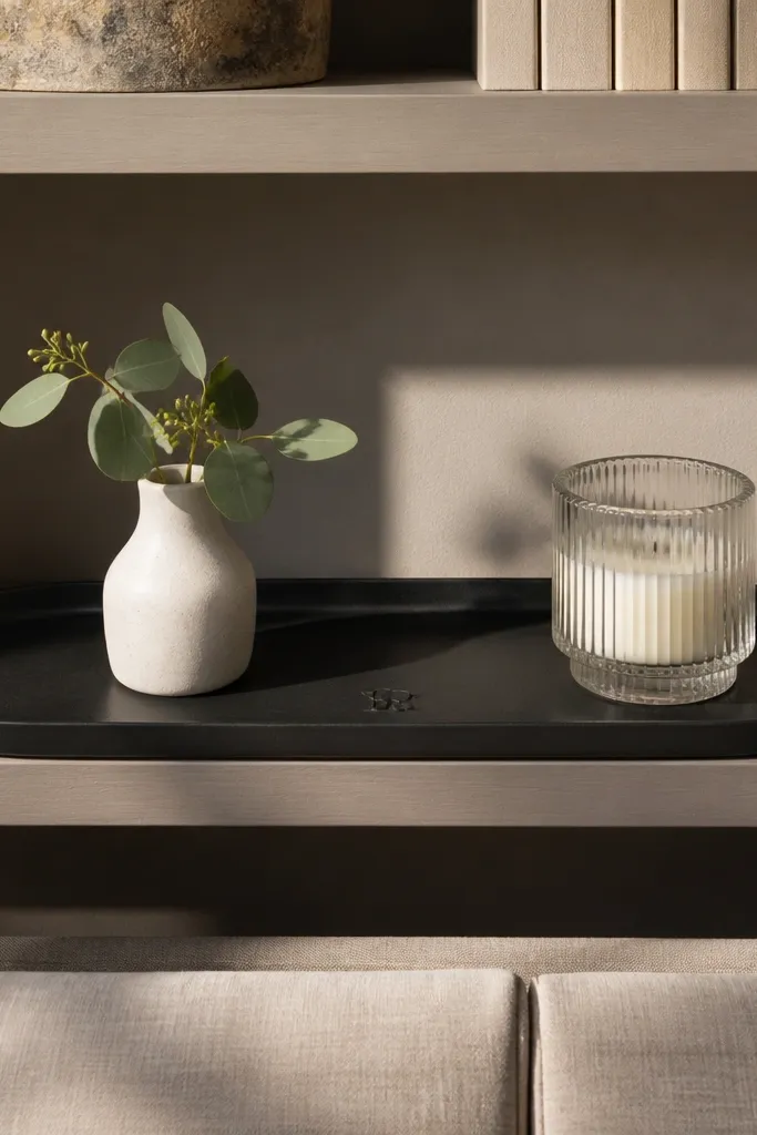
Small decor is where built-ins go off the rails. Trays fix that by giving every object a boundary, so shelves look intentional even with small items. Use one tray style across the built-ins — for example, matte black tray with a slightly raised rim — and place candles, a mini vase, or a small bowl on top. If you want a personal touch without clutter, add a monogram letter in the same finish as the tray. It’s a great look for living rooms that need a tidy surface for daily items.
Step one: measure shelf depth and choose trays that leave a 1-2 inch gap from the back and sides so they don’t look jammed. Step two: build clusters of objects on each tray, keeping the tallest item no more than 6 inches above the tray. Finally: repeat the tray finish across all shelves and keep backgrounds simple — mostly books or plain ceramics behind the trays.
Use battery candles or unscented candles with consistent height; real candles can change height and look uneven.
Skip mixing tray metals; silver with brass makes shelves look like a thrift pile.
14. Ceiling-to-shelf lighting with warm LED strips
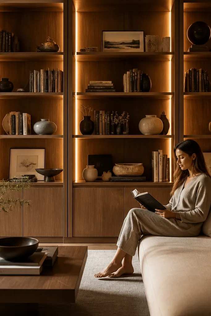
Lighting is the difference between “decor” and “styled.” Warm LED strips inside the shelves create a soft glow that makes textures pop — book spines, wood grain, and ceramics look richer without adding more items. This look also hides gaps and shadow lines that make shelves feel unfinished. Choose warm white LEDs around 2700K so it matches typical living-room bulbs. Then keep styling simple: a few books and one or two objects per shelf so the light does the heavy lifting.
Step one: install LED strip channels along the top inside edge of each shelf bay, then connect to a dimmer so you can dial it down for daytime vs night. Step two: secure the wiring with adhesive clips and test the light before closing panels. Finally: style with 2-3 book stacks per shelf and place ceramics at the front edge so the glow hits them and creates depth.
Editor's notePick LEDs with a diffuser cover; bare strips create hotspots on book covers.
Skip thisDon’t set LEDs too cool (like 5000K); it makes white paint look blue and ceramics look dull.
15. Color-blocked books with one neutral sculpture
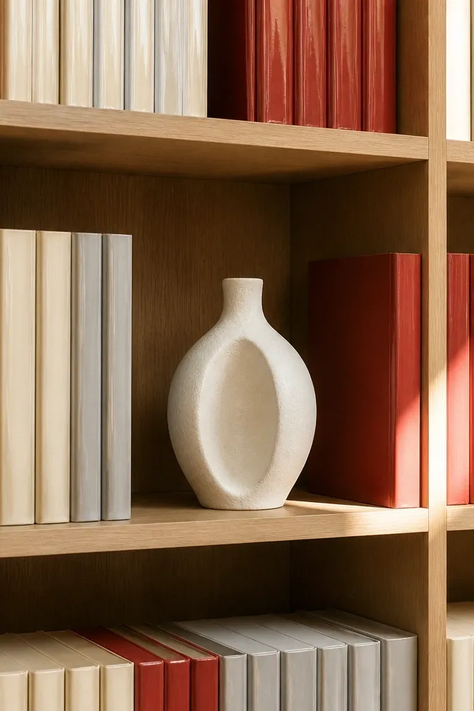
This is for people who want a graphic look without a bunch of decor. Color-blocking books creates a bold, organized pattern, and one neutral sculpture keeps it from feeling like a library wall. Pick one accent color and two neutrals, then build blocks that repeat across shelves. The shelf looks designed because the pattern repeats and the objects are restrained. It fits modern living rooms with clean lines and can work in any room color as long as you choose an accent that matches throw pillows or a rug.
Step one: group books by spine color into 3 piles and decide on block sizes, like 3 books wide by 5 books tall. Step two: stack blocks so the colors form rectangles, leaving a small gap between blocks so the pattern reads. Finally: place one neutral sculpture (beige ceramic, light stone, or matte black) at the center front of each shelf to break up the grid.
Editor's noteCover mismatched books with matte paper covers in the same color family so the blocks look intentional.
Skip thisDon’t mix glossy covers with matte covers; the shine breaks the clean graphic look.
16. Fabric back panels with framed prints behind glass
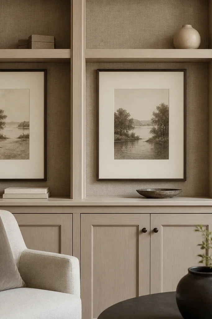
Fabric back panels turn built-ins into something soft and layered. It’s a strong trick for shelves that look too empty, because the background gives your decor a “stage.” Choose a textured fabric like linen or subtle herringbone and keep it in one color family. Then use framed prints behind glass — it keeps the shelf neat and protects the look from dust. This style is especially good if your living room is minimal and you want a warm, design-forward finish without repainting the whole room.
Step one: cut fabric panels to shelf bay size, add thin batting if you want a more cushiony look, and staple the fabric to a thin backing board. Step two: install the fabric backing on the back of each shelf bay using small screws or adhesive, keeping edges crisp. Finally: place framed prints in the middle shelves and use books stacked on the lower shelves so the fabric stays visible behind your decor.
Editor's noteUse darker fabric behind glass prints to reduce glare and make the prints look more contrasty.
Skip thisDon’t use shiny fabric; highlights look messy in daylight and photos.
17. Built-in shelves with sliding cabinet doors and open top styling
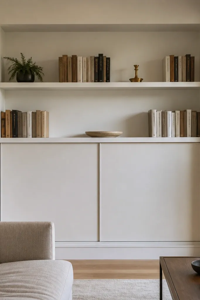
Open shelves look great until you need storage. Sliding cabinet doors fix that by hiding clutter while keeping the top area styled and photogenic. The trick is to keep the door finish consistent with the built-in frame so it looks built, not added. Style the open section with 2-3 clusters per shelf, using books and one or two statement objects. This is a smart choice for families, small apartments, and living rooms where you need the built-ins to work day-to-day.
Step one: measure the opening and install sliding door hardware rated for the door weight, then mount the door panels level so they glide smoothly. Step two: style only the open shelves — keep book stacks and decor clusters centered and repeat one material like ceramic or wood. Finally: use baskets inside the cabinet for items that would otherwise spill onto shelves.
Choose soft-close hardware so the doors don’t slam and make the built-ins feel cheap.
Don’t leave too many items on open shelves; with doors, you want the open section to look intentional.
18. Monochrome neutrals with a layered tray and tall vase corners
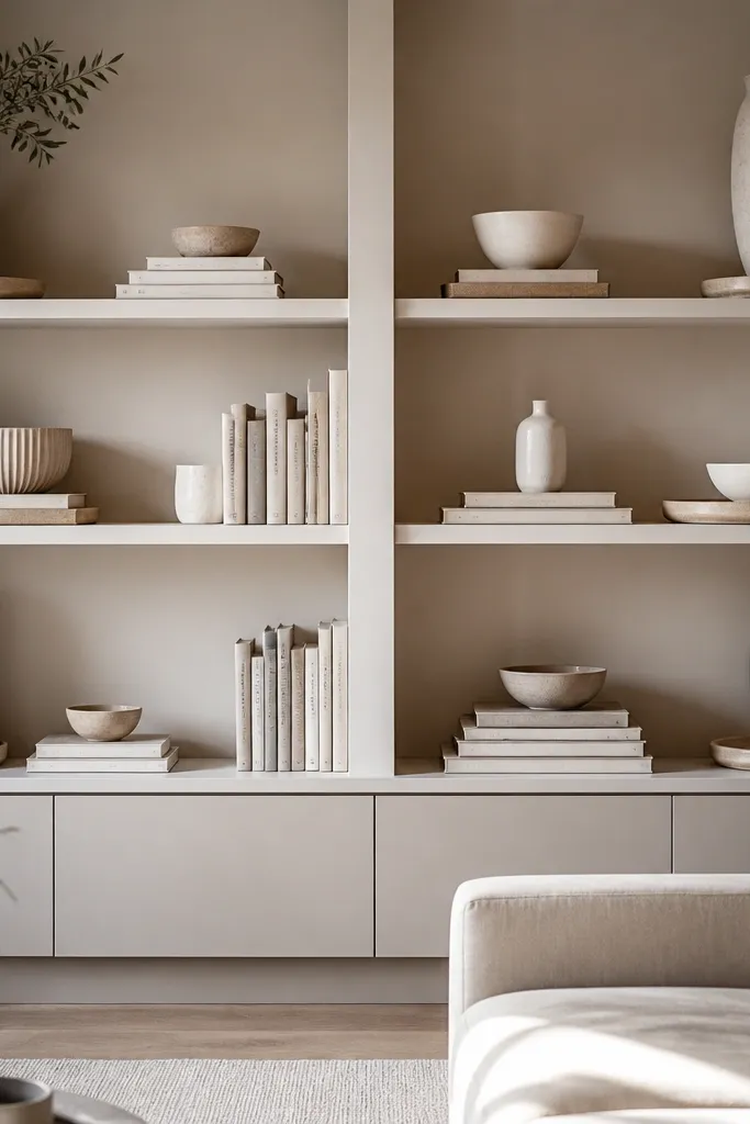
Monochrome neutrals make built-ins feel expensive when you add shape variation. Use cream, sand, and warm gray ceramics, then anchor each shelf with one layered tray and a tall vase at each end. Books can stay neutral too, but keep them stacked so the shelf looks structured. This look works in almost any living room because neutrals blend, and the corners give you a strong silhouette. It’s a good move if you want a “designed calm” feeling and you don’t want to change decor every season.
Step one: pick one neutral palette and buy or gather items that match it, then choose two tall vase shapes for corners and one tray for the center. Step two: stack books in consistent height groups and place the tray on the middle shelf front edge. Finally: add a small candle or bowl on the tray, then keep the rest of the shelf empty enough for the vases to read.
Use trays with different heights, like a small riser inside a larger tray, for instant dimension.
Avoid overcrowding shelves; neutrals look best with breathing room.
19. Built-in shelf with a fabric curtain backdrop for softness
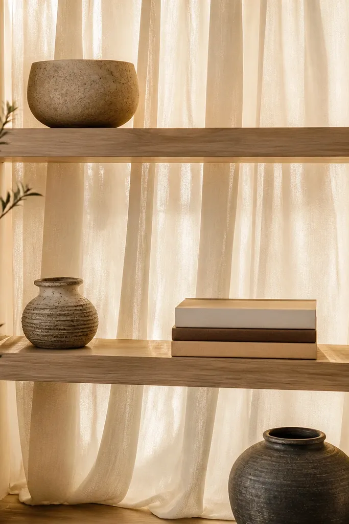
A fabric curtain behind shelves adds softness and makes built-ins look styled even when the decor is minimal. It’s especially useful if your built-ins have plain backs or you want to hide imperfections behind decor. Choose a sheer or semi-opaque fabric in a cream or warm beige so light still passes and the shelf doesn’t feel heavy. Then style with a few tall items and one horizontal book line so the fabric doesn’t turn into a busy background. This look is great for cozy living rooms with soft textiles like rugs and throw blankets.
Step one: cut fabric to the height and width of the shelf bay, then sew or hem edges so it hangs straight. Step two: attach a small track or tension rod behind the shelf opening so the fabric stays taut — sloppy folds look messy. Finally: place tall objects on the top shelf corners and keep books aligned in one horizontal line across the middle.
Steam the fabric before hanging; wrinkles show up fast against painted shelves.
Don’t use thick velvet; it can make the built-ins feel dark and closed-in.
20. Oversized art object on the bottom shelf with book columns
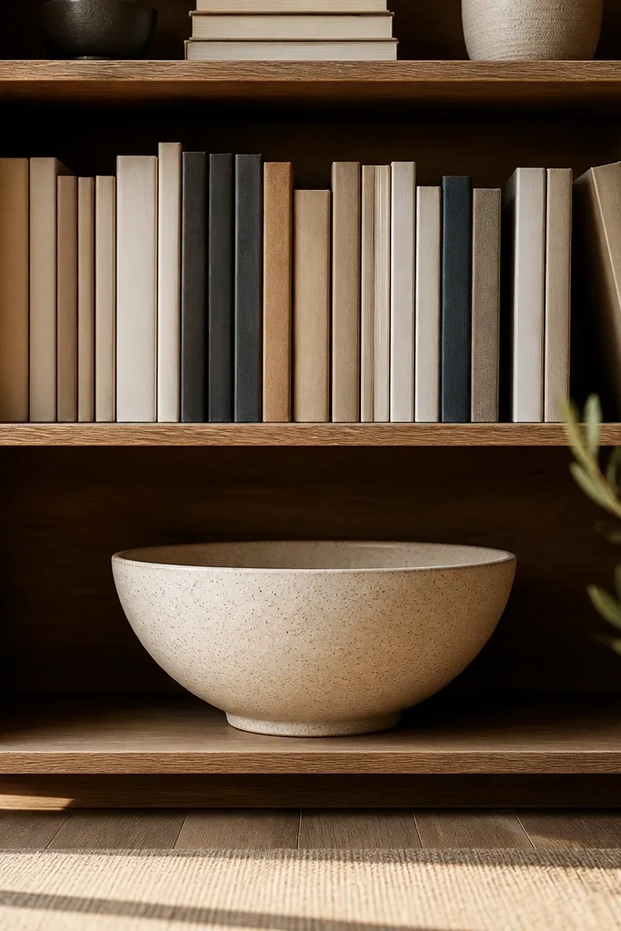
Bottom shelves often get ignored, which makes built-ins look top-heavy and unfinished. Put one oversized art object on the bottom shelf — a large ceramic bowl, a sculptural vase, or a framed piece turned upright — and build book columns on the shelves above it. The columns create vertical structure, and the oversized object grounds the whole unit. Keep it monochrome or limited to two tones so the large piece reads as intentional, not random. This works in living rooms where you want the built-ins to feel like a real design feature.
Step one: pick your oversized object and set it on the bottom shelf center, then measure the height it reaches. Step two: build book columns above it using 3-4 books per column, keeping the top height aligned across shelves. Finally: add small decor only at the edges — like one candle per side — so the oversized piece stays the anchor.
Choose an object with a strong silhouette; the shape reads even from across the room.
Don’t pair oversized objects with lots of small items; it turns into visual noise.



