
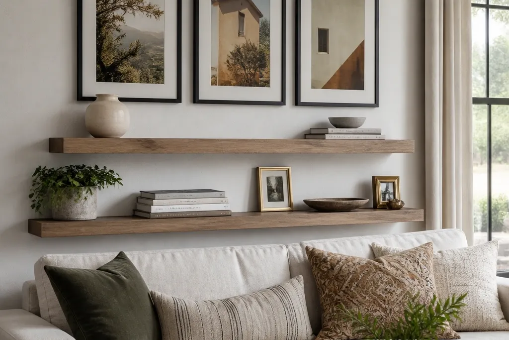
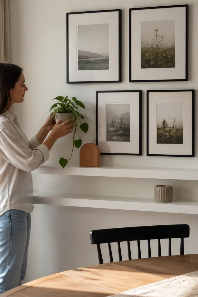
1. Floating shelf + 3-frame grid above it
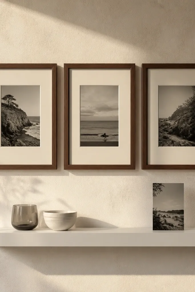
Start by mounting one floating shelf 60-66 in from the floor to the top edge of the shelf (adjust for your art height). Then hang three frames centered on the wall with equal spacing, keeping the bottom of the middle frame roughly aligned with the shelf top minus 2-3 in. Finally, place shelf decor in a triangle: a tall book or vase in the center, two flatter items on each side, and leave 1-2 in of empty space between decor clusters and the frame edges.
This is the easiest way to make Gallery Wall With Shelves Ideas look designed, not random. The shelf gives you a horizontal “line,” and the three frames create a clean, photo-friendly grid. Use matching frame colors and similar mat thickness so the wall reads as one unit. Style the shelf with two low items and one slightly taller piece so the eye travels left to right without bumping into clutter. This works in entryways, above a console, and anywhere you want the wall to look organized even when you change decor seasonally.
Skip thisDon’t mix thick chunky frames with a thin shelf — it makes the wall look like mismatched furniture.
Editor's noteUse a level + painter’s tape grid on the wall before drilling. It saves you from re-hanging frames when the shelf is slightly off.
2. Long shelf under a tight two-frame stack
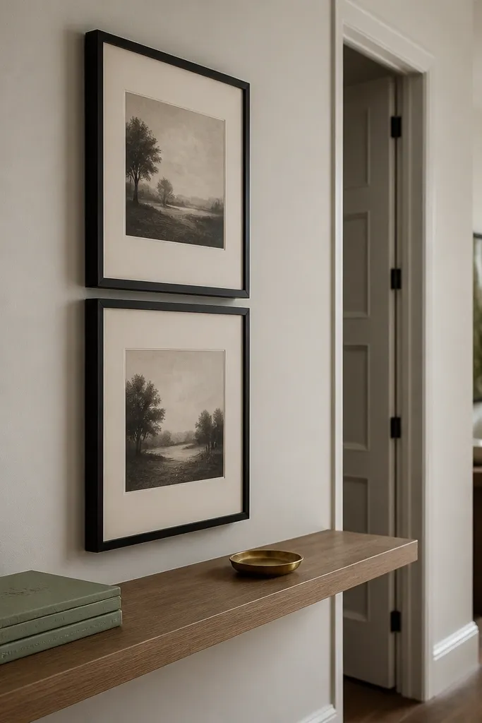
This layout gives you height without turning the wall into a tall column. The long shelf acts like a stage, while the two-frame stack adds vertical interest. It’s especially good if your wall has a doorway or light switch area that interrupts a full grid. Choose frames with the same width so the stack looks crisp. Style the shelf with a mix of tall and flat items but keep the tallest thing in the middle so it doesn’t visually collide with the stacked frames.
Mount a long shelf centered under where you want the frames, with the shelf top about 8-10 in below the bottom of the upper frame. Hang two frames stacked vertically with 2-3 in between their edges, and keep their centers aligned to the shelf center. Then decorate the shelf: place a tall object at center, two books or trays flanking it, and a small plant or candle on one side so the shelf looks intentional from across the room.
Pick frames with identical mat colors. The mats are what make the stack look “designed” instead of accidental.
Avoid placing a tall object directly under the gap between the two frames — it makes the center look crowded.
3. Corner gallery with two shelves wrapping the wall
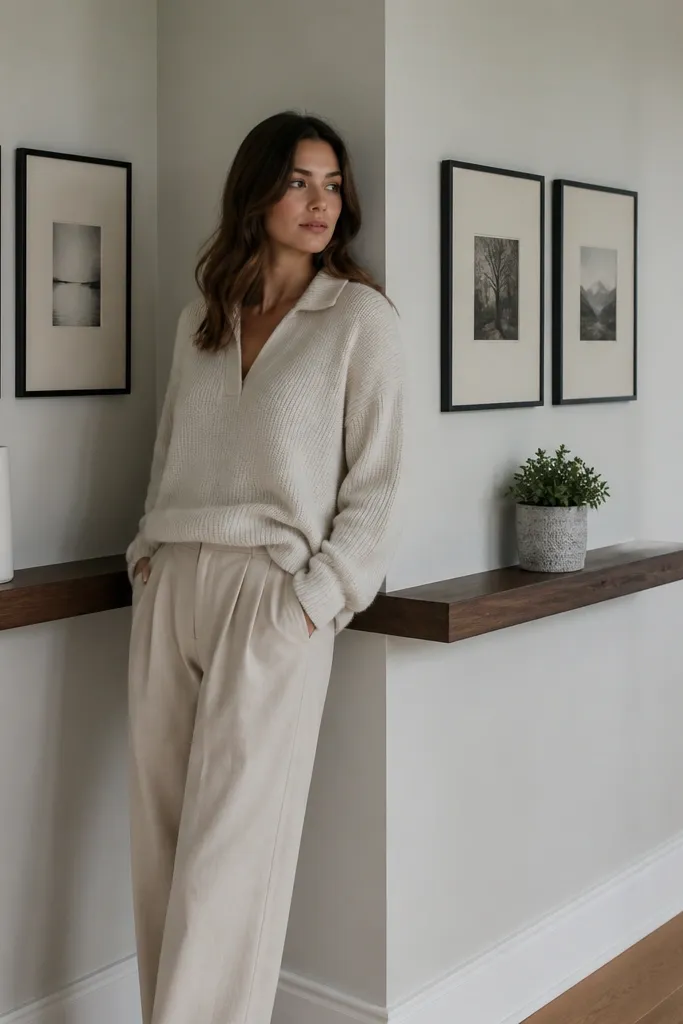
Measure the corner: decide the shelf height first, then mirror it on both walls so the shelf tops meet at the corner. Install the first shelf, then use a laser level or long straightedge to mark the second shelf location on the adjacent wall. Hang 2-3 small frames on each wall side, keeping the top edges of frames aligned to a single imaginary line. Style each shelf with fewer items than you think: one tall piece near the corner, one flat piece, and one small accent.
Corners are where Gallery Wall With Shelves Ideas can look stunning or messy, and this version keeps it clean. Two shelves wrapping the corner create a continuous visual line, so the corner doesn’t swallow your decor. Use small frames on both walls so they fit the tighter viewing angles. This look photographs well because the corner shelf edges catch light and add depth. It’s ideal for dining nooks, reading corners, and tight apartments where you want storage and art without taking up floor space.
Skip thisDon’t use large frames in a corner unless you’re going for a bold statement — they overwhelm the angle.
Editor's noteUse corner-friendly decor like shallow trays and book stacks so nothing sticks out into the walking path.
4. Asymmetrical shelf ladder with staggered frames
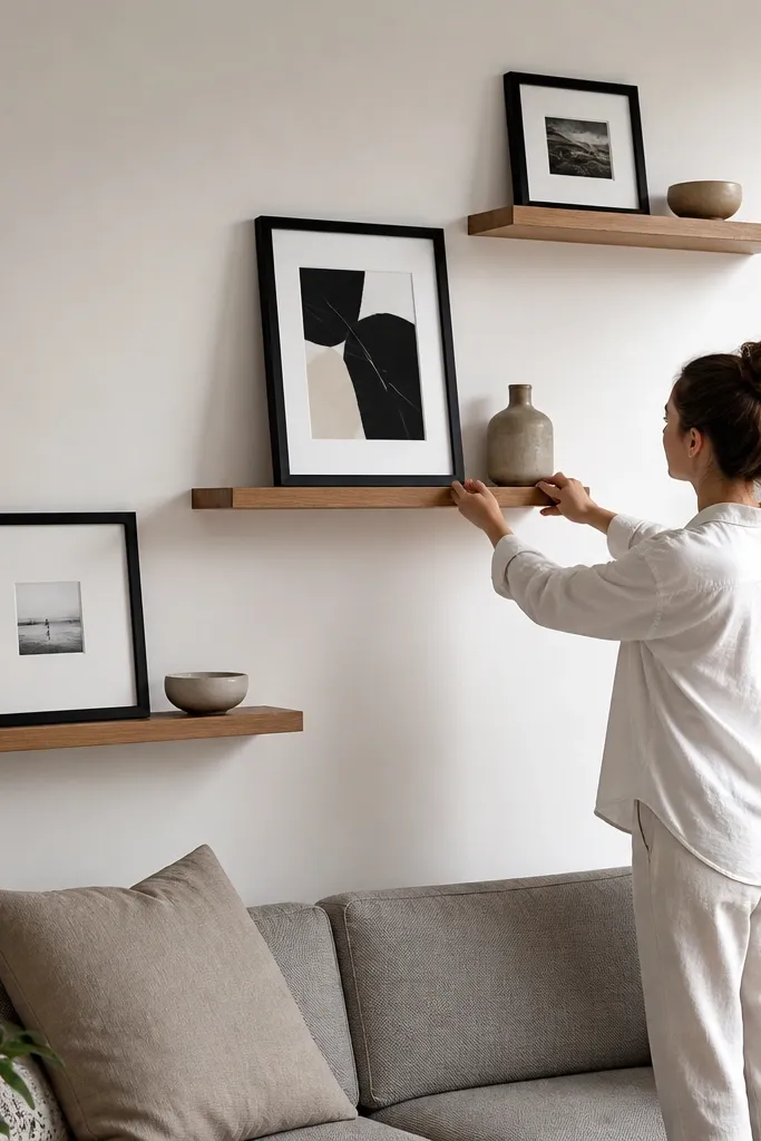
If your taste leans modern, this staggered ladder is a strong aesthetic move. The shelves step upward, and the frames don’t mirror each other, which makes the wall feel curated instead of symmetrical. It also gives you flexibility because you can place larger art where your wall has more blank space. Keep frame sizes varied but mat colors consistent to avoid visual noise. This works in living rooms, stair landings, and offices where you want a wall that feels like a planned composition.
Mark three shelf positions with a 10-14 in vertical step between shelf tops. Install the shelves first, starting with the middle shelf highest at about eye level (around 58-62 in to the shelf top). Then hang frames around the shelves, placing larger pieces near the center shelf and smaller pieces between shelves. Finish by styling each shelf with one tall element and two smaller items, leaving at least 1 in of empty space around the decor cluster.
Stagger shelf bracket placement slightly so the shelf line looks intentional, not like a copied grid that got “moved by accident.”
Avoid mixing too many frame colors. Stick to two frame finishes across the whole wall.
5. Two shelves, one wide center frame
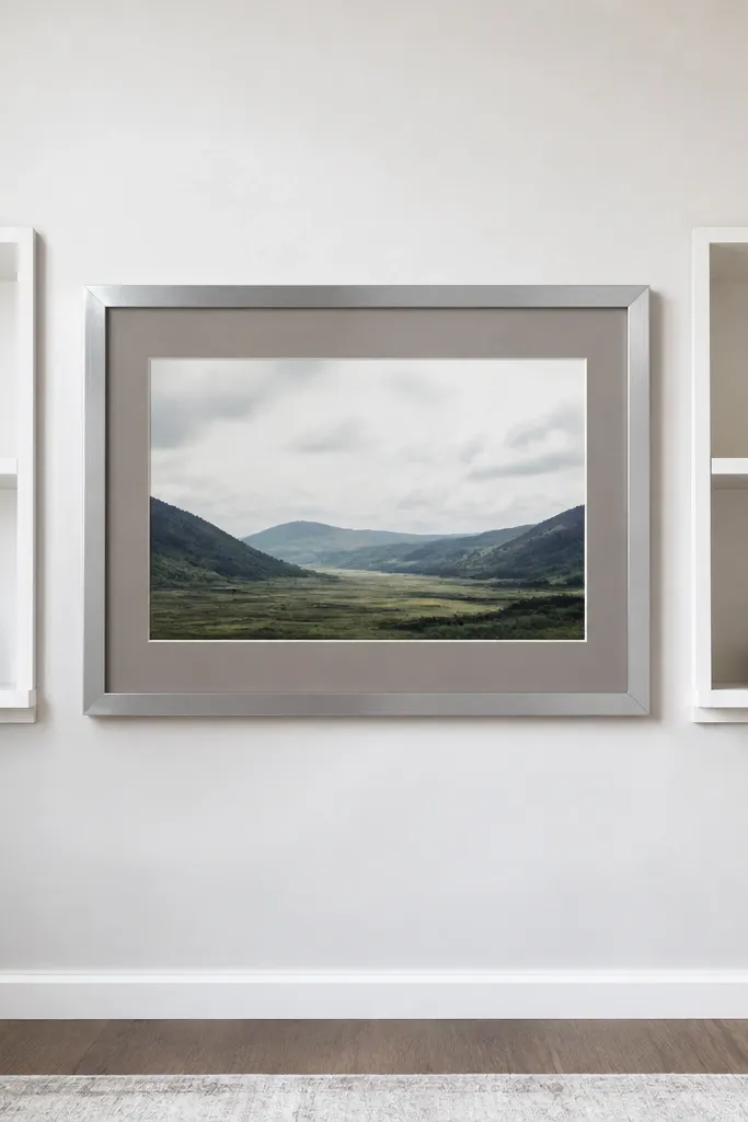
This is the cleanest way to make a Gallery Wall With Shelves Ideas layout look high-end. The wide center frame becomes the visual anchor, and the shelves on either side bring function without stealing attention. Because the center piece is large, you can keep the shelf decor minimal and still look styled. Choose a frame with a wide profile or a thick mat so it stands out. This layout suits long walls above sofas, especially when you want one statement art piece plus practical display space.
Mount two shelves at equal height on left and right sides, leaving a clear vertical gap where the wide frame will sit. Place the wide frame centered between the shelves so its center aligns with the room’s typical eye line (about 57-60 in to the frame center). Then decorate: keep each shelf to three items max, with one book or tray, one decorative object, and one small plant or candle. Finally, step back and adjust shelf spacing so the left and right decor doesn’t visually crowd the wide frame edges.
Use the same shelf finish on both sides even if you use different shelf lengths — it keeps the composition balanced.
Don’t overload the shelves. Two shelves with five items each looks busy when there’s a large center frame.
6. Symmetrical shelves with a "bookshelf art" look
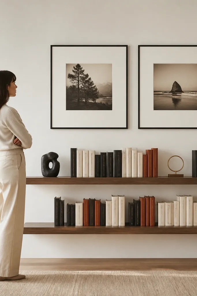
This one reads like a designed bookshelf wall, but with art you actually swap out. Symmetry makes it calm and expensive-looking, and the shelves help you build height using book spines. Choose a consistent palette for book covers and keep the frames aligned to the same baseline. This style is great for renters because you can keep the shelf mounting and rotate prints without redoing the whole wall. It’s also perfect for kitchens or hallways where you want something visually neat that won’t clash with the rest of the room.
Install two matching shelves at the same height level, spaced so the center gap fits your framed pieces. Hang frames between the shelves or slightly above them, keeping the frame bottoms aligned to a single line. Style the shelf decor with books stacked upright at corners, then add one small framed print or photo on each side. Keep the center of each shelf lighter — use fewer objects so the symmetry reads clean.
Pick book spines with a limited color set (2 neutrals + 1 accent). The wall looks intentional even when you change books later.
Skip random-sized picture frames in a symmetrical layout — the imbalance shows immediately.
7. Round mirror + shelf ledge combo
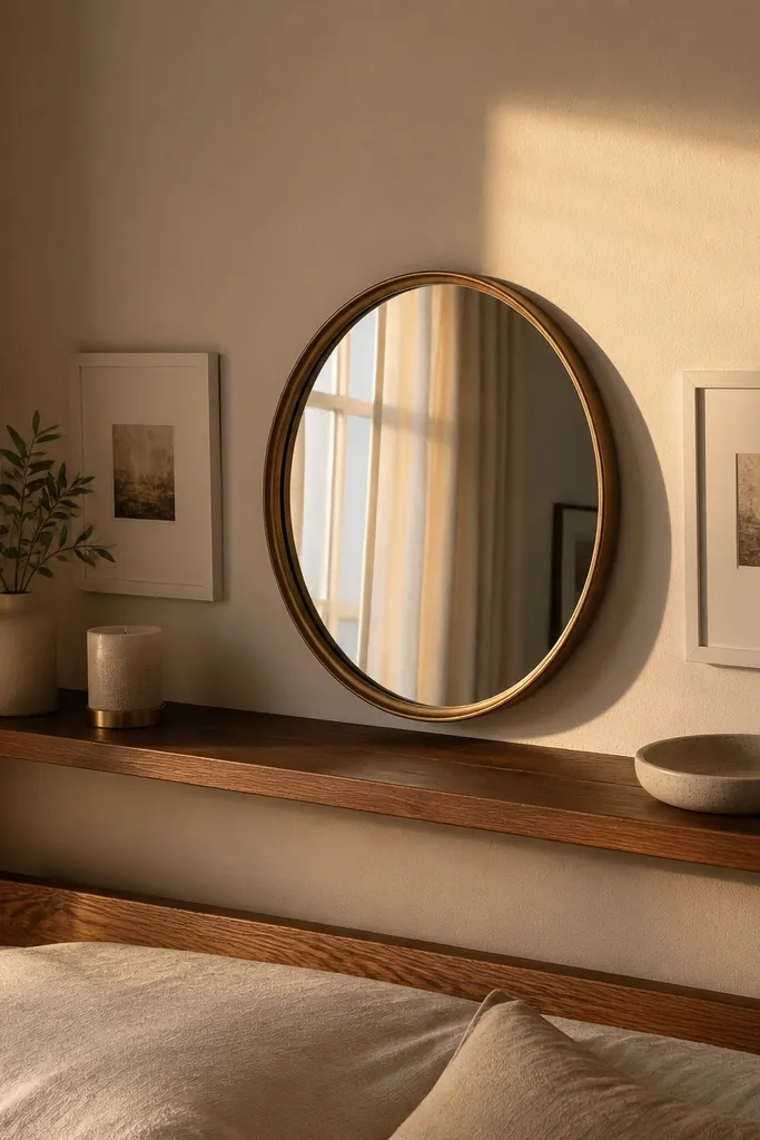
Mount the shelf first so it sits about 10-12 in below where you want the mirror’s bottom edge. Center the mirror above the shelf, aiming the mirror center at about 60 in from the floor. Add two small frames on either side of the mirror or slightly below it, spaced equally from the mirror edge. Style the shelf with a tray, two candles, and one small plant — keep items within the tray footprint so the shelf looks neat from across the room.
A round mirror changes the whole vibe of Gallery Wall With Shelves Ideas because it adds a soft shape that breaks up rectangles. Put the mirror above a shelf ledge and use smaller frames or photos off to the sides. The mirror also makes rooms feel brighter, which helps your shelf decor look better because reflections add depth. Keep the mirror centered and let the shelf handle the styling. This layout is great for entryways and small living rooms where you want light and function in one spot.
Skip thisDon’t place heavy decor directly against the mirror — the reflection makes everything look doubled.
Editor's noteUse a tray. It gives your shelf decor a “container” so it doesn’t sprawl.
8. Grid of narrow frames with one staggered shelf
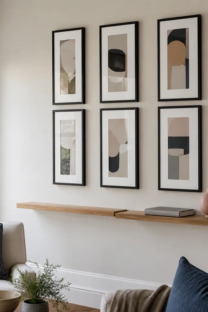
Arrange narrow frames in a tight grid with 1.5-2 in spacing between frame edges. Install one shelf beneath the grid, but shift it slightly left or right so it doesn’t line up perfectly with the frame grid center. Keep the shelf top about 6-8 in below the bottom row of frames. Style the shelf with a line of objects: one tall candle or vase, one small picture holder, and one short stack of books at the far end.
This is a high-impact wall when you want art to be the star and shelves to be support. Narrow frames create a gallery “pattern,” and a single shelf underneath gives you a place for objects without breaking the grid. The staggered shelf edge adds movement, which keeps the wall from looking flat. Choose frames with the same width and finish, then vary the art sizes with consistent mat borders. This works well in stairways, hallways, and dining rooms where you want lots of detail without clutter.
Skip thisAvoid mixing wide frames into this grid. It breaks the pattern and makes the wall look accidental.
Editor's noteUse picture-hanging wire or a frame template so every narrow frame sits at the same height relative to the grid.
9. Layered shelves with framed photos in front
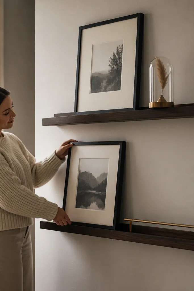
This look adds depth because the frames sit in front of the shelf line. It’s great when you want Gallery Wall With Shelves Ideas to look more dimensional and less flat. Use two shelves at different heights, then mount or lean small frames so their bottom edges overlap the shelf area. The trick is to keep frame depth shallow so the wall doesn’t look crowded. This is photogenic because it creates layered shadows that change with lighting throughout the day.
Mount the lower shelf first at about 50-54 in to the shelf top, then place the second shelf 12-16 in above it. Hang small frames so their lower edges overlap the shelf area by 1-2 in, keeping all frames within a consistent horizontal band. Style the shelves with a minimal base layer: one tray on each shelf and one small object per side. Finally, check from eye level and from across the room to make sure the frame overlap looks intentional, not like a mess.
Use frames with glass or acrylic fronts to keep reflections consistent and crisp in photos.
Don’t let frames overlap chaotically. Keep overlap only in one direction for a clean look.
10. Shelf + vertical art column with two side mini shelves
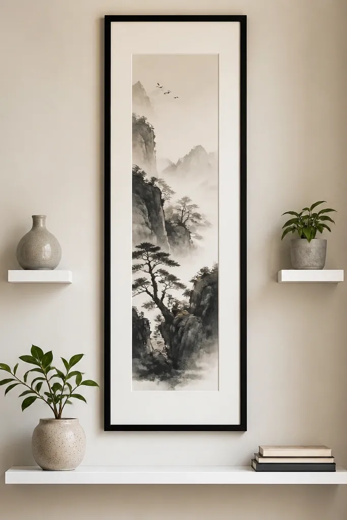
Hang the tall framed art first, centered, with the frame center at about 60 in from the floor. Mount the main shelf below it so the shelf top sits about 8-10 in under the bottom of the tall frame. Then install two mini shelves at matching heights, aligned with the left and right edges of the tall frame. Style each mini shelf with one small object and one book or box, leaving empty space in the middle of each shelf.
This layout is made for walls that need structure. You get a tall art column for impact, a shelf below for styling, and two small mini shelves that act like supporting characters. The vertical piece pulls the eye up, and the side shelves fill the negative space without turning the wall into a cluttered grid. Choose a tall frame with a consistent mat color and keep the mini shelves at the same height. This works in narrow living rooms and above dressers where you want the wall to feel taller.
Skip thisAvoid placing more than two items on each mini shelf. Tiny shelves get messy fast.
Editor's noteUse identical mini shelf bracket styles. The symmetry is what makes this layout look planned.
11. Dark wood shelves with light frames and linen decor
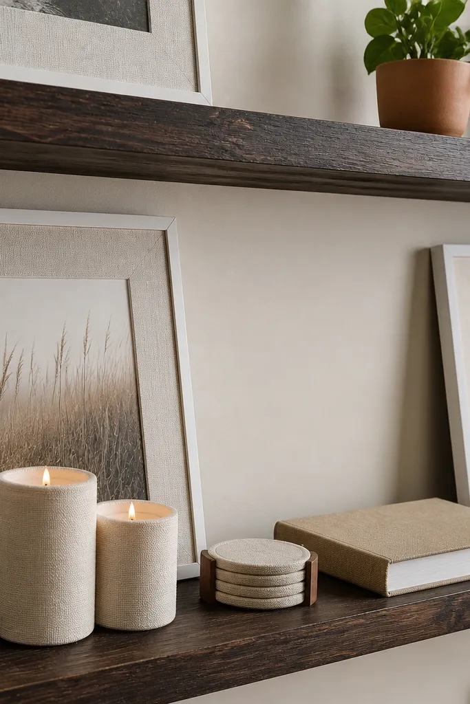
If you want aesthetic consistency, materials matter more than design tricks. Dark wood shelves against light frames look sharp because the contrast is clear. Add linen-texture decor (linen booksleeves, fabric-wrapped candles, or simple cloth coasters) to soften the hard lines of the shelf. The wall looks good even when decor changes because the shelf finish stays constant. This is great for living rooms and bedrooms where you want a calm, grounded look that still photographs cleanly.
Choose light frames in white or natural wood and match mat color across the gallery. Mount dark shelves at a height where the shelf top aligns around the middle of your frame arrangement (about 58-62 in). Arrange frames above or beside the shelves in a staggered pattern, but keep the mat edges aligned as much as possible. Style the shelves with linen-texture items on trays, then add one dark accent object to tie into the shelf color.
Keep your shelf decor palette to 3 colors max: one shelf tone, one light neutral, one accent.
Don’t use bright glossy decor on dark shelves. It creates glare that ruins photos.
12. White shelves with black frames for a high-contrast gallery
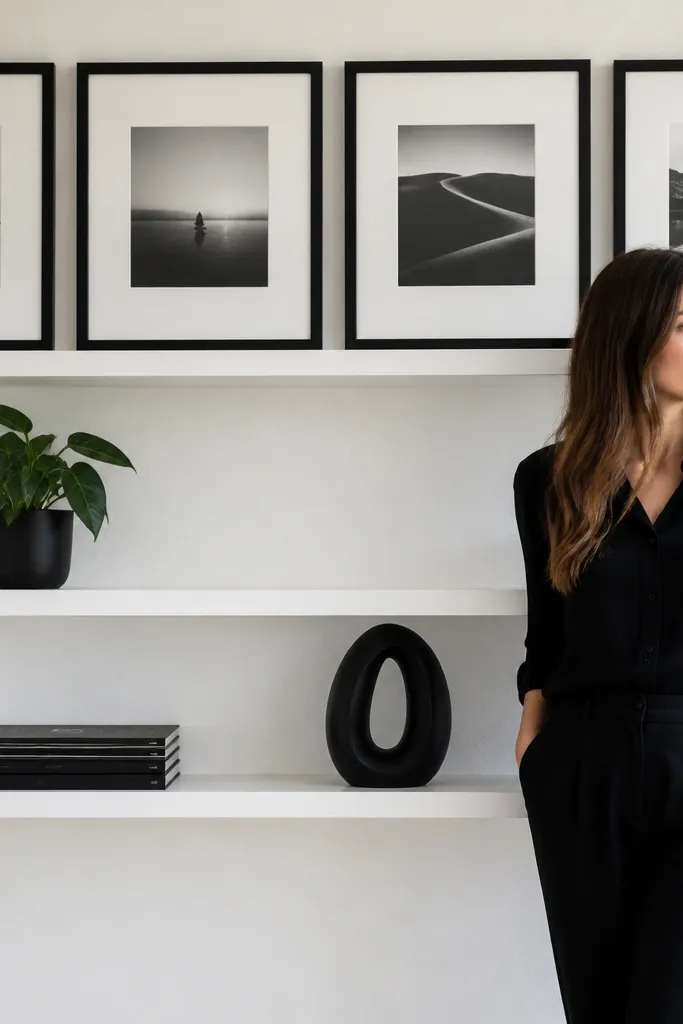
Mount one or two white shelves so the shelf tops sit between your frame rows. Hang black frames with consistent mat thickness and spacing, aiming for 2-3 in between frame edges. Style each shelf with a simple stack: two books horizontally, one upright book, and one small plant or object in the back center. Keep the shelf decor set back 1-2 in from the front edge so it doesn’t look crowded.
High-contrast palettes make Gallery Wall With Shelves Ideas look crisp instantly. White shelves make the wall feel brighter, while black frames add structure. Keep the decor minimal: a few books, one plant, and a small sculptural object. This look works in rooms with lots of natural light because the shelves don’t disappear into the wall. It’s also a safe choice if you’re unsure what art will look best — the frames do the heavy lifting.
Skip thisDon’t mix black frames with chrome decor. The shine fights the matte look.
Editor's noteIf your wall color is warm, choose black frames with a matte finish. Glossy black looks harsher in daylight.
13. Mismatched shelves with matching frame sizes
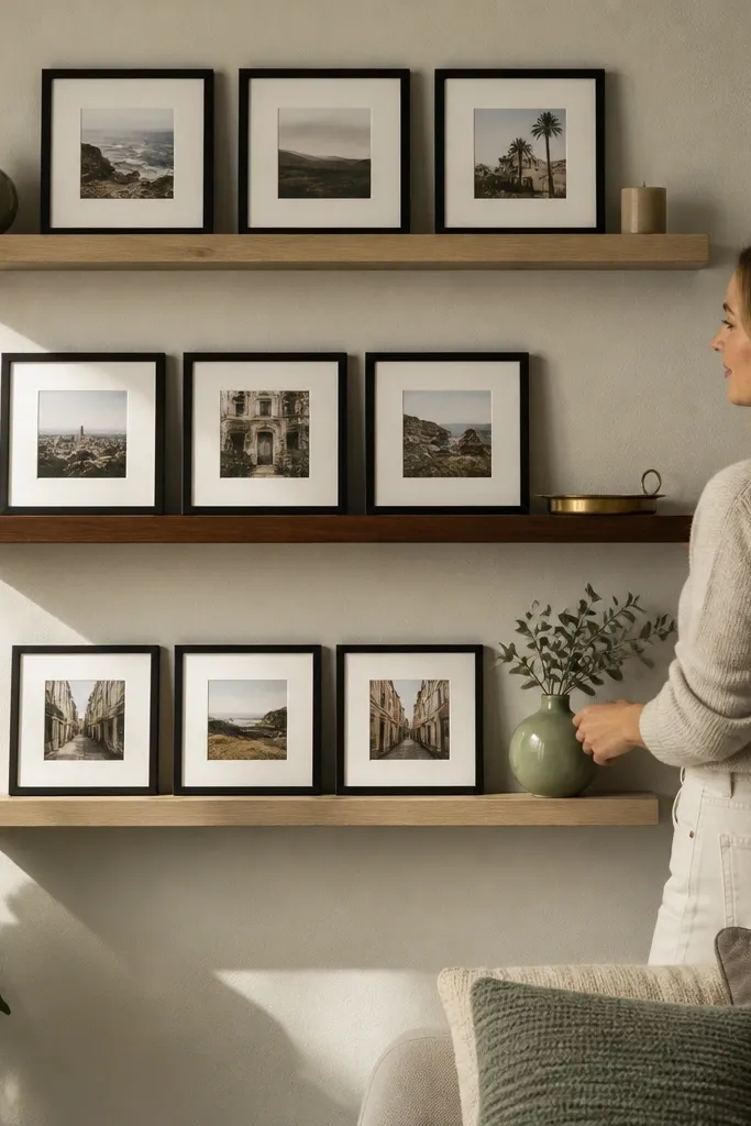
Pick one frame size and stick to it for the whole gallery, including the mat and frame finish. Mount shelves in two lengths with a small height difference (about 2-3 in between shelf tops) so the shelf edges don’t look like a rigid grid. Place frames around the shelf line so the frames form a consistent pattern above or between shelves. Style the shelves with 3-4 objects max, repeating the same type of items on each shelf (one book stack, one small bowl, one plant).
This is how you get personality without losing cohesion. Use shelves that are different lengths or slightly different tones, but keep the frames identical in size and style. The matching frames create a visual anchor, and the shelves add asymmetrical storage. This works when you’re pulling items from different sources but want one wall to look intentional. It’s also great for people who want to keep buying art over time — the frames stay consistent while the objects on shelves can rotate.
Skip thisAvoid changing frame sizes. The mismatched shelves look messy if the frames are also mismatched.
Editor's noteUse the same bracket color across all shelves even if the shelves differ. It ties everything together.
14. Shelf under a horizontal strip of small photos
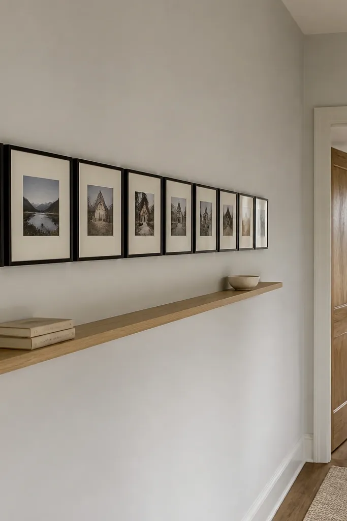
Hang a row of small frames across the wall, keeping equal spacing and aligning the top edges. Place the shelf so its top is about 4-6 in below the bottom edge of the photo row. Center everything on one vertical line so the shelf doesn’t drift. Style the shelf with a single tray, two small items on the tray corners, and one small plant or candle near the center.
A horizontal strip is a strong move when you want the wall to read wide and calm. Put the strip of small photos high, then add one shelf directly below to create a second layer. This layout is photogenic because it keeps the wall’s main detail in one line, and the shelf styling stays contained. It’s great for hallways and dining rooms where you need a long visual band. For the shelf, use a tray so decor stays in a neat rectangle.
Skip thisDon’t use deep shelf decor under a tight photo row. It visually pushes forward and competes with the frames.
Editor's noteUse identical frame widths for the photo strip. That’s what makes the strip look like one design, not a collection.
15. Recessed-look shelves using picture ledges
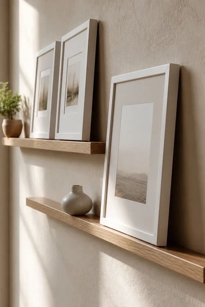
Install picture ledges level, with the top ledge about 56-60 in from the floor. Mount frames above or between ledges, using 2-3 in spacing between frame edges. Keep shelf styling minimal: one flat object (tray) and one vertical accent (book or thin vase). Check clearance around the wall so the shelf doesn’t stick into walkways, especially in hallways.
Picture ledges create a recessed look without building anything complicated. The thin shelf profile keeps the wall light, and the frames above look like they’re floating. This is a great option when you want Gallery Wall With Shelves Ideas that look airy, not heavy. Use this with smaller frames and simple art because the shelf itself is subtle. It’s ideal for bedrooms, studios, and reading rooms where you want the wall to feel calm and intentional.
Skip thisAvoid heavy bulky decor on picture ledges. The thin lip can make large items feel unstable.
Editor's noteUse ledges with a clean lip edge so items don’t slide. Add small felt pads under decor if needed.
16. Two-tone shelves matched to wall paint
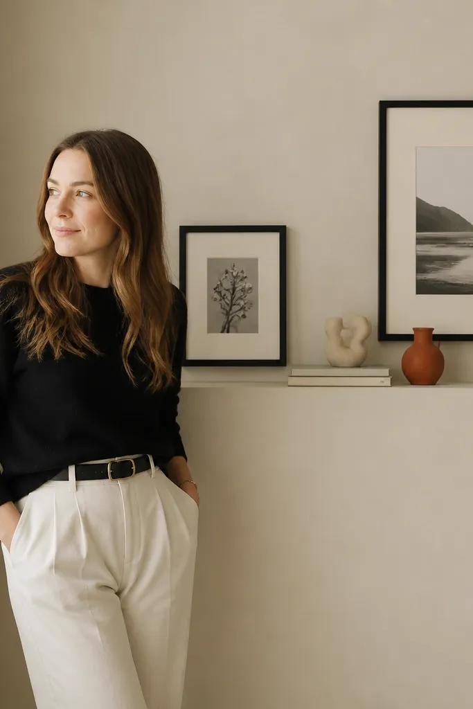
Paint or buy shelves in a color that matches your wall undertone (warm off-white for warm walls, cool gray for cool walls). Mount shelves so the shelf top aligns with the midline of your frame cluster. Hang frames with consistent mat colors and a consistent spacing rule (2-3 in between edges). Style the shelf with a tray in a neutral and one accent item in the same color as one frame element.
This look is about color control. If your wall paint is a warm off-white or soft gray, match one shelf color to it so the shelf disappears. Then use frames in a contrasting finish so the art stays the star. Add decor in one accent color pulled from your frames. The result is a gallery wall that looks curated even when your shelf decor changes. This is perfect for rooms where you already like the paint color and don’t want the shelves to fight it.
Skip thisDon’t pick shelf color based on a swatch alone. View it in the room’s light before committing.
Editor's noteUse matte finishes for both shelves and frames. Matte reduces glare and keeps photos clean.
17. Shelf + vinyl records + framed typography
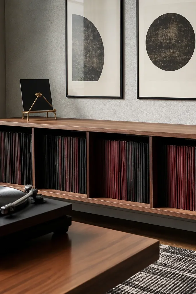
Mount a shelf at about 54-58 in to the shelf top so records sit comfortably at eye level. Hang framed typography above the shelf with 2-3 in spacing between frame edges and align their top edges. Stack vinyl records neatly with spines facing out, then add one small record player accessory or candle as a single accent. Keep the typography frames in one finish and use a consistent mat color so the wall looks intentional.
This is a fun, specific Gallery Wall With Shelves Ideas setup that looks great in music rooms and modern living rooms. Vinyl records add texture, and framed typography adds a clean graphic hit. Keep the shelf clutter controlled by stacking records in a neat row and using only a few small objects on top. The wall reads like a theme, but the frames keep it from becoming random memorabilia. If you want a wall that looks styled even when you’re not constantly changing decor, this is the way.
Skip thisAvoid mixing record brands with wildly different colors on the same shelf if you want a clean, designed look.
Editor's noteUse a record stand or shelf riser so spines face the room, not downward.
18. Corner-to-center shelf line with centered frame cluster
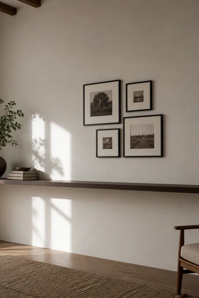
Install a long shelf with its center aligned to your focal frame cluster. Place the shelf top about 6-8 in below the bottom edge of the lowest frame in the cluster. Hang 4-6 frames in the center cluster with consistent spacing, keeping frame edges aligned to a grid. Style the shelf with two decor groupings, one on each side of the center, but keep each grouping to 3 items max.
Long shelf lines make walls feel organized because the eye follows the shelf edge. Put the shelf line so it visually leads from one side toward the center, then stack a compact cluster of frames in the middle. This is a smart choice when you have a large wall and need a clear focal point. The shelf holds decor that stays controlled, while the frame cluster provides the art detail. It’s photogenic because it creates a clear center of gravity and crisp negative space.
Skip thisAvoid placing decor across the entire shelf length. It flattens the center focal point.
Editor's noteLeave 6-10 in of empty shelf space near the cluster so decor doesn’t look glued to the frames.
19. Minimal shelf with one oversized framed print
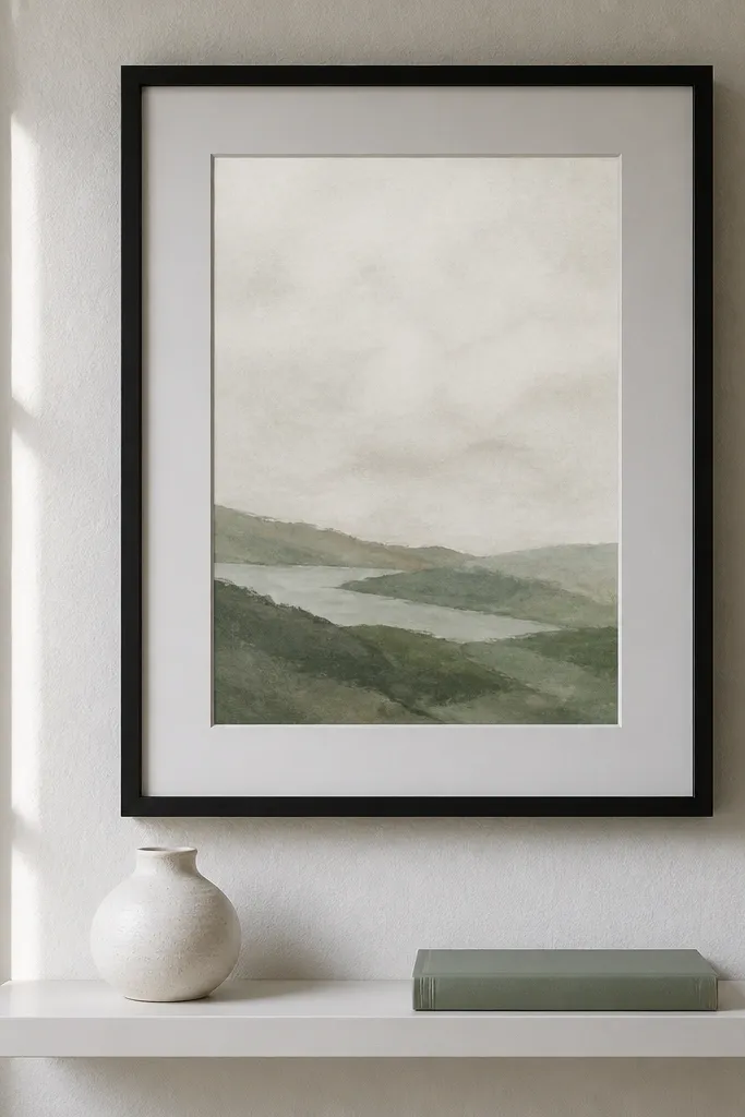
Hang the oversized frame first, centered, with the top edge about 10-12 in below the ceiling or crown molding if you have it. Mount a single shelf below it so the shelf top sits 8-10 in under the bottom edge of the frame. Style the shelf with a single tray and one or two objects on it. Keep the tray centered so the wall looks balanced even with minimal decor.
This is the anti-clutter answer to Gallery Wall With Shelves Ideas. One oversized framed print gives you impact, while a single shelf below adds function without turning the wall into a collage. The shelf decor stays minimal, so the wall still looks good when you don’t feel like styling. Choose an oversized print with strong color or a clean black-and-white image. This layout works in living rooms, bedrooms, and offices where you want a statement without the work of multiple frames.
Skip thisAvoid using tiny decor on a shelf under an oversized art piece. It looks like crumbs unless you scale up the decor.
Editor's noteUse a frame with a wide mat or thick border. It creates breathing room around the art and makes the shelf look intentional.
20. Picture ledge shelf with 2-tier shadow-box frames
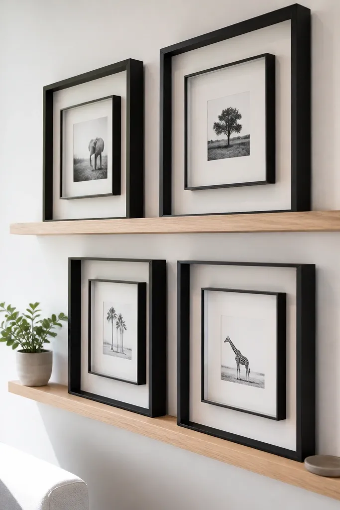
This is the gallery wall with shelves idea that looks expensive because it adds depth, not just height. The picture ledges hold the frames slightly forward, and the shadow-box style mat makes each photo feel layered and intentional. It fixes the “frames look flat” problem that happens when everything sits flush on the wall. You get a clean, modern rhythm that works in hallways, stair landings, and any room where you want art that reads from across the space. It’s a DIY-friendly build if you can measure straight and use a level, and it takes about a half-day once your frames are ready.
Pick a wall spot with enough width to fit two shelves plus the frame widths. Use 1x2 pine or poplar for the ledges, cut them to 36 in and 24 in, and keep the top shelf 6 in above the bottom shelf. Build a simple shadow-box frame for each photo: cut 1/2 in MDF or birch plywood into a 2-sided box (about 3/4 in deep), then glue and nail it so the photo sits inside with a 1/4 in lip. Mount the shelves first using a stud finder and 2-1/2 in wood screws with wall anchors only where you miss studs, then paint or stain the ledges and seal them with a matte clear coat. Hang the shadow-box frames after the shelves cure, setting the back edge of each frame on the ledge so they sit forward and create that shadow line.
Sand the shelf faces to 150 grit and wipe with a tack cloth before paint — it keeps the finish from going patchy. If you’re staining, do a test on the exact scrap and seal with the same matte clear so the ledges don’t look shinier than the frames.
Don’t mount the shelves by eyeballing the height — even a 1/4 in difference makes the stacked frames look “off” in photos.



