
1. Stone Cladding Panels With Centered Gate Border
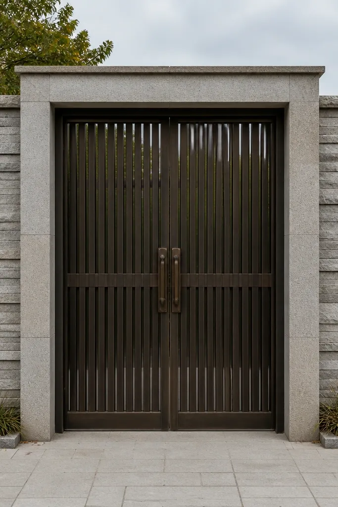
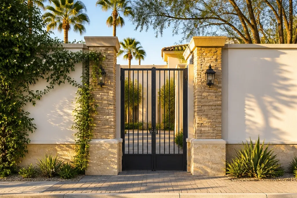
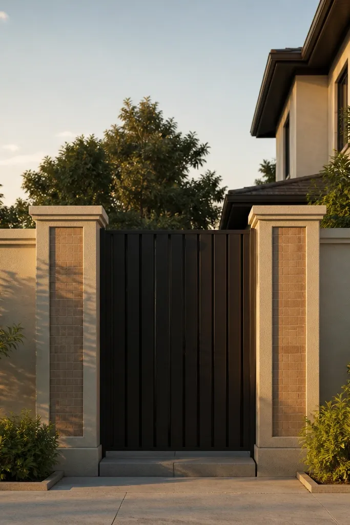
This design works because it gives the eye a clear center. Stone cladding in stacked rectangular panels creates depth without needing heavy carvings, and the gate border ties the opening to the wall instead of letting it float. Keep the stone finish consistent across both sides so the front reads symmetrical. It’s a great choice when you want a premium look but still want a straightforward build process with clean lines. Skill level is medium because you need neat panel layout and careful edge trimming.
Start by marking a vertical centerline and laying out panel widths so the pattern lands evenly on both sides of the gate. Apply base plaster, then fix stone cladding in straight courses using a polymer-modified tile adhesive; keep joints uniform with spacers. Finish the top edge with a concrete coping strip and seal the stone joints after curing. Finally, add a simple vertical border strip around the gate opening using either cladding returns or a cement-plaster trim band.
Editor's noteDry-fit the first three rows before adhesive so you can adjust cut sizes and keep the joints straight.
Skip thisAvoid mixing random stone sizes on the face; it makes the wall look patchy instead of intentional.
2. Brick-Slip Horizontal Bands Over Smooth Plaster
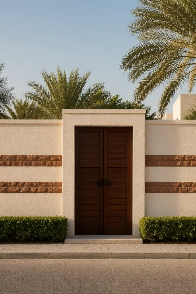
Horizontal brick-slip bands are one of the easiest ways to make a plain compound wall look designed. The smooth plaster field gives you a clean background, while the brick bands add warmth and texture at the exact height lines your eye naturally scans. This is especially good for long wall stretches where you want visual breaks without building many protruding elements. The look is modern-traditional because the brick texture is warm but the layout is controlled. It’s beginner-friendly if you can keep adhesive lines straight and measure consistently.
Mark two or three band heights across the wall, keeping them level with a laser level. Apply a skim coat of plaster and let it cure, then spread adhesive with a notched trowel and fix brick slips in straight strips. Use spacers for joint consistency and cut ends with a tile cutter for clean edges. Seal the brick-slip joints where needed, then paint the plaster field with an exterior masonry paint in a light warm tone.
Editor's noteUse painter’s tape as a guide line for band edges before you spread adhesive.
Skip thisDon’t run the bands with a slight slope; even a small tilt reads sloppy in photos.
3. Vertical Fins With Sand-Colored Plaster Panels
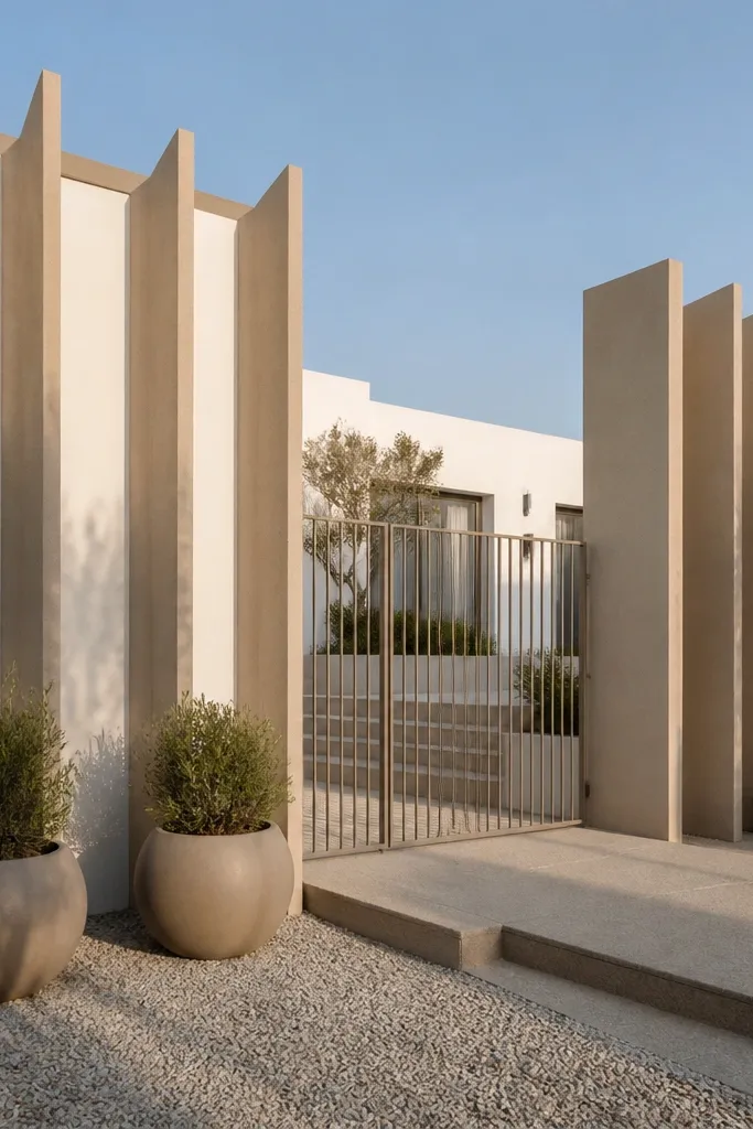
Vertical fins create a crisp rhythm and make the entrance look taller and more structured. The space between fins gives the wall a lighter, airy feel even if your height is moderate. This design looks best when your gate area has matching vertical lines, so the whole front reads like one composition. It’s also practical because the fins hide minor surface imperfections and give you natural shadow lines. Time and skill are medium since spacing and alignment matter.
Decide fin thickness and spacing first; a common clean look is 4-6 in fins with 8-12 in gaps, scaled to your frontage. Cast or build fin supports along the wall line, then fill the panel areas with plaster or tile backer sheets. Apply a final plaster finish in sand color and keep fin faces smooth with proper troweling. Top everything with a coping that spans over fins and panels for a uniform edge.
Use a spacer board cut to your gap width so every fin bay stays identical.
Avoid uneven fin thickness; it ruins the rhythm and makes the wall look handmade in a bad way.
4. Cement Plaster Ombre With Stone Feature Column
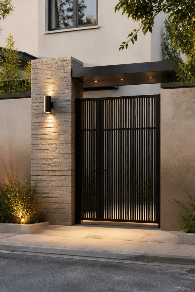
An ombre-style plaster finish makes the wall look designed without adding complicated structures. The trick is keeping it subtle — a gradual light-to-warm or warm-to-deep shift that catches light differently through the day. Place a stone or textured column near the gate so the color transition has a visual anchor. This design is good for modern homes that want personality but still look clean. Skill level is medium because you need control over mix color and brush/trowel blending.
Apply a uniform base plaster coat and let it cure fully, then prime with an acrylic masonry primer. Mix three batches of exterior pigment: base light, mid tone, and deeper tone. Apply the light layer first, then blend the mid tone with a damp sponge or wide trowel strokes, and finish with the deeper tone at the bottom or side feature zone. Wrap the feature column with stone cladding or textured tile, then add a simple coping line to keep the top edge crisp.
Blend in sections no wider than 3-4 ft so the edges don’t dry and create a hard line.
Don’t pick high-contrast colors; harsh jumps look like paint mistakes, not design.
5. Tile-Grid Panels With Matte White Finish

A tile grid turns a flat wall into a clean architectural surface. Matte white or off-white tiles keep the front bright, and the grid spacing makes the gate look more proportional. This is the best option when your entrance is narrow because the regular pattern visually organizes the space. Choose outdoor-rated ceramic or porcelain tiles with a slip-resistant surface so the wall stays neat even with rain. Skill level is medium because you must keep lines square and joints consistent.
Plan your grid with exact tile dimensions and joint widths, then mark reference lines from the gate edges so everything stays aligned. Apply cement-sand mortar or polymer-modified adhesive on a cured plaster base, then fix tiles using spacers for straight grout lines. Use a level and string line to keep each row perfectly level as you go. After curing, grout with exterior grout and seal if the tile is porous, then finish the wall top with coping or a tile-faced top band.
Editor's noteDry-lay the first row and adjust before you commit adhesive; a 1/4 in shift across 10 ft shows up in photos.
Skip thisAvoid glossy tiles; glare makes the wall look washed out and cheap in bright sun.
6. Diagonal Brick Accents On Plain Plaster
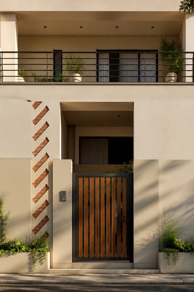
Diagonal brick accents add motion to an otherwise flat front. The trick is to keep the main wall finish simple and let only a narrow band of diagonal accents do the work. This makes the gate look more energetic without overpowering the whole compound. It’s also a great rescue design if your frontage is irregular because the diagonal elements guide the eye. Skill level is beginner-to-medium depending on whether you cut brick slips cleanly.
Paint or plaster the main wall face in a light neutral exterior finish and let it cure. Create a diagonal layout band width of about 16-24 in near the gate and mark the diagonal line with a string. Fix brick slips along the diagonal using adhesive, cutting ends to match so the band edges look sharp. Finish with a consistent coping and add a vertical trim strip at the band ends to frame the accent.
Editor's noteUse a chalk line and check symmetry on both sides of the gate before you start gluing bricks.
Skip thisDon’t make the diagonal band too wide; it can make the wall feel busy and visually smaller.
7. Checker Panel Base With Stone Top Band
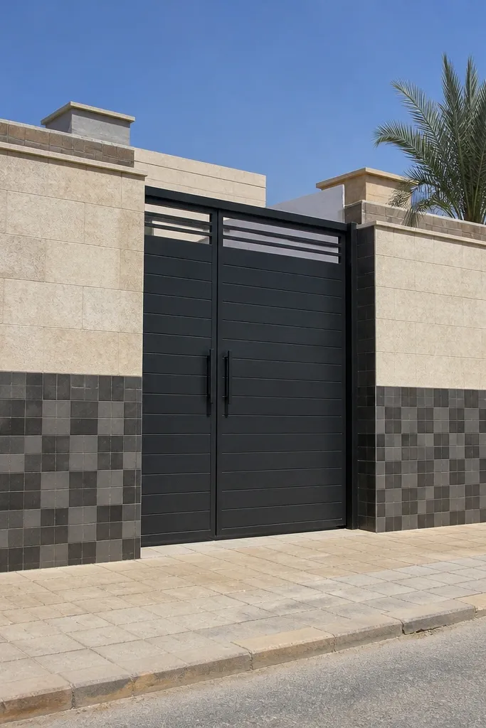
A checker panel base gives you a strong visual foundation that looks sharp in daylight and cleaner in photos. Pair it with a stone top band so the wall has a “finished” crown and the textures don’t fight each other. This design works well when you want the front to look modern but still grounded. Use small-format tiles for the checker pattern so it reads as texture instead of random pieces. Skill level is medium because you need careful tile alignment.
Choose checker tile size like 6x6 in or 8x8 in and plan your pattern so it centers around the gate opening. Apply base plaster and fix tiles on the lower section using spacers and a straight edge guide. After curing, grout and seal the joints if needed. Add a stone top band above the checker area, then install coping to tie the stone band and wall top together.
Start tiling from the centerline and work outward so the pattern stays centered even if your wall length is awkward.
Avoid using too-large checker tiles on a short wall; it makes the pattern look childish.
8. Full Height Vertical Slat Look With Timber-Color Tiles
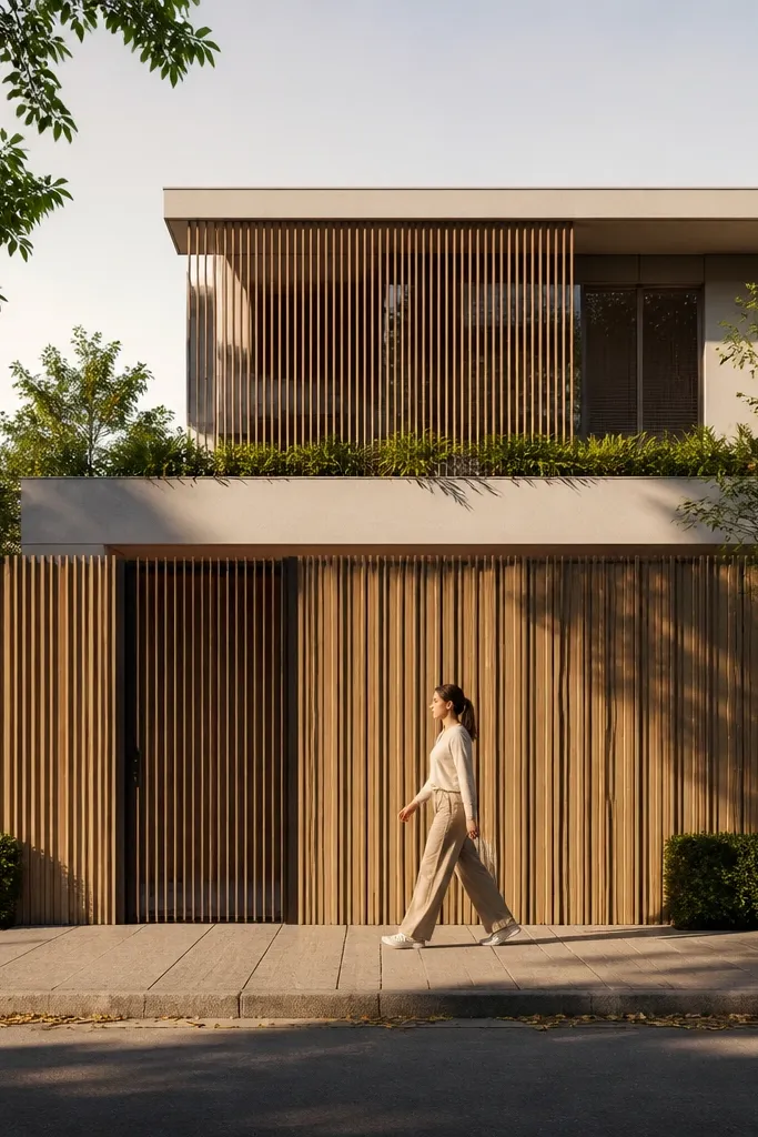
This is the cleanest way to get a “slatted” look without real wood rot issues. Vertical tile strips in a timber-color tone create warm shadows, and full-height layout makes the wall feel intentional instead of decorative. It looks especially good with a simple metal gate because the vertical rhythm matches the gate bars. The finish stays consistent in rain if you use exterior-rated tiles and proper grout sealing. Skill level is medium because you must cut and align strips precisely.
Pick exterior porcelain tile strips or tile panels cut into vertical strips, and decide the strip width and gap (like 2-3 in strips with 1-2 in grout gaps). Mark vertical centerlines and reference lines before adhesive application. Fix strips in parallel rows, using spacers to keep gaps uniform; check alignment every few strips with a straight edge. Seal grout after curing, then add coping and paint any remaining plaster in a matching warm neutral.
Editor's noteKeep the grout gap consistent; that spacing is what makes the slat look read as design, not just tile work.
Skip thisAvoid mixing multiple timber shades; choose one tone so the wall looks like a single material system.
9. Half-Wall Stone With Wrought-Iron Upper Frame
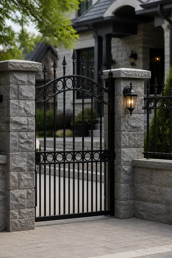
If you want the front to look classy and still keep visibility, this combo is hard to beat. The stone half-wall grounds the home and hides the mess at the bottom, while the wrought-iron upper frame gives a light, airy view. It’s ideal for homes where you want security without making the front feel closed off. The key is matching the iron design lines to the wall trim so everything looks coordinated. Skill level is medium because it involves metalwork measurements and masonry finishing.
Build the stone half-wall first to your chosen height, then level the top edge and install anchor plates for the iron frame. Apply stone cladding to the half-wall face using adhesive and keep joints consistent. Fabricate or install the iron upper frame with matching vertical bars and a top rail, then secure it to anchors with proper bolts and corrosion-resistant coating. Finish the iron base line with a trim strip and seal stone joints.
Use stainless or galvanized fasteners in the iron-masonry connection so rust doesn’t stain the stone.
Avoid skipping anchor alignment; if the iron frame is crooked, the whole front looks off in photos.
10. Geometric Cut-Block Columns With White Plaster
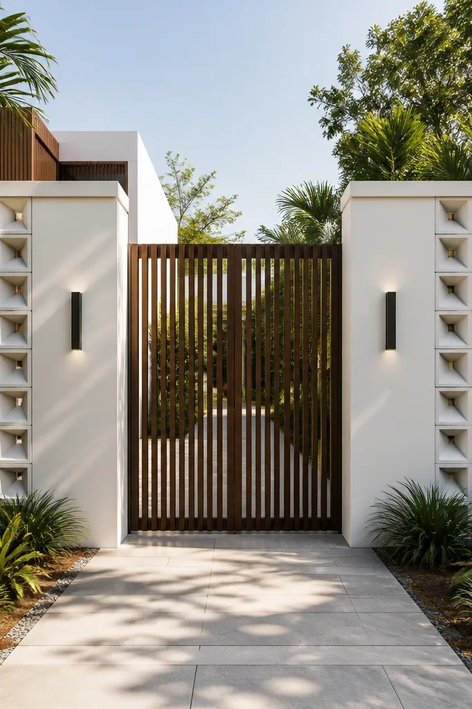
Geometric cut-block columns add structure at the corners and frame the entrance area. White plaster keeps the wall bright, and the cut blocks bring a sculpted look that reads premium. This design works best when your gate is centered because the corner columns guide the eye inward. It also hides small plaster surface issues because the blocks create depth and shadows. Skill level is medium since you’re building and finishing block shapes.
Plan your column sizes before you start, such as 12x12 in columns with 18-24 in spacing from edges. Build the base plaster wall first, then create the column forms by fixing block sections or using pre-cast cut blocks. Apply plaster around columns for smooth transitions and keep edges sharp with corner beads. Paint the wall face in exterior white and finish the top edge with a continuous coping strip.
Use corner beads and keep a wet sponge ready for immediate cleanup so edges don’t get rounded by plaster smears.
Avoid overly deep cut shapes; too much shadow can look dirty and uneven in daylight.
11. Dark Gray Plaster With Brass-Trim Panels
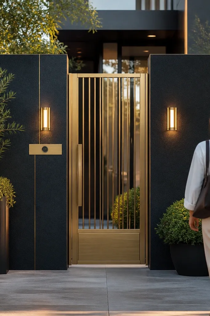
Dark gray plaster looks modern and makes the gate and plants stand out, but it needs a “pattern” to avoid looking like a plain slab. Thin brass-colored trim lines create panel geometry without adding bulk. This design is photogenic because the trim catches light and the dark base absorbs it. It’s great for contemporary homes with clean landscaping. Skill level is medium because you must keep trim lines straight and protect surfaces from moisture.
Apply exterior dark gray masonry paint or pigment to a cured plaster base, then let it cure fully. Mark your panel layout with painter’s tape and install thin metal or PVC trim strips using exterior adhesive or mechanical anchors. Keep panel sizes consistent; for example 24-30 in wide panels with 6-8 in vertical divisions. Seal the trim edges and finish with a coping strip that matches the trim height.
Editor's noteUse a laser level for trim lines; tape won’t fix an off-level grid once you install thin strips.
Skip thisAvoid cheap trim that warps in heat; it will create waves that ruin the panel geometry.
12. Limestone Look Cladding With Recessed Niches
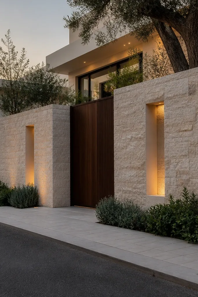
Recessed niches make the wall look custom without building a complex facade. Limestone-look cladding gives texture, while niches add depth and let you hide small LED lights for a high-end nighttime effect. The niches also break up long wall runs so the front doesn’t feel flat. This design is ideal if you want the entrance to look expensive in evening photos. Skill level is medium because niche box dimensions and waterproofing matter.
Plan niche sizes like 8x12 in or 10x14 in and mark positions evenly along the wall face. Build the masonry niche frames first or use pre-made niche boxes, then plaster around them so edges are clean. Fix limestone-look cladding panels around the niches, cutting carefully so the niche opening stays crisp. Install small exterior LED downlights inside the niches and run wiring in conduit before final sealing.
Use waterproof junction boxes and keep conduit accessible for repairs; wall wiring is a future headache if it’s sealed blindly.
Avoid shallow niches without lighting; they look like mistakes instead of design.
13. Terracotta Plaster With Arched Entry Side Borders

Terracotta plaster warms the entire front, and arched side borders give a classic entrance feel that still looks clean. Instead of putting arches on every bay, keep them only at the gate sides so the design stays controlled. This works well in courtyards with greenery because terracotta and plants photograph beautifully. Skill level is medium because you need consistent arch shapes and neat plaster finishing.
Apply terracotta exterior plaster or pigment over a cured base, then mark two symmetrical arch outlines near the gate sides. Build arch forms using plywood templates or flexible strips for smooth curves. Plaster the arch borders with corner finishing beads so edges stay sharp, then add a matching coping line across the top. Finish by painting the main wall and lightly distressing or texturing only the arch border area for depth.
Use the same template for both sides and check symmetry by measuring arch rise and width from the gate edges.
Avoid freehand arches; slight mismatches read instantly in photos.
14. Mosaic Accent Strip Running Along the Top
A mosaic accent strip is a smart way to make a simple wall look styled. Keep the main wall finish plain and bright, then run a narrow mosaic band along the top coping line so it catches light and adds color control. This design is excellent when you want to stay within a budget but still look polished. It also pairs well with modern gate designs because the wall doesn’t compete. Skill level is beginner-to-medium because mosaic placement needs straight alignment.
Finish the main wall face with exterior plaster and paint in a light color like warm white or soft beige. Choose mosaic tiles sized around 1x1 in or 2x2 in and decide a strip height of 2-4 in. Apply adhesive near the top edge and fix mosaic tiles along a straight guide line, using spacers to keep gaps uniform. Seal the grout, then cover the coping line with a matching top cap so water doesn’t soak under the mosaic edge.
Editor's noteMark the strip line with a chalk line straight from one corner post to the other.
Skip thisAvoid thick grout and uneven mosaic cuts; it makes the strip look hand-glued instead of crisp.
15. Raked Texture Plaster With Clean Border Lines
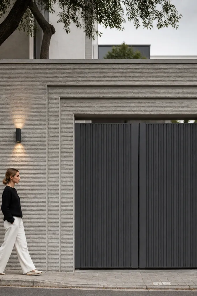
Texture does the heavy lifting here. Raked plaster creates shadow lines that look good even without fancy materials, and clean border lines turn that texture into a structured design. This is one of the best options when you want a matte, modern look that hides surface irregularities. It also works for larger homes because the texture reads intentional at a distance. Skill level is medium because raking consistency matters.
Skim coat the wall and then apply a final plaster layer with a controlled thickness. Use a raking comb or brush to pull lines in one direction, keeping pressure consistent so the texture depth stays even. Mark panel borders with thin plaster strips or apply exterior trim lines and paint over borders in a slightly different tone. Seal the texture with an exterior masonry sealer and finish the top with coping.
Editor's notePractice the raking direction on a small scrap board so your depth matches across the full wall.
Skip thisAvoid switching raking direction mid-run; it looks like patchy repairs.
16. Dark-Tan Stone Base With Light Plaster Upper
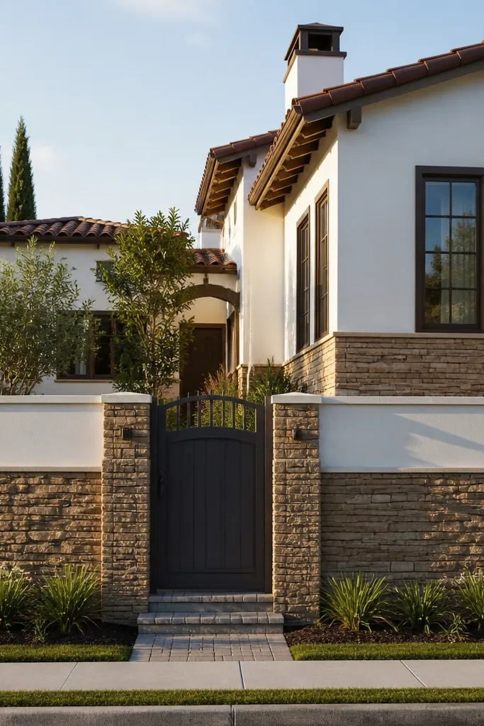
Two-tone walls look expensive because they add proportion. A dark-tan stone base hides dirt splashes and gives you a sturdy grounded look, while a light plaster upper keeps the front open and bright. This design is practical and photogenic because it creates a clear separation line that reads from the street. It also makes gates and grills look more balanced. Skill level is medium because you need a straight separation line and neat cladding edges.
Mark a horizontal separation height that matches your gate visual weight, often around 2.5-3.5 ft depending on wall height. Fix stone cladding on the lower section first, ensuring the top edge of stone is straight and level. Skim and plaster the upper section, then paint in a light neutral tone. Seal stone joints, then install coping across the entire wall so water runoff stays clean.
Use a straight metal angle as a temporary guide while stone adhesive sets so the top edge doesn’t creep.
Avoid painting the upper section before the stone joints fully cure; it can trap moisture and cause staining.
17. Concrete Panel Molds With Soft Rounded Edges
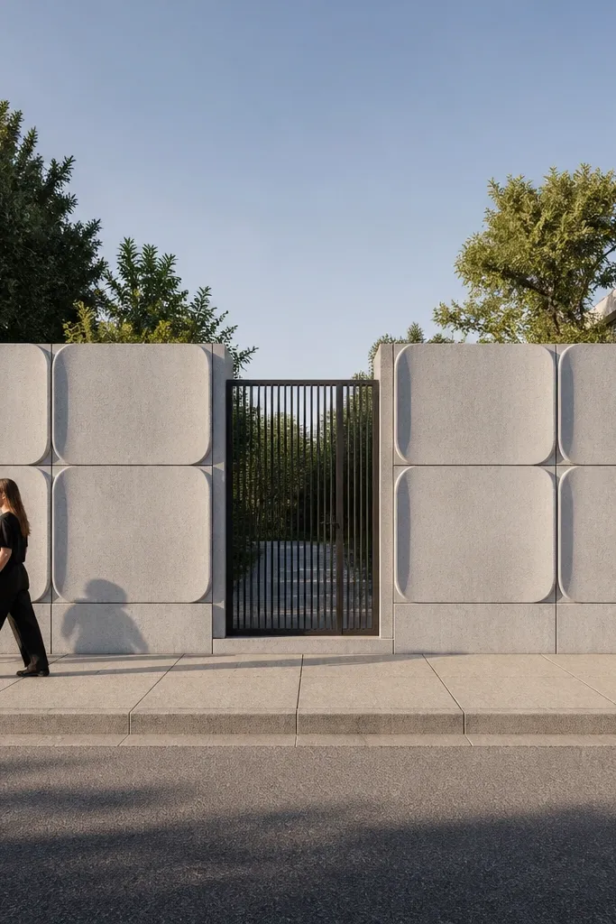
Precast-style concrete panels with rounded edges give a sculpted look that reads modern and sturdy. The rounded perimeter reduces the harshness of straight concrete and looks good in bright sun where sharp corners can cast ugly shadows. Use a repeating panel grid so the wall feels designed, not random. This is a great option if you want a monolithic look without stone or tile. Skill level is advanced because you’re doing formwork and finishing concrete panels.
Build the wall body first and let it cure, then mark a grid layout for the panel molds. Create or install panel mold forms with rounded edge strips and correct spacing, then pour or place concrete panels within the grid. After curing, remove molds and sand high spots so edges look smooth. Apply a protective exterior finish like cement-based coating or pigment with sealer, then add coping and paint any exposed reinforcement areas.
Rely on a rigid spacer frame for panel spacing; eyeballing gaps is how grids become uneven.
Avoid skipping surface sealing; unsealed concrete panels stain fast and look dull.
18. White Plaster With Black Tile Corner Squares
This design is simple but strong: a white plaster field with black tile corner squares creates a crisp graphic look. The black accents add contrast and make the gate area feel framed. It’s a good fit for contemporary homes with black window grills or door hardware. Keep the black squares consistent in size and placement so it reads intentional. Skill level is beginner because it’s mostly plaster painting plus a few tile applications.
Plaster and paint the wall in exterior white and let it fully cure. Decide square tile size like 8x8 in and place them at both corners and near the gate sides, keeping spacing symmetrical. Fix tiles with adhesive, using spacers for consistent grout lines, then grout and seal. Finish the top with coping and paint any trim pieces in black to match the tile accents.
Editor's noteUse a paper template for tile placement so your squares land at the same height on both sides.
Skip thisAvoid uneven grout thickness; thick grout makes the black squares look messy.
19. Green-Gray Plaster With Backlit Border Line
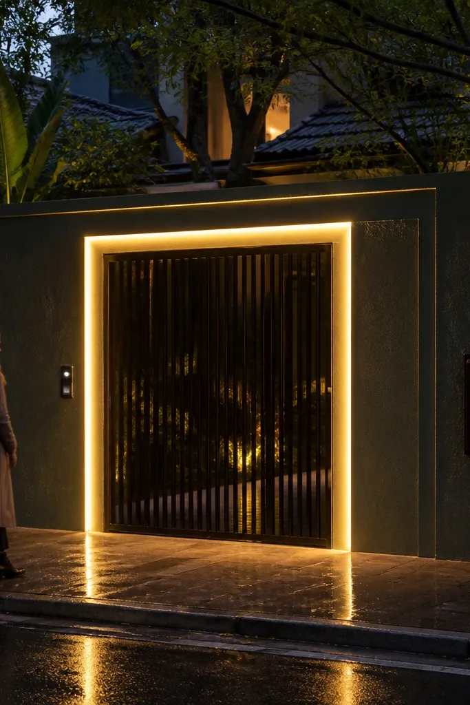
Backlit border lines make a wall look finished at night, and they don’t need a full facade makeover. A green-gray plaster base adds softness, while a thin border channel with LEDs creates a clean outline that makes the gate stand out. This is ideal when your entrance faces a street with evening visibility. Skill level is medium because you’re combining masonry finishing with electrical planning.
Choose an exterior green-gray masonry paint and apply it over a cured plaster base. Mark a thin channel line near the top edge and install a shallow LED channel or conduit-ready groove so light spreads evenly. Wire LEDs into a protected exterior driver and run cables in conduit before closing the channel. Seal the channel edges with exterior-grade sealant, then install coping so the light line stays protected from water.
Use warm white LEDs around 2700-3000K so the wall looks inviting instead of harsh.
Avoid cheap LED strips without proper casing; moisture will kill them and leave ugly spots.
20. Two-Panel Gate-Center Composition With Symmetry Cuts
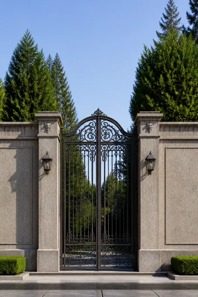
This is the composition-first design. You build two large face panels that meet at the gate centerline with consistent borders, so the whole front reads balanced. It’s the best choice when your gate is the hero and you want the wall to support it, not compete. Use one textured material in the panels and keep borders clean to make the symmetry pop. Skill level is medium because you need accurate measurements and straight border lines.
Measure from one side boundary post to the other and find the exact centerline of the gate. Divide the wall face into two equal panel widths and mark border strips or trim bands around each panel. Apply a textured finish inside the borders like stone-look cladding, brick slips, or textured plaster, keeping the pattern aligned across both panels. Finish with coping and ensure the border line height matches perfectly from left panel to right panel.
Check symmetry by stepping back and using a string line from the gate center — small measurement errors show up fast.
Avoid mixing two textures in the same panel; it makes the symmetry feel chaotic.



