
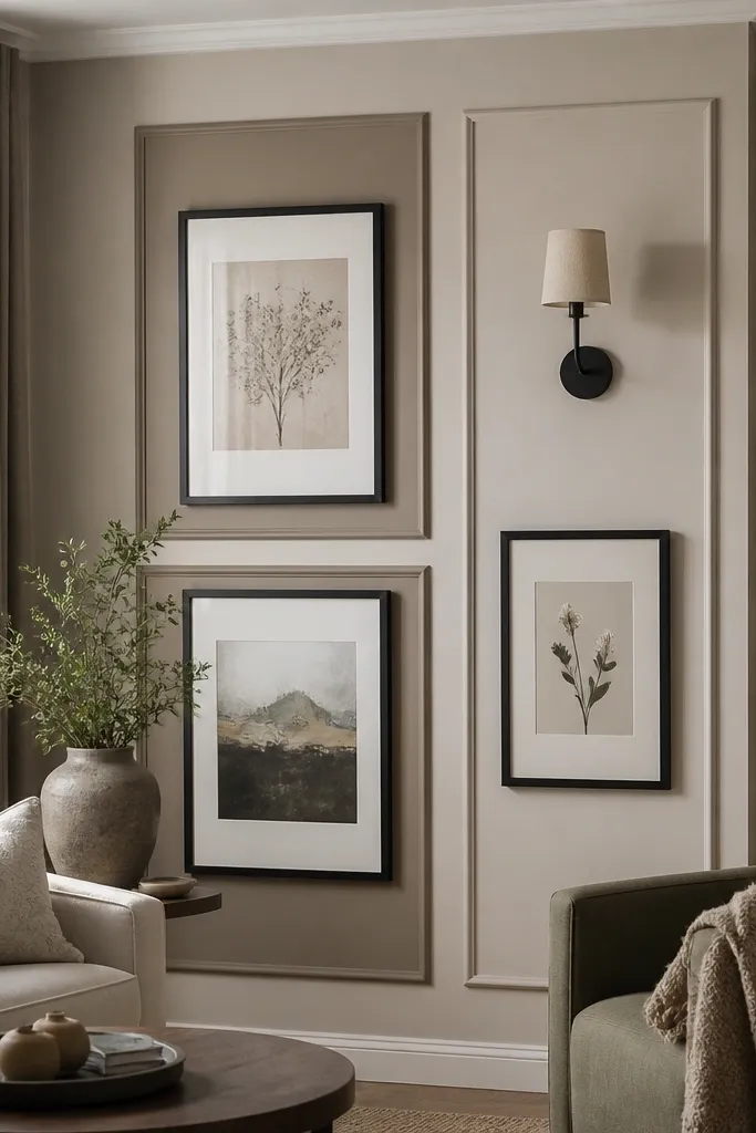
1. Batten grid with warm off-white paint
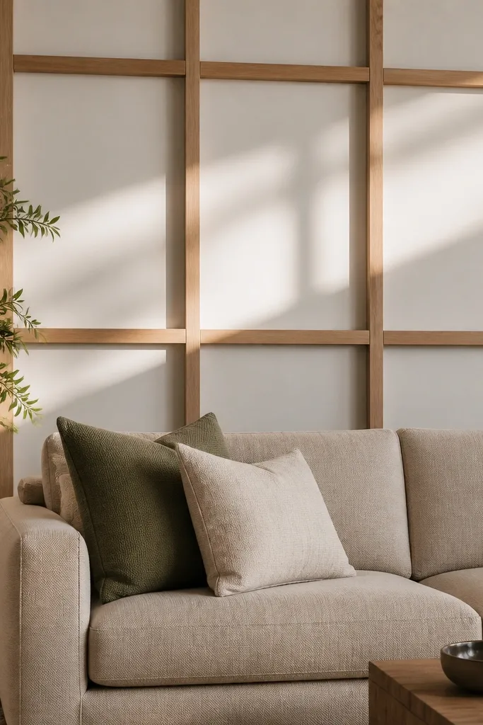
This is the wall design that makes a drawing room look “done” without needing a gallery of random frames. A batten grid adds depth because the thin strips cast shadows, and the off-white base keeps the room bright. Use warm off-white, not icy white, so the wall doesn’t look harsh next to wood floors or beige upholstery. The grid reads clean from across the sofa, which is exactly what you want for drawing room wall design ideas that look good in photos.
Measure your wall width and decide on 2-3 vertical columns so the grid feels balanced. Mark a level line where the grid starts, then use painter’s tape to outline each square so you can check symmetry before cutting. Cut MDF battens (about 1x2 inch look is ideal, but measure your strip width) and attach with construction adhesive plus small finishing nails. Fill nail holes, sand lightly, prime, and paint the wall and battens in the same warm off-white so the texture stays the star.
Editor's noteDry-fit every batten with tape first — the grid looks wrong when one line is even 1/4 inch off.
Skip thisAvoid painting battens a stark white against a warmer wall — the contrast makes the grid look patchy.
2. Fluted panel feature wall in matte paint
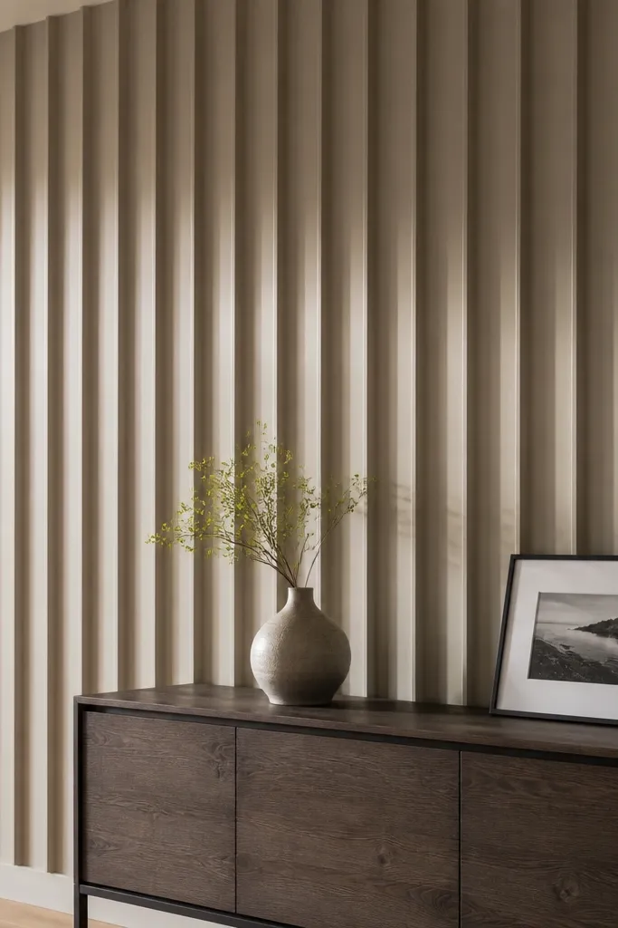
Fluted panels turn a plain wall into a sculptural backdrop. The vertical grooves create shadow depth that changes with the light, so the wall stays interesting even when the room is quiet. Keep the finish matte for a soft, high-end look; glossy paint can make the grooves look cheap. This works best when you want one clear feature wall behind the sofa or dining console.
Pick a panel system you can install in sections — pre-made MDF fluted panels are easiest for clean edges. Clean the wall, then mark level reference lines for the first panel so everything stays aligned. Apply adhesive or use a stud-ready method depending on your panels, then fasten at the edges. Fill seams, sand, prime, and paint with a matte interior wall paint in your chosen tone.
Editor's noteChoose a paint color with a slight warmth; matte cool grays can look flat and gray-beige rooms can feel dull.
Skip thisSkip installing fluted panels over peeling paint — the grooves will telegraph every surface flaw.
3. Wallpaper mural with a centered framed border
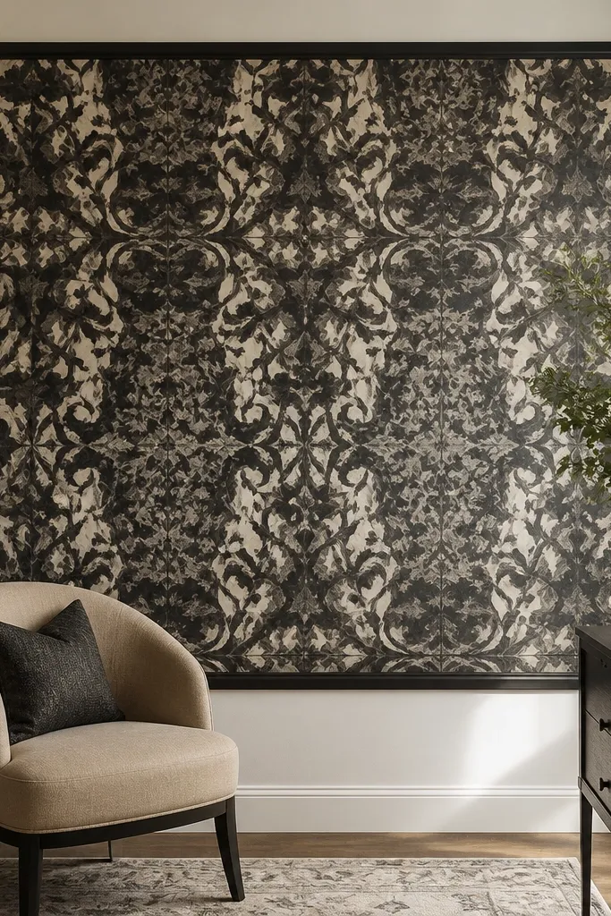
Wallpaper murals look dramatic because they add pattern movement, but the trick is keeping it structured. A centered framed border makes the mural feel like a piece of art instead of a random wallpaper section. Choose a mural pattern with a strong vertical or symmetrical composition so it doesn’t fight your furniture lines. This is a great option for drawing room wall design ideas when you want personality without building anything complicated.
Measure the wall and pick a wallpaper with panels you can align; calculate how many rolls you need with extra for trimming. Apply a painter’s tape rectangle for the mural area, then install wallpaper inside that boundary. Once dry, add flat MDF trim or simple picture-frame molding around the mural edges. Paint the trim to match your room palette, and seal any cut edges carefully.
Editor's noteUse a sharp utility blade and replace it mid-project if the cuts start to tug at the paper.
Skip thisDon’t center a busy mural on a wall if your sofa has bold upholstery patterns — the visual noise piles up.
4. Oversized picture ledge with layered frames
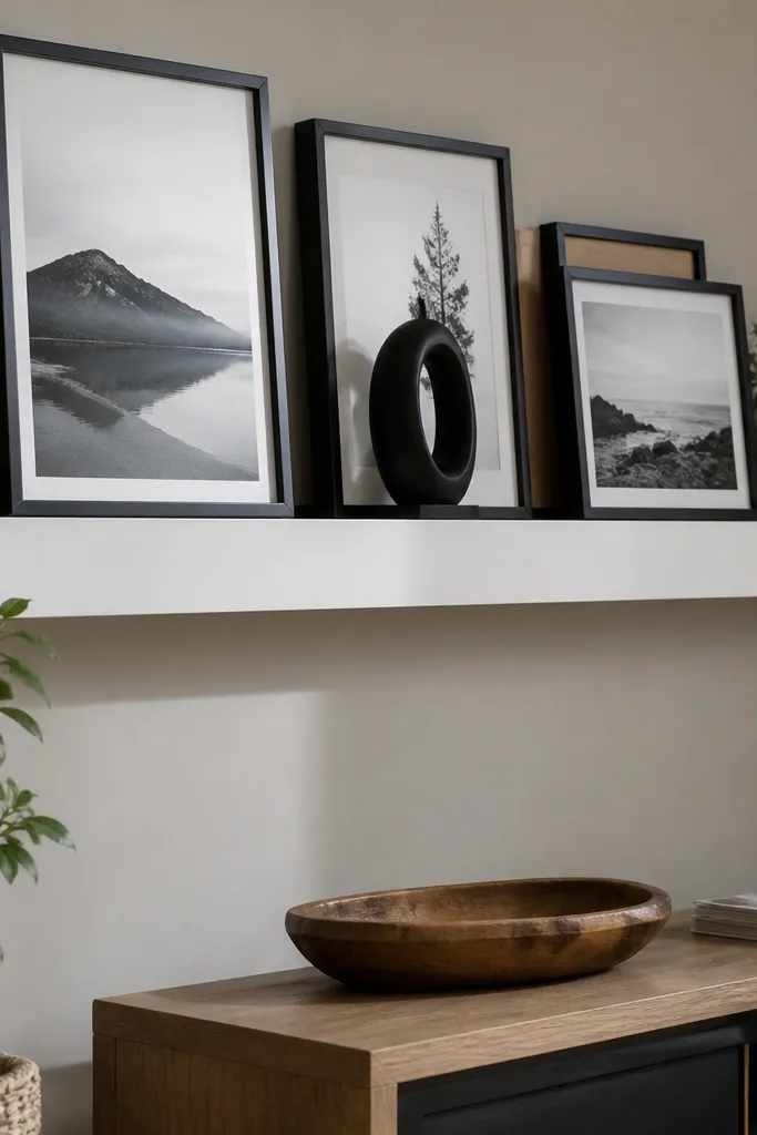
If your drawing room has a lot of small items already, a picture ledge makes the wall look curated without filling every inch. The ledge creates a horizontal anchor, and layered frames add depth without needing heavy construction. This look also photographs well because the wall has a clear line behind the frames. Use it when you want flexible styling — you can swap prints seasonally without drilling new holes.
Buy a sturdy wall picture ledge and mount it into studs when possible, using a level to keep the line straight. Mark the ledge height so the center of your tallest frame sits around 57-60 inches from the floor. Arrange frames on top first to plan spacing, then secure the ledge and add small frame stoppers or back supports so nothing slips. Finish by adding a few consistent mat colors (black, cream, or warm gray) so the layers look intentional.
Editor's noteChoose frames with the same inner mat width — it makes the layering look designer even when the frames differ.
Skip thisSkip thin ledges that flex — sagging makes frames lean and ruins the clean look.
5. Two-tone color block with a crisp midline
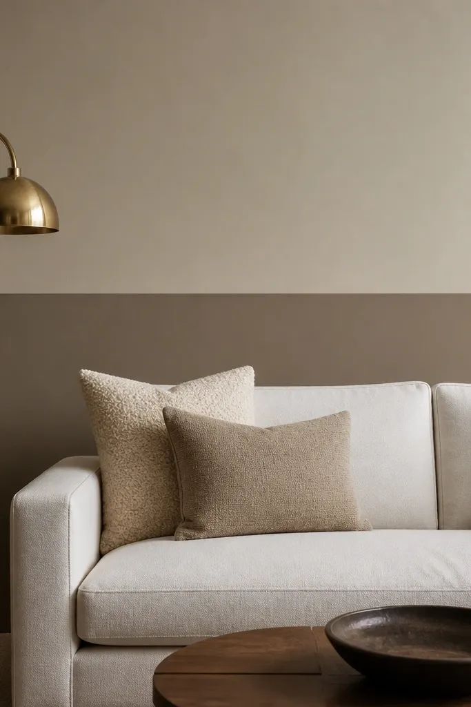
Color blocking is the fastest way to add architecture to a drawing room wall. A crisp midline gives structure, and it works whether your wall is plain or already has art. Keep the top and bottom tones related, like warm greige above and deeper taupe below, so it reads polished instead of loud. This is a strong choice when you want drawing room wall design ideas that take one weekend and no drilling.
Pick two paint colors that share an undertone. Measure and mark the midline height with painter’s tape, then use a second tape line to protect the edge. Paint the upper section first, let it dry fully, then apply tape again and paint the lower section. Remove tape while paint is still slightly tacky for the cleanest line.
Editor's noteUse a 2-inch angled sash brush for the tape edge and a small foam roller for even coverage.
Skip thisDon’t rush tape removal after a full cure — the edge can chip and look jagged.
6. Oversized wall mirror with a slim trim frame
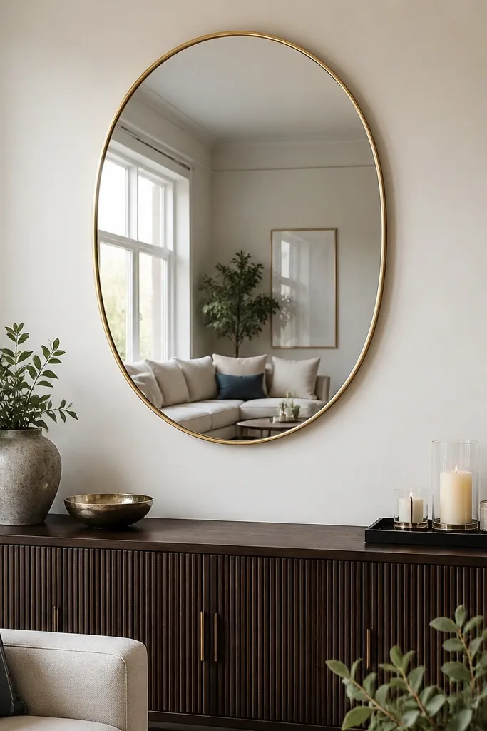
A mirror is one of the most photogenic wall moves because it adds light and creates visual space. A slim trim frame keeps it modern and avoids that “hotel” look of chunky borders. Hang it centered and high enough that it feels like part of the wall design, not just a fixture. This works especially well in drawing rooms that need brightness or have darker corners.
Choose a mirror size that covers a meaningful portion of the wall, like 30-36 inches wide for many living-room walls. Find studs with a stud finder and mark mounting points, then place a template on the wall to verify height. Use wall anchors only if the mirror mounting hardware is rated for them and the wall is solid. Finish by painting the area behind the trim if needed so the frame edge looks crisp.
Editor's noteWipe the wall and mirror frame with a microfiber cloth before final mounting so smudges don’t show in reflections.
Skip thisAvoid placing the mirror too low — it turns into a functional item instead of a design focal point.
7. Gallery wall with consistent mat widths and measured gaps
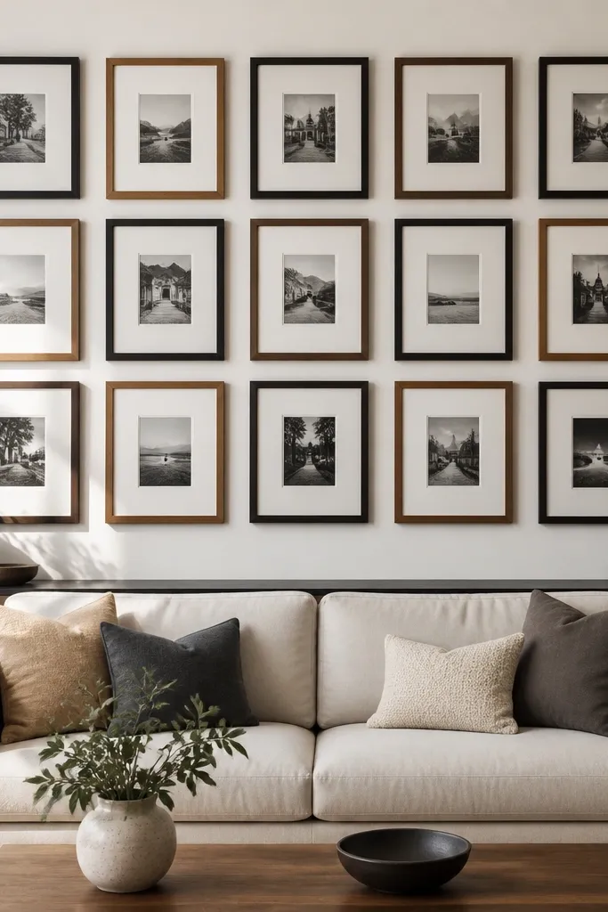
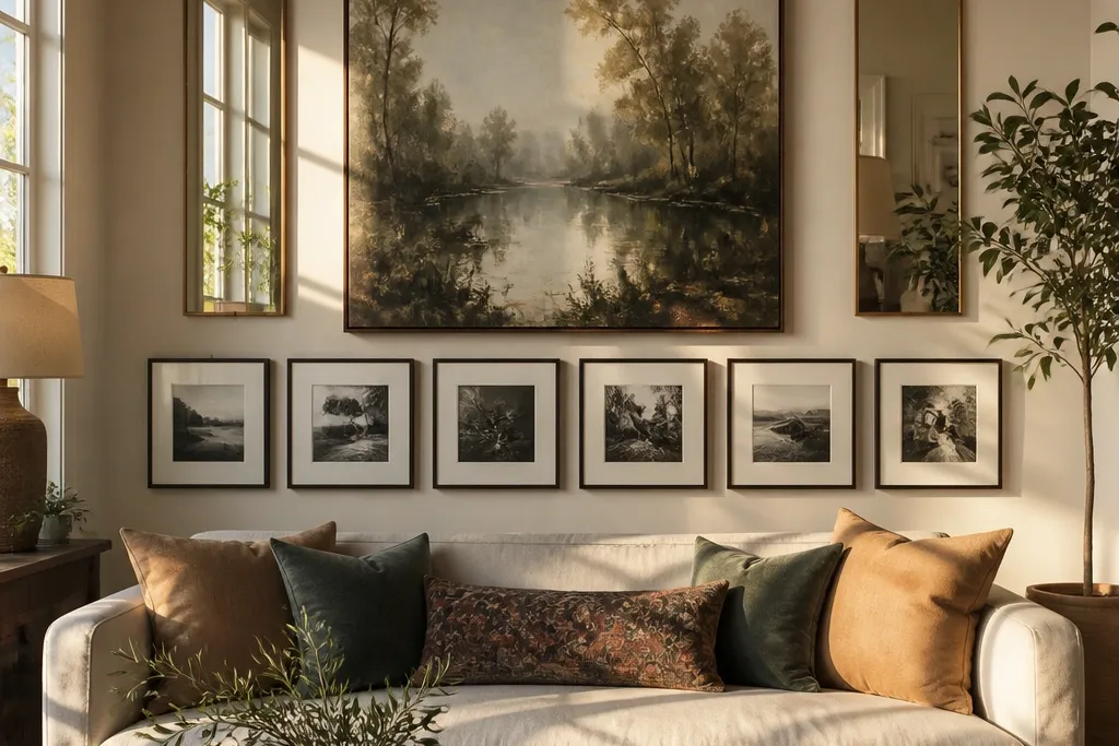
A gallery wall looks expensive only when the spacing and mat widths are consistent. The goal isn’t filling the wall; it’s creating a balanced grid that sits comfortably over the sofa or console. Use frames in two finishes max (black and wood, or black and brushed metal) and keep the mat color consistent across all pieces. This is one of the best drawing room wall design ideas when you want a personal look without building panels.
Pick a layout on paper first: a 3x3 grid, a 2x5 horizontal strip, or a centered vertical stack. Measure each frame’s outside dimensions and decide on a gap that repeats (for example, 2 inches between frame edges). Tape the entire layout on the wall, then adjust until the bottom row clears furniture sightlines. Hang the center piece first, level it, then work outward so the grid stays true.
Use a single mat color and mat width like 2 or 3 inches — it makes mixed artwork look like a set.
Skip mixed mat thicknesses — that’s what makes galleries look messy even when the frames match.
8. Linen-look fabric wall panels with a wooden frame
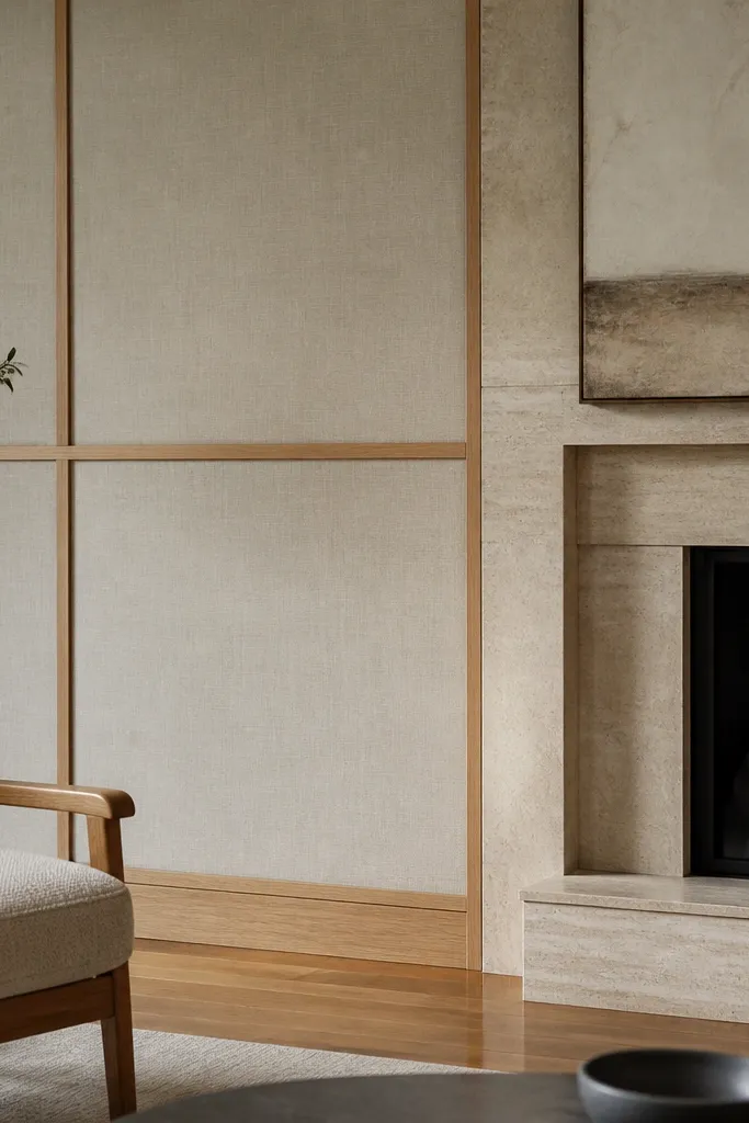
Fabric panels soften a drawing room and add a high-end texture that paint can’t replicate. A linen-look cover with a light wood frame gives that calm, layered feel without making the wall look bulky. This is great when your room has hard surfaces like stone, large windows, or glossy floors. The panels also hide small wall imperfections and reduce echo in the room.
Buy pre-cut fabric panel kits or build simple frames from 1x2 or 1x3 lumber, then staple fabric to the back. Start by measuring one panel area and build to fit, leaving a tight, even fabric pull. Mount the finished panels to the wall with adhesive plus screws through the wood frame into studs. Trim the edges cleanly, then add a thin bead of caulk where the frame meets the wall for a finished seam.
Editor's notePull fabric taut in two directions before stapling so wrinkles don’t show in the light.
Skip thisDon’t use shiny fabric — reflections make the panel look cheap and uneven.
9. 3D geometric wall tiles in matte plaster color
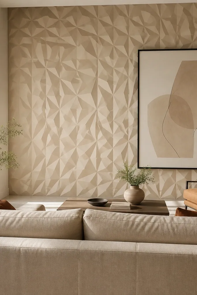
3D tiles create real shadow patterns, which is why they look gorgeous in a drawing room. Choose a matte plaster color so the texture shows without screaming for attention. Geometric patterns work best on one wall behind the sofa or a console because the eye needs a focal area. This design delivers depth quickly and gives a modern look even with simple furniture.
Pick a tile pattern that fits your wall width without awkward half pieces; dry-lay them on the floor to plan cuts. Clean and prime the wall, then apply tile adhesive with a notched trowel. Use spacers if the tile system includes them, and check level every row. After setting, fill grout lines or patch seams depending on the tile system, then seal with a matte finish if required.
Editor's notePlan the first row carefully — a slightly off level first row ruins the symmetry fast.
Skip thisAvoid glossy sealers on textured tiles — they highlight bumps and seams.
10. Wood slat wall with a vertical center stripe
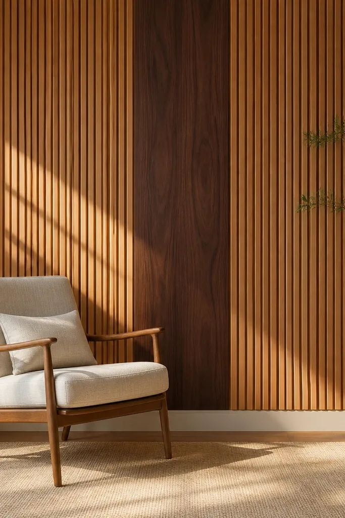
A wood slat wall looks warm and architectural, and adding a wider vertical center stripe makes it feel intentional. Slats create shadow depth, while the center stripe gives your eyes a landing point — perfect for drawing room wall design ideas where you want a focal wall without artwork overload. Keep slat spacing consistent so the wall reads tidy from a distance. This works well behind a sofa, especially if your sofa back isn’t too tall.
Decide slat width and spacing, then map it on painter’s tape across the wall. Install horizontal backing battens into studs first so slats can be fixed evenly. Cut slats to length, sand edges, and stain or paint before installation for cleaner results. Mount slats with screws through the backing, then add a wider center stripe by using a thicker slat or an extra frame piece.
Editor's noteStain slats in batches and keep a wet rag nearby to wipe even tones — blotchy staining shows between slats.
Skip thisDon’t install slats directly onto drywall without a backing plan — the wall will look uneven and the slats can loosen.
11. Stenciled arch on a neutral painted wall
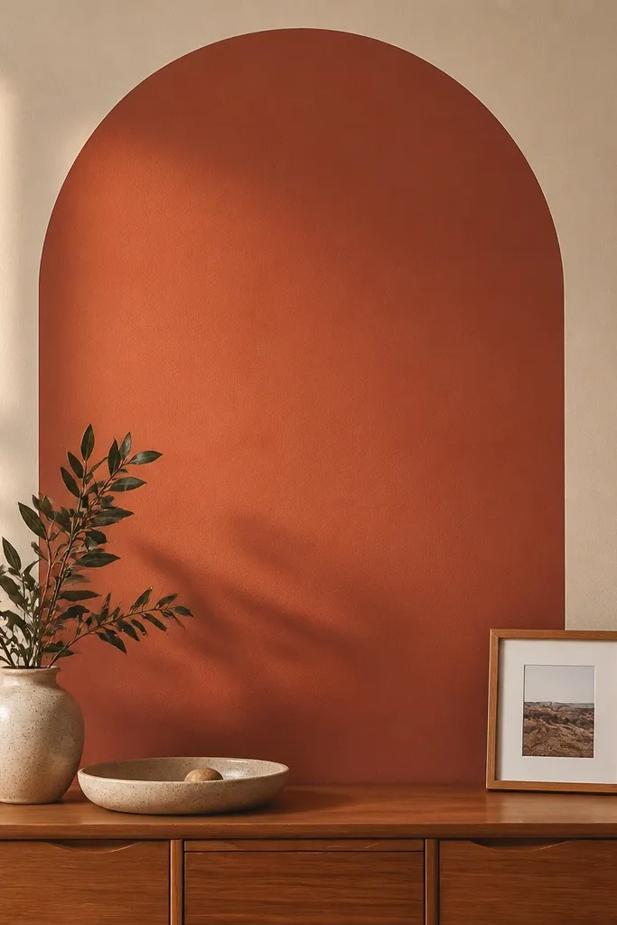
A stenciled arch gives you the look of custom molding without buying molding. The arch is an instant focal shape, and it works whether your room is traditional or modern because the line stays simple. Use one darker accent color against a neutral base for sharp contrast and easy styling with furniture. This is a smart choice when you want drawing room wall design ideas that feel unique but don’t require a full panel build.
Choose a stencil size that fits your wall scale — measure the sofa width and aim for the arch to be about 60-75% of it. Paint the base color first and let it dry fully. Tape stencil corners down, then use a foam roller or stencil brush to apply paint with light pressure so edges stay clean. Remove the stencil while paint is still slightly tacky, then add a second pass only if the stencil shows thin spots.
Use painter’s tape to seal stencil edges — paint bleeding ruins the crisp arch line.
Skip cheap stencils with fuzzy edges — they create messy borders even with careful taping.
12. Raised frame molding around a textured paint center
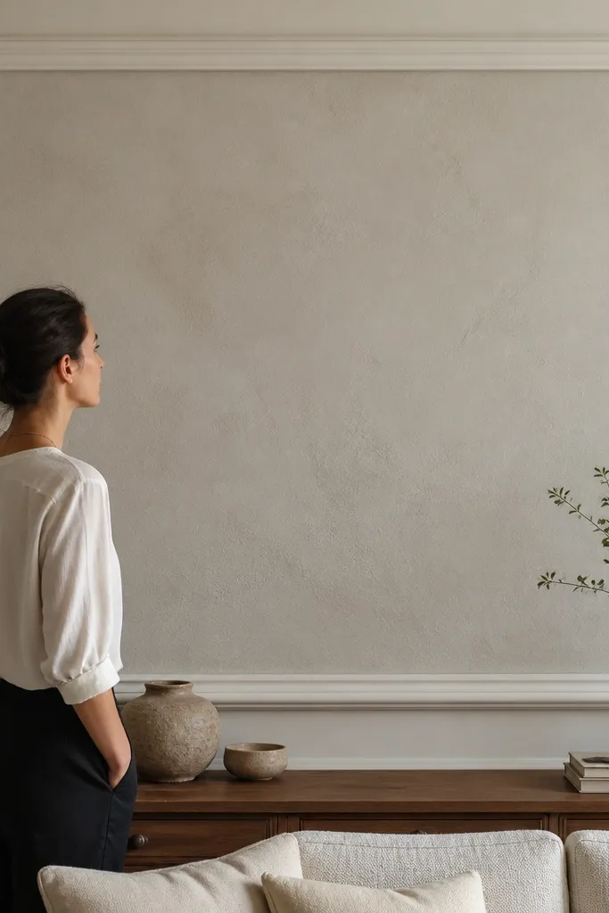
This design is a cheat code for “designer wall art.” The raised frame creates a gallery-like boundary, while a textured paint center adds depth without needing wallpaper. Texture reads well from across the room, and the frame keeps it from looking random. Choose a plaster-like paint finish in a tone slightly different from the base so the texture catches light.
Mark the frame rectangle first using painter’s tape, and decide the frame thickness based on your molding profile. Install the molding around the perimeter using adhesive and small nails, making sure corners are mitered cleanly or use corner blocks. Mask inside the frame and apply textured paint with a trowel or sponge technique according to the product. Let it cure, then paint the frame and touch up seams with caulk for a smooth look.
Editor's noteSand molding lightly before painting so the finish looks smooth where your eye lands most.
Skip thisDon’t apply textured paint too thick — it cracks and looks uneven around the frame edges.
13. Vertical wallpaper stripe columns with solid side walls
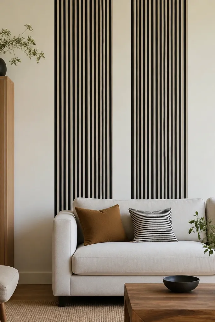
This gives you the visual wow of wallpaper without covering the whole wall. Two or three vertical stripe columns make the room feel taller, and they look sharp next to solid paint because the boundaries are clean. Pick stripes that match your room palette — black and cream looks crisp, while sage and cream feels calmer. This is a strong choice for drawing room wall design ideas when you want pattern but don’t want the wall to feel busy.
Measure your wall and decide the number of columns, then calculate stripe widths and alignment. Tape vertical guide lines so each column lands straight, then apply wallpaper only within those columns. Smooth the seams carefully and trim edges for crisp boundaries. Paint or keep the side walls solid, then add simple trim around the outermost columns if you want a finished look.
Editor's noteMatch your stripe pattern to the same starting point every time so the rhythm stays consistent across columns.
Skip thisAvoid placing stripe columns where they’ll be cut off by a window trim — it breaks the symmetry.
14. Concrete-look microcement wall panel behind the sofa
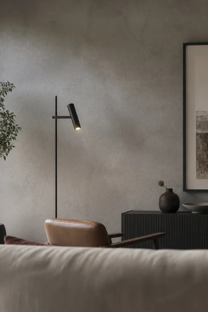
Microcement or concrete-look coatings create a sleek, modern drawing room wall with a soft industrial texture. It looks expensive because it’s seamless and catches light in a subtle way. Keep it in a medium gray or warm stone tone so it doesn’t turn your room cold. This works when you want a bold backdrop but still want it to blend with wood and neutral textiles.
Choose a microcement system rated for walls and follow its primer requirements — prep matters more than the coating. Tape off the panel area and protect floors with plastic sheeting and painter’s tape edges. Apply primer, then apply the base coat with a stainless trowel in thin layers, letting it dry per the product instructions. Finish with a topcoat sealant to control sheen and make it wipeable.
Editor's notePractice the trowel angle on cardboard — the smoothness comes from consistent strokes.
Skip thisSkip sanding between layers — roughness shows through and the finish looks dull.
15. Art rail with floating shelves for a salon-style wall
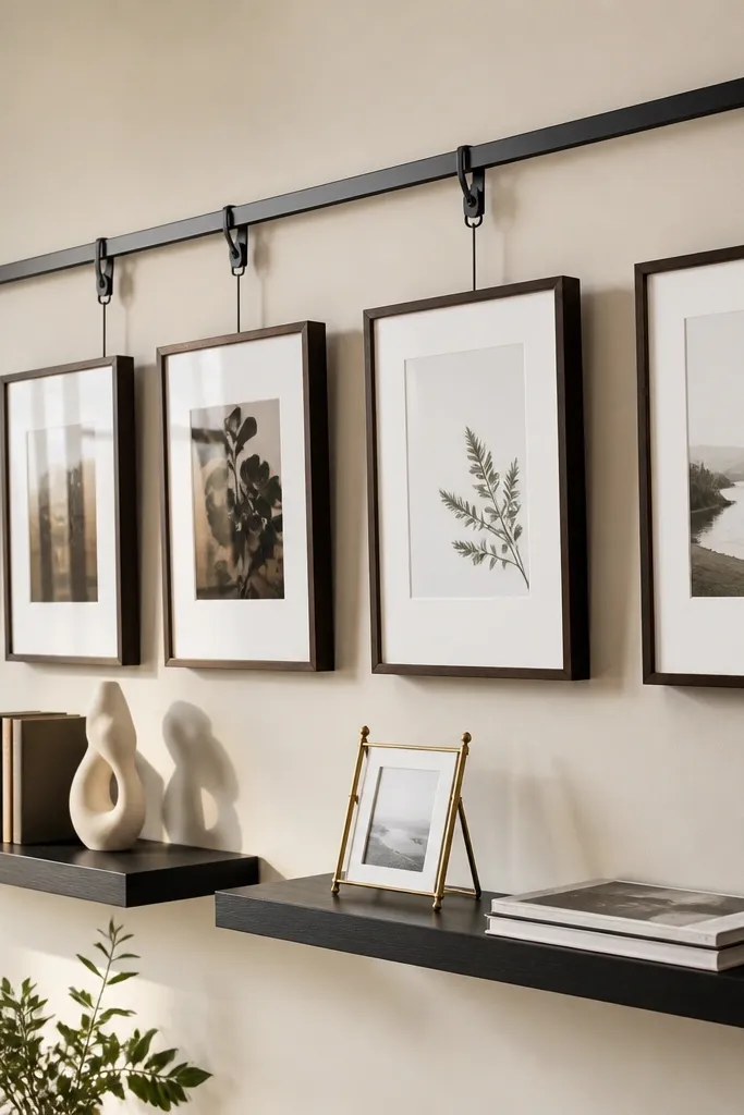
A salon-style setup looks curated because you’re combining vertical frames with objects at different heights. An art rail keeps frames perfectly level and makes swapping art easy, while floating shelves add depth and a place for books, ceramics, or small sculptures. This is one of the best drawing room wall design ideas when your tastes change often and you don’t want to remount everything. Keep shelf color and rail finish consistent so the arrangement looks intentional.
Mount an art rail into studs at a height that places the top of your most prominent frame around 57-60 inches from the floor. Attach floating shelves with a level, marking stud positions first so the shelves don’t sag. Arrange frames on the rail, then style shelves with 2-3 vertical stacks and one small object cluster. Use museum wax or non-slip pads under objects so nothing slides when you adjust frames.
Group items by height: taller objects at the ends, shorter in the middle — it reads balanced even when you mix items.
Don’t overload shelves with too many small pieces — the wall turns cluttered fast.



