
1. The rug that's too small for the seating zone
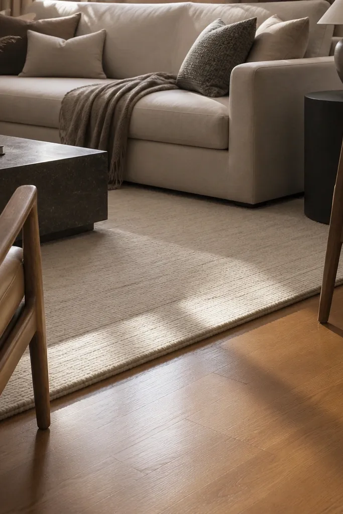
A rug that stops short of the seating makes the whole drawing room feel like it’s “floating.” Your eye keeps searching for an anchor, so the room looks unfinished even when you spent money on furniture. The fix is simple: size the rug to the conversation area. In practice, that means the front legs of the sofa and at least one chair should sit on the rug. Choose a pattern scale that matches the room size — large rooms can handle larger motifs, while tiny motifs get visually noisy.
Measure the width of your sofa and the chairs that face it. Pick a rug width so the front legs land on it, then add 8-12 inches beyond the seating edges on the sides. Check the length the same way: the rug should extend under the coffee table area enough that it feels grounded. Finally, vacuum the subfloor and use a rug pad so the edges don’t curl and slide.
Use a 6-8 mm rug pad for flatweave or low-pile rugs; it keeps the rug from creeping when you walk past the seating.
Don’t buy a rug that only fits under the coffee table — it reads like a decorative mat.
2. Coffee table that's the wrong height
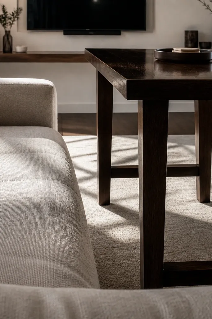
When the coffee table is too high, it feels like you can’t relax into the sofa. Too low and it looks disconnected from the seating, which makes your whole arrangement feel sloppy. The sweet spot is visual comfort: the tabletop should land around the same height as the sofa seat cushion or slightly lower. For most standard sofas, that’s often in the 16-18 inch range, but the real test is the cushion height you actually have. This is one of those mistakes that can’t be solved with throw pillows.
Measure from the floor to the top of the sofa cushion. Then measure from the floor to the coffee table surface. If the difference is more than about 2 inches, you need a new table or a different top strategy (like a lower-profile table or a rug stack reduction that raises the sofa’s perceived height). Shop by your measurement, not by “what looks right” in photos.
Editor's noteIf you already own the table, try a temporary height check with cardboard offcuts to see how it feels before you commit to buying anything.
Skip thisDon’t assume all coffee tables are the same height — they vary a lot by style.
3. Art hung too high (the classic "hotel wall" problem)
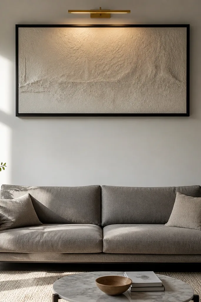
Art hung too high makes the drawing room feel tense and top-heavy. It also breaks the visual connection between the artwork and the sofa, so the wall looks like it’s trying to be a gallery instead of part of your seating area. A better placement is to treat the sofa top as your reference line. Aim for the center of the artwork to sit around 57-60 inches from the floor for typical rooms, then adjust down if your ceilings are low. Size matters too: a tiny print above a wide sofa looks lost.
Measure the floor-to-sofa-top height and find your center point for the artwork. Mark a pencil line for the center of the frame at about 57-60 inches from the floor. If your sofa is low and the room has lower ceilings, drop that center point by 2-4 inches. Then use painter’s tape to outline the frame on the wall so you can step back and check proportion before you drill.
Editor's noteUse a level and hang a paper template first. Frames shift when you remove tape, and a template keeps alignment perfect.
Skip thisDon’t hang art by eye when you’re tired — the height error is hard to fix later.
4. Wrong art width for the furniture below
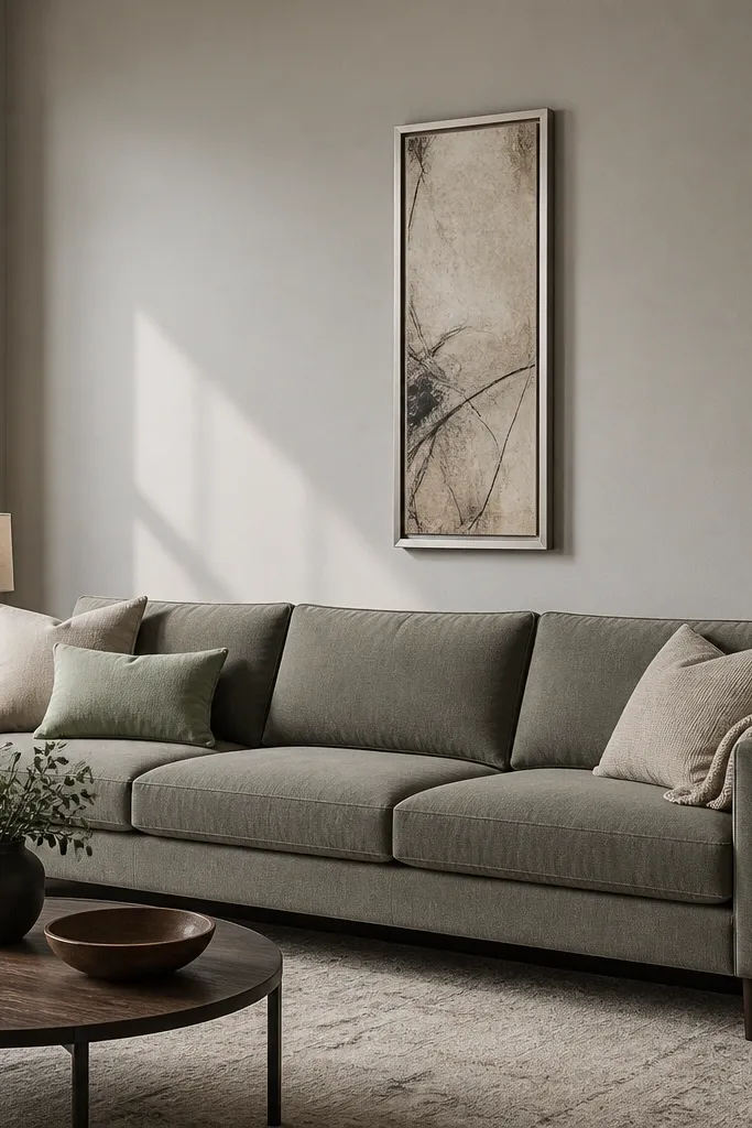
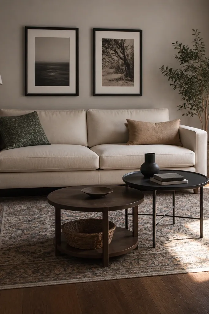
A narrow artwork piece centered above a sofa is the fastest way to make a drawing room look unfinished. The wall needs to “hold” the sofa visually, and the artwork is a major part of that. If the art is too small, your brain reads the space as empty even when it has decor. Use the sofa width as your guide: aim for artwork width around two-thirds to the same width as the sofa for a clean, intentional look. For gallery walls, build a unified grid so the spacing doesn’t drift.
Measure the sofa width. Choose art width so it takes up about 65-100% of that measurement. If you’re using two pieces, keep their combined width in the same range and align their centers to the sofa center line. For multiple frames, lay them on the floor first and match frame heights so the wall reads organized.
Editor's noteIf your art is smaller than you want, don’t force it — use a larger piece or a set with matching frames and mat sizes.
Skip thisDon’t center a tiny print and call it “minimal” — it reads under-scaled.
5. Window curtains that are too narrow
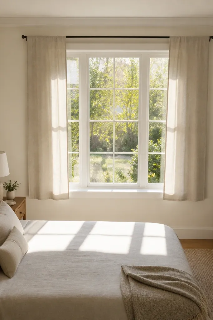
Curtains that are too narrow never look expensive because they don’t create folds. They hang flat, and a flat curtain makes the whole room feel plain. The fix is width: you need enough fabric to stack and drape. For most rooms, aim for curtains that are 1.5 to 2.0 times the finished window width, depending on how full you want them. If you like a cleaner look, lean closer to 1.5; for a soft, gathered drape, go closer to 2.0. This is one of the easiest upgrades that changes the room’s “finished” feel instantly.
Measure your window width and decide on a curtain rod that extends 4-8 inches beyond each side of the window. Calculate total curtain width needed: multiply the finished window width by 1.5-2.0. Buy panels in matched sizes and hang them so the curtain rod sits high enough to visually lengthen the wall. Finally, add a fabric steamer pass so the folds form correctly.
Editor's noteHang the rod higher than you think — even 3-5 inches above the top of the window changes the whole room height.
Skip thisDon’t buy two narrow panels and expect fullness from tiebacks.
6. Curtains that hit the wrong length
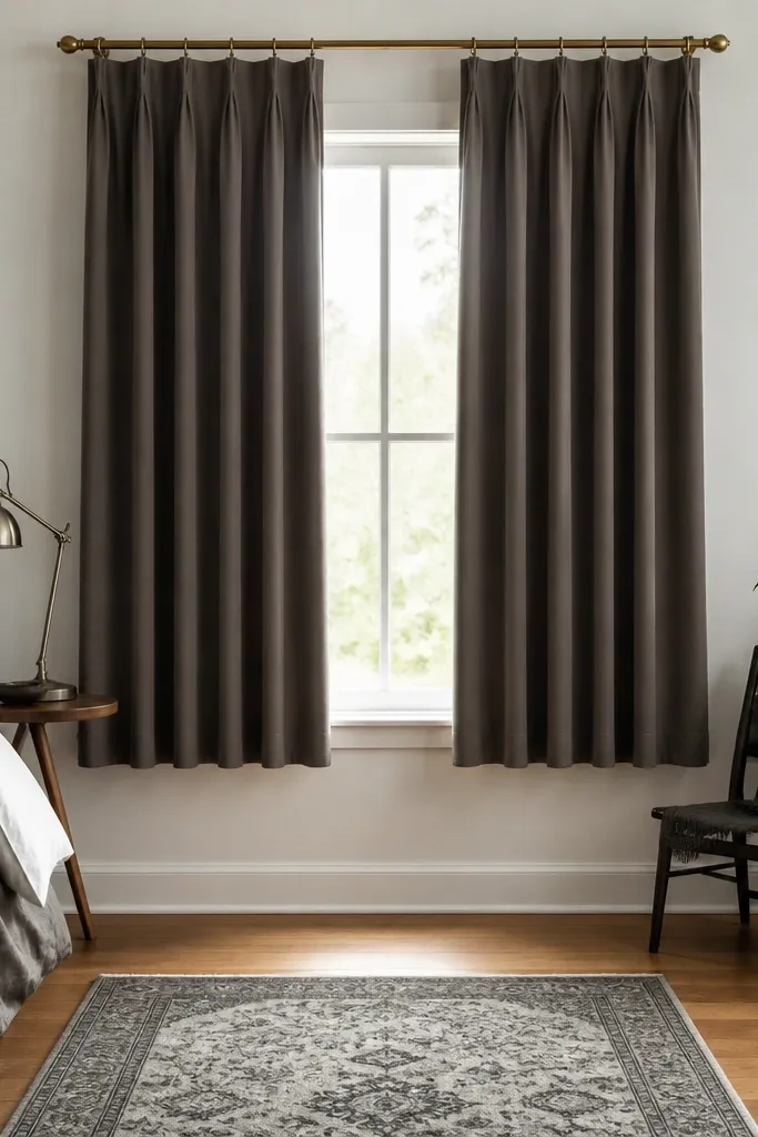
Curtain length is where people lose the “tailored” look. If the hem stops too high, the room feels cramped and the window looks unfinished. If it puddles too much, it can drag visually and make your floor look cluttered. For a drawing room, the safe target is a hem that breaks slightly on the floor or hovers just above it. You’re aiming for a gentle touch, not a dramatic pool. Measure from the rod to the floor with the shoes you wear most in the house, because the difference matters.
Measure floor level at two points: near the window and near the wall edge. Mark the rod height first, then measure down to where you want the hem to land. For most drawing rooms, choose a length that creates a light break on the floor or sits 1-2 inches above it. Hem the panels or choose ready-made lengths that match your measurement so you’re not stuck with a mid-calf hem.
Editor's noteIf your floors are uneven, use one long panel measurement across the window and adjust the rod position before hemming.
Skip thisDon’t let curtains land 8-12 inches above the floor — it looks like a placeholder.
7. Lighting that's all from one height
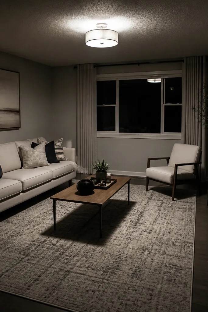
Overhead-only lighting makes every drawing room feel harsher and smaller. Shadows fall under eyes, behind furniture, and around corners, so the room looks flat. The fix is a layered lighting plan with at least two sources at different heights: table lamps at seating height and a floor lamp or wall light to fill the corners. You also want warm bulbs for comfort. Use 2700K bulbs for the main lamps and keep the brightness consistent across fixtures so one light doesn’t overpower the others.
Pick your seating focal point and place one lamp on a side table near the sofa. Then add a second light from a different angle, like a floor lamp beside a chair or a wall sconce. Choose bulbs in the 2700K range and match wattage/brightness so the room feels even. Turn everything on and walk around the room — if you see harsh shadows behind the sofa, move the lamp or add a second light.
Use lamps with shades in fabric or linen-like materials. They diffuse light better than glossy glass shades.
Don’t rely on one ceiling fixture for day-to-night use.
8. Mismatched metal finishes everywhere
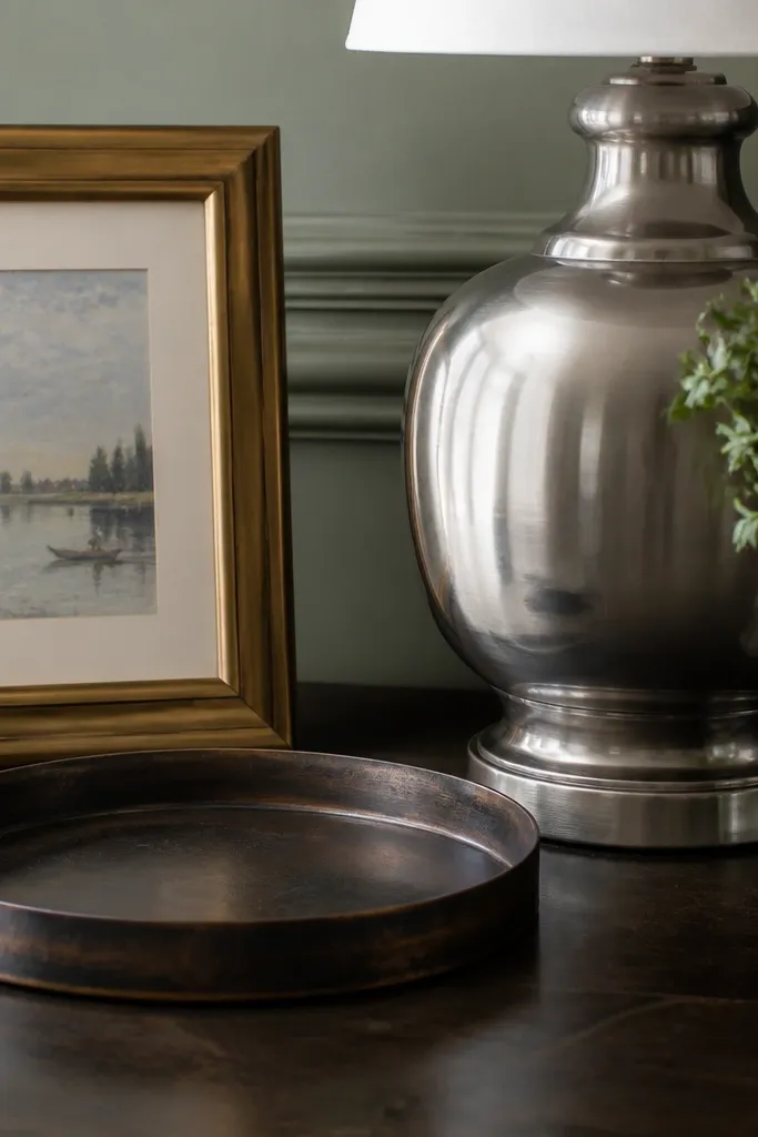
When you mix too many metal finishes, the room looks busy even if everything is “nice.” The eye catches every shine and it never settles. A drawing room looks calmer when you choose one metal finish as the lead — like brushed brass, satin nickel, or oil-rubbed bronze — and keep the rest as accents. You can still mix tones, but keep it within a tight range: for example, brass + warm bronze, or nickel + chrome. The goal is visual harmony, not a strict match on every piece.
List the metal finishes you already have: lamp bases, picture frames, curtain rod, hardware, and table legs. Pick the finish that appears most and choose it as the lead. Then limit the secondary finish to one other tone and keep it to smaller items like drawer pulls or small accents. Swap or paint only the most visible offenders first, like frames and lamp bases.
If you’re unsure, choose brushed brass or satin nickel as the lead for warm-toned rooms; they blend with wood without looking cold.
Don’t mix three or more finishes across large furniture pieces.
9. Throw pillows that don't match the sofa scale
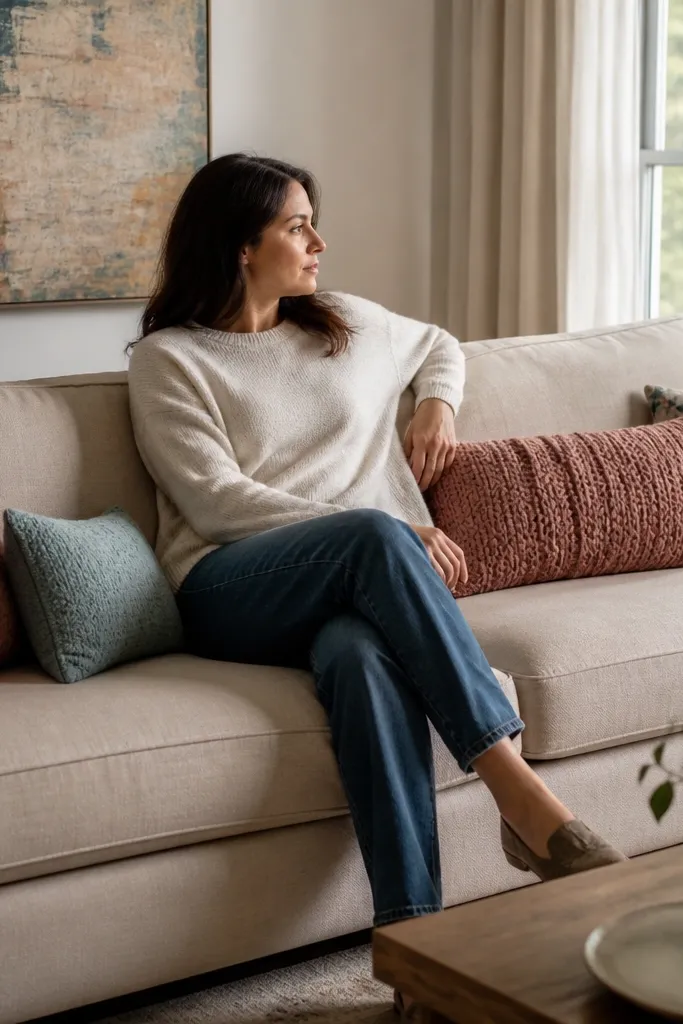
Pillows that are too small look like you’re trying to decorate around the sofa instead of styling it. Pillows that are too big can overwhelm the seating and make the room look cluttered. The fix is size discipline. For a standard sofa, use a mix of two sizes: larger lumbar or square pillows and smaller accent pillows. A common, reliable combo is 22x22 inches for the main pillows and 16x16 inches for the accents. Arrange them with breathing room so the sofa lines remain visible.
Measure the sofa back height and decide how much of the back you want pillows to cover. Choose 22x22 pillows for the main layer and 16x16 for the corners. Place the larger pillows first, then add the smaller ones only where there’s empty space. Keep the number controlled: aim for 4-6 pillows total on a typical sofa so the arrangement looks intentional.
Use pillow covers with a zipper and keep the insert slightly firm so the shape holds, especially on deep sofas.
Don’t stack pillows until you can’t see the sofa’s back line.
10. Wall paint undertone fighting the furniture
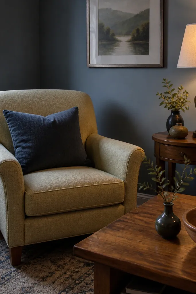
Paint undertones can ruin an otherwise good furniture setup. Warm wood looks muddy against cool gray walls, and cool upholstery can look sickly against yellow-beige paint. The mistake people make is choosing paint swatches by daylight only. A drawing room has mixed lighting, so undertones shift. The fix is to test paint in your actual room and compare it to your biggest objects: sofa fabric, rug base color, and wood tone. If the undertone clashes, the whole room feels “off” even when the layout is perfect.
Pick two paint options with different undertones, like a warm greige and a cooler greige. Paint large swatches on the wall that includes the area behind where your sofa will sit. View at morning light, late afternoon, and after you turn on your lamps. Compare against your rug and wood tones — if one makes them look dull or yellow, reject it.
Buy small sample pots and paint 2-foot sections, not tiny tester squares. Undertones show up with real coverage.
Don’t trust a paint chip from the store — it’s too small and too controlled.
11. Rug pattern scale that's the wrong size for the room
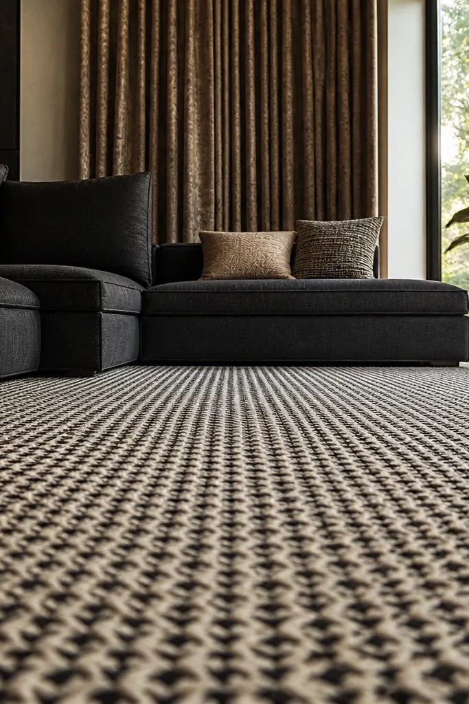
Pattern scale affects how “busy” a drawing room feels. A high-contrast tiny pattern can make a larger room look restless, while a giant pattern in a small room can feel overpowering. The fix is matching pattern intensity to room size and furniture bulk. If you have a lot of visual weight (big sofa, heavy curtains), go for fewer, calmer pattern elements or lower contrast. If the room is visually light, you can handle more contrast or bolder motifs. This is why rooms look good in photos sometimes and not in real life — the camera doesn’t show how your pattern scale interacts with your furniture.
Look at your furniture: identify whether your sofa and curtains are visually heavy or light. If they are heavy, choose a rug with either a larger but softer motif or a lower-contrast pattern. If your room is light, pick a rug with clearer contrast and slightly tighter motifs. Lay the rug near the seating zone (even temporarily) and step back to see if your eye rests or jitters.
Use contrast as your control knob: reduce contrast when you feel overstimulated, increase it when the room feels flat.
Don’t pair a busy rug with busy curtains unless you simplify one of the two.
12. Furniture spacing that kills conversation
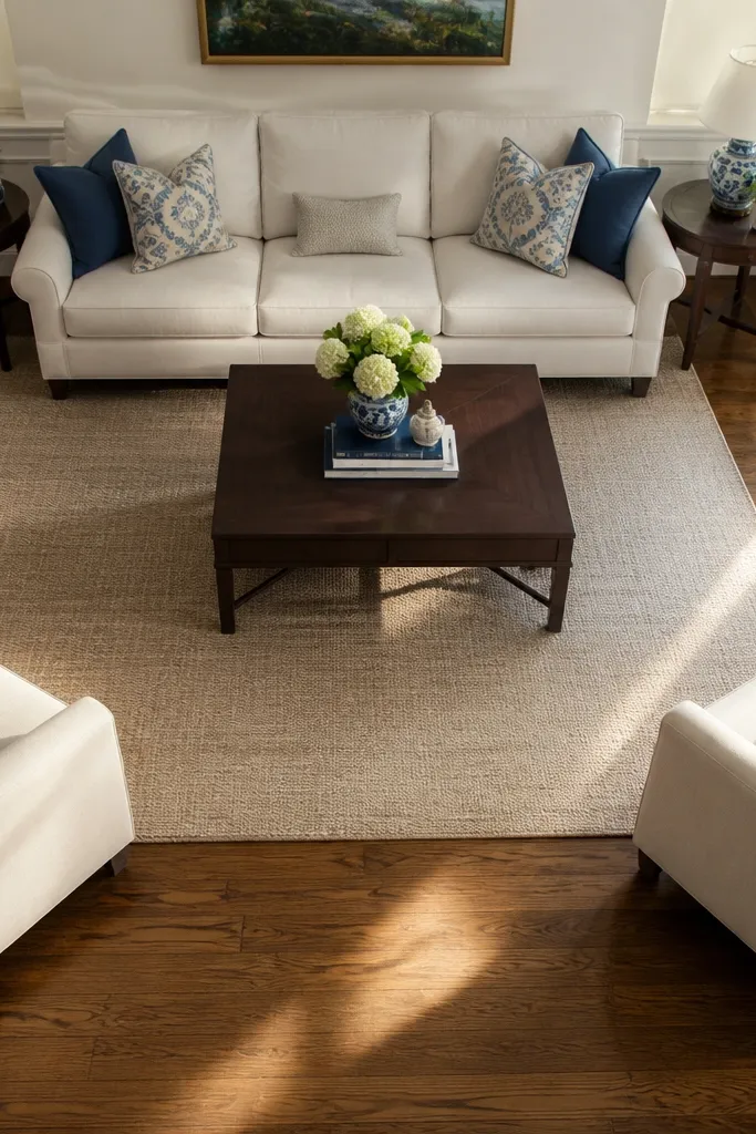
If chairs are too far from the sofa, the drawing room feels like separate zones instead of one conversation area. If they’re too close, you lose comfort and the room feels crowded. The mistake is guessing the distance instead of measuring. For a standard seating layout, keep around 14-16 inches between the coffee table edge and sofa front. Then keep chairs close enough that you can talk without leaning across a big gap. Your room needs a “reach zone,” not just a pretty arrangement.
Measure the sofa front to the chair front distance. Adjust until the coffee table can sit at about 14-16 inches from the sofa and chairs. Use tape on the floor to mark chair positions, then sit in the sofa and reach toward where the chair would be. Once the reach feels natural, lock the layout and only then plan rug size and art placement.
Put the coffee table in place before finalizing chair positions. Everything else depends on that one piece.
Don’t center everything on the wall and ignore the distance between seats.
13. Empty corners because you're afraid to add anything
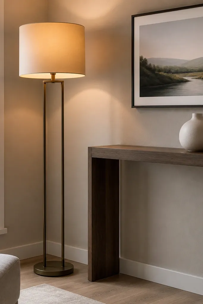
Empty corners make a drawing room look like it’s waiting for furniture. The room also looks darker because corners don’t reflect light well. The fix isn’t clutter — it’s one purposeful item in each corner zone. A floor lamp with a warm shade works, as does a tall slim console with a plant and a single framed piece above. Keep the item’s footprint narrow so you don’t block walkways. You want the corner to feel finished when you glance across the room.
Identify which corners are visible from the seating. Choose one solution per corner: a floor lamp, a tall plant stand, or a narrow console. Measure the space so the item doesn’t block doors or create tight turns; keep at least 18 inches of clear walkway. Style with one height anchor (lamp or plant) and one small visual element like a single tray or framed print.
If you add a plant, use a pot that matches your metal finish so the corner looks intentional, not random.
Don’t leave corners bare and compensate with more small items elsewhere.
14. Overstuffed shelves and the "everything is a decor object" look
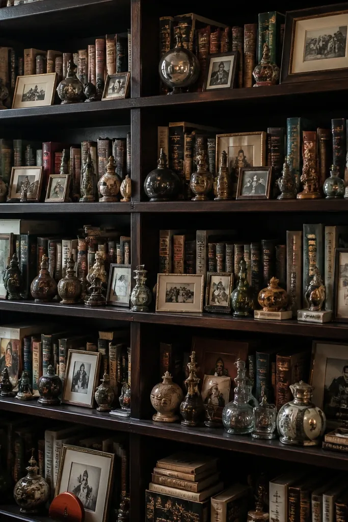
When every shelf item is the same visual weight, the drawing room feels noisy and hard to read. A bookshelf should have structure: some items sit forward, others recede, and there should be gaps. The mistake is turning storage into a pile of objects with no grouping logic. Use books as your base layer, then add decor in a few deliberate spots. Keep most objects grouped in sets of 2 or 3 so your eye knows where to land.
Pull everything off and sort into categories: books, frames, ceramics, and small decor. Put books back first, arranged by color or by height — either works, but pick one method. Leave 20-30% of shelf space empty so the room can breathe. Then add decor in small groups and keep one repeated material or color across groups.
Use vertical alignment: keep frame edges roughly aligned to create a calmer visual grid.
Don’t fill every inch of shelf space — emptiness is part of the design.
15. Too many small light sources without a main lamp
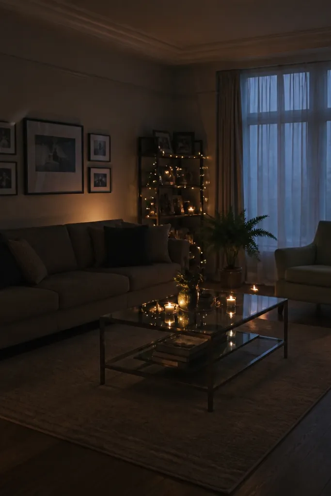
Small lights everywhere can look cute but it doesn’t solve the lighting job. You end up with uneven brightness and a room that still feels dim in the corners. The fix is one main lamp that creates a readable brightness level, then smaller accents. Think of it like cooking: you need a base flavor. Choose one floor lamp or large table lamp near the seating and set it as the primary. Then add one accent light like a smaller lamp or wall light to fill behind.
Pick the side of the sofa you want to read from and place the primary lamp there. Choose a shade that diffuses light and aim the beam toward the wall or ceiling for softer spread. Add only one secondary light source, positioned to reduce shadows behind furniture. Test by turning on the lamps at night and checking whether corners still look dark.
If you use candles for ambiance, keep them as occasional accents, not the main lighting plan.
Don’t rely on tiny lights to do the work of a proper lamp.
16. Using only one color in accessories
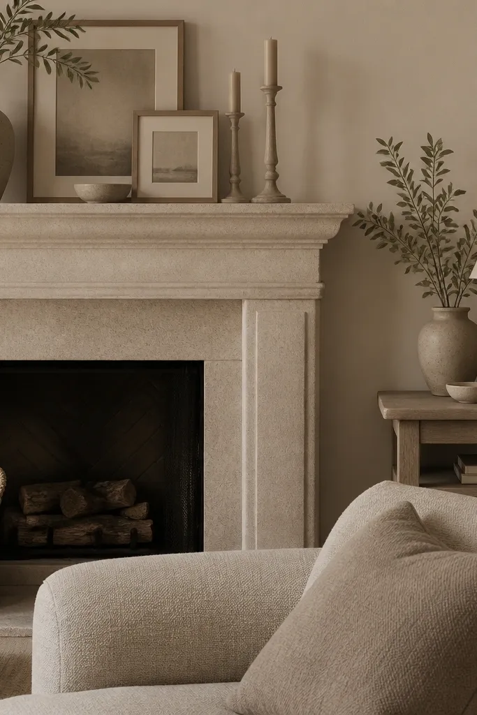
A drawing room with accessories all in the same color family can feel flat even when everything matches. The mistake is thinking “neutral” means “interesting.” Neutral rooms need contrast: either tone contrast (light vs dark) or temperature contrast (warm vs cool). Add contrast through textiles and small objects, not by repainting everything. A simple method is to choose one anchor color from your rug and then repeat it in two accessory types — like a throw and a set of frames.
Pick a dominant color from your rug or artwork. Choose one darker shade and one lighter shade within that same color family for pillows or throws. Add one texture that changes how light hits the room, like a bouclé pillow or a ribbed knit throw. Keep metal finishes consistent so the added color doesn’t fight with shine.
Editor's noteUse one color as a “thread” through the room: frames, lamp base, or a ceramic — not all of them at once.
Skip thisDon’t add more of the same shade. Add contrast.
17. Vases and decor with the wrong scale on consoles
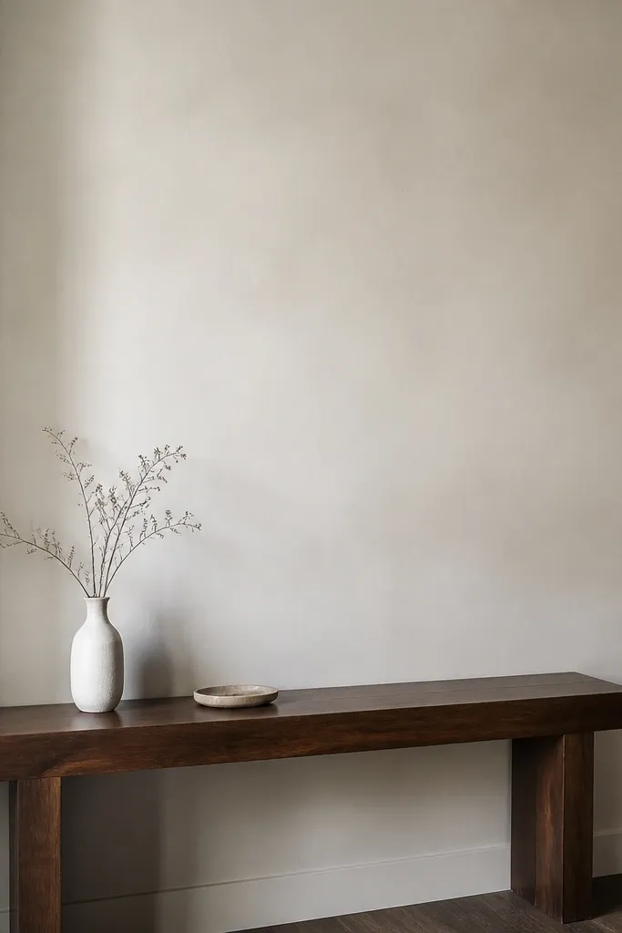
A console table is a long, shallow surface. If your decor is too small, it looks like an afterthought. If it’s too big, it blocks sightlines and crowds the entry or wall. The fix is height planning: choose decor that matches the console height and the wall space above it. For most drawing room consoles, a vase around 10-14 inches tall looks fine if the console is standard height, while taller pieces need a wider base or they look top-heavy. Pair one tall item with one smaller item or a single tray to ground it.
Measure the console height and the wall area above it. Choose one main decor piece with a height that’s about half to two-thirds of the console height, then add a smaller companion item. If the wall above is empty, increase the height or add a framed piece above the console that matches the console width. Place items centered and then check from the sofa — if it disappears, it’s too small.
Use a tray under small decor. It creates a boundary and makes the styling look intentional.
Don’t scatter random small items across a long table — it reads cluttered.
18. Overcrowded gallery wall spacing
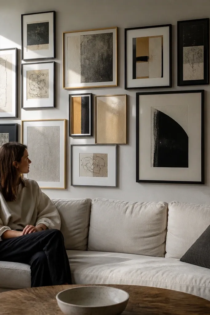
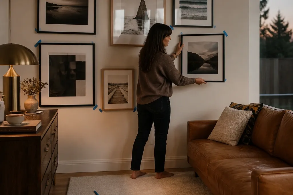
A gallery wall can look great, but only if the spacing is consistent. When frames are too close, the wall looks like a jumble. When spacing is inconsistent, your brain can’t find the pattern and the wall feels chaotic instead of curated. The fix is to pick a grid rule and stick to it: consistent gaps, consistent alignment, and enough space around the entire group so it doesn’t hug the ceiling or furniture. Use paper templates so the spacing stays even.
Lay all frames on the floor and decide on a grid: either equal spacing or equal frame alignment. Mark the total gallery width and height on the wall with painter’s tape. Keep gaps consistent, typically 2-3 inches between frames for a calmer look. Hang the outer frames first, then fill in the middle using the same spacing rule.
Editor's noteUse matte black or matching frame widths if your art is mixed. Frame consistency is what makes the spacing look intentional.
Skip thisDon’t mix random frame sizes with random gaps and expect it to look balanced.
19. Wrong couch fabric direction with bright light

Some fabrics show directional wear and light streaks, especially with textured weaves and lighter colors. The mistake is placing that couch facing the brightest window without considering how the light catches the surface. When the fabric shifts tone in different light, it looks like staining even when it’s just the weave. The fix is to manage light and placement: position the sofa so the strongest window light is angled, and use window treatments that soften glare. If you can’t change placement, choose a curtain fabric that blocks harsh light rather than thin sheers.
Identify the brightest light source in your drawing room — usually a window or skylight. Sit on the sofa at different times and look for glare or streaking on the fabric. If it’s intense, adjust the angle of the sofa relative to the window if possible, or add heavier curtains with blackout lining or thick weave. Then choose a throw blanket in a complementary texture so it hides any directional fabric variation without looking decorative.
Use a steamer or fabric brush on textured upholstery to keep the surface direction consistent over time.
Don’t ignore glare — it turns “texture” into “streaks.”



