
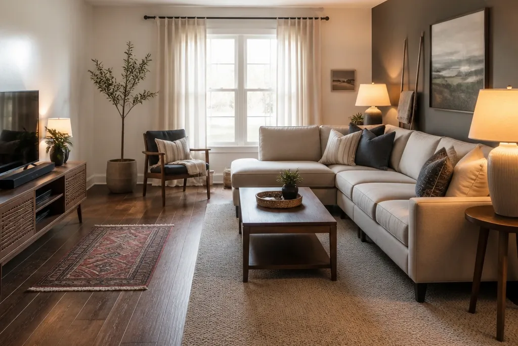
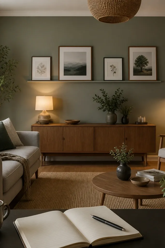
1. Rug that actually anchors the sofa (not a decorative mat)

A lot of drawing rooms fail the makeover test because the rug is too small, so the room looks chopped into zones. When the front legs of your sofa and chairs sit on the rug, the layout reads as one solid area instead of separate islands. I like neutral rug colors here because they work with most wall paints, but the real win is size and placement. Use a rug pile that feels good underfoot and doesn’t look flat — a mid-pile or low-pile textured weave hides dust and looks warmer in daylight. This is a beginner-friendly change that can make your drawing room before and after makeover feel instant.
Start by measuring your sofa width and depth, then measure the open floor area you want to unify. Choose a rug size where the front legs of the sofa sit fully on the rug; for an 84-inch sofa, that usually means a rug around 90x120 inches or larger. Place the rug so the center line of the sofa aligns with the rug’s center, then check from the doorway — the rug edges should not look like they’re floating. Finish by adding a rug pad with grippy backing so it doesn’t creep and the pile stays level.
Use painter’s tape to mark the rug footprint on the floor for 10 minutes before you commit — your brain catches misalignment fast.
Don’t center a small rug under the coffee table only — it makes the seating area look disconnected.
2. Paint one wall in a matte tone to kill glare and add depth
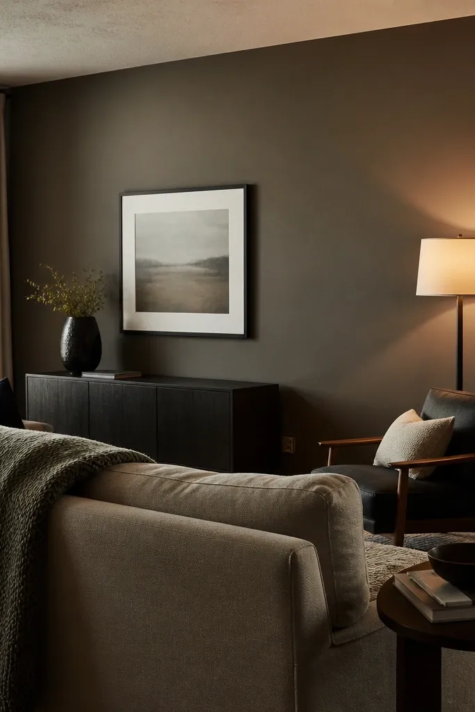
Glare is the silent makeover killer. If your walls are semi-gloss or eggshell and you have lamps or a bright window, the sheen reflects light and makes the room look harsh instead of calm. A matte accent wall behind the sofa reduces reflections and gives the room a grounded look that photographs well. I’m not talking about a black wall; deep taupe, muted olive, or warm greige in matte finish gives depth without turning the room gloomy. This project fixes the “before” problem of a room that looks washed out or shiny even after décor changes.
Pick your accent color by sampling on the wall you see from the main seating spot, not the aisle of the paint store. Test two heights with small swatches — one near the window and one opposite — then choose the tone that stays warm, not gray. Use a matte interior paint and cut in with a 2-3 inch angled brush around trim first, then roll the wall with a 3/8-inch nap roller for smooth walls. Let it cure per the can directions before you hang anything, so the surface doesn’t scuff when you tape.
If you already have glossy trim, scuff it with fine sandpaper and wipe with a damp cloth before painting — adhesion matters.
Don’t paint an accent wall with the same sheen as the rest if your room gets strong lamp glare.
3. Swap to warmer bulbs and fix lamp height for better skin tones
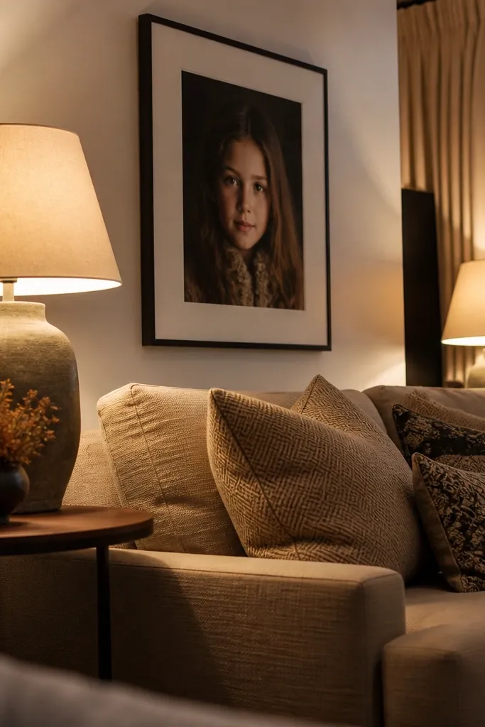
Lighting temperature is why so many drawing room before and after makeovers look “off” even when colors are correct. Too-cool bulbs (4000K and above) make walls look gray and skin look tired under lamps. Warm bulbs in the 2700K to 3000K range make whites look creamy and colors look intentional. Then there’s height: a lamp that throws light from too low makes corners dim and highlights clutter. This is one of the quickest upgrades because you’re changing how the room reads without changing the room itself.
Replace bulbs in every lamp with 2700K to 3000K LED bulbs, and match the wattage equivalent so brightness is even across the room. Use a simple test: stand at your usual seat and look at the wall behind the sofa — you want soft, even light, not bright spots. Raise floor lamps so the light source sits around eye level when you’re seated, usually 56-62 inches from the floor to the bulb center. Add a shade if the bulb is visible — a linen or fabric shade diffuses glare better than a clear glass globe.
Editor's noteUse a dimmer switch if you have one — soft dim at night makes the room look finished without adding more décor.
Skip thisDon’t mix 3000K lamps with 5000K bulbs in the same seating area.
4. Install picture rail or clean wall mounting to remove "tacked" mess
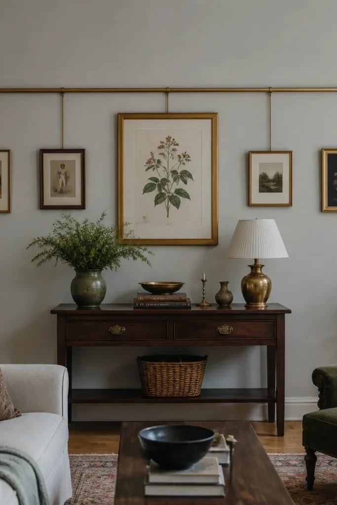
A drawing room can feel chaotic even with nice pieces because the wall hanging is inconsistent. When art is hung at random heights or with different hardware, the room feels “temporary.” A picture rail or a consistent wall mounting system gives you alignment and repeatable spacing, which is exactly what makes a makeover look real. You also get the bonus of easier changes later without patching holes every time. This project is especially good for rooms where the wall behind the sofa is a blank area waiting to be styled.
Measure the wall width and pick a central point based on the sofa center, then lay your art on the floor in the same arrangement you want. For gallery spacing, keep a 2-3 inch gap between frames and align the top edges if you’re using similar sizes. If you’re mounting directly, mark the wall level first with a laser level or a spirit level so everything sits straight. Install anchors appropriate to your wall type, then hang using a template so the frames don’t drift as you level them.
Editor's noteUse paper frame templates taped to the wall — you can step back and adjust spacing in seconds.
Skip thisDon’t hang the largest frame too low; art should sit around eye level, not at couch-back height.
5. Built-in look with a slim media console and cable control
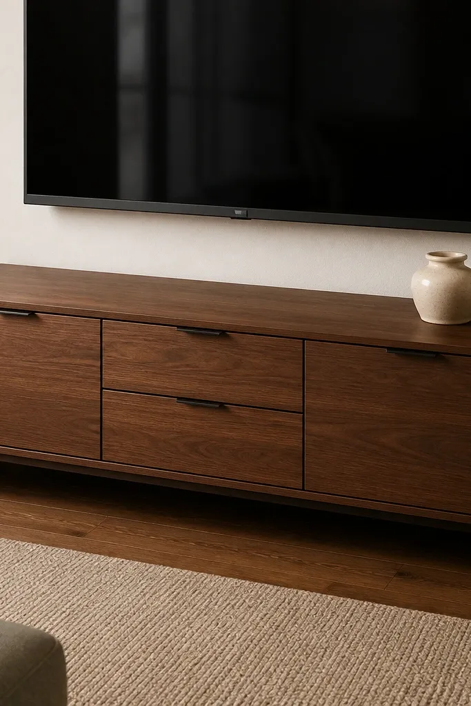
In a drawing room, the fastest way to ruin a makeover is visible cables and stacked electronics. Even if your furniture is nice, cords and devices create a “work zone” look, and your eye keeps returning to it. A slim media console with doors or drawers cleans the visual field, and cable management makes it stay clean. I like consoles that are 12-16 inches deep — they give storage without swallowing the room. This is a practical upgrade that changes the before/after instantly because it removes clutter from the main sightline.
Measure the wall where the console goes and keep the depth under 16 inches so you don’t crowd walkways. Choose a console with either closed storage or at least a back panel you can cut for cable pass-through. Install a power strip inside the cabinet and route cables through a grommeted hole so they disappear behind the unit. Finish by adding felt pads on the bottom of devices so they don’t rattle when you turn volume up.
Label cables with masking tape before you unplug anything — you’ll thank yourself in ten minutes.
Don’t leave the power strip on the open shelf; it makes the whole setup look temporary.
6. Curtains that reach the floor and widen the frame
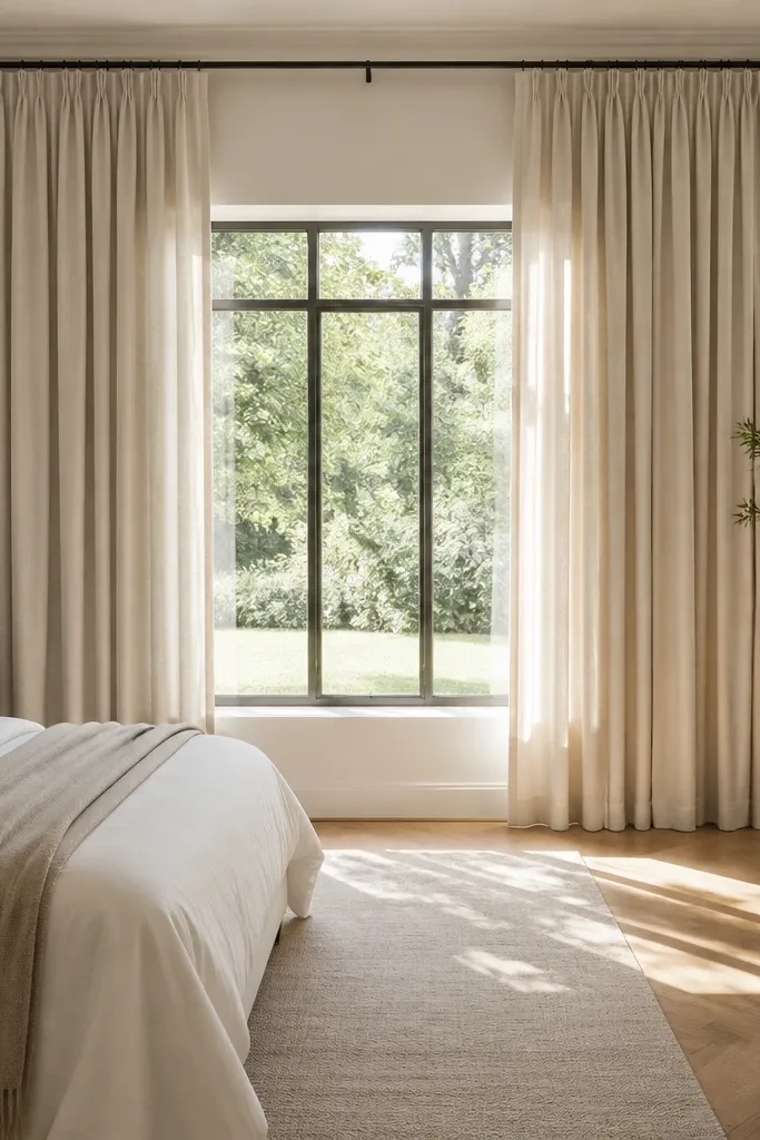
Curtains are one of the highest-impact makeovers because they change the room’s vertical lines. The mistake is hanging them too narrow and too short, which makes the window look smaller and the whole room feel lower. Floor-length panels with enough width create a tall, tailored look that makes the drawing room feel finished. If you choose a fabric with a bit of weight, it drapes better and hides dust and minor wall texture. This is a direct fix for the before look that feels “unfinished” even when the paint is new.
Measure window width and then multiply by 2 to 2.5 for total curtain fabric width — this creates fullness when closed. Hang the rod 4-6 inches above the window trim and 3-6 inches wider than the window on each side. Use floor-length panels that end just above the floor or lightly touch; measure from rod to floor with the curtain stretched flat. Steam the curtains after hanging so the pleats drop naturally, then adjust the hem if needed.
Use a curtain rod with brackets that let the curtain sit 1-2 inches off the wall so it doesn’t cling and look flat.
Don’t buy panels that are the exact window width; that’s the “before” problem.
7. Coffee table makeover with new top + stain-matching legs
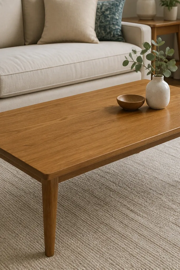
If the coffee table looks dull, scratched, or mismatched, it drags the whole drawing room makeover down. The coffee table is the visual center in most seating layouts, so a worn surface reads like “unfinished” even when walls and curtains are done. Refinishing the top and matching the tone of the legs fixes that mismatch fast. I like doing a stain on wood with a satin clear coat because it keeps the grain visible and feels more natural than paint. This is a beginner-to-intermediate project that gives you a true before/after change without replacing furniture.
Clean the table thoroughly, then scuff-sand the top with 120-grit and then 180-grit until the surface feels uniformly dull. Wipe dust with a tack cloth, apply wood stain in the direction of the grain, and let it develop for the time on the can. Seal with a satin polyurethane — two thin coats beat one thick coat for fewer bubbles. Let cure fully before you add coasters or set hot items.
Editor's noteDo a test patch in a hidden corner; stain color shifts a lot between wood species.
Skip thisDon’t skip sanding — paint and clear coat will peel over glossy varnish.
8. Replace a bulky chandelier with 2-3 warm wall sconces
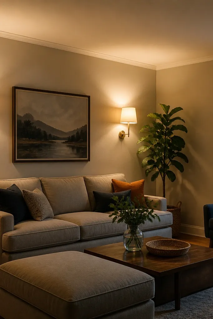
A single overhead fixture often makes a drawing room feel flat. You get bright light on the ceiling and dim corners where people actually look — behind plants, beside chairs, around the sofa. Two to three wall sconces create horizontal spread, which makes the room feel wider and warmer. I like sconces with fabric shades or diffusers so you don’t get harsh glare. This is a makeover move that changes the mood immediately and makes colors look more accurate.
Measure the wall length behind and beside the seating area and choose sconces that match in size and tone. Place the center of each sconce around 60-66 inches from the floor to the light source, then keep them spaced so they’re symmetrical around the seating. Use 2700K LED bulbs and pick a shade that diffuses light instead of reflecting it. If wiring is needed, turn off power at the breaker and follow local electrical rules; surface-mount sconces are easier for DIY.
Editor's noteUse a dimmer with wall sconces — it lets you keep daytime clarity and nighttime softness.
Skip thisDon’t install sconces too high; you’ll light the wall but not the people.
9. Gallery shelf swap: one floating shelf, not five knickknacks
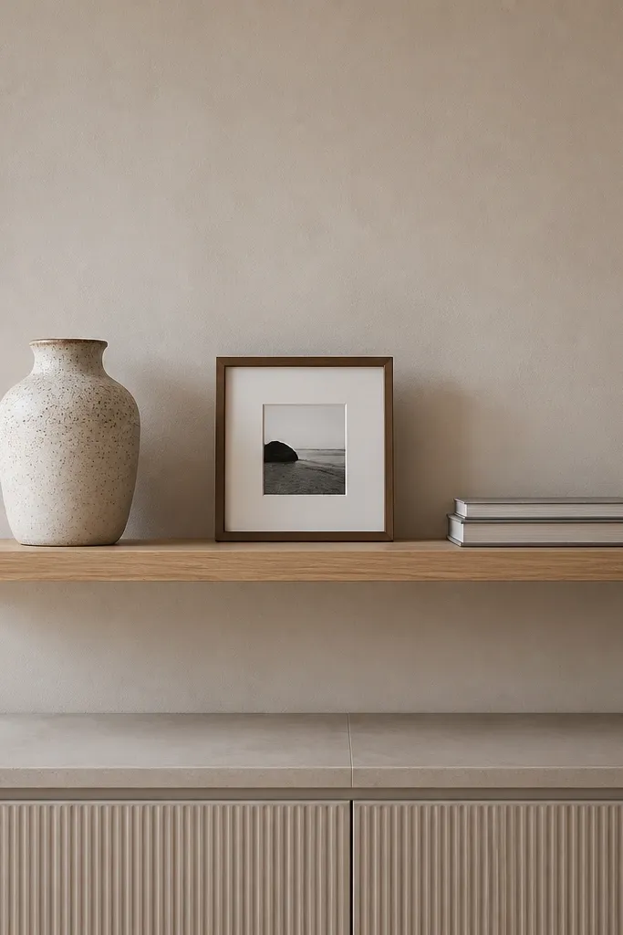
A crowded shelf makes the whole drawing room feel busy, even when every item is pretty. The before look is usually too many small objects spread across the wall, which creates visual noise. A single floating shelf with a tight edit reads cleaner and lets your wall color do the work. Use it to create a deliberate focal point: one ceramic piece, one stack of books, maybe a small frame. This makeover is cheap and fast, but it changes the room’s “calm” level more than most people expect.
Pick shelf length that matches your wall span — a 24-36 inch shelf usually looks right over a console or above a sideboard. Use a level to mount into studs when possible; if you can’t, use proper anchors rated for the shelf weight. Arrange items on the shelf first on the floor — keep it to 3-6 pieces so you can see negative space. Secure with felt pads so ceramics don’t slide and scratch the shelf.
Leave 2-3 inches of empty space at both ends of the shelf; it looks styled instead of accidental.
Don’t balance small items on both sides with no larger anchor — the shelf will look scattered.
10. Add a chair rail effect with painter's tape and the right height
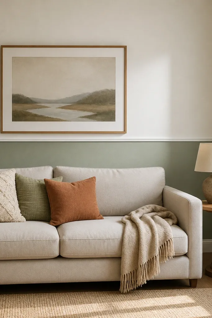
Two-tone walls can look designer when the line is placed correctly. The common mistake is putting the “divider” too high or too low, which makes the room feel unbalanced. A chair rail effect is a DIY-friendly way to add structure without installing actual trim. Use this when your drawing room walls feel flat and you want depth that isn’t loud. Done right, it frames the room and makes furniture look more intentional, especially with darker sofa fabrics.
Measure from the floor to the top of the chair rail line you want; a common starting point is 34-36 inches for many living room proportions. Apply painter’s tape in a straight line for the divider, then use a second tape line to mask the area for the top and bottom colors. Paint the bottom first with a satin or eggshell in a slightly deeper tone, let it dry, then paint the top in a lighter wall color. Remove tape while the paint is still slightly tacky to reduce peeling edges.
Press tape firmly with a plastic putty knife so paint doesn’t creep under the edge.
Don’t use matte on both sections if you want easy wipe-down — bottom walls take more scuffs.
11. Update window trim with simple paint + crisp caulk lines
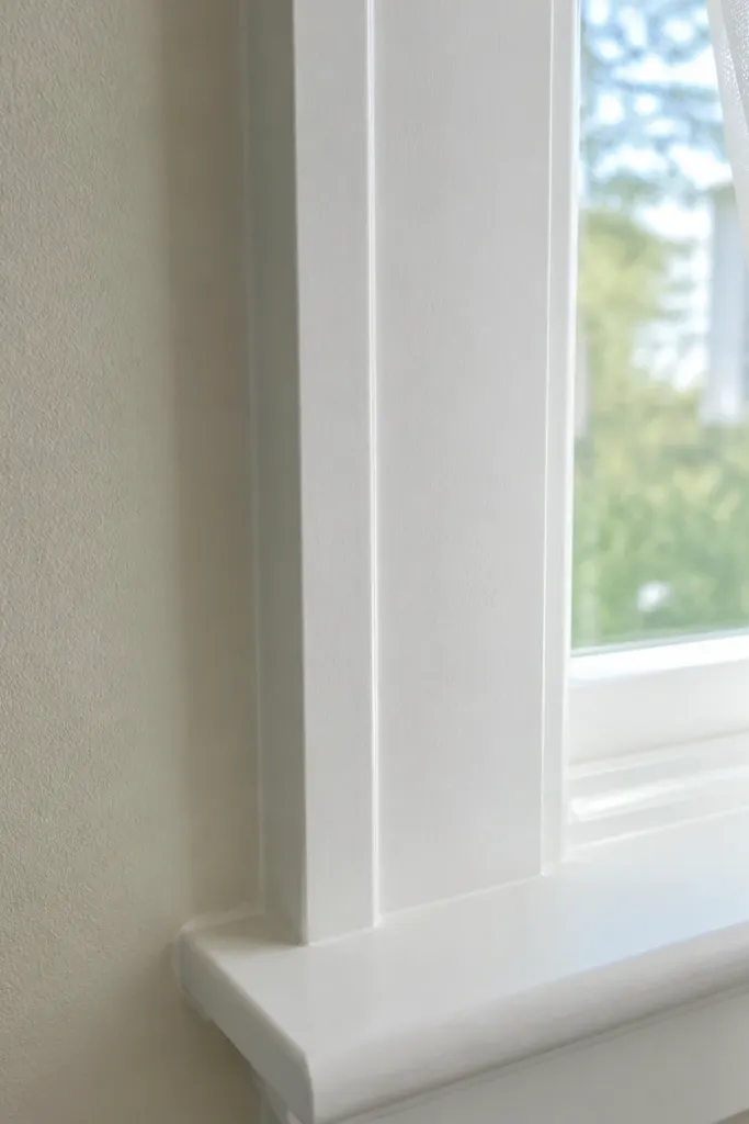
Old, yellowed trim makes a room look tired even after you repaint walls. The drawing room before and after makeover that people notice fastest is often trim — it changes the contrast and makes colors look cleaner. Painting trim in a true white or warm white (not grayish) makes the whole room feel brighter without adding new furniture. The key is clean caulk lines so you don’t see gaps between trim and wall. This is a straightforward DIY project with a big payoff.
Clean trim with a degreaser wipe, then sand lightly with 220-grit to help paint stick. Caulk gaps along the trim edges with a paintable acrylic caulk, and tool it with a damp finger or caulk tool for a smooth line. Tape along the wall and trim edges, then use a quality angled brush to cut in before rolling or brushing the flat sections. Let cure fully before removing tape for the cleanest line.
Use a mini foam roller for flat trim sections — it leaves a smoother finish than a standard brush.
Don’t paint over dust or old caulk residue; the finish will look patchy.
12. Side table makeover with new legs or a fresh finish
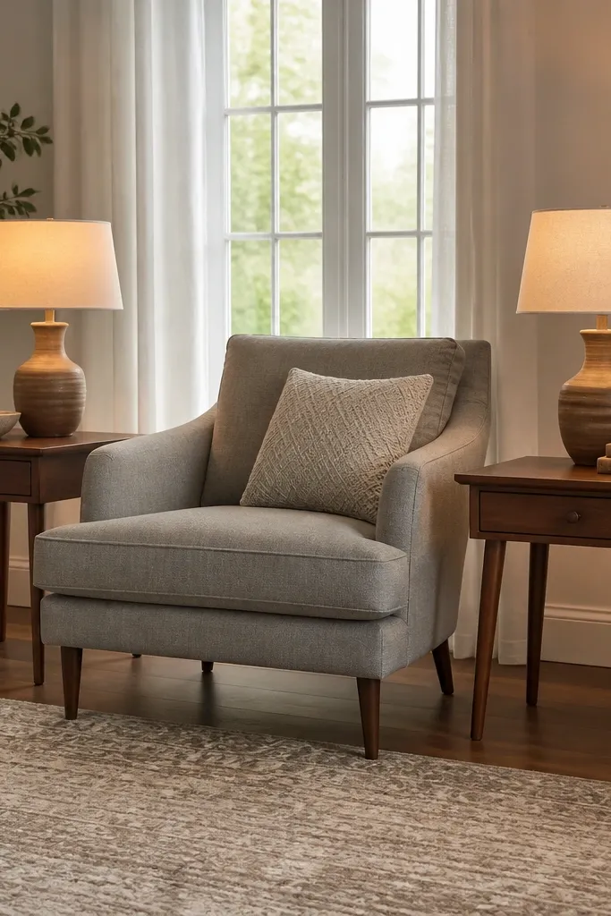
Mismatched side tables create a subtle “before” feeling because the eye expects symmetry in seating areas. You can fix that without buying new furniture by updating the finish or replacing legs if the structure is solid. A consistent tone between the side tables and coffee table makes the room look intentional. I like a satin finish because it hides minor scuffs and looks good under warm lamps. This makeover works in drawing rooms where the furniture is okay but the details look dated.
Remove hardware and sand the surface with 150-grit, then 220-grit for a smooth base. Apply wood conditioner if you’re staining porous wood so the color doesn’t blotch. For paint, use a bonding primer first, then two thin coats of enamel in a satin sheen. Reattach hardware after the final coat cures, and align tables so their top surfaces sit at the same height.
Editor's noteMatch the undertone, not just the color name — warm white trim pairs with warm brown finishes, not gray-brown.
Skip thisDon’t paint only one table; the mismatch will scream from the seating area.
13. Create a focal wall with removable wallpaper strips (no full wall commitment)
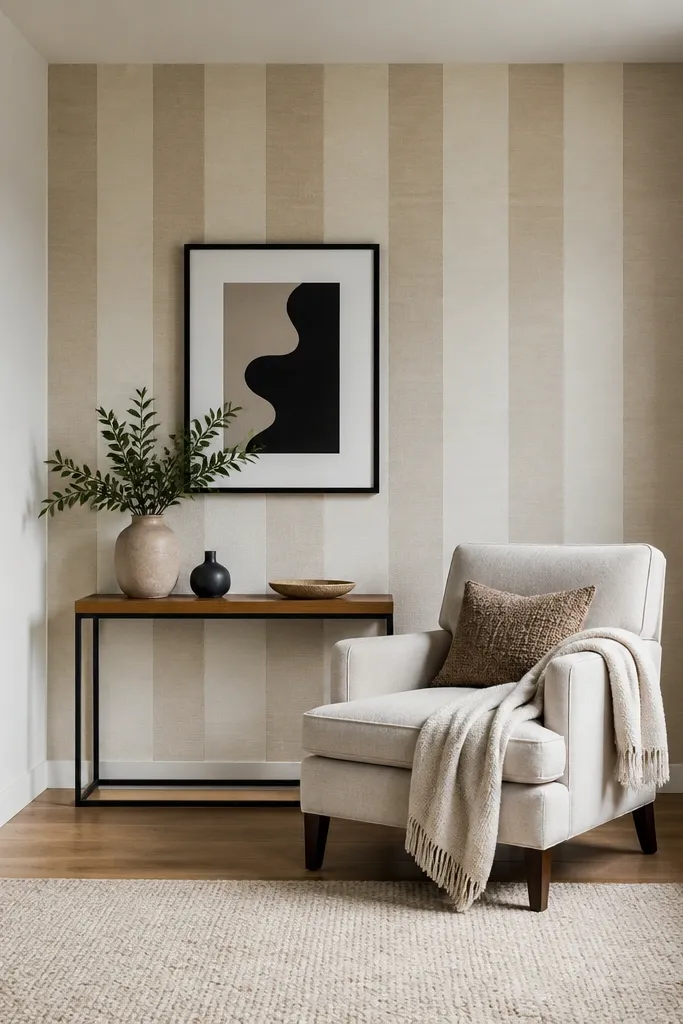
Full-wall wallpaper scares people because it feels permanent. The mistake is either going too busy or committing to a pattern that fights your furniture. A removable wallpaper focal zone — like behind an accent chair or a console — gives you the before/after drama without turning the entire room into a print overload. Pick a pattern with simple shapes and enough negative space so it doesn’t overwhelm. This is a DIY-friendly way to test a look and keep your drawing room flexible.
Decide the focal area width based on your furniture: for an accent chair, a zone about 24-36 inches wide usually looks right. Clean the wall, then plan vertical alignment using a level line. Apply wallpaper to the wall in sections, smoothing from the center outward to avoid bubbles. Seal edges if your product calls for it, then press corners firmly with a plastic smoothing tool.
Choose a pattern scale that matches your room: large shapes for larger rooms, smaller repeating motifs for tighter spaces.
Don’t place a high-contrast pattern behind a busy rug — the room will feel visually loud.
14. Make the fireplace look finished with trim paint and a new mantel styling plan
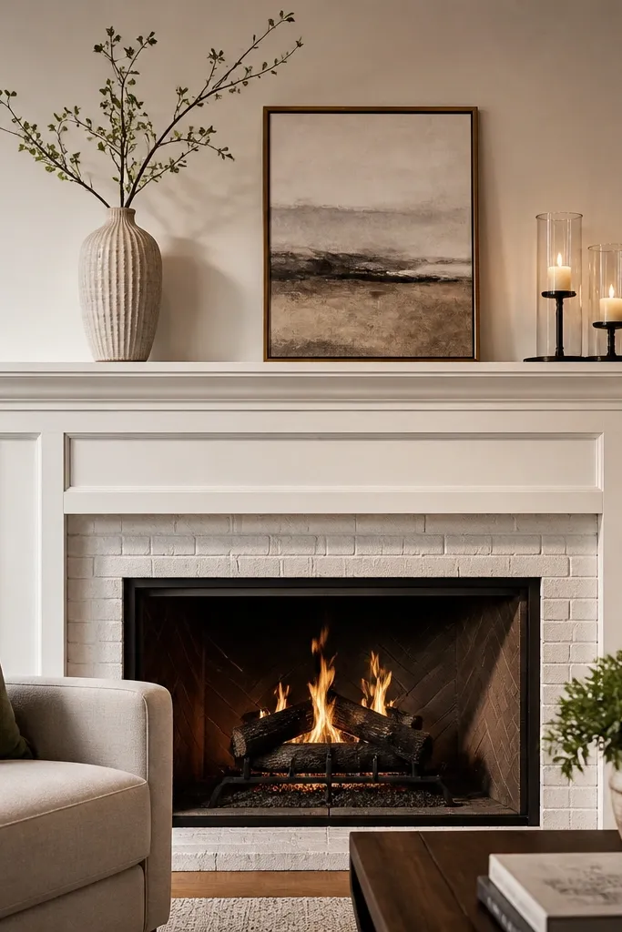
A fireplace is already the room’s anchor, but in many drawing rooms it looks unfinished because the trim is dull and the mantel is styled randomly. Paint the mantel and surround in a clean finish, then style it with a strict plan — one tall element, one medium, one small group. That gives height and balance without clutter. I like using matte on the surround to reduce reflections and satin on the mantel for a slightly warmer feel. This project is a makeover shortcut because it turns the room’s main spot into a clear focal point.
Sand the mantel lightly, then clean thoroughly and apply a primer if the surface is bare or stained. Paint the surround first in your chosen matte color, let it dry, then paint the mantel in satin for durability. For styling, measure the mantel length and choose items that cover about 60-70% of it, leaving breathing room. Place the tall item centered, then build outward with the medium piece and a small cluster on one side to keep the silhouette interesting.
Use painter’s tape to mask a straight line where mantel meets surround — it keeps the edge razor clean.
Don’t fill the mantel with many small frames; it turns the fireplace area into clutter.
15. Remove the "mismatched curtains" look with one color, one rod, one length
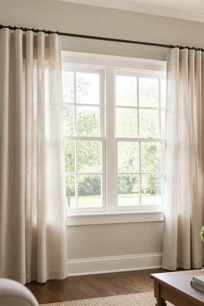
When curtains don’t match in color, length, or rod height, the room looks like it was fixed in pieces. That’s the exact before/after mismatch people hate because everything else looks coordinated. Picking one curtain fabric color and installing it with one consistent rod height makes the window look intentional. Even if your walls are bold, matching curtains calm the whole room down. This is a simple DIY that looks expensive because it creates uniformity where the eye expects order.
Measure from the rod to the floor, then buy panels that hit that measurement without pooling too much. Choose one fabric color for both sides and keep the pleat style consistent. Install the rod at 4-6 inches above the trim and ensure the curtains clear the window when open. Hang with the same number of inches of overlap on both sides so the closed look is symmetrical.
If you’re between lengths, go slightly longer — hemming is easier than trying to hide a short hem.
Don’t mix sheer panels with heavy blackout panels unless the color matches exactly.



