
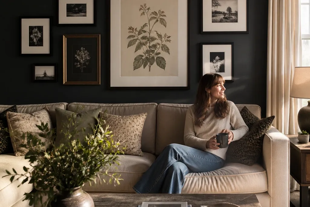
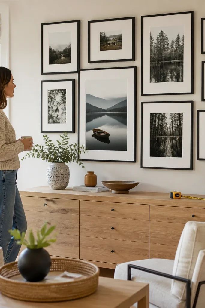
1. Single-Anchor Symmetry Above the Sofa
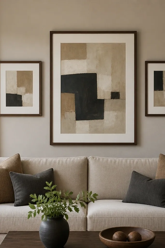
This layout looks curated because it has a real center line even when the pieces are different sizes. Start with one larger central print that acts like a visual “stop,” then mirror smaller frames on both sides so the eye knows where to rest. Keep the frame color consistent (black, espresso, or antique brass) and use similar mat widths so the white borders look like one unit. This works best in living rooms where you want gallery energy without making the wall feel busy. It’s also forgiving if your art sizes vary, because symmetry makes the whole arrangement read as intentional from across the room.
Start by marking the sofa center and measuring the total gallery width you want, then divide it into a left and right half that mirror each other. Lay painter’s tape on the wall to sketch the central frame first, then place two smaller frames on each side at matching distances from the center line. Use a tape ruler to keep a 2-inch gap between frame edges, then confirm the bottom edge sits 8-10 inches above the sofa backrest. Hang using a level and mount the anchor first, then use the level again for each side before removing tape.
Editor's noteUse the same mat color under all frames, even if the art differs. It ties everything together fast.
Skip thisDon’t center the frames by measuring only the inside edges — center by the frame outer edges so the symmetry is real.
2. Vertical Staircase With One Tall Center
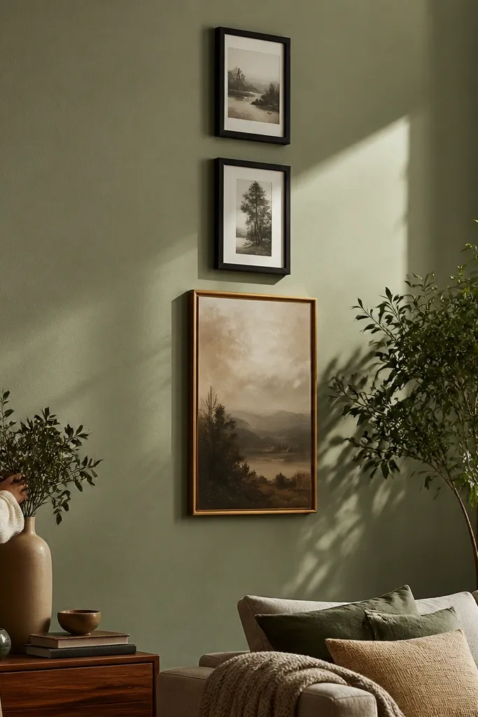
A staircase layout feels curated because it creates motion without looking chaotic. You get a clear rhythm: one tall hero piece in the middle and smaller frames stepping up along the same vertical column. Choose frames with the same width and keep the gaps tight and consistent, so the stagger looks designed. This is a great option for narrow walls or for rooms with tall ceilings where a standard grid feels too flat. The visual payoff is that the wall pulls your eye upward, which also makes the room feel more “put together” even in a small space.
Pick a central tall frame first and decide your overall height, then plan three smaller frames to the left and right that step upward. Mark the center line with a pencil, then place the tall frame so its top lands about 4-6 inches below the ceiling line you’re visually working with. For the staircase rhythm, keep frame edges 1-1/2 inches apart and align the left column frames to one vertical line and the right column frames to another. Mount the tall anchor, then hang the adjacent frames using the same tape spacing, finishing with the highest frame last so you can adjust without knocking anything.
If your art is mostly horizontal, rotate one piece 90 degrees so the stair feels intentional instead of random.
Don’t vary frame widths — the staircase collapses visually when some frames look chunkier than others.
3. Gallery Grid With a 2x3 Rhythm
A 2x3 grid reads curated because it’s mathematically neat without being boring. The trick is that you keep uniform frame outer sizes or, if you can’t, you use consistent mat sizes to make everything look the same footprint. Use art with similar contrast levels (all high-contrast black-and-white, or all muted landscape tones) so the wall doesn’t feel like a pile of different seasons. This layout works well in living rooms that have a lot of texture already — think woven rugs or patterned pillows — because the grid gives visual order. It’s also easiest to hang straight since every frame has a defined neighbor.
Choose six frames with the same outer dimensions if possible; if not, standardize the mat so each opening looks consistent. Tape a horizontal guideline across the wall at the gallery center height, then sketch two rows and three columns using painter’s tape squares. Keep a 2-inch gap between frame edges for a clean look, then double-check the total width against the wall space so it doesn’t feel cramped. Mount one corner frame first, then use a level to position the rest, measuring from the corner outward so the grid stays square.
Editor's noteIf you’re mixing frame finishes, paint them all to one satin finish before mounting so the shadows match.
Skip thisDon’t use wildly different mat widths — that makes the grid look lumpy even when the frames line up.
4. Asymmetrical Balance With Equal Visual Weight
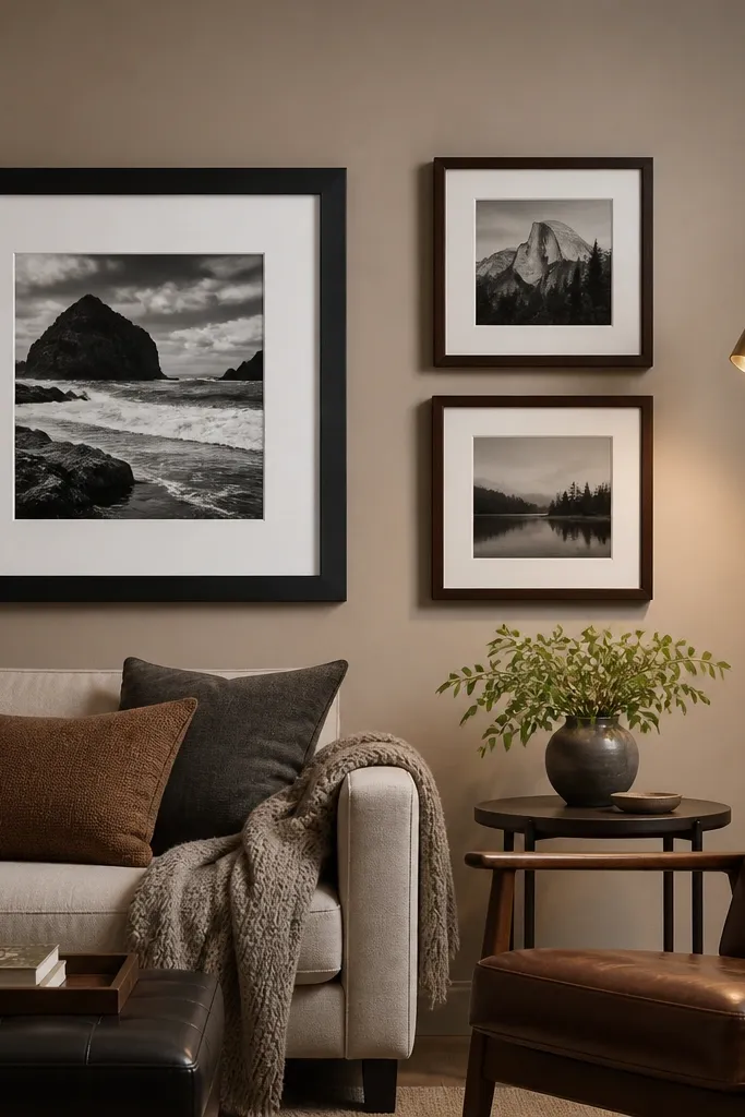
This is the curated “designer trick” — asymmetry that still feels balanced. Instead of mirroring left-right, you balance visual weight by size and darkness: a larger frame on one side pairs with two smaller frames on the other, or a dark piece balances a light piece. The wall looks intentional because the spacing is consistent and the arrangement has a clear center point. This works when your art collection isn’t uniform and you don’t want to buy more matching frames. It also looks great in modern living rooms where you want energy without the strictness of a grid.
Start by laying all frames on the floor and grouping them into two sides that feel visually equal, not identical. Pick one dominant frame (largest or darkest) and place it slightly below the arrangement center line, then arrange the opposite side with two or three smaller frames. Transfer the layout to the wall with painter’s tape, keeping frame-edge gaps at 1-1/2 to 2 inches. Use a level and measure from the dominant frame’s outer edge outward to keep the spacing consistent across the whole layout, then mount the dominant first and fill in the smaller frames last.
Use the same mat color on every frame even if you mix artwork styles. It prevents the wall from looking like a flea-market mix.
Don’t “eyeball” balance with size alone. Darkness and negative space matter, so place the darker pieces intentionally.
5. Modern Monochrome Striping (One Color, Many Sizes)
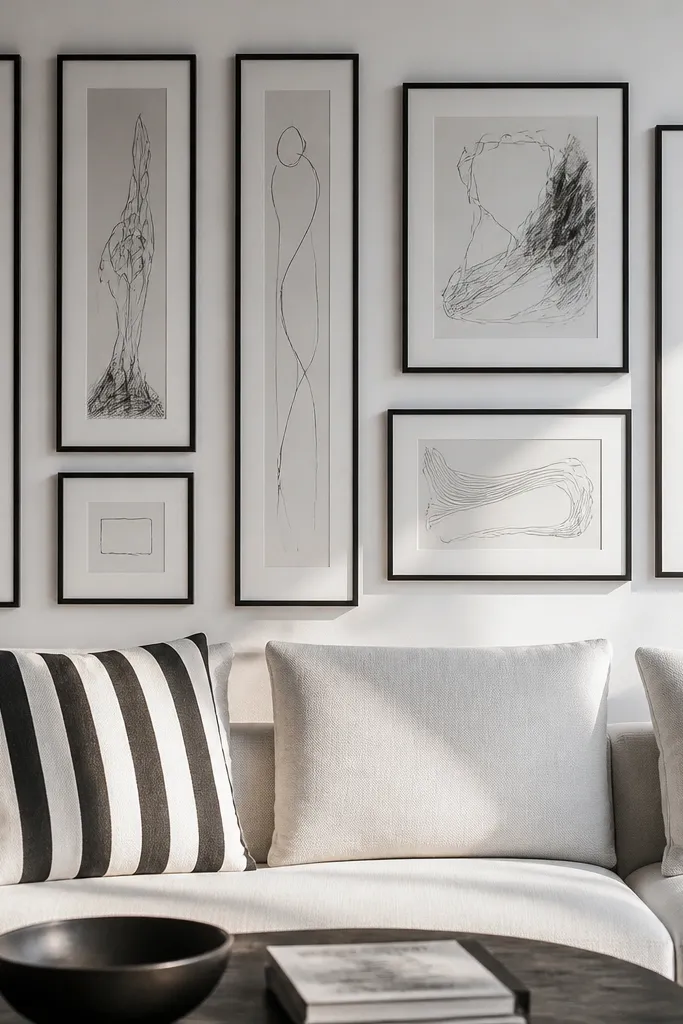
Monochrome striping looks curated because it creates a single visual language across different frame sizes. Choose one palette for frames and mats (black frames with white mats, or white frames with black mats) and stick to it. The art can vary as long as it has similar contrast — think black ink line drawings, grayscale photos, or simple typography. This layout is photogenic because the repeating frames create clean edges that catch light. It works especially well on walls with bold paint colors, because the gallery brings structure and keeps the room from feeling scattered.
Pick five to seven frames and keep the frame width consistent, even if the openings differ. Decide whether the strip runs vertically or horizontally based on the wall shape, then tape a single guide line across the wall. Arrange frames so their top edges align for one section and bottom edges align for another, creating a “striped” rhythm. Keep spacing at 2 inches between frame edges, then hang from the aligned top edge down so you don’t lose the stripe line. Finish by stepping back and checking that the overall strip sits centered in the wall space.
Editor's noteChoose matte art or matte prints. Glossy pieces create glare spots that ruin the gallery look on camera.
Skip thisDon’t mix warm and cool whites in the mats — the wall looks accidental when the borders don’t match.
6. Vintage Map + Photos Cluster (Tight Collage)
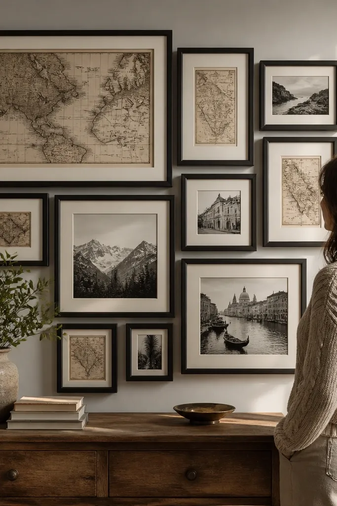
This cluster feels curated because it looks like a story wall, but it’s controlled. The key is using one dominant theme — vintage map print — and pairing it with photo frames that share the same black-and-white look. Keep the cluster compact so it reads as one object, not a scatter. Use frames with the same finish (antique brass or espresso wood) so the edges match and the collage doesn’t look mismatched. This layout is great for living rooms that need texture and personality without going full maximalist.
Choose one large map print and three to five smaller photo prints, then standardize the mat color (cream or off-white). Arrange everything on the floor first so the cluster feels tight, then tape the exact footprint to the wall. Keep the gap between frames at 1-1/2 inches for a cohesive cluster, and angle zero frames — keep them perfectly straight for a clean curated look. Mount the largest map first, then level and mount the smaller frames one by one, using a ruler to keep the cluster edges even.
If you want depth, use slightly different mat tones but keep them within one family (cream with warm gray, not cream with bright white).
Don’t leave huge empty gaps inside the cluster. The story-wall effect stops being curated when it turns into spacing mistakes.
7. Mirror + Frames Combo (Light-Boost Center)
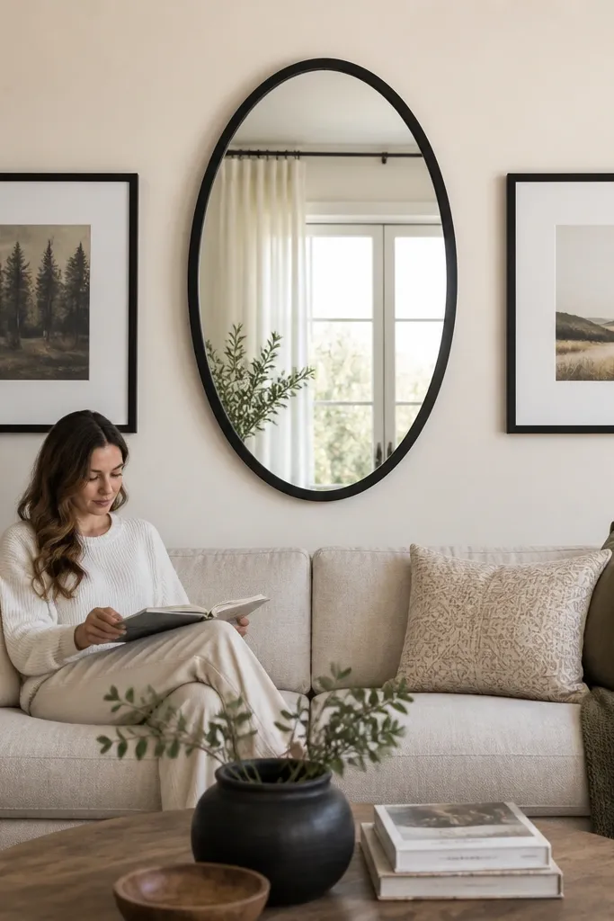
A mirror-centered gallery feels curated because it adds function and visual depth. Choose a mirror with a simple frame finish that matches your frame colors, then surround it with two to four framed prints. The mirror creates light bounce, which makes the wall look more expensive and helps art colors look more even. Keep the framed prints mostly vertical so the mirror doesn’t feel crowded. This layout works best in living rooms that need brightness or where the wall is opposite a window.
Pick a round or oval mirror and decide its outer diameter, then plan the surrounding frames based on that size. Tape a center line, mark the mirror’s center height around 60 inches, and place two vertical frames on each side with a 2-inch gap between outer edges. Use the same frame width and mat style for all prints so the mirror doesn’t look like an afterthought. Mount the mirror first (use the correct wall anchors for your wall type), then hang the frames with a level and measure from the mirror’s outer edge for consistent spacing.
Editor's noteChoose a mirror with a matte or satin finish frame. It reduces glare that can make photos look washed.
Skip thisDon’t pick mismatched frame finishes. The mirror pulls attention, so any inconsistency looks obvious.
8. Oversized Triptych (Three Panels, One Theme)
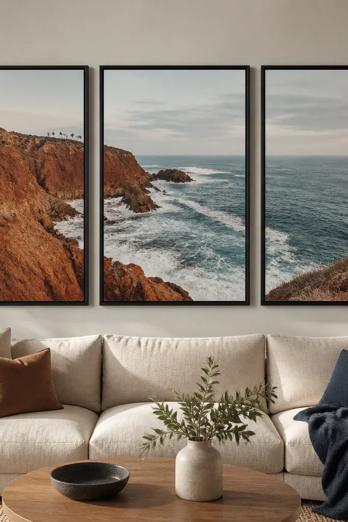
A triptych feels curated because it’s one composition split into three parts. The wall looks intentional even if your rooms decor is changing, because the panels share one style, one color range, and one scale. Use three matching frames or three identical canvas panel sizes so the gaps look consistent. This is the easiest “high impact” gallery wall if you don’t want to deal with lots of small pieces. It also photographs well because wide panels fill the wall and reduce the messy look of too many small frames.
Choose three panels with equal dimensions and decide the total width you want above your sofa or console. Tape the center panel first, then place the left and right panels so the gaps between frame edges are 2 inches. Align the top edges so the triptych looks straight, then mark mounting points. Hang the center panel, then use a level for each side panel so they sit on the same horizontal line. Finish by checking from the doorway angle — if it looks level from farther away, it will look level in photos too.
Use panels with the same finish sheen across all three, especially if they’re prints under glass.
Don’t mix different aspect ratios. A triptych stops reading as one piece when one panel is noticeably taller.
9. Picture Ledge With a Rotating Gallery Stack
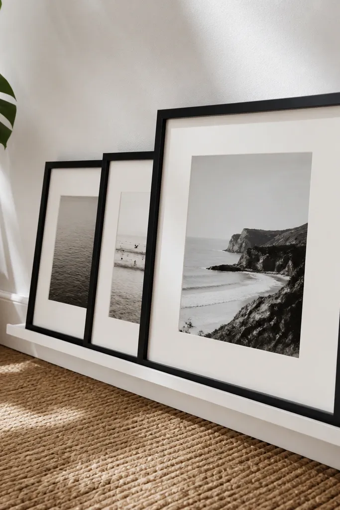
If you want curated without committing to one permanent layout, a picture ledge is the cleanest move. You get a gallery wall look with controlled overlap and spacing, and you can refresh art seasonally without remounting everything. Keep frames uniform in width and mat color, then vary only the art sizes. This looks great because the ledge creates a straight baseline, and the frames cast consistent shadows. It’s a strong option for living rooms where you like to swap prints or where kids might eventually change what they like.
Install a picture ledge at about 60 inches from the floor to the ledge top, then level it carefully with a spirit level. Use picture ledge hooks or frame supports so the frames sit flush and don’t tilt. Start by placing the largest frame in the center, then build outward with two medium frames and smaller ones at the edges, keeping a 1-1/2 to 2-inch gap between frames. Lightly press each frame into position so it sits straight, then step back and adjust before tightening everything.
Use museum-style glass or matte acrylic for glare control if your living room has strong overhead lighting.
Don’t put heavy frames on a ledge without checking weight rating. Sag ruins the curated alignment fast.
10. Frame-Within-Frame Layering (Shadow-Box Look)
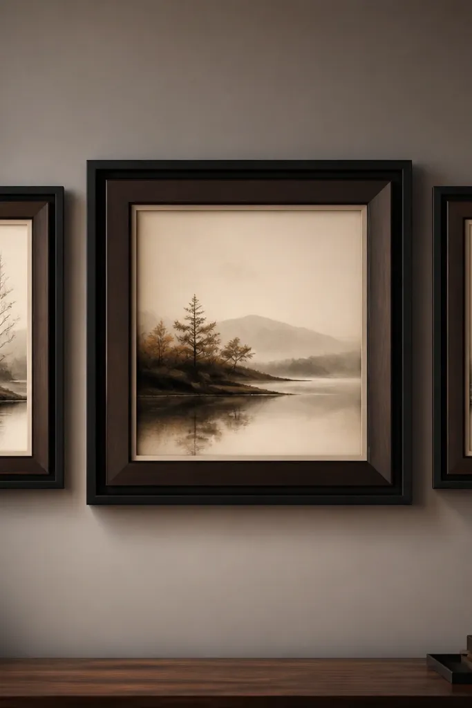
Layered frames look curated because they add depth and a designer-style “shadow box” feel. The wall reads as intentional because the artwork is framed like a focal artifact, not like a flat print. Use one central artwork and build around it with one or two supporting frames that match the same mat thickness. Keep the outer frame finish consistent and use a slightly darker inner mat to create contrast. This layout works well when you have one piece you really love and want the rest of the wall to support it without competing.
Pick one hero artwork sized to your wall, then choose two frame layers: an outer frame and an inner frame or deep mat. If you’re buying, look for frames with a deep lip so the inner border shows. Tape the outer frame outline to the wall, mount it level, then add the inner mat/art piece while keeping the border consistent on all sides. For the supporting pieces, place two smaller frames symmetrically with 2-inch gaps from the hero frame edges, then hang them using the same mat color and frame finish.
Choose a mat thickness that’s consistent with your other frames. Even 1/4 inch difference shows up in photos.
Don’t use two frame finishes on the layered piece. The depth becomes messy when the colors fight.
11. Gallery Wall With a Typographic Anchor
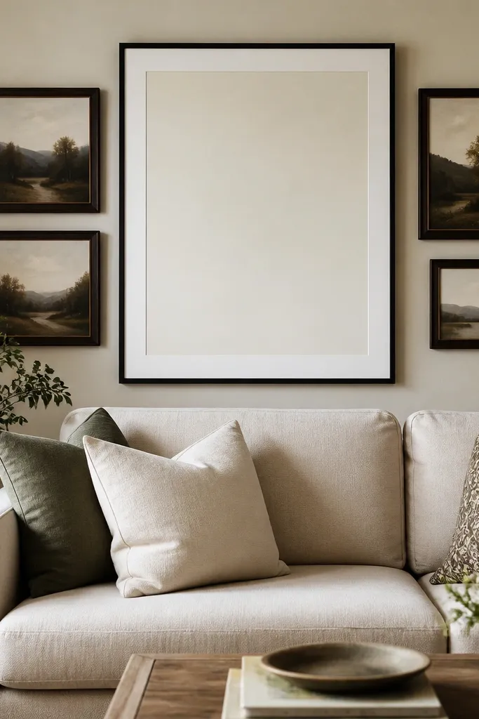
A typographic anchor makes the whole gallery feel curated because it gives the wall a readable focal point. Pick one large quote or word art piece, then build around it with photos or abstract prints that share the same font mood or color palette. Keep the typography frame simple — thin black or espresso — and make the rest of the frames match that finish. This layout works great in living rooms that need personality but don’t want heavy illustration. It also photographs well because text creates a strong shape even when the room is busy.
Choose one typographic print and decide its width so it takes up about 40-50% of your total gallery width. Tape the center line and place the typography frame first at a height where the center of the text sits around eye level. Add two smaller frames on each side, keeping their top edges within a consistent band so they feel grouped. Use 1-1/2 to 2-inch gaps between frame edges, then mount the typography piece first and align the rest with a level and a measuring tape from the typography outer edge.
Editor's noteUse high-contrast typography (black on cream, or white on dark) so it stays legible in bright rooms.
Skip thisDon’t scatter text pieces of different font styles. One typographic anchor is the clean move.
12. Color-Blocked Frames (One Wall, Three Paint-Color Matches)

Color-blocked frames look curated because they tie the gallery to the room palette on purpose. Pick three frame colors that match your existing paint accents or decor (for example: matte black, warm wood, and muted olive). Keep everything else consistent: same mat color, same spacing, and similar frame widths. Arrange pieces so each color appears in more than one spot, not all clumped together. This layout works when your living room has a strong accent color and you want the gallery to look like part of the design plan, not a random add-on.
Pick three frame colors and standardize mat color to one shade. Choose five to seven frames, then decide an arrangement that repeats each color — for example, one black frame in the center, two wood frames at left and right, and two olive frames at the corners. Tape the layout to the wall with a 2-inch gap rule between frame edges. Mount the center frame first, then hang the rest in the taped order so the spacing stays consistent and you don’t end up shifting one color group.
Spray frames with satin finish instead of glossy. Satin reads softer in daylight and photographs better.
Don’t use bright, saturated frame colors next to warm wood without a connecting mat shade. The wall looks mismatched.
13. Wainscoting-Style Row (Long Horizontal Line)
A long horizontal row looks curated because it mimics built-in architecture. You get a clean line across the wall, which makes the room feel finished even with simple decor. Use frames with the same outer width and keep them evenly spaced so the line looks intentional. This is great for living rooms with lower ceilings where vertical galleries can feel too tall. It also works well in hall-adjacent living spaces where you want the gallery to guide the eye along the room.
Measure the wall length you want to cover, then choose frames with identical outer dimensions if possible. Mark a baseline at the height you want the center of the arrangement (often 55-60 inches), then tape the first frame along the baseline and place the remaining frames with a consistent 2-inch gap between frame edges. Check the row length against the wall so it doesn’t crowd corners. Mount one frame at a time starting from the center, then work outward so the row stays straight.
If your wall has uneven paint, use a laser level or app level so the row doesn’t drift.
Don’t mix frame widths in a long row. Small width differences look obvious on a straight line.
14. Corner-to-Wall L Shape (For Awkward Living Rooms)
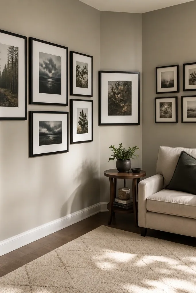
An L-shaped gallery feels curated because it solves the awkward corner problem. Instead of letting the corner be empty or randomly decorated, you wrap visual weight around it with one consistent frame family. Use larger frames on the main wall and smaller frames as the gallery turns the corner so the flow feels natural. Keep all frames straight and use the same spacing rule so the L doesn’t look like two separate projects. This works in open-plan living rooms where furniture sits at angles and the corner needs attention without clutter.
Decide how far each leg of the L should go, then pick a total number of frames that fits comfortably without crowding the corner. Tape a center line on the main wall and place the largest frame first, then tape the smaller frames along a second line that runs toward the corner. Use 1-1/2 to 2-inch gaps between frame edges on both legs, and keep the turning corner frames aligned so their edges form a clean angle. Mount the anchor on the main wall first, then mount the corner turn pieces, then finish with the far-end frames to keep adjustments easy.
Editor's noteUse the same frame finish on both walls so the corner transition looks intentional.
Skip thisDon’t rotate frames to “make it organic.” Straight frames are what keep the L shape looking designed.
15. Circular Cluster Around a Single Framed Art
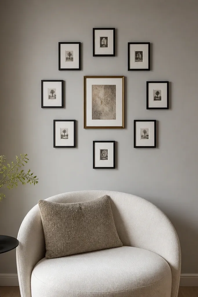
A circular cluster looks curated because it creates a focal orbit instead of a straight line. Start with one center artwork, then place smaller frames around it in a gentle ring, keeping their edges evenly spaced from the center. This arrangement looks good in living rooms with rounded decor elements or curved furniture lines. It also photographs well because the eye naturally moves outward from the center. Use a consistent frame finish and mat color so the circle reads as one composition, not a pile of frames.
Choose a center frame that’s about 40% of the cluster’s total width, then pick 5-7 smaller frames around it. Tape the center frame first, then place smaller frames around the perimeter using a consistent gap of about 1-1/2 inches between frame edges. Keep frame heights mostly similar so the ring looks like a deliberate shape, not a blob. Mount the center piece level, then mount the top and bottom frames first as anchors for the circle, and finally fill in left and right.
Editor's noteUse frames with identical width and consistent mat margins so the circle edges look smooth.
Skip thisDon’t choose wildly different frame depths. Deep frames create uneven shadows that break the ring effect.
16. Two-Level Gallery Split (Upper + Lower Bands)
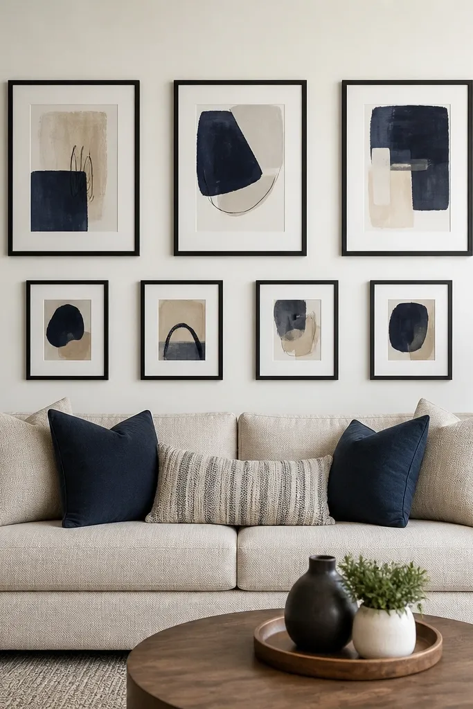
Two-level bands look curated because they add structure and prevent the wall from feeling too dense. You create an upper band of larger pieces and a lower band of smaller pieces, with consistent spacing inside each band. The gap between bands is bigger so the wall breathes, which makes the whole arrangement look intentional. This is a smart move for living rooms with patterned wallpaper or bold paint, because it keeps the gallery from visually fighting the background. It also helps when your art sizes are mixed and you want a controlled way to combine them.
Pick 6-8 frames and group them into two bands based on size: 3-4 larger frames on top, 3-4 smaller frames on bottom. Tape a horizontal guideline for the center of the top band and another for the bottom band, then sketch the spacing with painter’s tape. Keep 2-inch gaps between frames within each band and use a 3-inch vertical gap between the bands. Mount the top band first so you can align the bottom band to it, then mount the bottom frames using a level and a tape measure from the band edges.
If your bottom band feels too low, raise it by 2-3 inches instead of shrinking frame spacing. Breathing room looks better.
Don’t make the vertical gap between bands the same as the horizontal gap. That removes the band structure.
17. Color-Matched Frame Collage With a Single Big Photo
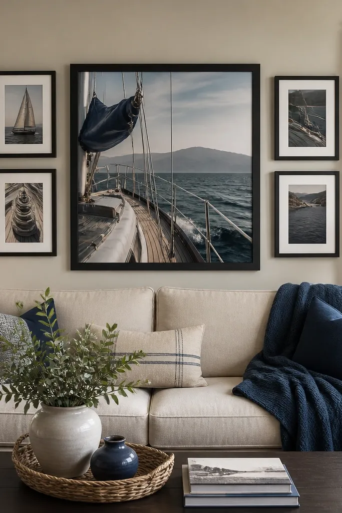
This collage works because it uses one big photo as the hub and gives everything else a supporting role. You get that “curated” feeling because the palette is consistent and the composition has a clear center. Choose a big photo with a dominant color that matches your room — like warm beige, deep navy, or muted terracotta — then pick smaller frames that echo that color through artwork or mat tones. Keep the frames the same width so the collage edges line up visually. This layout is ideal for living rooms where you want the gallery to feel personal, not generic.
Choose one large photo frame and then select 4-6 smaller frames that match the same frame width and mat color. Arrange everything on the floor with the large photo centered, keeping 1-1/2 inch gaps between frames around the hub. Tape the footprint to the wall and confirm the cluster fits above your sofa or console with at least 6 inches of breathing space on each side. Mount the large hub first, level it, then mount the surrounding frames in a clockwise order so you can adjust the last frame without throwing off the whole cluster.
Use a matte finish on the large photo if it’s under glass. It reduces glare that makes the hub look cheap.
Don’t let the smallest frames sit too far from the hub. The cluster stops reading as one composition.
18. Minimal Frame Trio With Wide Mat Borders
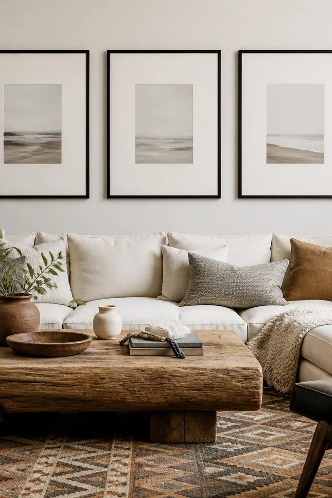
Minimal trio galleries look curated because the negative space does the work. Wide mat borders make the artwork feel intentional and give the room breathing room, especially in living rooms with busy textiles. Choose three frames with identical outer sizes and mat thickness, and keep the art styles consistent in tone. This option is ideal if you don’t want to manage lots of small alignment points. It also photographs cleanly because the frames have fewer edges and the mat creates a tidy visual border.
Pick three frames with the same outer dimensions and mat width, ideally with the same frame color. Tape a center line and place the middle frame first at a height where it sits near eye level for standing viewing. Add the left and right frames with 2-inch gaps between frame edges, then check total width against the sofa width or wall space. Mount the center frame, then mount the two sides using a level and measuring tape so the spacing stays equal.
Aim for mats that are at least 2 inches wide if you want the minimal look to read in photos.
Don’t use thin mats with minimal frames. The look gets flat and less curated.
19. Oval Mirror With Vertical Gallery Slats
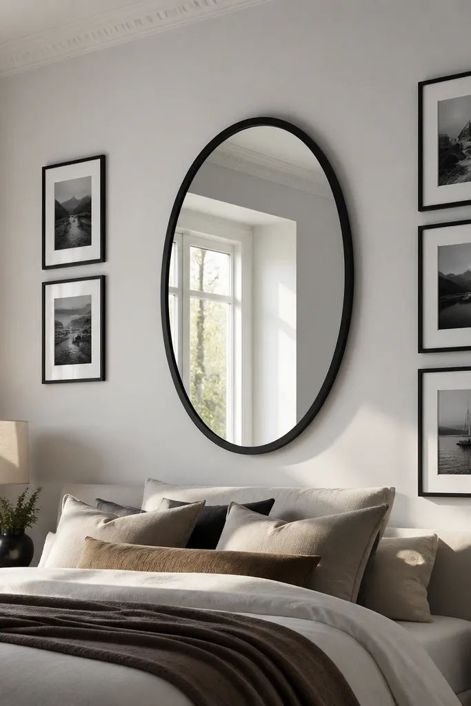
This layout feels curated because it combines one reflective focal point with a vertical “slat” rhythm. The mirror gives you light and depth, and the vertical frames create a structured, gallery-like extension. Use frames with similar proportions and keep gaps consistent so the vertical rhythm looks deliberate. This works in living rooms with mid-century or modern decor where vertical lines already show up in furniture legs or shelving. It’s also great for walls that are slightly off-center because the mirror pulls attention and makes the arrangement feel purposeful.
Choose an oval mirror and decide its placement first, then tape a center line. Place two vertical frames beside the mirror with 2-inch gaps between frame edges, keeping their heights aligned to the mirror center. Add one or two smaller frames above the mirror at the same spacing, forming a vertical stack. Mount the mirror first using proper anchors, then hang the side frames with a level, and finish with the top frames so you can adjust alignment without redoing the base.
Editor's noteMatch mirror frame finish to the frame finish, not the mat color. The mirror frame is what reads from across the room.
Skip thisDon’t add horizontal frames into this layout. Horizontal pieces break the vertical rhythm.
20. Rope-Framed Coastal Ladder Wall (Two Heights, One Theme)
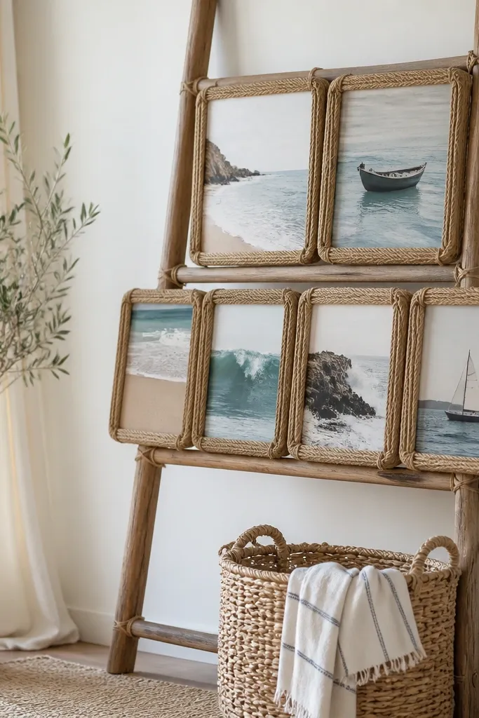
A living room gallery wall can feel “curated” without being a flat grid. This setup uses a simple ladder form to create vertical rhythm, then adds rope-framed photos so every piece looks intentional. The rope frames unify everything — even when you mix photo sizes, they all share the same material texture. It also solves a common layout problem: you get a clear focal area without covering the whole wall. This works best in rooms that already have wood tones, linen textures, or coastal/neutral decor, and it looks great in daylight because the rope adds soft highlights. Skill level is beginner-friendly if you can find studs and mount level — plan about 2-3 hours including layout time.
Find two studs and mark a centerline for the ladder, then set the ladder so the top rung lands about 72 in from the floor. Use a prebuilt small wooden ladder (or cut a simple version from 1x3s) and sand it smooth, then wipe it clean. Wrap jute or cotton rope into tight circles around each photo using a glue gun, then finish the rope edges with a thin coat of clear matte sealant so it doesn’t fuzz. Mount the ladder first with two heavy-duty wall brackets or a stud-mounted French cleat setup, then hang rope frames from small brass hooks on the ladder rungs. Keep spacing consistent by measuring the gap between frames — aim for 3 in between the bottom of one frame and the top of the next.
Seal the rope before you hang anything. Matte clear spray keeps the texture visible but stops dust and humidity from making it look dull.
Don’t mount the ladder to drywall anchors — rungs pull forward and the whole wall will look crooked fast.



