
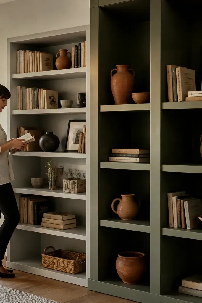
1. Full-height library wall with a ladder centerpiece
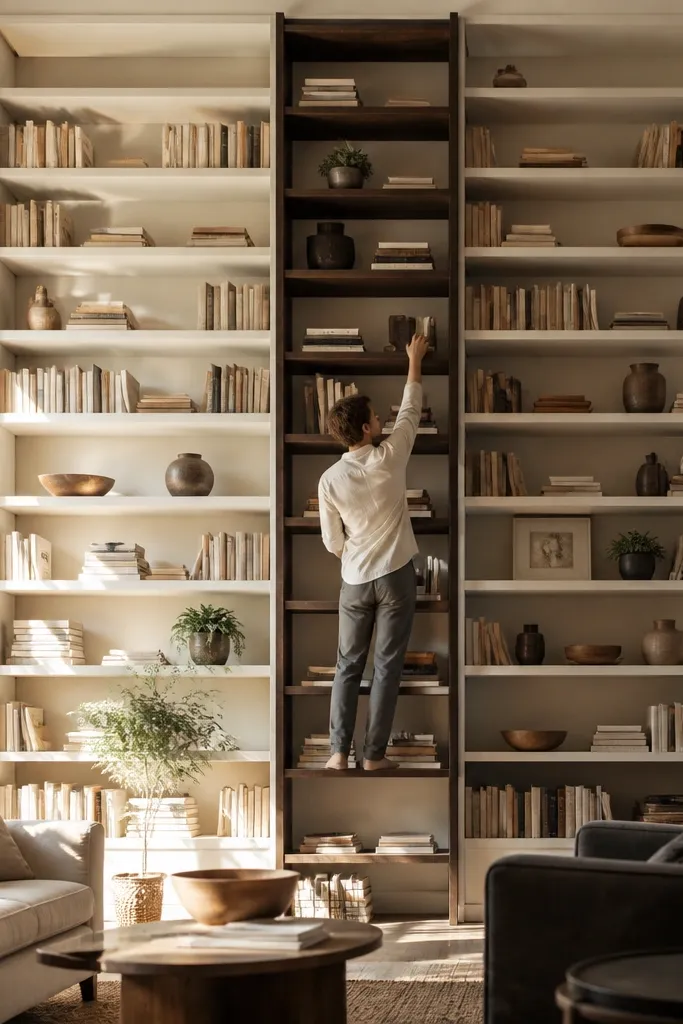
This layout makes your living room feel designed because it creates one vertical rhythm the eye can follow. Go full-height and repeat the same shelf spacing on both sides, then break the pattern with a ladder-style open section in the middle. The look works because tall vertical frames make ceilings feel higher and the shelves cast shadow instead of looking flat. For materials, MDF or plywood carcasses with a painted finish read clean and modern; stain only works if your wall trim and floors share a similar tone. Skill level is moderate: you’re aligning a long run, so take time on layout marks and keep the face frame reveal consistent.
Start by marking your shelf grid on the wall at three heights, using a laser level so the lines stay straight across the room. Build or assemble the carcasses so the center ladder section is fixed first, then clamp and fasten the left and right runs to it. Add a matching face frame across the whole wall, then install shelves at 12-14 inches clear spacing for books. Finish by caulking the trim seams, sanding the face frame corners lightly, and painting with a hard, durable enamel or lacquer-style cabinet paint.
Before you commit to shelf heights, mock the grid with painter’s tape and stand back at eye level for 30 seconds.
Don’t mix shelf spacing on the sides and centerpiece — it reads like “unfinished planning” in photos.
2. Fireplace surround built-ins with a floating mantel shelf
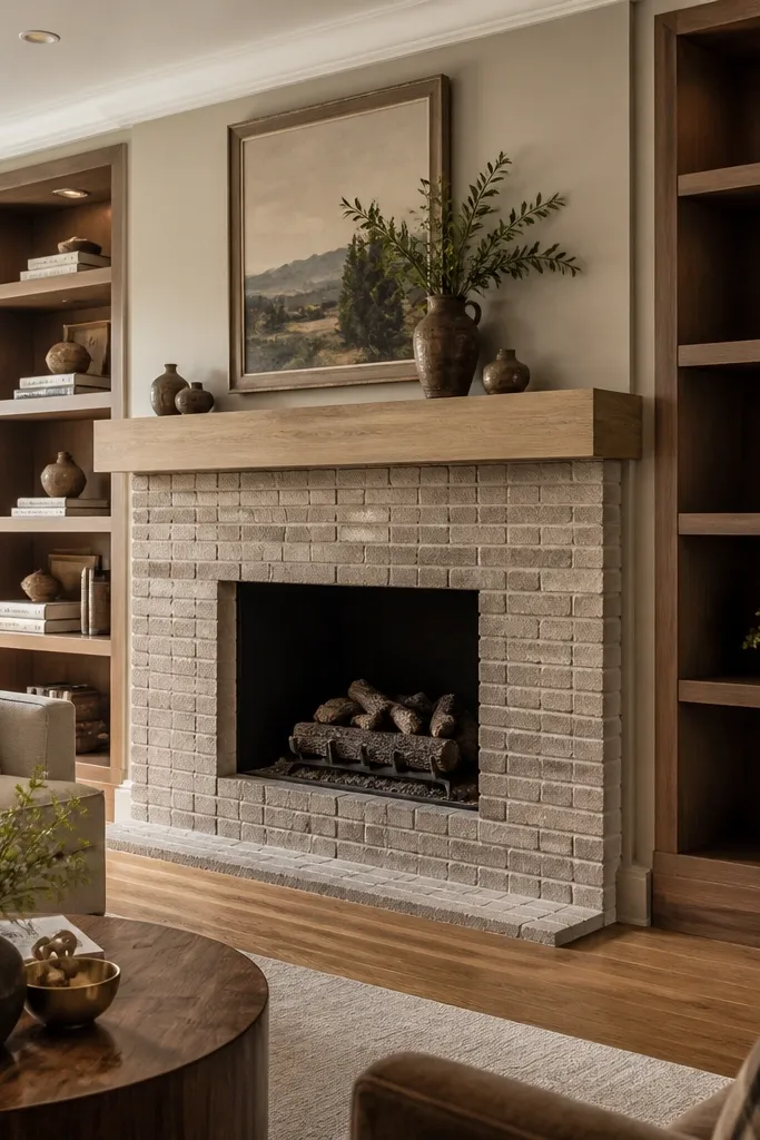
Shelves around a fireplace look instantly cohesive because the fireplace already acts like a focal point. The floating mantel shelf is what makes it feel like a custom built-in instead of two separate projects. Use deep display shelves on the outer bays (about 11-12 inches) so decor and books sit in shadow, while keep the inner shelves slightly shallower if you’re working around heat clearances. Painted built-ins with a crisp sheen keep the focus on the fireplace and makes the whole wall look intentional. This is a higher-skill build because you’re working with heat-safe clearances and aligning with an existing mantel or surround.
Start by verifying safe clearances for your fireplace insert or gas unit, and plan any backing materials accordingly. Build two side bays first, keeping the top line level with the mantel shelf height you want. Then frame the mantel shelf opening, set the mantel shelf, and install the inner shelf runs with consistent vertical spacing (14-16 inches for decor looks best). Finish by sealing seams with paintable caulk and using a heat-rated primer and paint on any surfaces near the unit.
Use a ledger board under the mantel shelf while you fasten — it prevents sag and keeps the line straight.
Don’t fasten shelves directly into drywall near the firebox zone without checking heat clearances and backing material.
3. Shiplap-backed open cubbies with smooth face frame
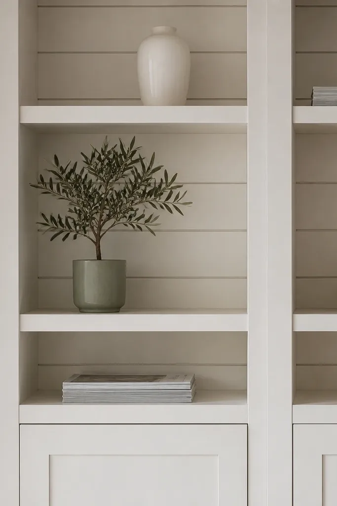
If you want warmth without clutter, this combo is a winner: open cubbies for styling and a shiplap back to add texture depth behind objects. The smooth face frame keeps it modern so it doesn’t drift into farmhouse-only. Use a consistent cubby size so the wall reads clean in wide photos, and pick a back color that contrasts with your shelves — light shiplap behind darker shelves is the easiest “impact” look. This project looks great in living rooms with neutral walls because the texture does the work. It’s beginner-friendly if you buy flat-pack carcasses and focus your skill on the back panels and face frame details.
Start by installing the carcass base line and top rails so the openings match your grid. Cut shiplap panels to fit each cubby back, leaving a tiny gap for expansion, then fasten with small brads or a finish nailer. Add a continuous face frame over the carcasses so all seams land behind trim. Finally, paint the face frame and shelves, then seal the shiplap with a clear or paint finish so it doesn’t look dusty.
Paint shiplap after installation — it hides nail holes and makes the back look even in photos.
Don’t leave cubby sizes random; mismatched openings kill the clean look.
4. Tall cabinets on the ends with open shelves in the middle
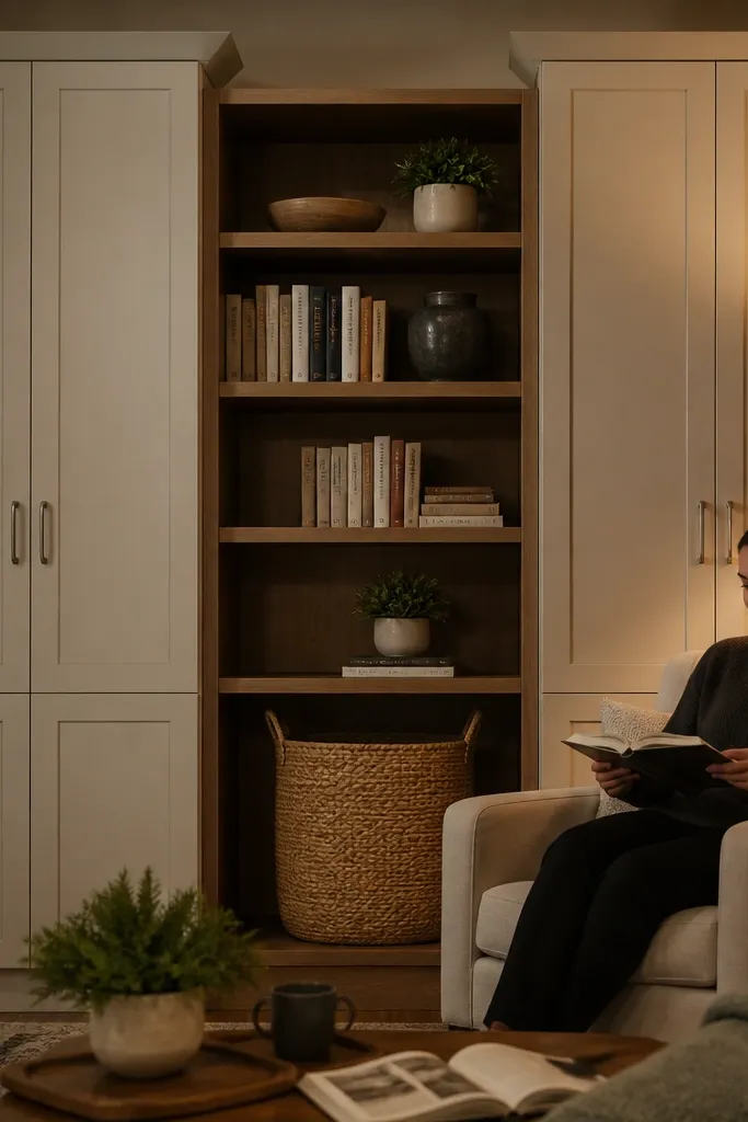
This is the layout that makes built-ins feel expensive even with simple materials. The end cabinets hide clutter, while the center open shelves show your best books and decor. The contrast gives the room breathing room and makes the open section feel bigger. Choose shaker doors with simple pulls and keep the open shelves consistent across the whole center run. For finish, painted cabinets in a satin or eggshell sheen reads clean and holds up to living-room traffic. This build is ideal when you want flat-pack flexibility but still need the “custom” look through trim and door alignment.
Begin by deciding your total wall width and splitting it into three zones: left cabinet bay, center open bay, right cabinet bay. Assemble the carcasses so the center open bay shelves line up vertically, then install the cabinet doors last to fine-tune gaps. Add a face frame across all three zones, then route or install decorative trim to frame the open section. Finish by adjusting hinges so doors sit evenly and caulking the trim seams for a smooth photo-ready surface.
Set cabinet doors with a consistent reveal by using plastic shims at every hinge point.
Don’t use different trim styles on ends vs center; keep the face frame profile identical.
5. Corner-to-corner wraparound built-ins with a 45-degree display bay
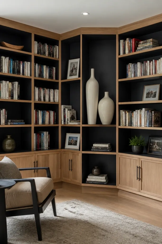
Corner wraparounds look high-end because they eliminate the awkward dead space and create a continuous visual line. The secret is the 45-degree display bay — it gives you a place for tall objects and breaks up the straight runs so it doesn’t feel like a warehouse. Build it so shelves continue with matching depth and spacing on both walls. For the best look, keep the corner bay back panel the same color as the shelves and use consistent trim thickness. This is a mid-skill project because you’re cutting angles and aligning two long lines that meet at the corner.
Start by measuring the corner walls and checking the angle with a speed square or angle finder. Build straight runs up to the corner, then fabricate the diagonal bay using angled panels and shelves cut with a miter saw. Install the diagonal bay first so it anchors the angle, then attach the left and right runs and add corner trim to cover any tiny gaps. Finish by sanding the trim edges smooth and painting in one continuous coat so the sheen matches across seams.
Dry-fit the corner bay shelves on the floor first, then install as a unit to reduce alignment errors.
Don’t rely on drywall for your corner line — snap chalk lines into studs and anchor there.
6. Floating mid-wall shelves with a built-in base and hidden wiring
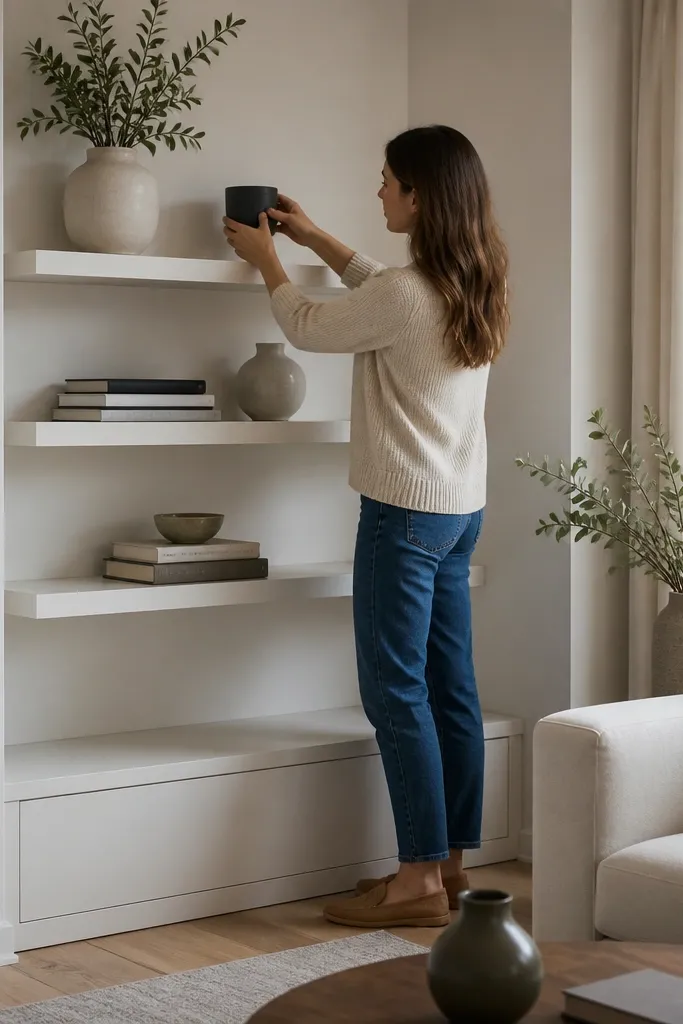
If your living room has a low TV or lots of wall clutter, this layout cleans it up without making the room feel heavy. The base gives structure and hides cables, while the shelves look lighter because they float visually with minimal trim lines. Keep shelf depth around 9-10 inches for books and decor, and use a consistent 12-14 inch spacing for a planned grid. Choose a painted finish with a smooth sheen on the base, then a slightly different sheen on shelves if you want subtle separation. This is a flat-pack-friendly build because you can assemble the base from standard units and mount shelves with rail supports.
Start by installing a level base line and locating studs for mounting rails. Assemble the base cabinets, add a rear channel for wire routing, and leave an access panel or removable back section. Mount the shelf supports (a continuous rail or hidden cleats), then set each shelf so the spacing stays even across the run. Finish by adding a thin trim strip at the shelf edges and painting the mounting surfaces so everything blends.
Editor's noteUse a cable routing kit and plan a service loop so you can pull the cable without tearing anything apart.
Skip thisDon’t mount shelves using drywall anchors — it looks fine for a week and then starts to sag.
7. Deep display wall with glass-front upper cabinets
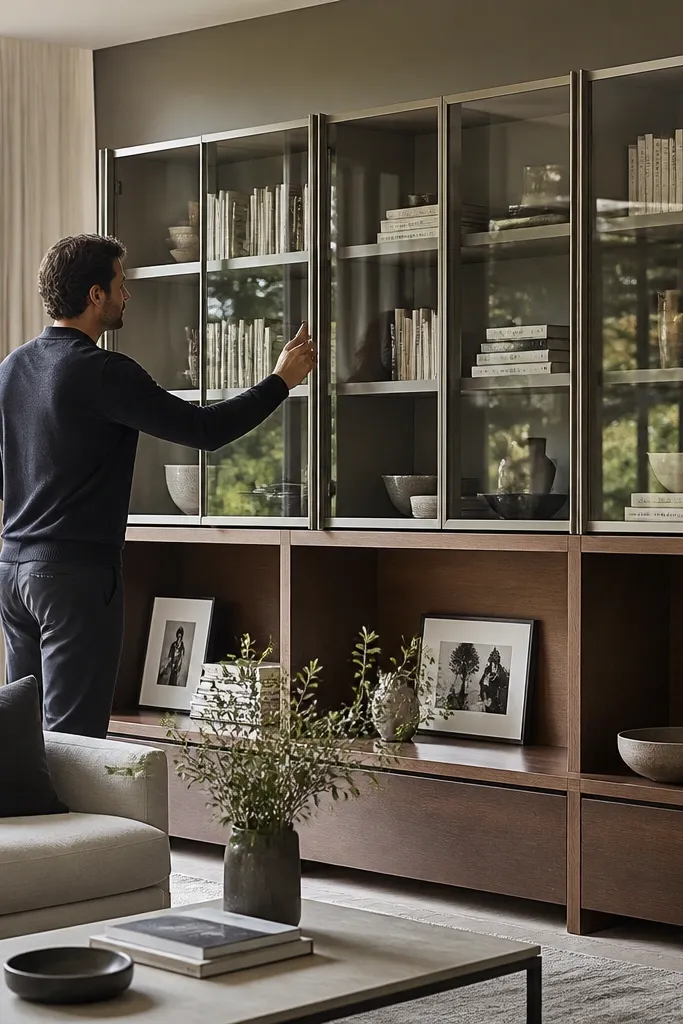
Glass-front uppers make the whole living room feel curated because they control what’s visible. Pair them with deeper open shelves below so you get both display and storage. The look works especially well if you style with matching book colors, simple ceramics, and a couple of taller frames. Use tempered glass with a clean frame so it reads modern and doesn’t look “cheap.” This build is more time than flat-pack alone because you need good alignment and consistent reveals around glass doors.
Start by measuring door openings and selecting glass door carcasses or building door frames with the same face frame profile as your shelves. Install the base shelving first, keeping shelf spacing consistent and depth around 11-12 inches for decor. Add upper glass frames and set doors so the reveal gaps are even, then install interior shelf pins or fixed shelves inside the glass section. Finish by adding LED puck lights inside the glass areas and painting the interior back panels to prevent glare.
Editor's noteUse warm LED bulbs around 2700K for glass — it looks better than cool white in living rooms.
Skip thisDon’t skip a painted interior back for glass — bare wood back panels look spotty through glass.
8. Book-matched paneling wall with recessed shelves

This is the most “designed” look on a budget because the wall paneling does the heavy lifting. Recessed shelves create shadow lines, and shadow sells depth in photos. Go with a consistent recess depth, then keep the shelf faces flush with the paneling system so it reads like one built-in. If you want the flat-pack vs custom decision to be simple: custom is worth it here because recess dimensions have to match your panel pattern and trim. If you’re willing to do paneling yourself, flat-pack carcasses still work, but you’ll spend time building matching frames.
Start by building a paneling grid on the wall using 1x2 furring or pre-made paneling boards, keeping everything level and plumb. Cut recess openings where shelves will sit, then install shelf frames that match the panel depth exactly. Set the shelves into the recess frames and fasten from behind through the frame supports. Finish by installing thin trim to create a crisp shadow line and paint the whole system in one continuous schedule so sheen matches.
Make one cardboard template for the recess opening and reuse it for every shelf so the spacing stays perfect.
Don’t eyeball recess depth; inconsistent shadows look messy even if the shelves are level.
9. Symmetrical two-column shelves with a long media drawer
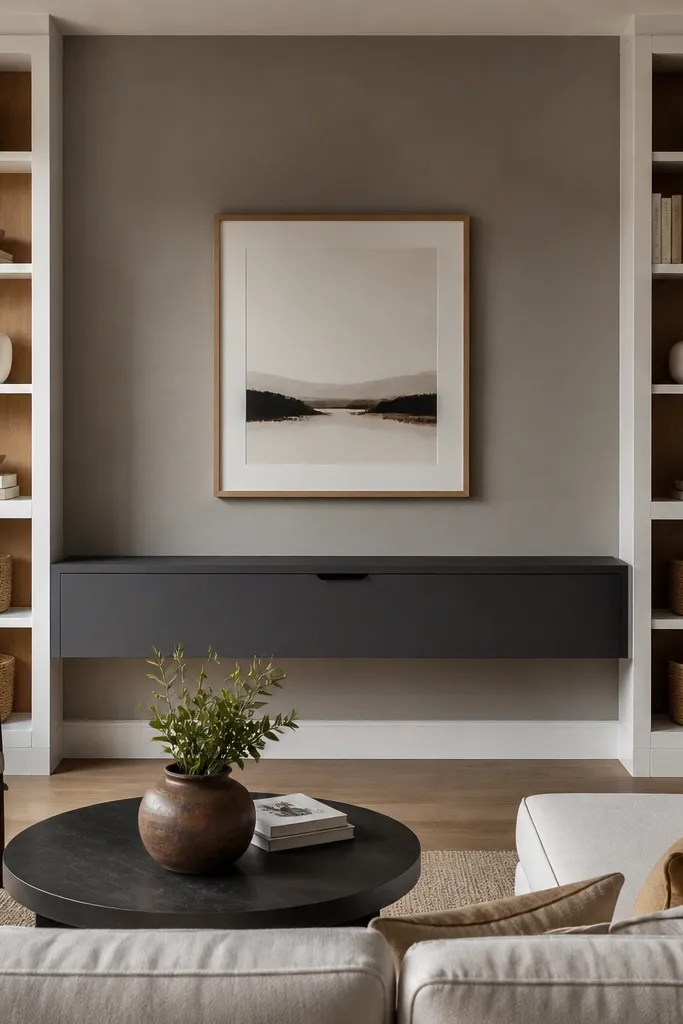
This setup looks balanced and calm in photos because it’s symmetrical, and symmetry reads as intentional. The long media drawer breaks up the open shelf grid and gives you a clean place for remotes and small electronics. Keep the shelves tall and narrow so the wall doesn’t feel like a block of storage. Use a drawer with a soft-close rail so it feels premium even if you buy a standard one. Flat-pack works well because carcasses are modular; the “custom” look comes from the drawer trim and the face frame continuity.
Start by marking a centered vertical line on the wall and deciding your column widths and drawer width. Assemble the two shelf carcasses first, then install the drawer base and align its top rail to the shelf grid. Add shelves with consistent 12-14 inch clear spacing and keep the column openings identical. Finish by building a continuous face frame around both columns and the drawer so the trim lines look like one piece.
Editor's noteUse a full-length straightedge to check face frame alignment before you nail or screw it.
Skip thisDon’t let the drawer top sit higher or lower than the shelf grid — it breaks the symmetry fast.
10. Half-height built-ins with a framed art ledge
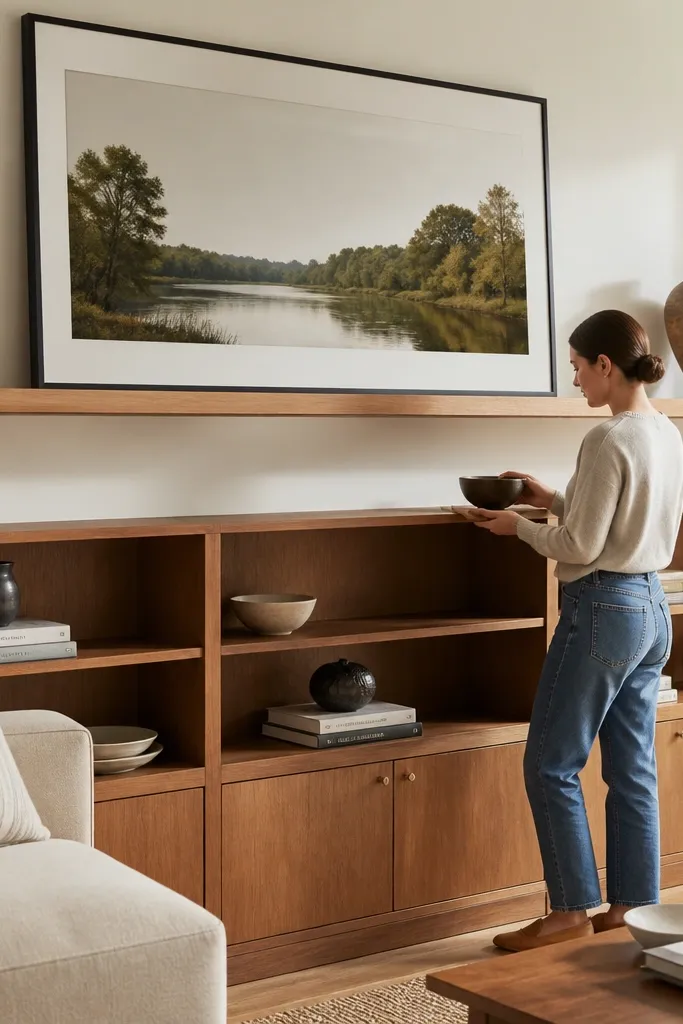
Half-height built-ins are a lifesaver when you don’t want to crowd the room or your ceiling is low. The framed art ledge above acts like the capstone, so the shelves feel like a designed furniture piece. Use open shelves below with a slightly deeper depth (10-11 inches) so objects don’t look sunken. This is also a good option if you have a wide window or doorway that you don’t want to fully frame. Flat-pack is smart here because you can stop at a clean height and finish with trim, making seams easier to hide.
Start by measuring the room and picking a shelf top height that clears furniture and keeps the art centered. Assemble the half-height carcasses and install them square to the wall using shims at the base. Add the art ledge frame using 1x2 or 1x3 trim and set it level across the run. Finish by painting the interior shelves and adding a backer panel behind the open sections so the wall behind doesn’t show through.
Editor's notePick a single frame color for the ledge and stick to it — consistent trim tone makes the whole wall look intentional.
Skip thisDon’t leave raw drywall behind the open shelves; it shows through and kills the built-in look.
11. Tall TV niche with side shelving and a library ladder
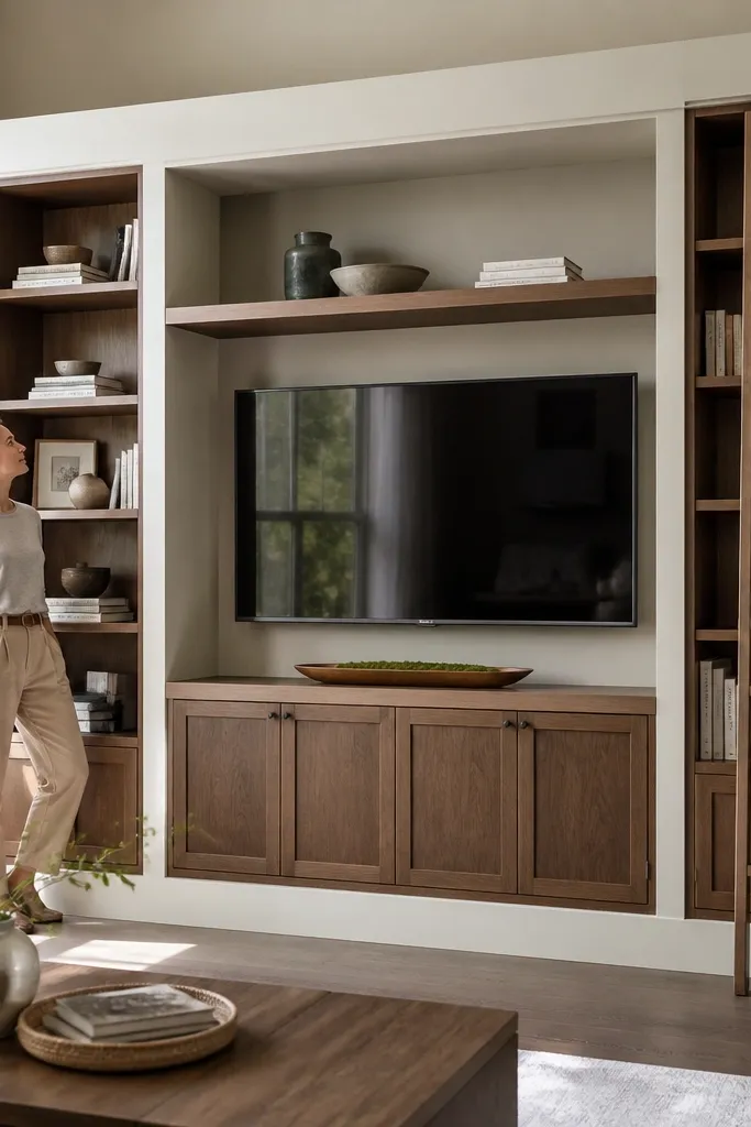
A TV niche plus built-in shelves is the fastest way to make a living room look finished, but only if the niche has strong proportions. Use a tall center opening for the TV area and flank it with shelves that match the TV opening width. Add a ladder-style vertical accent on one side to keep the symmetry from feeling boring. This layout photographs well because the TV becomes part of the architecture, not something floating on a wall. Flat-pack can work if the TV opening aligns with your unit dimensions; custom wins if you need exact clearance for a soundbar, cable box, or fireplace-style surround.
Start by measuring your TV width and height, then decide the total center opening so you have 2-3 inches of margin around the TV for ventilation. Assemble the side shelving bays and leave the center opening carcass area open for the niche framing. Install a backer panel behind the TV niche for cable access and add a shelf or platform for the soundbar. Finish by adding a face frame that frames the niche and shelves with the same profile, then paint everything to match.
Plan ventilation and cable access before you close the back — it saves hours later.
Don’t mount the TV too high; if the TV center is above seated eye level, the whole layout looks off.
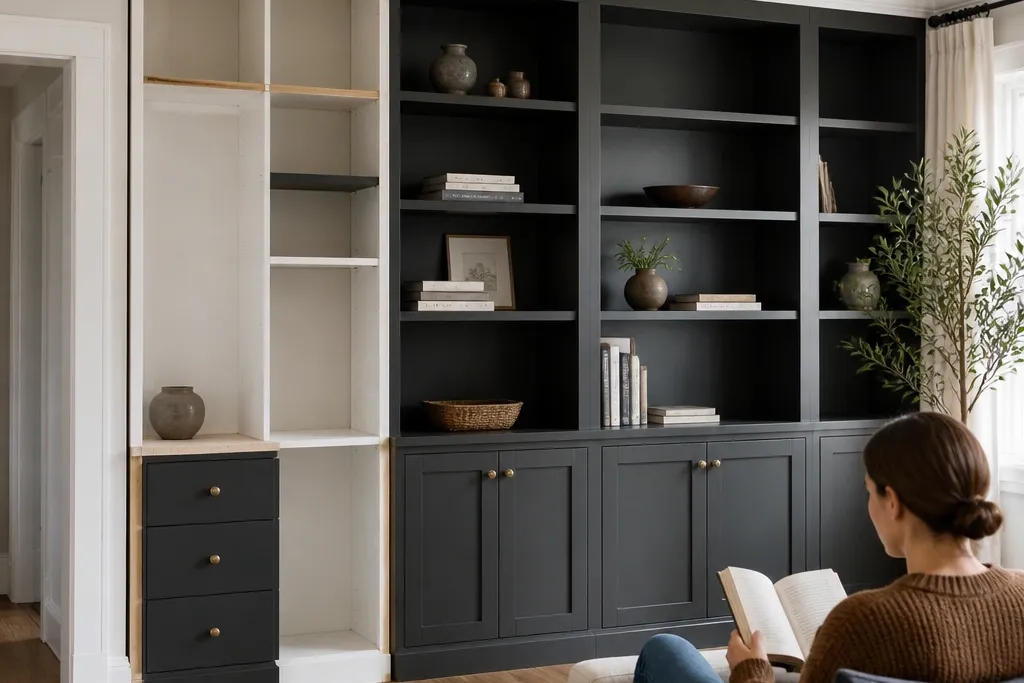
12. Color-block built-ins with charcoal shelves and off-white trim
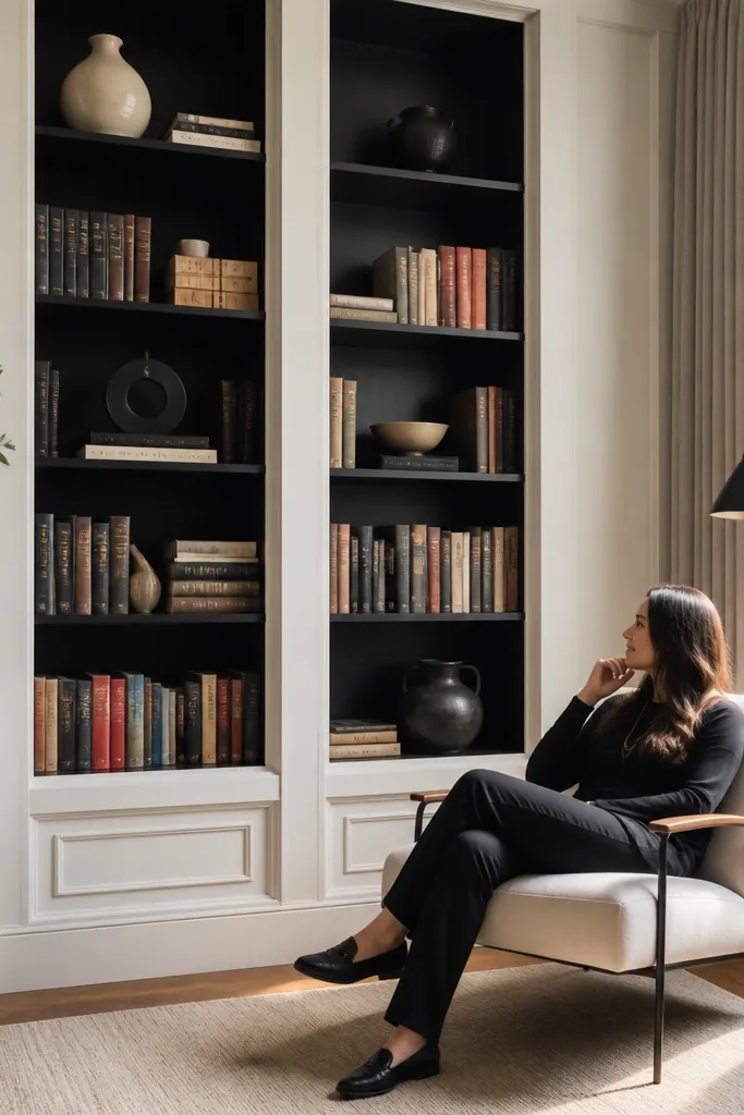
Color-blocking is how you get impact without complicated construction. The trick is to keep the structure simple and let the paint do the drama. Charcoal shelves make book spines look crisp, while off-white trim creates bright lines that read as custom millwork. Choose a matte or satin paint for shelves so objects don’t reflect glare, then use a slightly glossier finish on trim for contrast. This style works with both flat-pack and custom because the carcasses disappear once you add face frames and consistent trim. The build is mostly finishing work, so it’s very doable even if you’re not a contractor.
Start by assembling the carcasses and installing a face frame that covers seams cleanly. Sand and prime everything, then mask off the trim lines with painter’s tape to keep the charcoal edge sharp. Paint shelves charcoal first, then trim off-white after the shelf paint cures enough to avoid smearing. Finish by caulking where the trim meets the wall and doing a final touch-up with a small foam roller so the sheen matches across panels.
Editor's noteUse foam rollers for the shelves and a angled brush for corners — you get a smoother surface without lap marks.
Skip thisDon’t rush masking; tape lines that lift during paint create jagged edges.
13. Corner window seat with built-in storage shelves
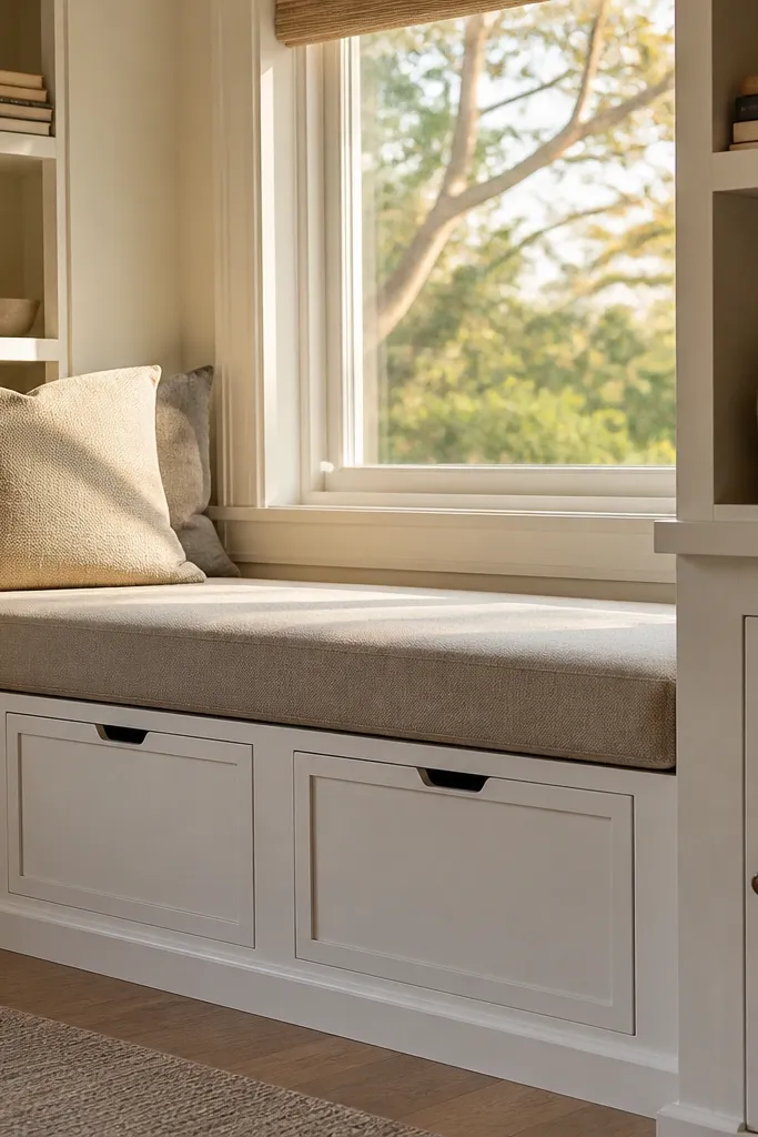
This is a practical built-in that still looks like a design feature. The seat makes the corner feel intentional, while the shelves underneath and to the sides keep the wall from looking blank. Use shelves with doors or closed bins for the lower storage so the face stays clean. The look photographs well because the seat provides a strong horizontal line and the shelves create vertical interest. Flat-pack can work for the storage sections, but custom is better for the seat frame if you want it to match window trim perfectly.
Start by building the lower shelving carcasses and adding a solid support deck for the seat. Install the window seat base with a level top surface, then add side cubbies at the same depth as the seat platform so everything lines up. Frame the seat cushion opening and use a removable panel or access hatch for storage ventilation. Finish by adding trim boards around the seat perimeter and painting the shelves to match the face frame.
Make the seat deck from plywood and add a thin protective layer so it doesn’t warp from humidity.
Don’t skip a removable access panel; storage builds get messy fast without a way to reach cables or bins.
14. Recessed panel doors with open shelf center for a clean look
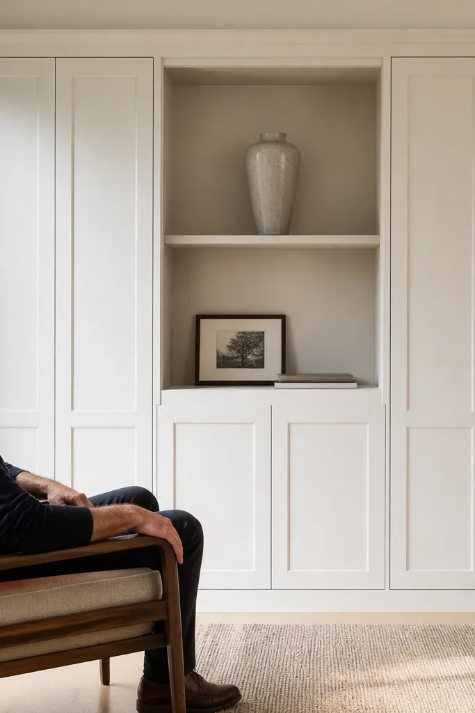
If you want built-ins that stay tidy on camera, recessed panel doors do a lot of work. The open shelf center gives you display space without the whole wall looking packed. Recessed doors also hide minor wall imperfections because the panel line catches light and makes the shape read crisp. Keep the shelf spacing consistent and use a small number of large decor items rather than lots of small ones. This is a strong flat-pack choice because you can assemble door carcasses and then dial in the trim and reveals for a custom feel.
Start by assembling carcasses in two zones: recessed door sections on the ends and open shelves in the center. Install the center shelves first at your chosen spacing, then mount the door carcasses and adjust hinges for even reveals. Add a continuous face frame across the whole run so the door frames and shelf edges match. Finish by adding trim around door openings and caulking the perimeter seams for a smooth finish line.
Use a consistent handle height across all doors — it’s the detail that keeps the wall from looking “assembled.”
Don’t overcrowd the open center; leave at least one empty shelf so the wall breathes.
15. Asymmetrical staggered shelves with a single long cabinet run
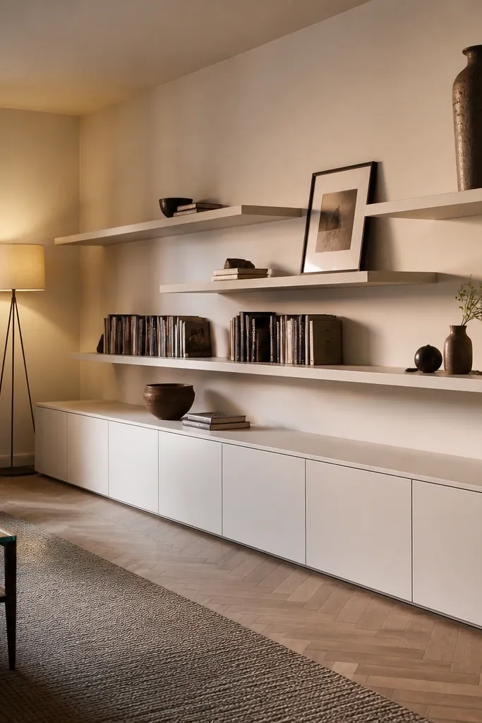
This layout looks modern and intentional because it breaks symmetry, but still stays organized thanks to one continuous cabinet base. Staggered shelves create a dynamic rhythm in photos, especially when you place a tall vase or framed print on the highest shelf. Keep the stagger within a controlled band so it doesn’t look random. Use consistent shelf depth and a matching face frame profile so the stagger feels like a design feature, not a mistake. This is doable with flat-pack if you’re willing to modify shelf positions and add custom shelf brackets.
Start by installing the long cabinet base first and ensuring the top rail is level. Mark your stagger pattern on the face frame area, then install shelf supports at the chosen heights — keep the depth the same for every shelf. Place the staggered shelves on one side only, leaving the other side as closed storage for balance. Finish by adding trim to hide any cut shelf supports and paint the whole run so the shelf edges look uniform.
Editor's noteUse shelf pins or adjustable brackets only if you plan to change decor; fixed shelves look cleaner in wide shots.
Skip thisDon’t stagger every single shelf — stagger in a pattern, not a scattered mix.
16. Wide shallow gallery shelves with picture rail styling
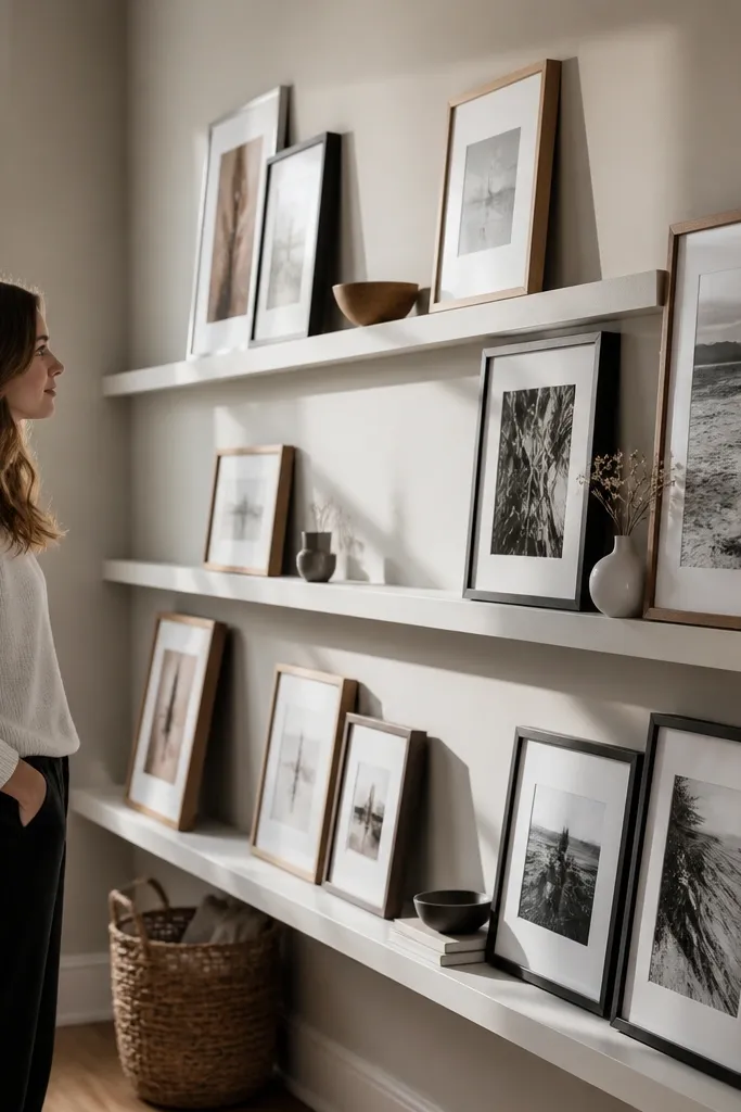
If your living room has lots of framed art, gallery-style shelves help the whole wall feel cohesive. The idea is a shallow shelf run with a picture-rail profile that lines up with artwork height. Keep shelf depth around 8-9 inches so the wall doesn’t get bulky, and use a consistent spacing of 10-12 inches between shelf lines. This look is very photogenic because it frames art and creates clean horizontal bands. Flat-pack works well if you choose carcasses with the right depth, then add a picture-rail trim board on the face.
Start by selecting the shelf depth and planning your picture-rail height based on your art frame sizes. Assemble the shelf carcasses or mount shelf units so the top line is perfectly level across the wall. Add a trim board that mimics a picture rail and covers the shelf face edges with a consistent reveal. Finish by painting the trim and shelves in matching sheen, then place framed pieces so their top edges align with the rail line.
Measure the art frame depth and test one frame on the shelf edge before you lock in the trim — it prevents accidental bumping.
Don’t make the shelves too deep; deep shelves push art forward and can look crowded.
17. Corner bar built-ins with open shelving and bottle niches
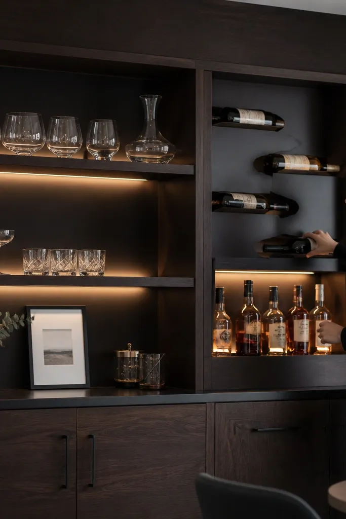
A corner bar built-in is impact by design because it gives you a clear theme and a reason to style. Use open shelves for glassware and books, then add bottle niches with angled cutouts or vertical slots so bottles look deliberate. The niches also add texture and depth behind the glassware, which reads well in photos. Choose a finish that matches your room — dark shelves with warm wood accents looks great in neutral living rooms. This is a mid-skill build because you’re mixing storage types and you need to plan clearances for bottles and glass stems.
Start by laying out the corner bay and deciding shelf depth around 9-11 inches for glassware. Install the carcasses and build bottle niches using angled supports or vertical dividers cut to standard bottle widths. Add a back panel behind glassware shelves to reduce glare and keep items from visually blending into the wall. Finish by installing a toe kick or base rail and painting the face frame; seal all shelf surfaces so spills wipe clean.
Use a simple bottle rack insert or build dividers so bottles don’t rattle; quiet storage looks better.
Don’t leave bottle niches too open at the top; bottles look messy if they don’t sit snug.
18. Tall open shelving with a continuous bottom kick rail
Open shelving can look cheap fast, but the kick rail fixes that. A continuous bottom kick rail gives you a strong visual base line so the shelves read like built furniture. Keep the shelves tall and spaced consistently, then style with vertical stacks to emphasize height. This layout works in living rooms with light walls because it feels airy, yet the bottom rail anchors it. Flat-pack is fine because you can cover gaps with the face frame and kick rail trim, then paint for uniformity.
Start by assembling tall carcasses or installing shelf units, then shim them so the top and bottom lines are level. Add a continuous kick rail across the entire run, using 1x3 or 1x4 material and fastening into studs or blocking. Install shelves at 12-14 inches clear spacing, then add a face frame to hide seams and create a consistent reveal. Finish by sanding trim edges, caulking the rail perimeter, and painting the full assembly in one schedule so the sheen matches.
If your floor isn’t level, shim under the base rails and let the shelves stay level to the wall — it looks more intentional.
Don’t skip the bottom rail; tall open shelves without a base line look like freestanding units.
19. Built-ins with hidden pull-out library ladder shelf
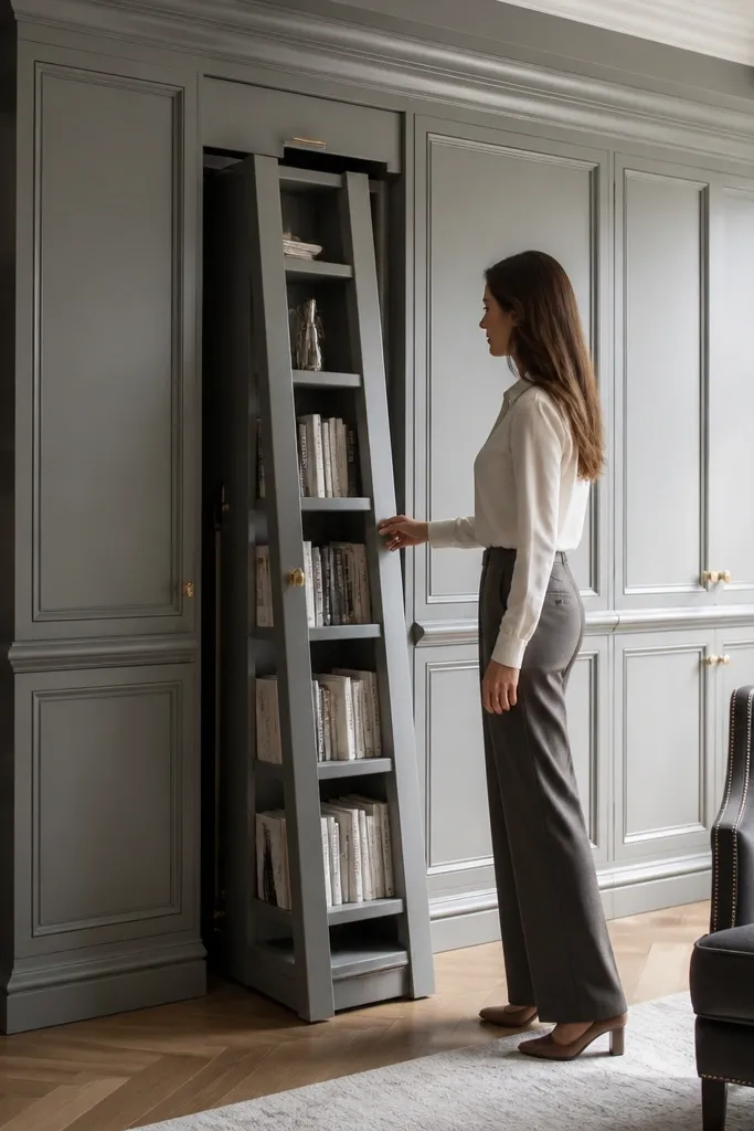
This is the kind of detail that makes built-ins feel like furniture you’d pay for, because it adds function and a clever reveal in the design. The visual payoff is that most of the wall looks clean and open, but you get a “secret” access shelf when needed. It’s best in living rooms where you want tall storage but don’t want a visible ladder taking up visual space. Materials are straightforward: carcasses, shelf rails, and a pull-out mechanism with smooth glide hardware. Skill level is advanced-ish because you’re aligning rails and ensuring the pull-out clears doors and trim.
Start by designing the ladder shelf bay width so it fits the pull-out mechanism without hitting face frame trim. Install the main carcass structure first, then mount the glide rails inside the cavity at level. Build the pull-out shelf platform and test the motion before you install the final face frame. Finish by adding a flush face panel or cover so the mechanism disappears when closed, then paint all moving surfaces and edges so friction points don’t bind.
Editor's noteUse a full-extension glide rated for the shelf weight so the mechanism stays smooth as you load books.
Skip thisDon’t guess clearances; mock the pull-out with cardboard and tape the thickness before cutting anything.
20. Wall-to-wall panel doors with slim vertical glass inserts
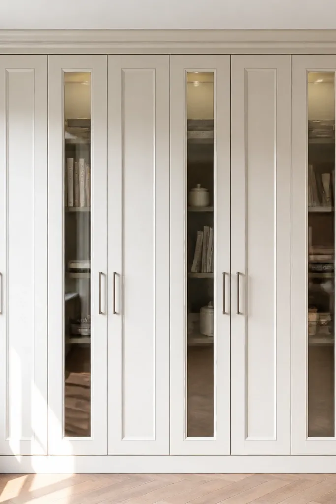
This look is sleek and controlled. Panel doors keep the room tidy, and slim vertical glass inserts add light-catching detail without showing clutter. It’s a great option for people who want built-ins but don’t want to style every shelf constantly. The aesthetic is all about repeating vertical lines, so choose consistent insert widths and align them across bays. This is where custom often wins because door and glass dimensions need to match your wall exactly, but a flat-pack carcass plan can still work if you’re committed to trimming and glass insert framing.
Start by mapping your bay widths and selecting insert sizes that repeat across every door. Assemble carcasses and face frames, then install recessed panel doors with openings sized for the vertical glass inserts. Fit glass inserts with a gasket or glazing channel so the glass sits evenly and doesn’t rattle. Finish by painting the frames and doors, then cleaning glass inserts before final installation so you don’t trap smudges.
Plan for gasket thickness in your measurements — it changes the glass fit more than people think.
Don’t use random insert spacing; keep the vertical grid identical across the whole wall.



