
1. Art hung too high because the ceiling looks "empty"

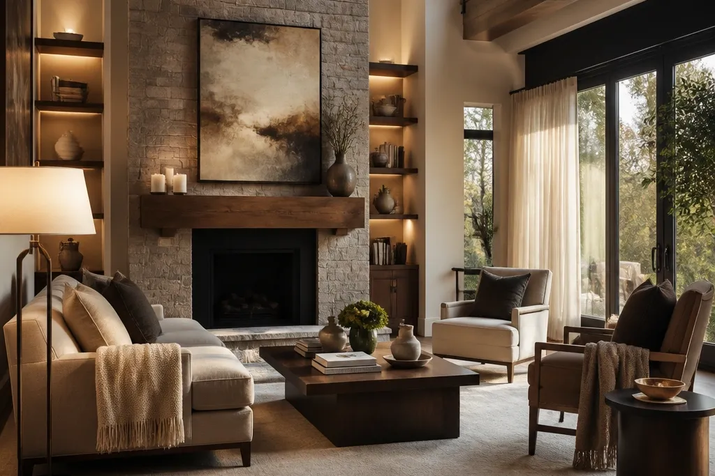
In a double height living room, the wall can look tall and lonely, so people hang art by ceiling logic. The result is a gallery strip that’s visible from across the room but feels disconnected from where you sit. Your correction is to anchor art to the seated sightline: the center of the artwork should land around eye level when you’re on the sofa. Use the room’s height only as a guide for scale, not for placement.
Start by taping a horizontal line at seated eye height from where you actually watch TV or talk. Next, measure where the center of your artwork will land; adjust until the center sits near that line. Then step back and check the composition from at least two angles: straight on and from the side where you catch the wall in peripheral vision. Finally, mark the final hanging points and use a stud finder or proper anchors before you drill.
Do a 2-minute mock-up with a paper print taped to the wall so you can feel the height before buying hardware.
Don’t center everything on the ceiling or on the tallest point in the wall.
2. Rug too small so the "floating furniture" look takes over
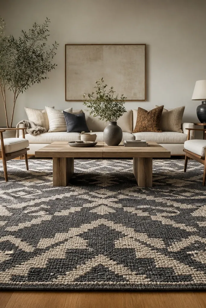
Measure your seating area width and decide your target rug size before you shop. A practical rule: aim for a rug width that covers the full seating group footprint plus 6-10 inches beyond the outer front legs on each side. Then test by laying painter’s tape on the floor in the rug’s shape. After that, vacuum the floor, mark the rug placement, and use non-slip pad strips so it doesn’t shift under traffic.
A rug that barely fits under the front legs makes a double-height room feel like furniture is hovering. The vertical space is already dramatic; a small rug removes the grounding layer that tells your brain “this is one room.” The fix is size that ties the seating group together. You want the rug to extend far enough that at least the front legs of the sofa and chairs rest on it, not just the middle.
Skip thisAvoid rugs that only sit under the coffee table area or stop before the front legs.
Editor's noteIf you hate the idea of a huge rug, go bigger anyway and choose a pattern with a low-contrast field so the rug doesn’t look chaotic.
3. Pendant lights hung at the wrong height (too high looks weak, too low blocks movement)
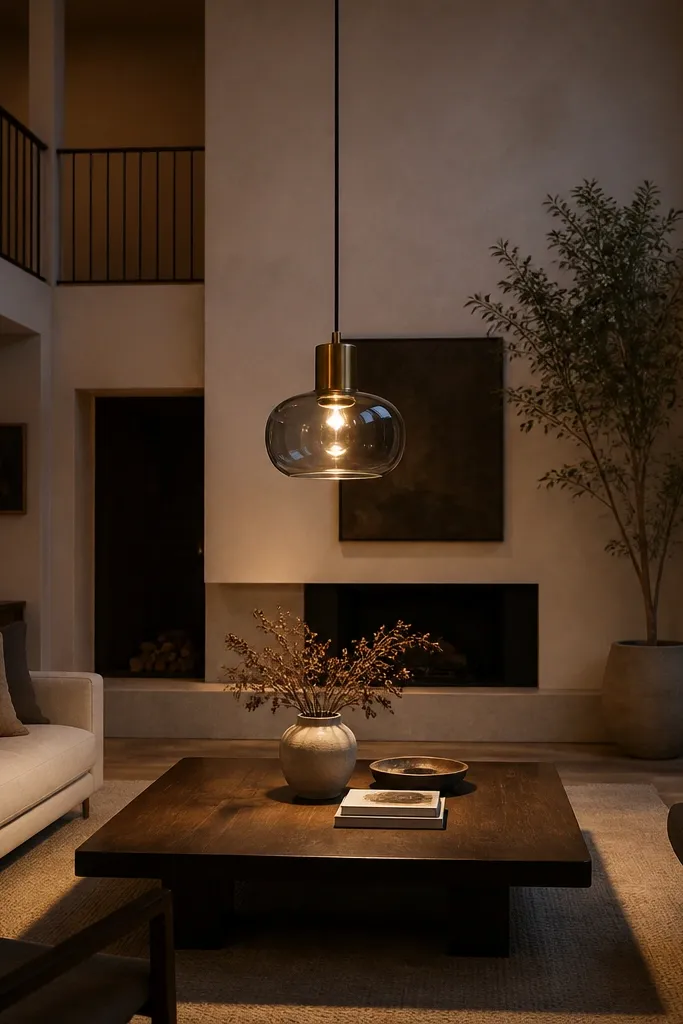
Pick the light’s function first: dining or reading/task. For a dining table, hang the bottom of the fixture so there’s about 30-36 inches between the tabletop and the bottom of the shade. For a living-area pendant over a seating table, use 34-40 inches between the seating surface and the bottom of the shade. Then use a temporary rope or string to set the height before you shorten any cords and drill mounts.
Double height rooms tempt you to hang pendants higher because the ceiling is tall. That kills the light’s usefulness and makes the pendant look like decoration instead of task lighting. The room also gets shadowy where you need brightness, especially around the seating conversation zone. Your goal is a hanging height that creates a focused pool of light without head-bump risk.
Skip thisDon’t set pendant height using the ceiling height alone.
Editor's noteUse LED bulbs with a CRI of 90+ so whites look clean under pendant light.
4. One overhead source only (the room goes flat and echo-y)
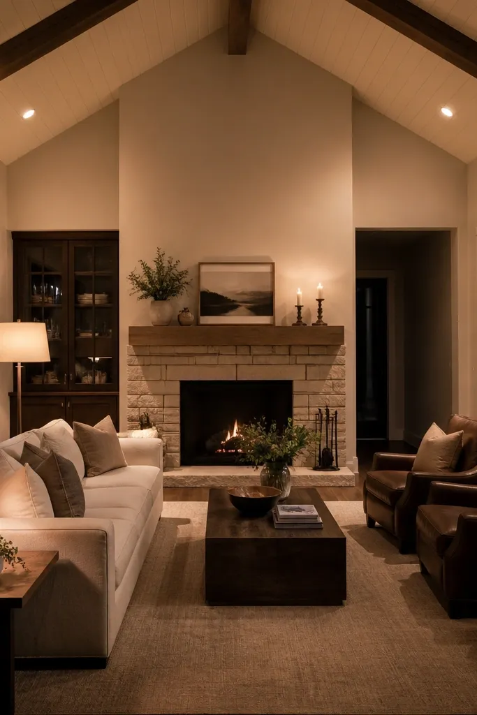
Plan three layers: a general light, a task light near seating, and a light that grazes a wall. Choose a general fixture with dimming so you can adjust for day vs night. Then add a floor lamp or wall lights aimed at the wall at about 45 degrees, not straight at the camera. Finally, wire or plan smart dimmers so all layers dim together instead of fighting separate switches.
Double-height rooms swallow light when you rely on a single overhead source. The ceiling reflects, but the seating area stays dim, and you get harsh contrast that makes the room feel unfinished. You also get more perceived echo because sound bounces off hard, unlit surfaces. Fix it by layering: ambient overhead plus task lighting at seating height and a couple of wall or floor lights to break up shadows.
Skip thisAvoid running everything on a single switch that only controls one fixture.
Editor's noteIf you can only add one extra light, add one at seated eye level (table or floor lamp), not another ceiling fixture.
5. Wrong bulb temperature (cool light makes tall rooms feel sterile)
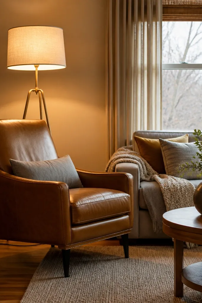
Pick a target color temperature for the whole room: 2700K for a cozy evening feel or 3000K for a slightly brighter look. Match bulb wattage and beam spread so you don’t get hot spots and dead zones. Then buy the bulbs first, label them, and install them before you judge the room. If you use dimmers, confirm the bulbs are dimmable and compatible with your dimmer type to avoid flicker.
In tall rooms, the ceiling height amplifies the color feel. Cool white bulbs (around 5000K-6500K) can make a double-height living room look like a showroom, even if the furniture is warm wood. Warm bulbs (2700K-3000K) usually read more natural and make materials feel inviting. The fix is choosing one consistent temperature across fixtures so the room doesn’t look mismatched.
Skip thisAvoid mixing 2700K in one lamp with 5000K in another.
Editor's noteUse the same brand and color temperature across lamps if you want consistent whites on artwork and skin tones.
6. Chandelier scale too small for the ceiling height
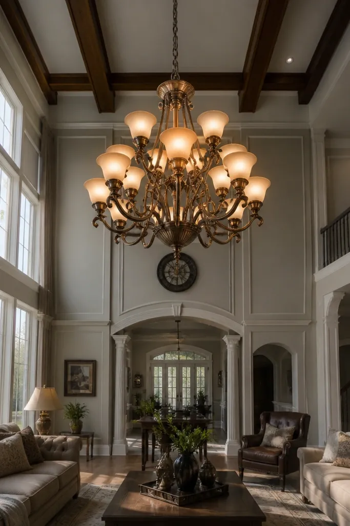
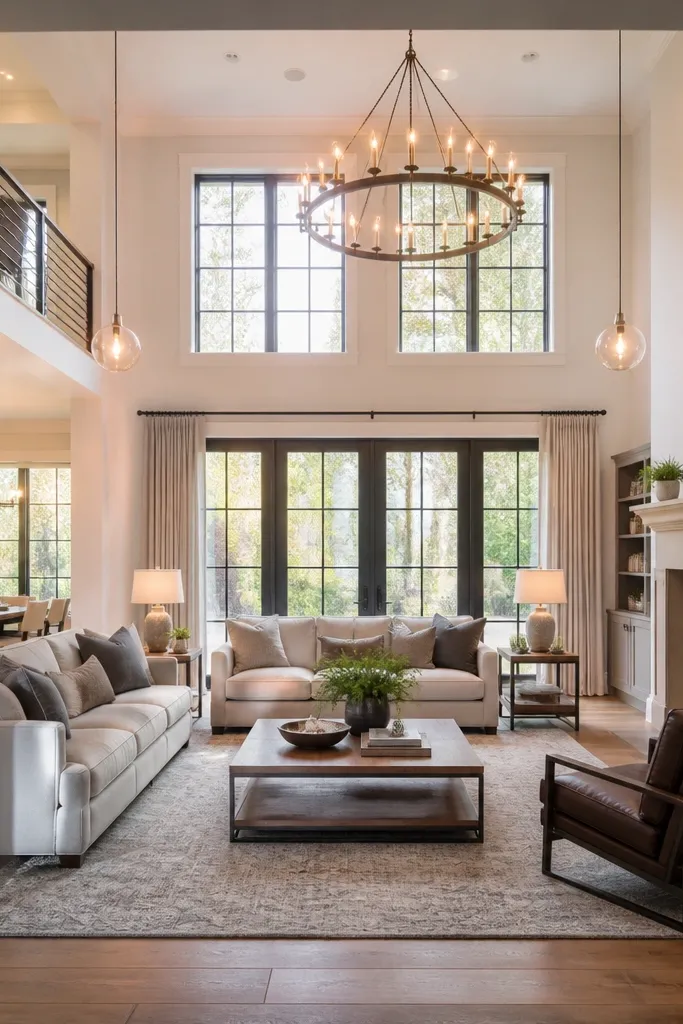
A tiny chandelier in a double height living room looks like it’s hanging for decoration only, because the visual weight is wrong. The ceiling is tall enough that small fixtures disappear unless they’re extremely bright. The room ends up feeling top-heavy without a satisfying focal point. Your fix is to size the chandelier so it visually “fills” the space between ceiling and seating without touching the sightline.
Measure the room’s footprint and convert it into a diameter target for the chandelier. A practical DIY sizing guide: add room length and width in feet, then convert that number to inches for chandelier diameter. Then adjust for the ceiling height by choosing a fixture with enough drop length so the bottom sits around 7-8 feet from the floor over a seating zone. Finally, confirm clearance with a ladder and tape measure before you install the mount.
Pick a chandelier with a substantial canopy and enough arms to avoid looking sparse when viewed from the side.
Avoid buying a “pretty” chandelier that’s scaled for a standard 8-foot ceiling.
7. Cables and cords visible because you planned after the fixture
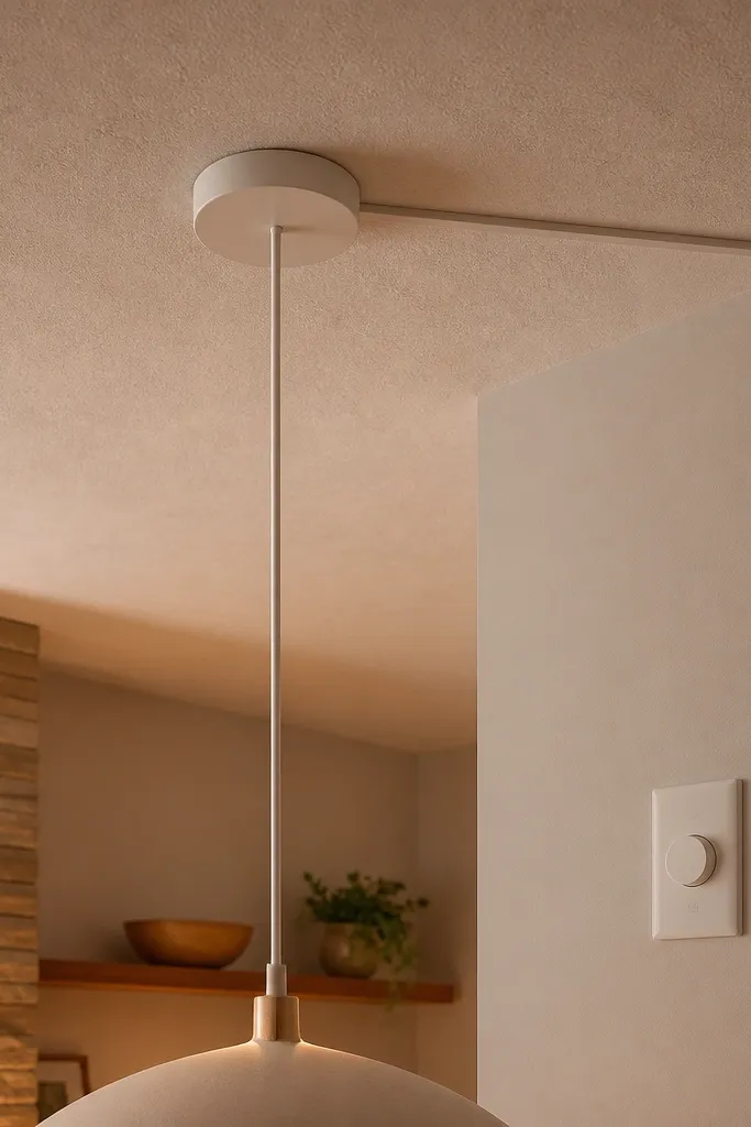
Double-height spaces show everything. A dangling cord, uneven drop, or a sloppy cord path becomes a permanent visual distraction. The room already has strong vertical lines; messy wiring fights them. Fix it by planning the cord routing and wall switch or dimmer locations before the final hang.
Before you install, run a temporary cord along the intended path and mark where the excess length will be trimmed. Decide if you want a ceiling box with a proper canopy cover or a recessed junction behind trim. Then check that your switch controls the fixture you think it controls and that dimming is compatible. Finally, cut and shorten the cord only after you confirm the final hanging height with painter’s tape.
Use a canopy cover sized for the fixture, not the smallest option — you want the cord to disappear cleanly.
Avoid leaving slack loops above the canopy where they can shift later.
8. TV placement that ignores the wall's vertical dominance
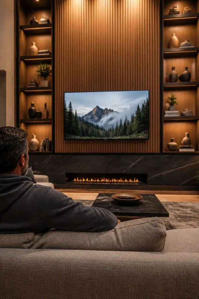
Measure seated eye height from the floor at your main seating position. Then mount the TV so the center of the screen sits near that height. If you’re using a media console, keep the TV width close to the console width so the composition reads as one block. Finally, run cables through the wall or behind the console before painting, so you don’t patch drywall twice.
Mounting a TV too high in a double-height room makes you tilt your neck up for every show. People then compensate with lower seating, which makes the room feel cramped. The tall wall also draws attention upward, so the TV becomes a floating rectangle rather than part of the conversation zone. Fix it by aligning the TV with seated eye level and using the right surround scale.
Skip thisAvoid centering the TV under the highest architectural feature.
Editor's noteIf you can’t mount at eye level, use a pull-down mount or a cantilever mount rather than forcing it higher.
9. Curtains hung from the ceiling but blocked by a low rod bracket
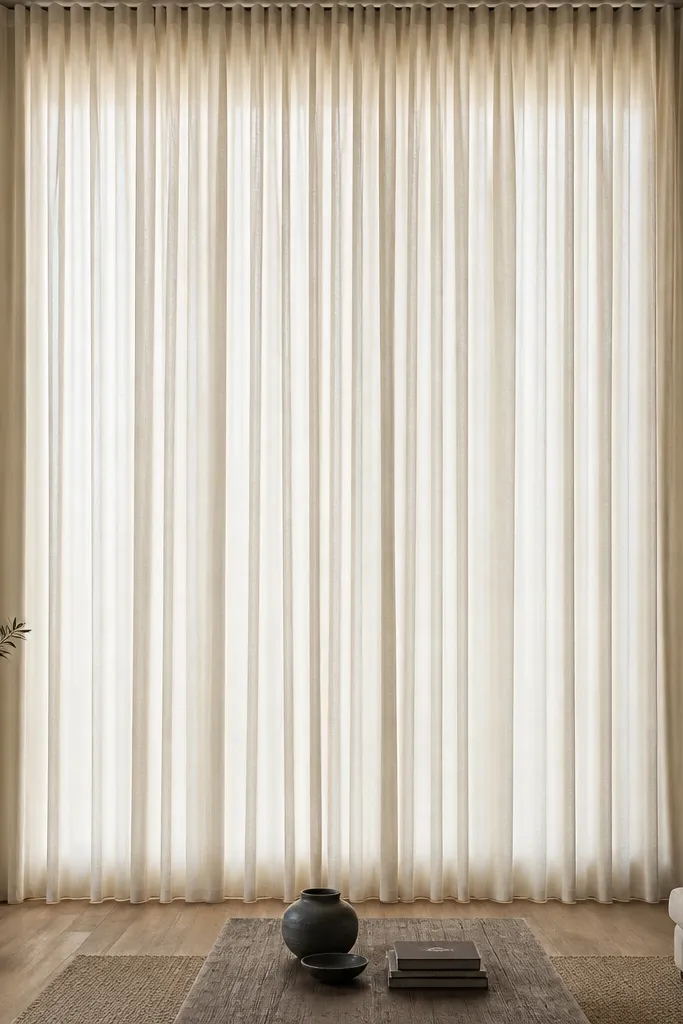
Measure window width and add at least 4-8 inches on each side for curtain overlap, more if your window is wide. Then mount the rod 4-8 inches above the window casing or higher if you want a true ceiling-to-floor line. Use a level and mark anchors into studs when possible. Finally, hem or choose panels that land just above the floor or lightly kiss the floor — avoid puddling unless you’re going for a heavy drape.
In double-height rooms, people go for floor-to-ceiling curtains to soften the vertical space. The mistake is hanging them in a way that creates a break at the window opening — the fabric stops too early and the rod hardware shows. That makes the whole wall look cut into sections. Fix it by setting the curtain rod high enough and extending the fabric well past the window edges so light can’t leak.
Skip thisAvoid rods that sit inside the window frame height or curtains that stop short of the floor.
Editor's noteUse a curtain track with glide rings if you want smoother movement and cleaner stacking in tall spaces.
10. Acoustic hardening ignored (double height makes everything louder)
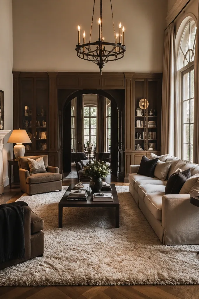
Start by adding a thick rug or rug pad to reduce floor reflections. Then hang heavier curtains on tracks so they cover a big portion of the wall when closed. If you want a more permanent fix, add acoustic panels disguised as art: fabric-wrapped panels mounted with standoffs or directly mounted where studs allow. Finally, check claps in an empty room and again after furnishings — you’re aiming for less “ring,” not dead silence.
Double-height rooms amplify sound because you’ve got more volume and more hard surfaces. Even if you love the airy look, the room can turn conversations into echoes and make TV dialogue harder to hear. The DIY fix is adding controlled absorption at the right heights and in the right materials. Think curtains, rugs, and fabric wall treatments, not just decorative items.
Skip thisAvoid relying on throw pillows alone for sound control.
Editor's noteUse a rug pad with at least 1/4-inch thickness for noticeable sound reduction.
11. Wall molding and paneling placed without accounting for the ceiling height
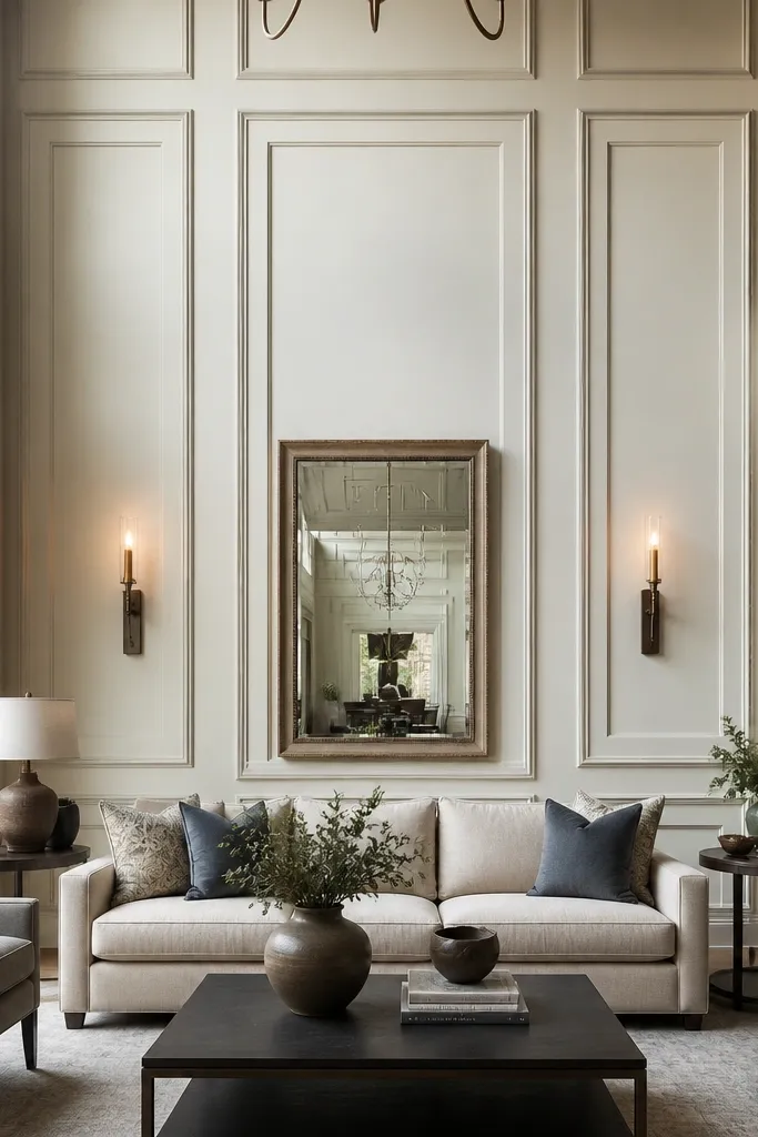
Measure the full wall height from finished floor to the top trim point you’re working with. Choose a panel grid that repeats 2-3 times vertically at most, not 5-6 small repeats. Mark your layout with painter’s tape first; walk around the room to see if the pattern competes with your furniture. Then install using a level and foam-backed adhesive or proper screws into studs depending on the panel system.
Decorative wall paneling can look amazing, but in a double-height room it can also look like tiny picture frames pasted onto a tall wall. The mistake is using standard panel spacing meant for an 8-foot room. The wall ends up feeling segmented in the wrong rhythm. Fix it by scaling panel sizes and spacing so the pattern reads as intentional from standing height.
Skip thisAvoid copying a panel grid from a standard-height room plan.
Editor's noteUse a laser level if you’re doing multiple vertical lines — a small drift reads huge at 2 stories.
12. Staircase lighting ignored (dark treads ruin safety and mood)
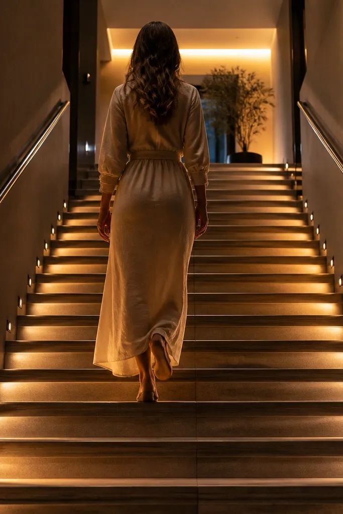
Decide on your lighting style: low-voltage LED strip under handrails, step lights set into risers, or recessed lights aimed at treads. Mark tread edges and test with a temporary battery LED so you can see the shadow pattern. Then plan power and switch control: a stair-friendly setup often needs a switch at both ends. Finally, use a junction box rated for your wiring method and follow local electrical rules.
In double-height spaces, stairs become a major visual element and a major safety problem if they’re underlit. People focus on the main living zone and forget that stairs are where shadows gather. That makes steps feel slippery and the room looks unfinished at night. Fix it with step lighting that marks the tread edges and a light source that fills the landing.
Skip thisAvoid relying on ceiling lights alone to illuminate the stairs.
Editor's noteWarm step lighting around 2700K looks natural and reduces glare compared to cool LEDs.
13. Overcrowded shelves that compete with the vertical space
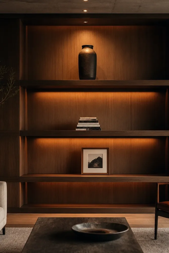
Double-height living rooms already have height drama. If you fill the full wall with shelves and objects, the room becomes visually noisy, and your focal points disappear. The fix is creating visual breathing room: leave open sections and use fewer, larger items rather than many small ones. Shelves should read as structure, not a clutter pile that stretches upward.
Limit the number of shelves you fully style in a single zone. Pick three main display sizes: two tall items, two medium items, and one low anchor like a tray. Then arrange with spacing — aim for at least 1 inch of empty space between objects where possible. Finally, keep shelf depth in mind: if the shelves are shallow, use larger pieces; if they’re deep, reduce clutter so shadows don’t look messy.
Stick to one or two materials (wood + ceramic, for example) so the shelf reads intentional instead of random.
Avoid styling every cubby from top to bottom in one go.
14. Built-in seating or benches that block the main sightline
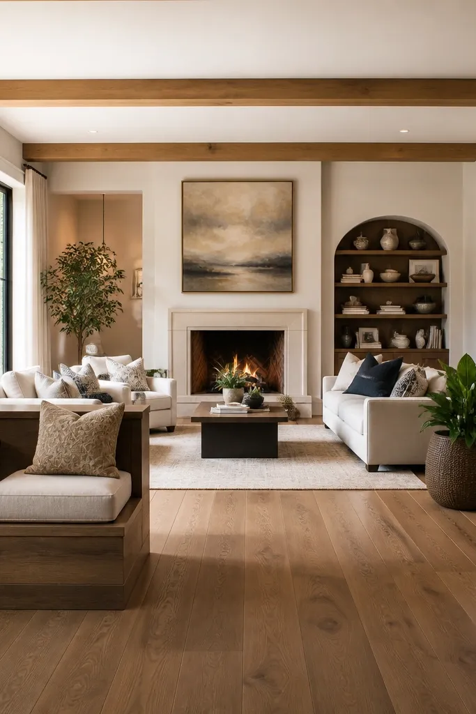
Draw the main walking path and the main view lines from the sofa and doorway. Then place the built-in so it doesn’t interrupt those lines; leave at least 30 inches clear walkway where people pass. If you’re adding storage, keep the top surface at a comfortable height for use, then hide clutter with doors or matching fronts. Finally, check clearance for furniture movement and window openings before you build the base.
Built-ins are tempting because they look “permanent,” but in a double-height room they can accidentally block the main sightline to the focal area. The room then feels chopped up even if the design is beautiful. Your fix is to plan clear pathways and keep built-ins from stealing the vertical center line. Make the built-in feel like it frames the room, not squeezes it.
Skip thisAvoid tall backs or bulky storage that reaches too far toward the room’s center.
Editor's noteUse a lower visual profile on the built-in’s back edge so the room stays open to the ceiling.
15. Oversized sectional placed without a plan for the room's vertical axis
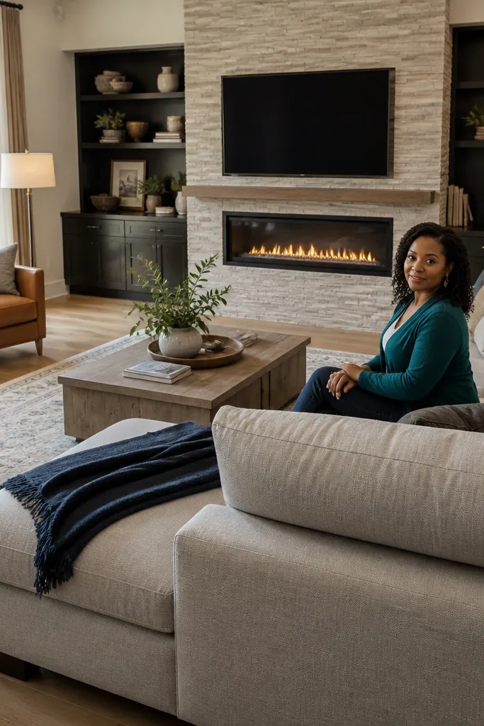
Find your focal point first: fireplace, big window, or the main feature wall. Then place the sectional so the distance from the seating to that focal wall creates a conversation zone, not a void. A practical target is 14-18 inches between the front edge of the sectional and a coffee table, and 6-10 inches between side edges and pathways. After that, confirm the sectional height doesn’t block lighting or wall art sightlines by standing from the doorway and from the far corner.
A big sectional can look right until you realize it’s anchored to the wrong wall and the room’s vertical axis feels unbalanced. In double height, the floor plan matters more because the ceiling draws the eye up. If the seating group sits too far from the focal wall or too close to it, you get either a tunnel feel or a disconnected cluster. Fix it by centering the seating around the focal point and leaving enough open floor for movement.
Skip thisAvoid pushing the sectional fully against a wall just because it fits.
Editor's noteIf you’re buying a sectional, measure door widths and turn radius. Double-height homes often have tighter entry turns than people expect.
16. Fireplace surround DIY that ignores heat and clearance
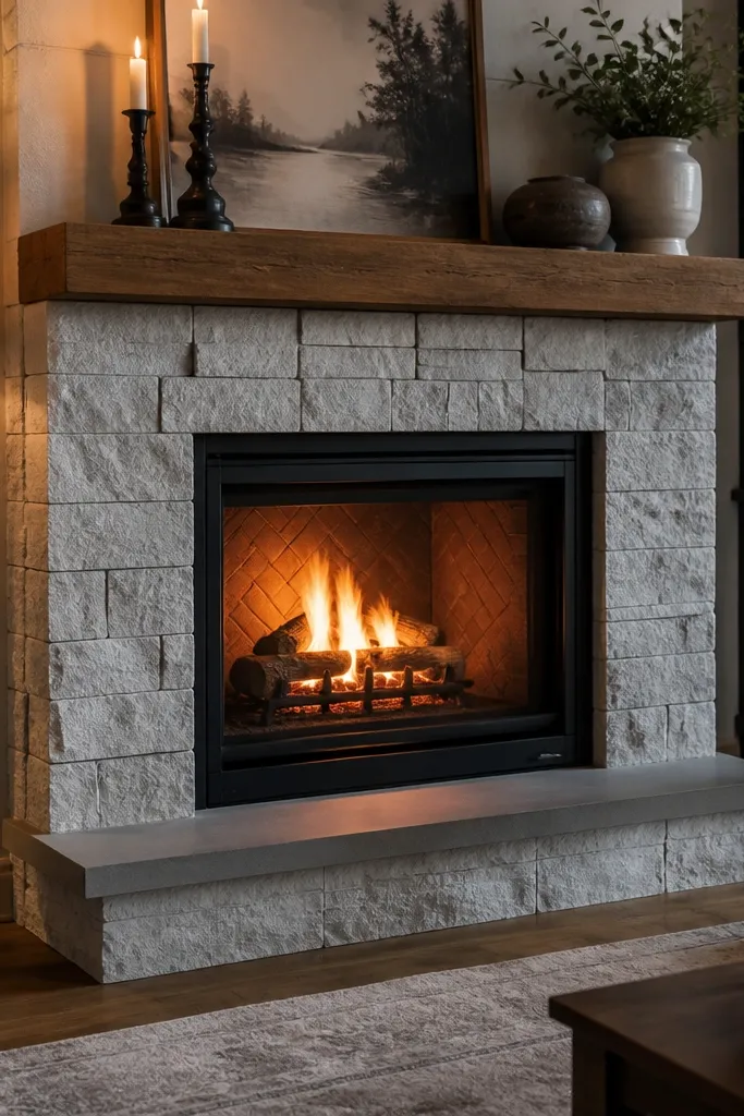
Figure out your fireplace type: wood-burning, gas, or electric — each has different clearance needs. Then measure the manufacturer-required distances from the firebox to combustible materials or decorative trim. Choose a mantel depth that doesn’t trap heat and keeps the viewing line comfortable; measure mantel height so it lands near art placement height if you’re pairing them. Finally, seal and finish with heat-safe products and keep any wiring or decor away from the heat zone.
A fireplace is already a heat source, and double-height rooms often make the surround look like a bigger feature than it is. The mistake is using decorative materials too close to heat or building a mantel that blocks airflow and drafts. The room can look wrong because the mantel ends up too high or too low relative to seating. Fix it by following clearance rules and using heat-safe materials and spacing.
Skip thisAvoid installing decorative finishes without checking clearance to the firebox.
Editor's noteUse cement board or approved backer board behind any tile or stone surround in dry areas around the fireplace.
17. Paint sheen chosen randomly (glare on tall ceilings looks worse)
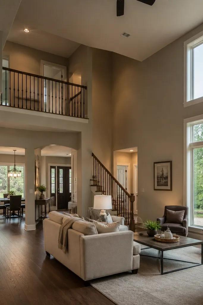
In double-height rooms, light hits tall surfaces at steep angles. If you use a higher sheen on walls or ceilings, you get glare and “hot spots” that make the room look uneven. Flat or matte hides imperfections, but too matte can make trim look dull. The fix is choosing sheen intentionally: flat/matte on ceilings, eggshell for most walls, and satin or semi-gloss on trim.
Start with ceilings: use a ceiling paint with flat or matte sheen. For walls, pick eggshell so it wipes clean without strong shine. For trim and built-ins, use satin or semi-gloss depending on how durable you need it to be. Then test in a small patch — paint a 2-foot square, dry fully, and check it under both daylight and lamp light.
Stir paint thoroughly and apply with a consistent roller nap so sheen stays uniform on the tall areas.
Avoid matching every surface to the same sheen.
18. Skylight or window treatments that don't control glare
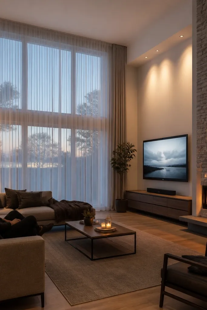
Measure each window and decide where you want privacy and where you need light control. Install a rod or track that extends beyond the window frame for better coverage and less light leak. Hang sheers first if you want them for texture, then add blackout panels that close fully. Finally, test the coverage by shining a phone flashlight around the edges while the panels are closed — you’re checking for gaps.
Double-height living rooms often have big windows that bring gorgeous daylight. The mistake is using treatments that look good in daylight but cause glare at night or during the day when the sun hits the wall. That makes art look washed out and TV hard to watch. Fix it with layered window coverings: a sheer for softness plus a blackout or light-filtering layer for control.
Skip thisAvoid sheers alone when you have a strong sun angle.
Editor's noteIf glare is the issue, prioritize blackout or thick light-filtering fabric over thin decorative panels.
19. Ceiling fans installed without planning airflow for seating
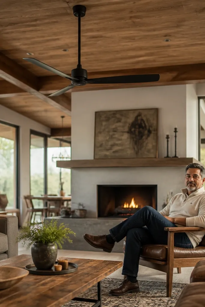
Choose a fan blade span that matches the room scale and ceiling height. Confirm that the fan has a downrod long enough to position blades at a safe distance from the ceiling while still clearing the highest point people might pass near. Then set the fan direction: winter mode pushes warm air down, and summer mode pushes air across the room. Use a remote or wall control so you can adjust speed without climbing ladders.
Fans help comfort, but in double-height rooms they can also stir heat near the ceiling without moving it down where you sit. People then feel cold near the floor and warm up top, which is the opposite of what you want. The fix is choosing the right fan size and setting it so the airflow reaches the living zone. You also need to think about blade clearance and control so you can adjust seasonally.
Skip thisAvoid installing a fan that’s too close to the ceiling so it only moves air at the top.
Editor's noteIf you don’t want a big fan look, use multiple smaller circulation methods like floor fans aimed low, but keep them controlled and quiet.



