
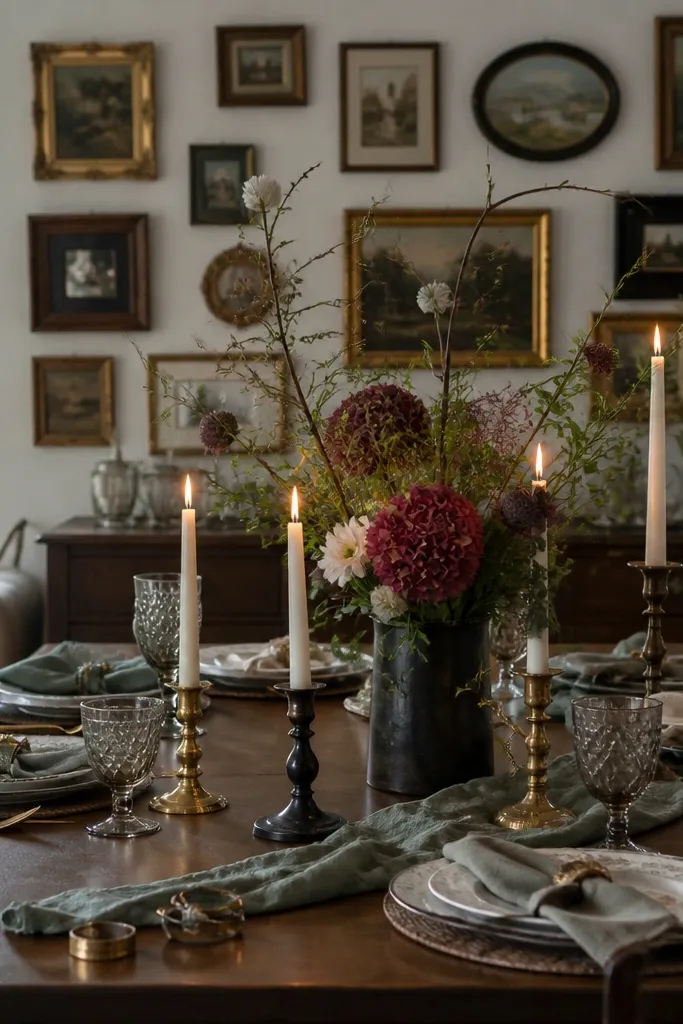
1. Oversized gallery ledge with 5 framed prints
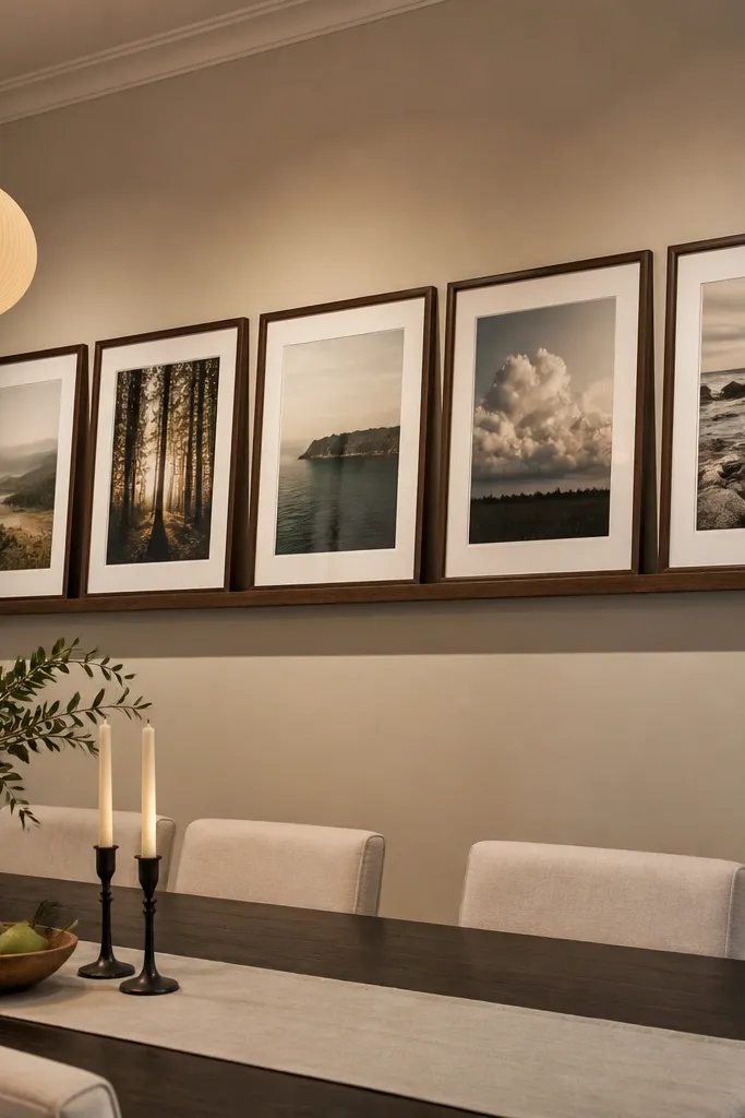
This works because it creates a wide horizontal mass above the table, which is what most dining walls lack. Use five frames so you can spread the visual weight without needing one giant custom piece. Go for frames in black, dark walnut, or aged brass so the set reads cohesive from across the room. Matting matters too — a cream mat softens bright walls and makes prints look intentional instead of cluttered. The result fills the space and looks curated without feeling precious.
Start by measuring your table width and target a total art span of about 2/3 to 3/4 of that number. Choose five frames with the same outside dimensions so the spacing looks even. Install a picture ledge rail (or a sturdy shelf) long enough to cover the full span, then hang the ledge so the bottom of the lowest frame lands about 6-10 inches above the table. Level the ledge, set frames on it, then use small felt pads under frames to prevent sliding and scratches. Finish by adjusting the frame gaps until the set looks balanced, then secure any frames with frame tabs or a tiny bead of removable museum wax.
Editor's noteCut a strip of painter’s tape the exact width of your target span and tape it to the wall first. You’ll feel immediately if the scale is right before buying anything.
Skip thisAvoid mixing frame sizes and mat colors randomly — it reads like leftovers, not a finished wall.
2. Three-panel wood sign triptych in matching tones
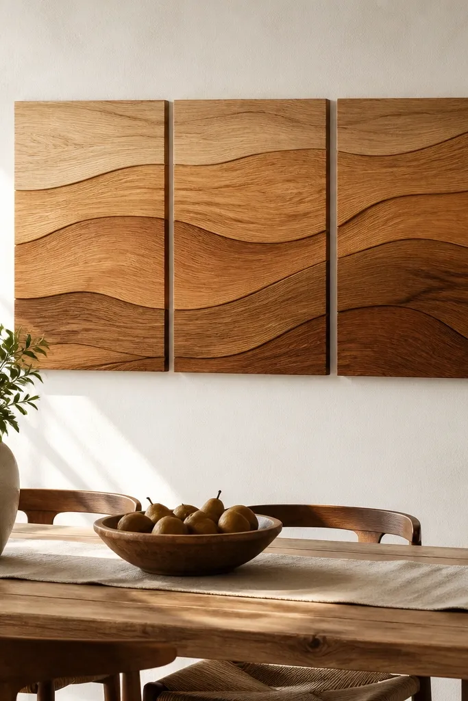
A triptych fills space with structure. Three panels give you width and rhythm, and wood brings warmth that photographs well in dining rooms. Keep the tones consistent — think one base color plus two close shades — so the wall looks designed, not busy. Text or no text, the panels should have the same finish level so they catch light similarly. This is a strong option if your dining wall is bare and you want something that looks good from ten feet away.
Cut three pieces of plywood or birch panel to the same height, with widths that add up to about 2/3 to 3/4 of your table width. Sand edges smooth and round corners slightly so they don’t look sharp in photos. Paint all three panels with the same base color, then use a second pass with a lighter or darker tone on the left and right panels for contrast. Seal with matte polyurethane or matte clear coat to reduce glare. Mount with two keyhole hangers per panel and hang them as a centered set, keeping panel gaps about 1/2 inch so the triptych reads as three pieces rather than one flat slab.
Editor's noteDry-brush the lighter panel lightly at a diagonal so you get texture without streaks.
Skip thisDon’t use three unrelated designs — a triptych only looks intentional when the tones and finish match.
3. Oversized framed mirror with a chunky DIY frame
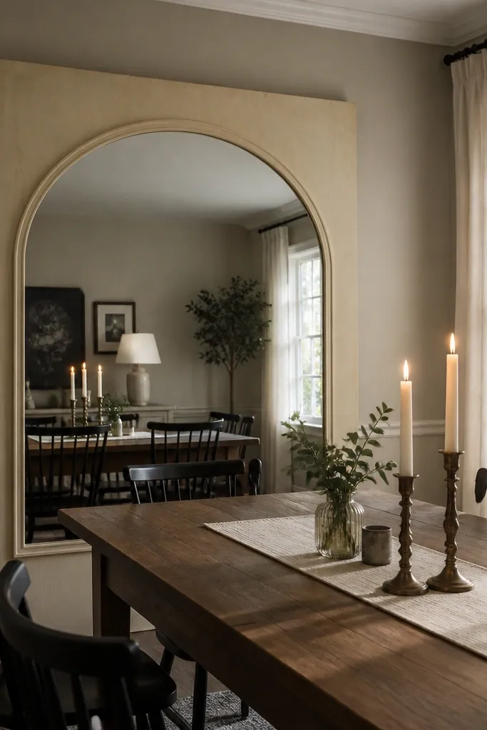
A mirror is the fastest way to make the dining wall feel filled because it adds reflective light and visual depth. A chunky frame gives it presence so it doesn’t look like a random mirror leaning against the wall. Choose a mirror size that spreads across the table — aim for frame width about 2/3 of table width. In photos, mirrors also bounce warm tones from the room, which makes the whole setup look more cohesive. This is especially good if your dining room is darker or has fewer windows.
Pick a mirror with a standard size and build a frame around it using 1x2 or 1x3 boards for a chunky look. Miter corners at 45 degrees for clean angles, then dry fit before glue. Sand, fill nail holes, and stain or paint the frame in a finish that matches your dining hardware. Use mirror clips or a thin silicone bead method so the glass sits safely in the frame. Hang with two sturdy D-rings rated for the mirror weight, and center it so the bottom of the frame sits about 6-10 inches above the table.
Use a matte or satin finish on the frame. Glossy frames flash in photos and can look harsher than you want.
Avoid hanging a mirror too high — if the bottom edge is far above the table, it stops looking connected to your dining area.
4. Fabric pennant banner with 9 flags and tassel ends
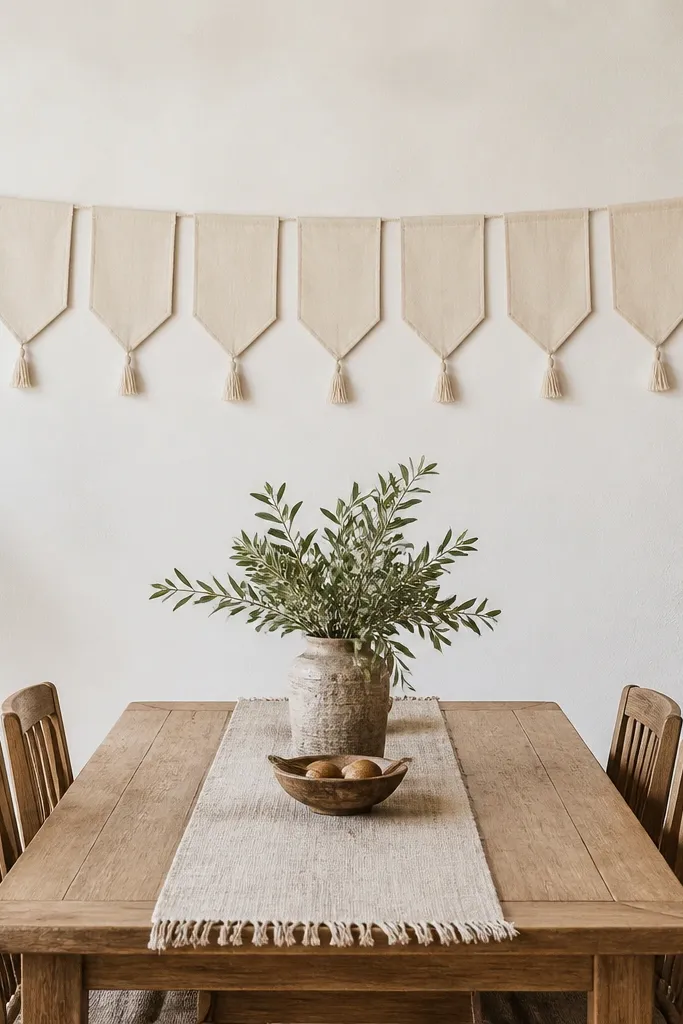
Soft fabric decor fills space without looking rigid, and pennants create a wide band that reads as intentional backdrop. Nine flags give you enough width to cover most dining tables while keeping the pattern rhythm. Choose fabrics with structure — cotton canvas, linen blends, or tightly woven upholstery fabric — so the flags hold their shape. Tassel ends add movement, which looks good in natural light and adds texture you can’t get from flat prints. This is a great choice if your dining wall is close to windows and you want something photogenic and cozy.
Cut nine triangles from fabric so each flag is about 8-10 inches wide at the base and 10-14 inches tall, then add a 1/2-inch hem allowance. Sew a narrow hem on the sides, then fold and hem the top edge to create a channel for a dowel or rope. Use a dowel or thick cotton cord as the line, and space flags evenly across a span that matches about 2/3 to 3/4 of table width. Add tassels by trimming fringe from a coordinating fabric strip and attaching to the bottom point. Hang by mounting two wall hooks and looping the line so the banner sits centered with the bottom tips about 6-10 inches above the table.
Press fabric flat with steam before cutting. Pennants that start crisp look cleaner after mounting.
Avoid thin, floppy fabric — it sags and looks unfinished instead of filling the wall.
5. Layered wall shelf with ceramic vases in a tight cluster
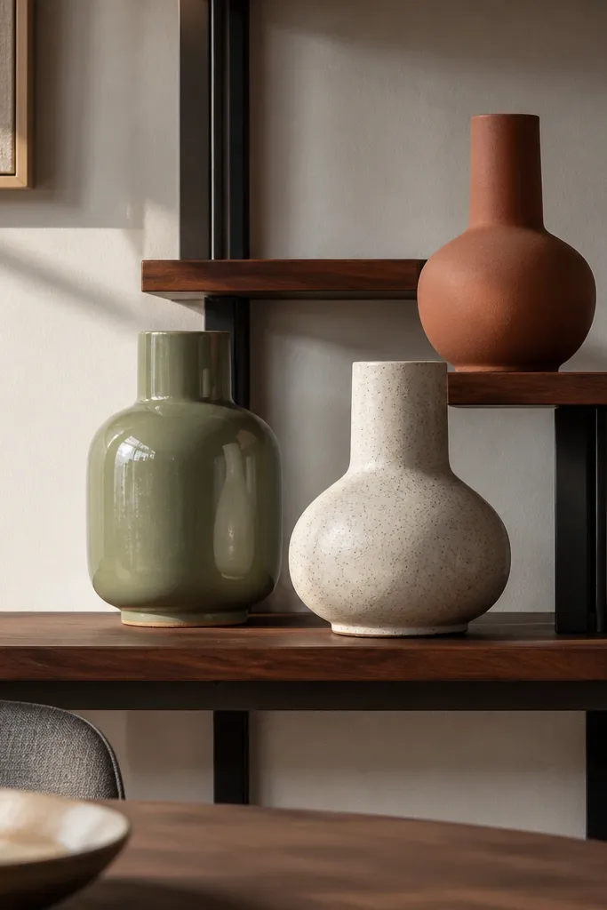
Three-dimensional decor fills space in a way flat art can’t. A layered shelf setup gives height variation and lets you style with ceramics that catch light beautifully. Keep the cluster tight: three vases in a similar color family with one slightly taller piece. This setup looks great in wide shots because the objects create shadows and texture. It also fixes the common problem of dining walls looking empty behind table centerpieces.
Install two wall shelves at different heights so you get a stepped look. Choose a lower shelf width that spans about 2/3 of table width and a smaller upper shelf centered above it. Use a level and mark stud locations for secure mounting. Style with three ceramic vases: one tall (about 10-16 inches), one medium (7-10 inches), and one short (4-7 inches). Add a small tray or a book-like riser under one vase to create intentional stacking. Finish by leaving 1-2 inches of breathing room around each object so the cluster reads airy, not crowded.
Use matte ceramics with one satin finish piece. Too much gloss makes the shelf look busy in photos.
Avoid scattering objects across the whole wall — the cluster needs to sit centered above the table.
6. Large woven wall basket wall with 3 oversized rounds
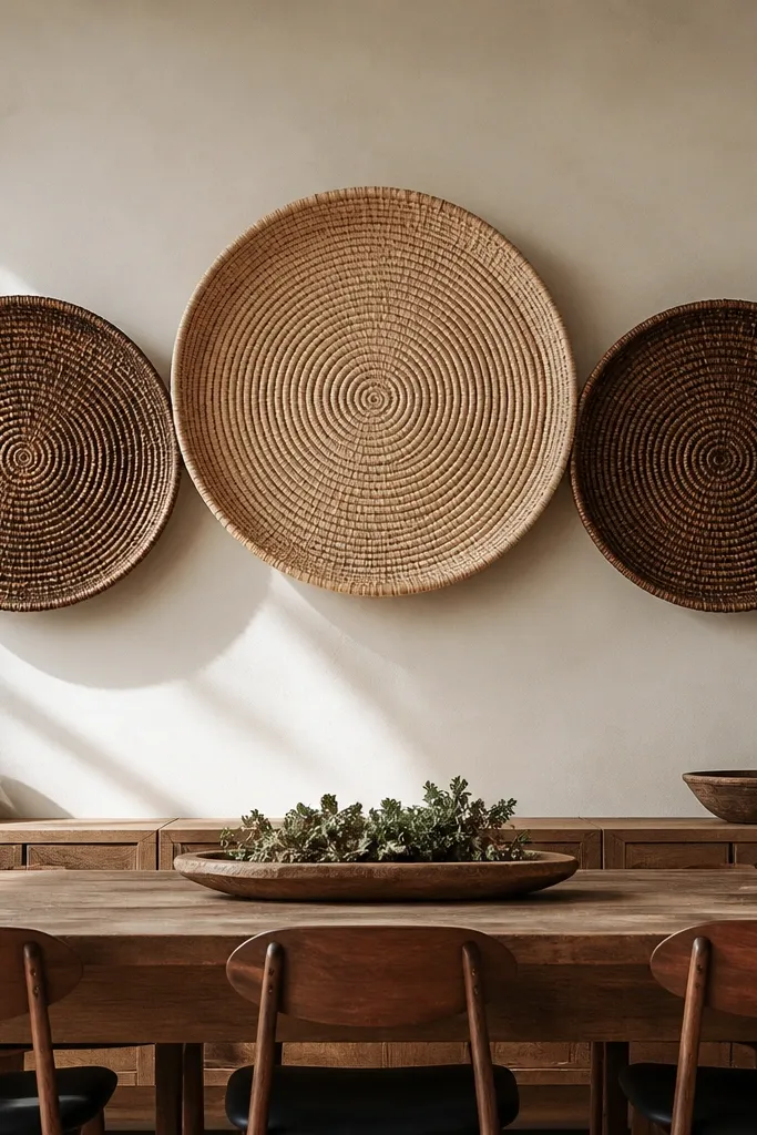
Woven baskets add instant texture and depth, and three oversized rounds fill a dining wall better than small sets. The natural fibers also soften hard lighting and make dining rooms feel warmer on camera. Use one color family — natural tan, walnut, or black-brown — and keep basket sizes clearly different: large center, medium sides. This layout creates a strong focal point that looks intentional even if you keep the table styling simple. It’s one of the best fixes for “our wall looks blank” complaints.
Pick three baskets with matching weaving style so they look like a set, even if sizes differ. Measure your table width and target a total basket span of about 2/3 to 3/4 of that number. Mount using basket hangers or screw-in hooks with a plate so the weight is supported. Center the largest basket first, then position the two smaller baskets symmetrically using a tape measure. Hang so the bottom edge of the largest basket sits about 6-10 inches above the table, then step back and check alignment from your dining chair height.
If your baskets have loops, use strong picture wire and two hooks instead of relying on thin handle loops.
Avoid mixing random weaves and colors — the wall looks like a thrift pile instead of a designed cluster.
7. String art on a pegboard in a wide geometric pattern
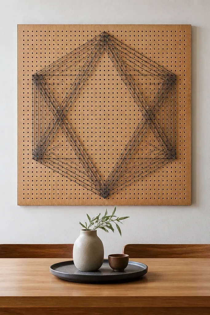
String art reads bold and modern, and a wide pegboard fills the exact horizontal space above a dining table. The pattern adds line texture, which looks crisp in photos and doesn’t blur like watercolor prints. Choose a geometric design with clear symmetry so it looks clean from across the room. Use string colors that echo your dining palette — one dark base and one accent. This project is a strong choice if you want something that looks handcrafted but still polished.
Build a pegboard frame from plywood cut to a width matching about 2/3 to 3/4 of your table width and a height around 18-24 inches. Sand and seal the board so string slides cleanly. Mark a grid lightly with pencil, then place nails or pegs along the marked points for your pattern. Stretch string lines by anchoring one end at the back, pulling tight, then wrapping around pegs as you go. Finish by trimming ends, adding a hanging bracket to the back, and sealing the front with matte clear spray from a distance to reduce fuzz. Hang centered so the bottom sits about 6-10 inches above the table.
Editor's noteKeep string tension consistent by pulling with the same force each time. Uneven tension shows up fast in photos.
Skip thisDon’t cram too many curves — a messy pattern makes the wall feel busy instead of filled.
8. Large macramé wall hanging with a wide spread
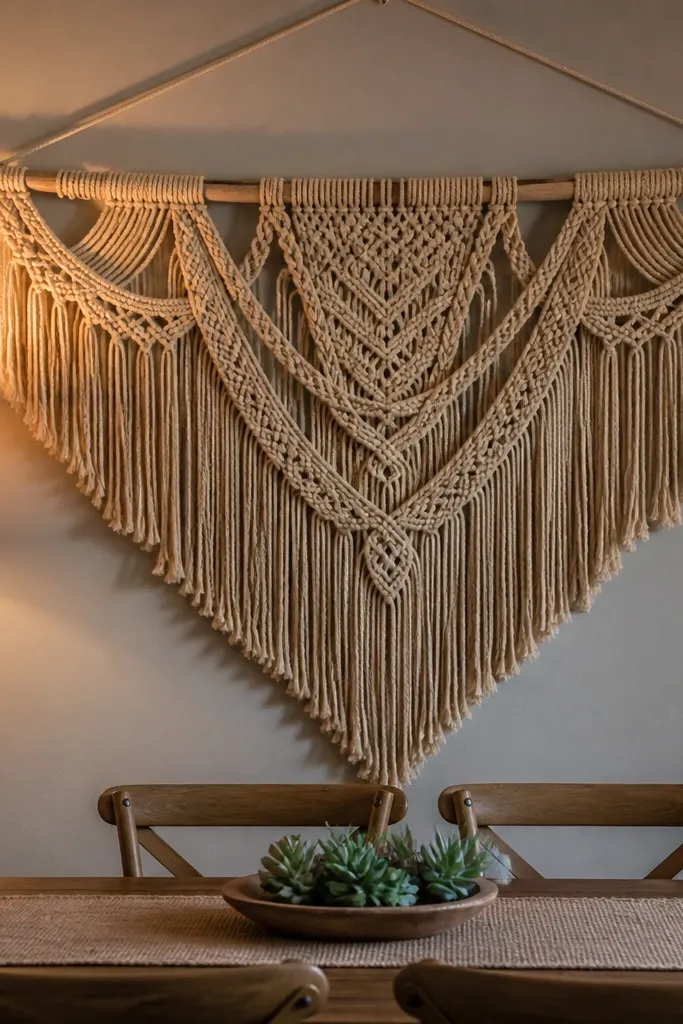
Macramé fills space because its fringe and knots create volume, not just a flat silhouette. A wide hanging with layered sections looks great above a dining table, especially if you keep your table decor minimal. Choose a neutral rope color — natural, oat, or black-brown — so it blends with wood and ceramics. The key is size: small macramé looks like it’s trying to hide. Go wide and let it drape with intent; it adds soft shadow lines that photograph well.
Buy thick cotton or jute cord (about 4-6mm) so the knots hold shape and don’t collapse. Build or assemble a wide macramé panel with a top bar width that matches about 2/3 of table width. If making from scratch, create a foundation row of square knots across the width, then add vertical knot strands with symmetrical spacing. Add a top hanging rod and use a sturdy wall bracket so the weight is supported. Trim fringe evenly after it dries fully. Hang centered so the bottom fringe sits about 6-10 inches above the table surface and adjust the top height until it looks balanced from seated eye level.
Editor's noteSteam the finished piece lightly before hanging so the fringe falls in a controlled way.
Skip thisAvoid thin rope and tiny knot boards — they look delicate but they do not fill the dining wall.
9. Painted wooden slat wall art with a shadow-gap frame
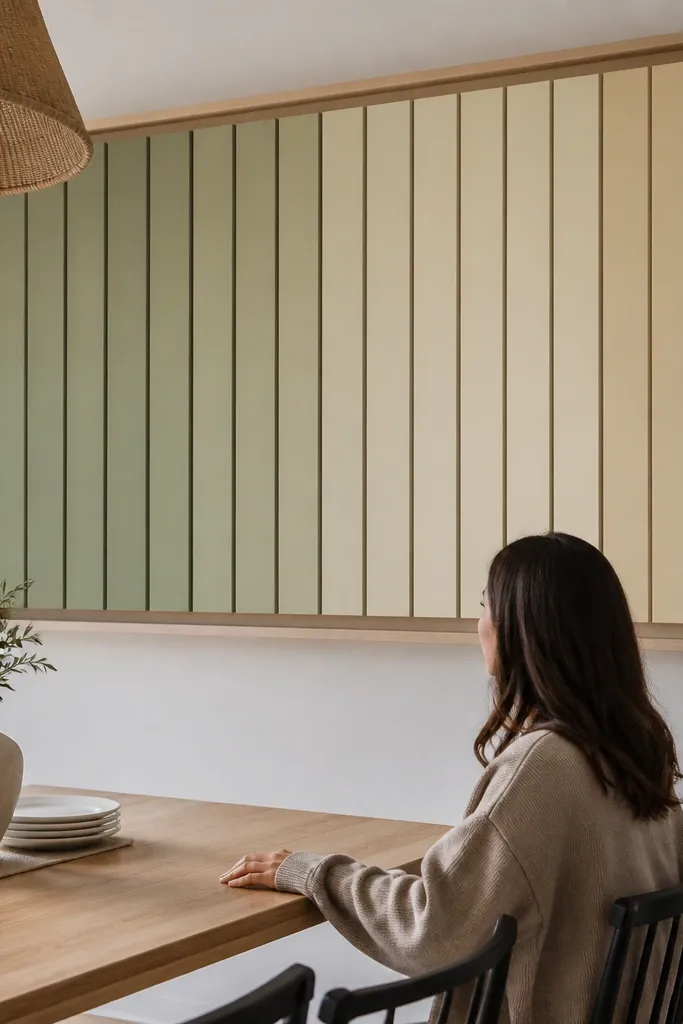
This is a clean way to add dimension without clutter. Slats create a repeating rhythm that reads as “designed” from far away, and a shadow-gap frame keeps it from looking flat on the wall. Paint the slats in a gradient or two-tone stripe pattern so your eye has something to land on. Keep the frame color neutral so the slats do the talking. It fills the wall while still looking modern and tidy.
Cut wooden slats about 1/2-inch thick and the same length, then space them evenly inside a larger frame. Build a shadow-gap frame using 1x2 lumber so the art sits slightly off the wall — aim for a 1/2-inch gap. Paint the slats and let them cure fully before assembly. Use small wood spacers or a jig while you glue slats into the backer so spacing stays consistent. Mount with French cleats for a level hang. Center the piece above the table with the bottom edge about 6-10 inches above the tabletop.
Editor's noteSand between paint coats and wipe with a tack cloth. Slats show brush marks more than flat panels.
Skip thisAvoid mounting directly flat to the wall — the lack of shadow gap makes the slats look like a sticker.
10. Wide framed fabric panel with a bold pattern
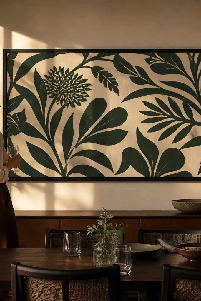
Fabric looks richer than paper prints, and a wide framed panel fills the dining wall with color and texture. Choose a pattern with big shapes so it stays readable from across the room. Stretching fabric tight prevents sagging, which is the difference between “homemade” and “intentional.” Keep the frame simple and flat so the pattern is the focus. This is a smart pick if you want the wall to coordinate with your chairs or table linen.
Select a fabric that has enough weight to stay taut (cotton canvas or decorator fabric). Stretch it over a wooden frame or foam board, pulling tight and stapling on the back. Build a picture frame around it with a width matching about 2/3-3/4 of table width. Use a backing board and corner brackets so it stays square. Finish with a clean edge trim so staples are hidden. Hang centered above the table, keeping the bottom of the frame about 6-10 inches above the tabletop.
Wash and iron fabric first. Wrinkles show through tight stretching.
Avoid using thin curtain fabric — it ripples and ruins the crisp “filled” look.
11. Floating picture ledge with 12 small plates
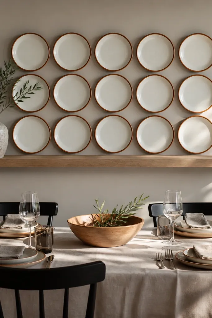
This is decorative without feeling busy because plates have built-in variety while still reading as one collection. A dozen small plates gives you a dense visual field that fills the wall, and the ledge keeps everything aligned. Choose a plate set with one shared theme — same rim color or same off-white base with different patterns. In photos, plate surfaces catch light, creating a lively texture that looks great even when the table centerpiece is simple. It also gives you an easy way to rotate decor seasonally.
Pick plates with similar sizes, ideally 6-8 inches across, so the arrangement stays tidy. Install a floating shelf centered above the table, long enough to cover about 2/3-3/4 of the table width. Use felt pads or plate stands to protect the shelf and keep plates from sliding. Arrange plates in two rows of six or a staggered pattern that fills the shelf evenly. Secure the shelf bracket into studs and level it carefully. Hang so the ledge sits about 6-10 inches above the tabletop, then step back to check spacing symmetry from your dining seat.
Use one rim color as the “anchor.” It makes mismatched patterns look coordinated.
Avoid uneven plate spacing — random gaps make the shelf look cluttered, not filled.
12. Large vinyl wall decal made into a framed look
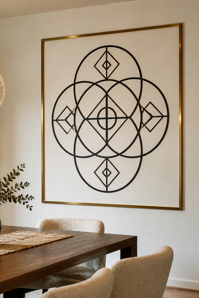
If you want a big graphic impact without DIY carpentry, a vinyl wall decal inside a frame effect is the shortcut. The wall decal gives you strong shape, and the frame boundary makes it look like real wall art. Choose a simple geometric outline or oversized script-free monogram so it reads clean in wide shots. Dark decals against light paint look crisp and filled. This works best when you keep the table decor neutral so the wall becomes the focal point.
Pick a decal design that fits a wide rectangle about 2/3-3/4 of table width. Mark the frame rectangle on the wall with painter’s tape so you have straight edges. Apply the vinyl using a squeegee and work slowly, smoothing from center outward to prevent bubbles. If you want the framed look, add a thin wood trim border around the taped rectangle and paint it to match nearby decor. Let paint cure fully before removing any tape. Hang placement is fixed by your taped frame — keep the bottom edge about 6-10 inches above the tabletop.
Use a level and a pencil line for the top edge. Vinyl errors are hard to hide after it’s pressed down.
Avoid tiny decals — they disappear above the table and look like an afterthought.
13. Woven rattan panel in a wide rectangle frame
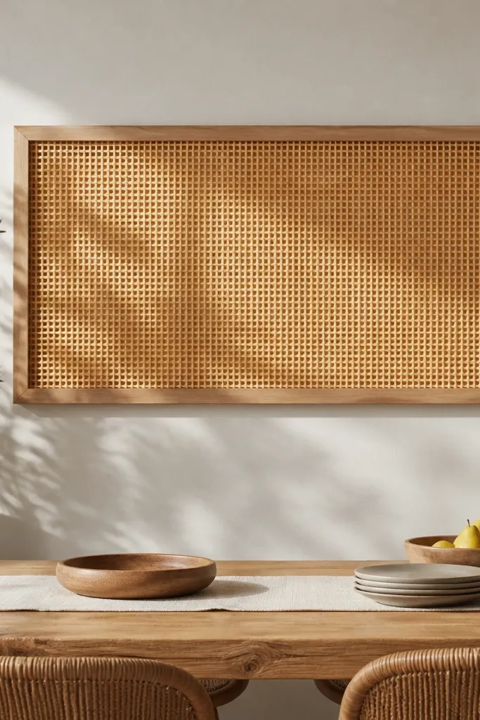
Rattan panels look airy but still fill space when you go wide. The woven texture adds depth and makes the wall feel warm without heavy weight. A wide rectangle gives a clean, modern silhouette that works with both farmhouse and contemporary dining sets. Choose a neutral rattan tone and frame it in light oak or matte black to match your furniture. This is a smart fix if your wall is too plain but you don’t want more small pieces.
Buy or cut a rattan/woven panel to a size that matches about 2/3-3/4 of table width and 18-26 inches tall. Build a simple rectangular frame using thin boards, then stain or paint it. Attach the woven panel to a backing board first so it stays flat — use staples or small corner clips. Sand the frame edges smooth and add corner protectors if needed. Mount using two French cleats or sturdy wall brackets. Center the panel above the table and set the bottom about 6-10 inches above the tabletop.
Editor's noteUse a clear matte spray on the frame, not the rattan. It helps keep glare down while protecting wood.
Skip thisAvoid framing a panel that’s too narrow — rattan needs width to look intentional.
14. Framed shadowbox with faux greenery and warm bulbs
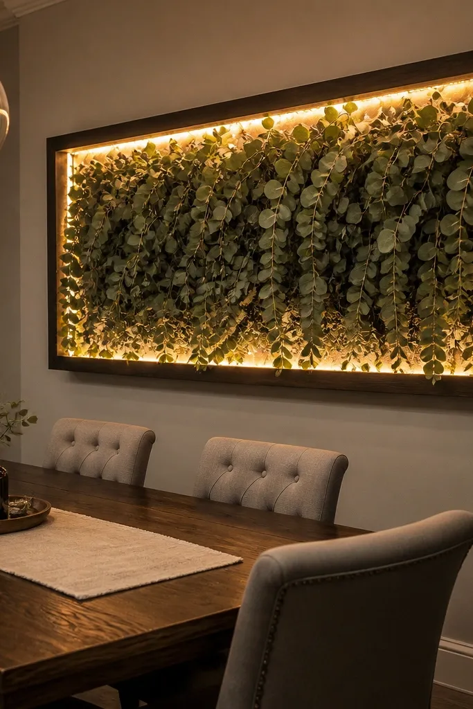
A shadowbox adds depth, and warm bulbs make the wall look alive at dinner time. Faux greenery stays full and photogenic without the maintenance of real plants. The trick is scale and spacing: build a tall but not skinny shadowbox so it fills above the table. Use warm white LED strip lights so it glows softly rather than looking like a gadget. This is great if you want dining ambiance that looks good in evening photos.
Build a shadowbox frame from plywood or a purchased deep frame, aiming for width about 2/3 of table width and depth at least 2 inches. Create a backing board and pre-arrange faux greenery so you can see the shape before gluing. Add LED warm white string lights or an LED strip, routing wires behind the backing. Secure greenery with hot glue or floral wire, then cover any sharp edges with craft felt. Mount the shadowbox centered above the table and keep the bottom about 6-10 inches above the tabletop. Add an on/off switch or plug-in cord routed neatly to an outlet.
Editor's noteChoose LEDs labeled warm white (2700K). Cool white makes greenery look gray on camera.
Skip thisAvoid using a shallow frame — without depth, lights and greenery look flat.
15. Oversized chalkboard panel with a clean dining quote layout
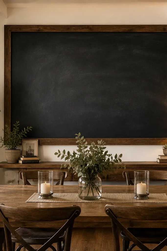
A chalkboard gives you flexibility and a bold surface that fills the wall. For photogenic dining decor, keep the writing simple and large, with plenty of negative space. Use one line or two short lines so it reads clean from across the room. Chalkboards also help when your dining wall changes seasonally because you can update the message instead of replacing art. This idea looks intentional when the panel is wide enough and the letters are consistent in size.
Sand and prime a plywood panel, then paint with chalkboard paint. Let it cure fully, then season with chalk and erase. Measure your table width and cut or choose a panel width about 2/3-3/4 of table width. Mount with picture hangers so the bottom edge sits about 6-10 inches above the tabletop. Plan the layout with a pencil grid first, then use a ruler for straight lines and consistent letter height. Seal the chalk with a light rub of paste wax only if you want to reduce smudging, then write with chalk close to the end of a typical dinner prep so it stays crisp.
Use one chalk color plus white accents. Two colors look designed; five colors look messy fast.
Avoid squeezing multiple lines — dense chalk writing makes the wall feel crowded.
16. Big botanical print triptych with matching mat width
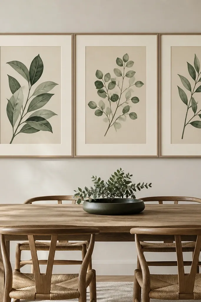
Botanical prints are classic, but the reason this works is the triptych format plus matching mats. The repeated mat width creates a unified block, which fills the wall without looking like three separate frames. Choose prints with a limited palette — sage, deep green, and warm cream — so it harmonizes with wood tones. Keep the frames consistent and go for matte finish to avoid glare from windows. This is a reliable option when you want art that looks good year-round.
Choose three prints and order or build frames with identical outside dimensions and identical mat widths. Target a total width of about 2/3-3/4 of your table width. Use a matte cream mat with a thin dark inner line for contrast. Hang the center frame first, then measure equal spacing between frames so the triptych looks symmetrical. Mount so the bottom edge sits about 6-10 inches above the tabletop. Level each frame by eye from seated height — slight tilt reads more obviously in dining rooms.
If your dining wall is bright, use darker mat lines. It keeps the triptych from washing out in daylight.
Avoid mixing glossy frames or mismatched mat colors — glare and inconsistency ruin the filled look.
17. Oversized wall clock with a DIY distressed frame
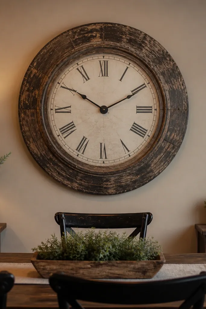
A big clock fills space because it has a built-in focal point and a strong silhouette. Distressing the frame adds character without needing lots of extra decor. Pick a clock face that matches your dining style — roman numerals for traditional, simple markers for modern. This works especially well if you want one statement piece rather than a gallery layout. In photos, the clock reads clearly even when your table has centerpiece clutter.
Choose a clock mechanism or a clock kit that matches the frame size you want. Build a frame with 1x3 boards for a sturdy look, then sand edges smooth. Apply a base paint, then add distressing with sandpaper on corners and raised areas for a worn finish. Attach the clock face to the frame and wire the mechanism if needed. Mount with two wall anchors rated for the weight and keep it centered above the dining table. Hang so the clock center sits at a comfortable eye level and the bottom of the frame is about 6-10 inches above the tabletop.
Use clock hands that contrast strongly with the face. Subtle contrast looks fine up close, but it disappears in wide shots.
Avoid tiny clocks — they look decorative, not filling.
18. Wide rope net wall art stretched in a square frame
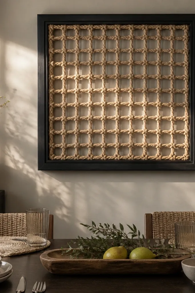
Rope net art adds a nautical-cool texture that still looks modern when framed cleanly. The square frame gives a graphic boundary, while the net pattern fills the interior with depth. Choose a frame size that covers about 2/3 of table width so it doesn’t feel like a small craft hung on a big wall. This is a great alternative if you’re tired of prints and want something with strong texture that photographs well in side lighting.
Build a square frame from straight lumber and sand smooth. Wrap or tie rope around the perimeter to create anchor points, then weave rope across in a consistent grid. For a clean look, use a measured spacing guide — mark small points on the frame and tie vertical and horizontal ropes to those points. Stretch the net tight so it doesn’t sag, then secure knots on the back. Seal the rope lightly with a clear matte sealant so it resists dust and looks even. Hang centered above the dining table and keep the bottom edge about 6-10 inches above the tabletop.
Editor's noteMist the rope with water lightly before weaving. It tightens as it dries and keeps the grid crisp.
Skip thisAvoid loose tension — saggy netting reads sloppy and won’t fill the wall.
19. Book stack wall art in two vertical columns
This idea fills height and keeps the wall from feeling flat, especially if your wall is wide but not tall. Two vertical columns create a structured look that holds attention without adding clutter. Use real book pages or patterned paper bound like books, then frame them so they look like a gallery piece. Choose covers in muted tones that match your dining chairs or buffet. It’s a good option if you want something graphic and textural, not floral and not too soft.
Create two columns using framed art panels or shadowbox-style frames. Each column should be about 1/4 to 1/3 of table width, with a gap between columns so the layout reads as intentional. Use consistent “book” heights within each column, with one taller piece at the top of each column for balance. Mount each frame using wall brackets or a French cleat strip for easy alignment. Center the combined arrangement above the dining table and set the bottom edge about 6-10 inches above the tabletop. Finish by adding a thin neutral mat so the colors don’t bleed into the wall.
Use one paper texture across both columns. Mixed textures make it look random instead of designed.
Avoid random heights across both columns — the wall needs repeat structure to look filled.
20. Color-block wall panel made from painted plywood rectangles
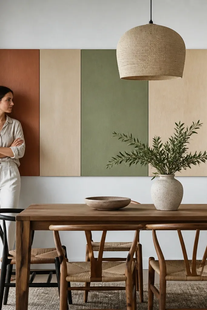
Color-block panels fill space because they create a bold, graphic field. The DIY advantage is control: you can match your dining room palette exactly by sampling chair fabric and paint chips. Use a wide layout with rectangles that vary slightly in width but share the same height band so it reads cohesive. Matte paint keeps the surface calm and reduces glare from overhead lights. This works well when your dining wall is plain and you want modern impact without a complicated build.
Cut plywood into a base rectangle sized to about 2/3-3/4 of table width and 18-28 inches tall. Sand smooth and prime, then paint the base in the lightest color. Cut smaller rectangles from thin plywood or MDF, paint them in two coordinating colors, and let dry fully. Attach the smaller pieces onto the base with wood glue and small brads. For a clean look, keep spacing between blocks consistent (about 1/2 inch). Mount centered above the table and keep the bottom edge about 6-10 inches above the tabletop.
Use painter’s tape as a spacing jig while gluing. It keeps blocks straight without measuring every time.
Avoid too many colors — three paint tones look designed; five looks accidental.



