
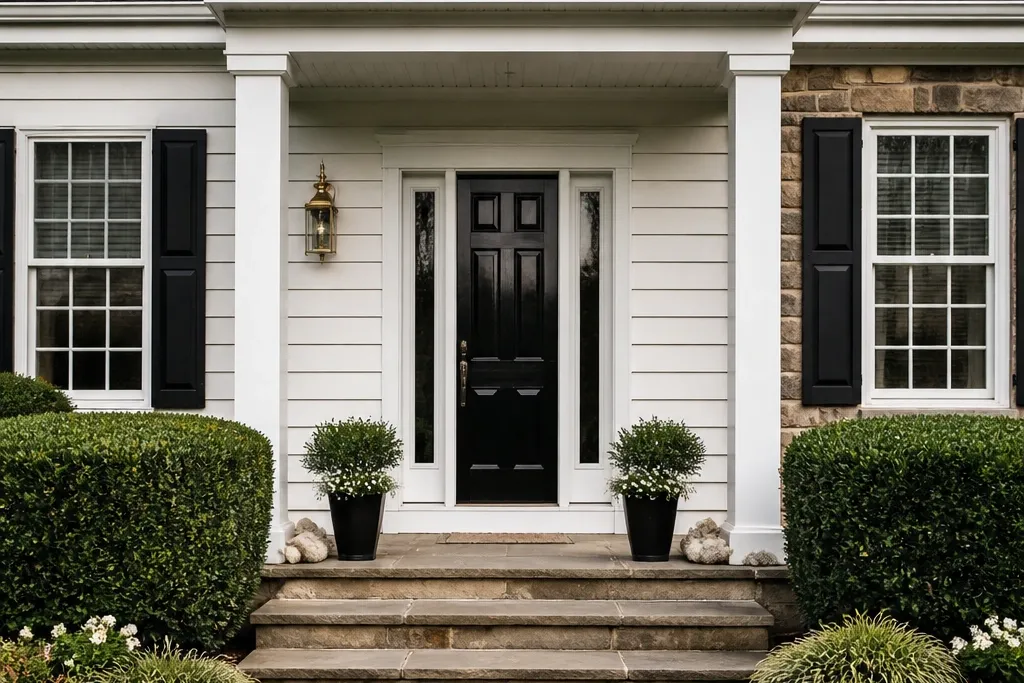
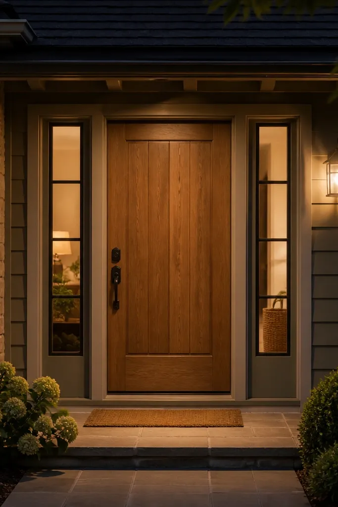
1. The "Wrong-Scale" Door Width Fix
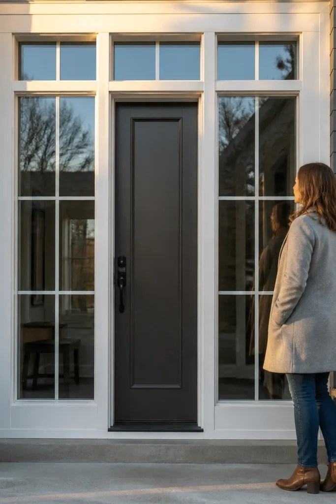
Start by measuring the finished opening width at three spots: top, middle, bottom. Subtract clearance needs for the jamb and shims, then confirm the exact door unit width you can install without forcing the reveal. If you’re stuck with a rough opening that’s too small or too large, plan on a door unit size change rather than trying to “make trim hide it.” After the door is installed, check the reveal gap around the perimeter and adjust shims so the gap looks even from the street.
A door that feels cramped or swallowed usually comes from a width mismatch. Even if it closes perfectly, the proportions look off because the casing and surrounding windows don’t line up visually. The fix is to choose a door width that restores the same visual weight as your adjacent openings. That means checking rough opening width, finished opening width, and the door slab spec before you fall in love with a style. This is worth doing when you’re replacing a slab or swapping a door unit, because the visual payoff is immediate and street-facing.
Skip thisAvoid ordering a door by “it fits the frame” without measuring the finished opening and reveal clearance.
Editor's noteUse painter’s tape to mark the door edges on the wall before ordering — it saves you from a scale mismatch.
2. Casing Reveal That Looks Clean (Not Patchy)
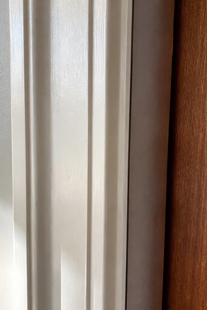
Start by removing any loose caulk and sanding high spots on the old trim so new casing sits flat. Dry-fit the casing and mark where it needs shimming so the reveal gap stays consistent around the full perimeter. Nail or screw the casing in place, then caulk the gap with a smooth bead using painter’s tape on both sides for a straight line. Finish by painting trim and door in the same sheen level so the reveal shadow reads evenly.
Messy reveals make even a beautiful door look DIY. The eye catches uneven gaps first — the door might be centered, but the trim spacing looks inconsistent because the casing depth isn’t uniform. A clean reveal reads as intentional, and it also protects against moisture where trim meets the jamb. This project is ideal if your current door has visible caulk blobs, uneven shadow lines, or a trim section that looks newer than the rest. It’s also the best place to spend time, because small adjustments in trim alignment show up immediately.
Skip thisAvoid “thick caulk to hide gaps” — it shrinks and cracks, and it makes the door look sloppy.
Editor's noteCut caulk lines with a flexible plastic tool and wipe lightly with a damp rag — you get a sharper edge than with a finger.
3. Hardware Too Small for the Door
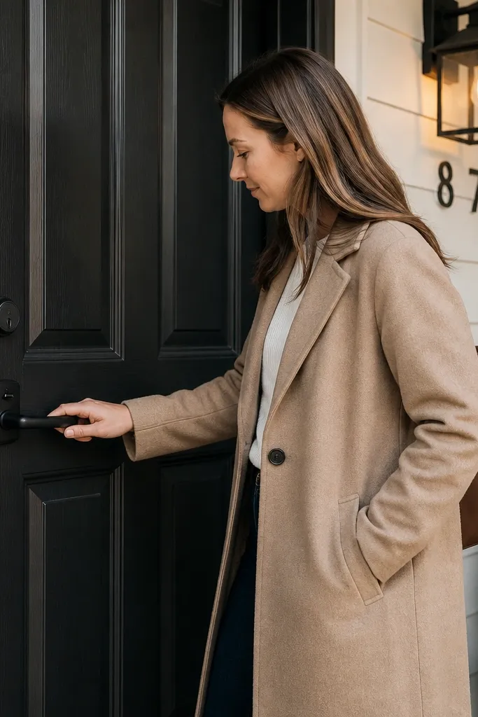
Start by measuring the door height from floor to top rail or door top, then choose hardware with a rosette size and lever length that visually matches that scale. Replace the entire lock set if the existing bore holes are mismatched — mixing parts often leaves small gaps. Install using the template that comes with the hardware, and keep the latch alignment square so you don’t get a crooked strike plate. Finish by adjusting the strike so the door closes with consistent compression on the weather stripping.
When the knob or lever looks like it belongs on a closet door, the entry instantly feels wrong. Scale matters because hardware is the strongest visual cue for distance and proportion. If you’re replacing a door or updating the hardware set, choose a lever length, rosette size, and deadbolt proportions that match the door height and trim style. The “after” effect is dramatic even if the door stays the same color. This fix is especially worth it on tall doors or doors with sidelights, where the hardware can otherwise look lost.
Skip thisAvoid reusing old hardware just because it works — mismatched scale makes the design look unfinished.
Editor's noteIf your door has a thick panel, pick hardware with a longer latch throw so you don’t end up with a weak seal.
4. Brass vs Nickel: The Metal Finish Clash
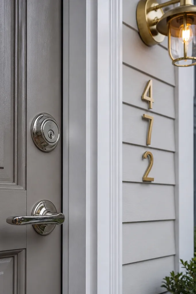
A door can be perfect and still look chaotic when the hardware finish fights the rest of the facade. Brass next to polished nickel, or black hardware next to a warm brass light, creates a “parts bin” look from the street. The fix is to pick one finish family and match it across the lock, deadbolt, house numbers, and the entry light. I like matte black or oil-rubbed bronze for most homes because they hide minor wear and keep the focus on the door shape. This change is fast and high impact because it affects the strongest visual accents.
Start by listing every visible metal on the entry: lockset, deadbolt, house numbers, door knocker if you have one, and both exterior lights. Choose one finish family and commit to it — don’t “half match” with two similar but different undertones. Replace the lockset first, then update house numbers and the light fixture if you need to. Install new numbers with the same finish and mount them so they line up with the door centerline.
Match undertone, not just color — warm bronze and warm brass can look closer than you think to each other.
Avoid mixing finishes to “keep some old stuff” — the entry reads like an unfinished project.
5. Door Color That Ignores Trim Undertone
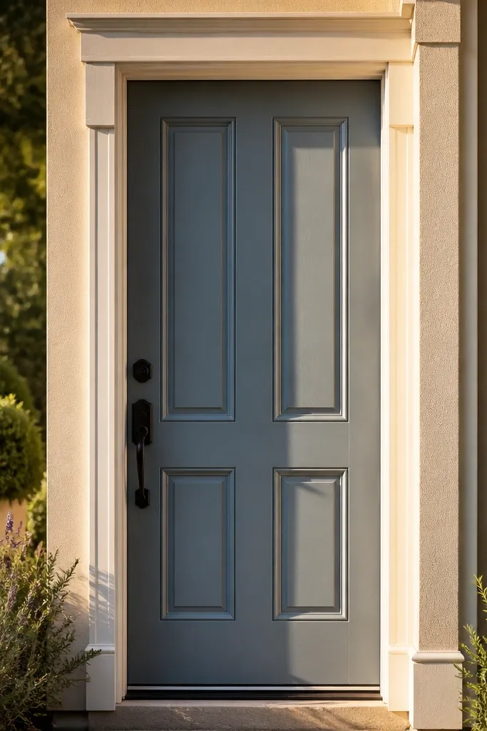
Start by checking your trim color under daylight and shade — hold a white card next to it to see whether it leans warm or cool. Pick a door color that matches that undertone family, then buy test quarts and paint two 12x12 inch samples directly on the door surface. Let the samples dry fully and compare them on a sunny afternoon and at dusk. When you’re ready, tape edges carefully and use exterior-rated primer plus a topcoat built for doors.
Color mistakes aren’t about taste — they’re about undertone. A door paint that looks warm in your garage can look sickly next to cool white trim outdoors. The fix is to choose a door color that shares the same undertone family as your trim: warm beige trim wants warm stains and warm paint; cool gray trim wants cooler tones. You’ll see the difference in how shadows look around the casing and how the door edge reads in daylight. This is worth doing whenever you repaint the door or swap trim, because the whole entry starts to feel coherent.
Skip thisAvoid choosing door color from a tiny swatch in indoor light — undertone errors show up outside.
Editor's noteUse painter’s tape on a cured surface and remove it within a couple hours of painting so you don’t pull the edge.
6. Shiny Paint That Makes Caulk Lines Obvious
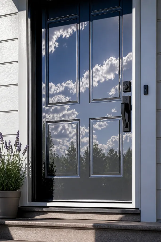
Start by sanding the door lightly with 180-220 grit so new paint bonds and the surface is uniform. Clean thoroughly, then prime bare wood or patched areas with exterior primer. Choose satin or eggshell for the door and match the sheen for trim so shadows stay consistent. Apply two full coats with a foam roller for the panels and a brush for edges, then inspect under angled light before the final cure.
High-gloss door paint turns every little line into a spotlight. If your caulk is uneven or your trim has tiny gaps, gloss will broadcast it from across the street. The after result you want is a finish that shows the door panels and keeps the edge lines crisp without glare. Most entry doors look best in satin or eggshell on the door and satin on the trim, because it balances clean reflectivity with forgiving coverage. This fix matters if you’re repainting after a hardware swap, casing repair, or trim replacement.
Skip thisAvoid painting over uneven caulk without sanding it flush — gloss will expose every ridge.
Editor's noteDon’t skip primer on patched areas — gloss paint will telegraph differences in absorption.
7. Sidelight Trim Joints That Don't Line Up
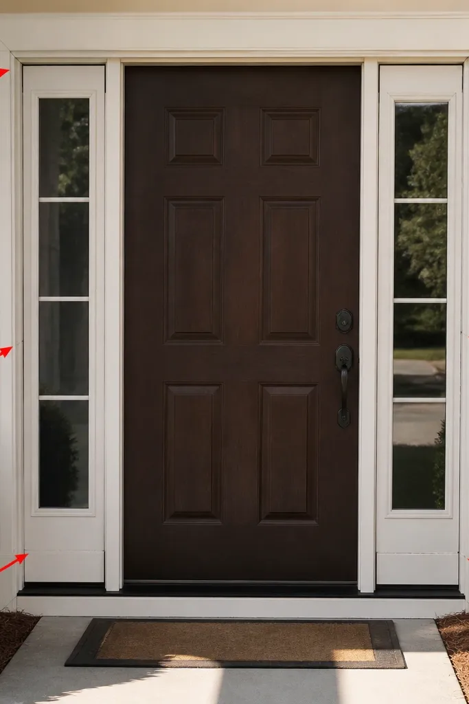
Start by removing loose or warped trim pieces and checking that the jambs are plumb — use a 6-foot level and measure at both edges. Dry-fit the casing around each side light and mark where joints land so they don’t land at awkward heights. Cut joints clean and test fit before nailing, then shim behind casing so reveal gaps match the door reveal. Caulk the inside edges with a paintable exterior sealant and keep the bead thin so the joint line stays sharp.
Sidelights are unforgiving. A door can look fine, then the sidelights reveal crooked trim joints, uneven spacing, or mismatched casing depth. The fix is to treat the sidelights and door as one trim system, with consistent joint placement and reveal gaps. When joints align and the casing thickness stays uniform, the entry reads as built, not assembled. This is worth tackling if you’re installing new sidelights, replacing a door unit, or redoing trim around the glass.
Skip thisAvoid assuming trim will hide a jamb that’s out of plumb — it will only make the glass look off.
Editor's notePlan joint placement before cutting — shift the casing a quarter inch to avoid a joint landing where your eye naturally stops.
8. Wrong Door Sweep and the Drafty Look
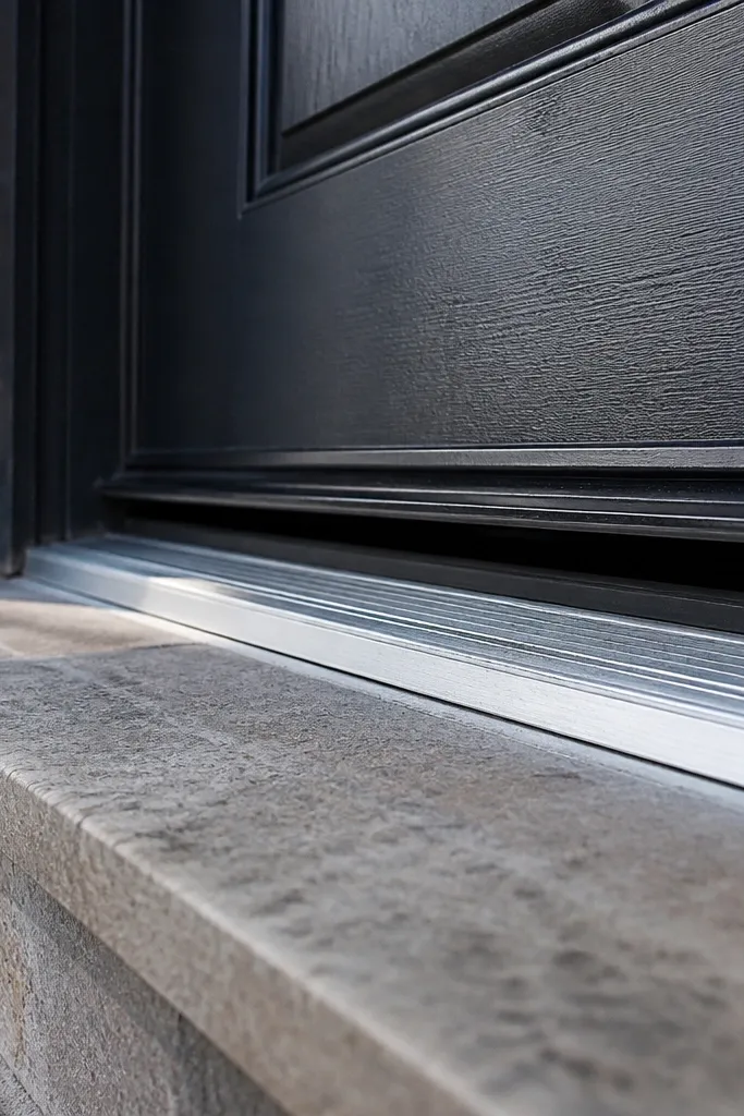
A door can look great and still make the entry feel neglected if the bottom seal is wrong. A poor door sweep leaves a visible gap, which reads as “cheap replacement” from the street and also makes the entry drafty. The fix is to use the right threshold and a sweep that matches your door’s clearance. If you’re seeing daylight at the bottom or the door drags, the design will never feel finished. This is a practical upgrade that also improves the look because the bottom line becomes straight and consistent.
Start by checking the gap under the door with a flashlight — mark where light escapes. Measure the clearance at the threshold and check the threshold height relative to the door bottom. Replace the sweep with one sized to your door thickness and the correct clearance range, then adjust hinges or leveling shims if needed. Finally, test the door for smooth closure and confirm the sweep contacts evenly along the full width.
Buy a sweep with an adjustable mounting track so you can dial in contact without re-hanging the door.
Avoid installing a new door without checking threshold alignment — you get visible gaps and drafts.
9. Too-Thick Threshold Transition
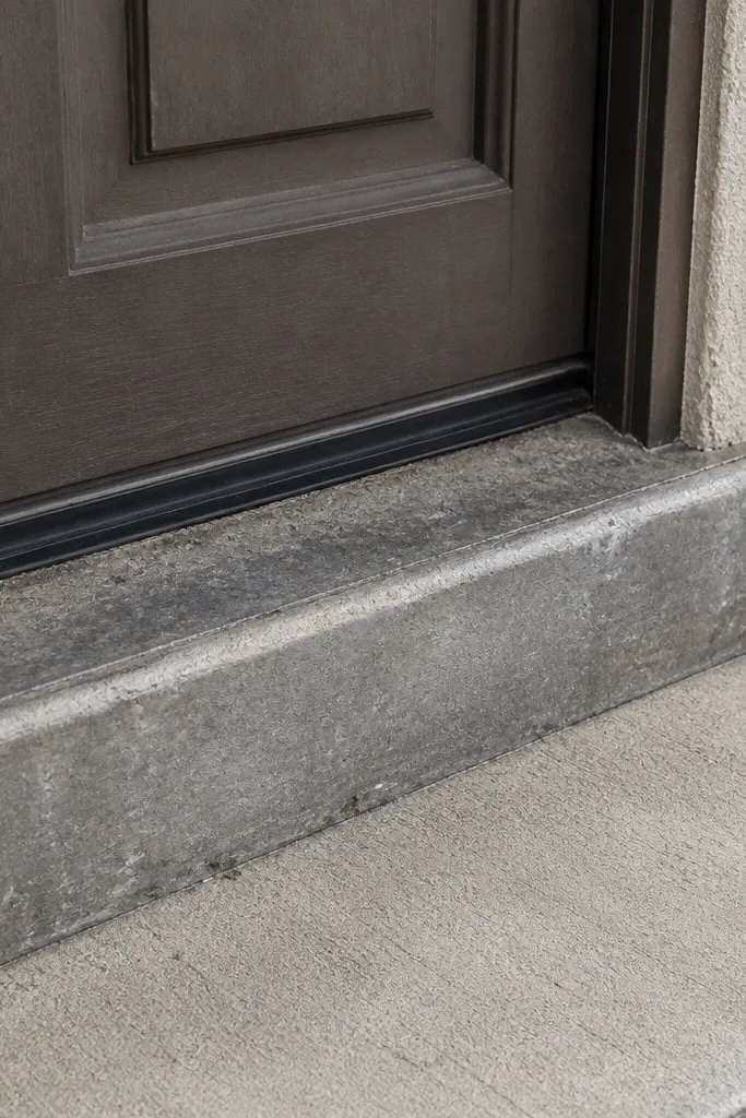
A thick or mismatched threshold ruins the “clean line” of the entry. Even if the door and trim are gorgeous, a high lip or chunky transition makes the doorway look patched and harder to use. The fix is to choose a threshold profile that matches your flooring and keeps the transition low and consistent. You’ll also want the right flashing and sealant so water doesn’t wick under the threshold. This is worth it if your entry has uneven steps, a new tile that sits too high, or a threshold that looks like it was added later.
Start by measuring the height difference between interior flooring and the exterior landing surface. Choose a threshold that matches that height and has the correct mounting flange for exterior sealing. Remove the old threshold carefully, clean out old sealant, and inspect the subfloor for rot. Install the new threshold with proper flashing tape where it meets the wall, then seal edges with an exterior-rated sealant and test the door for smooth clearance.
Dry-fit the threshold and close the door before final sealing — small height differences matter.
Avoid stacking shims or adding thick sealant to fix a height mismatch — it looks uneven and can fail.
10. House Numbers Mounted Too High or Too Low
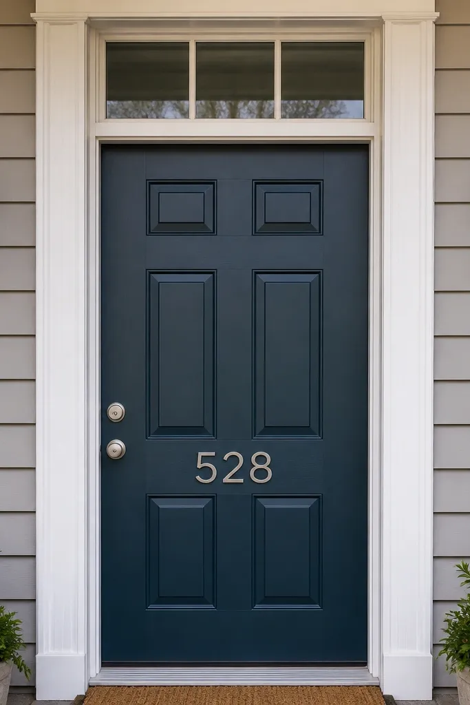
House numbers affect the whole entry because they sit at the same visual level as the door hardware. If they’re too high, they compete with the hardware. Too low, they make the door feel oversized or awkward. The fix is simple: align numbers with a consistent eye-level and center them to the door. You’ll also want to pick a font and finish that match the hardware metal family. This is worth doing when you repaint the door or change the hardware, because the numbers look like the “final touch” that can still ruin the design if placed wrong.
Start by finding the door centerline and marking it with painter’s tape. Measure an eye-level placement point from the ground, then keep your number baseline consistent across the width. Use a template or a printed guide to space each digit so the line looks even. After mounting, check alignment from the street at 15-25 feet so they read clearly without squinting.
Use a level and a straightedge even if you’re sure — numbers reveal sloppiness faster than trim does.
Avoid mounting numbers by “where the old holes were” if the height makes the door look top-heavy.
11. Door Mat and Entry Lighting That Fight the Door Color
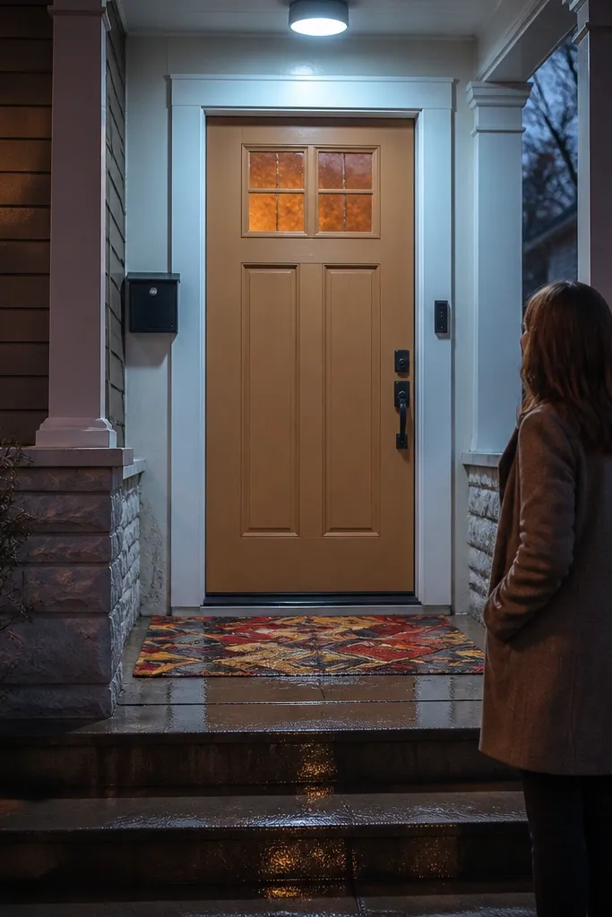
Start by checking the bulb type in your entry light and replace it with a consistent color temperature, like 2700K for warm environments or 3000K for neutral. Then choose a mat color that matches your exterior finishes: black or charcoal for matte black hardware, dark brown for bronze hardware. Position the mat so it doesn’t overlap the threshold flashing or cover the weep area. Finally, step back and view the entry at night — adjust bulb temperature before you judge the door color.
This is the mistake people don’t call a door design problem, but it is. A door can look off because the entry light color temperature makes the door paint look different at night, and the mat color makes the doorway feel cluttered. If you swap the door color but keep warm bulbs or a random mat, the entry won’t feel cohesive. The fix is to coordinate the light temperature and pick a mat that complements the door without adding another competing color. This is worth it when you’re doing a door repaint or hardware change and want the before-and-after effect to hold at night.
Skip thisAvoid using different bulb temperatures between fixtures — the door color will look inconsistent.
Editor's noteIf your light looks yellow, go cooler by one step; if it looks bluish, go warmer.
12. Over-Decorating the Door Face
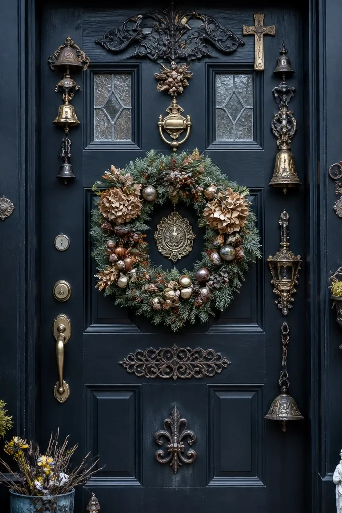
Too many accents make the door look busy, and busy reads as cheap when viewed from the street. Overdoing it usually means multiple metals, a knocker plus a wreath plus extra hooks, or layered trim decals that fight the door panels. The fix is to choose one focal point: either bold hardware or a simple knocker, and keep everything else minimal and in the same finish family. This matters because a main entrance door design should guide the eye to the opening, not scatter it across accessories. It’s a fast before-and-after if your current entry has lots of seasonal add-ons or mixed hardware styles.
Start by removing every non-permanent accessory for one full week and photograph the entry in daylight. Decide what the focal point is — hardware, a knocker, or a single address plaque — then keep only items in the same metal finish family. If you want a wreath, use a wreath ring that mounts to the door without adding extra hooks. For lighting, ensure your entry fixture is the only overhead accent so the door stays the center.
Pick one accessory finish and lock it — mixing silver and black hardware makes the door look unfinished even when everything is new.
Avoid stacking multiple metal finishes and accessories — it makes the door look like a temporary setup.
13. Door Frame Paint Missed the Jamb Edge
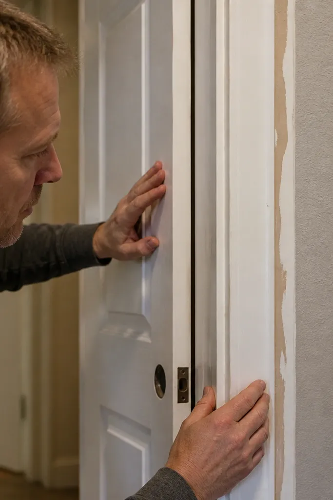
A door can look great on the front face and still feel unfinished if the jamb edge is unpainted, patchy, or has old caulk lines. That edge catches light and shows wear, especially around the latch side. The fix is to paint the jamb edges and casing with the same prep standard you’d use for interior trim: sand, prime, and feather the edges so you don’t see transitions. This is worth doing when you see old paint around the handle area, mismatched trim sections, or a jamb that looks older than the door slab.
Start by masking the door slab and glass so you don’t get paint on weather stripping or panes. Scrape loose paint, sand the edges smooth, and prime any bare wood or patch areas. Use a brush for jamb edges and a small roller for flat casing faces, keeping coats thin and even. After drying, inspect under side lighting and touch up any missed spots before final clear coat or topcoat.
Feather primer edges with 220 grit — it prevents a visible ridge after the topcoat dries.
Avoid painting only the door slab and leaving the jamb edge inconsistent — it reads as an incomplete job.
14. Wrong Door Swing Clearance and the "Tight" Entry Feel
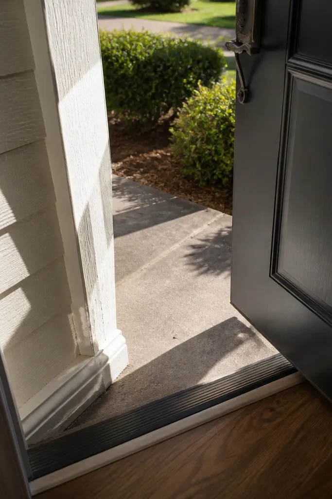
Start by opening the door fully and marking where it contacts the wall, steps, or storm door components. Check hinge side clearance and verify the door is plumb; adjust hinge shims if the latch side is pulling the door toward an obstruction. Set a door stop that limits swing at the correct angle without hitting anything. Finally, check the sweep contact and weather seal after adjustments so you don’t create a draft.
Swing clearance problems create a weird, cramped feeling even when everything else looks good. If the door hits a wall, the storm door rubs, or the landscaping forces the door to open at an angle, the entry looks like it was set up without planning. The fix is to correct obstructions and adjust hinges or door stop positions so the door opens cleanly without gaps or scraping. This is worth addressing during a door unit replacement or when you’re changing trim and hardware that changes latch alignment. It also improves safety because the door doesn’t snag when you carry groceries.
Skip thisAvoid ignoring scrape marks — they usually mean the door is out of plane or blocked during swing.
Editor's noteUse a strip of painter’s tape as a witness line to see if the door shifts after you adjust hinges.
15. Panel Depth and Staining That Doesn't Match Your Surroundings
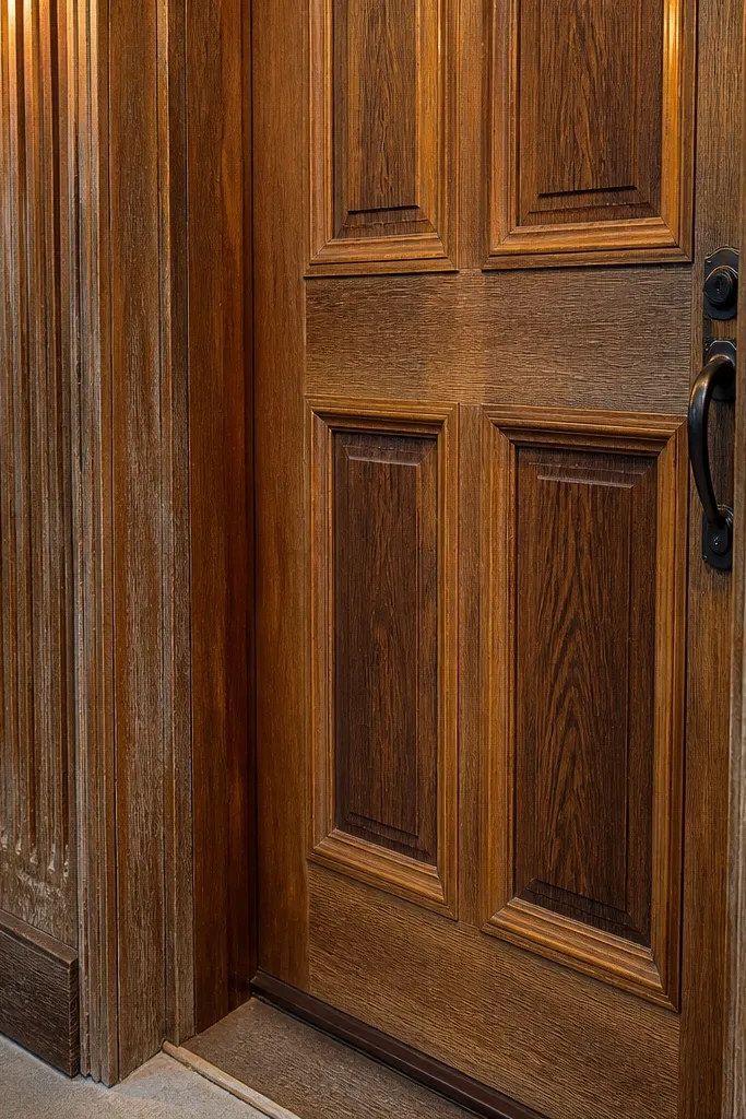
Start by sanding the door to an even surface, especially on raised edges and panel corners where stain soaks differently. Wipe away dust thoroughly, then condition the wood if your door is softwood or shows blotchiness. Apply stain with a foam brush or rag, working panel by panel and keeping wet edges consistent. After the stain dries to the target depth, seal with an exterior clear coat in the sheen level you want, and let it cure fully before reinstalling hardware.
If your door is wood and the stain looks darker in panels than on edges, it can look blotchy and disconnected from the rest of the facade. The fix is to choose a stain finish that matches the surrounding wood tone and apply it evenly across grain direction. This matters because street light creates contrast inside recessed panels, and uneven staining amplifies that contrast. The after look is a door that looks like it was always there — same warmth, same depth, no patchy “hot spots.” This project is best when you’re refinishing a wood door or correcting blotchy stain.
Skip thisAvoid rushing stain coats without grain-consistent technique — panel corners will darken first and ruin the look.
Editor's noteTest stain on the least visible panel first — recessed areas show blotchiness faster than flat sections.



