
1. Rainbow Strip Frames With Equal Gaps
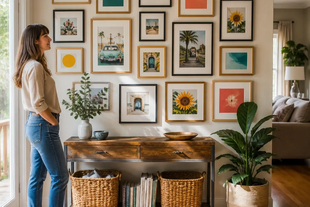
This layout is the fastest way to make Colorful Gallery Wall Ideas look deliberate. You hang frames in one horizontal strip so the color flow reads instantly, even from across the room. Use art that’s clearly different in color but similar in style or background — think bold shapes or solid-color blocks — because the spacing will do the heavy lifting. Cream mats make the rainbow feel brighter instead of muddy, and a consistent frame finish keeps the strip from looking like a thrift-store pile. It works great for hallways, above a console table, and any wall where you want joy without visual clutter.
Start by choosing 6-8 frames with the same outer dimensions or close to it, like 10x13, 11x14, and 12x16. Arrange your tape mockup in a straight line and keep the gap between frame edges around 3 inches. Place the frames from red through purple, then fill any missing colors with artwork that has the closest matching tone. Hang using a level and mark screw positions through the mounting holes, then step back and check that the centers line up at eye level (about 57-60 inches from floor to frame center).
Editor's noteIf your art varies a lot in brightness, add one “anchor” print with a cream or off-white background to keep the whole strip from glowing too hard.
Skip thisDon’t mix wildly different frame sizes in a single row or the rainbow rhythm breaks.
2. Teal, Mustard, and Cream Tiled Grid
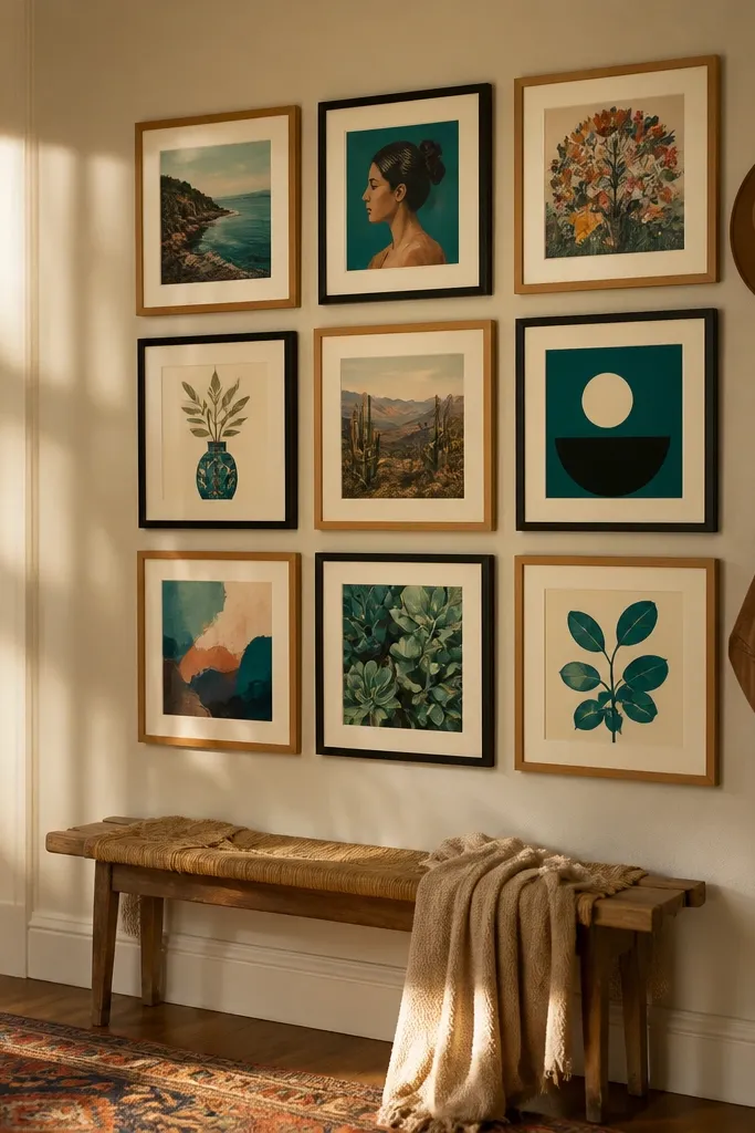
A tight grid turns colorful chaos into a calm, happy pattern. This is the one layout I recommend when you want Colorful Gallery Wall Ideas but you’re worried about the wall looking “busy.” Stick to exactly three colors in the artwork: teal, mustard, and cream, with cream or white mats to tie everything together. Black frames add contrast so the colors pop, and the grid spacing makes the wall feel structured even if the art styles vary. It’s ideal for dining rooms, stair landings, and any spot where you want a strong visual anchor.
Pick 9 frames so you can do a 3x3 arrangement, ideally in two sizes like 8x10 and 11x14 so it’s not too uniform. Use painter’s tape to outline the grid and keep gaps at about 2.5 inches between frames. Choose artwork so each color appears at least three times, then swap pieces until teal and mustard are evenly distributed (not clustered in one corner). Hang by starting with the center frame, then level the top row before you drill the rest.
Editor's noteIf your art doesn’t include all three colors, add a thin colored border using craft paper behind the mat so teal/mustard/cream repeat consistently.
Skip thisAvoid using more than three dominant colors because the grid stops reading as intentional.
3. Big Center Piece With Color Satellites
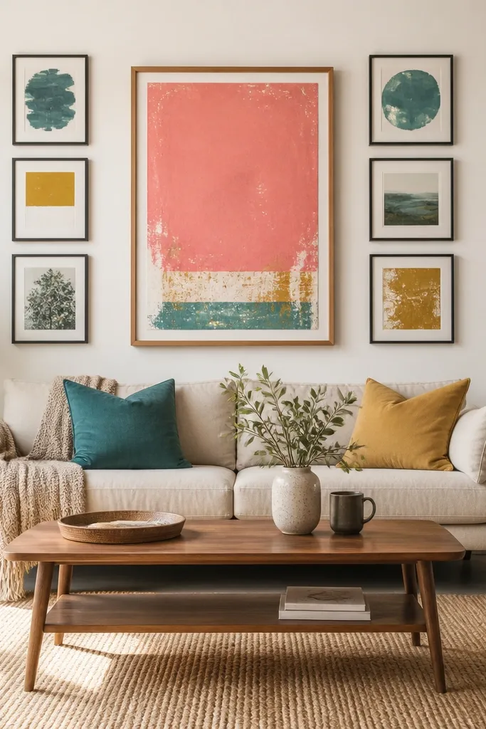
This layout is for when you want joy but you also want breathing room. The center piece gives your eye a starting point, and the smaller “satellites” add color without making the wall feel cramped. It flatters awkward spaces because it doesn’t require perfect symmetry — you’re aiming for balanced placement, not a math grid. Use a large artwork with a dominant color and choose smaller prints that repeat that same color plus one additional tone. It works especially well in living rooms over a sofa or in bedrooms where you want the wall to feel uplifting, not loud.
Choose one large frame around 20x26 or 24x30, then add 4 smaller frames around 8x10 to 11x14. Tape the center frame first and measure outward so the top of the satellites sits roughly level (within 1/2 inch). For the satellite placement, keep 3 inches between each smaller frame and the edge of the center frame. Hang the center, then hang two on the left and two on the right so the colors feel balanced.
Pick a center print with one clear background tone (cream, off-white, or light gray) so the smaller pieces don’t fight for attention.
Don’t pick a center piece with busy colors that don’t repeat anywhere else on the wall.
4. Vertical Color Stack for Narrow Walls
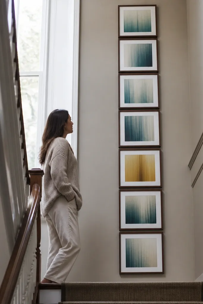
Narrow walls need a layout that uses height, not width. This vertical stack gives you a clean, happy look that still feels designed. Use artwork with vertical energy — tall illustrations, gradient blocks, or photography with strong color bands — so the wall doesn’t look stretched. Keep the frame widths consistent so the eye reads one column. This is one of the best Colorful Gallery Wall Ideas for stair rails, side hallways, and small corners where a grid would feel cramped.
Choose 5 frames with similar width, like 8x12, 9x12, and 9x13, and keep the same mat size if you can. Tape a straight vertical guide line and set the middle frame center first at about 60 inches from the floor. Place the remaining frames above and below with 2.5 to 3 inches between frame edges. Hang from the middle outward so you don’t end up with a lopsided top row.
Editor's noteUse a consistent mat color and keep the artwork aligned to the same side within each frame so the gradients look intentional.
Skip thisAvoid mixing landscape-heavy art with a vertical stack unless the art has strong color blocks.
5. Asymmetrical Color Mix With Top Alignment
This is the “cool aunt” version of Colorful Gallery Wall Ideas — playful, but still clean. The secret is aligning the top edges while letting widths and heights vary. That keeps the wall from looking like random frames were added over time. Use a limited frame finish like warm wood or matte black, and choose artwork that repeats at least one dominant color in three different frames. It looks great above an entryway table, in a home office, or anywhere you want personality without a strict grid.
Pick 7-10 frames in mixed sizes, like 8x10, 11x14, and 16x20, but keep the same frame finish family. Tape the top edges first: mark a line on the wall and align the top of every frame to it. Use a 2 to 3 inch gap between frames, adjusting slightly to keep the negative space balanced. Hang by starting with the largest frame, then place the smaller frames to create a visual triangle pattern around it.
If one frame feels too heavy visually, swap it for a lighter mat or a narrower frame width instead of changing the entire layout.
Don’t align both top and center at the same time with mixed sizes — it usually makes the wall feel rigid.
6. Colorful Photo Frames in a DIY Mat Collage
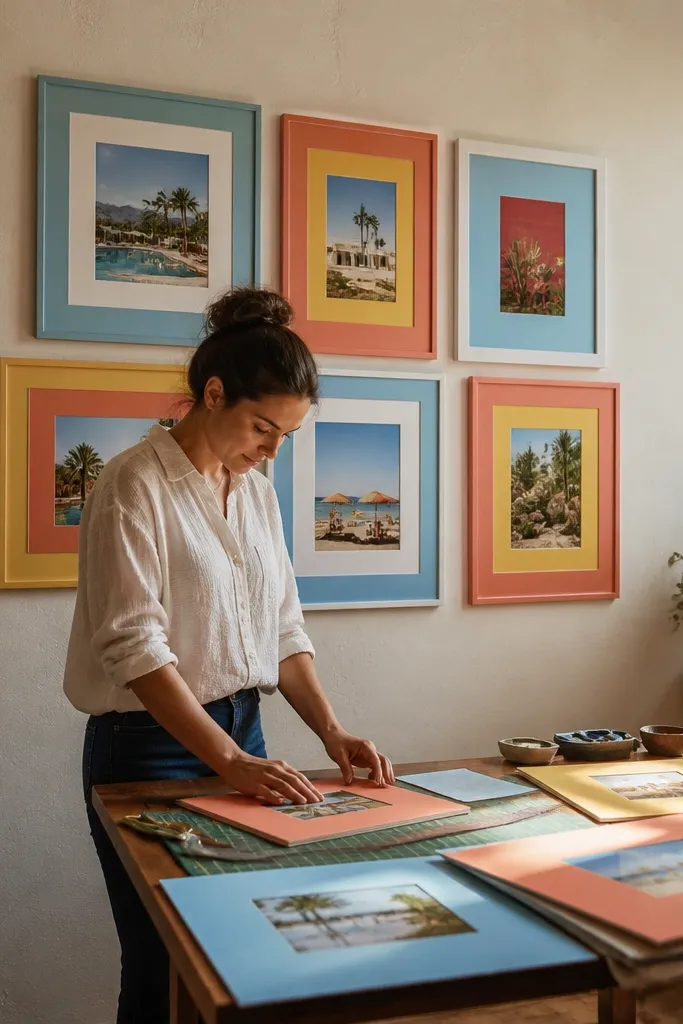
This one makes colorful gallery walls feel personal without turning into clutter. A DIY mat collage lets you keep the frame sizes consistent while you vary color through the mat layers. Thick mats also make small prints look intentional, not tiny. Choose photo prints or art prints with bold color — then pick mat colors that repeat across at least two frames. It’s a great option for renters because you can swap prints later while keeping the same mat layout.
Use a set of frames with the same outer dimensions so the wall looks uniform. Cut mat boards from foam core or heavy cardstock at the same opening size for each frame, then choose 3-4 mat colors. Tape your layout on the wall first, then place the frames so mats create a patchwork effect. Insert the photos/art, close the back, and hang using removable hooks rated for your frame weight.
Editor's noteUse a matte finish on photos or prints so the colors look softer under indoor lighting.
Skip thisAvoid glossy photo paper in this layout — reflections fight the colorful mats.
7. Monochrome Frames, Multi-Color Prints Theme Wall
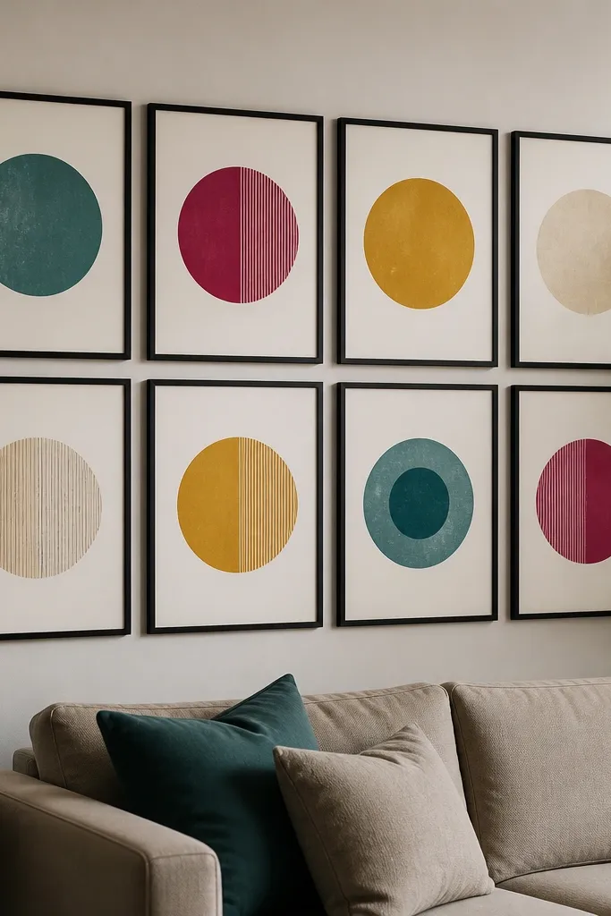
If you’re collecting prints over time, this layout makes the collection look like a planned series. All the frames match — that’s the anchor — while the art supplies the joy. Keep the mat color consistent, then choose prints that share a theme element like “circles,” “botanical outlines,” or “grid typography.” When the theme repeats, Colorful Gallery Wall Ideas read cohesive even when colors differ. This works well in living rooms, kids' play-adjacent spaces, and creative studios where you want energy.
Pick one frame finish, like matte black, and stick to it for every piece. Choose 8-12 prints, then group them by theme so each cluster has the same motif. Tape a layout that fills a rectangle on the wall, using 2.5-inch gaps between frame edges. Hang the largest print first, then fill in around it while keeping the overall cluster centered at eye level.
Use the same mat width across all frames (about 2 inches) so the color blocks look crisp and consistent.
Don’t mix frame finishes like brass and warm wood in the same wall — it turns the wall into noise.
8. Pastel Pop With White Mat Margin Frames
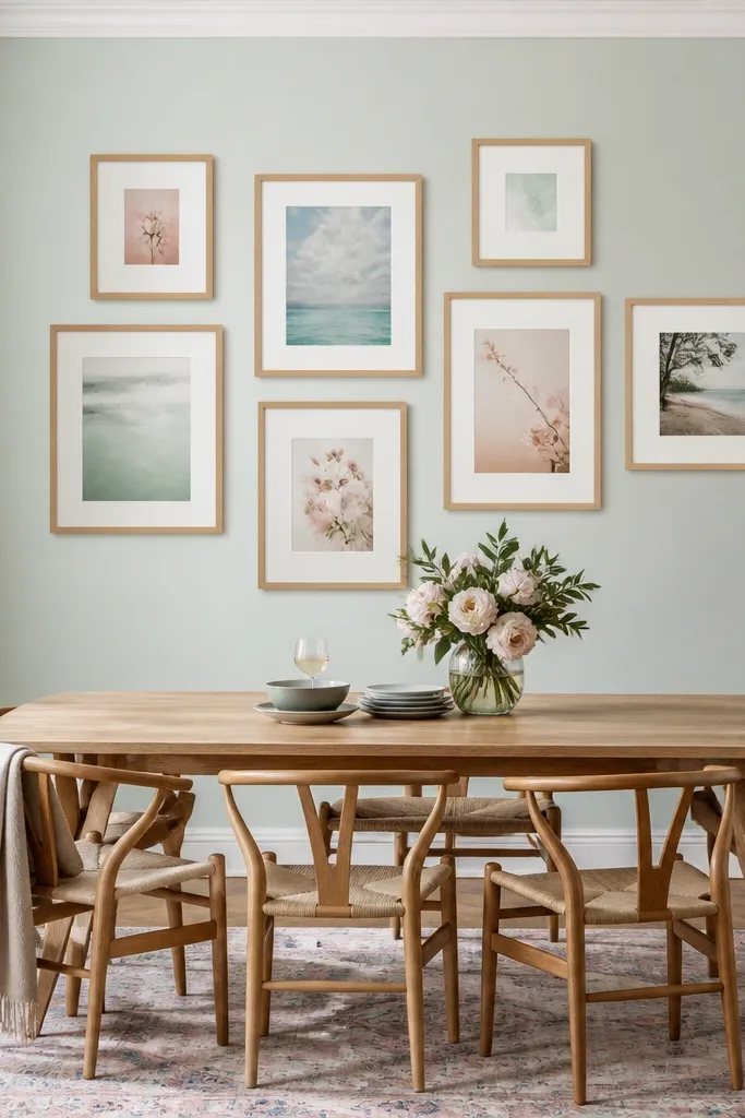
Pastels can still feel joyful when you control the spacing and mat width. Wide white mats add a “gallery” feel and keep Colorful Gallery Wall Ideas from turning into a soft blur. Choose 6-9 frames with similar mat width, then stagger them so not everything sits on the same line. The pastel palette looks bright in daylight and still calm at night. This is a smart pick for bedrooms, nurseries, and reading nooks.
Use frames with wide mat openings or add mats yourself using thick mat board. Choose 6-9 pastel prints that include at least one shared color across 3 pieces. Tape a staggered arrangement and keep gaps around 3 inches so the mats show. Hang by marking the center of the staggered cluster first, then adjust each frame so the top edges don’t all line up perfectly.
Editor's noteIf your wall is painted warm beige, use cooler pastels like periwinkle and mint so the colors stay crisp.
Skip thisAvoid thin mats with pastels — they make the wall look flat.
9. Torn-Edge Paper Art in Frame Floats
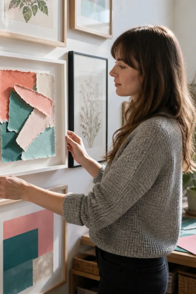
This is a DIY-forward way to make Colorful Gallery Wall Ideas look textured and lively. Floating paper art inside a frame creates depth so the colors catch light and feel dimensional. Torn edges add movement, and you can build the color palette with simple craft paper scraps. It’s great when you want to create your own art quickly without printing a bunch of files. Skill level is easy, and the result looks intentional because the texture is part of the design.
Buy shadow box frames or frames with a deep backing so paper can sit slightly above the surface. Cut paper shapes with a torn edge, then layer them on craft paper backgrounds in 3-4 colors. Use a light adhesive like removable photo tape or glue dots to attach only the center so edges stay raised. Tape your layout with 2.5-inch gaps, then hang the frames with hardware rated for the shadow box weight.
Use matte craft paper for less glare; glossy paper makes the torn texture hard to see.
Don’t use watercolor paper that warps — it can buckle under humidity.
10. Color Wheel Layout With 12 Small Frames
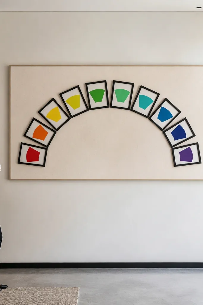
This layout turns color theory into a wall you can see. When you place colors around a curve, Colorful Gallery Wall Ideas feel like a system, not a random mix. Use 12 small frames and assign each one a slice of the spectrum so the wall reads like a rotating rainbow. Keep the frames identical so the color wheel is the star, and use a consistent background tone inside each print. It’s a bold look that works in entryways, playrooms, and creative spaces where you want the wall to feel like a feature.
Pick 12 small frames with the same outer size, like 6x8 or 7x9. Create a paper template circle on the wall with a radius that fits your wall space, then tape each frame position along the circle. Keep gaps at about 1.5 to 2 inches so the wheel looks continuous. Hang one frame at the very top, then work clockwise, checking that the circle looks even from standing height.
Editor's noteIf your prints don’t cover all hues, add simple colored overlays with marker on white paper and frame them as-is.
Skip thisAvoid huge gaps — the wheel breaks and turns into a scattered cluster.
11. Statement Lettering Frames With One Accent Color
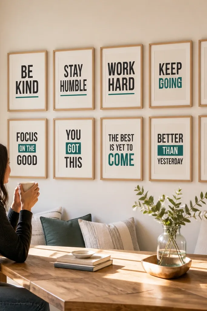
Lettering prints make joy feel direct. This layout uses one accent color inside the artwork — like coral, teal, or sunflower yellow — while everything else stays light. That makes Colorful Gallery Wall Ideas look clean even when the phrases are different. Use 8-10 frames arranged in two staggered rows so it feels intentional but not rigid. It’s perfect for kitchens, home offices, and entryways where you want a little mood boost you can read.
Choose 8-10 prints with white or cream backgrounds and bold lettering in one accent color. Use matching frames and mats so the wall is uniform, then tape a two-row layout with 3-inch gaps between frames. Keep the height of the top row consistent, and center the cluster at eye level. Hang the biggest lettering print first, then place smaller ones so the accent color repeats every 1-2 frames.
Editor's noteUse a mat that matches the background tone in the prints so the lettering looks like it’s floating.
Skip thisAvoid mixing multiple accent colors; it kills the crisp, happy readability.
12. Color Block Posters in a DIY Oversized Grid
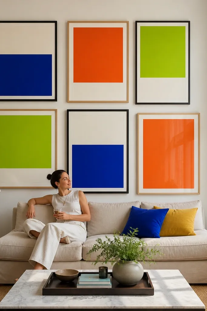
When you want maximum joy, go big. Oversized grid walls make Colorful Gallery Wall Ideas feel like a pop-art moment without needing fancy art skills. Use color block posters or simple graphic prints with strong shapes. Mismatched frames are fine if they share the same finish family, like all black or all natural wood. This layout is great for long living room walls and for covering a whole section of blank space in one go.
Pick 6-12 poster frames, aiming for two dominant sizes like 18x24 and 16x20. Tape a large rectangle outline and keep 3 inches between frame edges so the colors breathe. If your frames differ in size, align the left edges first, then adjust spacing on the right to keep the rectangle looking even. Hang starting from the center and work outward, checking level row by row.
Editor's noteChoose posters with flat color backgrounds so the wall looks crisp under lamps at night.
Skip thisDon’t choose posters with thin lines — they disappear when the wall is large.
13. Mixed Frame Heights With a Single Color Thread
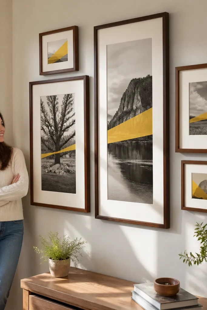
This is a clever way to unify Colorful Gallery Wall Ideas when your pieces are different sizes and styles. The “single color thread” is a repeated stripe or dominant tone that appears across multiple prints. You arrange frames in mixed heights, but you keep that color thread aligned vertically or diagonally. The result looks curated without requiring the same artwork in every frame. It works in hallways and staircases where you want movement but still need cohesion.
Choose 10-14 frames with artwork that includes a visible repeated color stripe or block. Tape your layout and decide on a thread direction — vertical alignment or a slight diagonal. Keep frame gaps around 2.5 inches, then adjust individual placement so the stripe lines up across at least 5 frames. Hang by starting with the frame that contains the clearest stripe, then place the remaining frames relative to that anchor.
Editor's noteUse a laser level app if you have one, or keep it simple with a long ruler and tape marks for stripe alignment.
Skip thisAvoid trying to align two different colors at once — pick one thread.
14. Gallery Wall Over Wallpaper Accent Panels
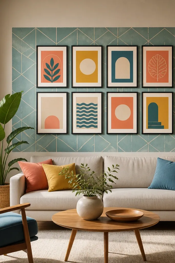
This makes your colorful gallery wall feel like part of a bigger design moment. Instead of relying only on the frames, you create a colorful backdrop with a removable wallpaper panel or a painted rectangle. Then hang your frames so they pop against the background. The backdrop also helps messy mismatched artwork look intentional because the wall has its own color rhythm. It’s a strong option for renters because you can remove the panel and keep the frames.
Choose a removable wallpaper design with large shapes or a solid color field, then cut it to fit the wall section you want. Hang or tape the wallpaper panel flat, then arrange 6-9 frames on top with 2.5 to 3 inch gaps. Keep the frames in one finish family and use mats in a light tone so the wallpaper stays the star. Mark holes through the frame mounting points, remove a frame, install anchors if needed, then hang everything back in place.
If your wallpaper is busy, pick artwork with simpler backgrounds so the wall doesn’t compete.
Don’t use glossy wallpaper under bright bulbs — glare makes the frames look dull.
15. Colorful Frame Ledge Look With Shelf + Leaners
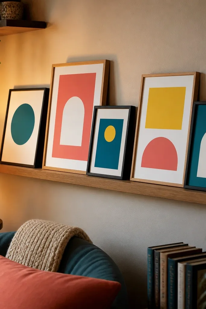
This is for people who like joy but hate committing to a fixed layout forever. A shelf with frames leaned against it creates colorful gallery wall ideas that look styled and casual at the same time. The frames don’t all need perfect spacing because the shelf acts like a baseline. It’s also easier to swap art seasonally, which keeps the wall feeling fresh. Use lightweight frames and keep the color palette consistent — repeat two or three colors across the leaning group.
Install a narrow wall shelf with a level and anchors rated for the shelf weight. Choose frames that lean securely; add small felt pads to the back corners so they don’t scratch the shelf. Arrange frames in a layered stack, keeping the front row about 1 inch in front of the back row so it looks dimensional. If you want it extra clean, use a strip of painter’s tape as a guide line for the bottom edge of the frames.
Editor's noteUse picture ledge brackets that sit flush so the shelf line stays straight and the colors look intentional.
Skip thisDon’t overload the shelf — too many frames makes it look like a pile.
16. Oversized Circular Frames With Rainbow Center
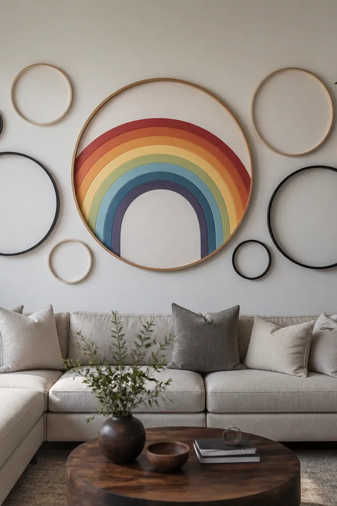
Circles add instant softness to Colorful Gallery Wall Ideas, which usually rely on rectangles. This layout uses one rainbow center art piece with two or three larger circular frames around it, creating a halo effect. It looks great in modern homes because the shape breaks the typical grid. Keep frame finishes consistent and choose artwork that has curved color elements or a strong circular composition. It’s a fun way to bring joy without filling every inch of wall space.
Pick one central artwork around 16x20 or 18x24 with a clear rainbow or multi-color block pattern. Add two or three circular frames around it with consistent outer diameter, like 14-inch and 16-inch circles. Tape the circle positions first so the spacing between frames stays even at about 3 inches. Hang the center piece, then mount the circular frames using proper anchors so they sit perfectly level.
Choose circular frames with a flat front edge; bevel edges cast shadows that can dull the colors.
Avoid mixing circle sizes too much or the halo looks lopsided.
17. Frame Within a Frame Using a Colored Mat Border
If your art is colorful but the frames feel plain, this layout fixes it fast. A colored mat border creates a frame-within-a-frame look that makes Colorful Gallery Wall Ideas look designed even when the prints are simple. You keep the artwork consistent in size, then vary the border color across frames. It’s also easy DIY because you can cut mat board and reuse it across multiple frames. This looks especially good in a row above a dresser or along a hallway that needs a bright line.
Use frames with removable mats or buy frames that accept custom mat board. Cut a second mat border layer so you create a thick colored ring around the artwork, like 1.25 to 1.5 inches. Choose 3-4 border colors and repeat them across 6-8 frames so it doesn’t look random. Tape the layout first with 2.5 to 3 inch gaps, then hang using the same center height for every frame.
Editor's noteUse a color wheel approach: pick border colors that sit next to each other (yellow to orange to coral) so the wall looks like one story.
Skip thisAvoid thin mat borders; they don’t create the frame-within-frame effect.
18. Colorful Botanical Prints in a Vertical S-Curve Layout
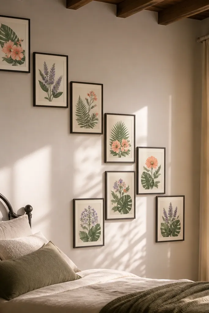
Botanical prints look joyful when you stack them in a curved path. The vertical S-curve layout creates motion, so Colorful Gallery Wall Ideas feel alive instead of static. Pick botanical prints with consistent line weight and use colors like green, coral, and soft purple for a cohesive palette. Mat them in cream or off-white so the colors don’t fight your wall color. This works well in living rooms, bathrooms with good light, and any wall where you want calm joy rather than loud blocks.
Choose 9 frames in similar sizes, like 10x13 or 11x14, so the S-curve stays smooth. Tape a gentle S-shaped guide on the wall, then place frames so their centers follow that curve. Keep gaps around 2.5 inches between frames, and ensure the top and bottom frames sit at a consistent height range. Hang starting with the middle frame at eye level, then work upward and downward along the curve.
Editor's noteIf your botanical prints vary in background color, add a uniform mat to force consistency.
Skip thisAvoid mixing watercolor-heavy prints with flat graphic prints unless you keep mat width identical.
19. High-Contrast Color Blocks With White Frames Only
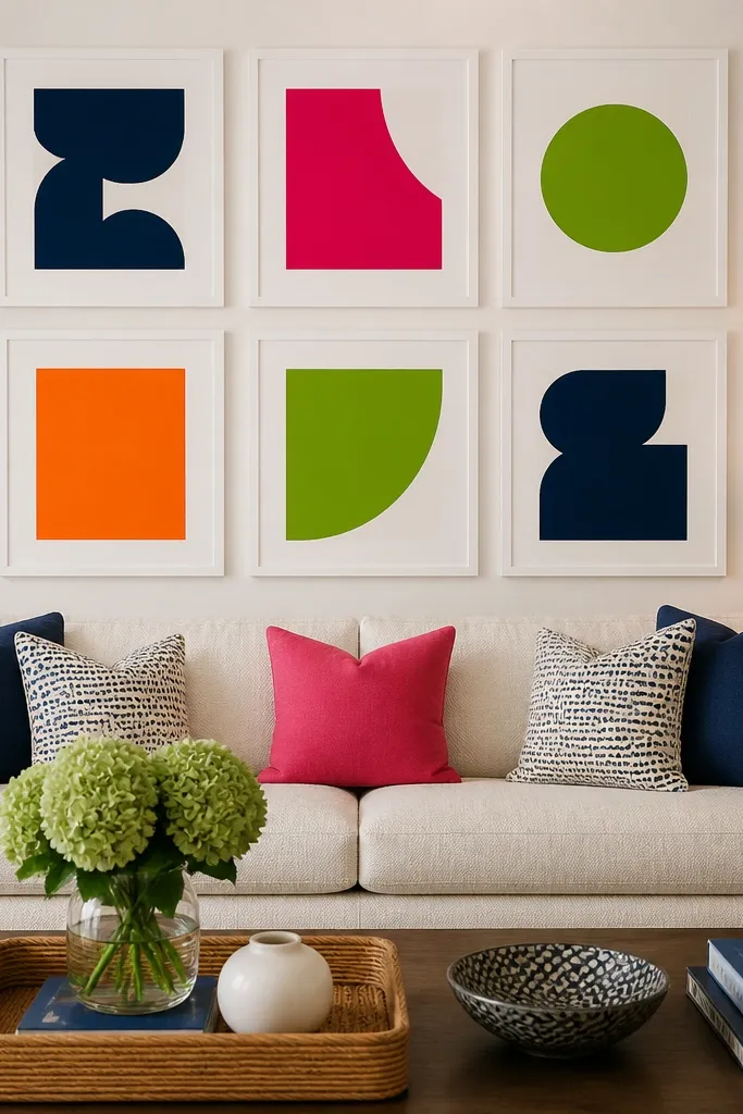
White frames make colorful art look sharper and cleaner, especially in rooms with warm lighting. This layout focuses on high-contrast Colorful Gallery Wall Ideas where the artwork has bold color blocks and simple shapes. When every frame is white, the wall reads as one design unit even if the art changes. It’s ideal for kitchens, entryways, and kids' rooms where you want the joy to look crisp and easy to maintain. Keep the mat strategy simple: either no mats with thick art or thin mats in white to keep edges consistent.
Choose 10-12 white frames in one style, and keep the outer sizes within a narrow range like 10x13, 11x14, and 12x16. Tape a collage layout on the wall with 3 inches gaps so the white frames act like separators. Place artwork in a color sequence — for example, group warm colors on one side and cool colors on the other — then adjust until the wall feels balanced. Hang the biggest frame first, then lock in the rest by measuring from the center line of the wall.
Use thick paper or canvas prints so the color blocks don’t look flat under indoor light.
Avoid thin frames that flex — they can warp and make the wall look uneven.
20. Colorful Mixed Media Frames Using Fabric Swatches
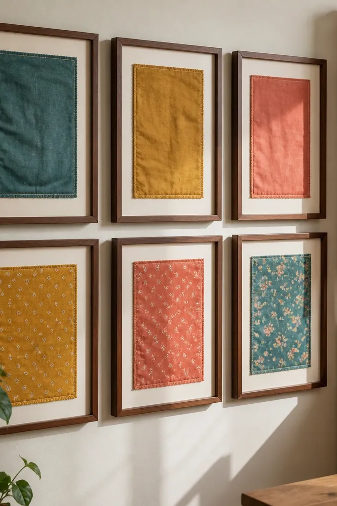
Fabric swatches in frames look handmade and fun, and they add texture that printed art can’t match. This layout turns Colorful Gallery Wall Ideas into something you can build from your own stash — quilting cotton, scrap fabric, or even ribbon-like material. You get color joy plus a tactile look that catches light. Use consistent matting and press the fabric flat so it doesn’t look wrinkled. This is a great choice for entryways and craft rooms where you want the wall to feel creative.
Buy frames that accept backing boards you can remove, and choose a consistent frame size like 8x10 or 11x14. Cut fabric swatches slightly larger than the mat opening, then press them flat and adhere only the edges with a fabric-safe adhesive or double-sided tape. Add a thin layer of acid-free paper behind the fabric so it stays smooth over time. Tape a 3x3 or 2x5 layout on the wall with 2.5-inch gaps, then hang using picture hangers rated for your frame weight.
Editor's noteWash and iron fabric first so the colors don’t shift and the swatches stay flat.
Skip thisAvoid fabric that frays at the edges unless you hem it or bind the perimeter.



