
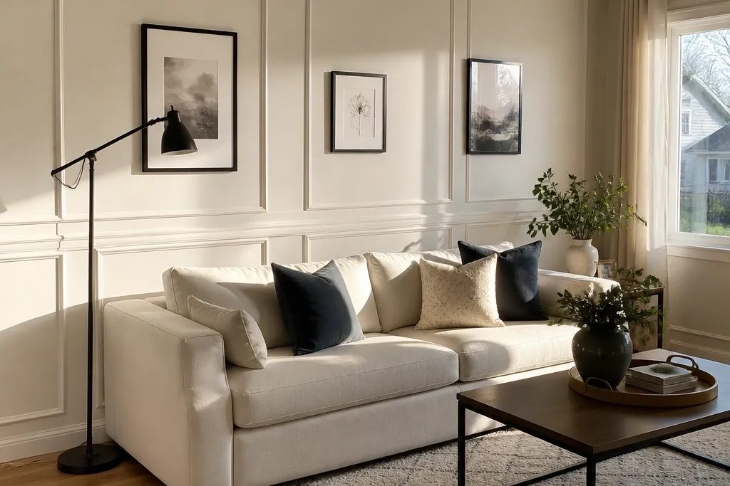
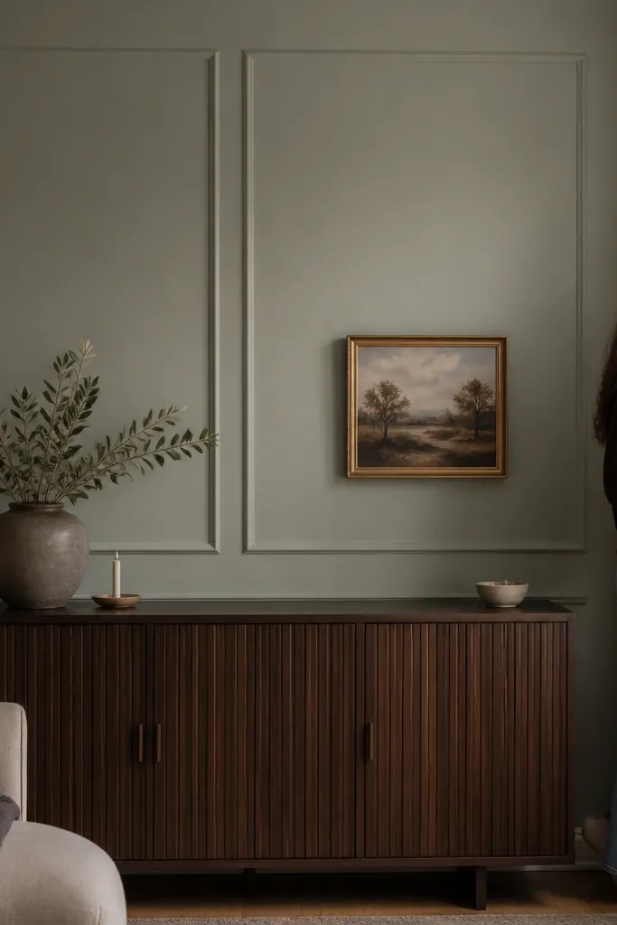
1. Tall Picture-Frame Panels Around the TV Wall
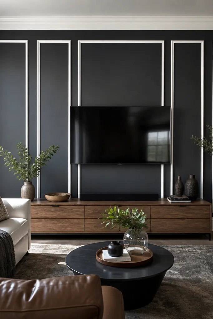
This look is the fastest way to make a TV wall feel intentional instead of “just mounted.” The tall vertical rectangles pull the eye upward, which helps living rooms feel taller even if your ceiling is standard height. It also hides small wall flaws because you’re building a structured frame grid that draws attention to the design, not the patchwork. Use a bright white moulding with a slightly deeper wall color for the shadow to show. This is beginner-friendly because the layout is simple and forgiving if you measure from one straight line.
Start by finding a level reference line under the TV area, then mark the outer border of the frame grid. Cut four border pieces first, then add vertical rails to create 2-3 tall rectangles; keep the spacing consistent (for example, 10-14 cm gaps). Install with a brad nailer or construction adhesive plus nails, then fill gaps with paintable caulk. Finally, pre-prime, caulk all seams, and paint the moulding and wall in two separate coats so the edges stay sharp.
Editor's noteDry-fit the rectangle layout on the wall with painter’s tape before you cut anything.
Skip thisDon’t rely on “eyeballing” vertical spacing — one crooked rail makes the whole wall look off.
2. Simple Rectangle Grid for a Feature Wall
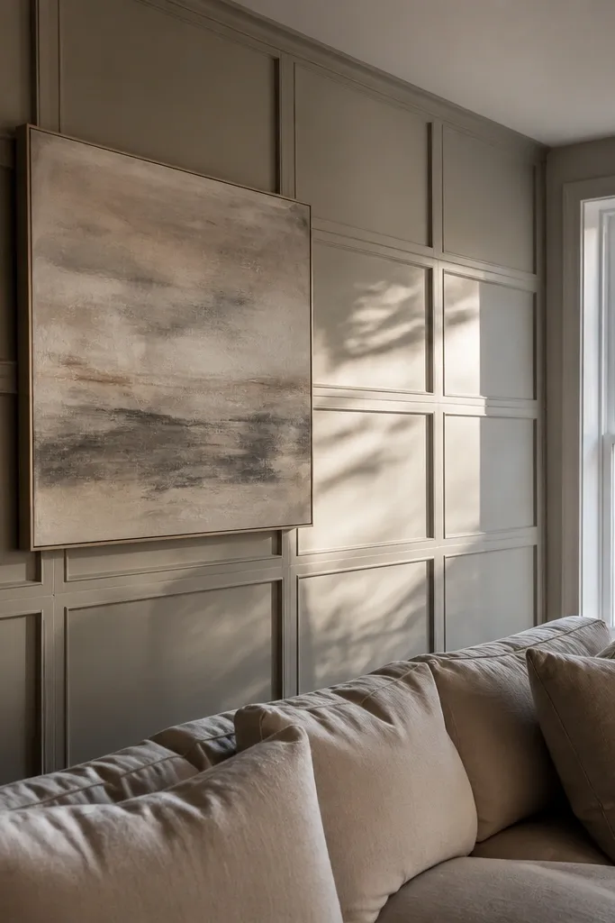
A rectangle grid makes the wall look designed, even in small living rooms where you can’t add much furniture. The pattern is photogenic because the repeated shadows create depth without needing wallpaper. This option works well behind a sofa, across from a window, or on a wall that already has art. Keep the grid clean and not too busy — a few big rectangles look better than lots of tiny ones. If your wall has uneven texture, the moulding’s shadow lines distract the eye in a good way.
Mark the grid start point using a laser level, then decide on 3-5 rectangles across the wall height. Cut long horizontal rails first, then cut vertical dividers to match your spacing. Nail the moulding into studs if you can; if not, use adhesive and add nails along the length. Caulk the seams, sand any raised caulk edges lightly, then prime and paint in eggshell to keep the shadows crisp.
Use the same moulding orientation for every piece so the profile shadow lands in the same direction.
Avoid mixing moulding widths inside the same grid — it makes the wall read messy.
3. Wainscot-Style Chair Rail That Goes Higher
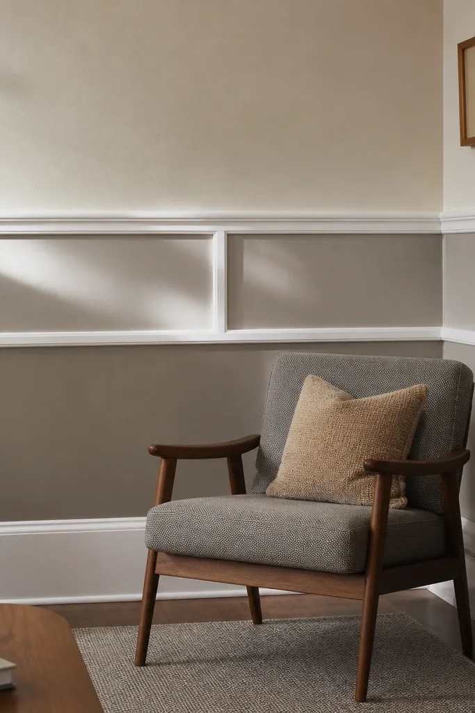
Traditional chair rail looks instantly homey, but pushing it higher gives you a cleaner, more modern “panel wall” effect. This is great if you want structure but don’t want a full grid. The moulding breaks up visual monotony and makes the wall feel finished, especially behind a sofa or dining area. Choose a moulding profile with a defined bevel so there’s a visible shadow line. Paint the top and bottom in two coordinated tones to make the panels pop.
Start by deciding the chair-rail height line, then mark a straight level line across the wall. Install a horizontal chair rail, then add vertical or square panel frames below it using shorter lengths. Keep the panel height balanced — for a living room, a 45-60 cm panel height usually looks right. Prime, caulk seams, then paint the moulding and wall sections separately so edges stay crisp.
Editor's noteIf you have baseboards, align the panel bottom edge visually with the top of the baseboard for a cleaner read.
Skip thisDon’t skip caulking the top edge of the chair rail — that line shows every imperfection.
4. Horizontal Shiplap-Look Moulding Lines
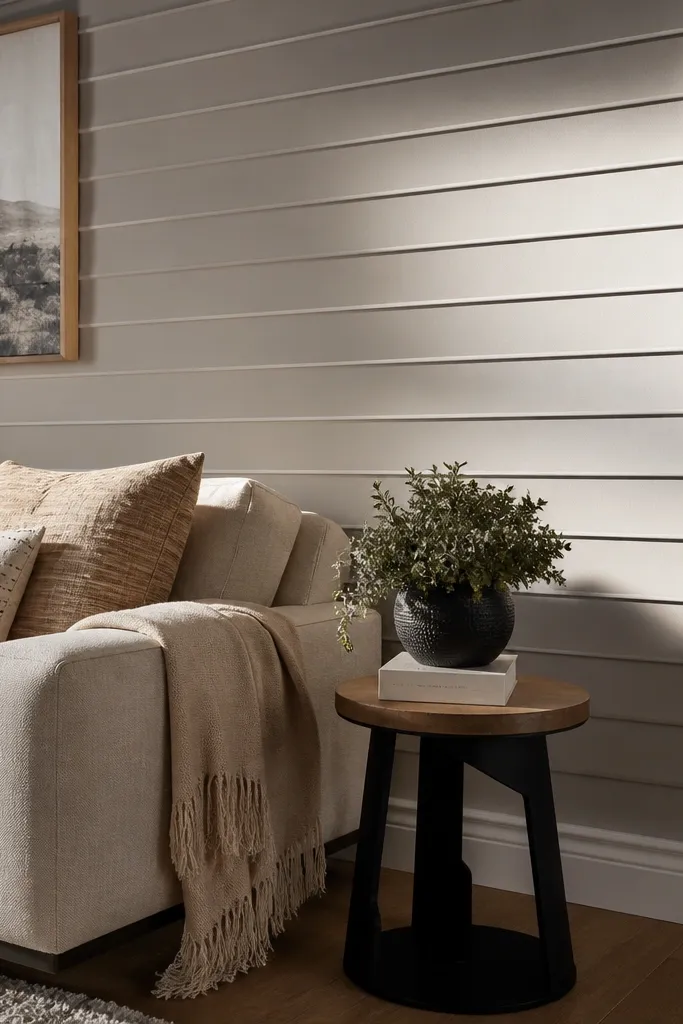
This gives you the texture vibe of shiplap without the work of installing actual boards. The trick is using thin moulding strips with consistent spacing so you get repeating highlights and shadows. It’s good for modern or farmhouse mixes, and it photographs really well because the light catches each groove. Keep the lines straight and evenly spaced — that’s where the “expensive” look comes from. This idea is ideal for living rooms where you want texture but still want the wall to feel light.
Measure your wall height and pick a strip width and spacing that fit neatly, like 2.5 cm strips with 1.5-2 cm gaps. Mark a level first line, then install the first strip, check level, and continue upward. Use a spacer block (a scrap piece cut to your gap size) so every gap stays identical. After installation, fill small nail holes, caulk along the edges, sand lightly, prime, and paint with a satin finish for better shadow definition.
Editor's noteUse a speed square to keep strip ends perfectly perpendicular at corners.
Skip thisDon’t choose random spacing — uneven gaps make the wall read cheap fast.
5. Oversized Corner Frames for Instant Drama
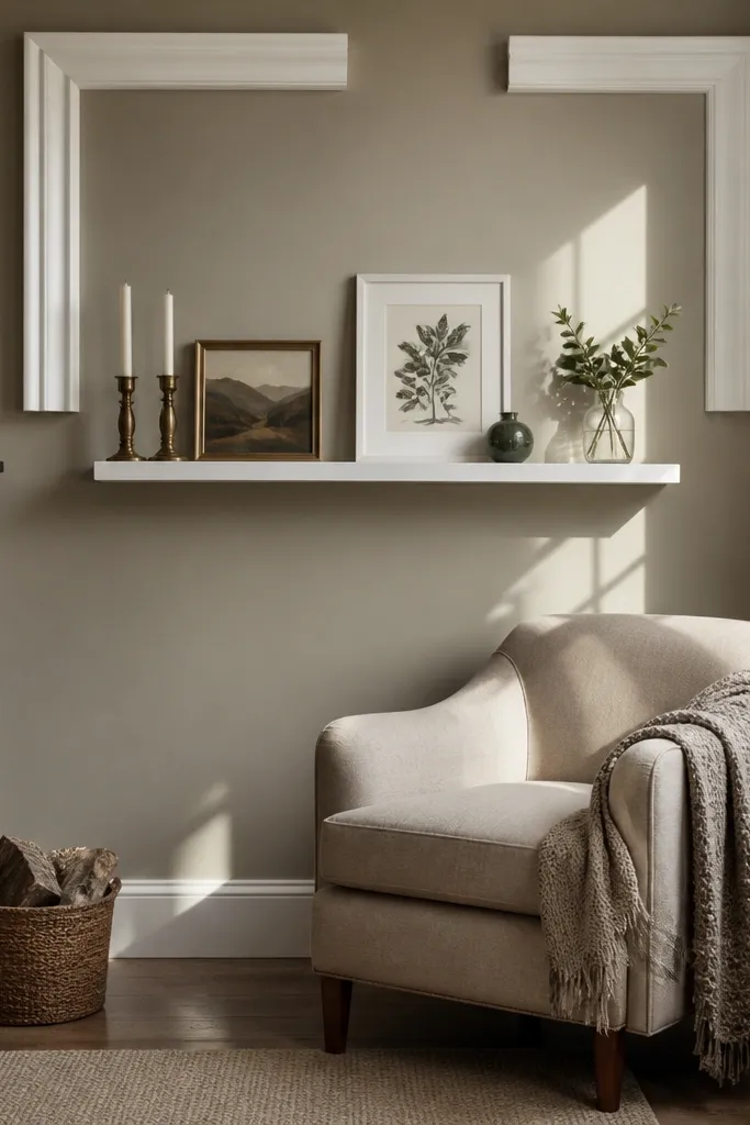
If you want moulding that looks like a design magazine but stays easy, oversized corner frames do it. You put big L-shaped corner borders near a focal point and let the negative space do the rest. This works especially well around an accent chair wall, a reading nook, or beside a fireplace. The shadows look dramatic even with simple white paint on a warm wall color. It also hides wall imperfections near corners because the frame shape draws the eye.
Pick two corners or one corner next to your focal point, then mark an outer frame boundary using a level and tape measure. Cut four long border pieces per corner frame (two per side) so they meet at the corner with clean miters or butt joints with caulk. Install the outer border first, then add an inner border line parallel to it if you want a double-frame look. Caulk seams, prime, and paint in two coats, paying extra attention to where the inner border meets the outer line.
Editor's noteFor corners that are slightly off-square, use butt joints on the corner and let caulk hide the tiny mismatch.
Skip thisAvoid tiny frames — small corner details vanish at normal viewing distance.
6. Arched Panel Frames Using Flexible MDF Strip
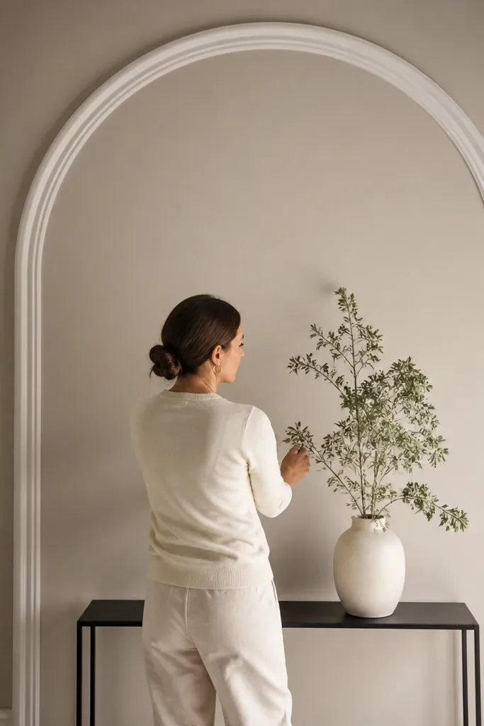
Arched moulding reads soft and expensive, and it breaks up the hard angles of most living rooms. You get a focal shape without installing a whole wall feature. This idea looks best above a console, behind a curved-back chair, or in a wall zone that needs “one pretty moment.” Use flexible MDF or thin wood strips so the arch stays smooth. Keep the rest of the wall simple so the arch carries the look.
Start by drawing the arch on painter’s tape at your chosen height, using a string compass or a pre-made template. Cut a top arch piece from flexible MDF, then add side uprights and a bottom rail so the panel looks framed, not like a single curve. Fix the arch to the wall with adhesive plus a few brads, then fill seams and sand any raised spots. Prime the entire moulding, caulk the perimeter, and paint in eggshell for a clean shadow edge.
Editor's noteUse a laser to keep the arch centerline consistent with the rest of your wall features.
Skip thisDon’t use thick rigid boards for the arch — you’ll fight warping and uneven curves.
7. French-Style Vertical Panels with Center Dividers
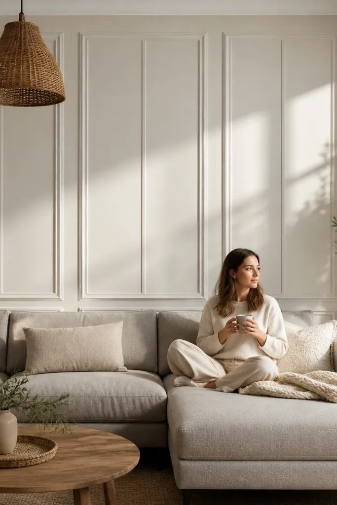
This is a classic moulding look, updated for living rooms by keeping the panels tall and the details simple. The vertical rails elongate the wall, and the center divider adds structure without making the wall feel busy. It’s a good fit for homes with neutral décor, where you want texture and shape but not loud color. Choose a moulding profile with a slight bevel so the shadows show even after painting. This also works well on walls with a doorway nearby because the panel logic feels intentional.
Mark a centerline on the wall and decide how many vertical panels you want on each side. Install the two outer vertical rails first, then add the inner dividers to create tall rectangles or columns. Use spacers to keep consistent gaps between rails, and check alignment at eye level. Caulk seams, fill nail holes, prime, and paint with a satin or eggshell finish so the bevel shadow stays visible.
Editor's noteKeep the panel widths consistent — symmetry is what makes this style look polished.
Skip thisDon’t make panel gaps different widths — it kills the French feel quickly.
8. Floating Shelf Moulding Frames (No Real Shelves)
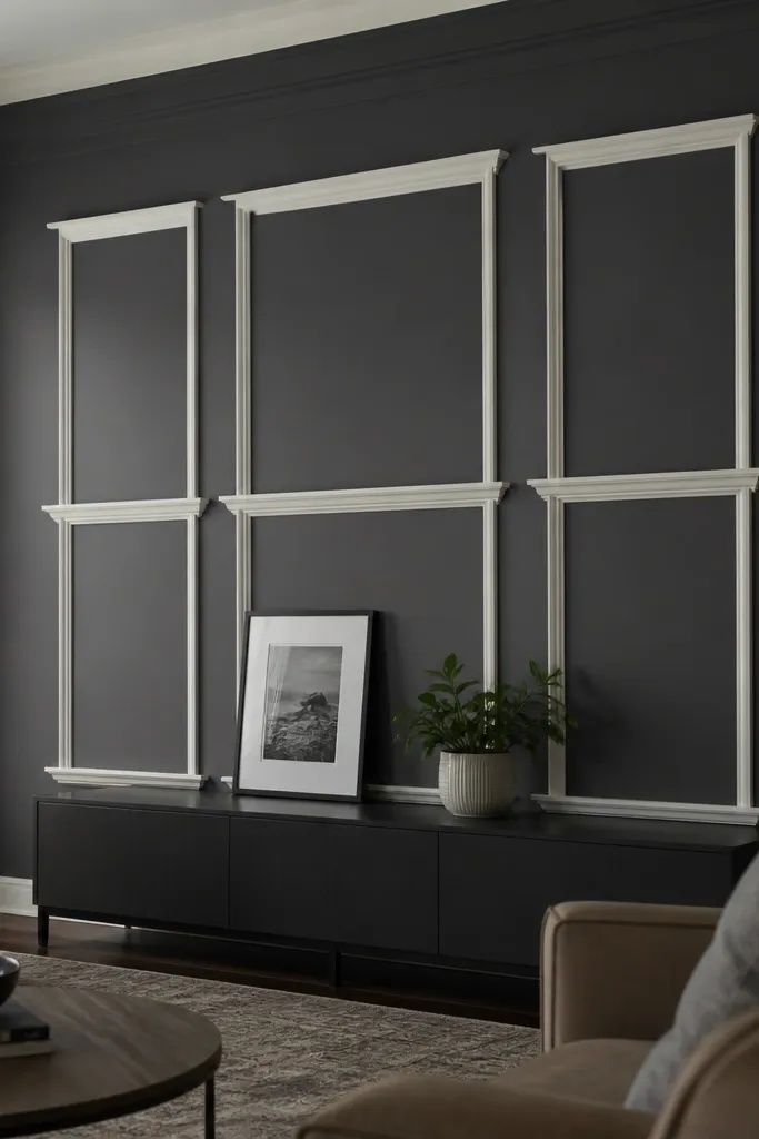
You get the “built-in” vibe without actually installing heavy shelves. The design uses moulding ledges and vertical sides to create the illusion of floating compartments. It looks great in modern living rooms where you want a clean, architectural wall but don’t want clutter. Pick a darker wall color and paint the moulding bright white for a strong shadow effect. This is also a clever way to add visual storage zones for art, even if you’re not putting anything on the wall.
Start by mapping out 4-6 compartments across the wall with painter’s tape. Cut vertical side pieces and a horizontal “ledge” piece for each compartment, keeping the ledge height consistent. Install the vertical sides first, then attach the ledge moulding on top, using a level so each ledge is flat. Fill nail holes and seam gaps with caulk, prime, then paint moulding and wall in separate coats for sharp edges.
Editor's noteUse a thin caulk line at the top of each ledge so the shadow gap stays clean.
Skip thisAvoid making compartments too shallow — they stop reading as frames from the sofa.
9. Single Vertical Feature Strip with Cross Bars
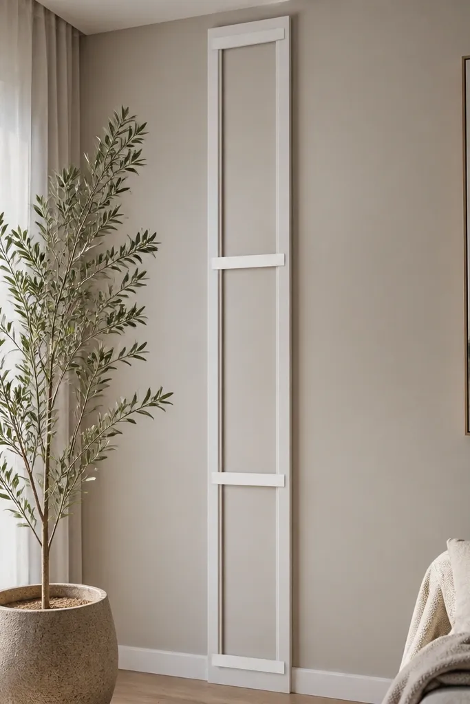
This is the low-effort, high-impact option when you don’t want a full wall grid. A single vertical strip creates a focal line, and two or three cross bars give it a finished, architectural look. It’s perfect beside a window, near a fireplace surround, or behind a tall plant. Keep the moulding profile bold enough to cast a shadow. The rest of the wall stays untouched, so the design looks intentional rather than “trim overload.”
Mark the feature strip location with a level, then install the main vertical moulding first. Measure and mark cross bar positions, then cut and install the horizontal pieces, keeping the spacing consistent. Use a scrap spacer to set the gap between the cross bars and the vertical strip so it looks even. Caulk all seams, prime, and paint in two coats, keeping paint edges crisp around the moulding.
Editor's noteIf your wall is slightly wavy, shim behind the moulding before nailing so the cross bars don’t wobble.
Skip thisDon’t place cross bars at random heights — uneven spacing makes it look accidental.
10. Layered Frame Inside a Larger Border
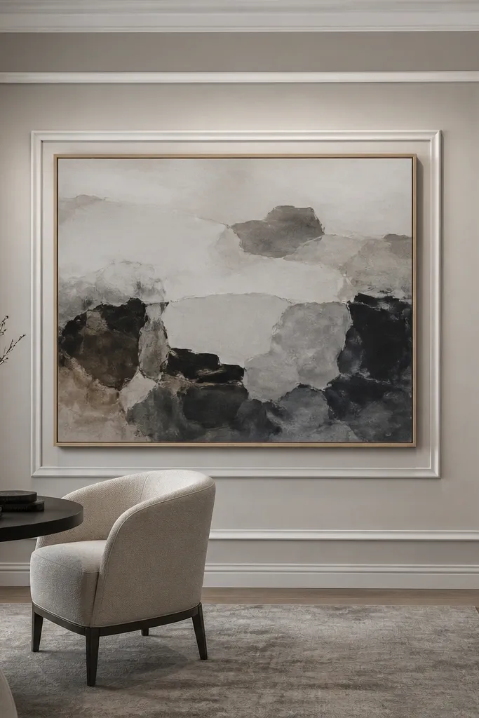
Nested frames look expensive because they create multiple shadow layers. You get depth without complicated shapes, and it works great behind a big piece of art or a blank wall you want to anchor. The inner frame pulls attention toward the center; the outer border makes the whole area feel “designed.” This is a strong choice if your living room has one big focal point and you want the wall to echo it. Keep the moulding width consistent and the inner-to-outer gap clean.
Choose your outer rectangle size first, then decide the inner rectangle dimensions by subtracting equal margins on all sides. Cut and install the outer border pieces, then install the inner border so it’s perfectly centered. Use a spacer or measuring jig to keep the gap between frames consistent, like 3-5 cm. Fill seams with caulk, prime, and paint with at least two coats so the profile edges stay sharp.
Use painter’s tape to mask the inner frame edge before caulking. It keeps the caulk line thin and neat.
Don’t let the inner frame touch the outer frame with uneven gaps — the nested look depends on a uniform shadow line.
11. Chevron Moulding Accent in One Corner
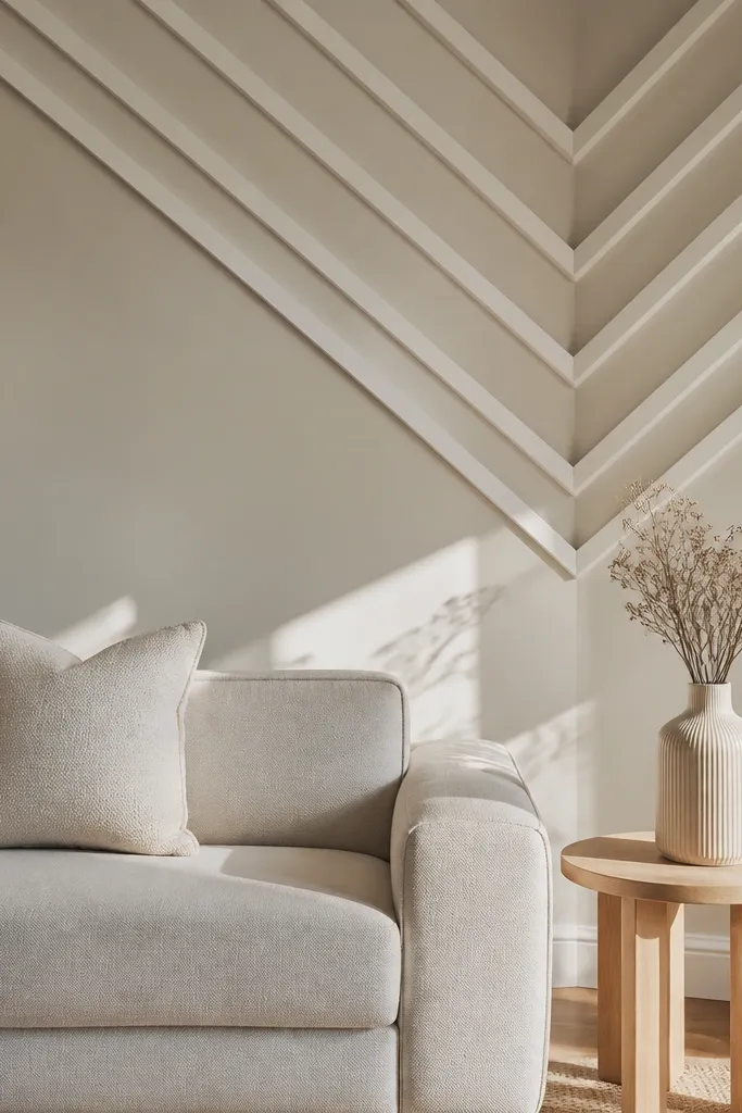
Chevron is bold, and one corner accent is enough to make the whole living room feel styled. You’re using moulding strips cut at angles to create a repeating V pattern that catches light. This works best with a neutral wall and simple décor so the pattern stays the star. It’s also easier than full-wall chevron because you limit the cutting to a smaller zone. Pick a wall color that makes the shadows show, like warm greige or light greystone.
Mark the chevron centerline, then decide your strip width and the angle. Cut a set of left and right pieces with consistent angles, dry-fit with painter’s tape, then install starting from the center and working outward. Use a spacer jig for the gap between strips so the V lines stay crisp. Caulk seams, prime, and paint in satin for stronger light reflection off the edges.
Label your left and right pieces before you start — it prevents flipping mistakes mid-install.
Avoid large chevrons on a small wall section — you’ll end up with distorted angles at the edges.
12. Grid + Diagonal Brace for a Geometric Look
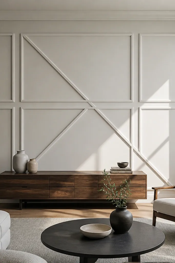
This is the moulding idea that looks custom without needing custom millwork. A simple rectangle grid gets you structure, and adding a diagonal brace adds movement and makes the wall feel designed. It’s especially good for modern living rooms where you want geometry rather than traditional paneling. Choose a wall section behind a sofa or console so the pattern is visible from multiple angles. Keep the diagonal pattern consistent across panels so it reads as intentional.
Start with a rectangle grid: install horizontals and verticals to create 2-4 main squares or tall rectangles. Then cut diagonal braces that connect the corners of each panel, using a miter saw set to the correct angle for your moulding thickness. Dry-fit each diagonal piece to confirm the ends land cleanly, then install. Caulk the seams, fill nail holes, prime, and paint with eggshell so the geometry stays crisp.
Editor's noteUse the same moulding piece for measuring diagonals — it keeps angles consistent across the wall.
Skip thisDon’t skip dry-fit — one diagonal that’s 2-3 mm off throws off the whole geometric rhythm.
13. Ceiling-to-Floor Vertical Strips for Height
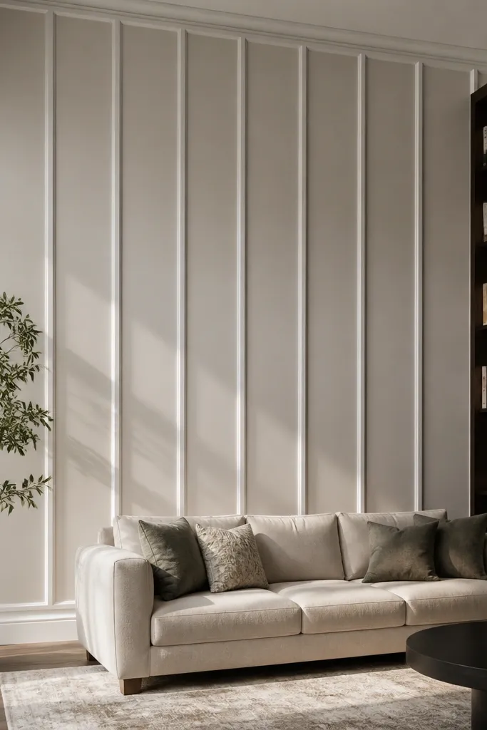
If your living room feels low, vertical strips are the cleanest fix. The eye travels up and down the lines, which makes the wall feel taller without changing ceilings or lighting. Keep the design minimal: evenly spaced vertical strips with a shadow gap and a simple border at the top and bottom if you want it finished. This idea looks great in narrow living rooms because it doesn’t eat visual space. The key is spacing and straightness.
Measure wall height and decide how many vertical strips fit evenly with consistent gaps. Mark a top border line level, then install vertical strips down to a bottom border line aligned with your baseboard top. Use a laser level to ensure each strip is straight, then nail or adhesive them into studs where possible. Caulk edges, sand lightly, prime, and paint with satin so the shadows show cleanly from across the room.
Editor's noteSet a consistent gap using a scrap spacer cut to the exact measurement you want.
Skip thisAvoid thick, heavy moulding if your room is already crowded with furniture — it can feel visually heavy.
14. Picture Rail Style for Small Living Rooms
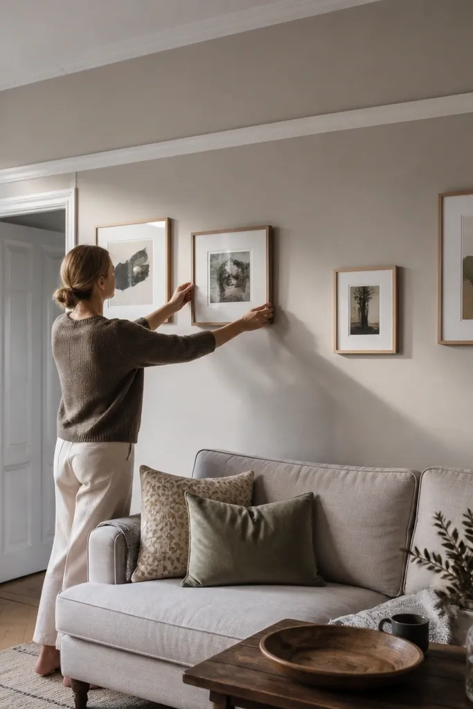
Picture rail moulding gives you a tidy, gallery-wall feel without taking over the entire wall. It’s ideal for small living rooms where you don’t want a big grid, but you still want the wall to look finished. The rail adds a horizontal anchor line, and you can add tiny frames beneath it for interest. This is also a good choice if you plan to hang art later because the design already feels “frame-friendly.” Keep the profile slim and crisp so it doesn’t overwhelm the room.
Install a single horizontal picture rail at a height that lines up with your art plan, then add one or two small frame boxes below using simple rectangular moulding. Keep the frame sizes consistent so the wall looks intentional. Use a level for the rail, then use a tape measure to repeat the same offsets for each small frame. Prime and paint the rail and frames in eggshell, and caulk the edges where moulding meets the wall.
Editor's noteIf you’re hanging art, plan frame openings around your future picture sizes so you don’t have to redo the spacing.
Skip thisDon’t place the rail too high — it can make the room feel chopped up.
15. Square Panel Farmhouse Wall with Thick MDF Trim
This look leans farmhouse without feeling dated because it uses clean squares and thicker trim for stronger shadows. Thick MDF trim makes the wall read from far away, so the moulding doesn’t get lost in the background. It’s great behind a couch where you want warmth and texture, and it also hides minor wall imperfections. Pair it with a soft warm wall color so the white panels feel grounded, not stark. This is a good weekend project for people who want a real transformation.
Choose thick moulding strips and decide your panel sizes, like 30-45 cm squares for a typical living room wall. Mark a grid on the wall, install the outer border, then install horizontals and verticals to form the squares. Use adhesive plus nails for better holding power, especially on MDF. Fill nail holes and seams, sand lightly, prime, then paint with a durable trim paint finish.
Cut a few extra spacer blocks so every square gap comes out identical even if you’re tired halfway through.
Avoid thin trim on large squares — the shadows get too faint and the wall loses impact.
16. Half-Arch Over Doorway or Window Wall Niche
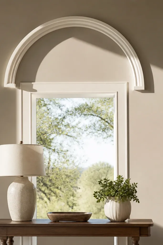
Half-arch moulding is a small move that makes a wall feel styled, especially near a doorway or window. You get a soft architectural curve that breaks up the rectangle shapes common in living rooms. This works well on the wall section above a mantel, between windows, or over a built-in niche. Keep the rest of the moulding minimal so the curve remains the star. The visual payoff comes fast because the arch frames the wall area you already notice.
Measure the width of the window or doorway area you want to frame, then pick an arch height that looks balanced, like 15-25 cm above the top line. Mark the base line and the arch endpoints, then cut an arched top piece using a template. Install the side uprights if you want a full framed look, then attach the arch top. Caulk the perimeter, prime, and paint so the arch edge looks crisp.
Use a flexible strip for the arch top if your template requires a gentle curve — it reduces cracking risk.
Don’t make the arch too tall — it starts to look like a costume prop.
17. Moulding 'Ledge' Border for a Built-In Look
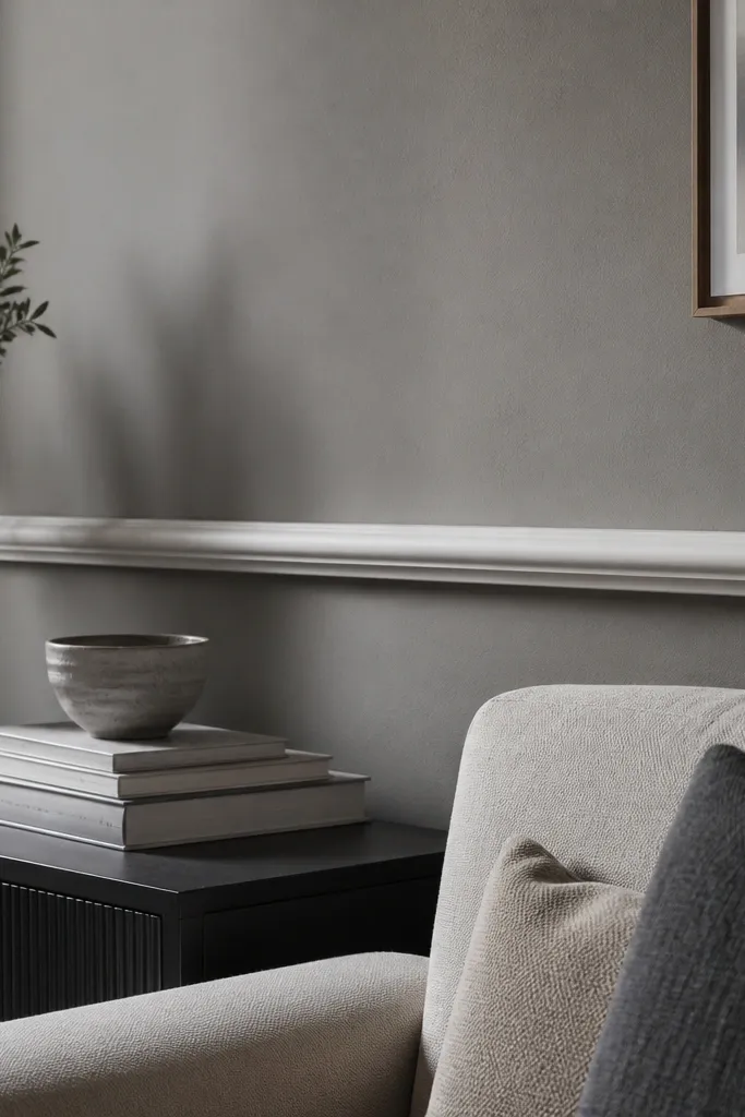
A ledge border gives you that built-in look without needing a full shelf system. The horizontal moulding ledge creates a shadow line that makes the wall feel deeper and more finished. Use it around the top of a wall area behind a sofa or above a console to anchor the space. This is also a good trick when your wall has awkward proportions because the ledge visually balances the area. Keep the ledge profile simple but pronounced so it casts a clear line of shadow.
Mark a straight horizontal line at the height you want the ledge border, and install the main ledge moulding first. Add vertical side pieces if you want a framed “box” effect, or keep it as a continuous border if the wall is long. Nail into studs where possible, then fill nail holes and seam gaps with caulk. Prime and paint in satin so the ledge shadow stays readable.
Editor's noteMask the top edge of the ledge before caulking so the caulk line stays thin and doesn’t smear into the shadow gap.
Skip thisAvoid a ledge that’s too small — it won’t cast a visible shadow from the seating area.
18. Stacked Trim 'Box' Sections for a Modern Accent
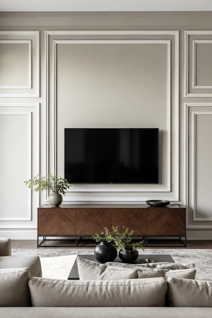
Stacked trim boxes look modern and crisp because you’re building depth with layers instead of complicated patterns. Each box reads as a clean, framed section, and the stepped edges create a gallery feel. This is a strong choice for living rooms with modern furniture and neutral walls where you want geometry without clutter. The look is especially photogenic when you use one wall color and paint moulding white so the layers separate. It also works well around outlets and switches since the boxes can be planned around them.
Plan your boxes by measuring the wall area and choosing box sizes that fit cleanly, like 20-30 cm wide sections. Install the largest outer box layer first, then add a smaller inner box layer with a consistent offset. Use a laser level to keep every layer aligned so the steps look straight. Caulk all seams, prime, and paint, then add a second coat to the moulding so the edges look solid and not translucent.
Editor's noteCut all inner offsets with the same measurement and label the pieces so you don’t mix layers.
Skip thisDon’t leave big gaps between layers — the stacked effect depends on a tight, even step.
19. Diagonal Corner Panel for a Soft Modern Twist
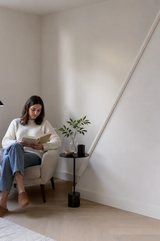
A diagonal corner panel adds movement without turning your whole wall into a full pattern. It’s a great way to make one corner look custom, especially if you have a reading chair, small console, or corner shelving nearby. The diagonal element creates a subtle dynamic line that looks good in photos because it catches light differently as you move. Keep the moulding colors simple: white trim against a warm wall tone makes the diagonal pop. This is also a good project when you want something different but still manageable.
Start by choosing the corner area and drawing a diagonal line from one corner edge to the other, with a margin so the panel doesn’t hit outlets. Install a rectangular border around the diagonal area, then cut two diagonal pieces that meet at the center line. Secure the diagonals with adhesive and a few nails, then caulk all edges so the lines look continuous. Prime and paint in eggshell for crisp contrast between moulding and wall.
Editor's noteMake a paper template for the diagonal lengths — it saves you from repeated test cuts.
Skip thisDon’t use a tiny diagonal panel — it needs enough size to read from across the room.
20. Oversized Rectangle Border with No Inner Grid
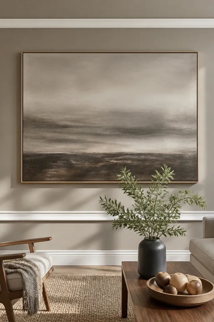
Sometimes you don’t need a grid. A large outer rectangle border creates a clean architectural frame that looks polished behind art, a mirror, or a focal wall. The simplicity is the point: it’s easy to measure, fast to install, and looks sharp in photos because the shape is bold. This works in living rooms with busy décor because it doesn’t add extra lines. Use a moulding profile with a visible bevel or step so the frame casts a shadow and doesn’t look flat.
Mark the outer rectangle dimensions first, then install the top, bottom, and side pieces with careful miters. Dry-fit the corners before nailing so the joints meet cleanly. If your corners are slightly off, butt joints with caulk can look better than forcing miters. Fill nail holes, caulk the entire perimeter, prime, and paint with two coats on the moulding for a crisp edge.
Editor's noteCheck the rectangle alignment from two angles — one slight rotation makes the frame look “off” instantly.
Skip thisAvoid narrow trim for big frames — it reads delicate and loses impact.



