
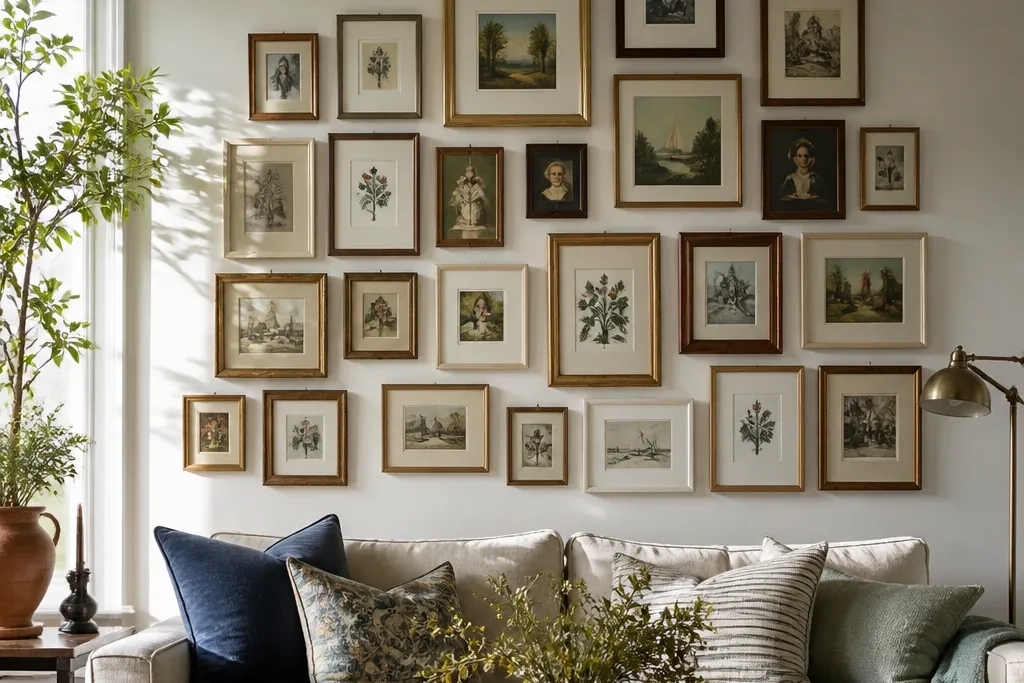
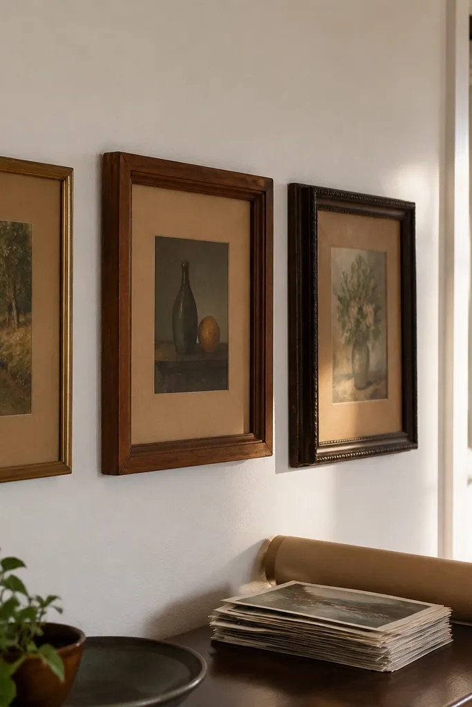
1. Off-White Frame Cluster With a Big Center Print
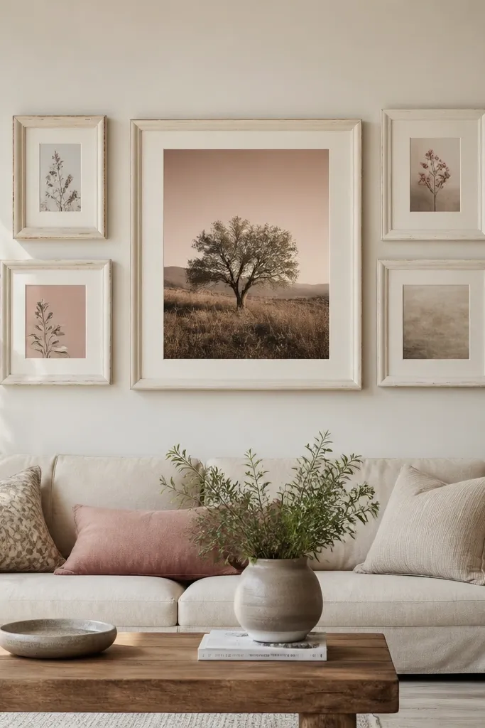
This layout works because one large center piece gives your eye a landing spot, then the smaller frames fill the space without competing. Use off-white frames to soften mixed art colors; thrift prints usually have random tones, and off-white keeps them from looking chaotic. The look reads polished from across the room because the center print controls the scale. It’s also forgiving: if your smaller prints are slightly different sizes, the group still looks intentional because the center is the reference point.
Start by picking one center print size, like 16x20 inches, and build the rest around it. Choose 4 smaller prints that are each 8x10 or 11x14, then keep their frame thickness the same as the center frame. Use painter’s tape on the wall to mark the outer edges of each frame, then set the spacing to 2 to 3 inches between frames. Hang the center first, level it, then hang the four around it using your tape lines as the guides.
Editor's noteMeasure frame edges, not the outer mat — mats hide small spacing mistakes, frame edges don’t.
Skip thisDon’t pick five random print sizes with no center anchor — that’s how you get a lopsided “pile.”
2. Gallery Grid in One Color Theme
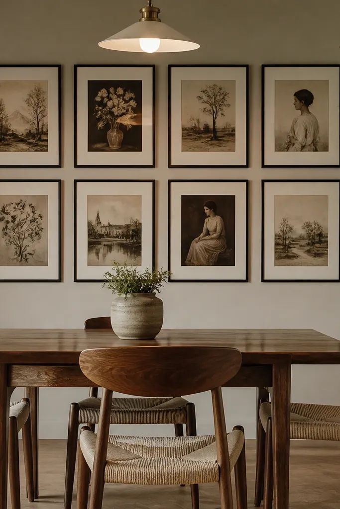
A simple grid is the easiest way to make mixed thrift art look like a designed gallery. When every frame has the same outer size, the wall reads clean even if the images vary. Choose a single color theme for the prints, like warm creams and muted browns or cool blues and grays, and you’ll get a calm, consistent look. This is a strong choice for hallways because it stays orderly at a glance.
Pick one frame size and repeat it nine times, like 11x14 frames, for a 3x3 grid. Print or buy nine images in the same color family, even if they’re different subjects. Mark a center point on the wall, then tape your grid boundaries first, keeping 2 inches between frames. Hang from the top middle down, using a level so the grid doesn’t drift over time.
Editor's noteUse the same mat color in every frame; it quietly ties the whole grid together.
Skip thisDon’t mix frame sizes in a grid — you’ll lose the crisp, structured look.
3. Horizontal Row of Tall Frames for a Long Wall
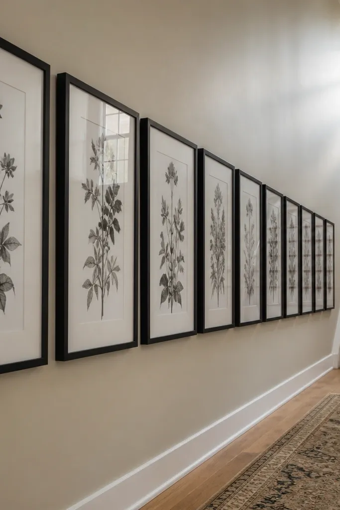
A horizontal row is a cheat code for rooms where the wall is long but narrow, like dining areas or stair landings. Tall frames make the wall feel taller without turning the space into a cluttered patchwork. Keep the images cohesive by using the same print style, like botanical prints, vintage maps, or black-and-white photos. This setup is photogenic because it creates a strong line that looks good in wide shots and from across the room.
Choose 5 to 7 frames that are the same size, like 8x20 or 10x24, depending on your wall length. Align the top edges so the row feels straight, even if the prints inside vary slightly. Tape the first and last frame positions, then fill in the middle with equal spacing — 2 to 3 inches works well. Hang the outer frames first, check the line with a level, then hang the rest.
Keep the row height consistent with furniture: aim for the center of the row about 57 to 60 inches from the floor.
Don’t let the frames “stagger” up and down — a row only looks intentional when it’s level.
4. Two-Story Look With a Split-Level Center
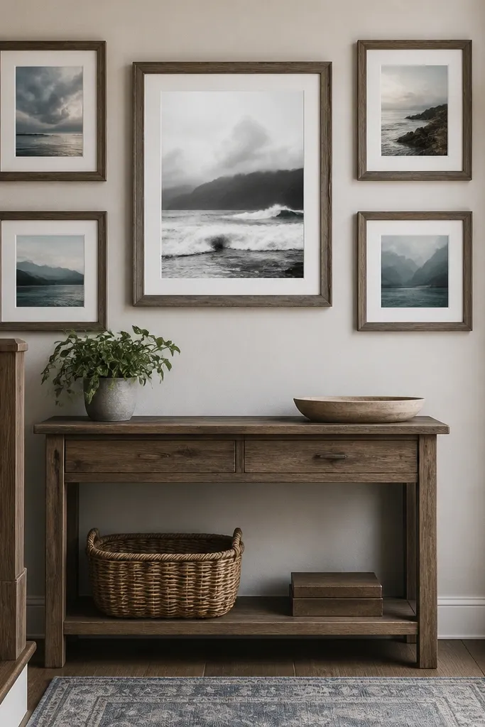
This is the layout to use when you want movement without chaos. The trick is a split-level center: one bigger frame sits slightly higher, while the surrounding frames form a calmer, lower ring. It looks artsy in photos because there’s a gentle diagonal energy, but it still reads organized. Choose one bold image for the higher frame — a black-and-white portrait, a graphic typography print, or a piece with high contrast.
Pick a larger center frame, like 16x20, and set it about 3 to 5 inches higher than the middle line of the other frames. Surround it with 4 to 6 smaller frames, all the same size such as 11x14, arranged in a loose oval or rectangle. Tape the wall to map the lower line first, then place the higher center frame and adjust spacing to 2 inches between frames. Hang the higher center frame first so you can build the rest off that reference.
Editor's noteUse the same frame finish on every frame, then vary only the print — it keeps the “artsy” look from turning into visual noise.
Skip thisDon’t raise the center more than 5 inches — too much height shift makes it look like a mistake.
5. Thrift Mat Mix With Matching Frames
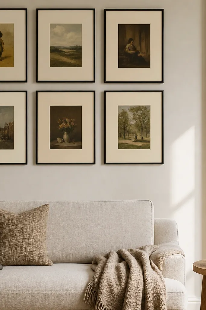
If you love thrift browsing, this layout makes the chaos work for you. Matching frames unify everything, while varied mat colors let each print feel special. Stick to mats that share the same undertone: warm whites, cream, and light beige. The result looks curated without buying a matching set of art. It’s also great for people who already own mismatched prints and want a plan to hang them.
Buy a set of identical frames, like 11x14 frames with the same frame width. For each print, choose a mat color that complements the dominant color in the image, but keep mat thickness consistent if possible. Arrange the frames in a staggered cluster with 1.5 to 2.5 inches between frames. Tape the layout first, then mount one frame at a time so you can adjust spacing while the tape is still on the wall.
Editor's noteIf your prints have different aspect ratios, trim only the image area, not the mat — the mat hides small size differences.
Skip thisDon’t mix frame finishes — thrift print variety is fine, mixed hardware finishes make it look sloppy.
6. Black Frames, White Paper Prints, and One Accent Color
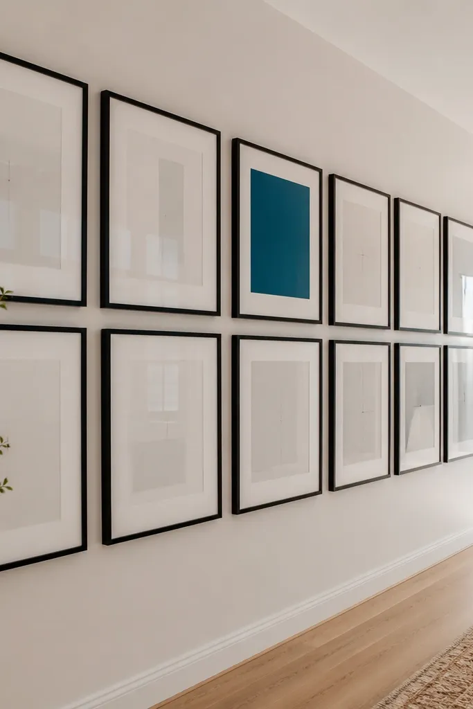
This is the clean, modern gallery wall look that photographs like a magazine spread. Black frames create a strong border, white paper prints keep the group bright, and one accent color print adds personality without fighting the rest. Choose one accent color you repeat at least twice, like terracotta or deep teal. The wall stays airy because the majority of the prints are light, and the black frames provide structure.
Use identical black frames, like 11x14 or 12x16 for each piece. Source prints on white backgrounds, then pick one or two prints with your accent color. Arrange them in a 5 to 8 piece cluster with 2 inches between frames. Hang the accent color pieces slightly closer to the center so they draw the eye first.
Editor's noteKeep print sizes within one step of each other — if one print is 5x larger, the group stops reading as “gallery wall.”
Skip thisDon’t add multiple accent colors — it turns the wall into a patchwork.
7. Asymmetrical Frame Cluster With a Tight Center
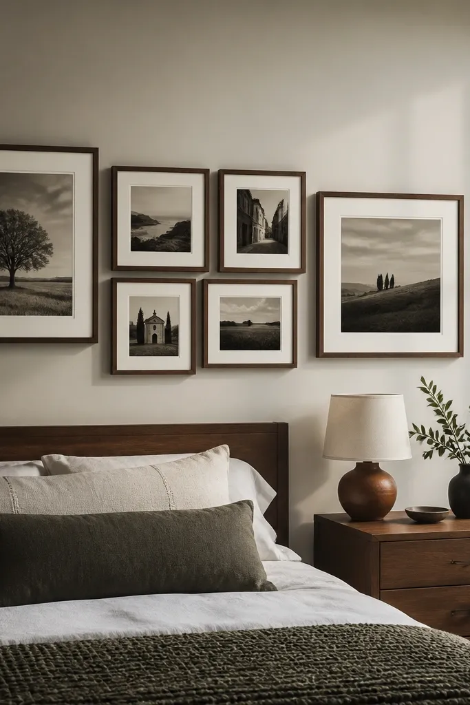
This layout is for the people who want gallery-wall energy without the clutter. You create a tight center cluster of 3 to 4 frames, then let the rest fan out slightly larger. The key is consistency: every frame still uses the same spacing style and frame finish. It looks dynamic in photos because the asymmetry creates a path for the eye, not a random scatter.
Pick one frame finish, then choose 7 to 9 frames with two size categories, like 8x10 and 11x14. Arrange 3 to 4 frames in the center with 1.5 inches between them, then place the remaining frames around with 2 to 3 inches spacing. Tape the exact positions and step back to check symmetry from a distance. Hang center frames first, then work outward so your cluster doesn’t drift.
Editor's noteUse painter’s tape to mark a “spacing stripe” on the wall — you’ll keep gaps even without measuring every frame.
Skip thisDon’t eyeball spacing across different frame sizes — it’s where asymmetrical clusters go wrong.
8. Floating Shelf + Frame Gallery Combo
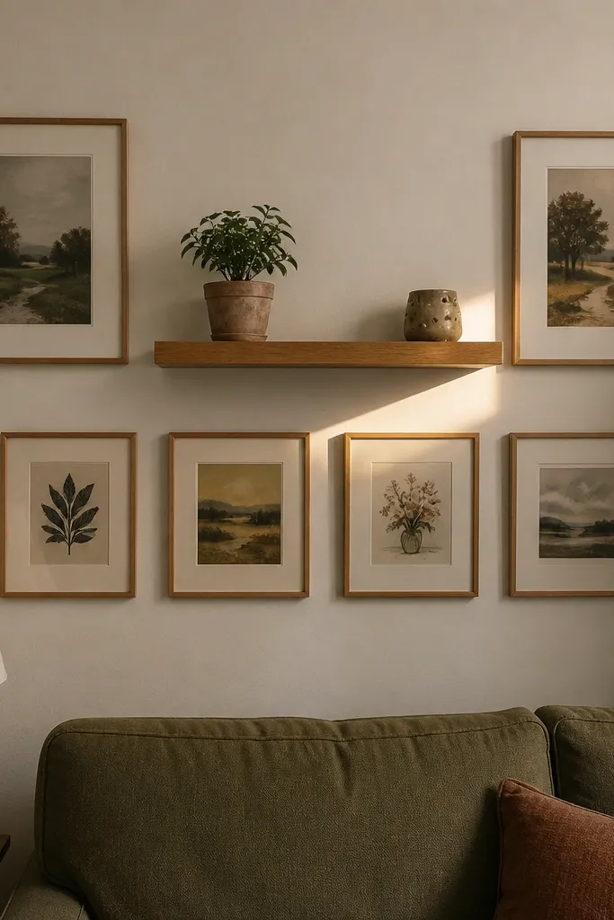
This idea solves a common problem: you want art on the wall, but you also need a place to put stuff. A floating shelf above or between frames creates a visual anchor, and it gives you a spot for books, small plants, or a candle that looks good in photos. The frames below should be consistent in finish so the shelf doesn’t compete. This setup is perfect for entryways and living rooms where you want personality without more furniture.
Install a floating shelf at a height where the bottom edge sits around 1 to 2 feet above furniture, then plan frames below it. Use 4 to 6 frames with the same finish, like 8x10 or 11x14, arranged in a rectangle under the shelf. Tape the frame layout while the shelf level is confirmed, then mark anchor points. Hang the shelf first, then mount the frames using the tape guides so everything lines up.
Editor's noteKeep shelf decor low and grouped in odd numbers — 3 items max in a small shelf looks cleaner than a full lineup.
Skip thisDon’t mix tall decor with tall frames — the wall gets visually top-heavy.
9. Mirror + Photo Frames for a Light-Boost Gallery
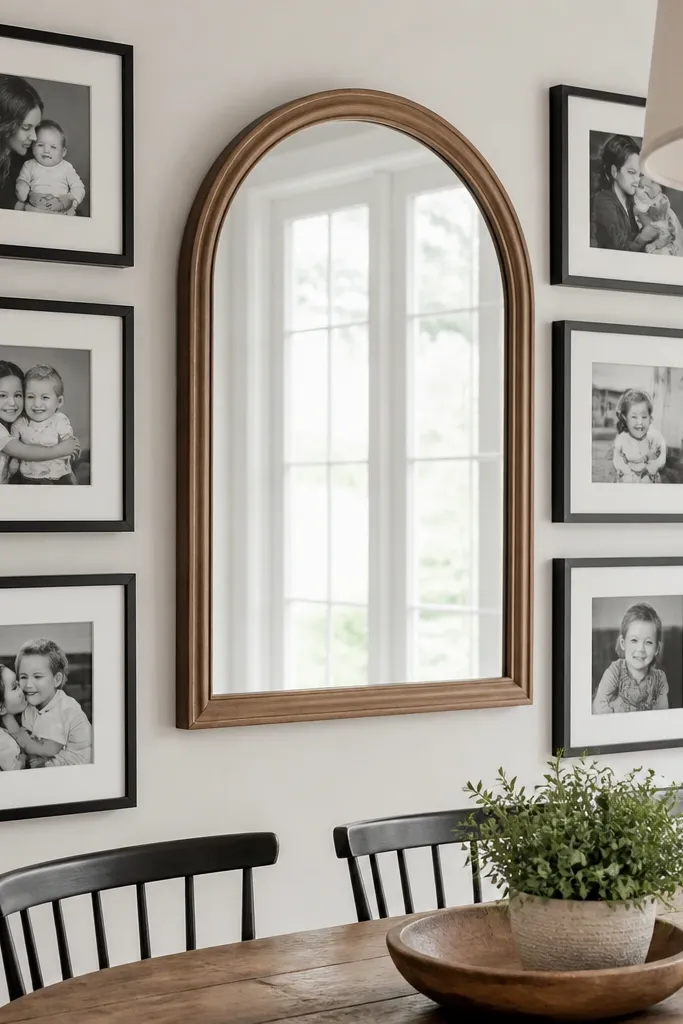
A mirror in the gallery is one of the fastest ways to make a budget wall look expensive. It bounces light and gives depth, so the frames feel more intentional and less like flat prints stuck to drywall. Pick a simple mirror shape, like a thin black rectangle or a warm wood arched mirror, and keep the rest of your frames in the same finish family. This is ideal for rooms with low natural light where everything can look dull.
Choose one mirror that’s wide enough to anchor the group, like 16x24 inches. Surround it with 4 to 6 matching frames, all the same size and finish, placed symmetrically or in a controlled asymmetry. Tape the mirror position first, then tape the frame edges around it with 2 to 3 inches spacing. Mount the mirror using the proper wall anchors for its weight, then hang the frames last so your spacing stays consistent.
Editor's noteUse black-and-white prints around the mirror so reflections don’t fight with colorful art.
Skip thisDon’t place the mirror too high — if its center is above eye level, the light boost feels wasted.
10. Vintage Map Frames With One Modern Color Print
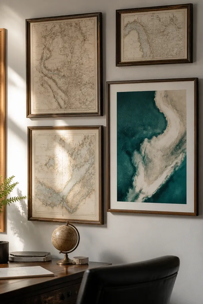
Maps look great in photos because they have texture and lines, and they hide the “budget” factor of thrift prints. To keep the wall from feeling dusty, add exactly one modern color print that uses a clean palette. The contrast reads intentional. Use a consistent frame finish to keep the maps from looking like a collection of random finds. This is a strong choice for home offices, reading nooks, and entryways.
Buy or print 4 to 6 map images, then frame them in identical frames, like warm oak or matte black. Choose one additional print in a bold modern style, like a block color or minimal abstract, and frame it the same way. Arrange the map frames in a rectangle or staggered cluster, leaving 2 inches between frames. Place the modern color print near the center so it acts like your visual “pause.”
Editor's notePick maps with similar border styles or similar paper tones so the group looks cohesive.
Skip thisDon’t add multiple different vintage subjects (maps plus old postcards plus newspapers) — too many eras looks messy.
11. Text-Only Typography Wall in a Two-Size Mix

Typography walls look sharp because the design is already structured. The budget version is to print typography on plain white paper and put it in matching frames. Use two sizes only, like 11x14 and 16x20, and keep the fonts consistent in style even if the words change. This looks modern and intentional, and it hides the fact that you’re using inexpensive prints.
Choose 6 to 8 typography prints and stick to one font family style, like serif quotes with simple line breaks. Frame them using identical frames in one finish, then alternate between 11x14 and 16x20 sizes in a balanced cluster. Tape the layout first, aiming for 2 inches between frames, and keep the top edges level. Hang the largest print in the center or slightly off-center, then place the smaller ones around it.
Use consistent margins on each print so the text doesn’t feel like it’s floating inside different frames.
Don’t mix fonts and colors — typography walls collapse visually when every print looks like a different designer.
12. Polaroid-Style Frames With White Borders
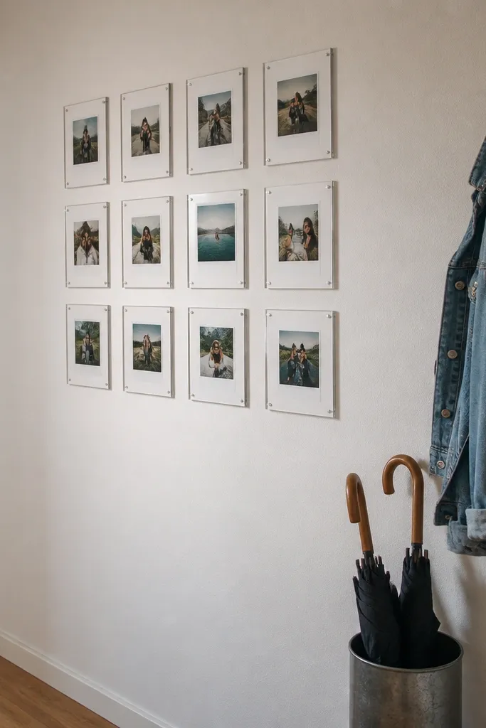
Polaroid-style framing makes a gallery wall feel warm and lived-in, but still clean when the borders match. The look is photogenic because the white borders create a consistent “frame frame” around every photo. You’ll also avoid the problem of mismatched image sizes — the white border does the work. This is perfect for family photo walls, travel prints, and any set of images you want to look cohesive without heavy editing.
Use frames that already include a white mat look, or add a white mat insert so each image has the same border width. Pick 8 to 12 photos and set them up in a grid-like arrangement with 1.5 to 2.5 inches between frames. Tape the positions and confirm the total width fits your wall without crowding. Hang the center frames first, then fill outward to keep the “casual” feel controlled.
Editor's noteChoose photos with similar tones, like warm indoor light or consistent black-and-white, so the set reads as one story.
Skip thisDon’t use mixed border widths — that’s how polaroid-style turns into scrapbook chaos.
13. Round Frames in a Bubble Layout
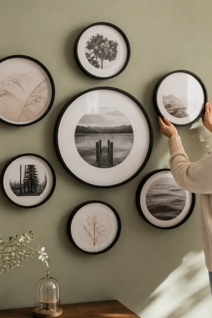
Round frames add instant softness and make the wall look curated even with cheap prints. The bubble layout works because circles naturally guide the eye toward the center. Use one larger round frame as the anchor and fill around it with smaller circles. Keep everything in one finish family, like black rounds or natural wood rounds, so the shapes don’t clash. This is a great option when your wall has sharp corners or when you want the gallery to feel friendly rather than strict.
Choose one large round frame, like 16-inch diameter, and 6 to 8 smaller round frames, like 8 to 12 inches. Arrange them in a loose circle, leaving 2 to 3 inches between frames so the circles don’t visually touch. Tape the layout first and adjust until it looks balanced from the couch. Mount the large anchor first, then hang the smaller frames around it using the tape marks as your spacing reference.
Editor's noteIf your circles feel too tight, increase the gap before you change sizes — spacing reads better than shifting anchors.
Skip thisDon’t mix round and square frames together — keep the shapes consistent for a clean look.
14. Shadowbox Frames for Fabric and Paper Layers
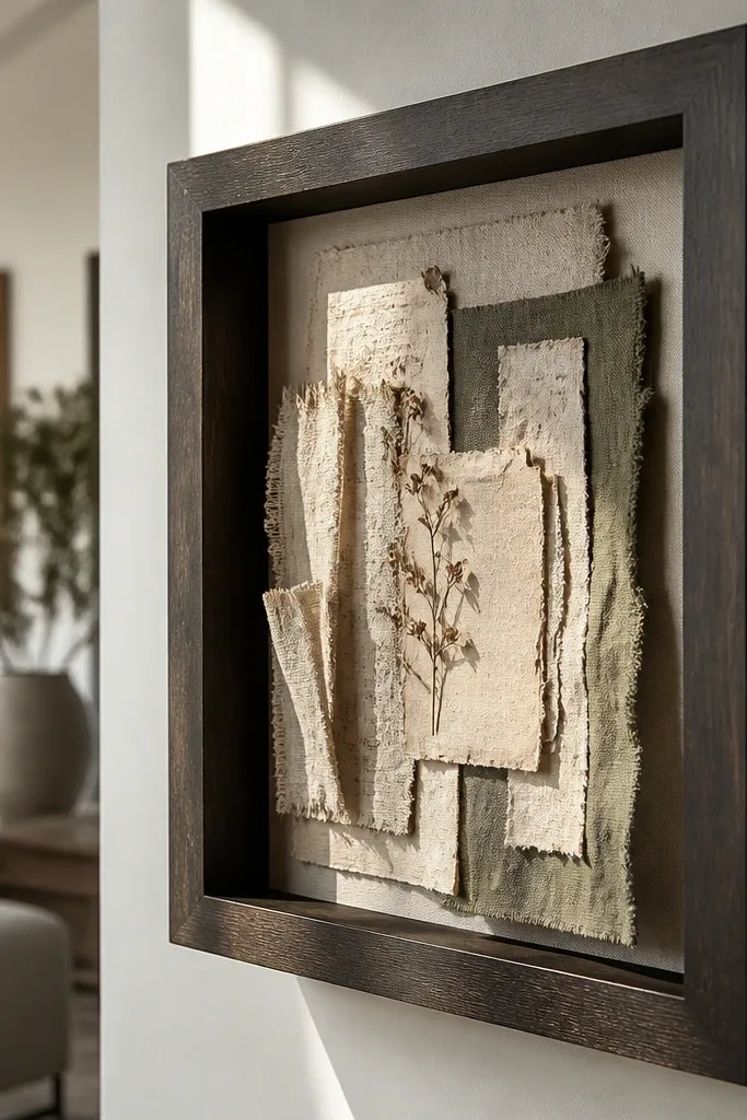
Shadowbox frames turn flat prints into something that looks handmade and more expensive. Layer fabric scraps, vintage paper, or pressed botanical shapes inside a deep frame so you get dimension. This is one of the best Budget Wall Gallery Ideas for people who don’t want a typical photo wall. It looks great in close-up photos too, because the layers catch light. Choose a consistent color family in the materials so the set looks intentional.
Buy deep shadowbox frames, like 1.5 to 2 inches deep, in a matching finish. Inside, create a simple layer stack: background paper, then a fabric or paper cutout, then a small focal piece in the center. Attach layers with removable craft adhesive dots so you can adjust. Plan 3 to 5 shadowboxes and arrange them in a vertical column or a tight cluster, spacing 2 inches between frames.
Editor's noteUse archival matte paper and avoid glossy materials — glare kills the layered look.
Skip thisDon’t overload the box with lots of tiny pieces — one focal layer looks best.
15. Large Statement Frame With a Mini-Row of Smaller Frames
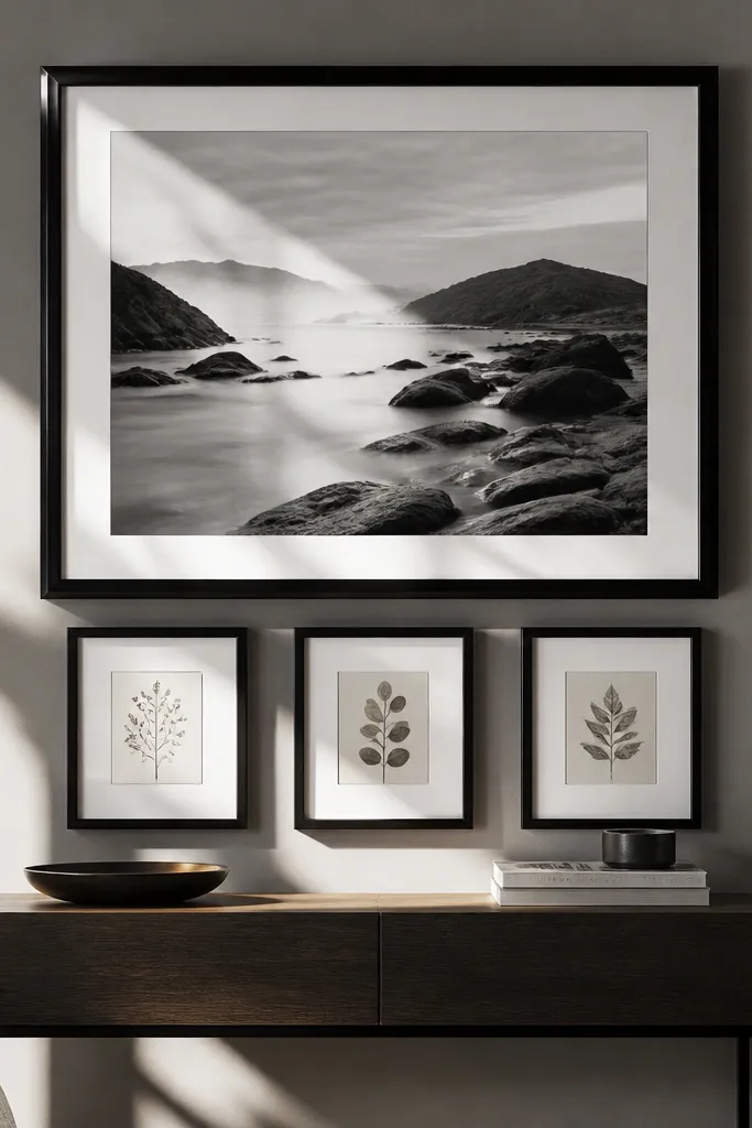
This is the “I want it to look high-end but I only have a few prints” setup. The oversized statement frame does the heavy lifting, and the mini-row adds detail without turning into a full collage. Keep the statement print in a bold color or strong black-and-white image. Then use smaller frames that match the statement frame finish and mat style. It looks like a curated set because the hierarchy is clear.
Pick one oversized frame, like 24x36 inches, and choose three smaller frames around 8x10 or 11x14. Place the mini-row directly beneath the statement frame with 2 inches between each small frame. Tape the arrangement on the wall and check the total height with furniture in front of it. Hang the statement frame first, then level the mini-row so it sits evenly under the larger piece.
Editor's noteKeep the mini-row aligned to the center of the statement frame so the whole group feels centered.
Skip thisDon’t choose statement and mini frames with different mat colors — it makes the set look improvised.
16. Staggered Book Spine Art in Matching Frames
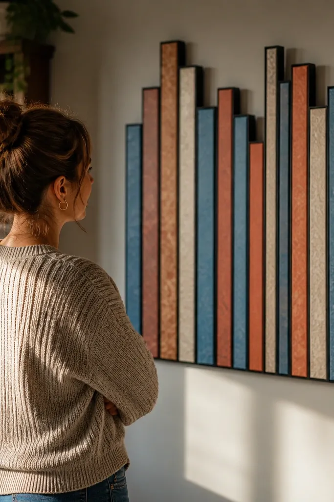
Book spine-style art looks surprisingly good because it creates color blocks and a built-in rhythm. You don’t need real books; you print book spine designs or use wrapping paper that mimics spines. Put them in identical frames and stagger them slightly so the color blocks show. This is a budget-friendly way to get an aesthetic wall that doesn’t rely on expensive photography. It also works well for offices and bedrooms where you want calm, organized color.
Choose 6 to 9 frames in one finish, like black or natural wood, and keep them the same size. Create book spine images in a consistent width and height ratio, then print them on card stock for sturdiness. Arrange the frames in two staggered rows, with the top row shifted half a frame width. Tape the exact positions, then hang the first row and use it as the guide for the second row.
Editor's notePick a limited palette of 4 to 6 spine colors so the wall looks designed, not random.
Skip thisDon’t use wildly different spine widths — the rhythm disappears.
17. Fabric Banner Gallery With Mini Clips and Frames
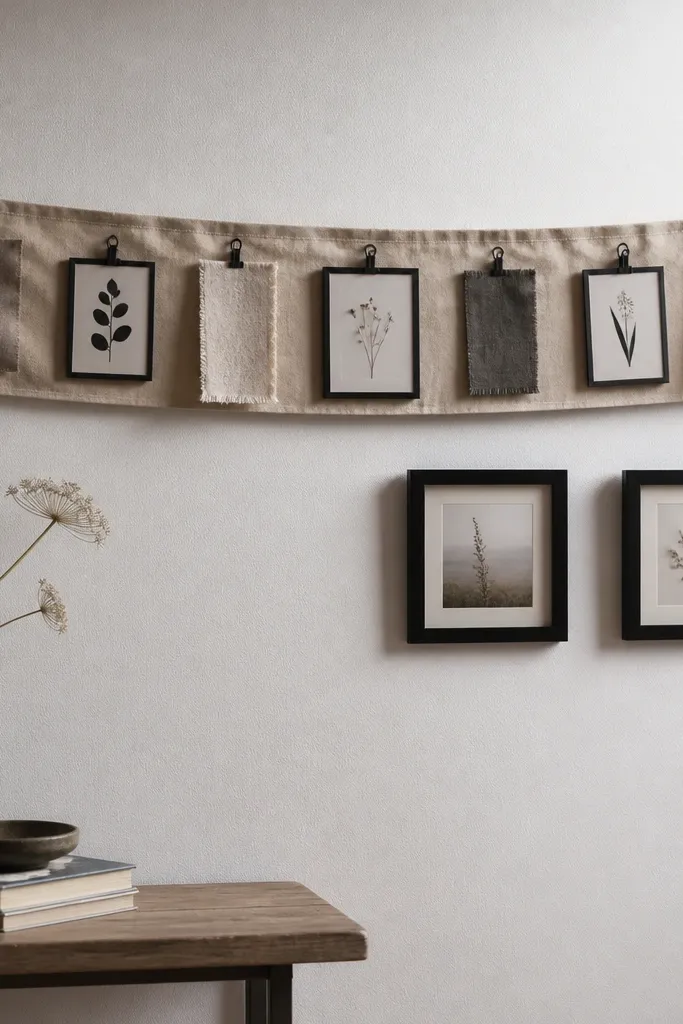
If you hate drilling lots of holes, this gives you gallery-wall vibes with less commitment. Use a simple fabric banner or linen strip across the wall and hang small framed pieces or fabric swatches with mini clips. The look is soft and photogenic because fabric has texture and shadows. Pair it with a couple of matching frames so it still reads like a set. This is great for renters and for seasonal swaps.
Mount a lightweight picture rail or use command-style hooks across a section of wall. Hang a linen or cotton fabric strip as the base, then clip in 4 to 6 small fabric pieces or printed cards using mini binder clips. Add two matching frames at the ends to anchor the design. Space the clips evenly, then step back and adjust so the fabric strip sits straight before you add the last clip.
Editor's noteUse fabric with a matte finish like linen blends — shiny fabric reflects light and looks messy in photos.
Skip thisDon’t mix clip styles and finishes — keep everything black or everything brushed metal.
18. Monochrome Photo Strip With One Color Pop Frame
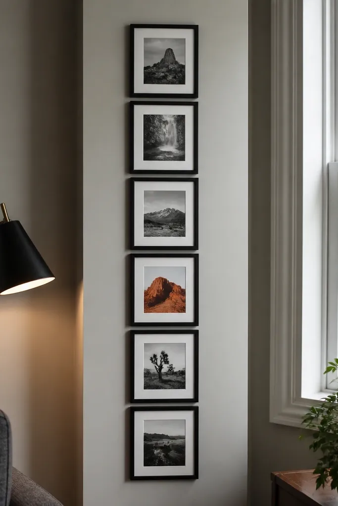
Monochrome photo strips look clean because the entire wall shares one visual rule. Add one color pop frame and you get focus without clutter. This setup is great for narrow walls where a grid feels too rigid but a big cluster feels too messy. Use black-and-white prints with consistent contrast, like portraits or city scenes, and then choose one colored image that matches a decor color in the room. It’s photogenic because the color pop reads instantly in a wide shot.
Pick 5 to 7 frames in identical size and finish, like 8x10 or 11x14. Choose monochrome photos and print them with similar contrast levels so none look washed out. Select one color image as the anchor and place it near the center of the strip. Tape the vertical alignment first, keep 2 inches between frames, then hang from the top down using a level to prevent drift.
Print monochrome photos on warm white paper — pure white can make black-and-white images look harsh.
Don’t choose a color pop frame that clashes with your room colors — the point is harmony.
19. Wide Frame Ledge Gallery With Oversized Mat Windows
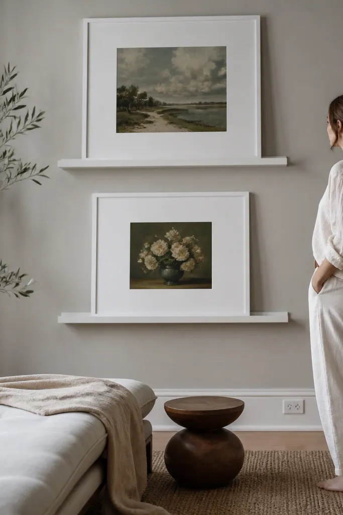
This is the kind of Budget Wall Gallery Ideas setup that looks expensive because it creates depth. You mount two or three wide, shallow frames like a ledge, then let each print sit behind a big white mat so the art has breathing room. The clean mat border makes mismatched prints look intentional, which fixes the most common “I bought random frames” problem. It also hides minor wall imperfections because the frame sits slightly proud and the mat covers edge gaps. This works great for living rooms, hallways, and over a console where you want the gallery to read from across the room.
Pick frames with the same outer dimensions, but let the prints vary in size. For each frame, cut a mat from 3/16 in foam core so you get a 2.5 to 3.5 in border around the print opening, then dry-fit the print so it sits centered without touching the mat’s inner edge. Mount the frames on the wall using a level and spacers so the gap between frames is consistent — aim for 1/2 in vertical spacing. Use a thin foam tape or frame spacer behind each print so it sits flat and doesn’t sag, then tape the back with painter’s tape before sealing the paper with a light mist of clear acrylic spray if the print is porous. Finish by swapping the glass for acrylic if you want less weight, and keep the hardware centered in the studs or use proper anchors rated for the frame weight.
Make your mat openings slightly smaller than the print’s longest side so you can trim the print once and avoid wonky centering.
Don’t mount frames directly to drywall with tiny anchors — wide frames pull forward and loosen over time.
20. Photo + Line Art Gallery With One Continuous Rope Border
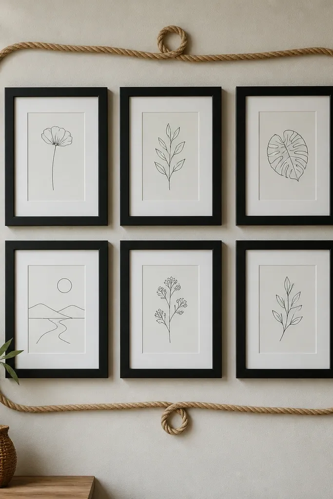
This is a wall gallery trick that makes your layout look designed even when the photos and prints aren’t matching. You build a simple grid of small frames, then connect the whole thing with one continuous rope border so the eye reads it as one piece. The rope adds texture and shadows, which makes budget prints look more “finished” in daylight and at night. It also helps when you’re short on wall space because the rope border gives you a clear shape to aim for. This suits entryways, stair landings, and any spot where you want a gallery that has a little personality without going full theme.
Choose four to six small frames in the same color family, like black or natural wood, with 8x10 or 5x7 openings so the wall doesn’t look cluttered. Arrange them in a tight rectangle with 1 to 2 in gaps, then mark the layout on the wall with a pencil grid so all frames line up. Stretch a jute rope or cotton clothesline along the outside edge of the rectangle and tack it temporarily with painter’s tape to check the curve and height. After you like the shape, glue the rope to thin picture-hanging adhesive strips or use small finishing nails through the rope at the corners only, then remove the tape. Mount the frames last so the rope sits behind or beside the frames cleanly and doesn’t get blocked by hardware.
Editor's noteUse rope thickness around 1/4 in — thick enough for shadow, thin enough to keep corners from looking bulky.
Skip thisDon’t glue rope directly to matte paint without testing — some glues pull paint when you reposition.



