
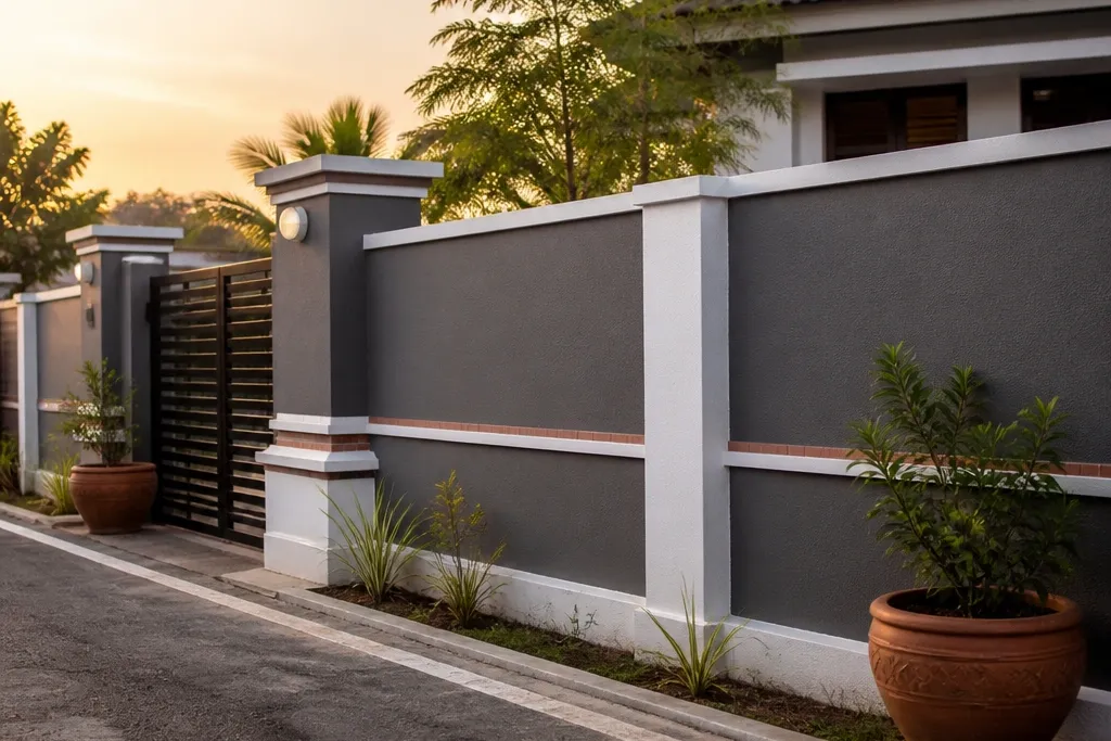
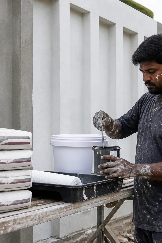
1. Vertical groove panels with white primer and charcoal paint
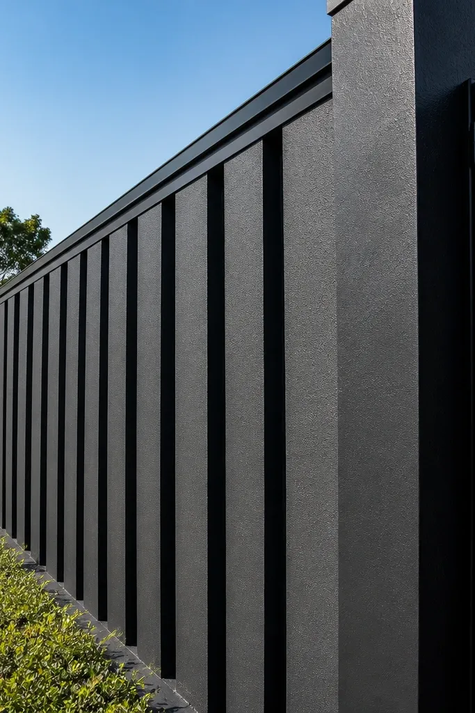
This is one of the best-looking budget-friendly compound wall designs because the grooves create shadow without expensive stonework. Paint does the rest: a white primer or undercoat makes the charcoal look clean, not muddy, and it helps hide patchy cement color. The grooves also make the wall look taller and more structured, especially on long stretches where a flat wall would feel boring. It suits street-facing fronts where neighbors can see the texture in daylight.
Start by marking your post lines and panel width. Use 10-12mm thick spacers on the shuttering so you get consistent groove spacing, then cast or plaster the panels with straight, parallel grooves using a groove trowel or a straight-edged scraper. After curing, apply exterior primer, then roll or brush two thin coats of charcoal exterior paint. Finish with a coping cap or a top plaster strip painted white to frame the wall.
Before painting, rub the wall lightly with a sanding block and wipe dust — paint sticks much better on a clean, matte surface.
Don’t make grooves too shallow; if they’re under 6mm, they disappear in shade.
2. Alternating cement blocks with lime-washed off-white
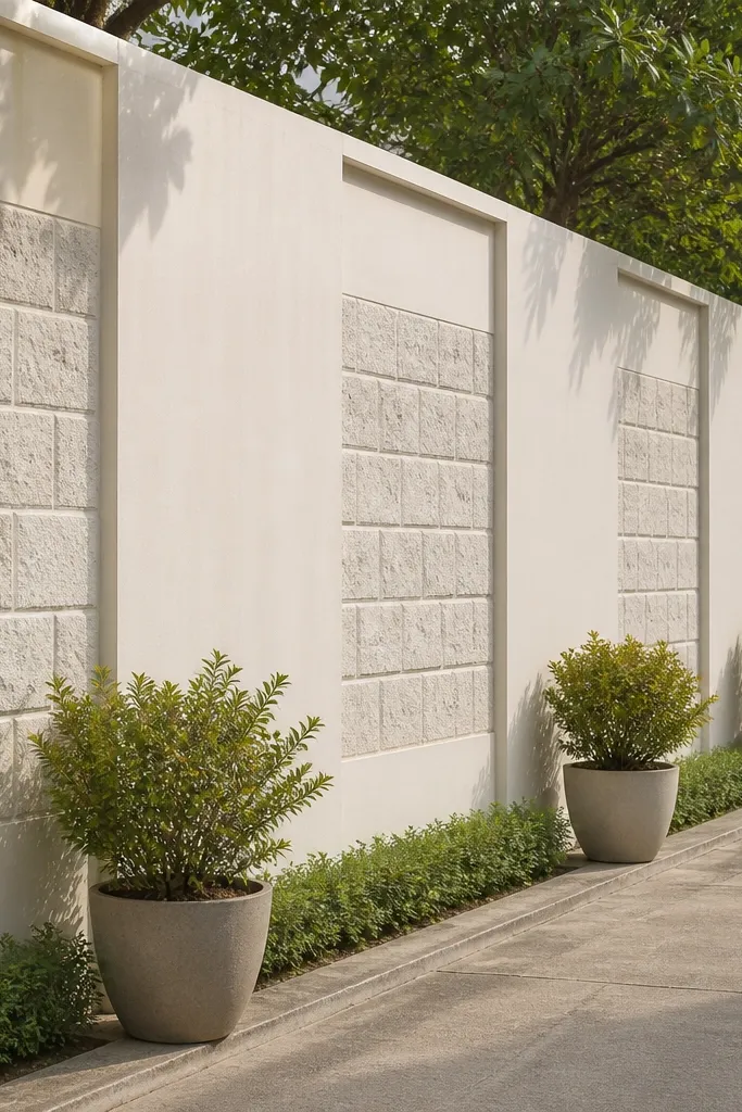
This style looks like a deliberate block pattern, not a half-finished plaster job. You create visual contrast by alternating solid plaster panels with recessed block-like sections, then keep the color light. Off-white or warm off-white reduces heat glare and makes the wall feel airy, even when it’s tall. It’s a smart choice for homes with darker gates or metal grills because the wall becomes the calm background.
Plan alternating sections in a repeating grid, with one panel recessed about 25-40mm and the next left flush. Build shuttering or use wooden battens to define the recessed depth, then plaster in two stages so edges stay crisp. After curing, apply lime-wash style masonry paint or an exterior lime-effect coating in thin layers for an even, soft finish. Seal the top edge with a cement cap so water doesn’t soak into the recesses.
Spray or brush a thin water mist on the surface before the final coat of lime-wash paint — it levels the color faster.
Avoid painting before the recess edges fully cure; trapped moisture shows up as dark lines.
3. Horizontal slab look using thin ledges and a coping cap
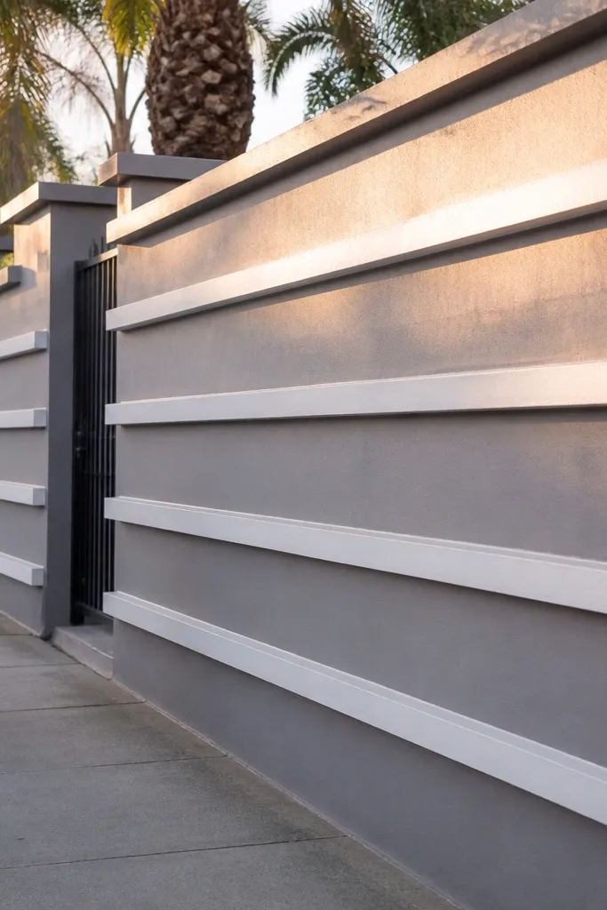
Horizontal ledges give you a slab-like rhythm that reads modern and tidy. This design works because your eye tracks lines across the wall; even if the base cement is simple, the ledges create structure. It’s especially good for long boundaries because the repetition feels intentional and calm. Use it when your gate design is busy; the wall lines keep the overall frontage from looking cluttered.
Mark three to four horizontal bands across the wall height, with each band thickness about 30-50mm. Cast or plaster these bands first, then fill the spaces between them flush for a smooth face. Use a straight screed board and a level to keep the ledges perfectly aligned — small misalignment becomes obvious in photos. Once cured, apply primer and two coats of exterior grey paint, then install a coping cap with a slight slope to shed water.
Tape a long straight edge along each band line while plastering; it’s the cheapest way to keep ledges straight.
Don’t skip the slope on the coping cap; flat caps collect water and stain the paint below.
4. Stone-slab texture panels with cement-based exterior putty
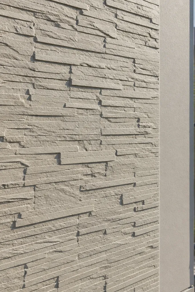
If you want the look of stone without stone prices, texture is your friend. Cement-based exterior putty can be combed and stamped to mimic slab texture, and paint over it makes it look finished instead of raw. This design hides minor surface imperfections because texture breaks up light reflections. It fits homes with warm wood tones, metal gates, or earthy landscaping because the wall blends in rather than shouting.
Skim the wall with 3-5mm cement-based exterior putty after proper primer. While it’s still workable, create slab sections using straight lines and a comb or trowel to form shallow ridges, then use a stamp or textured roller for a stone-like pattern. Let it cure, then apply a masonry primer and paint in two coats with a slightly darker shade for joints if you want extra definition. Finish with a clean coping cap to protect the textured face from rain streaks.
Editor's noteUse a dark grey joint paint on only the grooves with a small brush — it adds depth without turning the whole wall dark.
Skip thisDon’t use interior putty; it cracks faster on sun-heated, rain-exposed walls.
5. Frame-and-infill panels with thin border strips
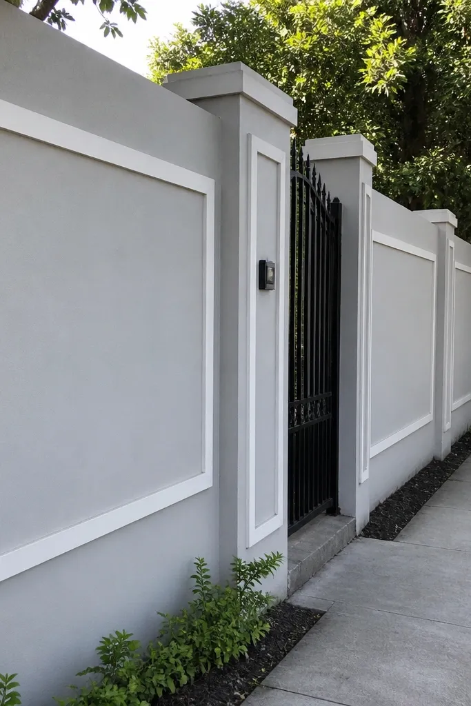
This is the budget-friendly compound wall design that makes a plain wall look like architecture. The trick is the border: thin raised strips around rectangular infill sections create a clean frame effect, and your paint colors can do the rest. White frames with grey infill look crisp in daylight and photos, and it’s easy to keep consistent across the whole boundary. It’s a great match when you want your gate and wall to look like one system.
Choose a repeating rectangle size, like 900mm by 600mm infill, with 70-100mm wide frame strips. Mark the grid, then build the frame strips with plaster or cement mortar in raised bands, keeping corners sharp with a steel trowel edge. Fill the infill area flush after the frame sets so the border stays defined. After curing, prime and paint frames in white and infill in a contrasting grey, then add a top coping cap.
For sharp borders, butter the frame strips slightly thicker at the start, then scrape flat with a straight edge once it firms up.
Don’t freehand the grid; if rectangles drift, the wall looks messy fast.
6. Brick-pattern spray using stencil over cement plaster
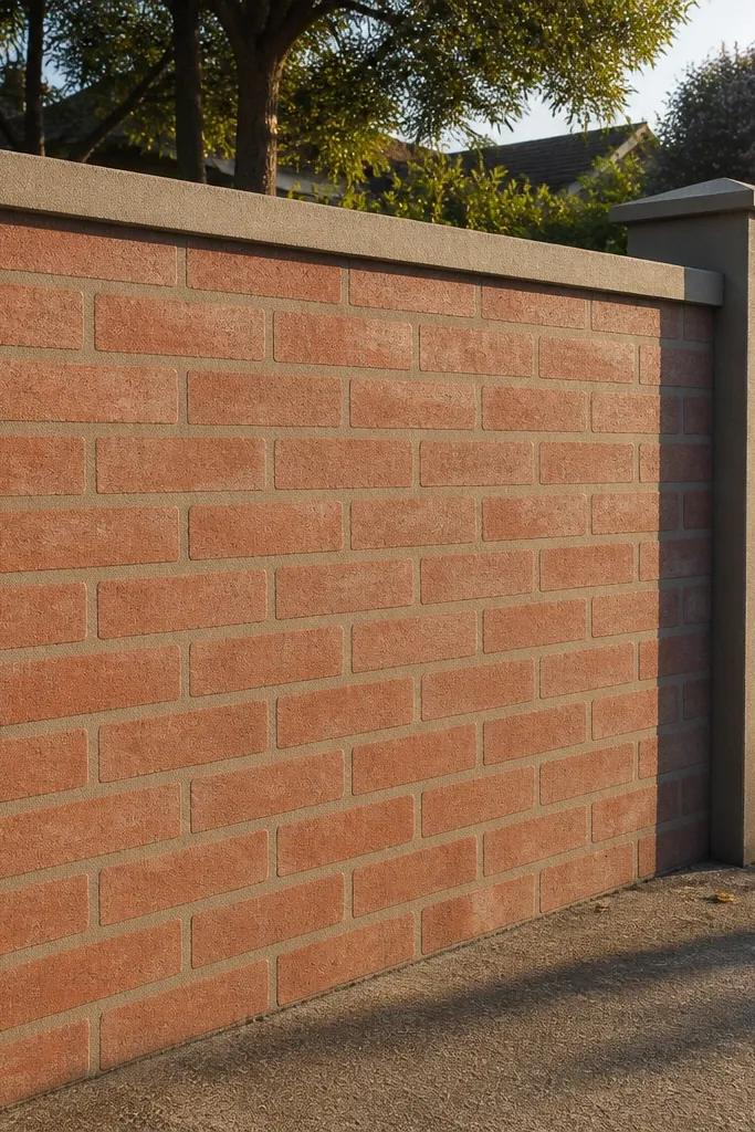
Stencils are one of the few ways to get a brick look without laying actual brick. You build the wall base normally, then apply a brick pattern using a stencil kit and masonry paint in two tones. The mortar-line color makes it read like real masonry, and the warm brick tone looks great with black grills and dark gate frames. This works well for fronts where you want a classic look but still need it budget-friendly.
Plaster and level the wall first, then let it cure fully. Apply primer, then paint the base brick color (like terracotta clay or warm red-brown) in two coats. Place a brick stencil and spray or dab mortar-line color (light grey or off-white) in consistent passes — keep the stencil edges clean to avoid smears. After the pattern dries, seal with an exterior masonry sealer and install a coping cap for water protection.
Use painter’s tape to mask the top line before stenciling; it gives you a straight, professional edge.
Don’t stencil on glossy paint — the pattern smears and looks cheap.
7. Cement art dots and bands with a matte seal
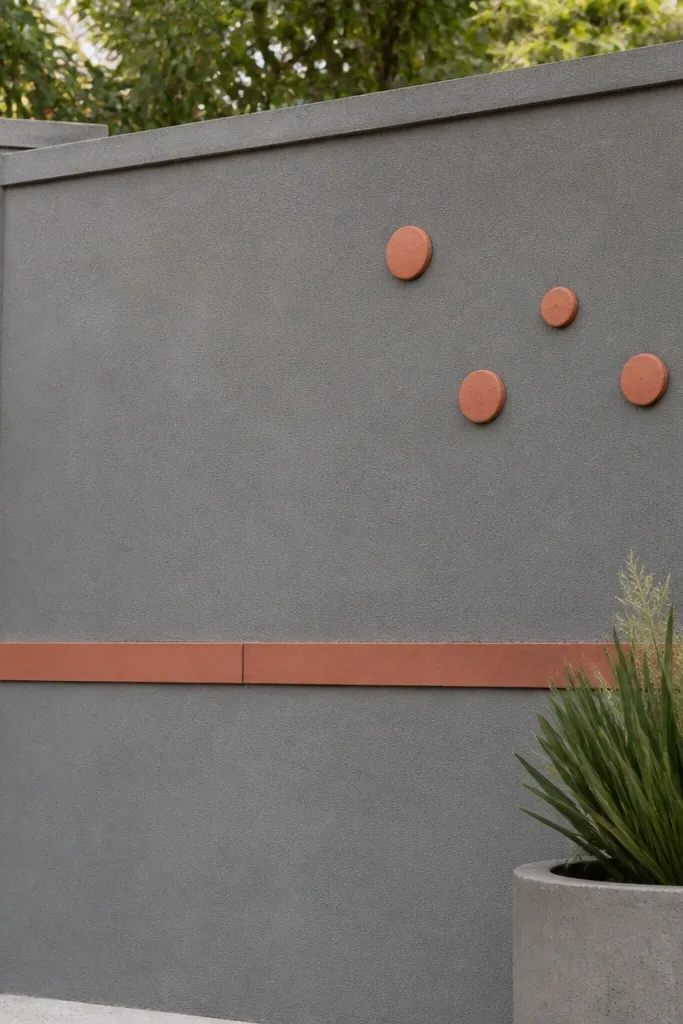
This design adds personality without expensive materials. Small dot accents and one colored band break up the wall and guide the eye, making the whole boundary look styled. Keep the base matte grey and add a single accent color like muted teal or terracotta — too many colors makes it look like a DIY experiment. It’s best for shorter front stretches or walls near gates where details are visible.
Start with a smooth, level plaster finish and prime it. Paint the base coat matte grey, then mark a dot grid with chalk at fixed intervals, like every 250mm horizontally and 300mm vertically. Create dots using the back of a small brush handle or a stencil dot tool, then paint a single horizontal band at mid-height using painter’s tape for clean edges. Seal everything with an exterior matte sealer and finish the top with a coping cap.
Let each dot row dry fully before starting the next color — it prevents bleeding into the base coat.
Skip glossy paint; it reflects light and makes dots look uneven.
8. Geometric half-moon recesses with sand finish
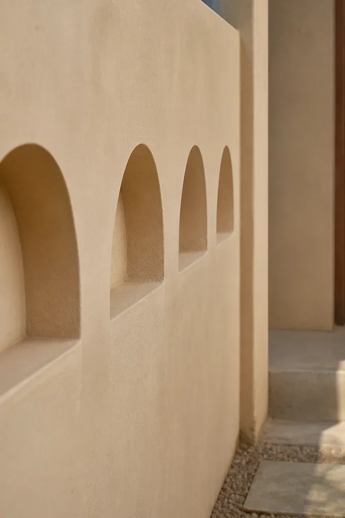
Half-moon recesses look modern and soft at the same time, and they create depth even if you keep the palette simple. A sand-colored finish hides minor plaster marks and gives a calm, warm look that photographs well. This is a good pick when you want a feature wall section near the entrance — the curves catch side light and feel intentional. It’s also forgiving for DIYers because the recesses can be repeated without perfect symmetry.
Mark the recess pattern in rows, with each half-moon about 200-250mm wide and 50-70mm deep. Use a curved template cut from plywood to shape the recess edges while plastering. Build the wall panels first, then carve or form recesses carefully before the plaster sets — the timing matters. After curing, apply primer, paint sand tone, and seal with exterior masonry sealer. Add a coping cap so the recesses don’t become water collectors.
Lightly roughen the recess walls before painting so the sand tone looks even and doesn’t show shiny patches.
Don’t make recesses too deep; deep cavities trap water and stain over time.
9. Terracotta panel inserts with contrasting grey borders
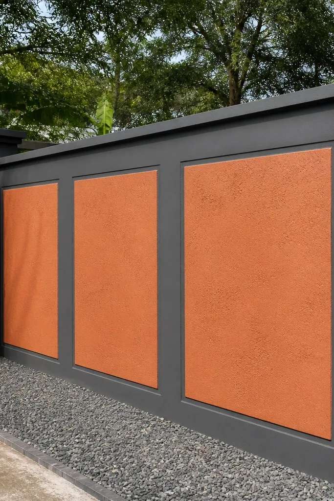
Terracotta inserts give you instant warmth and street appeal. The reason this works for budget-friendly compound wall designs is that you only need small insert areas, not full cladding. Grey borders keep it clean and modern, and the terracotta reads like tile or brick even if you’re using plaster and paint. This suits homes with beige, tan, or wooden doors and gates.
Plan insert sizes around 400-600mm squares or rectangles and keep borders 60-90mm wide. Create the border strips first using mortar or plaster raised bands so the edges cure crisp. Fill the inserts with a slightly rougher texture using a sponge finish or a light trowel scrape pattern, then paint terracotta in two coats. Prime and paint borders grey, and finish with a coping cap that overhangs slightly to protect the top edge.
Editor's noteUse a sponge technique on terracotta inserts — it adds “tile” texture without extra tools.
Skip thisDon’t paint terracotta over dusty plaster; it turns patchy fast.
10. Wainscot-style bottom block and smooth upper wall
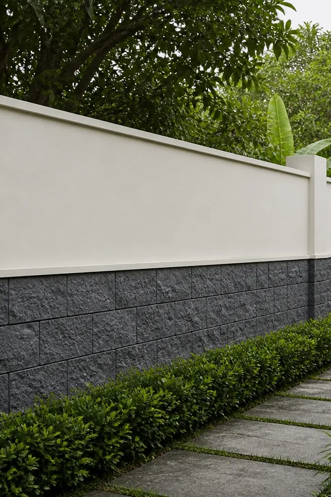
Wainscot styling makes a compound wall look taller and more designed because it mimics furniture paneling. The bottom section carries texture and the top stays smooth — the contrast reads premium even on a budget. Use a darker bottom like charcoal or concrete grey, and a lighter upper like cream or warm white. This is a strong option for homes with pastel facades or light-colored boundary gates.
Mark a horizontal line across the wall at about 1.0 to 1.2 meters from the ground, depending on your wall height. Create the bottom band with block-like rectangles using plaster strips or shallow grooves, about 80-120mm wide per block. Keep the upper section smooth with a thin plaster skim and sand it for a flat finish. Prime both zones, paint bottom in charcoal and upper in cream, then add a coping cap.
Editor's noteSand the upper section longer than you think; the smoother top is what makes the design feel intentional.
Skip thisDon’t let the dividing line wobble; even a slight curve looks sloppy.
11. Checkerboard recesses with two-tone paint
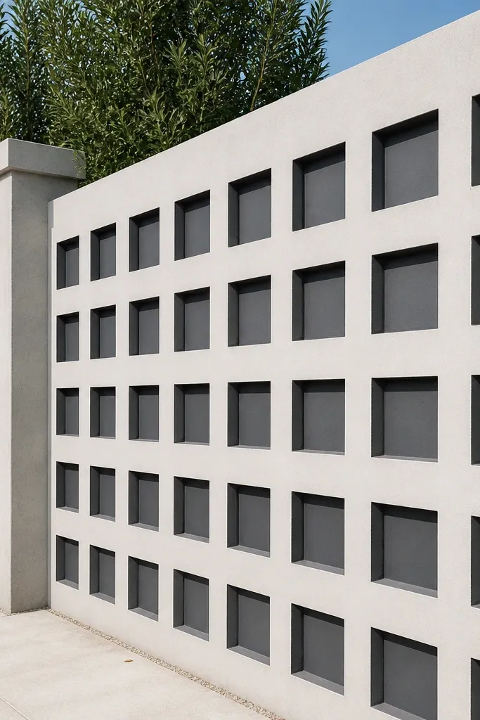
Checkerboard recesses look crisp in photos because the pattern catches light and creates a strong grid. Two-tone paint makes it pop without needing tiles or stone. Keep recess depth around 25-35mm so it’s visible but not fragile. This design fits modern homes and works well on mid-length walls where repetition can be seen from the road.
Mark a grid with alternating recessed squares, like 600mm by 600mm, separated by raised strips about 60-80mm. Form recesses with shuttering pieces or by building up mortar strips and plastering the recessed areas lower. After curing, prime the whole wall, then paint raised areas one color (light grey) and recess faces another (deep grey or muted black). Finish with a top coping cap and seal around joints if you have cracks.
Use the same roller direction across the entire wall to keep sheen consistent between colors.
Avoid uneven recess depth; shallow squares look like mistakes instead of a pattern.
12. Vertical slat panels using timber form strips and white paint
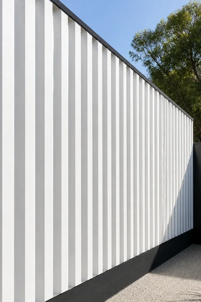
Vertical slats give a clean, contemporary look and they’re practical because you can repeat them with simple form strips. White paint on the slats makes the whole wall look bright, and a dark base line grounds it. This is one of the best budget-friendly compound wall designs for narrow plots because the slats make the boundary feel more refined without covering the whole surface with heavy texture.
Set up timber form strips as spacers on your shuttering, aiming for 80-120mm slat width with 20-30mm gaps. Cast or plaster the wall in sections so each slat gap stays open and straight. After curing, scrape any loose edges, prime, then paint the slats white and paint gaps or recessed lines a darker grey. Apply a coping cap and seal the top edge.
Editor's notePull the form strips carefully while plaster is firm but not fully set to avoid chipping the edges.
Skip thisDon’t use too-soft form strips; they flex and widen gaps unevenly.
13. Patterned breeze-block style using hollow concrete blocks
Hollow concrete blocks look decorative and they also reduce solid wall mass in sections, which helps budget and can improve airflow. You get a lace-like pattern that looks great when sunlight hits it. This design suits walls where you want partial transparency near ventilation points, or where the gate area needs visual lightness. Keep the solid frame around blocks so the wall still looks sturdy and intentional.
Build a solid RCC or cement frame with posts and horizontal beams first. Install hollow blocks in the grid, using mortar joints of consistent thickness, and keep the block face aligned with a straight reference string. Plaster only the frame edges, not the block faces, then paint with exterior masonry paint in a uniform grey or sand tone. Add a coping cap on top and grout the joints fully to prevent water seepage.
Editor's noteUse a taut string line while setting blocks; it’s the fastest way to keep a repeating pattern straight.
Skip thisDon’t leave joints half-filled; hairline gaps collect water and stain the paint.
14. Raised zigzag parapet line with muted olive paint
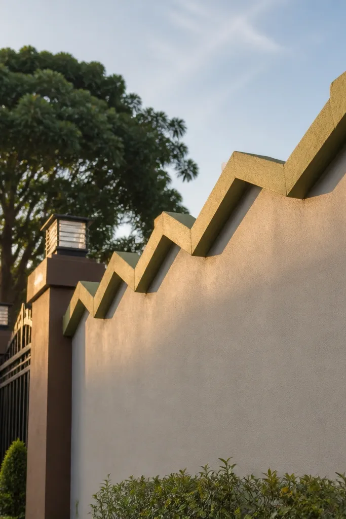
A zigzag top border is an easy way to make a compound wall look crafted, not generic. Muted olive paint adds a modern, earthy tone that looks good with black or brown gates. The raised parapet line catches side light and gives the wall a signature look without covering the entire surface in complex work. This is best for shorter wall segments or front boundaries where you’ll see the top detail clearly.
Start with a standard top beam or coping base, then mark a zigzag line with a consistent tooth width, like 150-200mm per segment. Build the zigzag using mortar or plaster on top of the coping base, then scrape and shape the edges with a steel trowel. Once it cures, prime the entire wall, paint the body in muted olive, and paint the zigzag line slightly lighter or in the same color for a clean monochrome look. Seal and make sure water drains away from the zigzag peaks.
Editor's noteShape the zigzag edges while the mortar is leather-hard; you get crisp corners without cracking.
Skip thisAvoid sharp overhangs; they trap water on the peaks.
15. Half-height stone look band with smooth upper cream
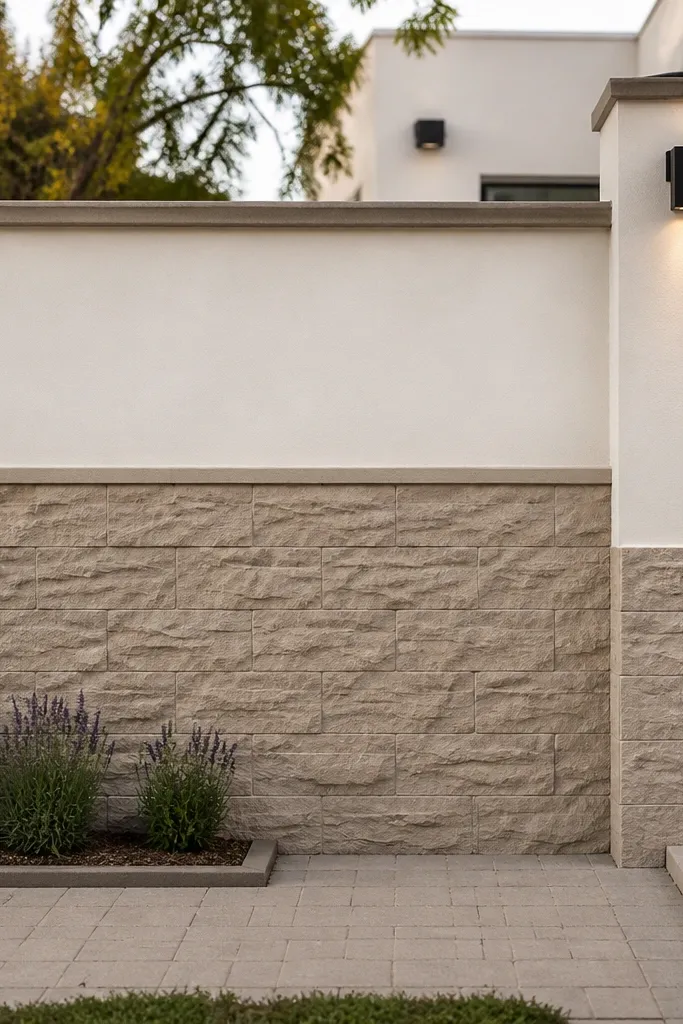
This design gives you the expensive look of stone only where it counts — near eye level — while the upper section stays smooth and bright. It’s budget-friendly because you’re spending texture work and paint attention on a smaller area. The contrast makes the wall feel taller and more curated, and it photographs well from the street. It suits homes with light facades, large windows, and simple gates.
Divide the wall height roughly in half, then choose a band height around 900-1200mm from the ground. Apply cement-based putty or texture coat only on the lower band, combing it into shallow stone slabs and lightly stamping for variation. Keep the upper half smooth with a thin skim and sand it flat. Prime both sections, paint the upper in warm cream and the lower in a stone grey-brown tone, then add a coping cap and seal the top edge.
Editor's noteMix texture coats in small batches so the tone stays consistent across the whole band.
Skip thisDon’t texture the upper section; it makes the wall look busy and harder to keep clean.



