
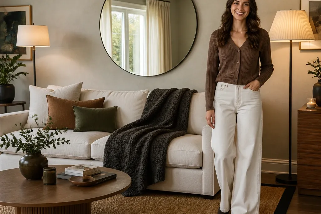

1. Greige Half-Wall Molding + Charcoal Accent Wall
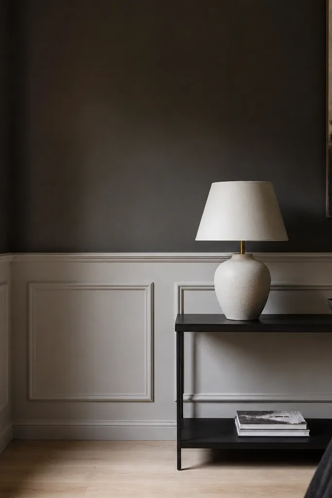
This setup makes your drawing room look custom without expensive carpentry. The greige half-wall calms the space, and the charcoal accent wall adds the modern contrast your eye expects. The white molding creates crisp geometry so the room reads polished in daylight and at night. Use this when you want a “designer wall” but your budget doesn’t allow full-height paneling. It works especially well with a light sofa, dark wood legs, and a simple rug so the wall stays the hero.
Measure the half-wall height from the floor to where you want the visual split, then mark a level line all the way around the room. Apply a coat of greige paint to the lower section, let it dry, then tape a straight edge for the charcoal upper section and paint it next. Install peel-and-stick MDF or foam molding strips along the taped lines with construction adhesive, pressing firmly and trimming edges cleanly with a sharp utility knife. Seal the molding with a thin coat of paint if your strips need a more uniform finish, then remove tape carefully to keep edges sharp.
Use painter’s tape for every line, even if you think you’re good at straight cuts — the tape does the heavy lifting.
Don’t choose charcoal that looks flat; pick one with a hint of brown or blue so it doesn’t turn dull on camera.
2. Walnut-Effect Media Wall with 3 Floating Shelves
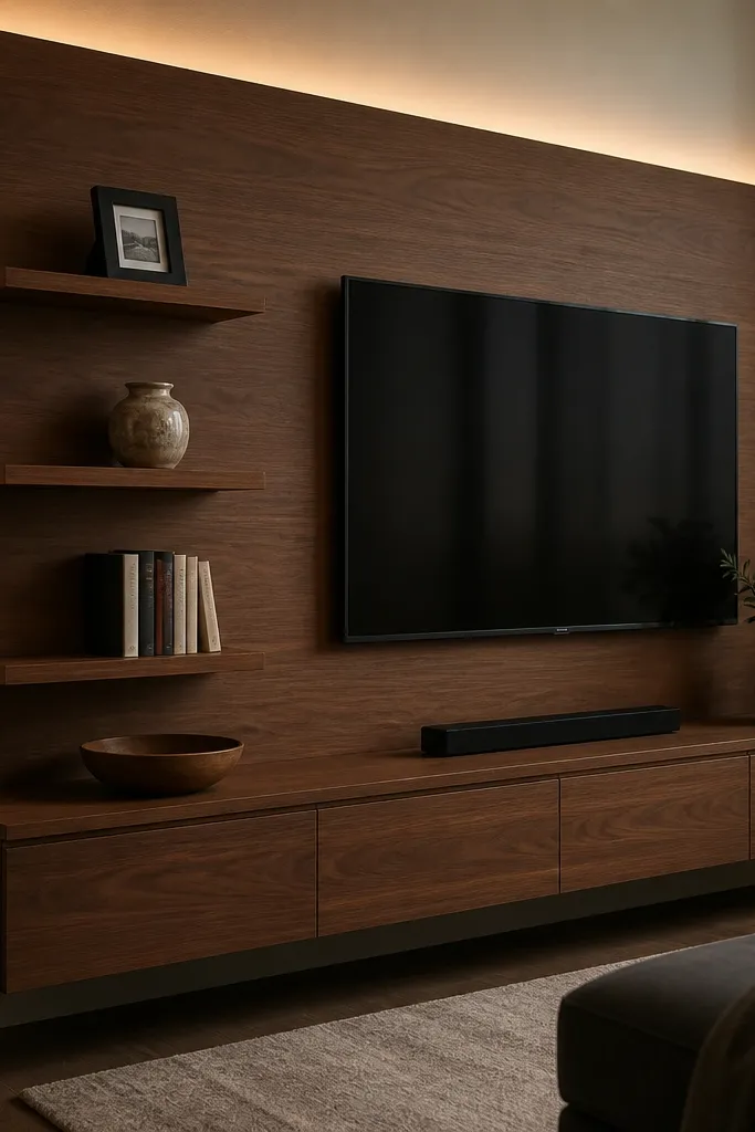
A media wall is the fastest way to make a budget drawing room interior look intentional. The walnut-effect panel gives warmth and modern depth, while three floating shelves create structure above the TV without heavy built-ins. This design is great for rooms where the TV area looks empty or messy, because it gives you a clean place for decor and keeps cables out of sight. It also photographs well because the panel creates a consistent backdrop and the shelves add horizontal lines.
Start by cleaning and priming your wall so the panel adhesive sticks. Apply a walnut-effect peel-and-stick panel to the TV backing area, using a level to keep it straight, then trim around outlets. Mount three floating shelves at eye-level spacing so the middle shelf lands slightly above the TV center. Add a simple TV cable raceway or cord clips behind the TV area, then style the shelves with matching items: two books stacked, one small plant, and one framed photo.
Editor's notePre-plan shelf spacing using masking tape outlines on the wall; move the shelves before you drill anything.
Skip thisDon’t place shelves too low; floating shelves that sit near the TV bottom make the wall feel cramped.
3. Two-Tone Sofa Wall with Vertical Panel Strips
Vertical panel strips make a drawing room feel taller and more modern, especially when your walls are plain. The two-tone split adds depth without needing a full accent wall, and it’s forgiving if your room has awkward corners. This look works best with a sofa in light fabric or neutral leather, because the panels add the interest. It’s a good choice when you want modern lines but don’t want to commit to a full media wall or heavy furniture changes.
Paint the wall base in a light neutral and let it cure fully. Tape a vertical grid where the panel strips will go, spacing them evenly — a 4 to 6 inch strip width looks clean. Install peel-and-stick vertical strips, then paint or touch up edges with the same color as the base so lines look intentional. Finish by painting a darker two-tone band behind the sofa area, keeping the band height at about one-third of the wall.
Editor's noteChoose panel strips that are the same width across the whole wall; mixed widths can look accidental fast.
Skip thisAvoid using thick, glossy paint on the wall; it reflects light and makes panel lines look uneven.
4. Sunken-Look Rug Zone with Oversized Jute + Black Edge
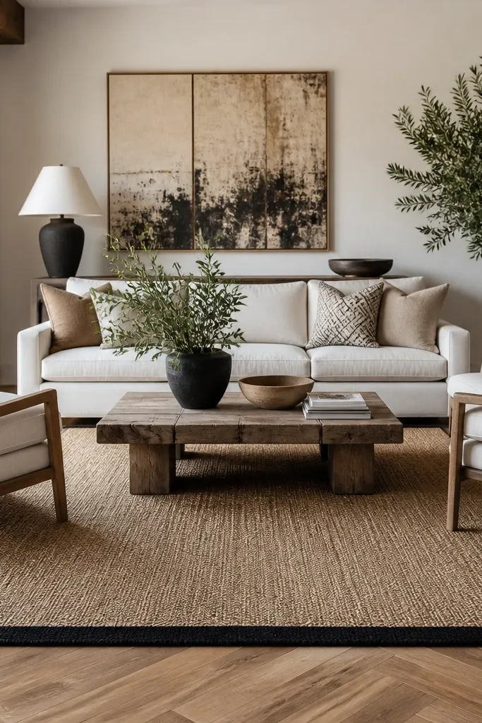
A rug that looks “framed” instantly upgrades a drawing room without touching the walls. Jute or flat-woven texture feels modern and grounded, and the black edge creates the sharp contrast that makes the room look styled. This design is perfect for budget drawing room interior ideas because rugs are one of the few changes that transform everything you see. It also helps define seating areas in open plans, so the room reads cohesive instead of scattered.
Measure your seating area so the front legs of the sofa and chairs land on the rug — aim for an 8x10 feel if the room allows. Use a flat-woven jute rug as the base, then add a thin black border effect using a peel-and-stick rug border tape or a thin black runner beneath the center area. Place a non-slip rug pad under the jute so it doesn’t shift when you walk. Finally, align the rug so it’s parallel to your main wall — use a laser line or a long level.
Editor's noteIf your jute sheds, vacuum it once a day for a week; it settles fast and looks cleaner in photos.
Skip thisDon’t pick a rug that’s too small; the “almost fits” size makes the room look unfinished.
5. Layered Lighting Plan with Two Floor Lamps and One Wall Sconce
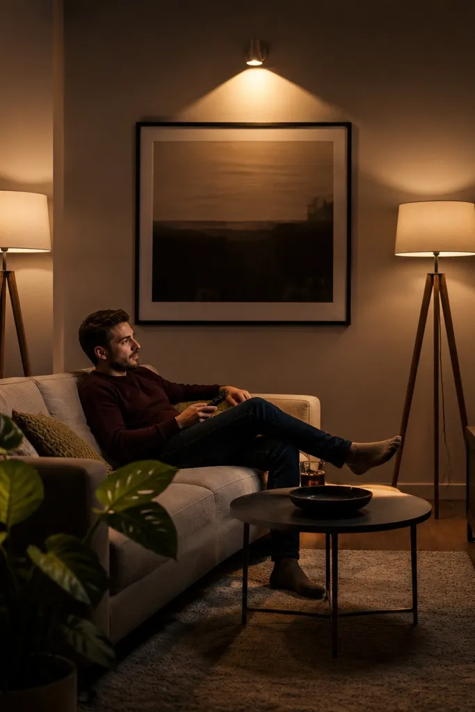
Modern drawing rooms look expensive when light is layered, not when there’s one bright ceiling fixture. This plan uses two floor lamps for soft side light and one wall sconce for a controlled highlight. The result is less glare on TV and art, better mood at night, and photos that look smoother. It’s a strong budget option because lighting upgrades can be cheaper than furniture, and you can install many parts as plug-in solutions. Great for rooms that feel flat even after painting.
Pick bulbs first: use 2700K warm white for living rooms and choose lamps with diffusers or fabric shades. Place floor lamps so their light hits the wall at a slight angle, not directly at eye level — aim for 6 to 8 feet from the sofa corners. Add a wall sconce above a console or artwork, centered and about 60 inches from the floor to the light source. If wiring is complicated, buy plug-in sconces and hide cords with adhesive cable channels painted to match the wall.
Editor's noteUse dimmers on at least one circuit; even a basic dimmer changes how the room looks instantly.
Skip thisAvoid mixing cool bulbs (5000K) with warm bulbs; the room will look patchy in every photo.
6. Brick-Style Peel-and-Stick Accent Behind the Coffee Table
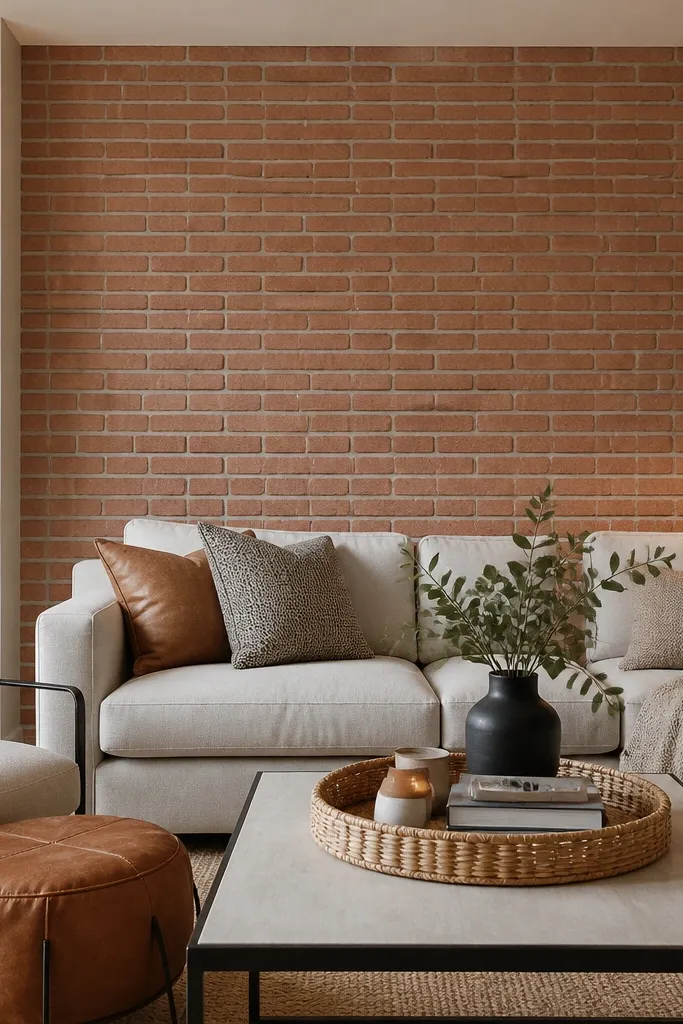
A brick-style accent adds modern texture without the mess of real masonry. Placing it behind the coffee table area makes the whole seating zone feel designed, because it shows up when you’re sitting down. Keep the rest of the room neutral so the brick reads as a clean backdrop rather than a themed wall. This works well if your drawing room feels too smooth or too empty, and you want a tactile look that still feels current.
Clean the wall thoroughly and wipe it with isopropyl alcohol so adhesive sticks. Apply brick-style peel-and-stick panels starting from the centerline, using a level to keep the first row straight. Press firmly with a plastic smoothing tool to avoid bubbles, and use a utility knife for outlet cuts. Seal edges with a thin clear adhesive if your panels have peel seams, then style the coffee table with one light wood tray and two matching candles or a single tall vase.
Choose a brick color that matches your wood tones — warm brick + warm wood looks cohesive.
Don’t put brick behind a busy patterned rug; the texture stack can overwhelm the room.
7. Matte Black Picture Ledge Gallery Wall
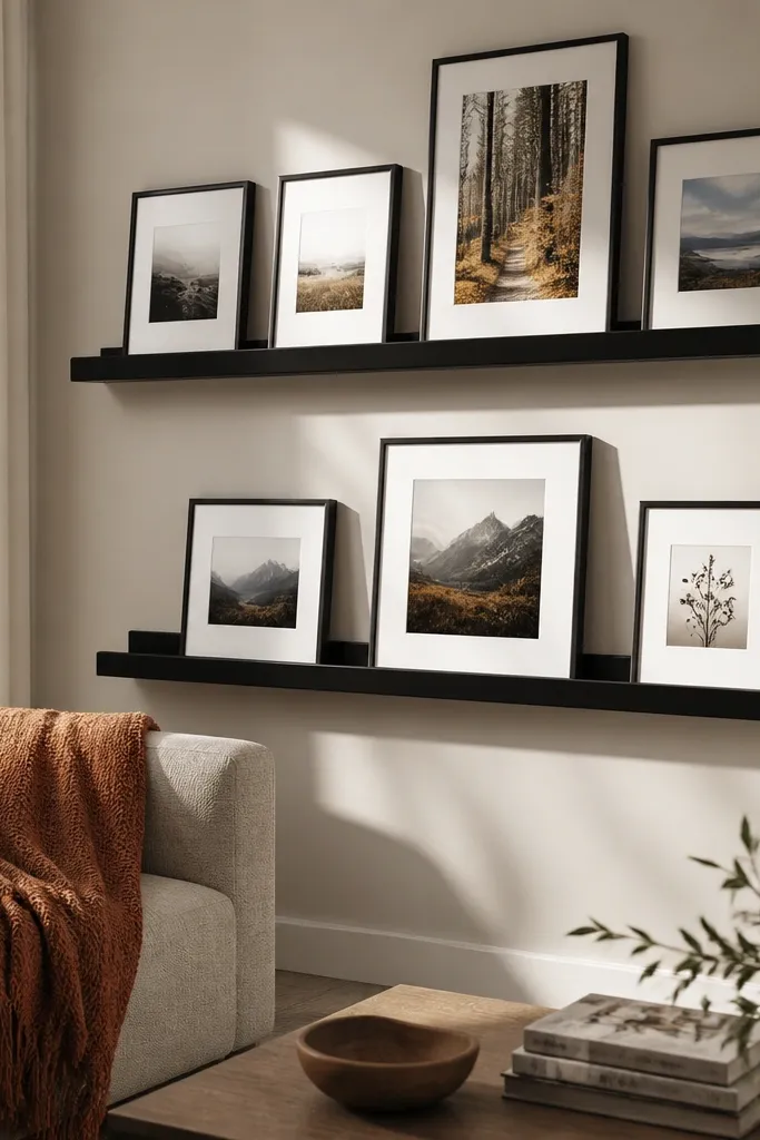
Gallery walls can be expensive when you buy multiple frames, but a picture ledge system gives a modern, organized look with fewer pieces. Matte black looks sharp against light walls, and the ledges let you swap art seasonally without re-drilling. This is a great budget drawing room interior idea if your wall space feels blank and you want a clean “collected” vibe. It also photographs well because the ledge line creates order and the frames align.
Measure your wall and mark a centerline, then choose two or three ledges at different heights with consistent spacing. Install a stud-backed bracket for each ledge or use heavy-duty anchors if you can’t find studs. Paint any frames the same color — matte black, espresso, or off-white — so the gallery looks intentional. Arrange art and objects on the floor first to decide a layout, then load the frames onto the ledges and keep the spacing even using painter’s tape marks.
Editor's noteUse museum glass or acrylic frames if you can; glare ruins ledge galleries in daylight.
Skip thisDon’t mix frame finishes like chrome, gold, and black together; it looks messy fast.
8. Ceiling-Height Curtain Illusion with Track + Extra-Wide Panels
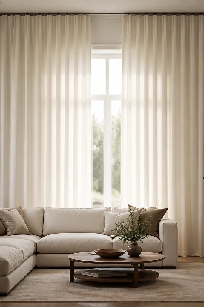
Curtains are the easiest way to make a drawing room look taller and more modern, and the trick is placement. Hanging panels near the ceiling and spanning wider than the window frame creates an illusion of height and width. This design is budget-friendly because you’re changing how cloth falls, not building furniture. Choose matte fabric with a slight texture so it doesn’t look shiny under lamp light. It works best if your windows feel visually small or your room feels boxed in.
Measure your wall from left to right beyond the window — aim for 8 to 12 inches extra on each side. Mount a curtain track 2 to 4 inches below the ceiling, not on the window trim. Use two panels per side at least 1.5 times the window width so you get fullness when closed. Hem if needed, then hang the panels so they kiss the floor with a 1/2 inch break for a clean look.
Editor's noteIf you can’t install a track, use heavy-duty ceiling hooks and a tension rod, but keep the rod width slightly wider than the track would be.
Skip thisAvoid thin, shiny sheers; they look cheap when the lights hit them from below.
9. Low-Cost Plaster-Style Wall Finish with Limewash Paint
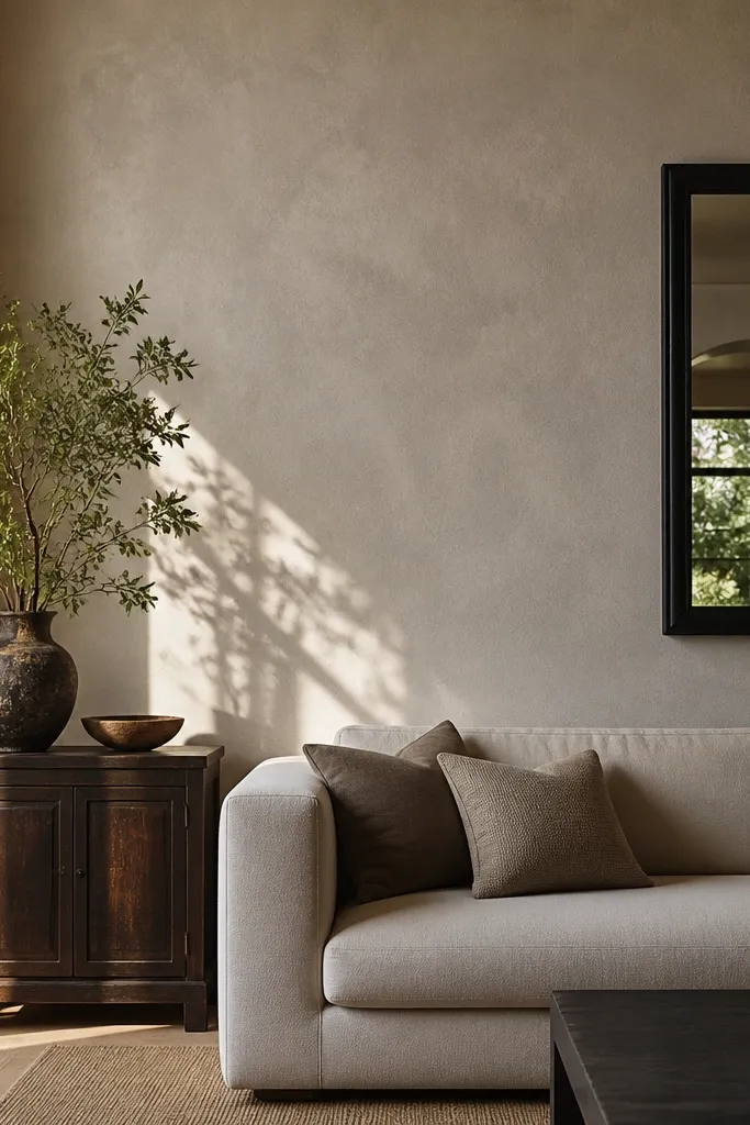
If your walls look flat and boring, limewash-style paint adds the kind of texture that makes modern rooms feel lived-in. The variation is subtle, not streaky, and it makes light bounce across the wall more attractively than standard flat paint. This is a strong option for budget drawing room interior ideas because it can replace expensive wall paneling. It works best for rooms that already have good natural light or warm lamps, since the texture shows up without looking messy.
Prep the wall by patching holes and sanding smooth, then prime if the surface is stained or uneven. Mix or stir your limewash paint thoroughly, then apply with a wide brush using light, irregular strokes. Work in sections about 3x3 feet so edges blend before they dry. Let it cure fully, then add one thin glaze coat if you want more depth around corners.
Test a sample patch next to the window; limewash reads different in morning vs evening light.
Don’t roll it like normal paint; limewash texture comes from brush technique.
10. DIY Floating Console with Slat-Front Storage
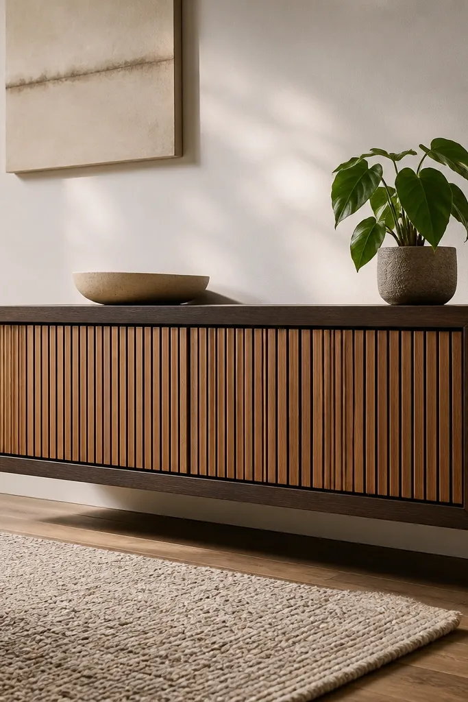
A floating console makes the room look lighter because you can see the floor, and that’s a modern cue. Slat-front storage adds texture without clutter, so the console stays photogenic even when you have daily items. This is great when your drawing room needs a surface for decor but you don’t want a bulky cabinet. The look works across styles — modern, Japandi-leaning, and minimal — as long as you keep hardware simple.
Build a simple rectangular box from plywood or MDF with a backing for stability, then cut a slat pattern for the drawer fronts (about 1 inch slat width with 1/4 inch gaps). Mount the console to the wall using a ledger board and heavy-duty brackets, making sure it lands over wall studs. Add a base trim only if you need extra rigidity; otherwise, keep it clean for the floating effect. Finish with a warm wood stain or paint, then apply clear matte sealer so it doesn’t look glossy.
Editor's noteUse a laser level for the mounting line; a console that’s off by 1/4 inch looks wrong in photos.
Skip thisAvoid cheap particleboard without backing; it warps and the slats won’t sit straight.
11. Color-Blocked Side Wall with Soft Navy and Warm Sand
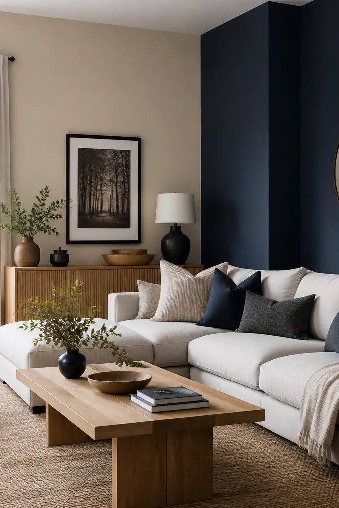
Color blocking is modern and budget-friendly because you’re changing the wall with paint only. Warm sand keeps the room open, and soft navy adds a calm, tailored contrast that looks good with wood, black frames, and neutral textiles. This design is ideal for small drawing rooms where a full accent wall feels too heavy. It also works when your seating is off-center, because the color block can be shaped around the furniture layout.
Tape a clean rectangle or stepped shape on the side wall, using a level to keep the edges straight. Paint the whole wall in warm sand first, then paint the navy block after the base coat is dry. Remove tape slowly while paint is slightly tacky to avoid tearing edges. Add one framed print in a matching navy frame color, then keep the rest of the decor neutral so the color block stays the focal point.
Editor's noteChoose navy with a grey undertone; bright blue navy can look harsh in warm indoor lighting.
Skip thisDon’t freehand the edges; crooked blocks ruin the modern look.
12. Oversized Round Mirror on a Dark Wood Console
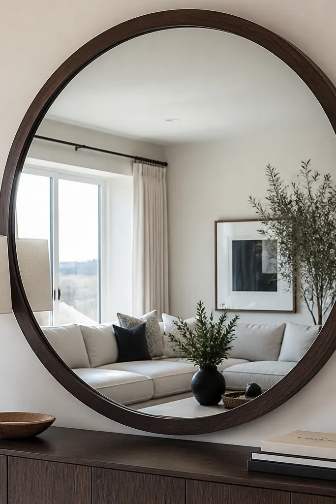
A large round mirror makes a drawing room feel bigger and more modern without any construction. The mirror reflects light and adds a clean shape that breaks up straight lines from sofas and shelves. Pairing it with a dark wood console adds warmth and contrast, which keeps the look from feeling washed out. This is one of the best budget drawing room interior ideas when your room feels dim or cramped. It also helps visually balance a seating area, especially if your TV wall is already strong.
Pick a mirror diameter that’s about 60-70% of the width of the console, so it looks proportional. Choose a console in espresso or walnut tone, then place it centered under the mirror. Mount the mirror securely using the manufacturer’s brackets, anchored into studs when possible. Style the console with one long tray and two objects in the same color family to keep the surface from looking cluttered.
Editor's noteHang the mirror so the center is around 57-60 inches from the floor for a natural height in most rooms.
Skip thisAvoid tiny mirrors; small mirrors look like you ran out of budget.
13. Modular Look with Matching Ottoman + Tray Coffee Table
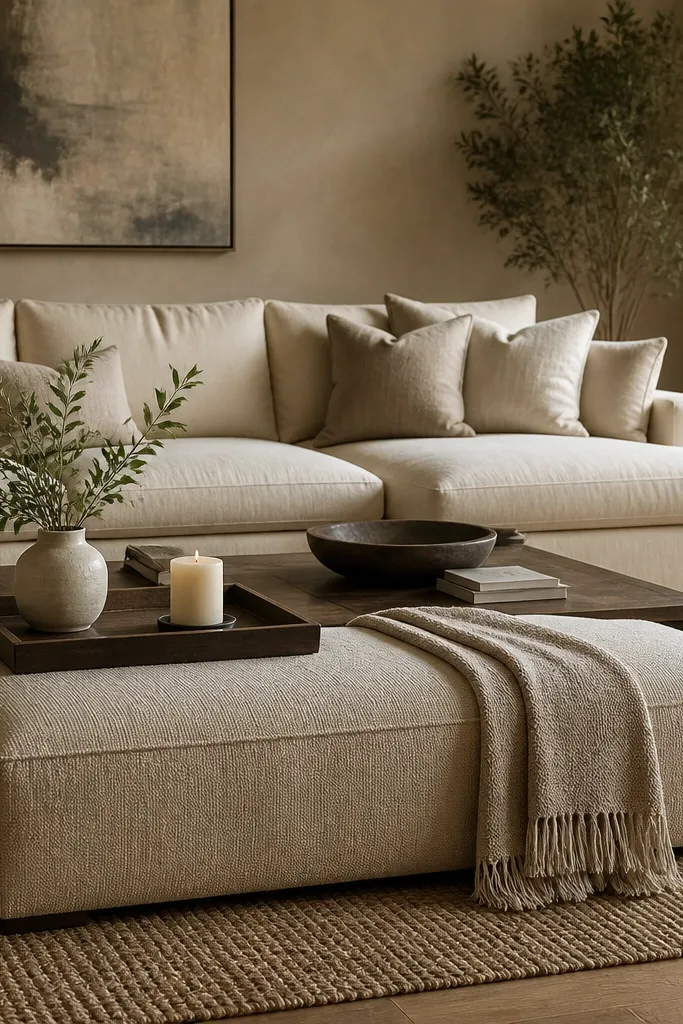
A cohesive seating vignette makes the whole drawing room read modern, even when everything is budget. An ottoman gives you extra seating and a clean, low silhouette, while a tray-style coffee table keeps items controlled so the room looks styled. Use neutral upholstery and one accent color in cushions to prevent visual noise. This design works when you want a modern look without changing your whole sofa set — you’re adding structure around it. It’s also easy to refresh by swapping trays or cushion covers.
Choose an ottoman with a flat top and simple legs, ideally in the same color family as your sofa. Place the ottoman close enough for comfortable movement, usually about 12-16 inches from the coffee table edge. Use a tray coffee table or a coffee table with a removable tray top, then keep the tray items limited to three: a small vase, a candle, and one book stack. Add two cushion covers in matching tones, and keep patterns to one cushion max.
Editor's notePick cushion covers with the same fabric finish (matte cotton, linen blend) so they don’t look mismatched under different lamps.
Skip thisAvoid filling the tray with random decor; a busy tray reads cluttered in photos.
14. Black-And-White Geometric Wallpaper on One Wall Panel
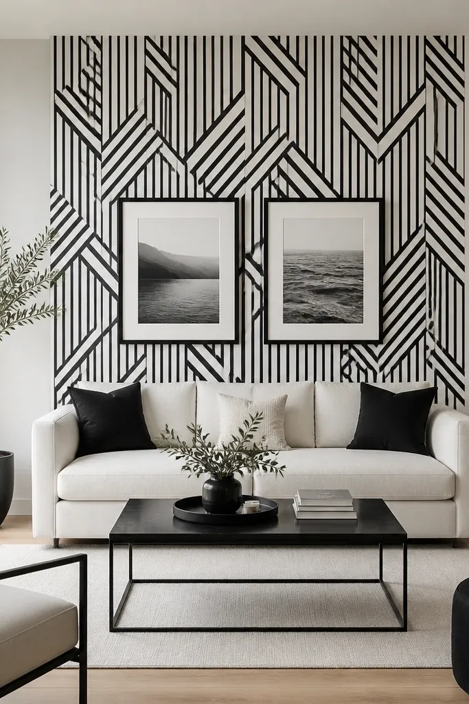
Geometric wallpaper looks modern fast, but the budget move is to use it on only one “panel” wall area. The black-and-white pattern gives strong contrast and makes plain furniture look sharper. Keep the rest of the room neutral so the wallpaper stays the focus, not the whole room. This works when you don’t want to paint multiple walls or your walls have small imperfections you’d rather hide with texture. It’s photogenic because the pattern reads crisp and structured.
Pick one wall and measure the area you’ll cover, usually behind the sofa or the wall that faces the entrance. Apply painter’s tape around the border area so you can keep edges clean. Use a wallpaper primer if the wall is porous, then apply the geometric wallpaper carefully with a smoothing tool to avoid bubbles. Trim edges with a sharp blade, then frame the wallpaper area with simple molding strips or a contrasting paint border for a finished look.
Editor's noteMatch the pattern alignment before you commit — line up the first seam perfectly or the repeat will drift.
Skip thisDon’t cover a wall with heavy sunlight glare; geometric patterns can look washed out.
15. Textured Plinth Coffee Table with DIY Wood Veneer Top
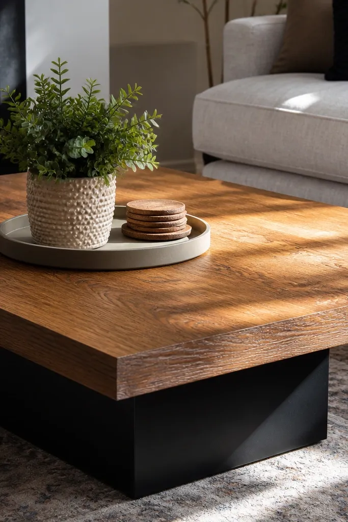
A coffee table is the center of the drawing room, and the finish is what your eyes notice first. A textured base plus a wood veneer top gives you that modern, high-contrast look without replacing the whole table. The veneer is the visual upgrade; the texture hides minor scuffs and makes the table look more intentional. This is a good budget drawing room interior idea if you already own a basic table and want it to look custom. It suits rooms with neutral rugs and sofas because the table becomes a focal point.
Sand the top lightly and clean it with tack cloth so adhesive sticks. Apply wood veneer using veneer contact adhesive or iron-on veneer sheets, pressing with a roller for full contact. Trim edges with a sharp utility knife and sand the edges smooth. Build or add texture to the base using a simple plinth wrap, then seal everything with matte clear coat so it doesn’t look glossy and cheap.
Use matte clear coat, not satin; satin highlights scratches and makes DIY work more noticeable.
Avoid veneer over a warped top; veneer will lift at corners and look uneven.
16. Removable Corner Paneling with Rounded Edge Trim
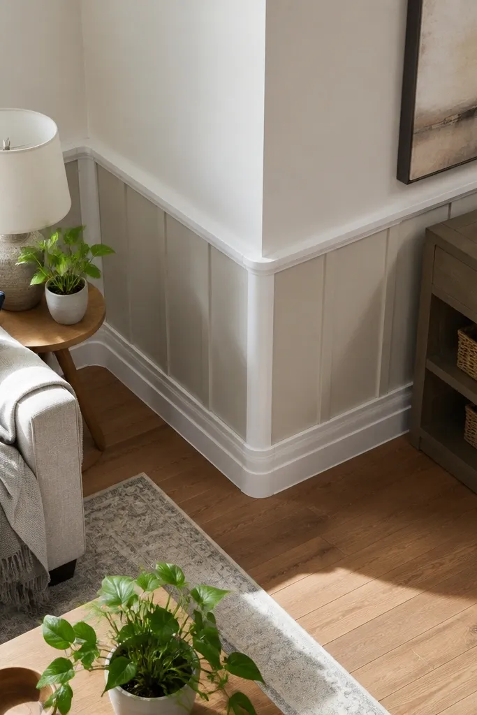
Rounded-edge trim makes paneling feel modern instead of traditional. This design is built for budget drawing room interior ideas because you can do it without major wall work: removable panels, simple adhesive, and paint. The paneling creates structure in corners, where rooms often look unfinished. It also frames your decor — a floor lamp, a plant stand, or a tall mirror — so everything looks placed, not scattered. Great for renters or anyone who can’t commit to full wall molding.
Clean the corner walls and measure the panel sections, keeping consistent widths on both sides of the corner. Use peel-and-stick wall panels or foam boards, and cut them to fit snugly with a small gap for expansion. Install rounded edge trim along the panel borders using adhesive that’s compatible with painted surfaces. Paint the panels to match the wall base or choose a slightly different tone for depth, then style the corner with one tall element and one medium one.
Editor's noteLeave a 1/8 inch gap at panel ends so the edges don’t lift when the wall temperature changes.
Skip thisDon’t stack panels too close to outlets; plan for access so you don’t end up cutting around live switches later.
17. Minimal TV Area with Cable Box Cover + Shelf Above

A modern drawing room looks messy when cables and power strips are visible. This design solves that by hiding the ugly stuff behind a clean cable box cover and adding one small shelf above the TV for decor you can keep neat. It’s a practical upgrade that looks good in photos because the wall stays visually calm. This works especially well in apartments where you can’t build a full media wall. Pair it with a light wall paint and dark frames for a crisp, contemporary look.
Mount a slim cable box cover below the TV or along the wall where cords gather, making sure it aligns with the outlet positions. Install a simple floating shelf above the TV, keeping it centered and about 10-14 inches above the screen top. Route cords through adhesive cable channels so they run straight and disappear behind the cover. Finish by placing only three items on the shelf: a small plant, one frame, and one neutral object in a tray so it doesn’t look cluttered.
Editor's noteUse a cord length plan before you mount anything; shorter cords save you from messy loops.
Skip thisAvoid overfilling the shelf; the clean wall effect collapses when you add too many items.
18. Color-Matched Cushion Covers with One Metallic Throw Pillow
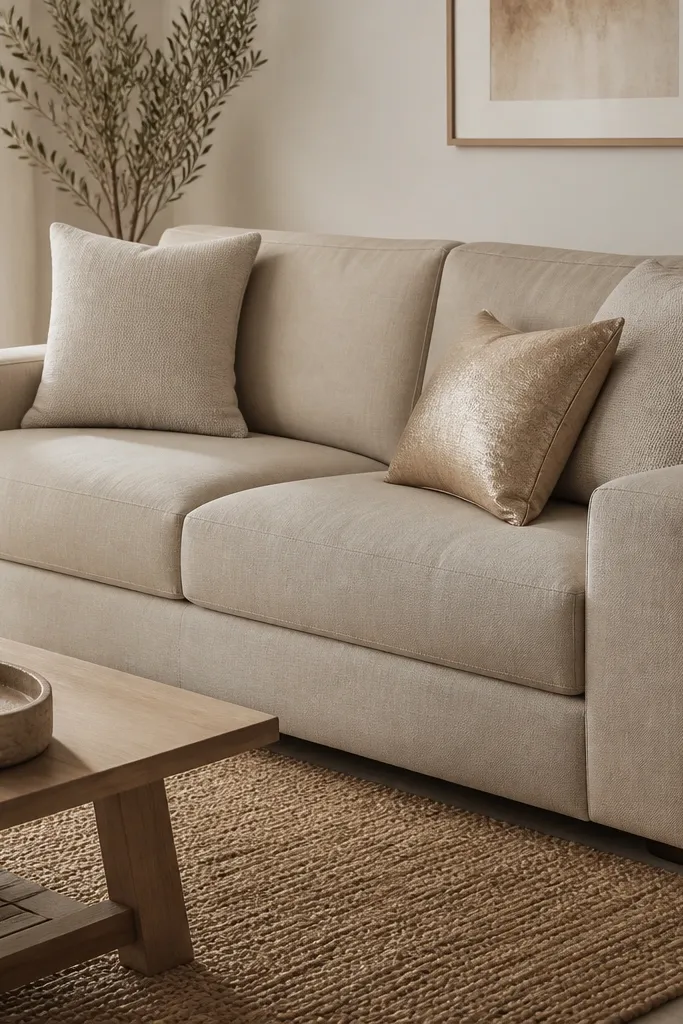
Sometimes the best budget drawing room interior ideas are the ones that change only fabric. Matching cushion covers in two neutral shades create a smooth, modern look, while one metallic accent pillow adds light-catching contrast. This works even if your sofa is older, because the covers visually reset the room. Pick metallic in a controlled way — brass or antique gold looks warmer than silver in most living rooms. This is ideal for people who want a modern refresh without painting walls or replacing furniture.
Choose two cushion cover colors within the same family, like oatmeal and greige, then pick one accent metallic pillow in antique gold or bronze. Measure your cushions and buy covers with the right insert size so they plump properly. Use a simple arrangement: two large cushions at the back, two smaller in front, and the metallic pillow centered or angled. Add one throw blanket in a matte fabric and keep it folded, not draped messily across the arm.
Editor's noteWash and dry covers fully before you style — wrinkles change how the fabric reads on camera.
Skip thisAvoid mixing too many patterns; one metallic and one solid is the clean formula.
19. DIY Wainscot Look in Vinyl Panels for Small Rooms
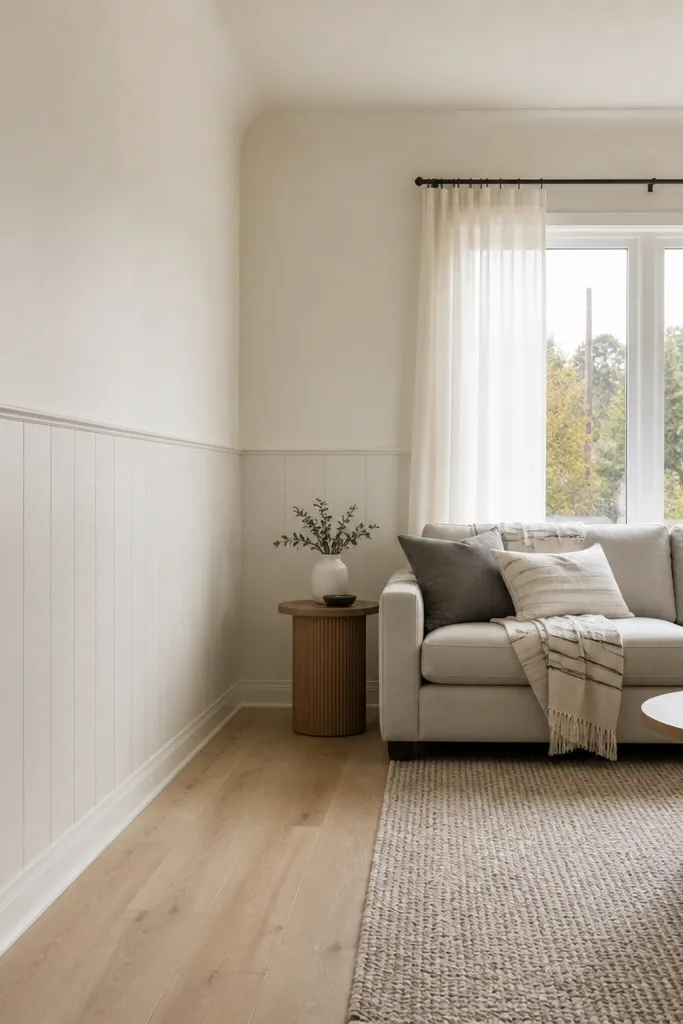
Wainscot styling makes a small drawing room look structured and higher-end without expensive trim work. Vinyl panels are budget-friendly, easy to cut, and forgiving if your walls aren’t perfectly flat. The lower panel section hides scuffs, while the light upper paint keeps the room open. This design is a win when you want modern structure but your walls are rough or you don’t want to commit to full wall molding. It pairs well with dark wood frames, simple floor lamps, and clean rugs.
Paint the upper wall first in your chosen light neutral, then mark the wainscot height with painter’s tape. Install vinyl panel sections using manufacturer adhesive or panel clips, starting from the center and working outward for symmetry. Add a simple cap trim at the top edge and base trim at the bottom edge to make the paneling look finished. Touch up paint around panel edges and install wall art so it sits above the wainscot line.
Editor's noteIf the room has uneven floors, align the top of the wainscot panels to a straight reference line, not the floor.
Skip thisDon’t rush the panel layout; misaligned sections look obvious in daylight.
20. Modern Corner Plant Wall with Trellis Backdrop
A plant wall corner adds life and height, and a trellis backdrop gives it a modern structure. This approach looks better than scattering plants around the room because the backdrop creates a single composition. It’s a budget drawing room interior idea when you want visual interest without changing major furniture. Keep the plant selection simple: two tall plants and one trailing plant, all in matching pot colors. The trellis also frames light and shadow, which makes the corner look styled even when the plants aren’t at peak growth.
Mount a lightweight trellis or lattice panel to the wall using wall anchors and screws, keeping it level. Paint the trellis a matte neutral like charcoal or off-black so it doesn’t look rustic. Place matching pots at the base and use plant stands to control height — aim for one plant at about 5 feet in height if the room allows. Train a trailing plant along the trellis, and use small plant ties hidden behind leaves.
Use matte pots in two shades max; glossy pots reflect light and look chaotic next to a trellis.
Avoid overcrowding the corner; too many plants make the trellis look like a plant store.



