

1. Full-height fluted feature wall in matte warm white
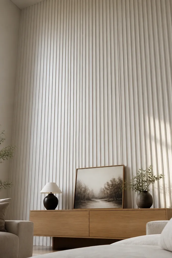
This look makes a double-height room feel designed because it gives the eye a vertical rhythm that matches the height. Fluting also hides minor wall waviness better than flat paint because the shadows do the work for you. Keep the finish matte and warm (not bright cool white) so it doesn’t look like a showroom. You get a high-end architectural vibe without needing expensive stone — MDF panels plus paint can look crisp if the lines are straight.
Start by measuring the feature wall height and dividing it into repeat sections so each flute width stays consistent. Build or buy MDF fluted panel boards sized to your wall, then mark a level baseline at the floor and the ceiling edges using a laser level. Install panels with construction adhesive and screws into studs, then caulk every seam. Sand lightly, prime with a bonding primer, and paint two coats of matte warm white with a small foam roller for clean edges.
Use a 2 m straightedge every few panels; one crooked line reads instantly in a double-height photo.
Don’t paint flutes before caulking seams — the gaps will show under side lighting.
2. Oak slat console wall with a matching stair railing finish
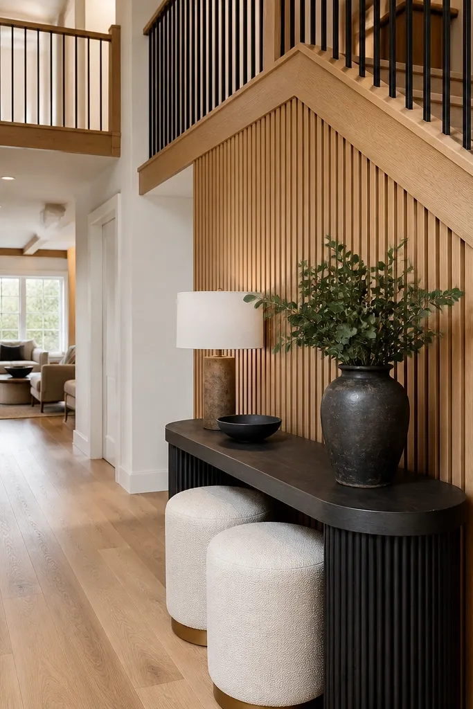
A slat wall gives you texture without visual clutter, and it’s one of the easiest ways to make a double-height space feel cohesive. When you repeat the same wood tone on the stair railing, the room stops looking like separate zones. It’s budget-friendly if you use thin slats over plywood or a simple backing frame. The result is warm, photogenic, and it photographs well from the ground because the slats create depth.
Cut plywood or MDF as the backing panel size you want (start with a manageable section like 2 m wide). Attach vertical oak-look slats (thin timber strips or veneer strips) spaced evenly with a jig or spacers, then secure the assembly to the wall studs. Stain or paint the slats to match the stair railing finish you already have. Finish by sealing with a clear matte water-based coat so the tone stays consistent under daylight.
Editor's noteStain a scrap slat first next to your railing so you don’t guess the undertone.
Skip thisDon’t vary slat spacing — uneven gaps create a “DIY wall” look fast.
3. Ceiling grid with shadow-gap strip lines
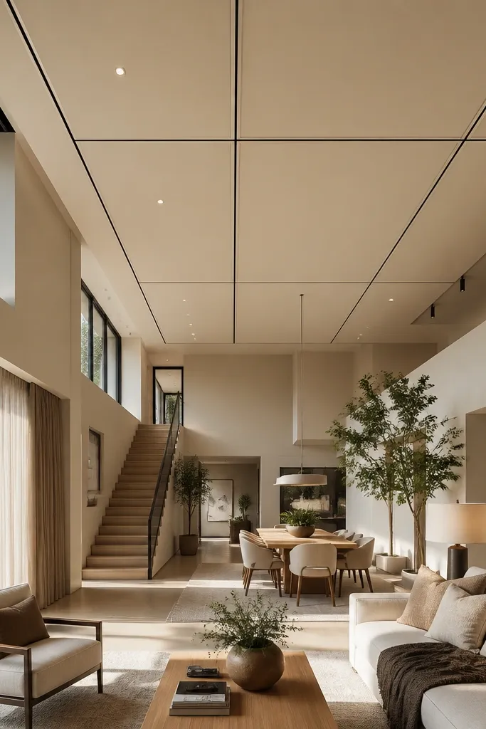
If your ceiling is plain, a shadow-gap grid adds structure that reads expensive in photos. The key is the shadow gap: it creates depth even when the paint color stays simple. This works especially well in double-height rooms because the ceiling is a big chunk of the image. You’re not building a whole drop ceiling; you’re defining lines that make the height feel intentional.
Plan a grid spacing based on your ceiling dimensions; a common starting point is 60-80 cm between main lines. Use 10-12 mm wide wooden or MDF trim strips and keep a 6-8 mm shadow gap by installing a spacer strip first. Fix the spacer to the ceiling with screws into joists or anchors, then attach the trim strips on top. Fill nail holes, caulk edges, prime, and paint the grid and ceiling in the same white for a clean, continuous look.
Use a laser to keep grid lines dead straight; small drift shows up because the ceiling is so tall.
Don’t skip priming the trim — the paint sheen difference shows in daylight.
4. Curtain wall: floor-to-ceiling panels with a ceiling track
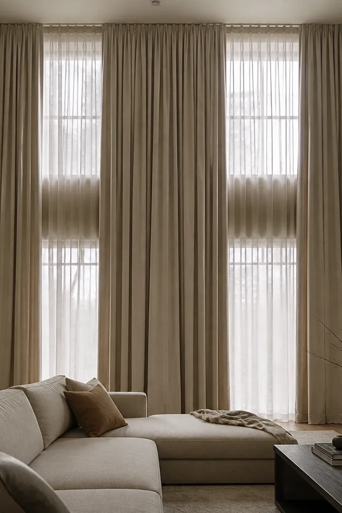
Curtains are the fastest route to that upscale double-height softness. The ceiling track lets the fabric start near the top and fall without gaps, so the room looks taller and more expensive instantly. Choose thick, matte fabric so it doesn’t cling to itself; linen blends or heavyweight cotton drape cleanly. This look is also forgiving — it hides window frames, radiator lines, and imperfect plaster edges.
Measure the width and height of the opening and add extra width for fullness (aim for 2x the finished curtain width). Install a ceiling track or heavy-duty ceiling batten with anchors into the structure, not just plaster. Hang panels so they cover the entire opening plus overlap, then steam or press to remove factory creases. Finish with curtain weights at the hems for straight, calm hanging lines.
Editor's noteHang the rod/track 15-20 cm above the top of the window line for better height.
Skip thisDon’t use thin, shiny fabric — it looks cheap and catches light in a bad way.
5. Oversized pendant cluster in black with warm bulbs
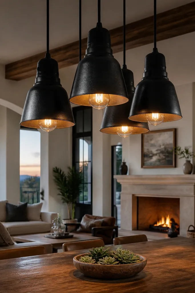
Lighting is the easiest “copy this look” win because it changes how the entire room feels at once. In double-height spaces, a single small light looks lost; a cluster or large pendant gives the eye a focal point and makes the ceiling feel curated. Black metal with warm bulbs keeps the contrast sharp against light walls. This is a budget win when you choose one strong fixture instead of many small ones.
Pick one fixture style with matching hardware, then size it to your seating area. For a double-height living room, aim for the fixture center about 75-90 cm above the tallest seat back. Use warm bulbs around 2700K and check wattage so the glow matches the room size. If you’re hanging multiple pendants, keep equal spacing and align cords so the cluster reads intentional.
Use a dimmer so the warm bulbs don’t look harsh after sunset.
Don’t hang pendants too high — you lose the glow and the ceiling dominates.
6. Stone-look peel-and-stick wall panels on one tall section
One tall panelled section gives you the look of real stone without the mess or cost. Peel-and-stick panels work best when you keep the rest of the room calm (light paint, simple trim) so the texture becomes the star. In a double-height room, a single textured vertical strip reads dramatic from the stairs and doorway views. Choose light stone tones with a matte finish so it doesn’t look plastic under daylight.
Prep the wall: clean, sand any glossy spots, and fill dents so the adhesive sits flat. Start at a level reference line and dry-lay a row to avoid weird half-stones near the top. Apply panels section by section, pressing firmly at edges and corners. Seal the surface with a clear matte sealer made for peel-and-stick to protect against scuffs.
Use a sharp utility blade and replace blades often; dull blades tear edges.
Don’t panel over peeling paint — adhesion fails even if it looks fine at first.
7. Rattan or cane screen wall behind the sofa
A cane or rattan screen adds airy texture that looks good at every height. In double-height rooms, it breaks up the wall without blocking light, and it frames the view when you look up from the sofa. It’s budget-friendly because you can buy modular screens instead of building custom carpentry. This look also photographs well because the pattern is natural and forgiving.
Measure the wall area behind the seating and pick a screen size that covers the section without towering over the room. Choose a freestanding screen with a stable base or a wall-mounted version with proper anchors. Place it centered and slightly forward so it casts soft shadows on the wall. Style with a matching tray, a tall plant, and one large art piece to keep the composition tight.
Pick a screen with a consistent weave spacing; random patterns look cluttered in tall rooms.
Don’t stack multiple screens with mismatched heights — it looks accidental from below.
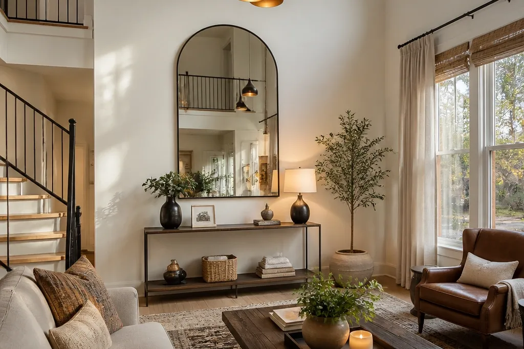
8. Oversized arched mirror on a tall wall with a slim console
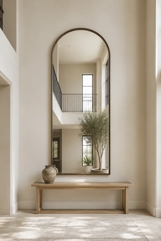
A big mirror is a reliable way to make a double-height room feel brighter and more intentional without spending on major construction. The arch shape adds softness against straight architectural lines, and it looks good in photos because it reflects the ceiling and light. Pair it with a slim console so the mirror doesn’t look like it’s floating over empty space. Keep frames simple — thin wood or matte black metal is the sweet spot.
Choose a mirror height that reaches about 60-70% of the wall height you’re using. Anchor a slim console to wall studs or use a console with a heavy top and stable legs. Hang the mirror so its center aligns with the top third of the console surface, then check level with a long spirit level. Style the console with two objects only: one tall piece (plant or vase) and one grounded object (tray or book).
Use wall anchors rated for the mirror weight — double-height rooms get more vibration when doors close.
Don’t use a tiny mirror — the scale mismatch is the fastest way to make the room look unfinished.
9. Gallery wall that climbs: large frames up the stair line
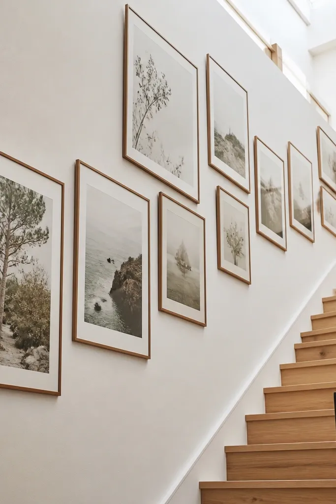
A gallery wall can look expensive when you treat it like a vertical composition, not a scatter of frames. In a double-height room, the stair line is your guide — align frames to create a climb from lower to higher zones. Use large frames (for example 50x70 cm and 60x90 cm) so the art reads clearly from the sofa. Stick to one frame color and one mat thickness so the wall looks designed.
Pick a frame color (matte black or natural oak) and a mat color (off-white works best with light walls). Lay the frames on the floor and group them in a vertical line that follows the stair rise. Mark mounting points using painter’s tape templates, then install hangers into studs. Keep consistent gaps between frames — about 6-8 cm looks clean and intentional in photos.
Use a measuring string or laser line so the top edges match even if the wall isn’t perfectly straight.
Don’t mix frame depths wildly — reflections and shadows will look messy.
10. Two-tone wall: warm white upper with soft greige lower paneling
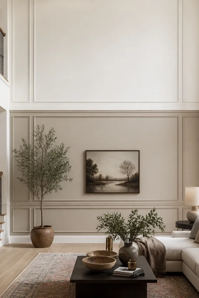
Two-tone walls make double-height rooms feel balanced because they break the vertical stretch into readable sections. The look is timeless when the lower tone is a muted greige, not a saturated gray, and when the dividing line is crisp. Add simple trim to create a panel effect without needing full wall panelling. This works well when your room has lots of windows or when the walls look too blank.
Choose two paint colors: warm white for the upper section and a soft greige for the lower. Add a dividing line using painter’s tape and a level, then install thin MDF chair-rail style trim or a simple 1x2 strip for the panel edge. Prime bare areas, cut in the line first, then roll the upper and lower sections separately. Remove tape while paint is slightly tacky for the cleanest edge, then touch up after cure time.
Editor's noteUse a matte or eggshell finish consistently; mixed sheen makes the line look wobbly.
Skip thisDon’t eyeball the dividing line — a 1 cm drift reads instantly in tall rooms.
11. Tall vertical fabric wall panels with wooden battens
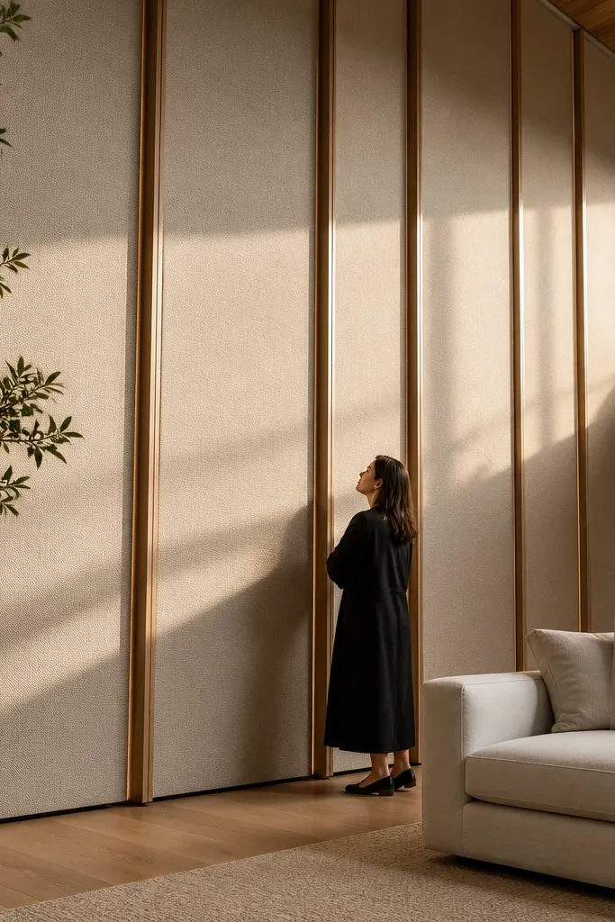
Fabric panels give you the “designer wall” look and soften acoustics in echo-y double-height rooms. Vertical orientation makes the ceiling feel taller and the wall feel intentional. You can keep it budget by using foam-backed fabric stretched over simple frames or by upholstering panels onto plywood. Pick textured neutrals (boucle, linen weave, or heavy cotton) so the wall catches light without looking shiny.
Measure panel widths and decide on a spacing rhythm; 40-60 cm wide panels with 2-4 cm gaps looks clean. Build simple rectangular frames from timber strips, staple foam and fabric over the top, and wrap the edges to the back. Screw the finished panels to a plywood backing or directly to wall studs through the frame. Trim the edges with slim molding, then vacuum and spot-clean the fabric after installation.
Editor's notePress the fabric seams flat before stapling so the texture doesn’t bunch along the vertical lines.
Skip thisDon’t use thin fabric — it will look flat and wrinkly at double-height viewing angles.
12. Matte black railings with matching wall sconces
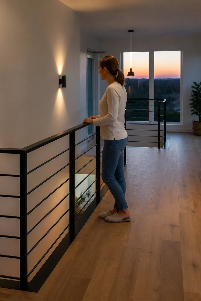
If you already have a stair opening, matching finishes is the cheapest way to make the space look cohesive. Matte black railings look crisp against light walls, and tying them to wall sconces makes the whole double-height feel designed. Add a pair of slim sconces at eye-to-shoulder height so the lighting layers up, not just down. This look stays photogenic because black lines define the vertical movement.
Choose sconces with the same metal color and a simple shade shape. Decide on spacing so the sconces sit symmetrically around a focal point (often the sofa or a mirror). Mark mounting points on studs and install a wiring box if needed; follow local electrical rules and use a qualified electrician if you’re not comfortable. Mount sconces, then touch up railing hardware so the sheen matches after painting or refinishing.
Use a satin black paint on railings, not flat — flat scuffs too easily and shows fingerprints in photos.
Don’t mix warm and cool bulbs — the black metal will look dull under mismatched color temperature.
13. Wood ceiling beams paint-matched to trim
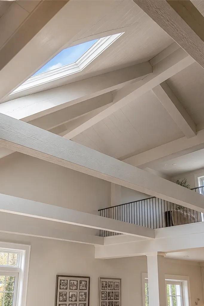
Ceiling beams give you instant structure and a “high-end build” look even in a simple room. In double-height spaces, beams pull the eye across the ceiling and make the height feel intentional instead of empty. You can do this on a budget with lightweight beam profiles, especially when you paint them to match your trim. The look is strongest when the spacing feels measured and the beams run parallel to the main viewing direction.
Decide beam direction based on the main sightline from the sofa, then measure the ceiling length and divide it into equal spacing (start around 80-100 cm between beams). Mark joists and install a ledger where needed so beams anchor securely. Attach lightweight beam covers to the ceiling using screws into joists and construction adhesive for extra grip. Prime and paint beams and trim in the same color so the beams look like part of the architecture.
Use a laser to keep beam lines straight; ceiling angles make this harder than walls.
Don’t install beams only to drywall — they must bite into joists or solid backing.
14. Concrete-effect wall with limewash paint finish
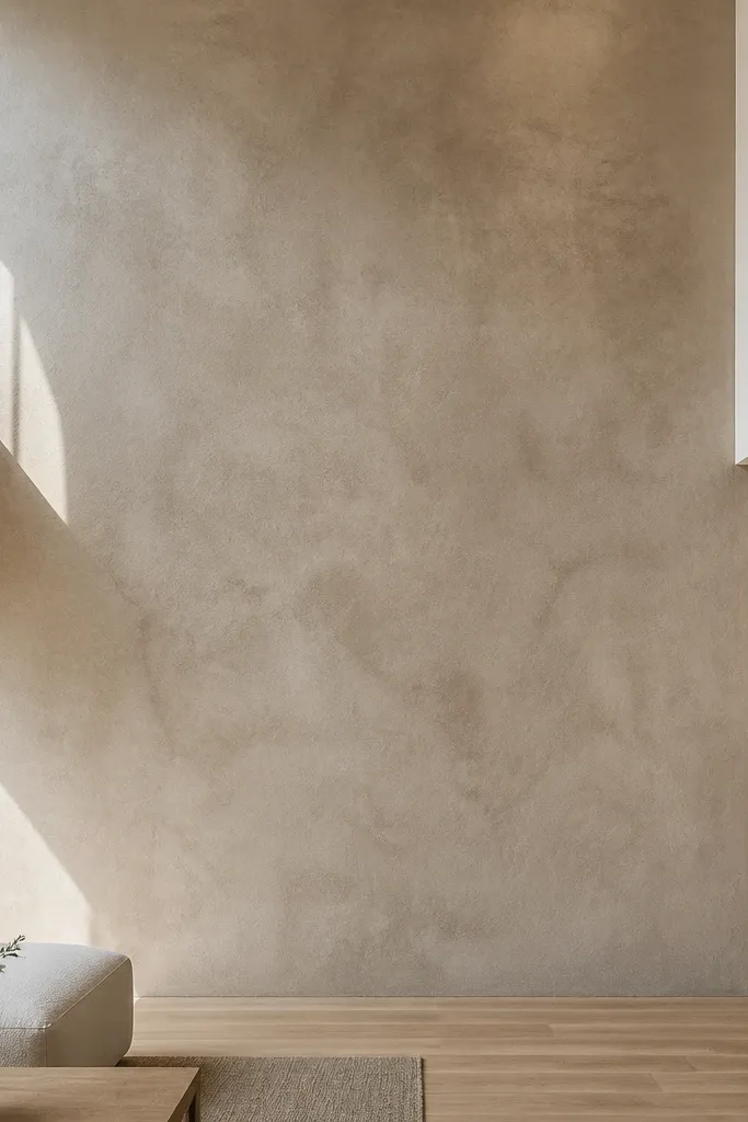
A concrete-effect limewash wall looks modern, calm, and expensive because it has variation. Double-height rooms can feel sterile with only flat paint, so this finish adds depth without going loud. It also hides small imperfections in the wall because limewash-style texture is forgiving. Keep the rest of the room in simple tones so the mottling is the star.
Prep and prime the wall so the surface is uniform, then apply a base coat in a light concrete tone. Mix or apply limewash-style layers with a wide brush, using a blotting motion to create natural variation rather than a smooth spread. Allow each thin layer to dry before adding the next so the mottling builds gradually. Seal lightly with a breathable matte sealer if the product system requires it, then let cure fully before styling heavy decor.
Editor's noteTest on a 1 m section first — the texture intensity changes a lot by wall absorption.
Skip thisDon’t roll it on thick — you’ll lose the limewash movement and it turns patchy.
15. Stair wall timber panels with a long vertical runner
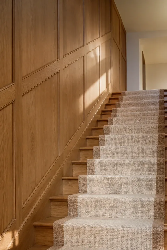
This look turns a stair landing into a design moment instead of an afterthought. Timber wall panels near the stair add warmth where the eye naturally travels, and a long vertical runner rug anchors the movement upward. It’s a strong budget combo because you can use thin timber panels and an off-the-shelf runner. The room looks layered — wall texture, floor texture, then lighting.
Measure the stair wall section and cut timber-look panels to fit vertical strips, leaving a small gap for expansion. Install panels on a plywood backing or directly on studs using screws and wood glue. Finish with a matte clear coat so the tone stays consistent across daylight changes. Add the runner rug aligned to the stair direction, then secure at the top with a non-slip underlay to prevent creeping.
Align panel seams with stair handrail lines for a cleaner visual rhythm.
Don’t choose a glossy timber finish — it reflects light and can look cheap on tall walls.
16. Oversized framed fabric art in warm neutrals
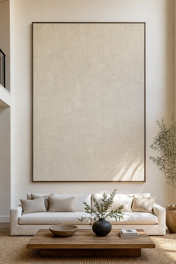
Fabric art looks softer than prints and it reads well from distance, which matters in double-height rooms. Large scale is the whole trick here: small prints disappear, but a big framed textile gives the eye something substantial to hold. Warm neutrals with subtle texture keep the room feeling calm while still looking styled. This is a budget route if you use fabric from a good bolt and frame it over a stretched backing.
Pick fabric with texture you can feel — linen weave or heavy cotton — and buy enough for a few test cuts. Stretch fabric over a backing board (MDF or foam core), then wrap edges to the back with a staple gun. Choose a frame width that looks proportionate to the wall (aim for 6-10 cm frame width for tall walls). Install two hangers and mount securely into studs or use rated wall anchors.
Use off-white mats; bright white mats can look harsh in warm double-height lighting.
Don’t use thin, see-through fabric — it turns into a flat sheet and loses the texture effect.
17. Two-layer rug zoning: wide runner + grounded area rug
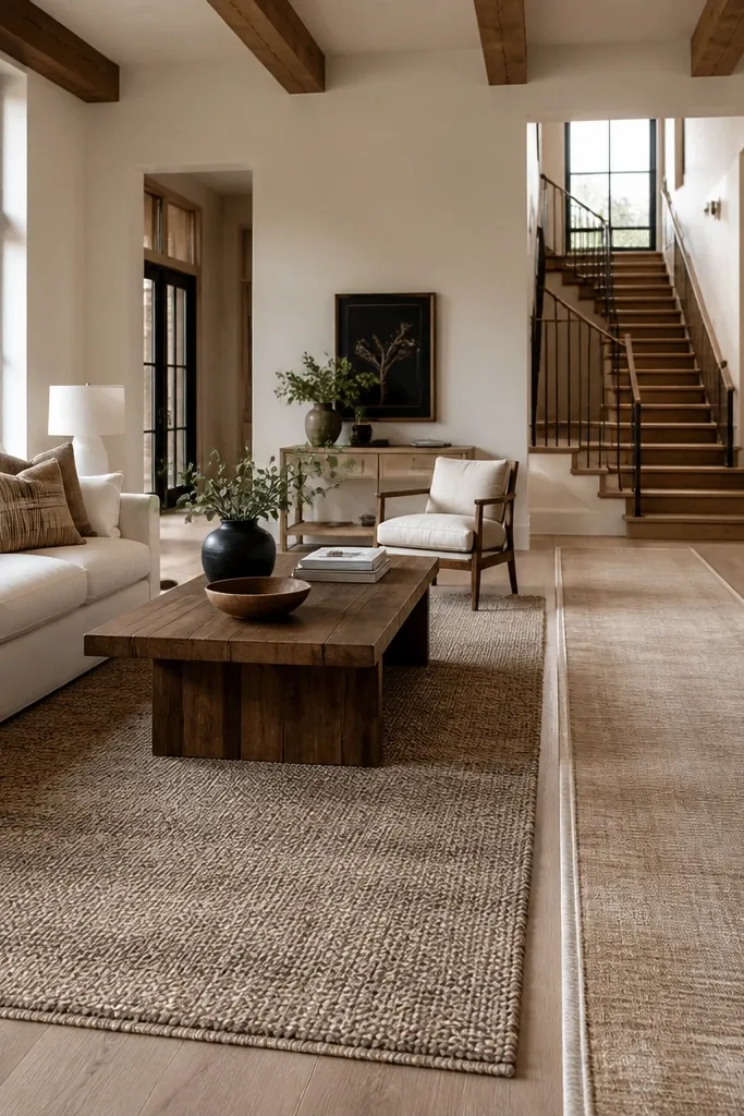
Rugs are what stop double-height living rooms from feeling like a hallway. Layering a wide area rug with a runner creates a designed path from seating toward the stair or focal opening. It’s budget-friendly because rugs are easier to swap than furniture, and you can get a high-end look with the right colors and pile height. Keep patterns restrained — think solid or subtle texture — so the vertical architecture stays the hero.
Measure the seating zone and pick an area rug that extends under the front legs of the sofa and chairs. Add a runner that aligns with the main path — usually toward the stair — and keep it centered. Choose a runner with a similar undertone to the area rug so the layers don’t fight. Use rug grippers under both layers and trim any curled edges so it lays flat for photos.
Editor's noteAim for pile height that’s low and even; thick uneven piles look messy in tall rooms.
Skip thisDon’t stack two bold patterns — the room looks busy instead of styled.
18. Floor-to-ceiling vertical slat privacy screen as a room divider
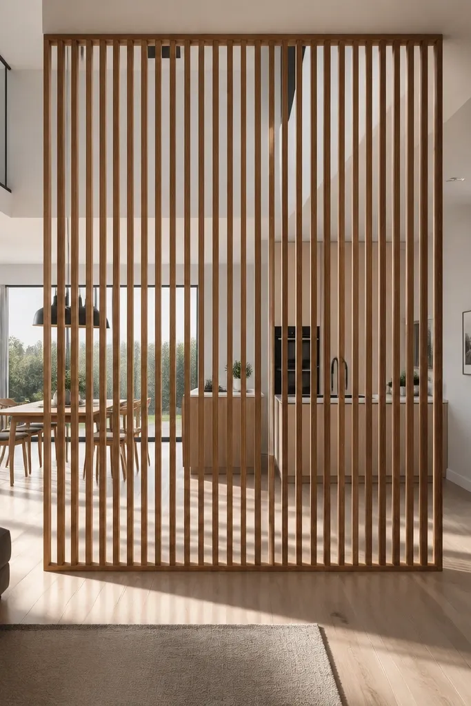
A vertical slat screen gives you privacy and structure while keeping the room open. The slats create a clean line that matches double-height proportions, and the screen adds a strong vertical element without painting more walls. If you have an open-plan layout, this helps the living zone read separate on camera. Budget-friendly versions use modular slats and a simple frame, so you avoid custom carpentry costs.
Decide the screen span and height — measure from floor to ceiling, then subtract 1 cm for clearance. Use a prebuilt frame or build a lightweight rectangular frame from timber, then attach vertical slats with consistent spacing. Anchor the frame at the top into ceiling structure and at the bottom with non-slip pads or discreet floor anchors. Finish with stain or matte paint, then add one or two plants near the base to soften the edges visually.
Keep slat spacing consistent using plastic spacers; it’s the difference between “designer” and “DIY.”
Don’t use warped slats — they create wavy lines that show up immediately in double-height photos.
19. Budget plaster molding: picture rail + framed wall squares
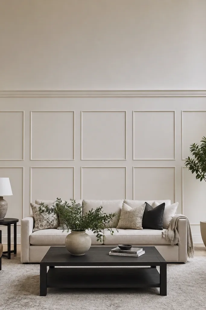
Picture rail molding is a cheap way to make a double-height wall look architectural. Add a simple grid of wall squares underneath and you get a structured, gallery-like composition that still feels light. This works when you don’t want a heavy feature wall but your room feels too plain. The best part is that the “design” is in the trim lines, so your paint colors can stay simple.
Install a picture rail trim at the height you want the visual break to happen, using studs for the mounting. Then add vertical and horizontal trim strips to create framed squares; pick a square size like 45-55 cm so they look proportional. Caulk seams, fill screw holes, and sand lightly so the trim looks smooth. Paint the entire wall system in matte white with a consistent roller nap so shadows look even.
Editor's noteUse a small foam roller for trim edges; brush marks show under tall-room lighting.
Skip thisDon’t skip caulking at the trim-wall seam — it leaves a dark line that looks unfinished.
20. Matte lime green accent column with gallery lighting
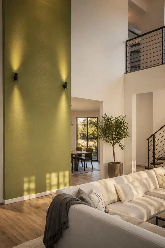
A single matte accent column is a bold but controlled way to add color to a double-height room. Keep the color muted (lime leaning green, not neon) and matte so it reads modern instead of loud. Place a pair of small wall lights or picture spotlights aimed at the column to create a halo of light and texture. This works when you want “stunning” photos without painting the whole room.
Tape off a narrow vertical column width, usually 30-45 cm, and mark the edges with a level. Prime the area and paint in matte green in two coats, letting it dry fully between coats. Install two small directed lights on the adjacent wall or use a single vertical light bar if wiring allows, then aim at the column center. Finish by keeping surrounding walls a warm neutral so the column stands out without fighting other elements.
Editor's noteTest the green on the wall in daylight — matte greens shift a lot under warm bulbs.
Skip thisDon’t use glossy paint on the accent — it reflects unevenly and looks patchy at height.



