
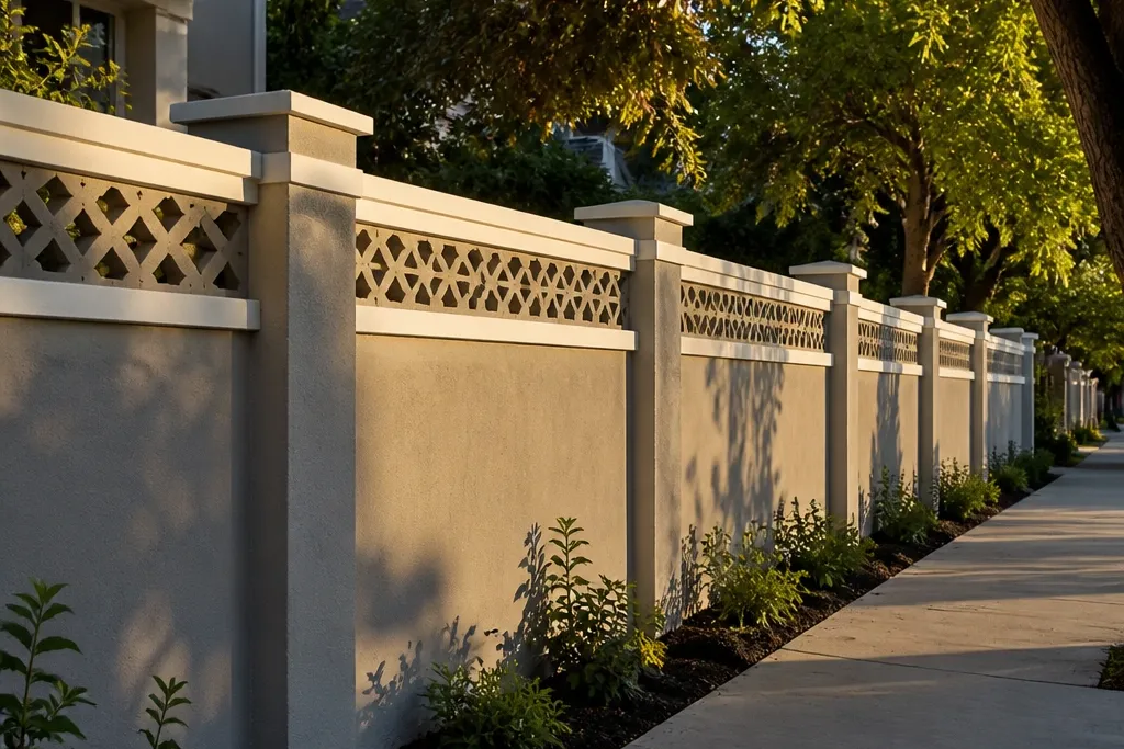
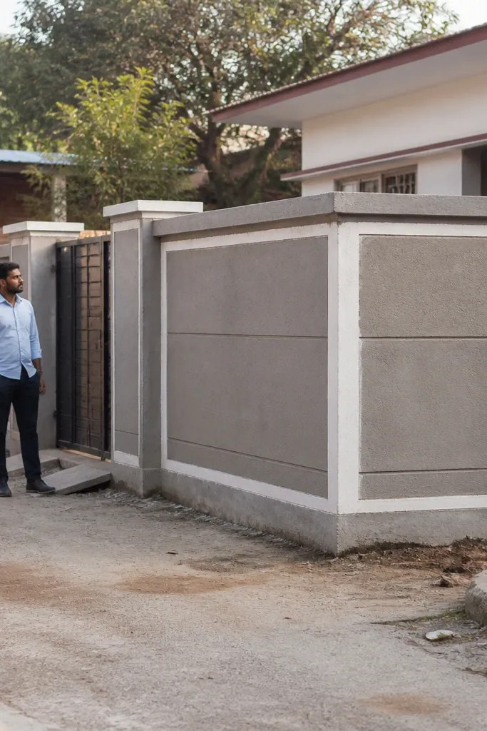
1. Grooved Cement Plaster Panels with Coping Caps
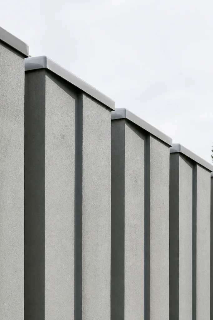
This is the cleanest “modern budget” look because the grooves create shadow without extra materials. You get a high-end feel from simple straight lines, and the coping caps stop water staining from running down the face. The wall reads tidy from the road because every bay repeats the same texture. It suits front boundaries where you want privacy but still want the surface to look crisp in daylight. Skill level is beginner-friendly if you can keep straight edges.
First, lay out your posts and infill so each bay is the same width, then plaster the panel faces in two coats (base scratch coat, then a smoother finish). While the finish is still workable, mark vertical lines and use a straight grooving tool to cut shallow channels, about 10-12 mm deep, keeping spacing consistent across the run. Finally, add precast coping caps or a cement cap with a slight slope and drip edge so rain runs off instead of soaking into the wall.
Use painter’s tape as a guide for grooves on the first few bays, then remove it and reuse the same spacing marks.
Don’t make the grooves too deep — they chip easily and look messy after a few seasons.
2. Brick-on-Edge Top Band with Solid Panels
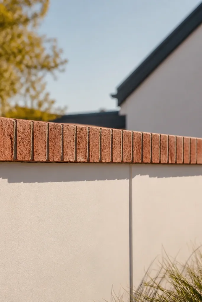
Start by building your posts and solid infill panels, then plaster and level the top surface so the brick band sits flat. Lay bricks on edge across the entire run using a thin mortar bed, keeping the band height consistent (commonly 2-3 brick courses thick). Finish by grouting the joints neatly and adding a waterproof cap or cement topping over the band to prevent water from sitting in the mortar.
A brick-on-edge top band turns a plain wall into something that looks designed. The band casts a thin, even shadow line, which makes the top feel “finished” even if the panels are simple. This idea is great for privacy-first walls because the infill stays solid, and the only decorative work is at the top. It also hides minor unevenness at the top edge, since the brick band frames everything. If you want something that photographs well without complicated carving, this is a strong pick.
Skip thisAvoid skipping a waterproof cap — water trapped in the band joints shows up as dark streaks.
Editor's noteDry-lay one 2-3 m section to confirm how many bricks fit and adjust bay widths before you set mortar.
3. Hollow Block Infill with Vertical Shadow Recesses
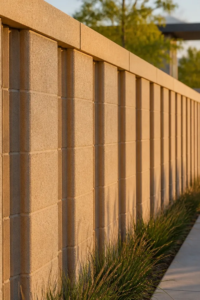
First, install posts at your chosen bay spacing and build hollow block infill panels using standard mortar joints. Then, after the panel is set, add vertical cement strips (thin plaster ribs) between bays or over selected block lines, typically 15-20 mm wide, to create shadow gaps. Finish with a smooth skim coat around the ribs so the texture contrast is clean, and cap the top with a sloped coping to keep water out.
Hollow block infill is a budget win because it costs less than solid masonry and it lets air move through. The trick for an aesthetic result is adding vertical shadow recess lines so the blocks don’t look like a rough partition. When the sun hits, the recesses create crisp depth and the wall looks intentional. This is ideal for side boundaries where you still want airflow and less heat buildup. The build is straightforward but needs careful alignment for the recess lines.
Skip thisDon’t leave hollow block cells open at the top — water collects and stains the interior.
Editor's noteUse a laser level or long spirit level for the first course — hollow blocks show unevenness fast.
4. Alternating Texture Panels with Smooth and Brushed Plaster
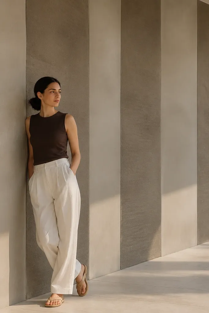
Alternating textures make a budget wall look styled because your eye reads pattern, not plain concrete. Smooth plaster panels catch light differently than brushed or trowel-textured sections, so the wall has depth without expensive cladding. This is great when you want a modern look but don’t want to deal with tile grout lines. It also hides small surface imperfections because the brushed sections forgive unevenness. It suits front and side walls where you want curb appeal without going heavy on materials.
Build your post-and-panel framework first, then plaster all panels to a similar base thickness. On alternating bays, apply a smooth finish with a steel trowel; on the other bays, use a stiff brush or broom finish while the plaster is still damp to create directional texture. Keep a consistent bay width, and seal the entire wall with a cement-friendly exterior coating after curing, then add a simple coping cap at the top.
Pick one direction for brushed texture (vertical or horizontal) and keep it the same across the run.
Don’t mix textures within the same bay — it looks accidental in photos.
5. Perforated Brick Screens in a Frame
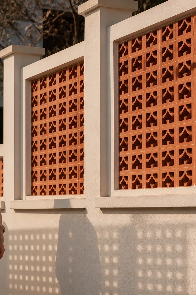
First, plan your screen openings inside the post spacing, then build solid borders around each opening using bricks or plastered masonry. Lay perforated brick in the framed area with consistent mortar thickness, keeping the pattern aligned vertically across bays. Finish by adding plaster trim on the border edges and install a coping cap that covers the top of the frame so rain doesn’t soak into the perforations.
Perforated brick screens give you a “privacy with personality” look. The holes create a lace-like pattern that reads beautifully in sunlight, and the wall still blocks direct sight better than fully open fencing. Frame it with solid posts and a clean plaster border so the perforated areas look intentional. This works well along front corners or side sections where you want to reduce heat and keep air moving. It’s a mid-simplicity build: more layout work, but the finish looks premium.
Skip thisAvoid thin, wobbly frames — if the border edges aren’t straight, the perforated pattern looks crooked.
Editor's noteMake screen openings a multiple of your brick module so you avoid awkward half-brick cuts on the sides.
6. Stone-Look Ceramic Tiles on a Cement Backer
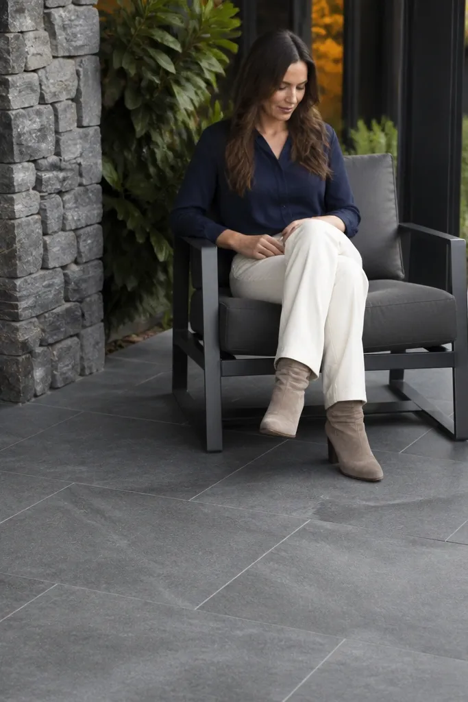
First, plaster the panel faces flat and let them cure, then apply a cement backer layer or bonding coat suitable for exterior tile. Dry-lay a grid and start from a level reference line so your tile rows stay straight, using spacers for even grout lines (commonly 2-3 mm). Finally, grout with an exterior grout, seal if your tile system recommends it, and cap the top with a waterproof coping so water doesn’t creep behind tiles.
Tile gives you the strongest “expensive” look per effort when you pick the right product. Stone-look ceramic in a medium-slate grey hides minor wall unevenness better than glossy finishes, and it’s easy to clean. Use tiles only on the visible face panels, not the entire structure, and you can keep costs controlled. This is best for front walls where the surface is seen daily and you want a crisp, photo-ready finish. Skill level is medium because alignment and grouting matter.
Skip thisDon’t grout too soon — trapped moisture can cause hairline cracks and staining.
Editor's noteChoose matte tile with subtle veining; it hides dust and small chips better than high-gloss.
7. Vertical Slat Cement Panels with Cap Lights Ready
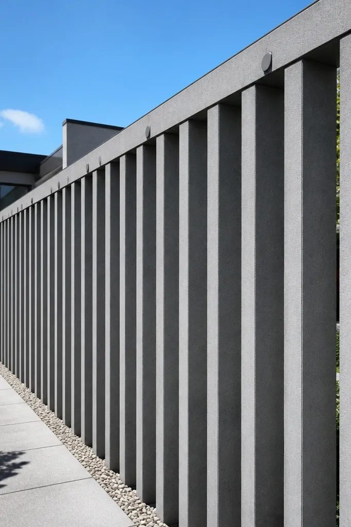
First, build posts and infill frames, then install vertical cement or brick slats inside the frames, keeping each slat width consistent (commonly 50-75 mm) and spacing equal. Plaster around the slats for a clean face, then smooth the edges so the slat shadows are crisp, not ragged. Add a top coping with a slight slope, and leave the exact mounting spots for lights by fixing small anchor points into the coping during the cap pour.
Vertical slat panels look sharp and give a modern rhythm to the wall. The slats create narrow views through the wall without turning it into a full fence, and they break up the surface so it doesn’t look like a single flat sheet. This option is also practical if you want to add small solar or wall lights later — the top coping edge gives you a consistent line to mount from. It suits both front and side boundaries. It’s an easy-to-plan design because you can repeat slat spacing across every bay.
Skip thisAvoid uneven slat heights — even small differences look obvious once the sun hits.
Editor's noteUse a spacer block for slat gaps so every shadow line stays the same width.
8. Alternate Bay Solid and Lattice Infill
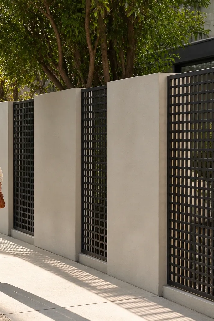
Start with your posts and build solid infill panels for every other bay, plastering them smooth. For the lattice bays, create a frame opening and install a simple lattice pattern using masonry strips or pre-made cement/metal lattice panels fixed to the frame. Finish all faces with the same plaster thickness so transitions look clean, then add matching coping caps across the entire wall line.
This design is photogenic because it breaks the monotony of full-height solid walls. Alternating solid bays and lattice infill gives you privacy where you need it and visual interest where you want it. Lattice also helps the wall look lighter from the street, which makes it feel more “designed” even with a budget build. It’s ideal for front corners or street-facing runs where plain walls feel heavy. The build is manageable if you can keep the lattice opening sizes consistent.
Skip thisDon’t mix lattice materials mid-run — inconsistent texture reads as messy.
Editor's noteMatch lattice bay width to your panel bay width — don’t squeeze the opening; it makes the lattice look cramped.
9. Terracotta-Style Plaster with Whitewashed Panel Borders
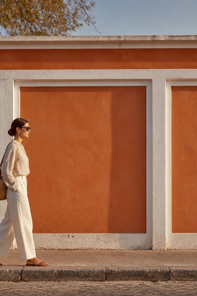
First, plaster the wall panels and let them cure fully, then apply a base coat of exterior terracotta-toned cement paint or mineral coating. Mark panel borders with tape and paint a clean white border strip, keeping the border width consistent across bays (commonly 40-60 mm). Finish with a grey or matching top cap, then seal the entire exterior with an exterior-grade clear coat if your product recommends it.
Color is the fastest way to make a budget wall look expensive, and terracotta-style plaster with white borders is a proven combo. The warm tone makes the wall feel inviting, while the white border lines create a crisp frame around each panel. This works especially well if your house facade has warm tones or off-white trims. It’s also easy to maintain because you can touch up paint/borders without redoing the masonry. The look is bold and photogenic in morning light.
Skip thisAvoid using interior paint — it flakes with rain and sun.
Editor's notePrime the cement surface before color — it prevents patchy dark spots after drying.
10. Cement-Block Pattern Wall with Diagonal Bracing Tiles

First, build a block-based infill with consistent grid bays and plaster the face smooth enough for tile adhesion. Then, plan your diagonal tile accents so they land symmetrically across each bay opening, typically at 45 degrees. Use exterior tile adhesive, set the diagonal tiles with spacers, and grout after curing. Finish with a waterproof coping cap that covers the tile edge line so water doesn’t seep behind.
If you want something that looks “architect-designed” but still builds from basic materials, use a block pattern plus diagonal tile accents. The diagonal pieces create an X-like visual that draws attention and makes the wall look purposeful. The blocks provide the structure and cost control, while the small tile accents handle the aesthetic payoff. This is great for front sections where you want a statement wall without covering everything in expensive cladding. Skill level is medium because you need straight lines for the diagonal pattern.
Skip thisDon’t eyeball the diagonals — one slightly off angle ruins the symmetry in photos.
Editor's noteMake a paper template for each bay so your diagonals match across the full run.
11. Brick Privacy Wall with Alternating Vertical Openings
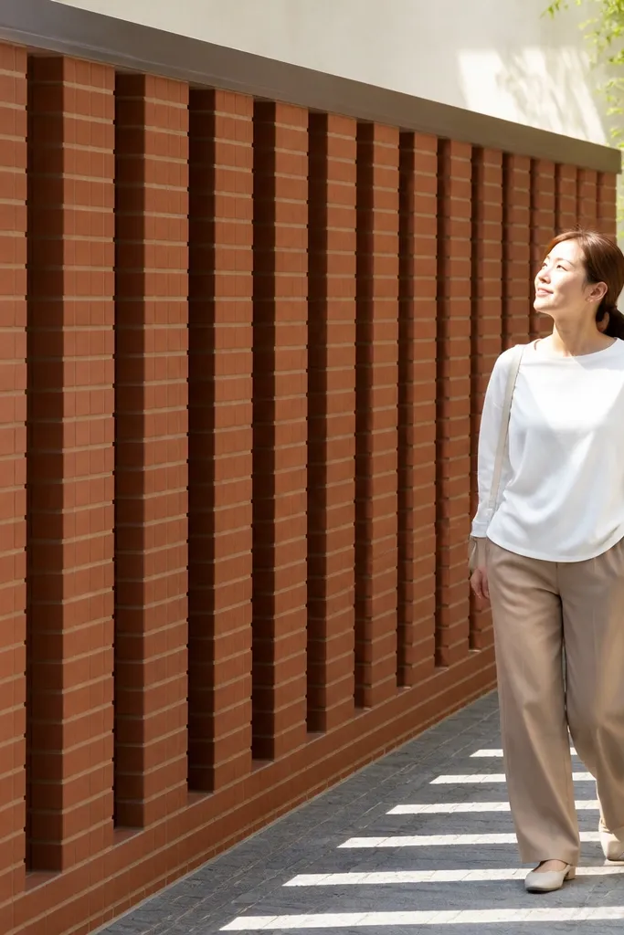
First, lay out a consistent bay width and decide the opening width for the vertical gaps (commonly 50-100 mm). Build the brick wall in courses, leaving the openings at the planned positions while keeping mortar joints aligned. After the masonry cures, plaster and tool the face around openings so edges are crisp, then add a cap with a slight slope to keep water out of the gaps.
This is a budget idea that feels premium because the openings add rhythm without making the wall fully open. Alternating narrow vertical gaps reduce heat and give a glimpse line, but the wall still reads private from street level. Use it when you want a brick look but don’t want to pay for full decorative brickwork. The best part is the repeating pattern — it looks intentional in every photo angle. It’s a solid masonry project with clear layout rules.
Skip thisAvoid irregular gap spacing — it looks like unfinished work instead of a design.
Editor's noteMark opening positions on the first course and transfer the marks up with a plumb line.
12. Precast Concrete Panel Look with Painted Joints
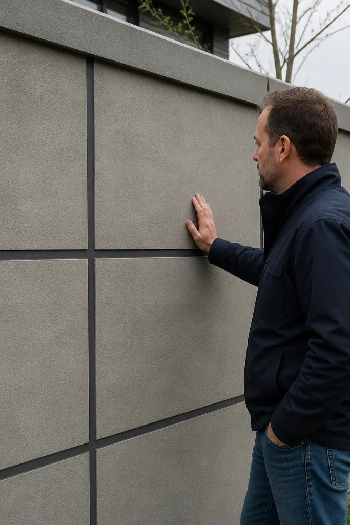
First, build a solid plastered wall face and keep it as flat as you can. Then, measure a repeating panel grid (for example 600 mm wide panels) and tape the joint lines on the surface. Paint the joint lines with a darker exterior cement paint, then paint the main panel areas with your chosen lighter grey or off-white. Finish with a proper coping cap and seal the surface if your paint system needs it.
You can fake a precast-panel look using plain plaster and painted joint lines. This design gives you a grid pattern that reads clean and modern, and it’s cheap because you’re only doing surface finishing. The darker joint lines create depth and hide small surface waves because the “panels” define the visual. It’s great for long street-facing runs where a plain wall feels flat. It also works well with any house exterior color because you can choose joint and panel tones.
Skip thisDon’t paint over dusty plaster — joint lines will peel or look patchy.
Editor's noteUse a small roller and keep joint lines consistent thickness; thick lines look like cracks.
13. Limestone-Color Cement Plaster with Raised Border Frames
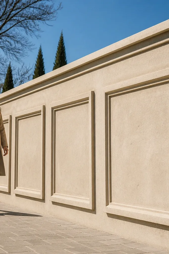
Raised border frames are a simple way to make a wall look like it has architectural panels. The limestone-color plaster keeps it bright and clean, and the raised borders catch light so the wall looks dimensional. This idea works for both modern and traditional homes because the frame style is neutral. It’s also cost-friendly since you’re shaping plaster borders instead of buying cladding. Build it if you want photogenic panels that read clearly even in overcast light.
First, plaster the wall face with a smooth base coat, then mark rectangular panel areas using string lines. Mix a thicker plaster or cement mortar for the border frames and apply it along the marked outlines to create a raised edge, commonly 15-25 mm wide. Smooth the frame edges so they look uniform, then paint the wall in a limestone tone and paint the borders slightly darker for contrast. Finish with coping caps and a sealant if your climate gets heavy rain.
Build borders in sections and keep a damp cloth nearby to clean smudges before they set.
Avoid uneven border thickness — it looks sloppy in straight-on photos.
14. Sand-Finish Plaster with Horizontal Step-Ledge Top

First, plaster the wall with a base coat and then apply a sand-finish layer using a textured trowel or sand mix appropriate for exterior use. Create the stepped ledge in the top coping by building a two-level cement cap, with the top step projecting slightly for water shedding. Keep the step height consistent across bays, and slope the top surface so rain runs off. Seal the sand-finish plaster with an exterior sealer after full curing.
A sand-finish plaster face plus a stepped top ledge looks modern and hides minor wall imperfections. The sand texture creates a soft, matte look that doesn’t show scratches as easily as smooth finishes. The stepped top ledge creates a strong horizontal line that reads clearly from the street. This is a good option if you want a low-maintenance look that still photographs well. It’s also forgiving for beginners because the texture helps hide tiny trowel marks.
Skip thisDon’t skip sealing — sand-finish plaster can absorb water and darken unevenly.
Editor's noteTest your sand texture on a scrap panel so you match the grain size before doing the whole run.
15. Checkerboard Brick Infill with Plaster Edge Trim
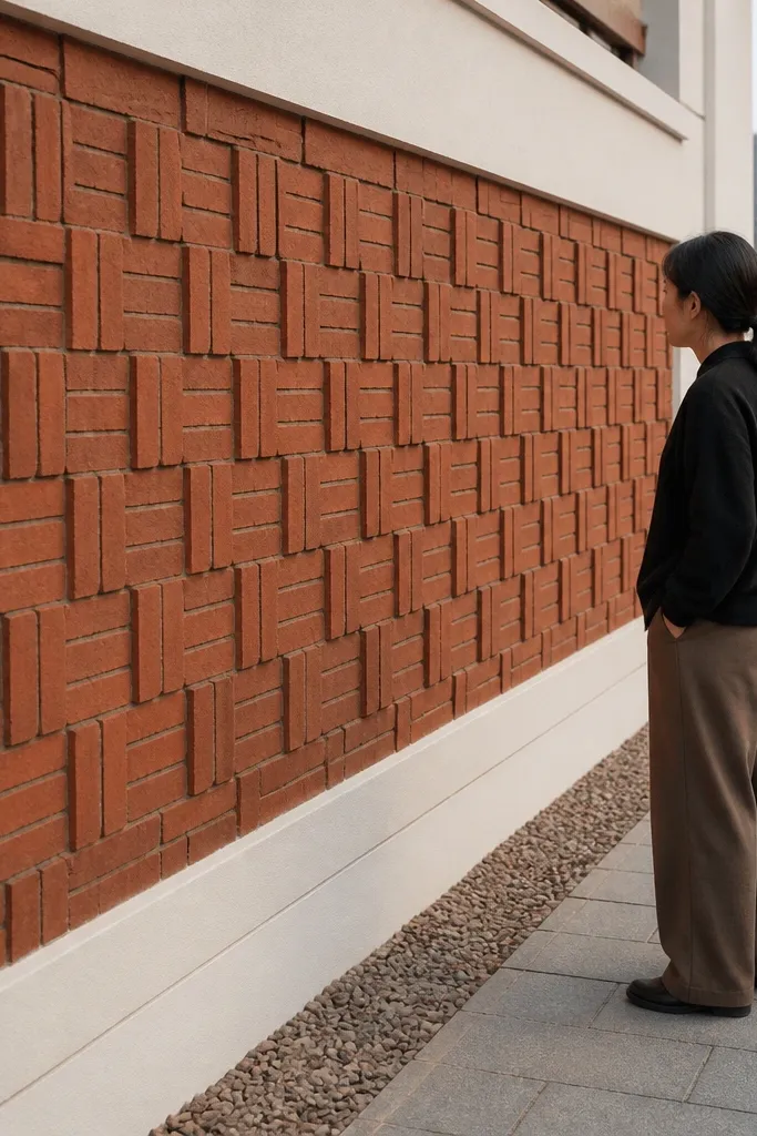
First, build your posts and create a rectangular infill panel area, then plaster the panel borders smooth and flat. Lay bricks in a checkerboard orientation pattern inside the panel, keeping mortar joints even and using spacers if needed. After the masonry sets, apply plaster edge trim around the panel to sharpen the border lines. Cap the top with a waterproof coping so the brickwork stays dry and the pattern doesn’t stain.
A checkerboard brick infill is one of the simplest ways to make a wall look handcrafted. The alternating brick orientation creates micro shadows, so the pattern shows up even when the lighting is flat. Plaster edge trim makes the pattern look framed and clean instead of chaotic. It’s perfect for side walls where you want visual interest without adding height. This build looks best when the checkerboard stays consistent across each bay — that’s where the “designed” look comes from.
Skip thisAvoid sloppy mortar joints — thick joints make the pattern look uneven.
Editor's noteUse a chalk grid on the panel before laying bricks so the pattern doesn’t drift.
16. Wood-Look PVC Slat Panels on a Cement Base
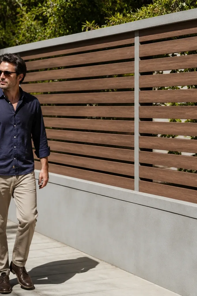
First, build your cement base up to the height you want solid (often 2-3 ft), then install horizontal rails or a frame on the top edge of the base using anchors. Mount wood-look PVC slat panels vertically on the rails, spacing them evenly and fixing at the top and bottom to stop sag. Seal the connection points with exterior-grade silicone or recommended panel sealant, then finish with a coping cap over the top frame to protect mounting hardware.
Wood-look slats on a cement base give you the warm, modern look of timber without treating and weatherproofing real wood. The slats create airflow and reduce wind pressure, which helps the wall feel lighter visually. This is a strong pick for budgets because PVC slat panels are faster to mount than masonry infill and the finish stays consistent. It’s photogenic because the slats create a clear vertical rhythm. Use it where you want privacy but not a fully solid wall.
Skip thisAvoid skipping proper anchors — loose slats rattle and warp faster.
Editor's notePick PVC slats with a matte finish — gloss plastic looks cheap in direct sun.
17. Vertical Reed-Style Cement Columns with Panel Bays
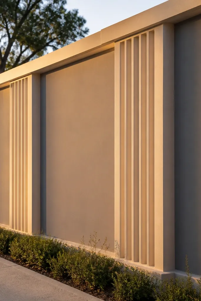
Thick vertical columns break up the wall face and make it look like a series of architectural elements. The reed-style look is mostly about proportion: wider columns and clean panel bays between them, so the wall reads structured. This is a great budget compound wall idea because you’re shaping plaster into columns rather than buying decorative stones. It suits long runs where you need rhythm and strength. Photos look good because the columns cast strong vertical shadows.
First, create a post-and-panel framework where columns align with the posts, then plaster the wall face smooth between column areas. Build up the column shapes by applying thicker cement plaster in vertical strips, then tool the edges so each column has a crisp outline. Keep column width consistent and leave panel bays uniform. Finish by adding a solid coping cap with a waterproof top surface.
Use a flexible straightedge to check column edges; cement plaster can drift if you only eyeball it.
Don’t make the columns too narrow — the shadow effect disappears.
18. Colored Cement Stain Panels with Whitewashed Vertical Bands
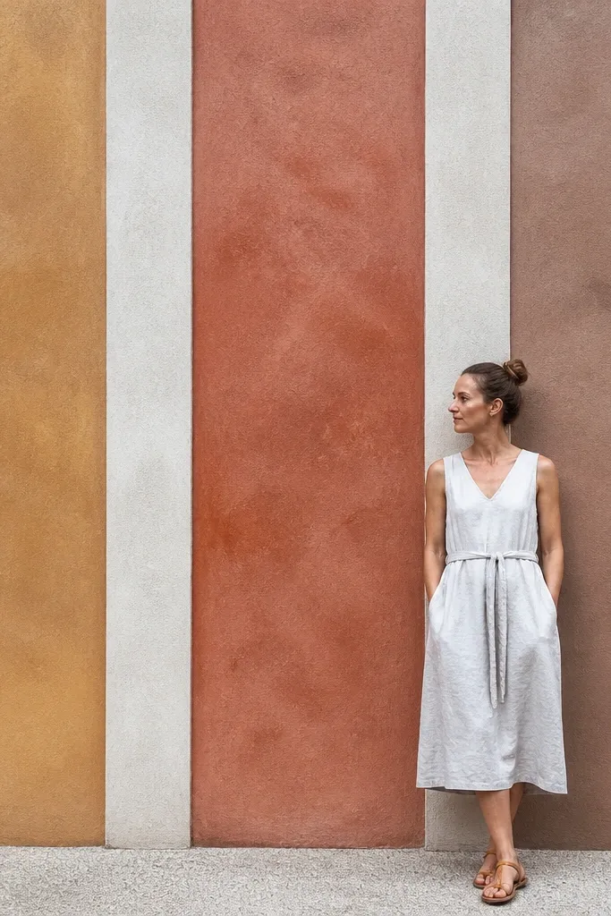
First, plaster and fully cure the wall, then clean it so the stain bonds correctly. Apply cement stain in panel sections using a brush or sprayer, working consistently and wiping excess to keep color controlled. Tape and paint whitewash bands over the stained area after the stain dries, then seal the whole wall with an exterior sealer. Cap the top with a waterproof coping to prevent rain from driving water into the stain layer.
Cement stain and whitewashed bands make a budget wall look styled without adding bulk. The stained panels create mottled depth like mineral plaster, while the whitewashed bands frame the design and keep it clean. This is ideal for homeowners who want a “hand-finished” look but don’t want tile or stone. It also hides small surface flaws because stain varies slightly across texture. Best used on walls that get decent daylight so the color variation shows.
Skip thisAvoid glossy sealers — they make stained cement look artificial.
Editor's noteDo a small test patch — stain tone changes a lot depending on plaster smoothness.
19. Metal Grille Upper Section with Solid Lower Privacy
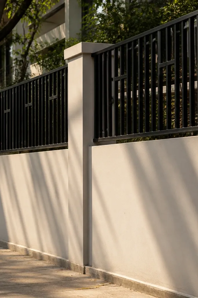
A solid lower wall plus a black metal grille upper gives you the best of both worlds: privacy where you need it and a light, airy look above. The grille creates a crisp pattern that reads well from the street, especially in late afternoon sun. This is a strong budget approach because you’re only paying for metal in the top band, not for full fencing. It also makes the wall feel less bulky compared to full-height masonry. It suits front compounds and side boundaries where you want airflow.
First, build the solid lower masonry and plaster it smooth up to your chosen height. Then install a metal grille frame on top using anchor bolts into the masonry posts, keeping the frame level and square. Paint the grille in an exterior powder coat or rust-resistant exterior paint, then add a waterproof coping cap on top of the masonry to protect the anchors. Seal any gaps around the grille frame with exterior sealant.
Choose a grille pattern with thick bars — thin bars look flimsy and photograph poorly.
Don’t mount directly without a frame — it warps and the gaps widen over time.
20. Rounded Plaster Panel Edges with a Thick Cap
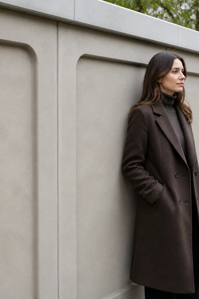
First, build your post-and-panel framework and plaster the face to a smooth base coat. Then shape the panel edges using a rounded trowel or edge tool, keeping the radius consistent, typically 10-20 mm. Apply a thick cement cap at the top with a slight overhang, and finish the underside so water doesn’t drip onto the face. Seal the plaster surface after curing so the rounded edges don’t erode.
Rounded panel edges are a small detail that makes the whole wall look softer and more finished. Instead of sharp corners that highlight imperfections, rounded edges create a smooth highlight line that looks clean in photos. Pair it with a thick cap so the top looks heavy and intentional, not thin and unfinished. This design is ideal for homes with curved or soft architectural elements. It’s beginner-friendly if you can keep the radius consistent across the run.
Skip thisAvoid over-rounding — too much curve makes panels look “worn” instead of designed.
Editor's noteWork one bay at a time so the plaster stays at the right moisture for clean rounding.



