
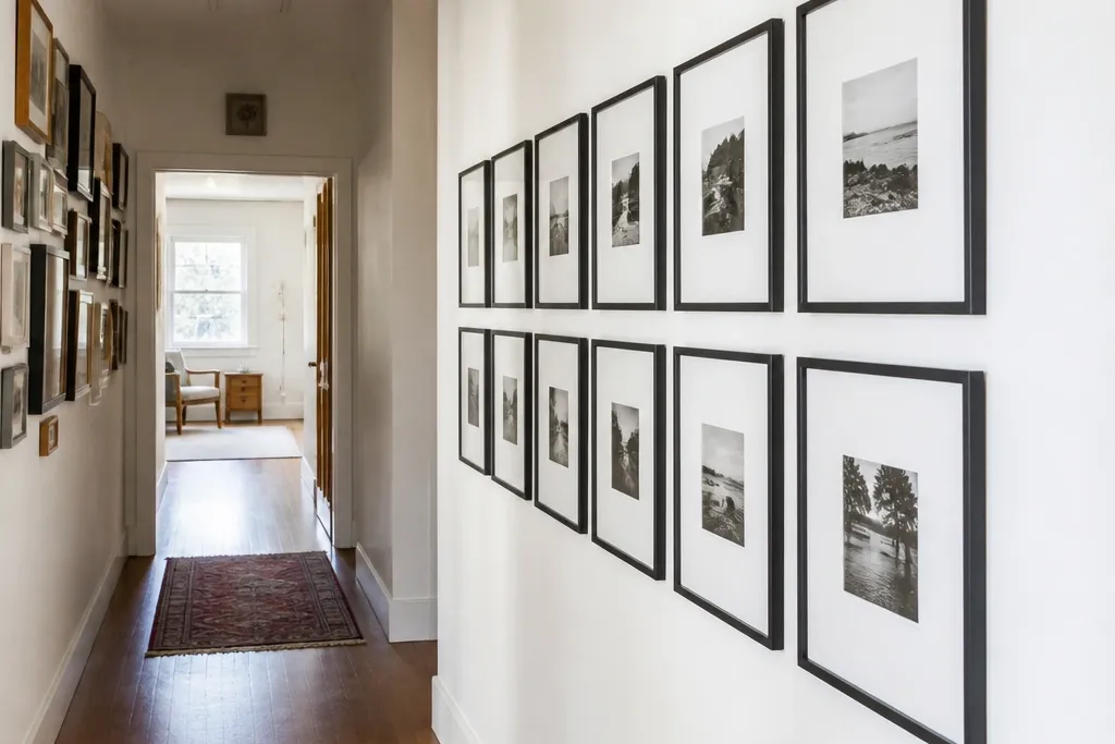
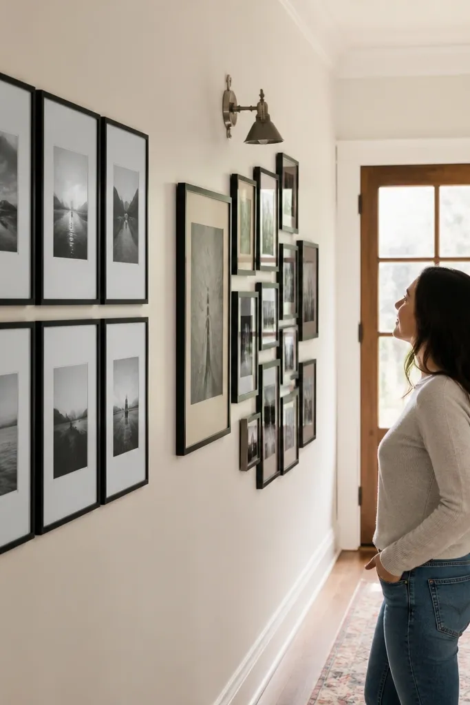
1. 8-Foot Grid Run with 2-inch Frame Gaps
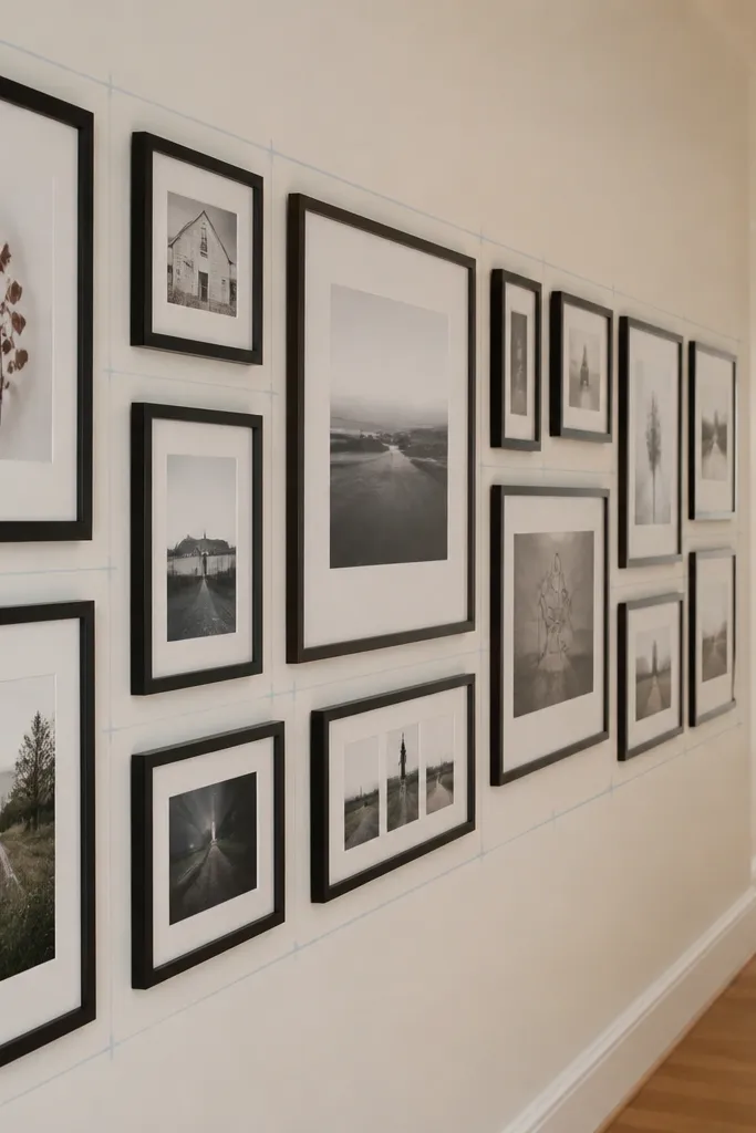
If your hallway is long and you hate the “one frame is slightly higher” feeling, this is the easiest win. Build a grid across the main stretch of wall with 2 inches between frame edges so the spacing stays consistent even when frame sizes differ. Use frames that are similar in style — think matching matte black or matching oak — so the grid reads intentional instead of mismatched. This layout works best when you can keep the gallery within one uninterrupted wall section and you’re aiming for a clean, beginner-friendly finish.
Start by measuring the wall length and choosing a rectangle that fits your available space, then mark its top and bottom with painter’s tape. Place your first two frames as a test row, then lock the gap at 2 inches between frame edges using a ruler or a scrap spacer. Once the row looks right, level it, tape the frame positions, and repeat the same vertical spacing down the wall. Finally, drill pilot holes only after you confirm the centerline stays around 60 inches from the floor to the middle of the whole arrangement.
Editor's noteUse a single cardboard spacer cut to your gap (2 inches) so every placement is repeatable.
Skip thisDon’t start hanging the middle frame first — start with the top row so your vertical rhythm doesn’t drift.
2. Doorway-Adjacent Grid That Doesn't Obscure Trim
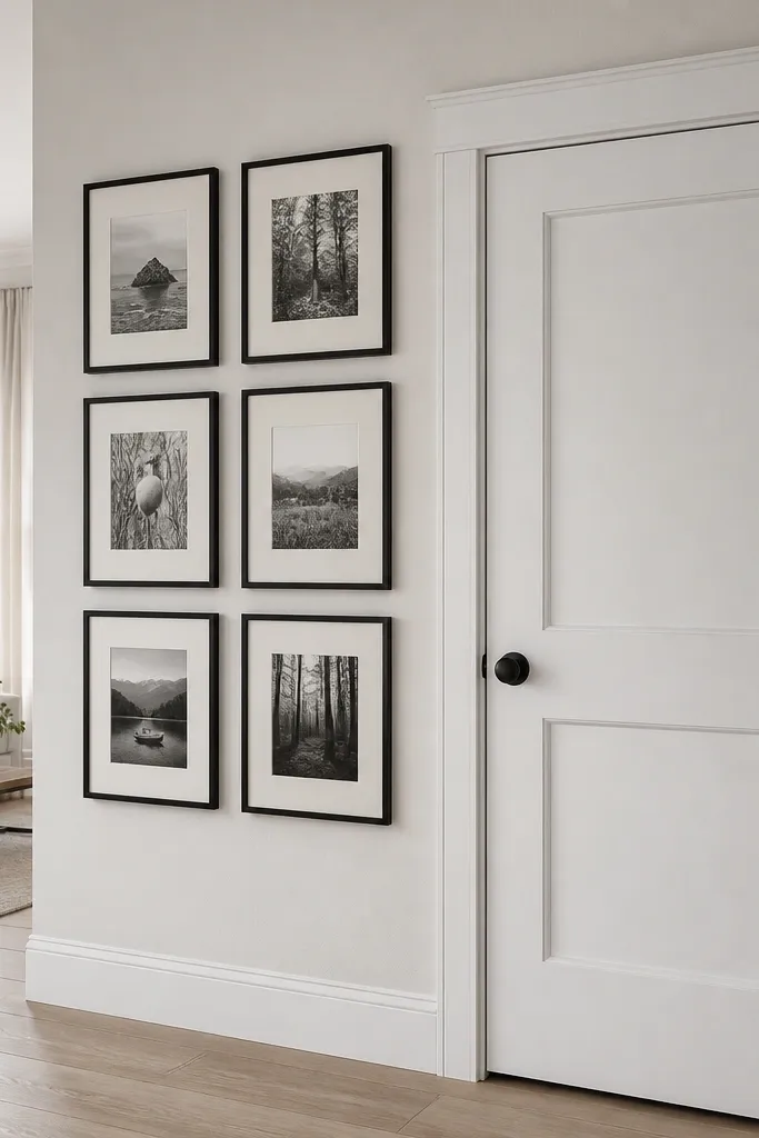
Hallways with doors create a spacing trap. This grid approach keeps frames from fighting the door trim by building the gallery around the door clearance zone and keeping the structure strict. Use a two-column grid that sits beside the door, not over it, so the arrangement looks planned. It’s beginner-friendly because you’re limiting variables: fewer frames, clear boundaries, and repeatable spacing.
Measure the door’s swing area and mark a no-drill zone on the wall with painter’s tape. Build a grid rectangle that stays outside that zone, then choose two consistent frame widths for the columns so the edges line up. Set a 2-3 inch gap between frames, level the top of the left column, and then mirror the right column using the same measurements. Hang the frames from the top down so you can adjust the bottom spacing if the wall has slight height differences.
Editor's noteIf your door trim has a rounded edge, keep at least 1 inch between the frame edge and the trim so the gallery doesn’t visually mash into it.
Skip thisDon’t place a frame so its bottom lands exactly where your eye naturally checks the door hardware.
3. Salon Style with 3 Hero Frames and Consistent Vertical Gaps
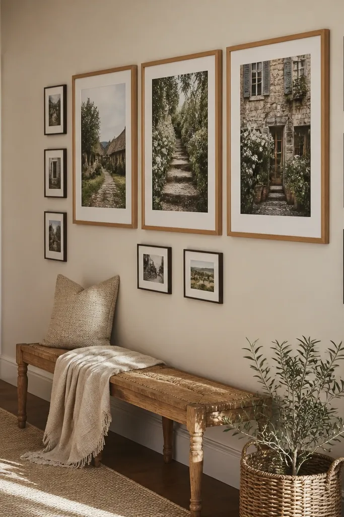
Salon style looks best when you give it a backbone. Choose three hero frames — bigger prints or photos — and keep their top edges aligned to a shared guideline so the whole wall doesn’t feel random. Then surround them with smaller frames that follow one consistent vertical gap rule, like 2.5 inches. This delivers that collected look while keeping it beginner-friendly because you’re controlling one axis instead of trying to “eyeball everything.”
Start with tape and place the three hero frames first, using a centerline to keep the middle hero aligned. Set a single vertical gap rule between frame edges, like 2.5 inches, and place the smaller frames so their top or bottom edges respect that spacing. Leave slight left-right offsets to create the salon feel, but keep the hero row straight. Once the layout looks balanced, level each frame individually and mark hardware locations through the frame backing.
Pick hero frames with similar color tones so the stagger looks intentional instead of chaotic.
Don’t mix wildly different frame thicknesses with no color repeat — it makes salon style look like a storage room of frames.
4. Symmetry Pair Gallery for Narrow Hallways
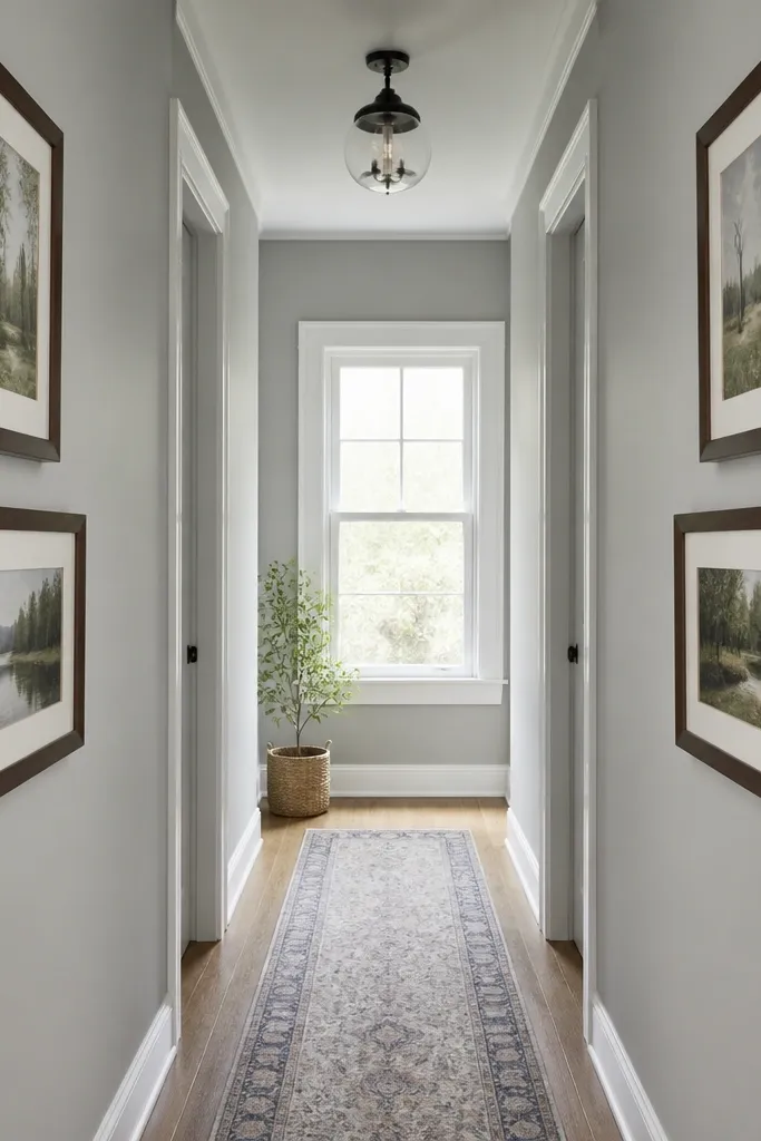
Narrow hallways can swallow asymmetry. A symmetry-first gallery makes the space feel wider and calmer because your eye gets a clear left-right match. Use pairs: two frames on the left, two on the right, with a consistent vertical spacing between the rows. This is also a smart move if you’re nervous about spacing — you’re making the wall do the work for you.
Find your hallway center line, then choose two row heights that fit your wall length. Hang the two frames in the top row first, using tape to mark exact positions, and keep their outer edges the same distance from the center line. Add the second row using the same vertical gap between frame edges — 2 inches is a good starting point. Level each pair so the top edges match, then finish by checking that the bottom edges land at the same height on both sides.
If you’re using different print sizes, match frame widths first so the symmetry reads even from a few steps away.
Don’t rely on “it looks centered” — center line plus measurement beats eyeballing every time.
5. Single Vertical Column Gallery (5 Frames)
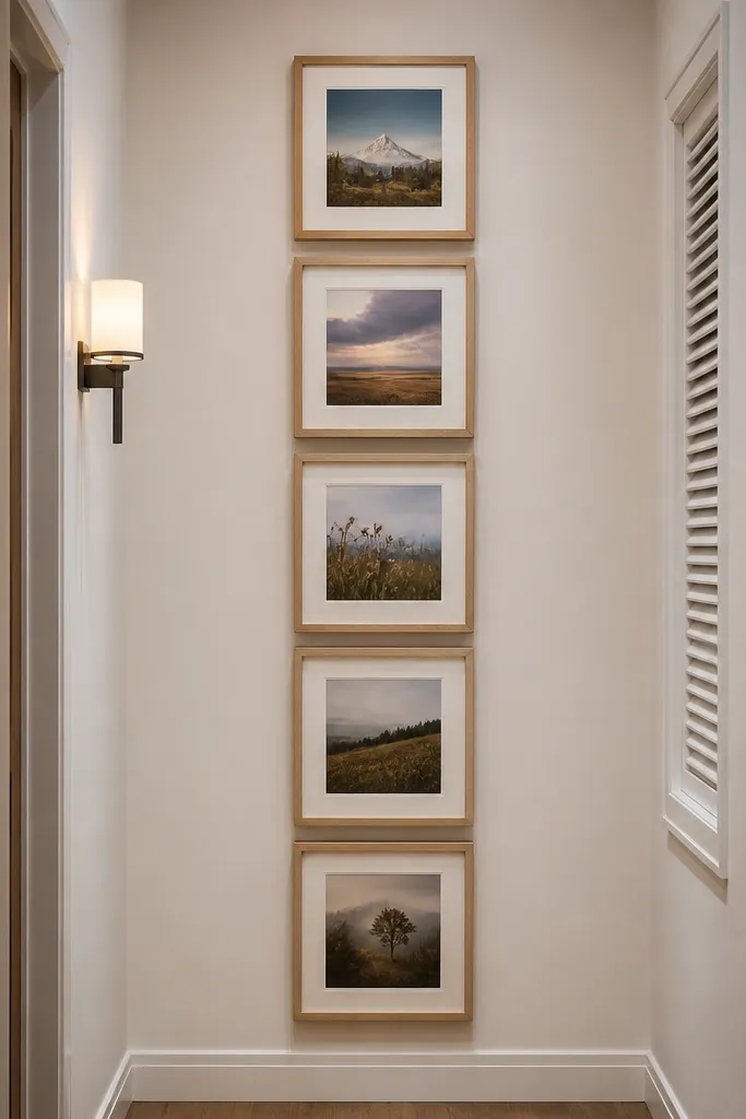
When your hallway wall has a lot going on — sconces, vents, or a tight run between doorways — a single vertical column is the cleanest beginner setup. Five frames in a straight line creates a tidy focal point without requiring you to manage side-to-side spacing. This style is also forgiving if one frame is slightly different in size, because the column keeps everything aligned. It’s great for renters too since it uses fewer holes than a full grid run.
Pick a column width by choosing one frame size as your anchor, then keep all other frames within that width by using matching frame styles or mat sizes. Mark the centerline, tape the top frame position, and set consistent vertical gaps between frames (start with 2-3 inches). Place the remaining frames so their edges align with the column width and the spacing stays even. Then level each frame and mark hardware positions before drilling.
Editor's noteUse frames with mats so the print sizes feel consistent even when the outer frame sizes differ.
Skip thisDon’t pick frames with wildly different aspect ratios — it makes the column look lopsided.
6. Grid with Alternating Sizes Like a Brick Pattern
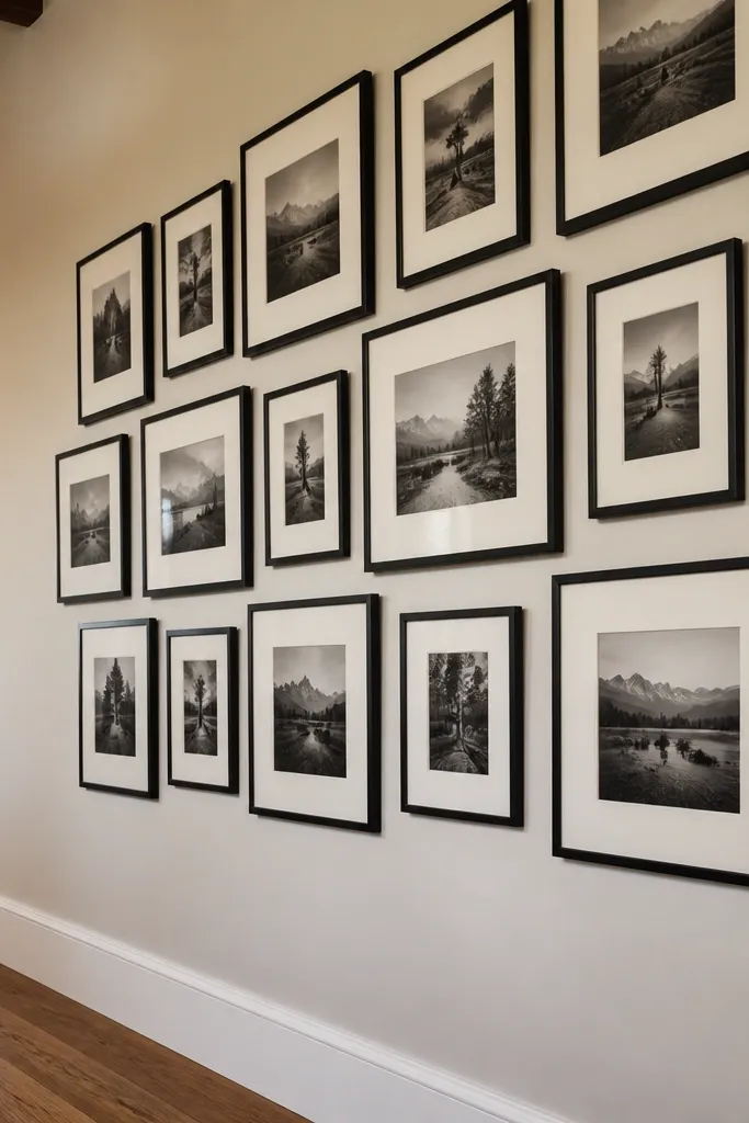
This is the grid style that still feels lively. Alternate two frame sizes — for example, 8x10 and 11x14 — and offset them like brickwork so you get movement without losing alignment. The spacing stays controlled, but the pattern gives the wall texture. Beginners like it because the rule is simple: keep the gap consistent and repeat the offset every row.
Choose two frame sizes that share one dimension feel, like both having similar outer widths or both using the same mat color. Lay out a rectangle with painter’s tape, then place the first row as a normal grid with a consistent 2-inch gap. For the second row, shift every other frame by half a frame width so it looks like bricks. Continue the pattern down the wall, level-check the first row, then hang row by row from top to bottom.
Editor's noteIf your two frame sizes have different outer widths, use a spacer strip (paperboard) to keep the gap consistent across both sizes.
Skip thisDon’t change the offset every row — brick patterns die when the shift is inconsistent.
7. Salon Style with a Straight Top Edge Line
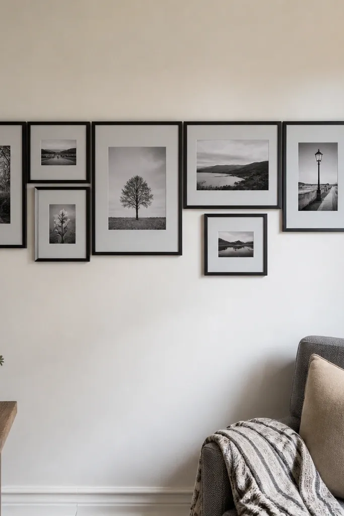
You get the relaxed salon look, but the wall stays calm. The trick is to keep the top edges of every frame on one straight line, then let the bottoms vary. This makes the gallery feel designed even if you mix sizes and orientations. It’s a great option for beginners because you only have to worry about one alignment rule — the top line.
Mark a top guideline with painter’s tape at the height you want the gallery to start, then place your largest frame first on that line. Add smaller frames below it, allowing different heights and slight left-right shifts, but keep each frame’s top edge touching the guideline. Use a consistent gap on the vertical axis — 2-3 inches between frame edges — so the stagger doesn’t collapse. Once the layout is taped and looks balanced, level each frame before marking hardware.
Editor's noteUse a long level or a straight 2x2 board as your guideline tool so the top edge line stays truly straight.
Skip thisDon’t let one frame’s top edge break the guideline — that one error ruins the whole “intentional” effect.
8. Gallery Wall Using One Frame Color and Two Mat Colors
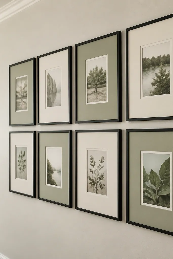
If you’re mixing prints and want the wall to look cohesive without overthinking, match the frame color and vary the mat color. This setup works in both grid and salon style, but the simplest version uses a grid because the mats help unify the spacing. Choose one frame finish — matte black is the easiest — then use two mat tones like off-white and light gray. The result is beginner-friendly because you control the visual chaos: frames match, spacing is repeatable, and prints can be different without looking messy.
Pick a frame finish and stick to it for every frame in the hallway gallery. Choose two mat colors and keep the mat opening consistent within each color set so the prints don’t look uneven. Lay out a grid rectangle with 2 inches between frame edges, then alternate mat colors in a pattern you can repeat across rows. Level the first row, tape the positions, and then hang the remaining frames following the same order.
Editor's noteIf you’re unsure about mat colors, go with off-white and warm light gray — they hide print color differences better than bright white.
Skip thisDon’t mix glossy frames with matte mats — glare makes the wall look unfinished.
9. Two-Row Grid That Reads Like a Magazine Layout
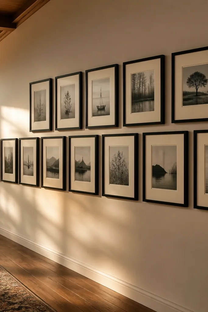
A hallway gallery doesn’t need ten frames to look designed. Two rows can look “editorial” when you align edges carefully and keep gaps consistent. Use 6-8 frames total, with the top row slightly shorter than the bottom row so the arrangement has a subtle slope. This is a beginner-friendly compromise between grid and salon: structured spacing, but a more interesting silhouette.
Decide the width of your top row and bottom row, then mark both rectangles with painter’s tape. Place the top row first, keeping 2-inch gaps between frame edges and aligning left edges as your reference. Build the bottom row using the same gap rule, then allow the bottom row to extend 2-4 inches further on one side for a magazine feel. Level each row separately, then hang from top row down.
Use frame widths that repeat at least twice across the rows so the layout feels intentional instead of random.
Don’t change the gap between rows — keep it consistent or the wall reads like a mistake.
10. Grid of Same-Size Frames with One Landscape Accent
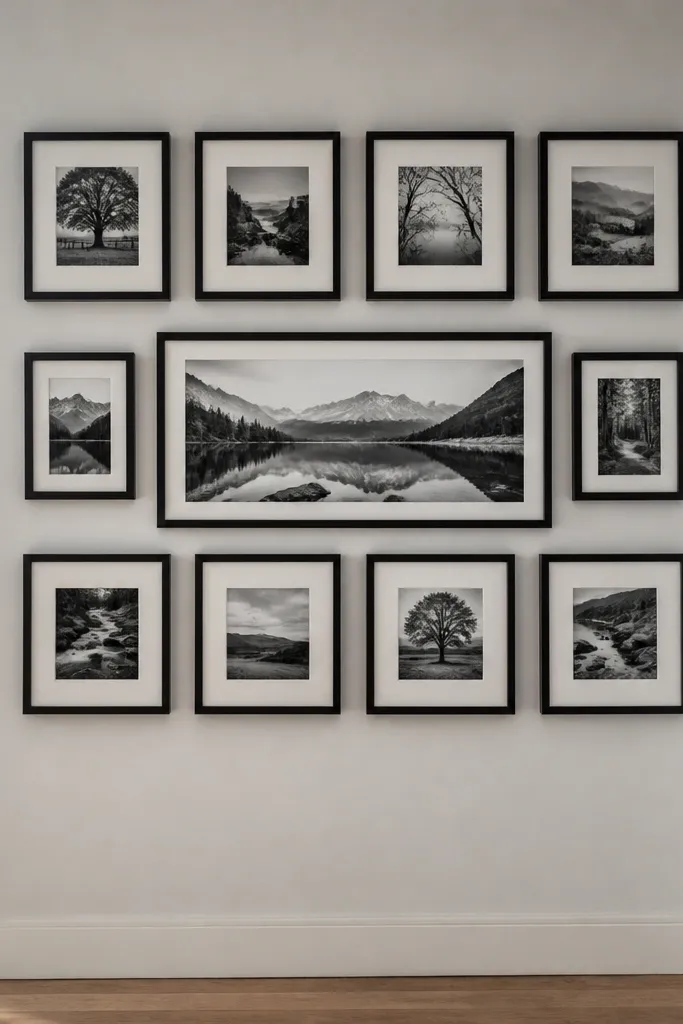
This is the easiest way to add personality without losing alignment. Use same-size frames for the majority of the gallery, then swap in one landscape accent piece that breaks the pattern. The wall looks polished because the grid is uniform, and the landscape frame gives you a focal point. It’s ideal for beginners who want a clean look but don’t want their hallway to feel like a classroom wall.
Choose one frame size as the main grid, like 8x10 or 11x14 depending on hallway width. Arrange them in a rectangle with 2-inch gaps and keep all frames portrait. Place the landscape accent in the center of the grid, then adjust the surrounding frame positions so the gaps around it look equal. Tape the full layout, check level and centerline, then hang starting with the landscape accent so it anchors the rest.
Editor's noteIf the landscape frame is heavier, use two hangers or a proper wall anchor rated for the weight so it doesn’t sag over time.
Skip thisDon’t put the accent frame slightly off center — it will draw the eye to the error.
11. Salon Style Corner Cluster Without Overhanging the Hall
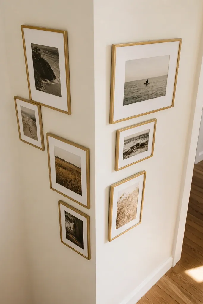
Corner areas are tough because the wall direction changes your viewing angle. A salon corner cluster works when you keep the cluster tight and avoid frames that extend too far into the hallway sightline. This layout uses 6-7 frames with a slight diagonal rhythm so it feels dynamic without taking up the whole wall. It’s beginner-friendly if you commit to tape-first planning and keep the cluster’s outer edges close to one rectangle.
Tape a compact rectangle near the corner and place your largest frame first, slightly closer to the corner than you think. Add two medium frames under it, then fill with smaller frames so the cluster has a diagonal flow from upper left to lower right. Keep a consistent gap of 2-3 inches between frames, and make sure the cluster’s outer edges stay within your taped rectangle. Level each frame before marking, then hang from the largest frame down so smaller frames fill the gaps naturally.
Use frames with similar depth (same thickness) so the cluster doesn’t look “stacked” in a messy way.
Don’t let one frame stick out past the cluster’s rectangle boundary — it looks accidental in corners.
12. Grid with Removable Hook System for Renters
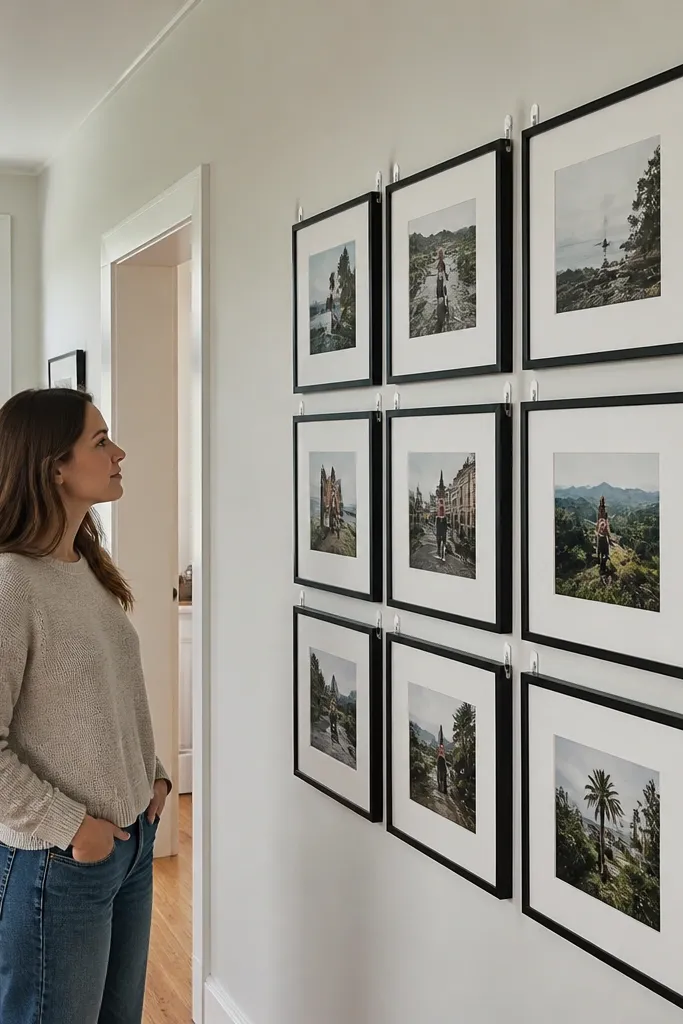
You can do a real hallway gallery without drilling into drywall every time you change your mind. This grid layout pairs with a removable hook system so you can re-space frames later. The look is structured and clean, and the build is beginner-friendly because you can dry-fit and adjust without worrying about patching holes. Choose frames with lightweight backing and use only hooks rated for your frame weight.
Measure frame weight and pick wall hooks rated for that weight plus a little buffer. Tape a rectangle and mark a grid with 2-inch gaps, then mark hook locations through the frame backing holes. Hang the first row using the centerline and level, then add the second row and confirm vertical spacing. Finish by stepping back and checking that all outer edges form a rectangle, not a wave.
Use self-leveling hooks if your wall has small dips — they keep the grid from turning into a tilt.
Don’t use heavy frames with removable hooks — sagging shows up fast in hallways.
13. Saloon Style with a Mat-First Color Plan
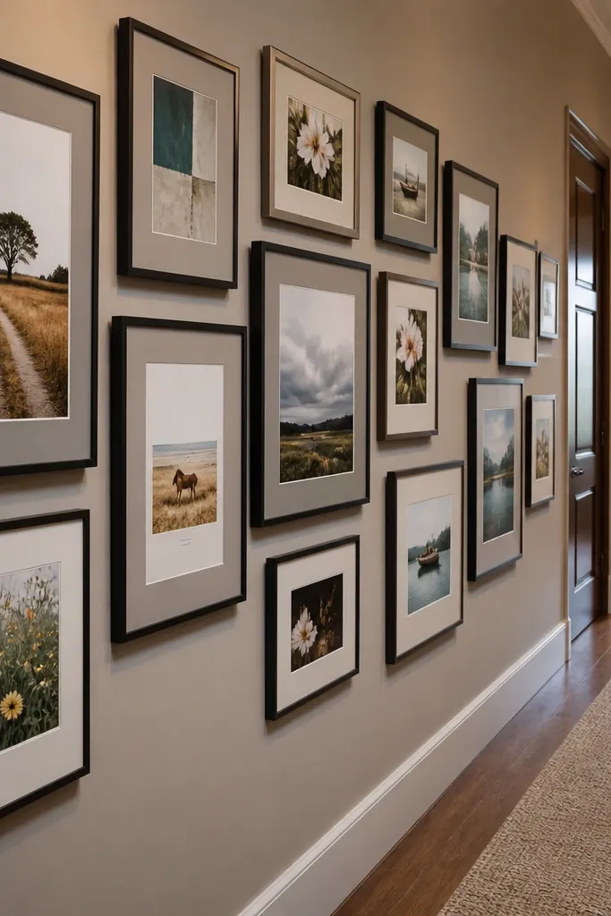
If your prints are colorful and you’re worried the wall will look chaotic, let the mats do the calming. This salon style uses a limited mat palette and lets the prints vary. Choose two mat colors and keep them consistent across the whole gallery even as frames shift. The staggered placement adds interest, but the mat plan keeps everything cohesive for a beginner-friendly result.
Choose two mat colors and decide which one goes to which type of print (warm vs cool tones, or black-and-white vs color). Tape a rectangle for your gallery, then place the largest two frames first with their mats facing forward. Add smaller frames around them, keeping gaps between frames at 2-3 inches and letting the heights vary. Once the layout looks balanced, level each frame and mark the hardware points through the backing.
Keep mat openings the same width so the color differences come from the prints, not random mat sizes.
Don’t mix multiple mat widths — it makes salon style look messy even when spacing is correct.
14. Grid of Thin Frames for a Light, Airy Hallway
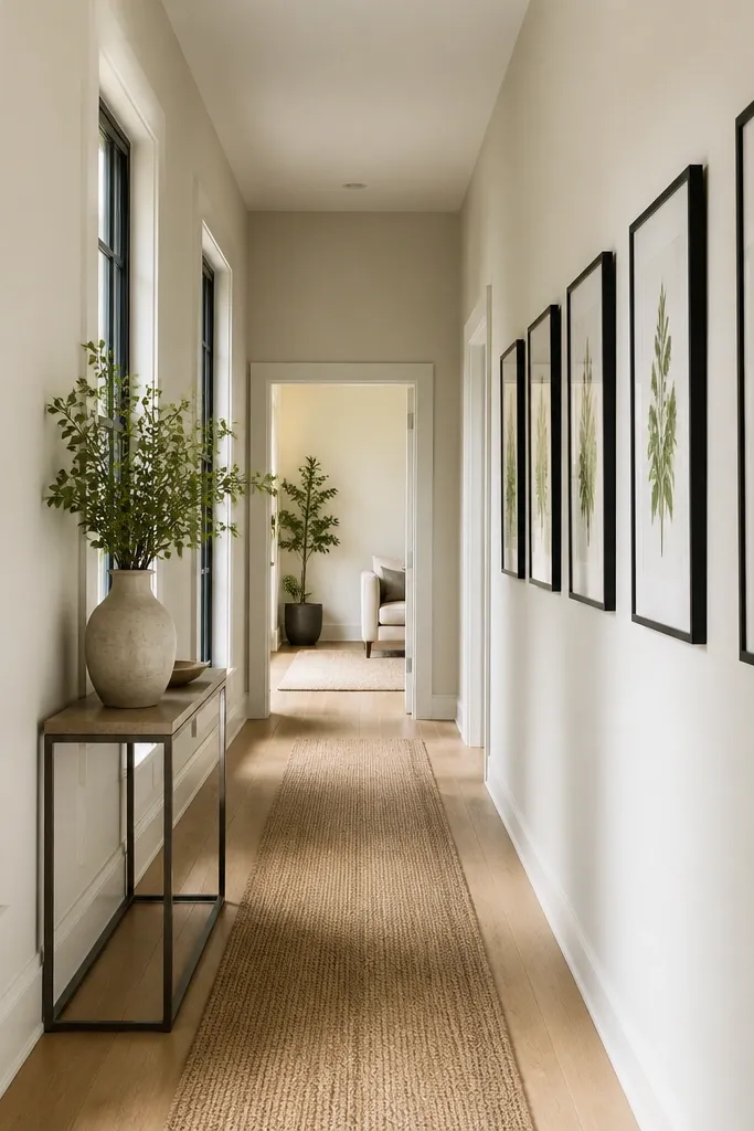
Thin frames make a hallway gallery feel less heavy, especially in tight spaces. This layout is a straightforward grid with consistent gaps, but the frame profile is the design decision. Use slim black or natural wood frames and keep the mat or print size similar so the wall doesn’t look crowded. It’s a beginner-friendly way to hang more frames without the “wall is taking over” effect.
Pick one slim frame width and one mat color, then choose 7-10 frames that fit a rectangle on your hallway wall. Tape the rectangle and mark a consistent 2-inch gap between frame edges. Place the first row, level it, then continue row by row using the same spacing. Hang top down and check the overall rectangle from a few steps back before drilling the last frame.
Editor's noteIf you want it to feel extra airy, keep all frames portrait and avoid mixing too many landscape orientations.
Skip thisDon’t overcrowd the rectangle — thin frames still need breathable spacing or the hallway looks cluttered.
15. Grid with 1-Inch Border Alignment Using a Spacer Strip
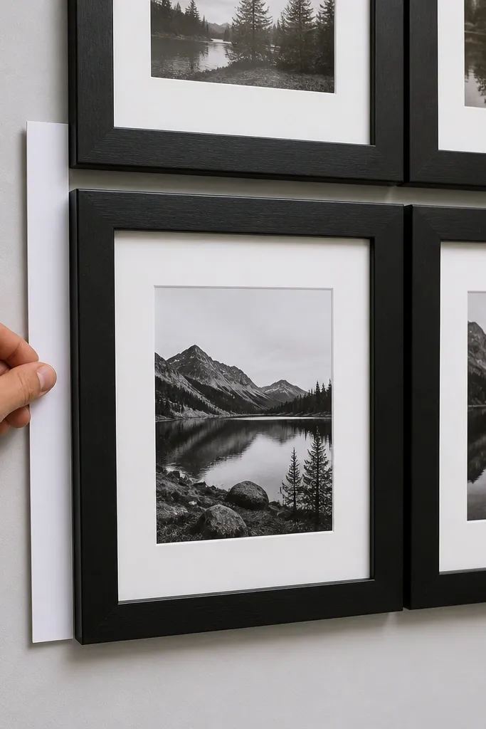
This is for beginners who want exact spacing but don’t trust their eye. The build rule is simple: align frames using a spacer strip so the gap is identical everywhere. A 1-inch border gap works well for smaller frames where 2 inches feels too wide and the wall looks underfilled. The result is a tight, modern grid that looks intentional even with mixed sizes.
Cut a spacer strip from cardboard or foam board to 1 inch. Tape your hallway rectangle and place your first frame, then set the next frame using the spacer strip between frame edges. Continue across the row, then repeat down the wall while keeping the same spacer rule. Level the first row, tape-confirm the centerline, and then hang in order so you don’t have to re-check spacing after every drill.
Editor's noteLabel the spacer strip “1 inch” with a marker so you don’t accidentally use the wrong scrap later.
Skip thisDon’t switch gaps halfway through — mixed spacing is the fastest way to make a grid look sloppy.
16. Salon Style with a Baseline Row and Floating Second Row
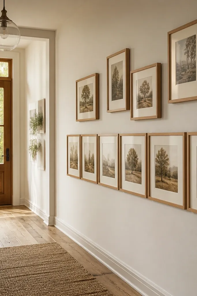
This hybrid approach gives salon style its personality while keeping one part of the wall perfectly aligned. Anchor everything with a baseline row — all frames sit so their bottoms line up. Then add a second row that floats above with staggered placement. It’s beginner-friendly because you’re using one strong alignment rule and letting the rest be flexible.
Choose your gallery width and tape a baseline guideline where the bottom edges of the first row will sit. Place the frames on that baseline first, using 2-3 inches between frame edges. For the second row, position frames so their bottoms sit higher or lower, keeping a consistent gap from the baseline row. Level each frame individually, then mark and drill starting with the baseline row and finishing with the floating row.
Use the same mat color across both rows so the stagger reads like design, not like a size mismatch.
Don’t let the baseline row drift up or down — if the bottom line isn’t straight, the whole wall looks off.



