
1. Two-Neutral + One-Accent Grid (11x14 Frames)
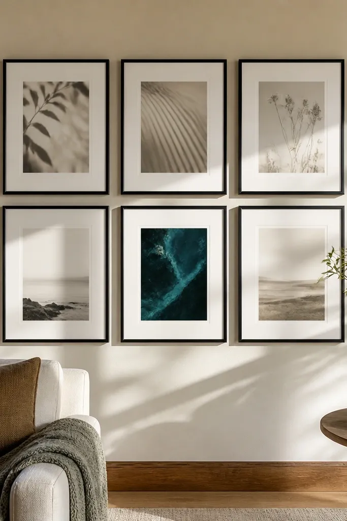
This is the quickest way to get that “my room looks styled” feeling without overthinking. Use a grid of 6 frames where five prints share a neutral palette and one print adds the accent color, like teal, rust, or olive. The repetition of 11x14 size keeps the wall calm, while the single accent print gives the eye a focal point. Choose matte paper prints or photos with similar brightness so they don’t fight each other. This setup works especially well above a console table, in a hallway, or behind a reading chair where you want the wall to look neat from multiple angles.
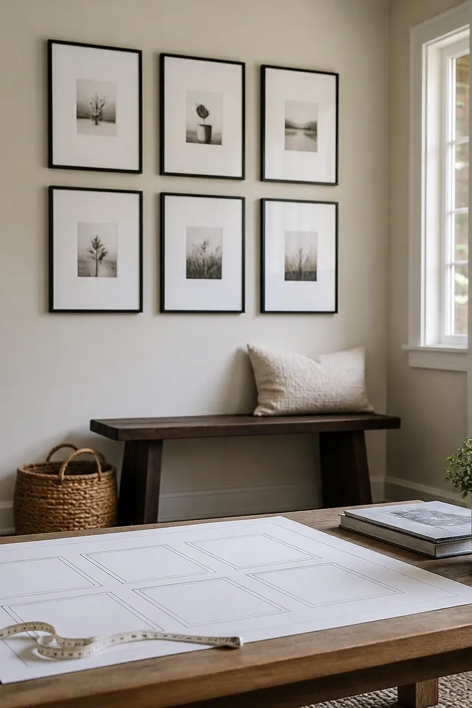
Start by picking six prints and standardizing them to 11x14 with the same frame width (for example, 1.25-inch or 1.5-inch). Lay painter’s tape on the wall in a 2-by-3 grid, then measure 2.5 inches between frame edges for the best spacing. Mark the hanging points with a pencil through the frame hardware, then remove the tape. Hang the center frame first, level it, then hang the surrounding frames using your tape marks so the grid stays straight.
Print with matte finish and add a 1-inch mat if your photos have different contrast levels.
Avoid mixing frame widths across the grid; it makes the wall look like a collection instead of one piece.
2. Black Frames, White Mats, Text-Only Set
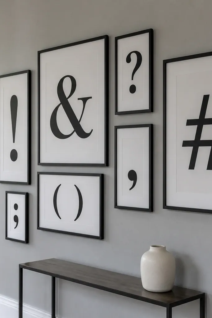
If you want a modern look that still feels warm, build a text-only gallery wall. The trick is to keep the typography style consistent: same font family or same vibe of lettering, just different sizes. Black frames and white mats create a high-contrast, clean look that pops against most paint colors. This works great in kitchens, home offices, or entryways because it reads intentional even when you only have a few pieces. It also photographs well because the matte paper and mat board reduce glare.
Choose 5-7 typography prints sized to match a common frame format like 12x16 or 11x14. Use all black frames with the same mat color, ideally off-white. Arrange them into a loose cluster on tape, keeping the top edges within about 1 inch of each other. Hang the largest print first, then place the rest around it, using the tape as your spacing reference before you drill or anchor.
Use a consistent line spacing across prints so the wall has rhythm when viewed from across the room.
Skip glossy paper; text prints glare under warm bulbs and ruin the crisp look.
3. Wood Frames with Botanical Print Ladder
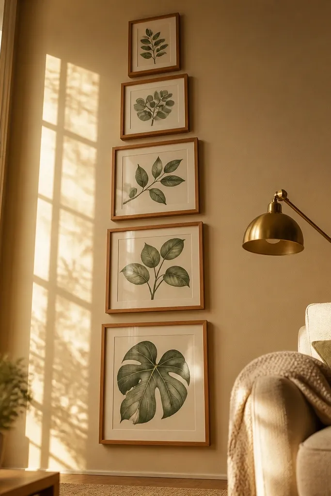
Pick 4-5 prints and standardize them to one frame width, like 2-inch wood frames. Decide your ladder effect by varying print heights: for instance, alternate between 8x10 and 11x14 or keep all frames the same and vary only the print crop. Tape the wall with a vertical column and keep about 1.5-2 inches between frames. Hang the middle frame first at eye level, then work upward and downward so the ladder stays centered.
This is a beginner-friendly way to add softness without making the wall feel childish. Arrange 4-5 botanical prints in a vertical ladder, where each frame gets slightly taller or the prints vary in leaf scale. Warm wood frames keep the room cozy, and the vertical layout makes the wall feel taller and more intentional. Use botanical prints with a consistent background tone, like cream or pale beige, so they look like one collection. This is a great fit for bedrooms, bathrooms, and corners where you want something pretty but not overly busy.
Skip thisDon’t mix cool and warm wood tones; keep the wood finish consistent so the wall looks designed.
Editor's noteChoose frames with a satin finish instead of high-gloss so the leaf textures look soft in photos.
4. One Large Statement Print + Four Small Satellites
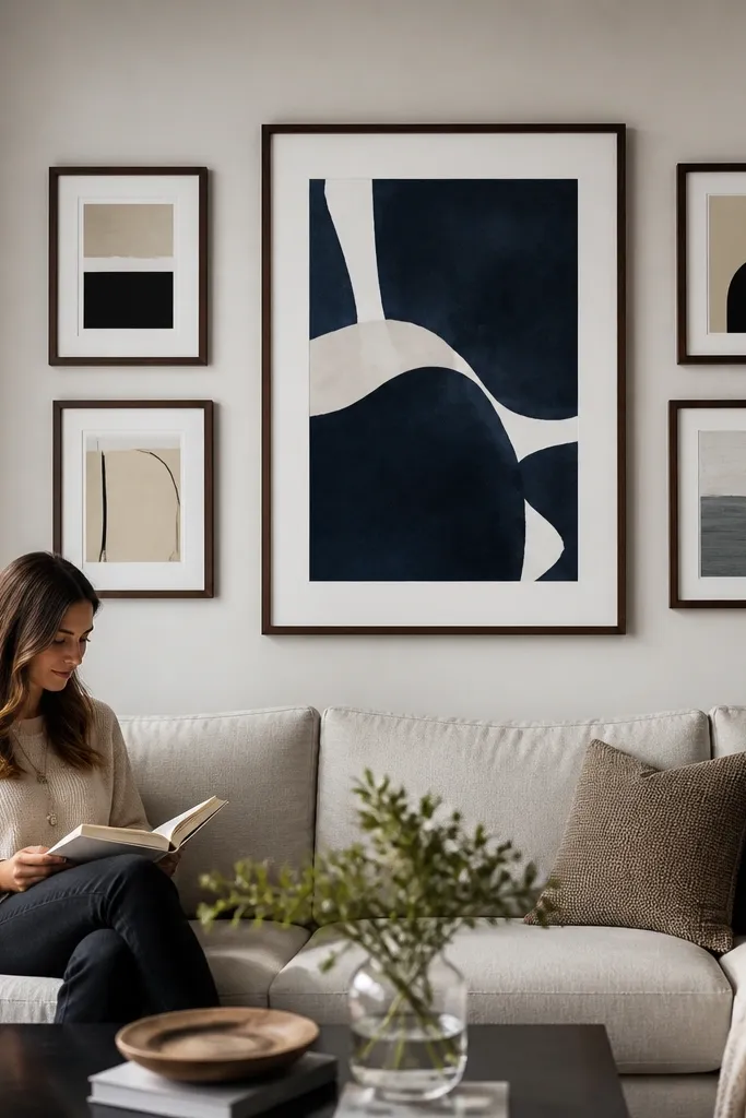
This layout is a guaranteed “pop” because it creates a clear focal point and still fills the wall. Use one large statement print, like 24x36 or 20x30, then surround it with four smaller frames like 8x10 or 11x14. Keep the smaller frames evenly spaced and at roughly the same distance from the big print. The result reads styled even if your small frames are different subjects, because the big piece anchors the design. This works above a sofa, bed headboard wall, or any wide blank area that needs structure.
Start by choosing the big frame size first and hang it centered, with the top edge around 60-65 inches from the floor depending on your furniture height. Then select four smaller frames that share the same frame width and mat style. Use painter’s tape to position two smaller frames to the left and right, and two above or below depending on your wall shape, keeping about 2-3 inches between frames. Mark holes, drill or anchor, and hang from the center outward.
Match the mat color on the small frames to the big frame so the focal point looks intentional, not floating.
Avoid placing the small frames at random heights; keep them in one or two horizontal lines.
5. Centered Symmetry with a Two-Row Layout
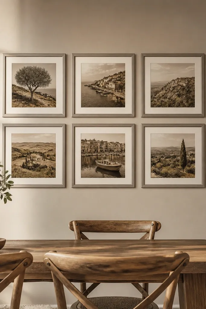
Choose six frames in one size such as 11x14, then decide on frame width and mat style. Tape a two-row grid and use a spacing of 2 inches between frame edges for a tighter, more modern look. Find your wall center point and mark it, then align the middle frame in the top row first. Level the center, then place the remaining frames using tape measurements so every frame sits the same distance from its neighbors.
Symmetry makes a beginner gallery wall look instantly polished. Use 6 frames in two rows of three, centered on the wall, with equal spacing between frames. Pick prints that share one theme — travel photos with similar color grading, or monochrome art prints — so the symmetry doesn’t feel sterile. The layout is easy because you’re repeating a pattern, which reduces mistakes. It’s perfect for entryways and dining rooms where you want the wall to look neat and balanced.
Skip thisDon’t use different frame widths across the grid; symmetry can’t fix mismatched edges.
Editor's noteUse a laser level if you have one; if not, a long level and a pencil guide line works fine for straight rows.
6. Staggered Photo Collage with Cropped Edges
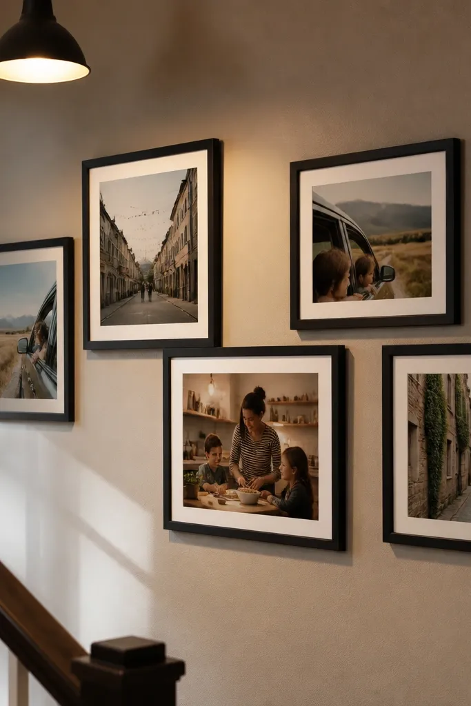
Pick five photos and crop them to match a consistent aspect ratio set, like all 4x5 or all 3x4, then print them with matte paper. Choose matching frames and mats so the only variation is the photo content and the stagger. Tape the wall in a loose “T” or “V” shape and keep about 2 inches between most frames, tightening to 1 inch where the collage overlaps visually. Hang the anchor frame first (the one you want to be the main), then build outward following your tape spacing.
This look turns everyday photos into something designed by using intentional cropping and small height differences. Use 5 frames, but stagger them by 1-2 inches so the collage feels lived-in, not perfectly rigid. The visual trick is consistent color temperature: warm photos together, cool photos together, and don’t mix. If you want it to pop, keep the frames the same finish and use a thin mat to separate images from the frame. This works in living rooms and stair landings where you want a casual, personal vibe that still looks good in pictures.
Skip thisSkip low-resolution prints; blurry photos make the whole collage feel messy.
Editor's noteUse the same border color on every print so the stagger still reads cohesive.
7. Pastel Arch Cluster in White Frames
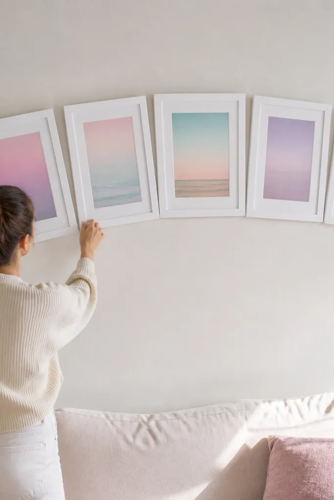
An arch cluster adds movement and softness without needing a lot of frames. Use 5 pieces arranged so the top edges curve upward like a gentle rainbow arch, then keep the frame finish all white for a clean background. Pastel prints photograph beautifully because they don’t create harsh contrast, and the arch shape makes the cluster look intentional. This style suits nurseries, bedrooms, and any room with light walls where you want the wall to feel airy. It also hides small imperfections in spacing because the eye reads the curve.
Pick five prints and standardize them to one frame size like 11x14. Choose white frames with a slim profile so the arch line looks smooth. Tape a curved arrangement and aim for about 1 inch between frames at the closest points, 2 inches at the widest gaps. Hang the middle frame first at eye level, then place the next two frames left and right to form the arch line before you drill.
If your wall is busy with outlets or vents, build the arch around the center and let one side shift slightly lower to avoid obstructions.
Don’t use dark frames with pastels; it makes the cluster look heavy.
8. Mirrored Look Using Same-Size Frames
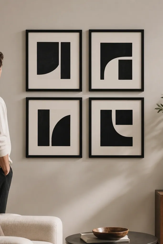
Choose four frames in one size, like 8x10 or 11x14, and keep mat color identical across all. Tape a two-by-two arrangement centered on the wall and use 2-2.5 inches between frames for a crisp look. Mark the center, hang the top-left frame first, then mirror the placement for the top-right and bottom-left. Level each frame as you go so the mirrored effect stays straight.
This is a tidy way to make the wall look “designed” even with simple prints. Use 4 identical frames, same size and same mat, and arrange them so they feel mirrored across the center — either two-by-two grid or a slightly offset cross. The look works because the frames repeat exactly, so your brain reads it as one composition. Choose artwork that has a similar tone and subject style, like monochrome line drawings or abstract shapes with the same color family. This is great for bathrooms and hallways where you want something clean that doesn’t clutter the space.
Skip thisSkip mixed frame finishes; mirrored layouts look off when edges don’t match.
Editor's noteUse identical hardware on every frame so hanging points line up when you measure.
9. Monochrome Magazine-Style Strip (3 Vertical Frames)
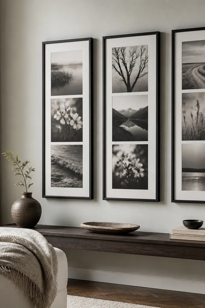
Pick three vertical frames, like 8x24 or 12x18, and keep the mat and frame finish the same. Tape a straight column and keep about 2 inches between frame edges. Hang the middle frame first, centered at eye level, then align the top and bottom frames so their outer edges match the column line. Use a stud finder if the frames are heavy, and use anchors only if you’re sure the wall can hold the weight.
If you want a gallery wall that looks like a feature wall, do a vertical strip. Use 3 vertical frames with monochrome artwork, keeping everything in black, charcoal, and white tones. The strip layout makes the wall feel taller and more intentional than a cluster. It’s also beginner-friendly because there are fewer frames to align. This works in narrow spaces like hallways and between shelving, where a horizontal cluster can look cramped.
Skip thisDon’t tilt one frame; in a vertical strip, even a small angle shows.
Editor's noteChoose matte monochrome prints with visible texture; flat images look bland in a tall layout.
10. Gallery Wall with Floating Shelves Under Frames
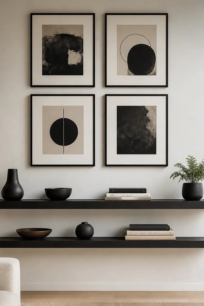
This layout makes your wall feel styled even before you hang more art. Put 4 frames in a neat grid and add floating shelves below them for small objects that repeat your color theme, like black ceramics, neutral books, or a single plant. The frames give the clean structure, and the shelf adds life without adding more frames. It’s great for living rooms, offices, and entry tables where you want the wall to look finished and functional. Plus, it photographs well because you get layers: frame layer, shelf layer, object layer.
Choose 4 frames, ideally 11x14, and hang them in a 2-by-2 grid with 2-3 inches spacing. Then install a floating shelf centered under the middle of the grid, using a level and wall studs for support. Keep shelf items minimal: 3-5 objects total, spaced evenly so the shelf doesn’t look cluttered. Finish by wiping frames clean and adjusting shelf placement so the objects don’t block the art when you step back.
Use shelf brackets with a matte finish and match the frame finish so the hardware doesn’t steal attention.
Don’t overload the shelf; too many items makes the wall look busy instead of styled.
11. Color-Block Frames with Uneven Heights (But Same Width)
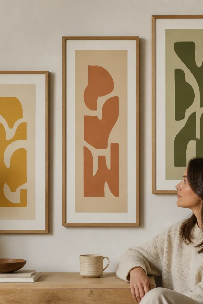
This idea gives you that designer look where the wall feels intentional but not stiff. Use frames with the same width and finish, then vary the print sizes slightly so you get a color-block rhythm. The key is consistency in frame width, not in the number of frames. Pick a color story like cream background with mustard, terracotta, and sage prints. This works in bedrooms and living rooms where you want the wall to bring warmth and structure without looking too formal.
Select 5 frames that share the same outer frame width, even if the inside print size differs. Tape the wall into a staggered layout and keep about 2 inches between frames, tightening to 1.5 inches where the blocks feel too wide. Hang the largest or darkest piece first at eye level, then place the next two around it so the color blocks feel balanced. Drill and hang using the same hardware type across frames to keep the wall level.
Keep the mat width the same on every frame so the color blocks line up visually.
Don’t change frame thickness across the set; uneven thickness makes even a good color plan look messy.
12. Dot-to-Dot Layout with Polaroid-Style Prints
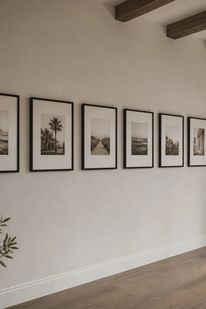
Choose 6 or 8 prints and standardize them to a polaroid-like size, like 3x4 or 4x6 prints with a white mat. Use frames with the same color and mat style so the polaroid illusion stays consistent. Tape a grid with equal spacing of 2 inches between frame edges. Hang the top-left frame first, level it, then follow the grid tape marks so every frame lands at the same height lines.
Polaroid-style prints add charm, but beginners mess it up by making the spacing random. Use a dot-to-dot grid feeling: equal gaps, same mat size, and consistent print tones. This layout uses 6-8 frames that look like they’re evenly spaced, creating a “collected” look that still reads organized. If you use black frames and off-white mats, the photos look cohesive even when the subjects vary. It’s great for gaming rooms, bedrooms, and creative studios where you want playful energy with structure.
Skip thisAvoid mixing mat colors; polaroid-style looks cohesive only when the border is consistent.
Editor's noteUse photos with similar exposure and avoid mixed flash-heavy shots; polaroid-style magnifies lighting differences.
13. Oversized Frame Border Effect (Two Rows of Big Frames)
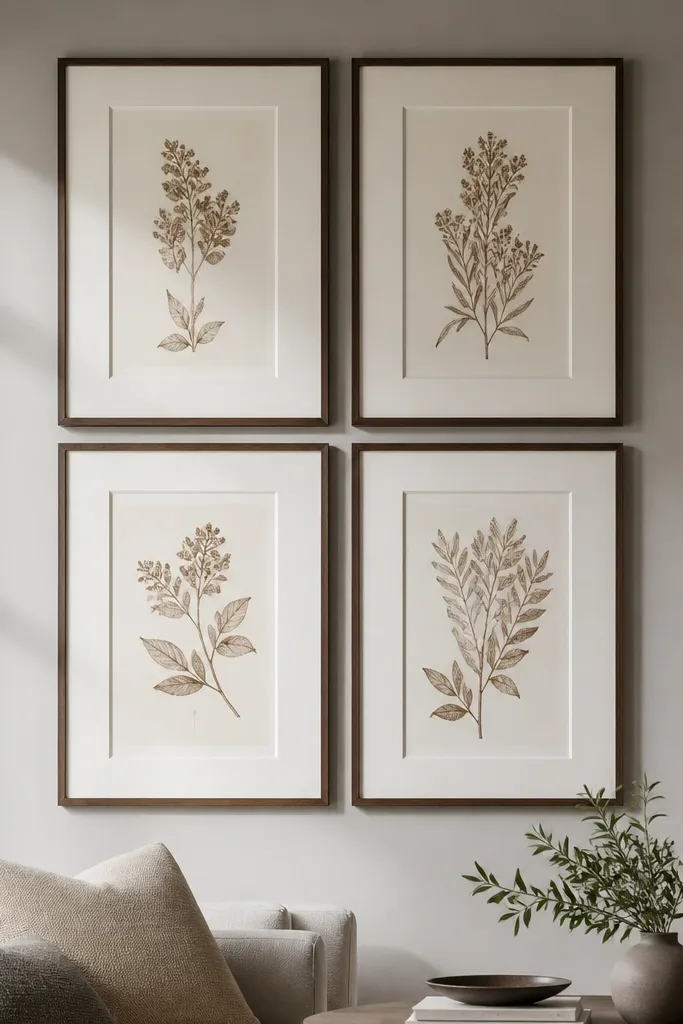
This is how you fake a gallery wall that looks bigger than it is. Use four oversized frames in two rows, with consistent mat widths, so the negative space inside the rectangle looks like a designed border. The wall pops because the frames create a clean outline and the mats give the prints breathing room. Choose artwork with similar color temperature so the border effect stays calm. This is a smart choice for renters because you get impact without needing a ton of small pieces.
Pick four large frames, like 16x20, and keep the mat color identical across all. Tape a rectangle layout on the wall with 2-3 inches between frame edges. Hang one frame in the top row first, centered, then place the second top frame to match its spacing. Finish by hanging the bottom row frames, keeping the bottom edges level so the border effect looks crisp.
If the wall is tall, increase the gap to 3 inches; it makes the border feel intentional instead of cramped.
Don’t use tiny prints inside oversized frames; the border effect looks empty when the art is too small.
14. Rainbow Accent in a Neutral Frame Wall (7 Pieces)
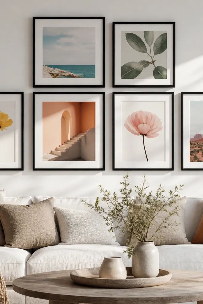
Choose 7 prints and standardize them to 11x14 or 12x16 so the wall looks unified. Use a consistent mat color, like off-white, and pick frames in a single finish such as black. Tape the layout as a loose grid: 3 frames on top row, 4 on bottom row, with about 2 inches between frames. Hang the center-most frame first, then fill outward using the tape marks so the rainbow progression stays aligned.
This gives you the “room pop” effect without making the whole wall loud. Keep most prints neutral — cream, gray, or black-and-white — and add one soft color per frame that steps through a rainbow order. The result looks playful when you notice it, but still clean from a distance. Use the same frame finish on all pieces to keep it cohesive. This works especially well in living rooms with neutral furniture because the wall adds color without clashing.
Skip thisAvoid using fully saturated neon colors; they overpower the neutral base and look harsh in photos.
Editor's noteLimit the accent colors to soft versions of red, orange, yellow, green, blue, and purple so it stays cohesive.
15. Warm Gallery Wall with Antique-Style Prints (Aging Look)
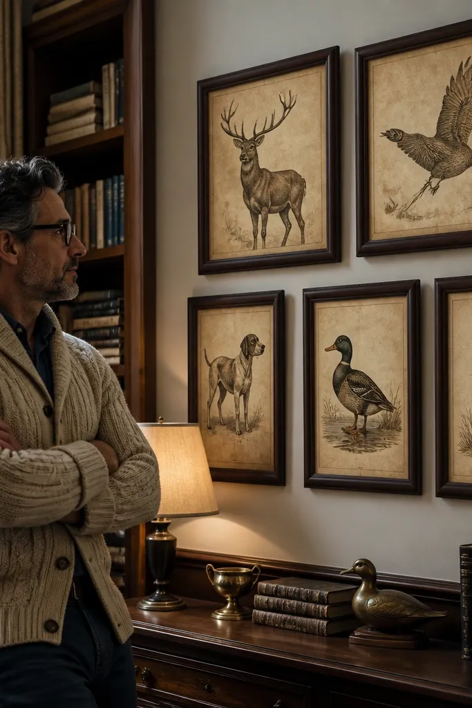
If your room is modern and you want warmth, antique-style prints are a simple fix. Use sepia or muted brown-toned prints and put them in brown or dark wood frames. Keep the set consistent by selecting prints that share the same background tone, like parchment cream. Cluster them with 1-1.5 inches spacing so the wall feels dense and intentional. This look is great for living rooms, dining areas, and offices where you want warmth without bright color.
Pick 5-6 prints and standardize them to two sizes, like 8x10 and 11x14, so the cluster has variety without chaos. Use all the same frame type in brown wood, with a consistent mat color if you include mats. Tape a cluster arrangement and keep the closest frames about 1 inch apart. Hang the central piece first, then build outward, checking level as you go to keep the cluster from drifting.
Use matte glass or acrylic covers if your frames include glazing; it reduces reflections on warm-toned prints.
Skip mixing antique-style prints with crisp modern photos; the contrast can make the wall feel mismatched.
16. Geometric Abstracts in a Tight 1-Inch Cluster
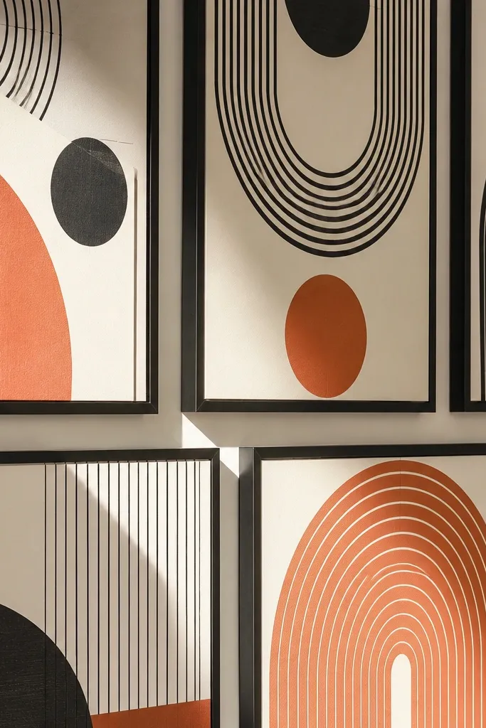
Choose 5 geometric abstract prints and standardize to one frame size, like 11x14, then tape a compact cluster shape on the wall. Keep spacing tight at about 1 inch between frame edges, but don’t let frames overlap. Hang the center frame first, level it, then place the surrounding frames using the tape gaps. Drill or anchor after you’re sure the cluster is centered and level from a step-back distance.
Tight clusters look expensive because they feel cohesive and bold. Use 5 frames in a compact arrangement with about 1 inch between frames, all in black frames so the geometry stays the star. Choose geometric abstract prints with similar line thickness or a shared palette, like black, cream, and terracotta. This works well in small walls where a grid feels too light. It also photographs beautifully because the cluster creates a strong shape and color block effect.
Skip thisAvoid leaving big gaps inside a tight cluster; it breaks the bold look and turns it into random hanging.
Editor's noteIf your frames have slightly different widths, swap them out or use mats to equalize the visible border.
17. Minimalist Line Art in White Frames (3x2 Grid)
This is the cleanest beginner-friendly option when you want your wall to look modern and calm. Line art reduces visual noise because the images are simple, and a 3x2 grid makes it easy to align. Use white frames and either no mat or a thin mat in off-white. Pick line art with the same thickness style so the set looks coordinated. This works in bright rooms and small spaces because it doesn’t visually crowd the wall.
Choose 6 line art prints and standardize to 8x10 or 11x14, keeping the frame size consistent. Tape a 3x2 grid with 2-2.5 inches between frames for a clean look. Hang the top-middle frame first at eye level, then work outward left and right. Use a level for each frame so the grid stays straight and doesn’t tilt as you fill it in.
Print line art on matte paper so the lines stay crisp under warm lighting.
Don’t mix line art with busy photos; the contrast makes the wall look uneven.
18. Monochrome Photo Strip Above a Bed or Sofa
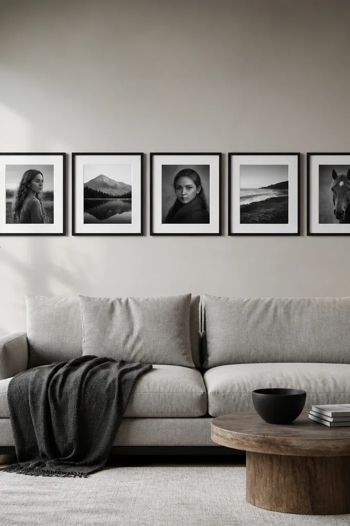
Pick five frames in one size, like 11x14, and choose monochrome prints with similar contrast. Tape a straight line layout on the wall and keep 2 inches between frame edges. Mark the center point and hang the middle frame first, then align the remaining frames left and right using the tape. Drill or anchor and confirm the strip is level before you remove the tape completely.
A horizontal strip is one of the easiest ways to make a big wall look finished without building a complex layout. Use 5 frames in a row and keep spacing consistent, so the wall reads as one composition. Monochrome photos look cohesive even when the subjects vary, like portraits, landscapes, or city scenes. Choose frames with the same finish and mat style so the strip doesn’t look like a random collage. This is ideal for bed headboards, sofa walls, and long hallways where you want a clean line across the space.
Skip thisAvoid uneven spacing; a strip looks wrong immediately when the gaps vary.
Editor's noteUse a consistent crop across all photos so faces and horizon lines don’t fight each other visually.
19. Frame + Fabric Panel Hybrid (Art Without Prints)
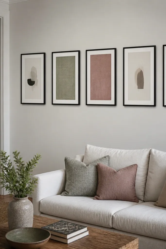
If you don’t want to print a bunch of art, a fabric panel hybrid gives you texture and color without needing new prints. Combine 5 frames where 2-3 frames hold fabric samples stretched tight behind the glass or acrylic, and the rest hold simple prints. The wall pops because fabric adds depth and the patterns catch light differently than paper. Keep the fabric palette aligned with the room, like linen neutrals with one bold pattern in muted blue or terracotta. This works in bedrooms and living rooms where you want softness and you like a tactile look.
Choose 5 matching frames and decide which ones get fabric. Cut fabric to fit the inner opening with 1-2 inches extra on each side, then wrap and staple to the backing board if your frame supports it. Use matte prints in the remaining frames. Arrange the set on tape with about 2 inches between frames, then hang the center frame first and level the rest.
Press fabric flat before you mount it so wrinkles don’t show through the frame opening.
Don’t use shiny fabric; it creates glare and looks uneven in photos.
20. Color-Matched Matting for a Designer Look (Same Mat, Different Art)
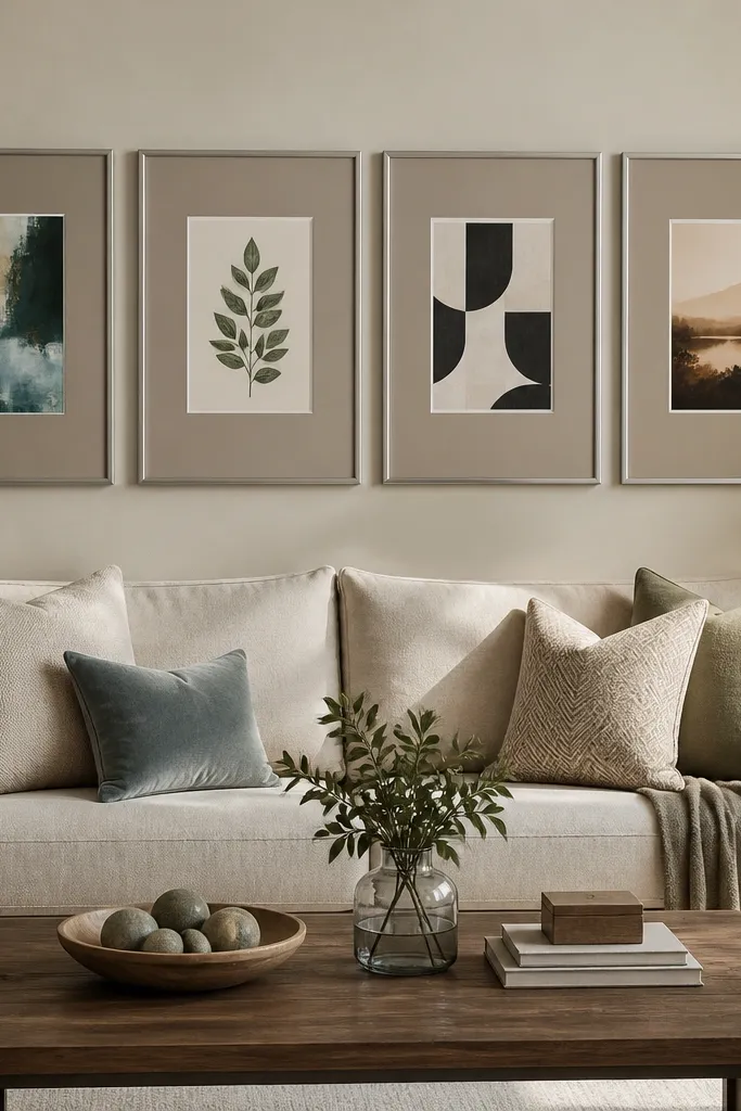
Pick 6-7 prints and standardize their frame size, then order or choose mats that have the same color and width across every frame. Tape the layout on the wall with a spacing rule of 2-2.5 inches between frame edges. Hang the anchor frame first, usually the one with the darkest color or the biggest print. Then place the rest so their mats visually line up, drilling only after you confirm the spacing with tape.
People think they need matching art to get a cohesive gallery wall. You don’t. What you need is matching matting — same mat width and same mat color — so the frames share a consistent border. That makes different prints look like they belong together. Use a mat color that matches your room’s undertone: warm rooms look better with off-white mats, cool rooms look better with bright white mats. This is one of the most beginner-friendly ways to “make it pop” because you can mix subjects while keeping the structure consistent.
Skip thisAvoid mixing mat widths; a small difference makes the wall look sloppy even when the colors match.
Editor's noteIf you’re mixing prints with different brightness, keep the mat width the same and let the art contrast do the work.
21. Frame Within a Frame Effect Using Oversized Mat Borders
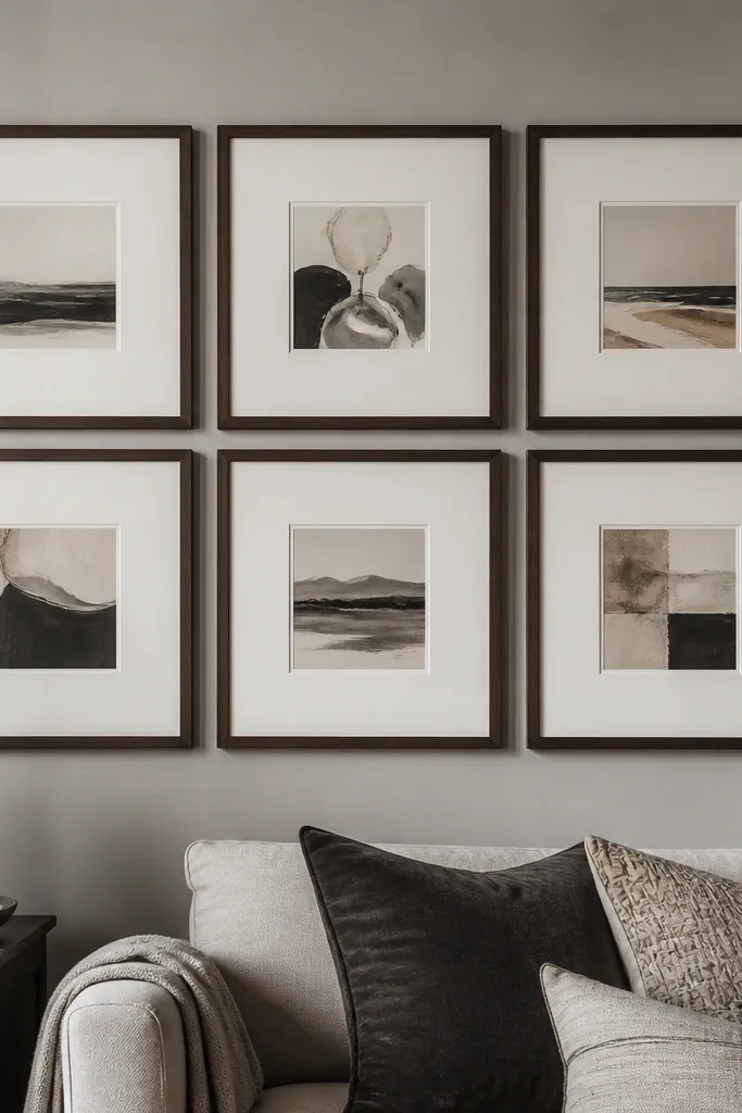
Choose 4-6 prints and frames that can accommodate wide mats, like adding a 2-inch mat around a smaller print size. Standardize frame finish and mat color across all pieces. Tape a grid with 2-3 inches between frame edges, then hang the center frame first at eye level. Level and hang the rest using tape marks so the thick mats create a consistent border feel across the wall.
This look makes even simple prints look custom. The trick is using oversized mats so there’s a thick border around each print, creating a frame-within-a-frame effect. It adds visual weight and makes the wall look intentional from far away. Use 4-6 prints with a shared palette and place them in a grid or gentle cluster. This works well in rooms with neutral decor because the mats create clean structure. It’s also forgiving for beginners because the mat border hides small alignment differences.
Skip thisDon’t go too wide on mats for tiny prints; the art gets swallowed and the wall looks hollow.
Editor's notePick mats in off-white instead of bright white if your wall paint is creamy; it stops the wall from looking too stark.
22. Gallery Wall with a Built-In Center Line (No Guessing)
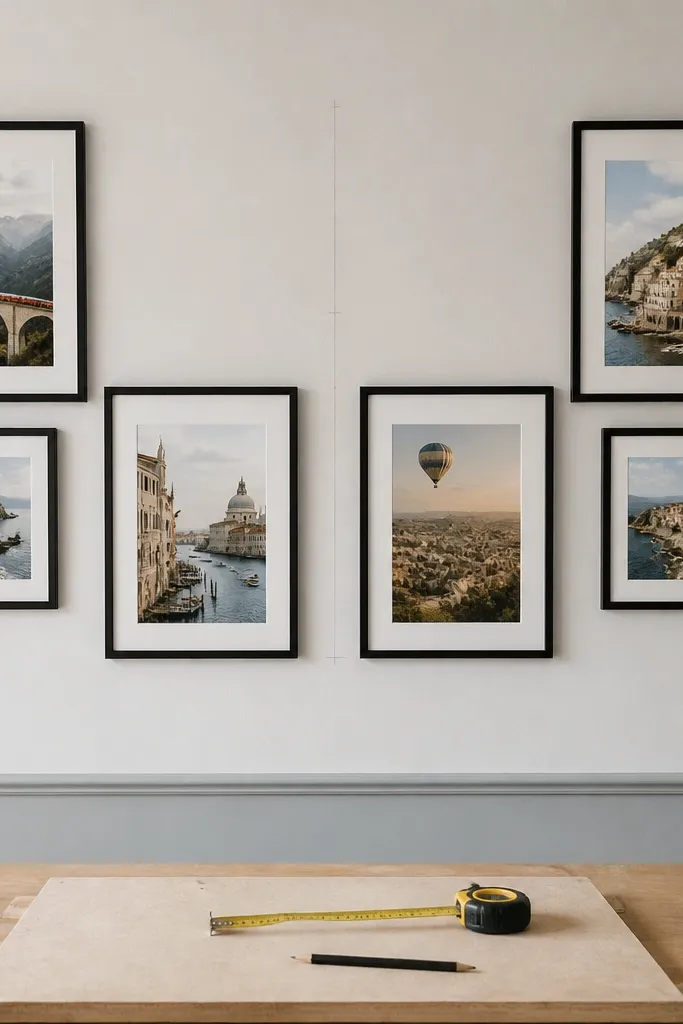
Start by marking a vertical center line on the wall using a measuring tape and pencil. Tape your frames around that line, aiming for equal spacing left and right, with 2 inches between frames unless they’re in the cluster zone. Hang the center-most frame first, level it, then place the remaining frames so their centers sit evenly around the line. Once everything is positioned, mark hardware points and hang from the middle outward.
If you struggle with alignment, build the wall around a center line. This creates a clean, balanced look even when you use different frame sizes. The wall pops because the composition has order: equal visual weight left and right. Choose prints with a shared theme and mix sizes like 8x10 and 11x14, but keep the frame finish consistent. This is a strong option above a dresser or sofa where you want the wall to look symmetrical without being a strict grid.
Skip thisAvoid centering by eye; if your wall isn’t centered, the whole arrangement looks off.
Editor's noteUse frame centers, not frame edges, for balancing; it makes mixed sizes look intentional.
23. Corner Gallery Wall with a Diagonal Flow
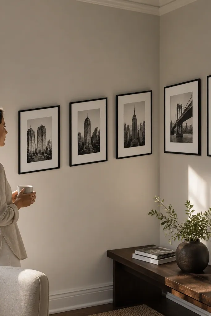
Pick 5 frames in one finish and standardize to two sizes like 11x14 and 8x10. Tape a diagonal line across the corner area, then place frames so the nearest frames are about 1.5-2 inches from each other. Hang the frame closest to eye level first, then place the adjacent wall frames so the diagonal visually continues across the corner. Mark holes and drill with care so you don’t hit wiring or plumbing.
Corners are hard because straight lines don’t wrap around the room. A diagonal flow fixes that by guiding the eye across the two walls instead of forcing the frames to look like separate projects. Use 5 frames total: 3 on the main wall and 2 on the adjacent wall, arranged so the top edges form a gentle diagonal. Keep all frames the same finish and keep spacing tight enough to feel connected. This look pops in living rooms and hallways where the corner currently looks empty or awkward.
Skip thisDon’t leave huge gaps in a corner; the diagonal flow only works when the frames feel connected.
Editor's noteMeasure from the corner to each frame edge so the diagonal spacing stays consistent on both walls.
24. Vintage Map + Photo Mix in One Cohesive Color Scheme
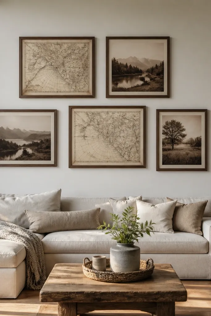
This mix makes a gallery wall feel curated without needing fancy art. Use vintage maps and photos together, but keep them in one color scheme: sepia, parchment cream, and muted brown. Brown frames tie everything together, and the mix of subject types adds interest without clutter. Arrange 5 frames in a tidy cluster with slightly tighter spacing so it feels like one story. This works in living rooms and home offices where you want a warm, traveled look that still feels organized.
Choose 2 map prints and 3 photo prints and standardize their frame size to one common format like 11x14. Use brown frames with the same mat color, ideally parchment or off-white. Tape a cluster layout and keep 1.5-2 inches between frames so the wall feels dense. Hang the center frame first, then place the maps and photos around it so the map prints don’t both end up at the same side.
Crop maps so the text blocks don’t dominate; focus on the lines and locations instead.
Avoid mixing bright modern photos with aged maps; the color mismatch makes the set look accidental.
25. Minimal Shelf-Style Gallery Using Clip Frames
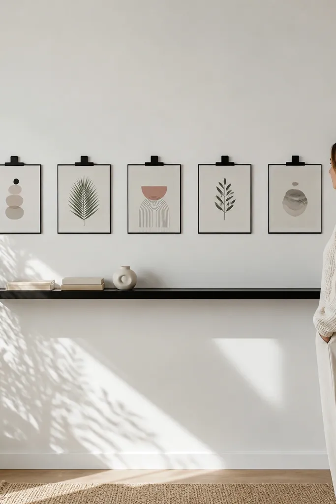
Buy clip frames or picture ledge clips that match the print size you want, like 8x10 or 11x14. Mark the wall with painter’s tape for spacing, keeping 2 inches between frames. Use a level when mounting the base strip or rail so all clips sit aligned. Insert prints, then step back and adjust the spacing by eye before tightening everything down.
Clip frames are a clean way to make a gallery wall feel fresh without committing to permanent placement. This is beginner-friendly because you can adjust spacing as you add prints, and it creates a neat, uniform look. Use 5 frames in a straight line or slight stagger, mounted so they sit at one height band. Pick minimalist prints in black, white, and one accent color for maximum pop. This works in kitchens, offices, and kids' rooms because you can swap prints seasonally without remounting everything.
Skip thisDon’t mix frame sizes; clip systems look best when the frames align evenly.
Editor's noteUse the same paper finish across prints so some don’t glare more than others.



