
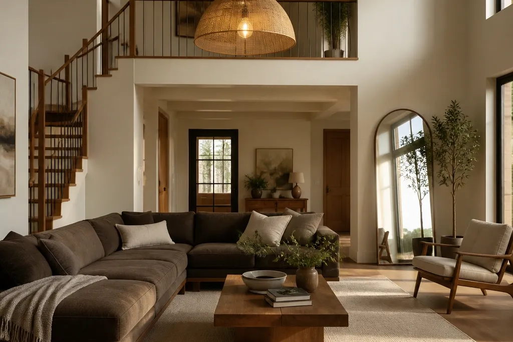
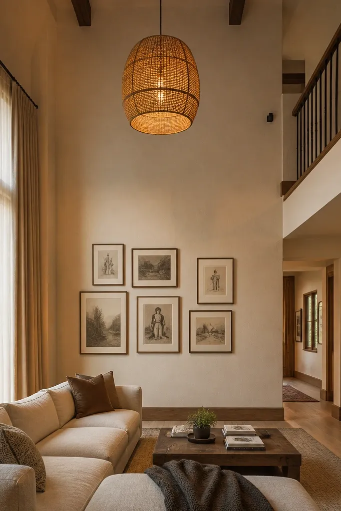
1. Ceiling-to-floor linen curtains with a high track and wide stack
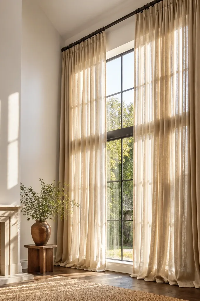
This is one of the most reliable beginner-friendly Double Height Living Room Ideas because curtains add height and softness at the same time. Hanging at the ceiling line (or even slightly below it) makes the window read taller, and the fabric stack creates that “designed” layered look that shows up clearly in photos. Choose medium-weight linen or linen-blend in oat, sand, or warm white so it drapes in confident folds instead of clinging. If your room has a railing or second-floor opening, curtains also help visually connect the levels, making the space feel intentional rather than cavernous.
Start by measuring the window width and adding 2x to 2.5x fabric width total for fullness. Mount a ceiling track or curtain rod 2-6 inches below the ceiling and at least 6 inches beyond each window edge so folds don’t get cut off. Hang panels so they just kiss the floor (or stop 1 inch above, if you have thick pile rugs) and use curtain rings or clips that slide smoothly. Finally, steam the fabric and check that the folds stack evenly — uneven stacks look sloppy fast.
Editor's noteIf you want the cleanest look, use a ceiling track instead of a wall rod so the top edge stays perfectly straight.
Skip thisDon’t hang curtains at window height; it shrinks the room visually.
2. Oversized rug that tucks under the sofa's front legs
In double height living rooms, the floor can look like it’s floating because the room is visually tall but the furniture is visually small. A larger rug fixes that by grounding the seating zone and giving the eye a stable base for the vertical drama above. Go for a rug size where the front legs of the sofa and chairs land on it — the room reads cohesive instead of scattered. Patterns are a photographic advantage here: subtle geometric lines or a warm medallion can add structure without overwhelming your walls and ceiling.
Measure from the front of the sofa to the point you want the rug to extend, then size the rug so at least the sofa’s front legs sit fully on it. Aim for a layout where you can pull a chair in and still keep its feet on the rug. Choose a low-to-medium pile if you have a lot of foot traffic or if the room echoes, because it visually “settles” the space. Lay it, center it, then use felt pads under rug corners to prevent shifting on smooth floors.
If your floors are dark, choose a rug with a lighter field (cream, clay, warm grey) so the seating area pops in photos.
Don’t buy a rug that stops behind the sofa; it makes the room look unfinished.
3. Statement pendant with a long drop and warm dimming
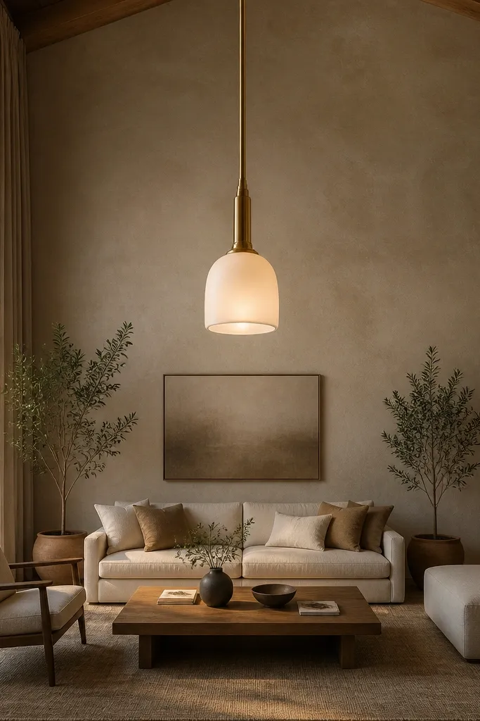
A single ceiling light rarely looks right in double height rooms because the ceiling is too far away for the fixture to feel “anchored.” A statement pendant solves that by creating a clear focal point in the vertical space, right where the camera catches it. Choose a warm bulb color around 2700K and a dimmer so the room can shift from bright to cozy without changing the look. For photogenic results, pick a pendant with a strong silhouette — a drum shade, a rattan cage, or a sculptural glass piece.
Check ceiling height and decide on a drop length that lands the bottom of the shade roughly 60-70 inches from the floor. Install a dimmer and use a warm LED bulb (2700K) so the color stays flattering on walls and skin tones. Suspend the pendant centered over the seating zone (often between the sofa and coffee table, or over the main conversation area). Finally, test the dimmer at night and adjust if glare hits the second level railing or artwork.
Editor's noteUse a pendant with an internal diffuser if you hate hot spots; it keeps the glow smooth in tall rooms.
Skip thisDon’t choose a tiny pendant — it looks lost against a high ceiling.
4. Gallery wall scaled for a double-height eye line
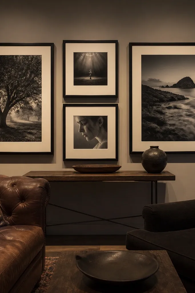
Wall art is where double height living rooms go wrong most often: people hang small frames and the wall looks bare from the sofa. The fix is scale and placement. Build a gallery wall that sits in the eye-level band — typically around 56-65 inches to the center of the frames — so it reads instantly when you’re seated. Use consistent frame finishes (black, oak, or warm walnut) and vary only the art sizes. This gives you a bold, photo-friendly focal point without needing a single “perfect” piece.
Pick a wall and decide your total gallery width first — target 60-75% of the furniture width in front of it. Lay out paper templates on the floor, then transfer to the wall using a level and pencil marks. Keep the frame centers around 60 inches from the floor for the main row, then add higher pieces only if they align with a second-floor sightline. Use picture wire or wall anchors rated for the frame weight, and leave even spacing between frames.
Use matte or eggshell art surfaces with low glare — shiny prints look washed out in tall rooms with lots of daylight.
Don’t center a tiny cluster; it looks accidental against a tall wall.
5. Tall ladder shelf anchored behind the sofa
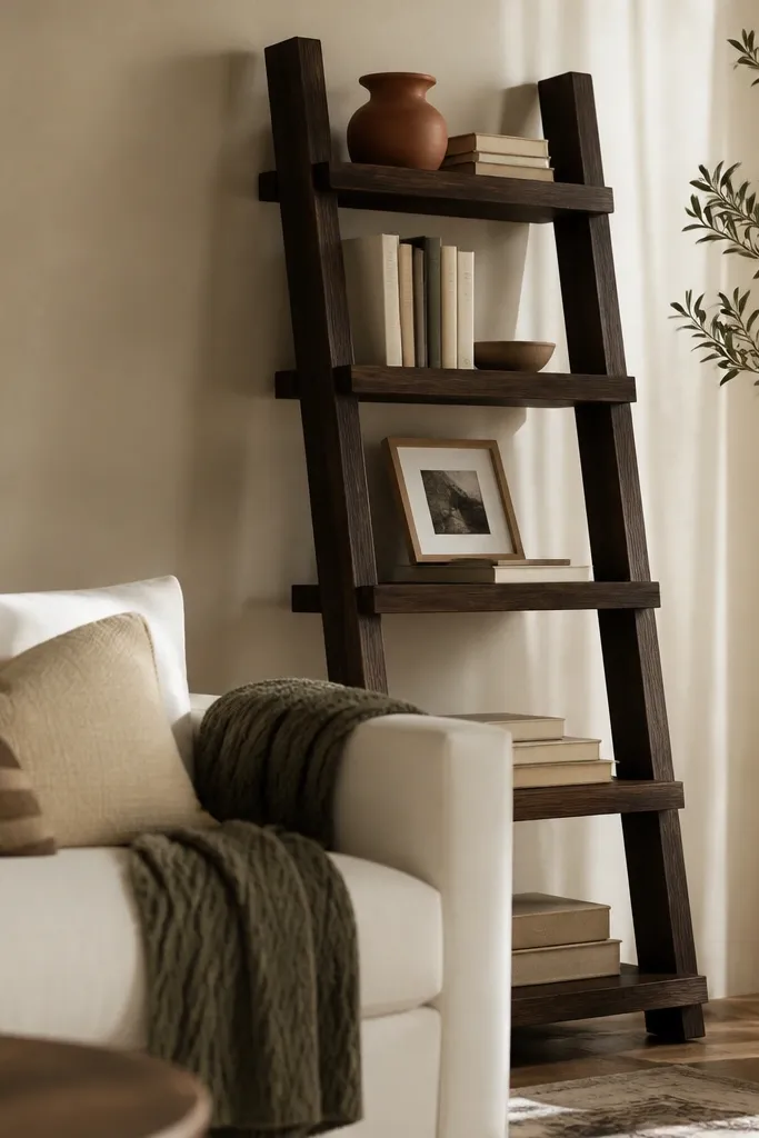
If you want a vertical element that reads intentional without heavy construction, a ladder shelf is the move. It adds height, gives you a place for books and decor, and creates layered texture that looks great in photos. In a double height room, the shelves help “connect” the floor to the second level by filling the vertical gap. Use wood with a warm tone (oak or walnut stain) and style with a strict mix: books for height, two sculptural items for contrast, and a plant or vase to soften edges.
Choose a ladder shelf width that’s narrower than your sofa so it doesn’t block the sightline — often 24-32 inches wide works well. Anchor it properly: locate studs and use lag screws or heavy-duty wall anchors rated for the shelf weight. Arrange items by height: tallest items on the top rungs, medium in the middle, smaller at the bottom. Finish by wiping the shelves and keeping the back edge clear so light doesn’t bounce oddly off clutter.
Style with book spines facing out at least on the top two rungs; it gives instant visual height.
Don’t overfill every rung — empty space makes the shelf look designed.
6. Rope-and-wood ceiling beam effect with slatted panels
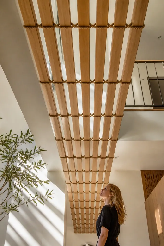
A tall ceiling can feel empty, and painting the whole thing feels like too much. Slatted panels create a “beam” look that draws the eye upward while adding warmth and texture. This works especially well in double height living rooms because the lines travel vertically and make the space feel structured. Keep the slats in a simple grid and use a matte finish so the pattern doesn’t glare under daylight. You’ll get a high-end architectural look without full ceiling renovation.
Measure the ceiling area and decide on a grid spacing — 12-16 inches between slats looks clean in most rooms. Use lightweight MDF or wood slats, cut to length, then prime and paint matte (eggshell or flat) in a warm white or soft greige. Install with construction adhesive plus small finish nails or screws into ceiling joists. Seal edges and caulk small gaps for a smooth line when you view it from the sofa.
Editor's noteUse a laser level for straight lines; ceiling installs punish even small misalignment.
Skip thisDon’t use glossy paint on slats — it shows every uneven surface.
7. Two-tone media wall with fluted paneling and a warm wood base
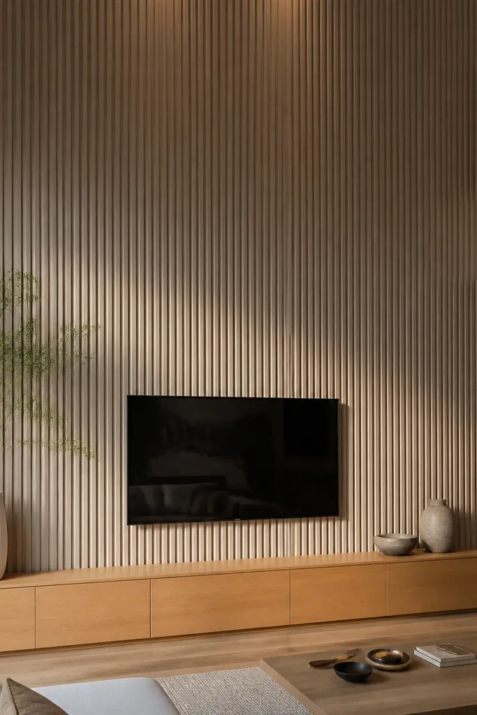
A media wall is the fastest way to make a double height living room look “finished” because it creates a clear anchor at eye level while still reading tall. Fluted or ribbed panels add shadow lines that photograph beautifully, and the warm wood base keeps it cozy instead of cold. Keep the color contrast controlled: paint the upper section a warm white and choose a wood tone for the lower portion. This gives you depth without needing elaborate decor up high.
Choose a wall width that matches your TV placement and leave breathing room on both sides — about 6-10 inches. Install fluted panel sheets or stick-on MDF fluting on the upper portion first, then paint after fully sanding and priming. Add a wood base panel or slatted trim to the lower section and install with screws into studs or strong anchors. Mount the TV at a comfortable viewing height and finish by adding two slim wall lights or picture lights to highlight the fluting texture.
Paint fluted surfaces before install if possible; it’s easier to get even coverage in corners.
Don’t skip priming — MDF fluting soaks paint and looks patchy in daylight.
8. Oversized floor mirror with a dark frame and arched top
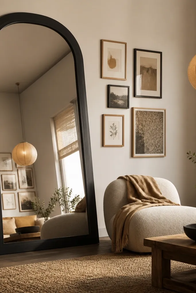
Mirrors are a cheat code in double height spaces because they bounce light and visually expand the wall behind your seating. An oversized mirror with a strong frame shape gives you a focal point that reads from the second level too. Choose an arched top if you want softness against hard architecture, and keep the frame finish darker (matte black, espresso, or dark bronze) so it shows up clearly in photos. Position it so it reflects something you like — a lamp, a window, or part of the gallery wall.
Pick a mirror width that’s at least 1/3 the width of the sofa, then check clearance so doors and walkways stay usable. Place the mirror on the floor with the bottom edge around 8-12 inches above the baseboard (or just above if you have tall skirting). Anchor if it’s a tip-over risk: use wall straps rated for mirror weight. Adjust until the reflection lines up with a light source, then tighten the mounting hardware.
Editor's noteWipe the glass with a microfiber cloth and keep it fingerprint-free; mirrors show every smudge in tall rooms.
Skip thisDon’t place it so it reflects clutter or the back of a TV cabinet.
9. Picture lights over art with warm bulbs
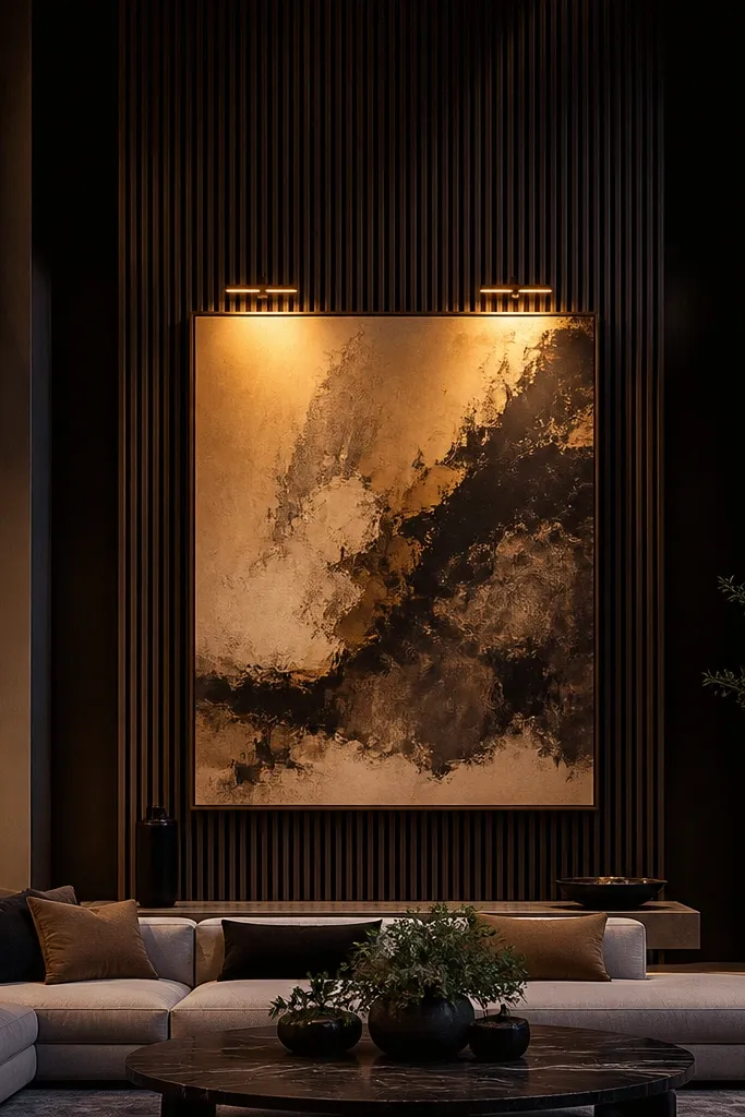
In double height living rooms, the art can look flat once the sun goes down. Picture lights add a controlled pool of warm light that makes the frames look intentional and gives the wall texture depth. This is especially good if you have a gallery wall or one large piece — it turns it into the nighttime focal point. Use warm bulbs around 2700K and pick lights with diffusers so you don’t get glare spots on the glass.
Choose picture lights with adjustable heads and measure the frame depth so the light clears the wall and targets the art center. Install anchors into studs where possible, then mount the lights so the beam hits the art evenly. Use 2700K LED bulbs and test on a dimmer if your room has one. Finish by aligning the beam angle so it lights the edges too, not just the center.
Editor's noteSet the light so the brightest spot hits the art, not the frame glass — glare kills the look.
Skip thisDon’t use cold bulbs (5000K); the frames look gray and the room feels sterile.
10. Stair-step wall panel molding behind the sofa
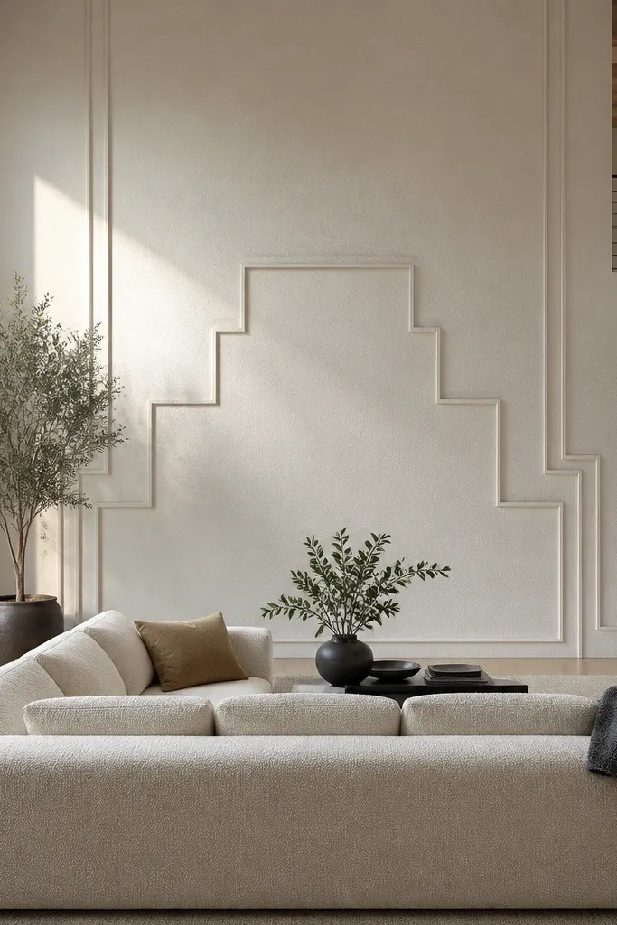
Panel molding is one of the best ways to add “architectural” interest without going full renovation. A stair-step pattern behind the sofa creates depth and shadow lines that help double height walls feel less blank. Keep the pattern simple and centered so it reads clean from across the room. This project looks great in daylight because the shadows move throughout the day, giving the wall a living, dimensional feel.
Plan the pattern first: mark a grid on the wall using painter’s tape, with repeated steps of about 8-12 inches. Use MDF trim pieces or ready-made molding strips, cut to length, and install with construction adhesive plus small finish nails. Caulk the seams and sand smooth, then paint in a warm white with a matte finish. Stand back and check alignment from the sofa before the paint fully cures.
Use a laser level and painter’s tape guides — molding alignment is the whole difference between “wow” and “meh.”
Don’t start with a complicated pattern; beginners should keep steps consistent.
11. Recessed-style shelves using floating ledges and hidden supports
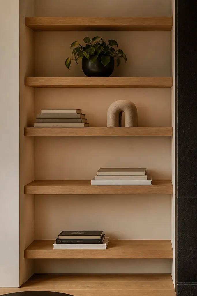
Floating shelves can look cheap if they’re too thin or too small. To make them work in double height living rooms, you need them to read as a vertical series that fills the wall. Use thicker ledges, keep spacing consistent, and style with a plan: books for height, one artwork object, and one plant or candle. The result is a clean, gallery-like look that photographs well and helps you avoid the cluttered “random decor” vibe.
Buy or cut shelves with a depth around 7-10 inches so objects don’t look like they’re floating in midair. Mark stud locations and install a hidden support rail or heavy brackets so the shelf stays level. Space shelves 10-14 inches apart for decor, then paint or stain to match your wall. Style after installation: place larger items first, then fill gaps with smaller pieces so the vertical line stays balanced.
Editor's noteUse a single neutral backdrop color (book spines in beige/cream tones) so your wall looks cohesive.
Skip thisDon’t mount shelves too close together; it makes the wall look crowded.
12. Sculptural coffee table in dark wood with a light runner
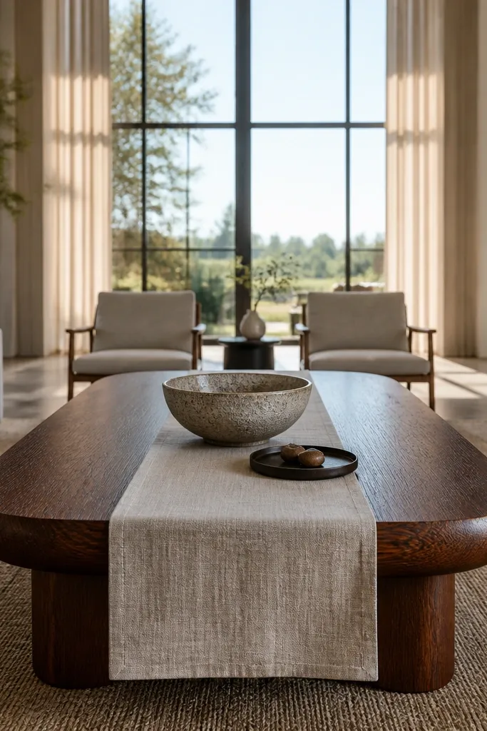
Double height rooms often look impressive overhead but underwhelming at the center, where your eyes land when you sit. A sculptural coffee table with a darker finish gives you a strong silhouette, and a light runner adds a clean, photo-friendly surface. This combo creates contrast and makes styling look intentional without adding more furniture. Choose a table with interesting joinery or a sculpted edge, then keep decor simple: one tray, one vase, and two smaller objects.
Pick a coffee table size that leaves at least 16-18 inches between it and the sofa so the seating area doesn’t feel cramped. Add a washable runner or flat woven textile in a light tone and size it so it covers most of the tabletop. Style with a tray in a contrasting finish (matte black, brass, or warm wood) and place items in a triangle arrangement. Keep the runner edges aligned so the tabletop looks crisp in photos.
Editor's noteUse felt pads under the runner so it doesn’t slide when you adjust cushions or set drinks down.
Skip thisDon’t overload the coffee table — the runner will highlight clutter.
13. Oversized wall-mounted planters on a vertical rail
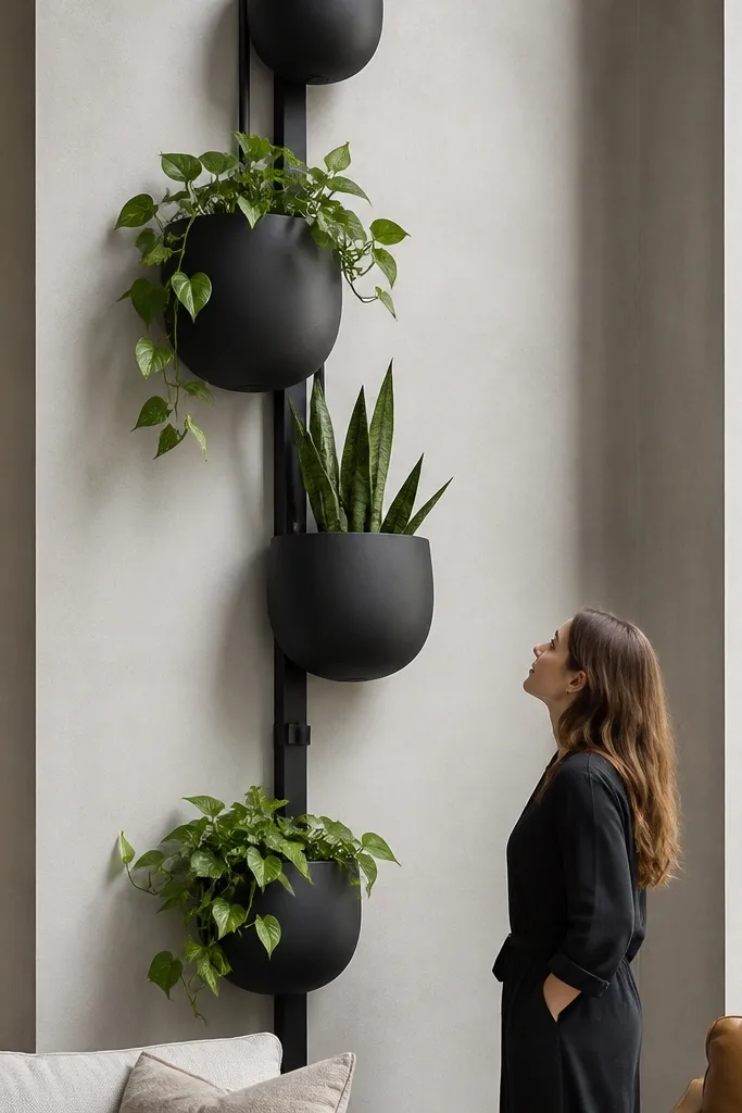
Plants look great, but in double height rooms they often end up in the wrong place — too small and too low. A vertical rail with wall planters creates a controlled, architectural green feature that fills the height gap. Choose planters in a consistent finish (terracotta, matte white, or dark ceramic) and include one trailing plant so movement shows up in photos. This is also a practical way to add color without taking up floor space when your layout is tight.
Choose a vertical rail system or install a sturdy mounting rail into studs. Space planters vertically with 10-16 inches between the top edges so leaves don’t tangle. Use lightweight grow pots inside planters to control drainage, and add a drip tray or liner to protect the wall. Water carefully and rotate planters every couple of weeks so one side doesn’t grow more than the other.
Editor's notePick plants with a similar leaf texture so the vertical line looks curated instead of random.
Skip thisDon’t mount planters directly to drywall without locating studs — it cracks fast.
14. Warm-toned wood slat wall behind the sofa
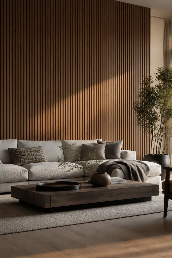
A wood slat wall turns a double height living room from generic to intentional because it adds texture that reads from every angle. The slats create subtle shadows and a warm tone that makes the room feel calmer, especially if your ceiling is tall and bright. This project is beginner-friendly if you use pre-finished slats or simple MDF slats and keep the layout consistent. It also gives you a clean backdrop for art, a TV, or just framed pieces.
Measure the wall and plan slat spacing — 1 inch spacing between slats looks balanced in most rooms. Install a level backing grid or directly attach slats to studs with screws, depending on your wall condition. If you use unfinished slats, sand lightly, then stain and seal before install to reduce mess. After installation, fill tiny gaps with wood filler and touch up stain so the finish stays even.
Use a matte clear coat; gloss makes slats look like plastic under overhead lights.
Don’t vary slat spacing — it makes the wall feel DIY in a bad way.
15. Rattan or linen shade floor lamp placed to frame the seating
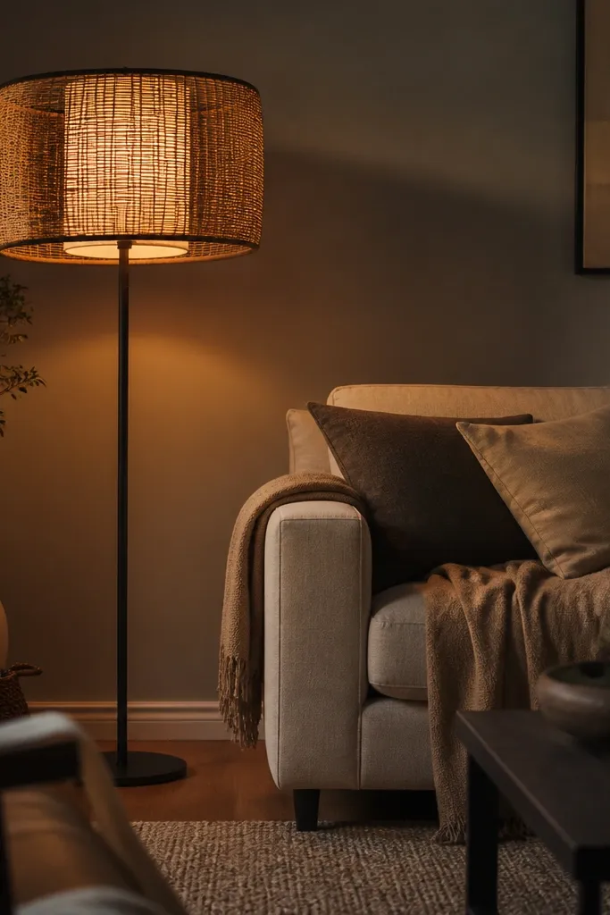
Lighting is where double height rooms either feel cozy or feel like a showroom. A floor lamp with a large linen or rattan shade adds warm, directional light at eye level, which makes the whole seating area feel more inviting. Place it slightly behind the sofa line so it frames the conversation zone and creates layered light with your overhead pendant or ceiling fixture. The shade texture also photographs beautifully because it softens highlights and keeps the light from looking harsh.
Choose a lamp height so the shade bottom sits around 60-70 inches from the floor, matching the eye-level band. Position it so it doesn’t block the sightline to the gallery wall or second level railing. Use a warm bulb around 2700K and, if possible, a dimmer switch. Finally, check shadows: move the lamp a few inches left or right until it lights the wall art cleanly without glare.
Pair one warm floor lamp with one cooler accent only if you’re sure — otherwise stick to the same 2700K for a cohesive look.
Don’t pick a small shade; it won’t fill the tall space or soften glare.
16. Ceiling-height fabric wall panels for instant softness
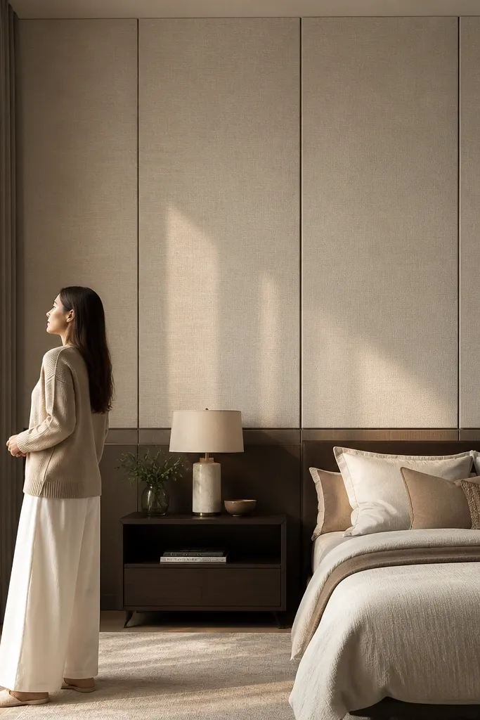
Fabric panels are a cheat for double height rooms because they reduce visual harshness and make the space feel “finished” without heavy construction. When panels run close to the ceiling and stop at a designed height above furniture, they frame the room and make the second level feel less exposed. Choose tightly woven fabric in a muted neutral so it reads smooth rather than wrinkled. This is also a strong photography play since the fabric texture shows up under natural light.
Decide your panel height based on your furniture: aim for the bottom of panels around 18-24 inches above the sofa back. Use acoustic felt or fabric-wrapped panels mounted on a simple rail system, and keep the panel width consistent for a clean grid. Install into studs or use heavy anchors rated for the panel weight. Finish by pulling fabric taut on the panel face and checking the seams from the sofa angle.
Editor's noteUse a steamer before install so the fabric doesn’t show creases in daylight.
Skip thisDon’t cover too much wall — tight paneling looks intentional, full-wall covering looks busy.
17. Double-height "book stair" styling on a floating ledge
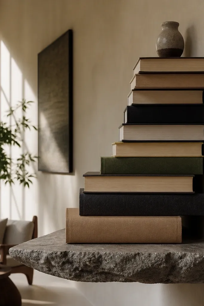
This idea is about making books look like decor instead of storage. In double height rooms, a small book arrangement reads too low and too ordinary, but a stepped “book stair” on a floating ledge creates vertical momentum that matches the architecture. Use book stacks with intentional heights so the line climbs, then add one framed piece or a tall vase to cap the look. It’s beginner-friendly because you’re not building furniture — you’re arranging what you already own with rules.
Pick a ledge height where the top of the tallest stack lands near 6-7 feet from the floor for a strong visual line. Arrange books by height first: build two or three stacked steps, then lock the shape with a few horizontal books. Add a tall object at one end (vase or sculpture) and a smaller framed print at the other to balance. Keep the book spines in a limited color range (cream, tan, black) for a cohesive photo look.
Editor's noteUse bookends only if they match the frame finish; mismatched metal can look cheap next to wood and paint.
Skip thisDon’t use random piles — the stepped line is the whole point.
18. A bold window cornice box in the same color as trim
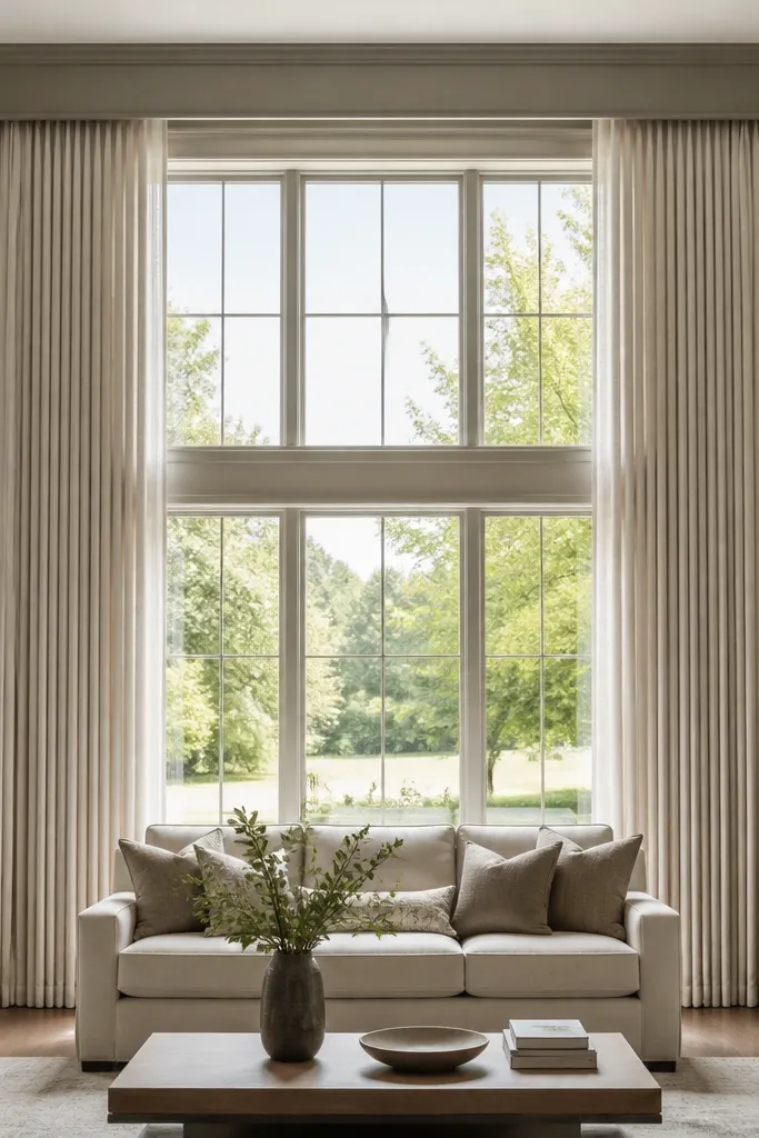
A cornice box gives your double height window area a “designed” top, which is exactly what most rooms lack. When you match the cornice color to your trim (warm white, soft greige, or deep charcoal), it looks built-in. This creates a strong horizontal line that balances the vertical curtain drama. For beginners, a ready-made cornice kit or simple MDF box with fabric wrap is far easier than reworking the whole window treatment.
Measure your window width and decide your cornice depth — 6-8 inches is enough to look substantial without blocking light. Build or assemble an MDF box, then wrap it in fabric or paint it in your trim color. Install with brackets into studs so it stays aligned. Mount curtains below and keep the cornice edge crisp by using a level and painter’s tape during install.
Editor's noteIf you want it to look expensive, use a fabric with a matte weave and keep the pattern small.
Skip thisDon’t pick a cornice color that clashes with trim; it makes the whole window look off.
19. Large-scale wall clock or framed compass above the seating zone
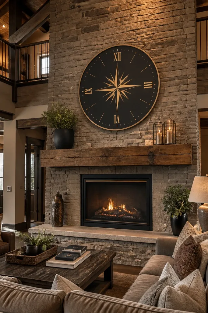
A big clock or compass-style wall piece is a clean way to fill vertical space with personality. In double height rooms, it reads from both the sofa and the second level, so it doesn’t feel like a random decoration. Choose a matte finish and a strong scale — too small looks like a craft project. This is also beginner-friendly because you’re mounting one piece, not building a complicated arrangement.
Measure the wall area above your sofa and aim for the clock or compass to be at least 24-36 inches wide. Mark the center point at around 70 inches from the floor (adjust based on the second level sightline). Use a stud finder and mount into studs with the included hardware or heavy-duty anchors. Step back and check alignment from the sofa and from the hallway view.
Editor's noteUse a matte frame and avoid shiny glass — double height rooms show glare fast.
Skip thisDon’t place it too high; it should feel like it belongs to the seating zone.
20. Textured plaster-look feature wall behind the main sofa
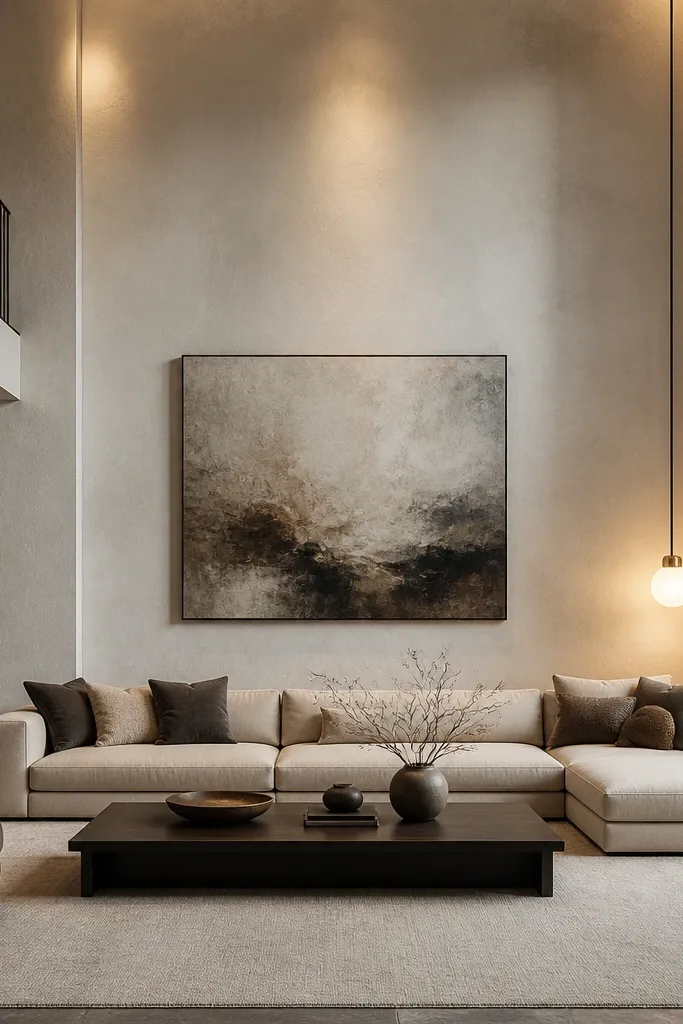
Paint can look flat in tall rooms, especially when light hits from different angles. A plaster-look finish adds micro-texture that creates depth without changing your furniture plan. For photogenic results, choose a warm white or soft greige and keep the finish matte. This feature wall also makes art and lighting look better because shadows fall naturally into the texture, so everything looks more dimensional.
Prep is everything: clean the wall, patch holes, and sand smooth so the texture doesn’t highlight defects. Apply a plaster-look coating with a trowel in thin layers, then manipulate with a sponge or knockdown tool for the texture pattern. Work in small sections and keep your edges wet so you don’t get hard seams. Let it cure fully, then protect with a matte sealer if the product requires it.
Editor's notePractice on a scrap board — plaster-look finishes vary a lot based on trowel pressure.
Skip thisDon’t skip sanding and patching; texture exaggerates wall imperfections.
21. Floating bar cart wall niche with backlighting
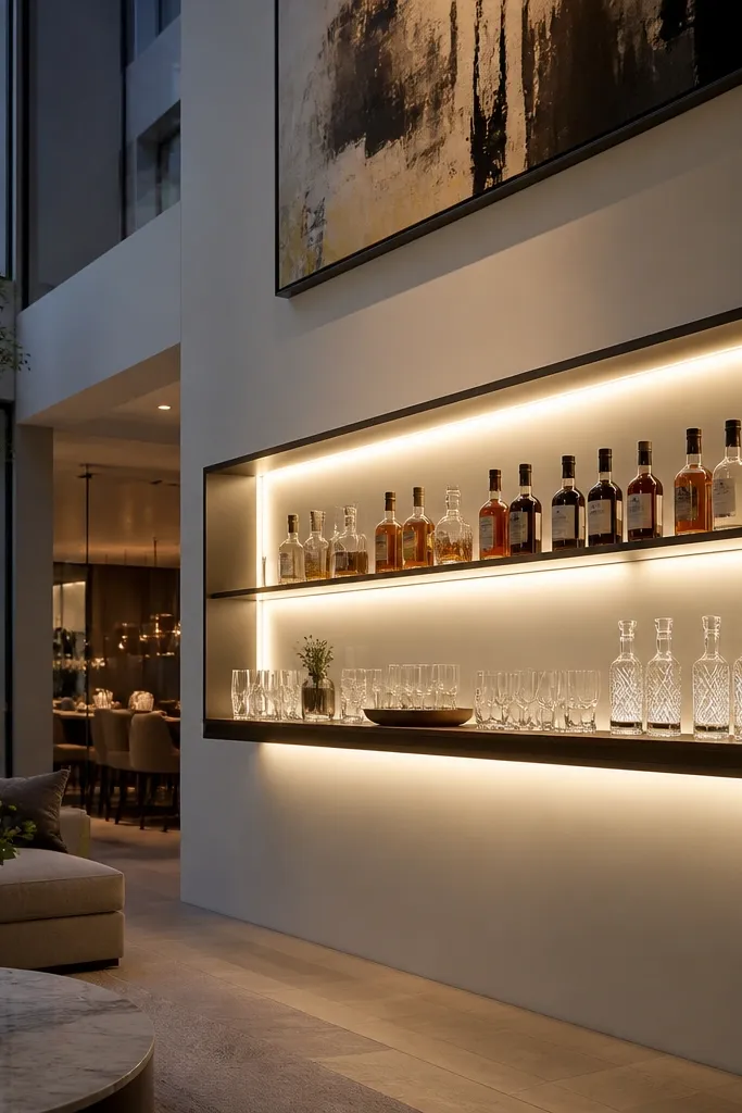
If your double height living room has enough wall space, a bar niche looks like a design feature, not a corner. Backlighting makes the glasses and bottles glow and gives the room a high-end vibe in photos. Keep it beginner-friendly by using a pre-made niche kit or a simple shelf frame, then add LED strip lighting with a dimmer. This also solves a common problem: double height rooms can feel too formal; a bar niche adds warmth and casual personality.
Choose a niche width that fits your main wall sightline — often 36-48 inches wide. Build a simple boxed frame from plywood or use a kit, then mount into studs. Install LED strip lights on the back panel, using a dimmer and a warm color temperature around 2700K. Add shelves and secure glassware with non-slip pads, then style with a tray and two consistent glass types.
Editor's noteUse frosted LED diffuser strips so you don’t see bright dots behind glass.
Skip thisDon’t place the niche too low; it should be readable from the sofa.
22. Stretched canvas "vertical banner" above the sofa
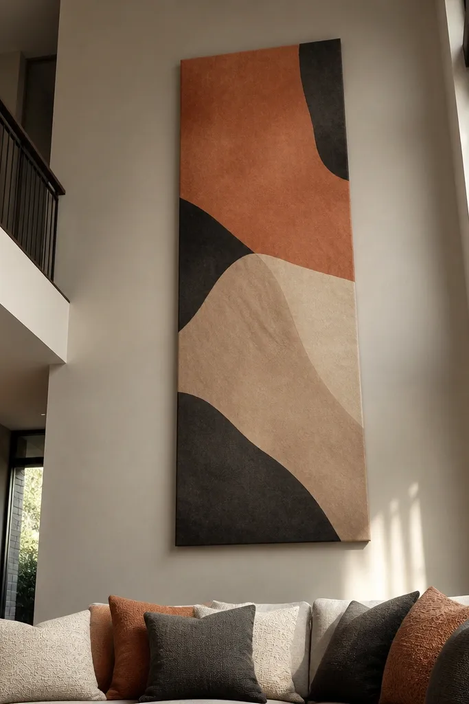
Vertical art is the simplest way to make the room feel taller in a good way. A stretched canvas or framed vertical piece creates a continuous line from the eye-level band up into the tall air, so the space stops feeling like it’s missing something. Choose a piece with a limited palette that matches your room’s main tones — warm neutrals, charcoal accents, and one muted color. This is a beginner-friendly Double Height Living Room Ideas pick because it’s one installation with big visual impact.
Pick a height that’s about 60-80% of the wall height between your top sofa line and ceiling. Center it above the sofa so the bottom edge sits around 6-10 inches above the sofa back. Mount with a stud finder and use wall anchors only if studs aren’t available. Level the piece carefully and wipe the canvas so it doesn’t catch glare.
Editor's noteIf you have a lot of daylight, choose matte canvas or non-gloss finishes to avoid reflections.
Skip thisDon’t hang a vertical piece too small; the whole point is the upward line.
23. Rope-wrapped column-style mirror stand for a second-level vibe
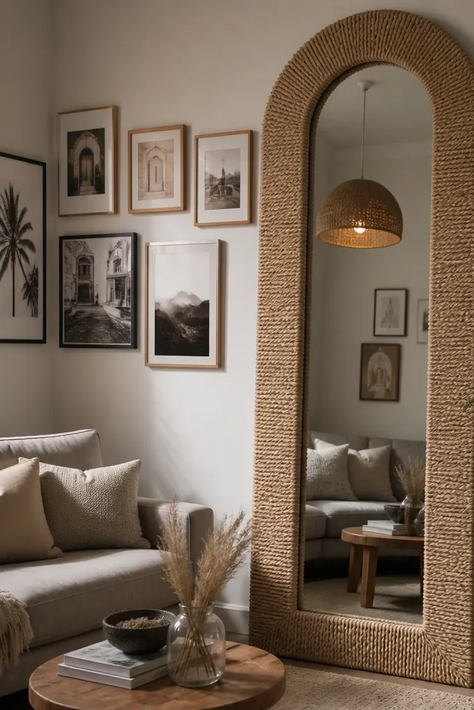
In double height rooms, the second level often feels like it’s floating without visual anchors. A tall mirror with textured wrapping or a column-like shape adds a “landing” point for the eye when you look up from the sofa. The rope or woven texture also adds warmth and handles shadows nicely, so it looks good in natural light and evening lamps. Keep the mirror frame simple and the texture controlled so it doesn’t look like a themed prop.
Choose a mirror shape that’s tall and narrow, typically 14-20 inches wide and 60-70 inches tall. Wrap a frame or a slim column base with sisal rope or a woven cord using a hot glue gun or wrap adhesive, then let it set fully. If the mirror is freestanding, add non-slip pads; if it’s wall-mounted, secure into studs with rated hardware. Place it where the second level railing visually aligns with the mirror — this makes the room look “composed.”
Editor's noteUse a darker rope tone (natural tan or espresso) so it doesn’t look washed out against white walls.
Skip thisDon’t choose a rope that frays easily; loose fibers make the texture look messy.
24. Two-level window styling with sheers and blackout pairs
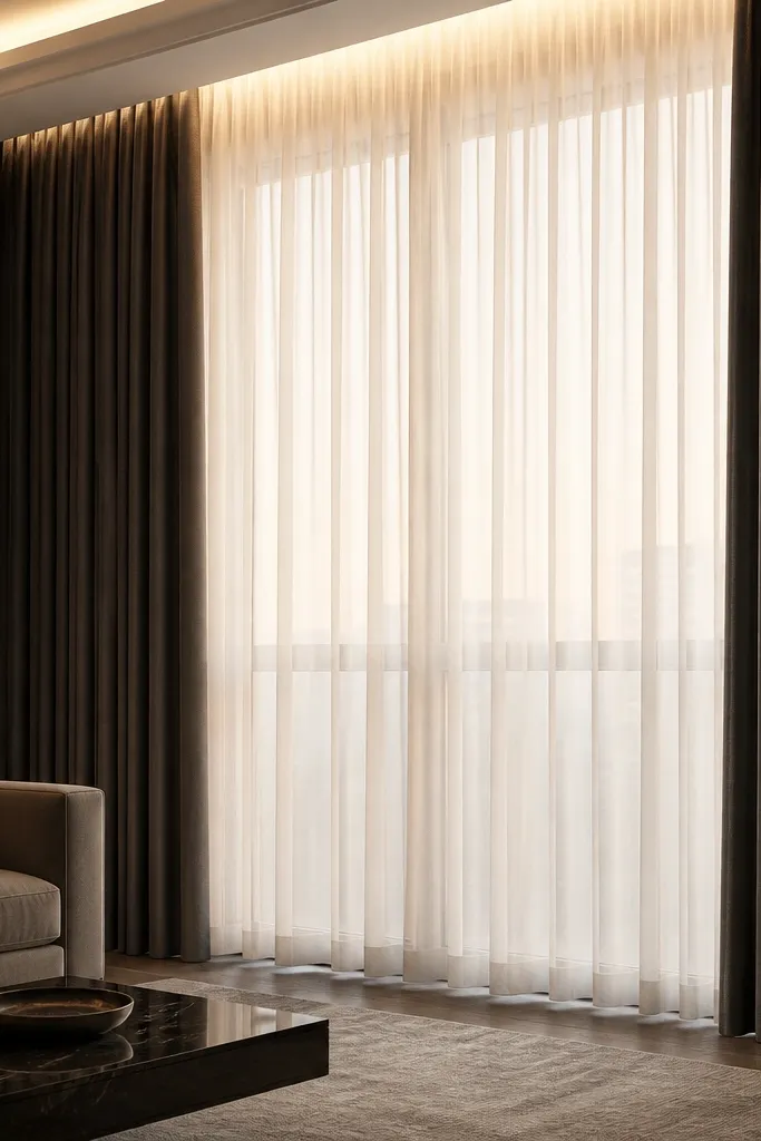
Double height living rooms need both daylight control and softness. Layering sheers behind blackout drapes creates a clean, hotel-like look in photos and gives you flexibility: airy in the day, cozy at night. The key is fabric weight — the sheer should be light and floaty, while the blackout layer should hang with weight to create strong folds. This idea makes the room feel designed because it adds depth at the window without cluttering the view.
Install a double-rod system or two tracks so sheers and blackout panels move independently. Hang sheers first, then add blackout panels in the front layer with 2x to 2.5x fullness. Use warm neutral sheers (ivory, oatmeal) and choose blackout drapes in a slightly deeper tone (clay, taupe, or warm grey). Steam everything and check that overlap is even across the full width.
Editor's noteIf you have a second level, keep the sheer pattern subtle so it doesn’t look busy from above.
Skip thisDon’t mix wildly different textures that fight each other in daylight.
25. Matte black wall sconces flanking the main art or mirror
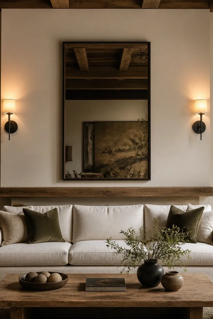
Sconces help double height rooms feel balanced because they add light at mid-height, not just at the ceiling. Flanking the main art or mirror creates symmetry that reads instantly in photos and makes the wall look styled. Matte black hardware keeps the look modern, and warm bulbs keep skin tones and wood tones flattering. This is also a practical fix for glare: sconces let you dim the room without losing the focal wall.
Pick sconces with a warm, diffused shade so the light spreads across the wall. Measure the main art width and install sconces so each light sits about 6-12 inches from the edge of the art frame. Mount into studs when possible and wire to a switch with proper electrical work or an electrician if you’re not comfortable. Use 2700K bulbs and test before final tightening to confirm the beam hits the wall center.
Editor's noteUse adjustable sconces if you can; small angle changes make a huge difference on glare and shadows.
Skip thisDon’t place sconces too high; mid-height lighting is what makes the room feel cozy.



