
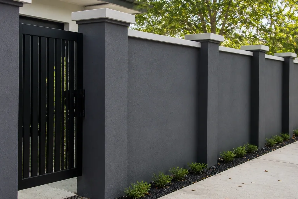
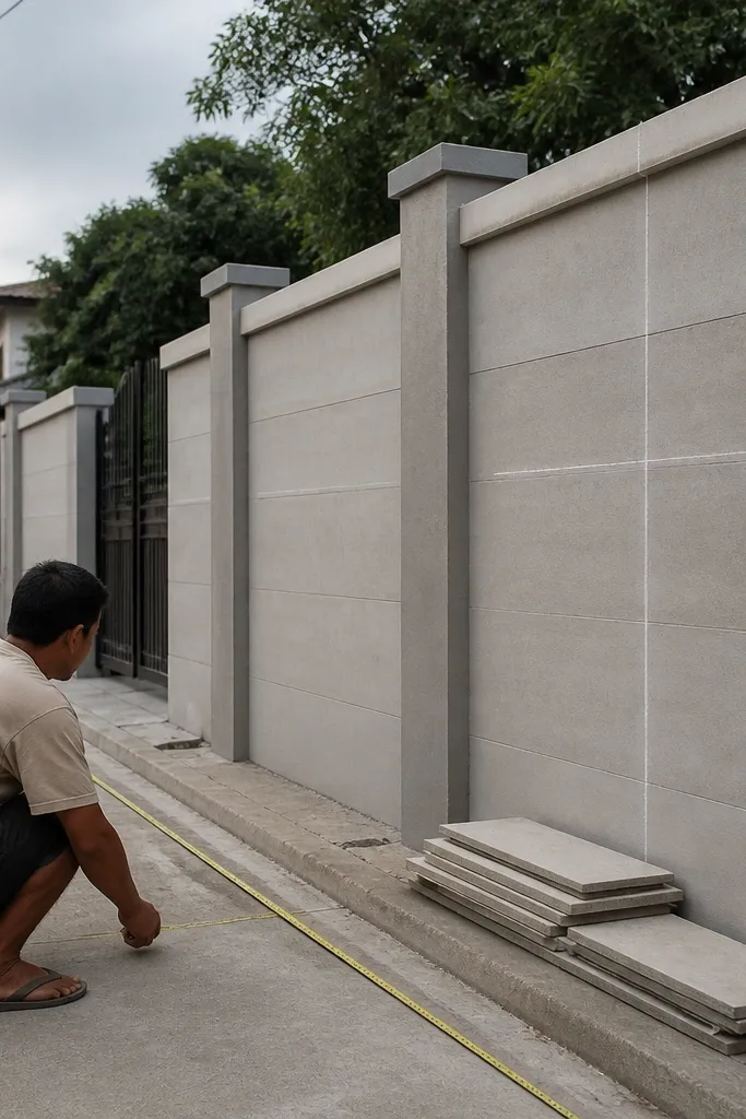
1. Charcoal plaster with white coping and 4x4 post rhythm
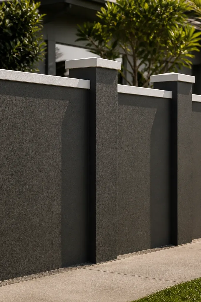
This look is clean and modern because it reduces visual noise. The charcoal plaster hides minor wall imperfections better than light colors, while the white coping draws a crisp line at the top. Square posts in a strict rhythm create order, and the repeated edges catch light at different angles during the day. It works best for a wide entrance where you can keep multiple bays consistent. Skill level is beginner-friendly because the core structure is simple: plaster panels between posts, then paint with a two-coat exterior system.
First, mark post centers across the entrance using a tape measure so you get bays that repeat evenly. Keep posts at 4 ft to 5 ft spacing for a tight, premium look, and use a coping width of about 1.5 to 2 in beyond the post face. Then plaster the wall panels flush, let it cure fully, prime with an exterior primer, and paint charcoal with two coats. Finish by installing precast white coping or casting a thin RCC coping with a smooth finish and clean edges.
Use a straightedge and level to check post faces before plastering; fixing 1/8 in now saves a lot of sanding later.
Don’t paint over under-cured plaster — it will chalk and ruin the crisp contrast.
2. Cream brick posts with dark grey cement infill
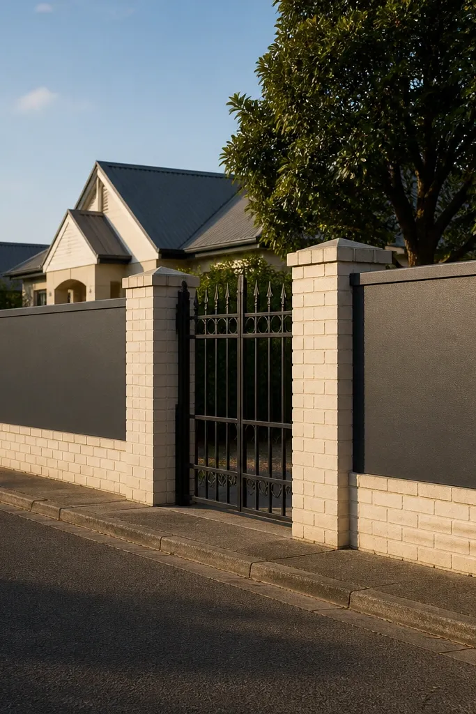
This design looks upscale without complicated patterns. Brick posts give texture and depth, while dark grey cement infill keeps the entrance modern and easy on the eyes. The contrast also makes your post spacing look intentional even if the wall isn’t perfectly straight. It suits entrances with gates that are black, grey, or dark brown, because the color pairing looks planned. Beginners can pull this off by building posts first, then keeping infill panels flat and finishing them with exterior paint or textured cement.
Start by laying brick for the posts at consistent thickness, aligning faces so the brick runs straight. Space the posts 4.5 to 6 ft apart, then build simple infill frames with RCC or cement block backing so the cement panels don’t crack. After curing, apply a textured cement plaster layer on the infill and level the surface. Prime and paint the infill dark grey, then optionally seal the brick with an exterior brick sealer so the color stays even.
Editor's noteChoose one mortar color for brick posts and keep it uniform — it’s what makes the texture look clean.
Skip thisSkip glossy sealants on dark grey infill; they reflect dust and make imperfections obvious.
3. Limewash white with horizontal slats and warm steel trim
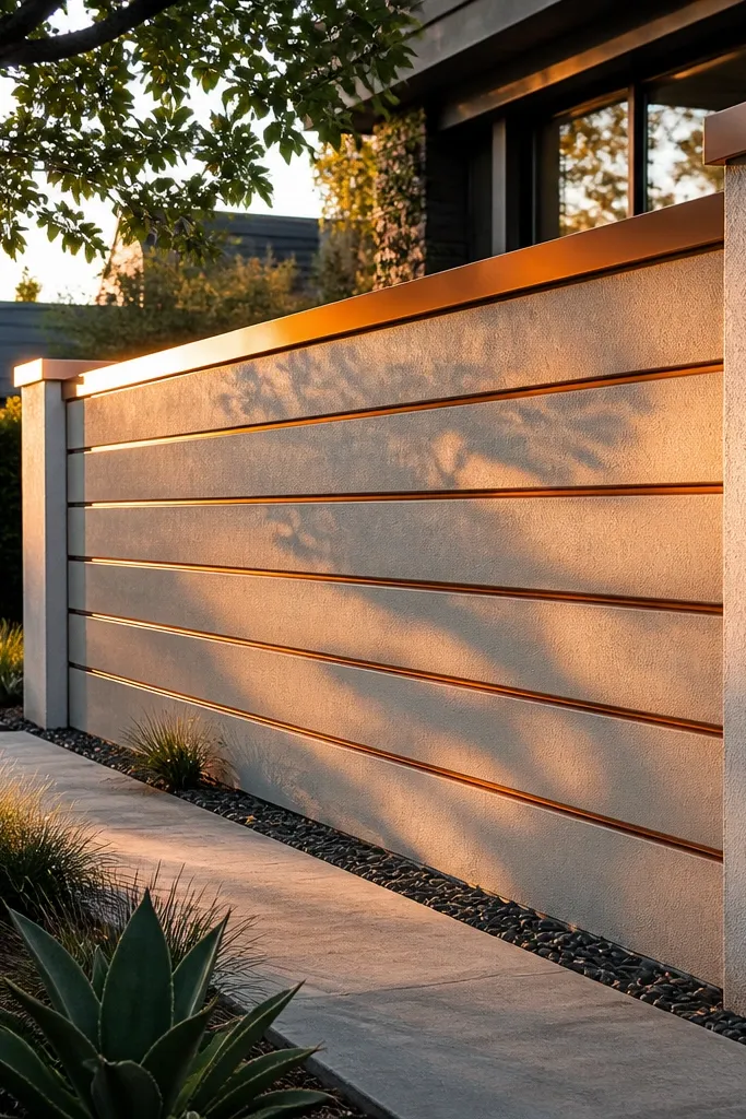
Horizontal slats make a compound wall feel wider and more architectural. Limewash white gives a soft, natural tone that looks good in both daylight and evening lighting. Warm steel trim lines add a modern edge without needing heavy stonework. This design works especially well for front entrances where you want a “feature wall” behind the gate. It’s beginner-friendly if you use prefabricated slat panels or simple timber-style cement moulds, then paint and trim.
First, decide slat spacing: keep the gap between slats consistent at around 3 to 4 in for a balanced look. Build the base wall and posts, then fix slat supports at equal intervals using masonry anchors. Install slat panels (cement mould panels or lightweight slat cladding), then fill seams with exterior filler and sand smooth. Finally, paint with a limewash-like exterior finish in white, and add warm steel trim along the slat boundaries with exterior screws and anchors.
Editor's noteUse a template made from plywood to mark slat lines; it keeps the whole wall looking straight.
Skip thisDon’t eyeball slat spacing — uneven gaps make the wall look DIY in a bad way.
4. Terracotta panels with small arched cutouts
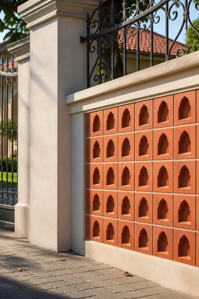
Arched cutouts soften the entrance and make the wall feel traditional but still crisp. Terracotta tones look warm against common gate colors like black wrought iron or brown aluminum. The arched openings also break up the flat face, so the entrance photographs well even from a slightly angled road view. This is a great choice for homes that want a welcoming look rather than a purely modern one. Beginners can do it using moulded cement panels or by building simple RCC frames and cutting arched shapes with formwork.
Start by making a post-and-panel grid with posts every 5 ft and panel widths around 2 ft to 2.5 ft. For each panel, mark arched cutouts at consistent height and spacing, then build a simple form inside the panel frame. Pour cement or install mould panels with the arched openings ready, then cure properly. Finish by plastering edges cleanly, painting terracotta exterior paint, and sealing arched edges with an exterior sealer to avoid water staining.
Editor's noteKeep the cutout edges smooth and paint them too; rough edges look messy in close photos.
Skip thisDon’t make arches too large — oversized openings weaken the panel visually and structurally.
5. White marble-look tile band at eye level
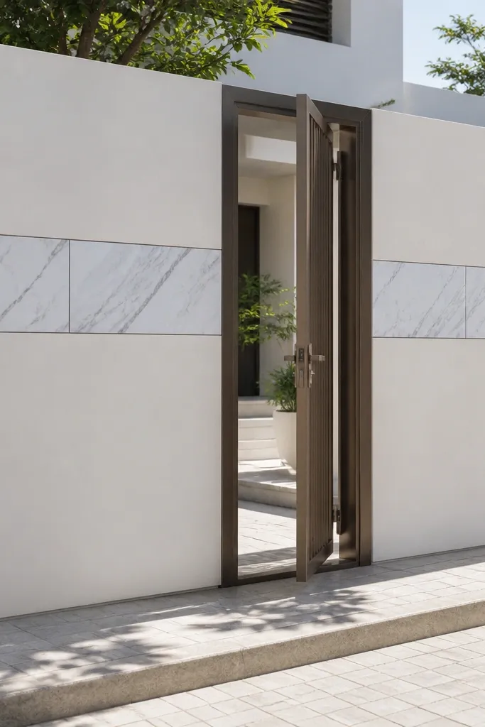
A marble-look tile band is the fastest way to make a plain wall look designed. The idea is simple: keep the wall mostly one neutral color, then add a clean horizontal tile feature where the eye naturally lands. White marble-look tiles reflect light and look expensive, especially with thin grout lines. This design is beginner-friendly because the structure is unchanged; you’re just adding a tile band between posts. It works best when your entrance has a gate and fencing that would otherwise compete with the wall.
First, choose a base color like medium grey or warm taupe, then plaster and paint it as your foundation. Decide the band height: keep the tile band center around 4 ft to 4.5 ft from ground level for a balanced look. Measure and mark a level line across the entrance, then install tile with exterior-grade tile adhesive. Use spacers for grout lines, let it set, grout with an exterior grout, and finally seal the grout if the tile system recommends it.
Dry-lay 1 bay first to confirm tile count and cut sizes; it prevents ugly slivers at the edges.
Don’t install tiles directly on flaky paint — scrape, prime, and make the surface solid.
6. Dark walnut stain effect on wood-texture panels
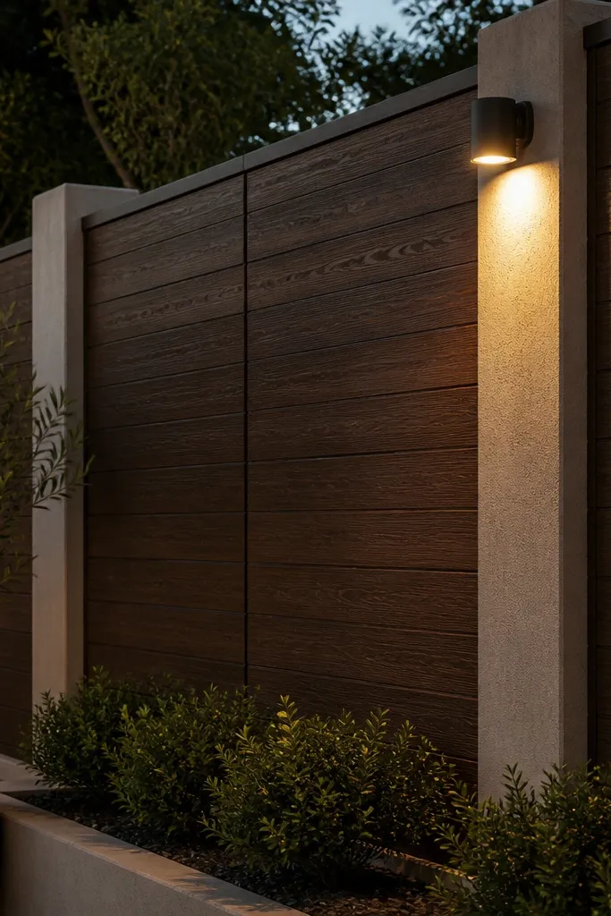
Wood-texture panels look warm and modern, especially when you keep the rest of the wall simple. A dark walnut effect hides dirt and makes lighting look cozy at night. The key is choosing a wood-look finish that can handle rain — use cement-based board or cement mould panels, not real timber for outdoor durability. This design suits entrances where you want a softer, less industrial feel. Beginners can execute it with cement mould panels, then spray or roll a durable exterior coating system.
First, build a basic post-and-panel frame with posts at 5 ft spacing and panel widths that match your mould sheets. Install cement mould panels or cement board infill and keep edges straight with a level line. Then apply a primer made for exterior surfaces and build the walnut effect using a dark brown base coat plus a lighter dry-brush layer to mimic grain. Finish with a clear exterior sealer to protect against UV and water splash.
Editor's noteDo a small test panel first — walnut effect comes out different depending on the base shade.
Skip thisSkip clear sealer; without it, the finish fades unevenly and looks patchy.
7. Stone veneer columns with simple plaster infill
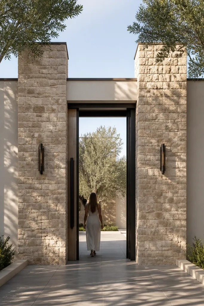
Stone veneer columns create a high-end look while keeping the infill cheap and easy. You get texture where it matters — at the vertical “anchors” — and the plaster infill stays smooth and clean. This works great when your entrance gate is simple and you want the wall to carry the visual weight. It’s beginner-friendly because veneer panels are modular; you’re not carving stone. The look photographs well from the front because the columns cast clear shadows.
Start by marking column positions and building RCC/cement block backing for the veneer thickness. Keep columns about 1.5 ft to 2 ft wide and space them 5 to 6 ft apart. Plaster the infill portion smooth, then apply stone veneer on the column faces using exterior adhesive. Cut around edges neatly, grout if your veneer system requires it, and seal the veneer after curing. Paint or finish the infill to match the gate — light warm grey looks best with natural stone colors.
Editor's noteDry-fit veneer sheets before sticking; it helps you avoid awkward corner seams at the most visible spots.
Skip thisDon’t use interior adhesive; the veneer can delaminate when water hits the wall.
8. RCC posts with alternating grey and white vertical bands
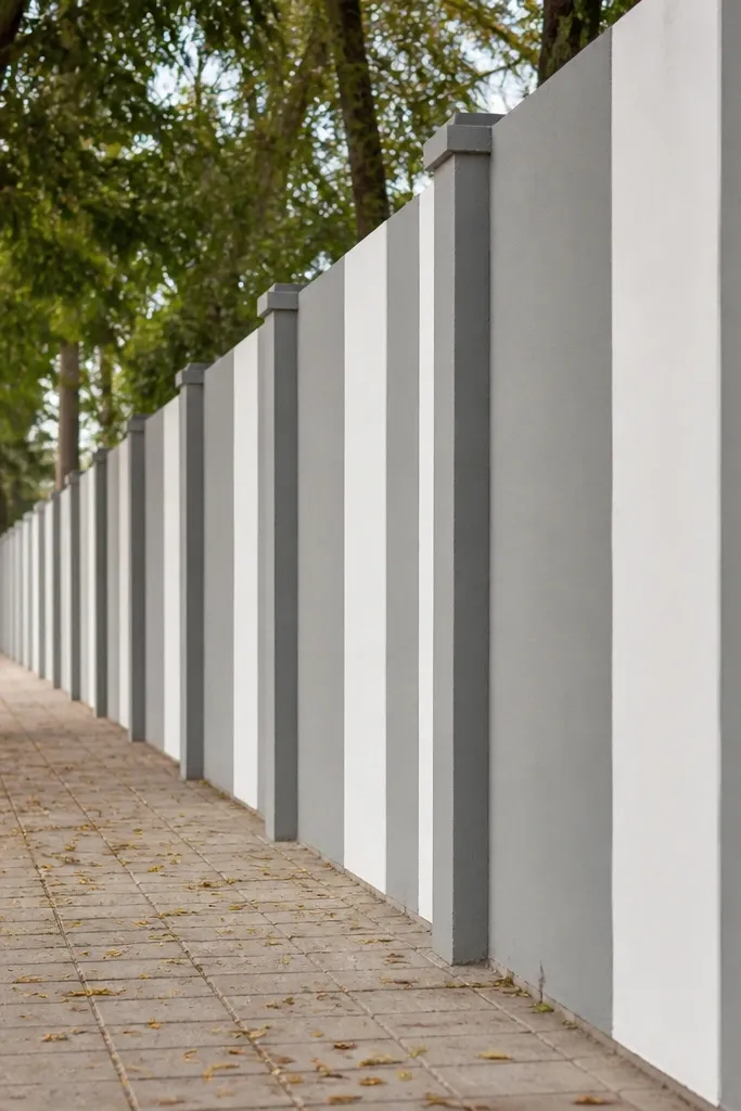
Alternating vertical bands give you a “designed” facade without complex patterns. The posts provide the structure, and the alternating bands create a rhythm that looks good from a distance and up close. Use grey and white for a modern, low-fuss palette that matches almost any gate. This is a strong choice for a long compound wall run leading to the entrance, because the pattern keeps moving and doesn’t feel random. Beginners can do it with simple plaster strips and exterior paint.
First, plaster the wall uniformly in a base color, then mark band widths using a measuring tape and chalk line. Keep band widths around 8 to 12 in so the pattern looks balanced on typical entrance lengths. Tape off edges with painter’s tape, paint alternating bands in the second color, and pull tape while paint is still slightly tacky. Finish by painting the posts and coping in a consistent color so lines stay crisp across the whole entrance.
Use painter’s tape + a foam roller; it stops paint bleeding under tape edges.
Don’t paint bands before curing the base; fresh plaster stains and ruins the clean contrast.
9. Black metal lattice panels over light grey cement
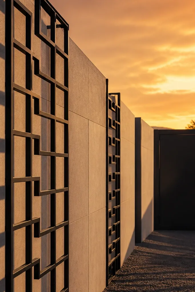
Lattice panels look sharp because they add geometry without needing heavy stone or tiles. Light grey cement keeps the wall bright, while black lattice reads crisp and modern. The lattice also creates a subtle shadow pattern that looks great on photos at sunset. This design suits entrances where you want airflow and visibility but still want a decorative wall. Beginners can build it by installing framed lattice panels on RCC posts and finishing the cement base cleanly.
Start by plastering and painting the wall base in a light grey exterior shade. Install RCC posts or ensure your existing posts have straight faces for mounting. Then mount black metal lattice panels within the bay openings using anchor bolts and spacers to keep the panel level. Prime and paint any cut metal edges to prevent rust. Finish with a top coping and repaint the frame edges if needed after curing.
Editor's noteLeave a 5 to 10 mm gap between lattice and plaster so water doesn’t get trapped and cause staining.
Skip thisDon’t skip rust-proof primer on cut metal; it will bleed through paint later.
10. Half-height privacy wall with decorative parapet above
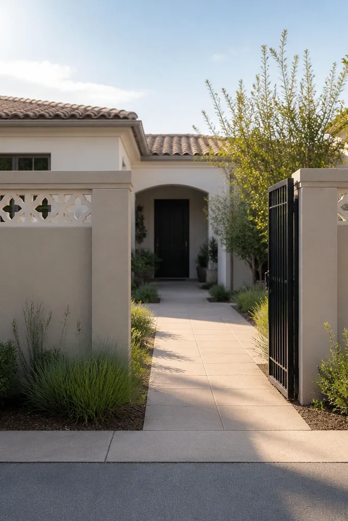
This design is a smart look for entrances that feel too closed. A half-height privacy wall gives clean privacy, and the decorative parapet above adds style without blocking light. It’s beginner-friendly because the foundation is simpler: build a full wall up to about 3.5 to 4 ft, then add a lighter decorative upper section. The parapet can be lattice, slats, or small panel cutouts, and it photographs beautifully because the top section creates a distinct silhouette.
First, build a solid privacy wall up to 3.5 to 4 ft with RCC/posts and smooth plaster. Then plan the parapet height to reach the total wall height around 7 ft, leaving roughly 3 ft for the decorative section. Install decorative panels in a frame — metal lattice or cement mould panels — and anchor them securely to the top beams. Finally, add coping and paint the privacy portion and decorative section in complementary colors.
Editor's noteKeep the parapet pattern centered above each bay so it lines up with the post grid below.
Skip thisDon’t make the parapet too heavy; it adds weight and stresses the top beam.
11. Terracotta + beige geometric block pattern
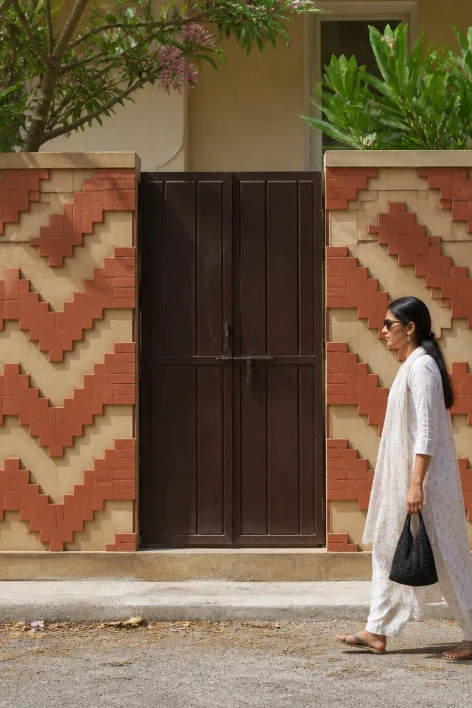
Geometric block patterns look handcrafted even when they’re built with simple moulds. Terracotta and beige is warm, and the geometry creates depth because shadows fall across the raised blocks. This style is great for homes that don’t want plain color-only walls. Beginners can execute it using cement block moulds or precast decorative panels, then paint to lock the look. It’s photogenic because the raised pattern catches light consistently.
Start by building posts and flat infill panels as a base. Then mark a grid on the infill — for example, 12 in by 12 in blocks — and install precast mould blocks in the raised pattern. Keep block edges aligned and use exterior adhesive so the blocks don’t shift. After curing, fill gaps with exterior filler, sand, prime, then paint terracotta on the raised blocks and beige on the recessed areas. Finish with a coping in a neutral color to stop the pattern from feeling cramped.
Editor's notePaint raised blocks first, then recessed areas — it gives cleaner edges than doing the reverse.
Skip thisSkip over-thick filler in gaps; it creates bumps that show up in photos.
12. Pastel blue panels with white pebble-texture coping
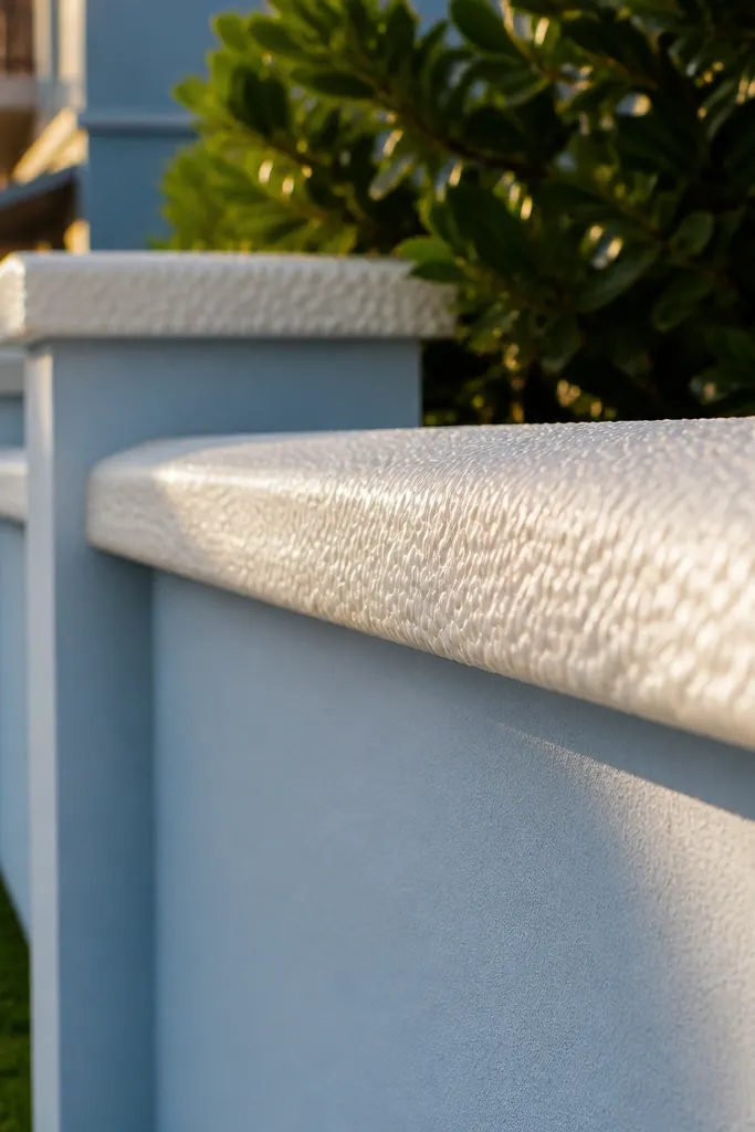
Pastel blue is bold but still friendly, and it looks especially good with white coping. The coping line is the star here — a pebble-texture finish makes the top edge look thick and premium. The wall base stays smooth, so the eye reads the design as a clean entrance feature. This works best if your gate has white, cream, or light grey elements. It’s beginner-friendly because pebble-texture coping can be achieved with surface finishing on the coping or with precast options.
First, plaster and paint the wall in a pastel blue exterior paint with primer. Then install or cast the top coping, aiming for an even thickness across the entrance span. If casting, apply a pebble-texture finish by pressing a pebble-sand mix into the wet surface, then trowel only lightly to keep texture. After curing, seal the coping and touch up the paint edges so the blue-to-white line stays sharp.
Editor's noteUse a mask along the coping edge while painting the wall so the white line stays crisp.
Skip thisDon’t choose a pastel that’s too close to your gate color; it can blend and lose the entrance focus.
13. White + grey tile mosaic squares on entrance posts
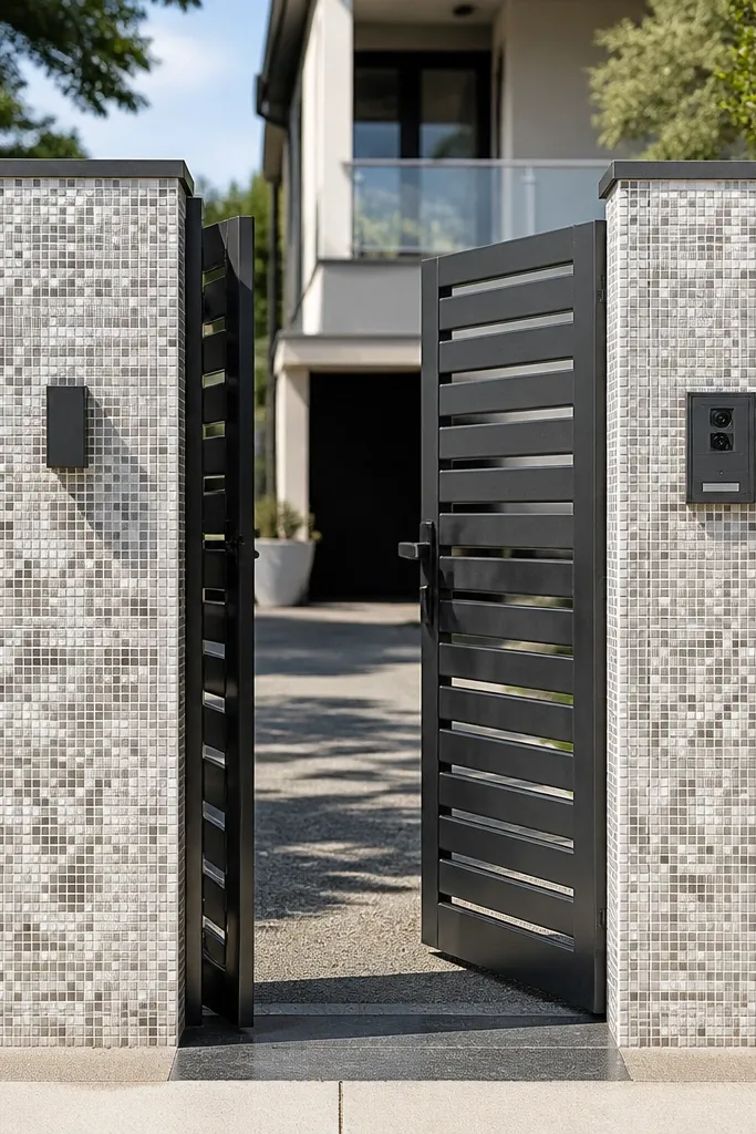
Mosaic squares on the posts make the entrance feel special without covering the whole wall in tile. Keep the main panels painted and use mosaics only on the vertical anchors, and you get a high-impact look for less labor. White and grey mosaics reflect light nicely and don’t look too busy when the rest is simple. This design is beginner-friendly because it’s a small tile area — you’re not tiling the entire wall. It’s also very photogenic because the posts are the first thing people notice.
First, build the posts and plaster them smooth. Mark a mosaic zone on each post — about 1.5 ft wide and centered vertically — then dry-fit small mosaic sheets to plan cuts. Apply exterior tile adhesive, set the mosaic, and keep sheet edges aligned using spacers. Grout with a light grey or white grout, wipe clean, and seal the grout. Finish by painting the infill panels in a solid grey and add coping.
Editor's noteUse a laser level or long spirit level to keep mosaic rows perfectly straight across all posts.
Skip thisAvoid dark grout on light mosaics; it makes tiny misalignments look dirty.
14. Sleek grey finish with recessed vertical light strips
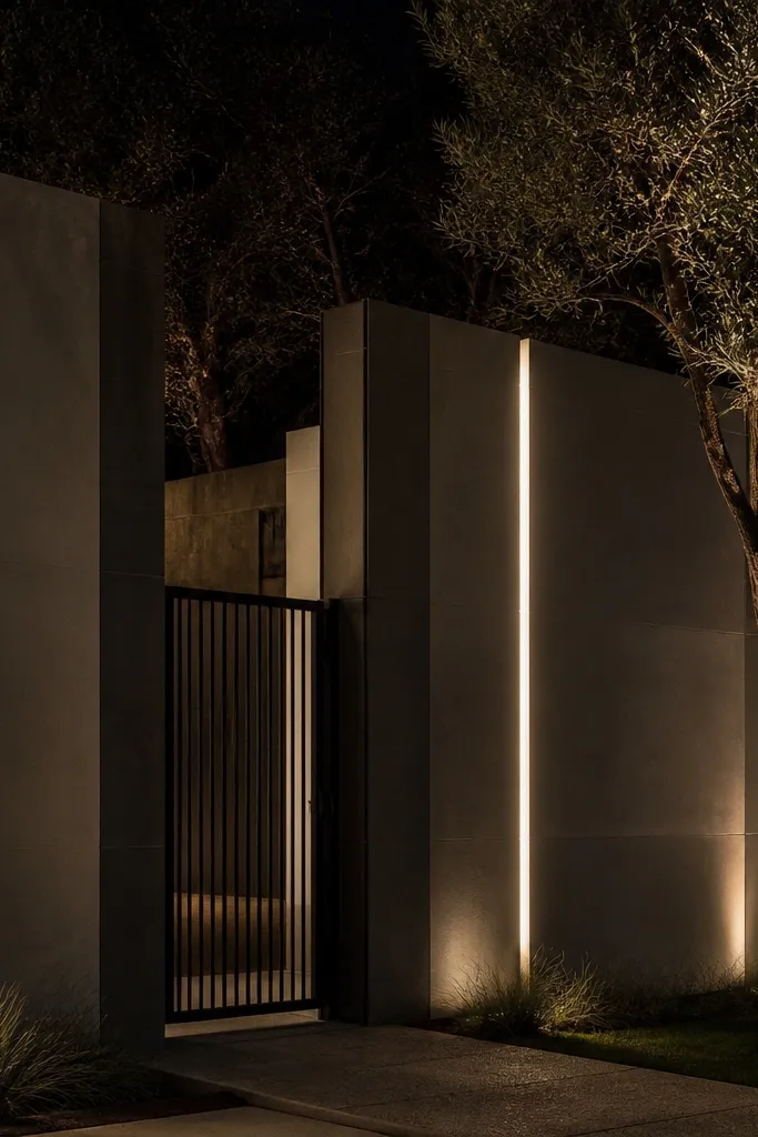
Recessed vertical light strips turn a compound wall into a night-time feature. The daytime look is minimal: grey plaster and clean posts. At night, the light strips create a vertical glow that makes the entrance look higher and more premium. This is a beginner-friendly concept if you plan wiring before plastering and use safe low-voltage LED strips with proper drivers. It’s photogenic because the glow creates depth and smooth gradients on the wall surface.
First, mark where the vertical recesses will go between posts, keeping them around 2 to 3 in wide and evenly spaced. Install conduit and low-voltage wiring before plastering, then build shallow recess boxes using cement board or a form. Plaster over, leave the recess openings clean, and mount LED strip channels inside. After curing, install LED strips, connect to the driver, and seal the recess edges with exterior sealant. Finish with a grey top coat and install coping.
Editor's noteTest the LED strips before closing the recess — a single dead strip is painful to fix later.
Skip thisDon’t run bare wires inside plaster; use conduit and weatherproof connections.
15. Brick soldier course at the top with charcoal panels
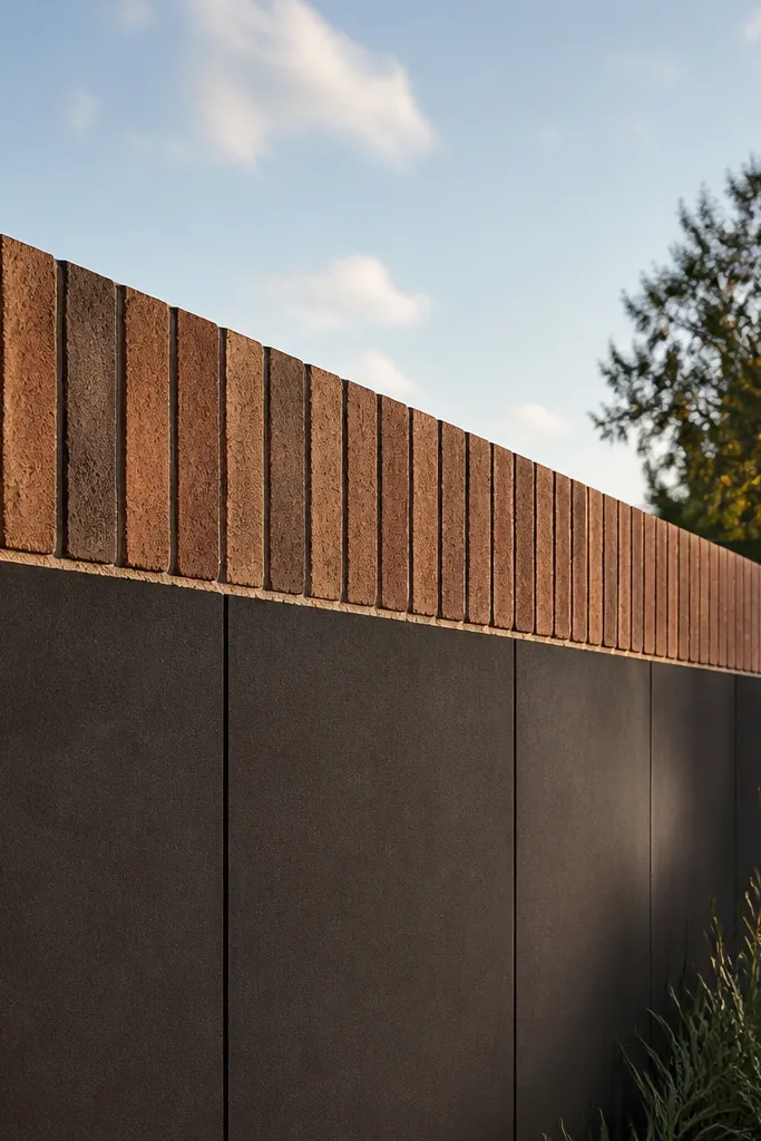
A soldier course — bricks laid vertically — gives a strong, textured top line that instantly makes the wall look finished. Pair it with charcoal panels and you get a modern foundation with a traditional detail. This is a great option if you don’t want precast coping but still want a crisp top. It works on both short entrance stretches and longer runs because the top line stays consistent. Beginners can build it with careful brick alignment and a simple plaster infill.
First, build posts and infill panels, then plaster and paint the panels charcoal. Next, build the top edge using a soldier course: lay bricks standing on their edge along the entire entrance length. Keep the soldier course thickness consistent, and mortar neatly to avoid uneven bumps. Finally, seal the top bricks with an exterior sealer or apply a protective top coating, then paint around the edges so the line stays clean.
Editor's noteDry-lay the soldier course first to confirm brick count and adjust panel spacing before you mortar.
Skip thisDon’t skip sealing — top bricks take water and will stain lower plaster over time.
16. Alternating solid and mesh infill for a modern airy entrance
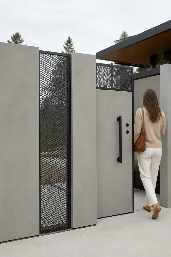
This design balances privacy and openness. Solid panels keep the street view clean, while mesh sections add a modern look and help airflow. It also makes the entrance look less heavy, which is useful when your gate is tall or wide. The look is beginner-friendly because you’re mixing two simple elements: cement infill and a framed mesh panel. It’s photogenic because the alternating pattern creates clear shadows and depth.
First, plan a bay pattern like solid, mesh, solid, mesh across the entrance width so it feels intentional. Build solid infill panels with plaster and exterior paint, keeping edges square. Then frame mesh sheets (powder-coated steel mesh or welded wire) inside the remaining bays and anchor them to the posts. Finish by painting metal frames with exterior paint and installing a coping along the full wall.
Choose mesh with a consistent opening size; random-looking mesh makes the pattern look messy.
Don’t attach mesh directly to raw plaster; install a frame so the metal can expand and contract.
17. Two-tone plaster panels with a thin brass-like border line

Two-tone plaster looks sharp when you keep the divider line thin and straight. The trick is making the border line feel intentional, like a design element, not a sloppy paint edge. A brass-like border (painted metal effect or thin trim strip) adds warmth and makes the entrance feel “finished” even with simple posts. This is beginner-friendly because you’re mainly painting and adding thin trim, not building complex masonry patterns. It photographs well because the contrast lines are crisp.
First, paint the wall base one color — choose warm grey or off-white. Then mark a divider line across each bay at the same height using a laser or long level. Apply painter’s tape to create a thin border area about 1/2 to 3/4 in wide, paint it in a metallic bronze effect exterior paint, and pull tape cleanly. Finally, paint the second color on the panel area below or beside the divider, let it cure, and finish with coping.
Use a small foam roller for border lines; it keeps metallic paint from streaking.
Don’t use thick metallic paint — it dries uneven and catches dust in close photos.
18. Raised diamond cement panels in warm grey
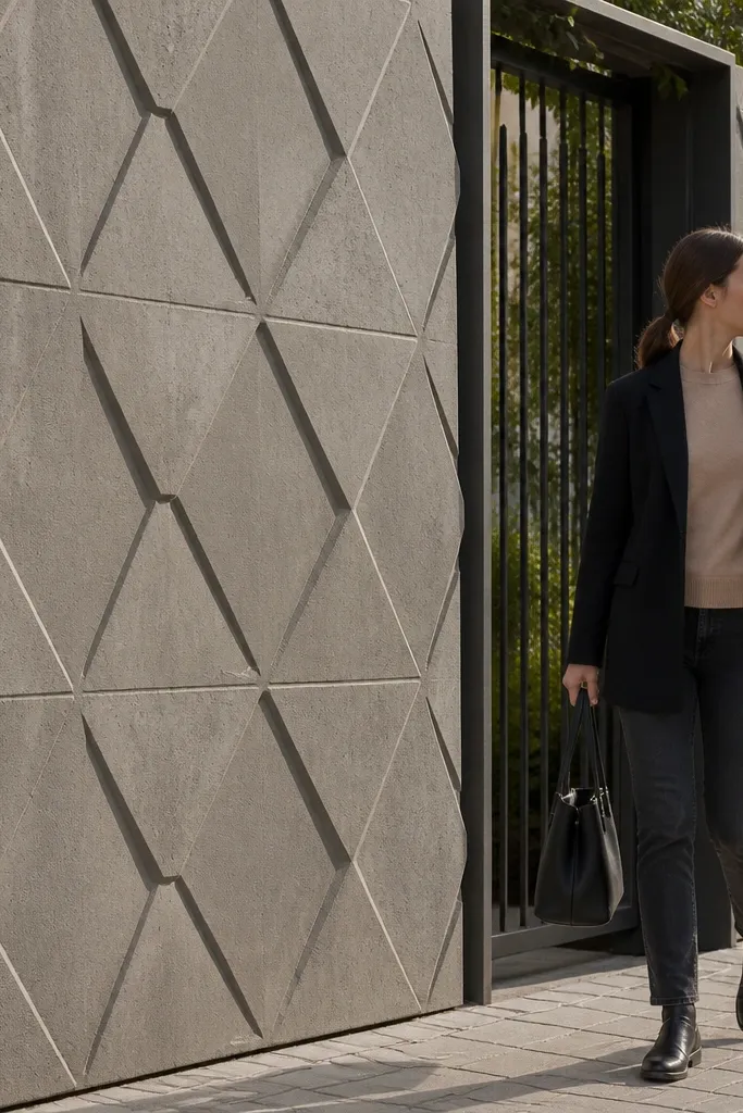
Raised diamond panels add texture without looking busy. Warm grey keeps it modern, and the diamond geometry creates shadow depth that reads well from the road. You also get a forgiving surface — small unevenness disappears into the texture. This design suits beginners who want something more interesting than flat plaster but don’t want elaborate stonework. Use cement mould panels or create shallow diamond relief in plaster within panel frames.
First, build your post grid and create flat panel frames between posts. Then install raised diamond cement mould panels into each bay, or mark diamonds and build relief using a cement mould sheet and formwork. After installation, fill seams and sand high spots so the surface feels even. Prime and paint warm grey exterior paint, then add a protective sealer if the texture is rough. Finish with a top cap so the diamonds don’t look cut off at the top.
Keep diamond pattern alignment across bays; even a small mismatch makes the design look random.
Don’t paint over dusty texture — wipe down and prime so paint bonds evenly.
19. White vertical fluted panels with grey base
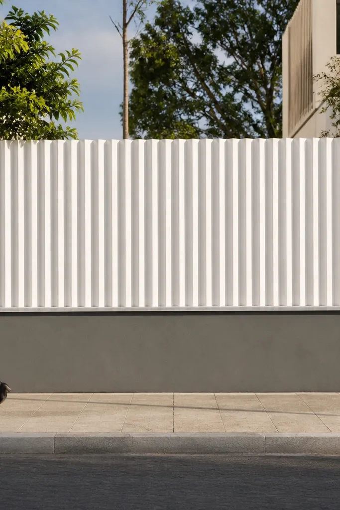
Fluted vertical panels look expensive because they create strong, narrow shadows. The grey base keeps the wall grounded, while the white flutes brighten the entrance and make it feel taller. This is a clean, photogenic look that works for modern homes and also for older homes that need a refreshed boundary wall. Beginners can execute it with fluted cement mould panels or vertical slat-like cement boards. It’s all about keeping panel edges straight and spacing consistent.
First, plaster and paint the base wall grey, then mark panel bays between posts. Install fluted cement panels vertically inside each bay, aligning the flutes so they line up across multiple bays. Use exterior adhesive and anchors where needed, then fill gaps with exterior filler and sand flush. Prime and paint fluted panels white with two coats, and finish by adding coping in grey or a light neutral to match the base.
Editor's noteUse a consistent panel height — stop flutes at the same line across the whole entrance for a clean look.
Skip thisAvoid flutes that are too shallow; shallow flutes don’t cast enough shadow and look flat.
20. Dark green panels with light stone texture on posts
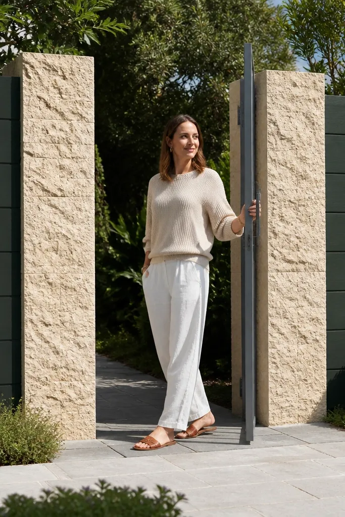
Dark green panels feel classy and calm, and light stone-textured posts keep the entrance bright. This combination looks great with many gate finishes and looks premium in photos because of the color contrast. The stone texture on posts adds depth where the eye naturally rests. Beginners can build it with stone veneer on the posts and paint the infill dark green. The look is also forgiving: stone hides small plaster variations.
First, build posts and infill wall, then plaster and prime the infill for dark green paint. Apply stone veneer only on the post faces, using exterior adhesive and careful corner cuts. Keep veneer thickness consistent and grout or seal as required by the veneer system. After curing, paint the infill with a two-coat exterior system in dark green, then seal the stone veneer. Add top coping in a neutral grey so the color doesn’t feel too heavy.
Pick a dark green paint with a slightly warm undertone; it looks better than blue-green in sunlight.
Don’t paint over wet veneer — wait for full cure so the paint doesn’t peel.
21. Patterned parapet with small cube blocks above solid wall
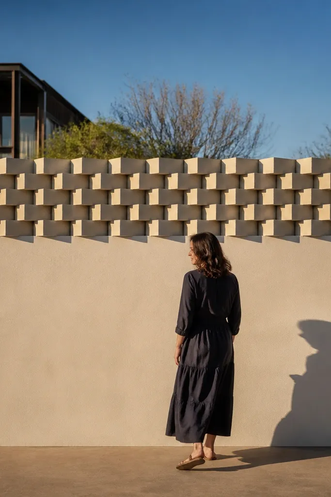
Cube blocks on a parapet make the entrance look engineered and modern. The solid wall below keeps privacy, while the cube pattern above adds a repeating highlight that photographs well. This is beginner-friendly because you’re building a normal wall and then adding a modular top feature. It also helps disguise minor top unevenness because the parapet covers the edge. Use lighter grey or off-white for blocks so the cube shadows show clearly.
First, build the solid wall to about 5 ft with RCC/posts and smooth plaster. Then design the parapet to bring total height to around 7 ft, leaving a 2 ft decorative zone. Install small precast cube blocks or form cube-shaped blocks in a grid on a reinforced top beam. Secure blocks with exterior adhesive, fill gaps, and then apply a paint system to the entire parapet for uniform color. Finish with a coping or a flat cover cap if the cube tops need protection.
Keep cube size consistent, like 6 in cubes, across all bays to avoid a “random” look.
Don’t overload the parapet with too many blocks; heavy top sections can crack the beam.
22. Minimal white wall with black vertical stone-look stripes
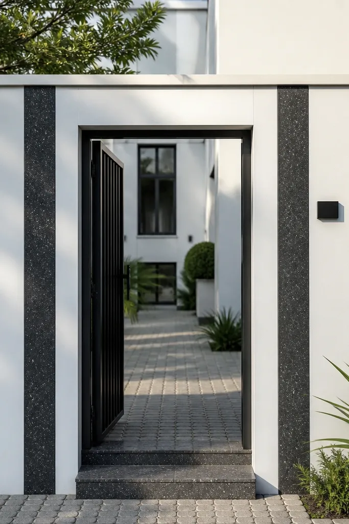
This is the “clean but not boring” option. A minimal white base makes the entrance feel bright, and black vertical stripes create a strong, modern frame behind your gate. Stone-look stripes add texture without the cost of full stone cladding. It’s beginner-friendly because stripes can be done with stone-look tiles, thin cladding sheets, or textured cement strips. The look works best when the entrance is visible from the road and you want a crisp first impression.
First, plaster and paint the wall pure white using primer and two coats. Then plan stripe widths around 6 to 8 in and spacing about 2.5 to 3 ft between stripes. Apply stone-look cladding strips or tile strips on the stripe zones using exterior adhesive, then grout only if using tile. Seal the cladding and touch up white around edges so the stripe boundaries stay sharp. Install coping in white or a light grey to finish the top line.
Use a long straightedge to check stripe alignment across bays before adhesive cures.
Don’t use thick adhesive under stripes; it can create uneven edges that show in photos.
23. Warm sand plaster with dark brown vertical fins

Vertical fins give a modern, architectural look and break up glare from the street. Warm sand plaster acts like a neutral canvas, while dark brown fins read grounded and match many gate woods and metals. This design is beginner-friendly because you can build fins using cement mould strips or thin cladding boards fixed to the wall. It’s photogenic because fins cast long shadows — especially in morning and late afternoon.
First, plaster and paint the wall warm sand with an exterior primer and two coats. Mark fin positions between posts, aiming for fins every 16 to 24 in with consistent widths around 2 to 3 in. Fix fins to the wall using exterior adhesive and masonry anchors, keeping them perfectly vertical with a level. After installation, paint fins dark brown and seal any exposed edges. Finish with a top coping that matches the fin color for a clean silhouette.
If you use cement mould fins, sand the edges lightly before painting so the paint line stays crisp.
Don’t install fins with uneven spacing — the shadows amplify the mistake.
24. Alternating arch tiles on a grey base

Arch tile panels add a decorative rhythm without turning the wall into a busy mural. A grey base keeps it modern, and alternating arches create a structured pattern that looks intentional from the road. This design suits entrances where you want a decorative touch but still want the wall to feel tidy. Beginners can build it by installing tile panels only in specific zones, not across the whole wall. It’s photogenic because the arch shapes catch shadow and light.
First, build posts and plaster the wall in medium grey, then mark a repeating pattern zone across each bay. Install arch-shaped tile panels using exterior tile adhesive, keeping the arches centered in each bay. Use spacers to keep grout lines consistent and grout with an exterior grout mix. Seal grout if the system recommends it, then paint around tile edges to hide minor plaster differences. Add coping in a neutral color and check alignment from a distance before final curing.
Dry-lay one bay with tiles and arches to confirm how many tiles fit without awkward slivers at the sides.
Don’t rush grout — uneven grout thickness makes arches look lopsided.
25. Matte off-white wall with black speckle panel inserts
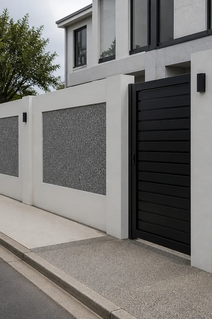
Speckle panel inserts look like a poured aggregate finish, and they hide dust better than solid paint. Matte off-white keeps the entrance bright and clean, while black speckle adds texture and a modern contrast. This is a beginner-friendly approach because you can use pre-made cement panels or finish panels with a speckle coating. The result looks designed because the inserts are consistent across bays. It’s especially good for families who want a wall that still looks decent after months of street dust.
First, plaster and paint the main wall off-white with a matte exterior finish. Then choose speckle inserts: precast cement panels or speckle-coated infill sheets that fit your bay openings. Install inserts between posts using exterior adhesive and anchors, keeping edges straight. Finally, touch up paint at the borders and apply a protective top coat to reduce staining and improve washability.
Editor's noteSeal the off-white areas — it makes future cleaning much easier without damaging the finish.
Skip thisDon’t mix multiple speckle textures; keep one insert style for the whole entrance.



