
1. Sofa-Back Centered 3x3 Grid With Consistent Mats
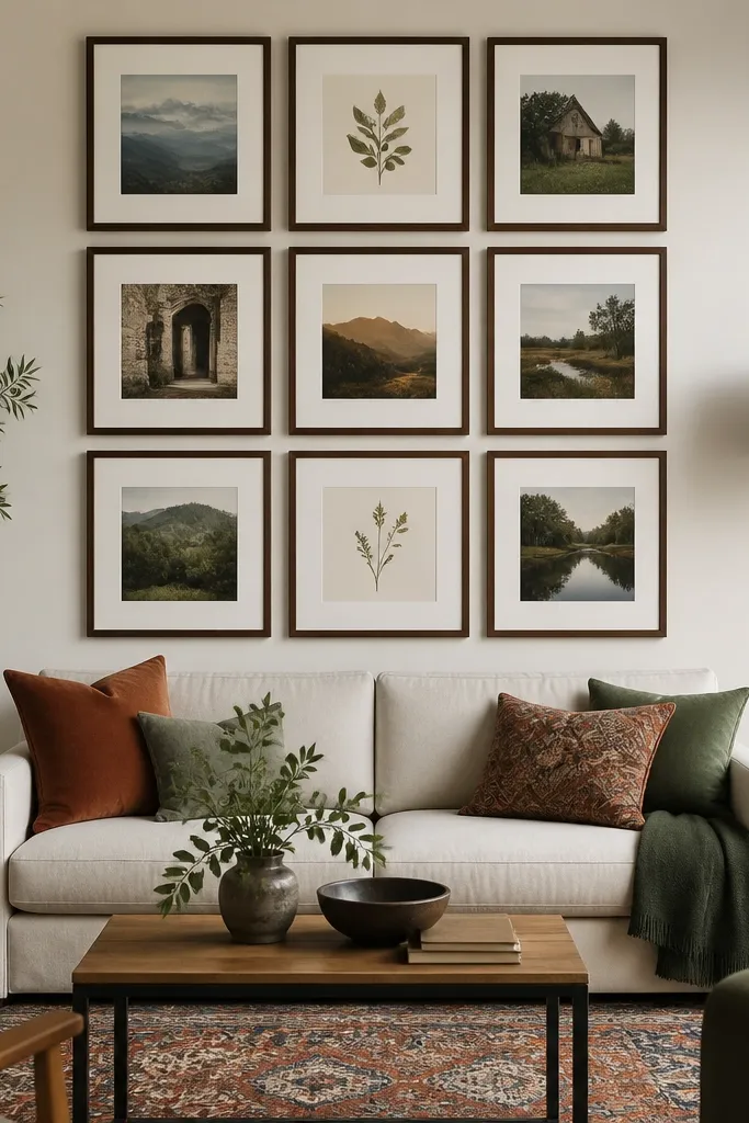
This is the cleanest option when your Before Living Room looks cluttered but you still want personality in the after. A 3x3 grid reads organized from across the room, and consistent mats make mixed prints feel like one collection. Use this when your living room has a strong horizontal line already — like a low sofa, console table, or built-in shelving. It also hides beginner mistakes because the spacing stays predictable even if you mix subject matter. Skill level is beginner-friendly: you’re basically doing straight lines, not balancing a puzzle.
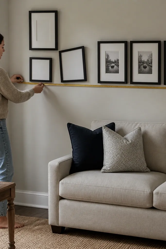
Start by measuring the wall width you want to cover, then pick a grid that fits with even margins. Lay out nine frames so the outer edges leave about 6-10 inches of breathing space on each side of the grid relative to the wall boundaries. Choose frames with the same outer width and install with consistent spacing between frames — I recommend 2 inches between outer edges. Mark the top-left frame corner on painter’s tape, then transfer that tape outline to the wall. Finally, hang the center frame first at eye-level for the sofa, then work outward using the tape spacing as your reference.
Use a laser level or a phone level app for the first row. Fixing the top line prevents a whole wall of crooked frames.
Don’t mix frame widths in a grid unless you’re keeping mat sizes identical — otherwise the gaps look uneven.
2. Two-Story Salon Hang With a Tight Upper Cluster
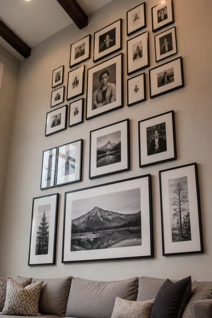
If your Before Living Room feels like it needs “more,” a salon hang gives you that filled-in look without turning into a jumbled collage. The trick is the cluster: keep the upper area tighter and let the lower frames spread slightly. This draws the eye up, which matters in rooms with lower ceilings or bulky furniture. Choose this when you’re mixing art sizes or want a more collected, lived-in vibe. It’s a mid-level project because spacing is less forgiving, but the payoff is a wall that looks styled, not arranged by accident.
Pick 7-11 frames total, then group them into two bands: a tighter top band and a slightly wider bottom band. Start by placing the largest frame in the top band at the center of your layout footprint. Add smaller frames around it with 1 inch spacing between outer edges in the tight band. For the bottom band, increase spacing to 2 inches between outer edges so it doesn’t feel heavy. Tape the full footprint first, then hang the largest frame, then the surrounding frames to the tape marks.
Use the same frame finish for every frame, even if the art is different. Consistency in frame finish is what makes salon hangs look intentional.
Avoid random spacing between sizes. Salon hangs need a spacing rule or they read messy.
3. Gallery Wall Over a Console With Vertical Rhythm
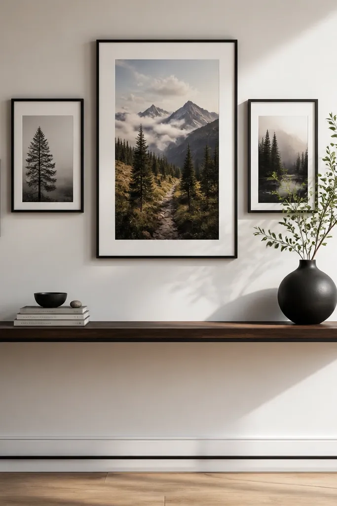
This idea fixes the most common Before Living Room problem: the wall above a console looks too tall or too empty. Vertical rhythm uses one taller piece as the anchor, then balances it with medium and short frames so your eye travels smoothly downward. It’s great for narrow walls or hall-adjacent living rooms where you want the gallery to feel tall instead of wide. Choose this if your sofa is low and you want the gallery to “stand up” rather than spread. The build is straightforward because you’re planning a sequence, not a mosaic.
Editor's noteIf you’re using prints behind glass, tilt the top frame slightly on the layout tape to see glare direction under your living room lights.
Measure the console width and decide how wide your gallery should be, aiming for 2-6 inches of margin on each side. Choose one tall frame for the center and then select 2-4 medium frames and 1-2 smaller frames to create a descending pattern. Plan 2 inches between outer edges horizontally, but keep vertical spacing tighter — about 1.5 inches — so it feels connected. Tape the outline to the wall, hang the center tall frame first, then align the rest to the tape lines. Use wall anchors rated for your frame weight if you’re going into drywall.
Skip thisDon’t center a vertical gallery on the wall midpoint if the console is off-center. Center it on the console.
4. Oversized Single Frame With a Mini Gallery Left Side
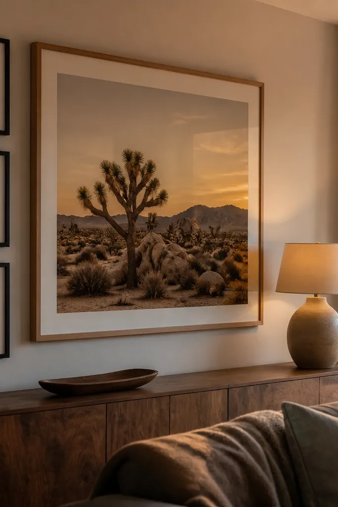
When your Before Living Room looks like the wall is “missing something,” an oversized anchor frame is the quickest fix. The mini gallery on one side adds personality without turning the whole wall into a busy grid. I like this for rooms with a big TV, a large mirror, or heavy built-ins because it creates a focal point that still feels balanced. This approach also hides uneven wall space better than a full grid. It’s beginner-friendly because you only need to nail one big anchor and a small cluster around it.
Editor's noteUse a mat in the big frame. Without a mat, the oversized frame can look too boxy and flatten the wall.
Choose one large frame that’s about 60-70% of the available wall width. Place it slightly off-center toward the side that has more negative space, then add 3-5 smaller frames grouped to the left (or right) of the big piece. Keep the smaller frames aligned by top edges or bottom edges, not mixed randomly. Use 2 inches between outer edges between the big frame and the mini cluster, and 1 inch between frames inside the mini cluster. Tape the layout, hang the big anchor first, then hang the mini frames using the tape spacing as your guide.
Skip thisAvoid mixing too many frame colors. Two finishes max for this layout looks intentional.
5. Photo-First Family Grid With One Statement Color Mat
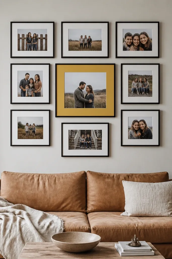
This layout is for people who want Before and After Living Room warmth without turning the wall into a generic photo dump. The grid keeps it tidy, and one statement color mat adds contrast so the wall doesn’t fade into the room. Pick a consistent frame finish (black, dark walnut, or natural wood) and keep most mats neutral like cream or light gray. Then choose one frame with a deeper mat color like terracotta, olive, or navy to create a visual “stop.” It’s a smart option for living rooms with patterned pillows or a strong rug because it gives your wall a controlled rhythm.
Pick 9 frames for a 3x3 grid, and keep all frames the same size except the single statement piece. Use neutral mats for 8 frames, and one bold mat color for the statement frame. Plan 2 inches between outer edges and 6-10 inches of margin on the sides depending on wall width. Tape the full grid footprint, then hang the center frame at the sofa eye-line. Build outward row by row, measuring spacing with the tape marks so gaps stay even.
Choose your statement mat color by sampling a color from your rug, not from random decor. It should already exist in the room.
Don’t use glossy photo paper behind glass on a sunny wall. Glare makes the whole grid look cheap.
6. Floating Shelving + Frame Mix for a Layered Look

If your Before Living Room feels flat, layering helps it look lived-in without adding more furniture. Floating shelves let you mix frames, small objects, and even a couple of books, so the wall changes slightly over time. This works well in living rooms where you want storage and display at the same time. Keep the shelf line straight and the frame sizes consistent so the wall doesn’t look like a clutter shelf. Skill level is intermediate because shelf mounting requires solid anchors and level checks.
Editor's notePre-plan how much weight each shelf holds. If you put heavy books on a shelf without checking load rating, you’ll regret it later.
Choose two floating shelves of different depths, like one 6 inches and one 8-10 inches, and keep them parallel. Mark the shelf height so the bottom shelf sits around 8-12 inches above where you’d normally place art on a wall. Mount the shelves into studs if possible; if not, use drywall anchors rated for the shelf load. Then place frames on the shelves with consistent mat colors and keep frame thickness the same. Finish by hanging one additional frame centered between the shelves or directly behind the shelf gap for a continuous look.
Skip thisAvoid mixing shelf brackets that look different. One bracket style keeps the wall from looking chaotic.
7. Mirror + Frames Triangle for a Small, Dark Room
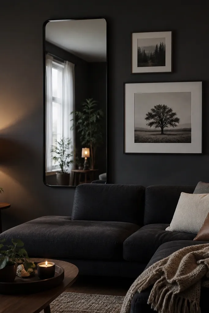
A Before Living Room that’s dark needs more than art — it needs bounce. A mirror in the gallery does that, and a triangle arrangement keeps the layout from looking like you randomly placed things. This is especially good for living rooms with limited natural light or narrow spaces where widening the visual area matters. Use frames that are thin and consistent, and choose a mirror with a simple shape like an oval or tall rectangle. It’s a mid-level project because you’re balancing reflections and spacing, but it’s not hard if you tape the layout first.
Editor's noteTest glare by turning on the main living room light and looking at the wall from your sofa spot before drilling.
Pick a mirror that’s about 1/3 to 1/2 of the total gallery width. Place it slightly above where you’d normally hang a frame, then add 2-4 frames around it so the composition forms a triangle. Keep 2 inches between outer edges between the mirror and frames. Choose art that doesn’t create glare — matte prints or textured art behind glass works better than glossy photos. Tape the mirror and frame layout, check it under the room lights, then mount the mirror first using proper mounting hardware for its weight.
Skip thisDon’t cover the mirror with frames that are too close. Tight spacing makes reflections look messy.
8. Black Frame Minimalism With White Mat Grid
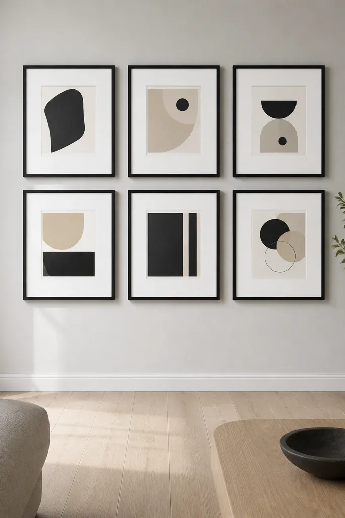
This is a clean Before and After Living Room upgrade for people who want the wall to look expensive without taking up much visual noise. All-black frames and white mats create high contrast, which makes art read clearly even from across the room. It also prevents the “mixed frames look random” problem because the frames all match. Choose this when your room has neutral walls, a patterned rug, or a calm color palette and you want the gallery to add structure. The build is beginner-friendly and forgiving because the look depends on consistency, not complex geometry.
Choose 8-12 black frames and keep the outer frame width identical. Use matching white mats so the spacing looks even even if the art sizes vary. Map a grid footprint with 2 inches between outer edges for most frames. Hang the center or top-center piece first, then work outward with painter’s tape guides. If your wall is slightly off-level, adjust by using shims behind frame mounts so the top row stays straight.
Use the same glass type for every frame. Matte vs glossy differences show up fast and break the uniform look.
Avoid mixing black finishes like matte black with shiny black. It reads like mismatched frames even when sizes match.
9. Warm Wood Frames With Linen Textures and One Black Accent
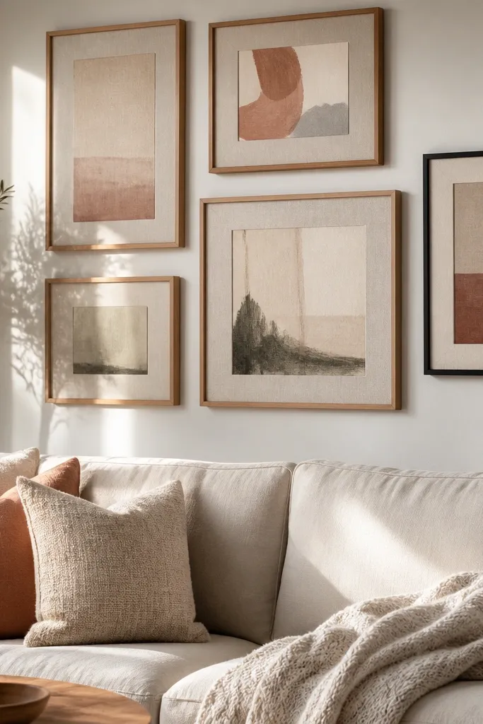
If your Before Living Room feels too cold, warm wood frames plus linen-texture art makes the gallery feel softer without going overly farmhouse. The key is texture variety: linen prints, watercolor-like pieces, or paper with visible grain look better together than glossy photos. Add one black-accent frame to keep it from turning into a beige blur. This layout works in living rooms with light wood floors, tan walls, or neutral textiles. Skill level is beginner, but pick your art carefully because texture is the whole point.
Select 6-10 frames with warm wood finishes and keep the frame width consistent. Choose art with linen or paper textures and stick to a limited palette like cream, taupe, and muted olive. Add one black frame with a stronger contrast piece — typography or a darker illustration — so it anchors the wall. Plan 1-2 inches between outer edges depending on how dense you want the wall to feel. Tape the layout, hang the black anchor first, then fill in the warm wood frames around it.
Use museum-style matte paper for the prints if you’re ordering. It photographs and looks better behind glass in daylight.
Don’t add a bunch of glassy, high-contrast prints. They fight the linen texture look and make the wall feel uneven.
10. Two-Row Checker Layout With Uneven Frame Sizes

This one is for rooms where a grid feels too rigid but a full salon feels too chaotic. The two-row checker layout gives you structure while still letting you mix sizes. It’s also great when you want to cover a wider wall without making it look like a long shelf of frames. Choose this when your living room has asymmetry — like a window on one side or a tall plant near one corner. Skill level is intermediate because you’re staggering frames, but the method keeps gaps consistent.
Editor's noteKeep the same mat color across both rows. When mats match, the stagger looks intentional instead of accidental.
Pick 10-14 frames and sort them into two groups: larger pieces for the top row and smaller pieces for the bottom row. Mark a footprint and place the first top-row frame at center. Then stagger the bottom row so each bottom frame sits between two top frames, not directly under one. Keep 2 inches between outer edges in the vertical direction and 1.5 inches horizontally between staggered pairs. Tape everything, hang the center-most top frame, then follow the tape lines for the rest.
Skip thisAvoid random staggering. If bottom frames don’t sit between top frames, the pattern collapses visually.
11. Color Block Gallery With Three Shades Only
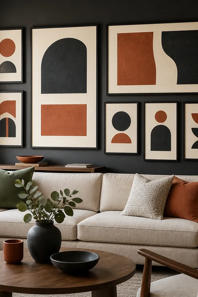
If your Before Living Room feels like it has too many colors already, a color block gallery fixes the problem by limiting the palette. You’re not decorating with “more.” You’re organizing what you already have. This works best when your living room has one main wall color and your decor repeats a few shades — like cream walls, rust pillows, and dark green accents. The look is modern but still warm because you’re using art color intentionally. It’s beginner-friendly because you can keep the frames in a simple grid and let the color do the work.
Choose frames with the same finish and pick only three art/mat colors for the entire gallery. Decide the color pattern before you hang anything — for example: top row is shade A, middle row is shade B, bottom row is shade C. Use 2 inches between outer edges for a clean grid and 6-10 inches of side margin depending on wall width. Tape the grid footprint, then lay the frames on the floor in the exact color order you’ll mount. Hang the center frame first, then complete rows so the color blocks line up.
If your art comes in different tones, standardize by choosing mats that are the same shade and brightness across all frames.
Avoid five-plus colors. Color block only works when the palette stays tight.
12. Asymmetrical Line-Up for Tall Walls (One Side Heavier)
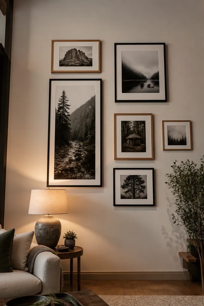
Tall walls can make a gallery look like it’s floating if it’s centered and evenly spaced. An asymmetrical line-up solves that by giving one side more weight — more frames or larger pieces — while the other side stays lighter. This makes the wall feel grounded and helps the gallery relate to furniture like a tall bookshelf or a window. Choose this when your room has one dominant element on one side. Skill level is intermediate because you’re balancing visual weight, but you can make it foolproof with a tape layout.
Editor's noteUse one repeated element across the whole wall — like the same mat size — so the asymmetry looks designed, not random.
Measure the wall height and pick a layout footprint that leaves at least 6-8 inches from the top of the gallery to the ceiling line. Choose 9-13 frames, then decide which side gets heavier — usually the side closer to the bookshelf or window. Place the largest frame on the heavier side first, then add medium frames around it, keeping 2 inches between outer edges. On the lighter side, use smaller frames with 1.5-2 inches between outer edges so it feels airy. Tape the layout, stand back to check balance from the sofa, then hang from the largest frame outward.
Skip thisAvoid making the heavier side only heavier by adding more tiny frames. Use size variation instead.
13. Vintage Map Corner Gallery With Ruler- Straight Alignment
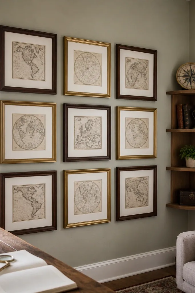
Corner walls are where Before Living Room galleries go to die. People hang frames crooked to “fit” the corner and end up with a wall that looks like it was assembled in a hurry. This corner gallery solves that by using strict alignment lines and a tight cluster. The vintage map theme works because it tolerates mixed frame sizes while still looking cohesive. Choose this when your room has a corner with a lamp or a reading chair and you want it to feel intentional. Skill level is intermediate because corners expose alignment errors fast.
Editor's noteUse a ruler and tape line even if you think your wall is level. Corners exaggerate tiny slants into obvious ones.
Choose 6-9 frames and keep them within a 30-40 inch footprint in the corner so the wall doesn’t feel scattered. Pick one larger map print for the center of the cluster and surround it with smaller maps or vintage-style prints. Use painter’s tape to draw a straight horizontal reference line that runs level across both walls. Keep 1 inch gaps between outer edges for the cluster so the corner doesn’t look empty. Hang the center frame first, then follow the tape grid for the rest, checking level every two frames.
Skip thisDon’t try to “hug” the corner with equal gaps on both walls. One wall almost always needs slightly tighter spacing.
14. Minimal Frame Strip Above a Sofa With 5 Frames Only
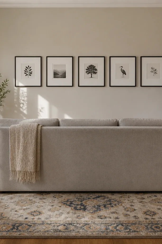
Some living rooms look worse after you add a gallery wall because the wall already has a strong focal point. A minimal strip fixes that by using fewer pieces and clean spacing so the wall feels finished, not stuffed. This is great for small living rooms, apartments, or spaces where you already have a TV, big rug pattern, or lots of decor. The after looks intentional because the frames are aligned and evenly spaced. It’s beginner-friendly and fast, and it still hits the Before and After Living Room promise because it eliminates the “empty wall” feeling.
Pick 5 frames and keep them the same outer width. Choose art sizes that match the frame proportions so the strip looks uniform. Tape a straight line across the wall at the level you want the top of the frames to sit — then mark each frame position with tape squares. Use 2 inches between outer edges for a clean look and keep side margins equal on both ends. Hang the middle frame first, then hang the two frames on each side using the tape marks to keep spacing consistent.
If the wall is textured, use wall anchors rated for picture frames so the frame doesn’t wobble and create a crooked look.
Avoid mixing vertical and horizontal art in this layout. It breaks the strip’s clean rhythm.
15. Black-and-White Typography Gallery With One Curved Frame
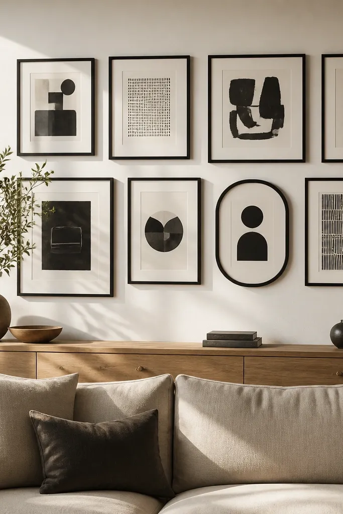
Typography galleries are where people go wrong by printing random quotes and calling it a day. The fix is consistency: same font style feel, black-and-white palette, and one deliberate shape break. Adding one curved frame (oval or rounded rectangle) creates a focal twist that makes the whole wall look designed. This is perfect for modern living rooms with neutral furniture where you want the wall to add personality without color clutter. Skill level is beginner because the palette keeps it cohesive even if the art varies slightly.
Editor's noteUse matte paper or matte photo prints so the text stays readable under warm bulbs.
Choose 7-10 typography pieces and keep them black-and-white. Pick frames with the same finish and size for most pieces, then add one curved frame as the anchor. Place the curved frame slightly above center so it draws attention first. Keep 2 inches between outer edges for the grid or 1.5 inches if you’re doing a light salon around the anchor. Tape the layout, check the reading angle from the sofa, then mount the anchor frame first and fill in the rest.
Skip thisAvoid multiple fonts that don’t match. Two font “mood families” max.
16. Round Frame + Rectangular Frames Mixed Halo
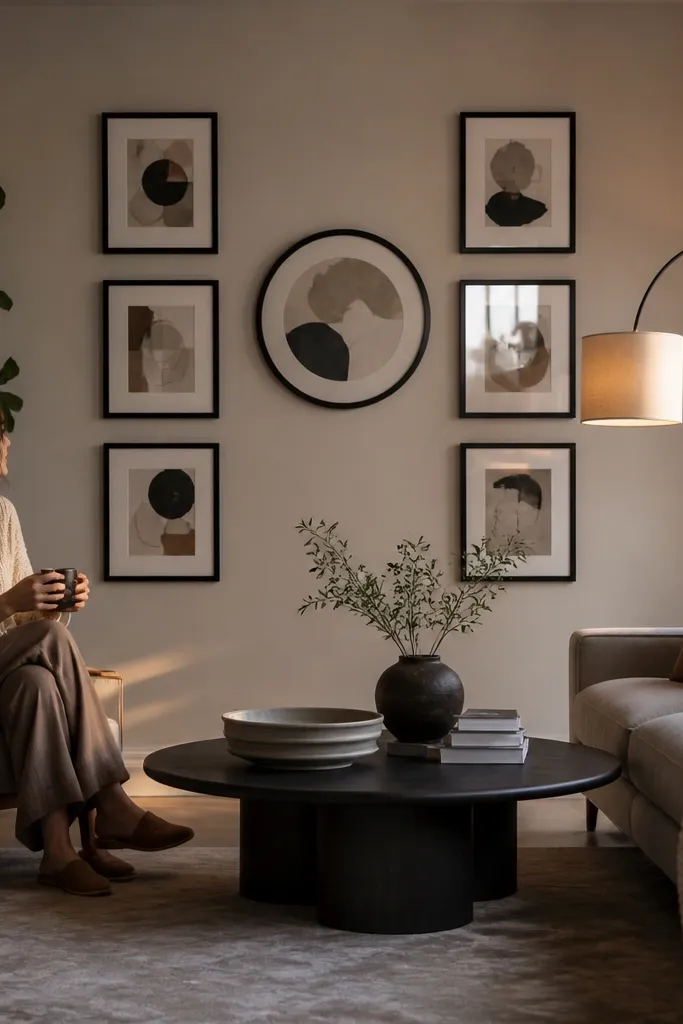
A round frame changes the whole feel of a living room gallery wall because it interrupts the usual rectangle pattern. The halo approach makes it look intentional instead of random. This works well when your room has rounded elements like a round coffee table, arched doorway, or curved lamp base. It also helps soften a Before wall that feels too boxy or too square. Skill level is intermediate because you’re planning a circle-like flow, but you can nail it with tape and a simple spacing rule.
Choose one round frame for the center and 6-10 rectangular frames around it. Decide your spacing first: keep 2 inches between the round frame’s outer edge and the nearest rectangular frames. For the rectangles, keep 1.5-2 inches between their outer edges so the halo doesn’t look cramped. Tape a center point on the wall, place the round frame, then build the rectangles around it until the halo feels balanced. Hang the round frame first, then mount the rectangles using the tape positions you made on the wall.
If you’re using glass, rotate the round frame so glare doesn’t hit the text or image — check before final mounting.
Don’t let the rectangles overlap the halo spacing. If they touch or feel too close, it reads accidental.
17. Oversized Mat-Only Frames for a Gallery That Looks Clean
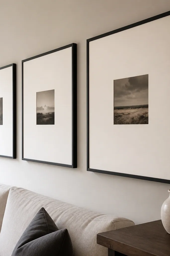
This is the move when your Before Living Room looks busy but you still want a gallery wall. Oversized mat-only frames create breathing room, so the wall looks clean even if your art content is simple. It’s also a great option if you’re printing your own pieces because you can design the art area smaller and let the mat do the styling. Choose this in living rooms with lots of patterns where you want the wall to calm things down. Skill level is beginner, and the build is straightforward because the frames do most of the visual work.
Pick frames that have a wide mat opening and choose art that sits centered within that opening. Use consistent mat color across all frames, like cream or light gray, so the wall reads like one design. Plan a simple grid footprint and keep 2 inches between outer edges. Tape the layout, hang the center frame first, and then align the rest using the tape marks. If your frames vary slightly in outer dimensions, standardize by using a single mat border size and keeping frame placement consistent.
Use a mat color that matches your wall undertone. Too warm or too cool mats can make the whole wall look off.
Avoid thin mats with a lot of art. The look collapses and you end up with a cluttered wall again.



